Stats Section Examples

Numbers persuade only when they are specific and believable. A stats section compresses a track record into a few figures a visitor can take in at a glance, such as time saved or uptime. Vanity totals and unlabeled figures do the opposite and invite doubt. Look at how these stats section examples use type scale, spacing, and short labels to turn numbers into proof.


34 sections

  1. Koyeb value proposition section: gray band with four large condensed metrics on a dark grid background
  2. Zamp stats section: single row of four large figures with labels separated by thin dividers on white
  3. Concourse stats section: headline above a 2x2 grid of large metrics with labels on a near-black background
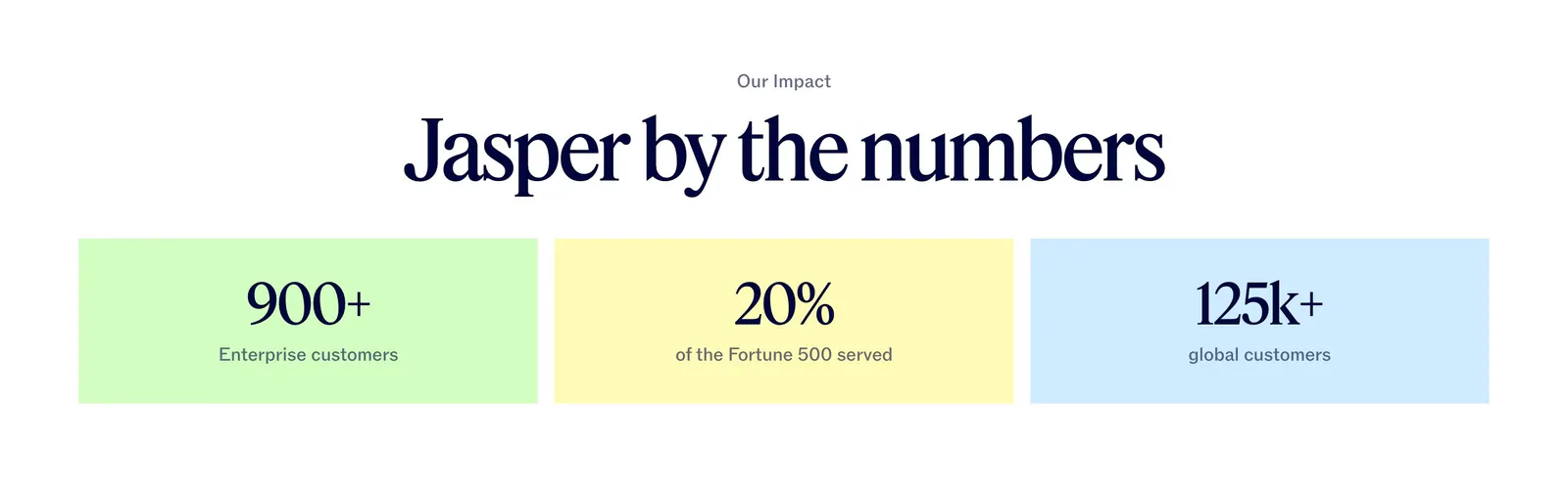
  4. Jasper value proposition section: centered serif headline above three pastel tiles with large customer metrics
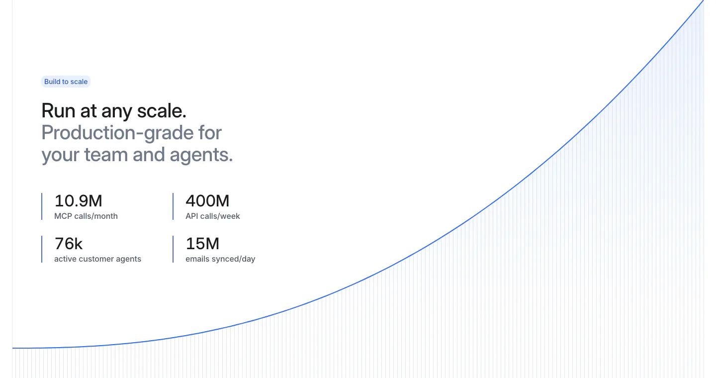
  5. Attio stats section: two-tone headline and four metrics at left beside a rising blue growth curve with vertical line fill on white
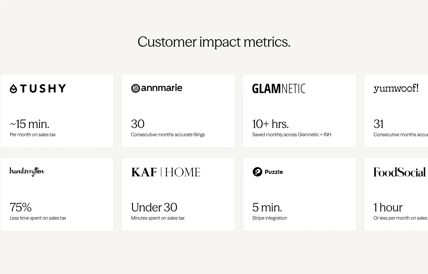
  6. Zamp stats section: centered heading above two rows of white cards pairing customer logos with time-saved figures, cut off at the right edge
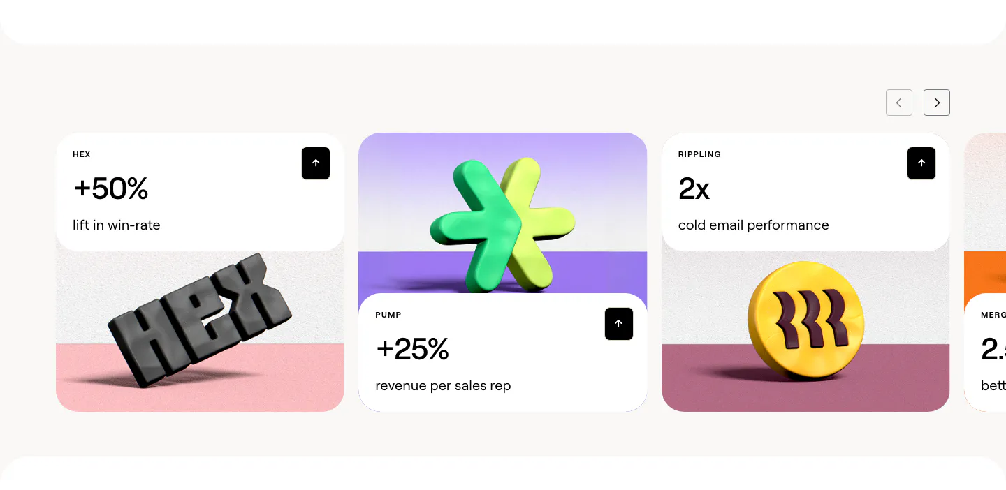
  7. Clay stats section: slider of customer result cards with large percentages above 3D rendered brand logos on colored stages
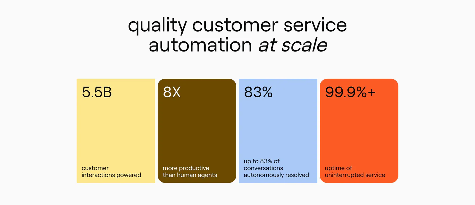
  8. Ada value proposition section: centered headline above four colored stat cards in yellow, brown, blue and orange
    Ada
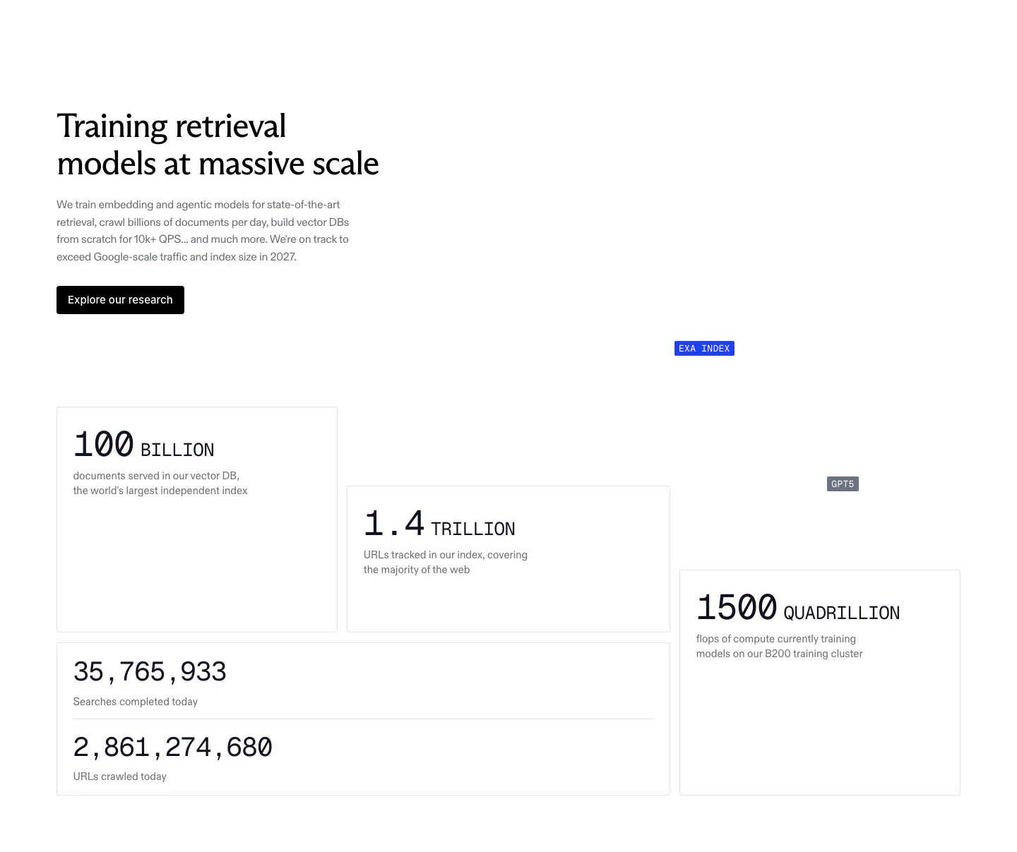
  9. Exa stats section: headline, copy and research button above staggered bordered cards with large monospace figures for index size and compute
    Exa
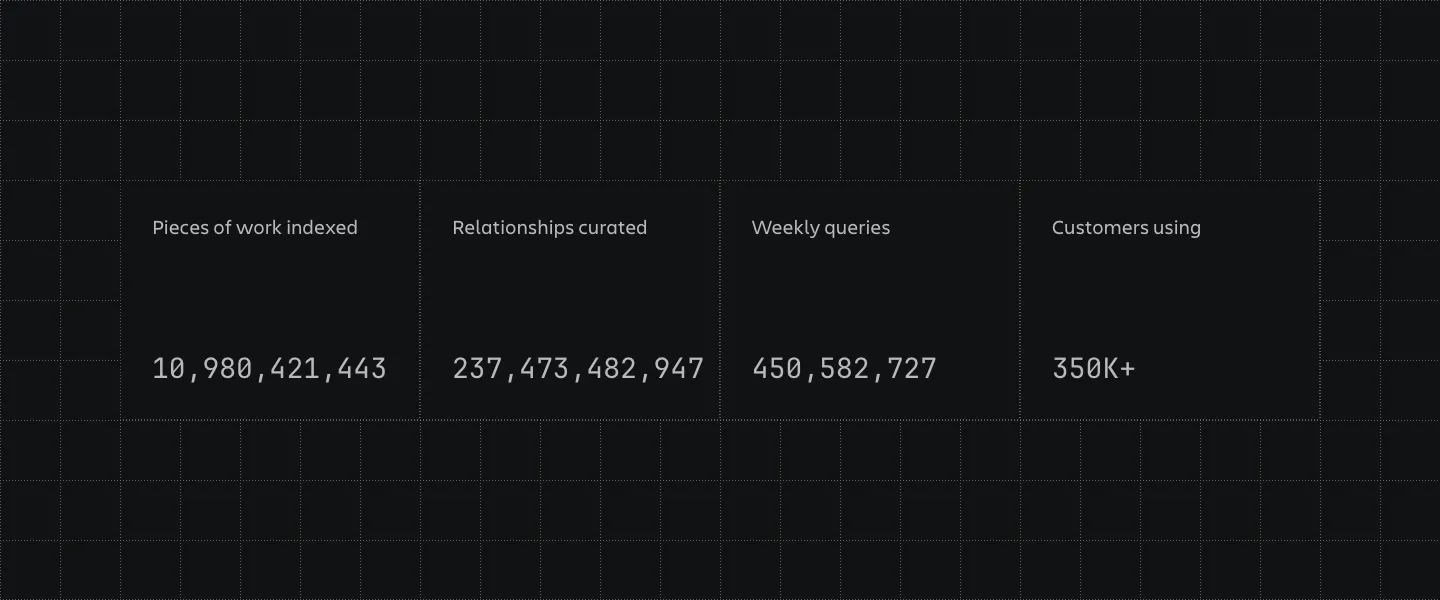
  10. Atlassian stats section: four bordered cells with large monospaced counters and labels on a dark grid-line background
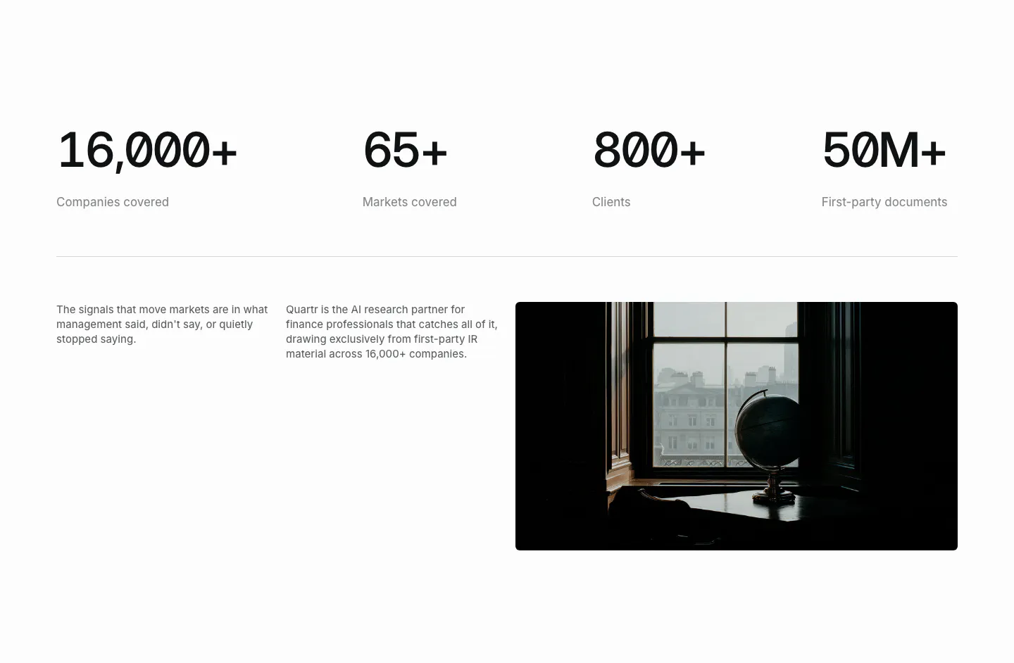
  11. Quartr stats section: four large monospace figures in a row above two short text columns and a dark photo of a globe by a window
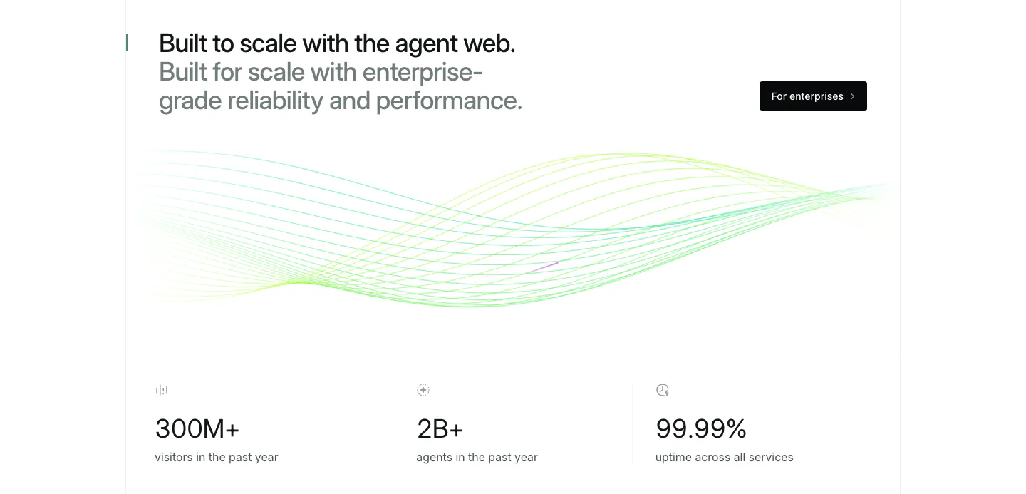
  12. Mintlify stats section: two-tone headline and button above green line waves and a row of three large usage metrics
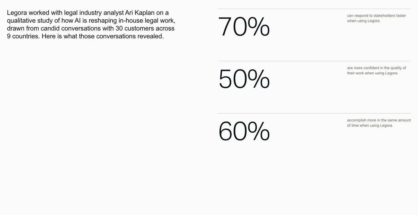
  13. Legora stats section: intro paragraph on the left and three large percentage figures with small labels stacked right on light gray
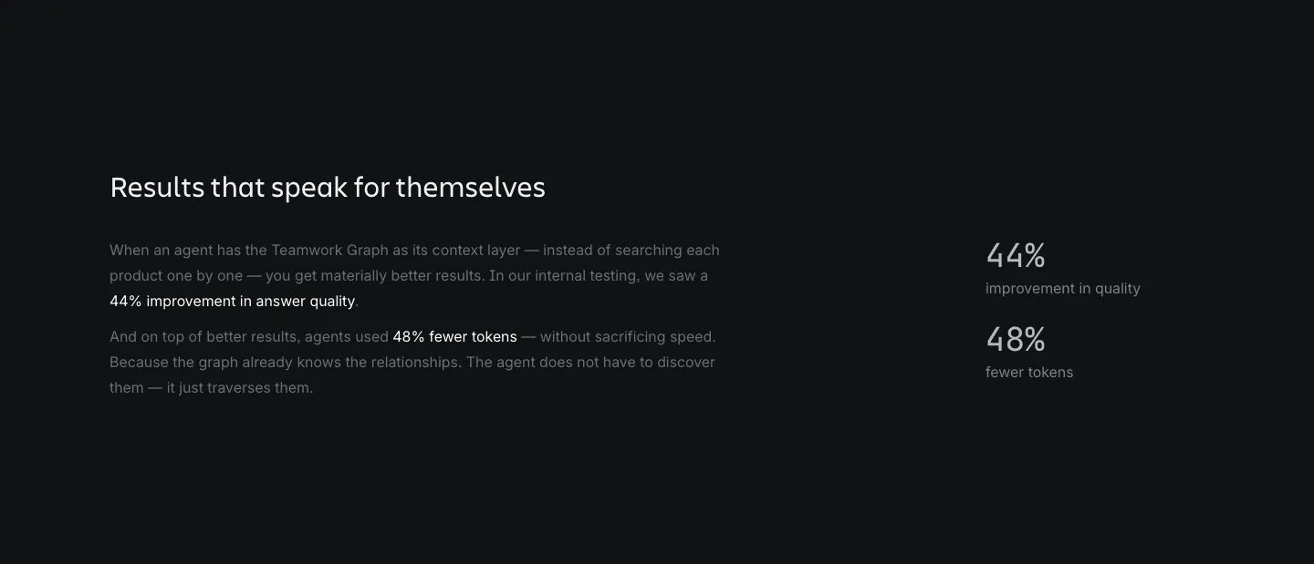
  14. Atlassian stats section: heading and explanatory copy on the left with two percentage metrics on the right on a dark background
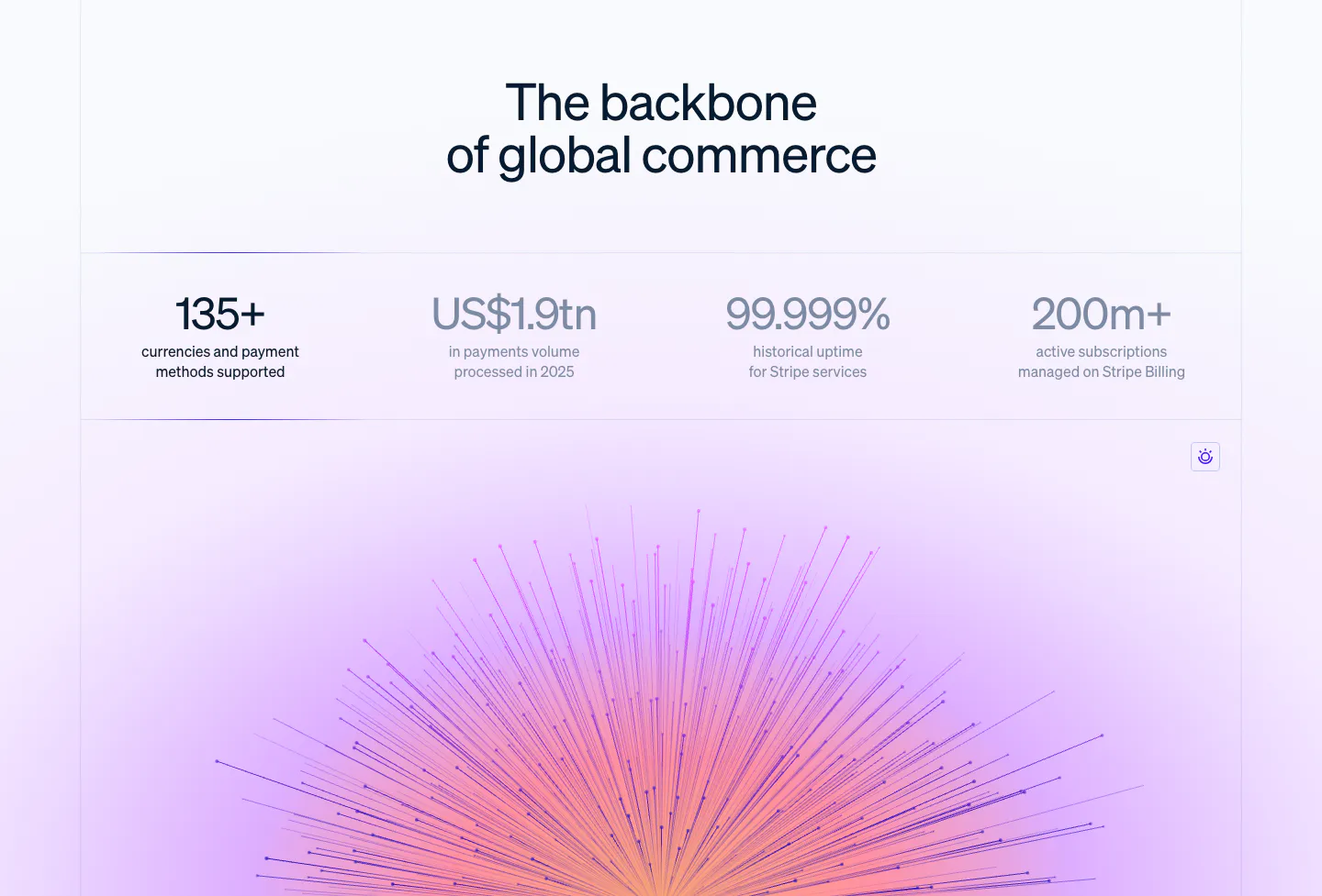
  15. Stripe stats section: centered headline above a row of four large metrics, with a purple-pink radiating line artwork glowing below
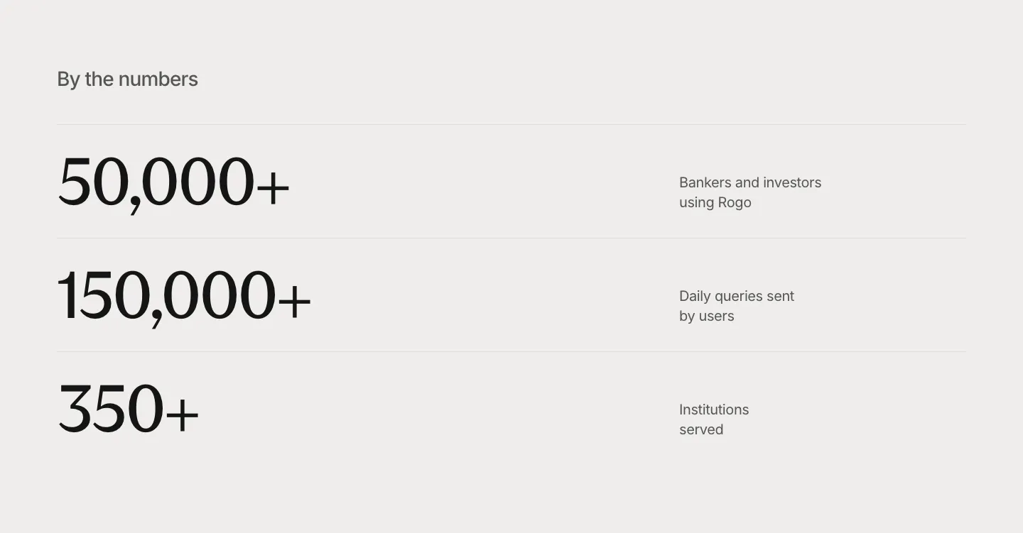
  16. Rogo stats section: three large serif numbers in divided rows with short labels on the right, light gray background
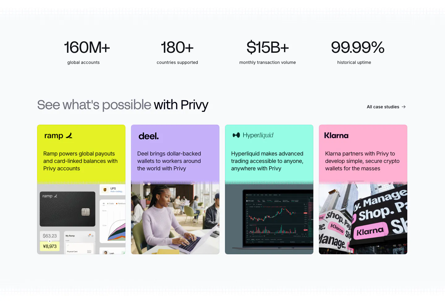
  17. Privy testimonials section: four large metrics above a row of colorful customer case study cards with logos, short copy and photos
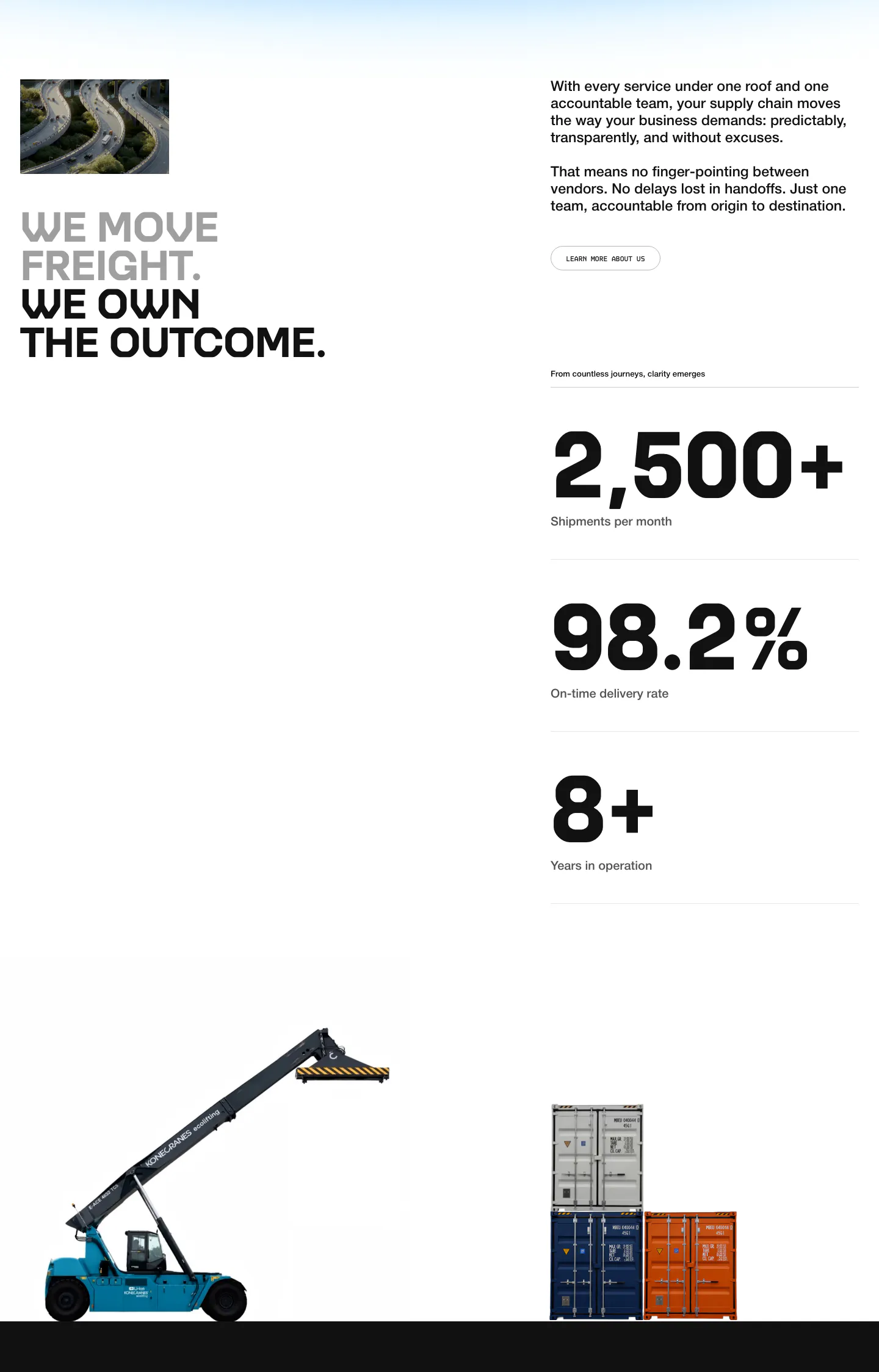
  18. United Carriers stats section: uppercase headline, intro copy and three large metrics with cutout photos of a reach stacker and containers
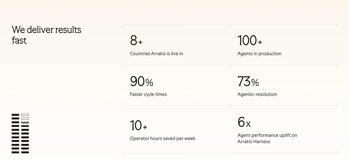
  19. Arrakis stats section: headline at left beside a 2x3 bordered grid of large metrics on a light background, with a striped graphic
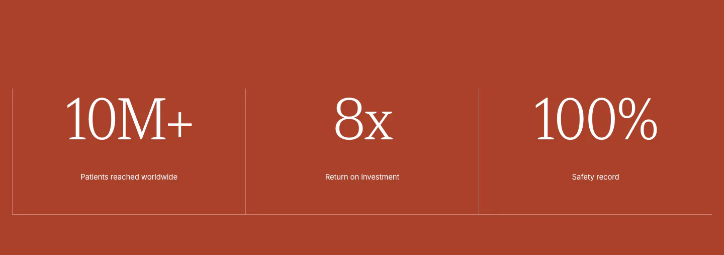
  20. Concurrence stats section: three large serif metrics with small labels split by thin dividers on a solid rust-red background
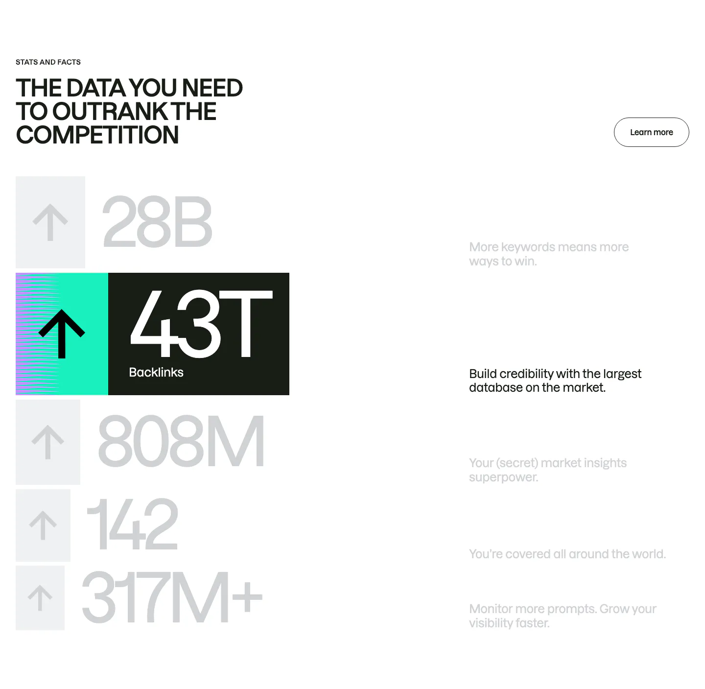
  21. Semrush stats section: uppercase headline above a stacked list of huge gray numbers with arrow tiles, one highlighted 43T backlinks row
  22. Routable value proposition section: strip of four serif italic metrics with arrows and labels separated by dotted dividers on light gray
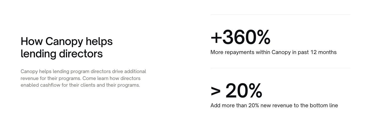
  23. Canopy stats section: heading and copy on the left, two large percentage metrics with labels on the right, white background
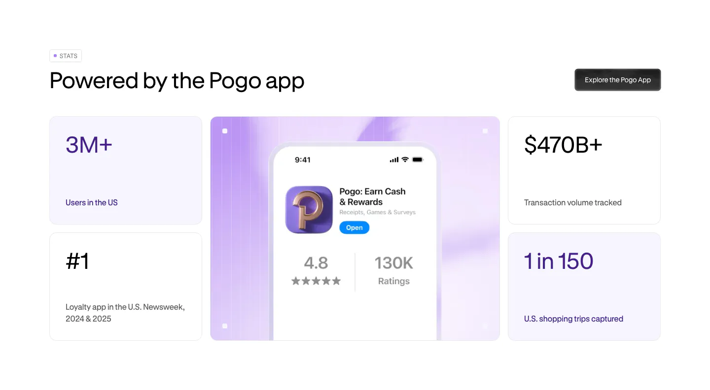
  24. Pogo stats section: bento grid of four metric cards around a lavender panel with a phone showing the Pogo app store listing
  25. Steel value proposition section: three metrics in a bordered row showing tokens scraped, browser hours and session start time on dark gray
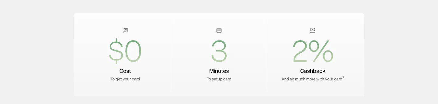
  26. Plasma stats section: white panel with three large green gradient figures for cost, setup minutes and cashback
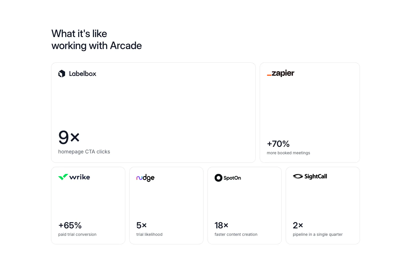
  27. Arcade stats section: bento grid of six bordered cards, each with a customer logo and a large result metric like 9x or +70%
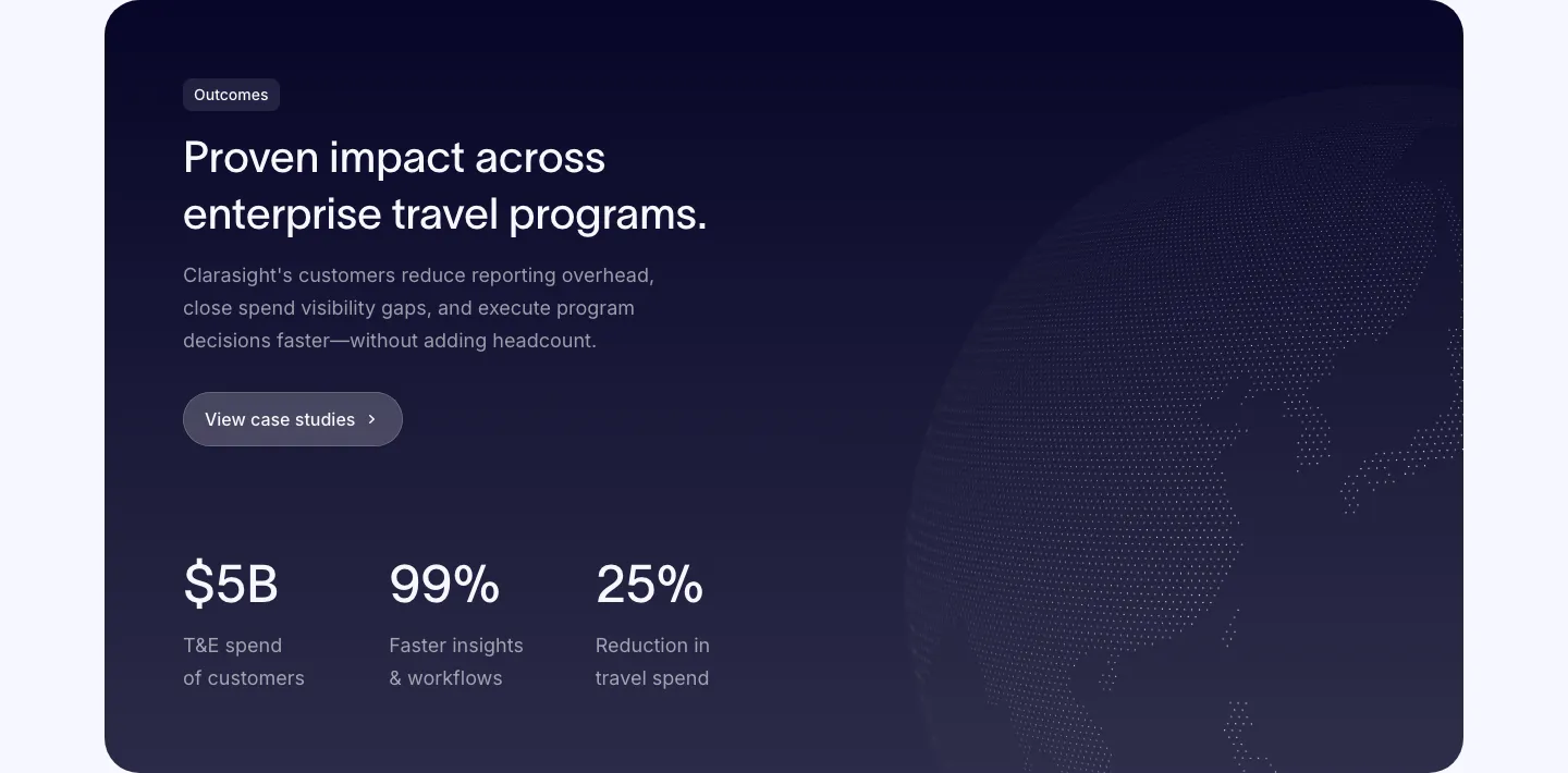
  28. Clarasight stats section: dark navy card with headline, copy and case study button above three large metrics, faint dotted globe at right
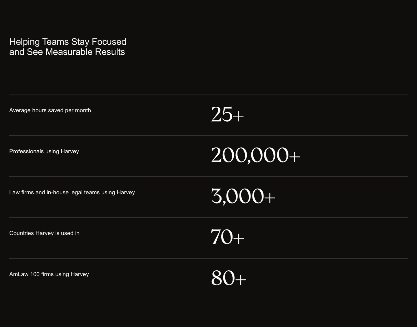
  29. Harvey stats section: headline above five divided rows pairing labels with large serif numbers on a black background
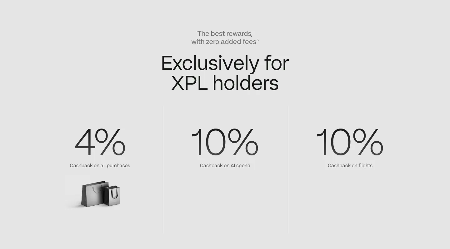
  30. Plasma stats section: centered headline above three large cashback percentages with labels on a light gray background
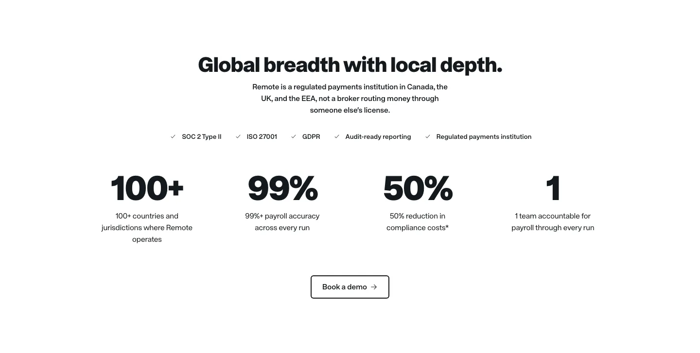
  31. Remote stats section: centered headline, compliance checklist row, four large black metrics and an outlined demo button
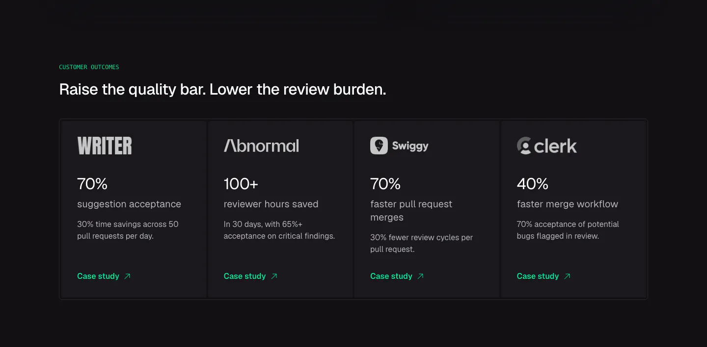
  32. CodeRabbit stats section: dark row of four customer outcome cards with logos, large percentages and case study links
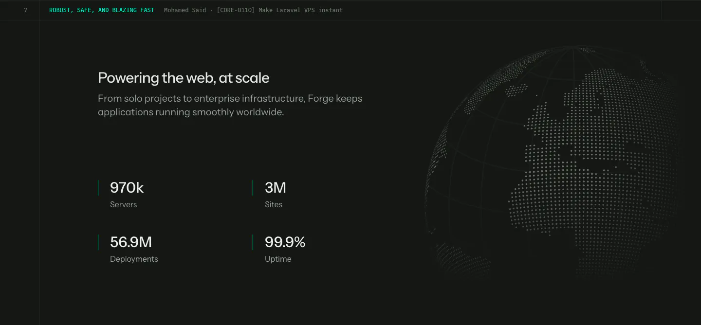
  33. Laravel Forge stats section: four large metrics under a heading on the left with a dotted globe on the right, dark background
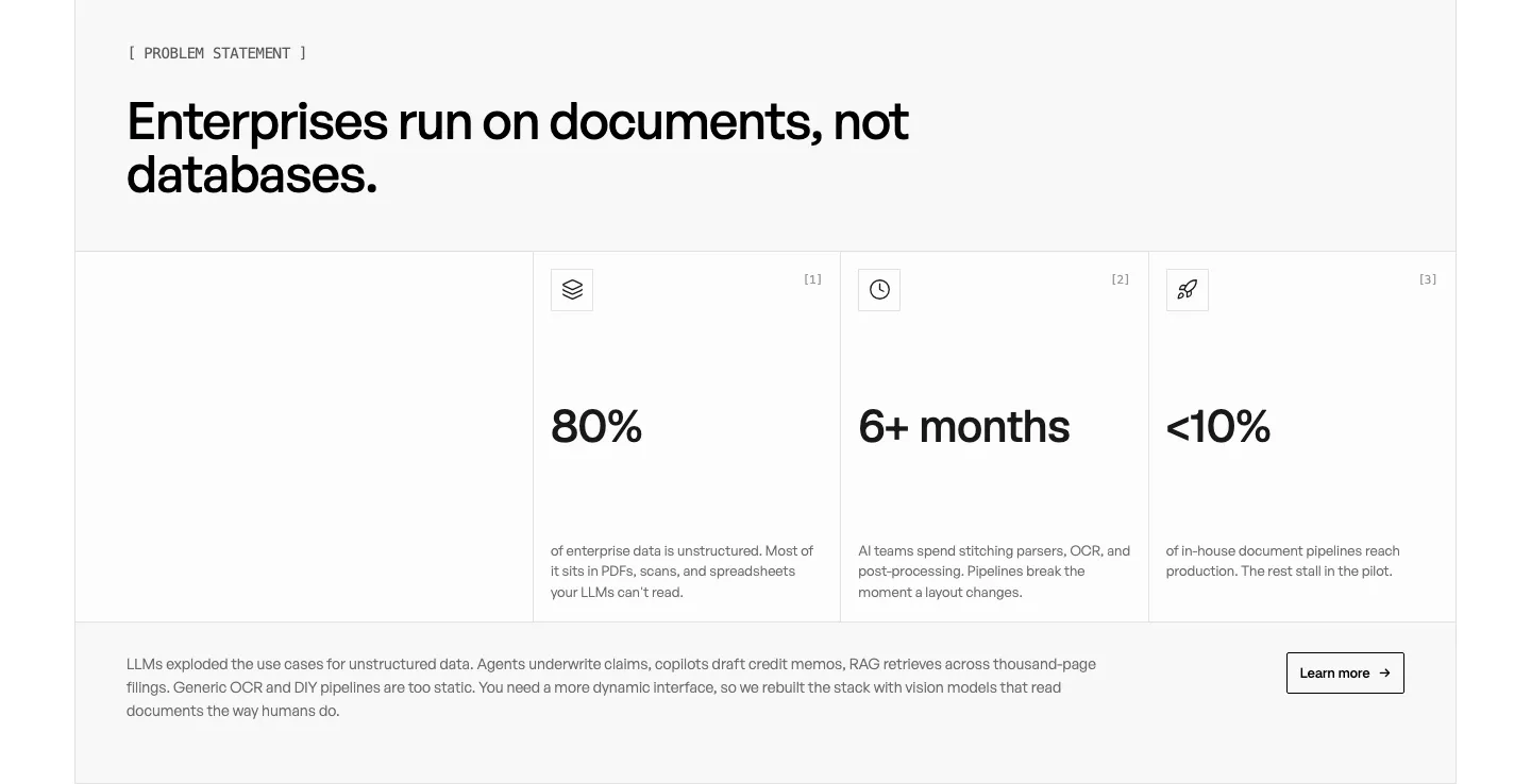
  34. Unsiloed stats section: left headline above three bordered cells with large figures 80%, 6+ months and <10% plus a closing paragraph on white

Common patterns in stats sections

How to present numbers in a stats section

  1. Pick metrics the buyer cares about

    Choose numbers tied to outcomes the reader wants, such as hours saved, error rates, or response times. Total signups or page views say little to a prospect. A few strong figures do more than a long row of weak ones.

  2. Let the figure dominate the label

    Set each figure in large, heavy type and its label in a much smaller muted style beneath it. Align numbers on a shared baseline, and use tabular numerals so digits do not shift width if the value animates.

  3. Define each figure in its label

    A label like "Average reduction in support tickets" tells the reader what the figure means. Single words like "Customers" or "Growth" do not. Add a footnote or source link when a number might invite skepticism.

  4. Run count-up animations once

    Trigger any counter a single time, quickly, when the section scrolls into view, and show the final value immediately for visitors who prefer reduced motion. Make sure screen readers announce only the final number, not every intermediate value along the way.


Companies in this collection

All section types
    ↑↓ Navigate ↵ Open

    Section preview

    Website section