Hero Section Examples
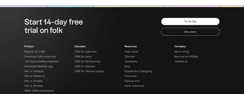
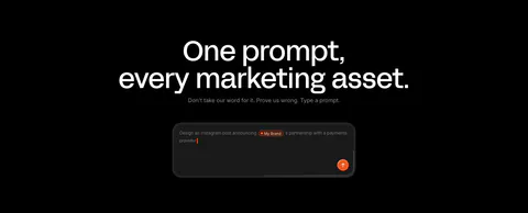
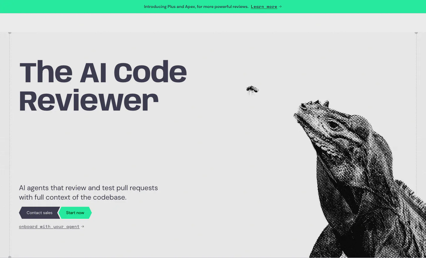
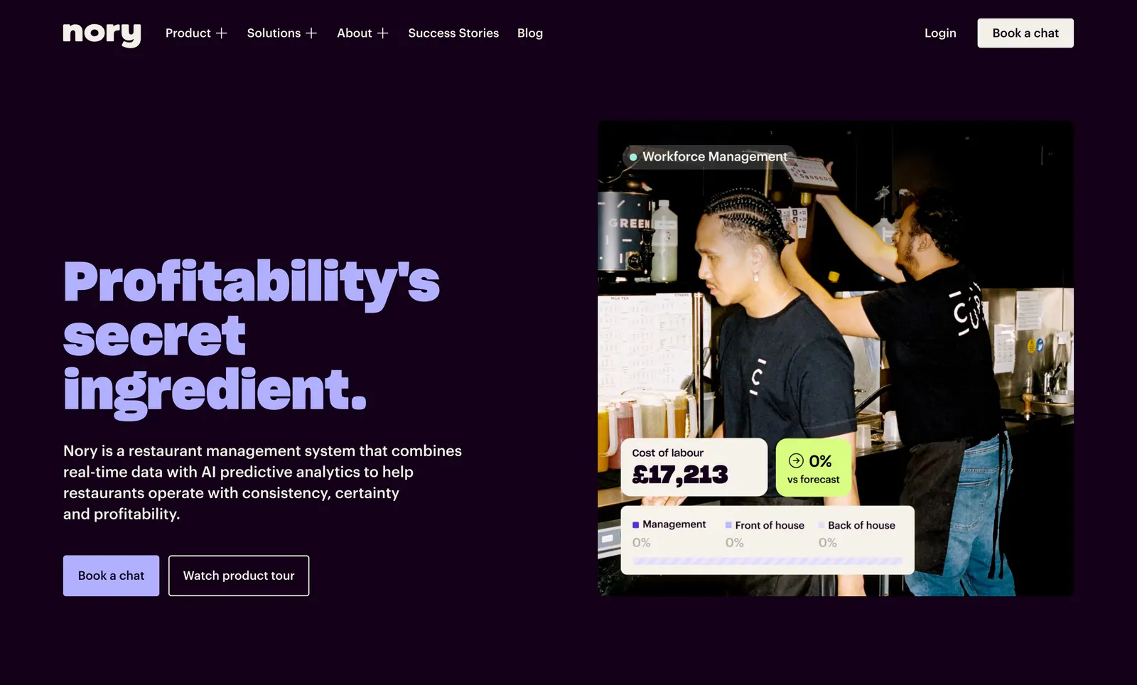
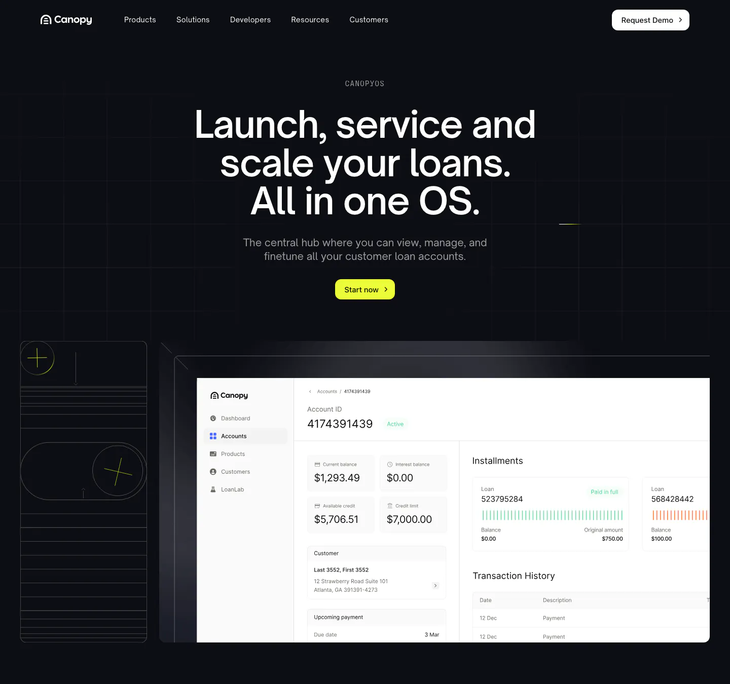
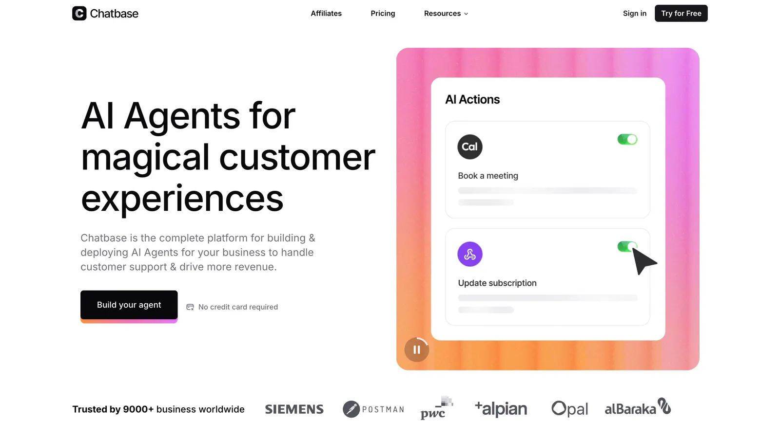
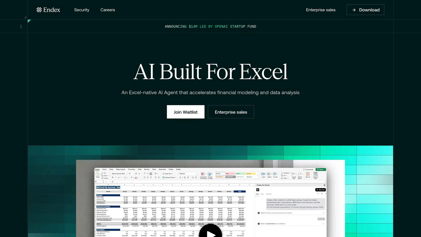
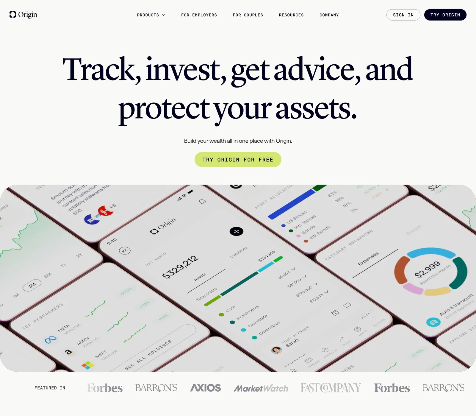
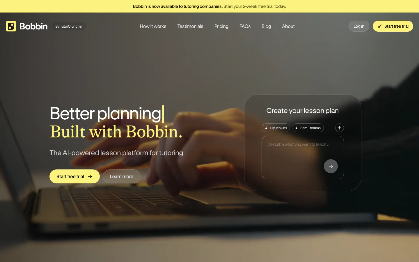
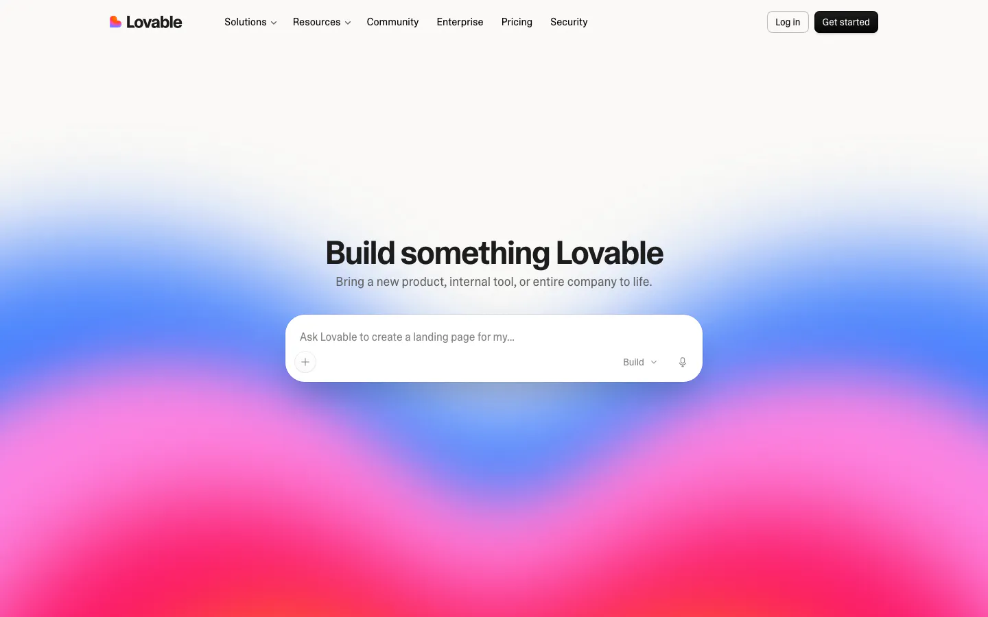
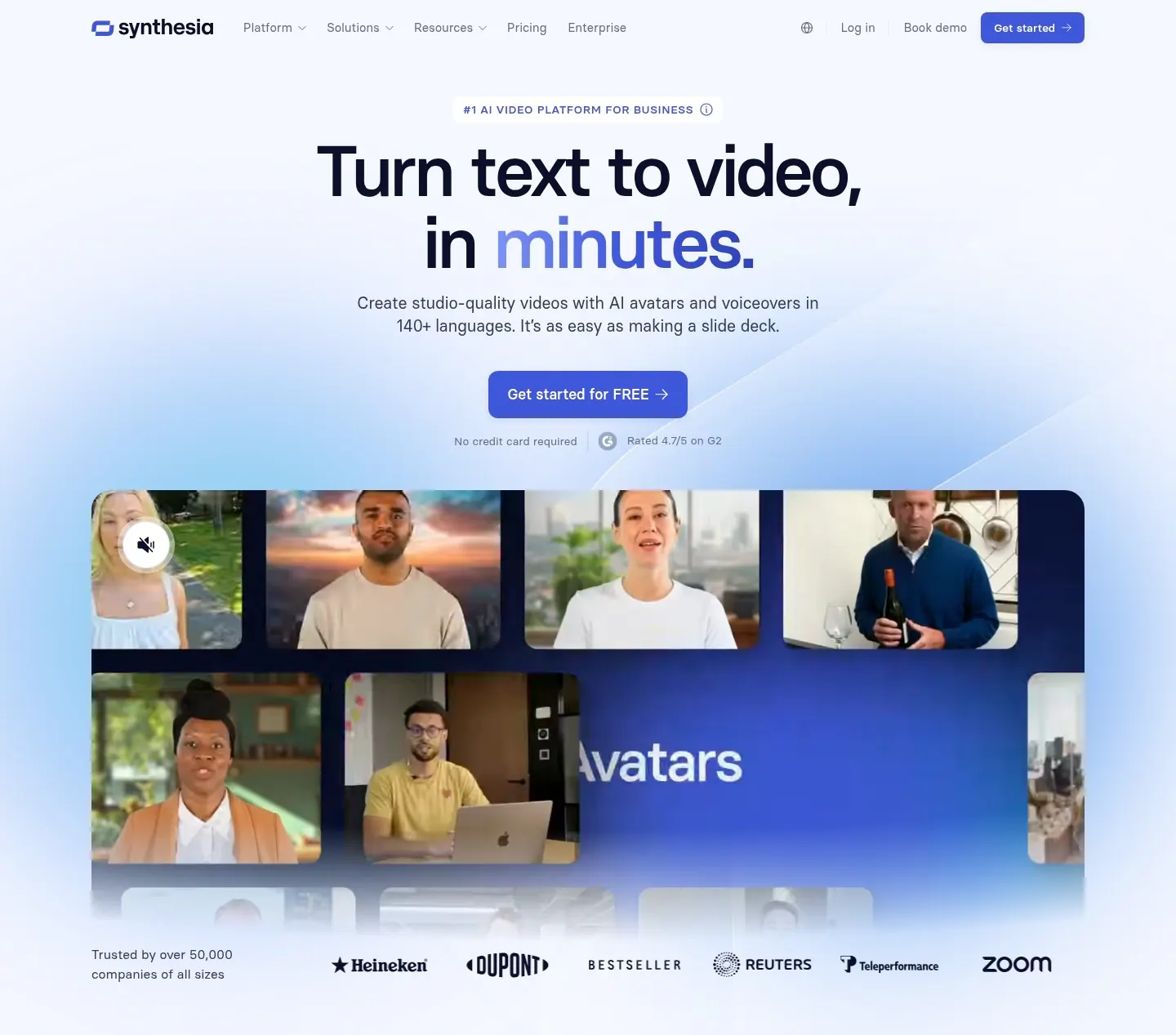
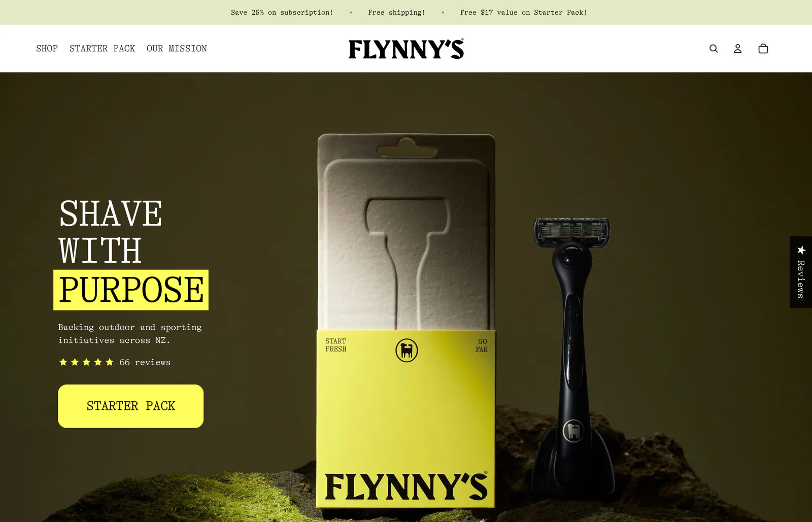
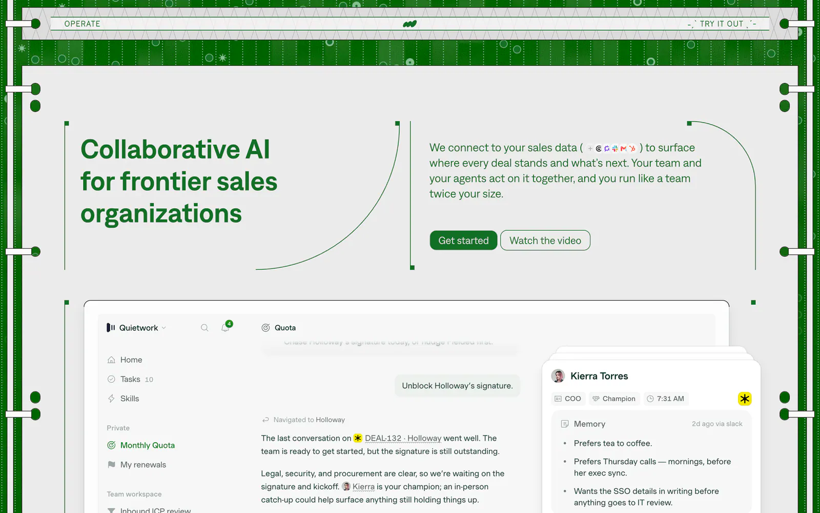
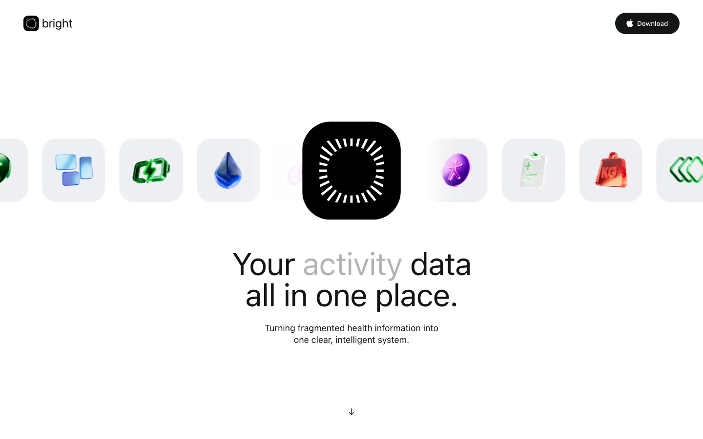
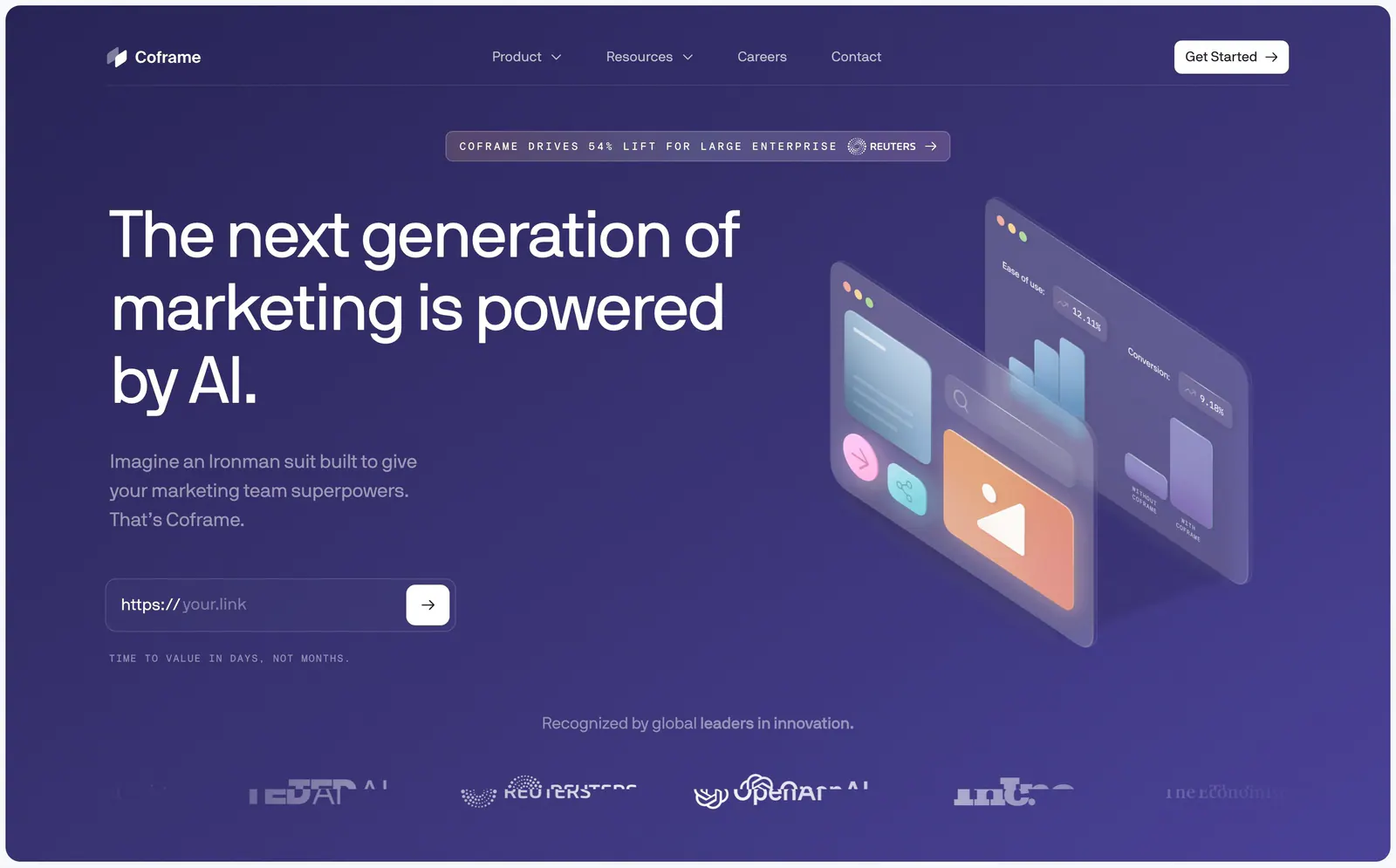
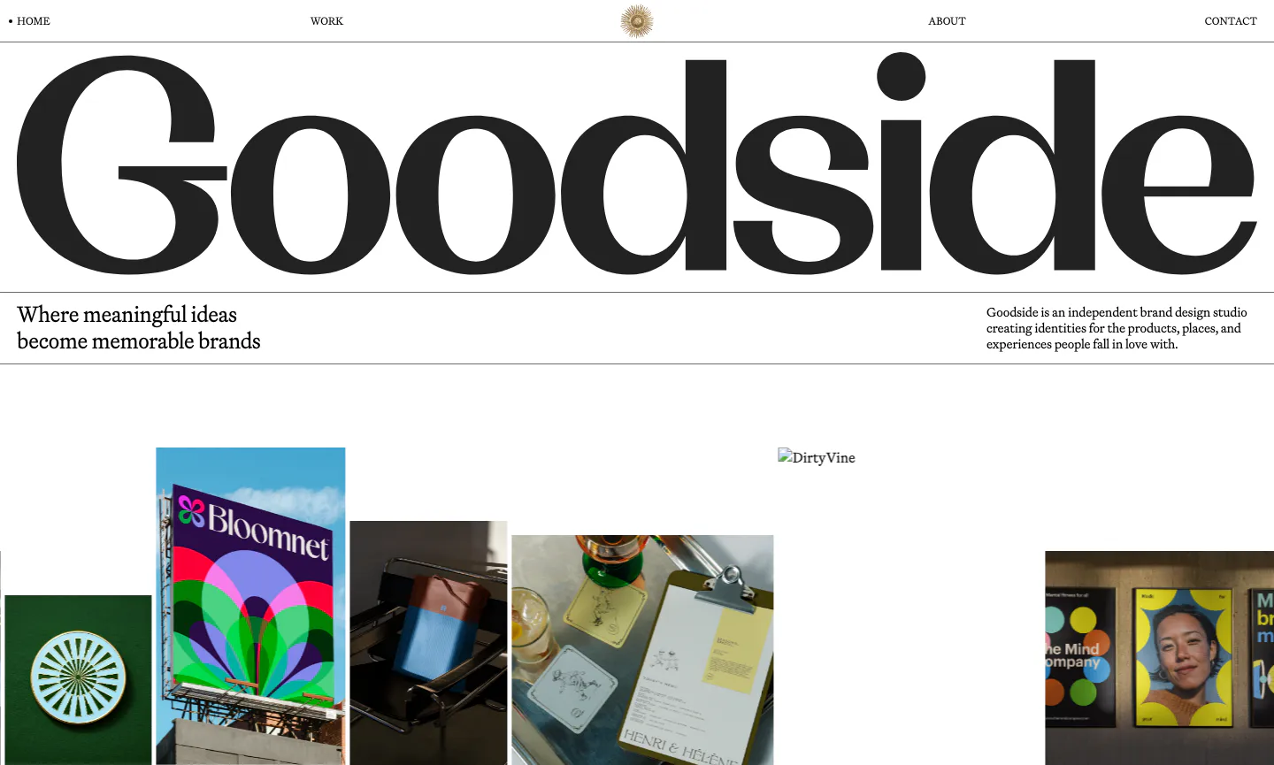
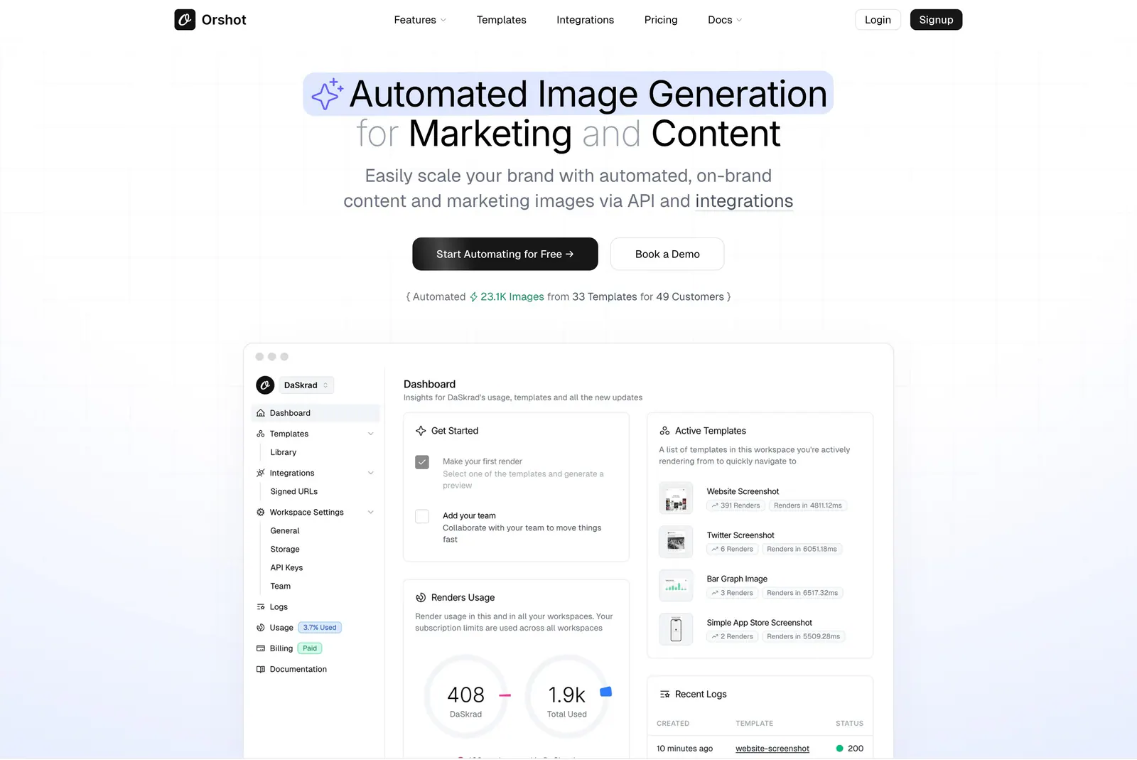
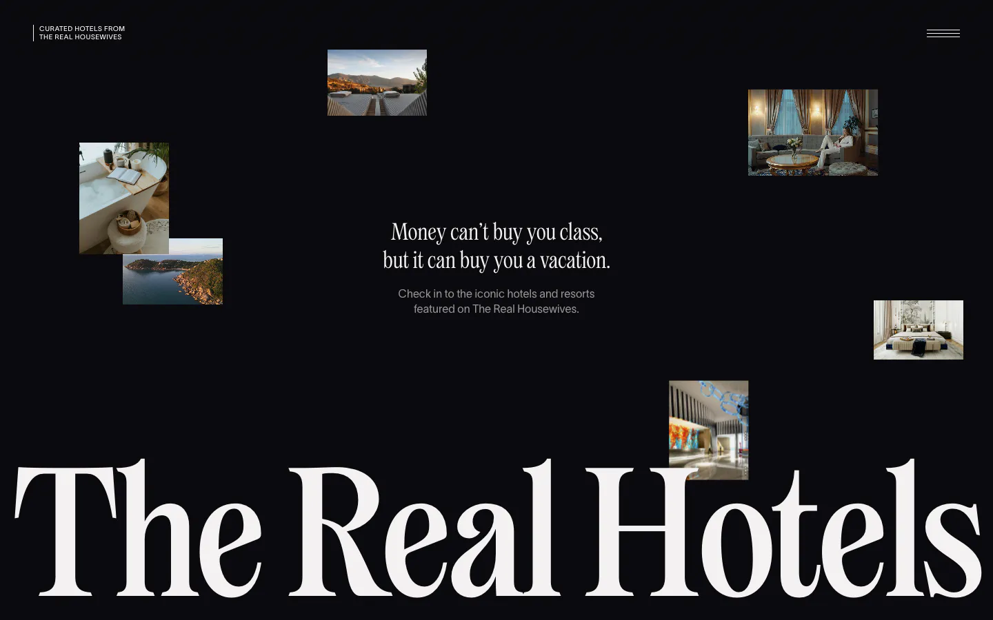
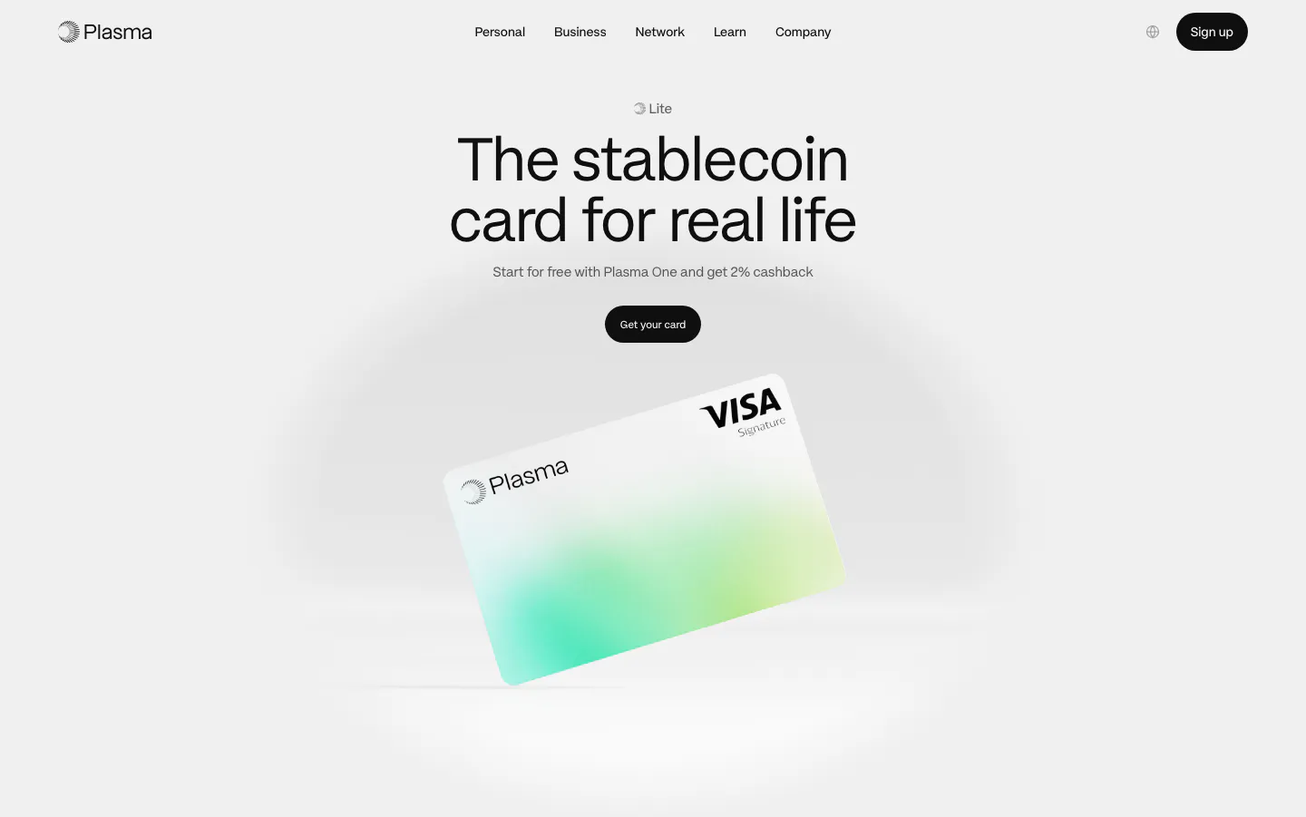
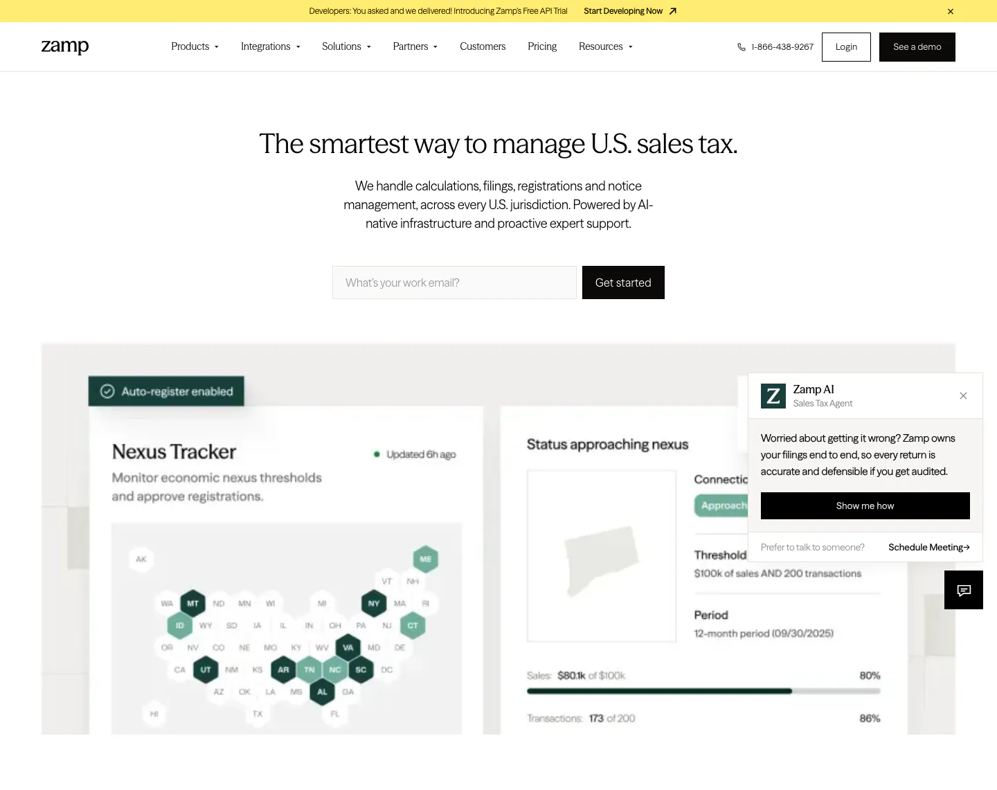
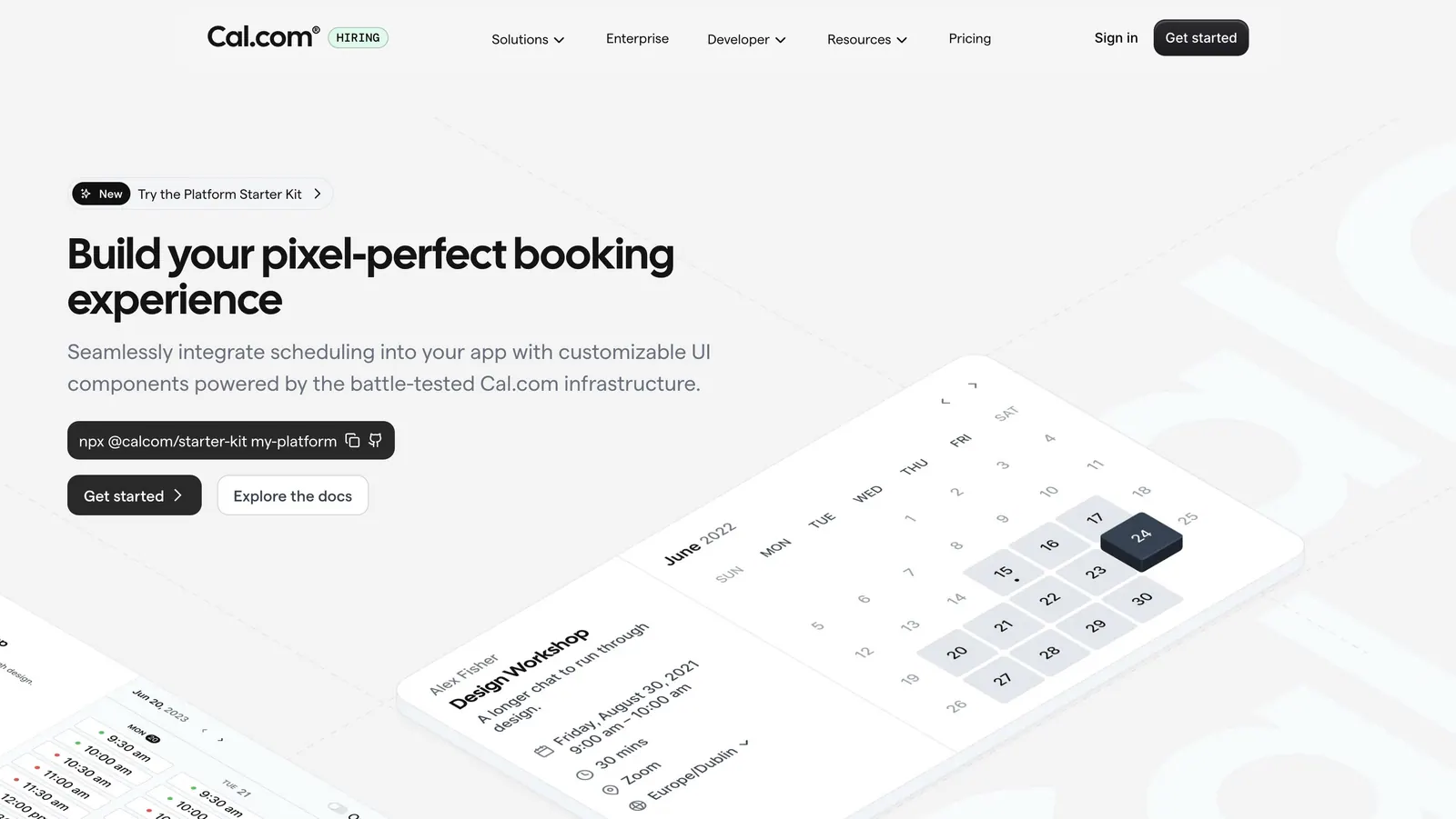
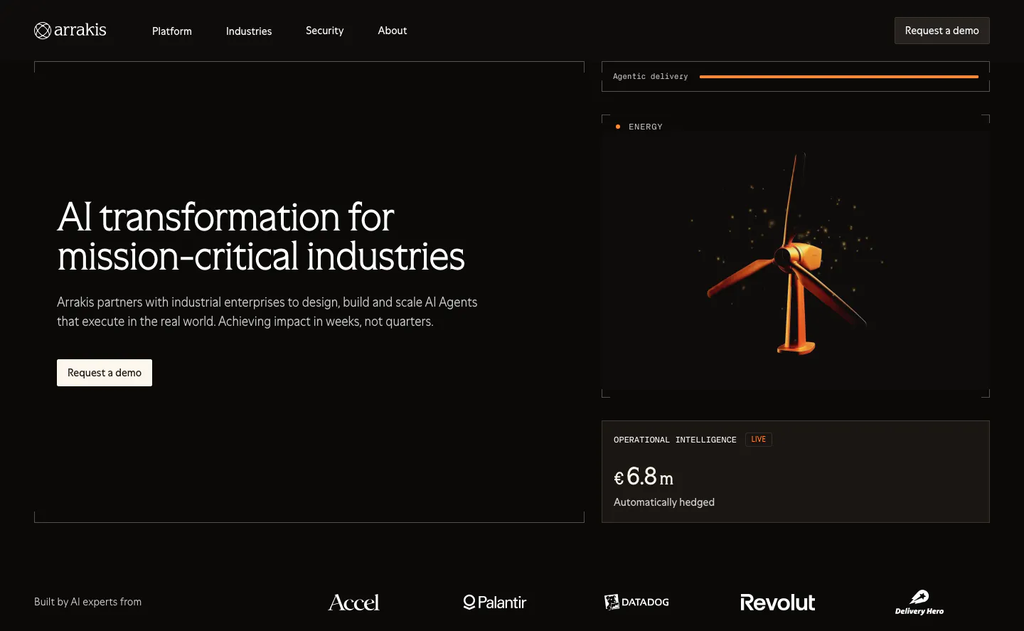
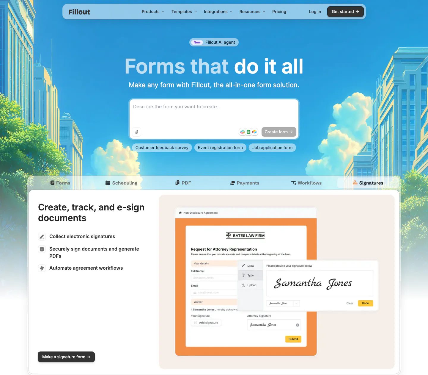
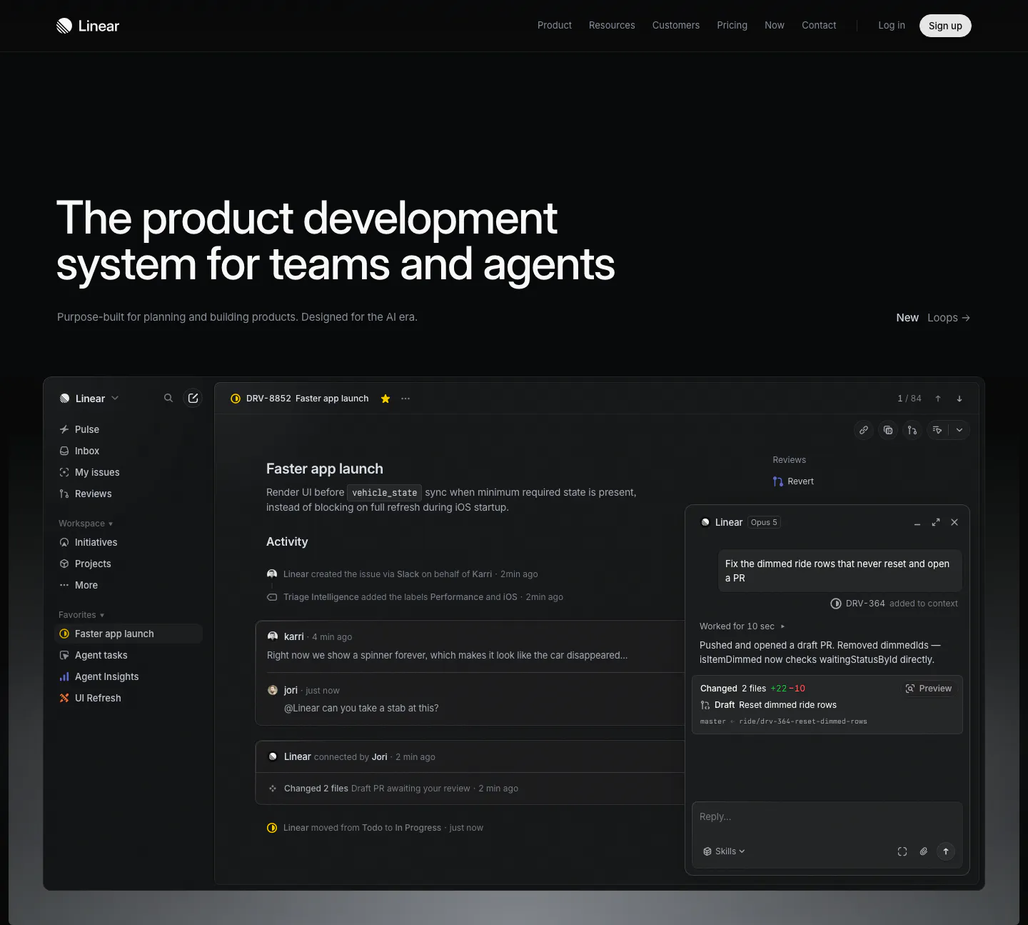
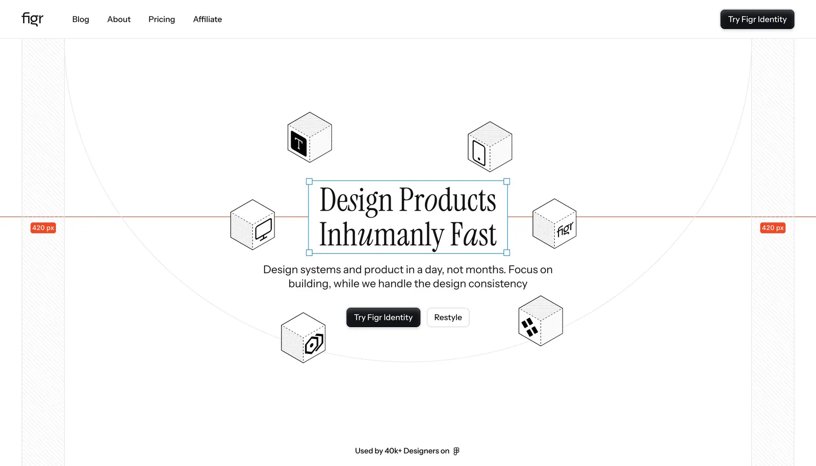
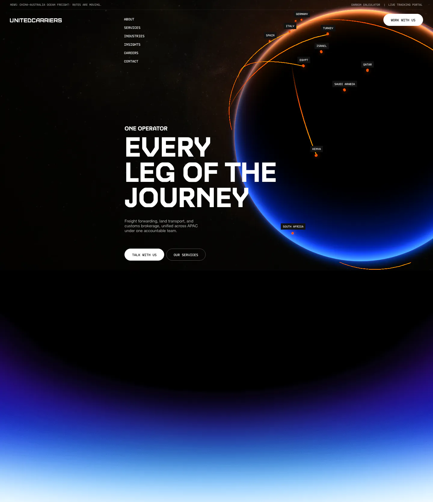
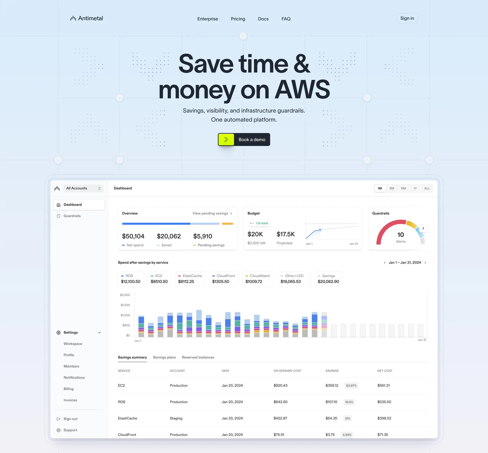
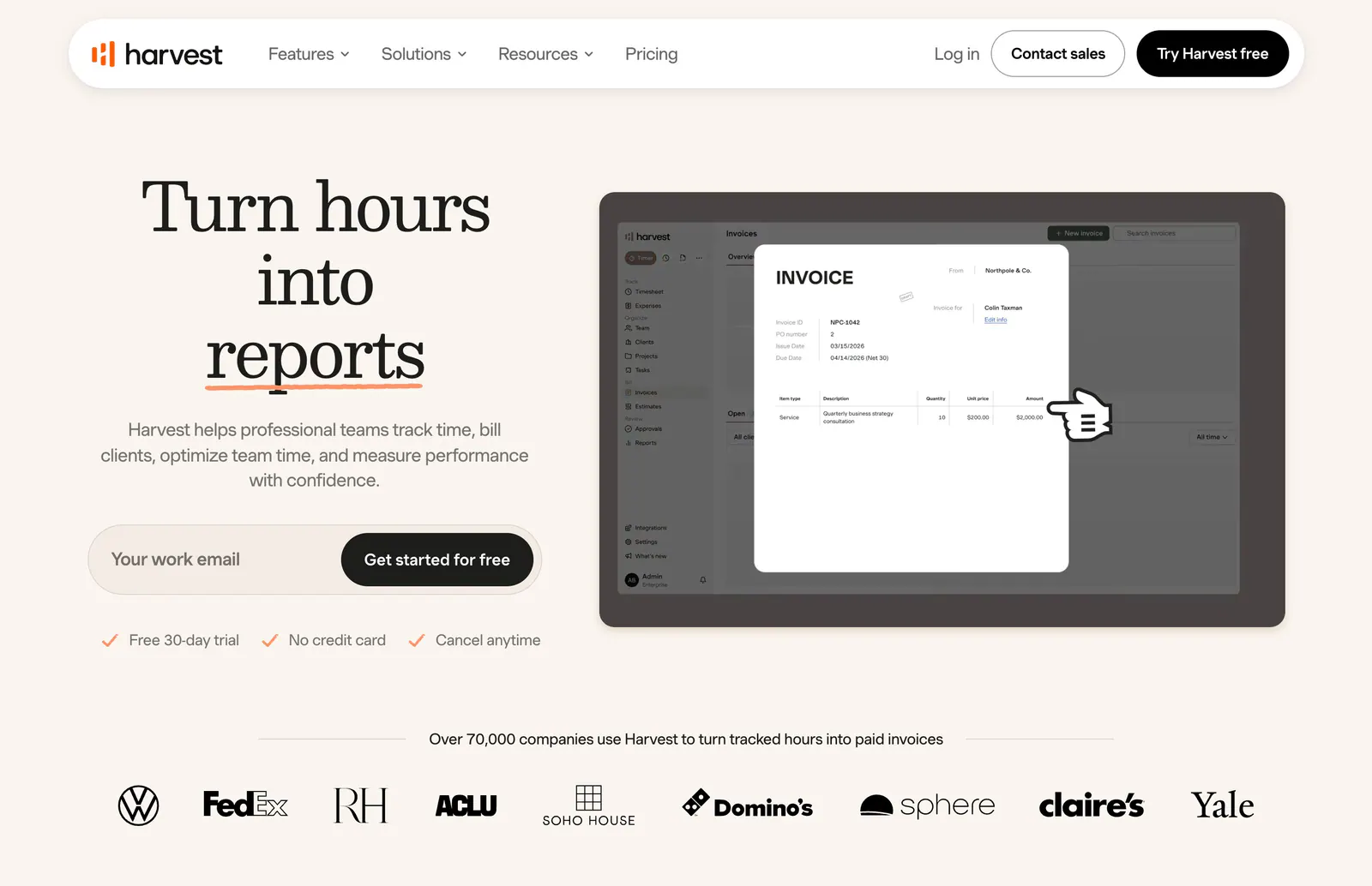
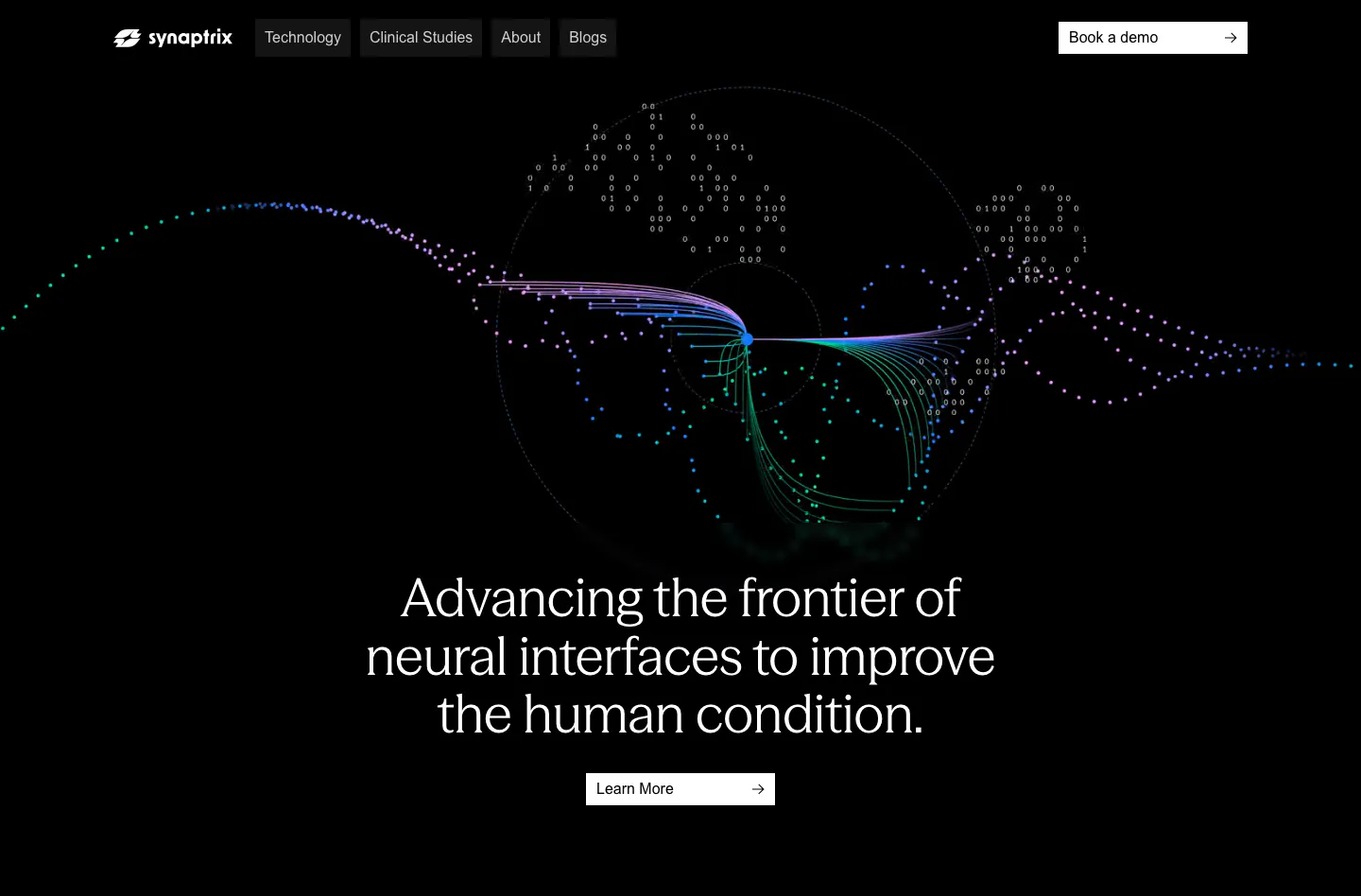
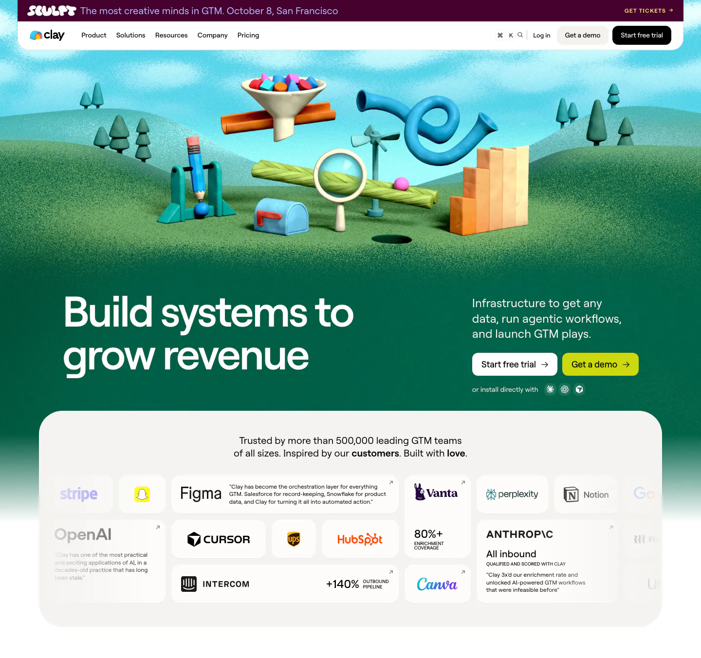
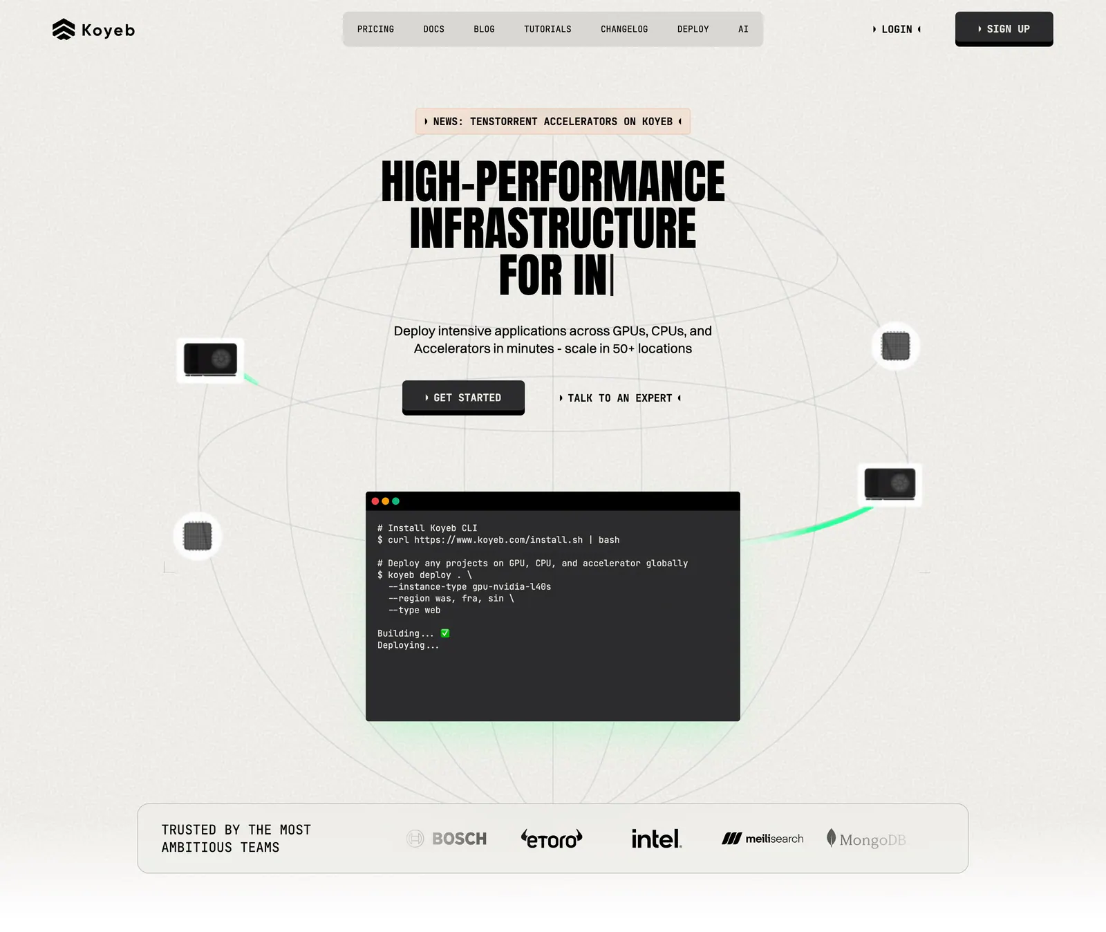
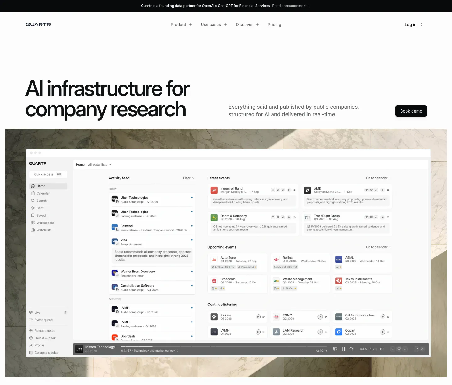
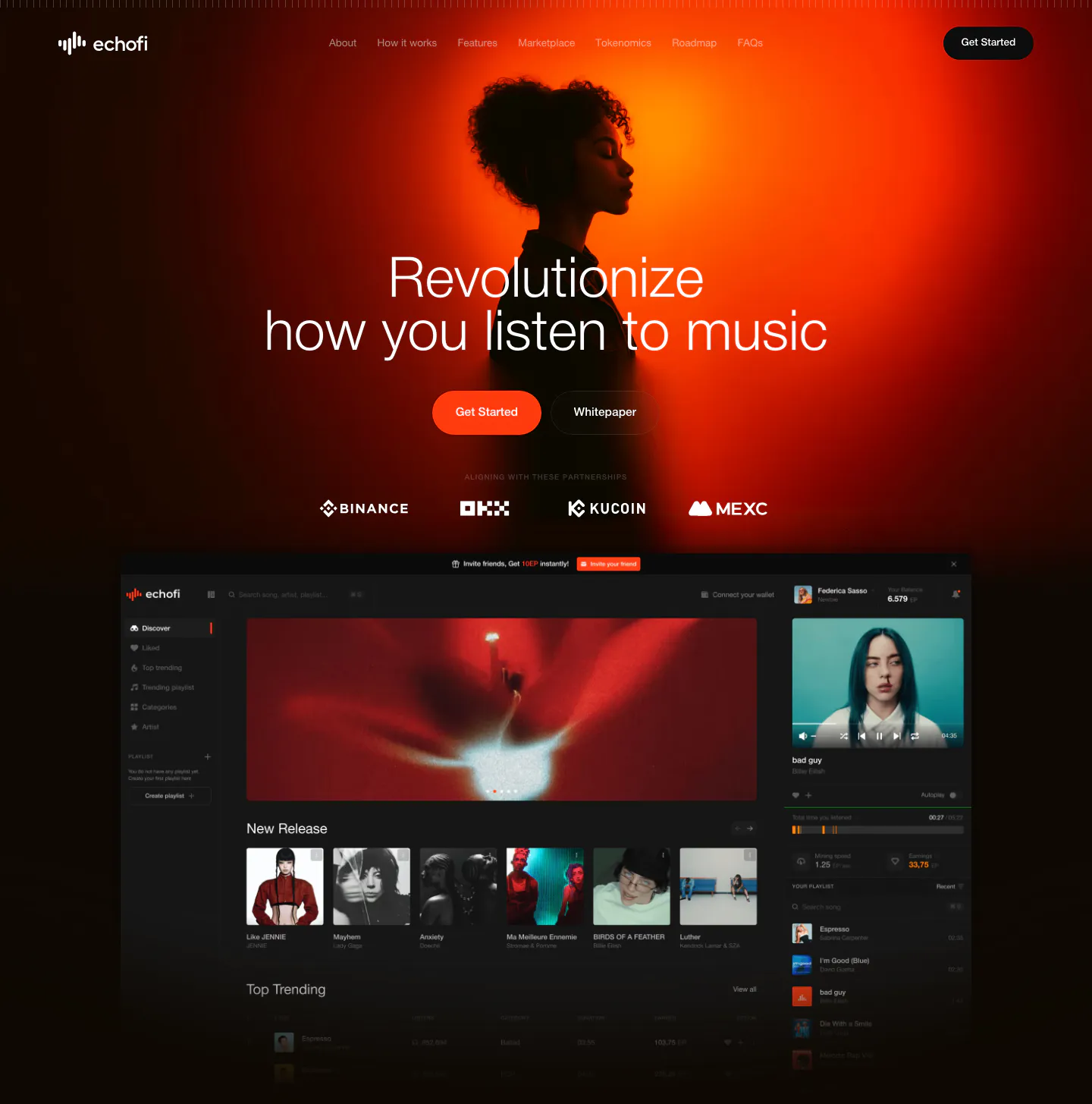
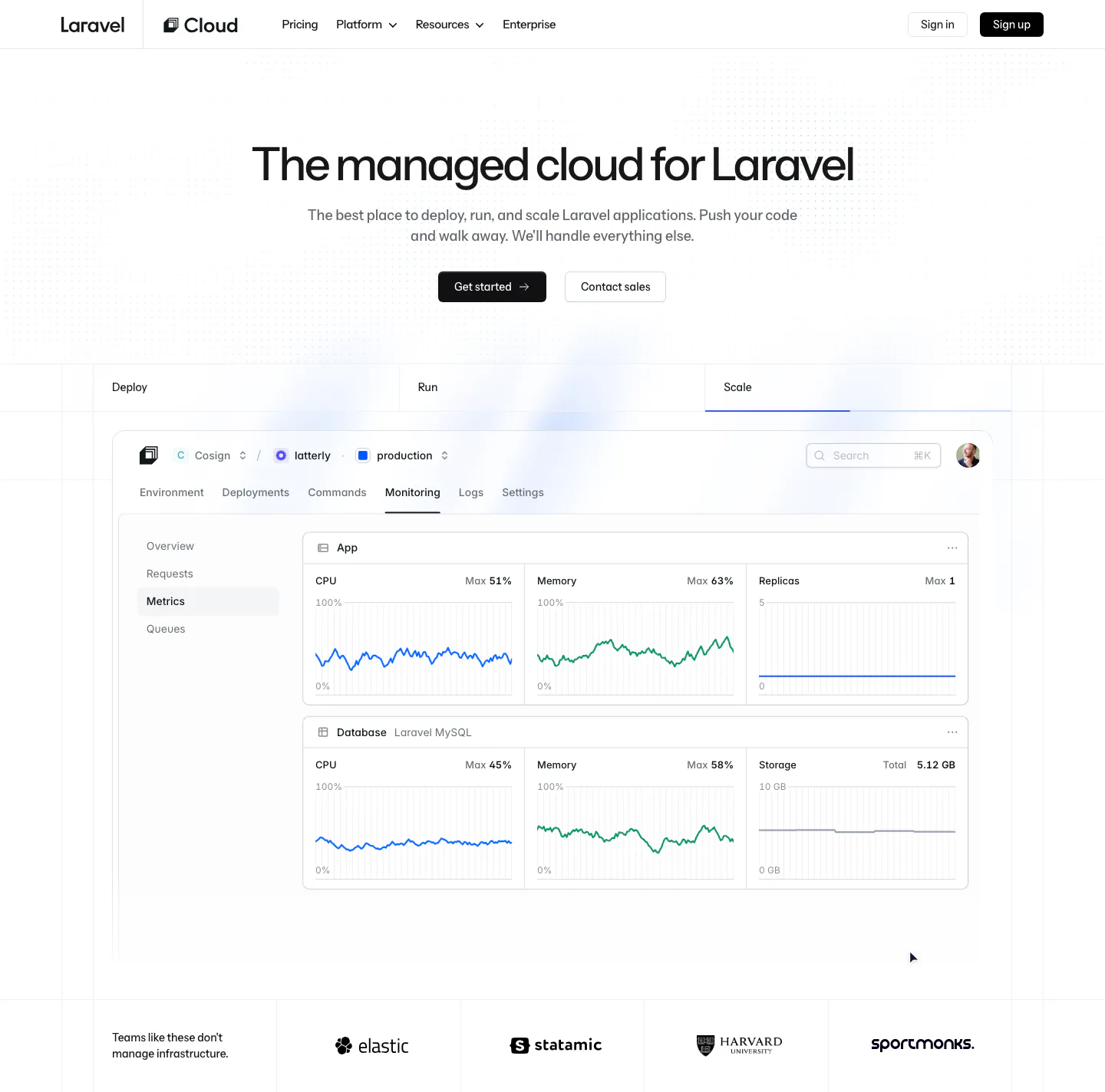
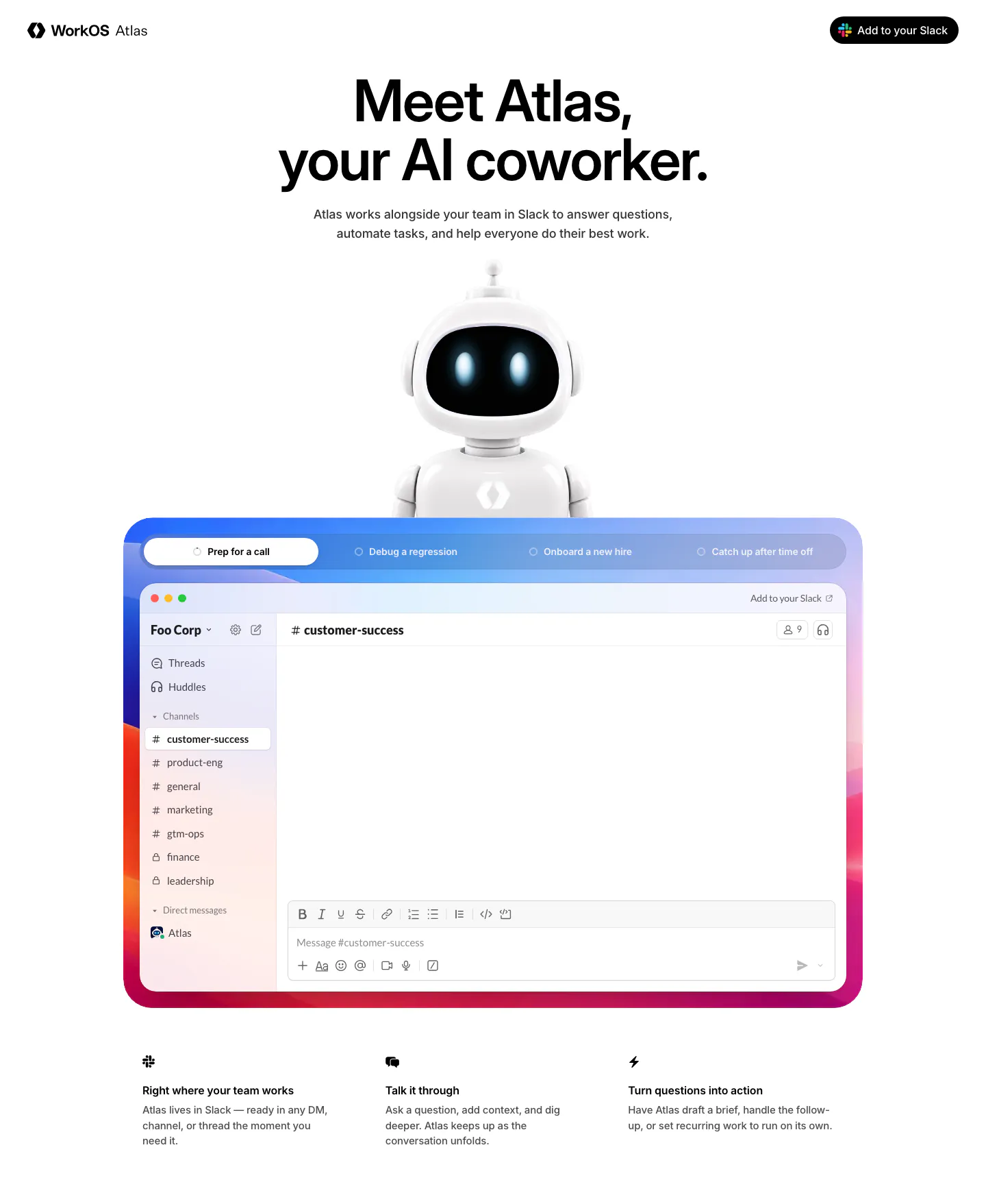
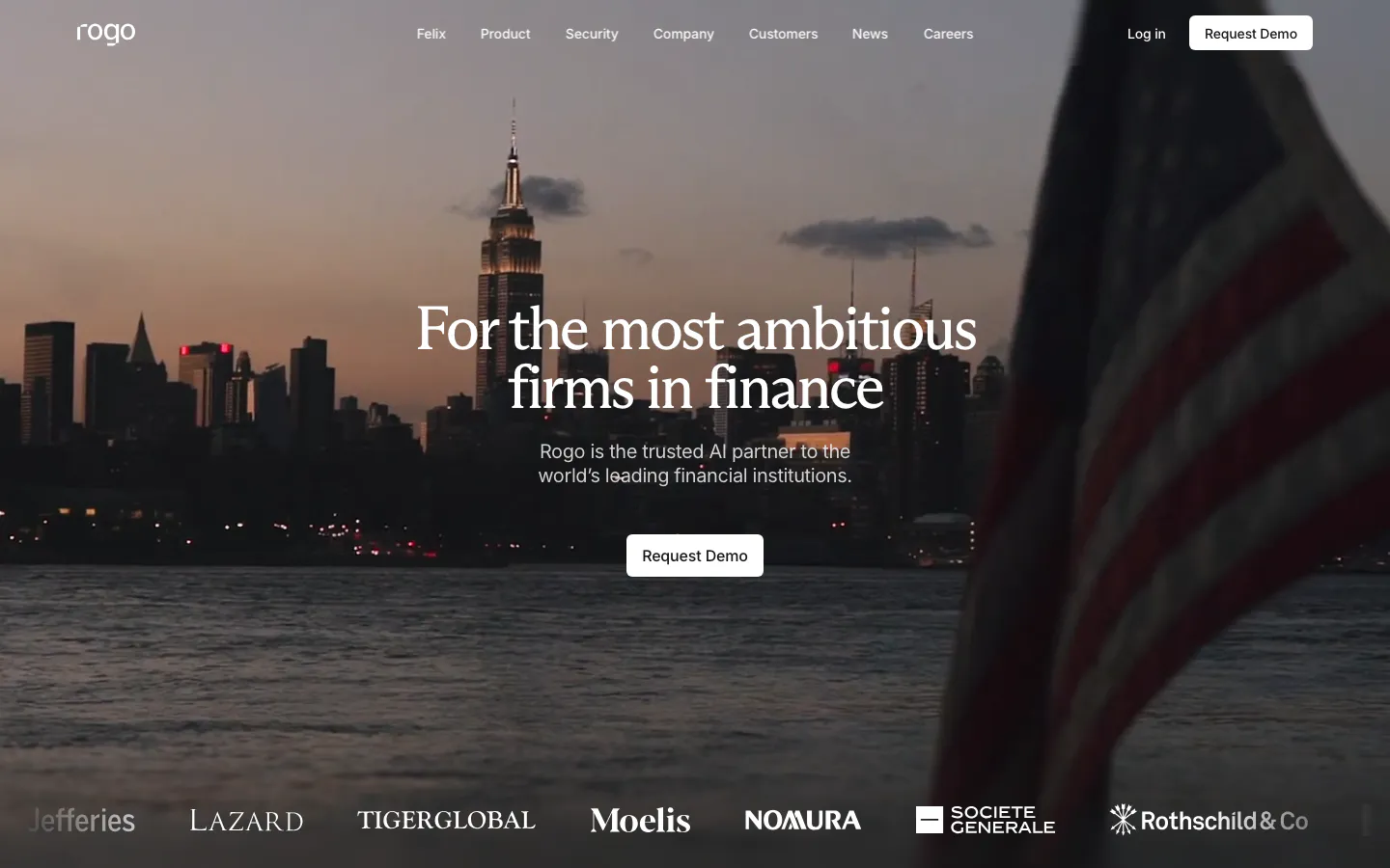
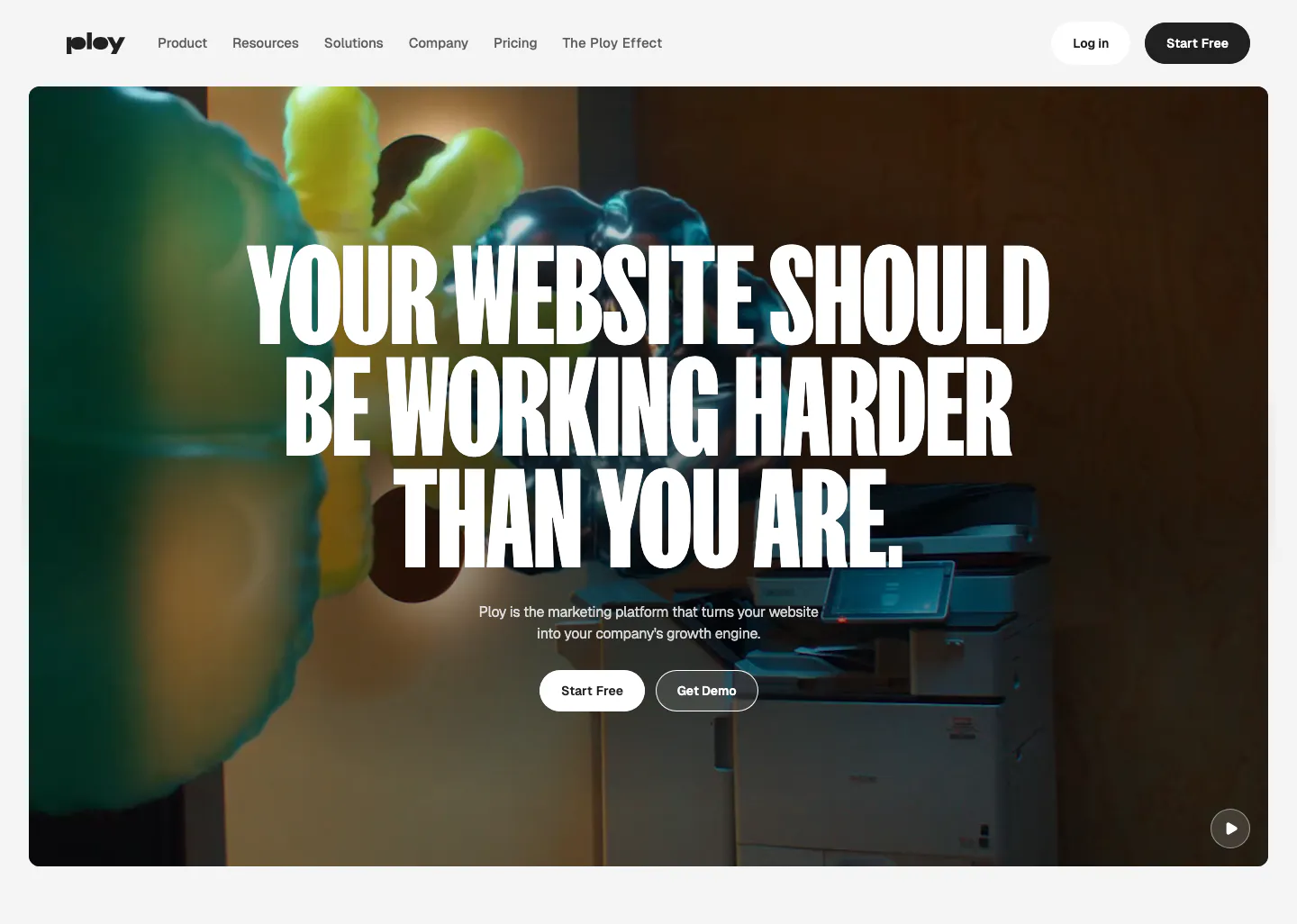
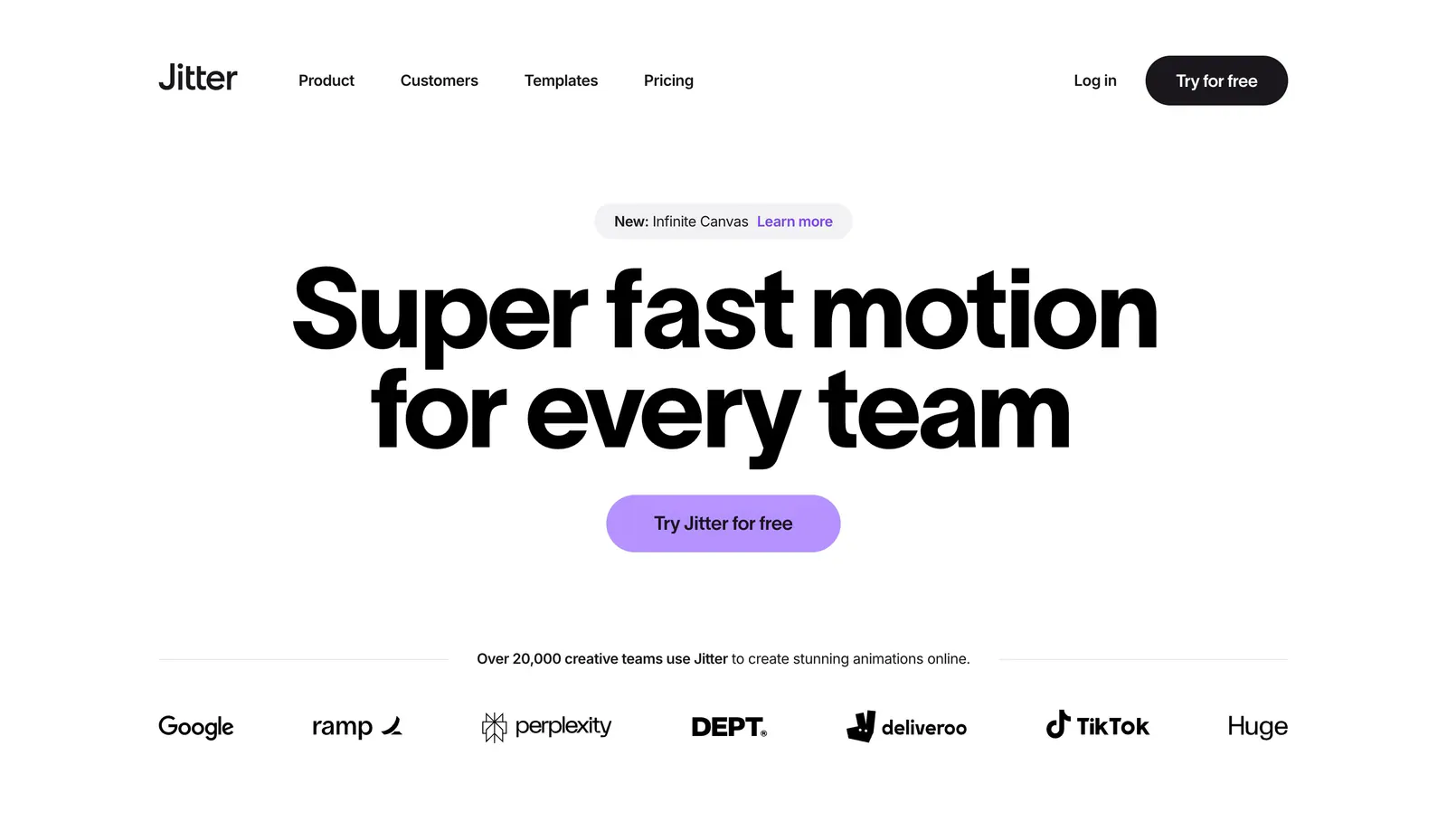
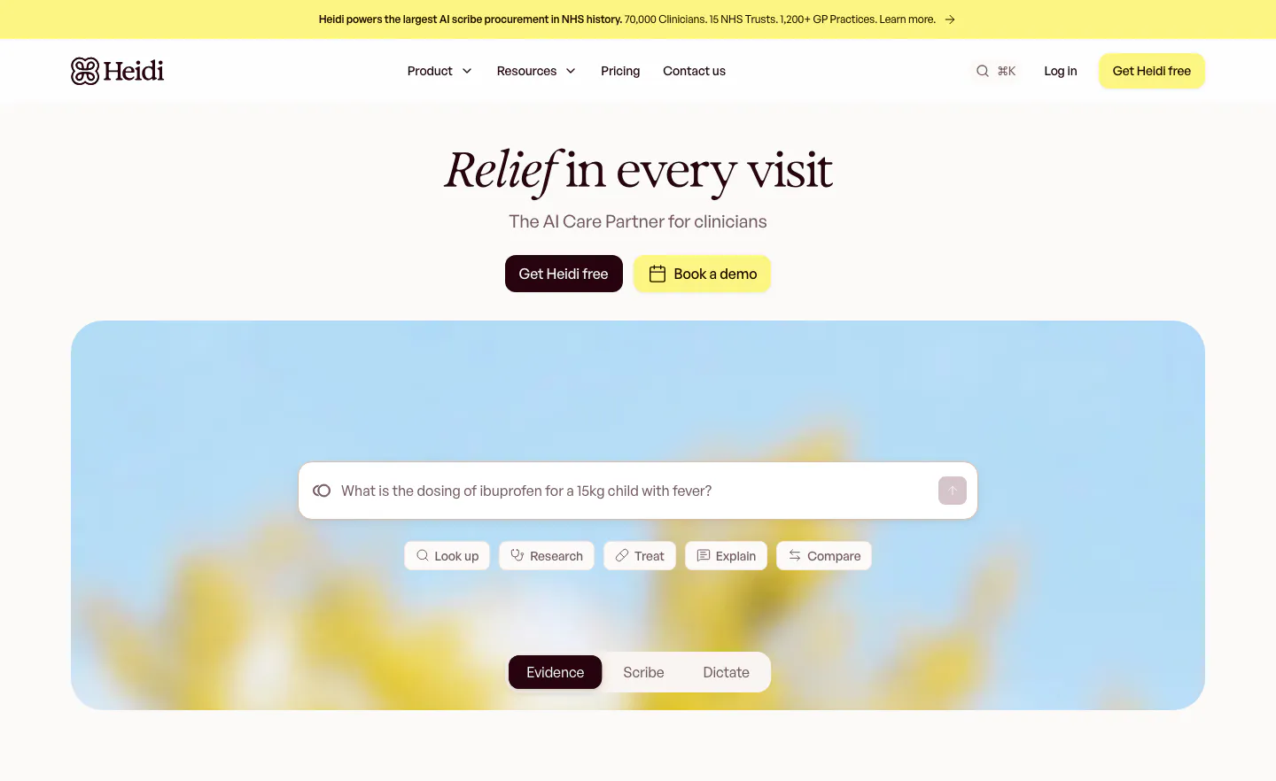
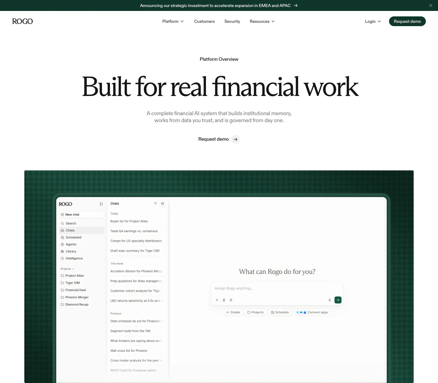
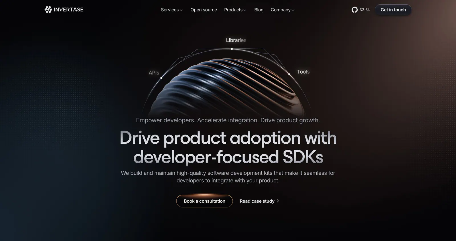
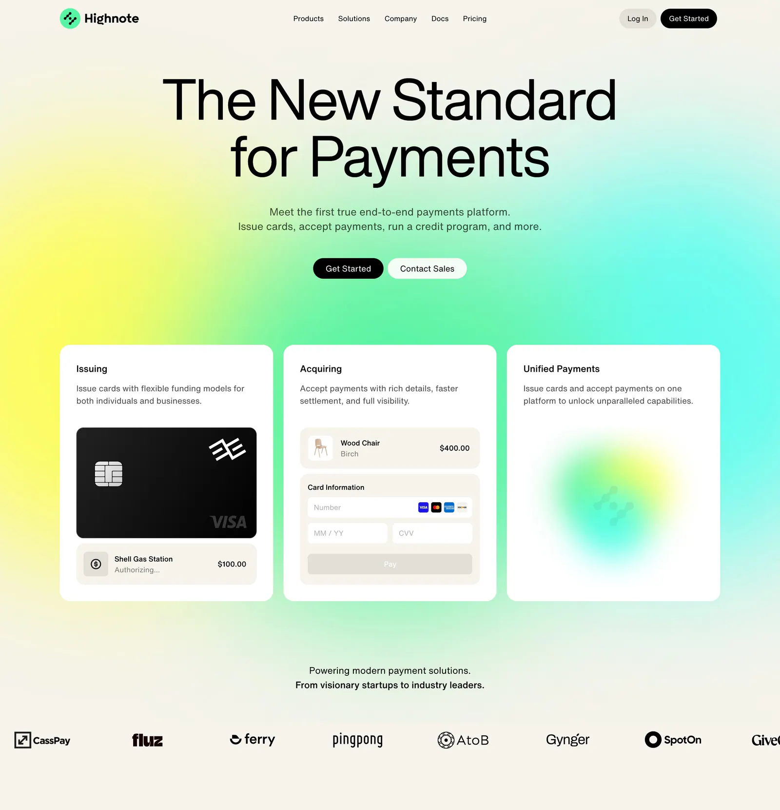
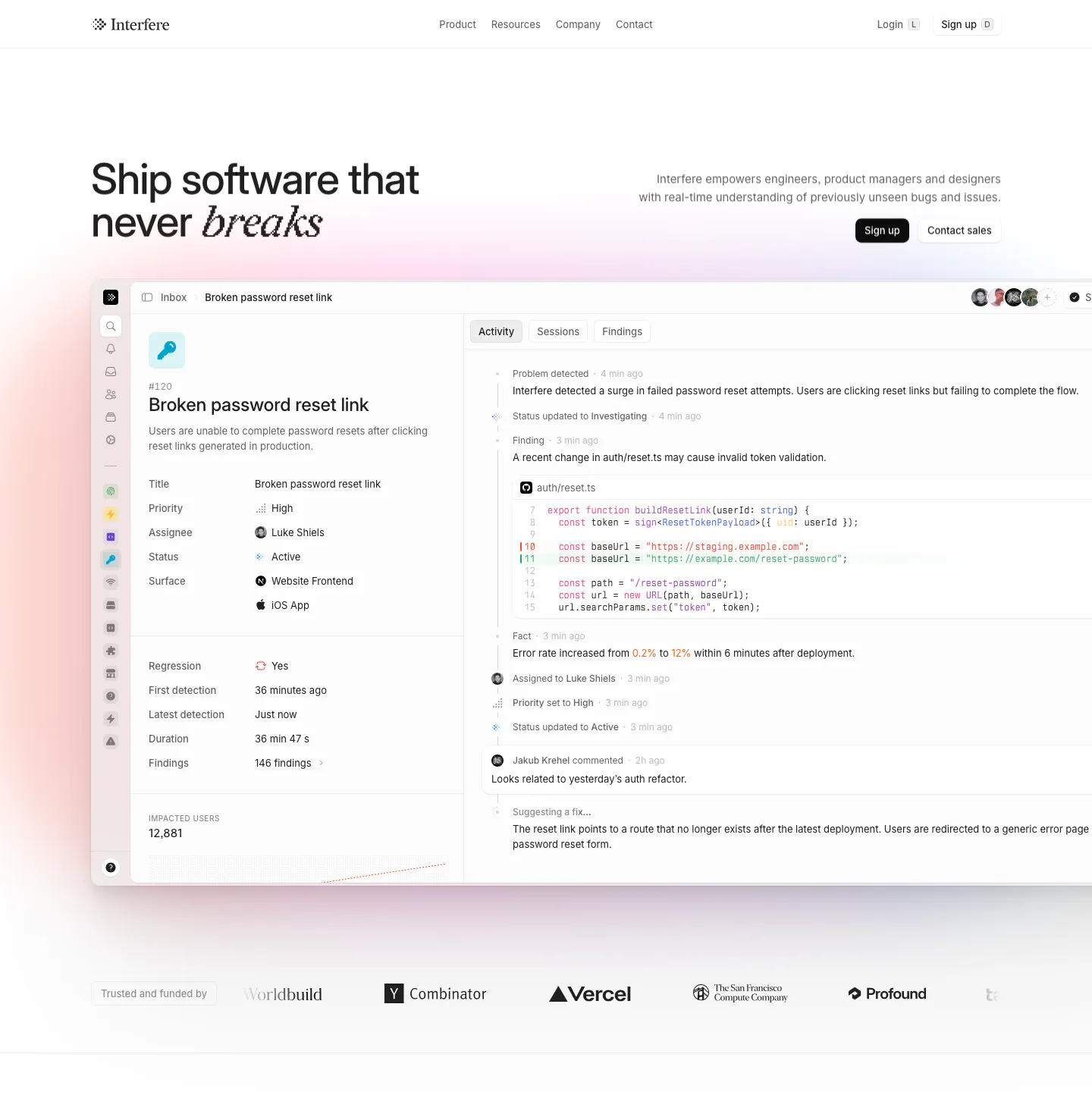
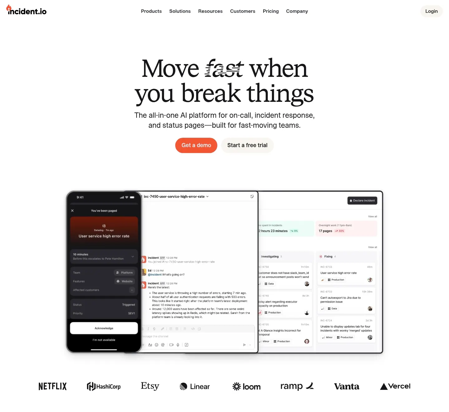
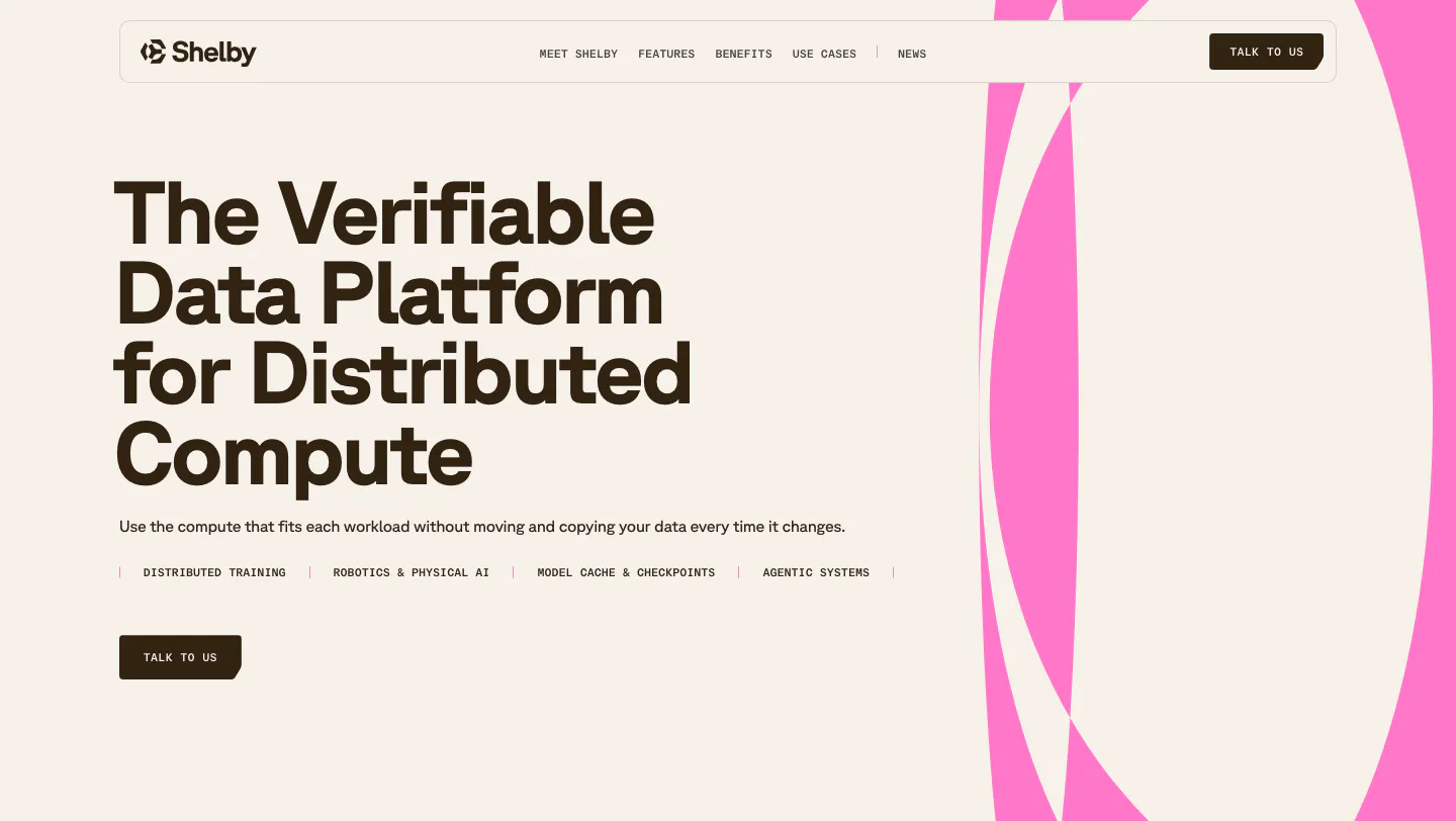
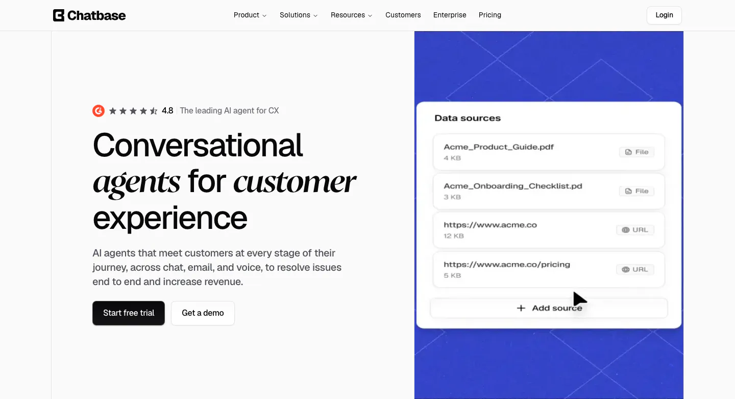
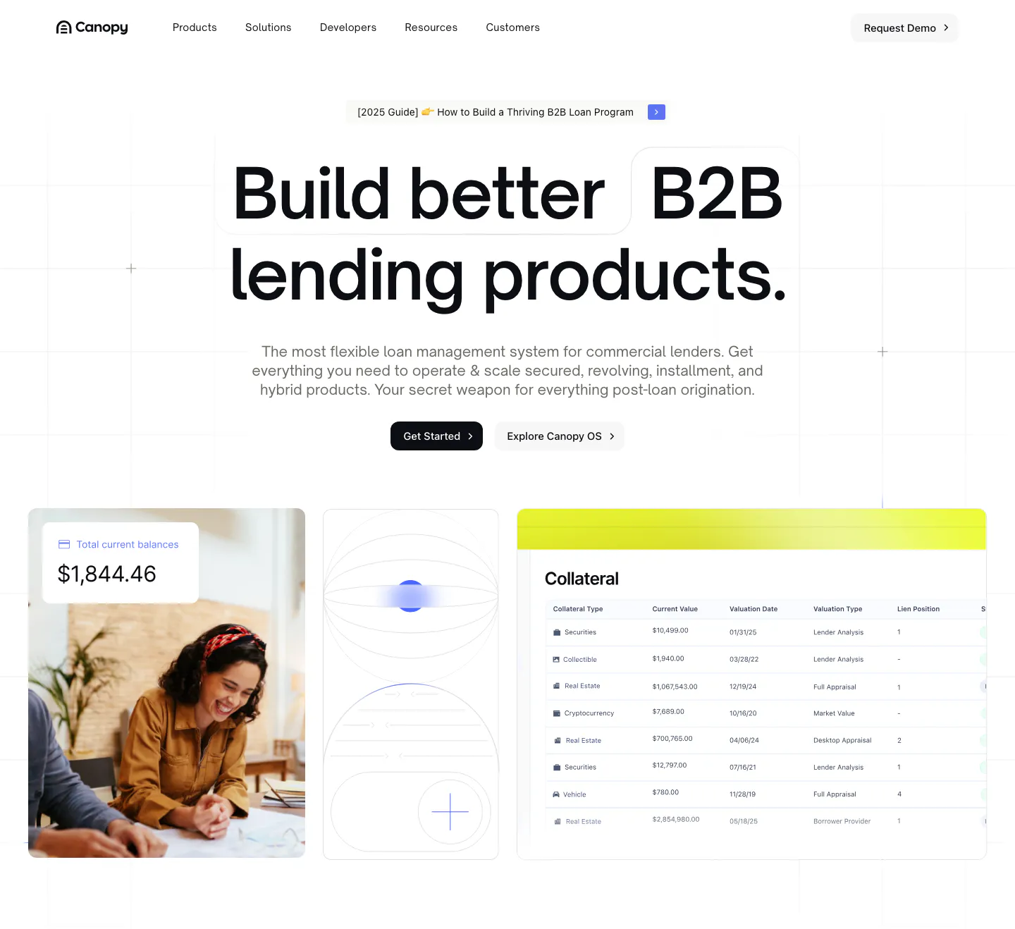
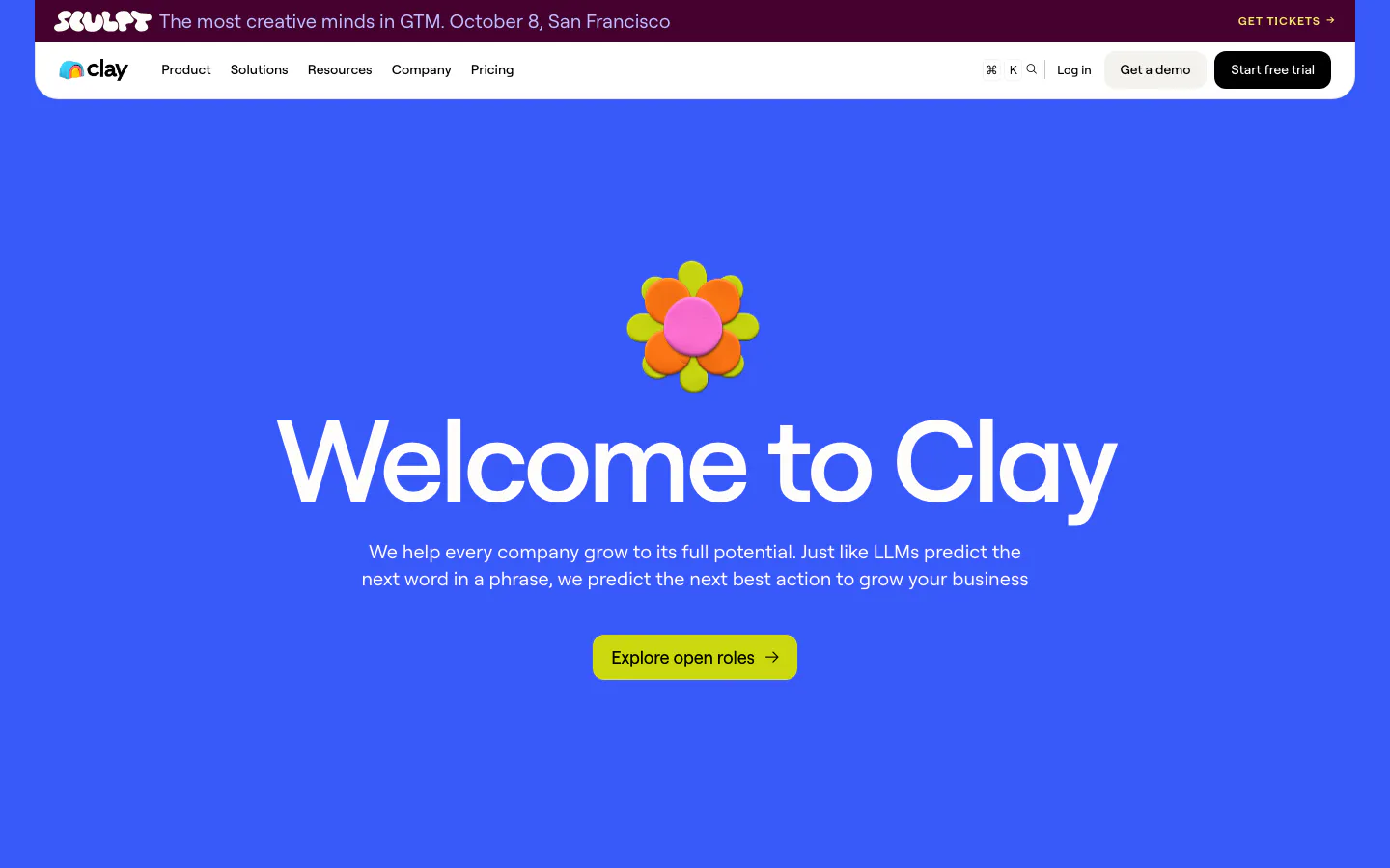
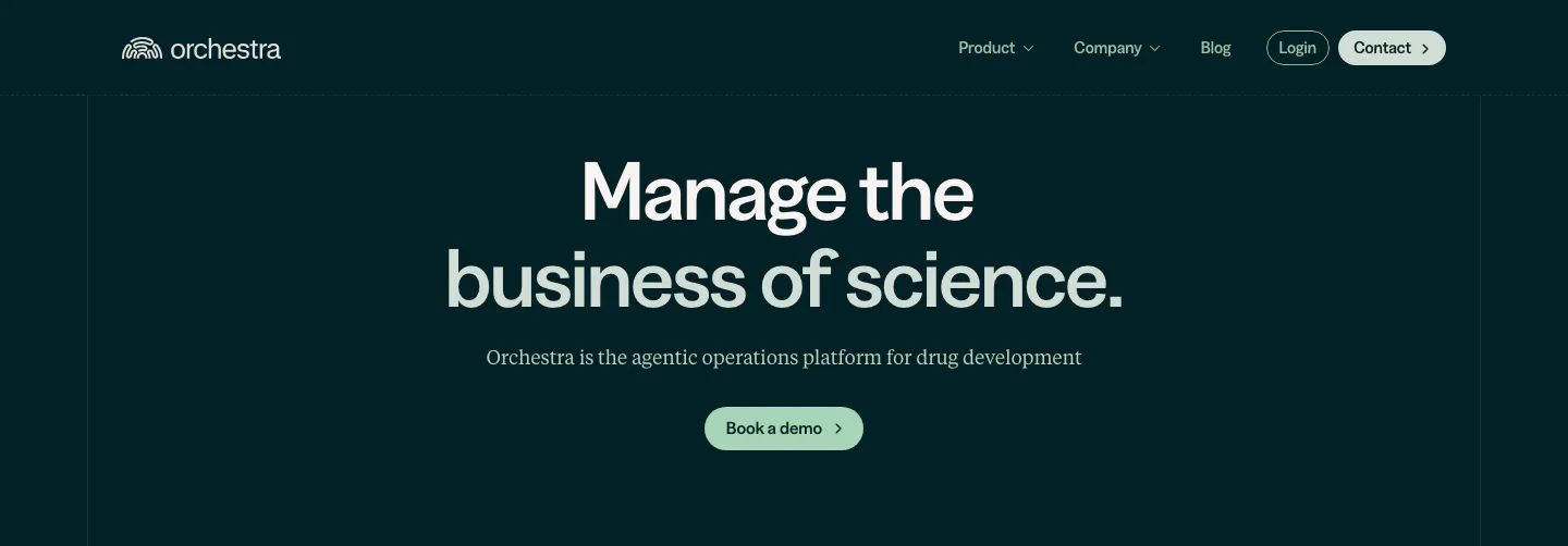
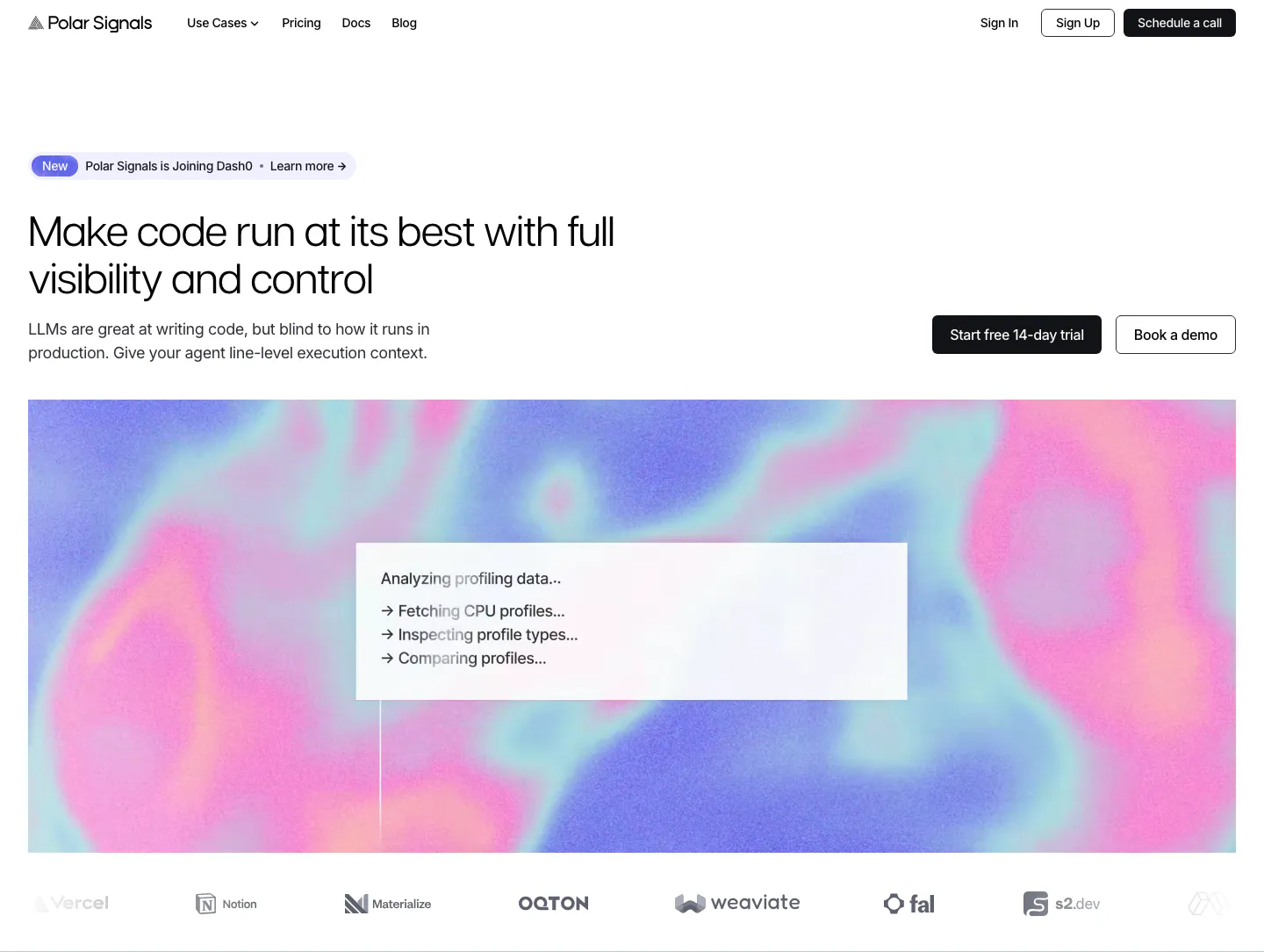
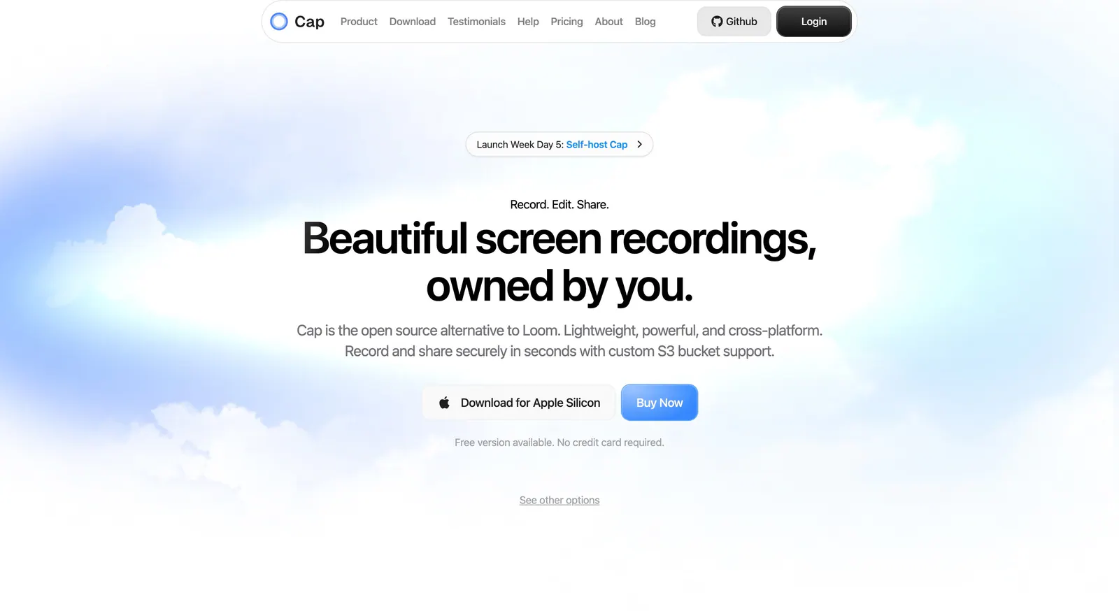
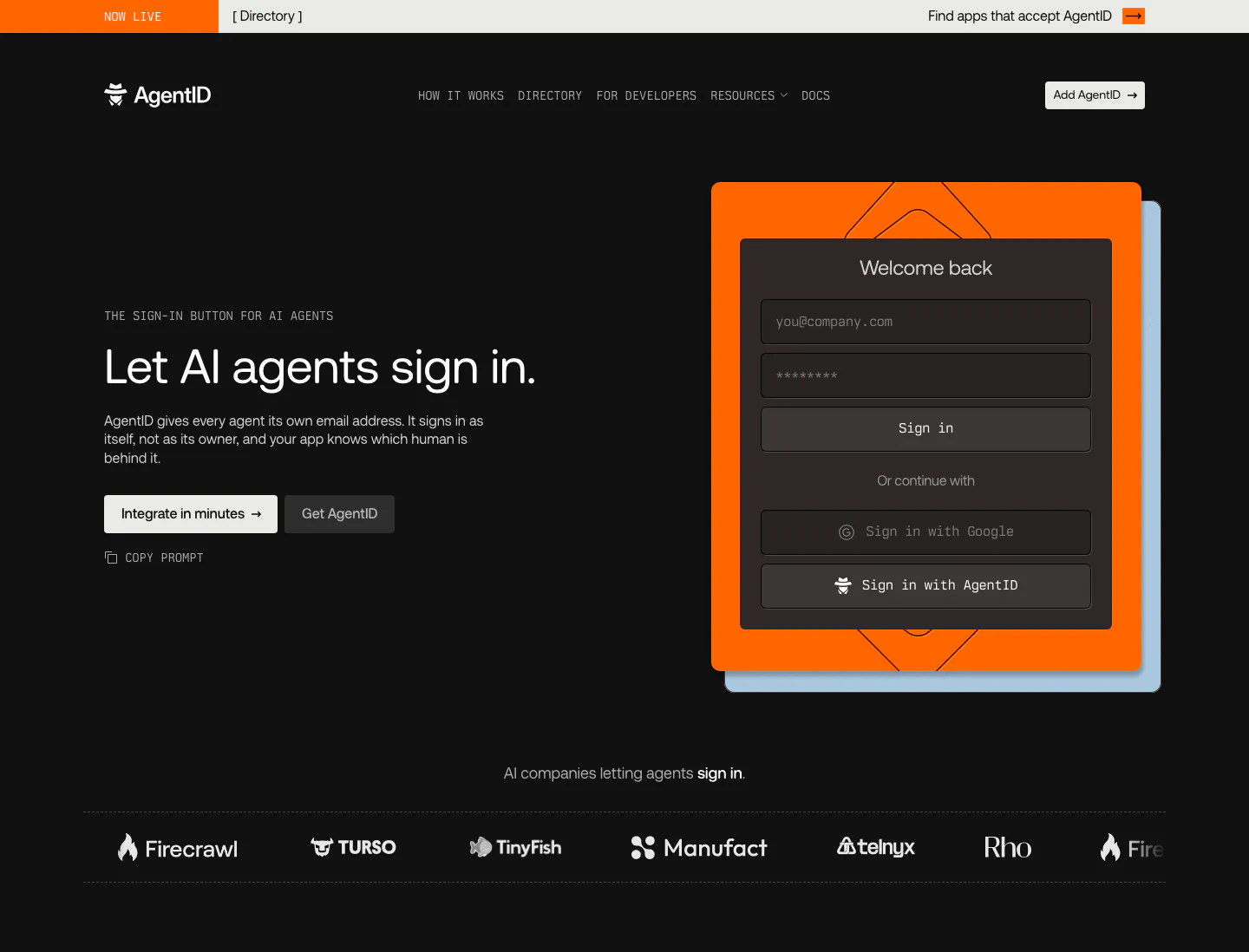
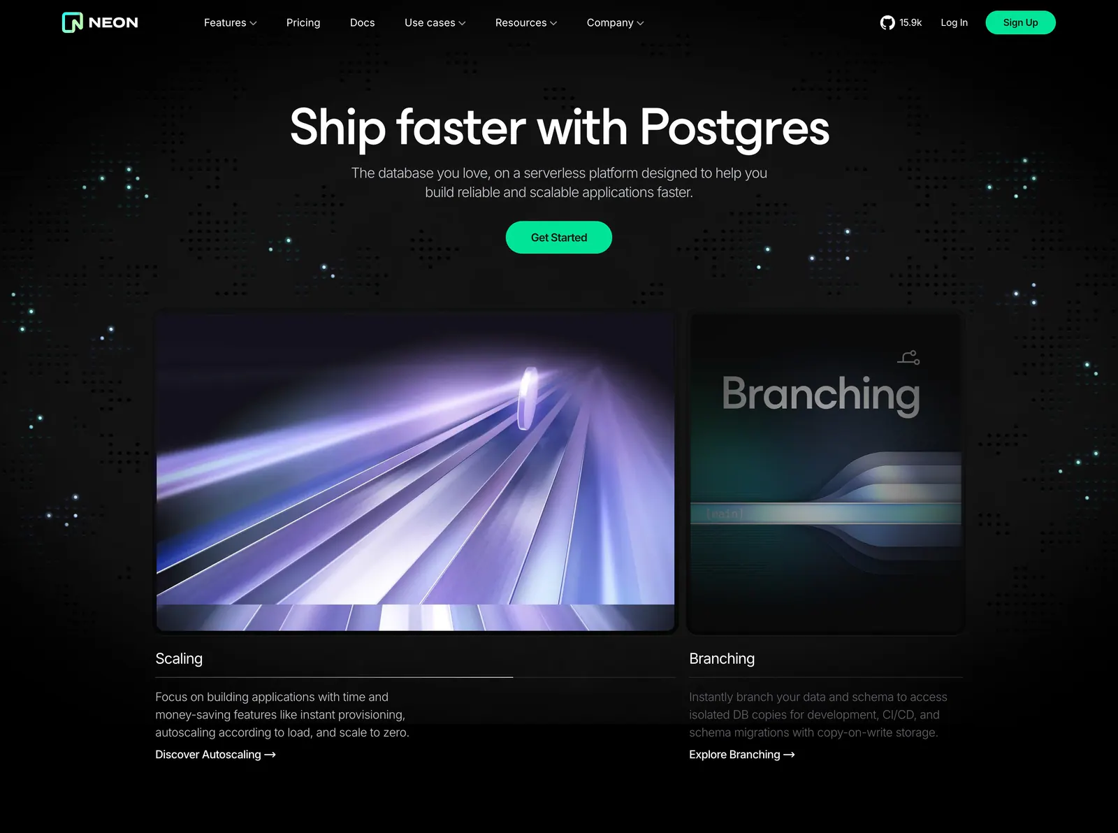
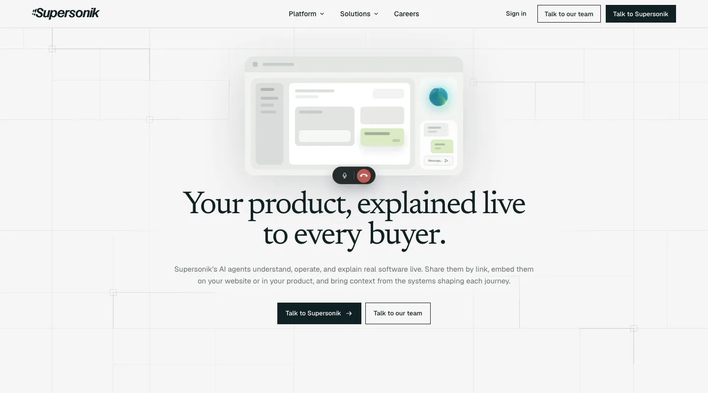
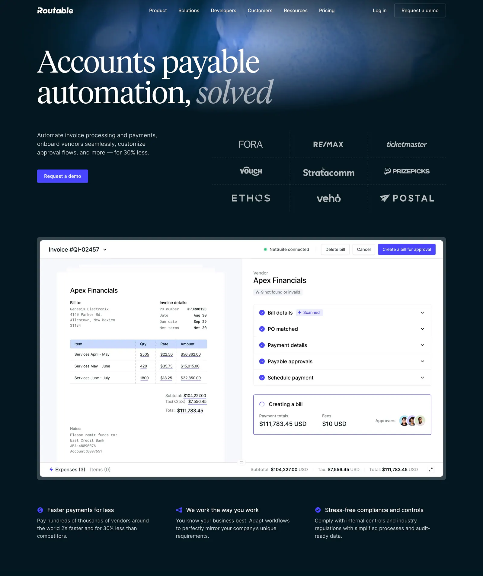
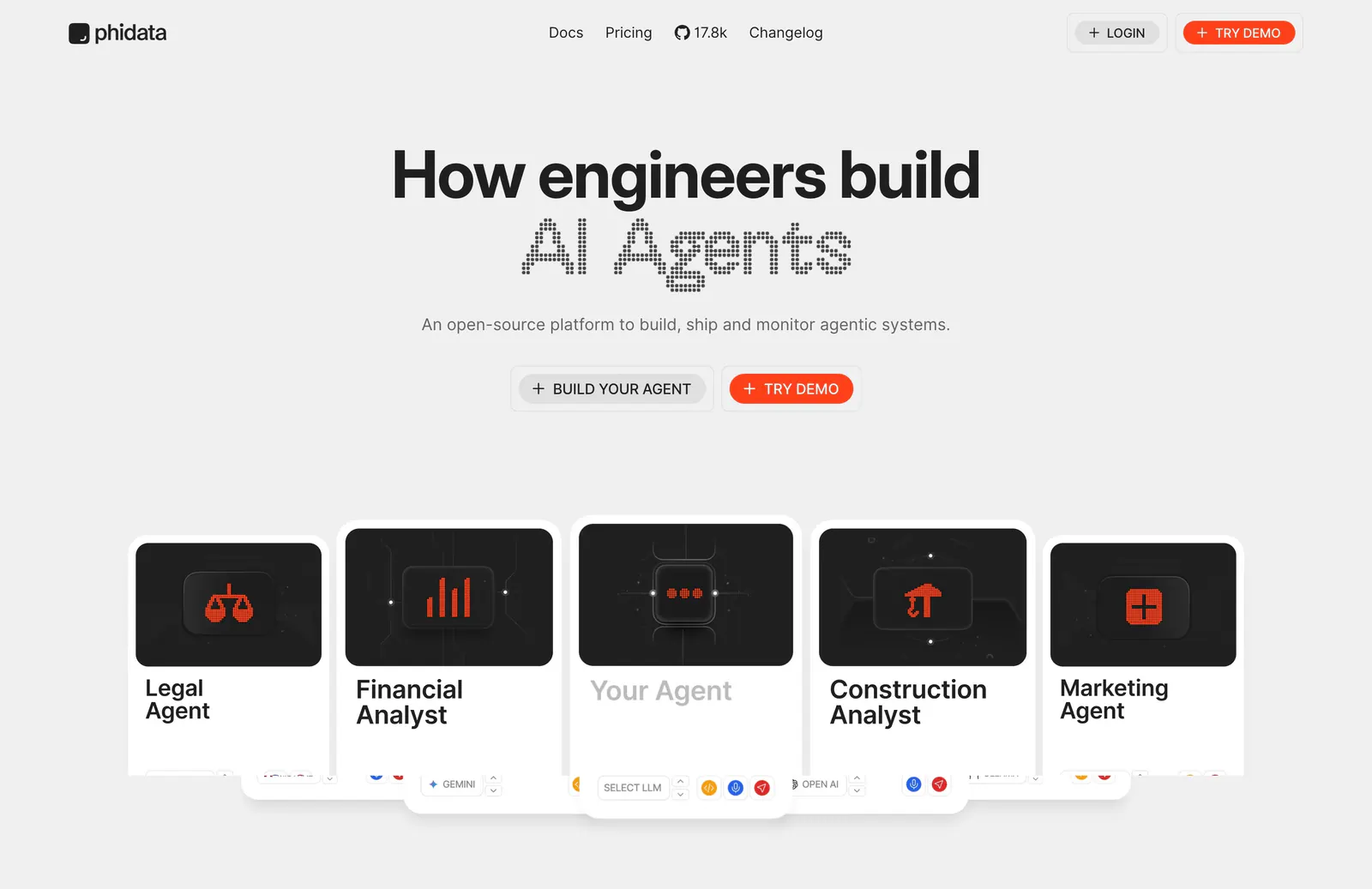
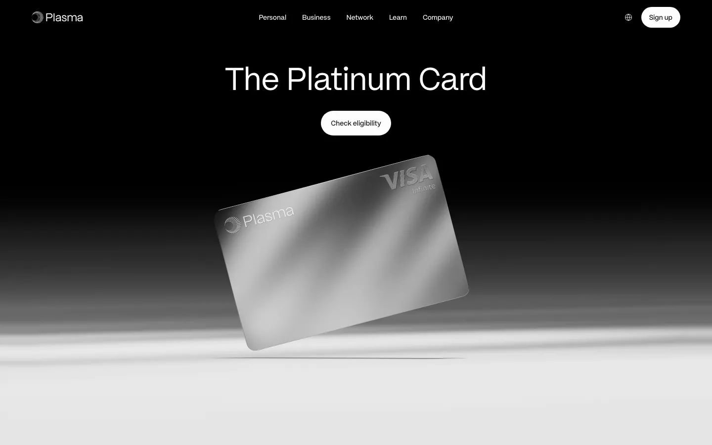
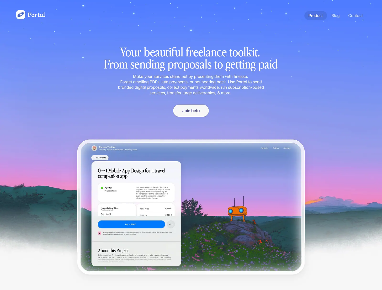
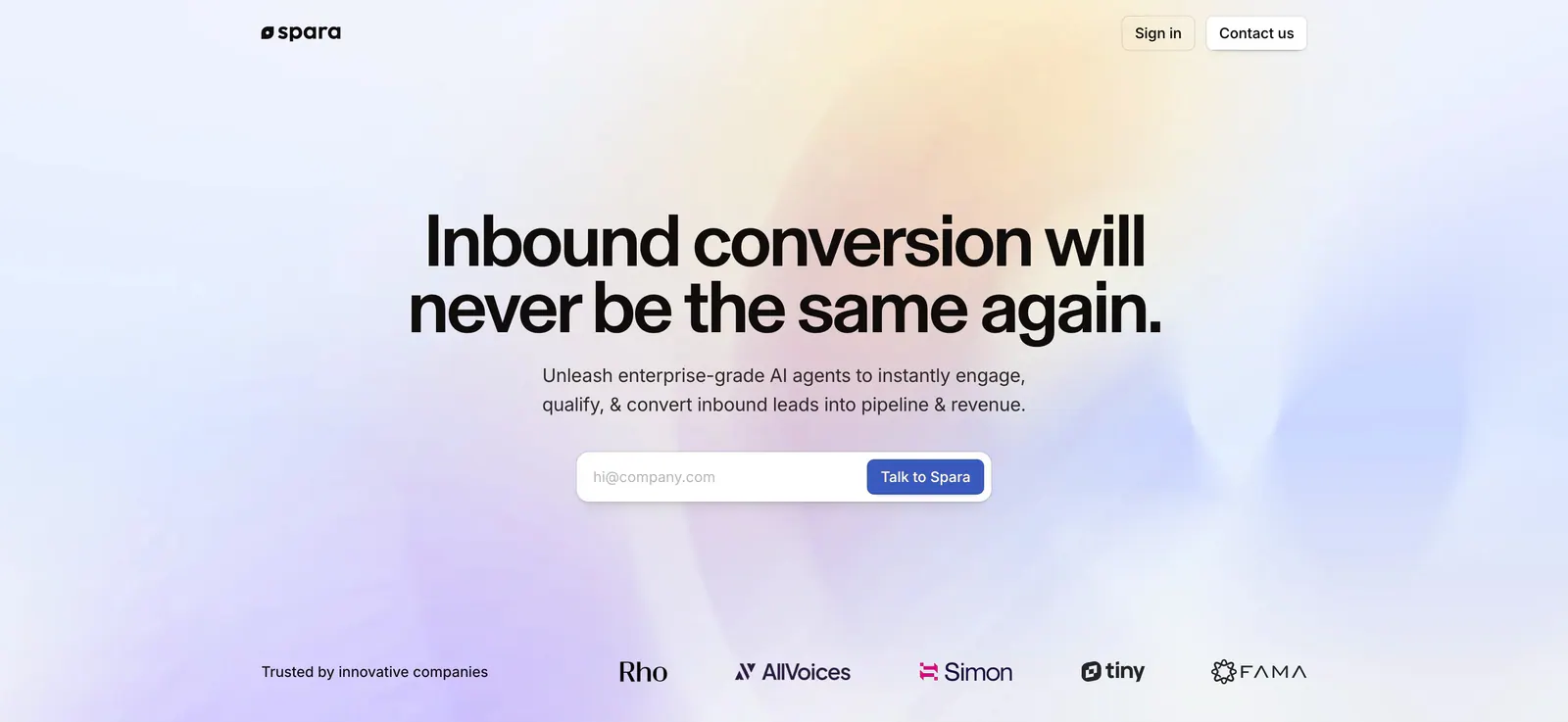
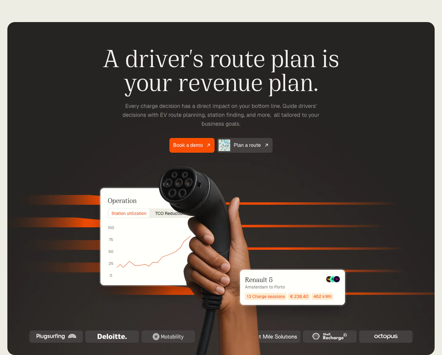
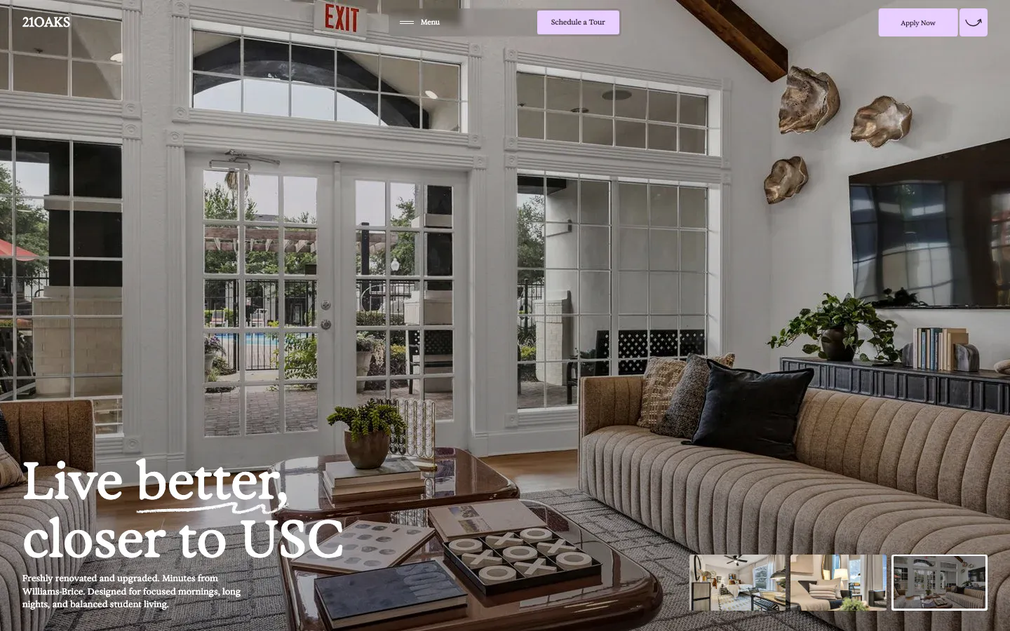
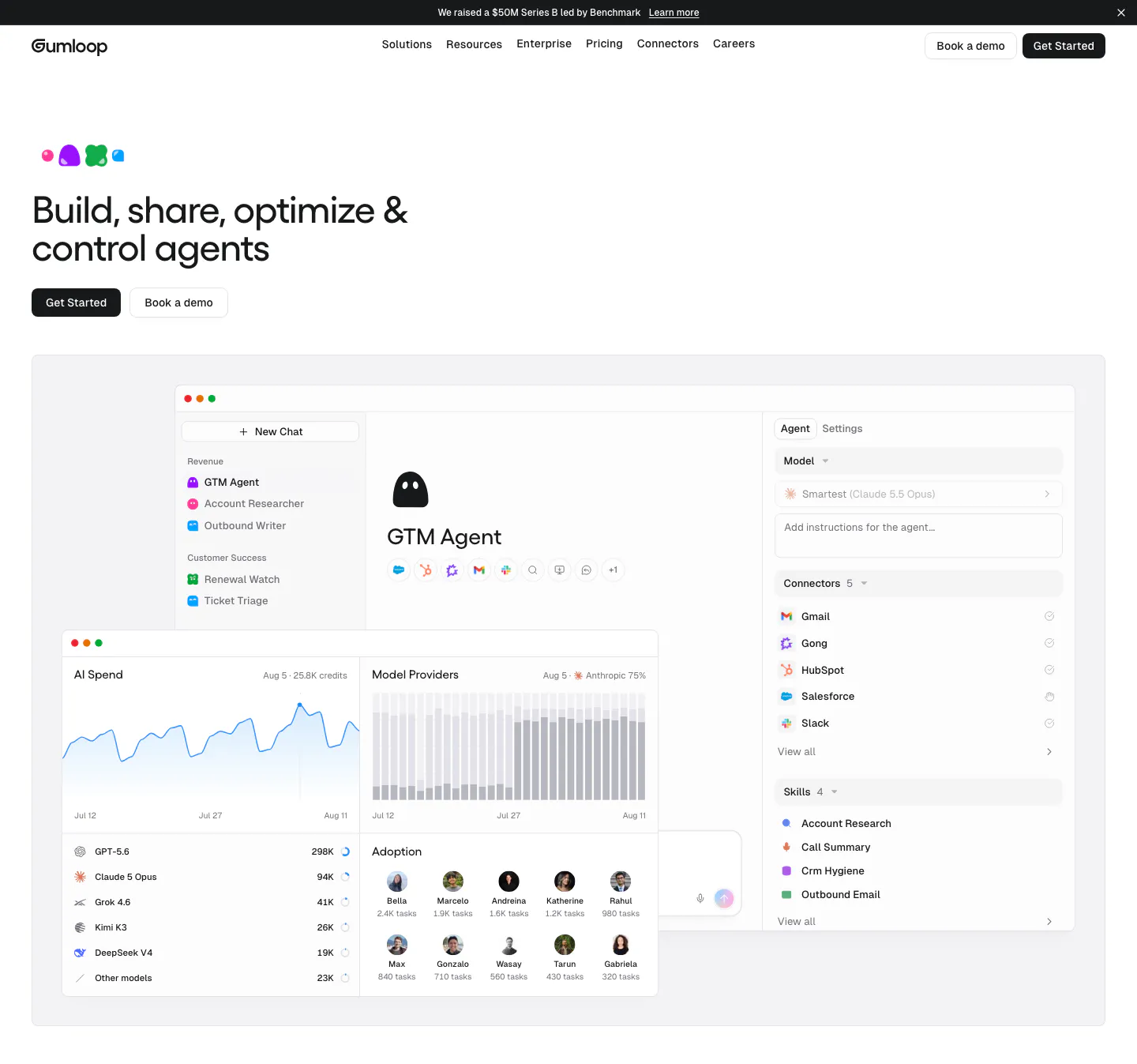
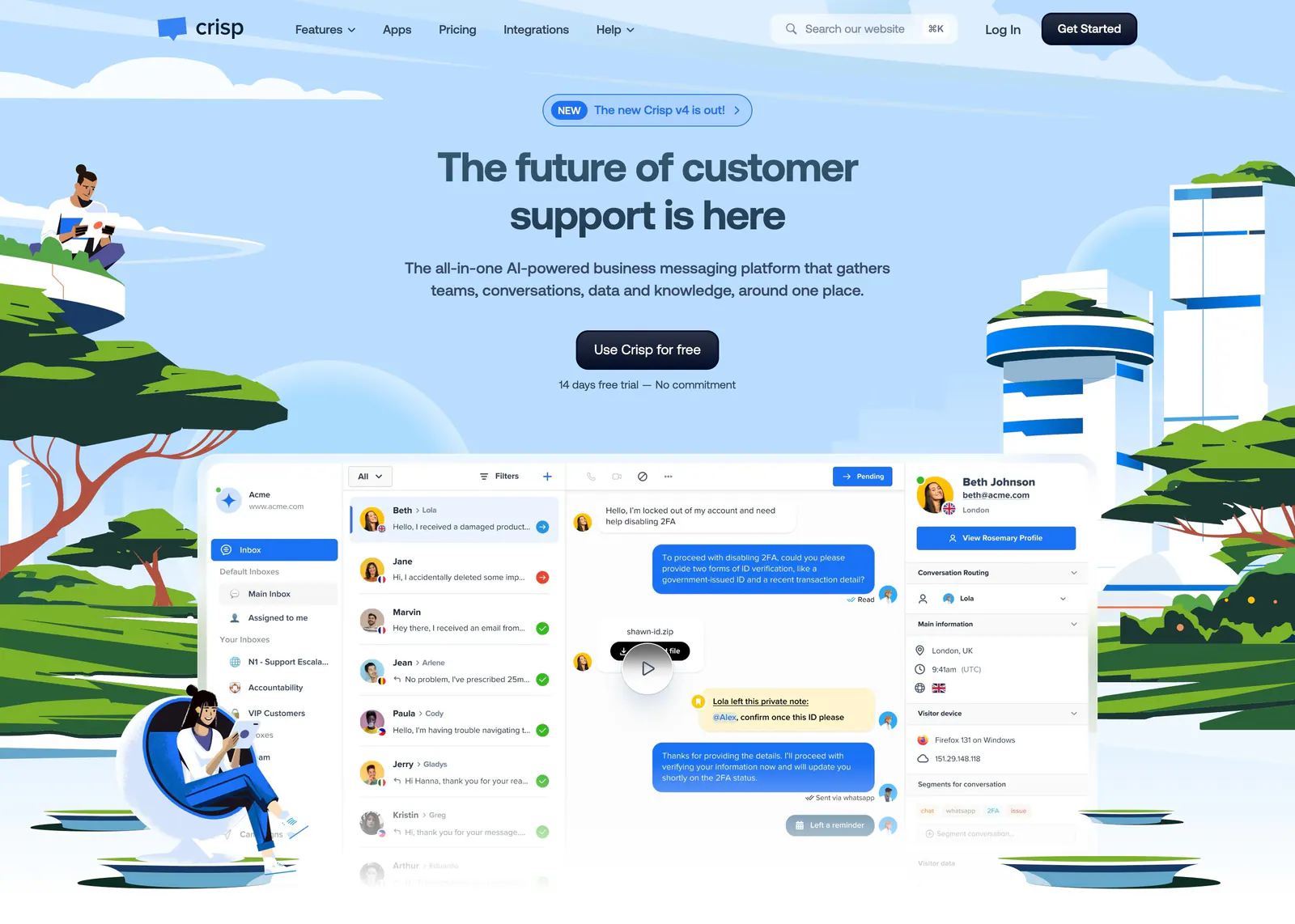
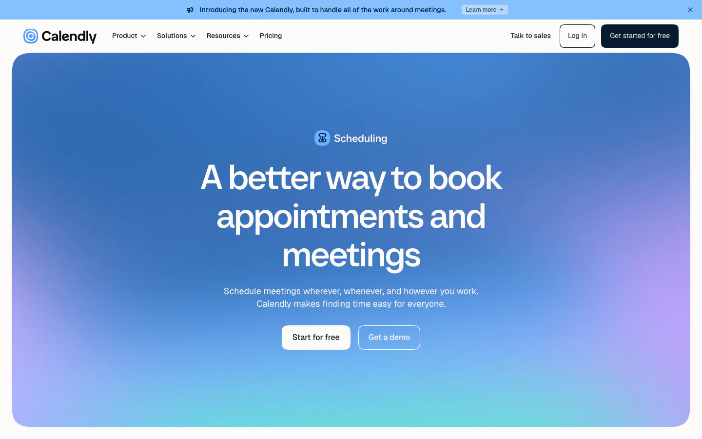
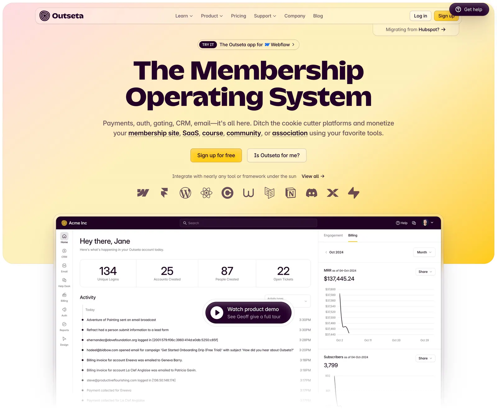
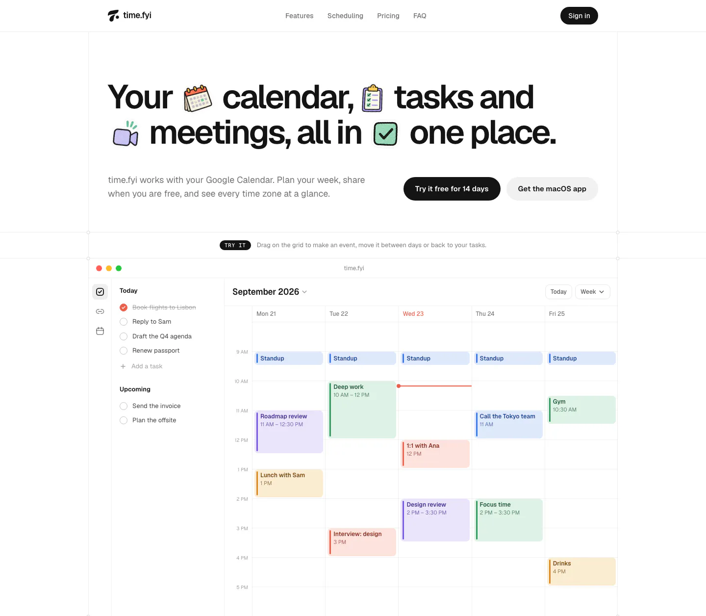
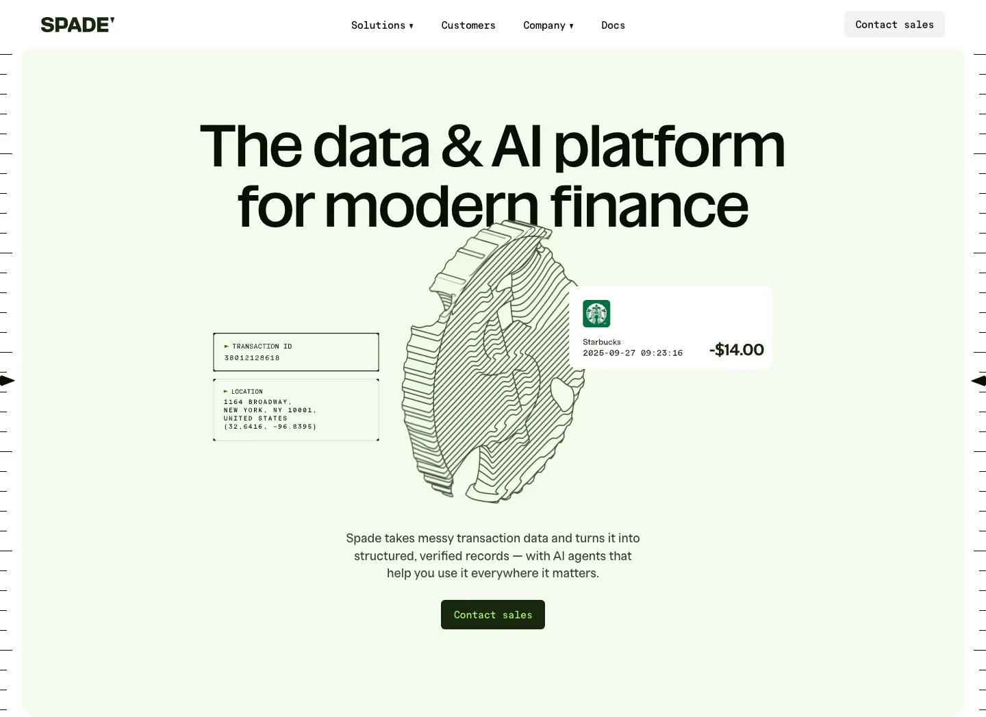
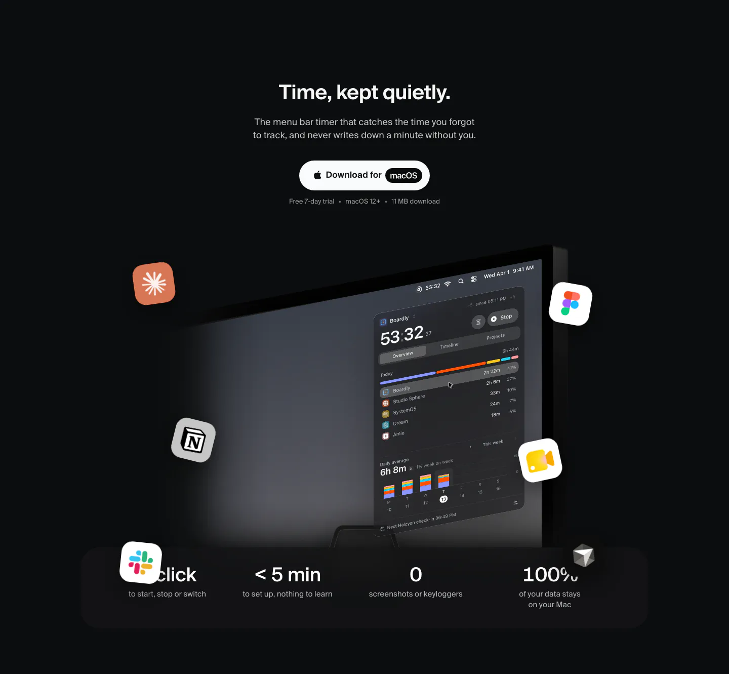
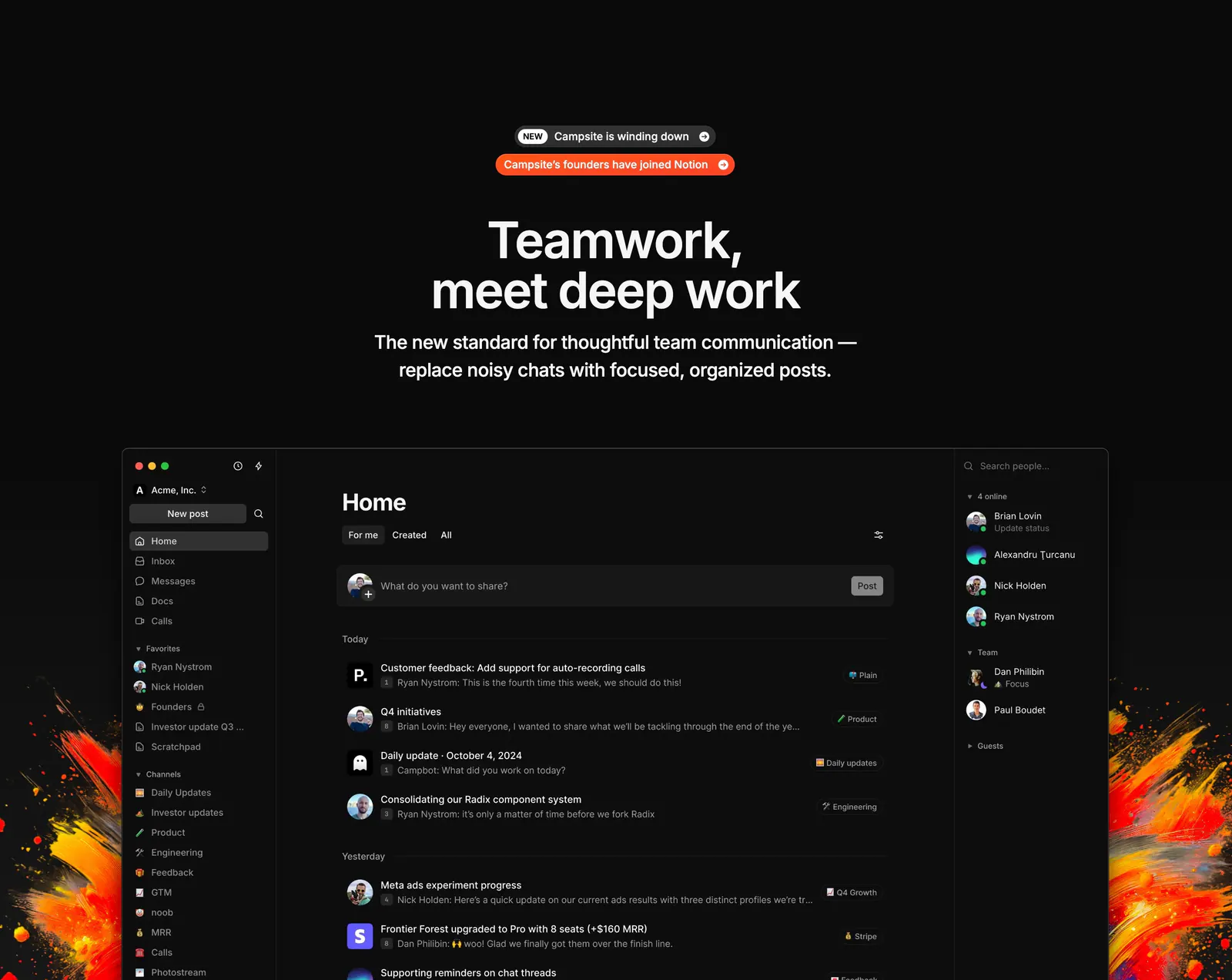
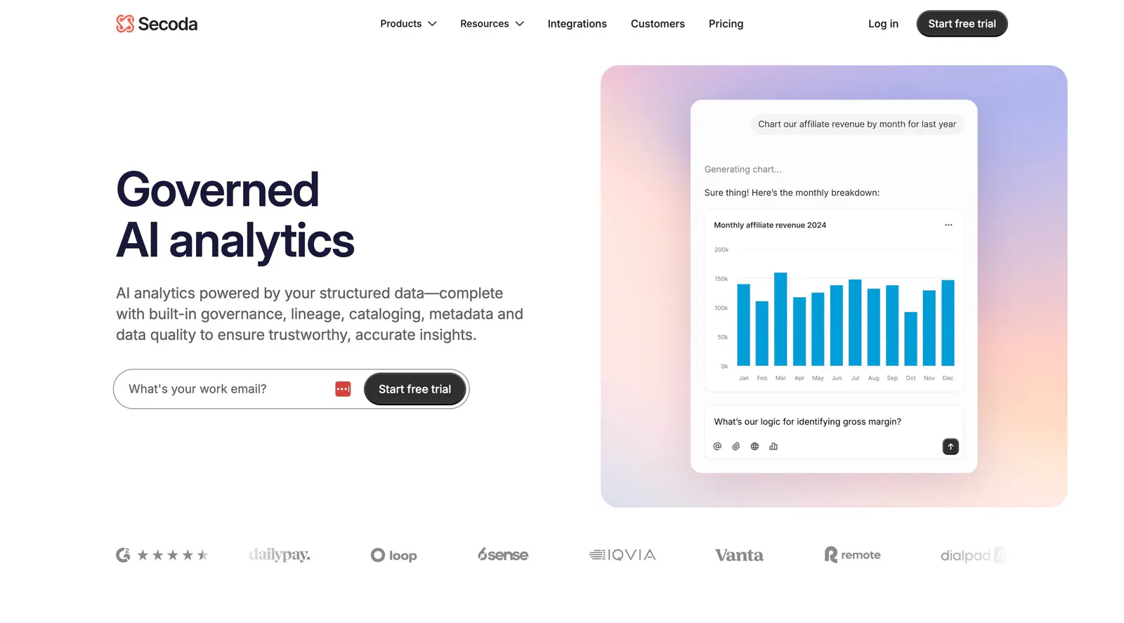
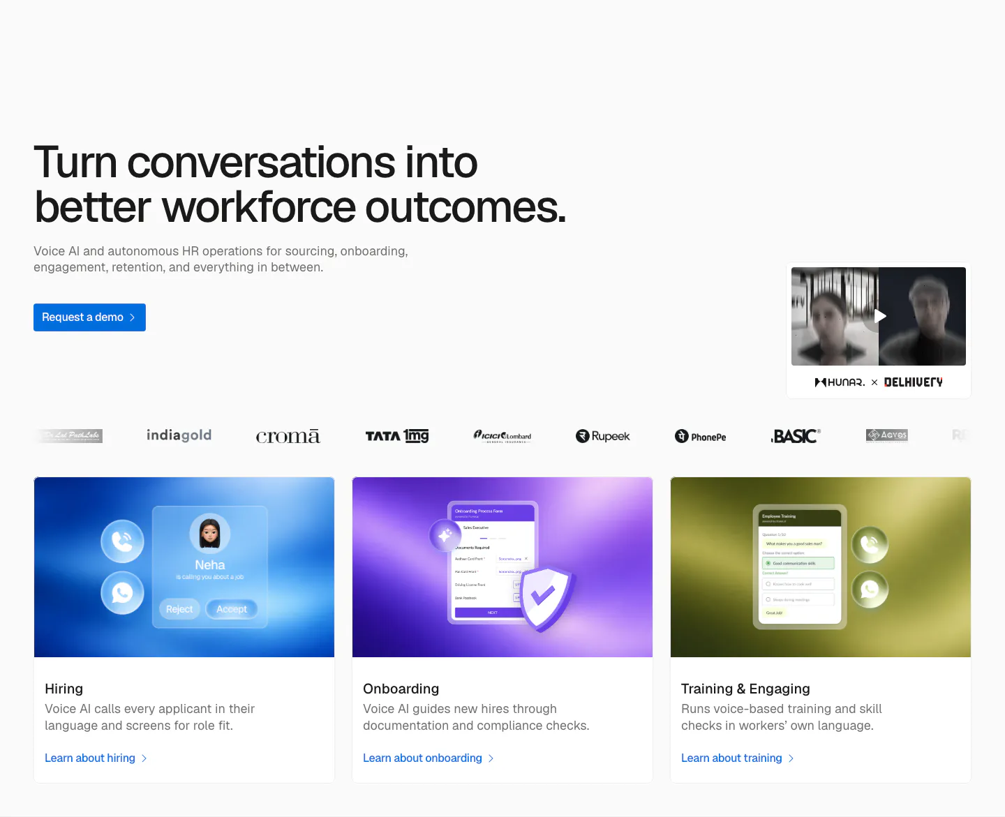
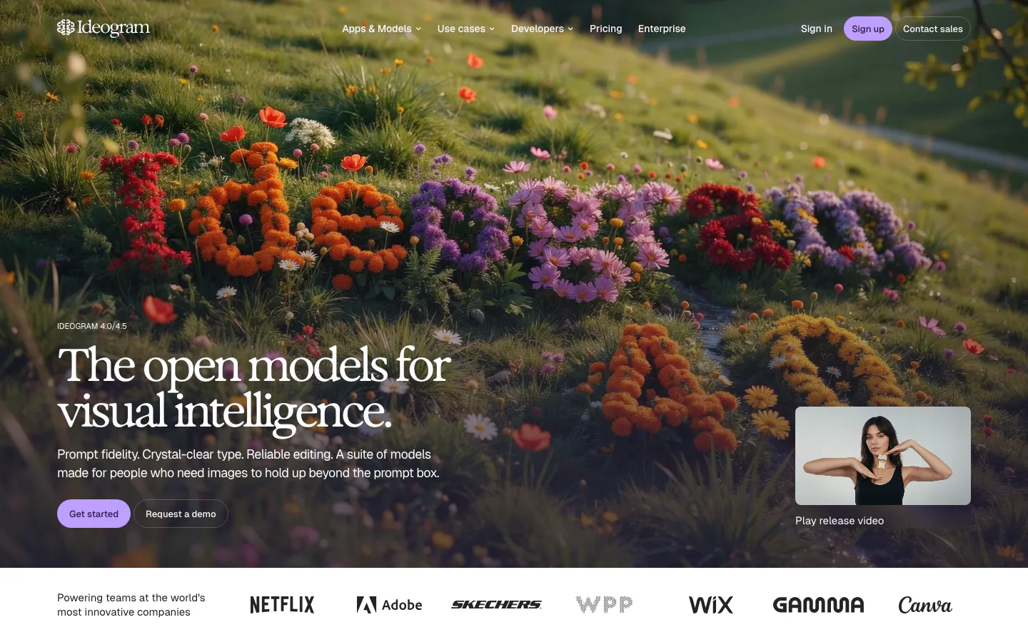
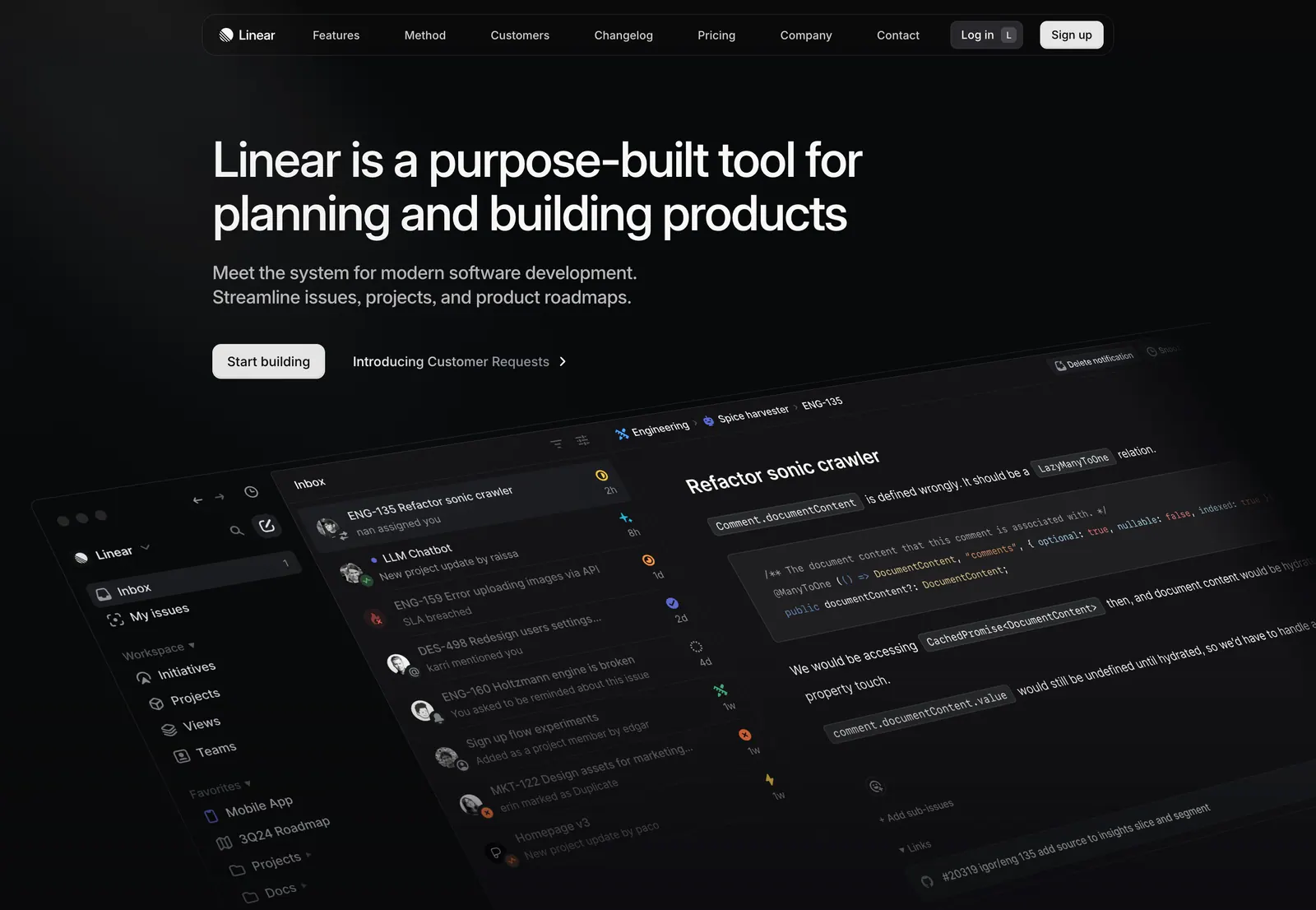
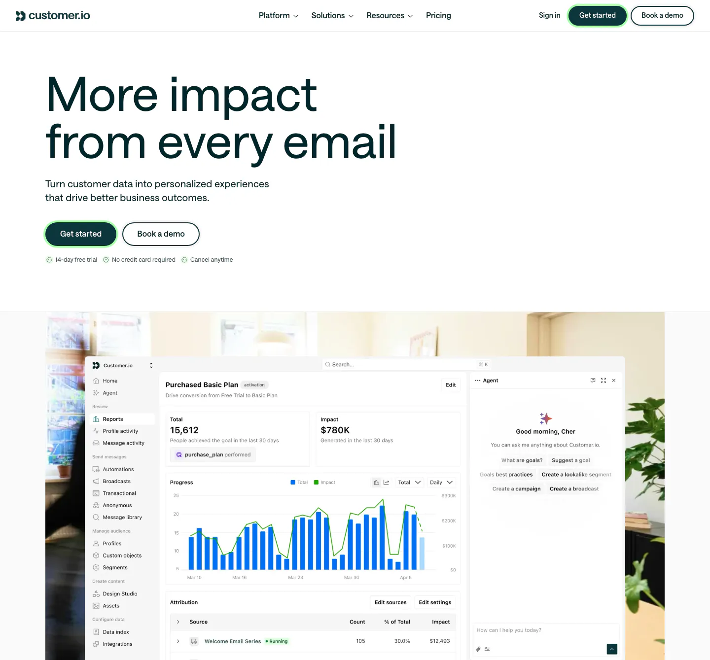
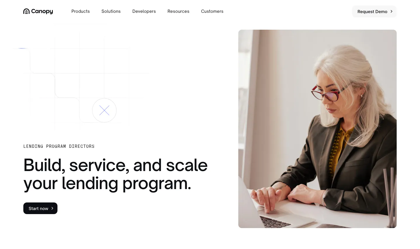
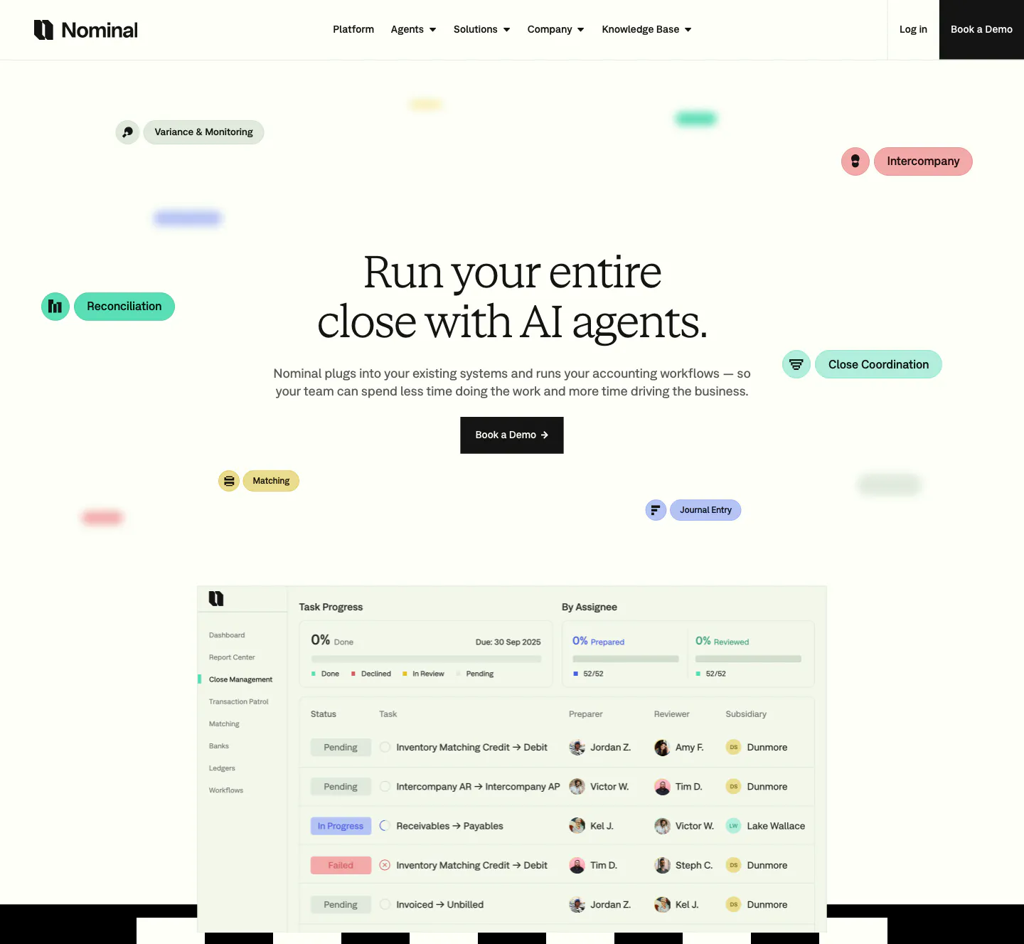
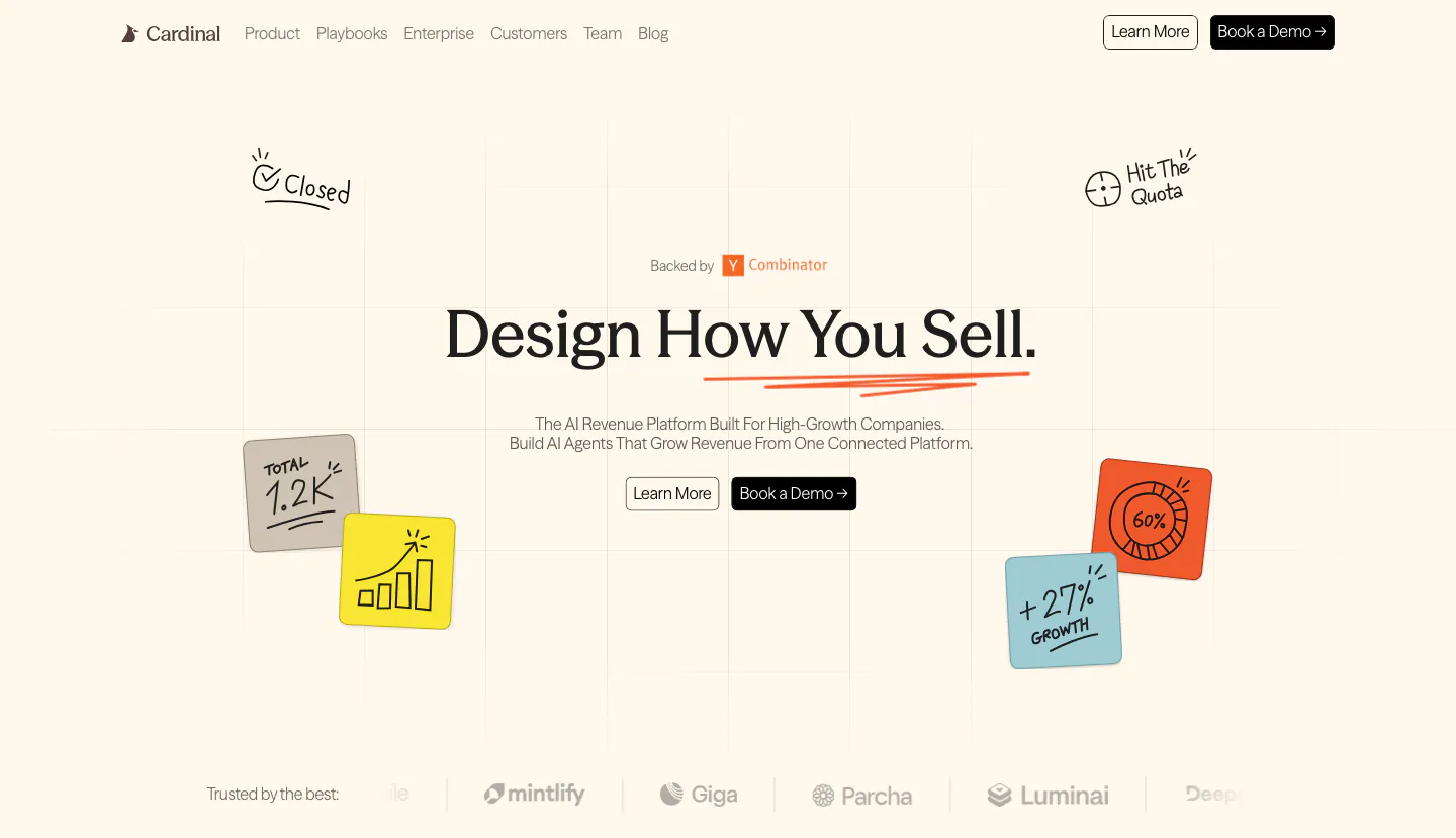
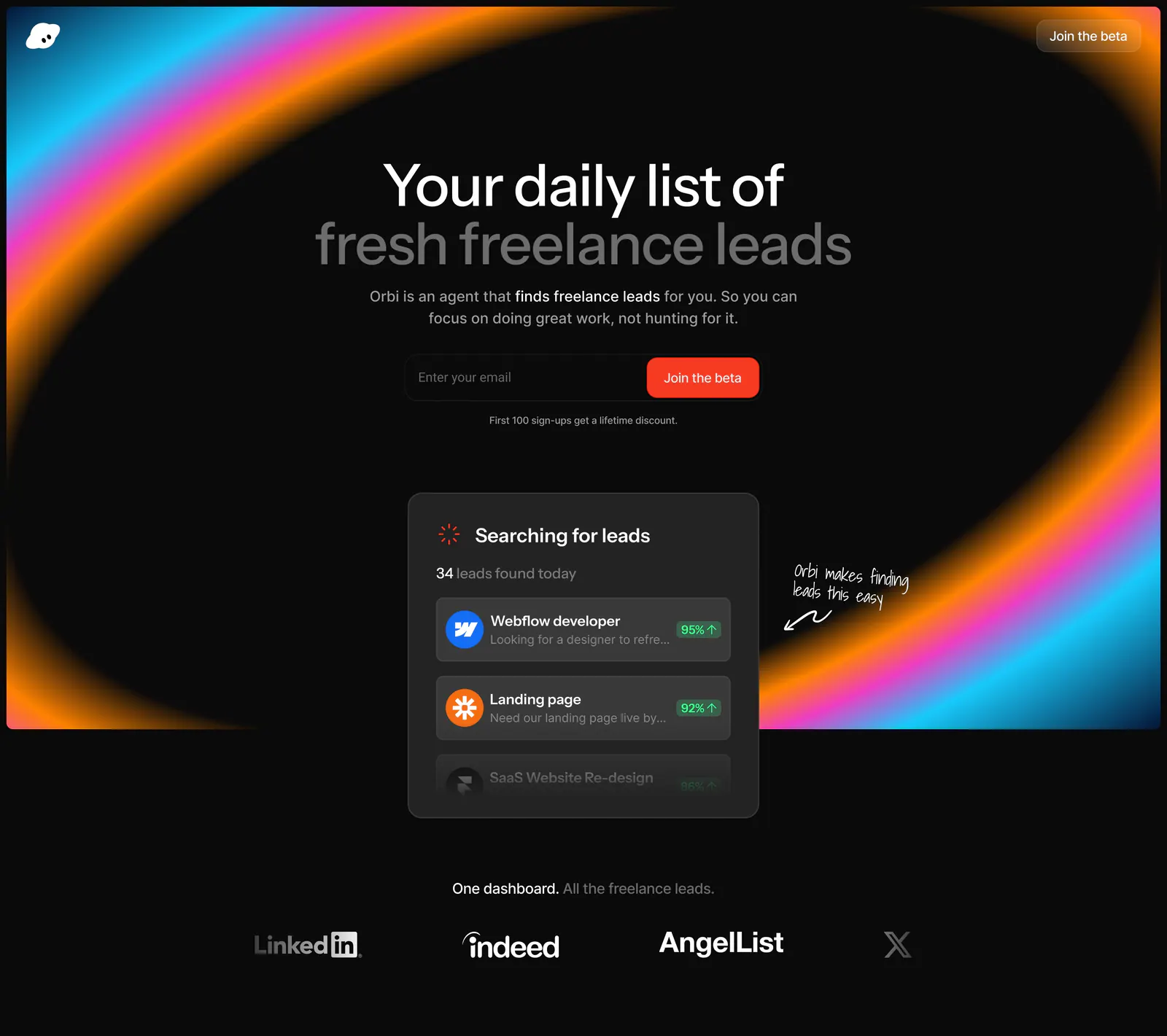
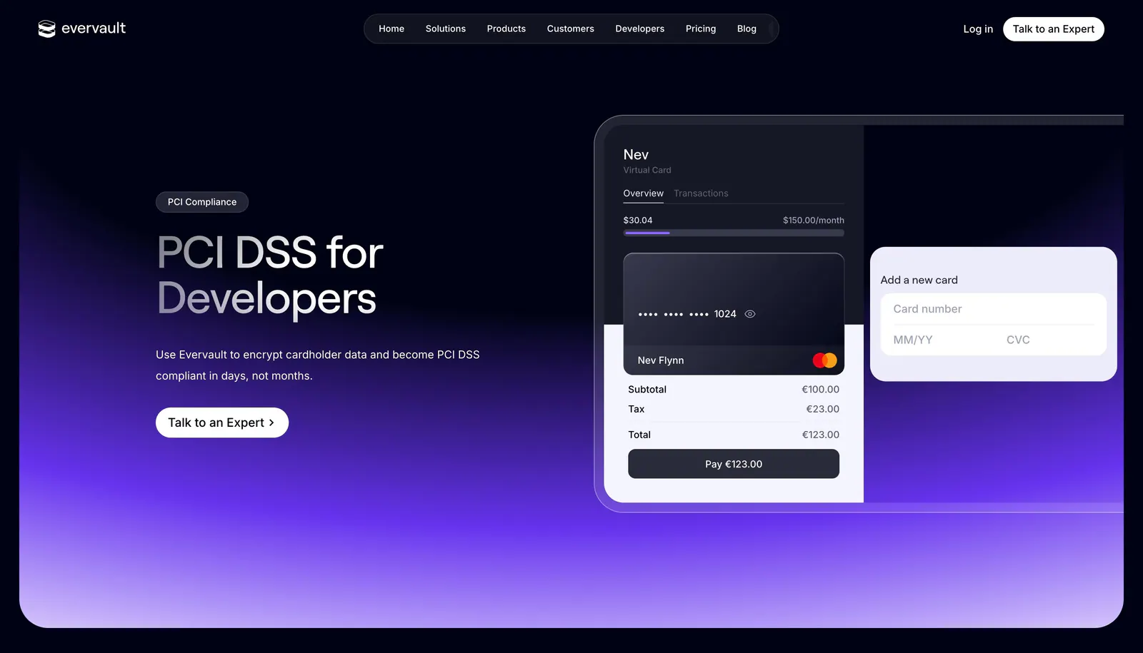
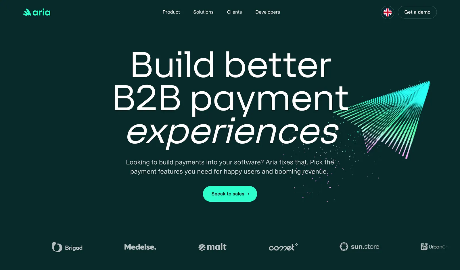
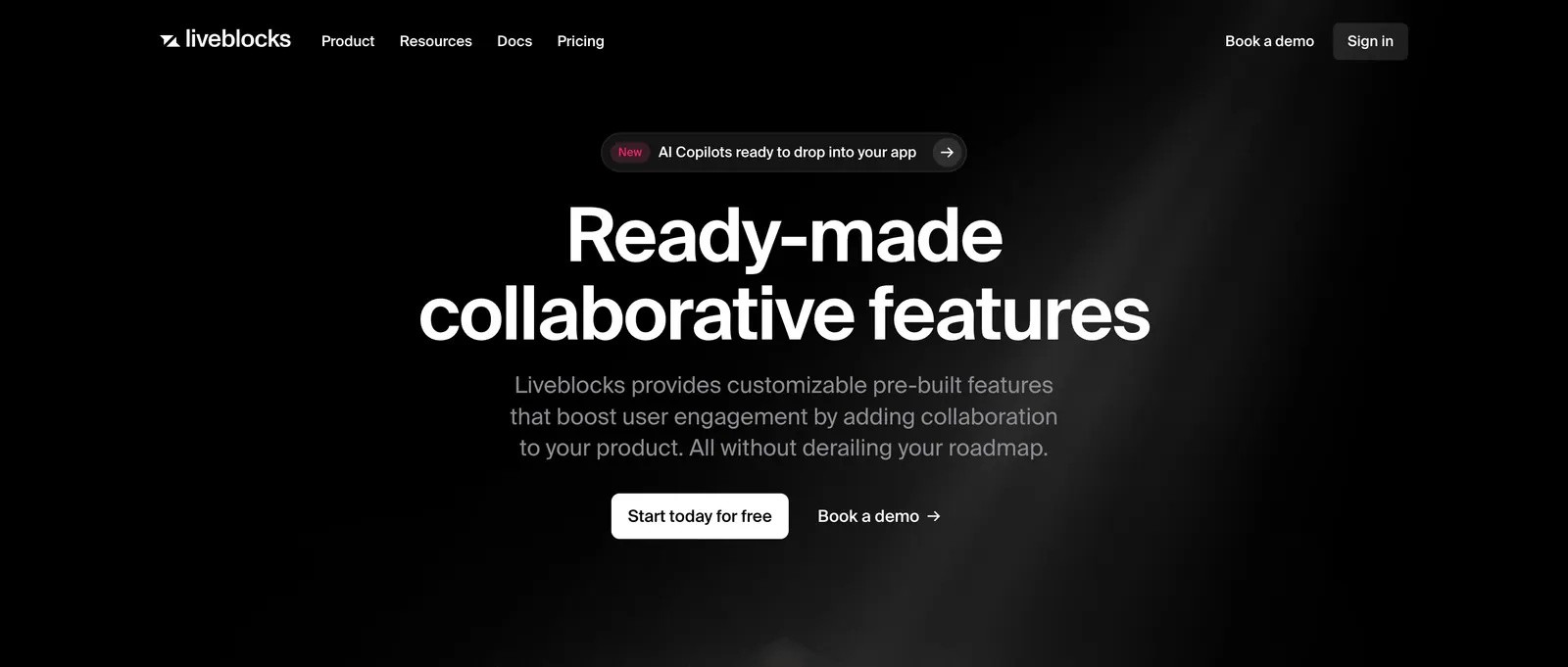
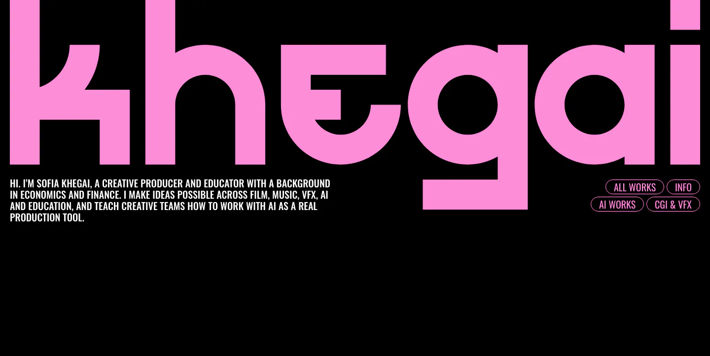
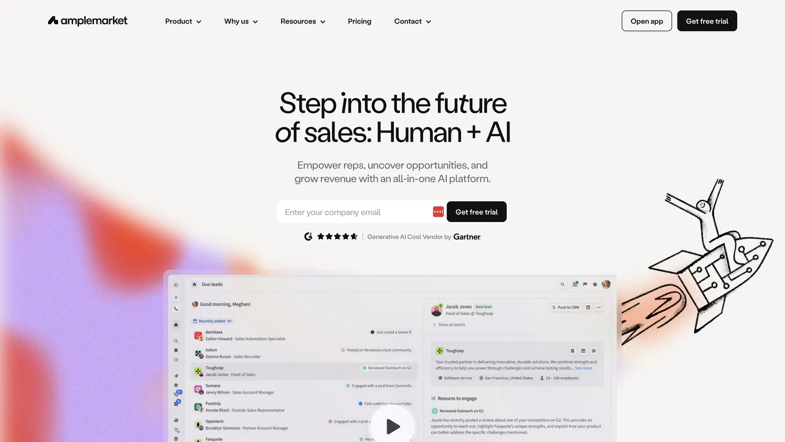
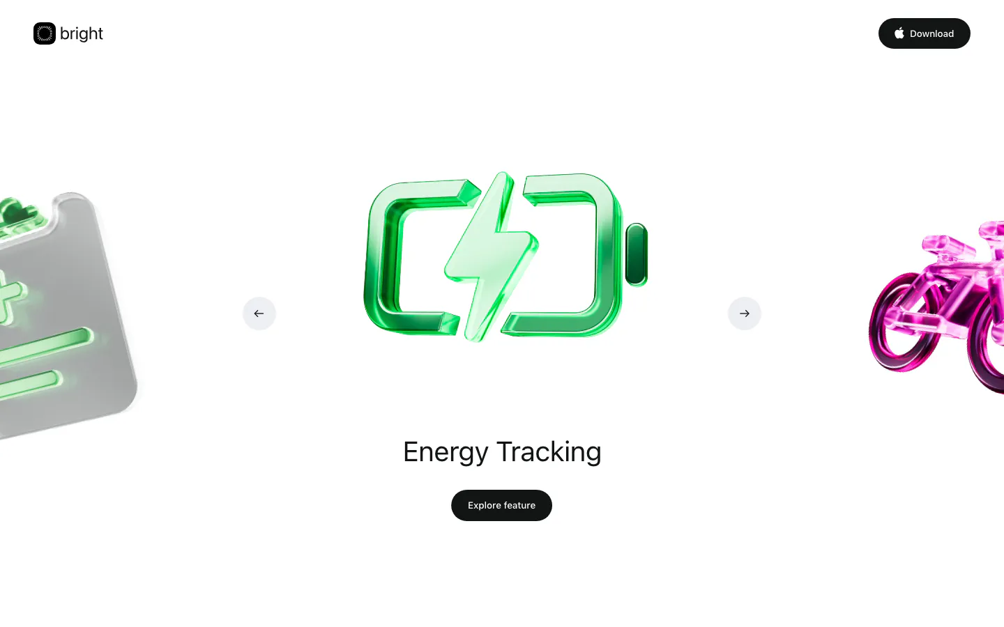
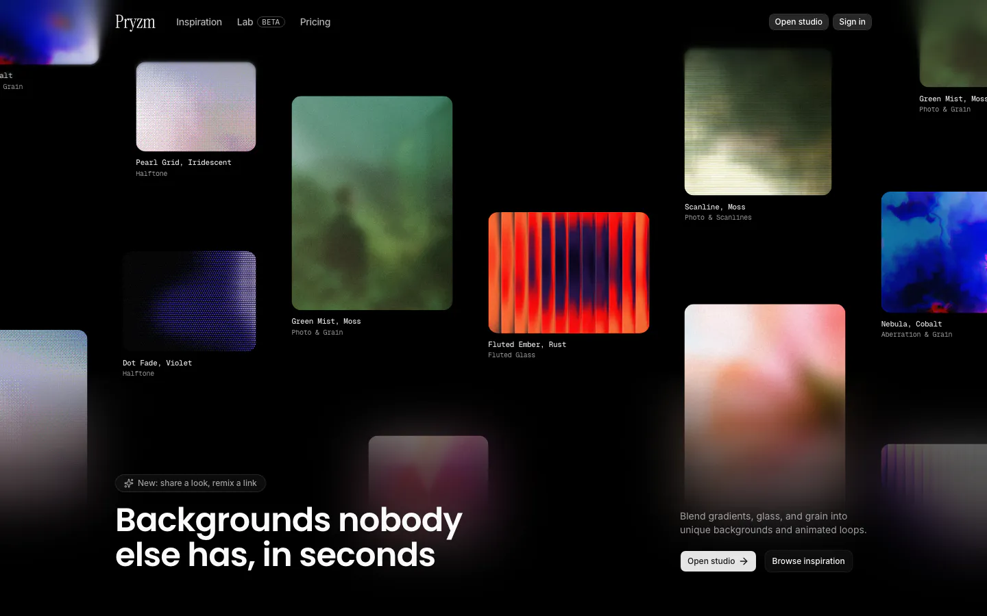
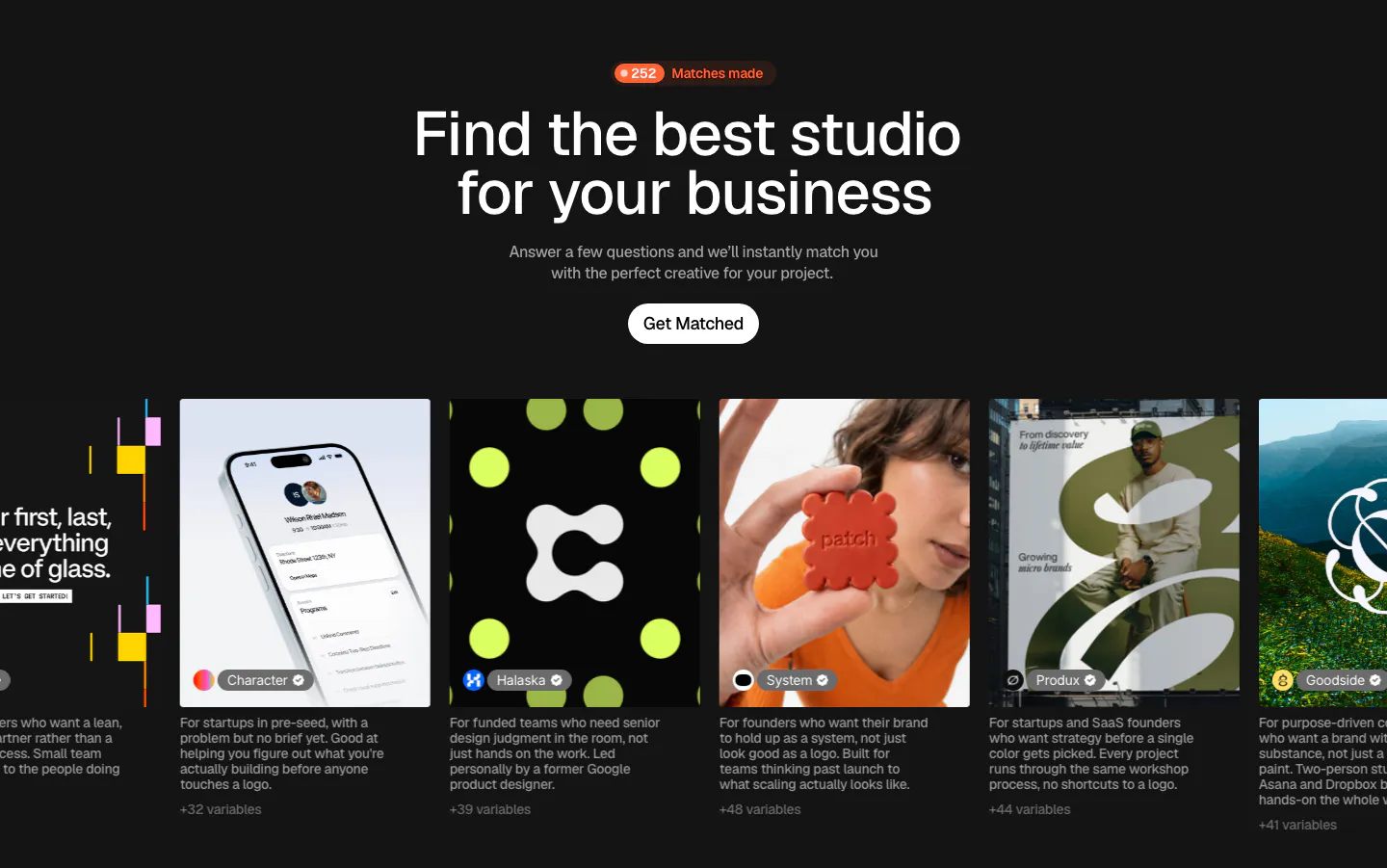
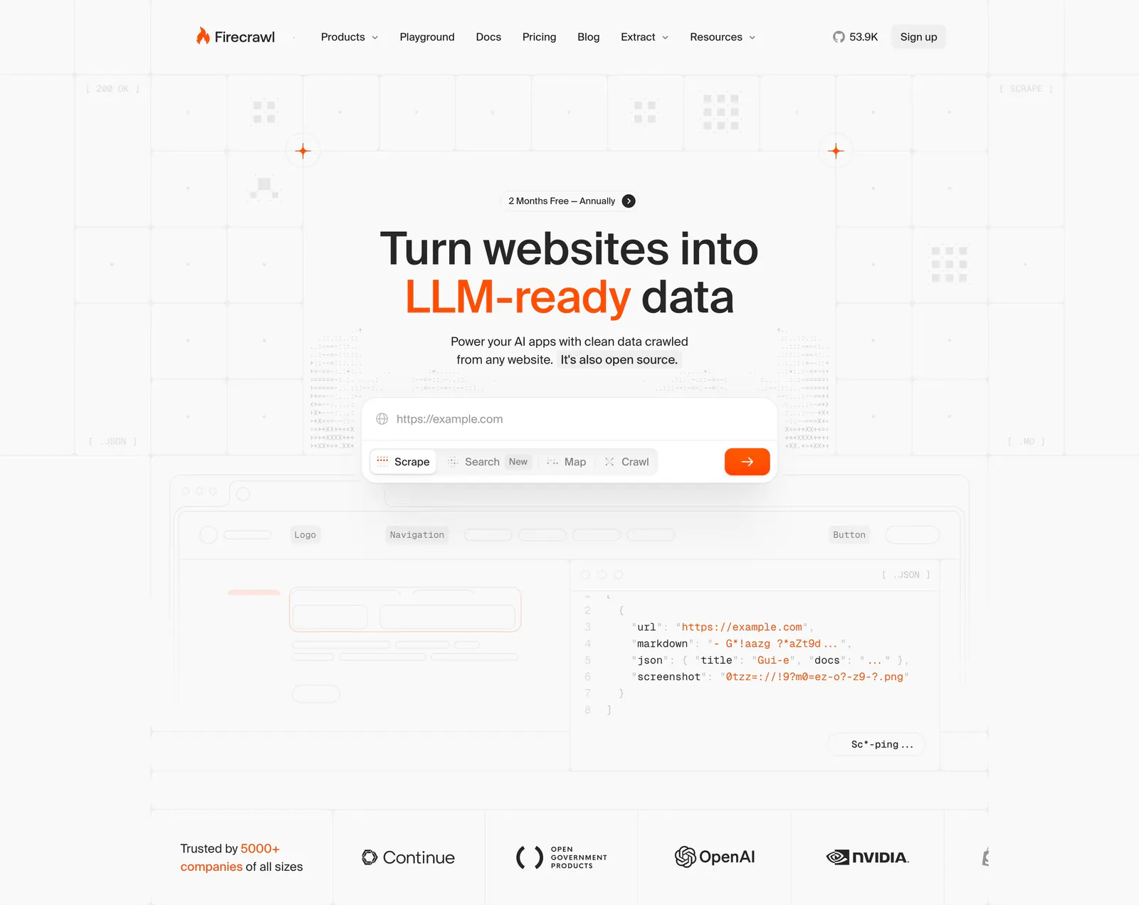
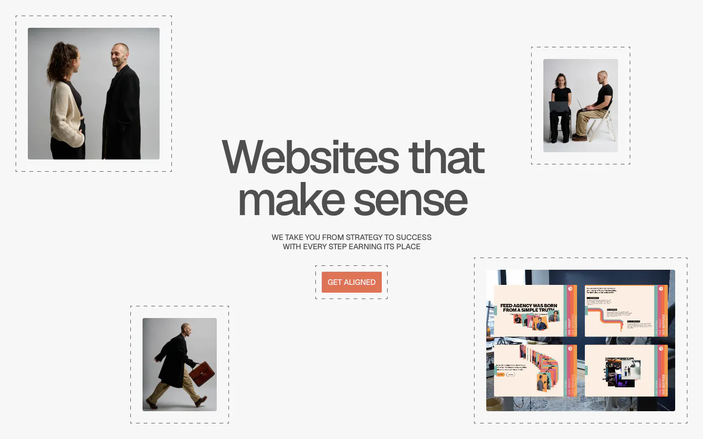
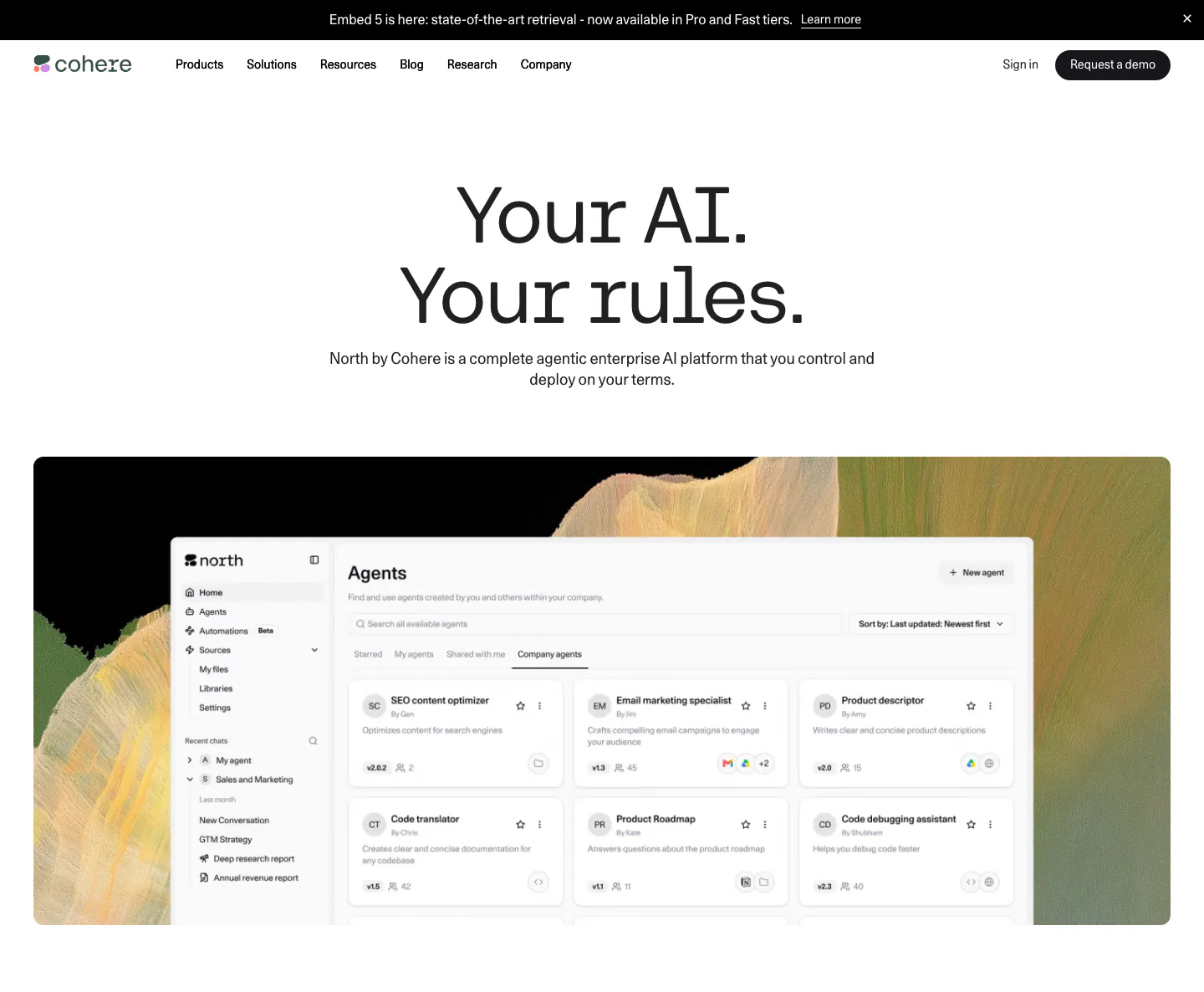
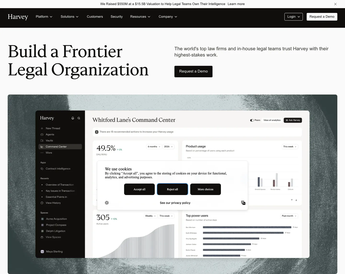
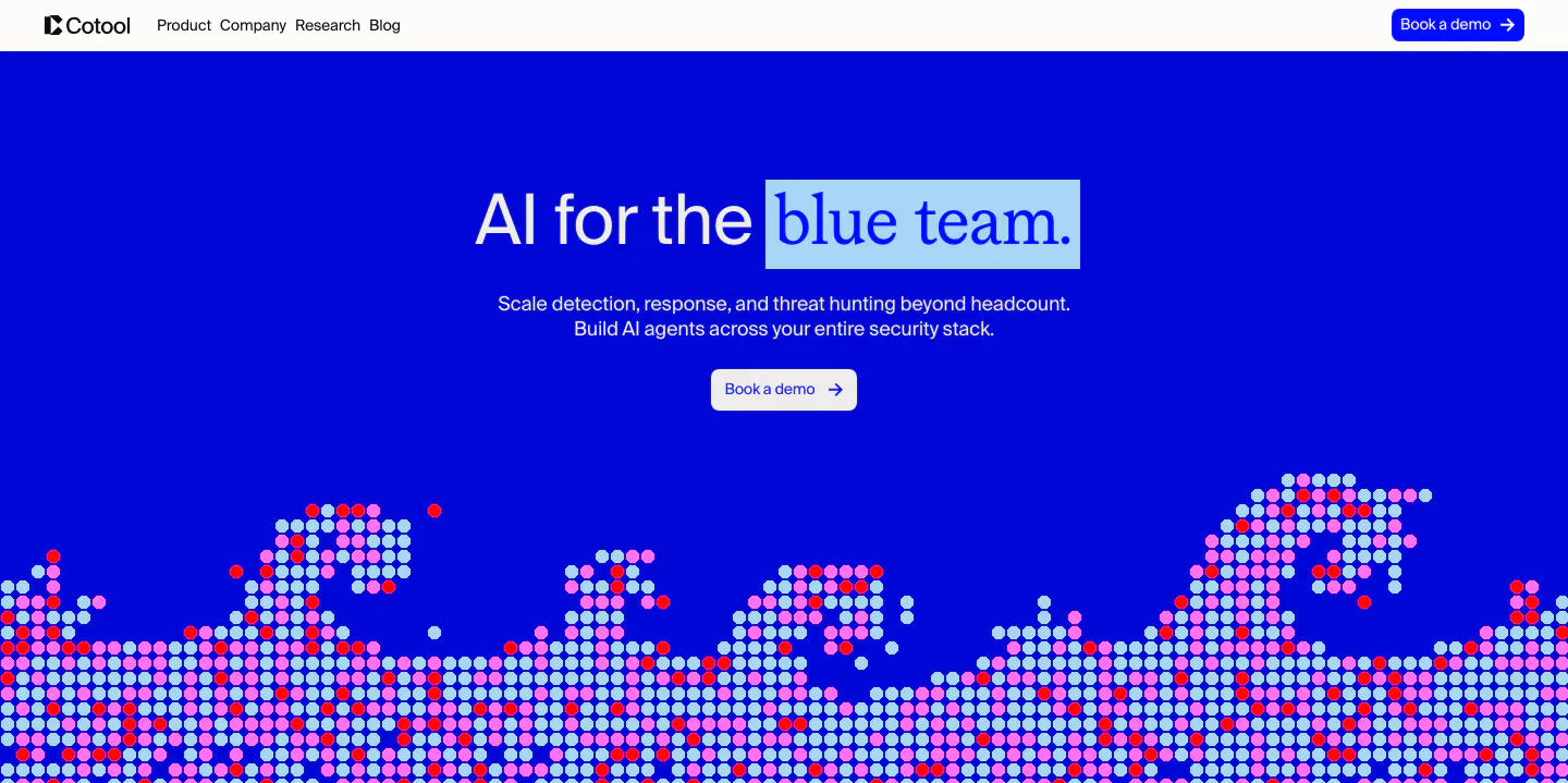
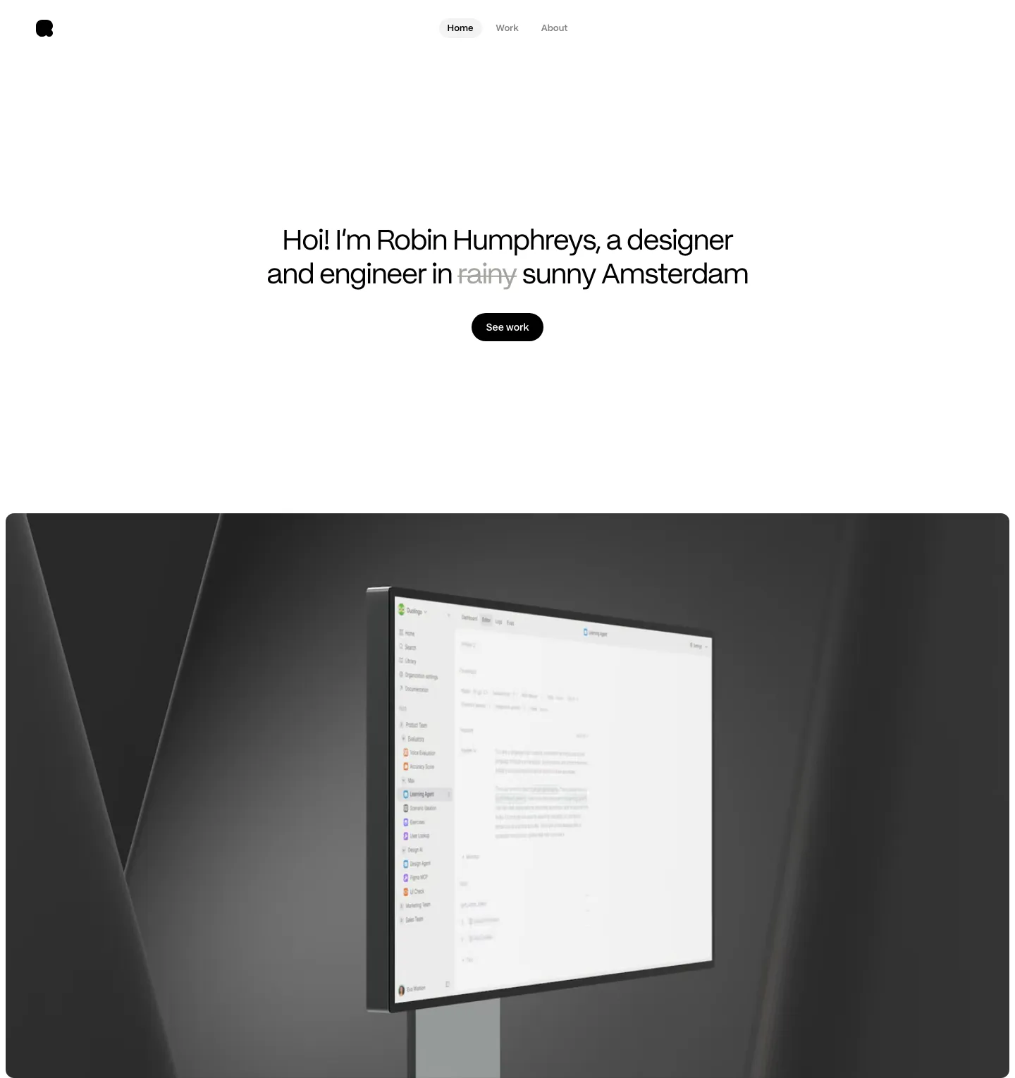
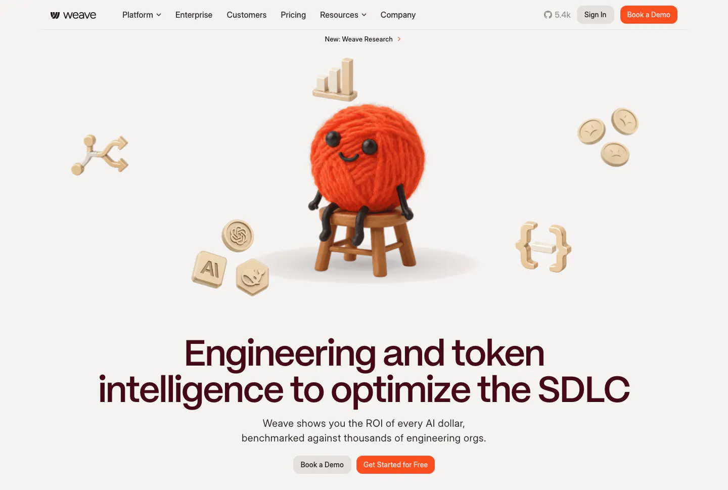
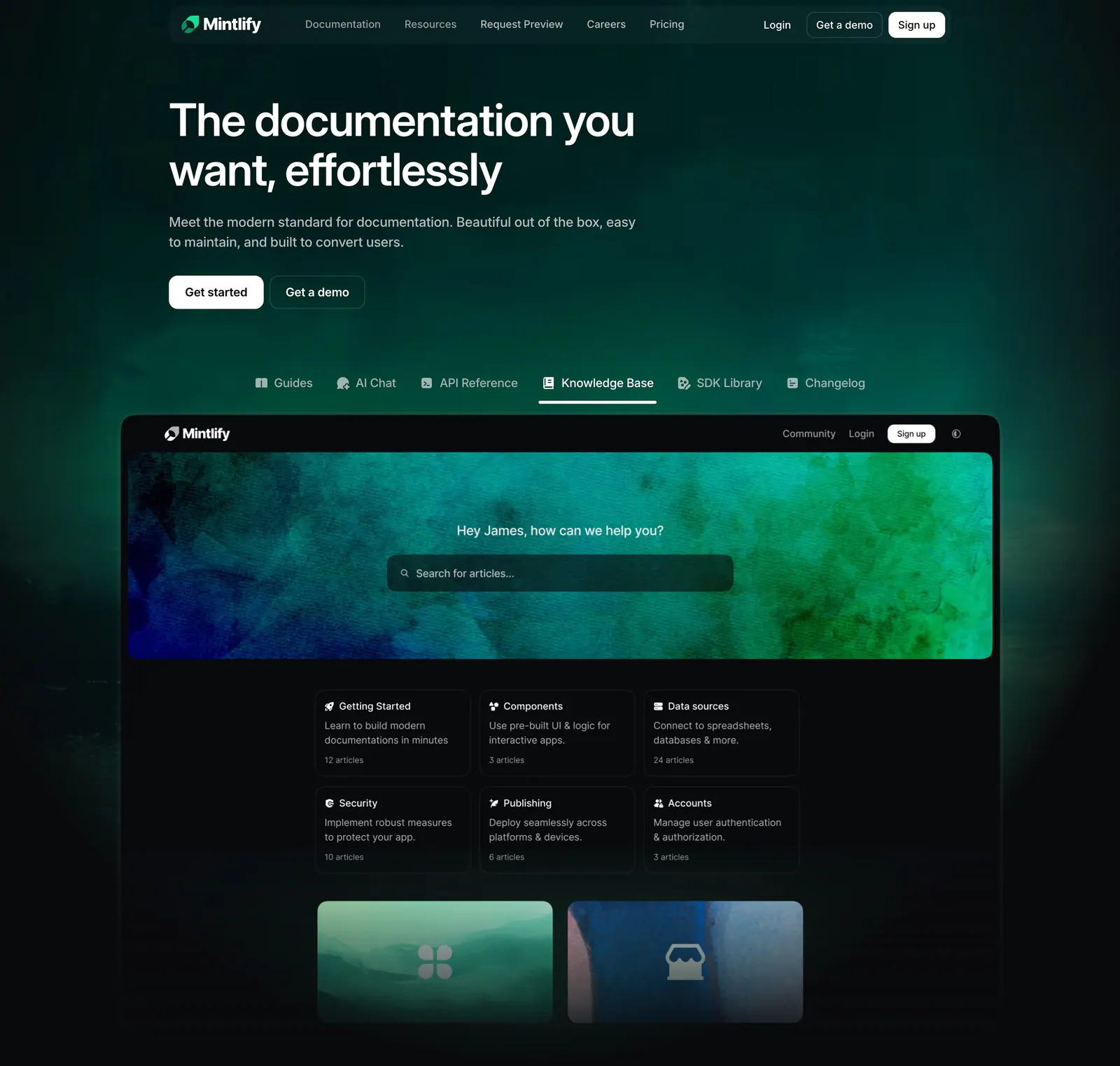
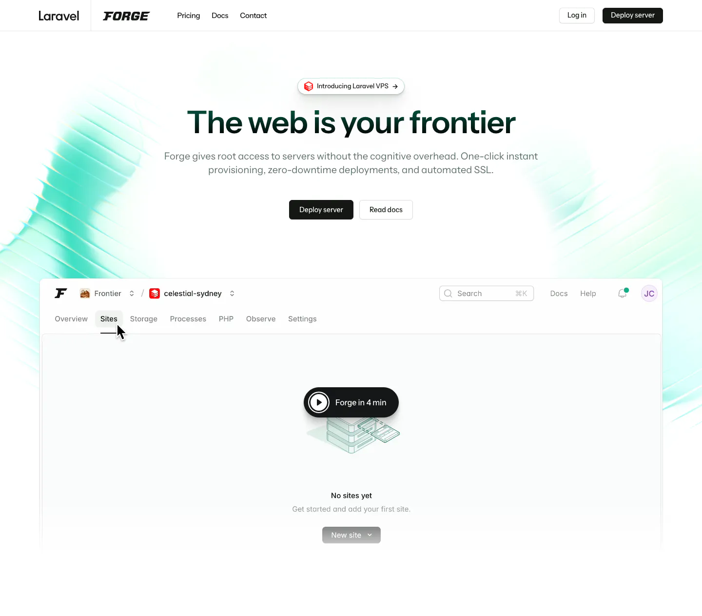
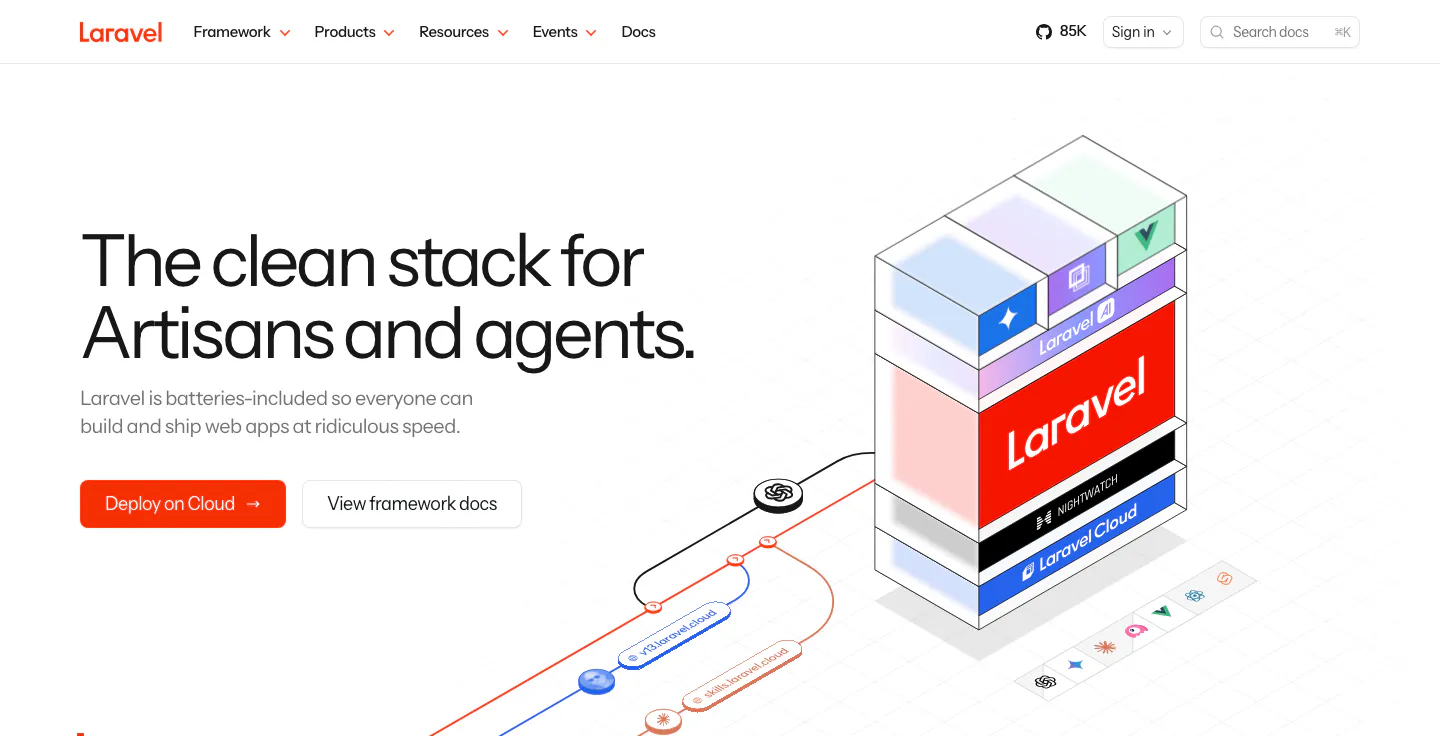
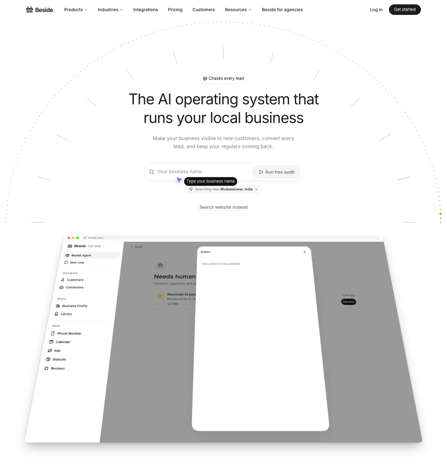
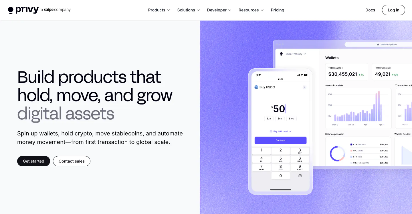
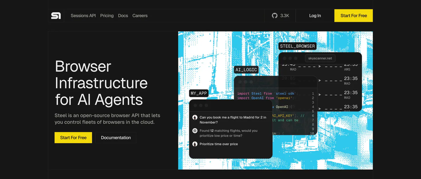
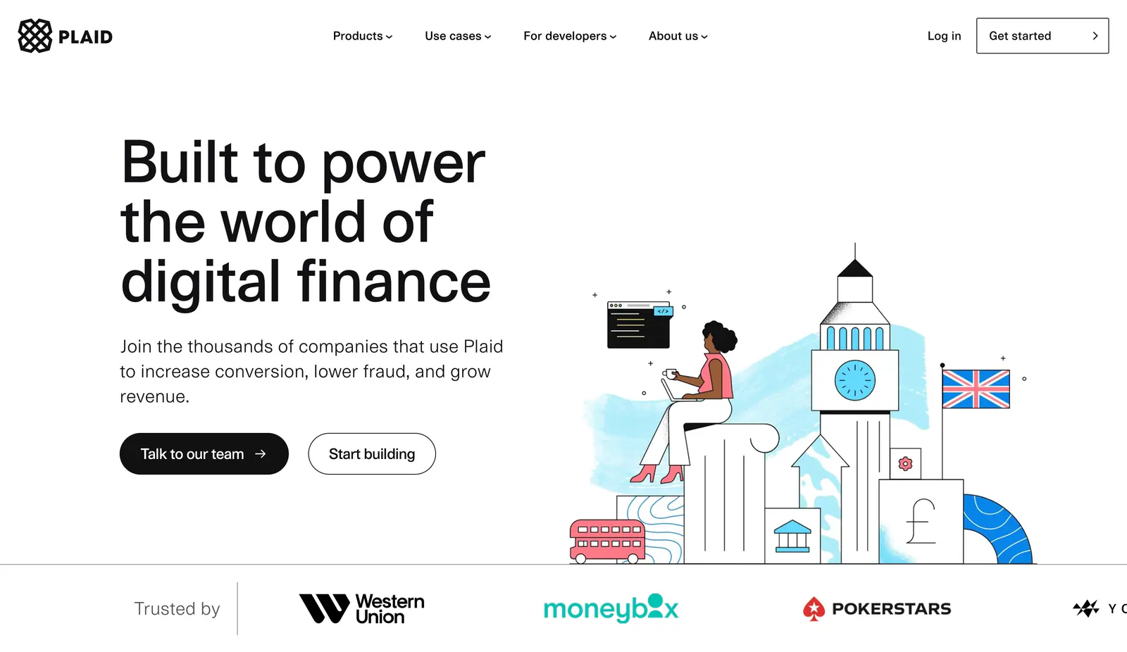
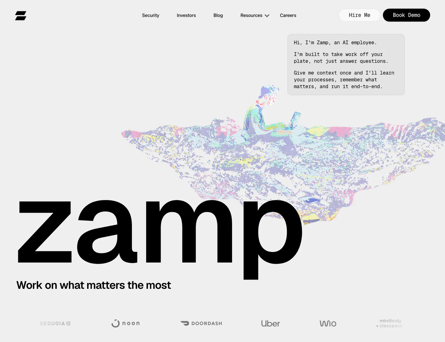
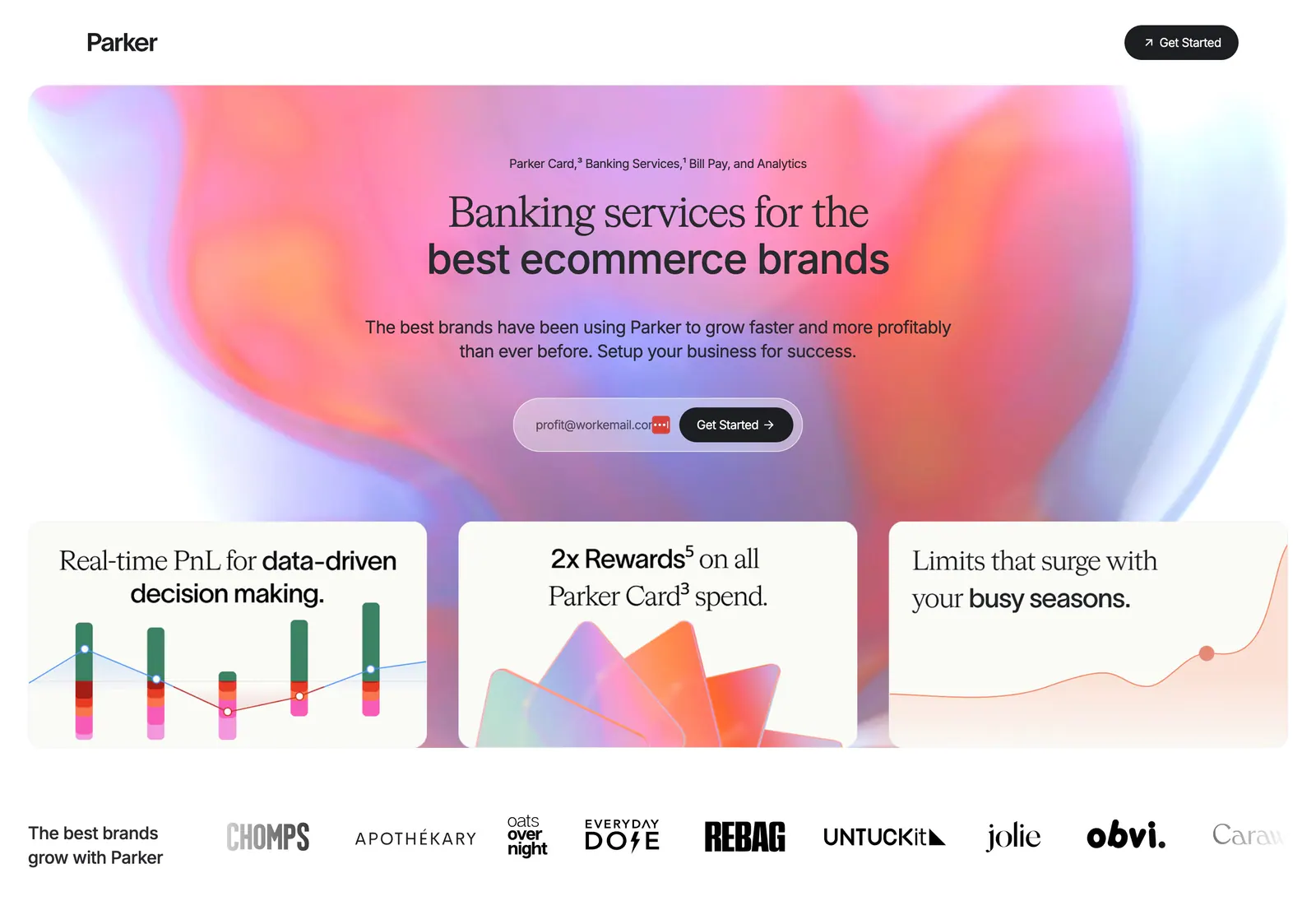
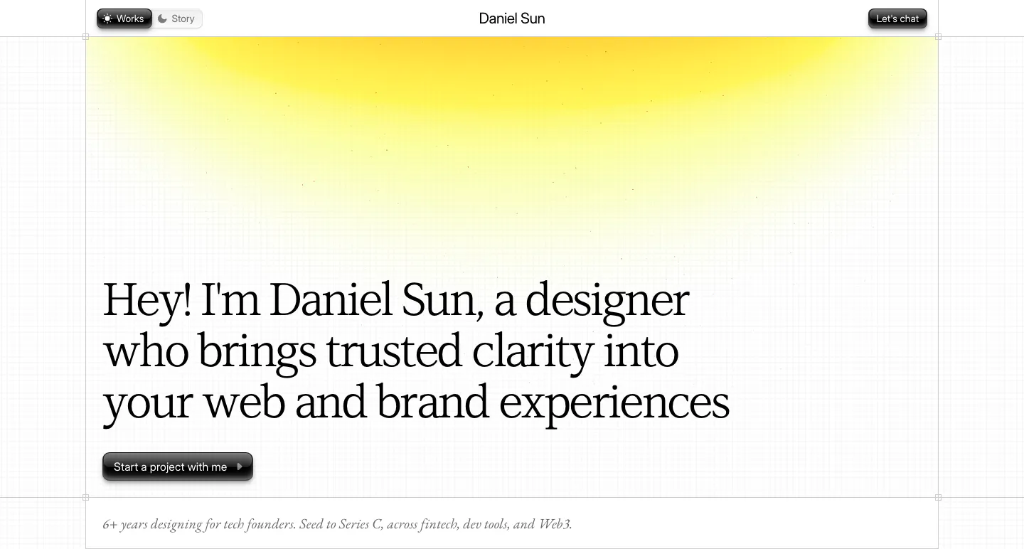
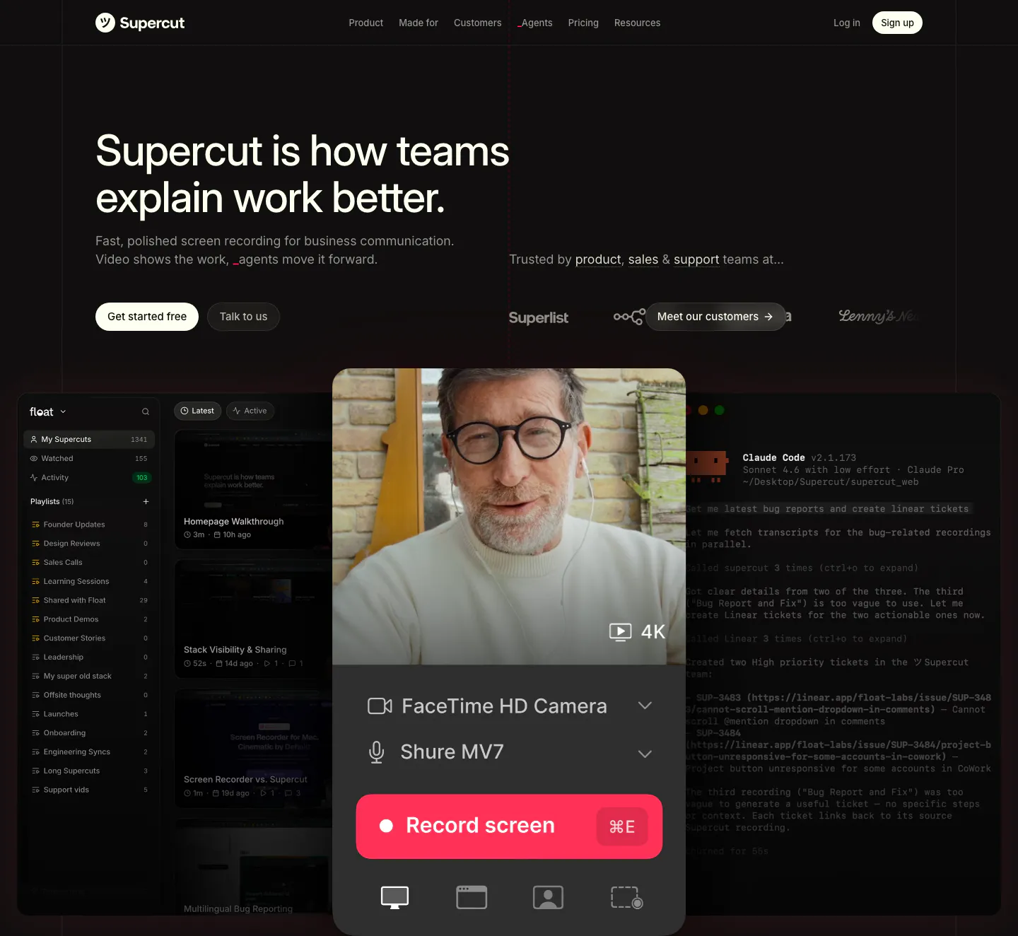
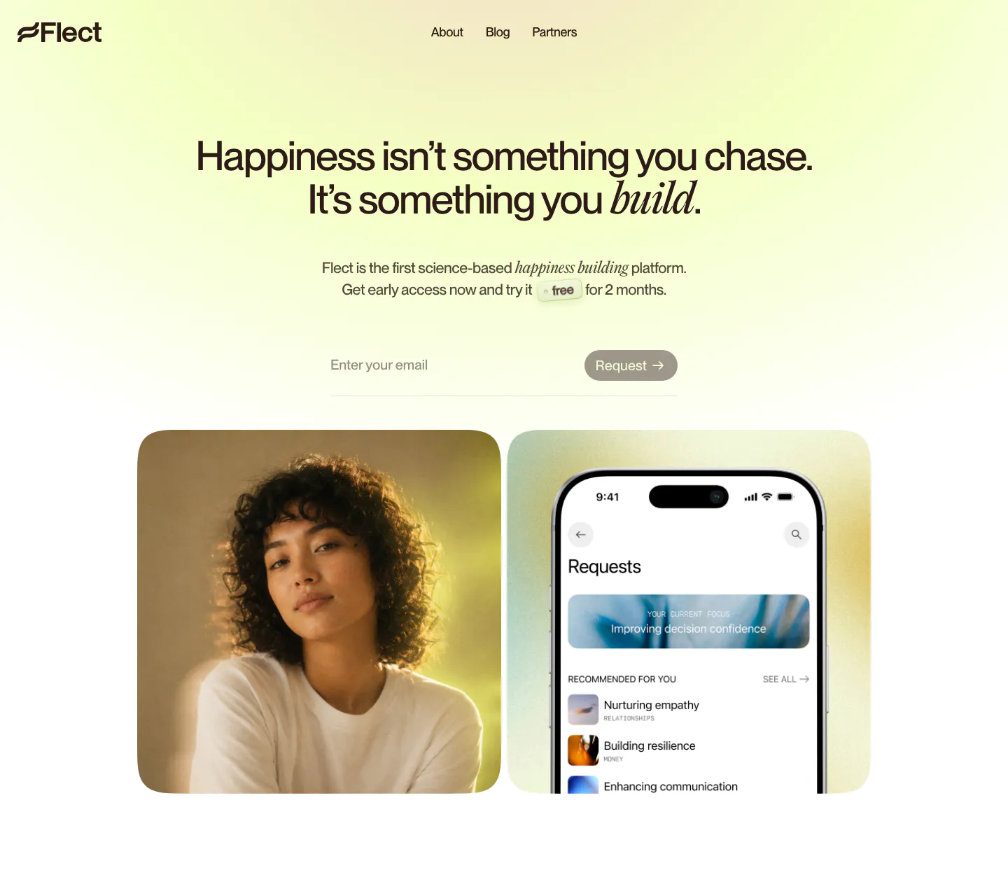
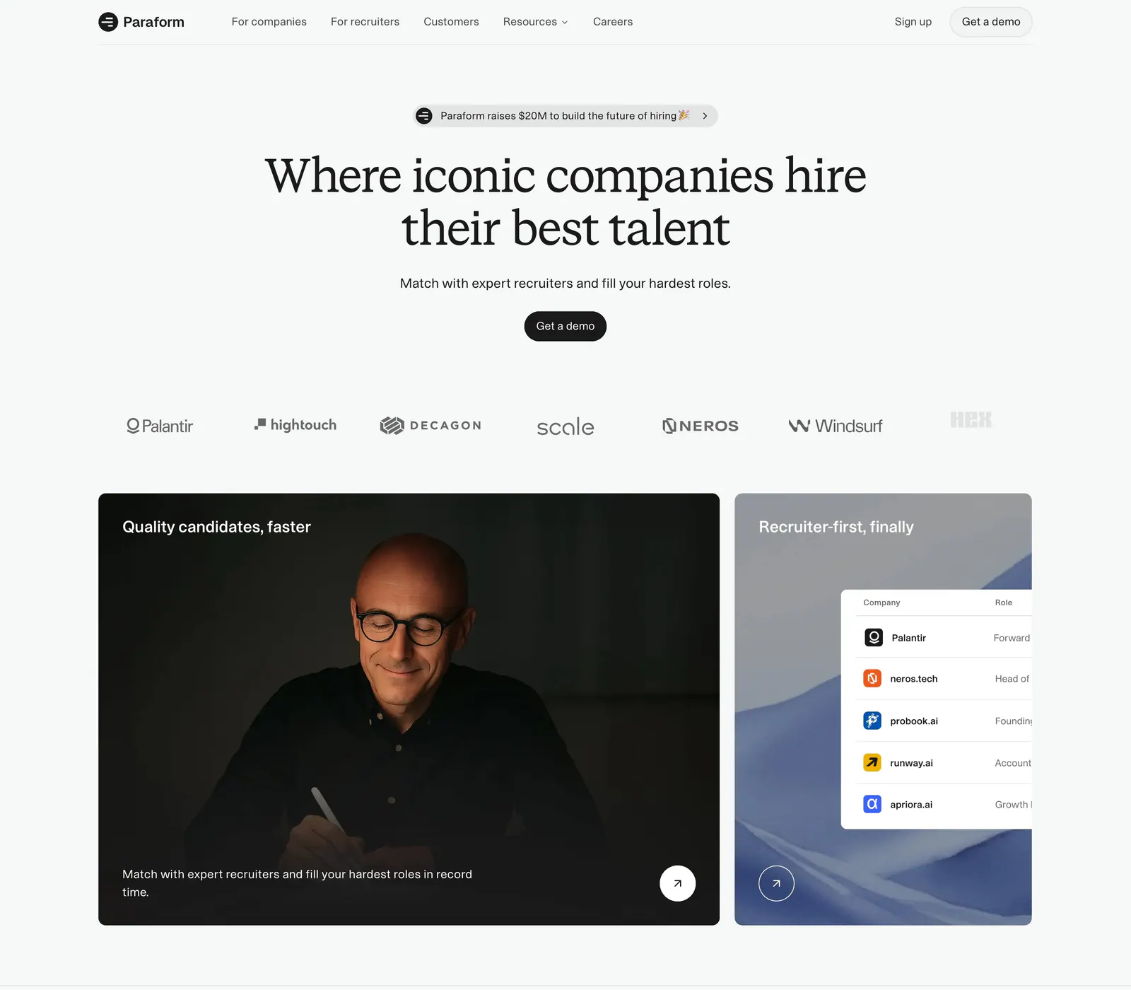
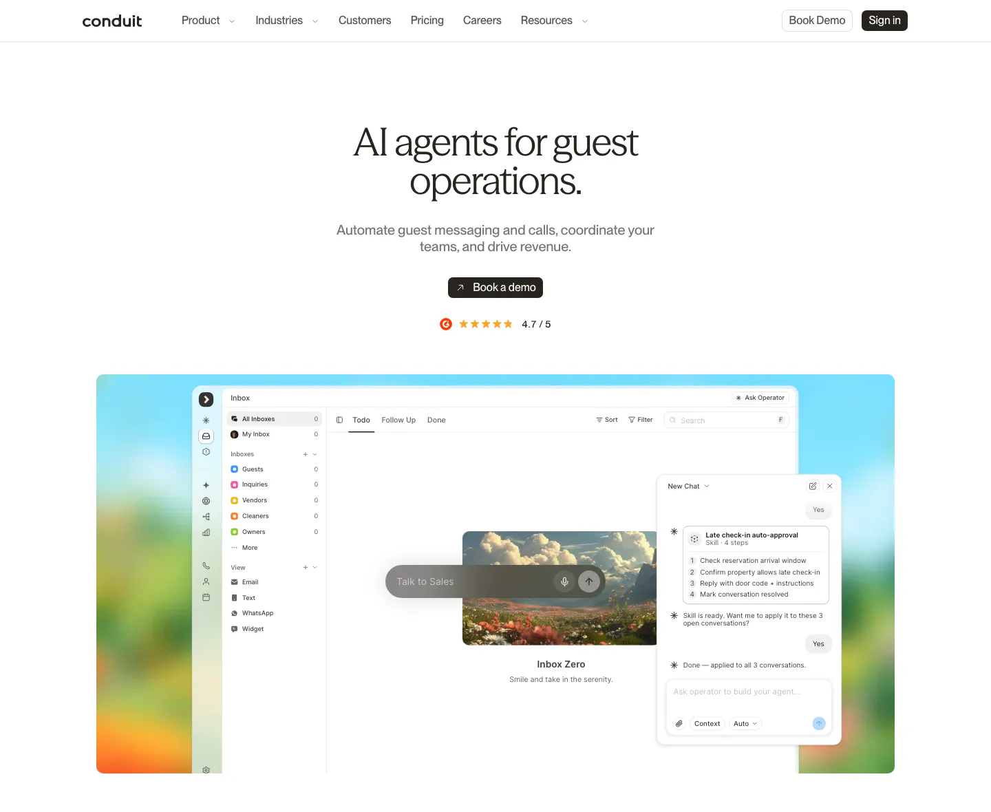
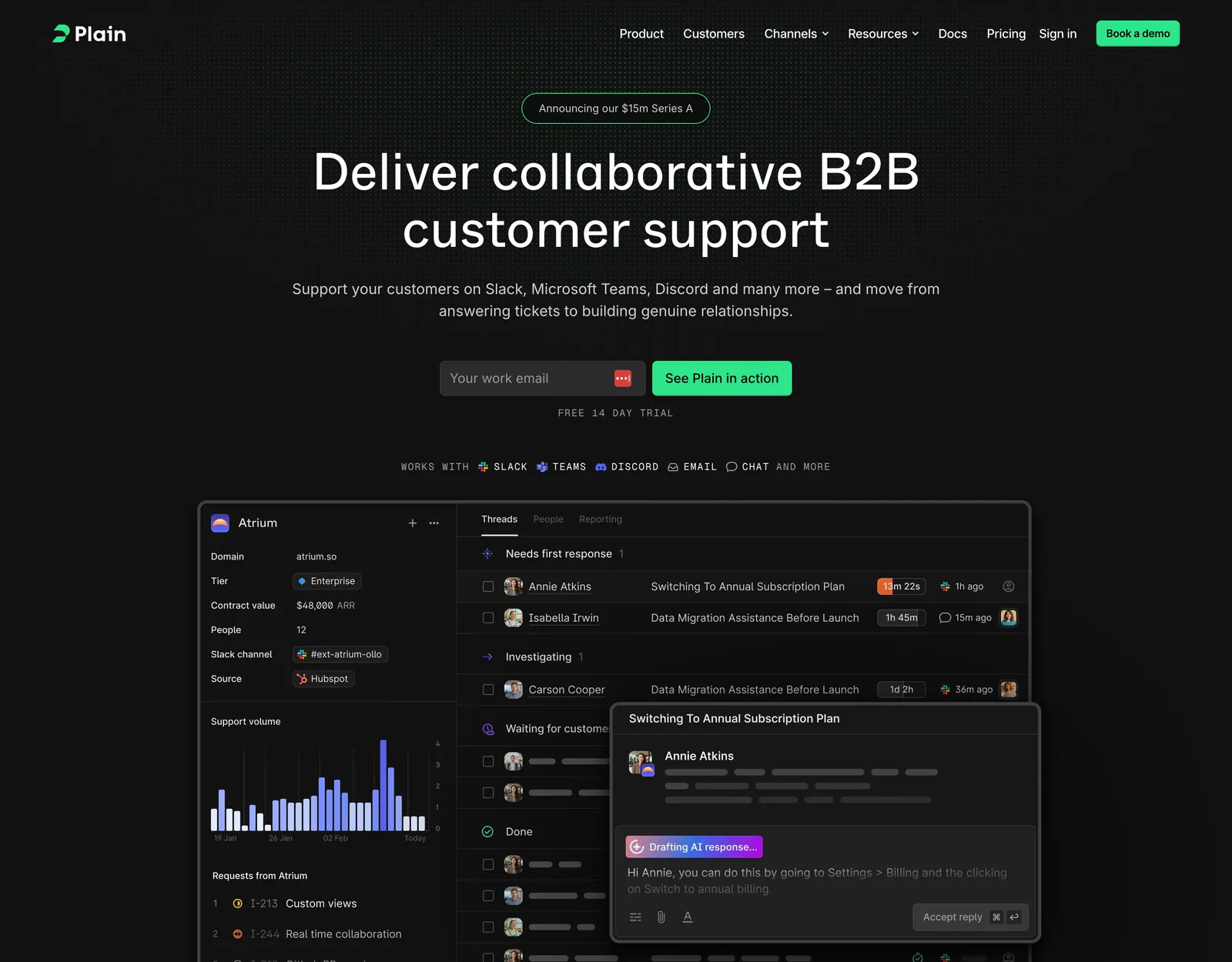
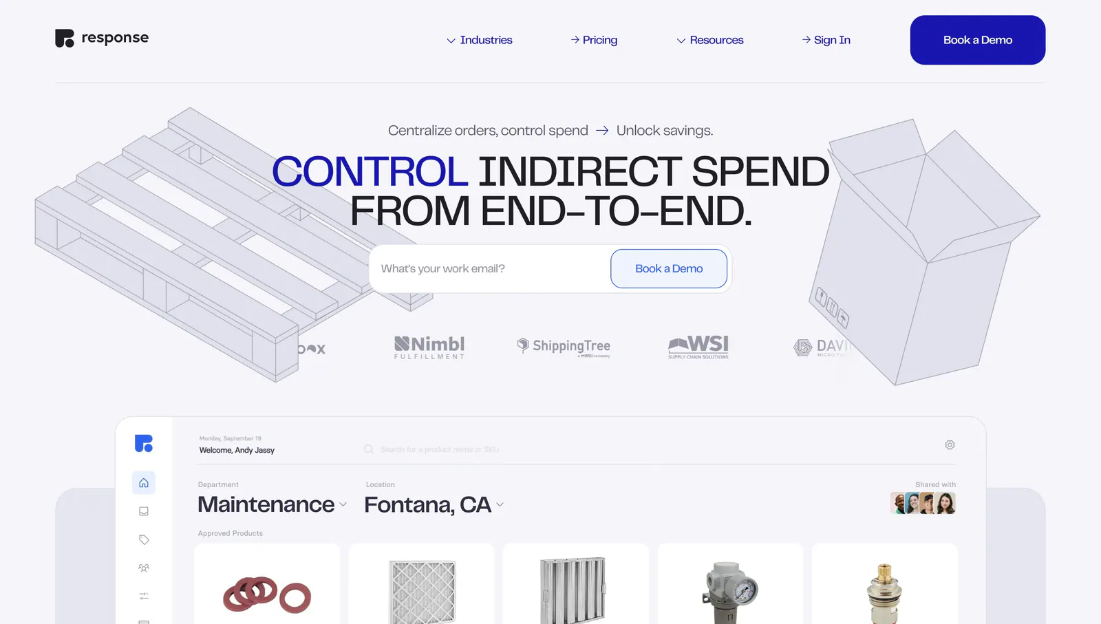
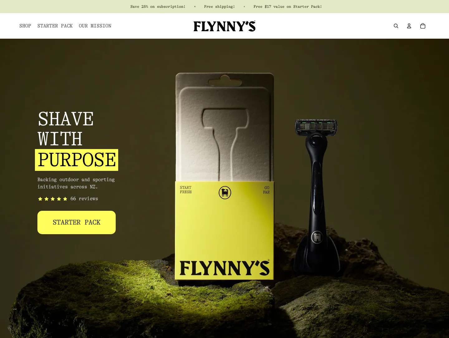
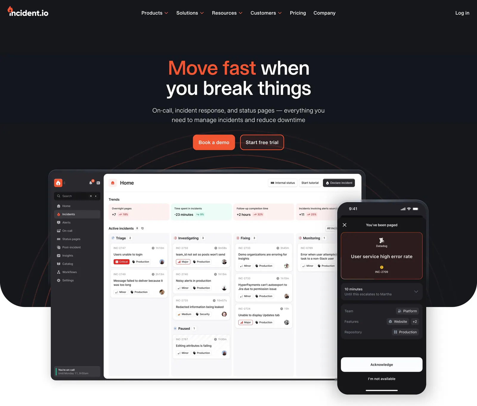
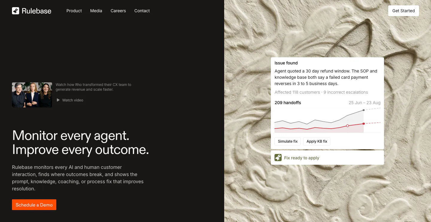
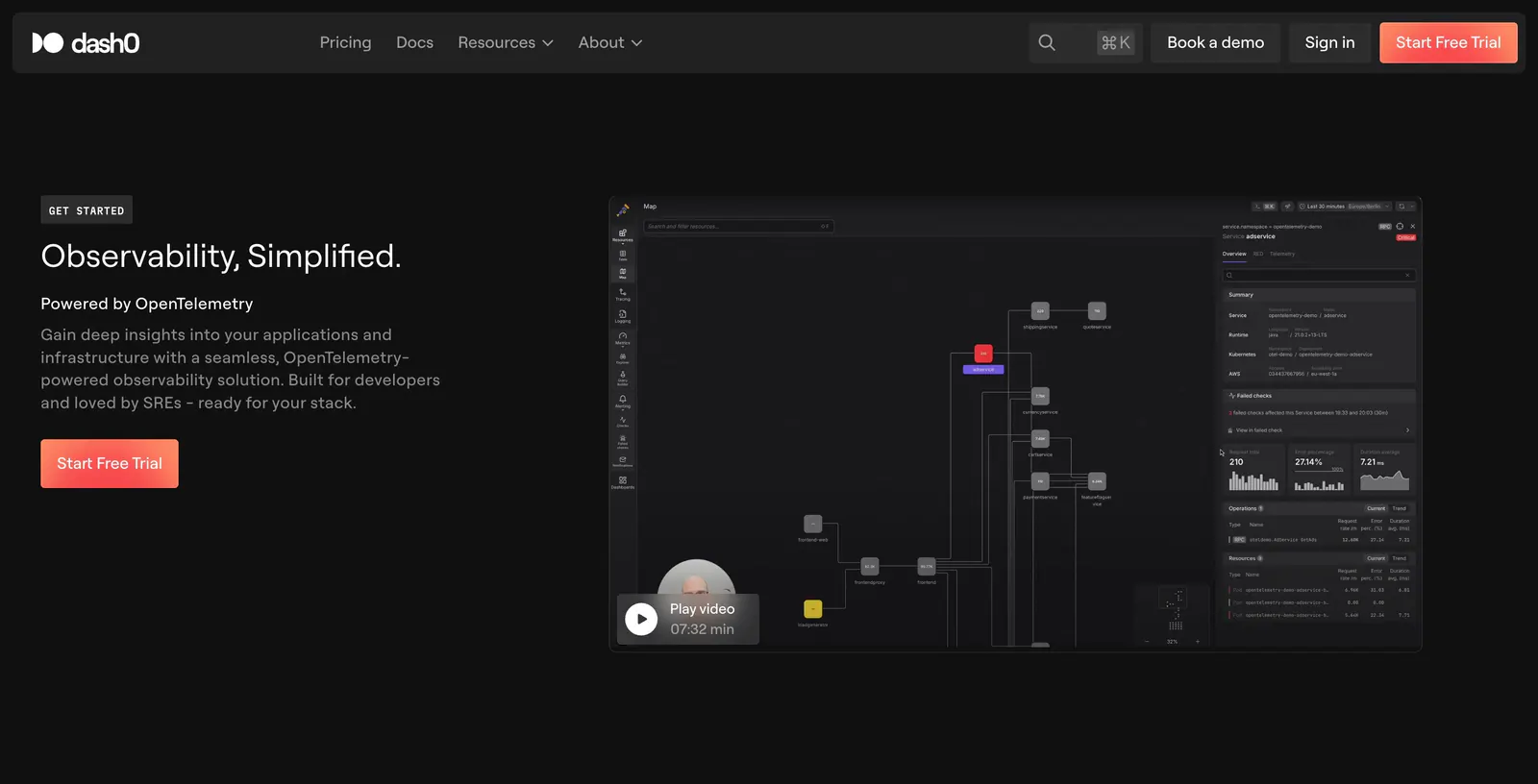
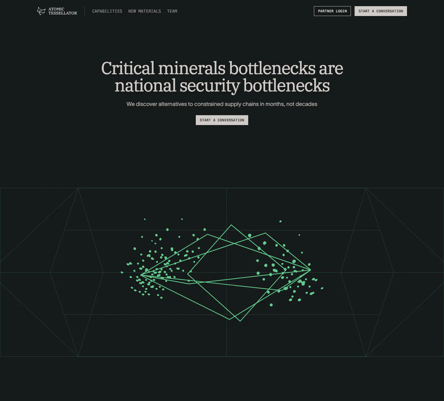
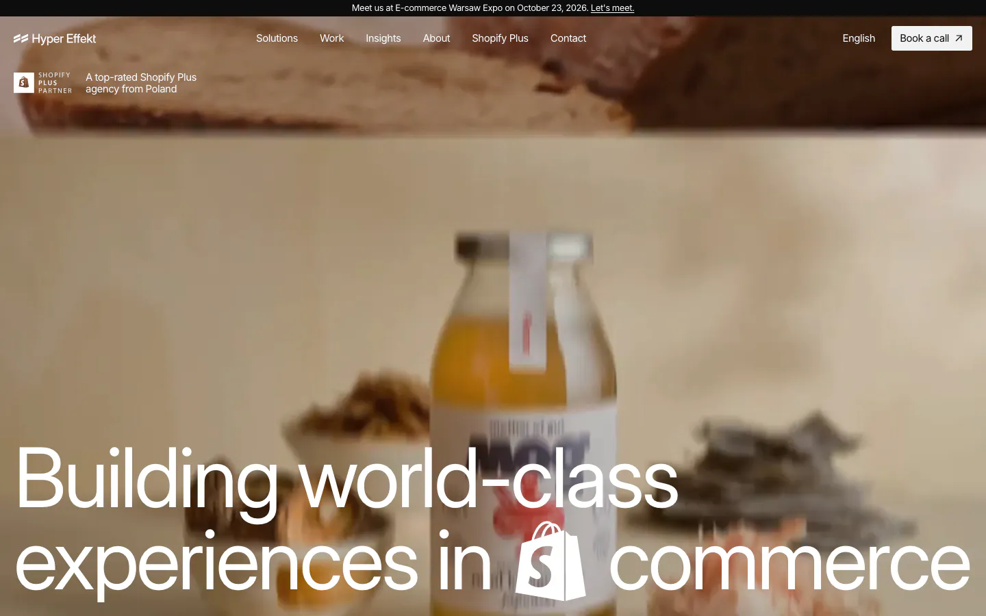
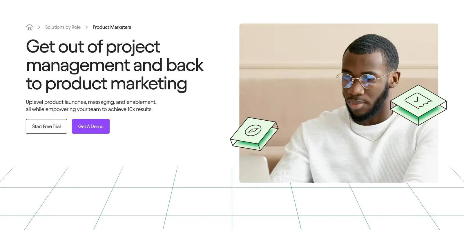
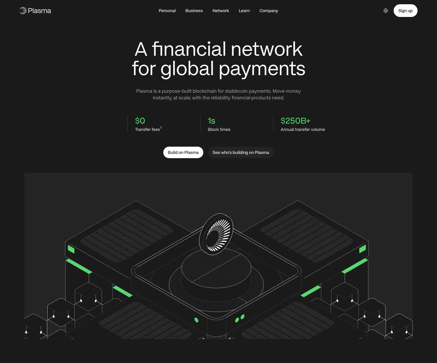
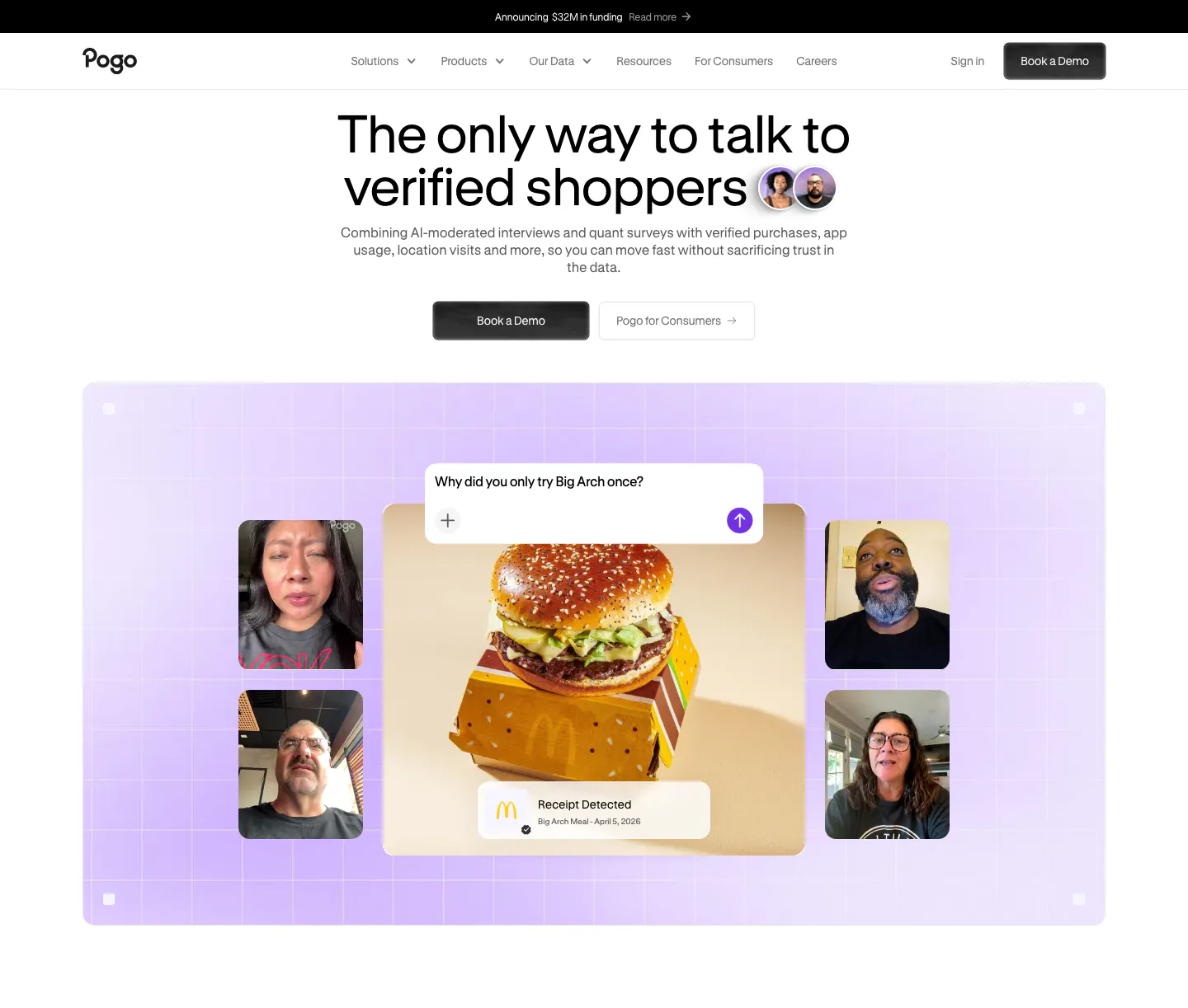
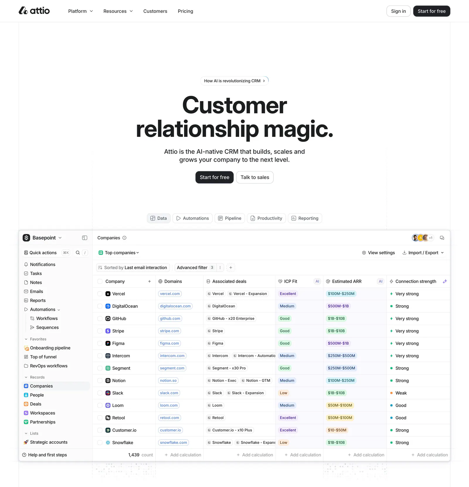
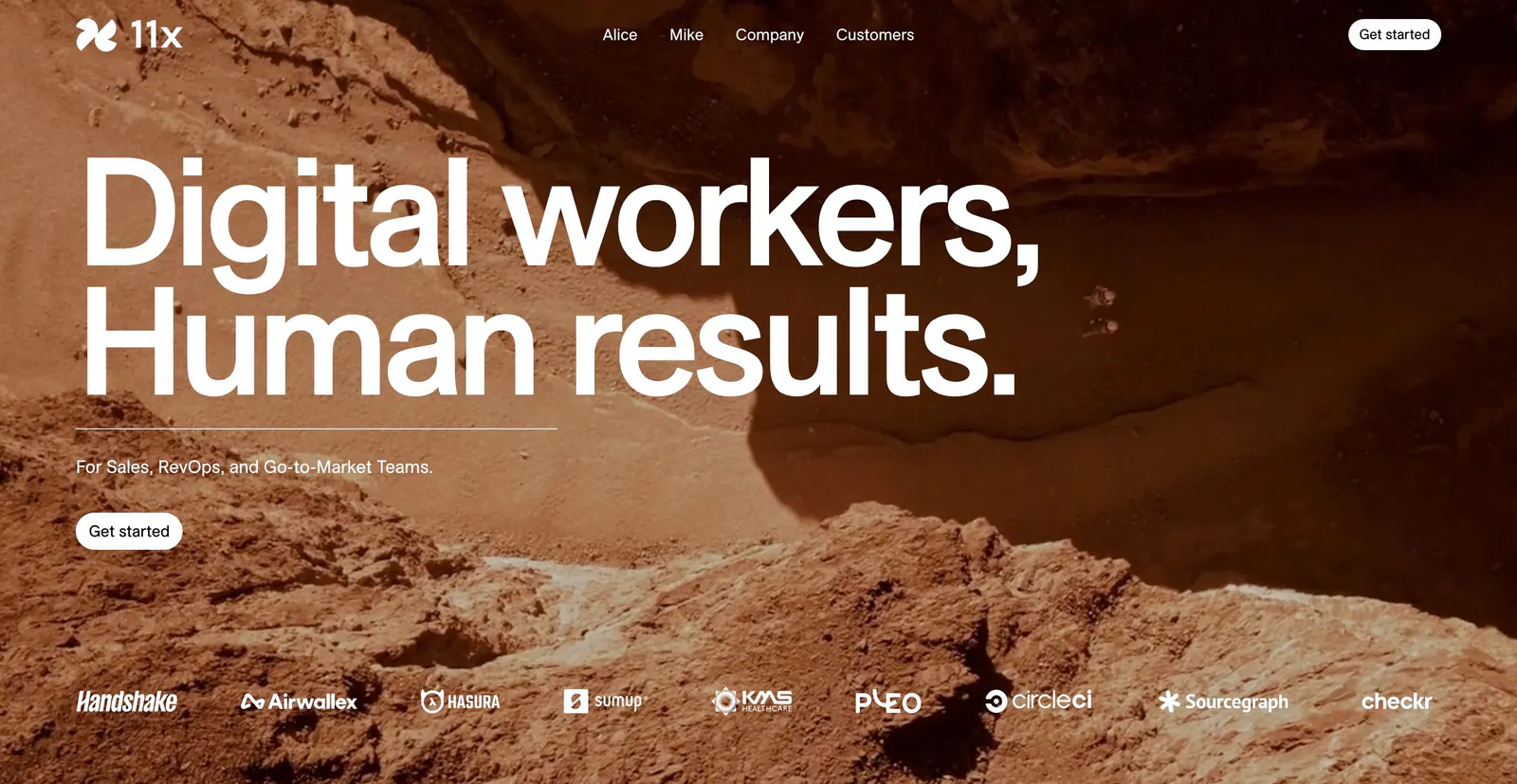
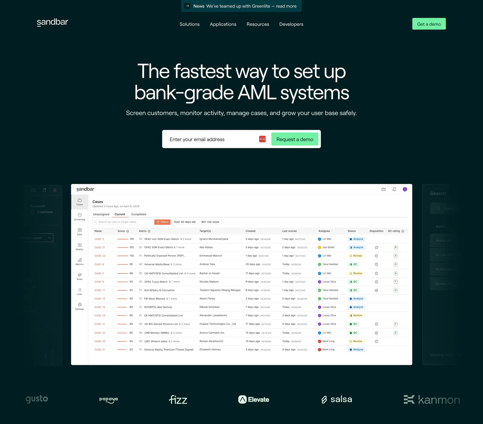
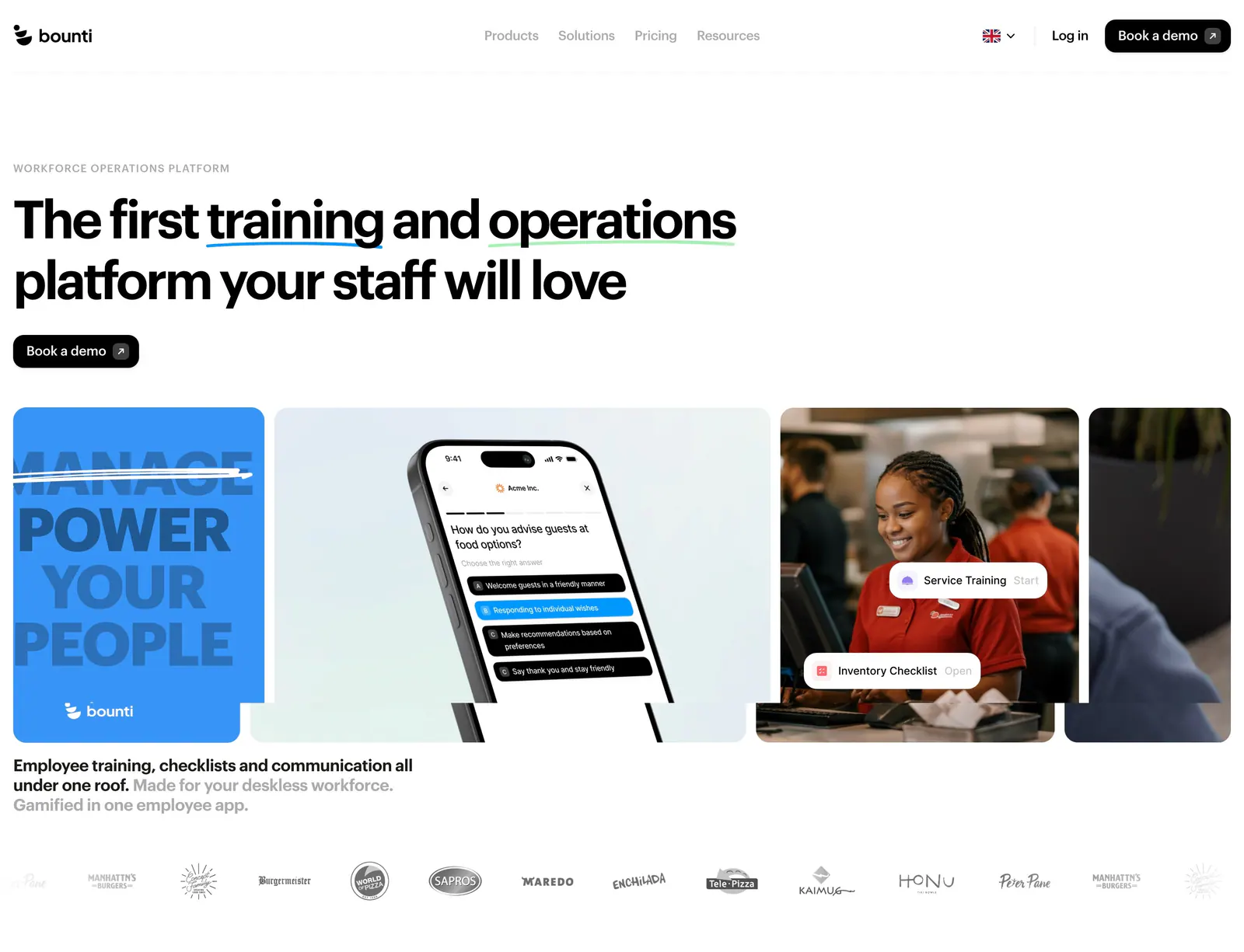
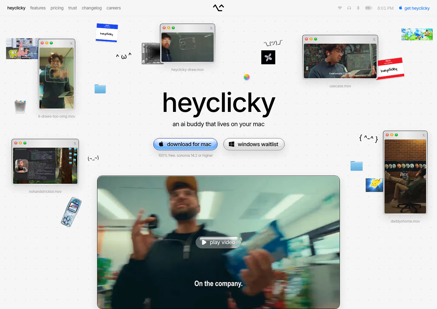
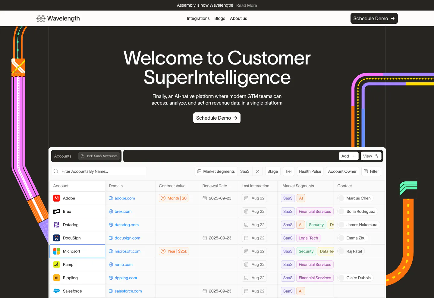
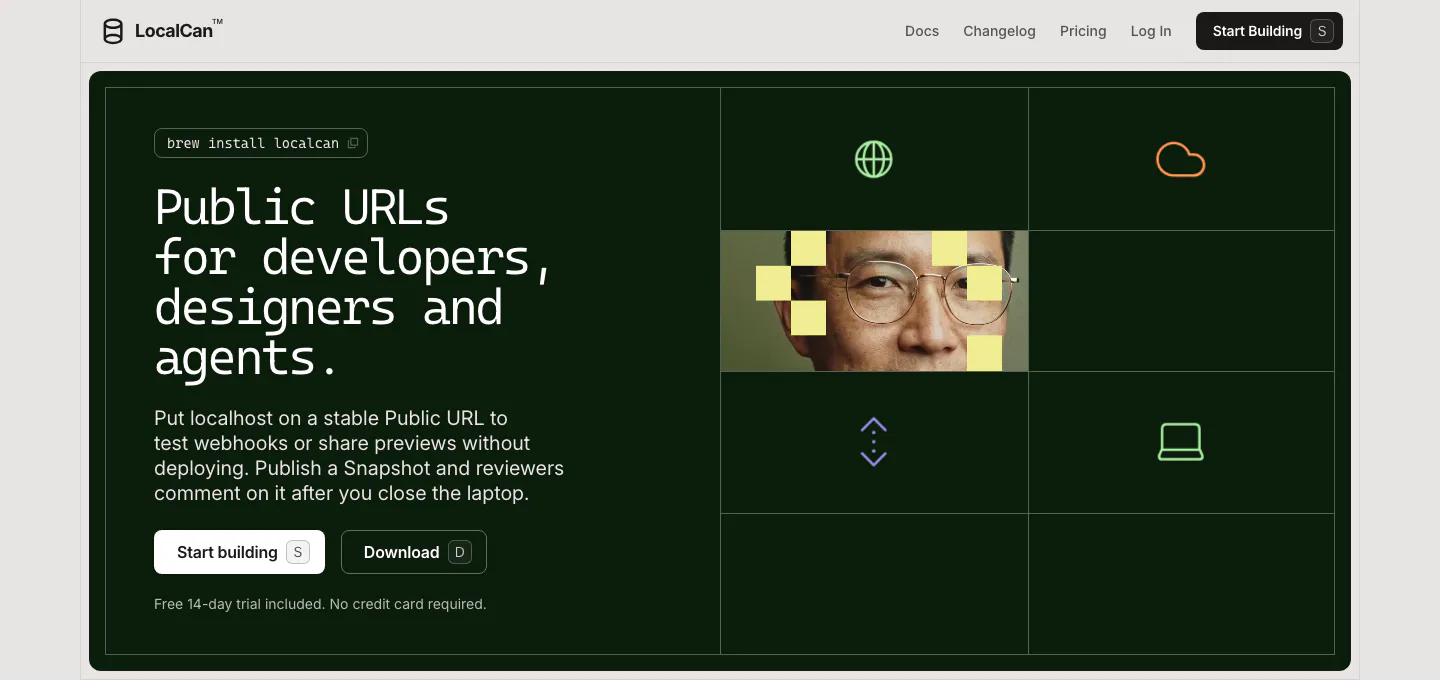
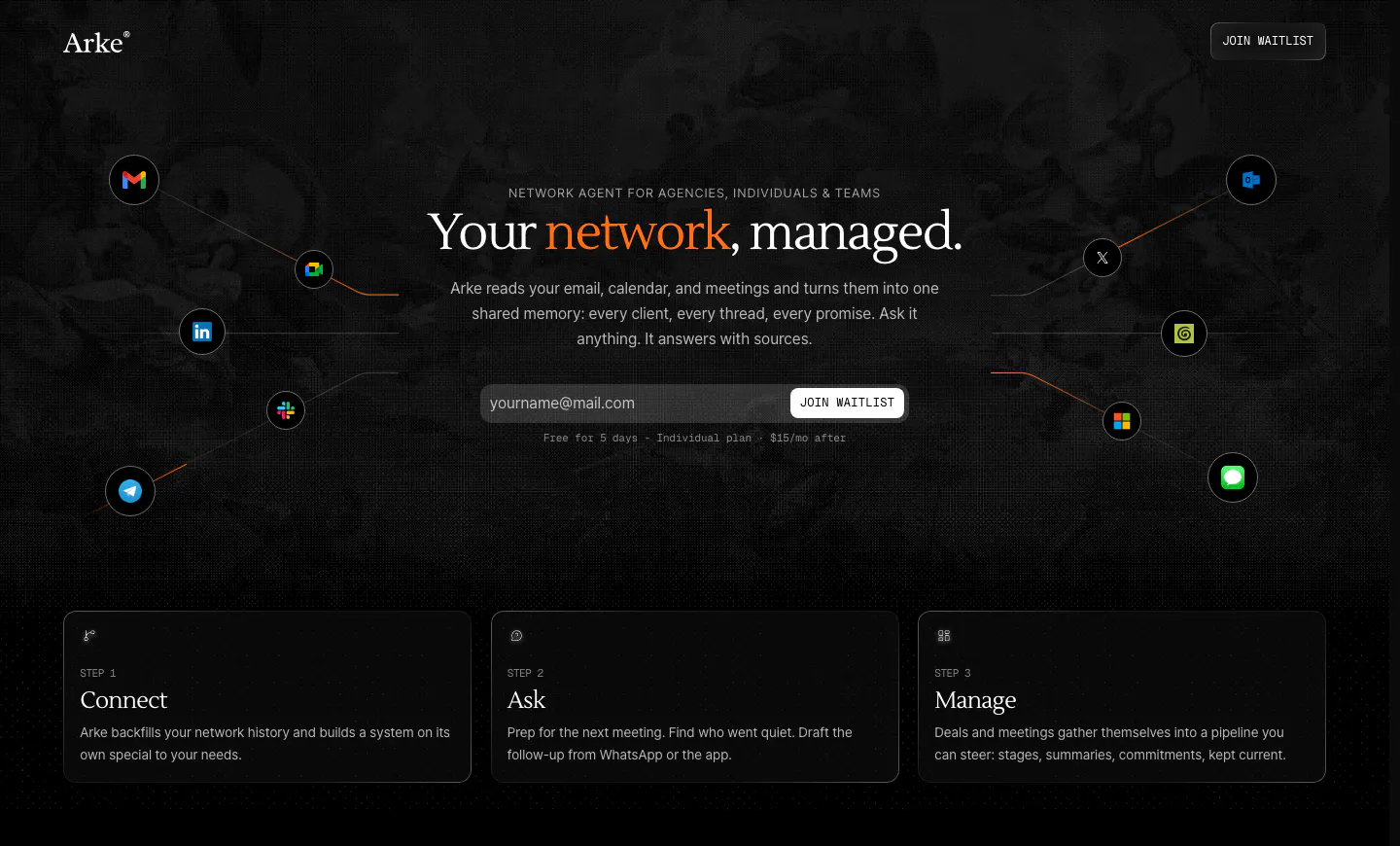
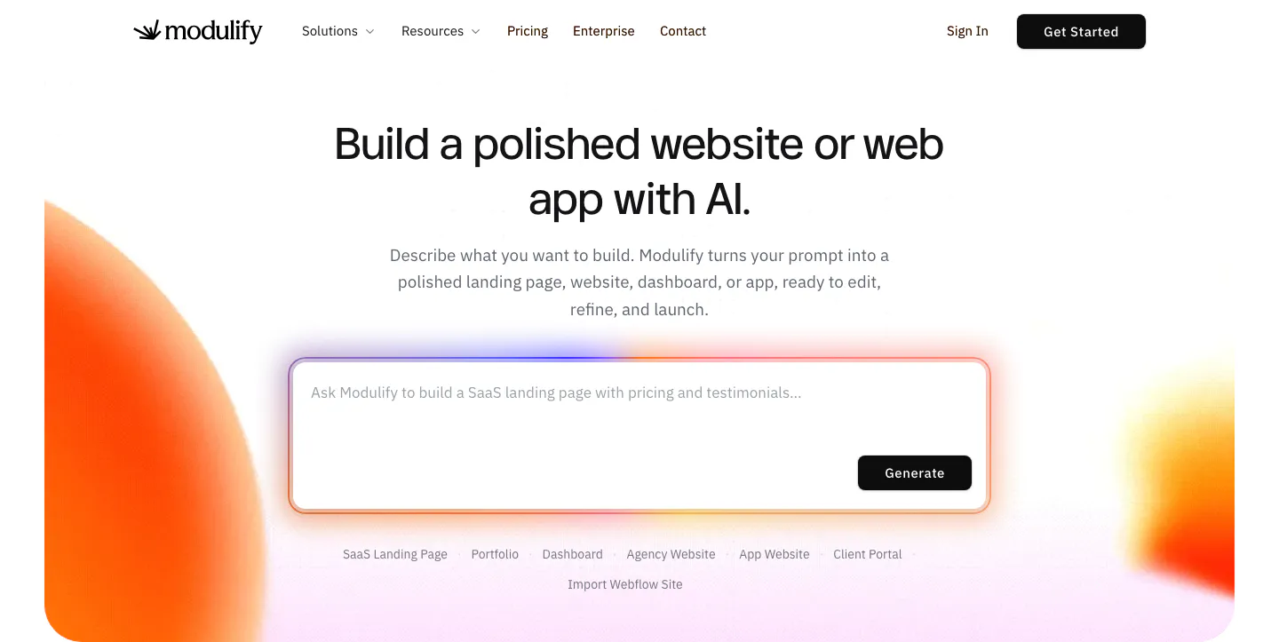
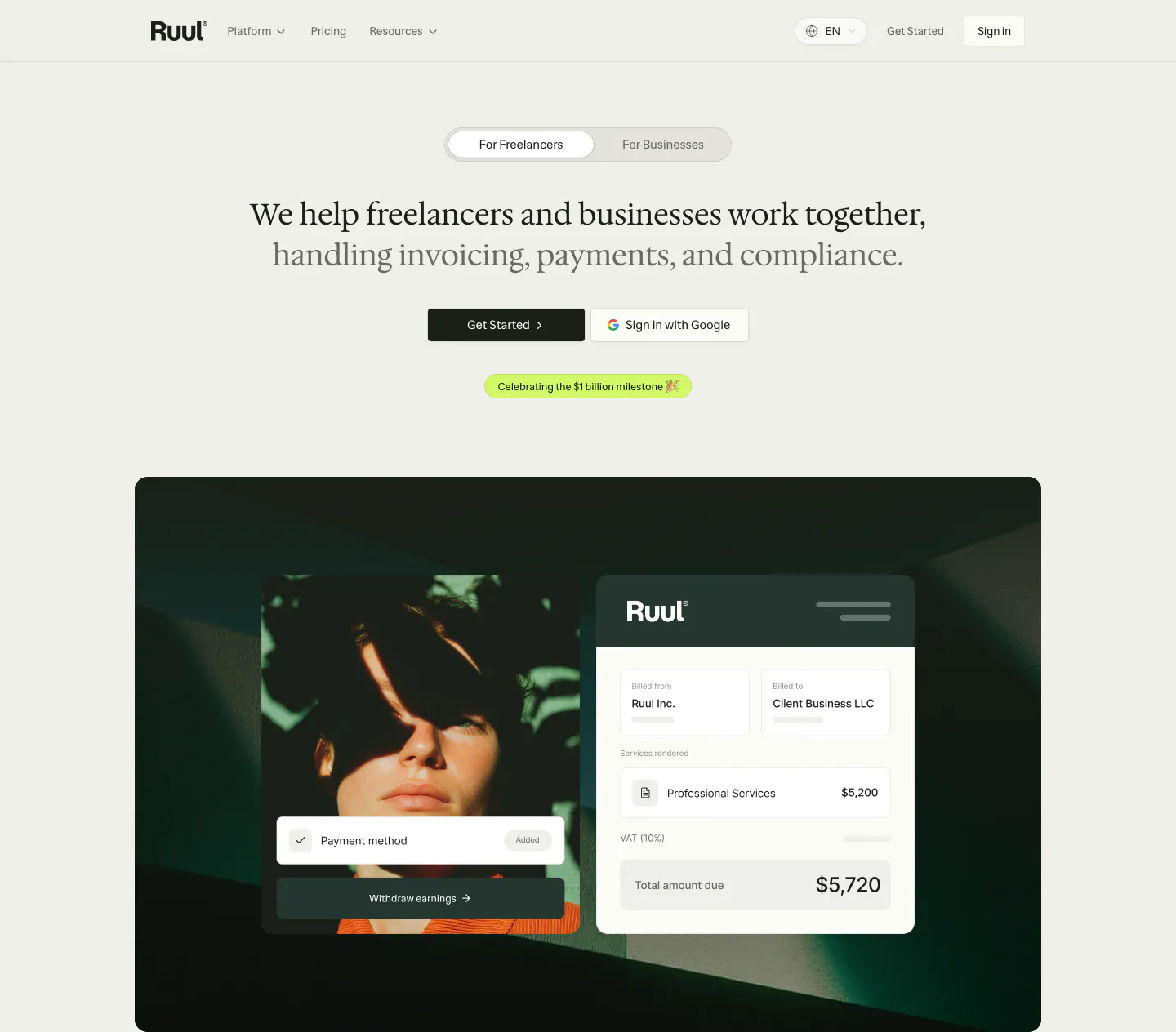
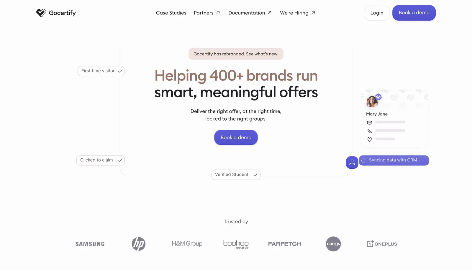
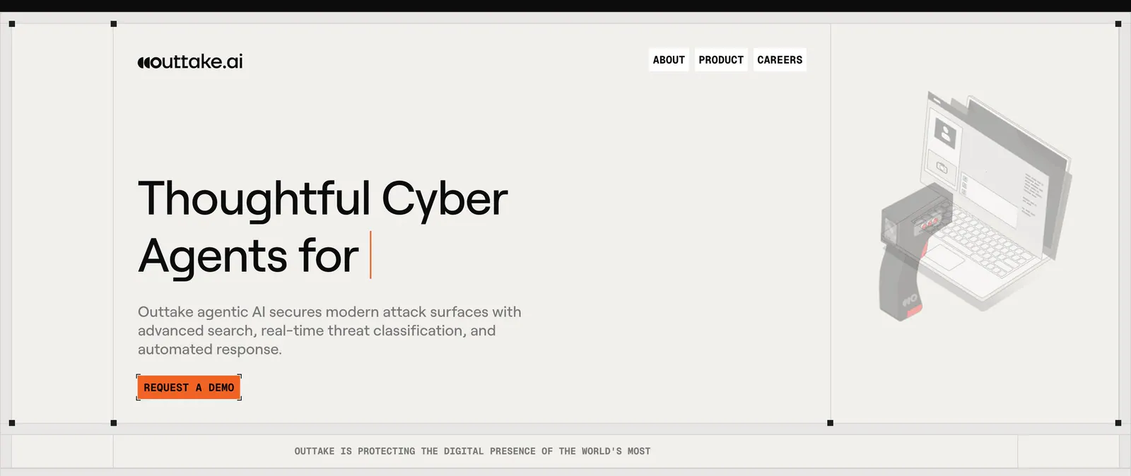
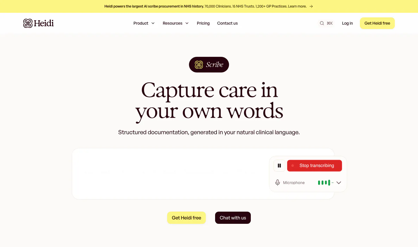
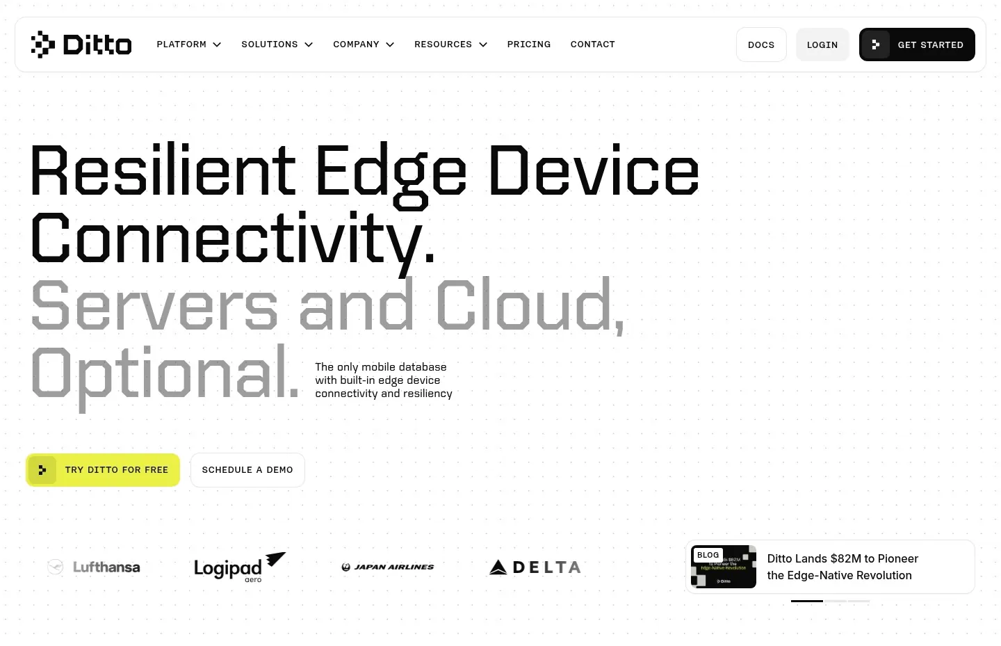
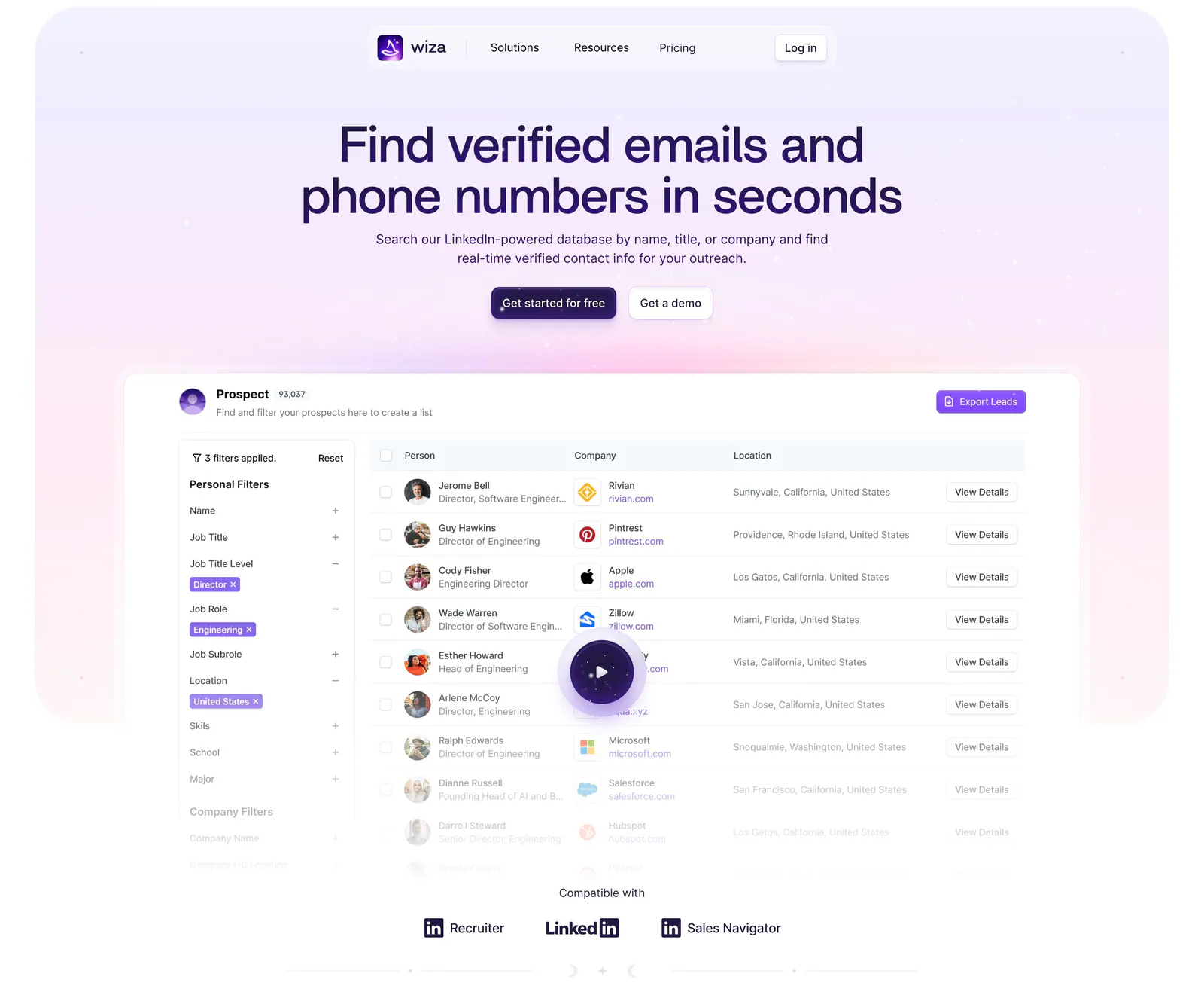
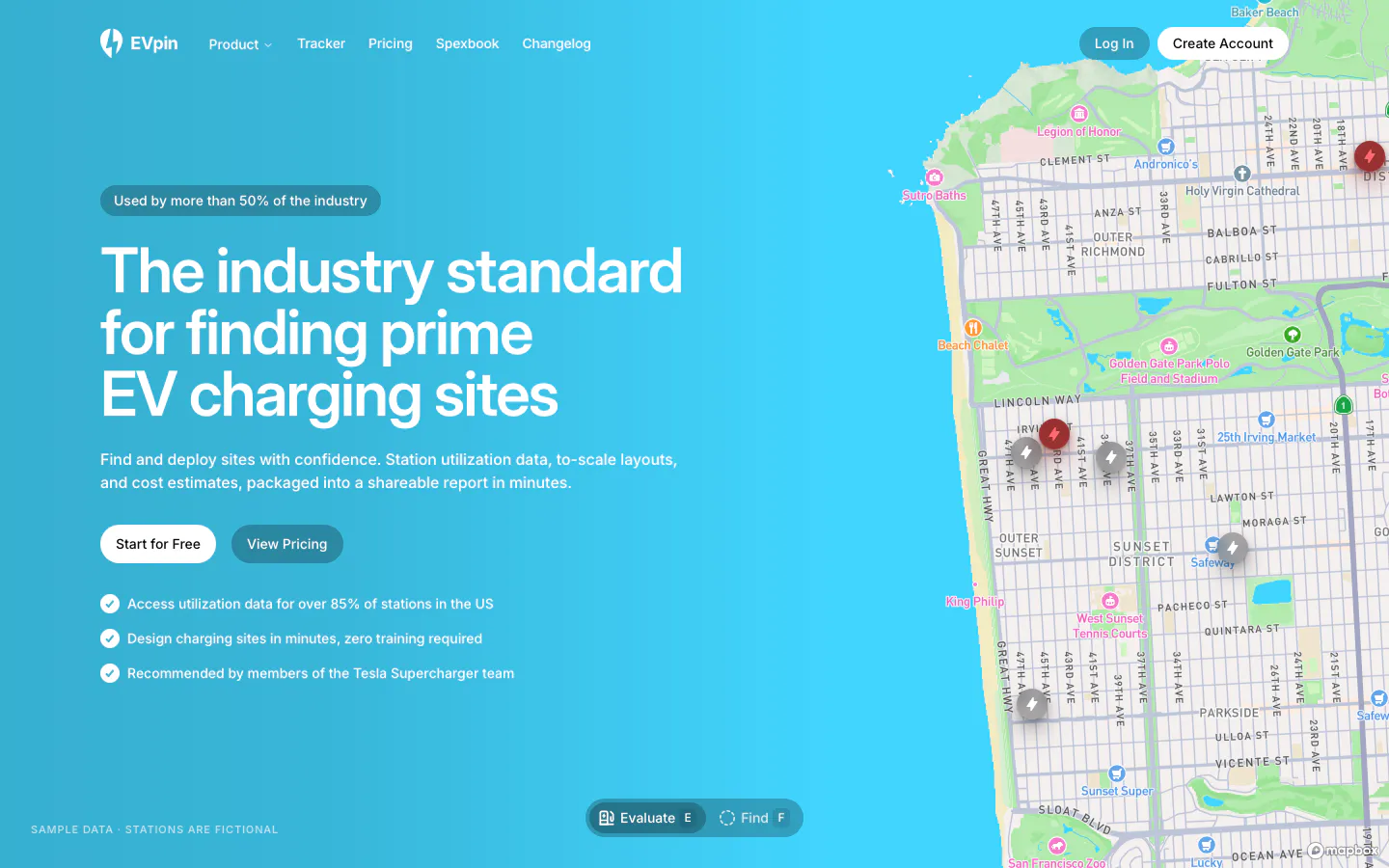
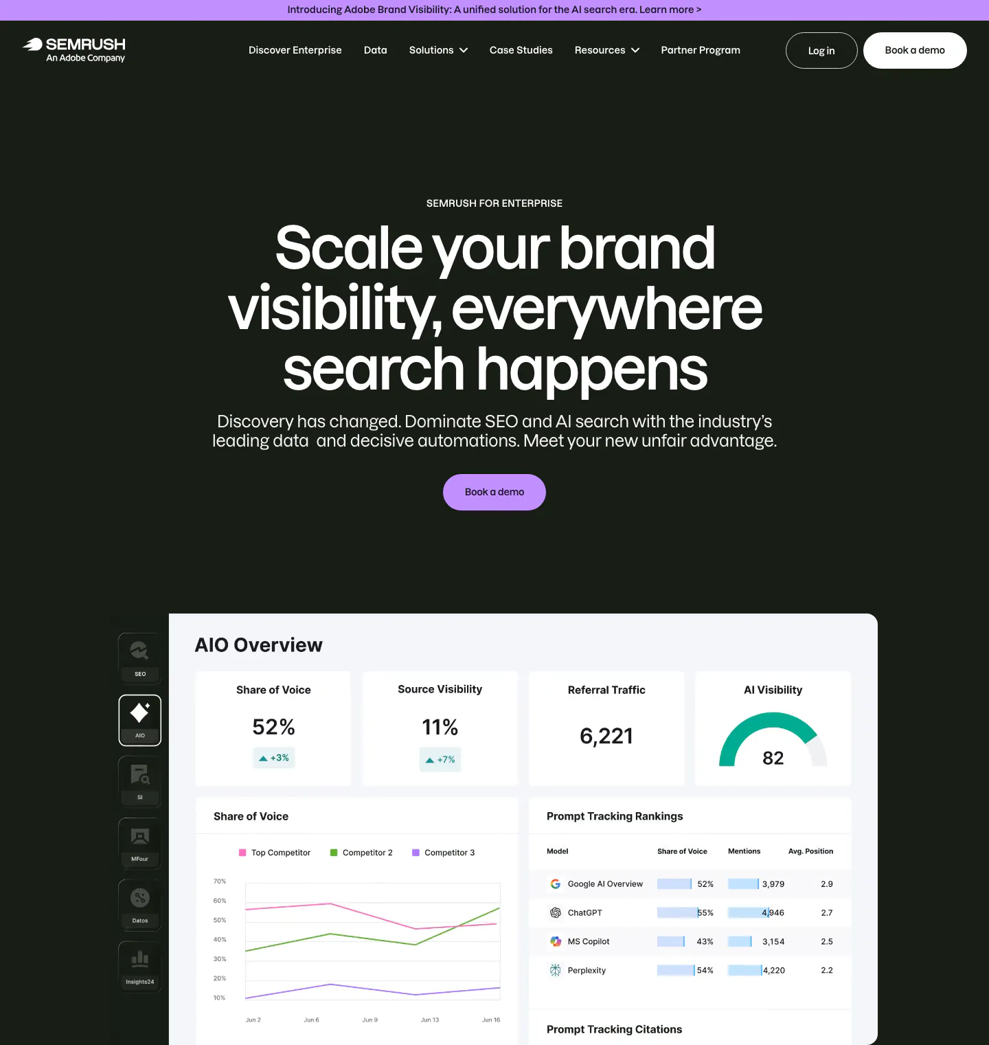
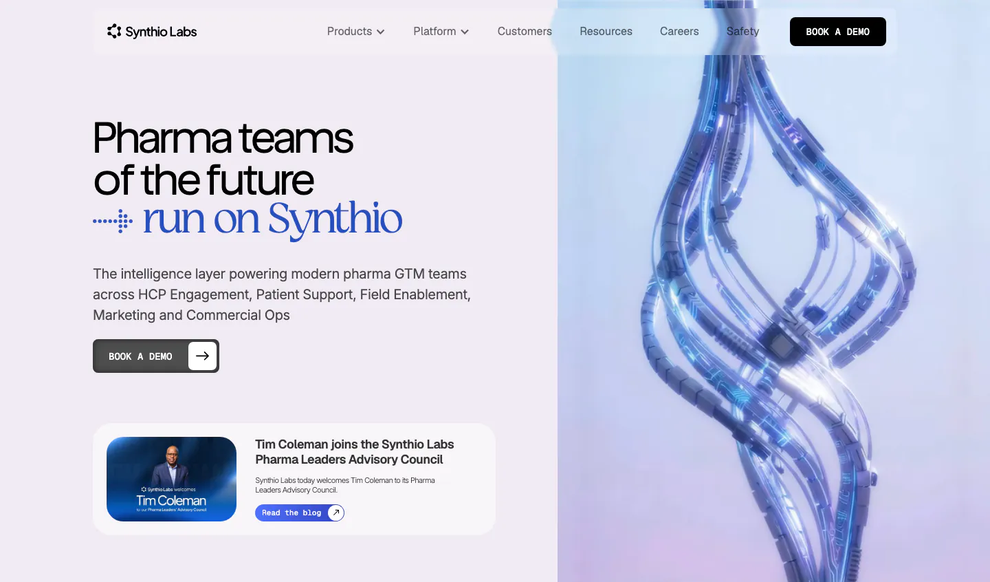
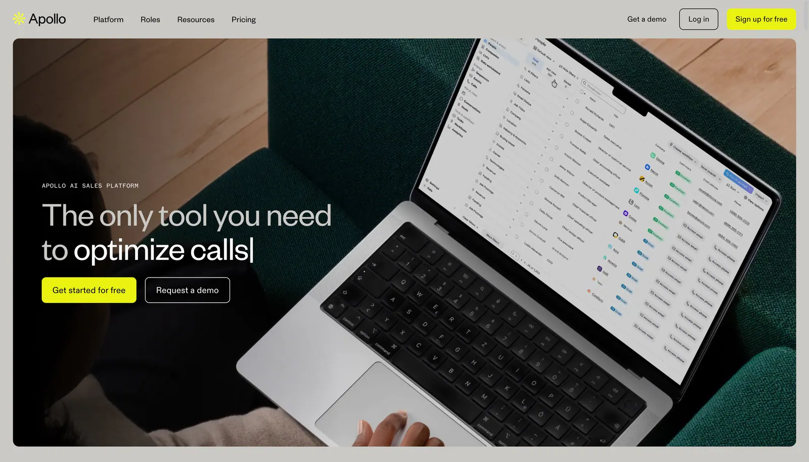
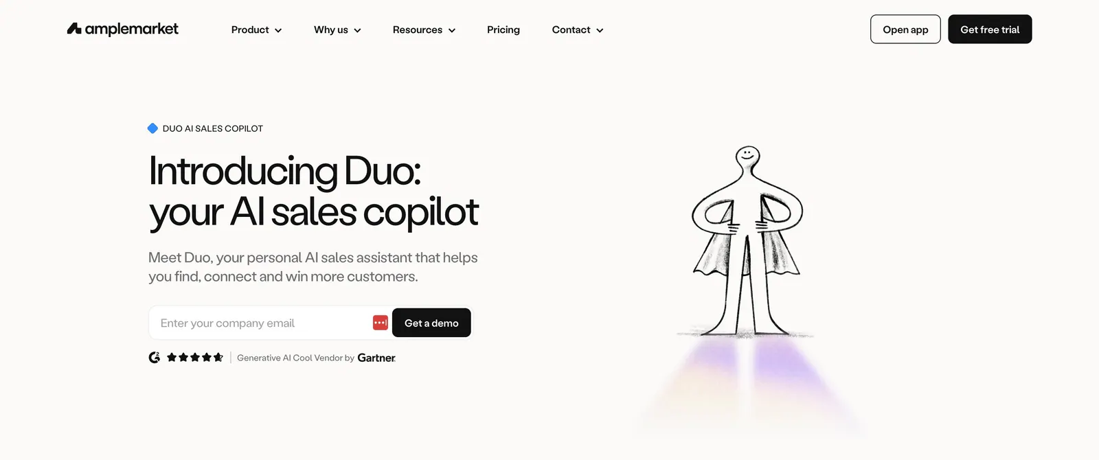
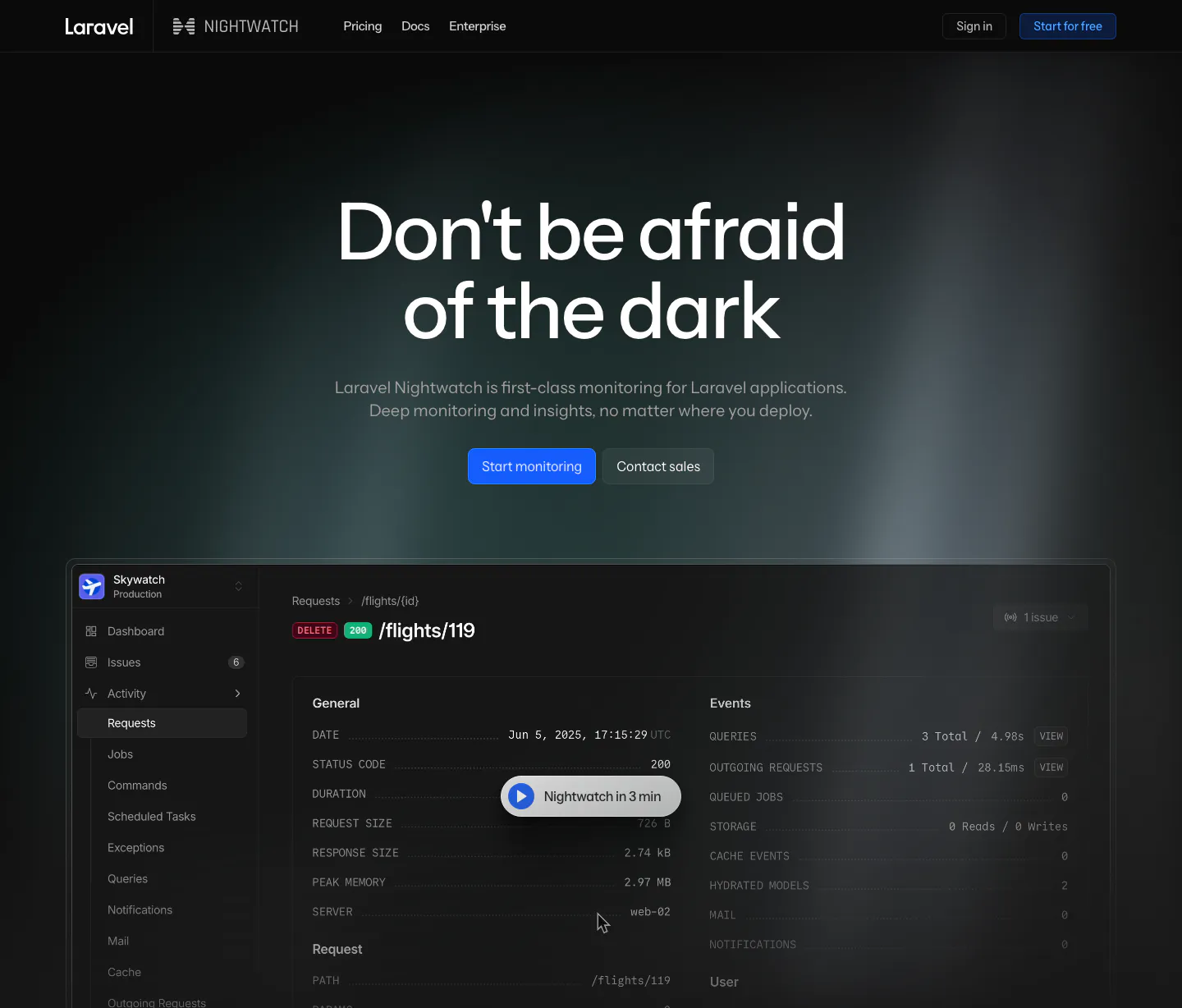
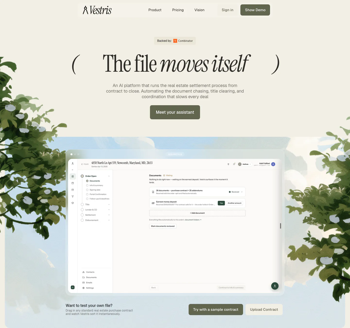
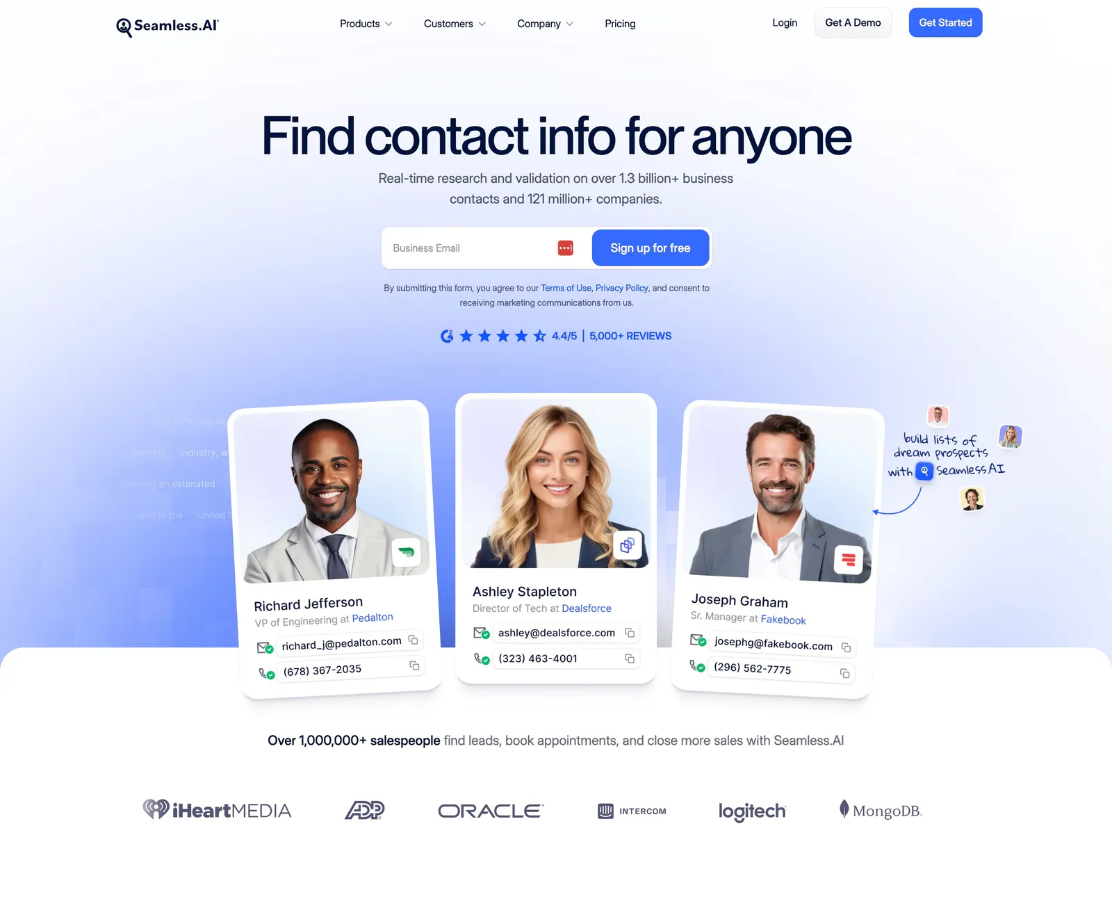
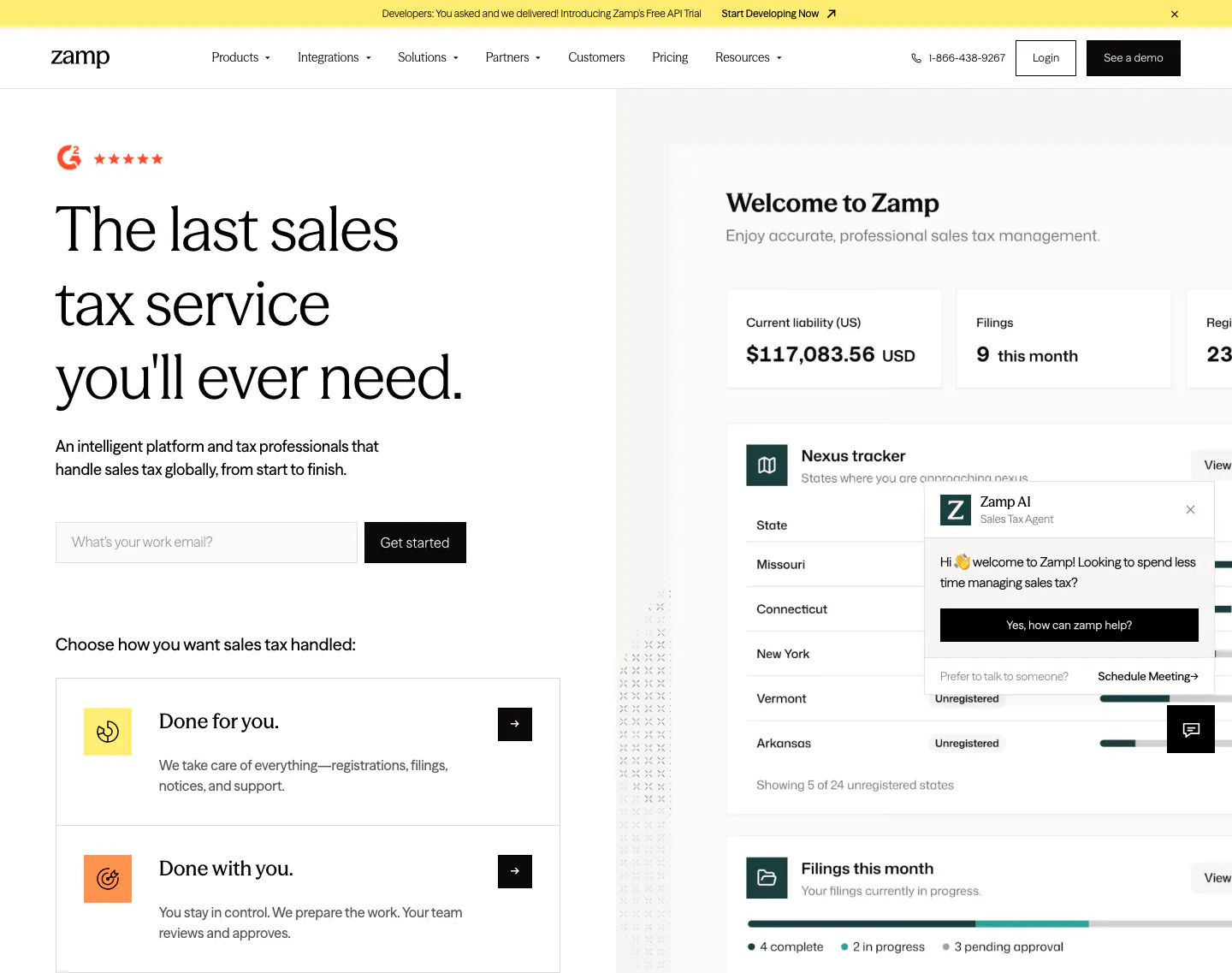
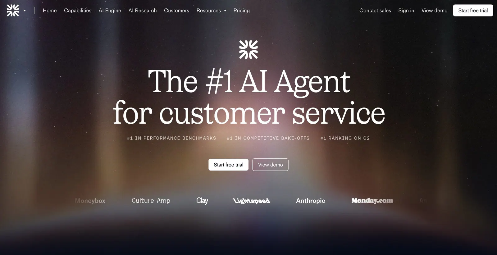
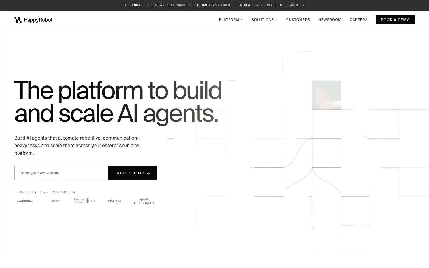
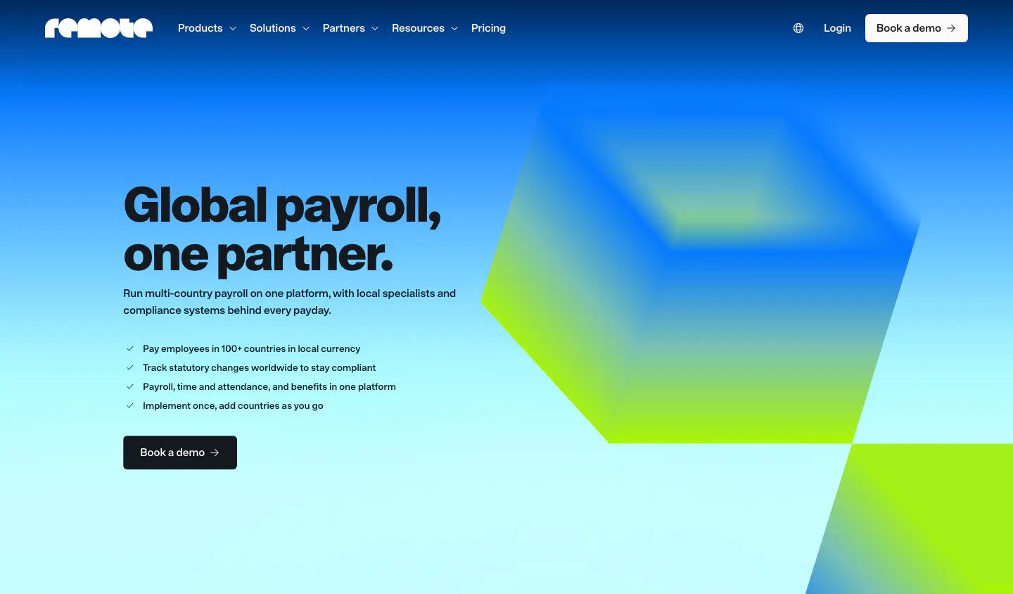
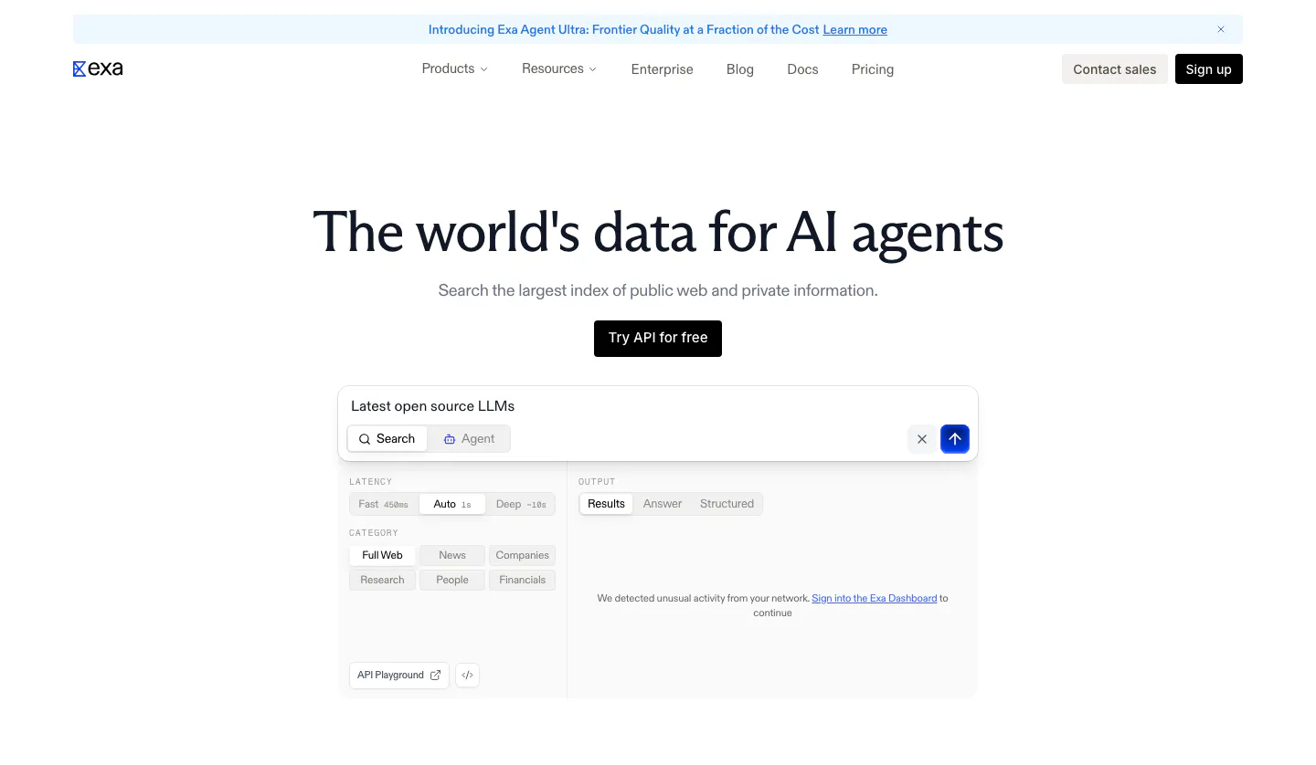
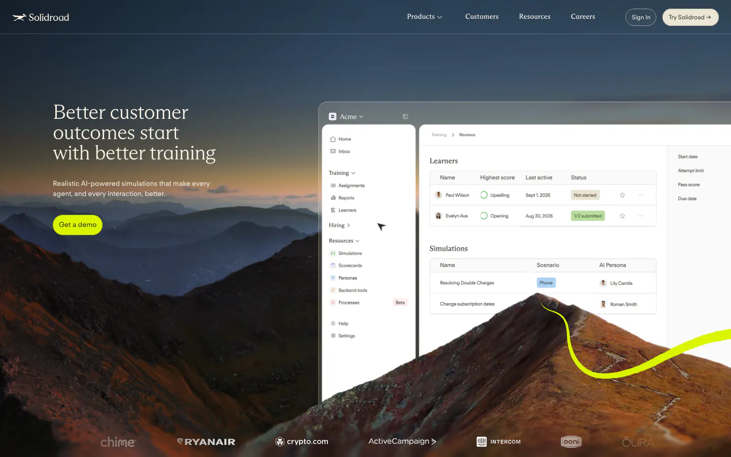
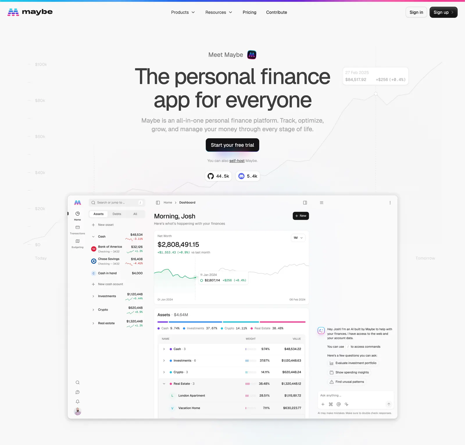
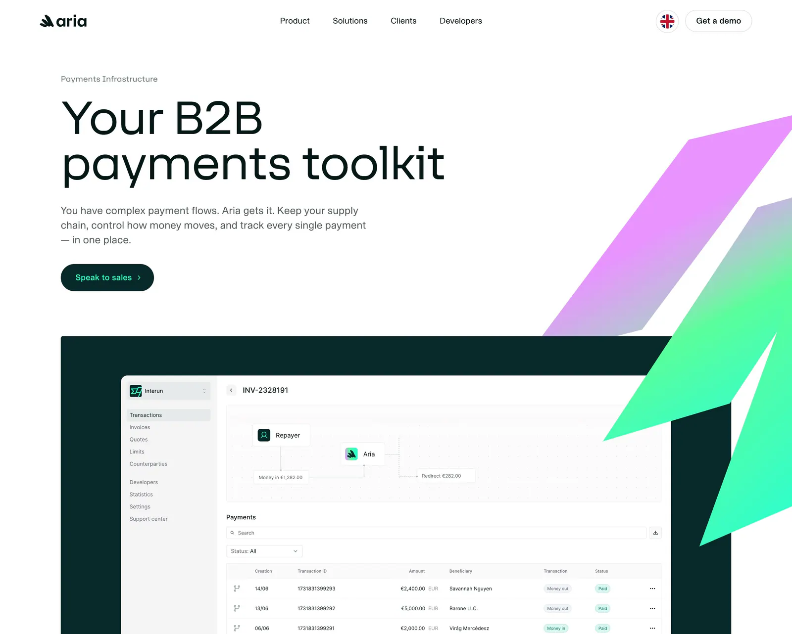
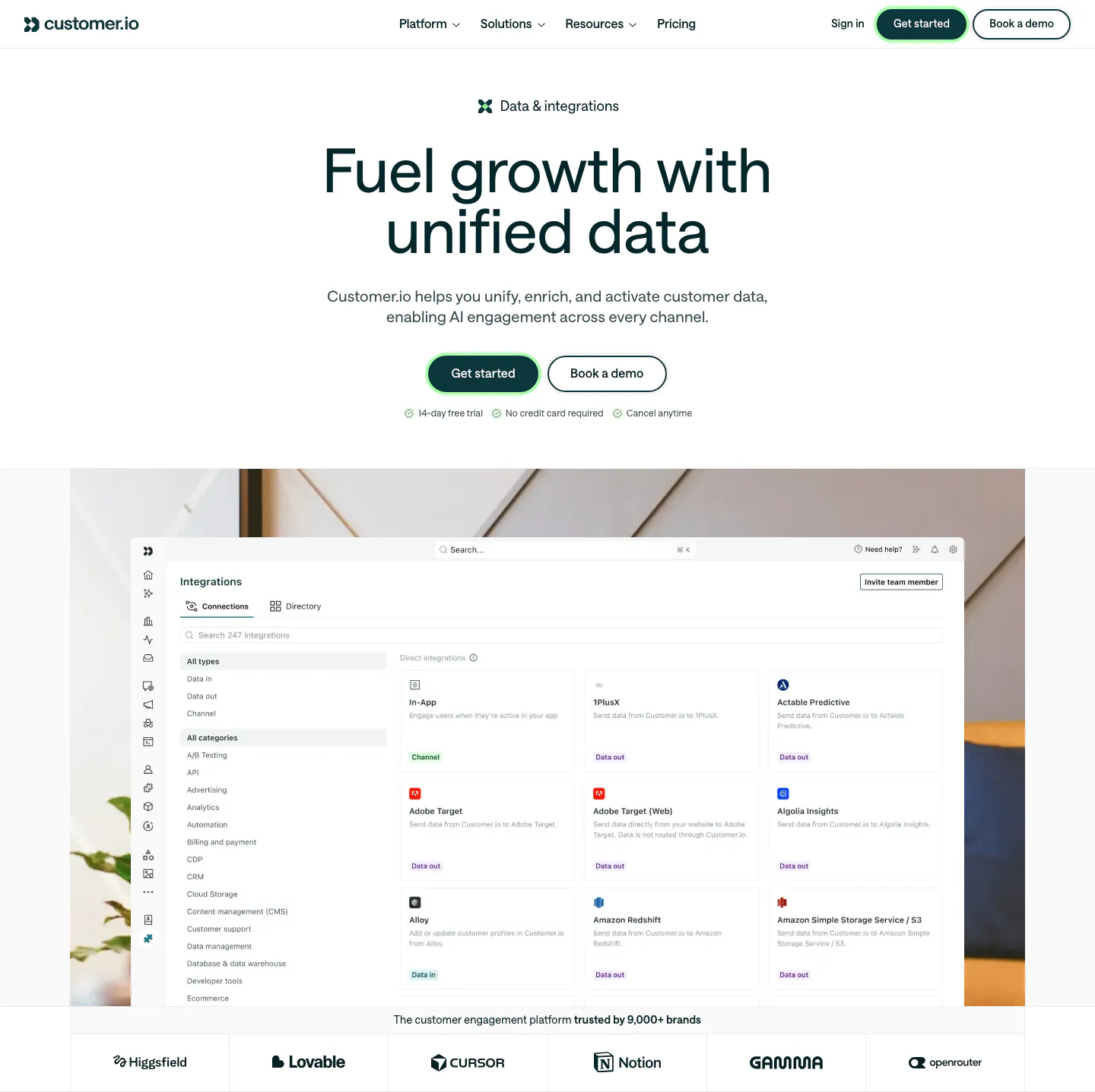
The hero is the first thing a visitor reads and often the only thing. In a few seconds it has to say what the product does, show it, and offer one clear next step. Vague slogans, abstract art in place of the product, and a row of competing buttons all waste that moment. Each hero section example here takes its own approach to headline length, product visuals, and button placement.
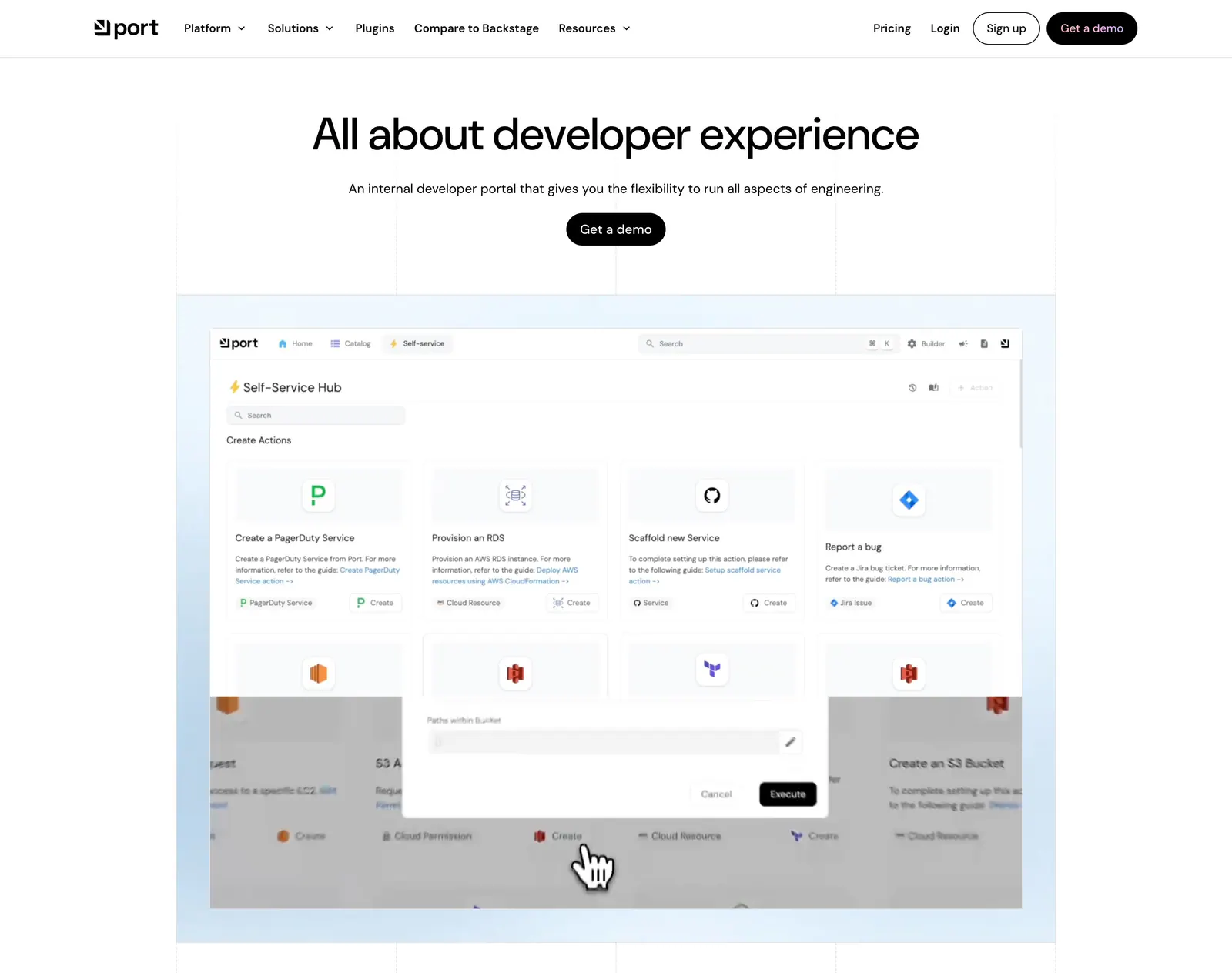
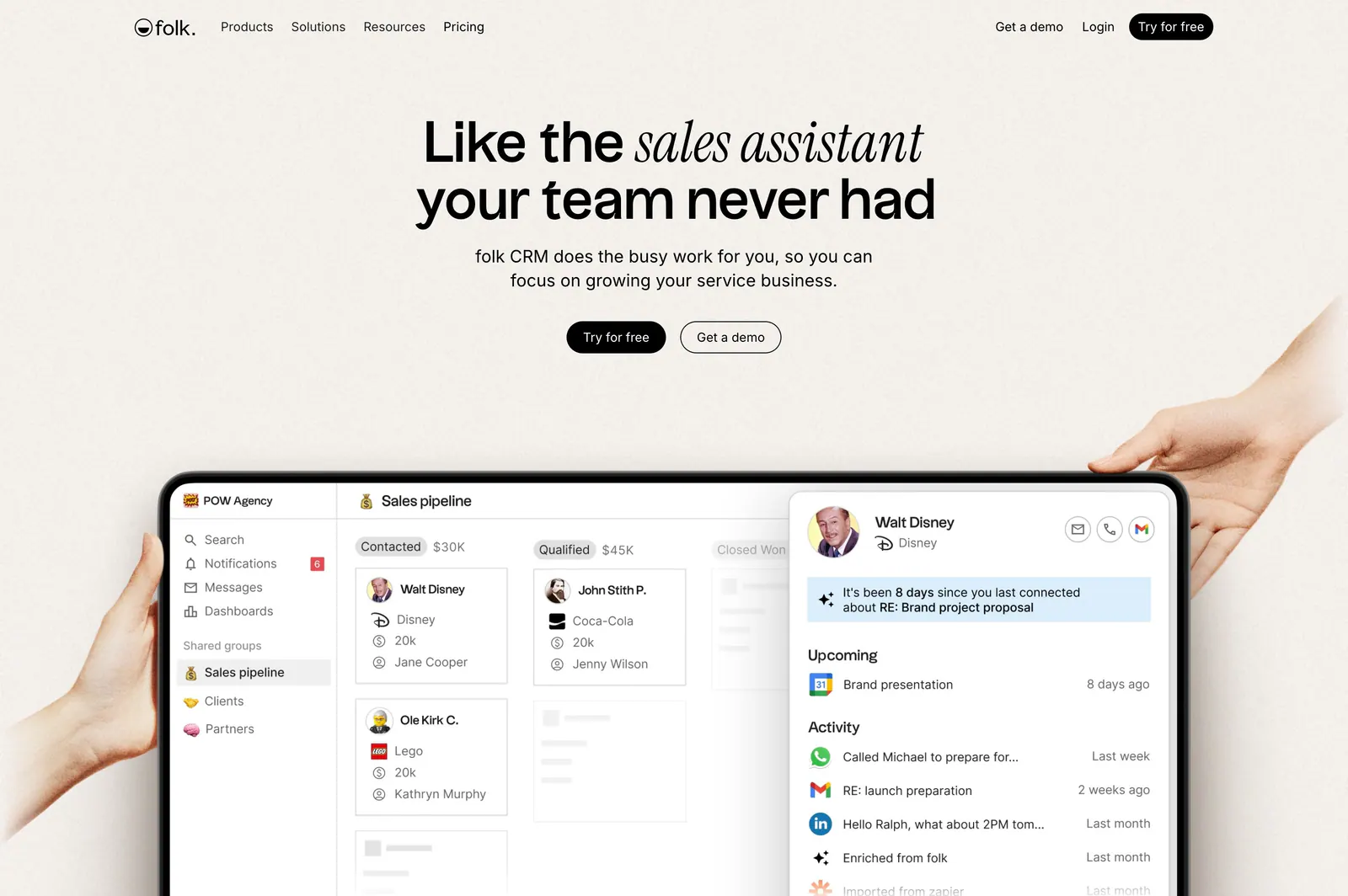
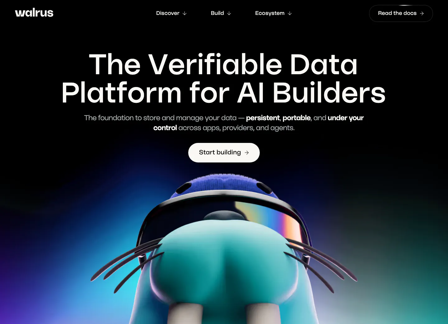
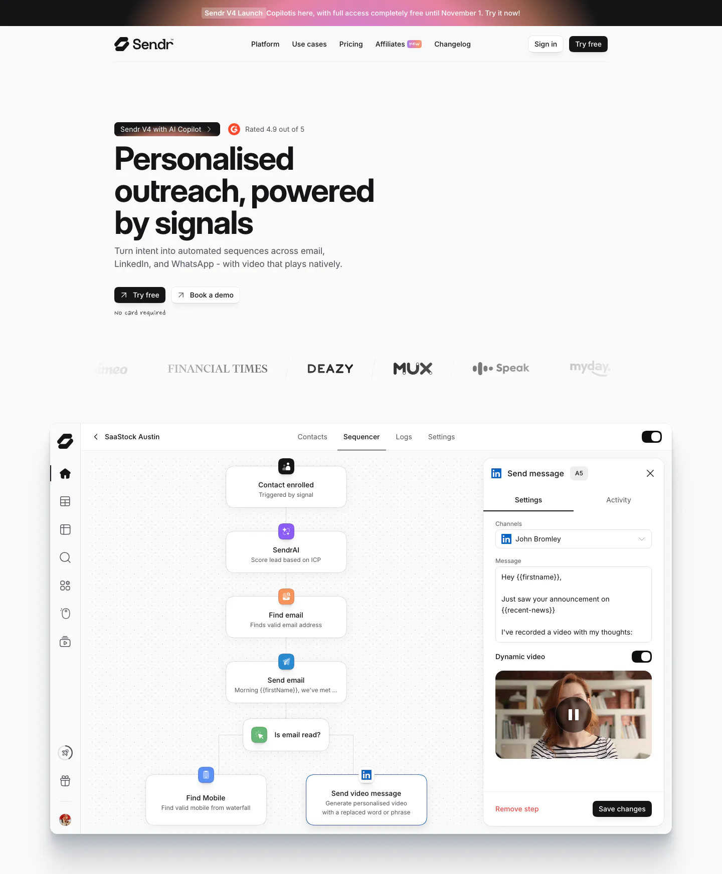

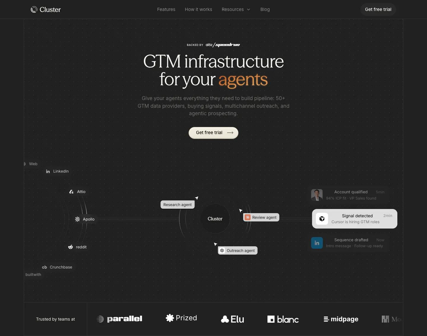

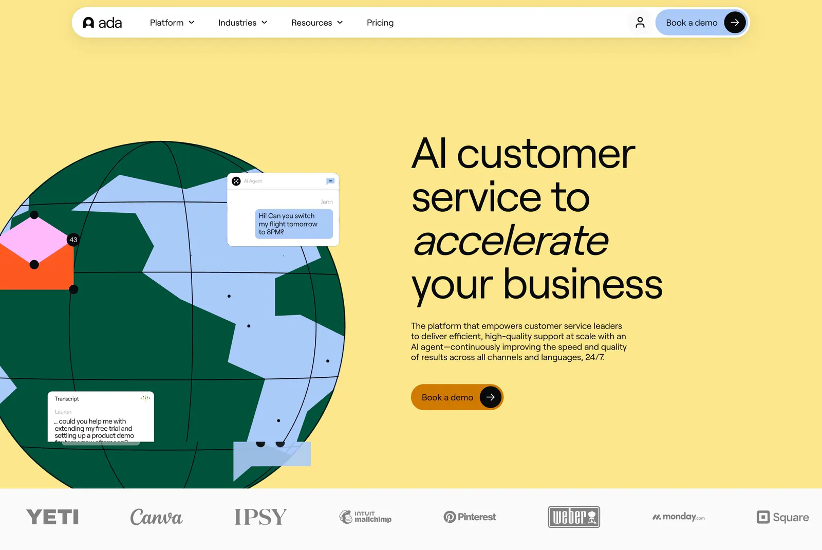
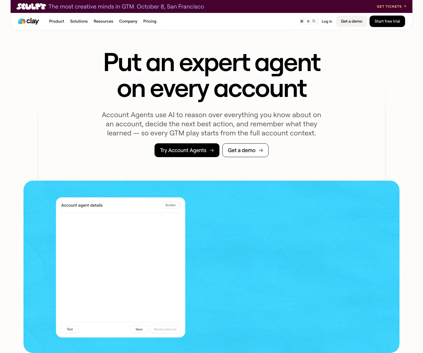

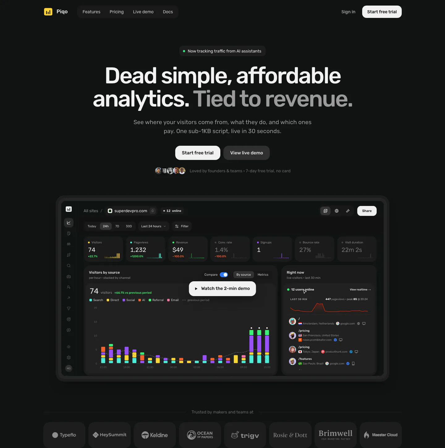
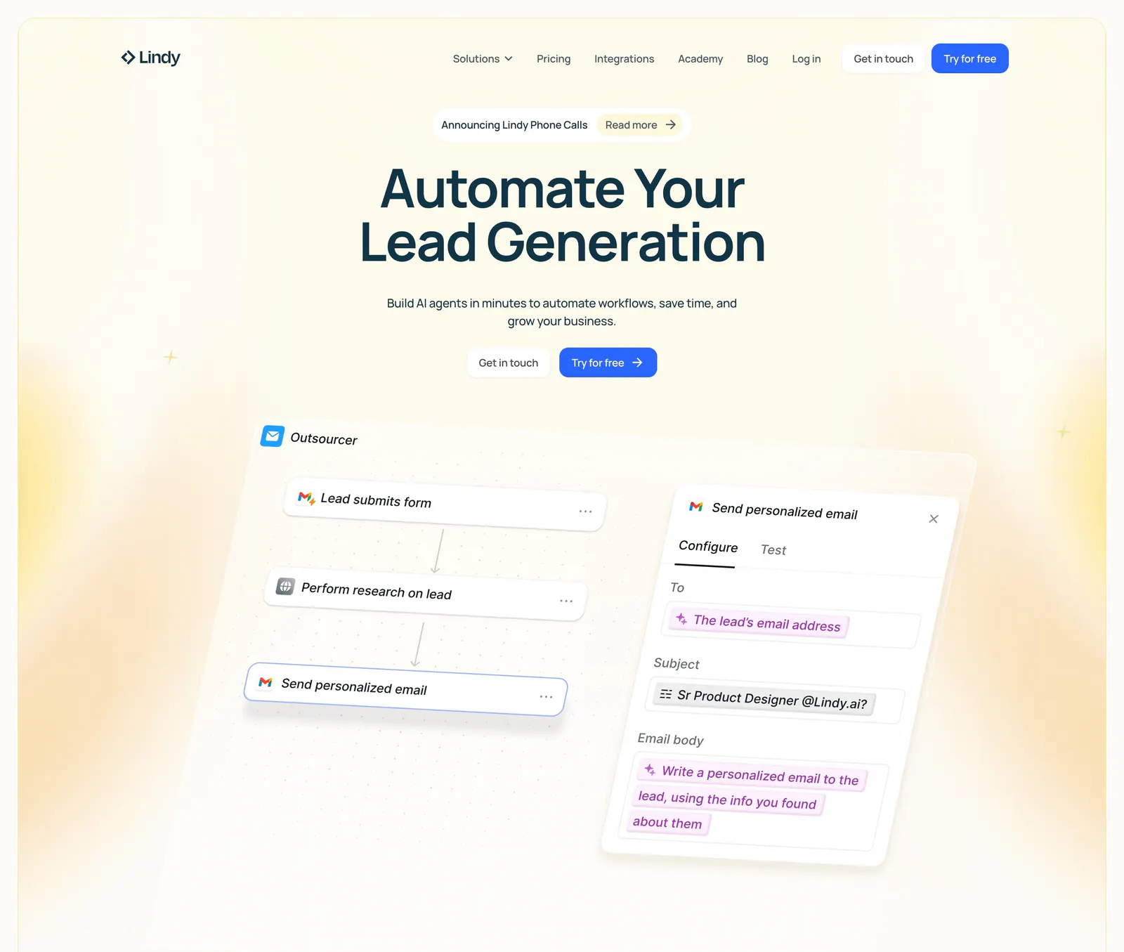
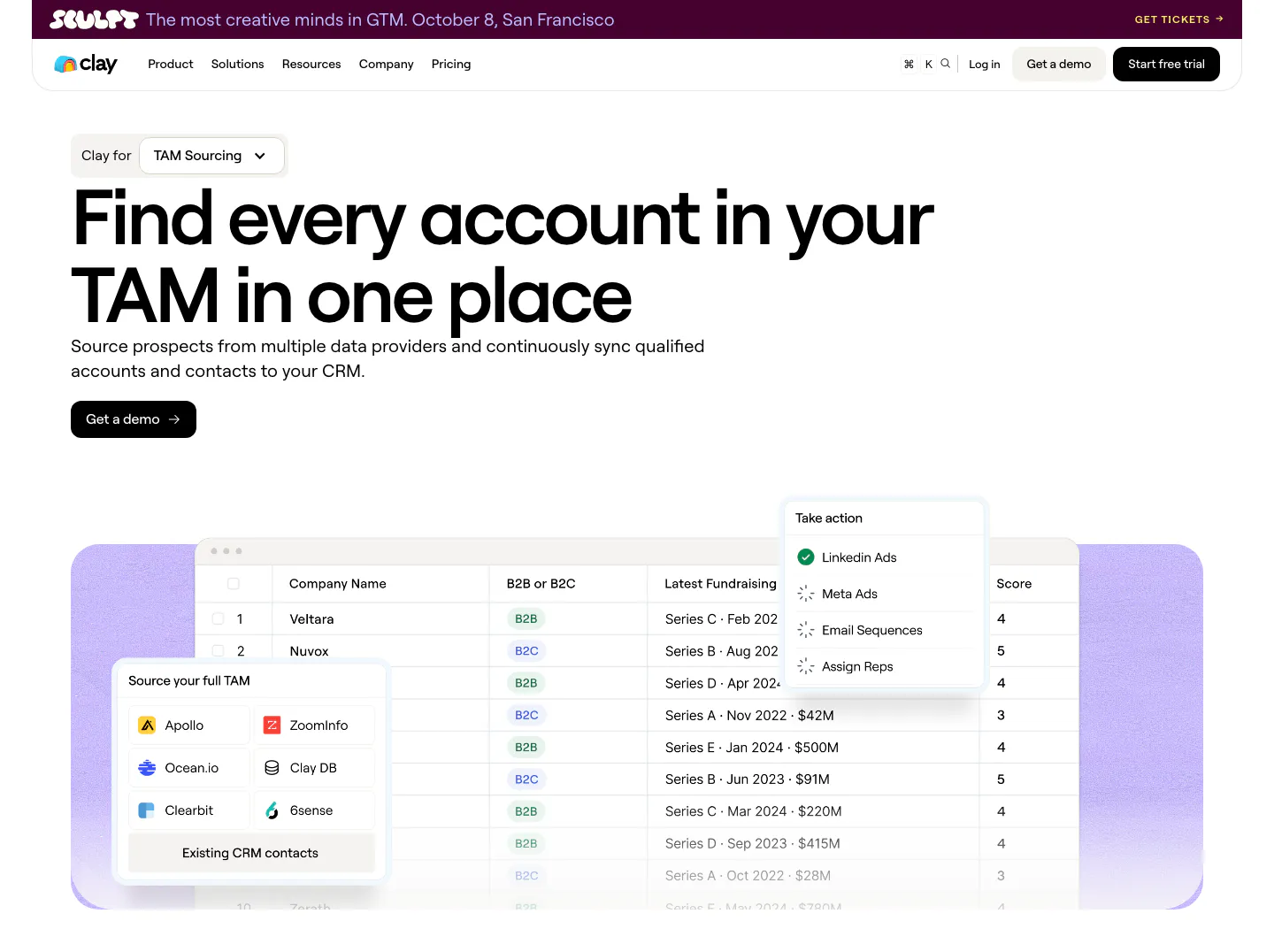
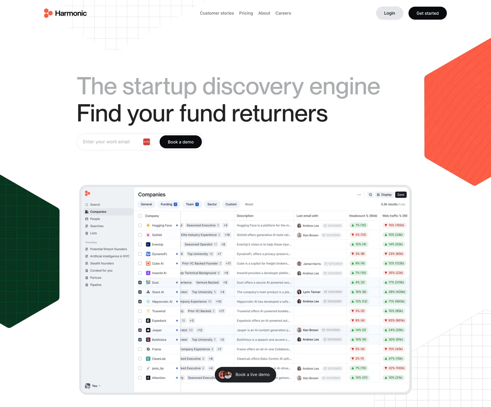
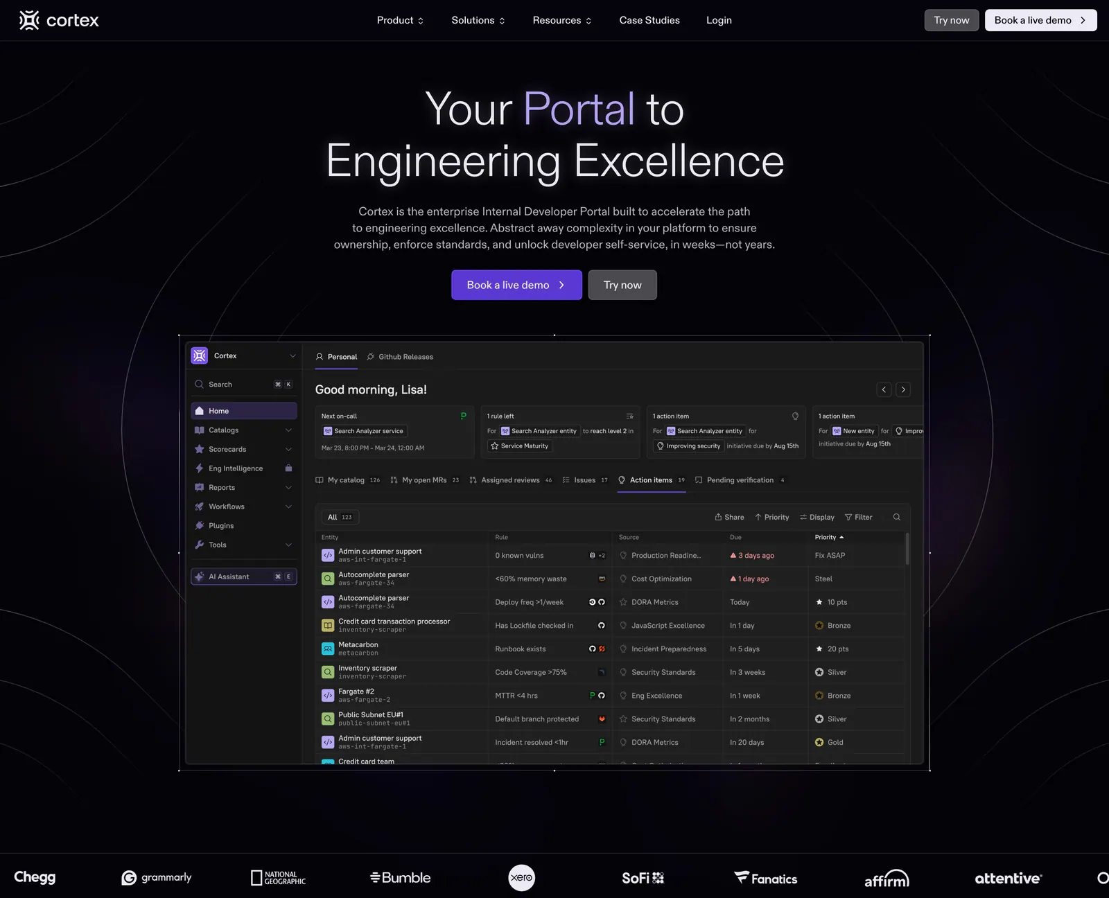

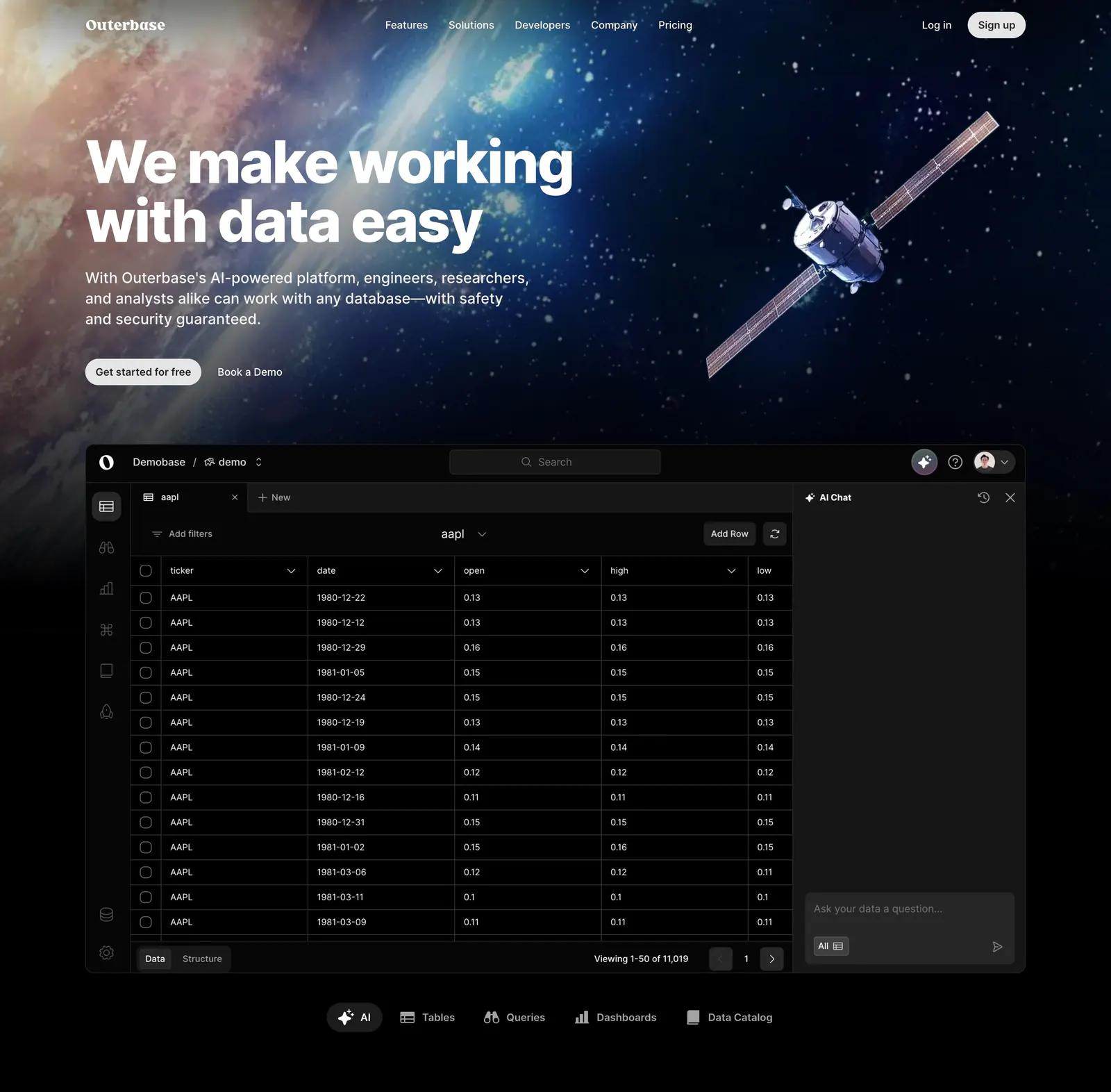
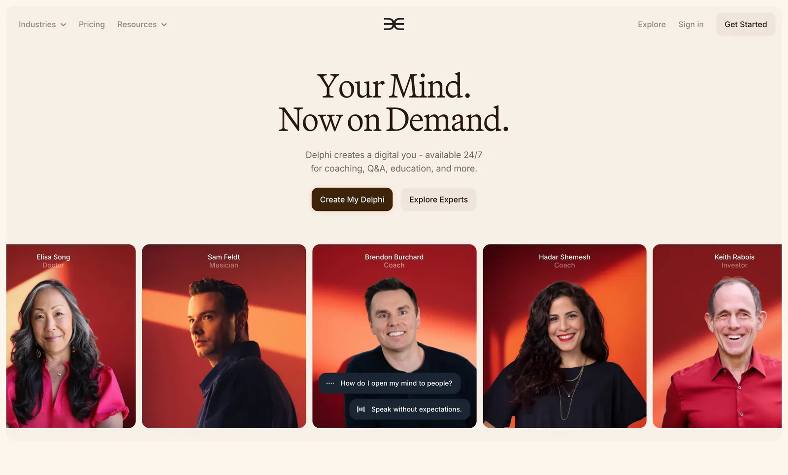
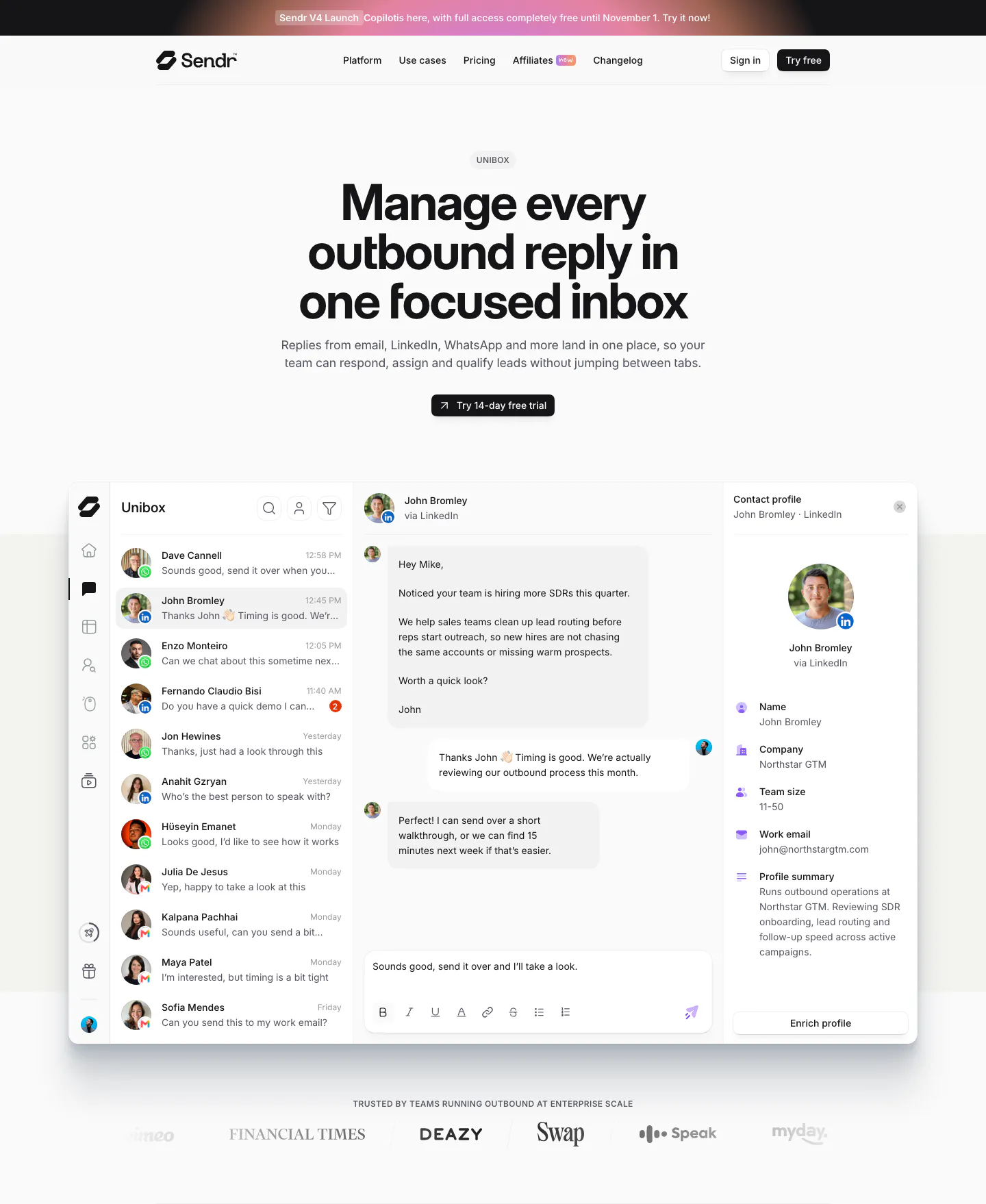
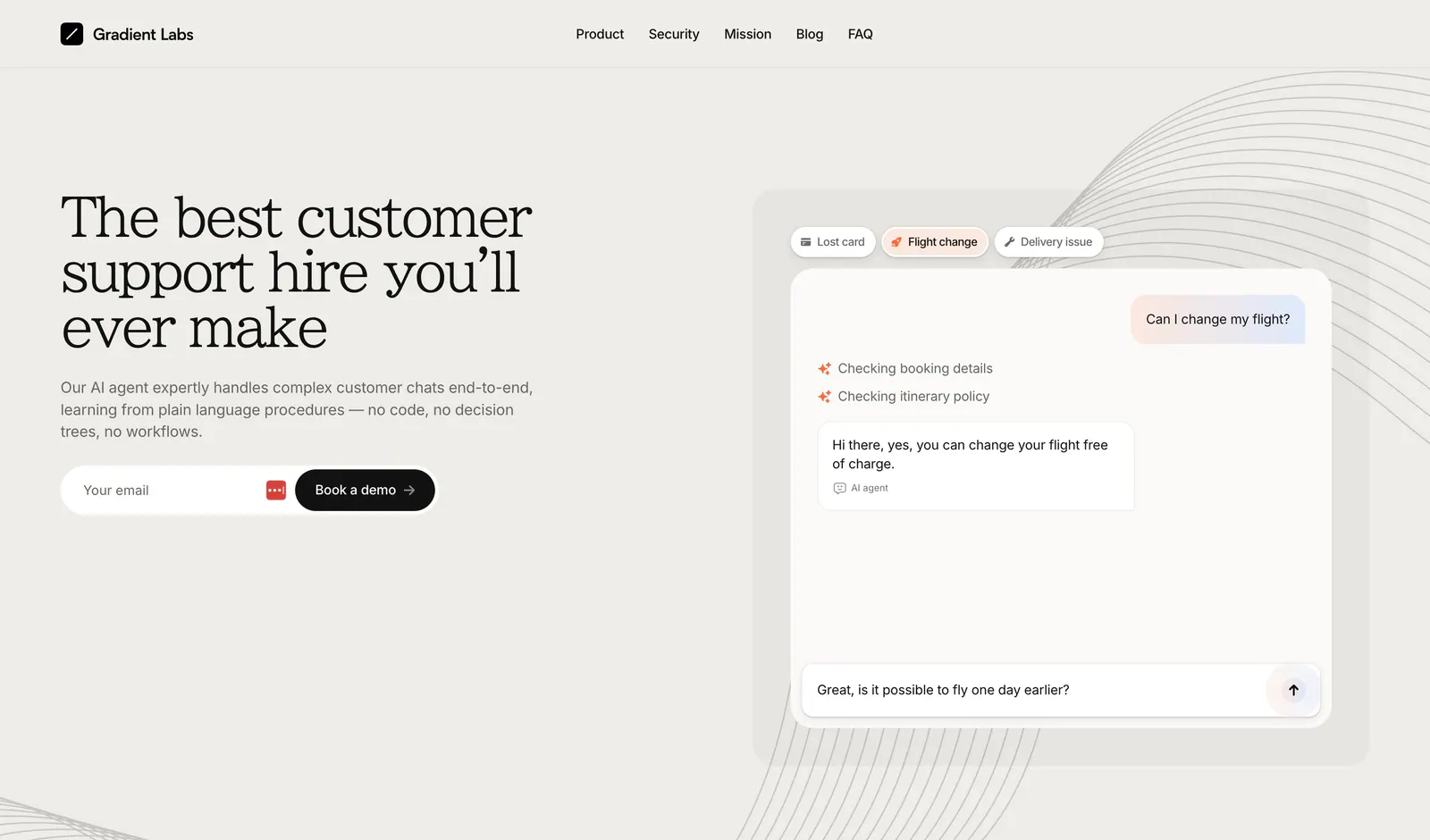
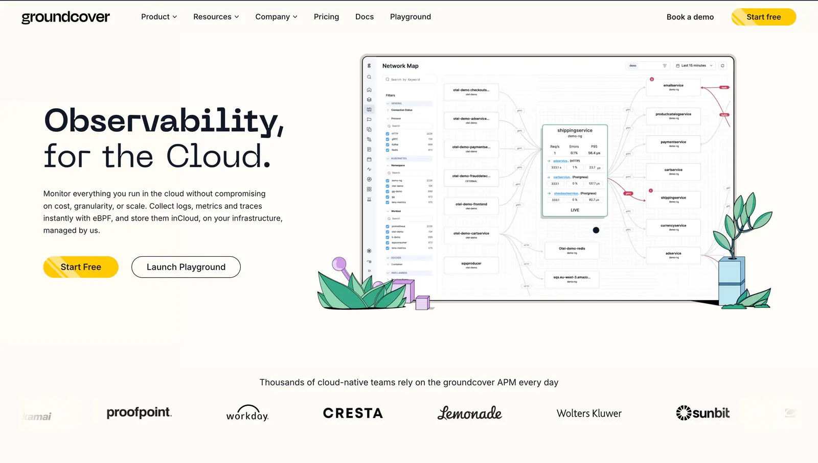
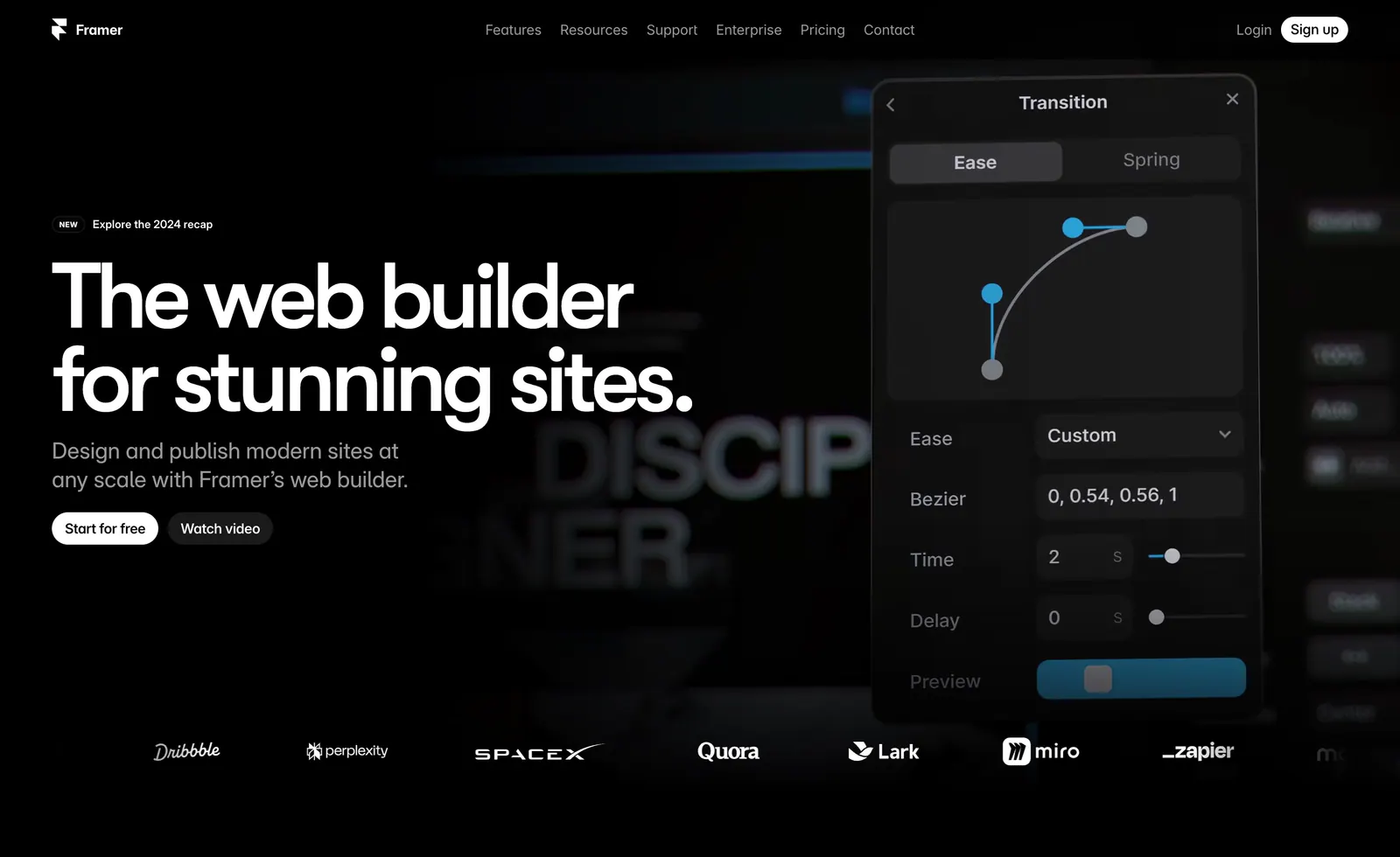
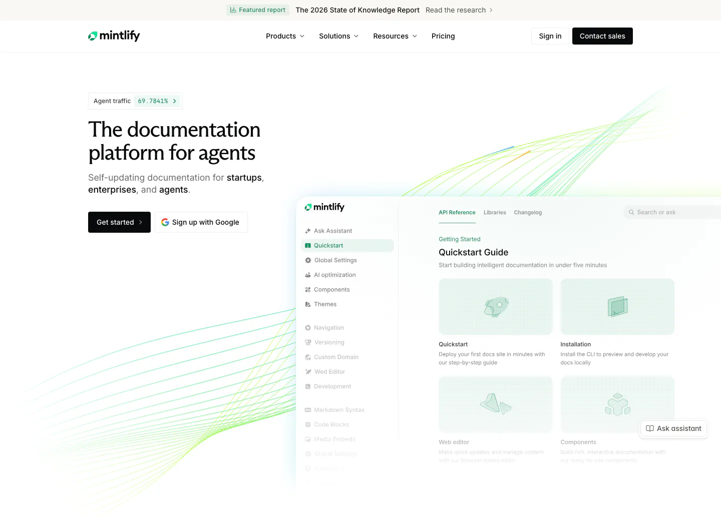
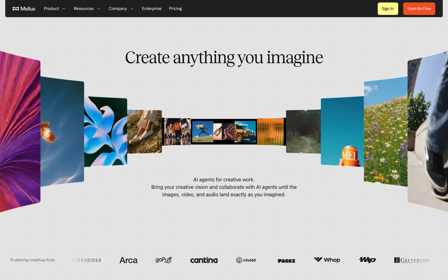
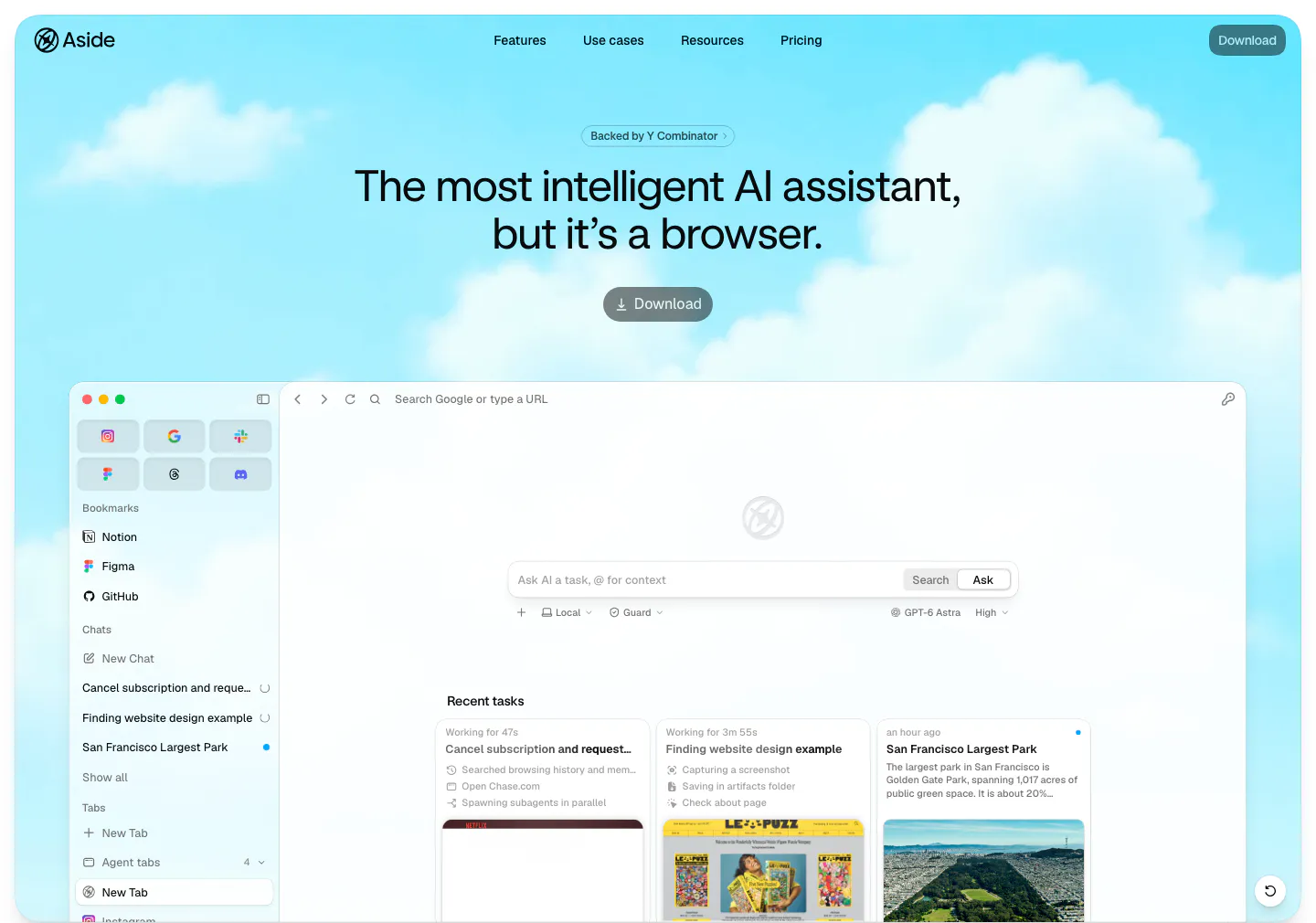
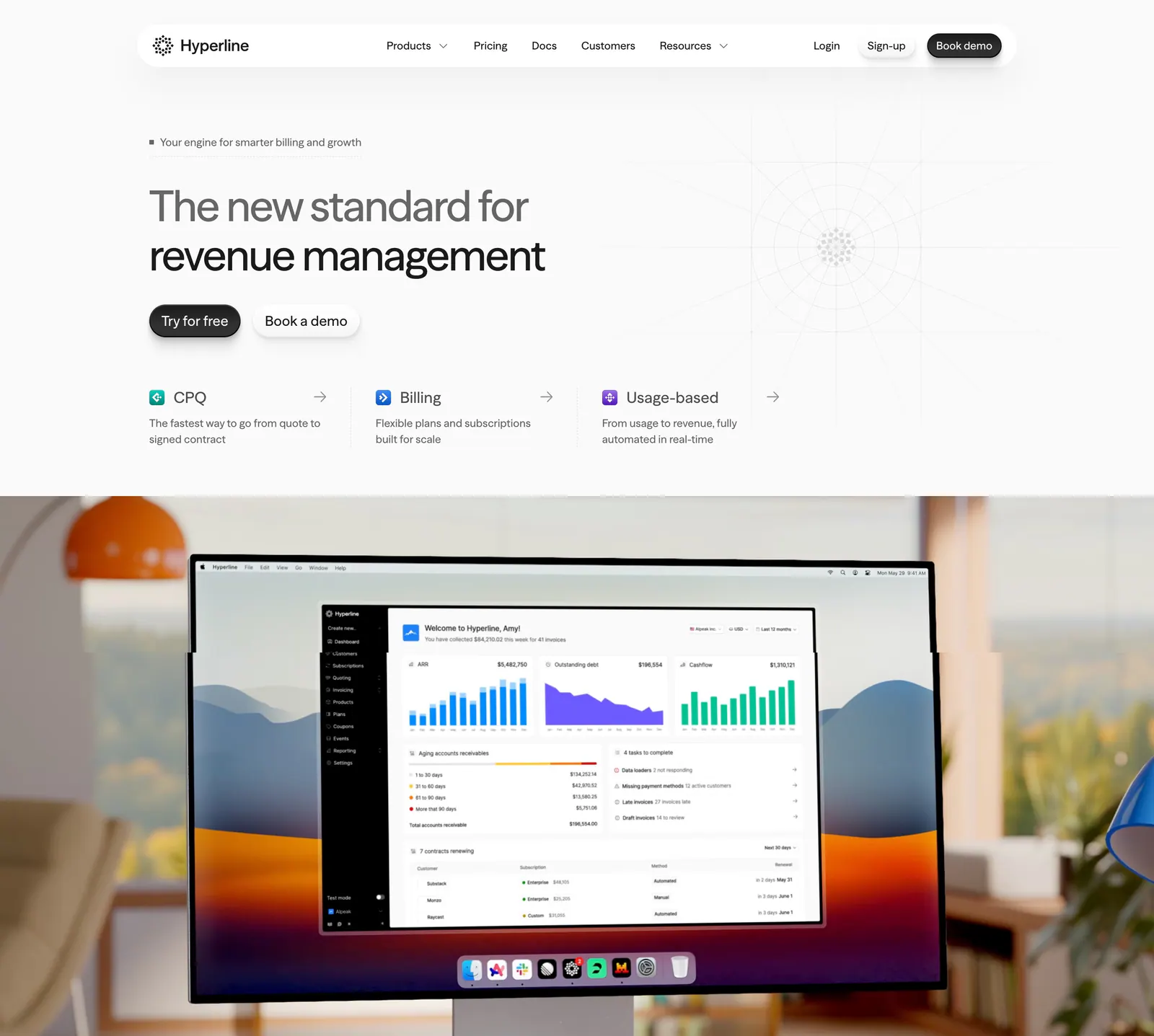
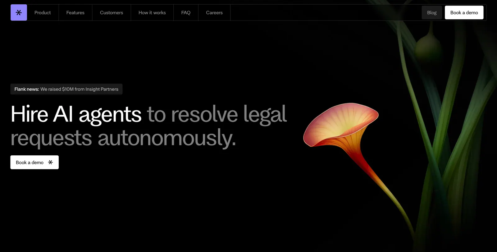
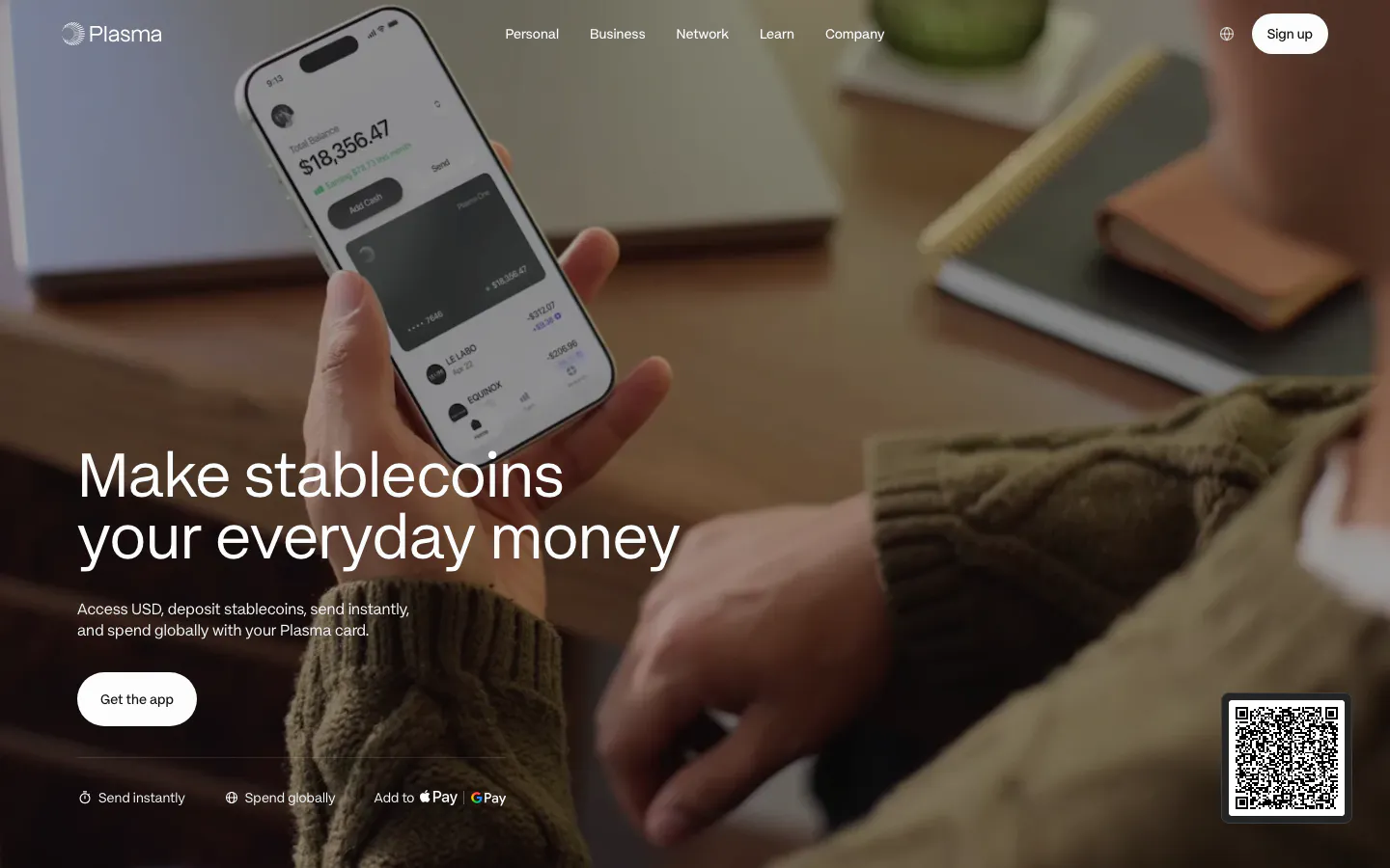


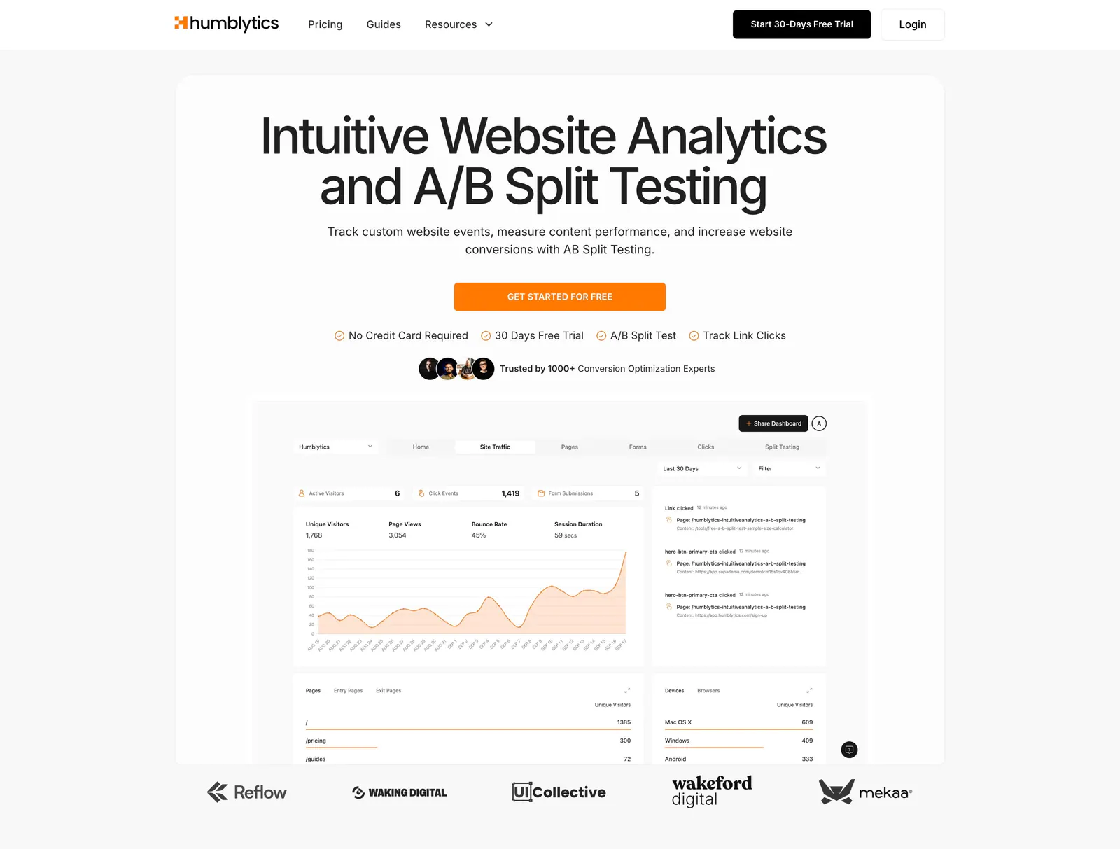
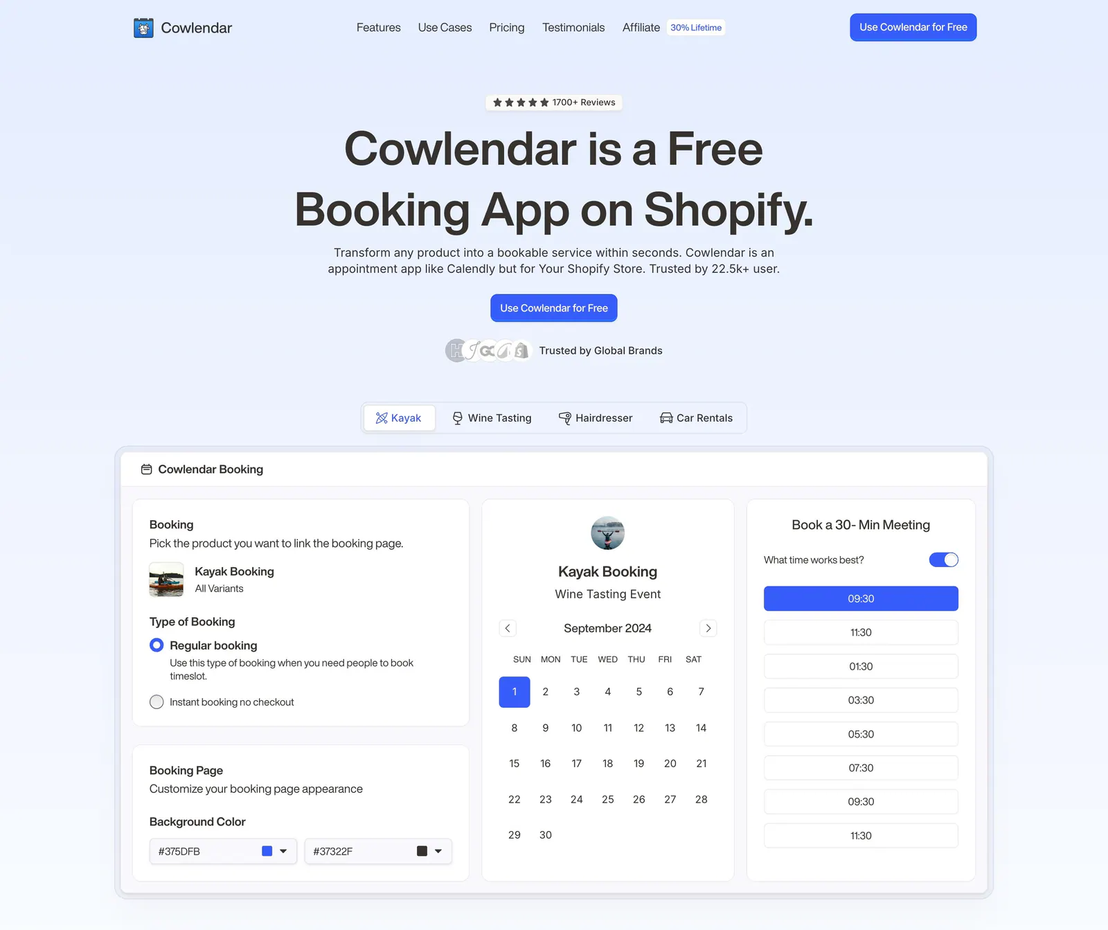
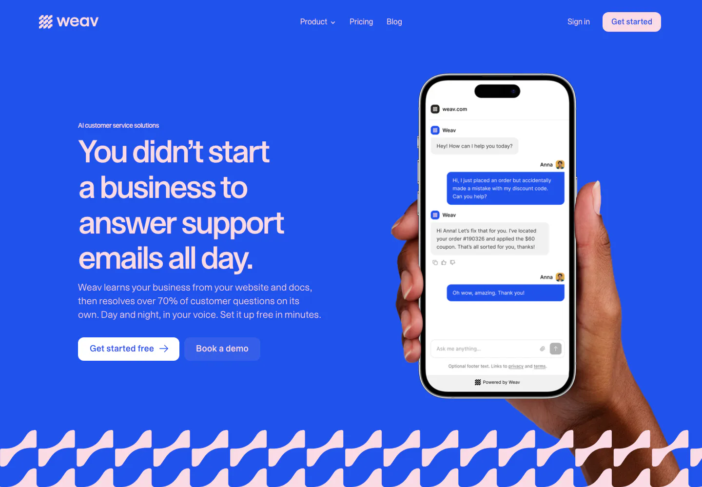
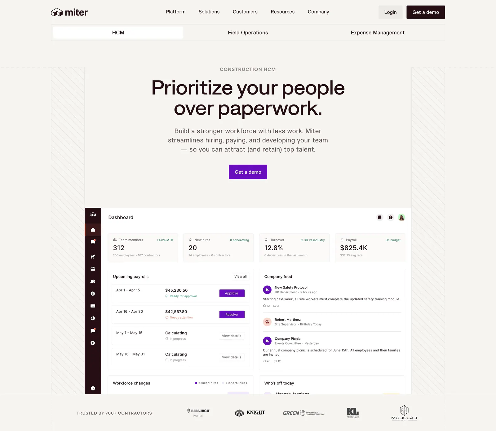


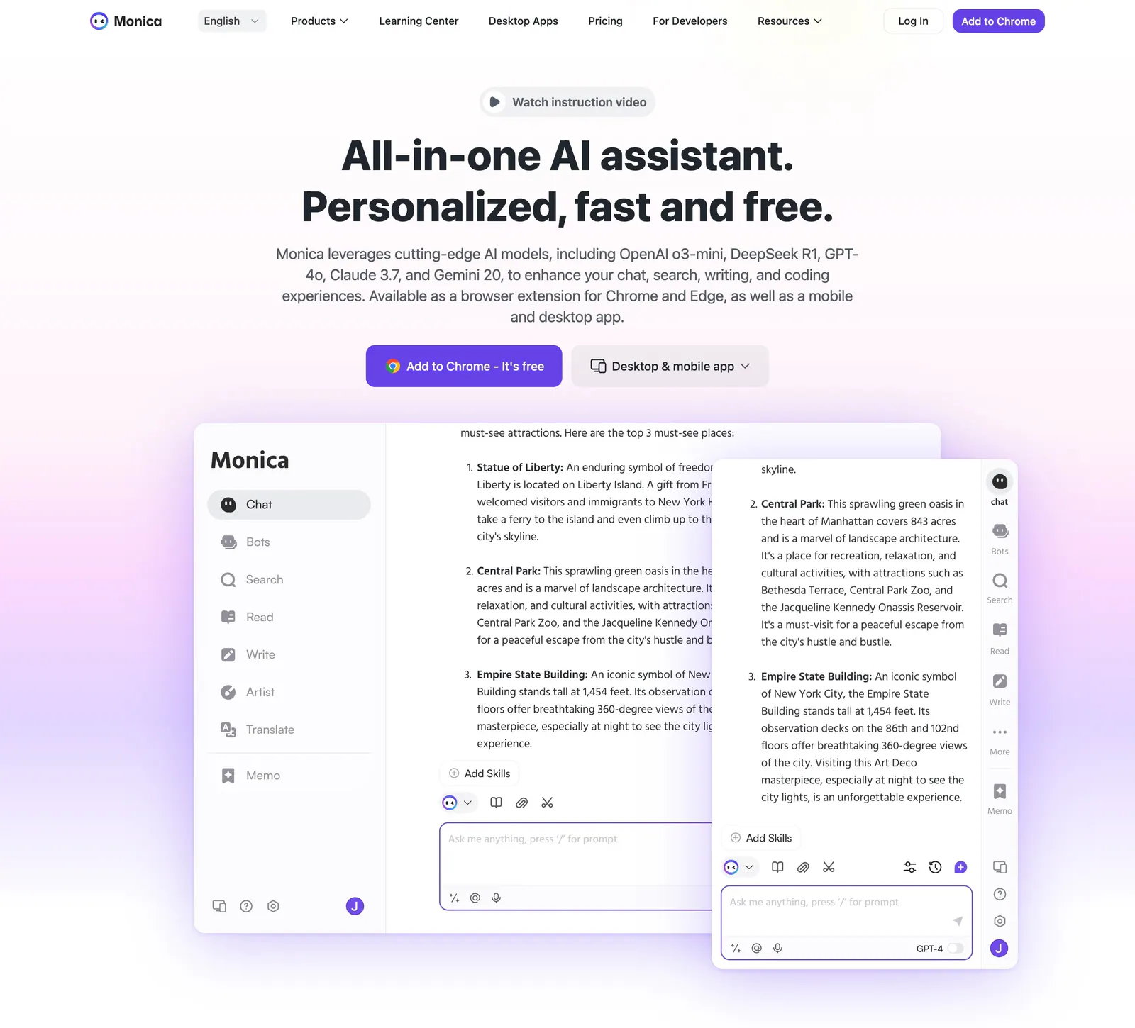

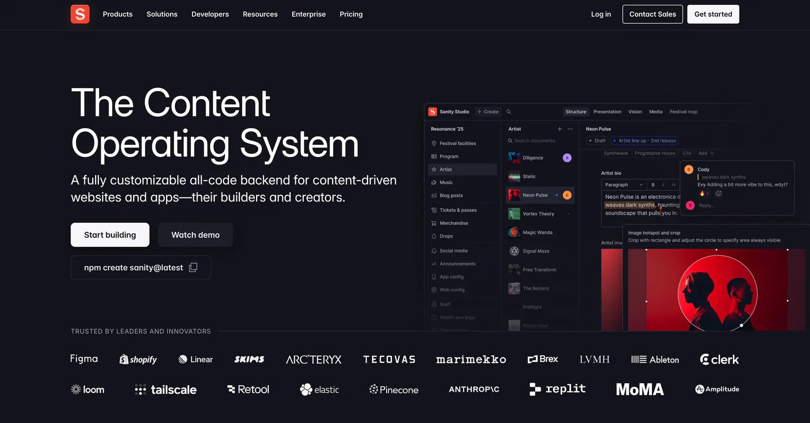
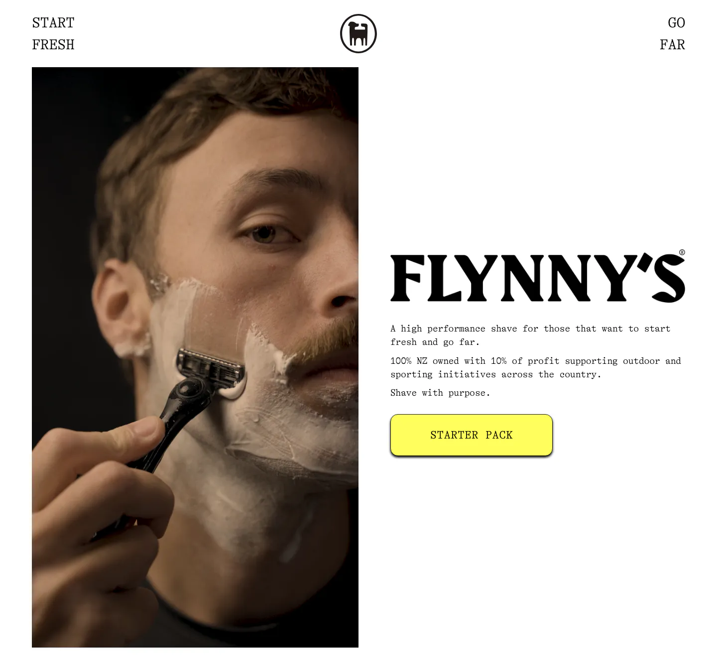
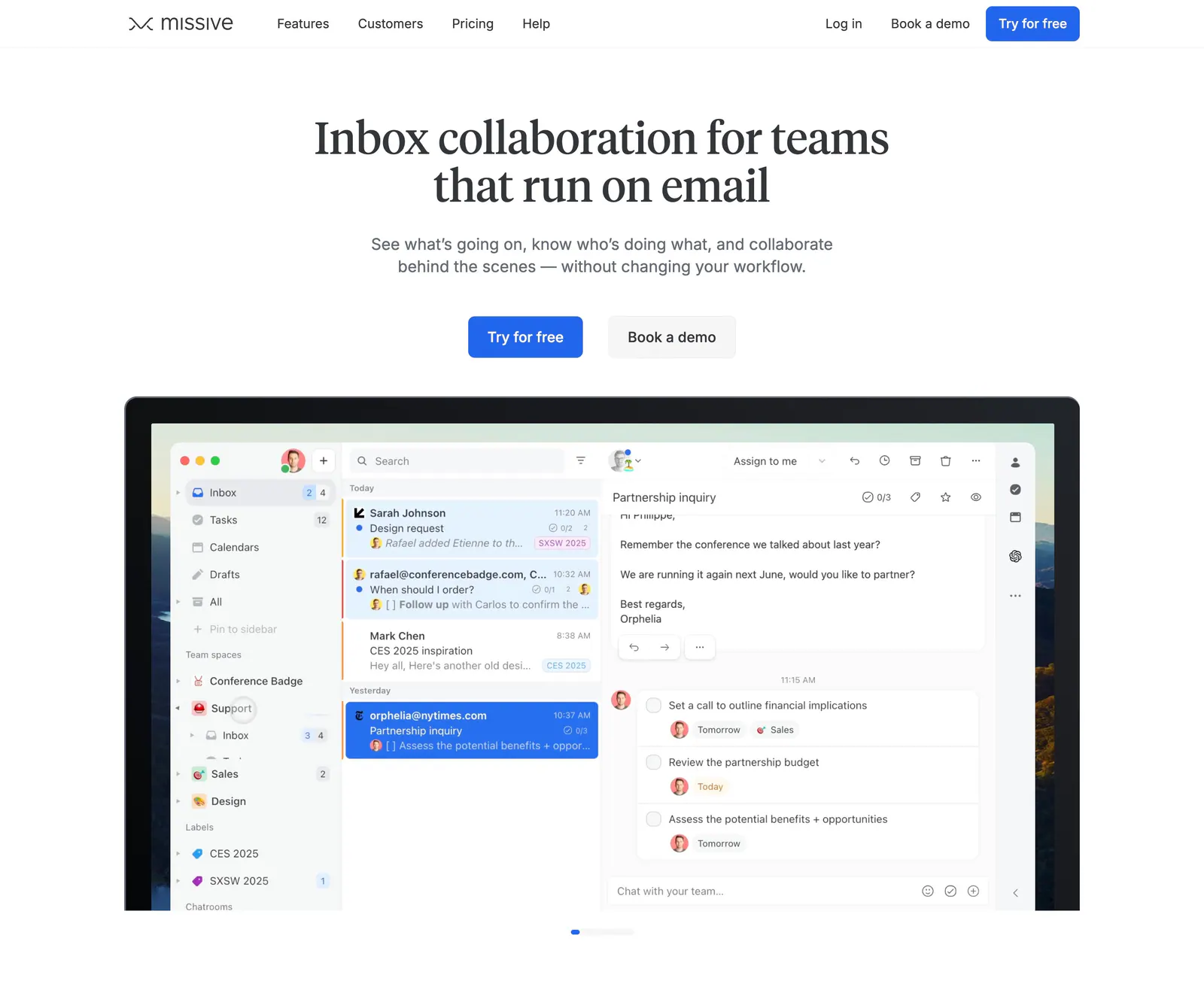

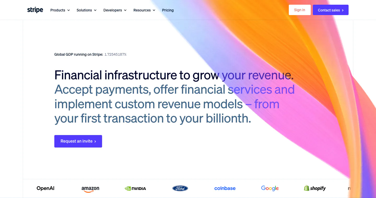
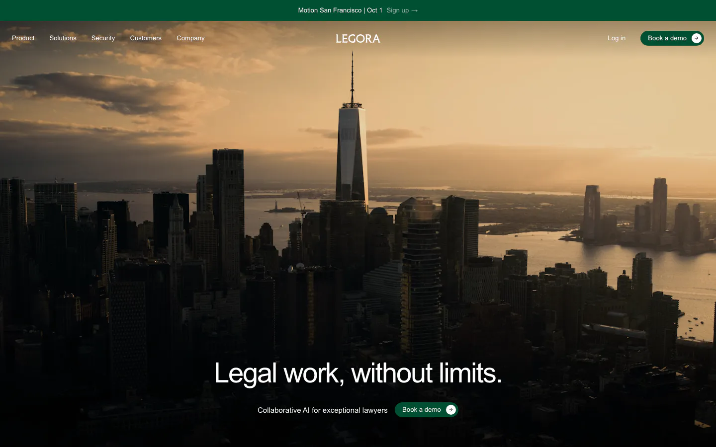
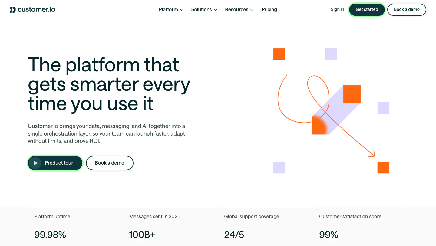
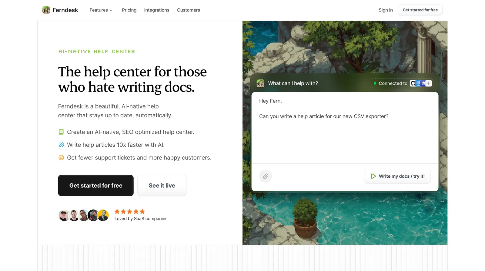


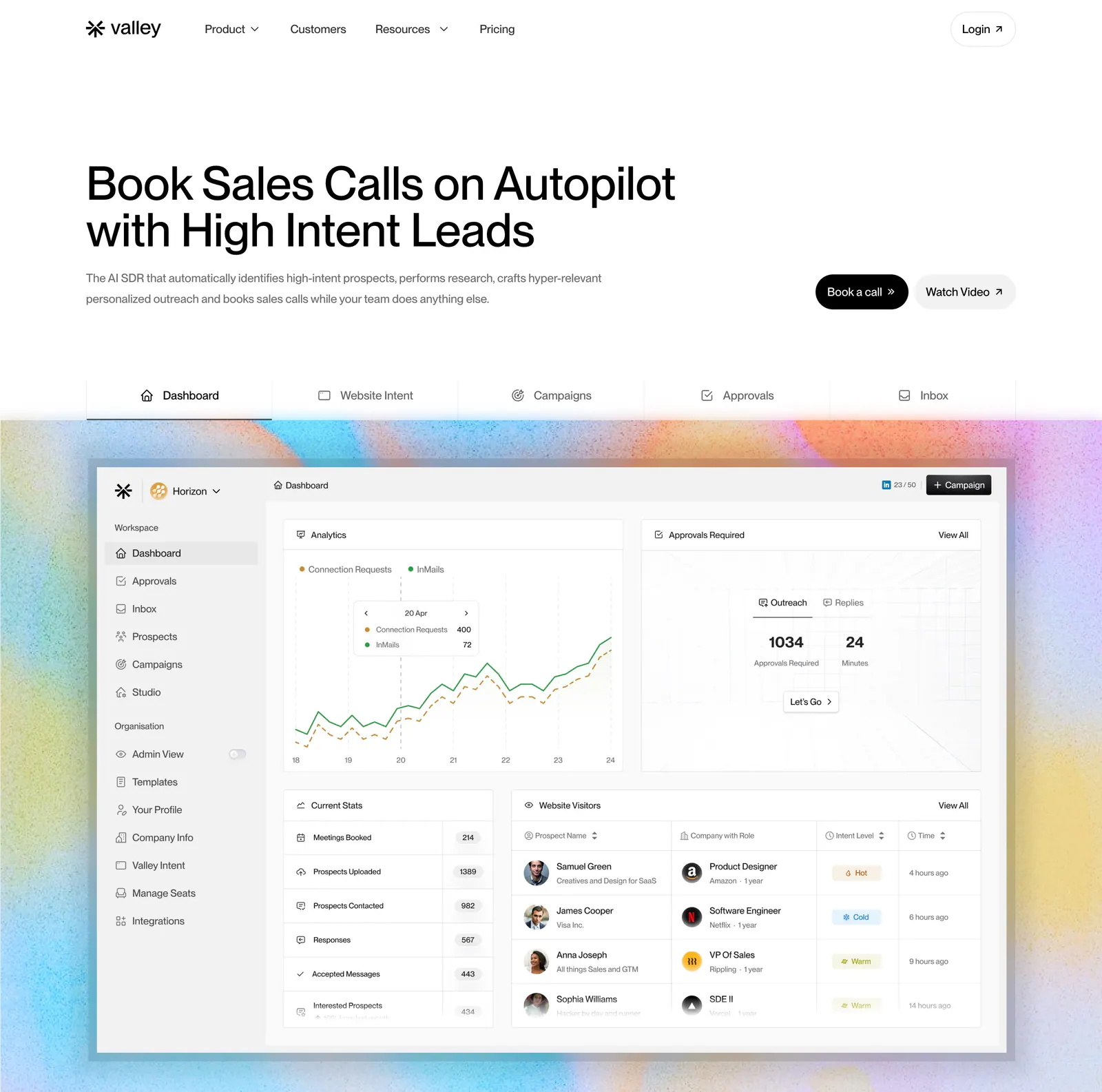
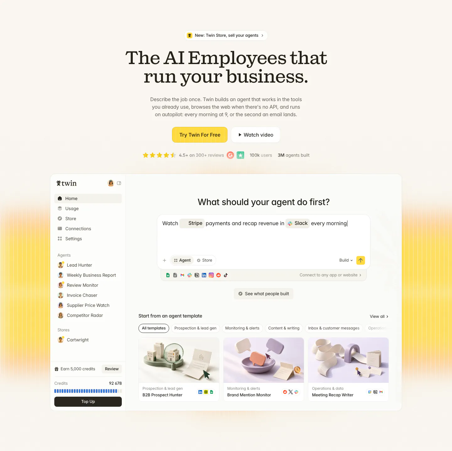

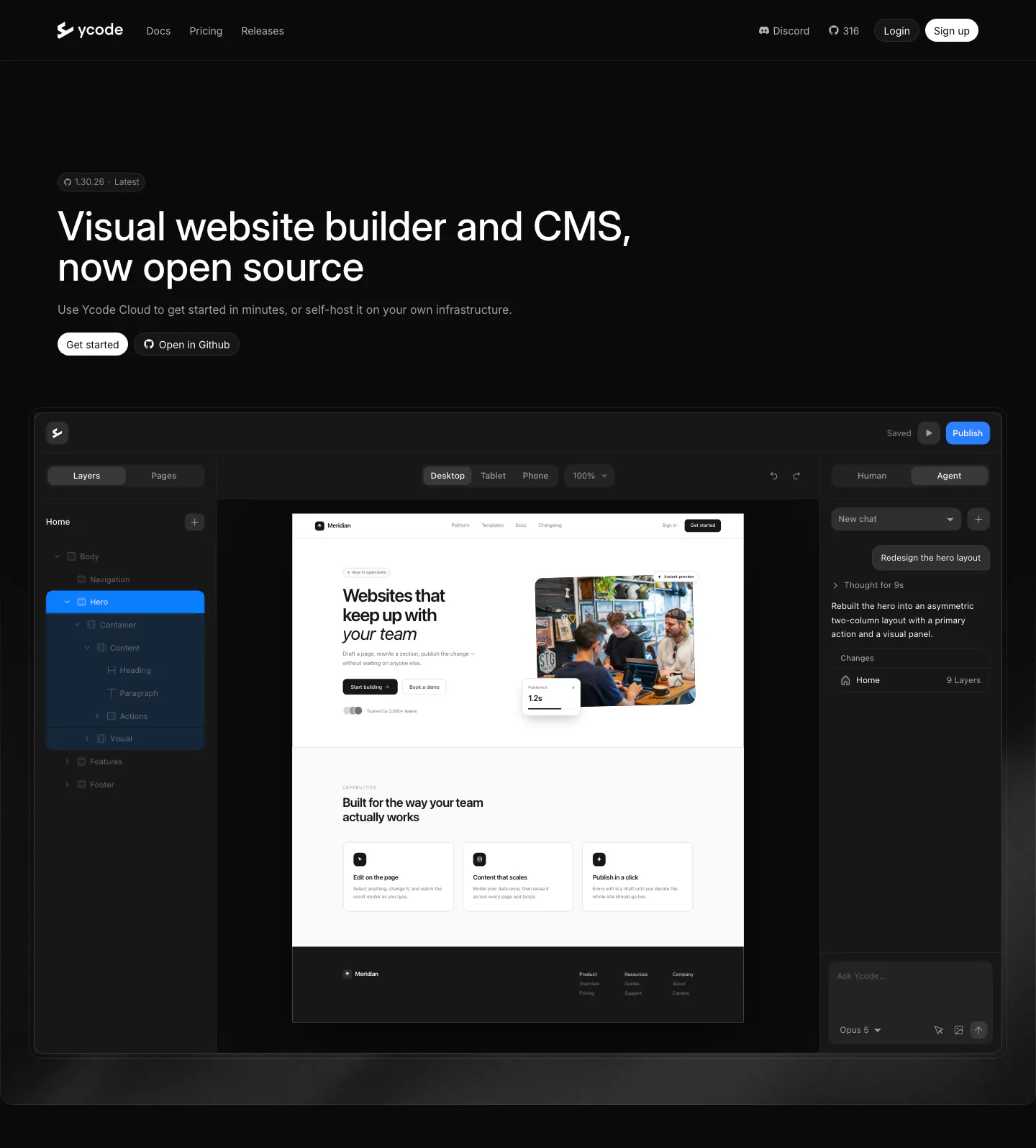
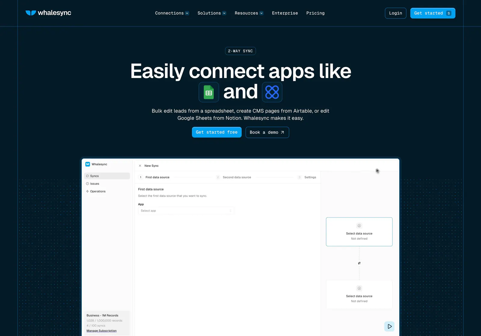


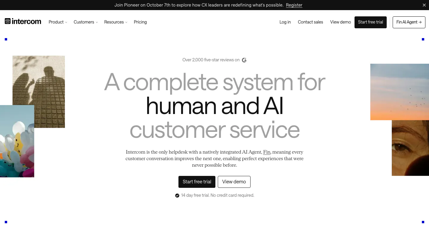
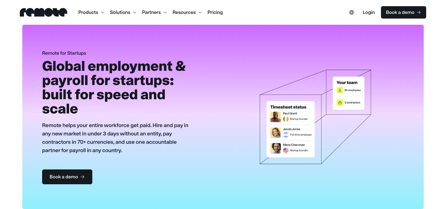
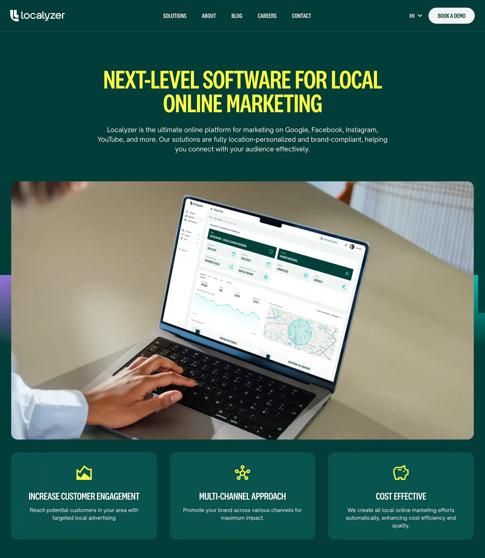
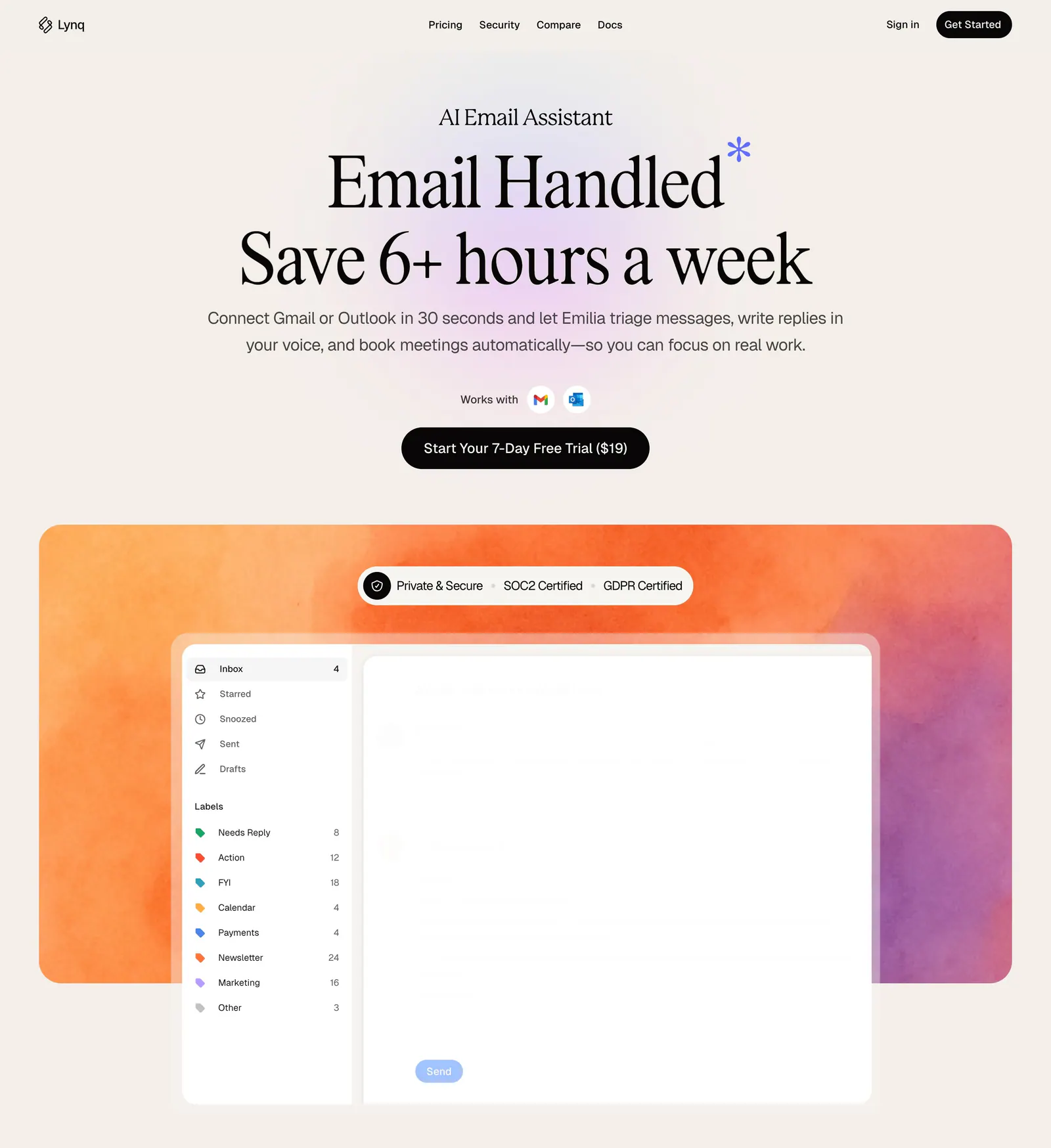
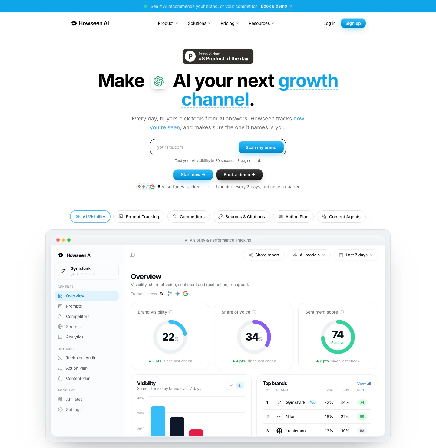
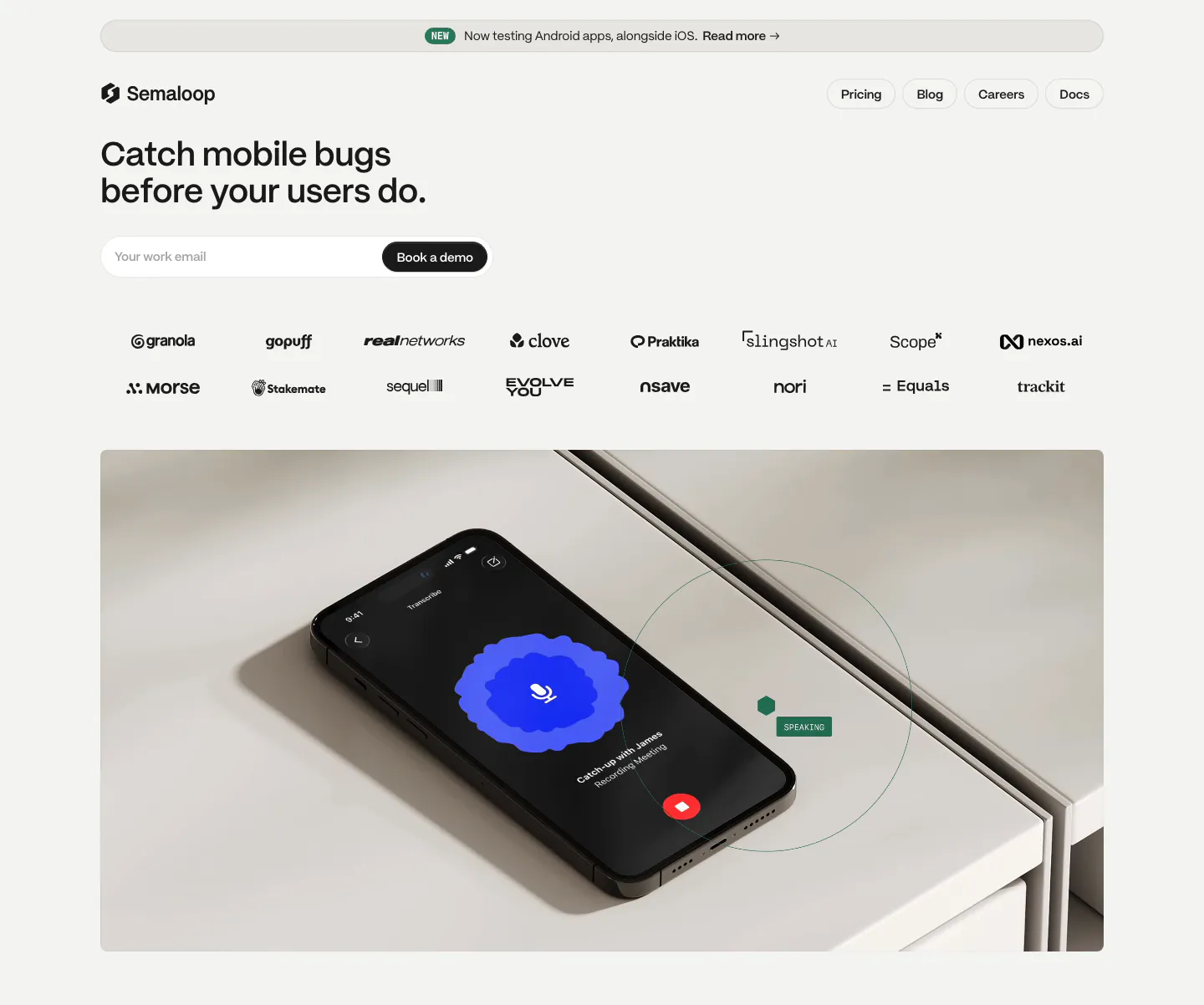
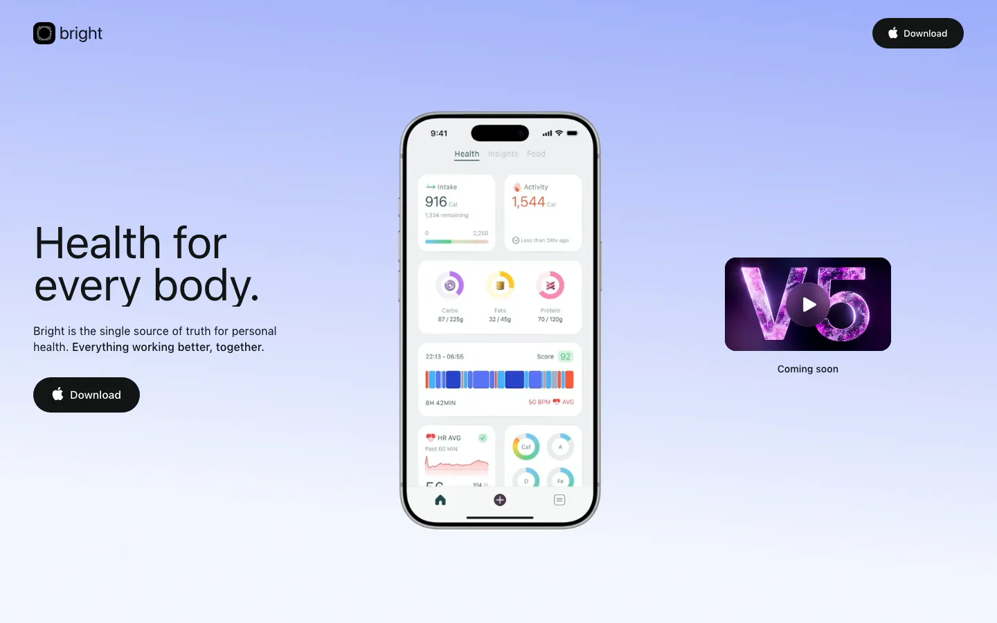
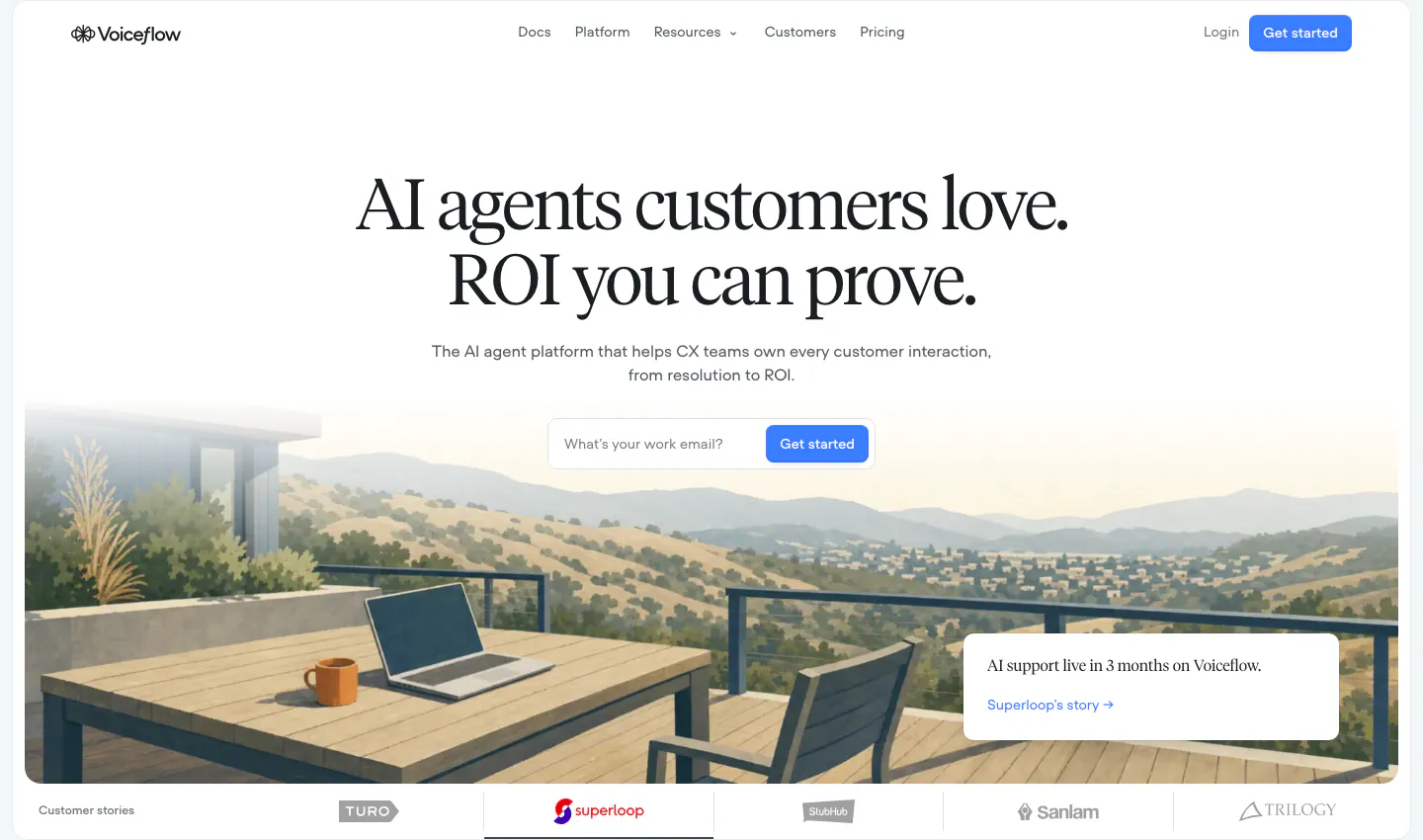
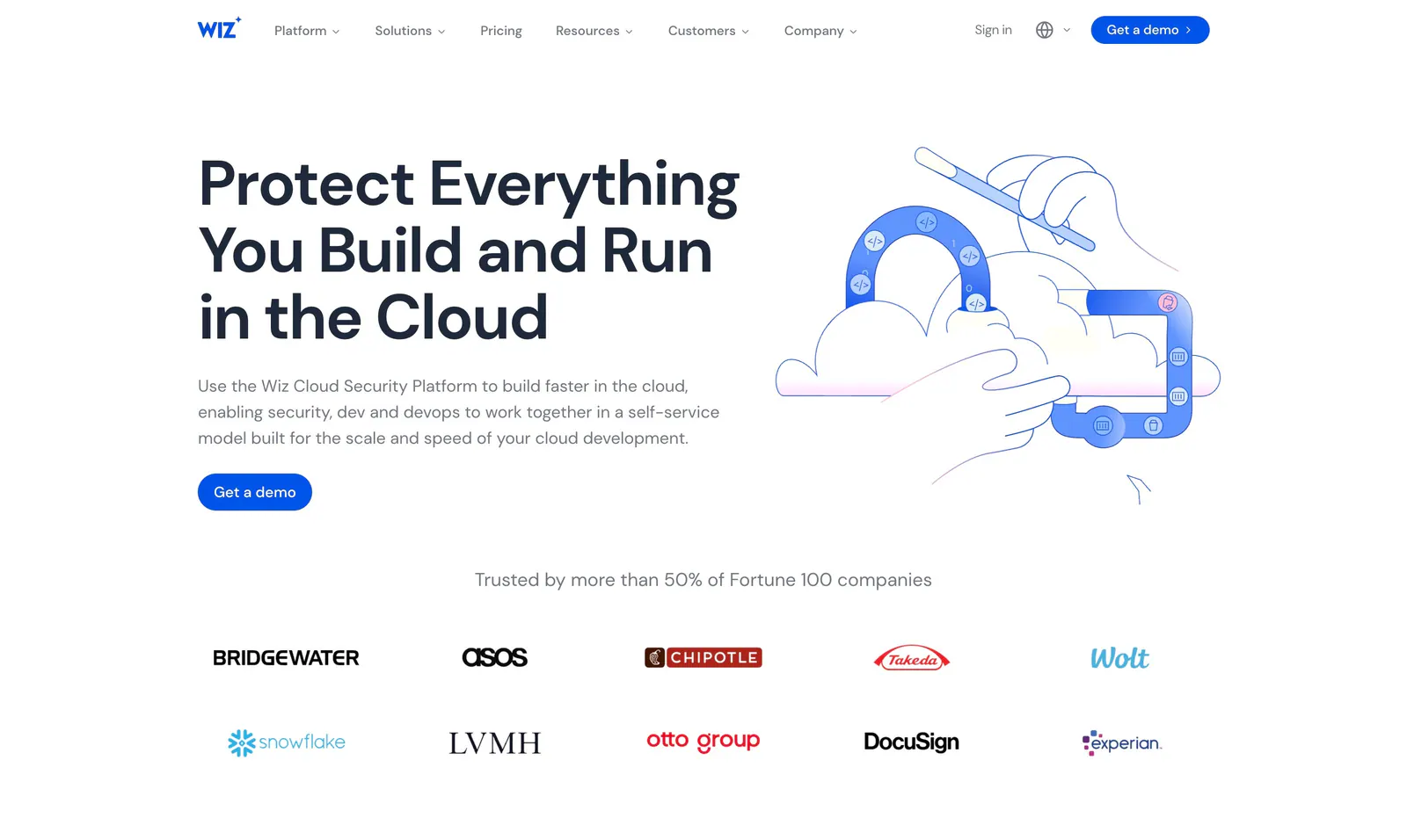
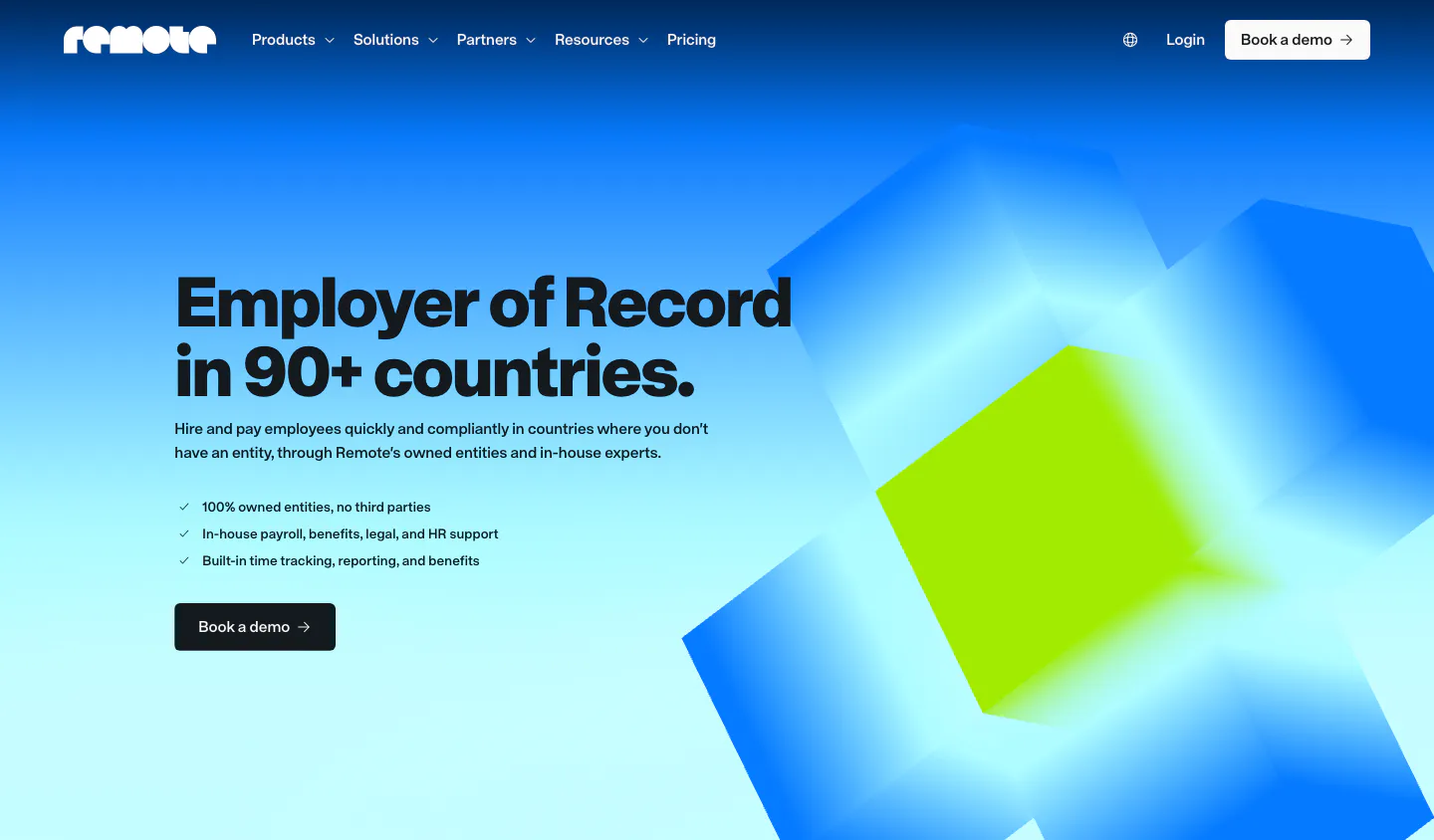
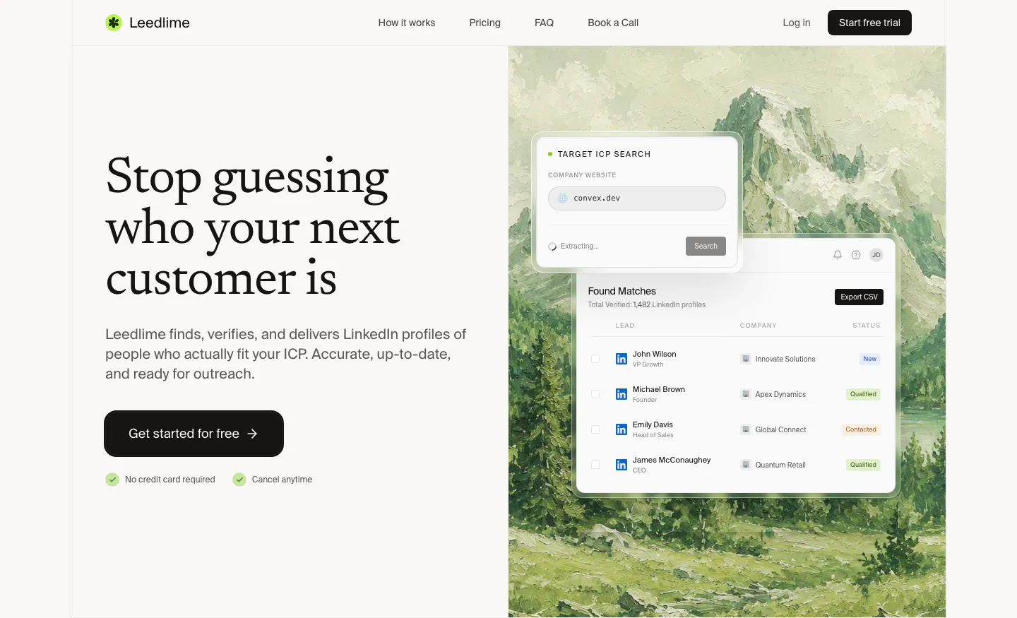
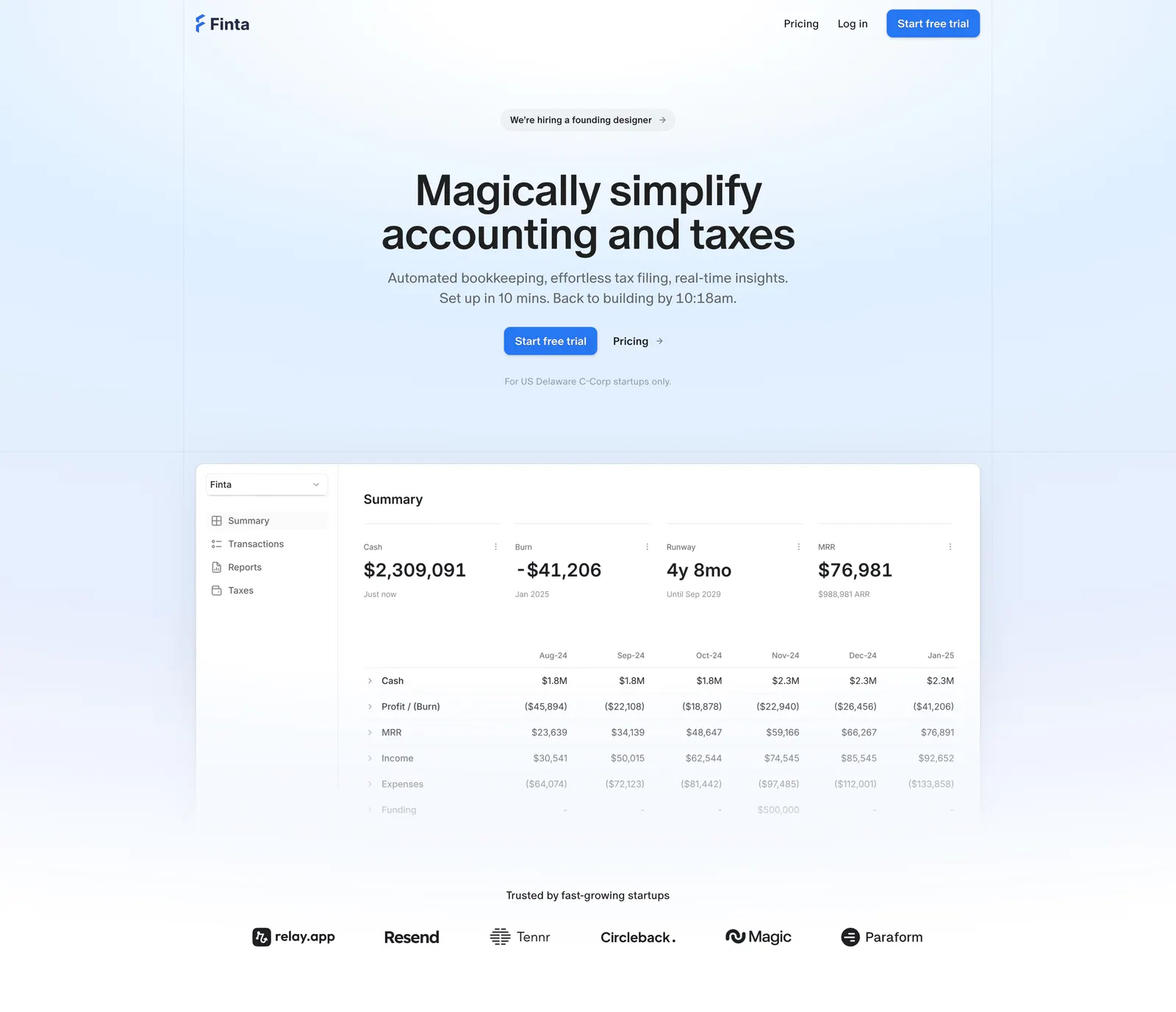

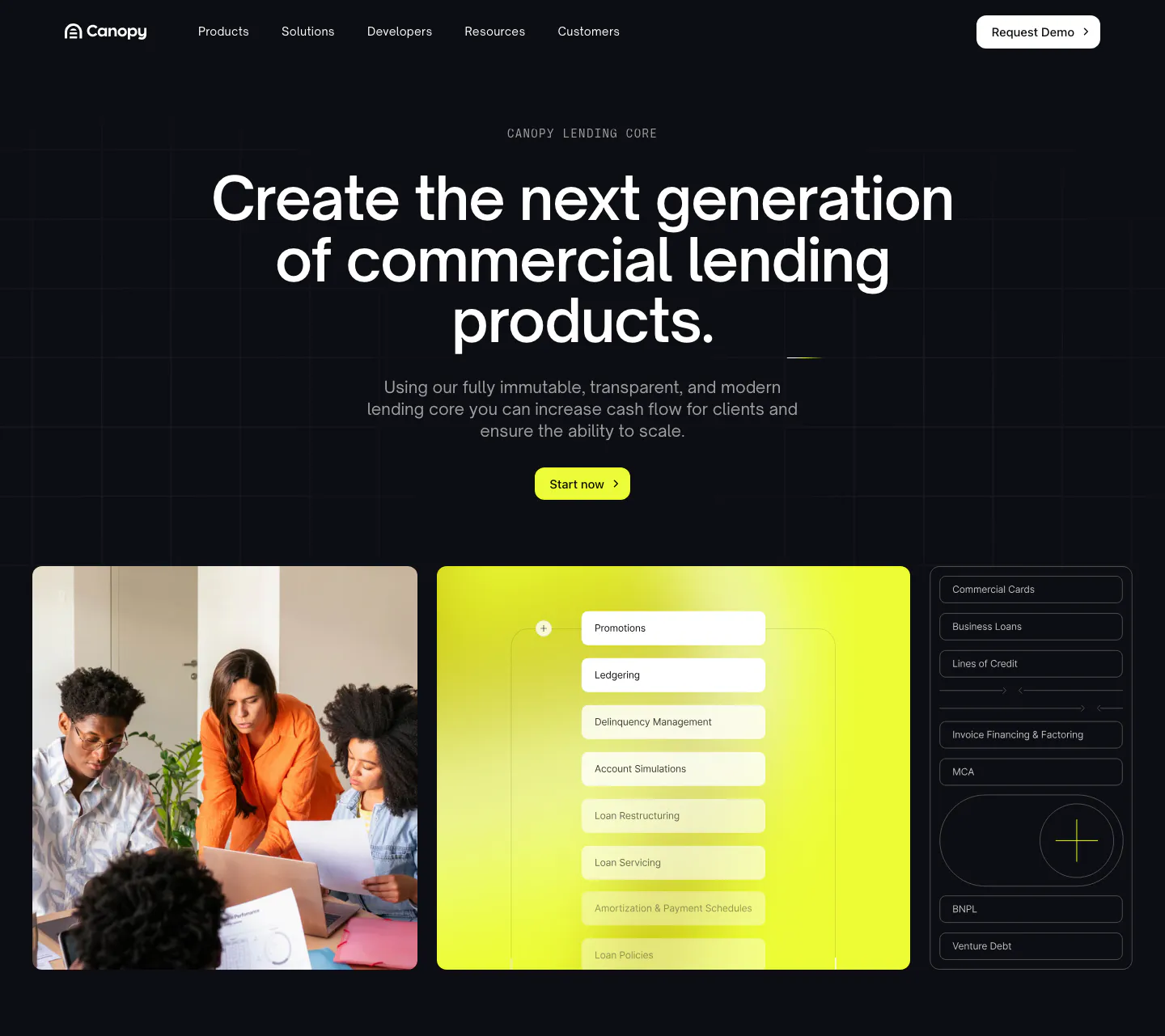
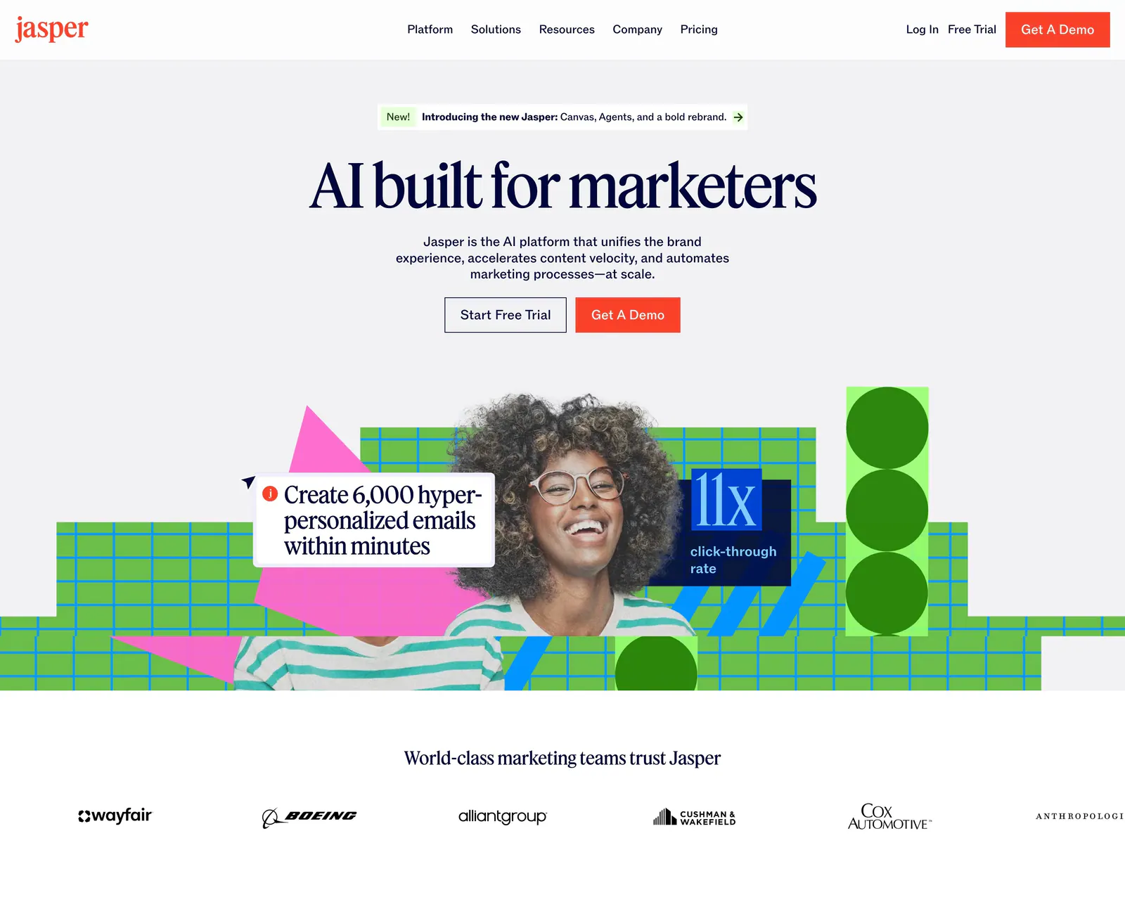
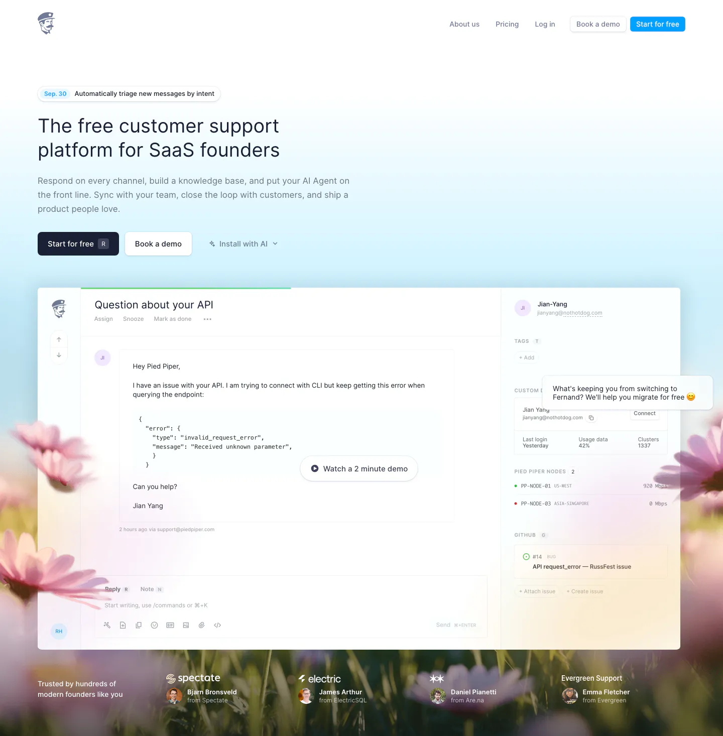
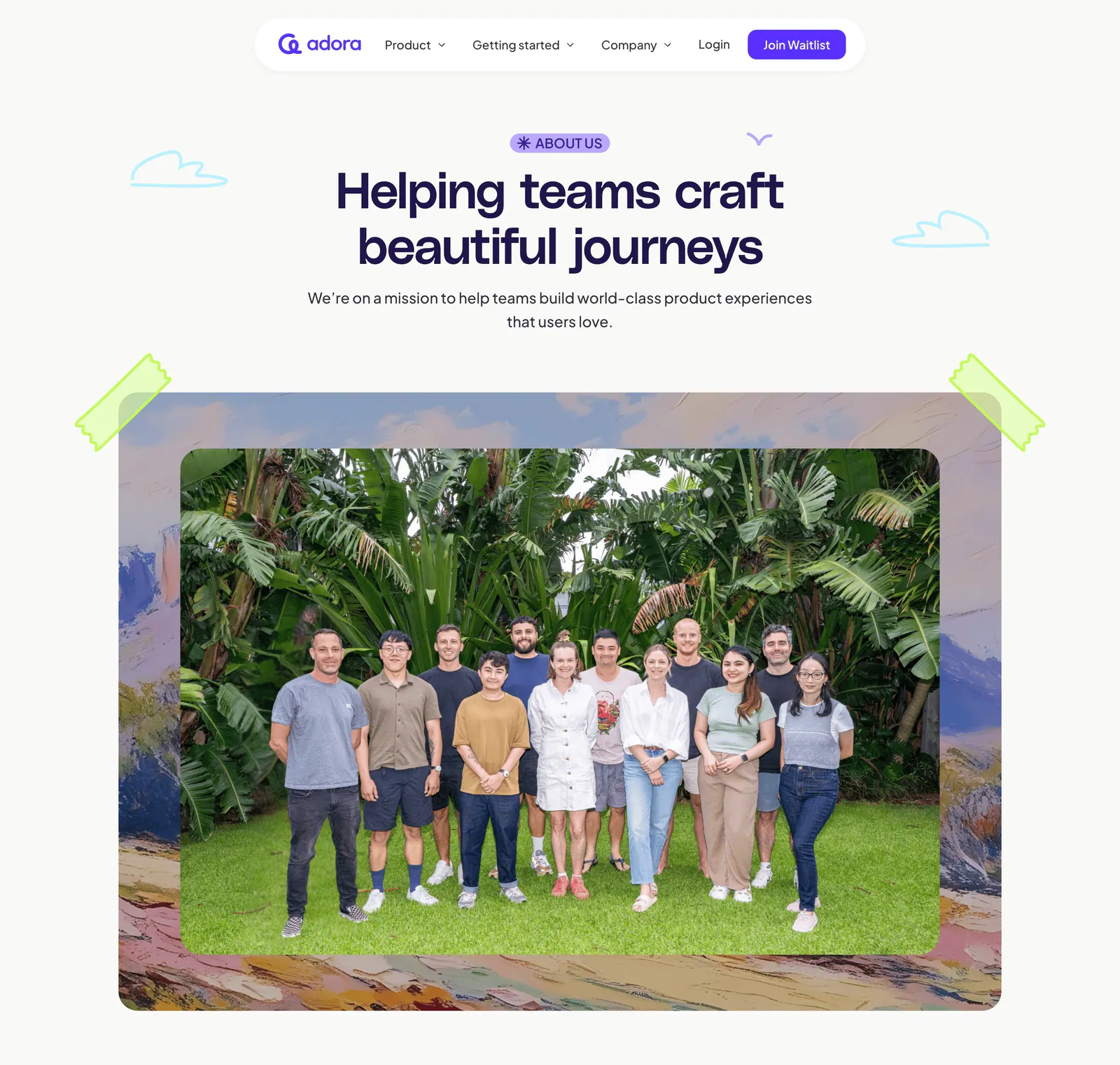
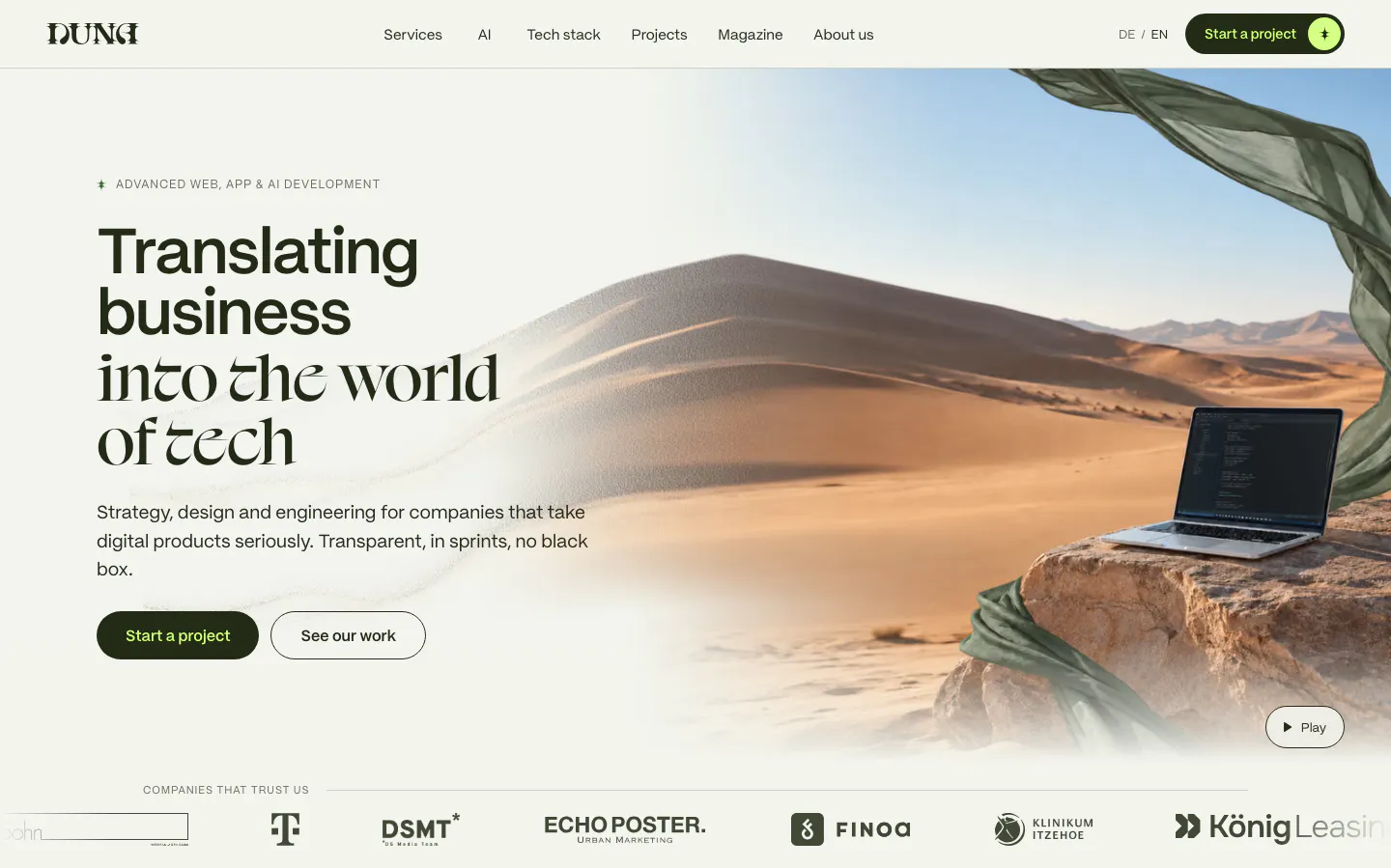
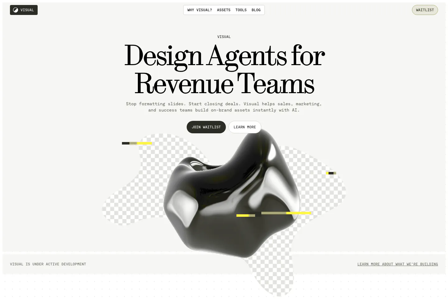
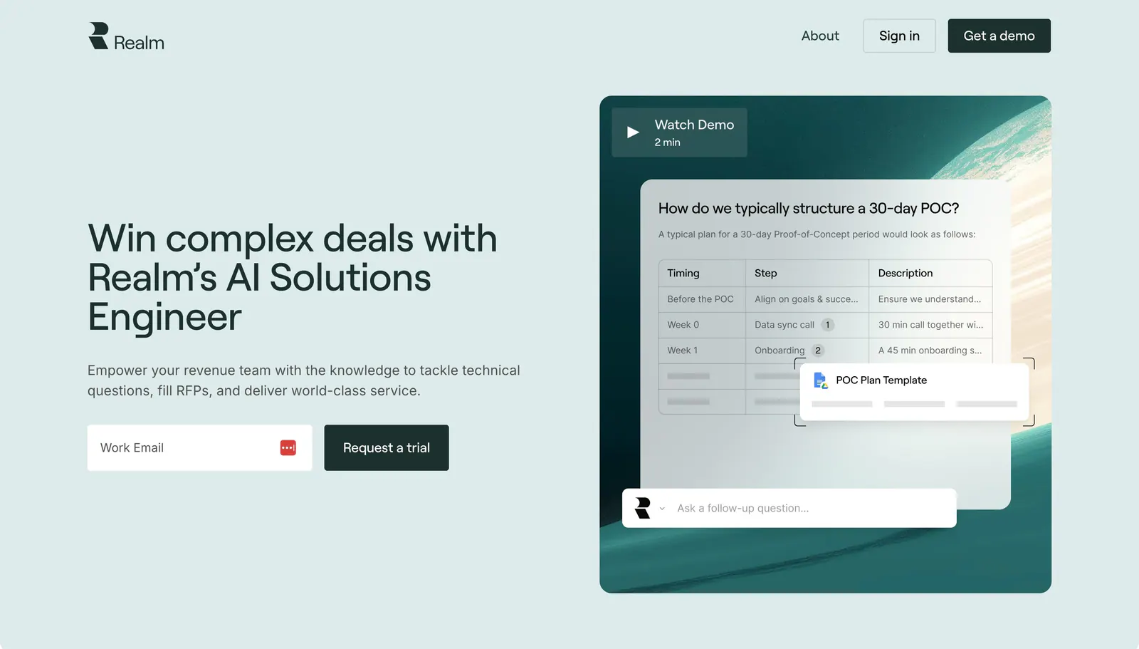

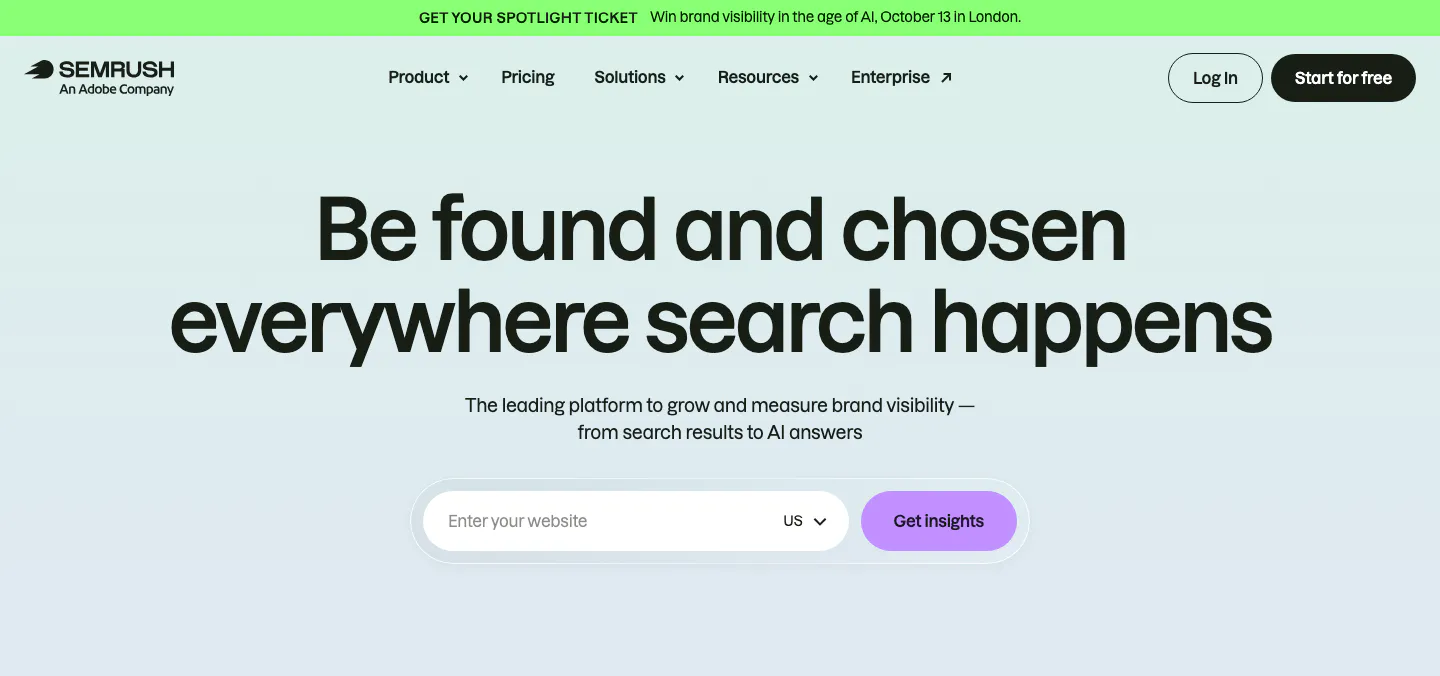


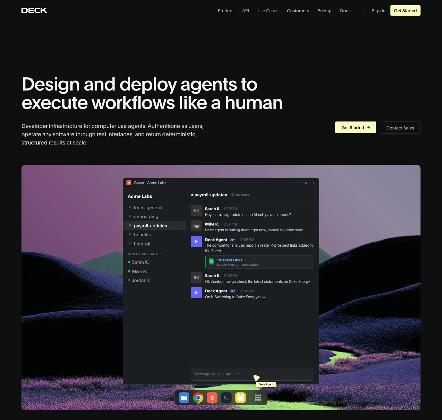
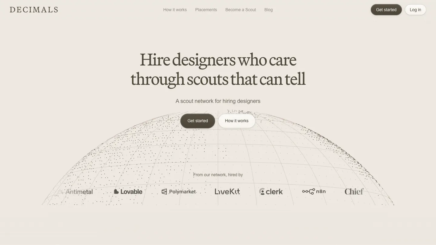
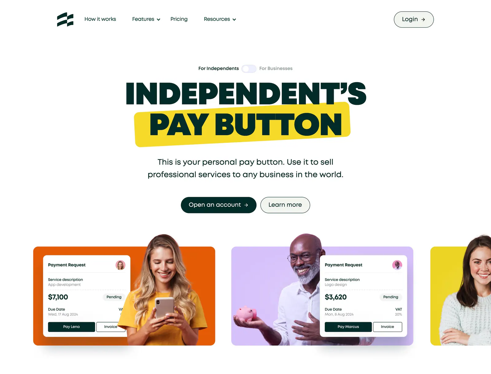
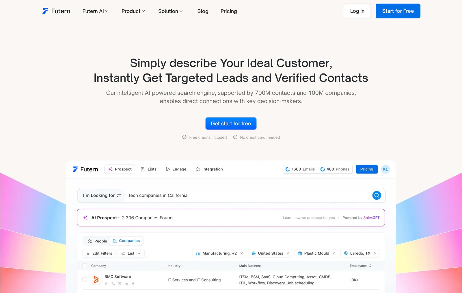

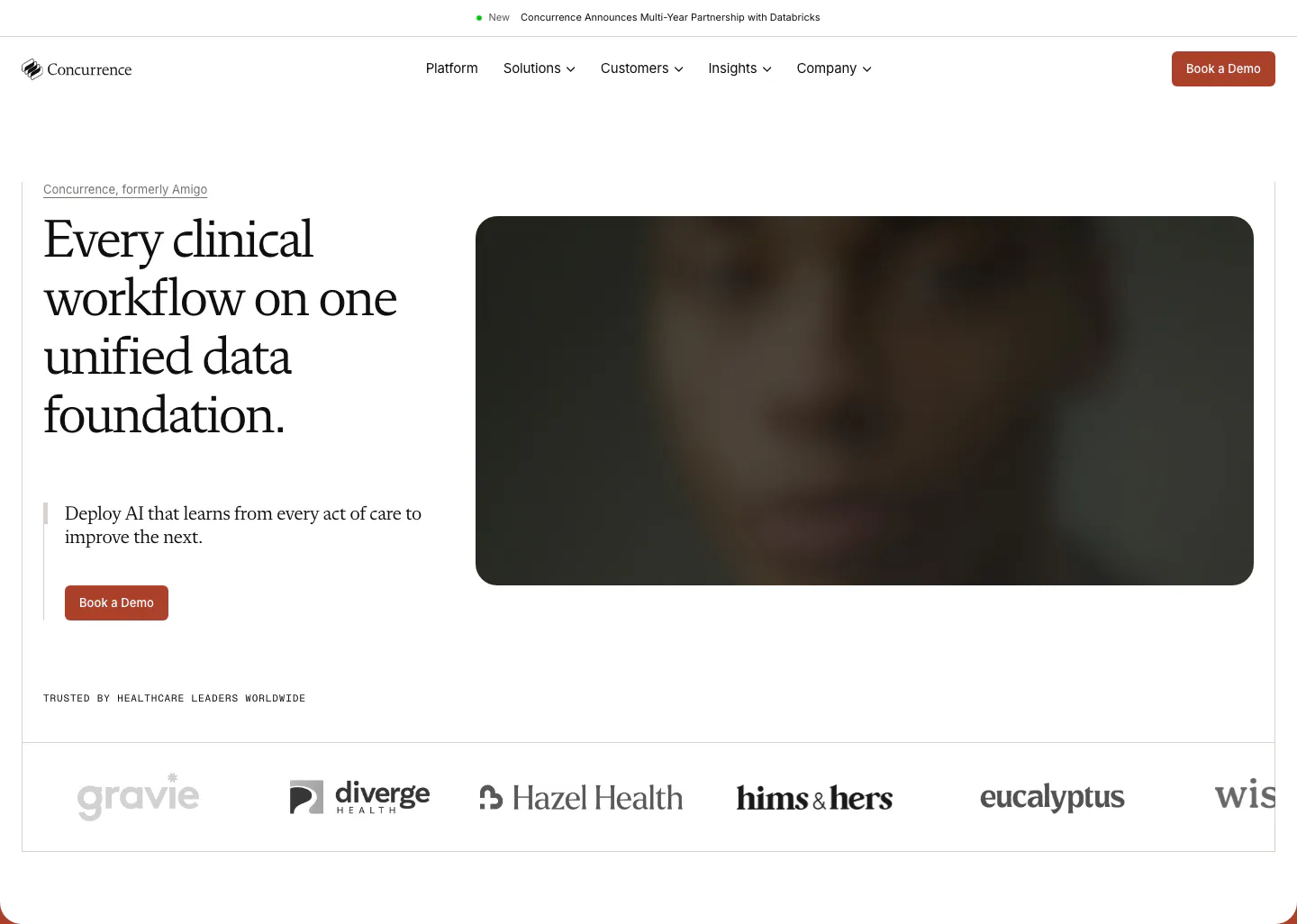
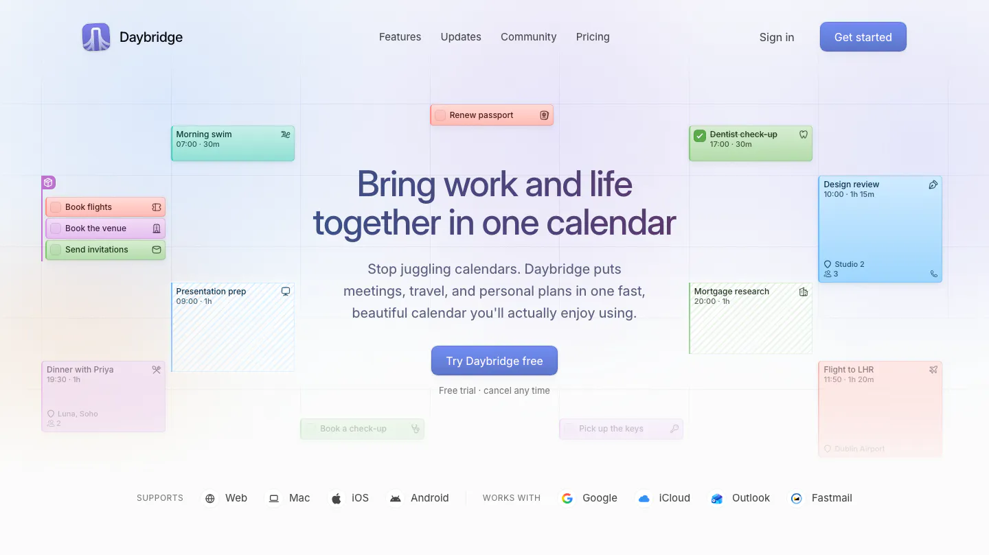

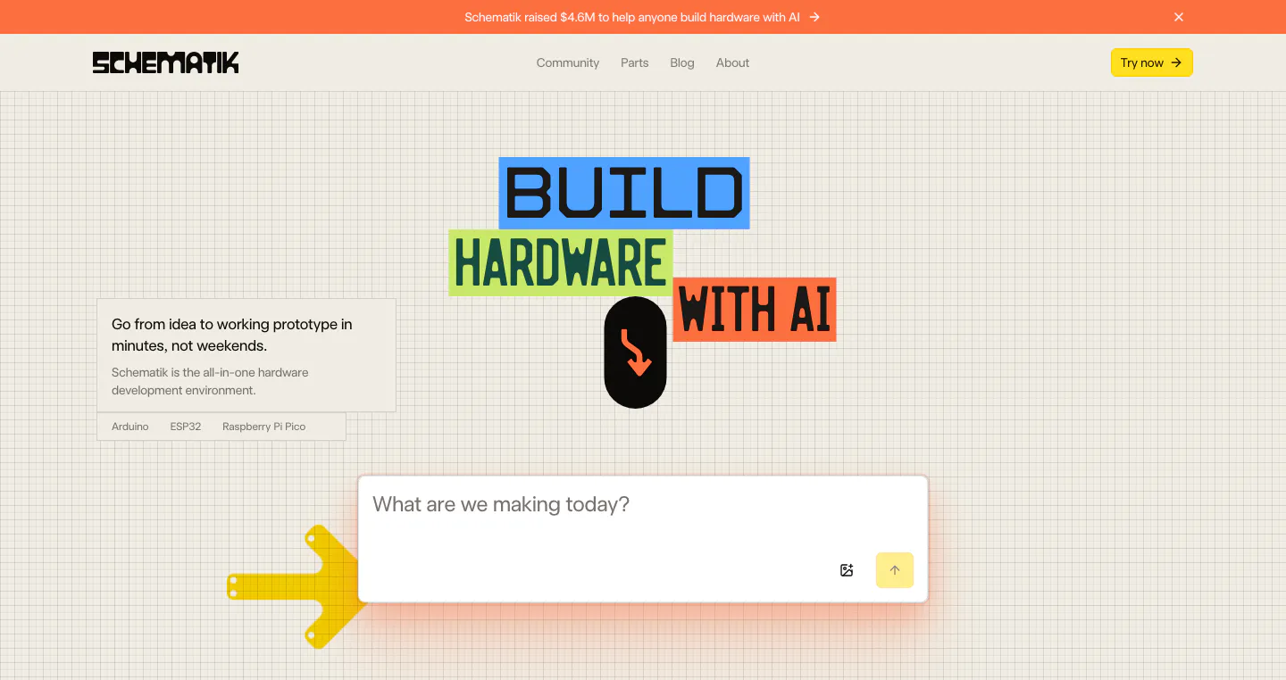

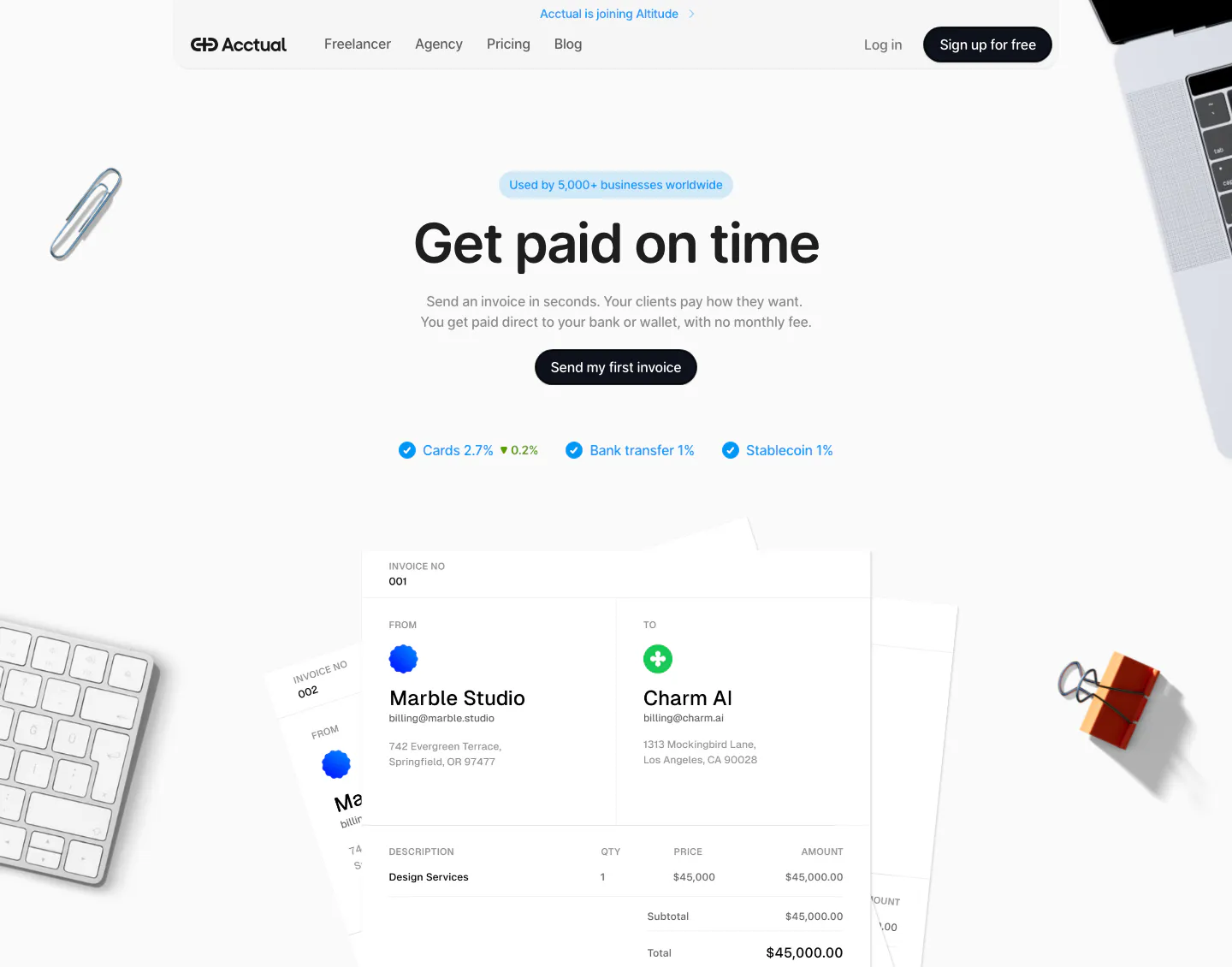
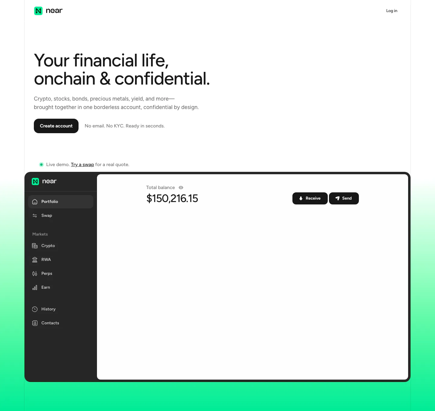
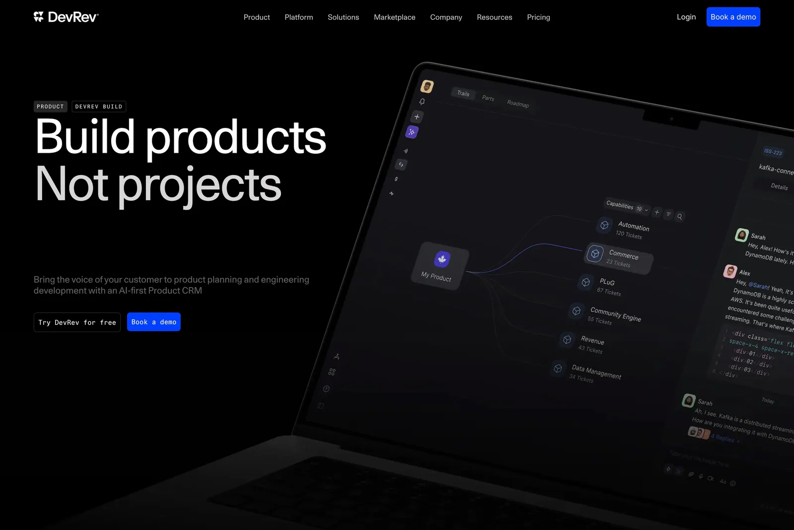
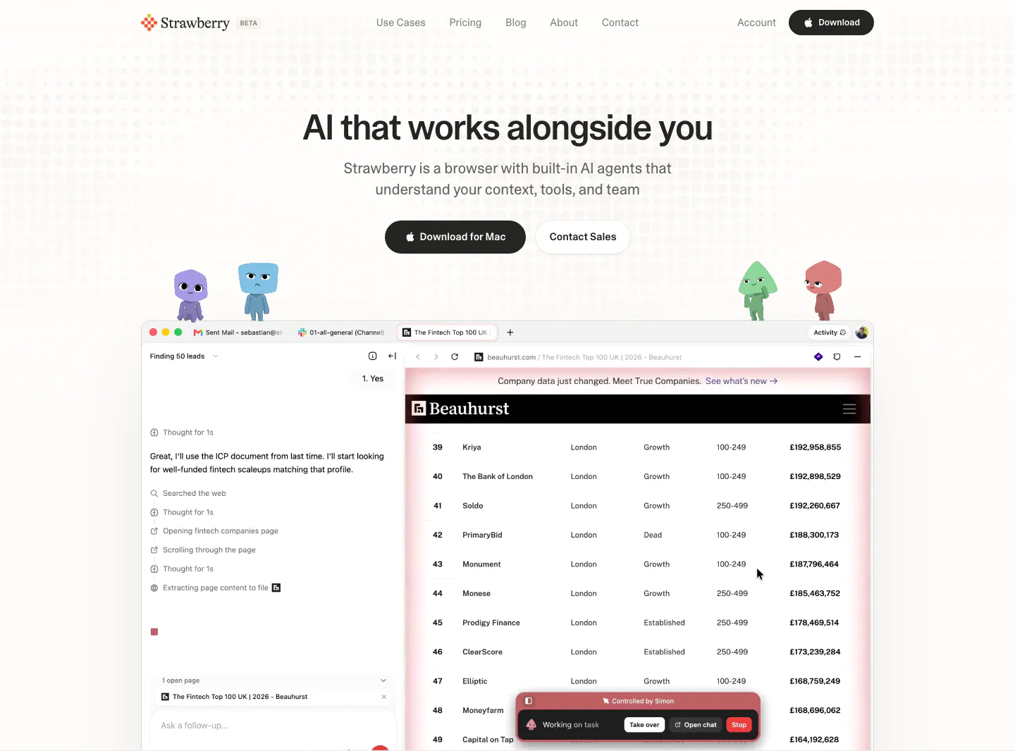
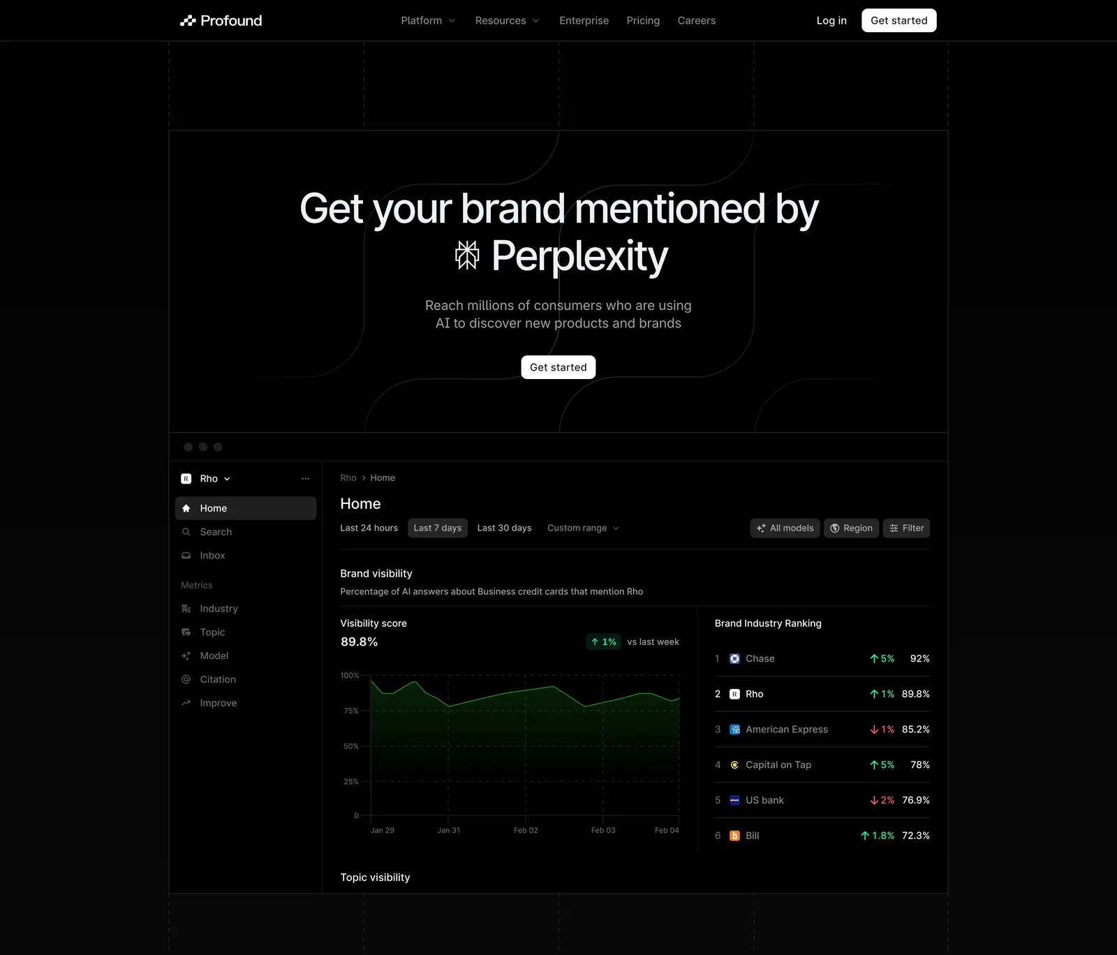



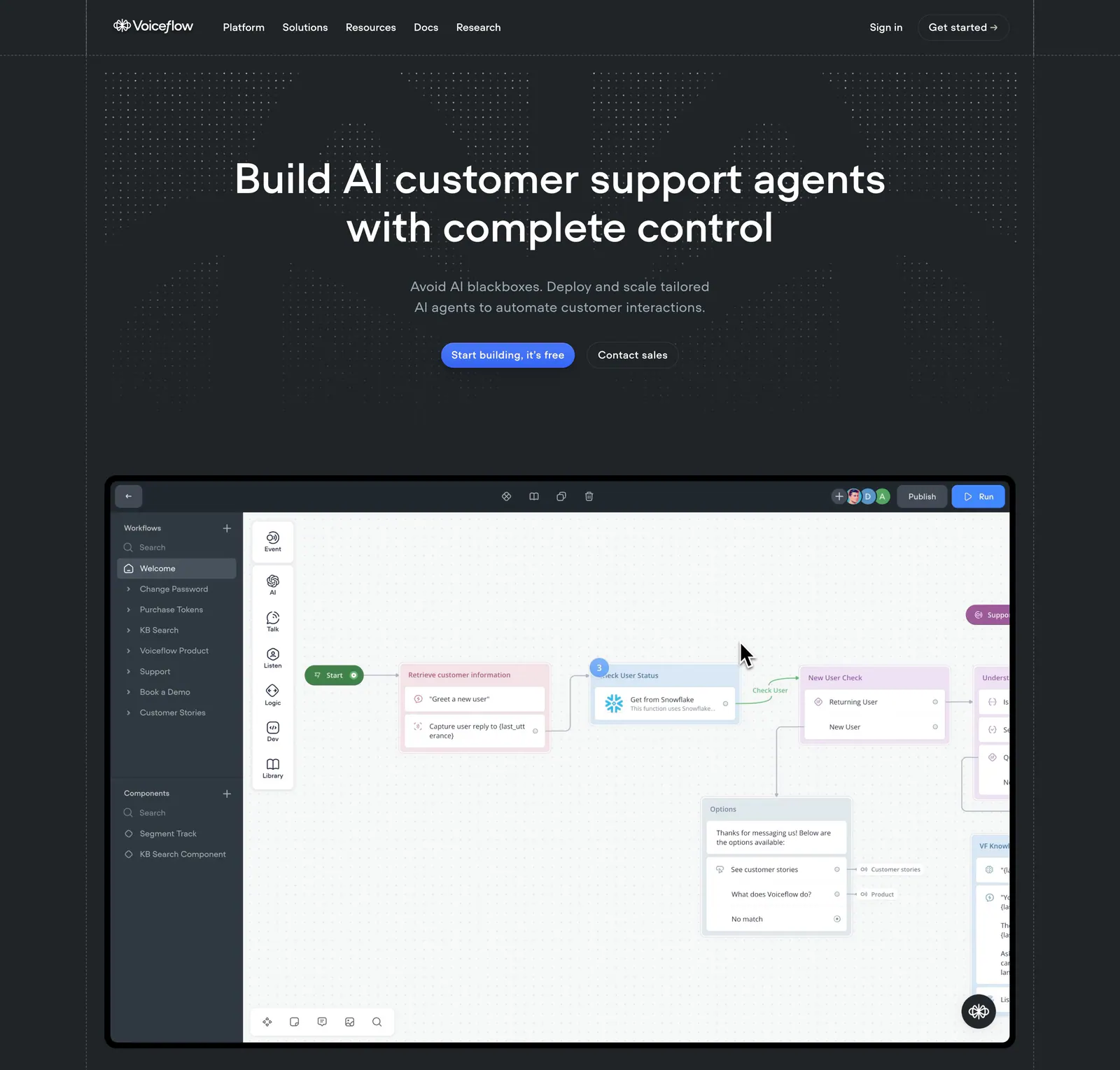
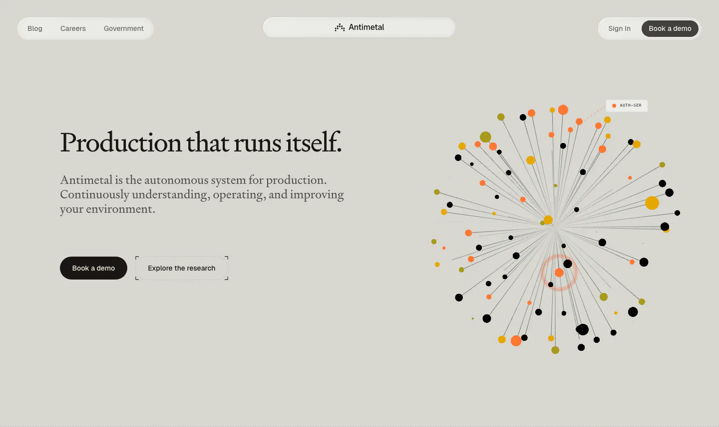
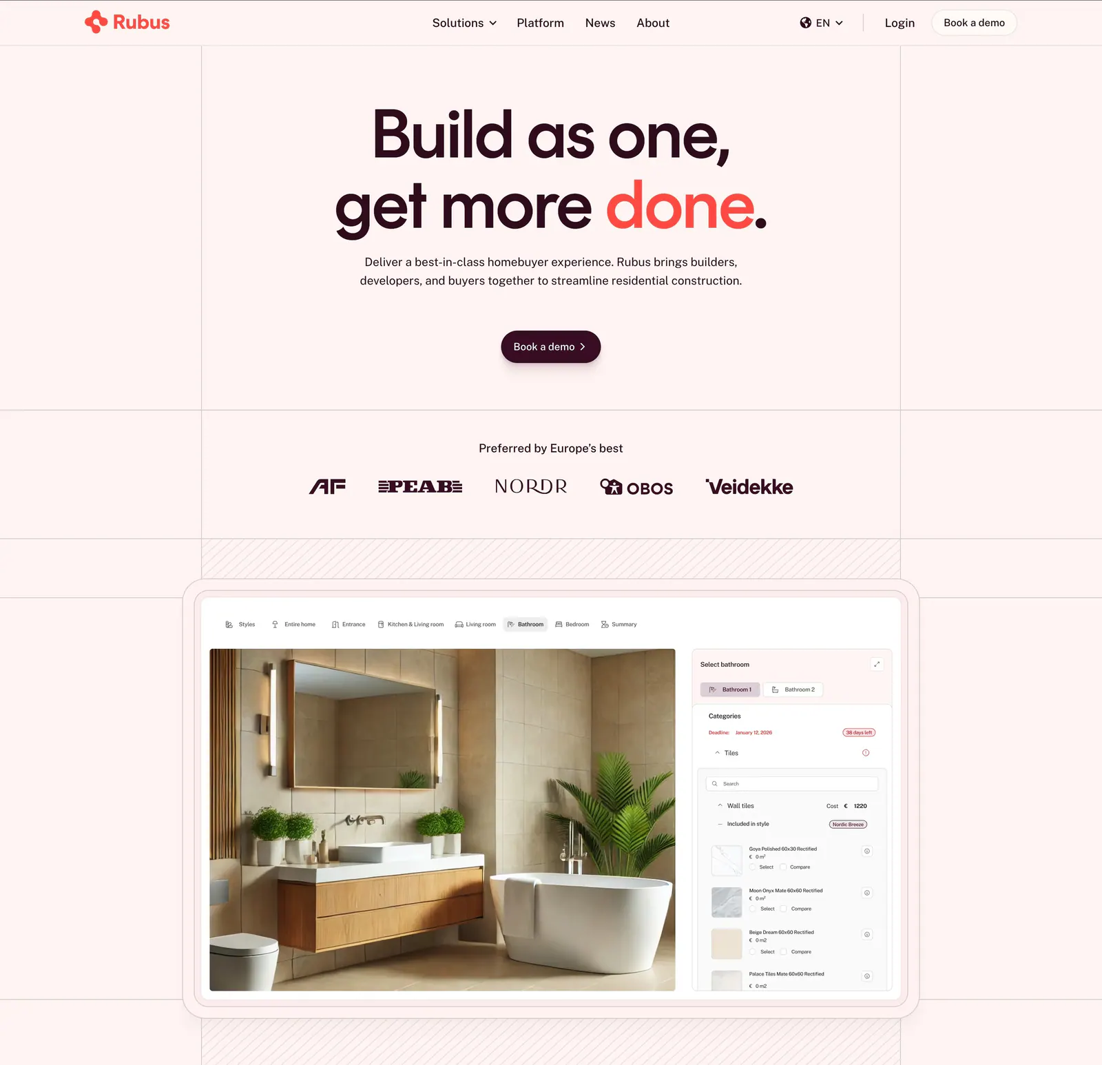
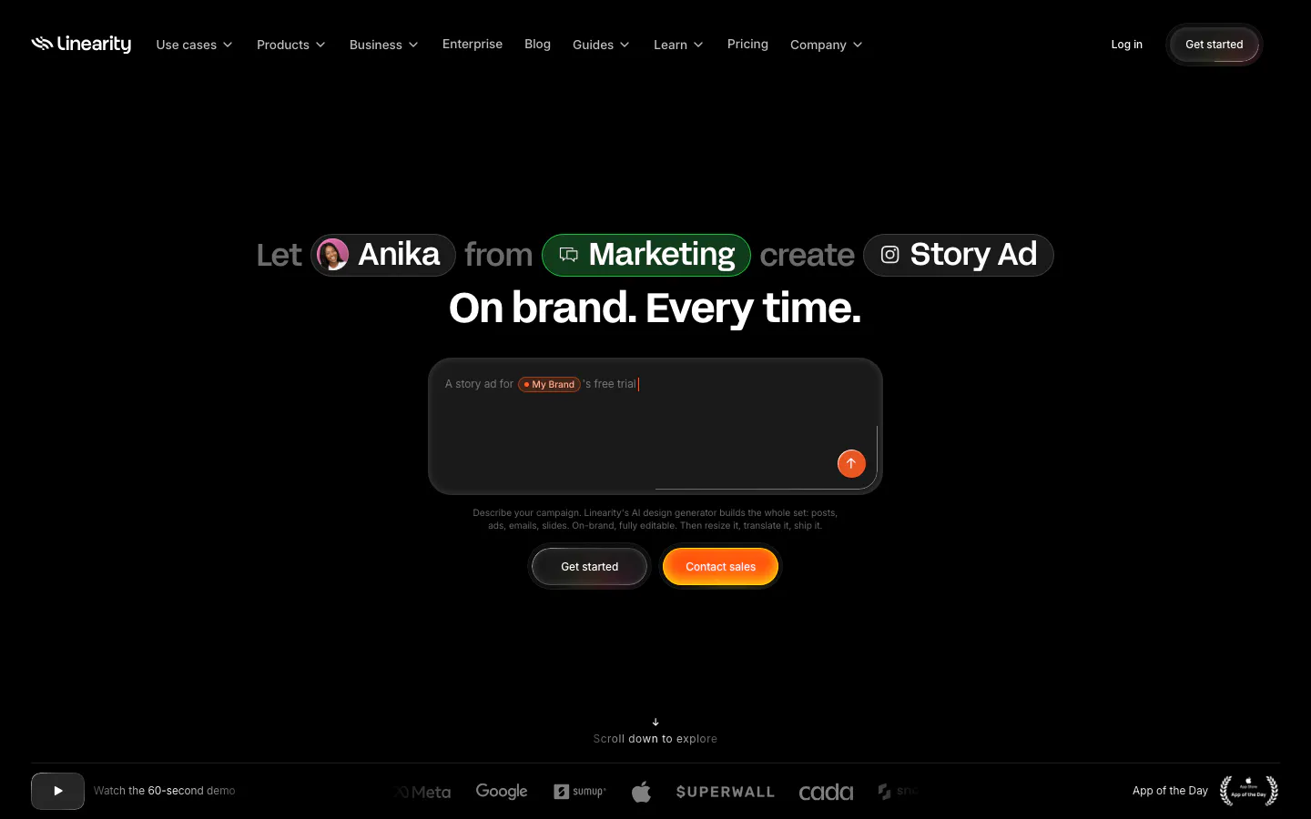





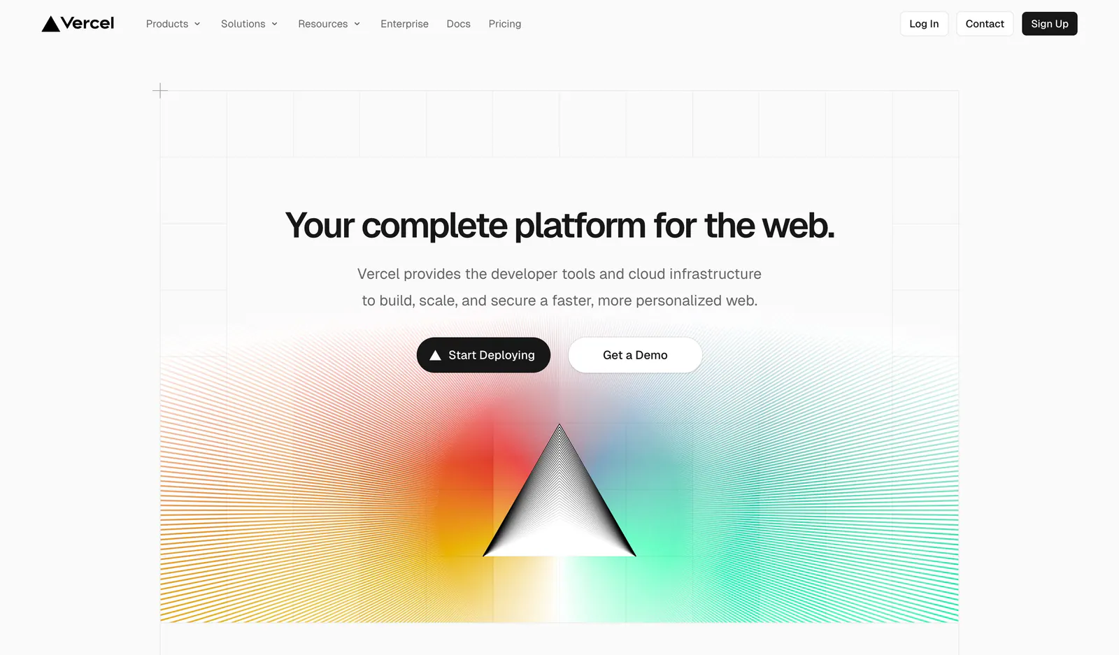
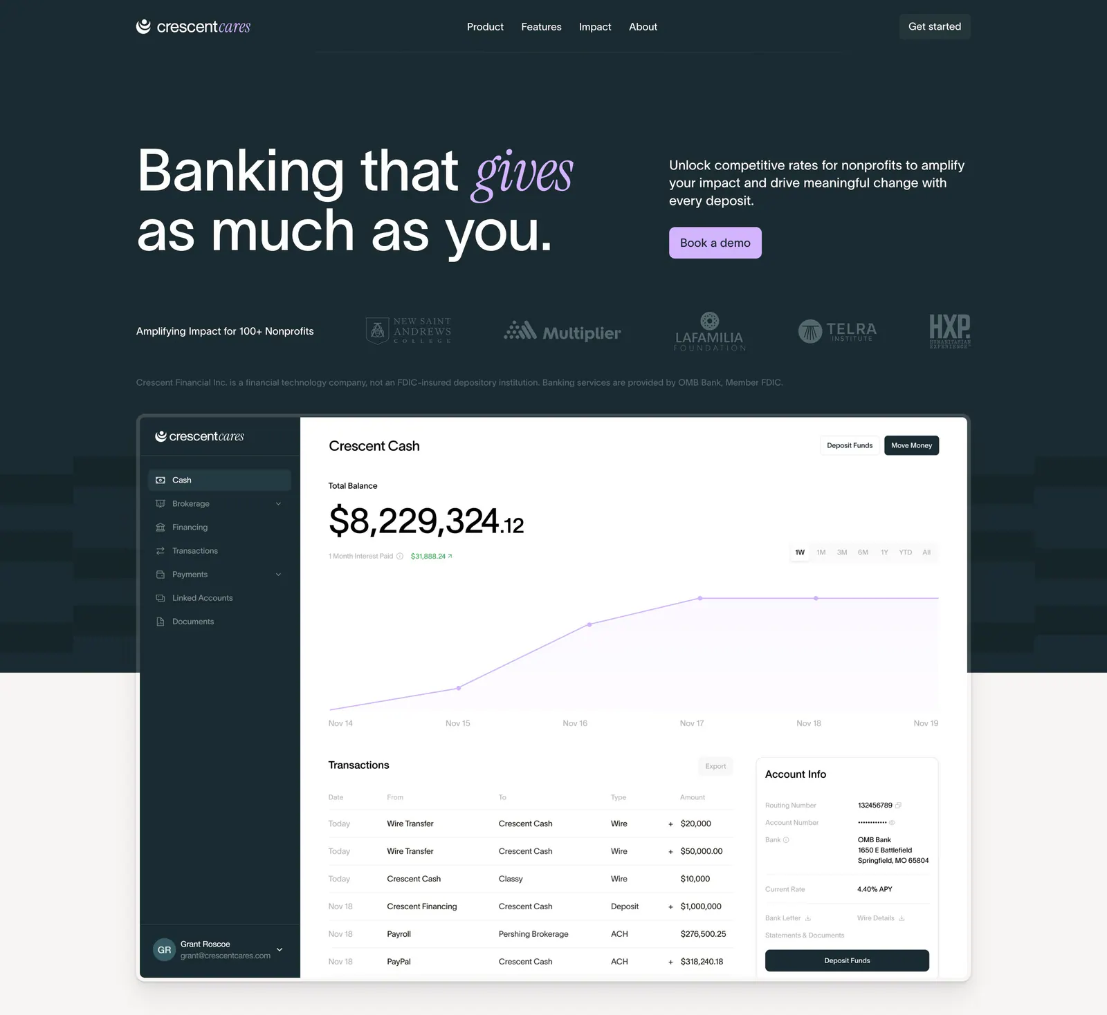
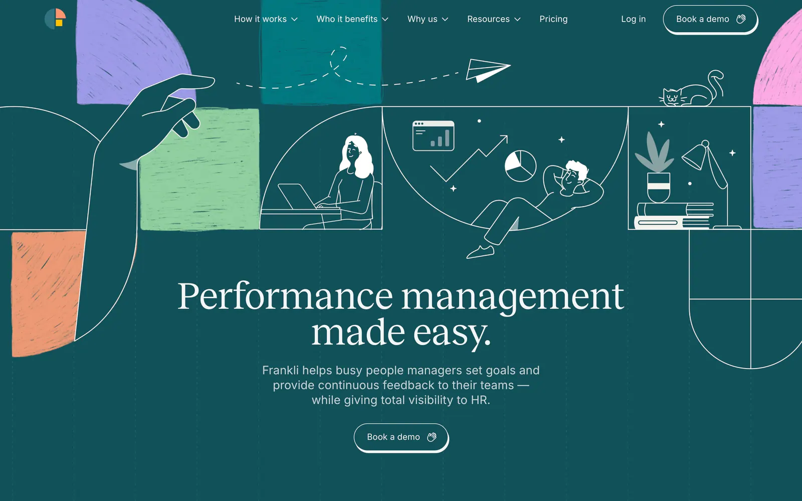
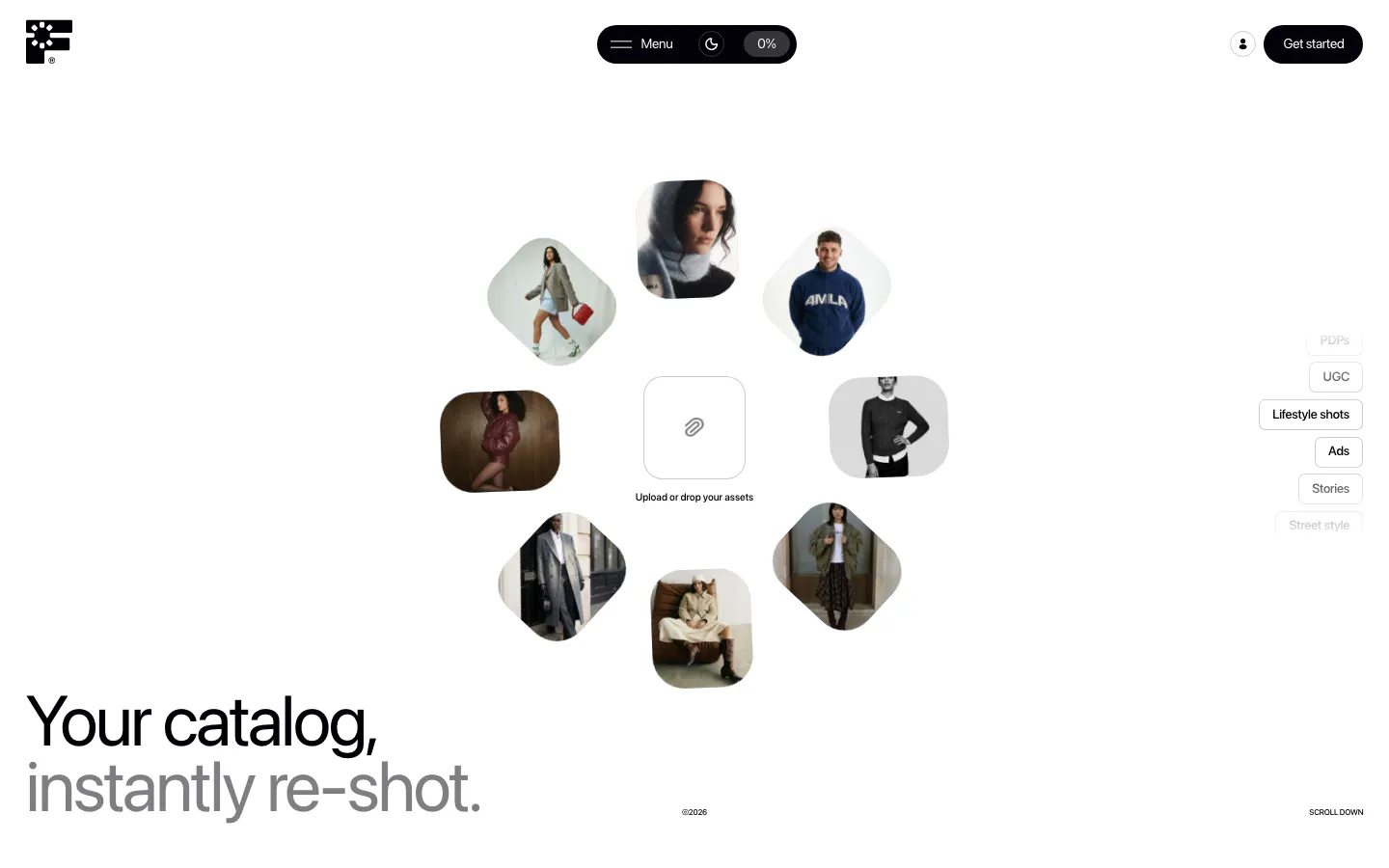
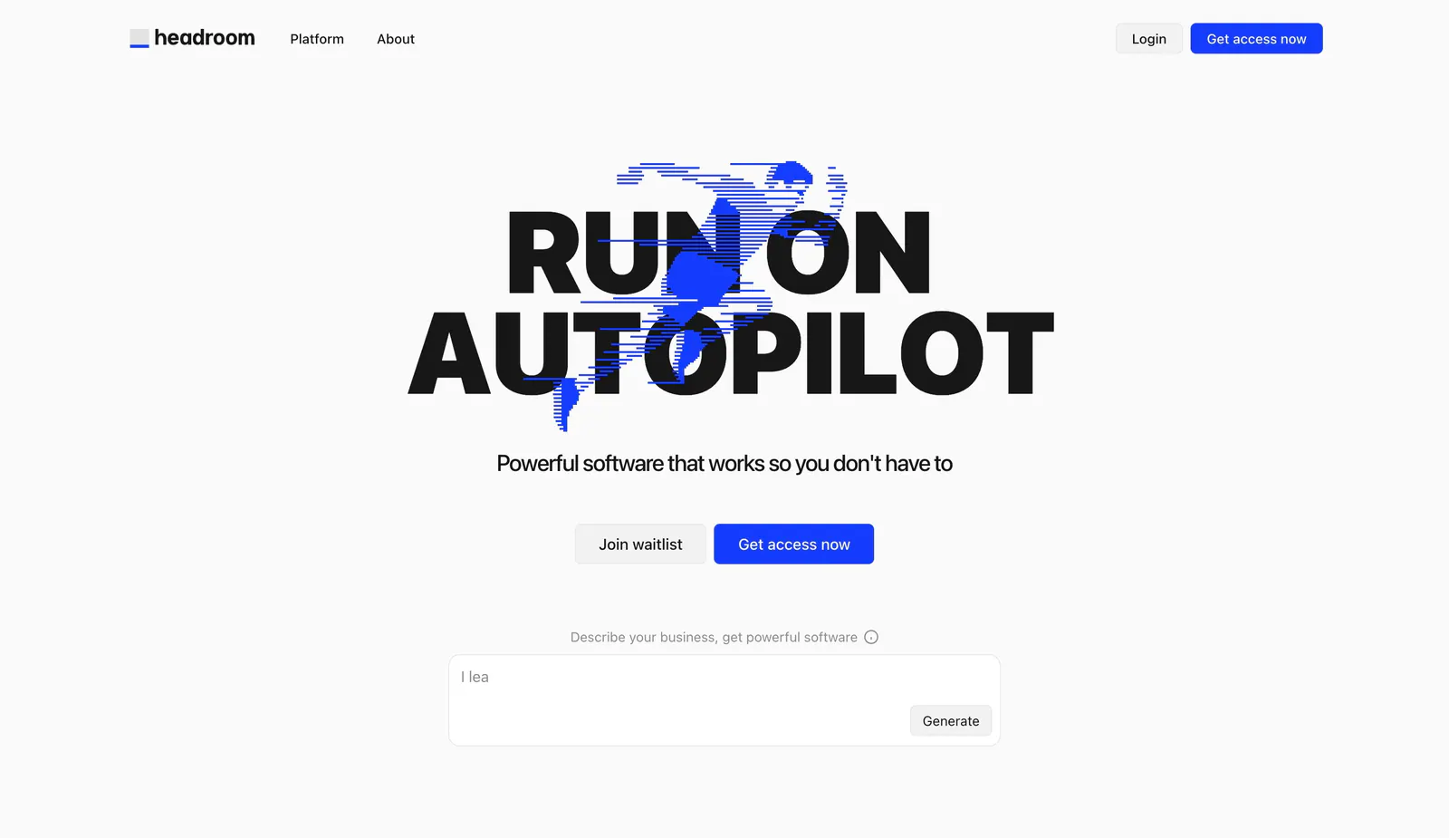
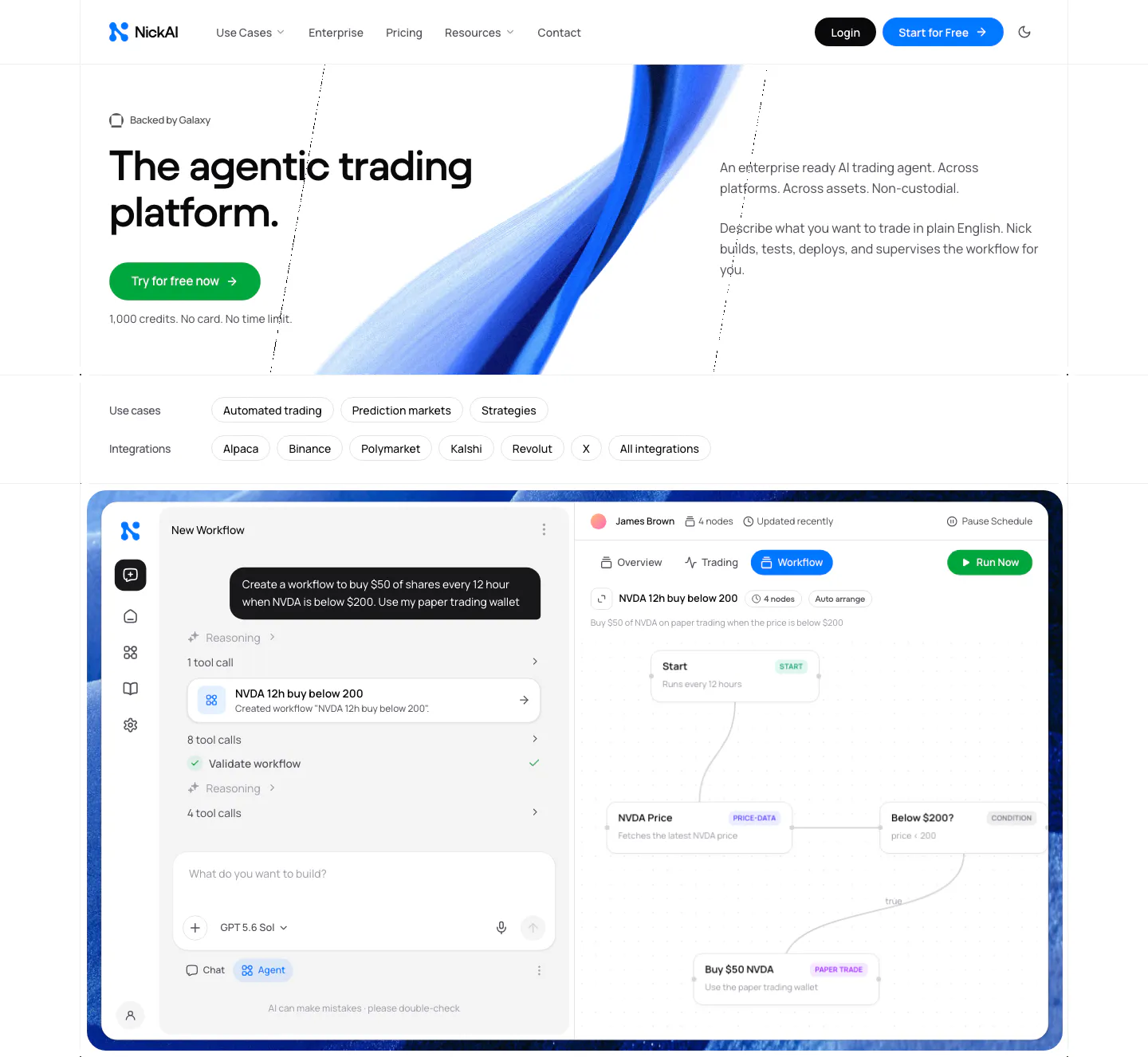
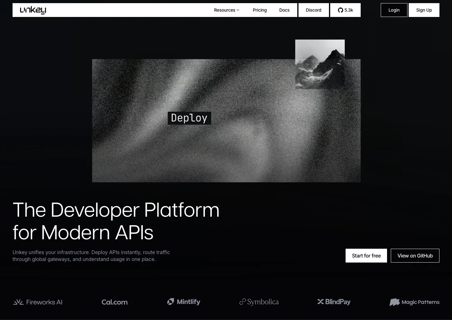
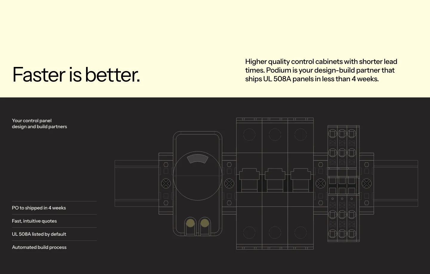


Common patterns in hero sections
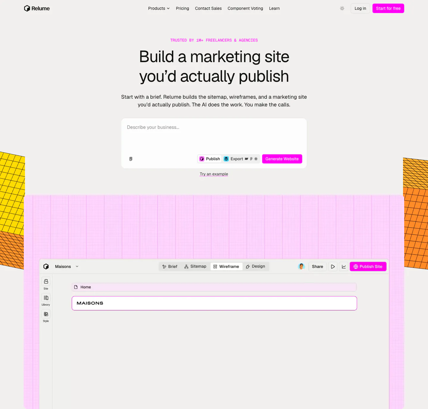
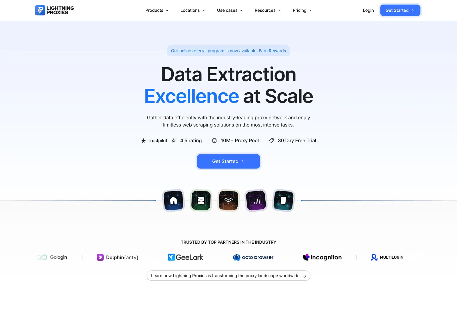
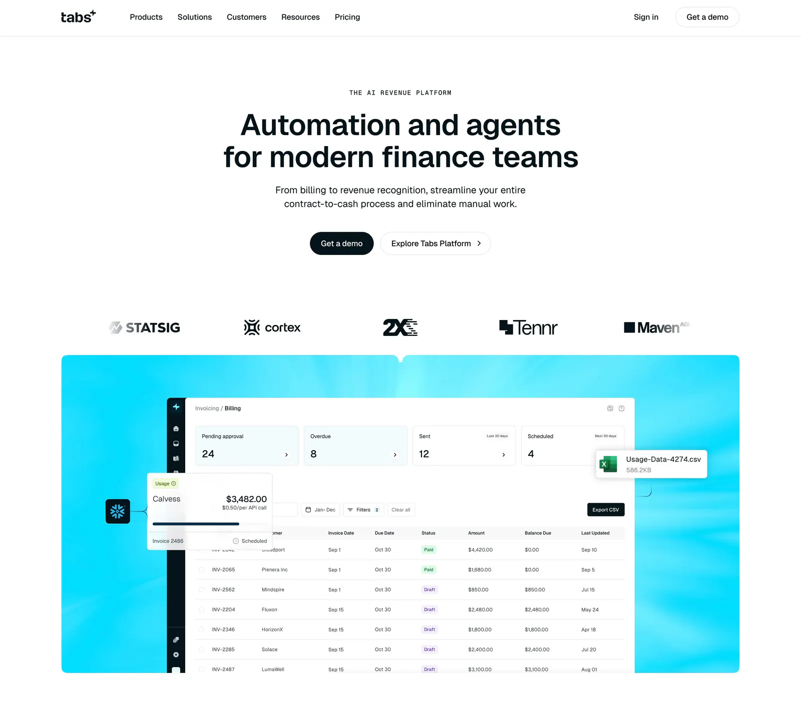
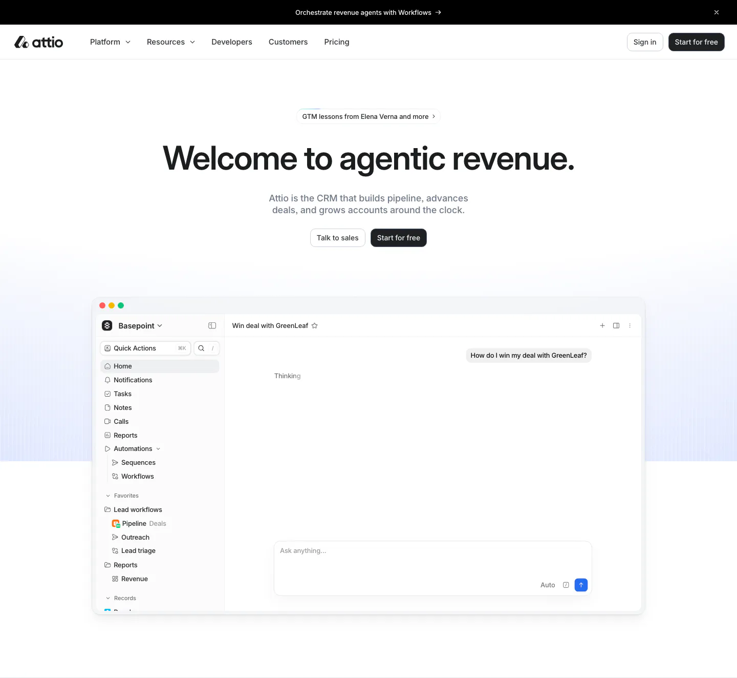
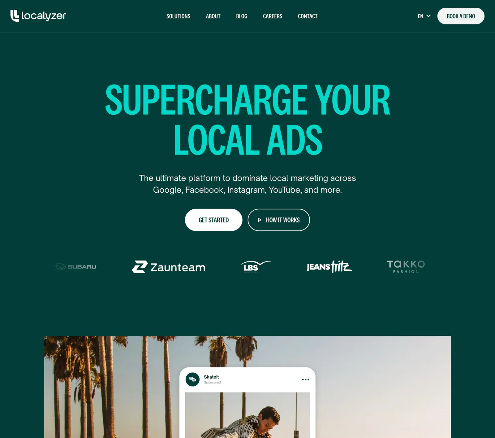
- Centered
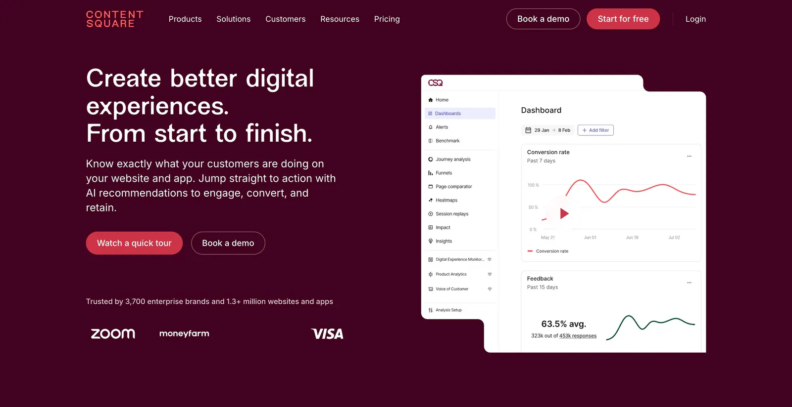
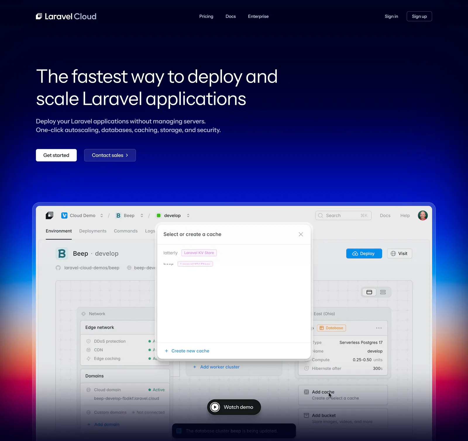
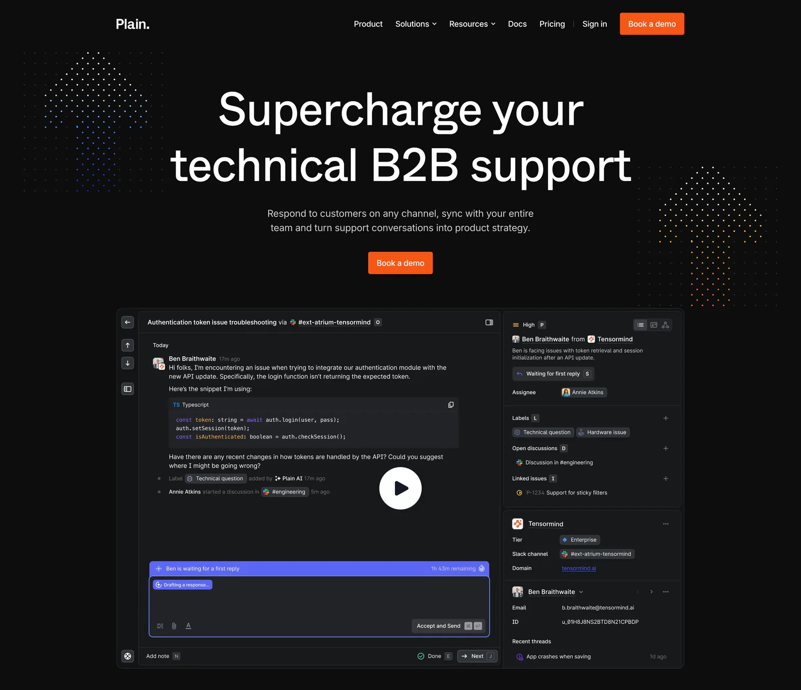
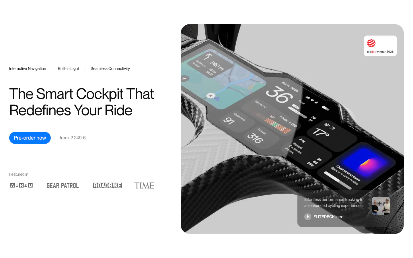
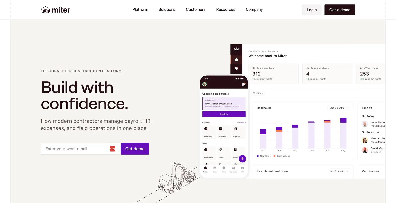
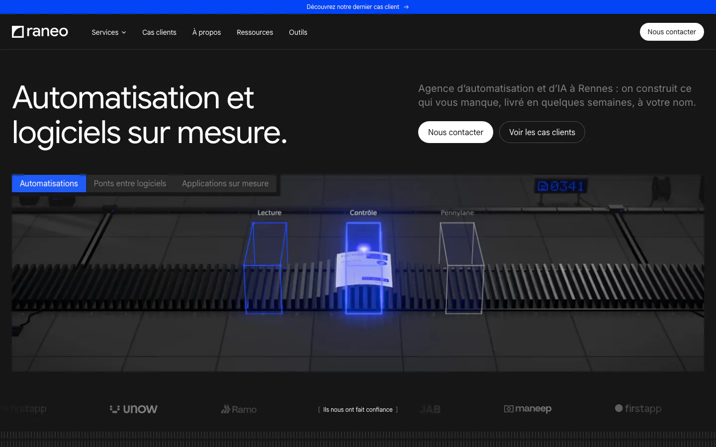
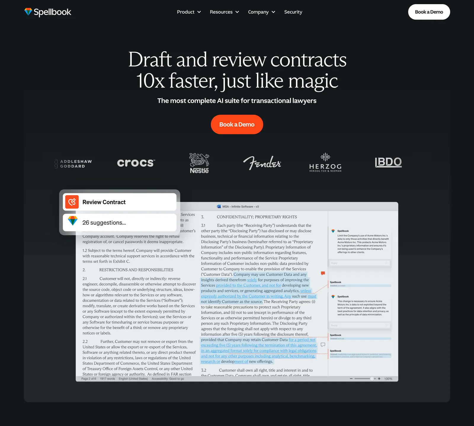
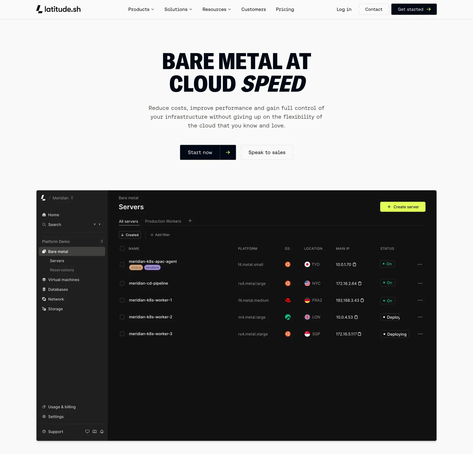
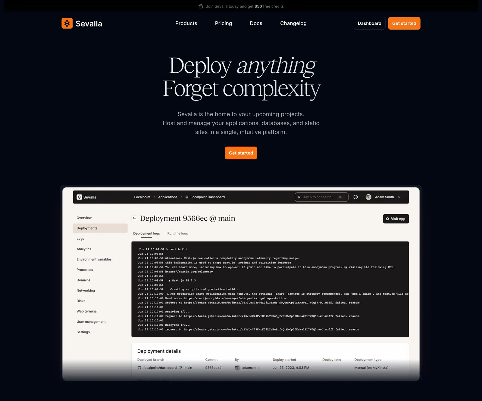
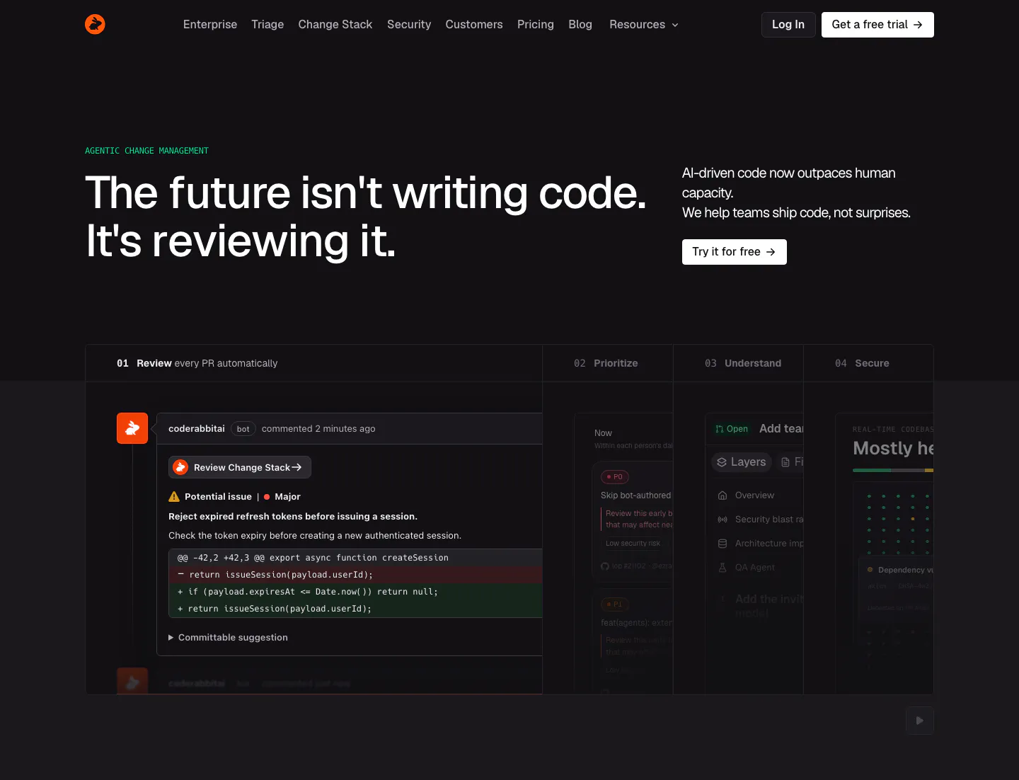
- Product UI
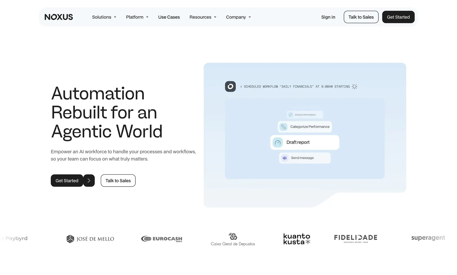
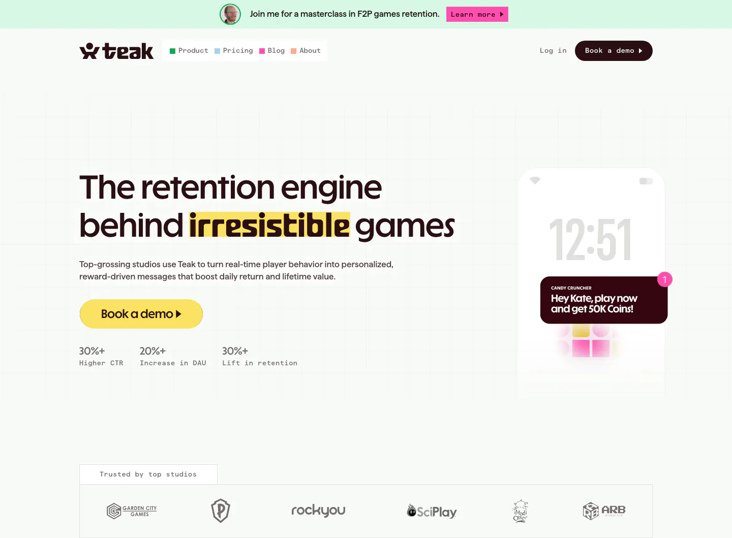
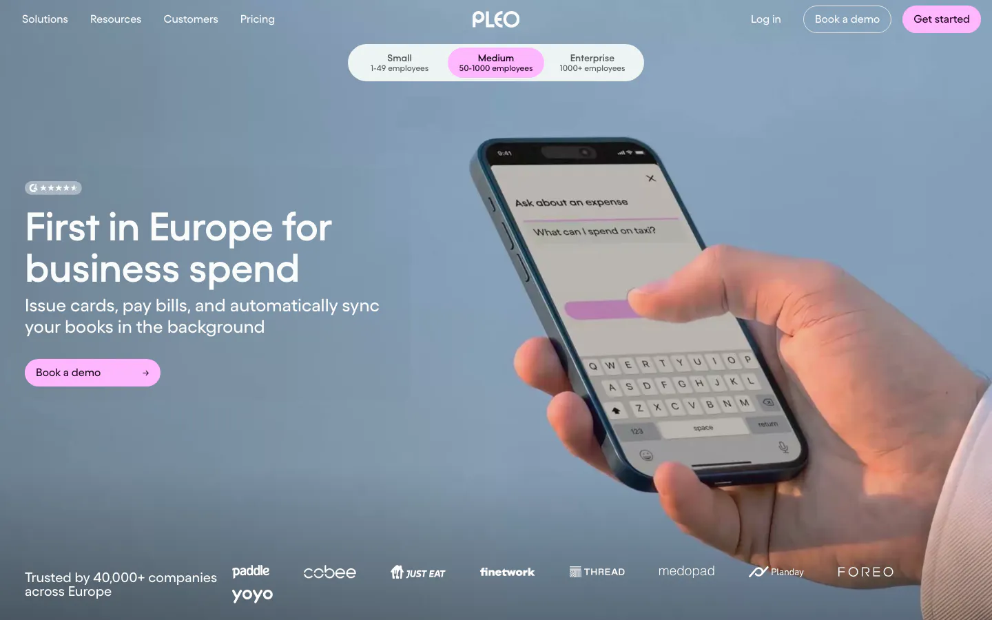
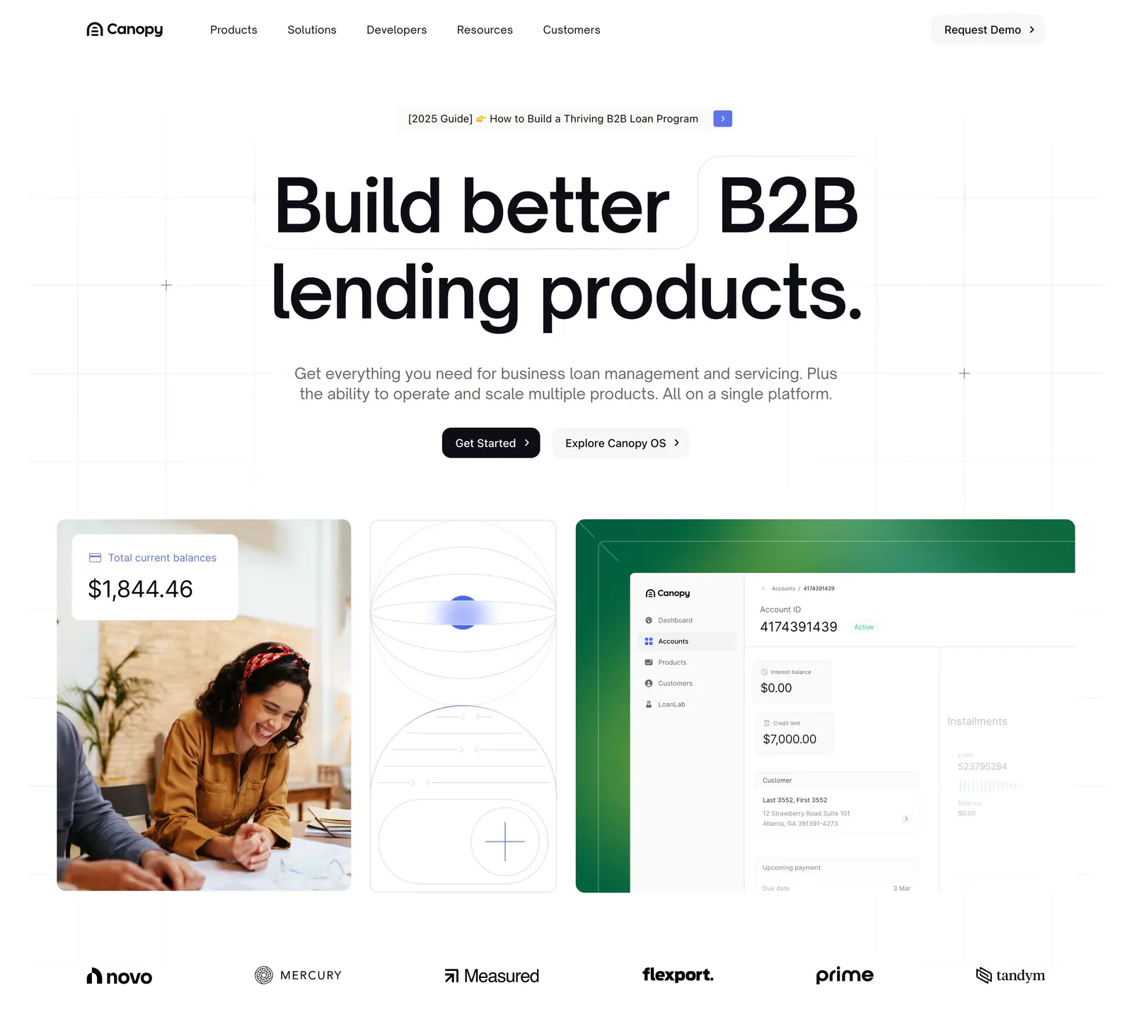
- Logo strip
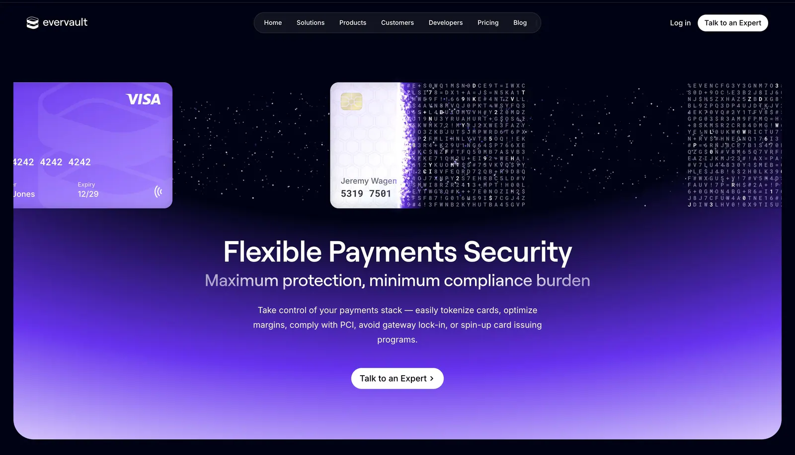
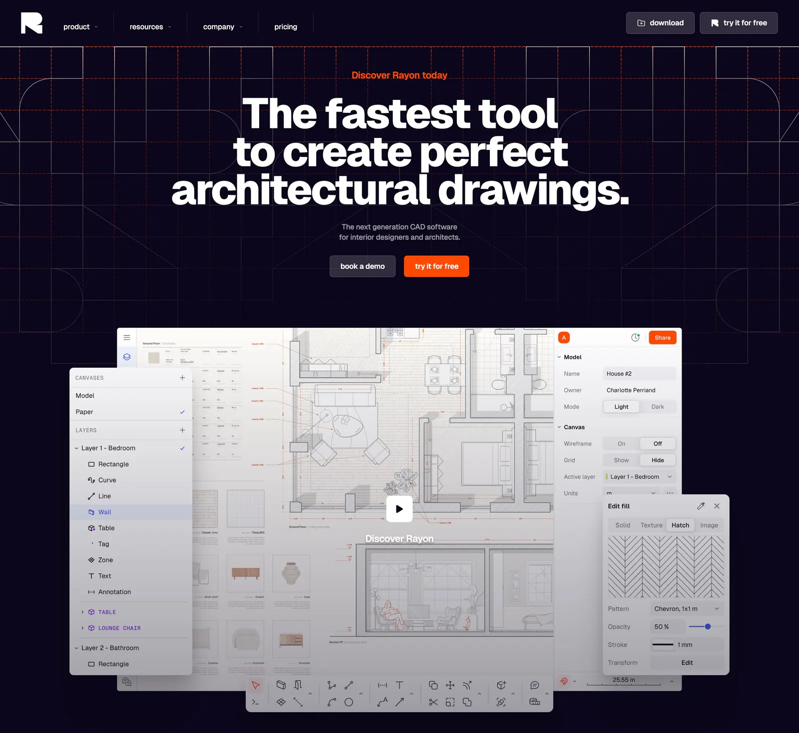
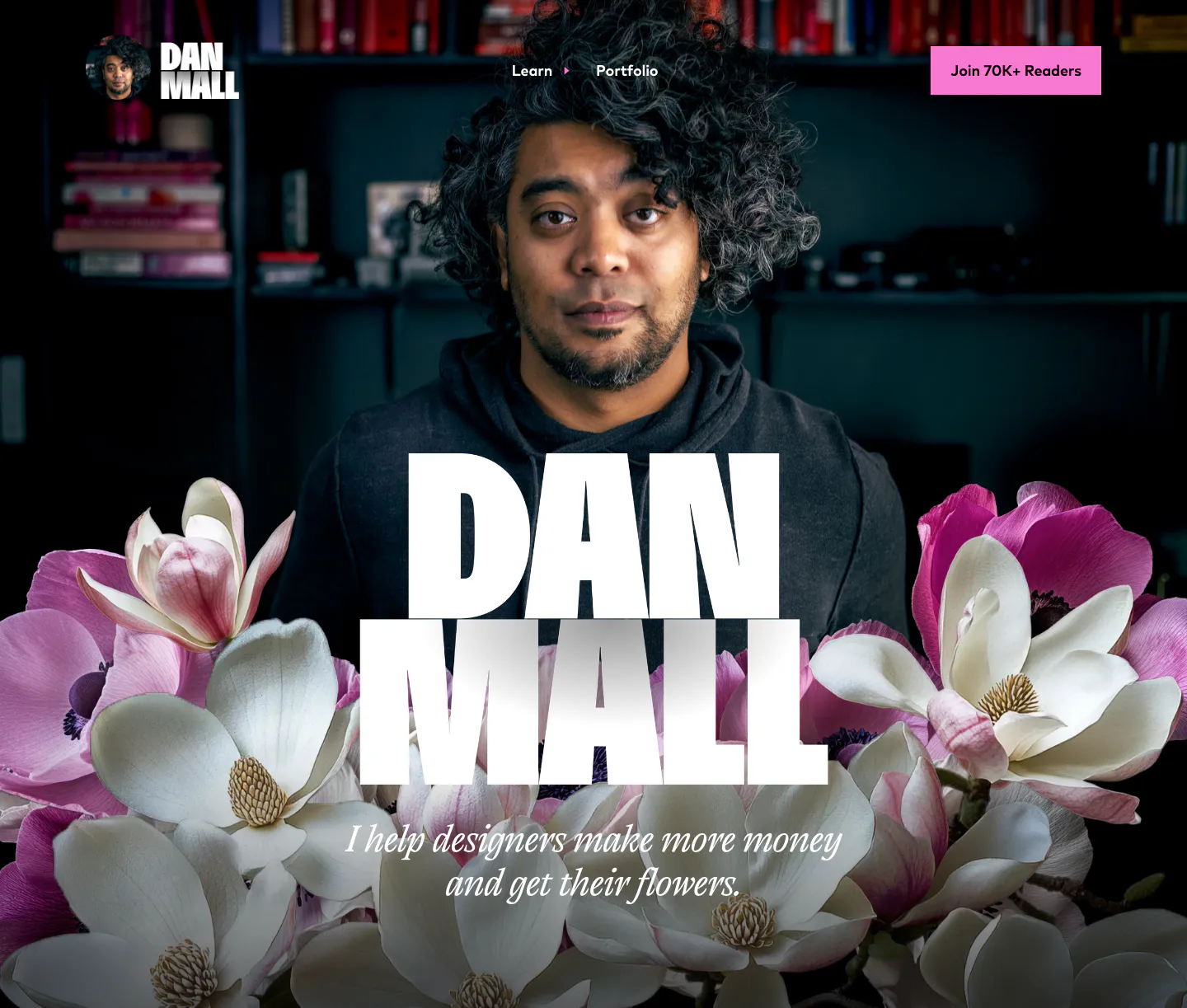
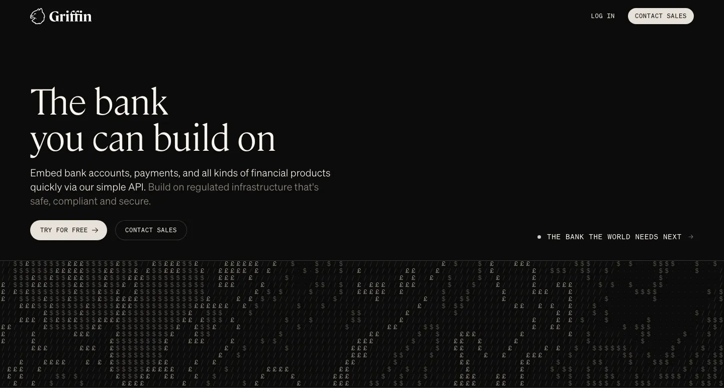
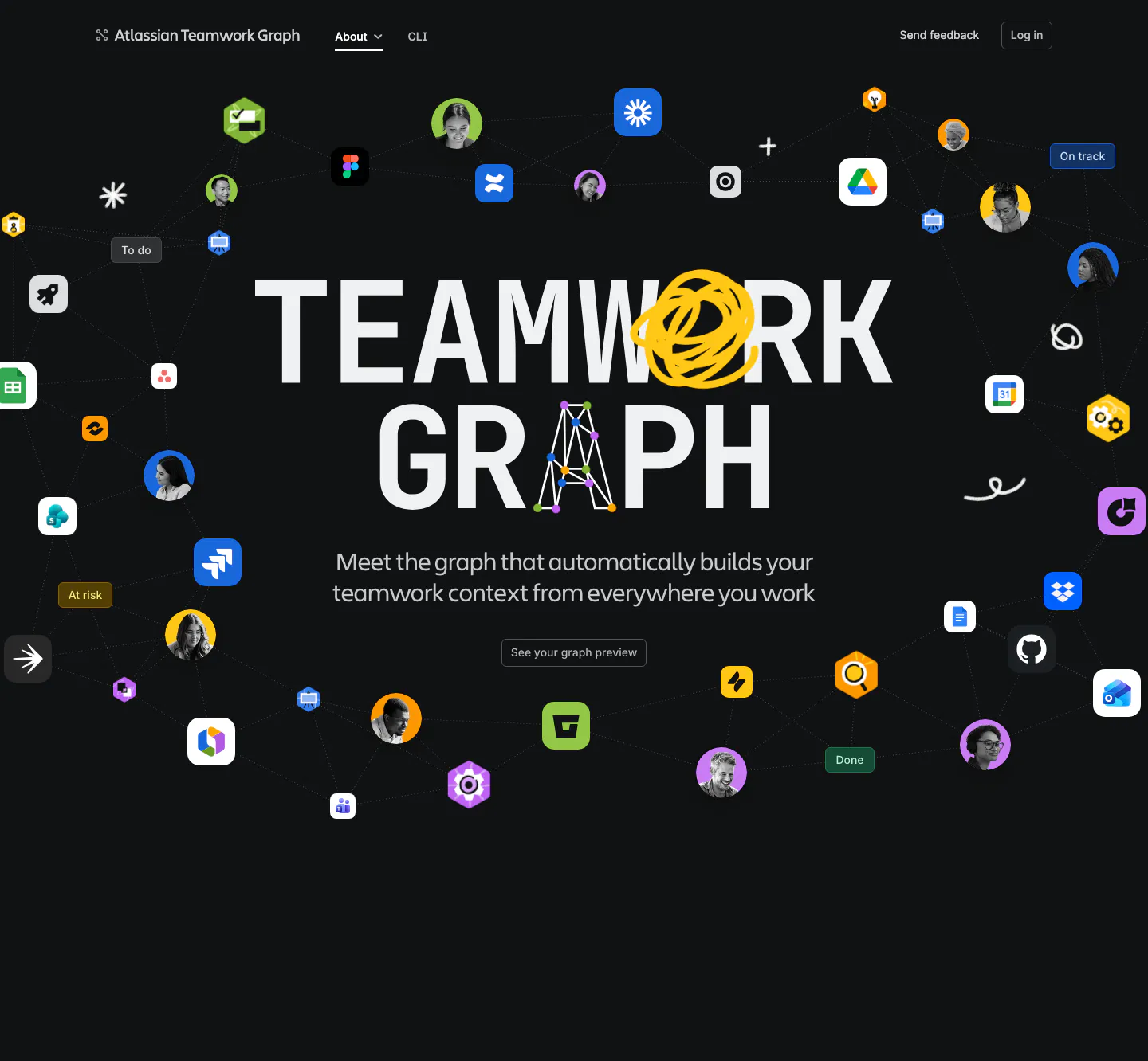
- Dark mode
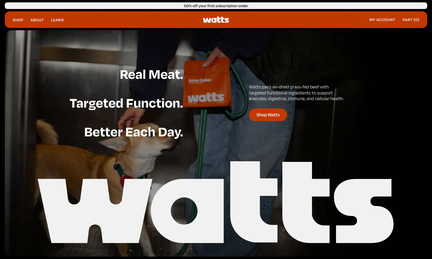
- Photography
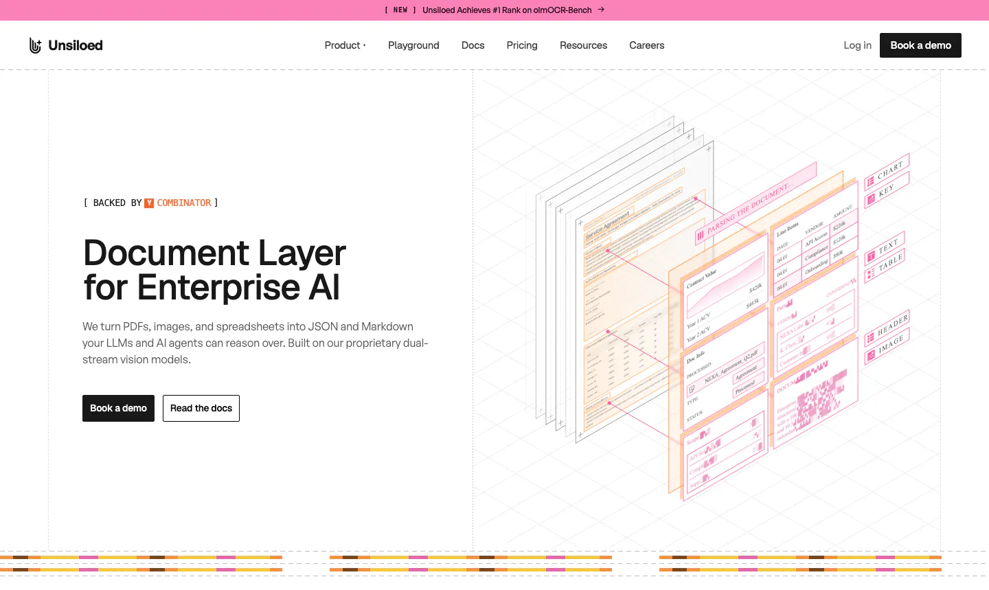
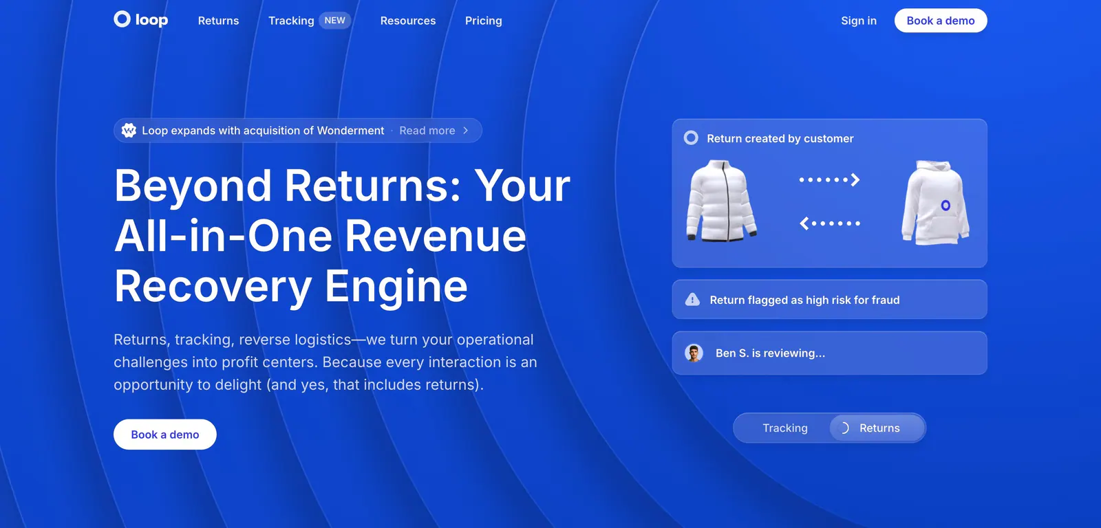
- Split layout
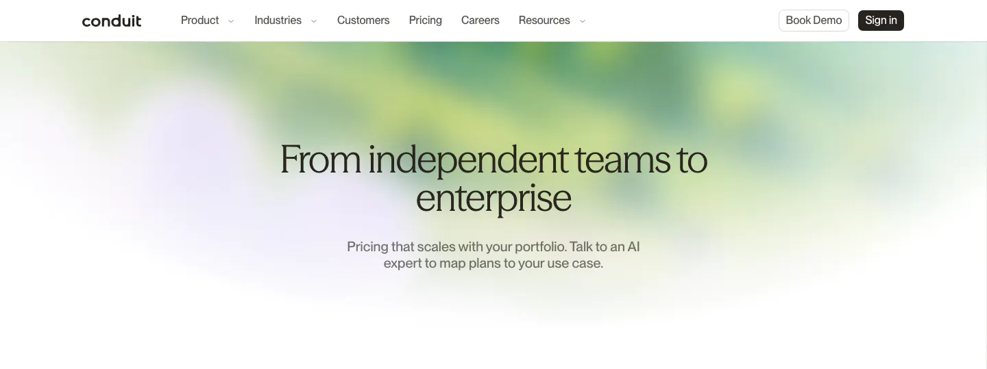
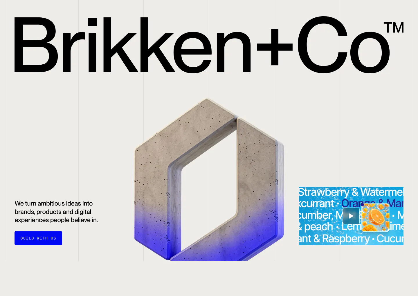
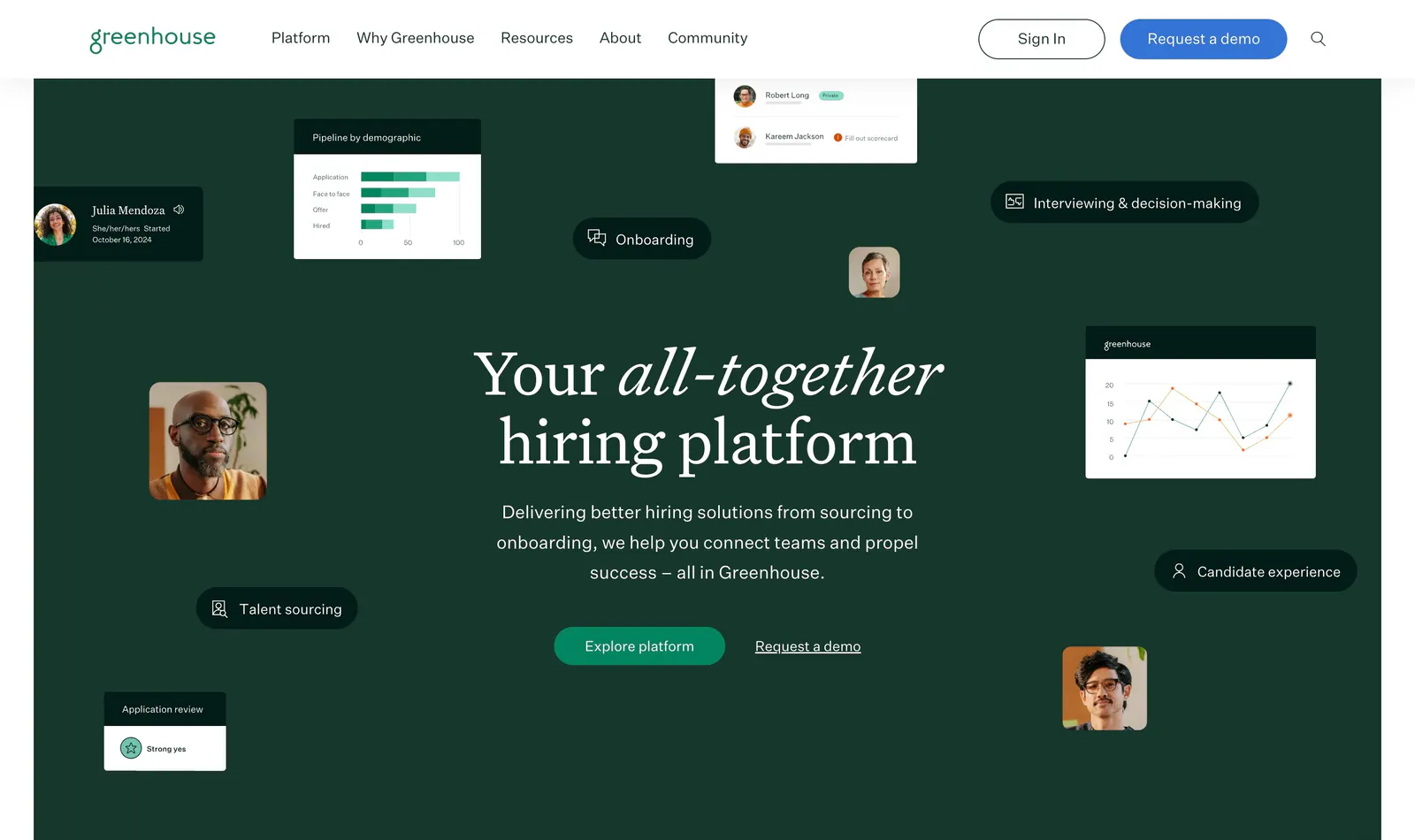
- Serif type
How to design a hero section
-
Lead with a specific headline
Name what the product is and the outcome it delivers, ideally in under ten words. Put the detail in a one- or two-line subhead. If a visitor cannot repeat what you sell after reading both, rewrite the copy before you touch the layout.
-
Give one action clear priority
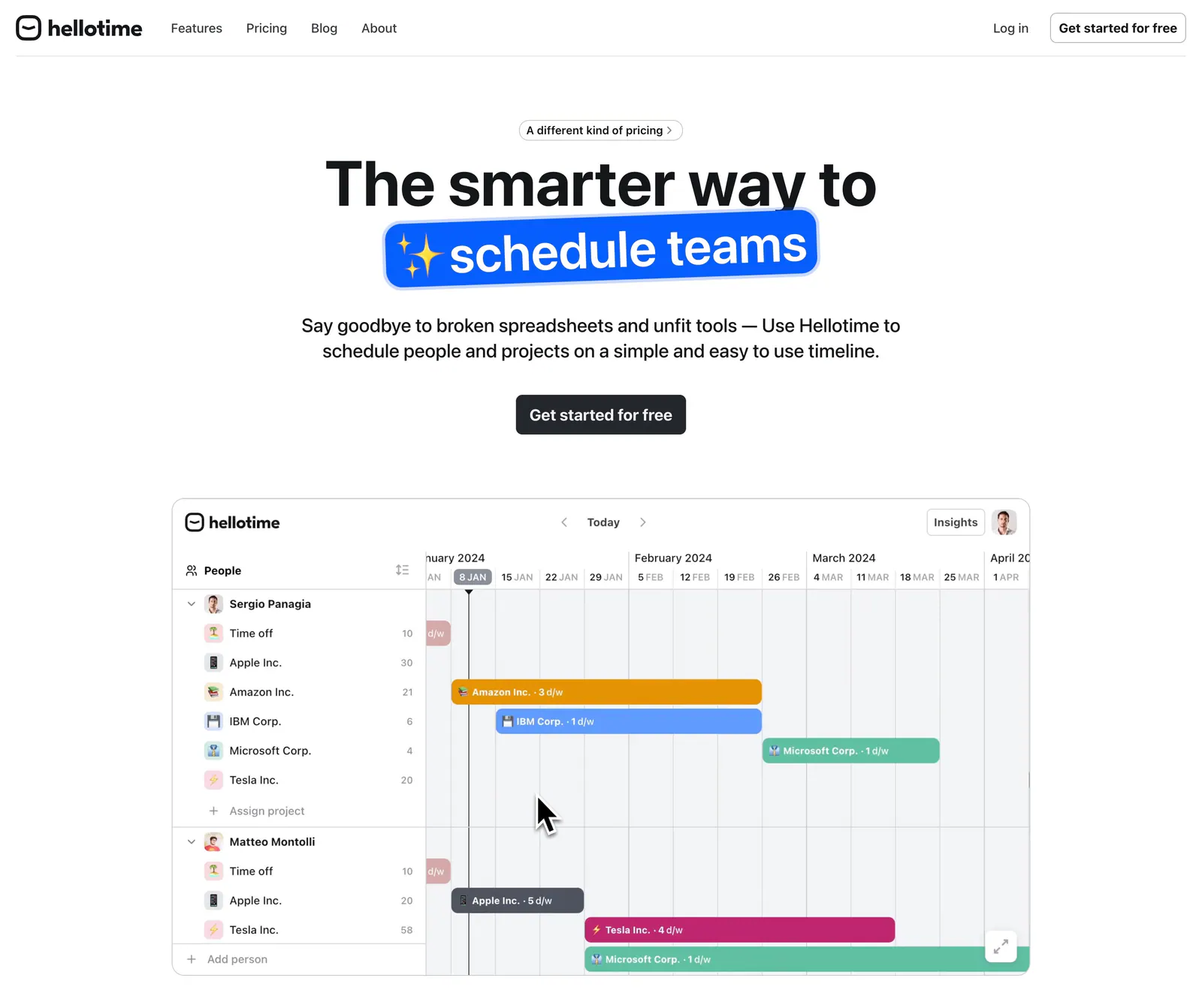
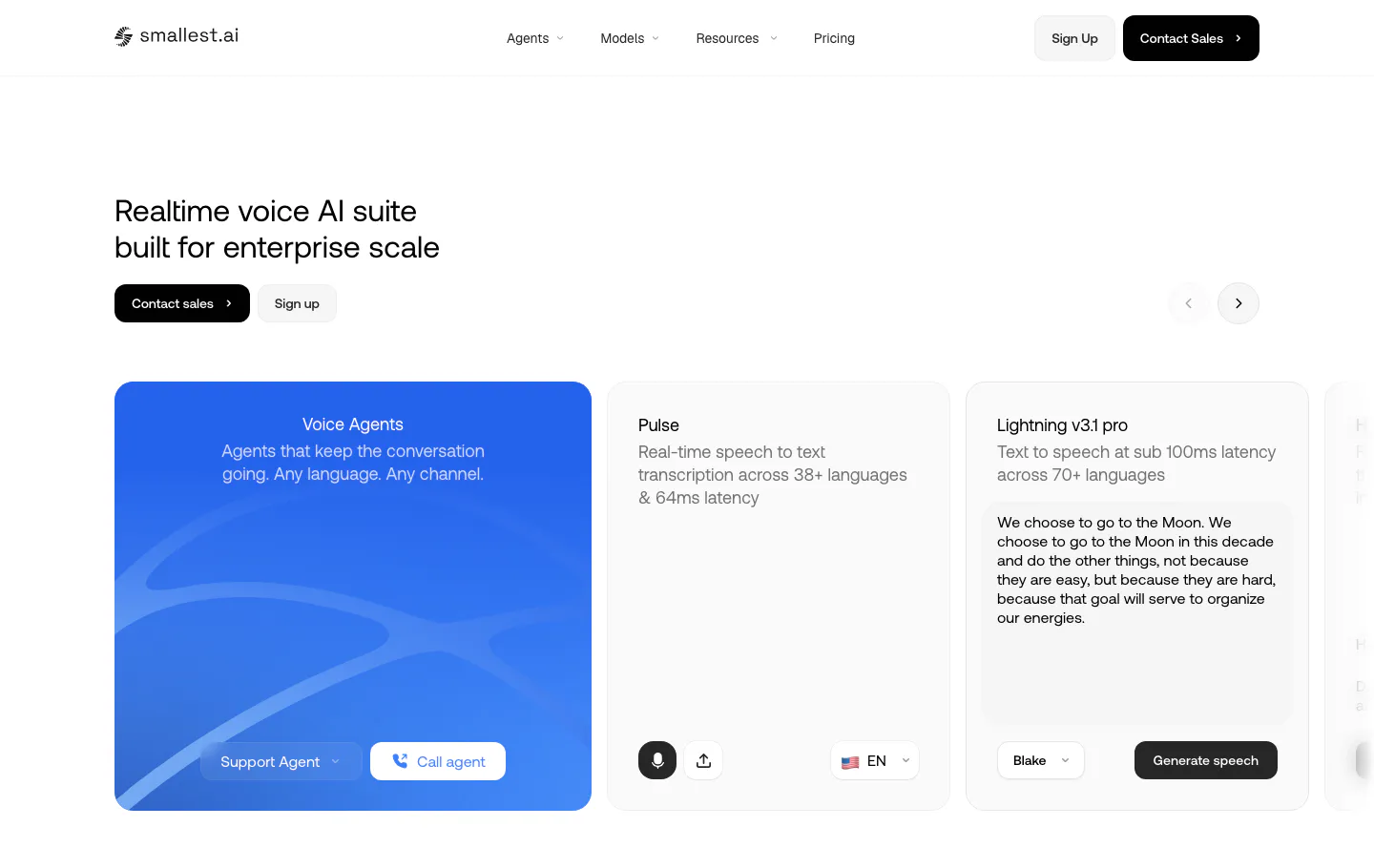
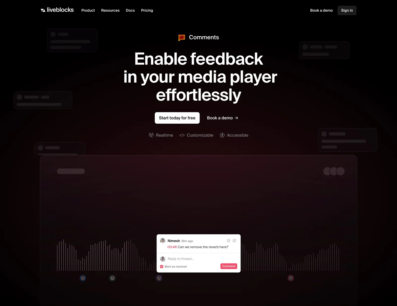
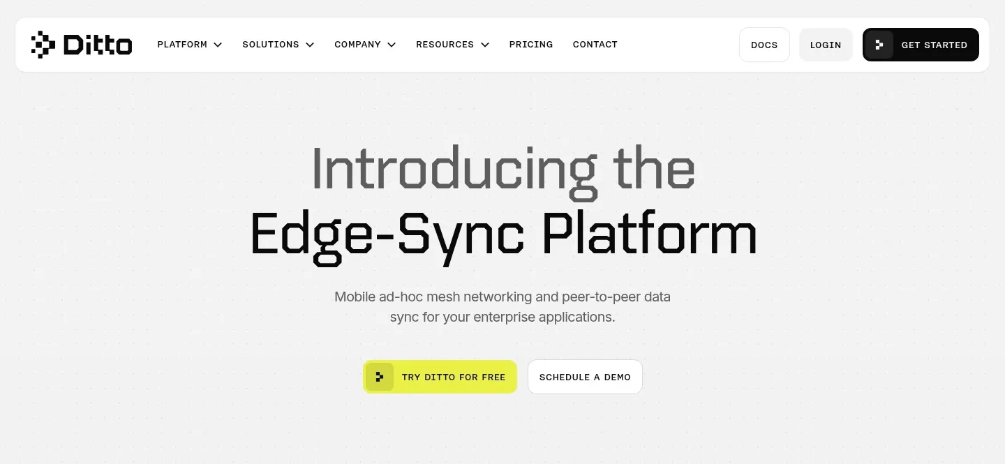
Make the main action a filled button with strong contrast and a verb-led label such as "Start free trial." If you need a second option, style it as an outline button or text link so the two never compete for the same glance.
-
Show the real product
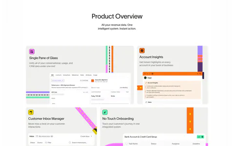
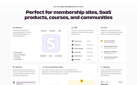
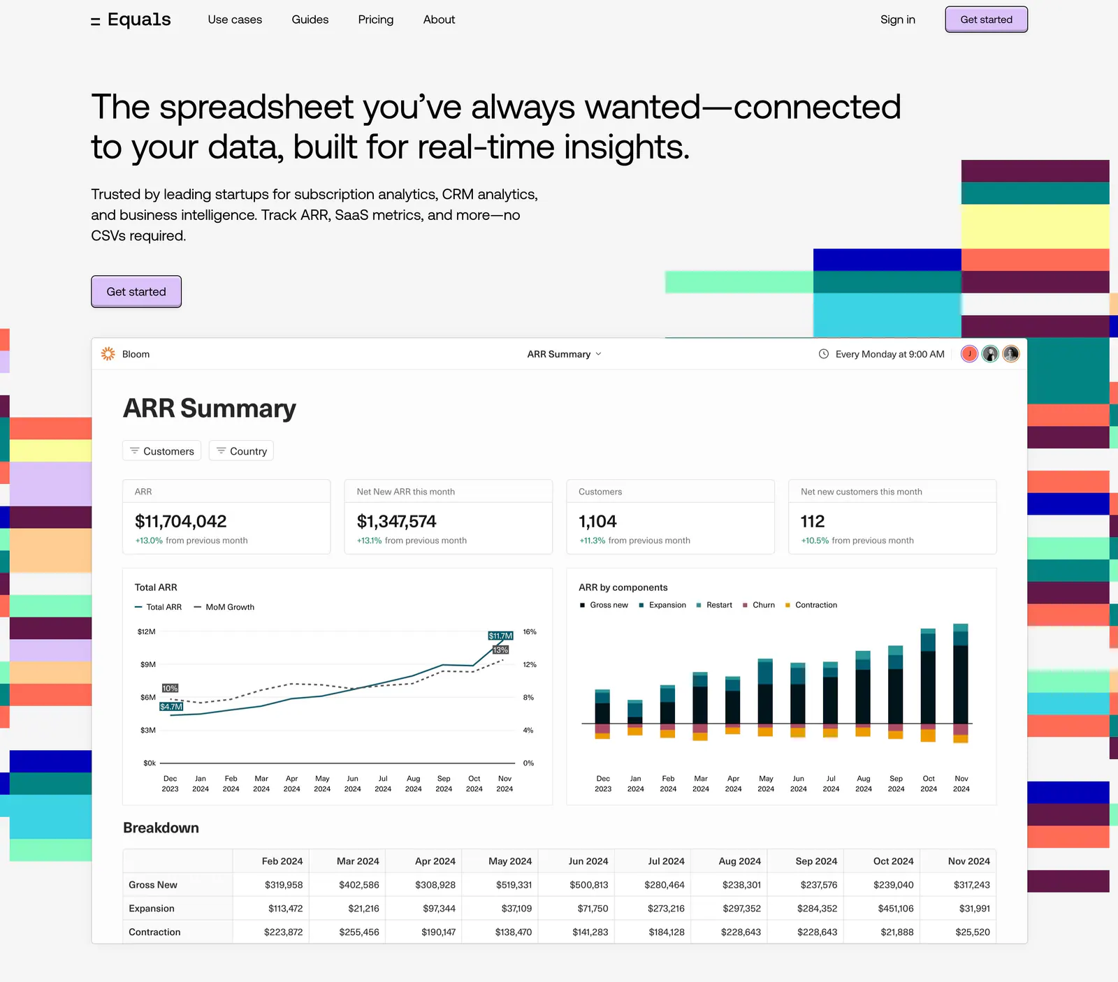
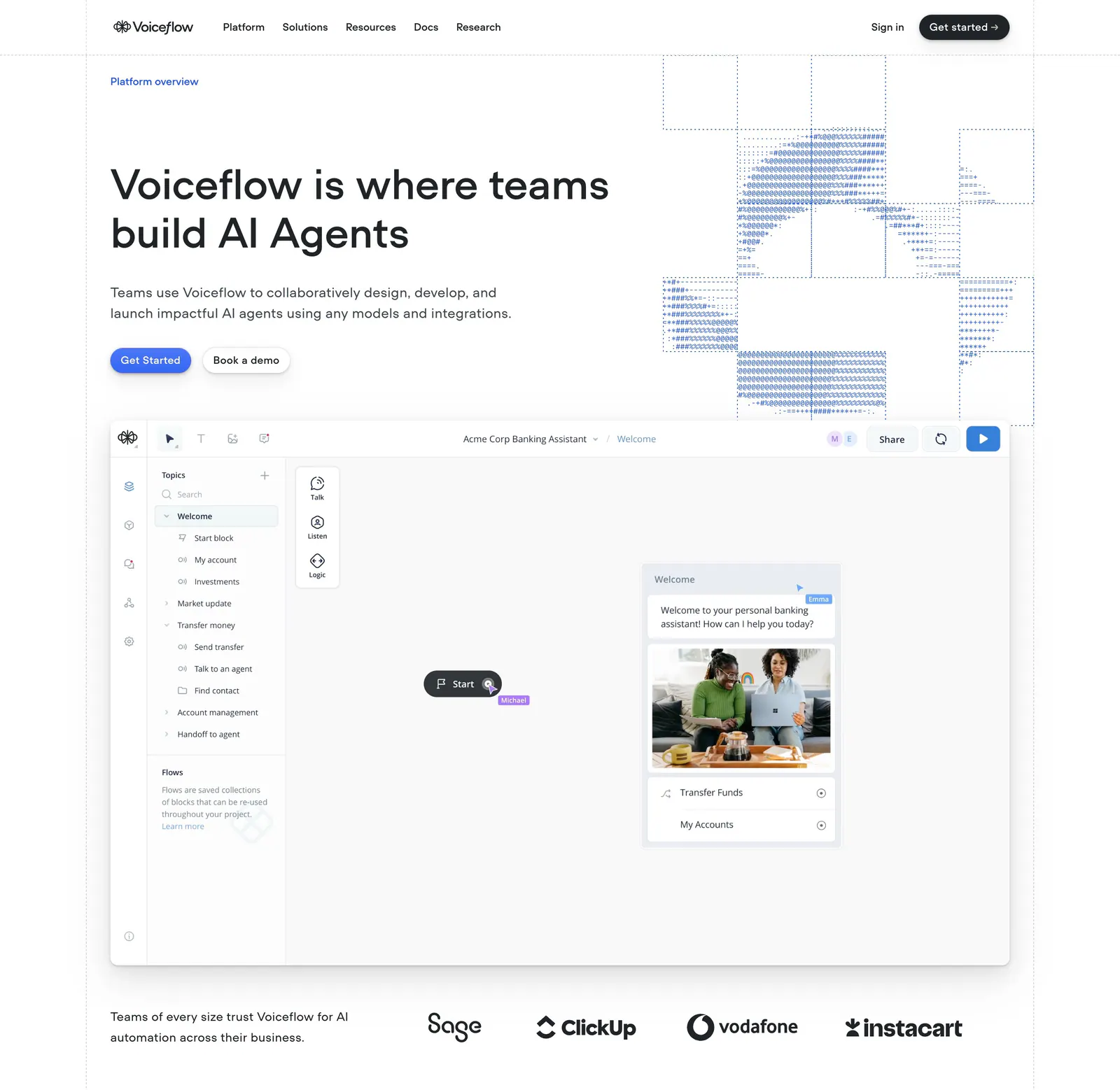
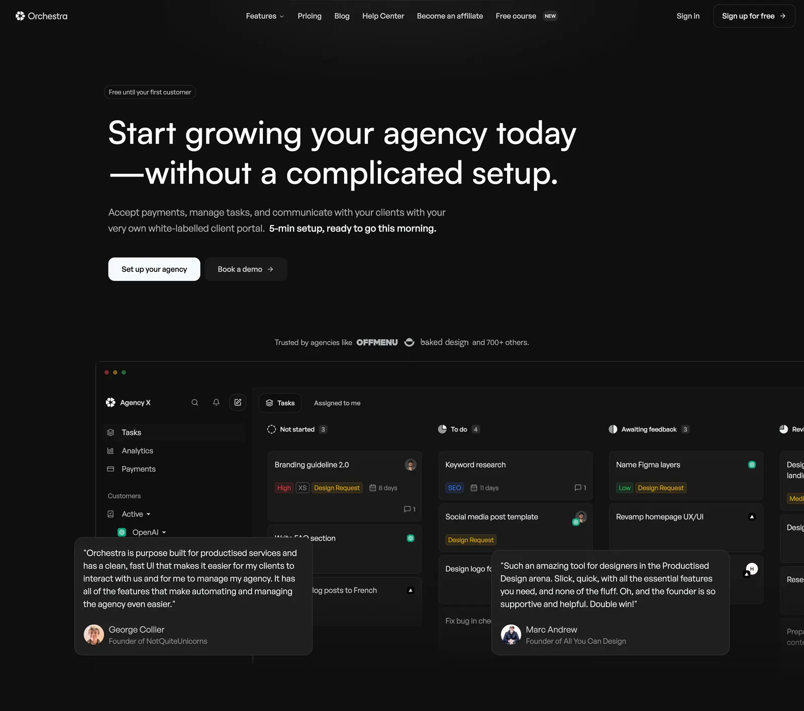
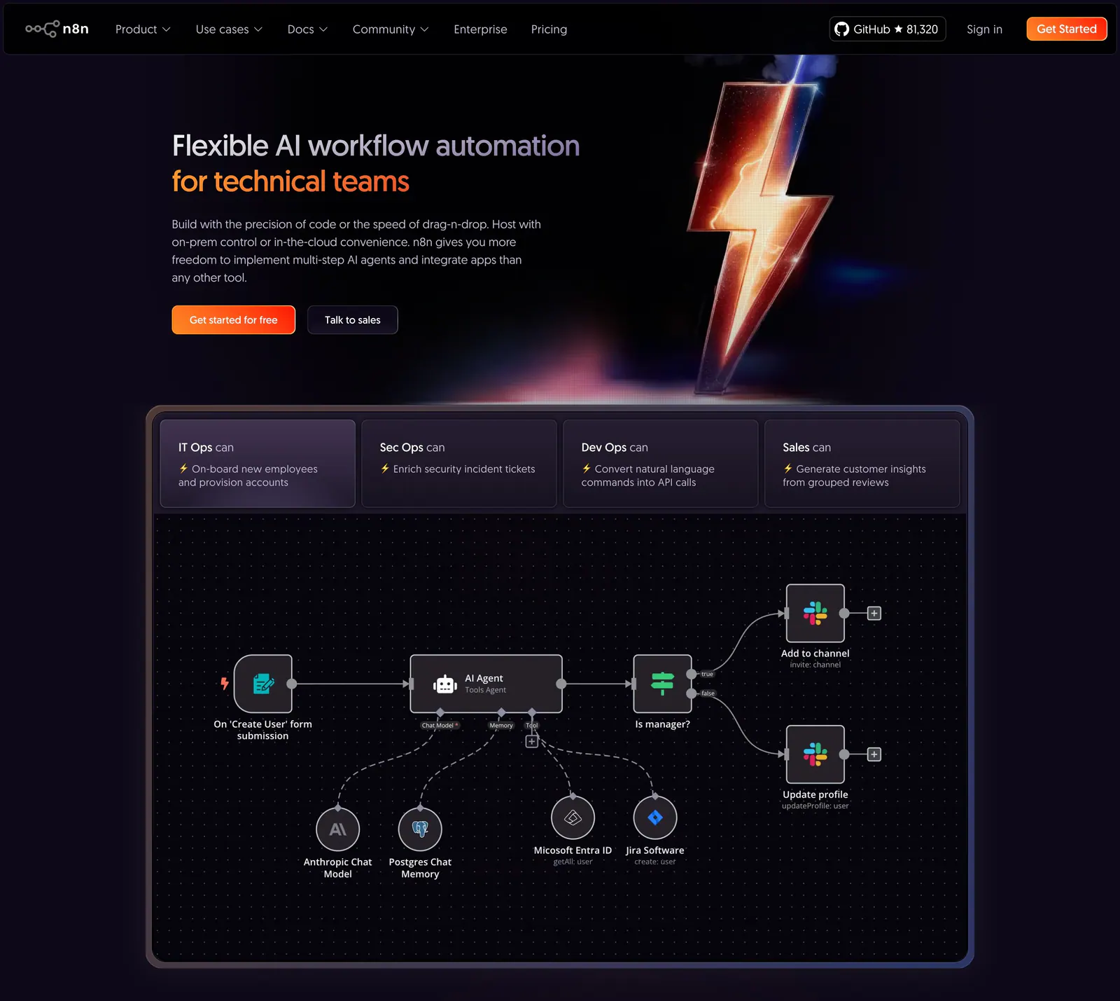
A screenshot or short loop of the actual interface builds more trust than generic illustration. Crop to the part that matters, keep any text in it legible at laptop width, and add a subtle frame or shadow to separate it from the background.
-
Load the hero image fast
The hero image is often the largest element on first paint. Compress it, serve a modern format, skip lazy loading on it, and set explicit width and height to prevent layout shift. Avoid autoplaying heavy video above the fold, and let the headline render before any decorative animation.