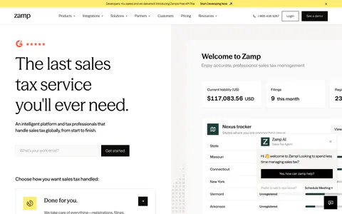
Parker website design

Every section we captured from the Parker website, in page order, from the hero section down to the features section. Open any thumbnail to see it full size.

Sections 3

In page order, top to bottom

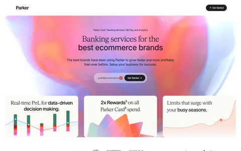
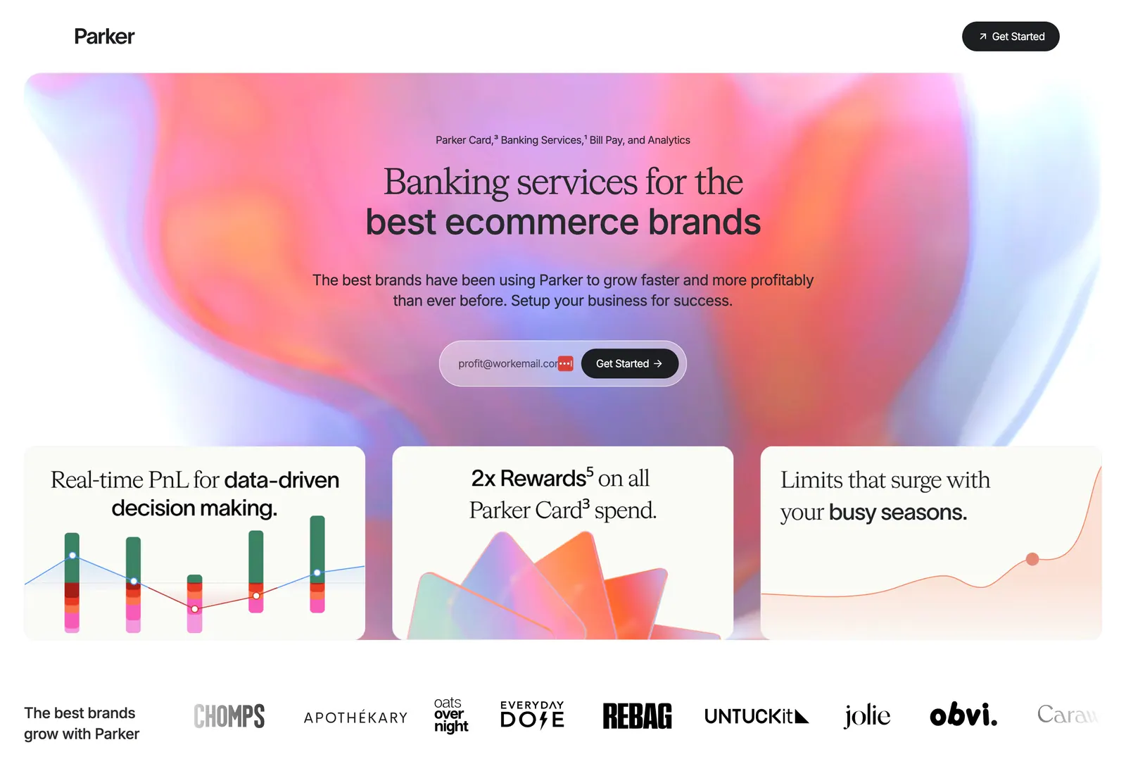
  1. Parker hero section: centered headline and email signup on a pink-orange aurora gradient above three feature cards and a brand logo row
    01 Hero

    Banking services for the best ecommerce brands

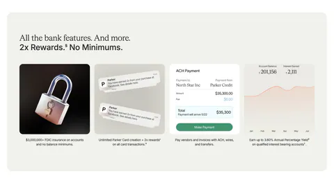
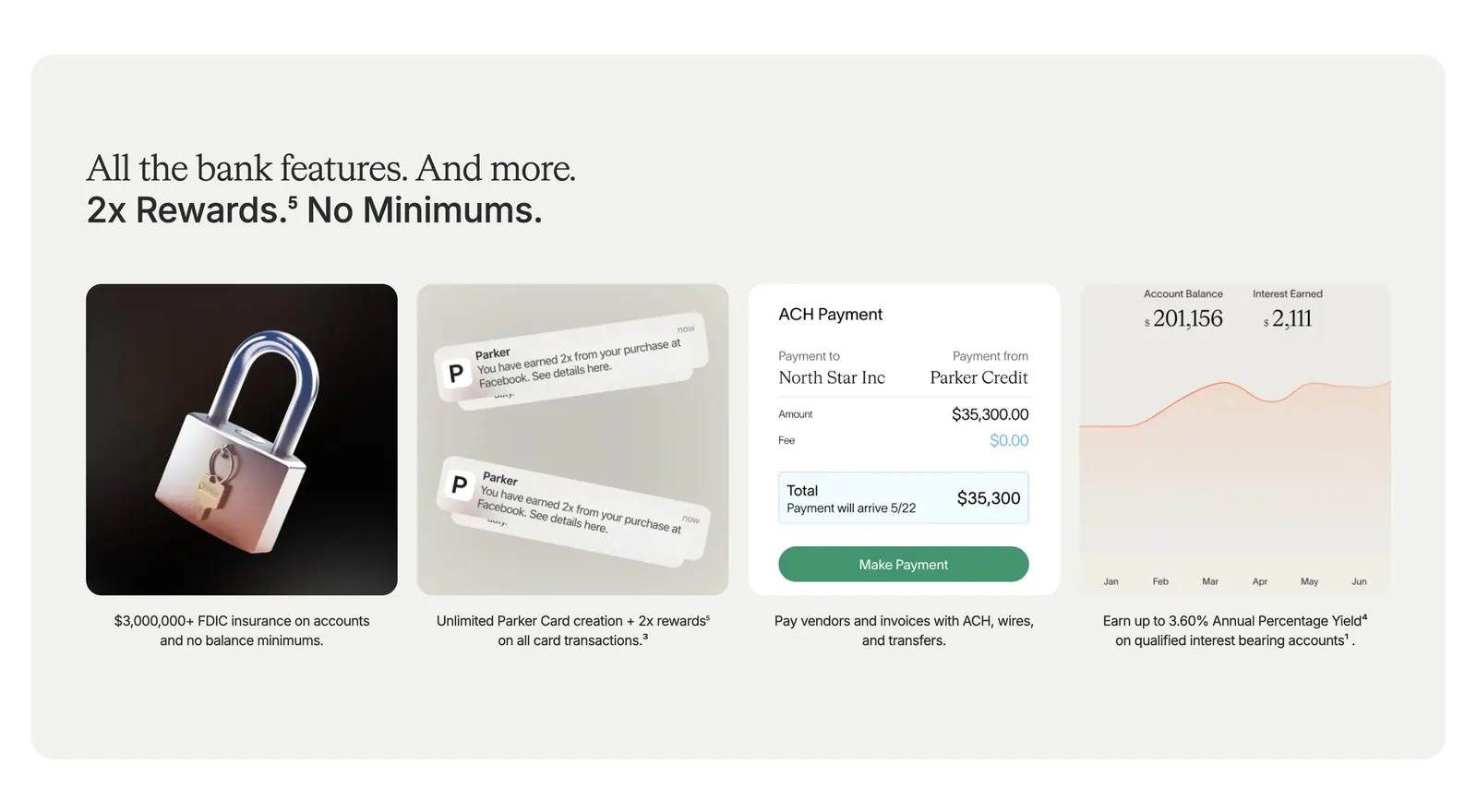
  2. Parker value proposition section: beige panel with headline above four cards showing a 3D padlock, notifications, payment UI and a yield chart

    All the bank features. And more. 2x Rewards. No Minimums.

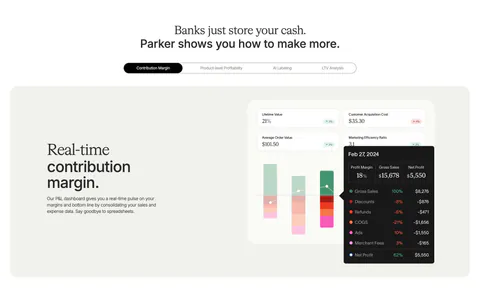
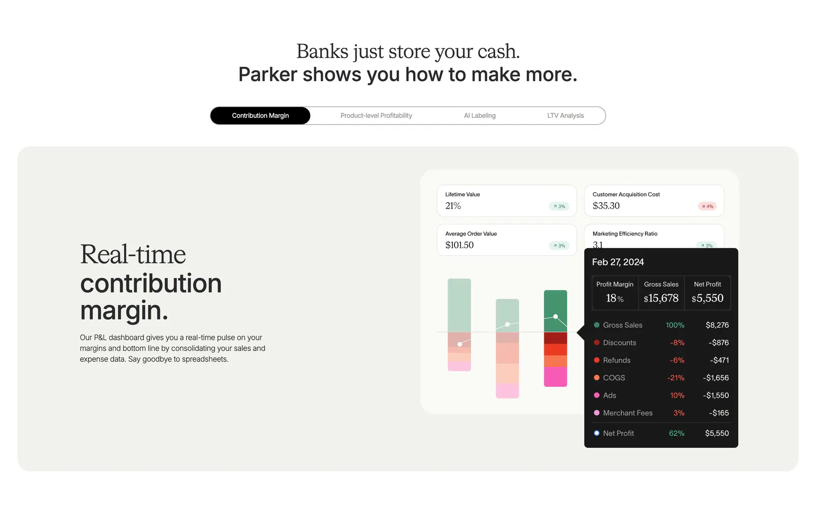
  3. Parker features section: centered headline over a pill tab bar and beige panel with text beside a contribution margin dashboard UI

    Banks just store your cash. Parker shows you how to make more.
Similar companies

All companies
    ↑↓ Navigate ↵ Open

    Section preview

    Website section