Testimonial Section Examples
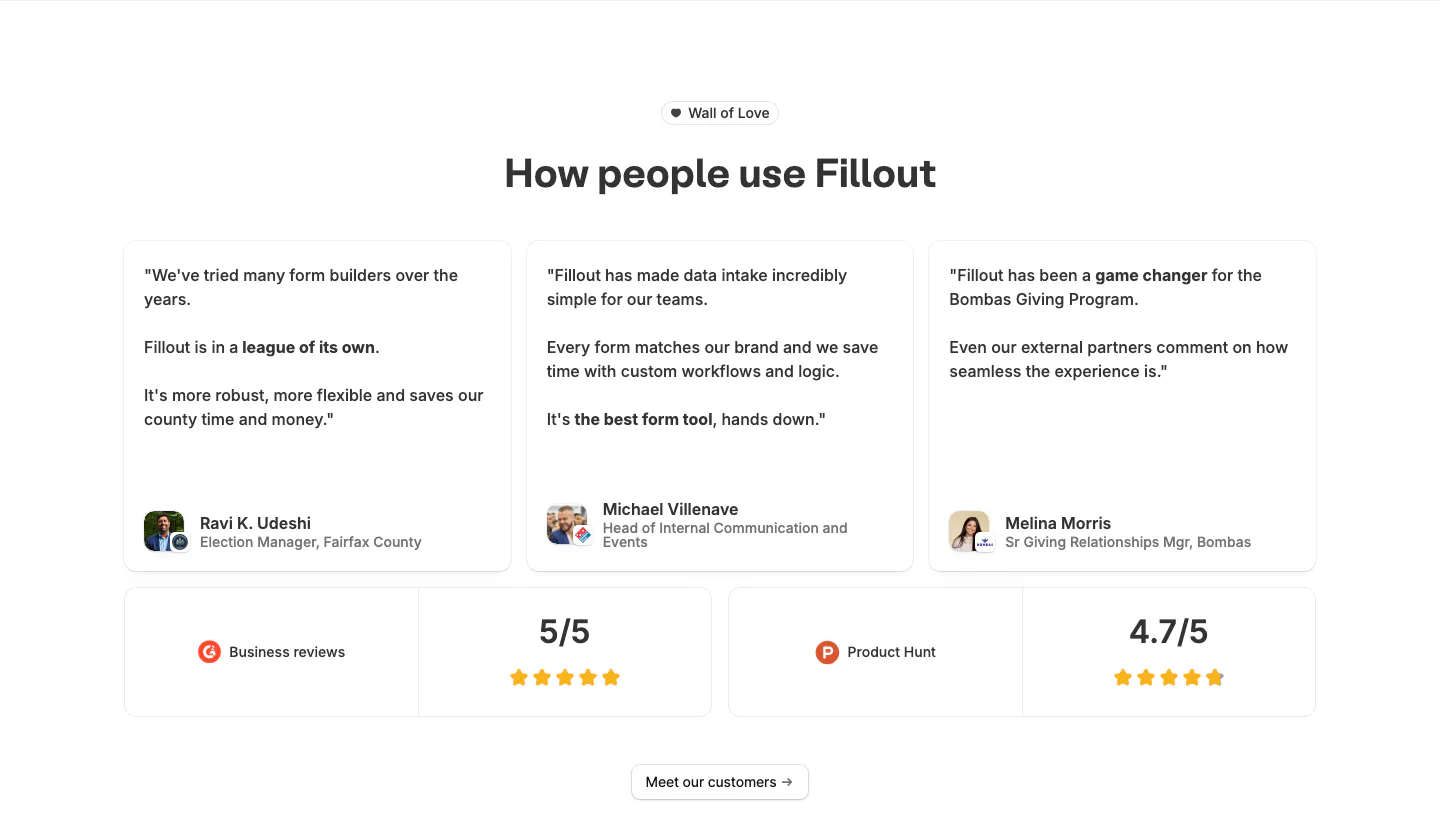
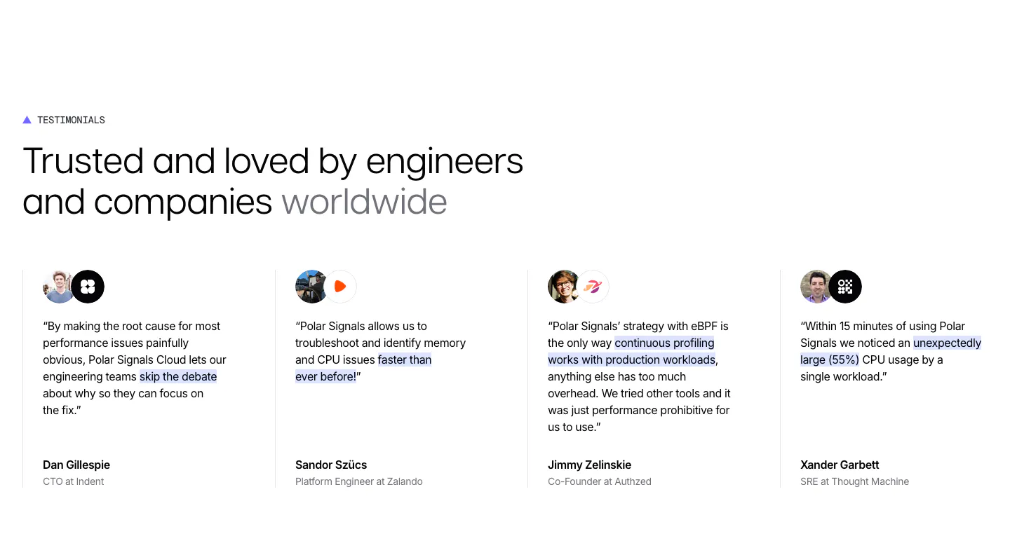
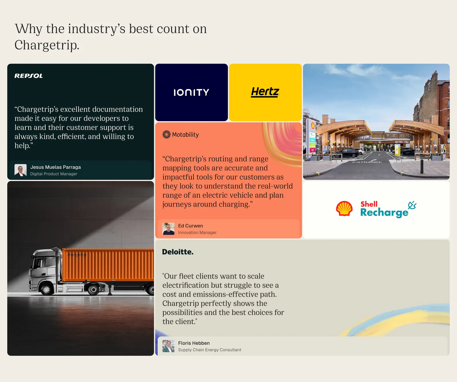
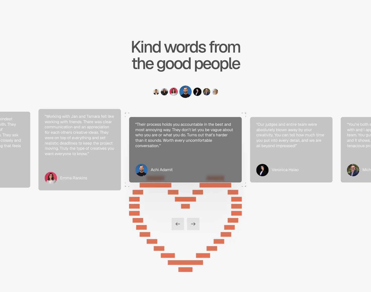
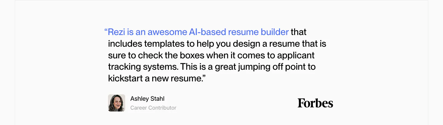
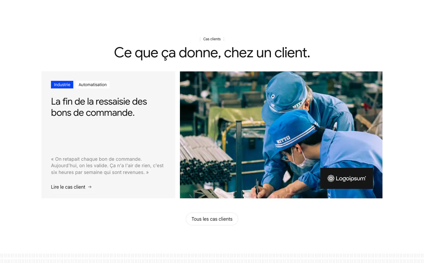
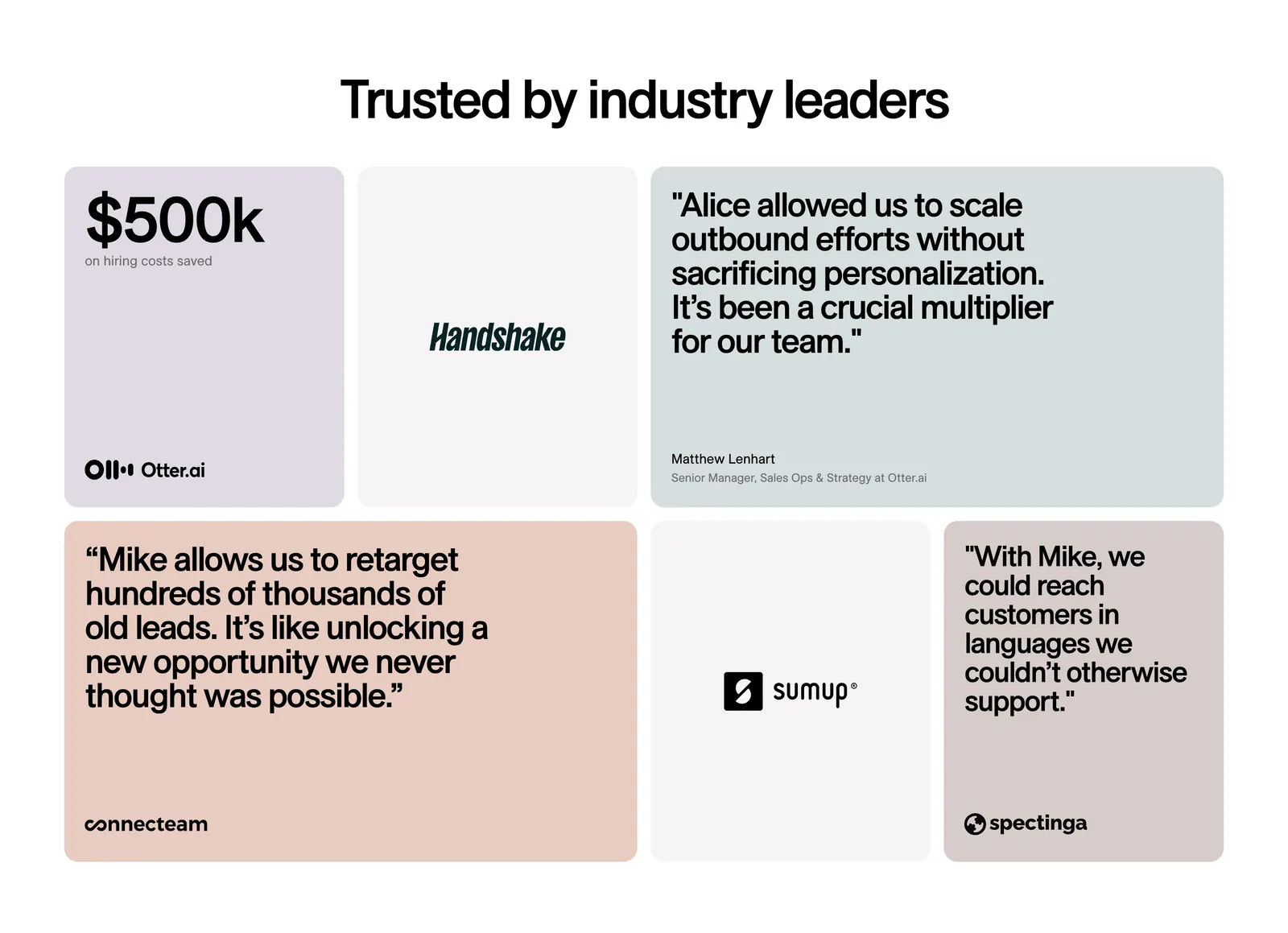
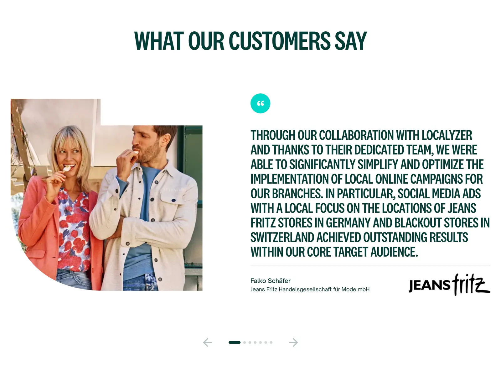
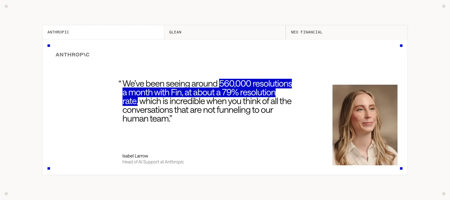
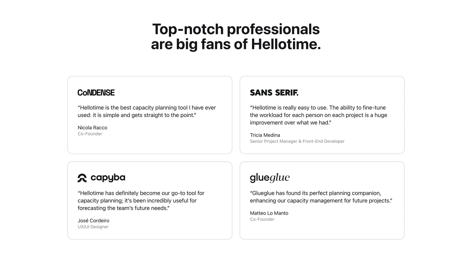
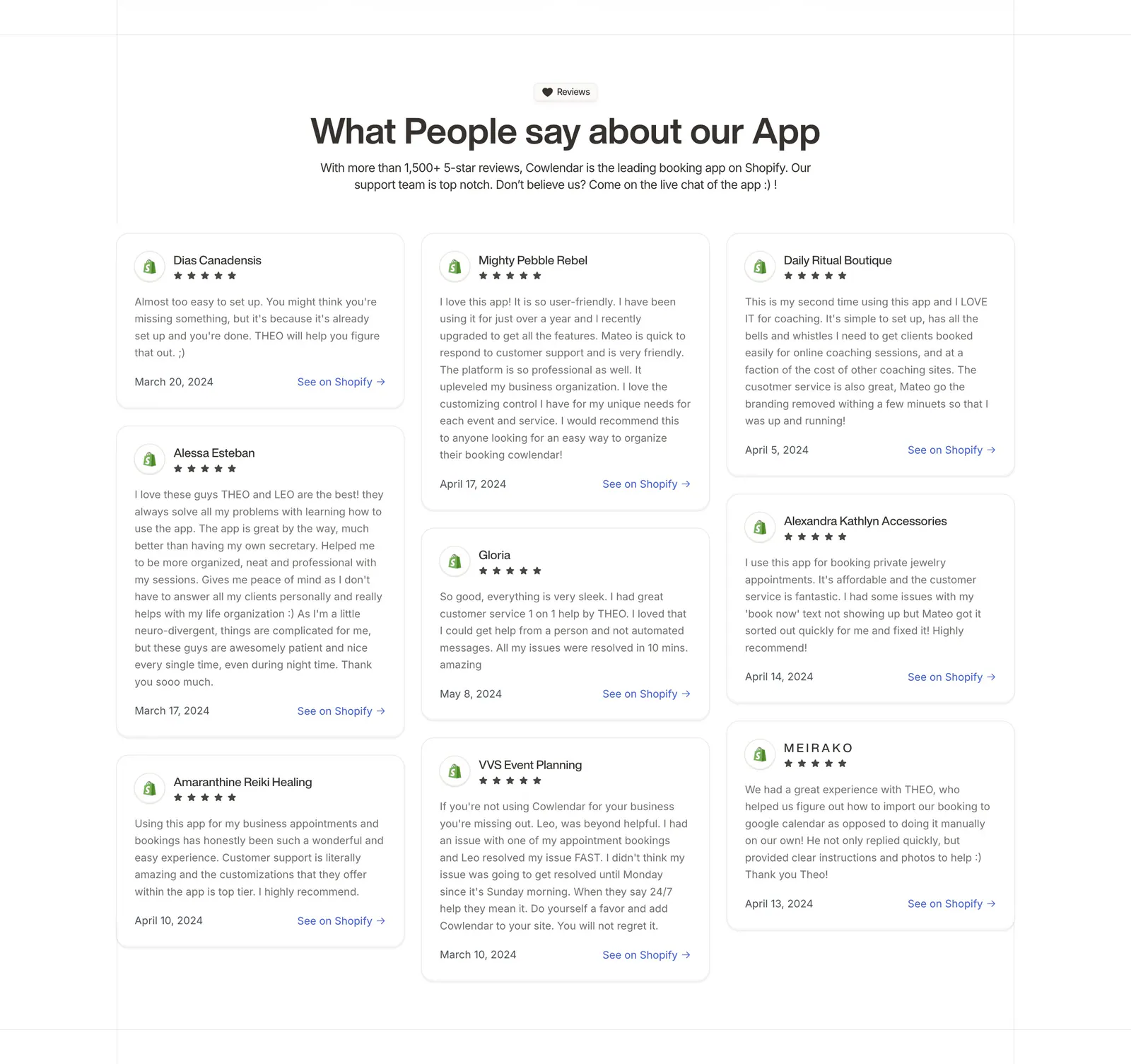
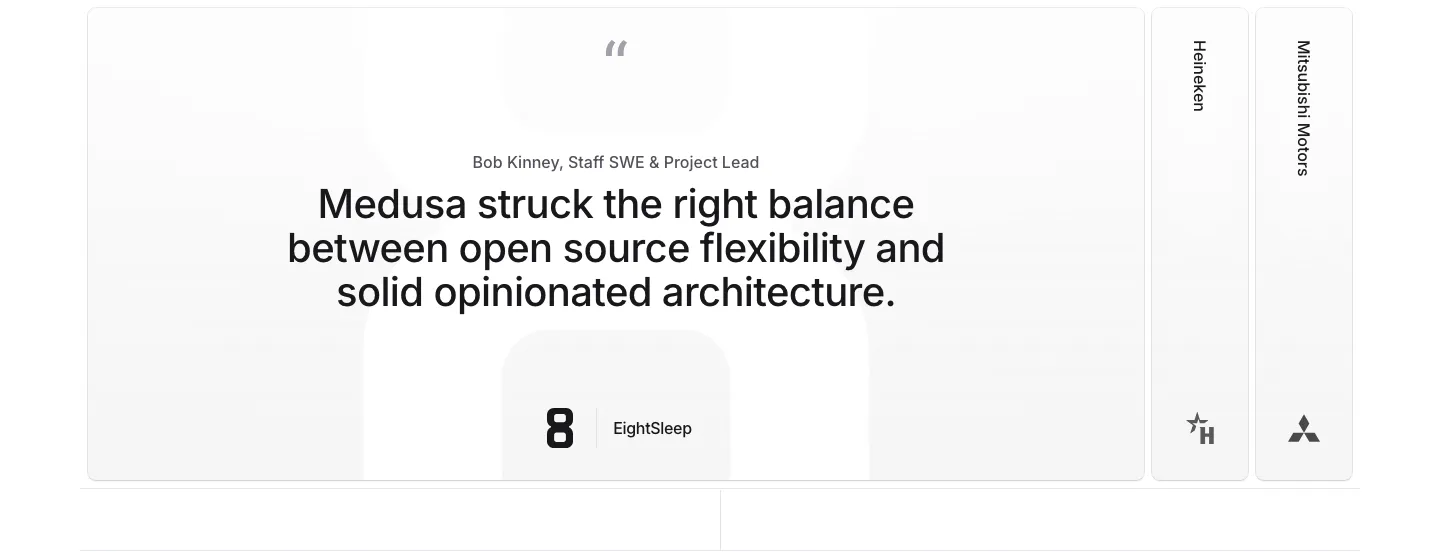
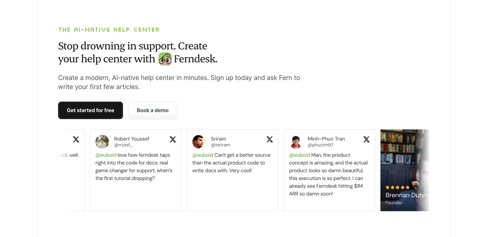
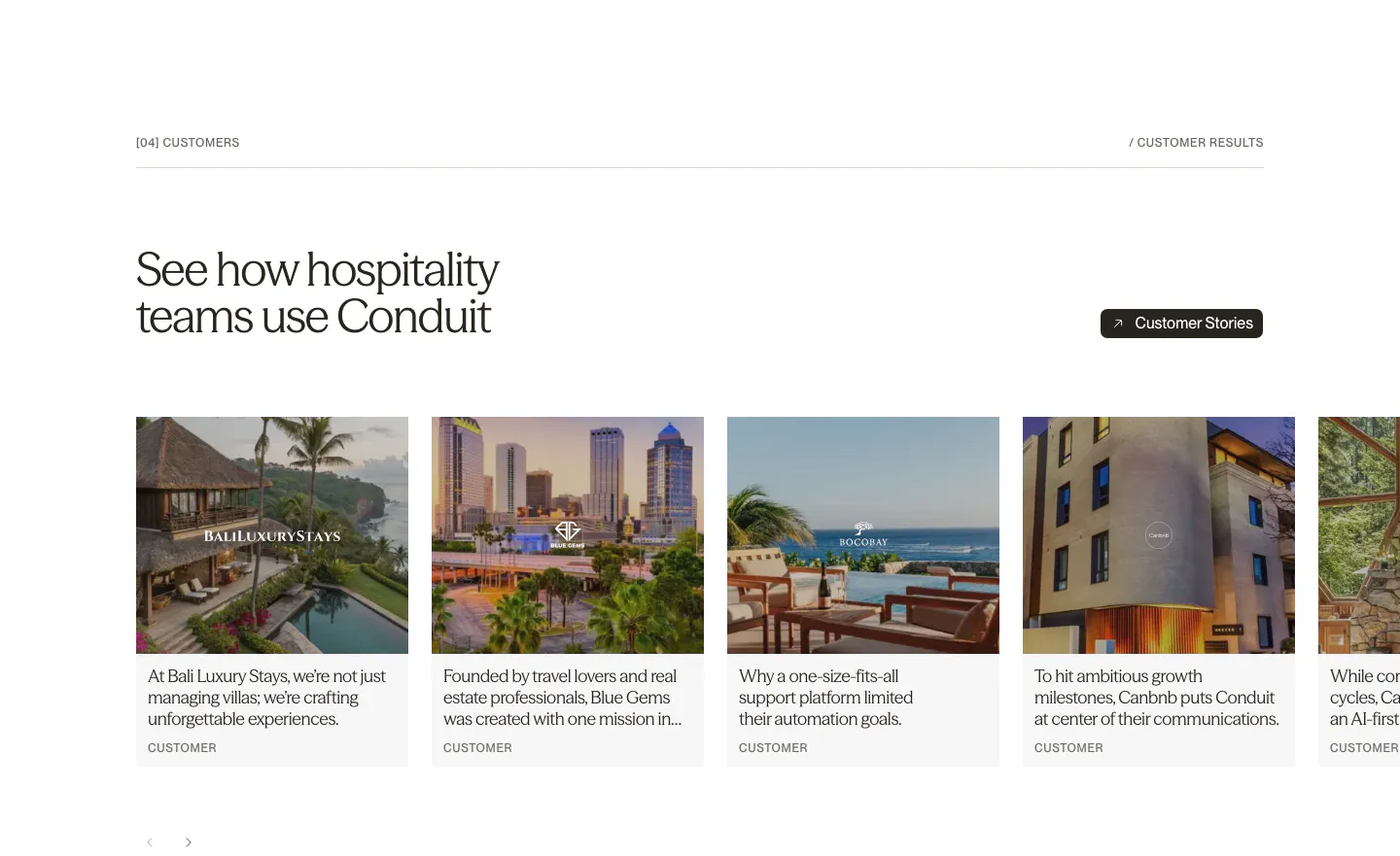
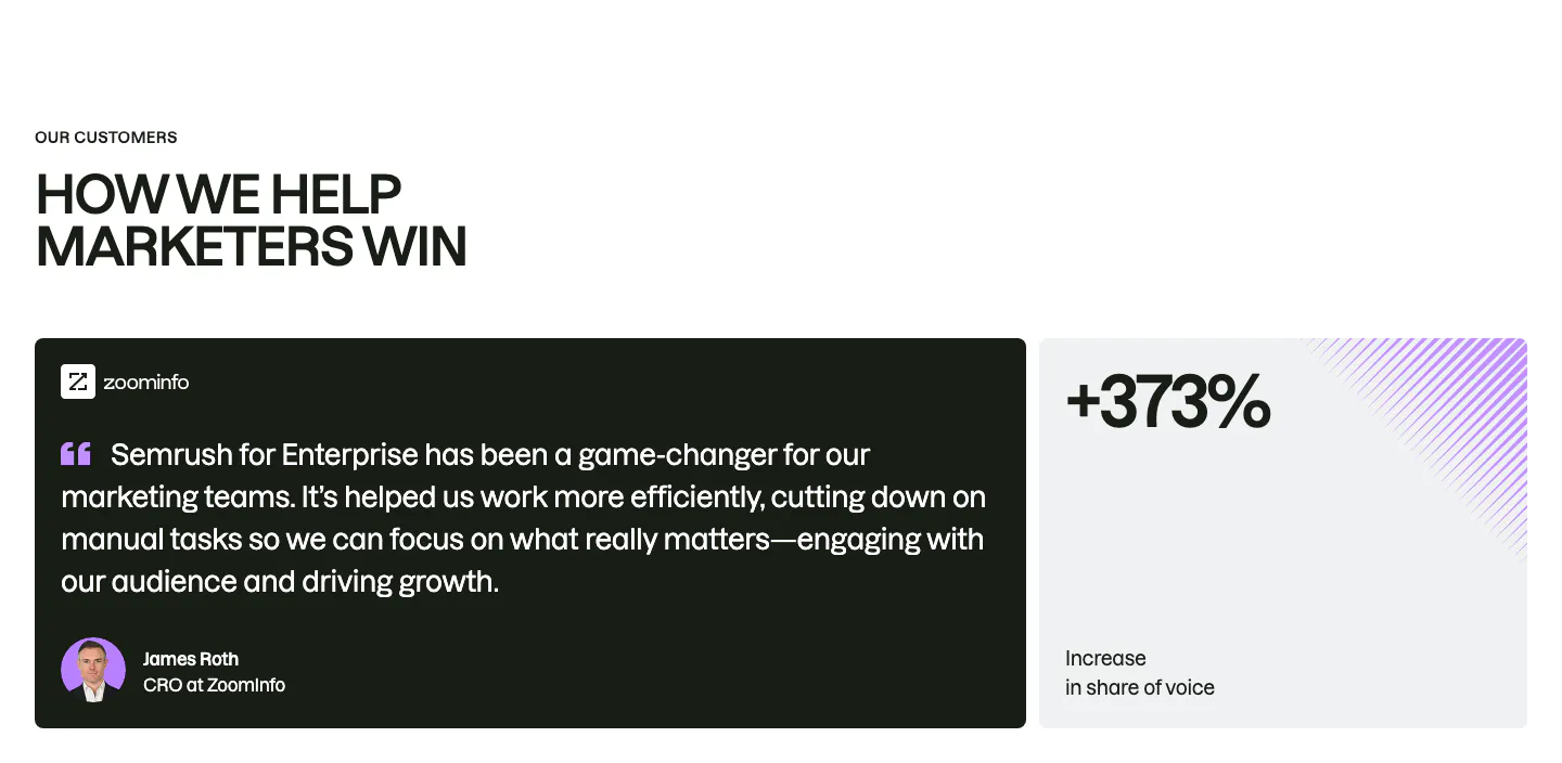
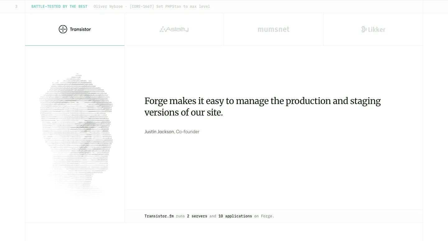
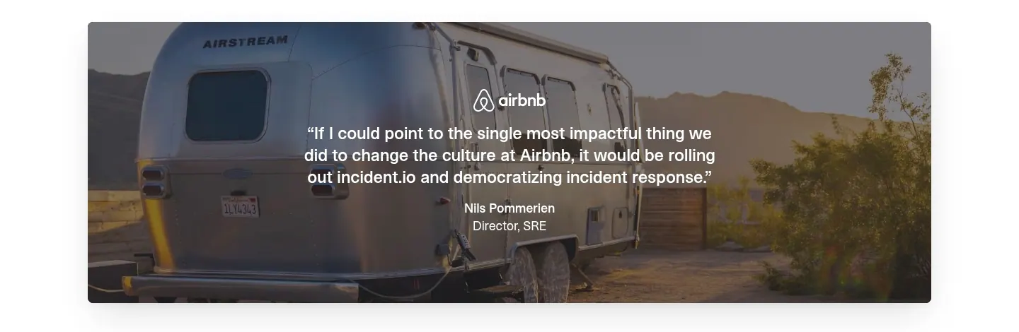
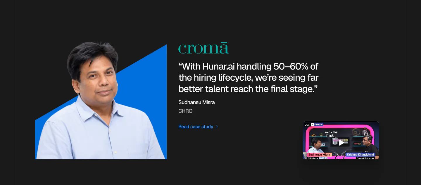
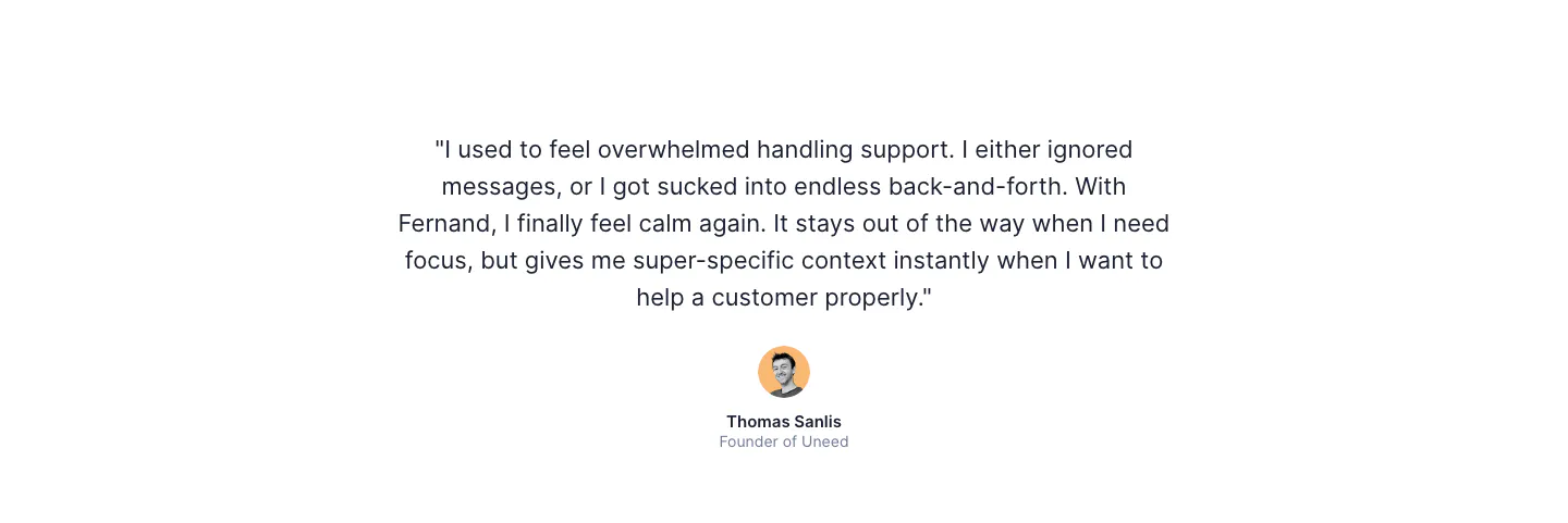
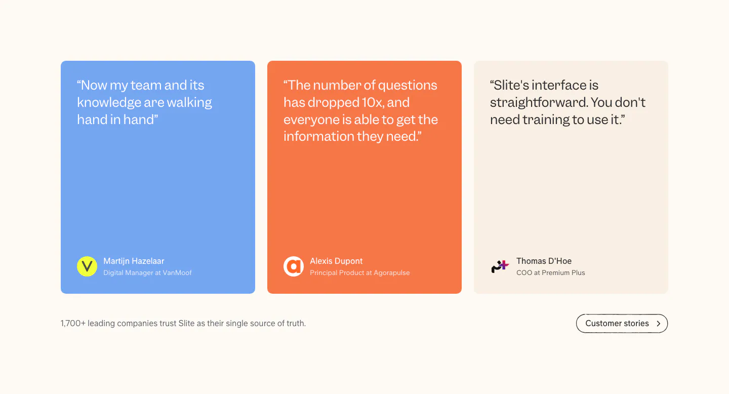
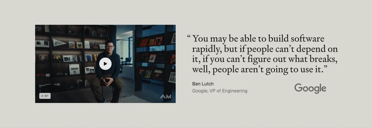
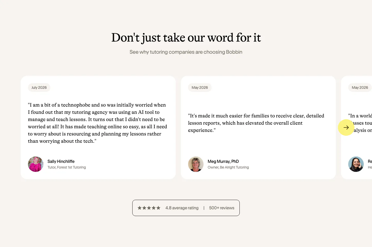
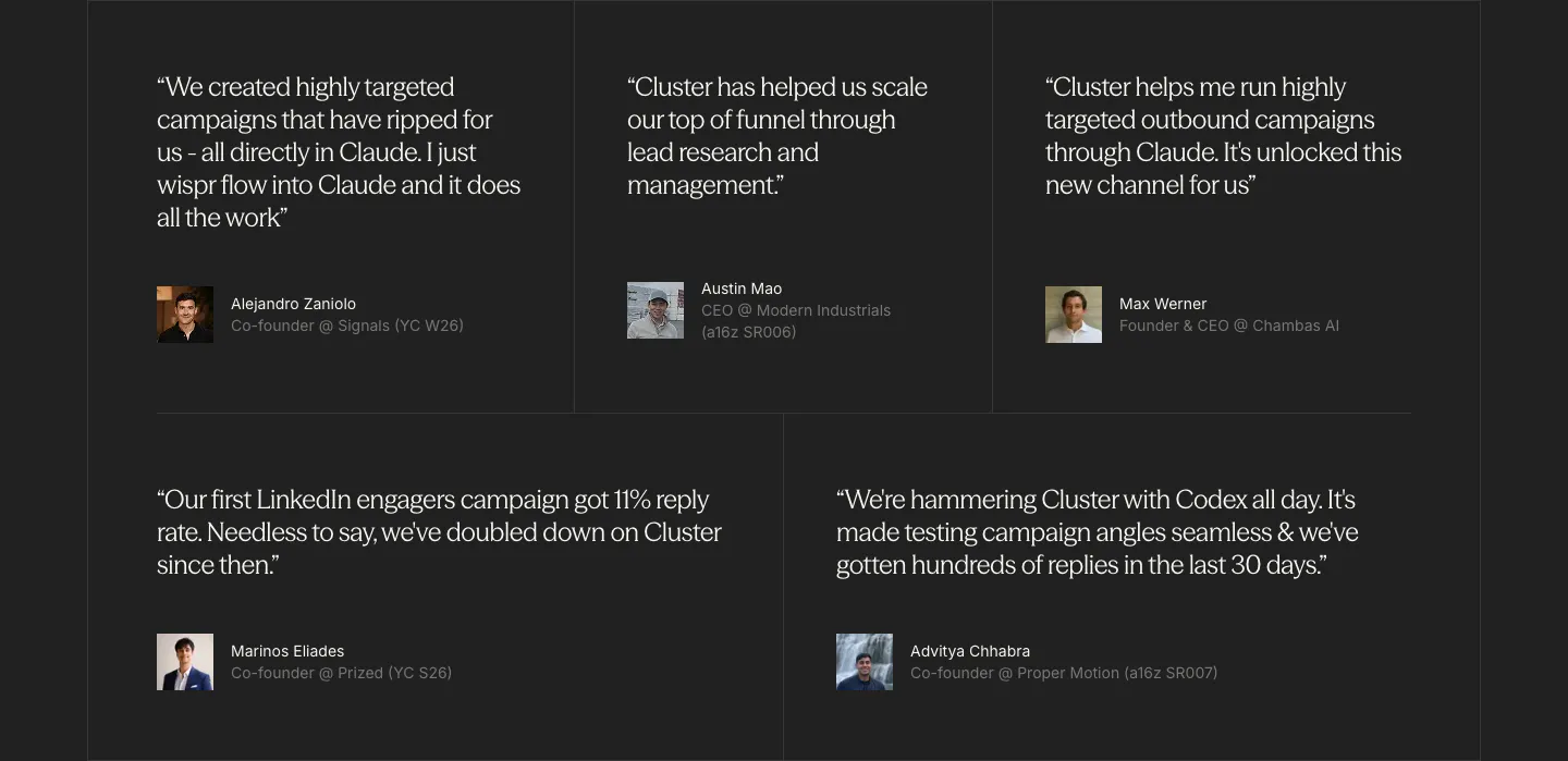
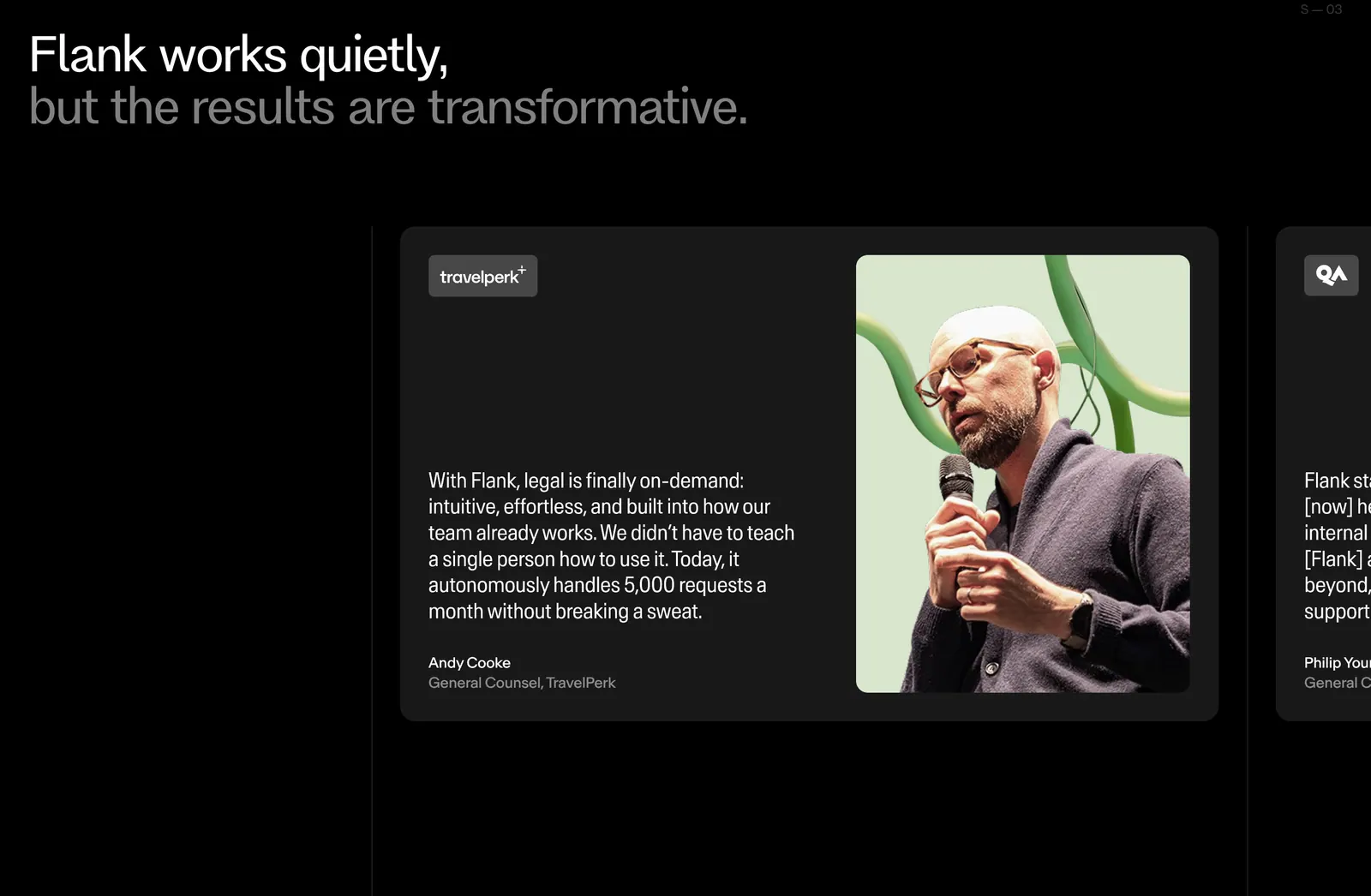
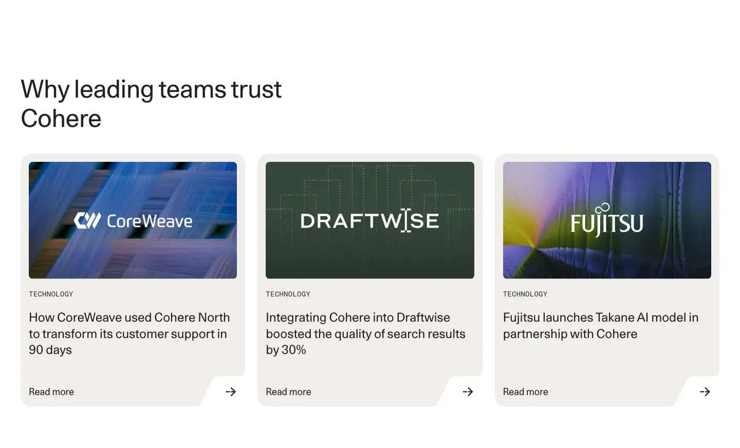
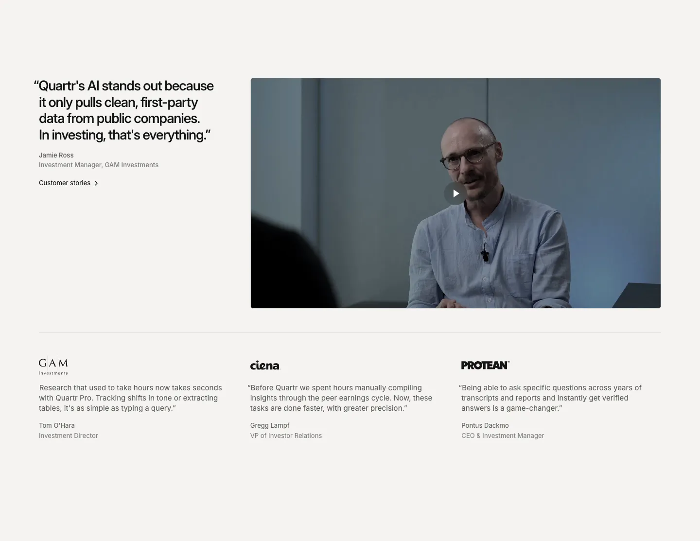
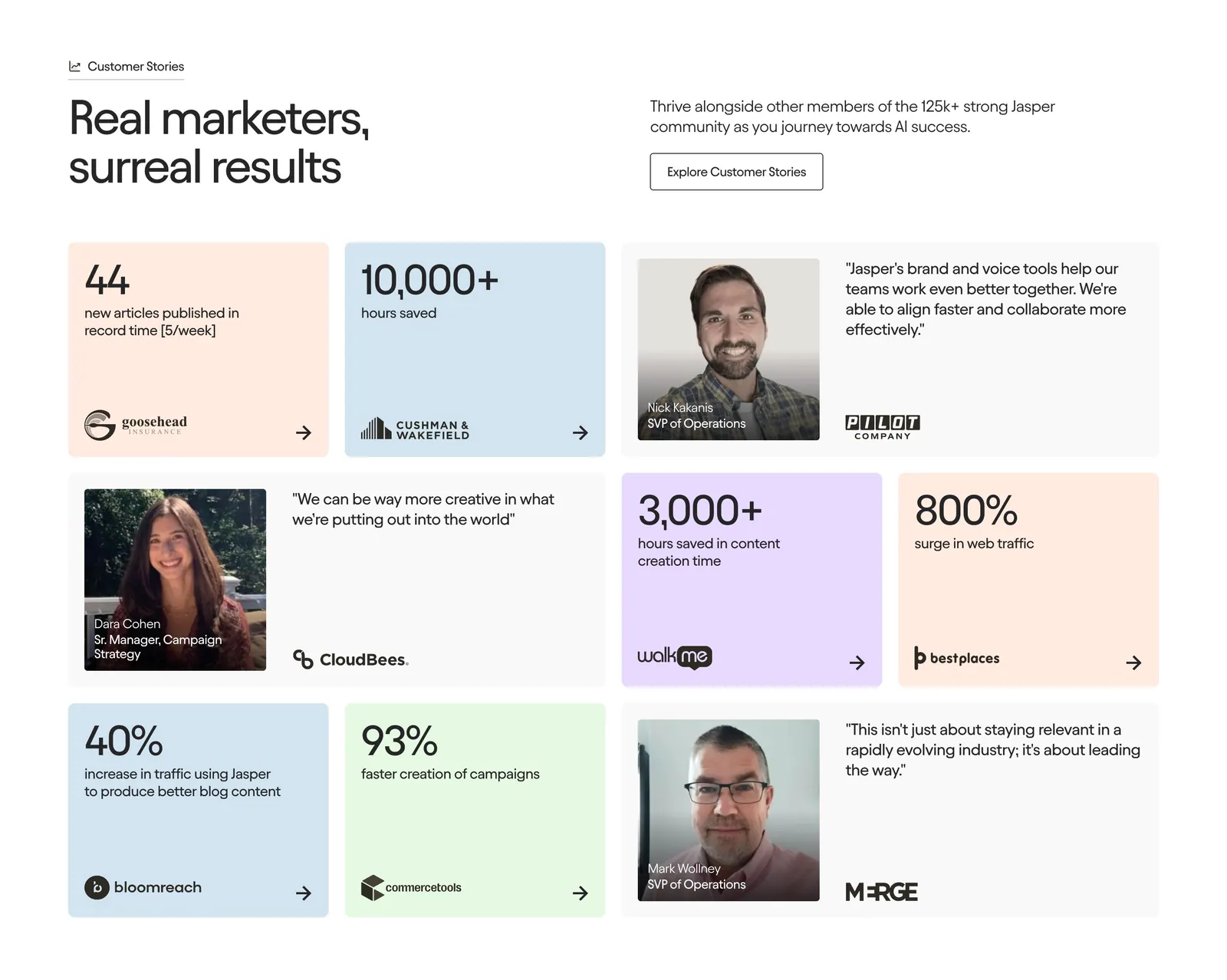
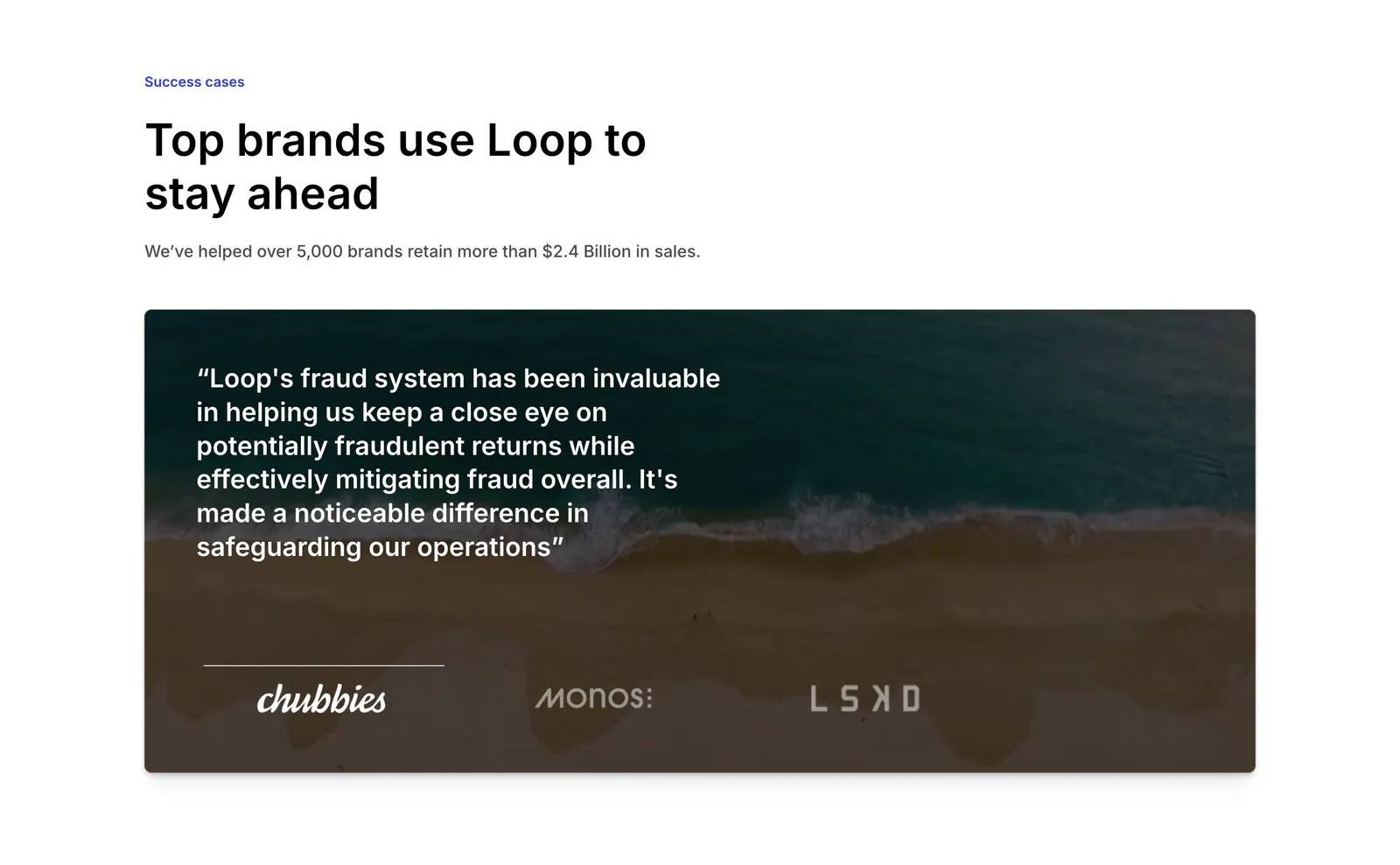
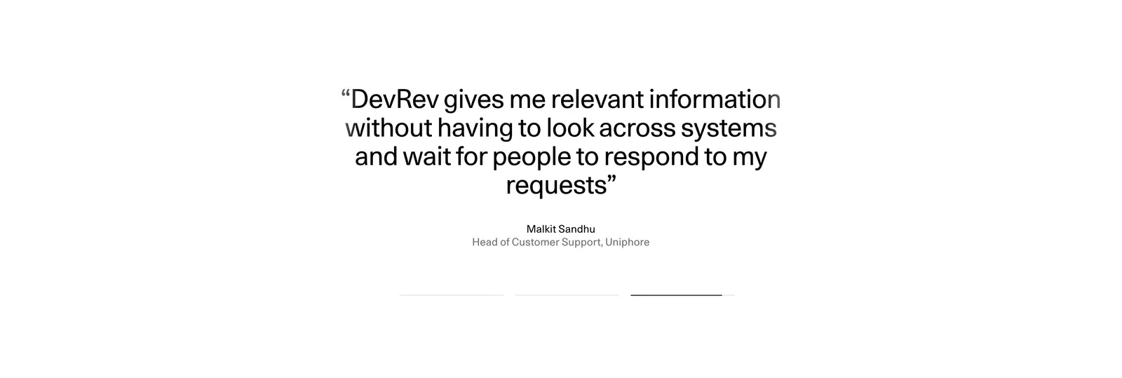
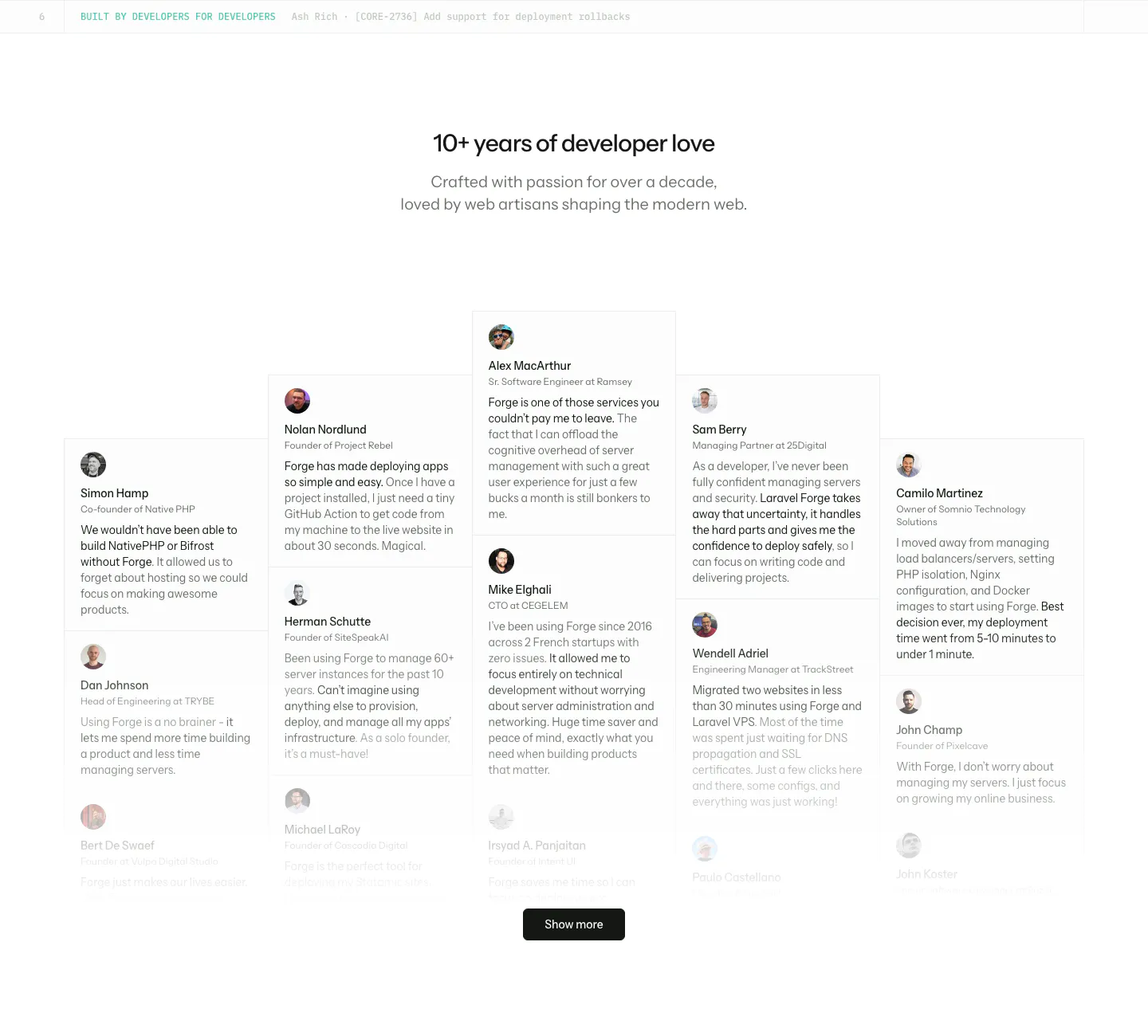
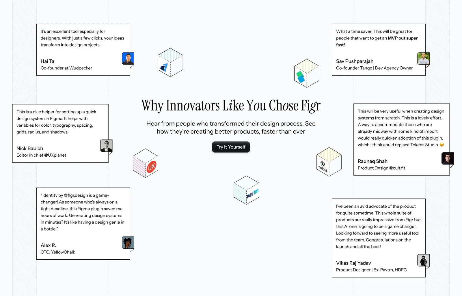
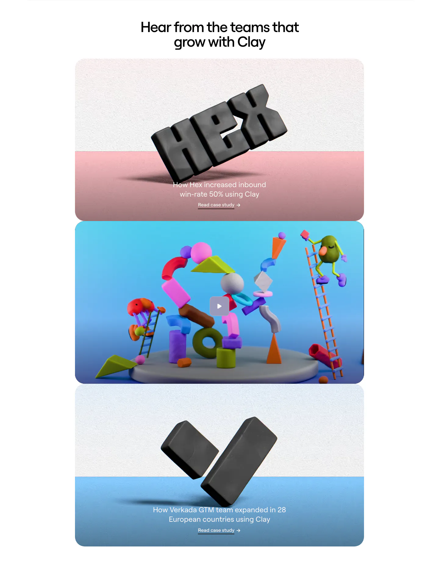
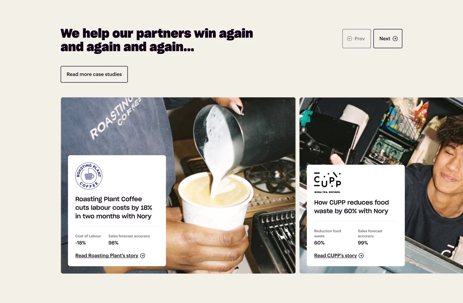
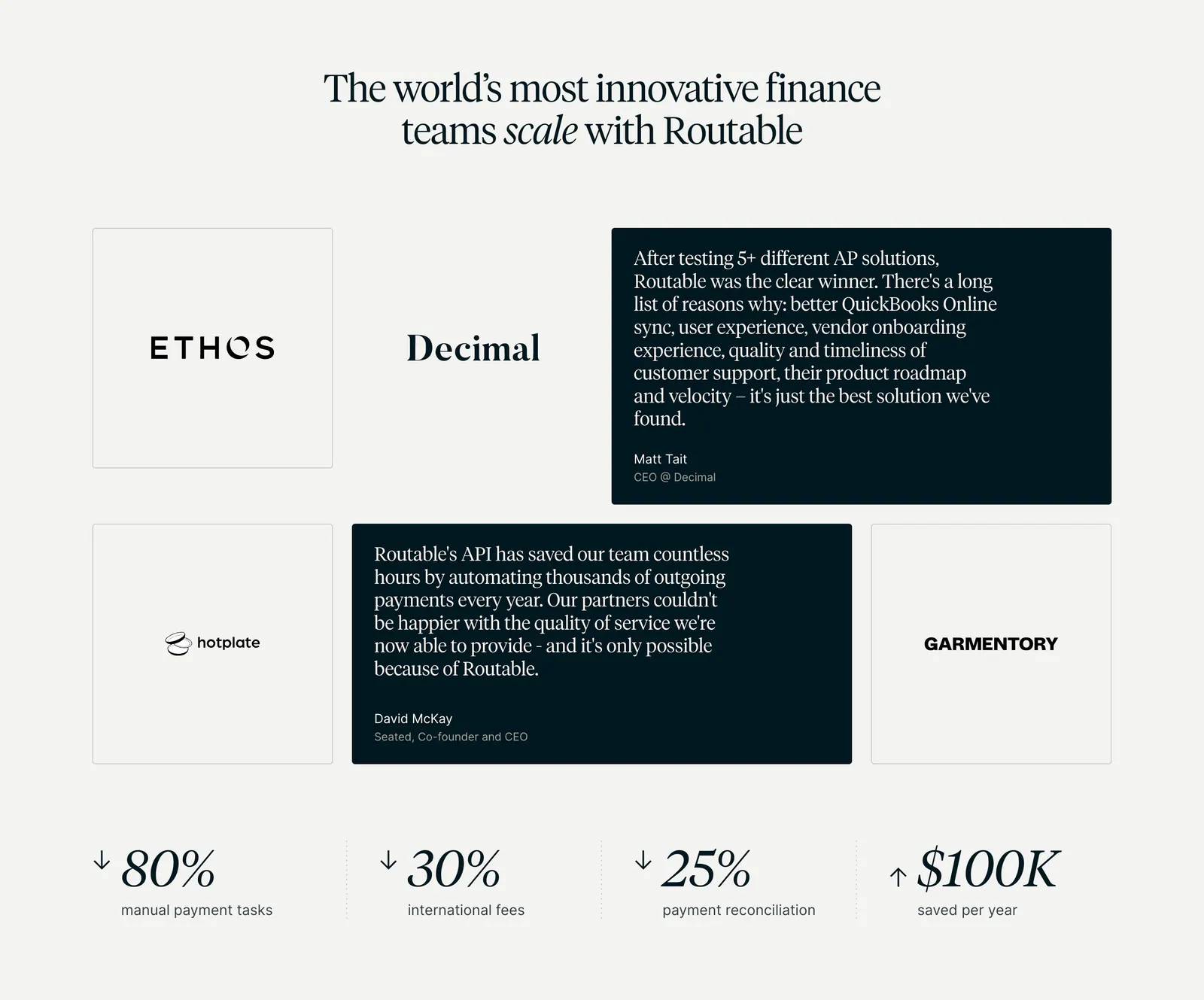
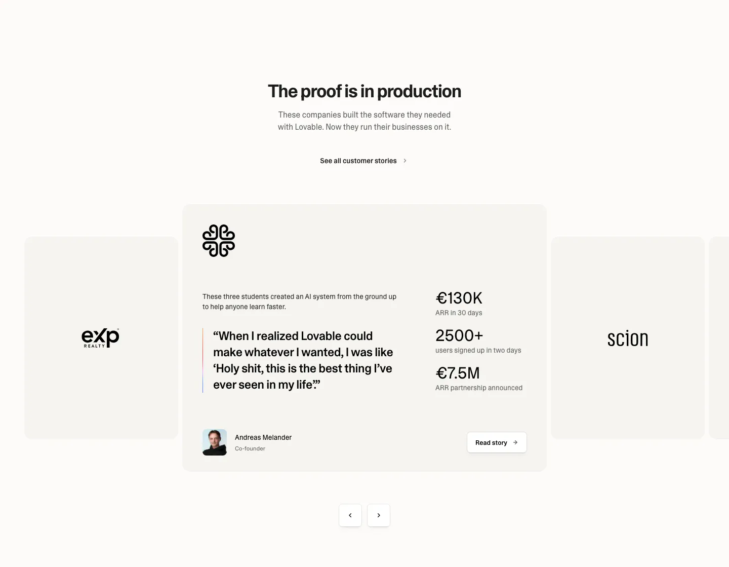
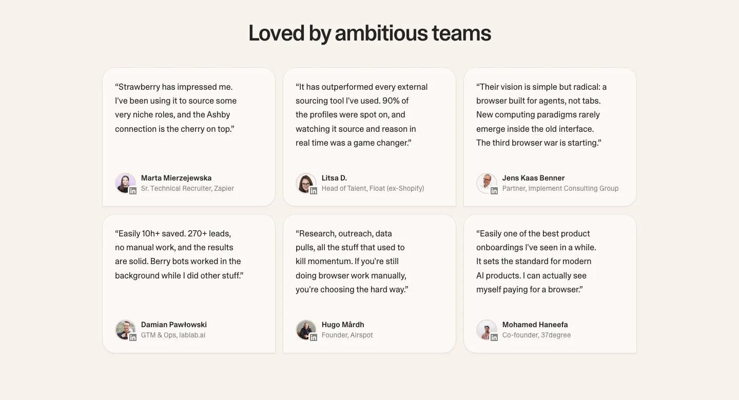
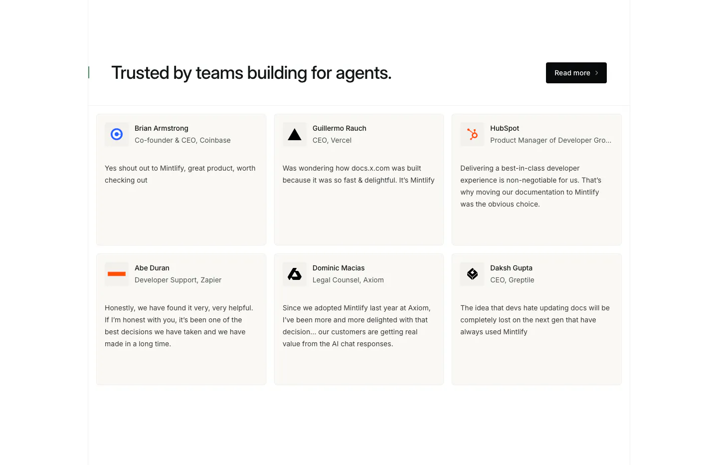
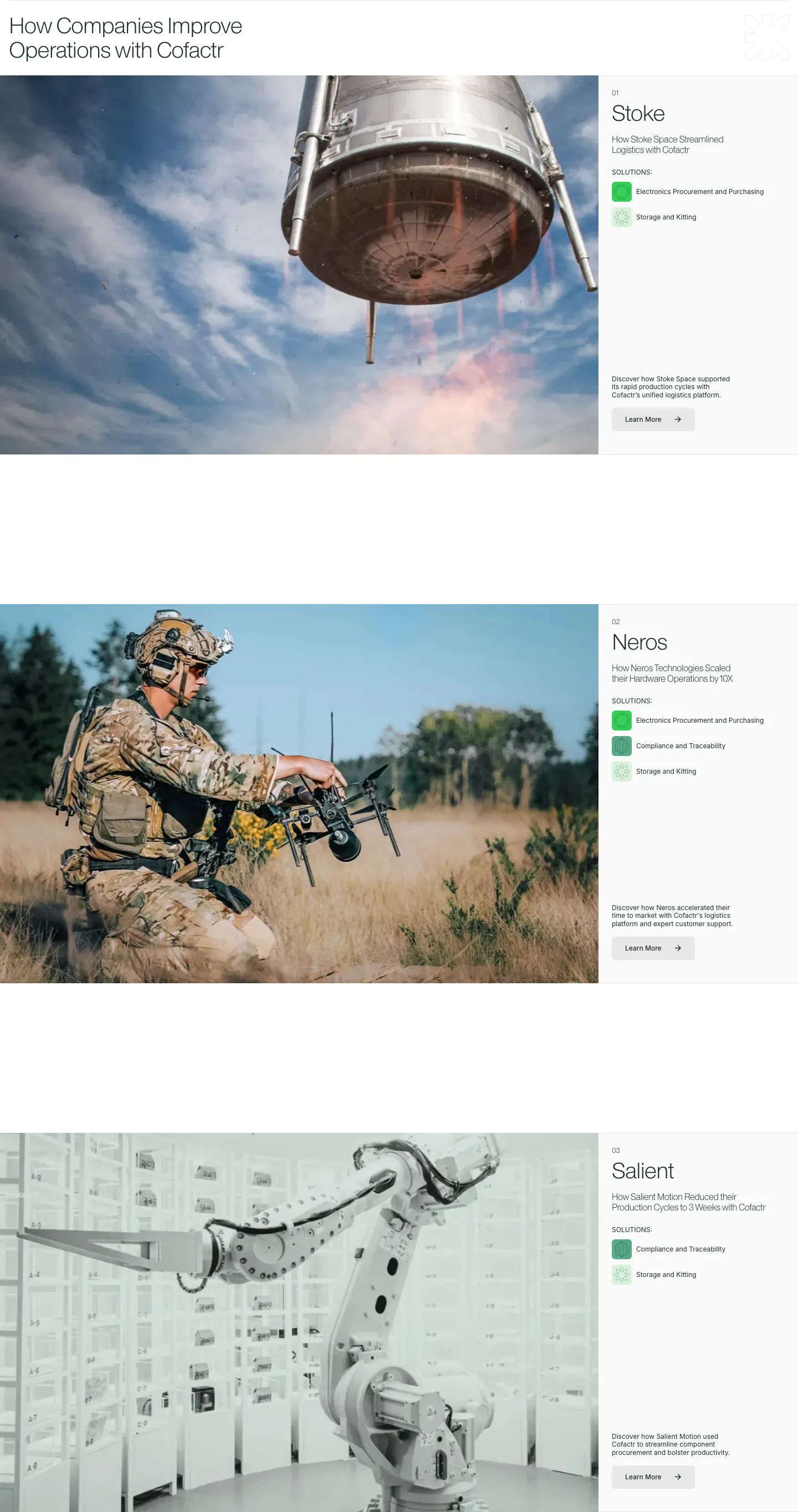
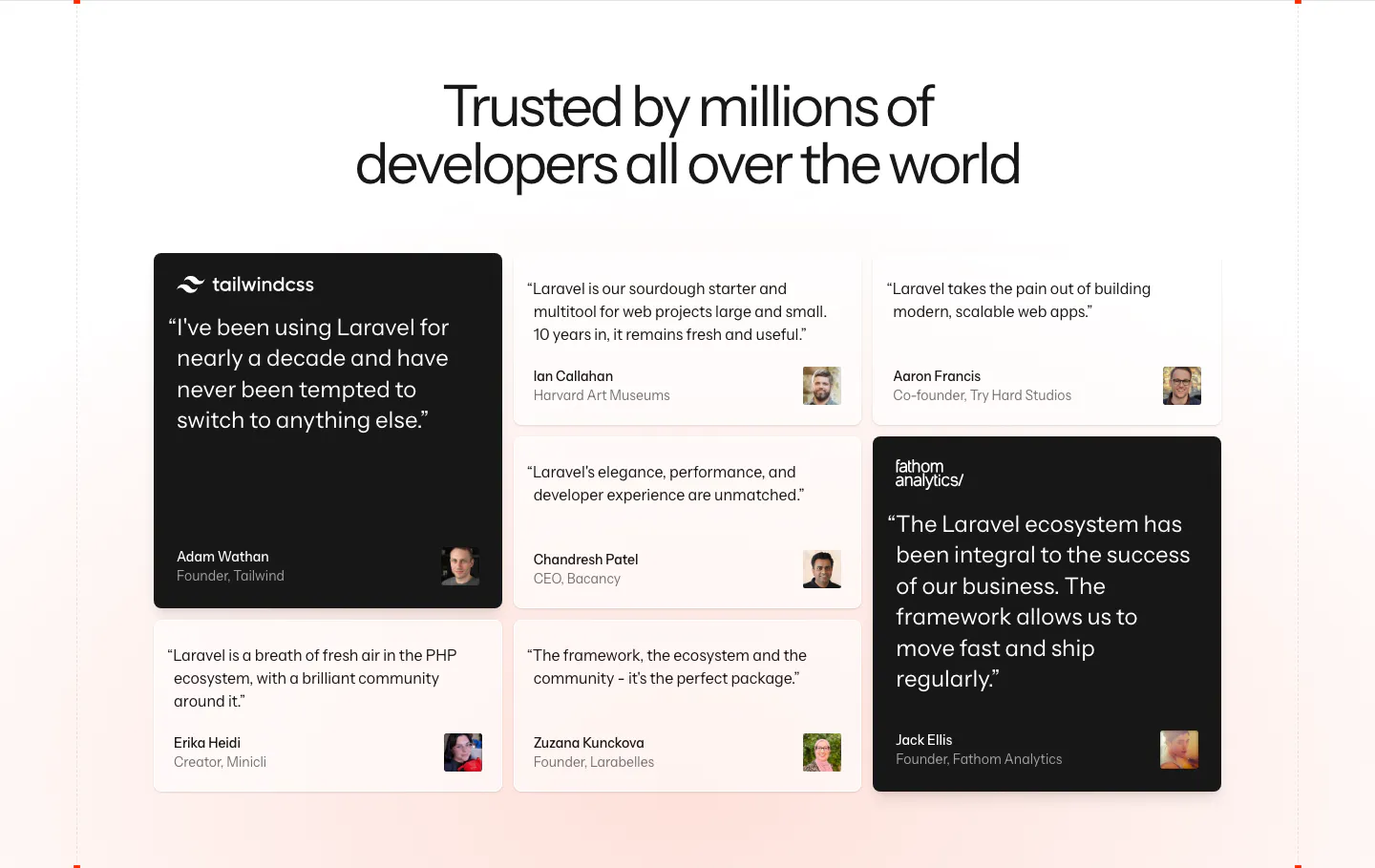
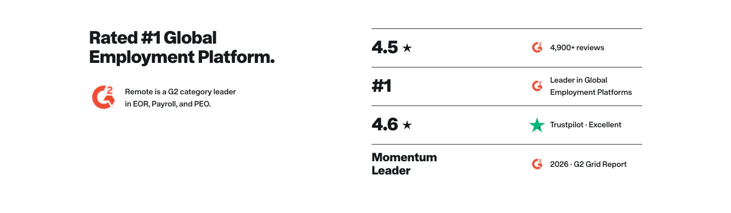
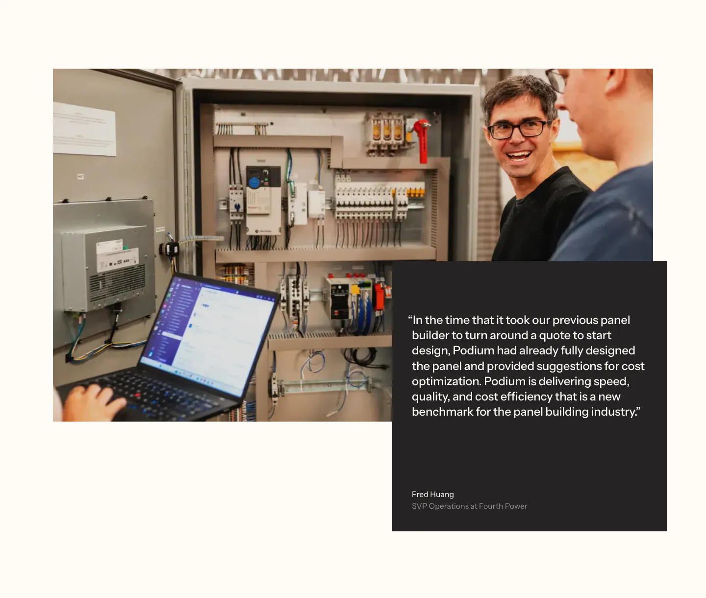
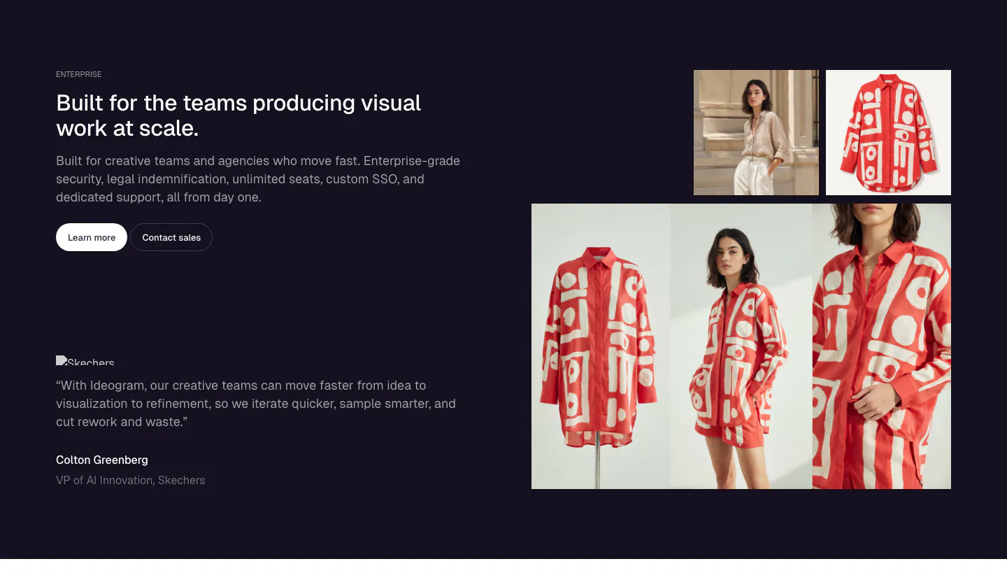
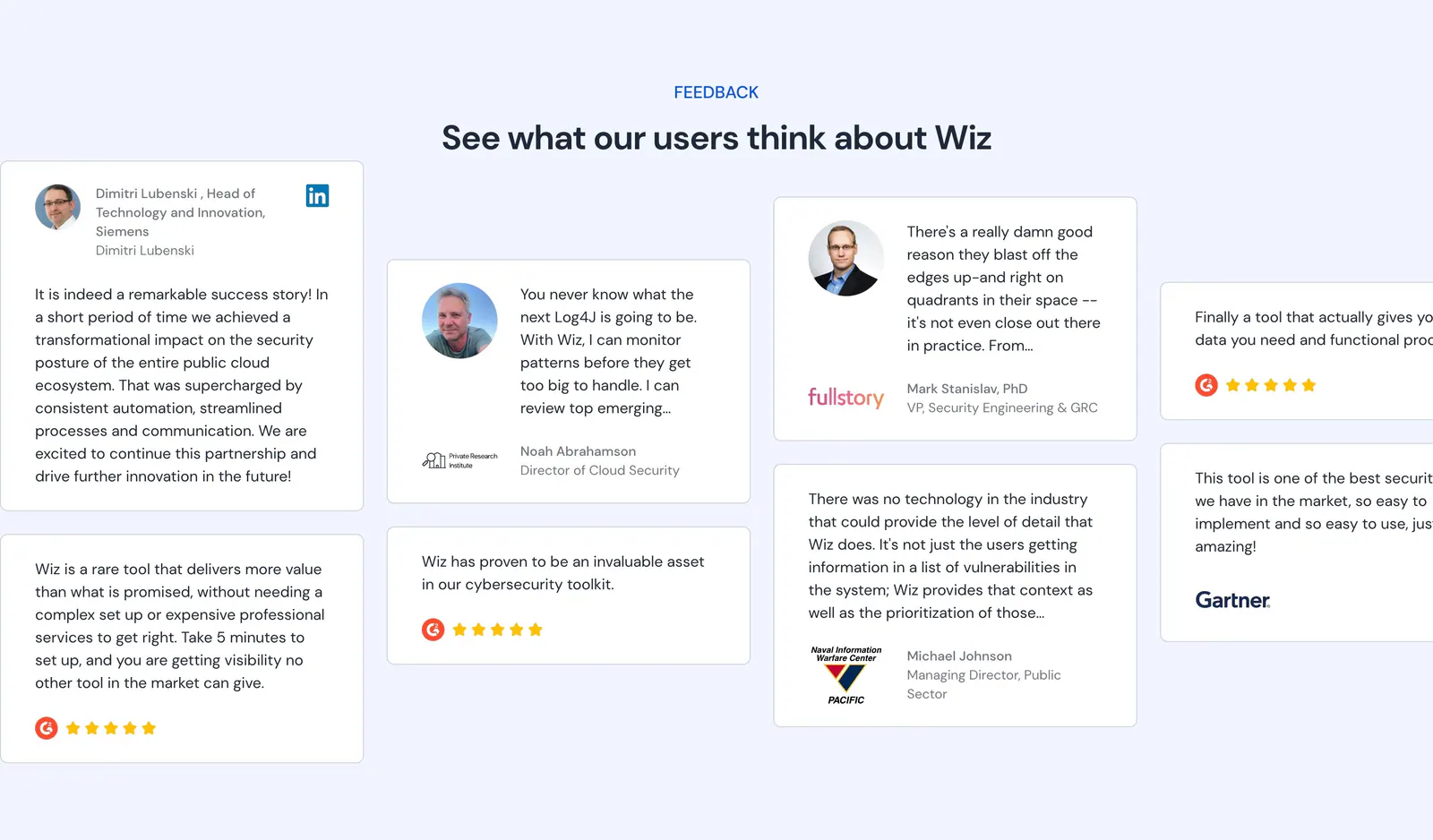
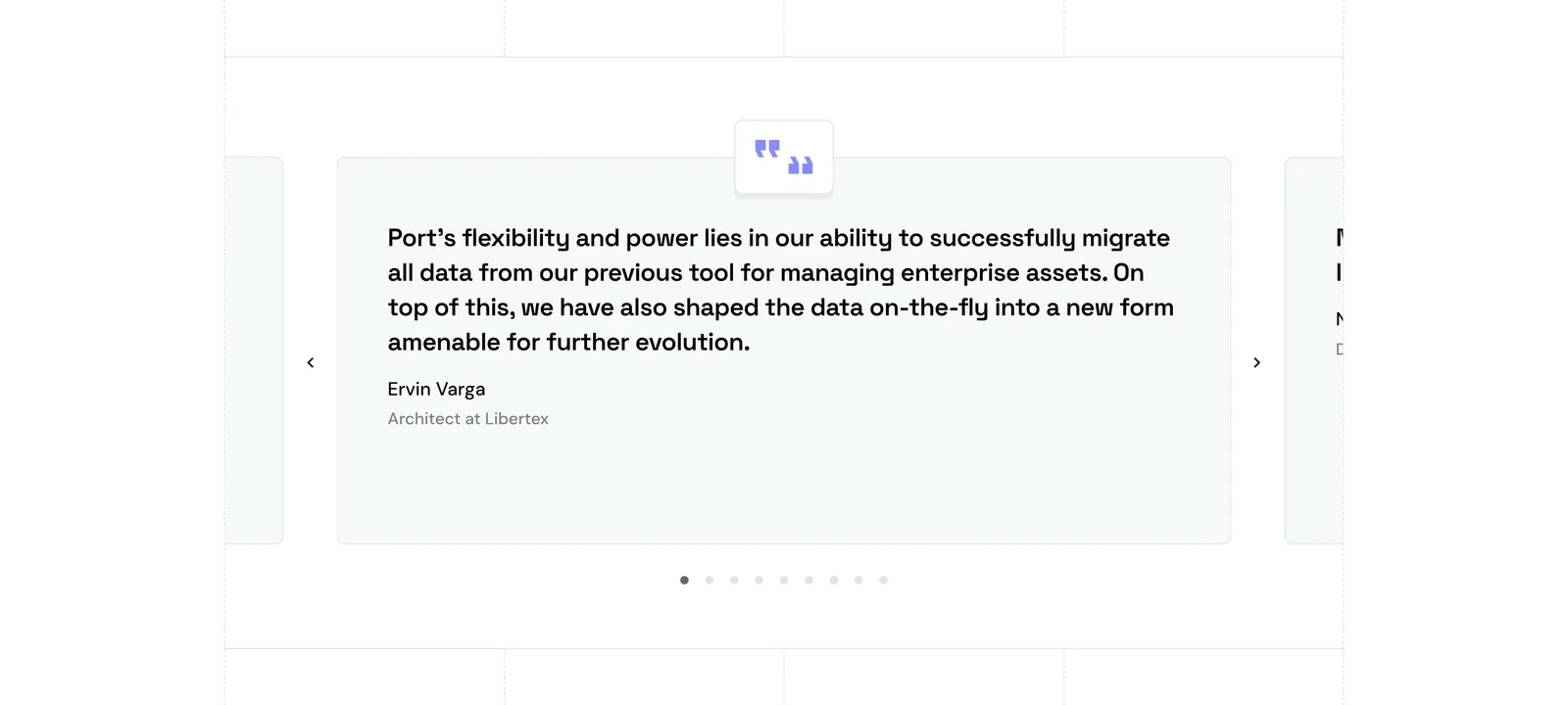
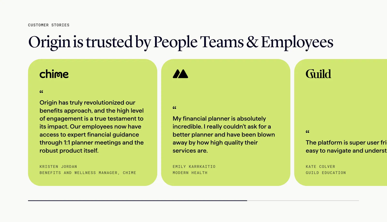
A customer saying it beats you saying it, but only when the quote sounds real. That comes down to details: a full name, a role, a photo, and a sentence about a specific result. Generic praise reads as filler and can make the whole page feel staged. Featured quotes, card grids, review walls, and case-study cards all appear in this set of testimonial section examples.







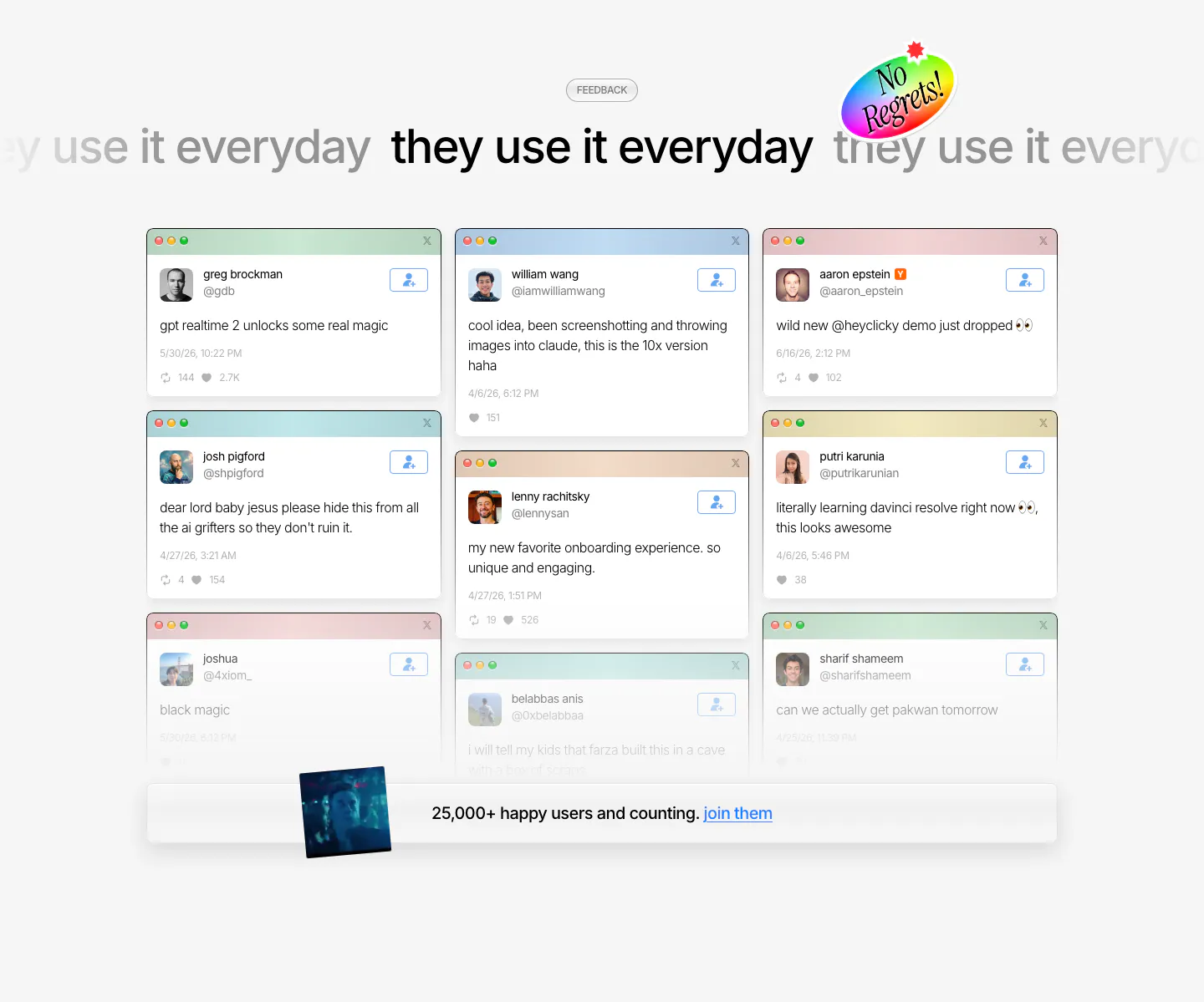

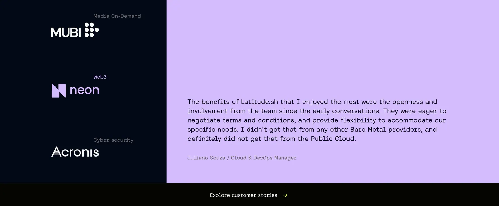
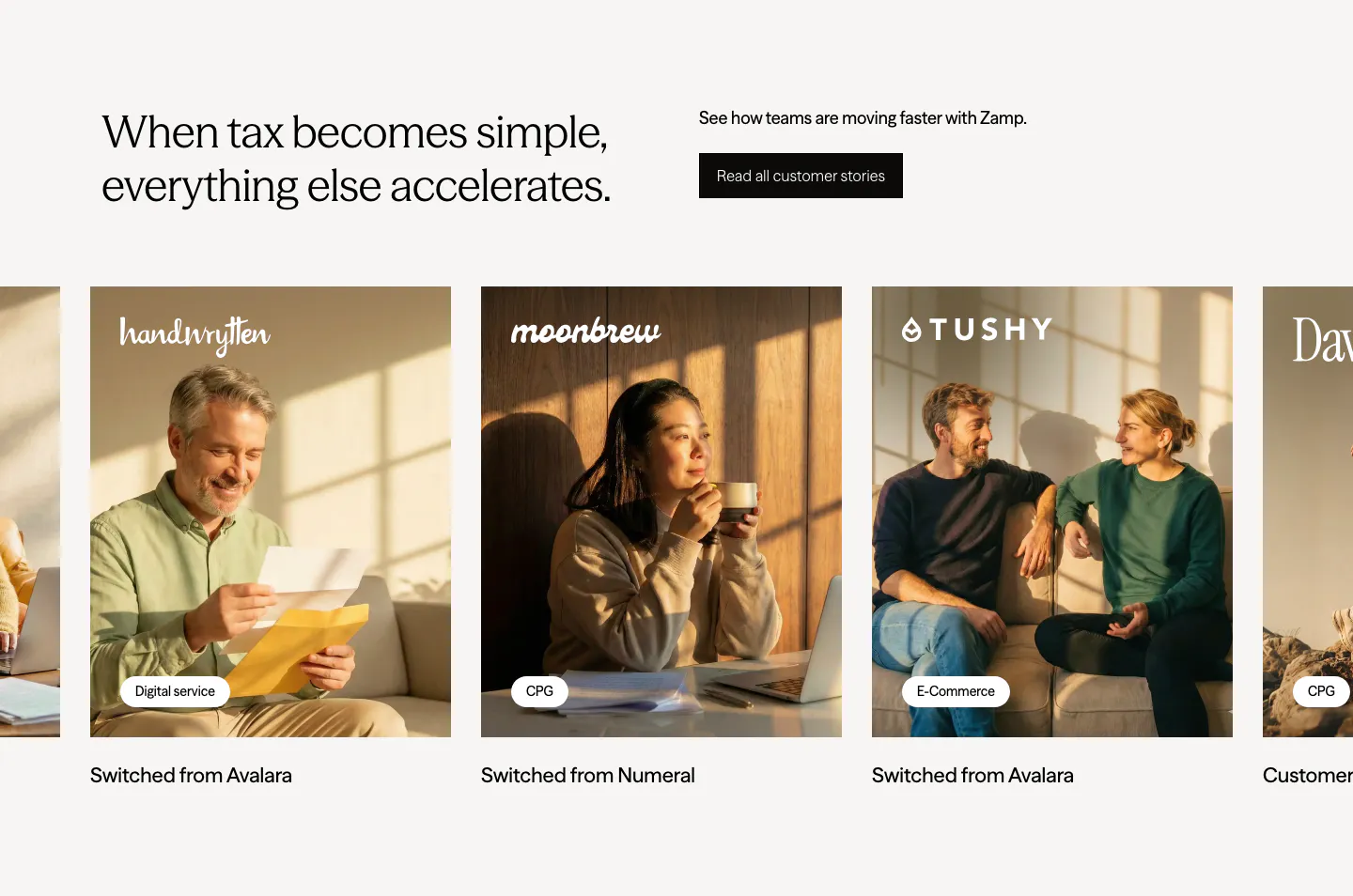
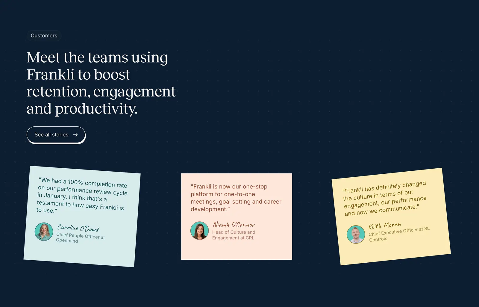



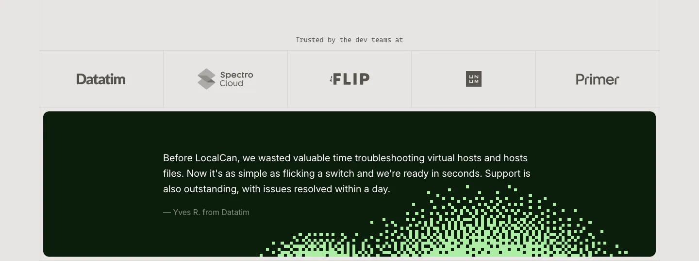




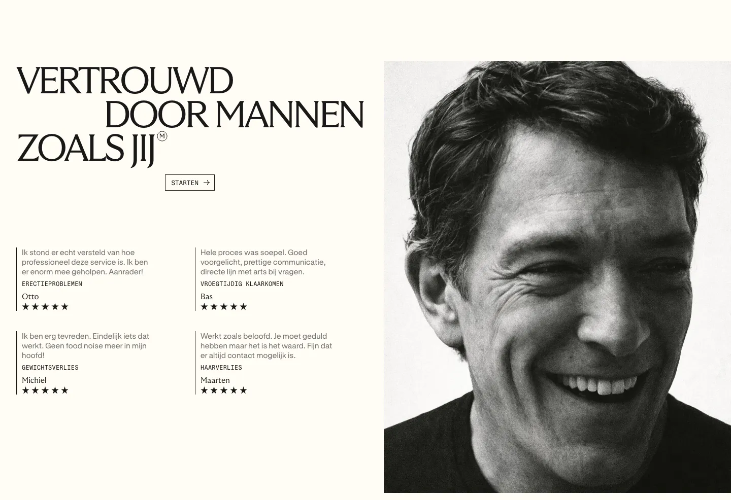
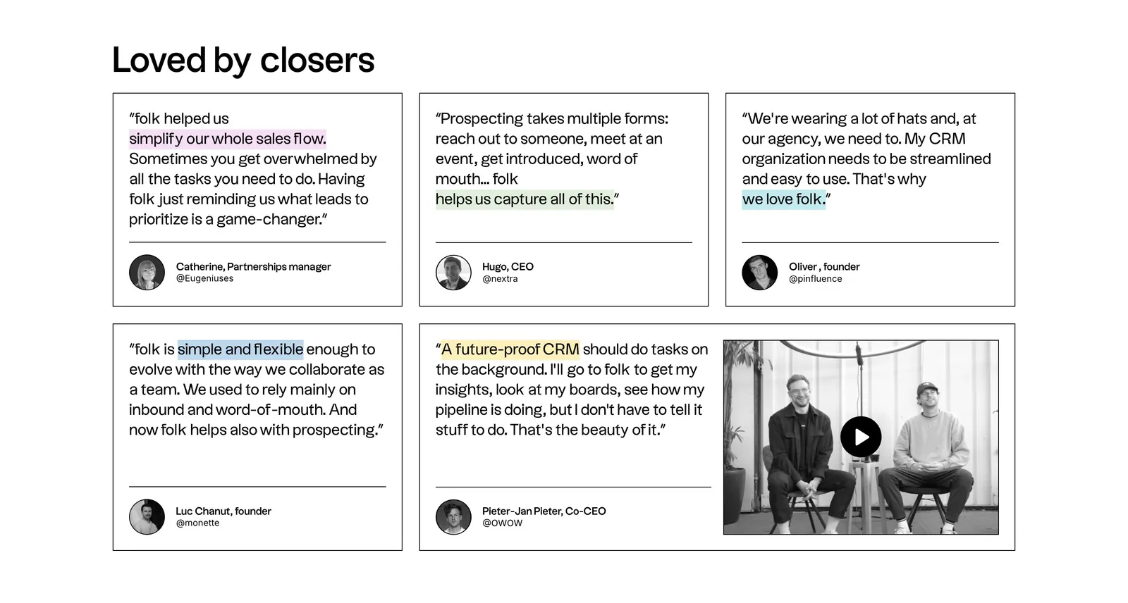
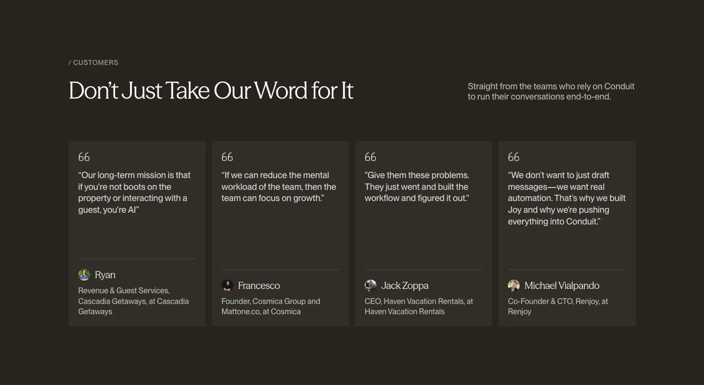


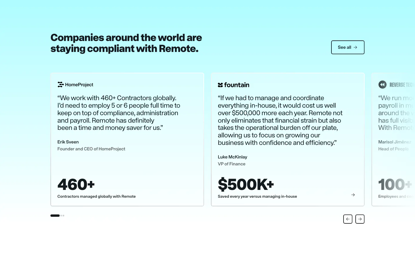
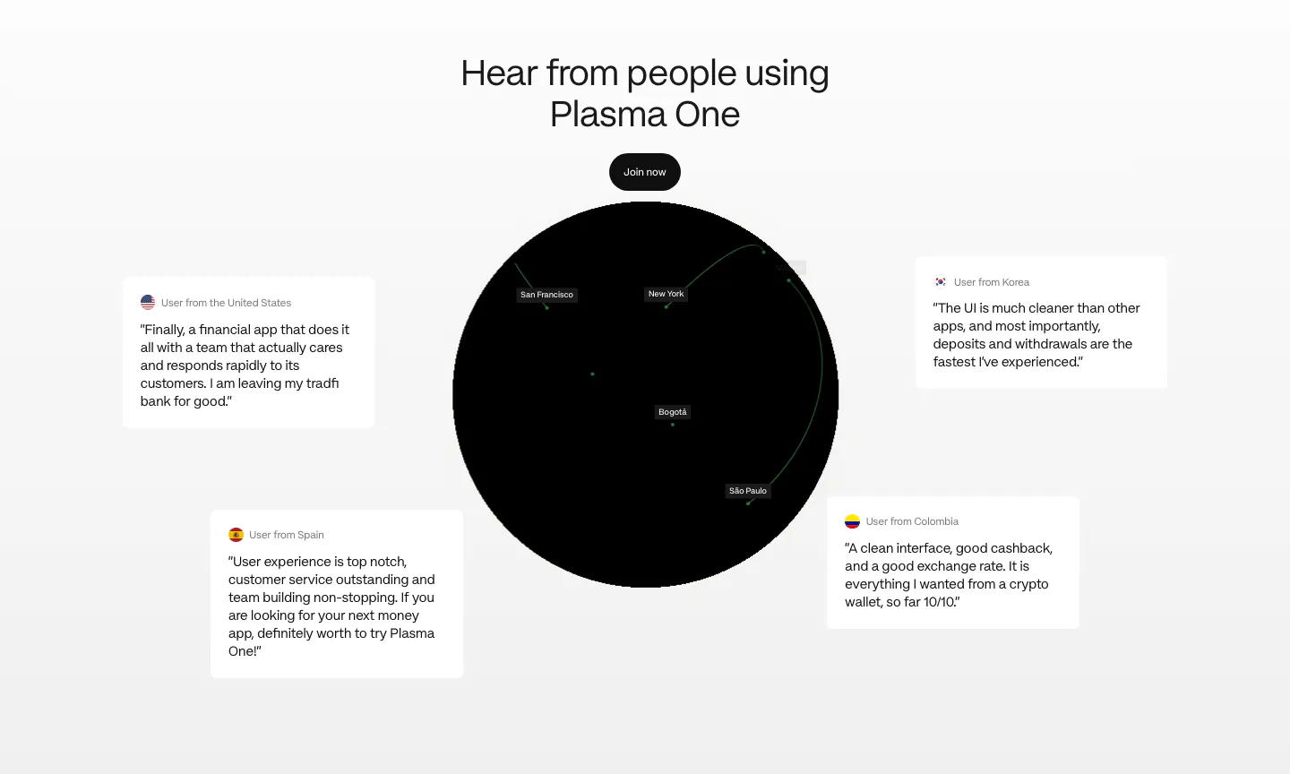
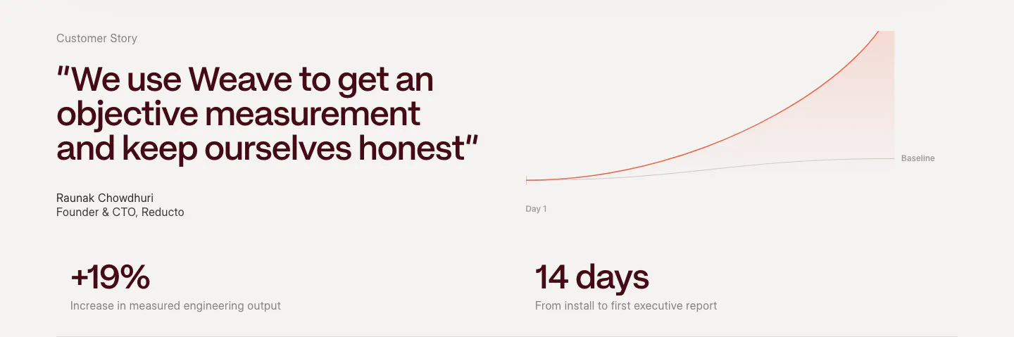
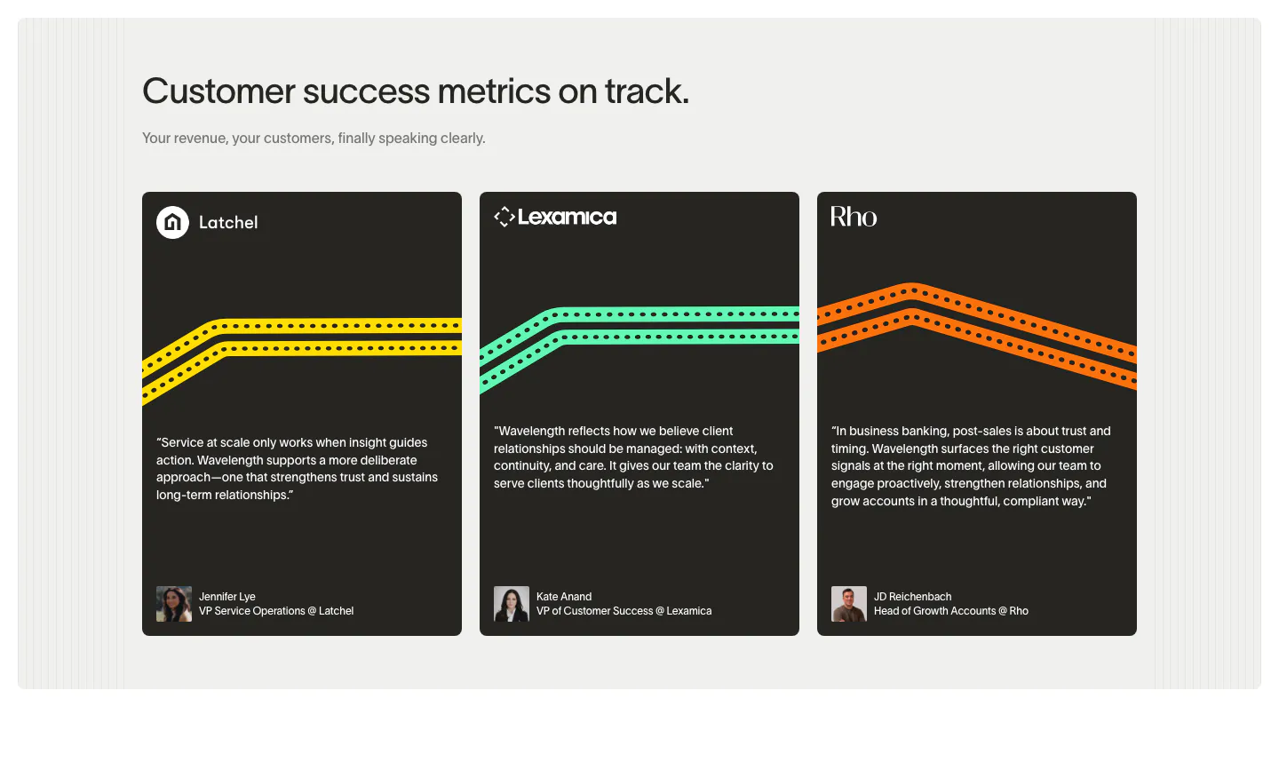



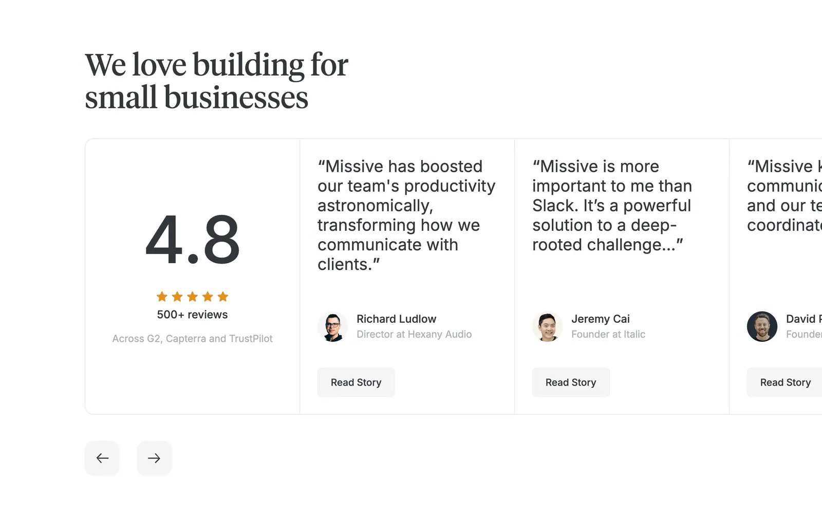

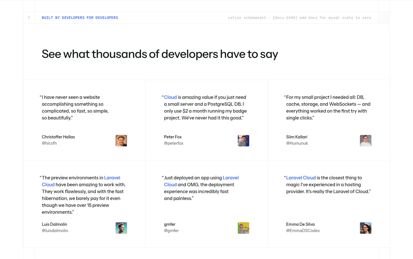
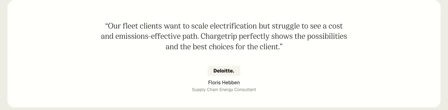
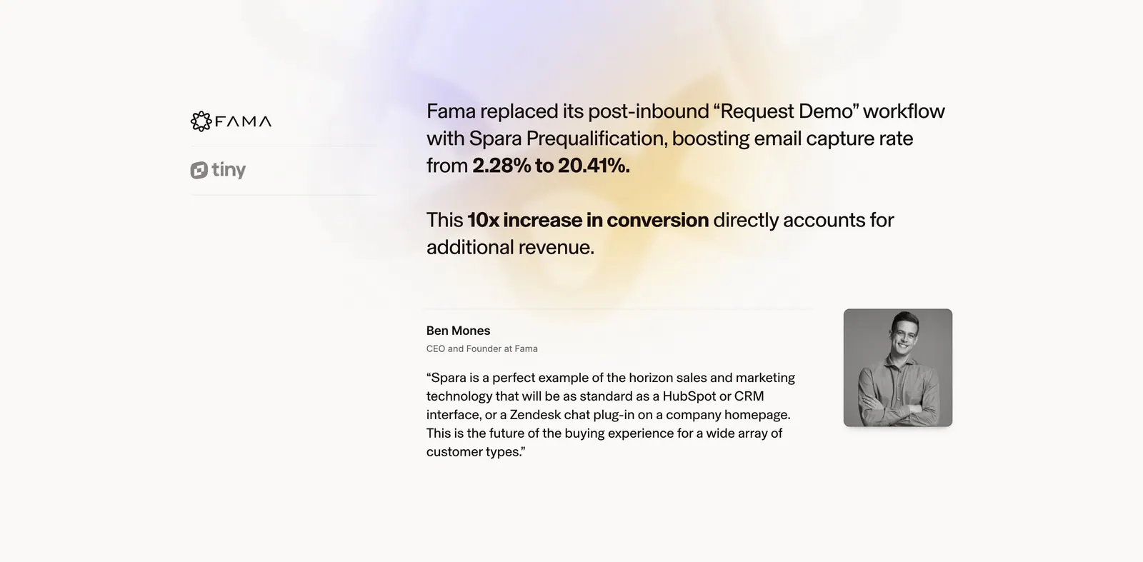



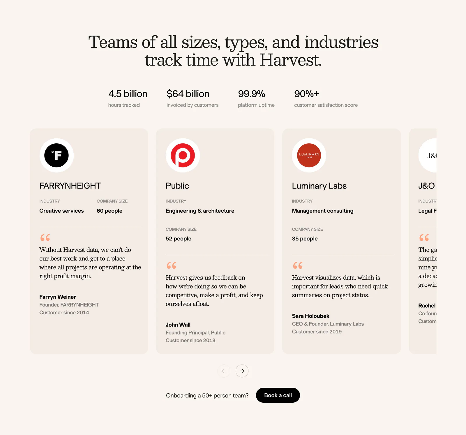


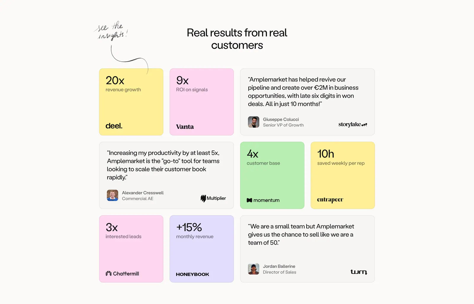
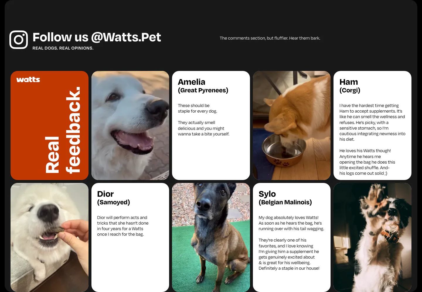


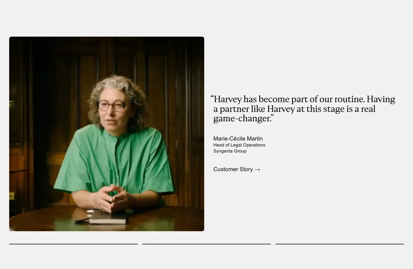














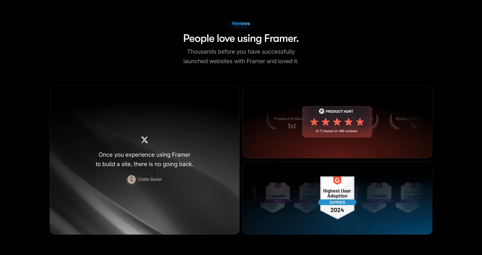



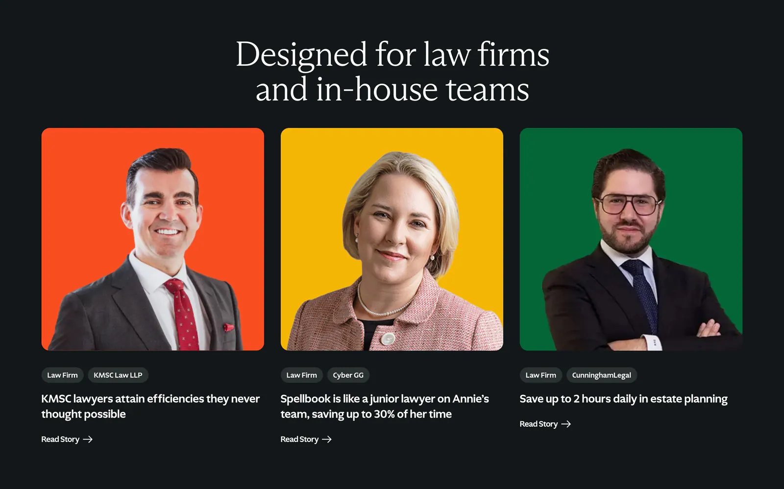




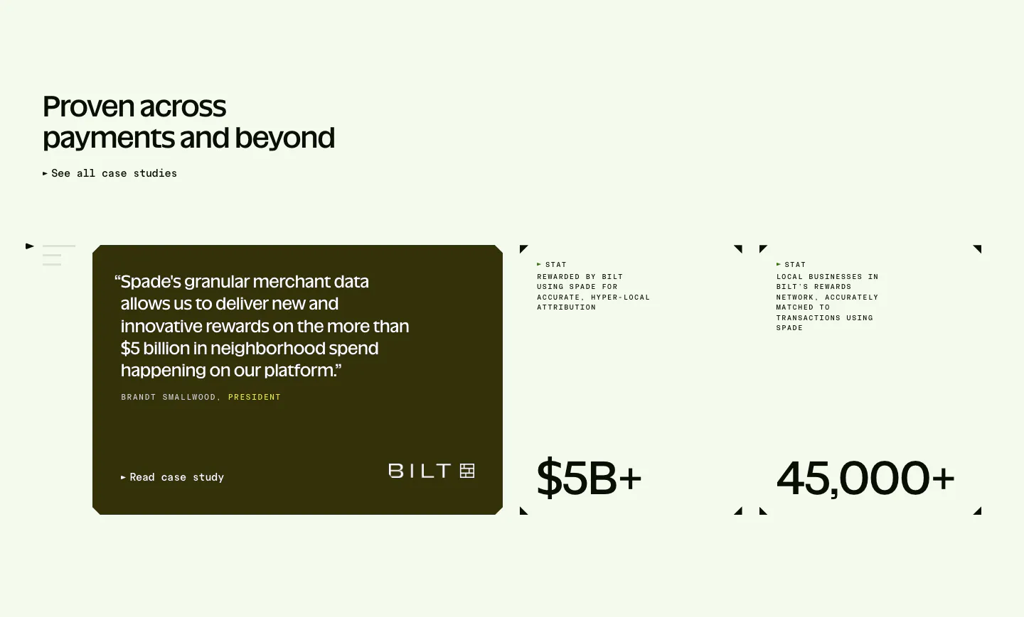
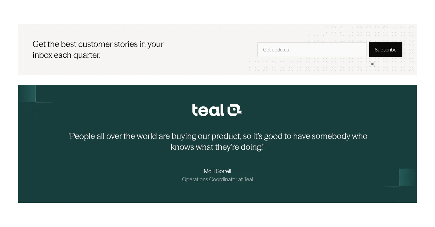

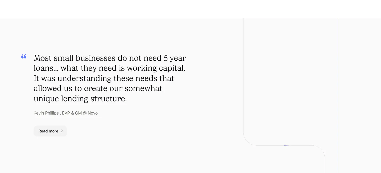
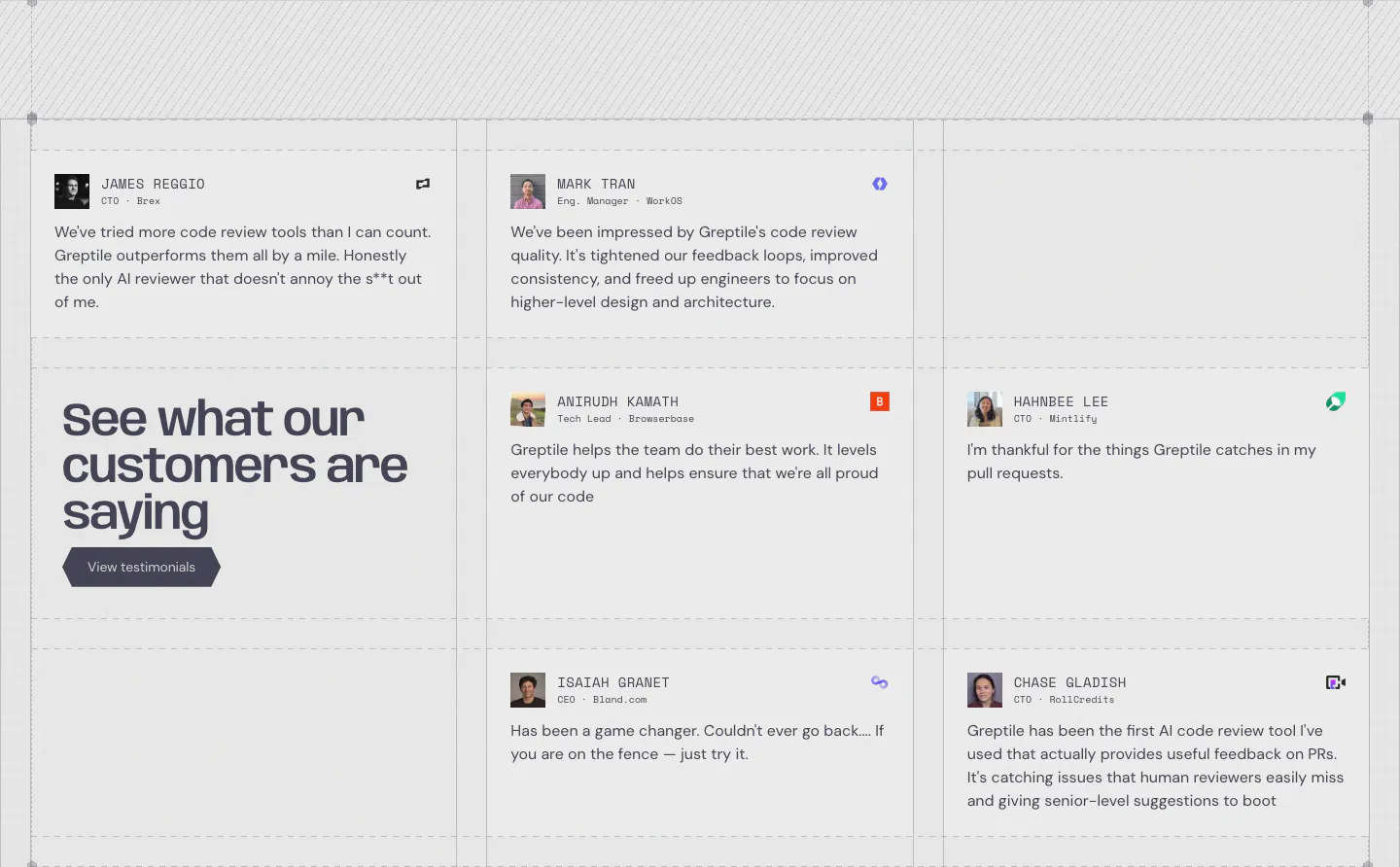


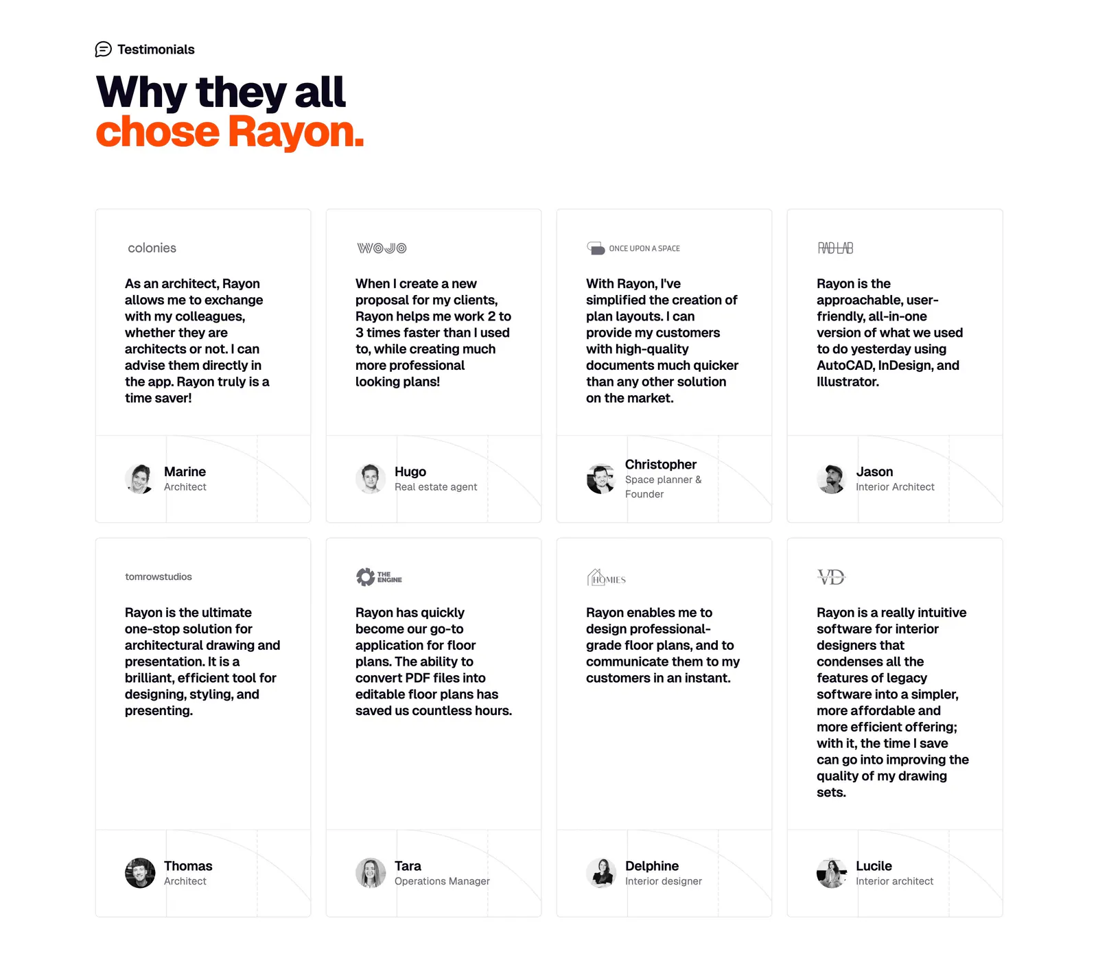






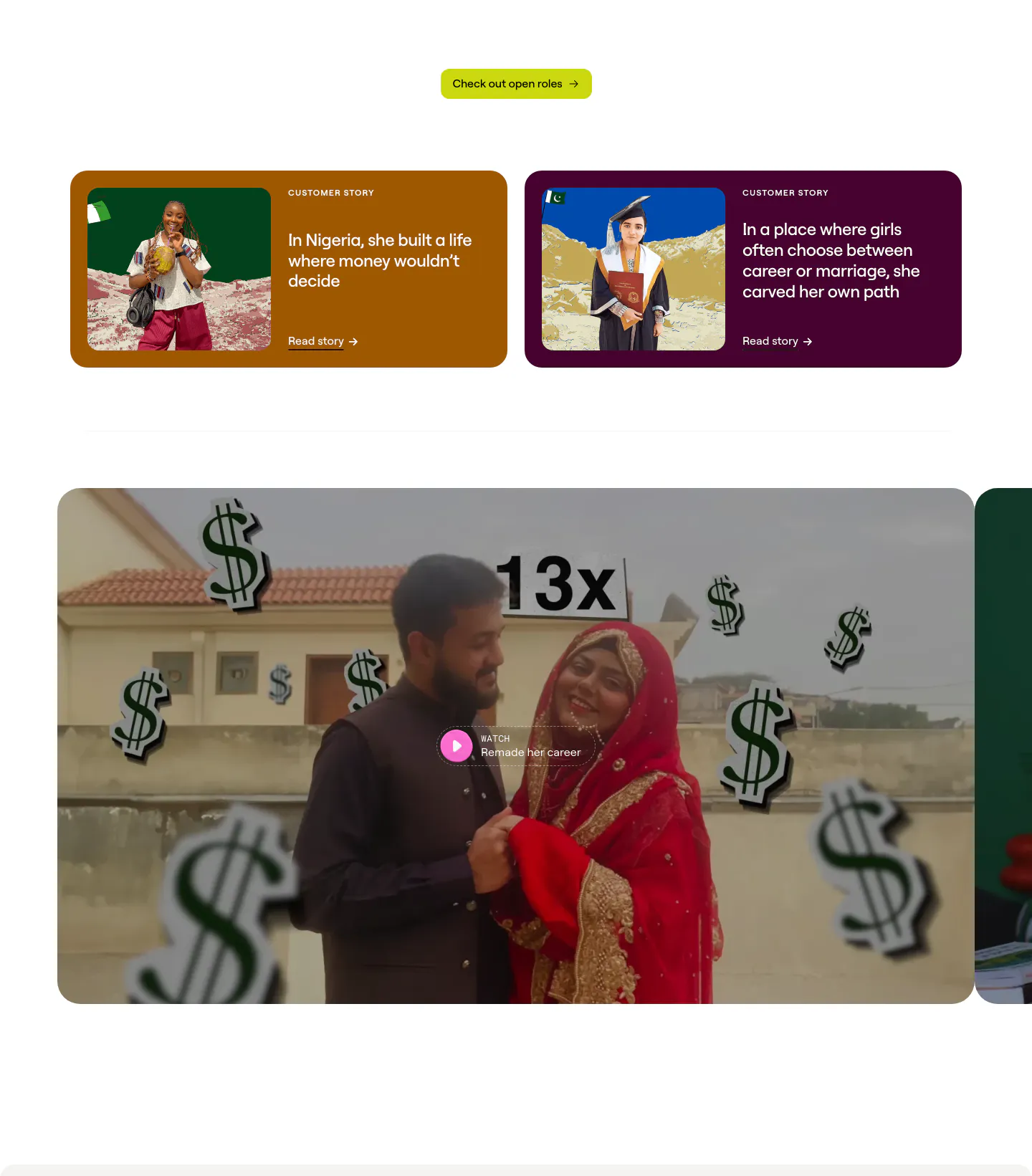

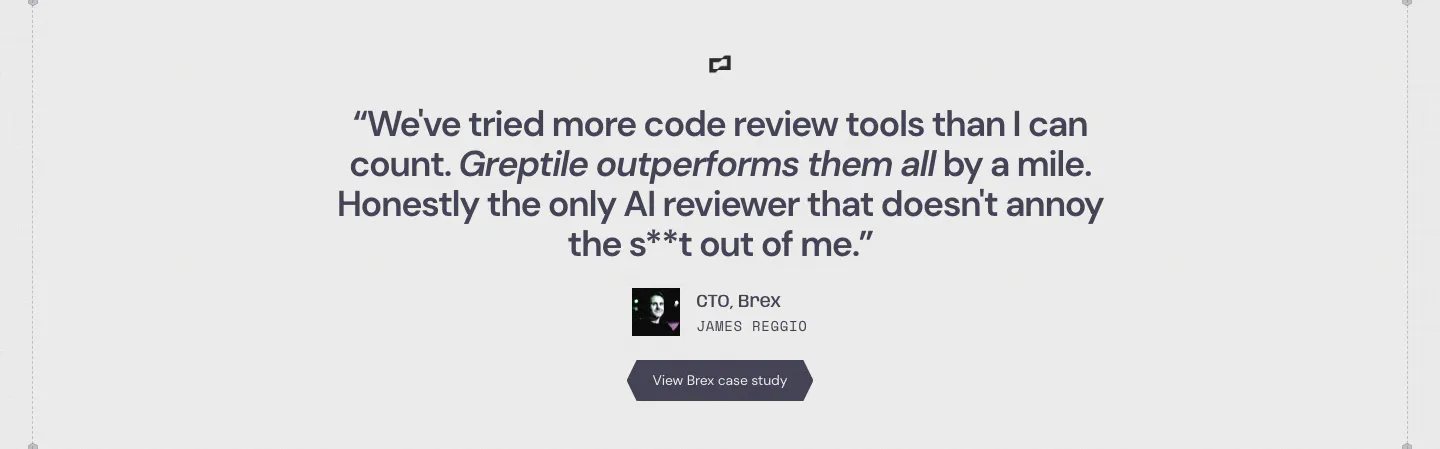
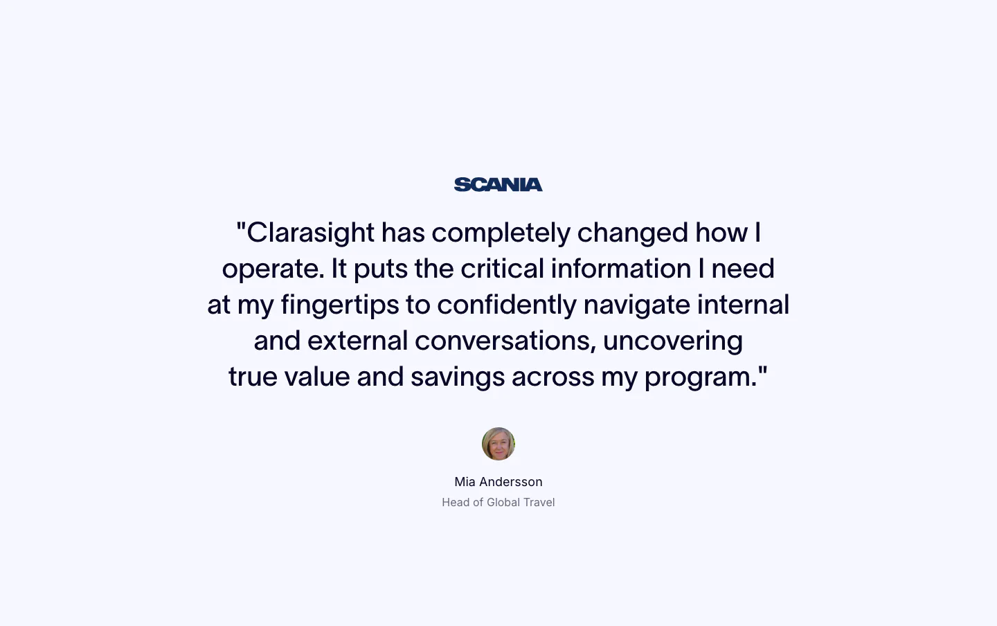
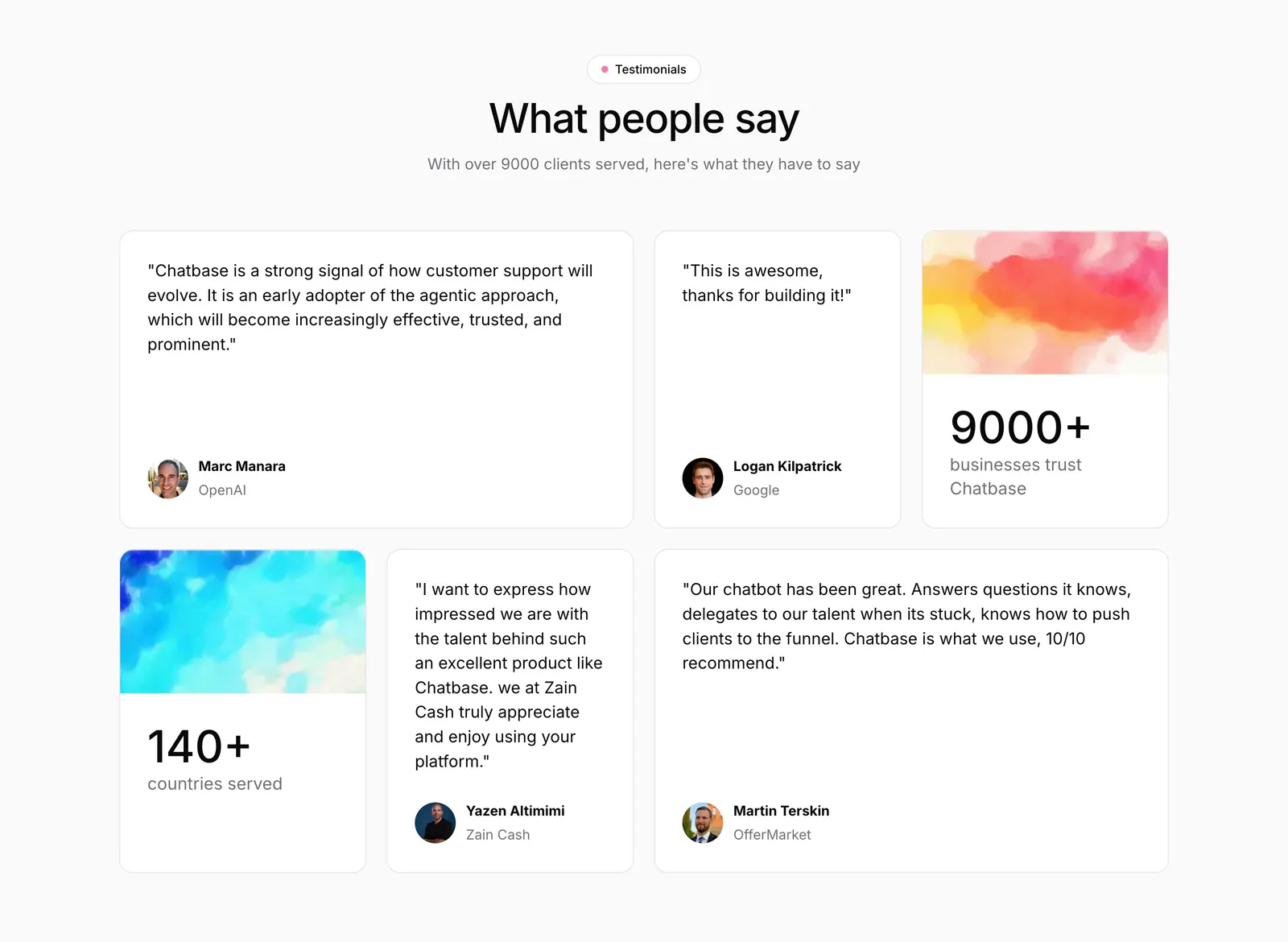

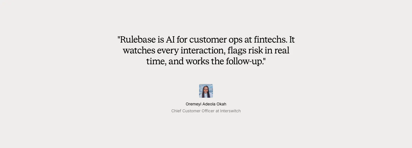




























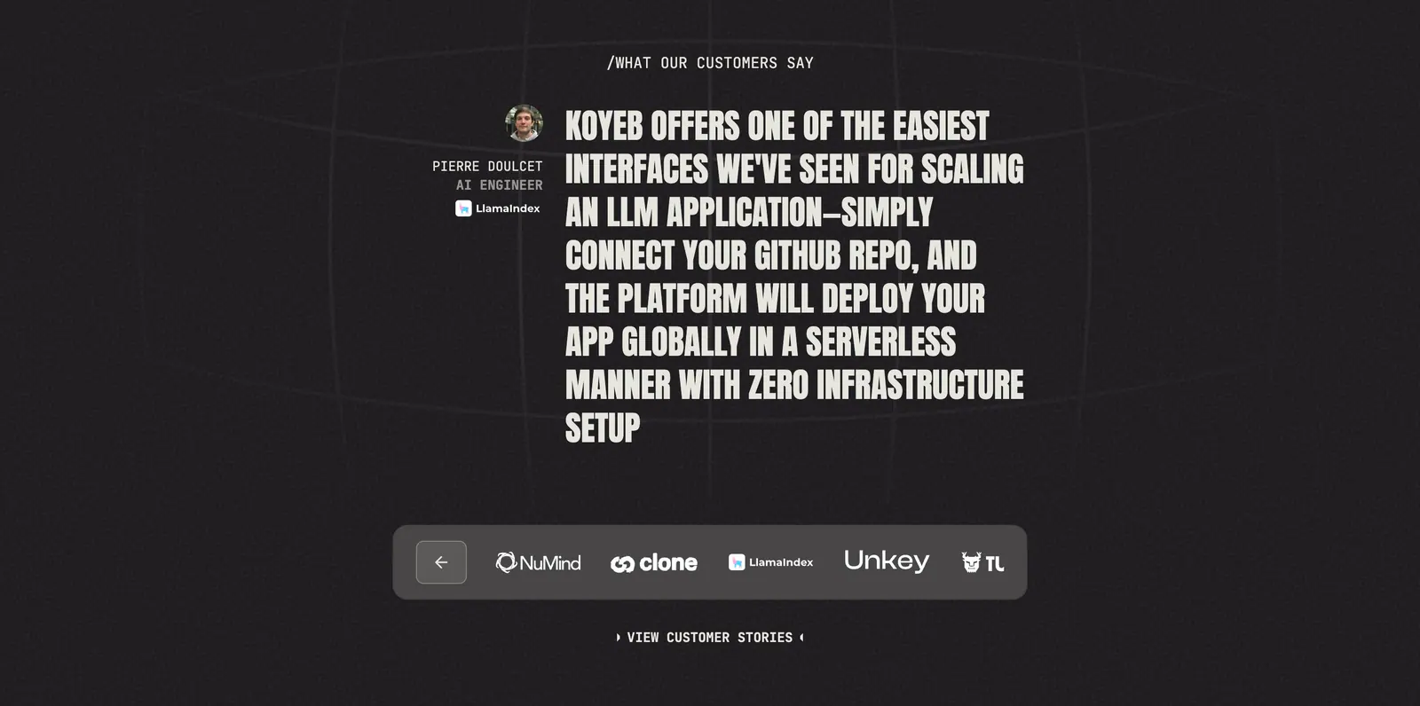
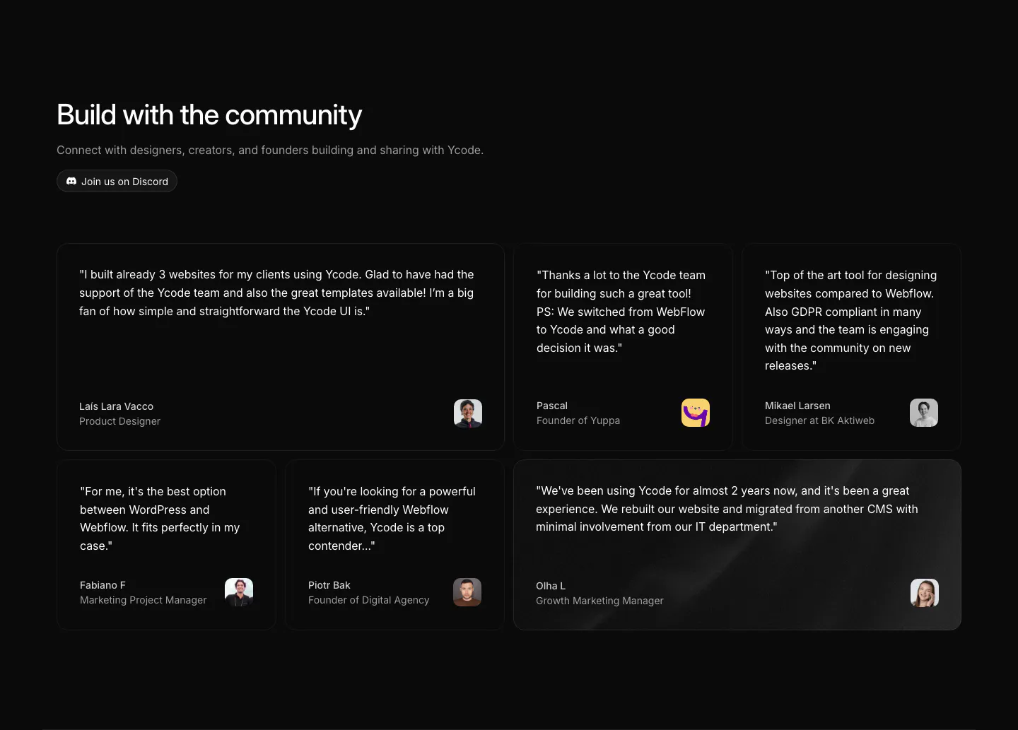

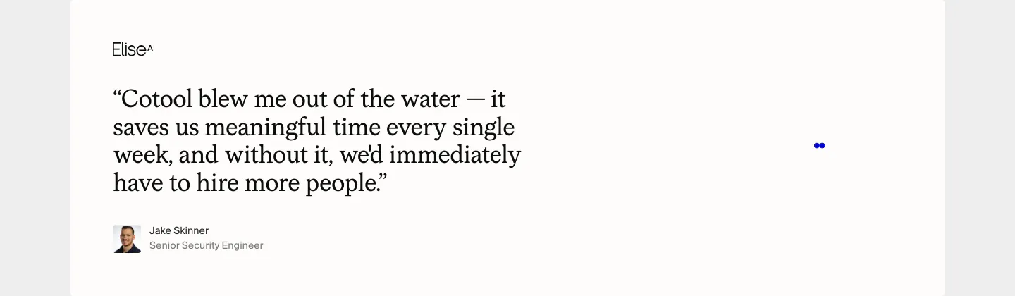

Common patterns in testimonial sections
- Photography
- Carousel
- Monochrome
- Minimal
- Centered
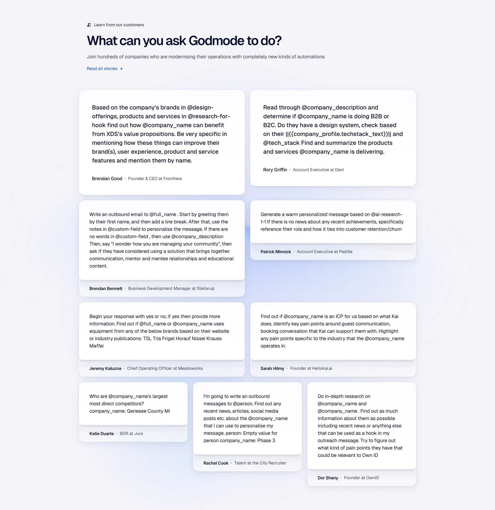
- Card grid
- Serif type
How to make testimonials credible
-
Choose quotes with specific outcomes
Pick quotes that mention a result, a before-and-after, or a named problem solved. Trim each to the one or two sentences that carry the point, and bold the key phrase so skimmers catch it without reading the whole card.
-
Show exactly who said it
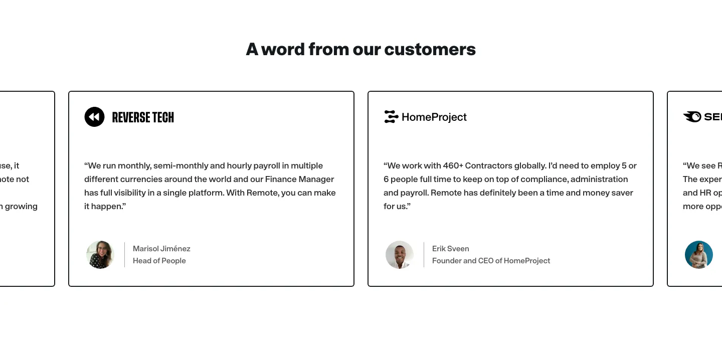
Include a full name, role, and real headshot with every quote. Anonymous or initials-only quotes look invented. Keep attribution consistent across cards, with the name in a heavier weight and the role in a muted color beneath it.
-
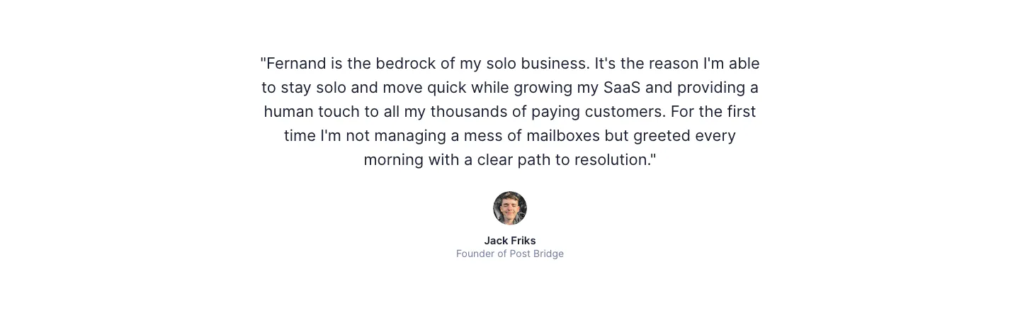
Feature one quote above the rest
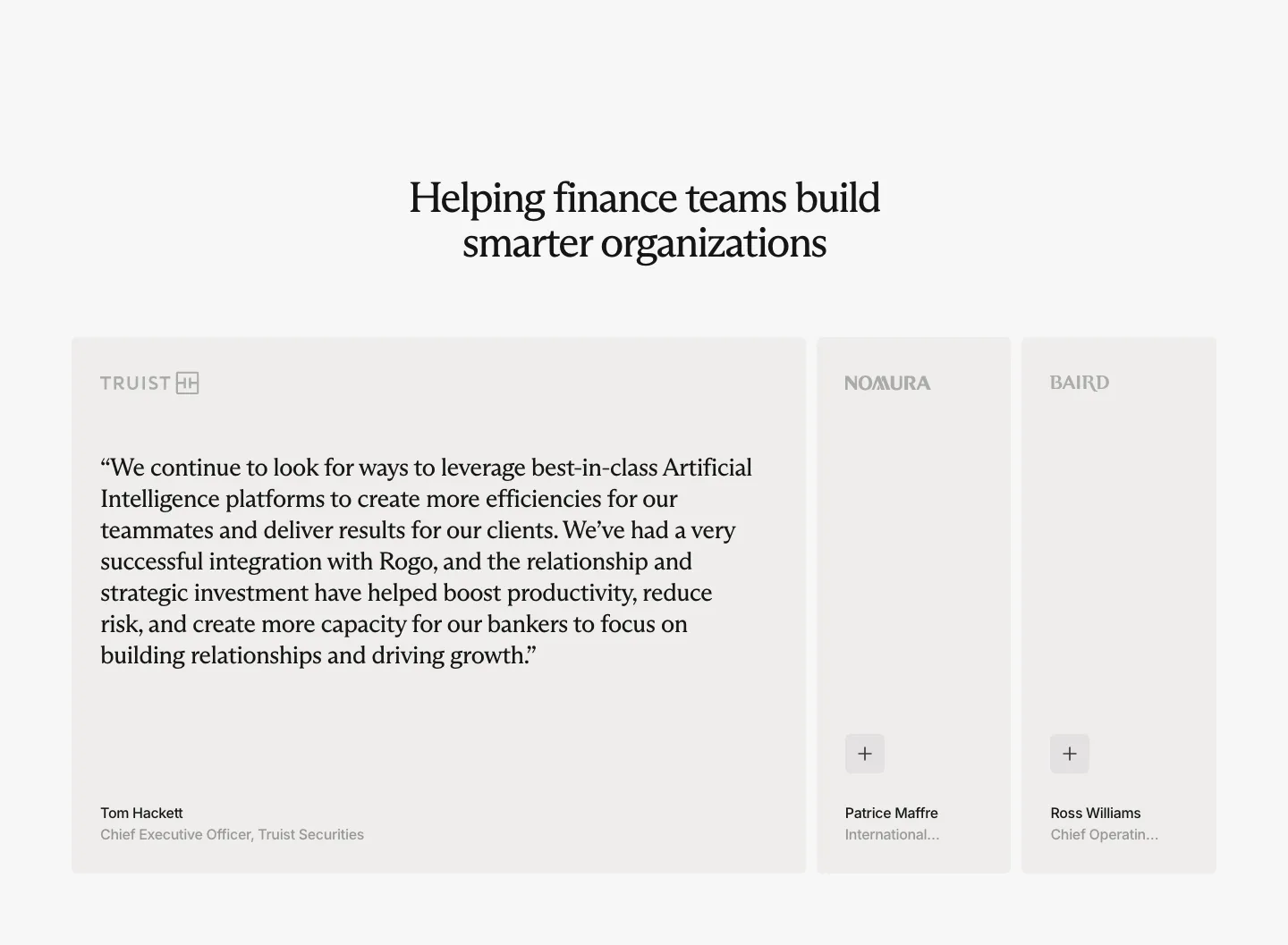
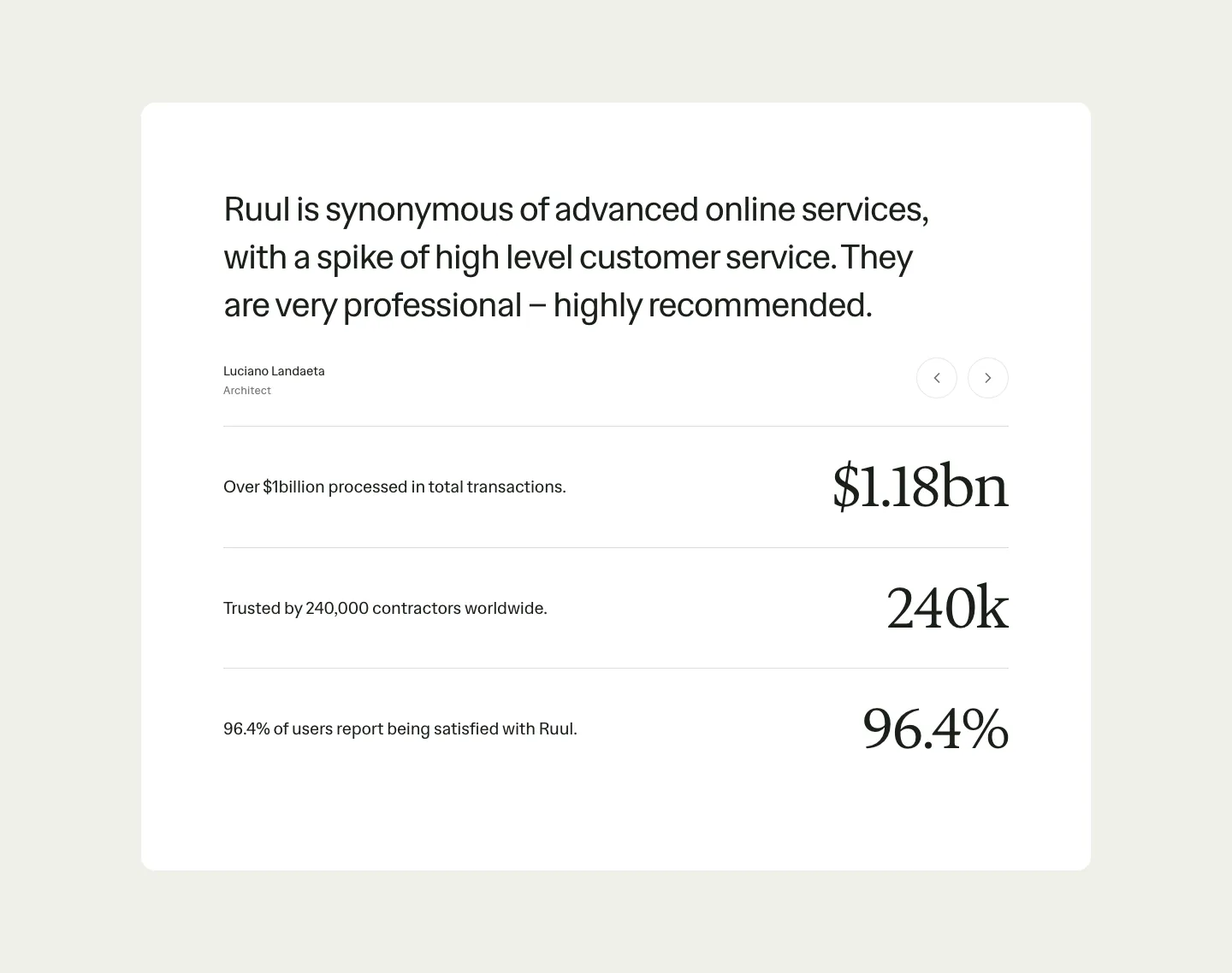
A single large testimonial with a portrait creates a focal point, and a grid of smaller cards below adds volume. Without that hierarchy, a wall of identical cards turns into texture that readers scroll past instead of evidence they read.
-
Place quotes beside the claims they support
A quote about fast setup works hardest next to the onboarding steps, and one about security belongs near the compliance details. Spreading a few targeted quotes through the page often persuades more than collecting every testimonial in one block that readers skim past.