Serif Type Website Design Examples

A serif headline is one of the quickest ways to step away from the geometric sans that so many software sites share. Used in website design, serif type brings an editorial, literary, or premium tone, and it is usually paired with a clean sans-serif for body text and interface elements. That pairing needs care. The wrong serif at the wrong size looks dated or hard to read.
300 sections

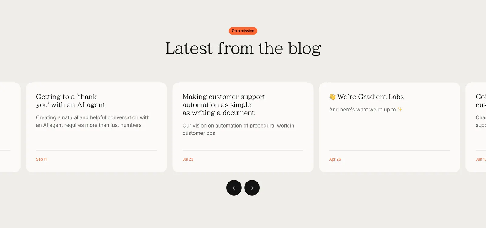
  1. Gradient Labs blog & resources section: centered serif heading above a carousel of off-white article cards with round arrow buttons
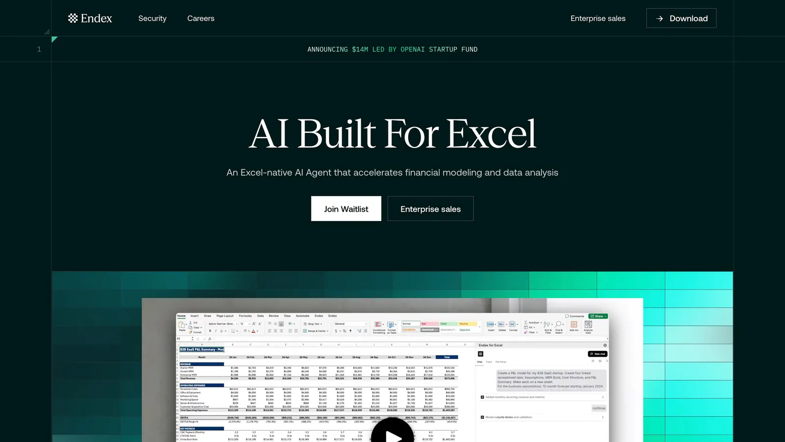
  2. Endex hero section: centered serif headline with two buttons above an Excel AI screenshot set on a teal pixel-gradient band, on dark green
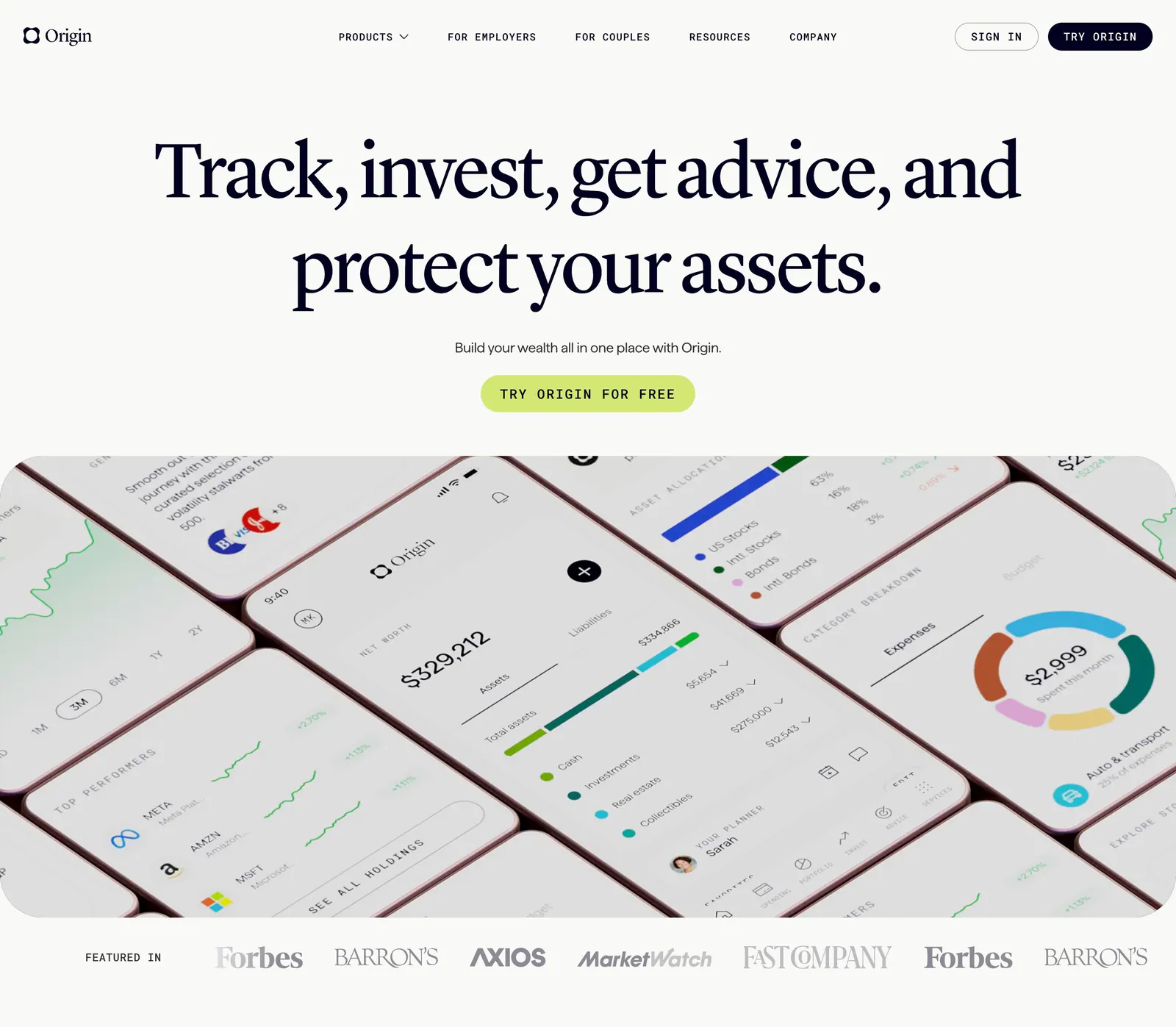
  3. Origin hero section: large centered serif headline and lime CTA above tilted mobile app screens, a Featured in press logo row below
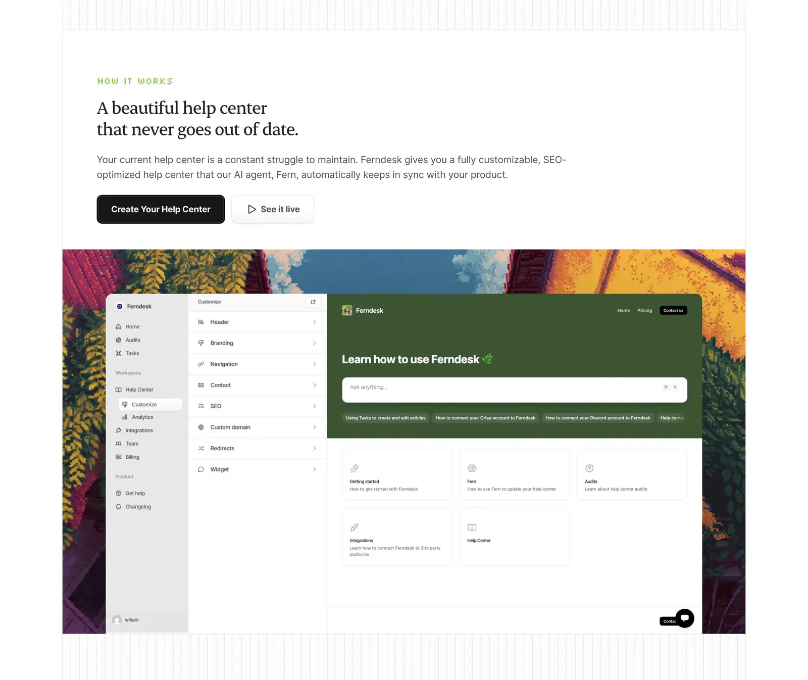
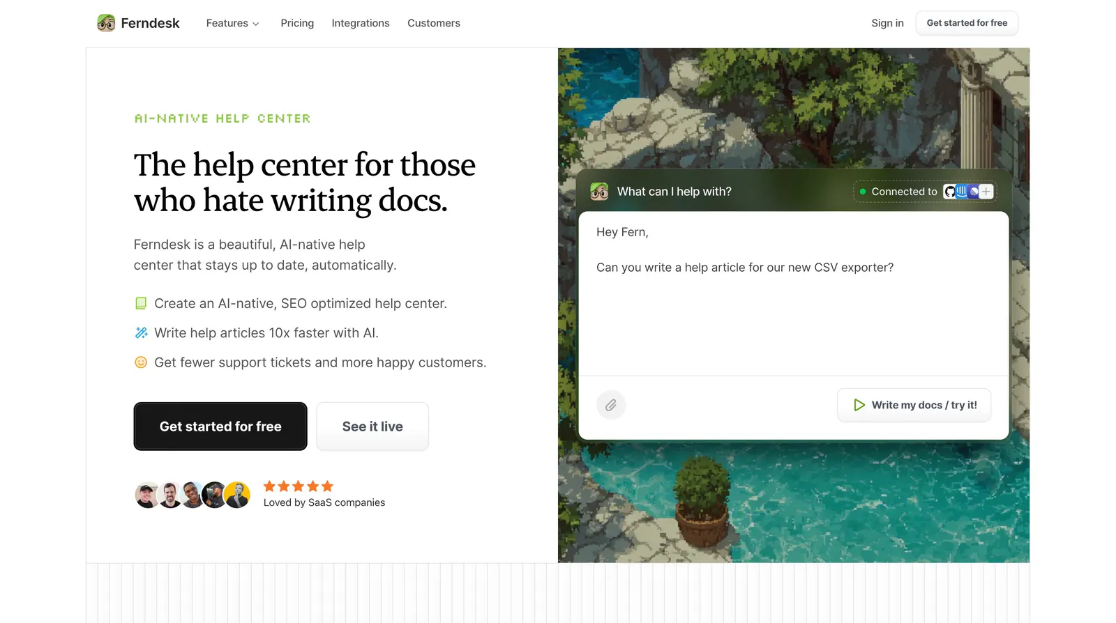
  4. Ferndesk how it works section: serif headline and two buttons above a help center editor screenshot framed by pixel-art scenery
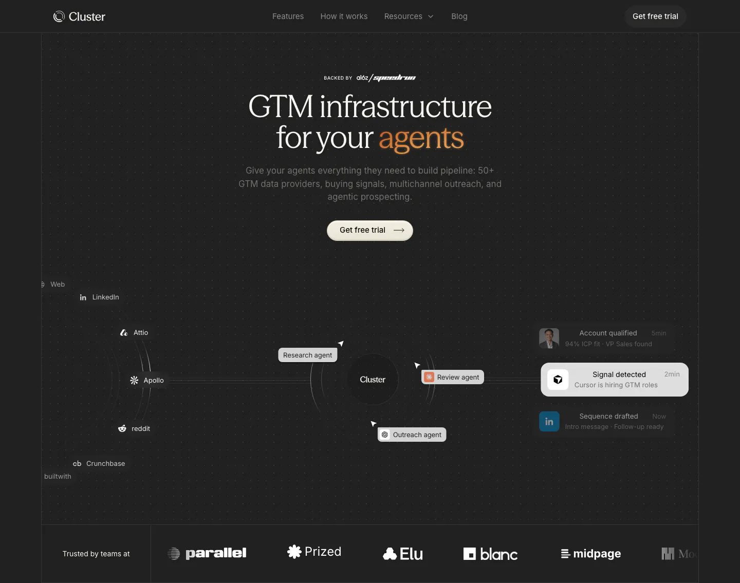
  5. Cluster hero section: centered serif headline with orange accent over an agent workflow diagram and a customer logo row on dark
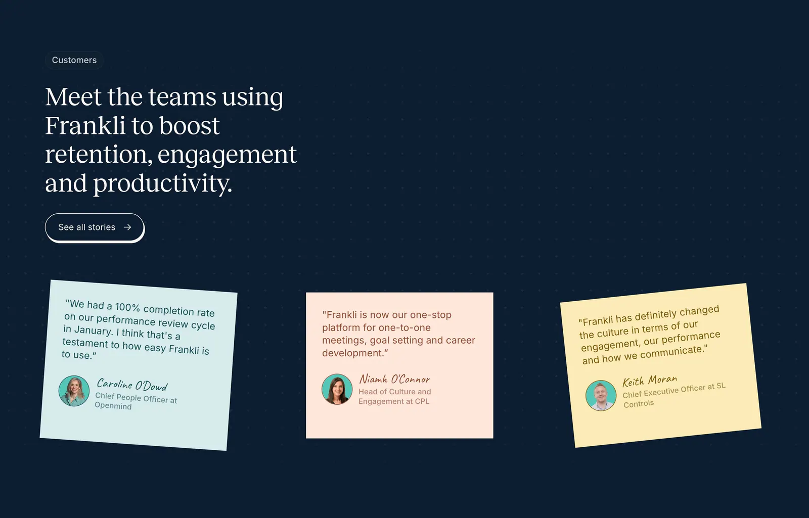
  6. Frankli testimonials section: serif headline with stories button above three tilted pastel sticky-note quote cards on a navy dot grid
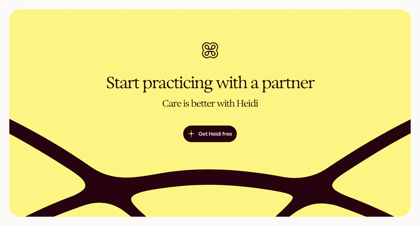
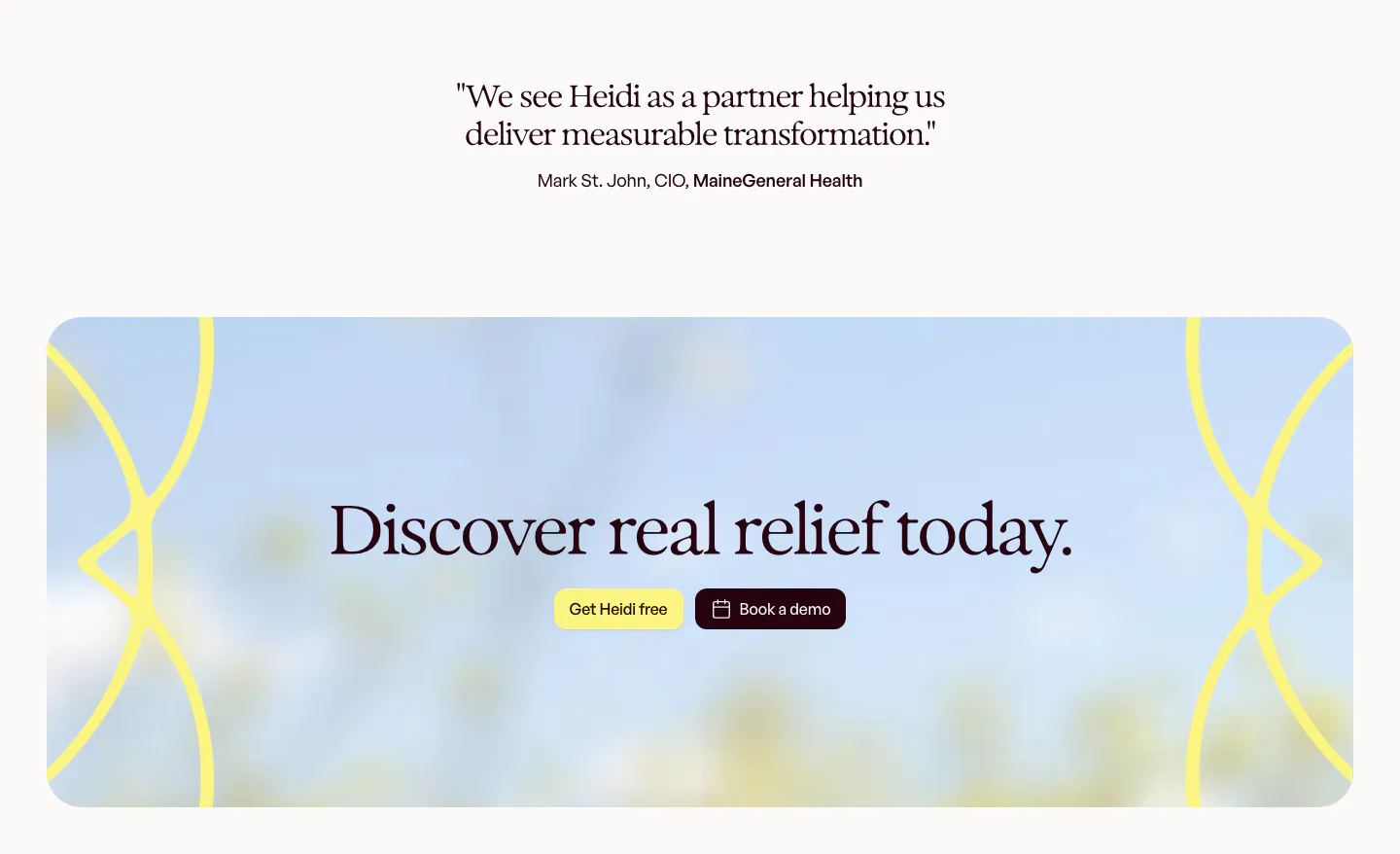
  7. Heidi call to action section: yellow rounded panel with logo, centered serif headline and button over a large dark curved logo shape
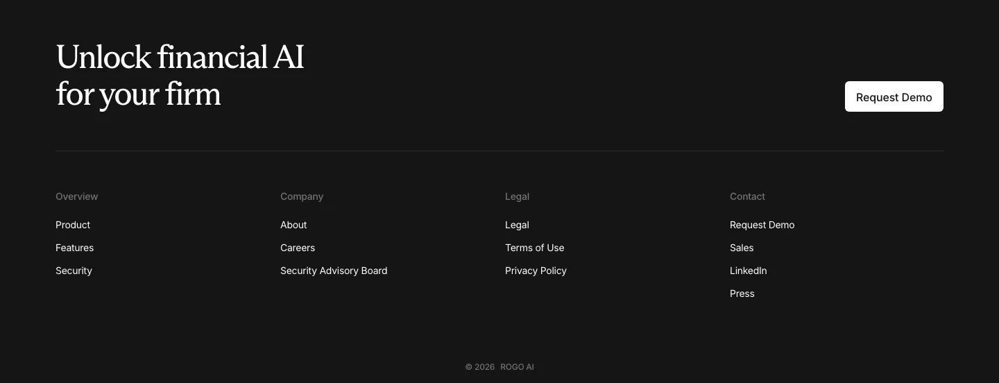
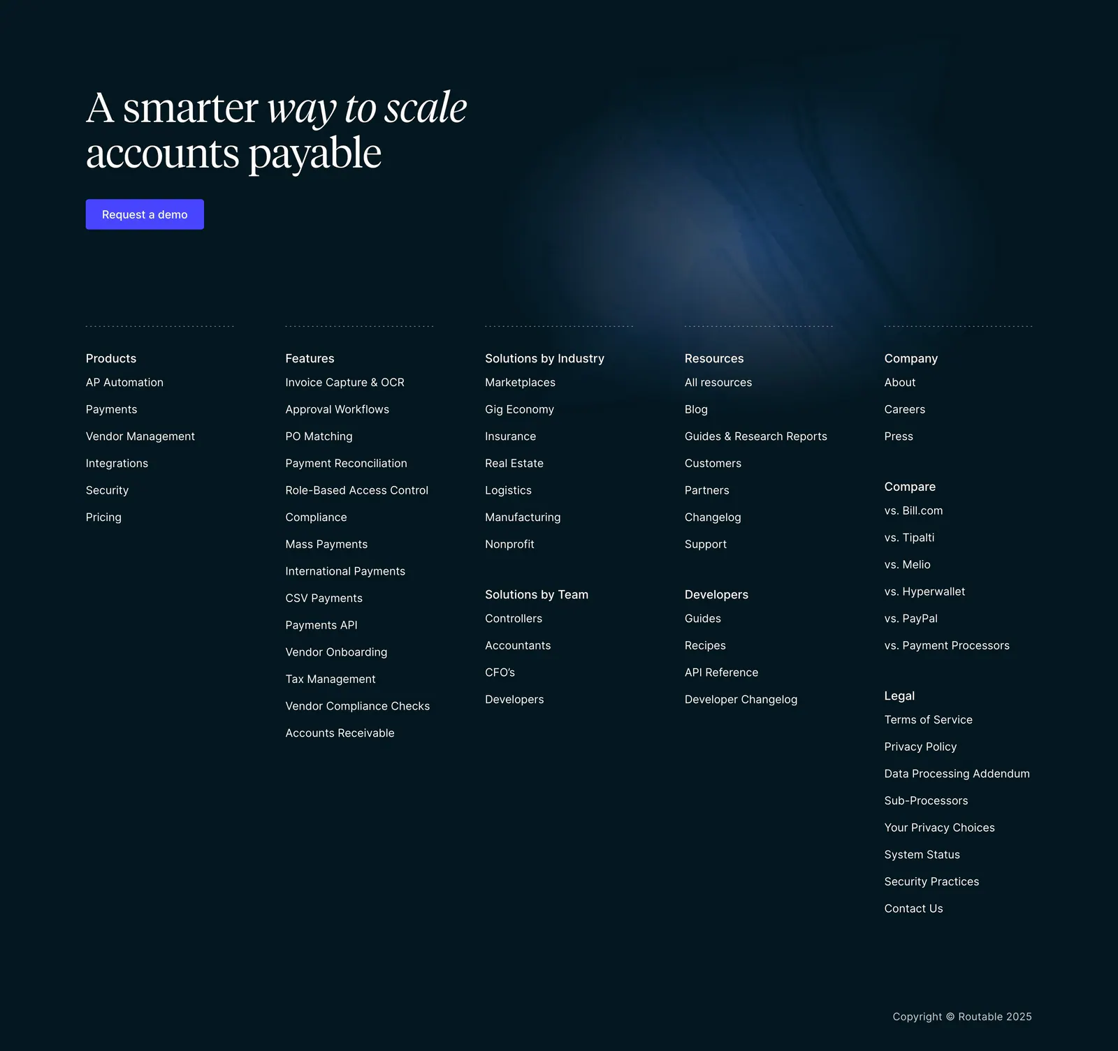
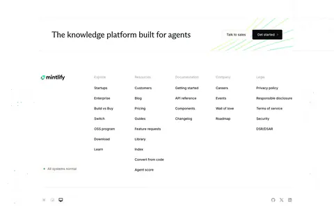
  8. Rogo footer section: serif CTA headline with demo button above four link columns and a copyright line on a dark background
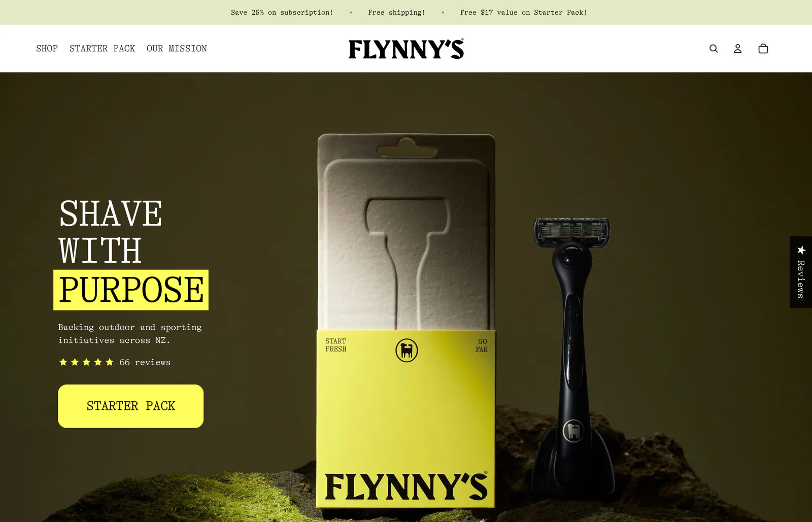
  9. Flynny's hero section: serif headline with a yellow-highlighted word, star rating and yellow CTA over a dark photo of a razor and its box on moss
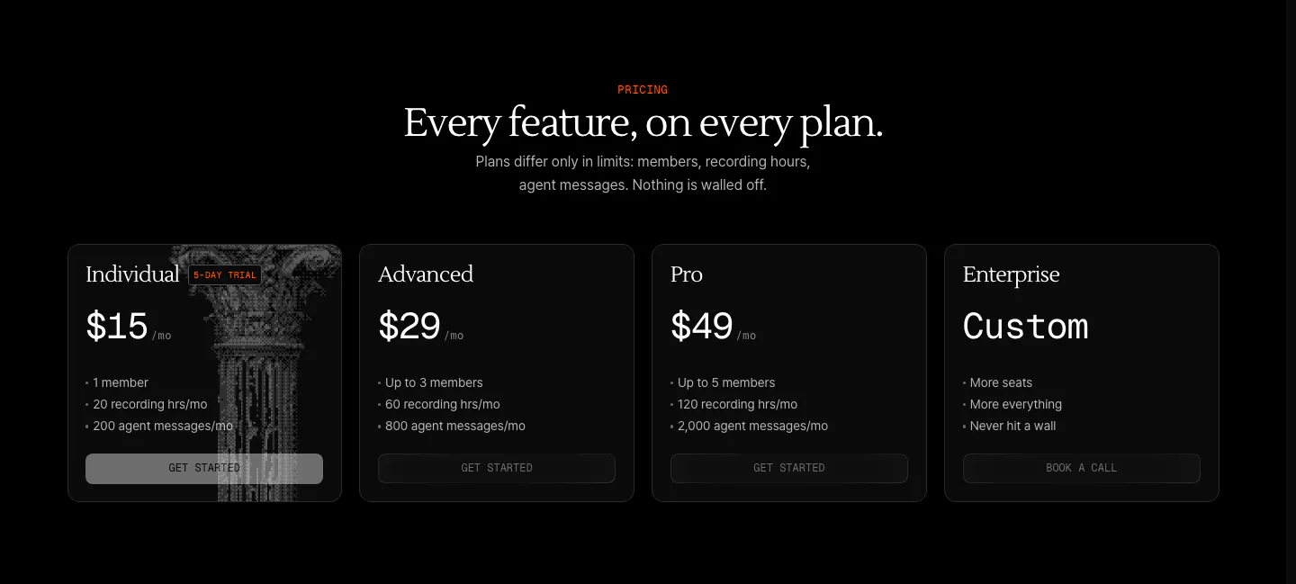
  10. Arke pricing section: centered serif headline above four dark plan cards from $15 Individual to Custom Enterprise, one with a halftone column
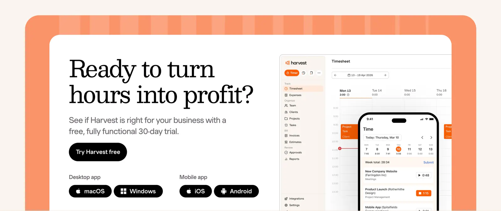
  11. Harvest call-to-action section: serif headline, trial button and app badges beside desktop and mobile timesheet UI in an orange-framed card
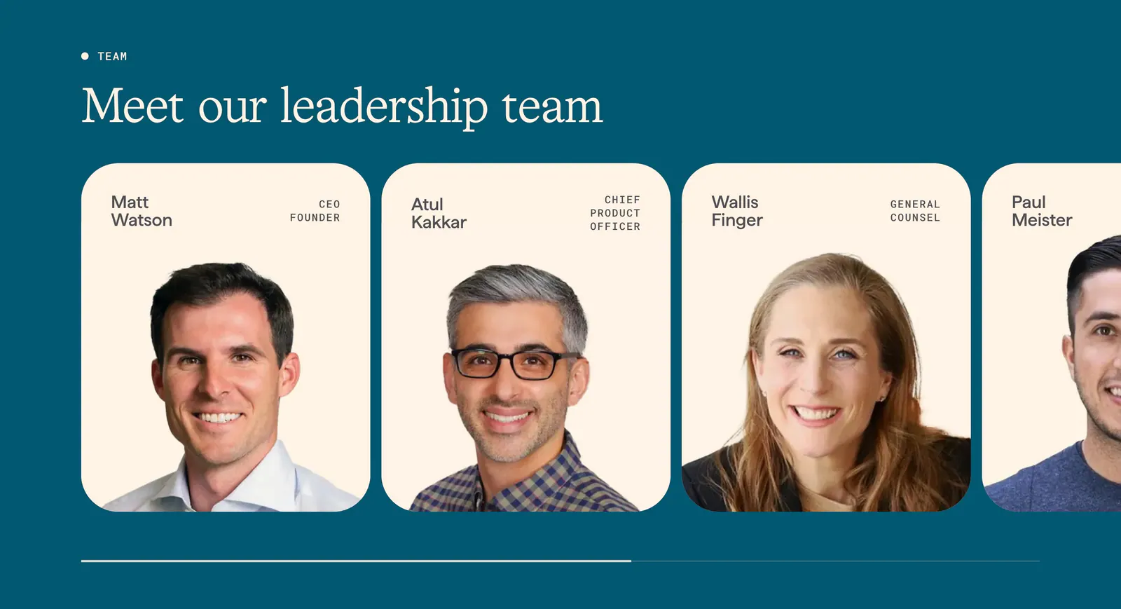
  12. Origin team section: serif headline above a scrolling row of cream leadership cards with portrait photos and titles on deep teal
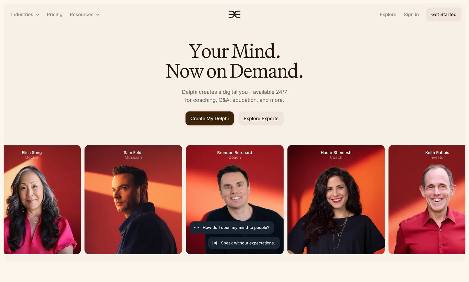
  13. Delphi hero section: centered serif headline with two buttons above a row of expert portrait cards on red backgrounds, on a cream page
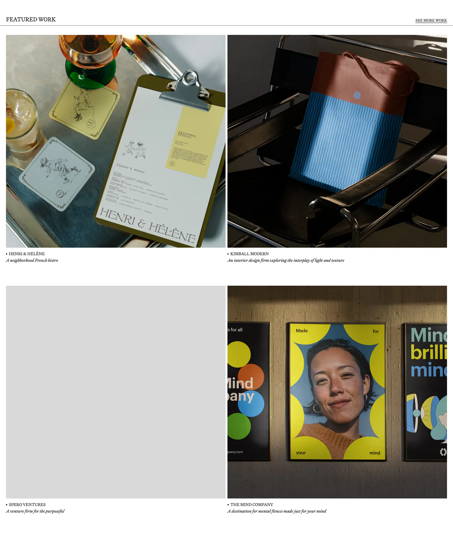
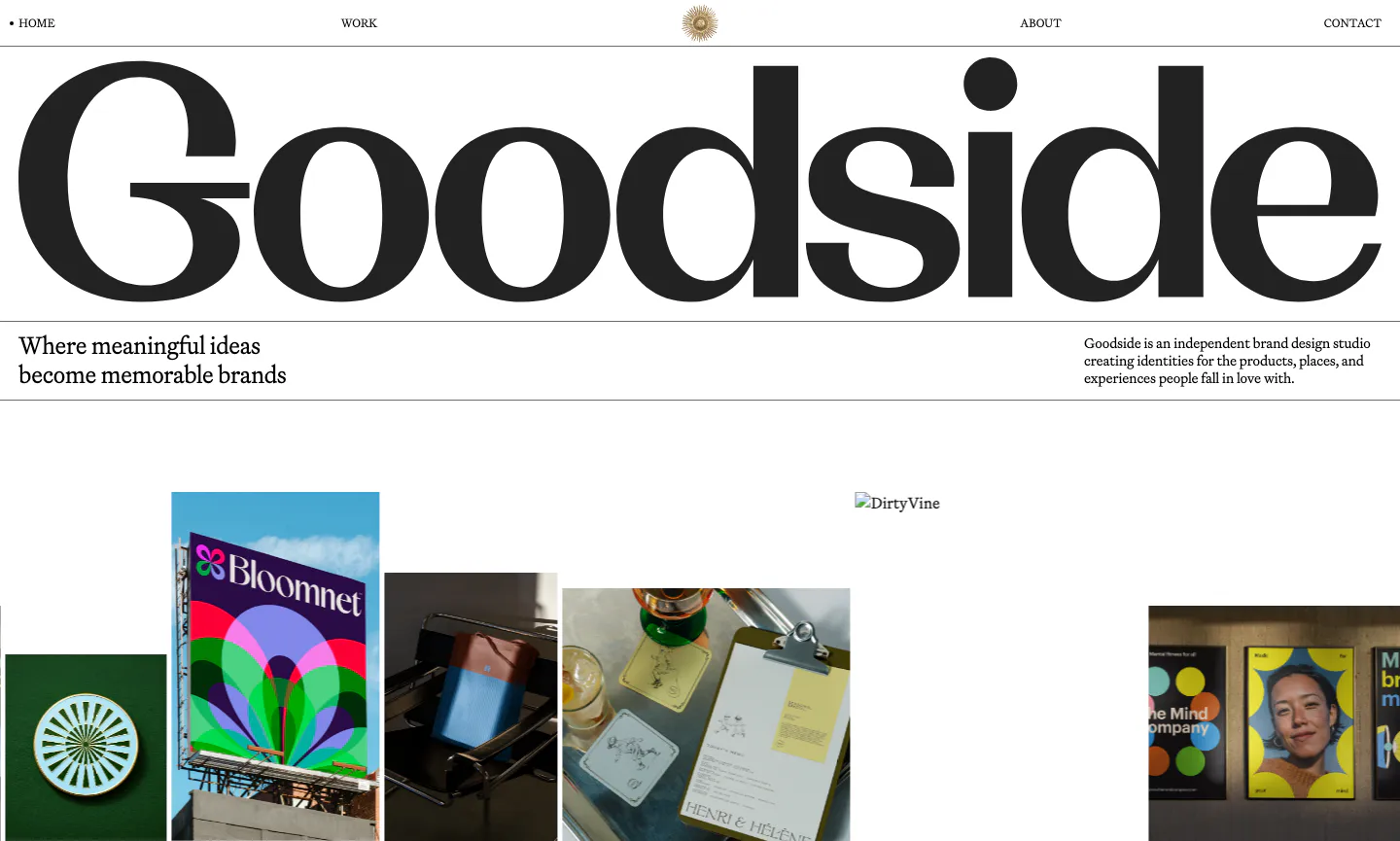
  14. Goodside other section: 2x2 grid of brand project photos with serif captions under a Featured Work header rule
    Goodside Other
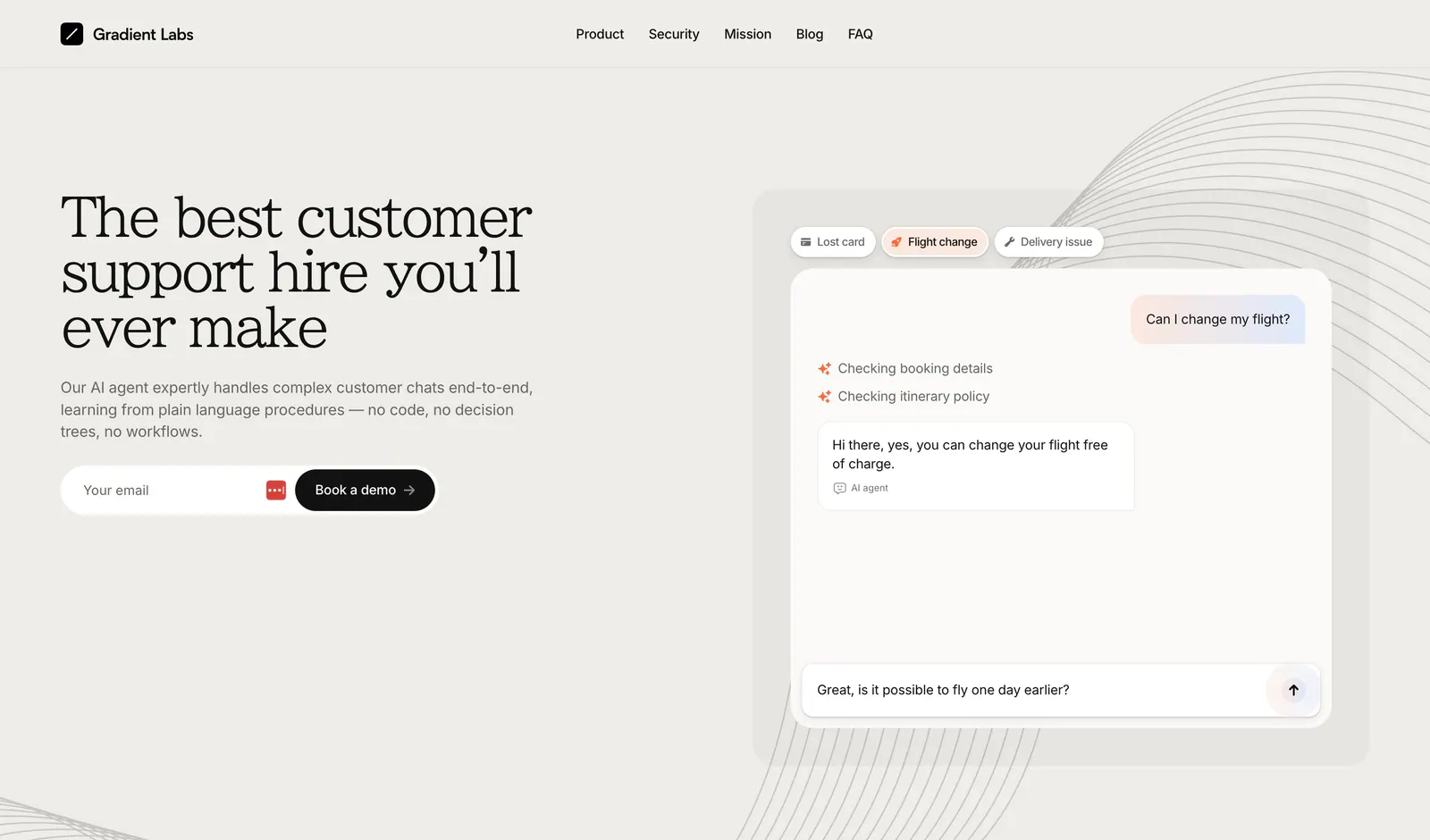
  15. Gradient Labs hero section: serif headline, copy and email field on the left with a support chat mockup on the right on beige
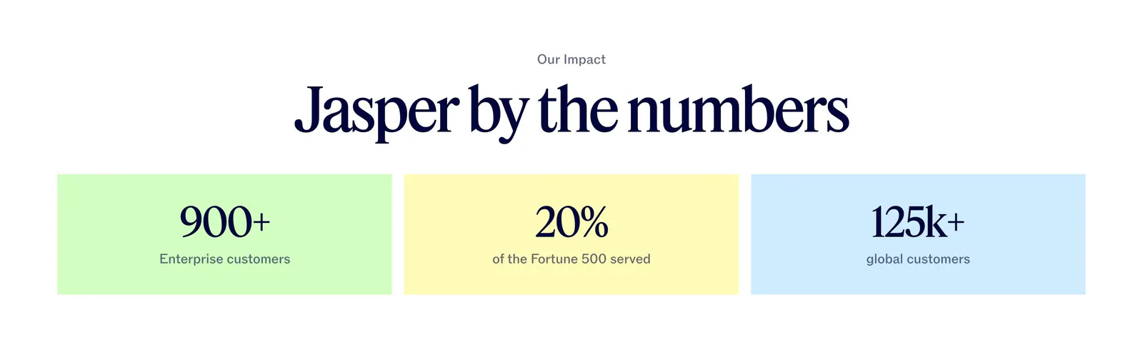
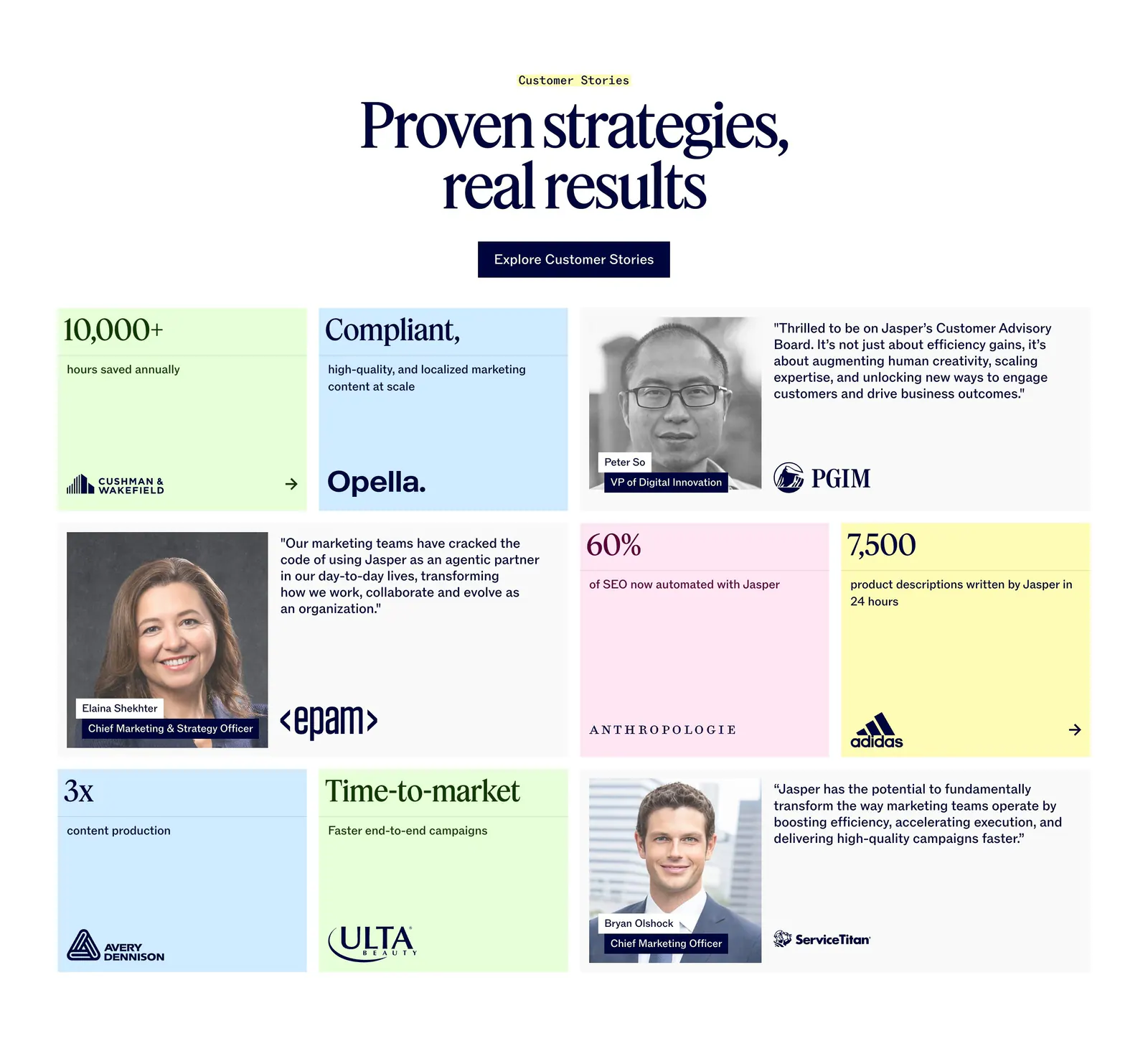
  16. Jasper value proposition section: centered serif headline above three pastel tiles with large customer metrics
  17. Menkind team section: serif headline above four staggered black-and-white portraits of medical professionals with roles on cream
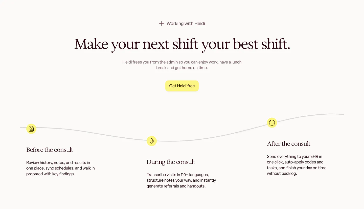
  18. Heidi how it works section: centered serif headline above a wavy timeline with before, during and after the consult steps
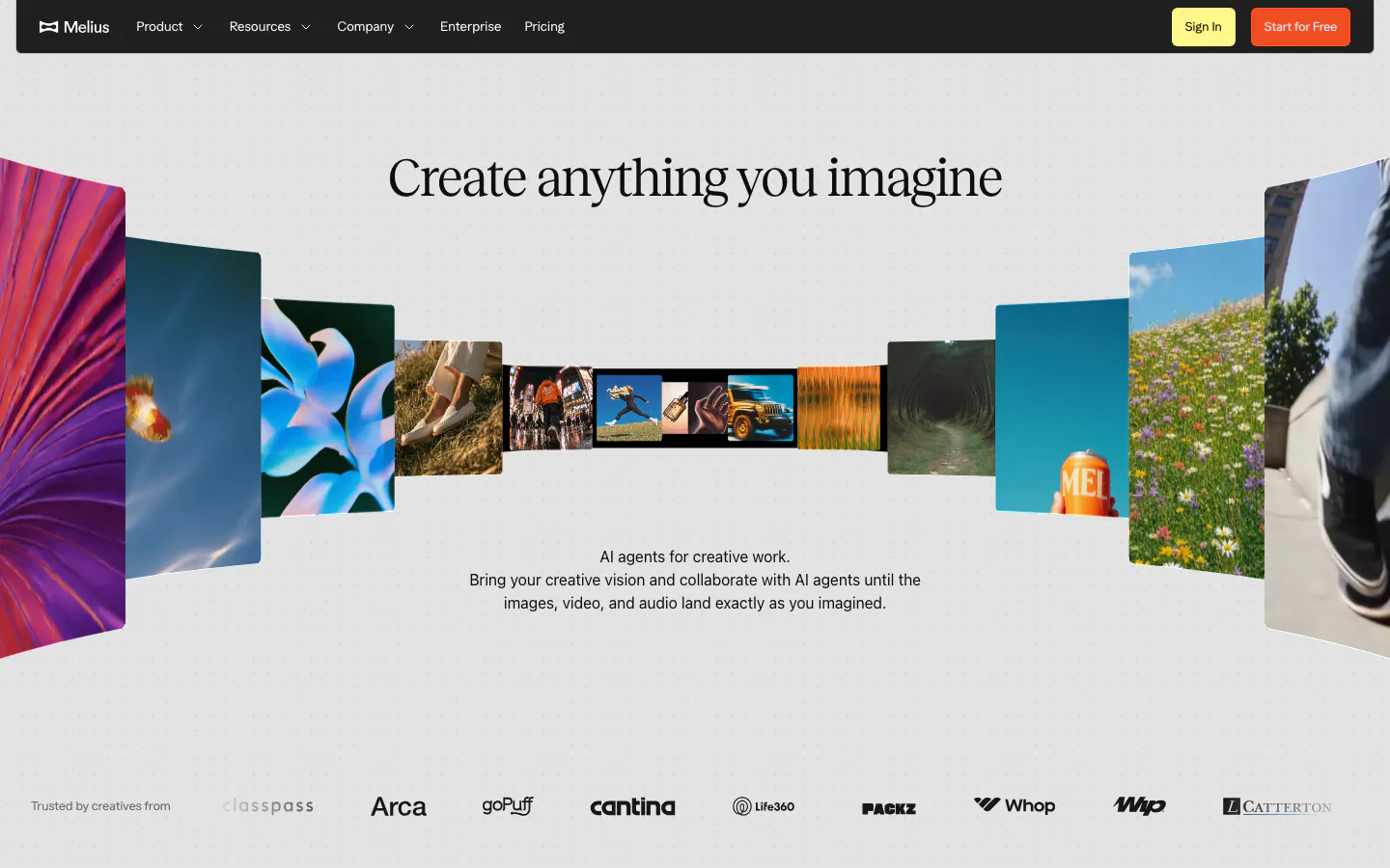
  19. Melius hero section: dark nav bar over a centered serif headline inside a curved gallery of photos and artwork, logo row at bottom
  20. Goodside hero section: full-width serif wordmark under a minimal nav, tagline row and a strip of brand project photos on white
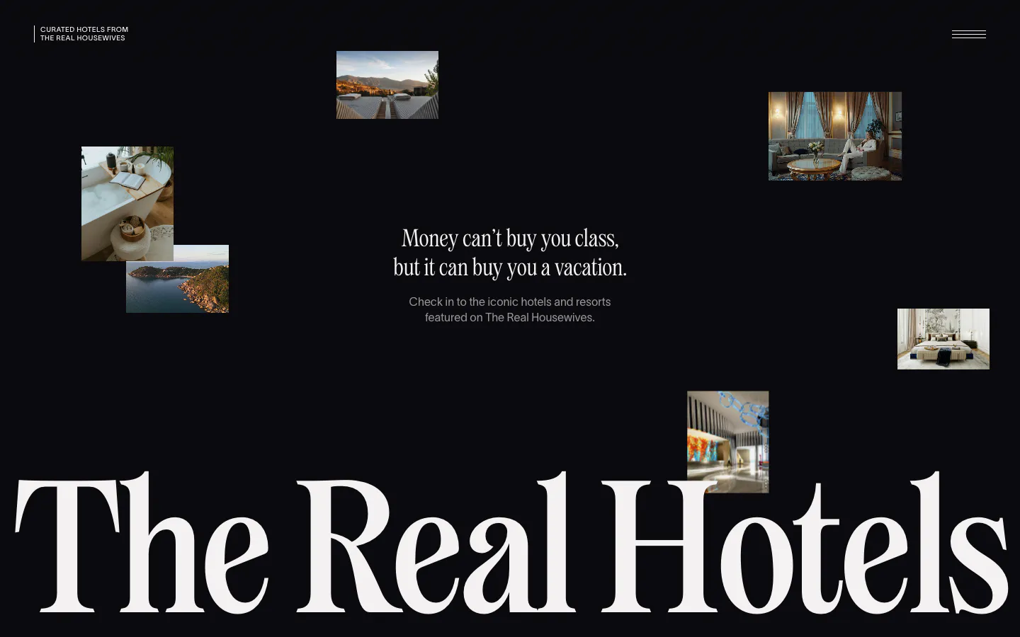
  21. The Real Hotels hero section: scattered hotel photos on black around a centered serif tagline, huge serif wordmark across the bottom
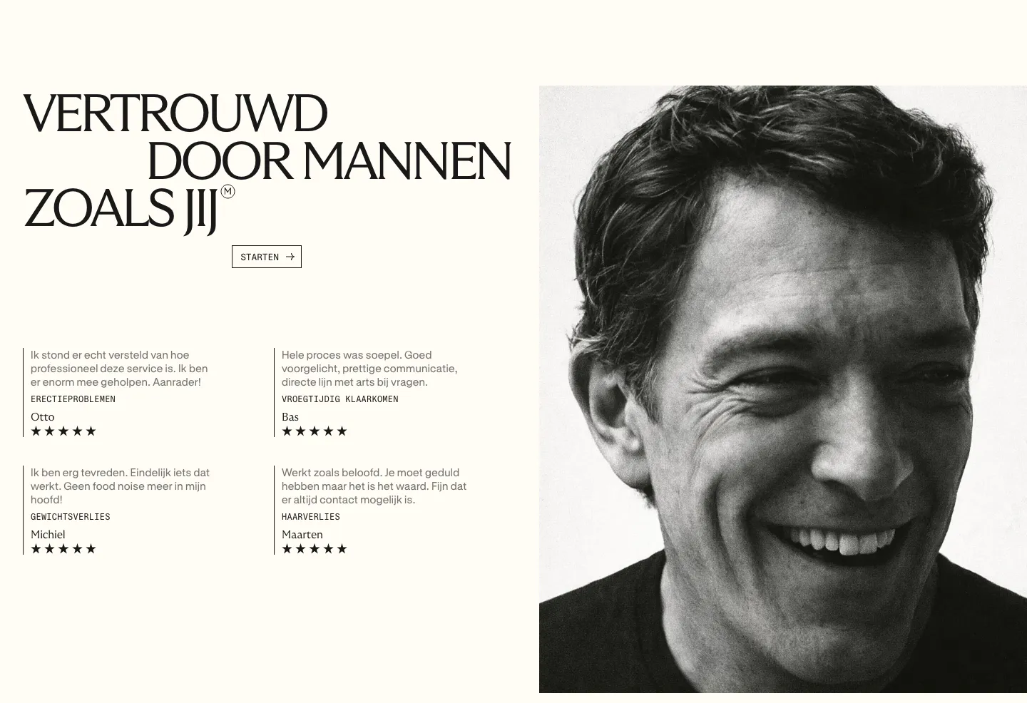
  22. Menkind testimonials section: serif headline and four starred review quotes beside a large black-and-white portrait on cream
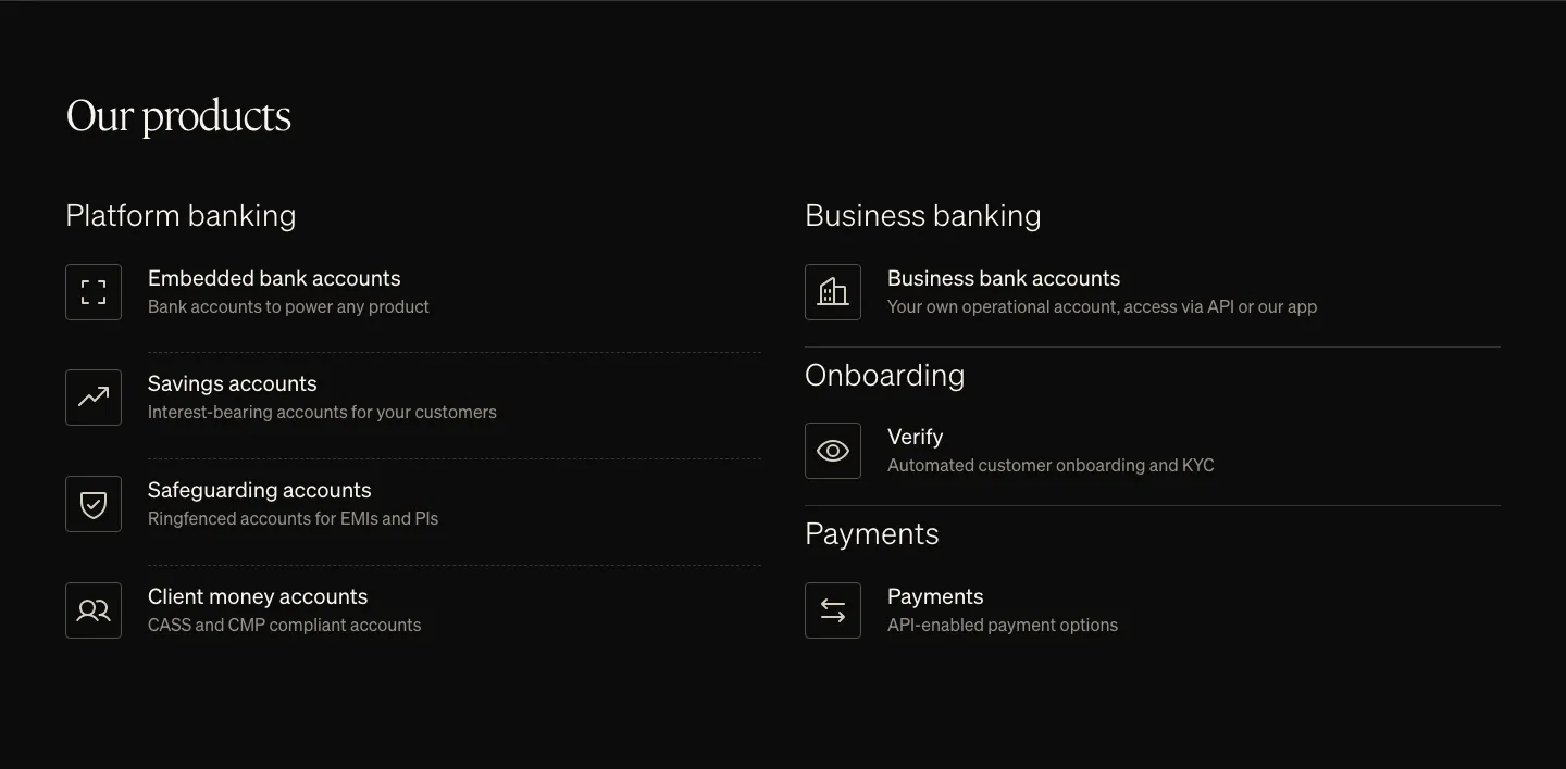
  23. Griffin features section: serif heading above two columns of product list items with outlined icons on black
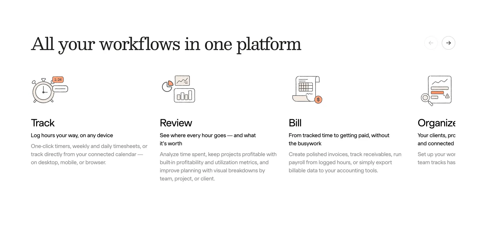
  24. Harvest features section: serif heading with arrow controls above a sliding row of track, review, bill and organize columns with line drawings
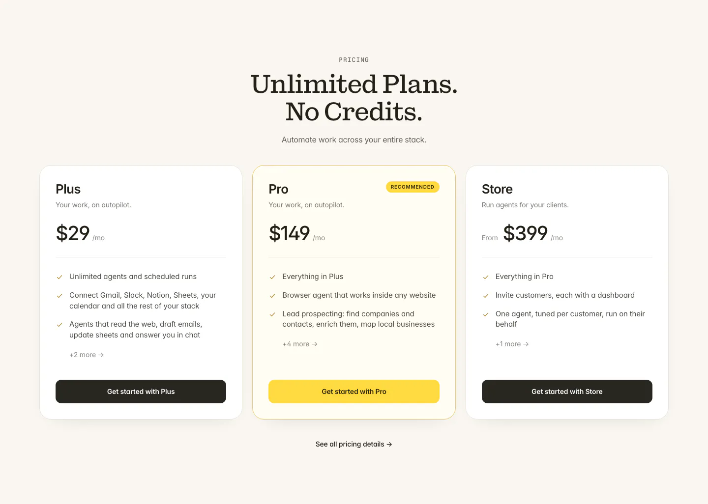
  25. Twin pricing section: centered serif headline above three plan cards with the middle Pro plan highlighted in yellow on cream
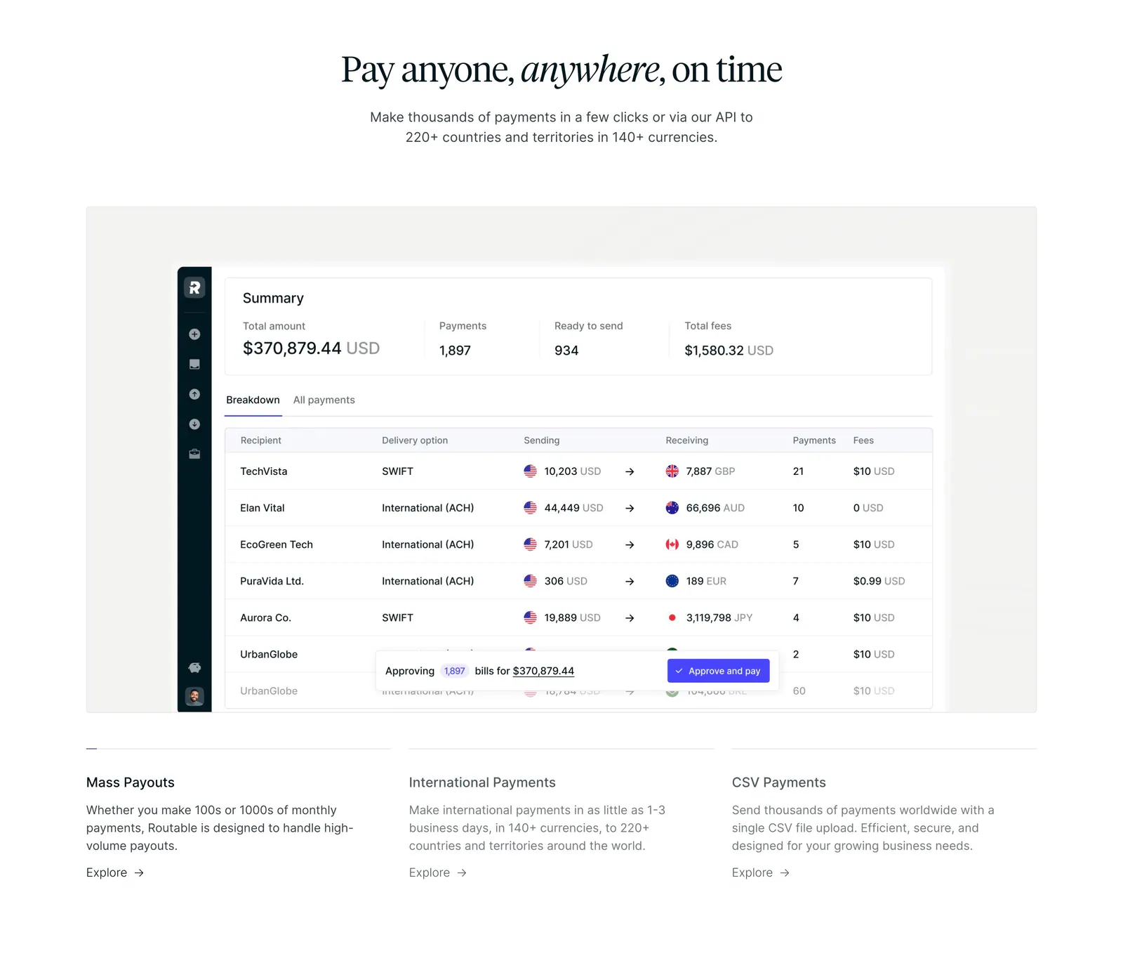
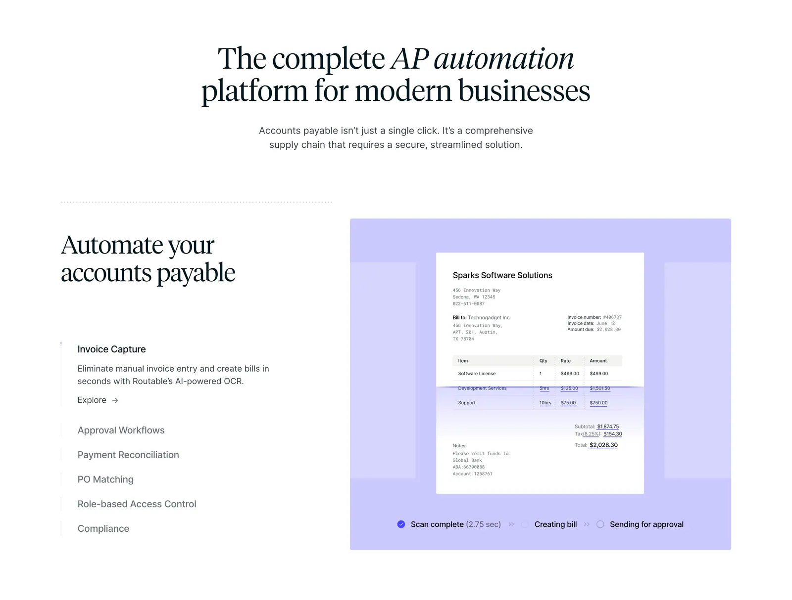
  26. Routable features section: centered serif headline above a payments summary dashboard screenshot and three feature columns on white
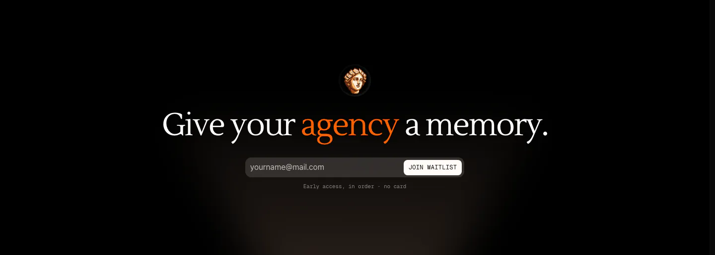
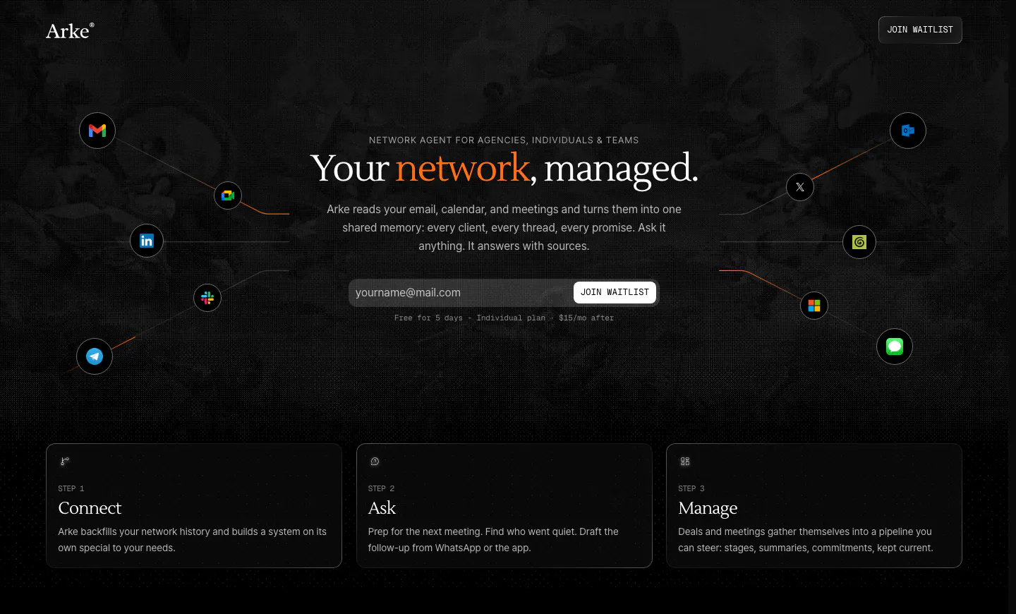
  27. Arke call to action section: centered serif headline with an orange accent word above an email waitlist field and a small statue icon on black
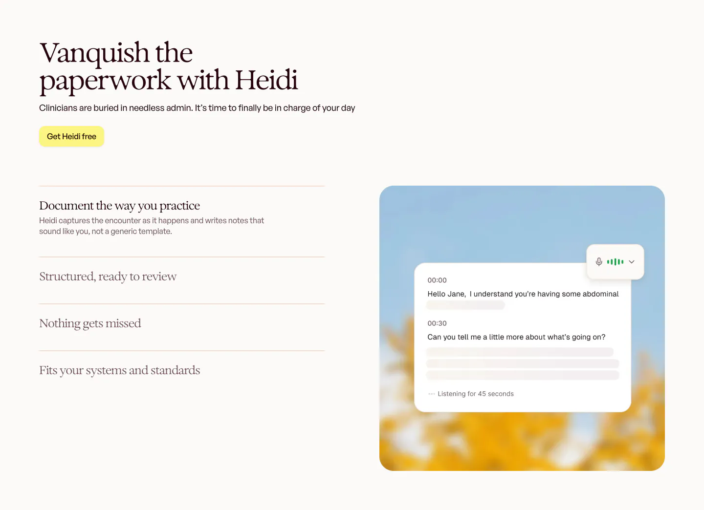
  28. Heidi features section: serif headline and accordion feature list on the left, live transcript card over a blurred sky photo on the right
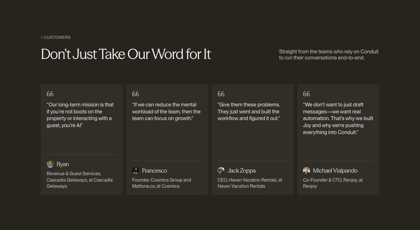
  29. Conduit testimonials section: serif headline above four quote cards with avatars on a dark brown background
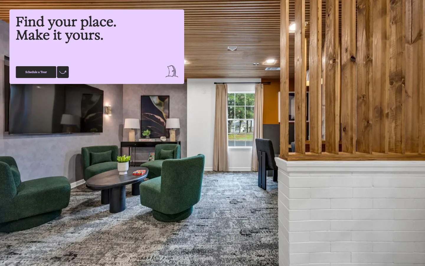
  30. 21Oaks call-to-action section: full-bleed lounge photo with a lavender card holding a serif headline and tour button
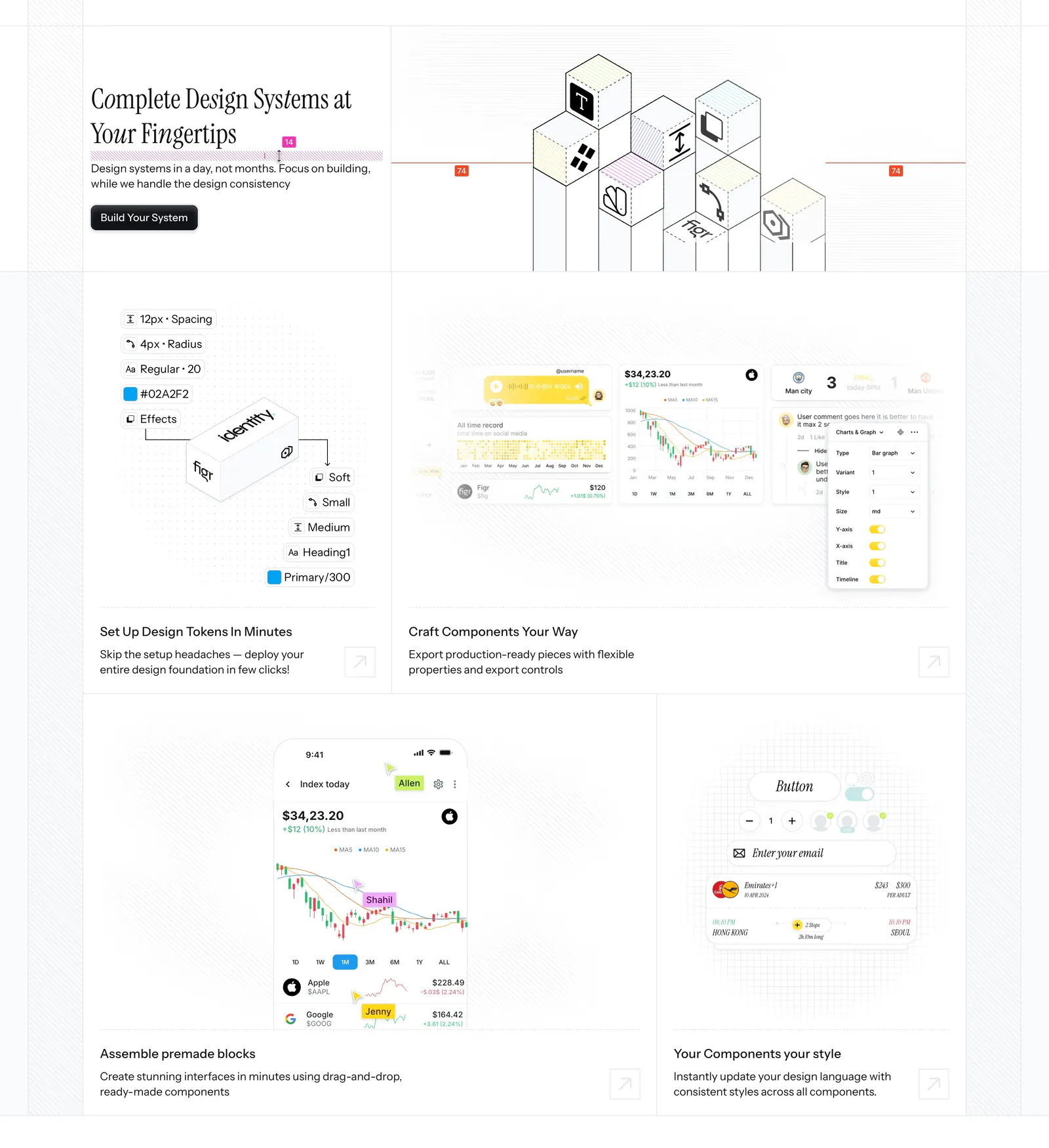
  31. Figr features section: serif headline beside an isometric cube drawing above a bento of design token, chart and mobile UI tiles
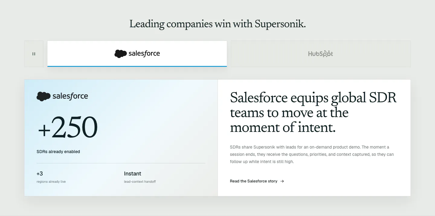
  32. Supersonik testimonials section: customer logo tabs above a Salesforce case study card with a large +250 metric and serif story headline
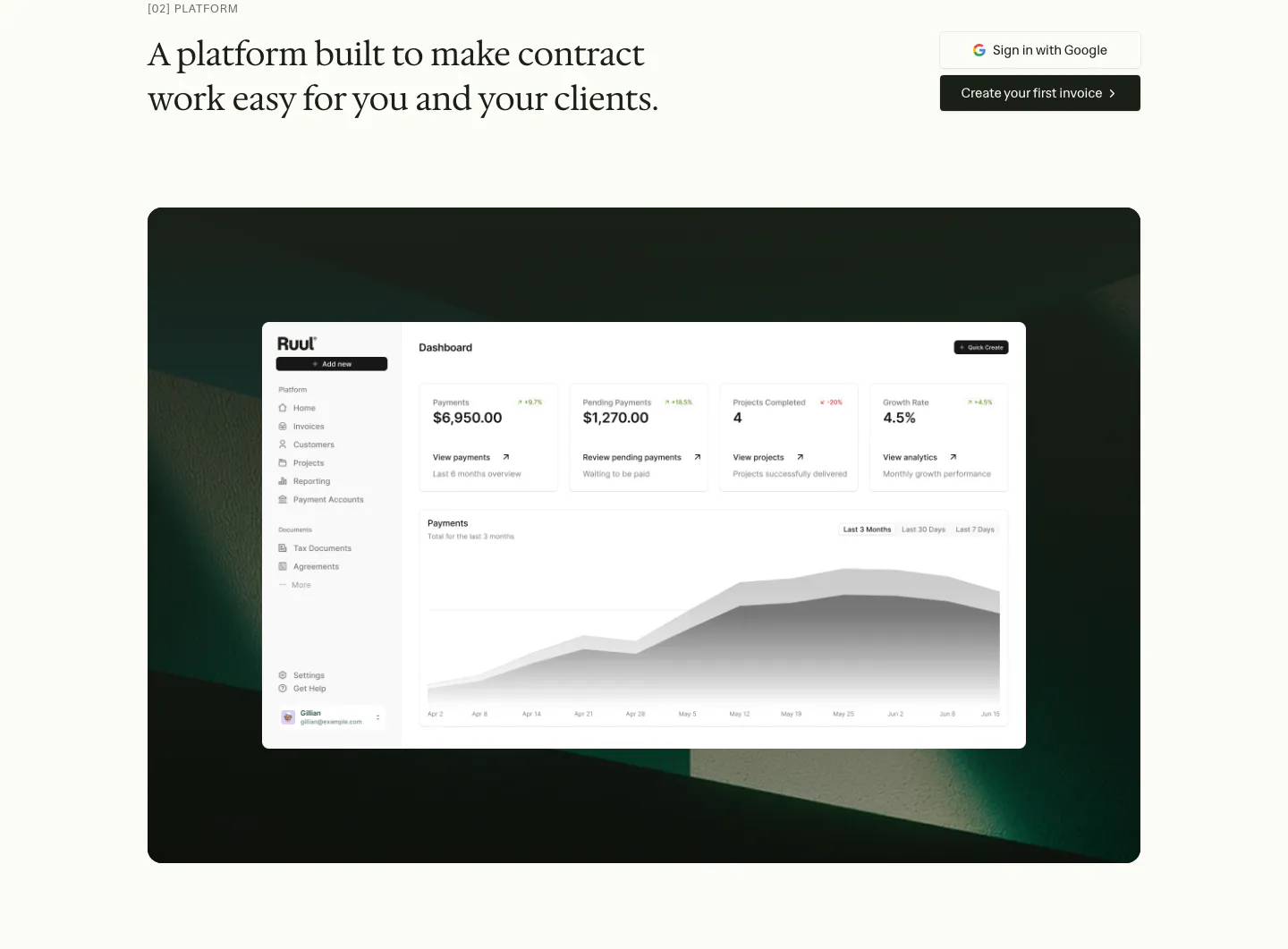
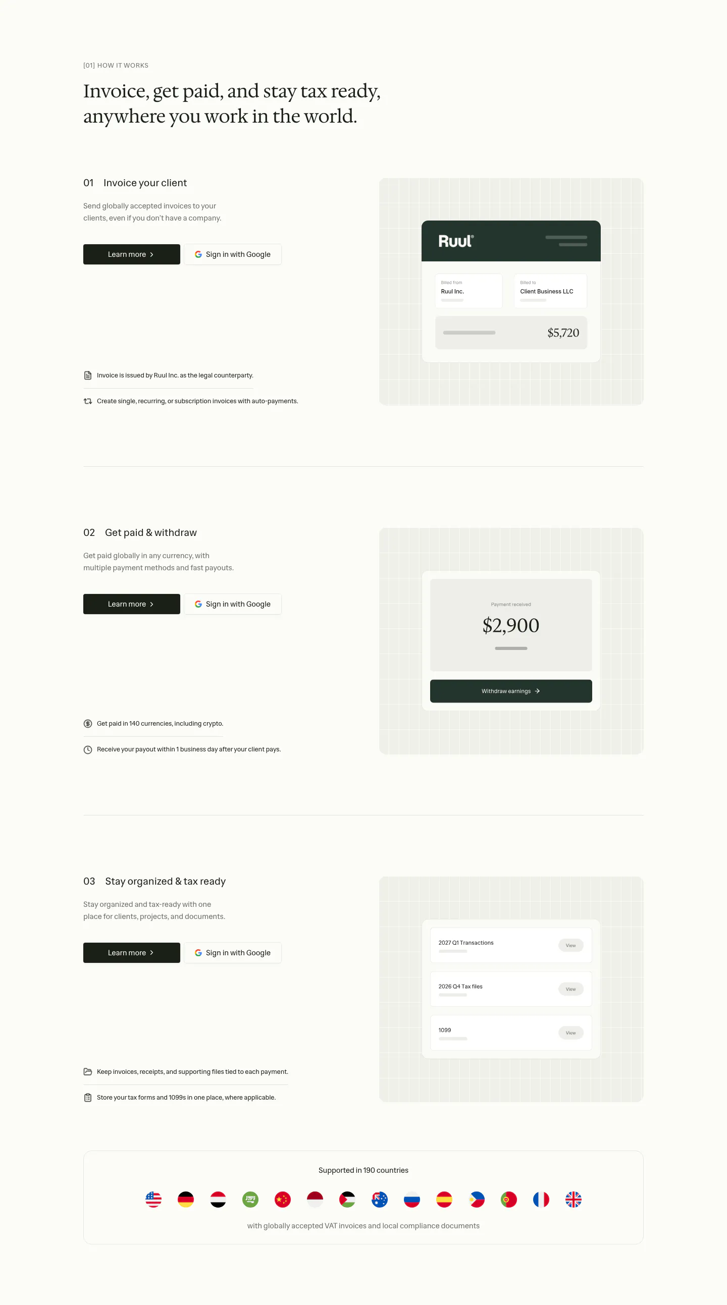
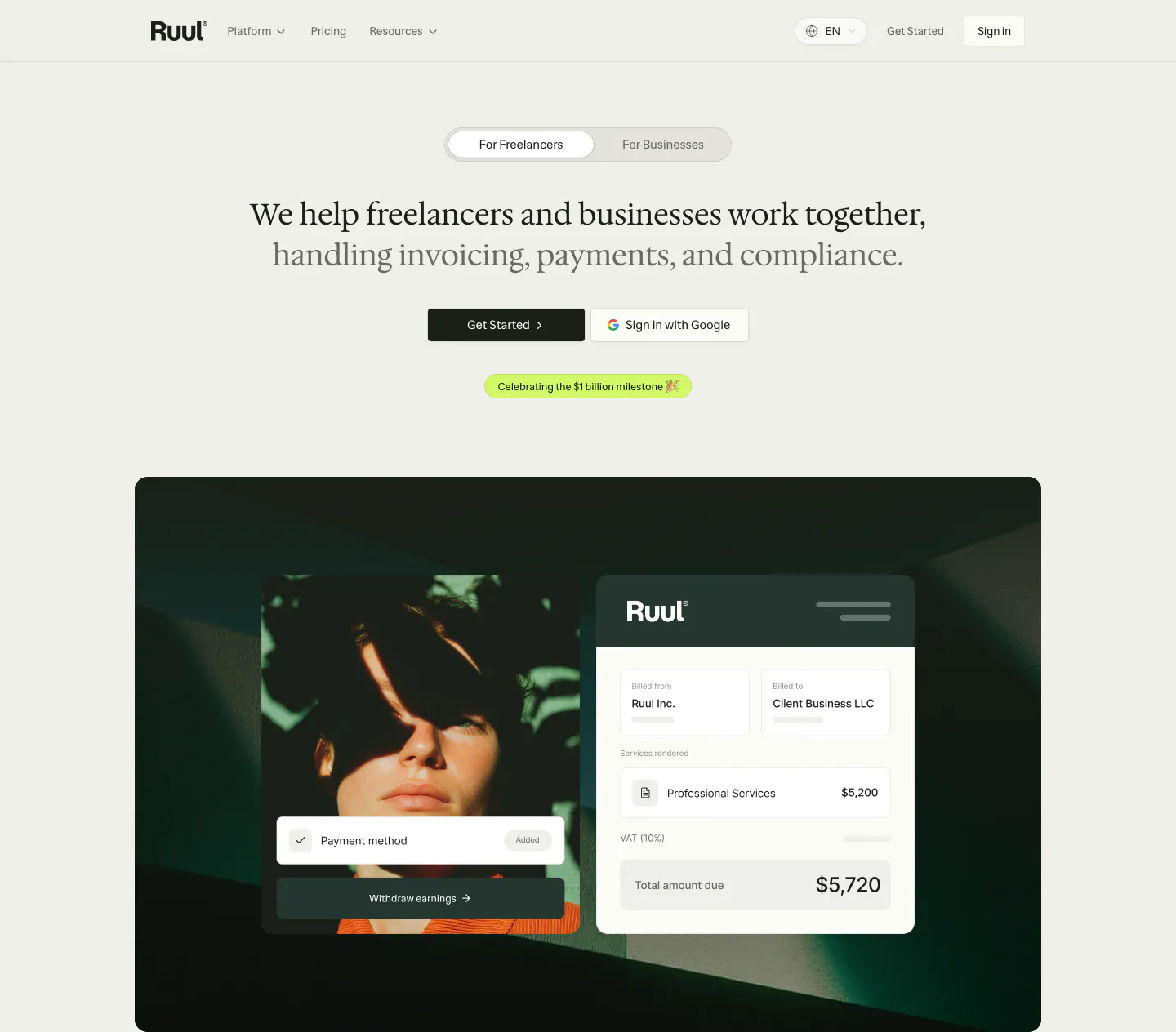
  33. Ruul features section: serif headline with two buttons above a dashboard screenshot on a dark green textured panel
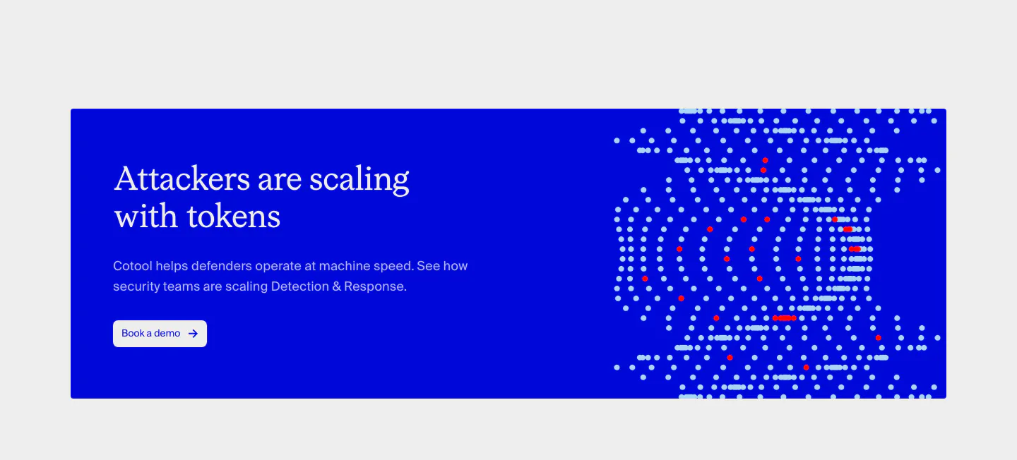
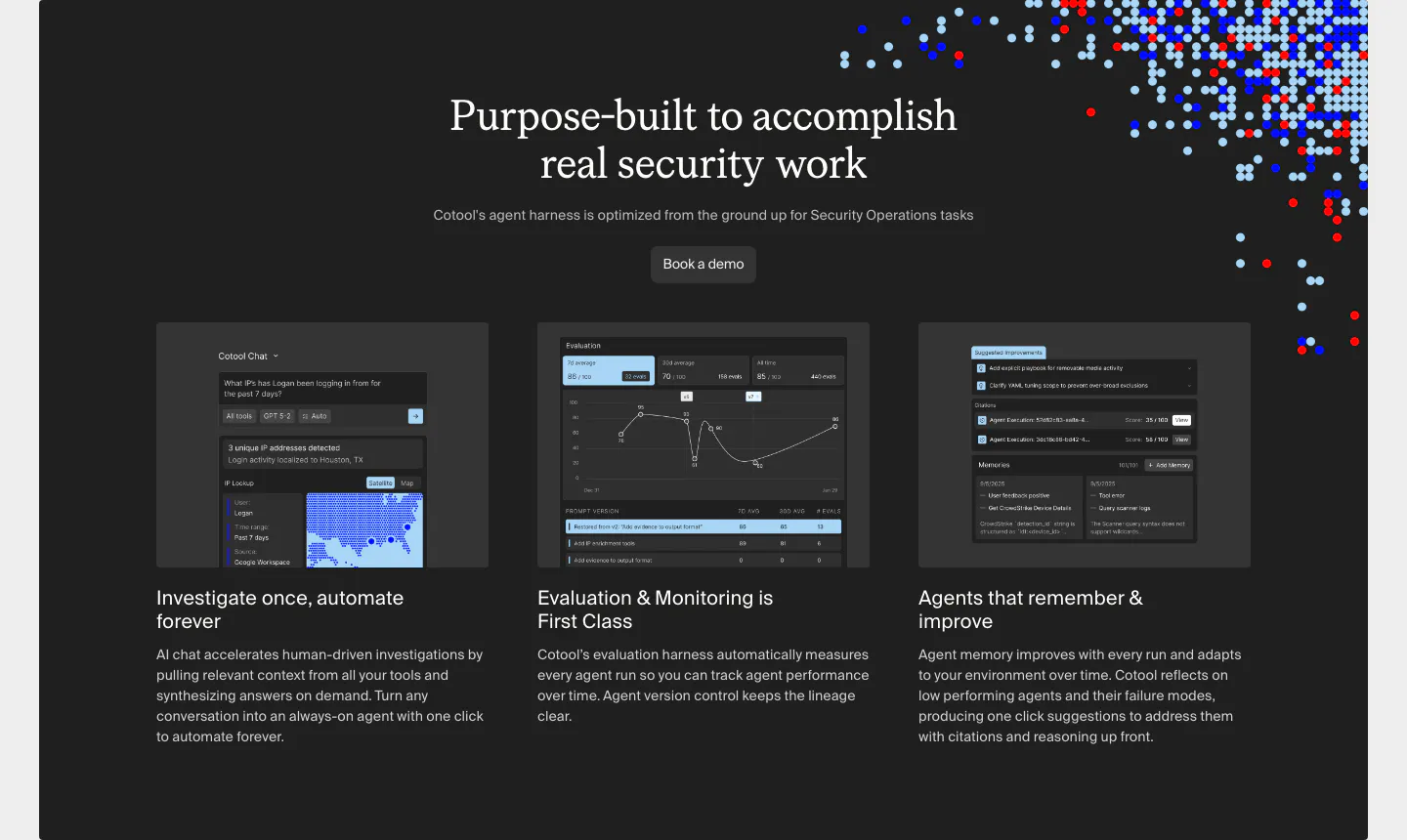
  34. Cotool call-to-action section: saturated blue banner with serif headline and button on the left and a dotted pixel artwork on the right
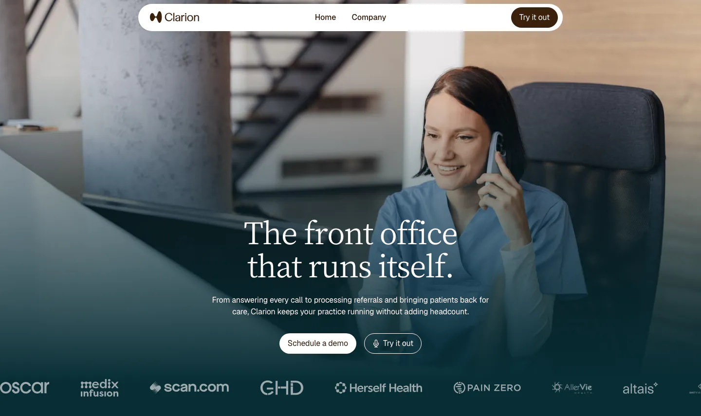
  35. Clarion hero section: full-bleed photo of a clinic worker on the phone, centered serif headline, two buttons and a customer logo row
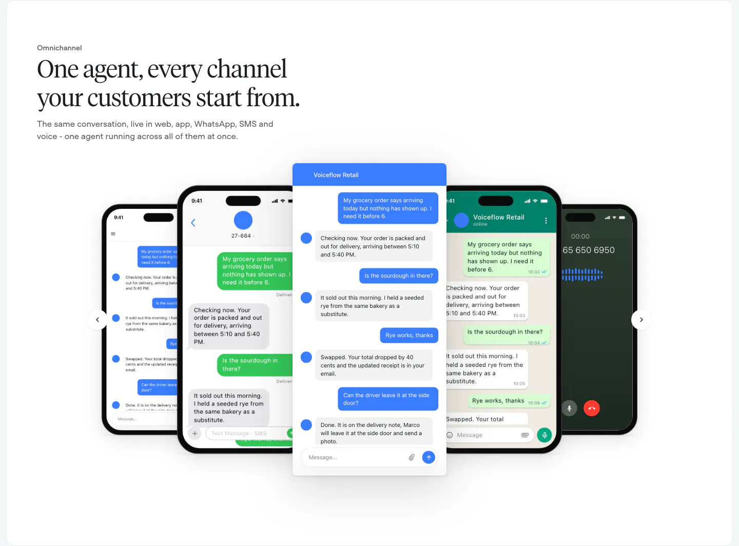
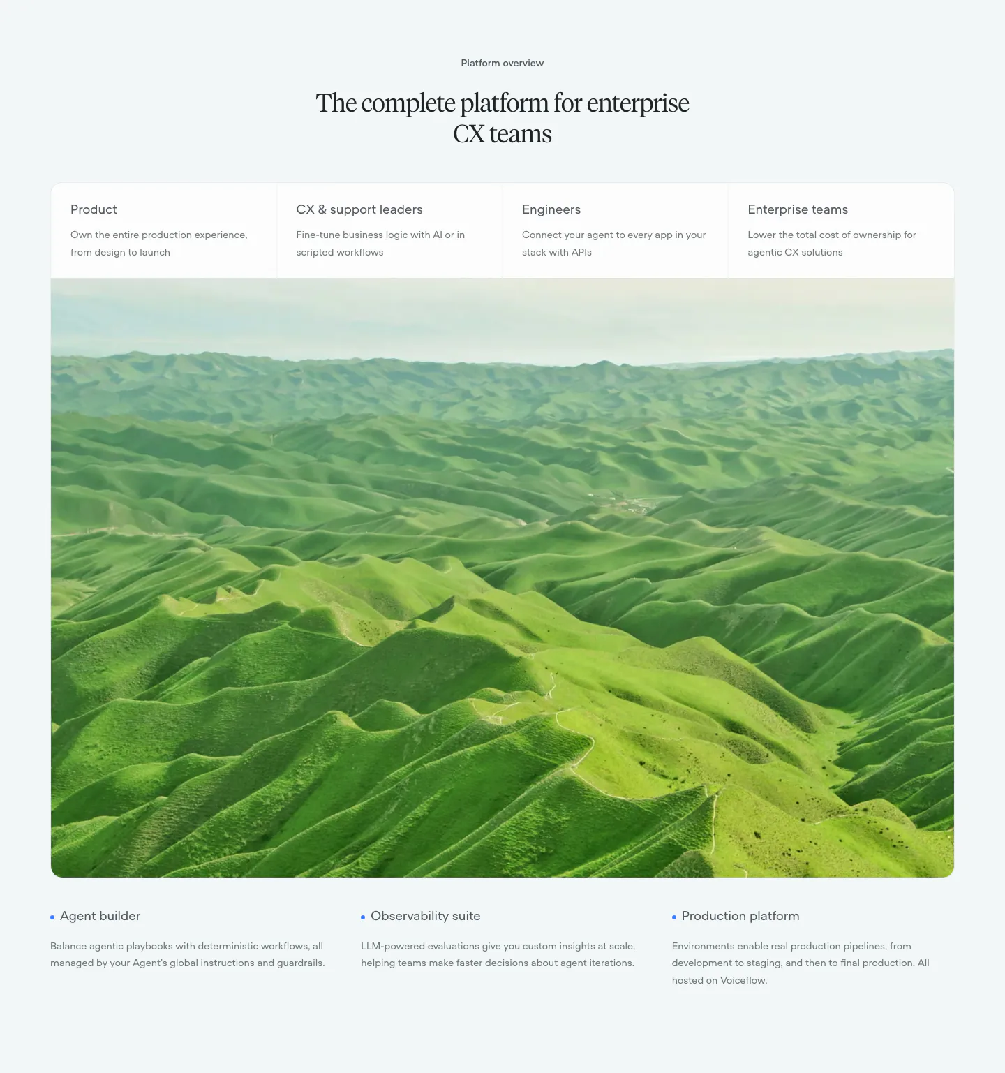
  36. Voiceflow features section: left-aligned serif headline above a carousel of phone and chat UI mockups with arrow controls
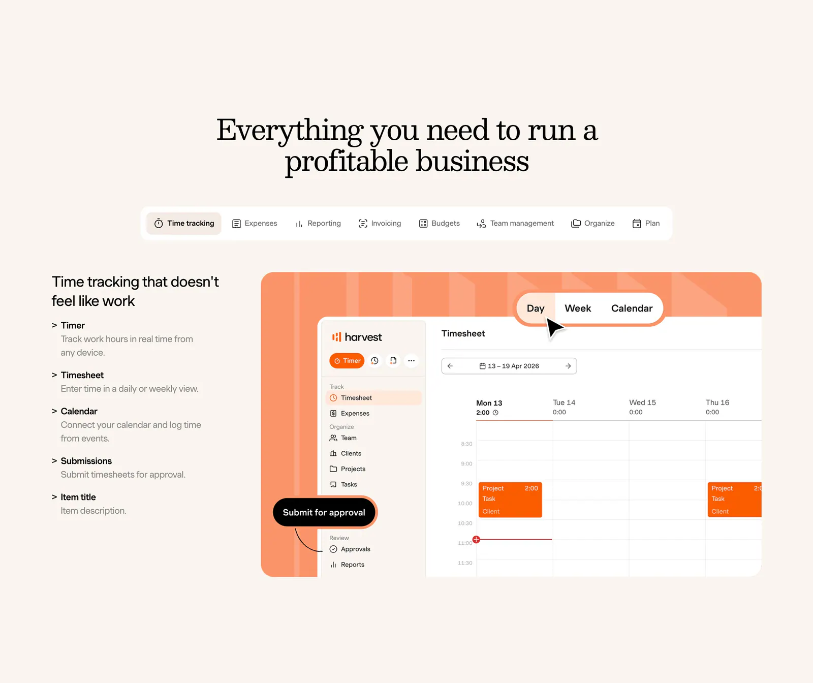
  37. Harvest features section: centered serif heading and feature tabs above a feature list beside a timesheet UI on an orange panel, cream background
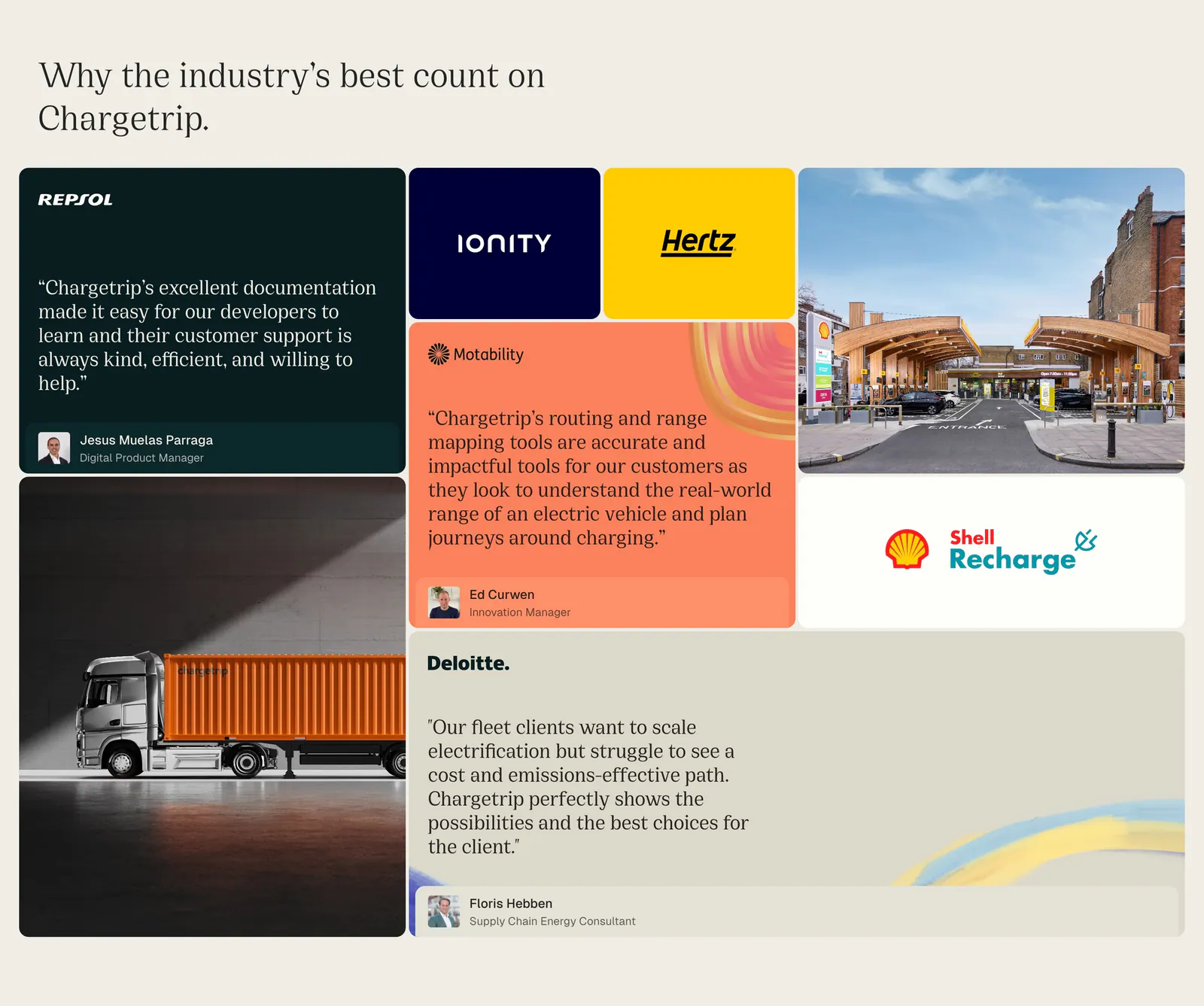
  38. Chargetrip testimonials section: bento grid of quote cards, partner logo tiles and photos of a truck and charging station on beige
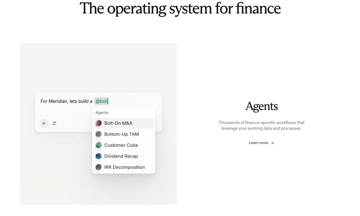
  39. Rogo features section: serif heading above an agent picker UI mockup on the left and Agents text with a link on the right
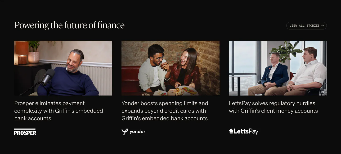
  40. Griffin testimonials section: serif heading above three customer story cards with photos, captions and logos on black
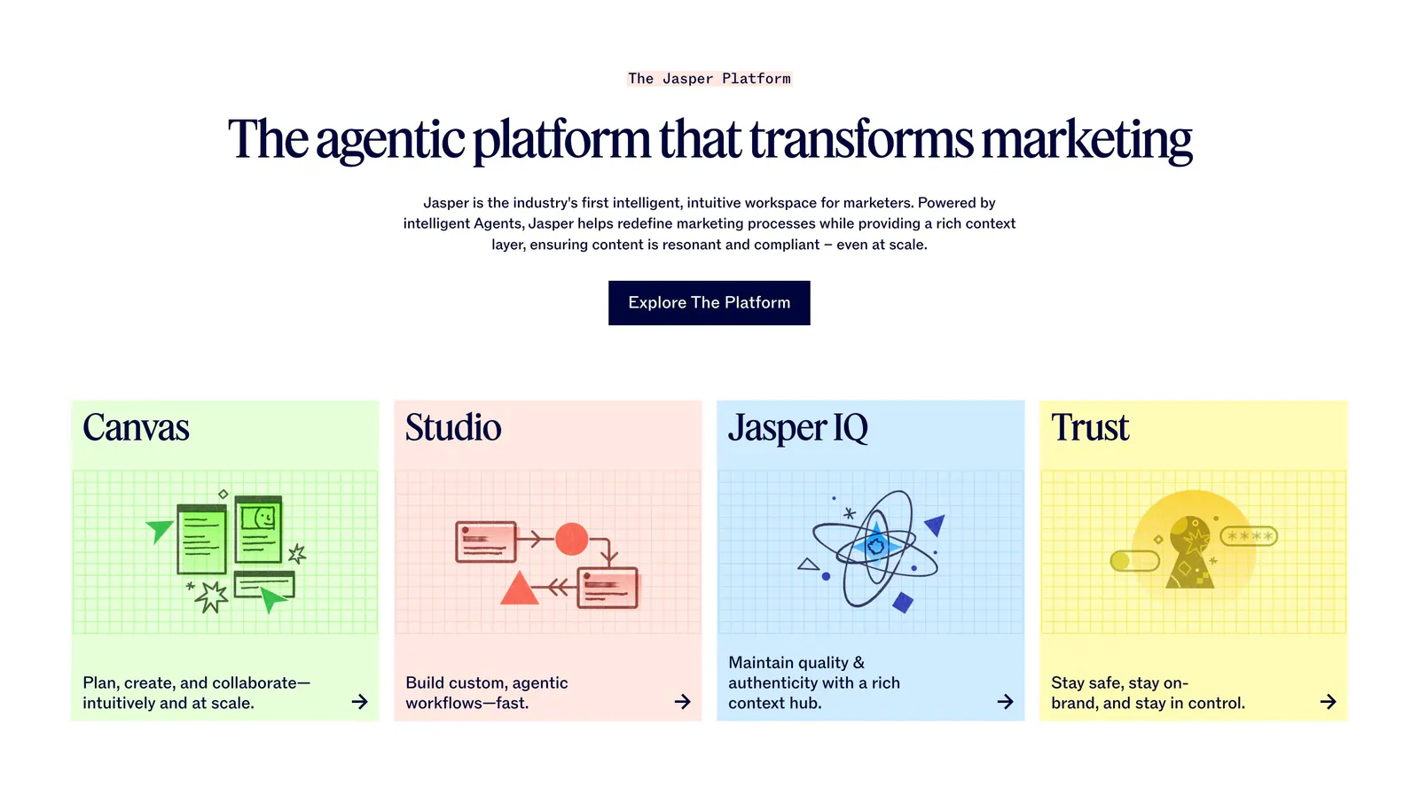
  41. Jasper features section: centered serif headline and button above four pastel cards with line illustrations on grid backgrounds
  42. Harvey logo cloud section: centered serif headline above three rows of grayscale law firm and enterprise logos
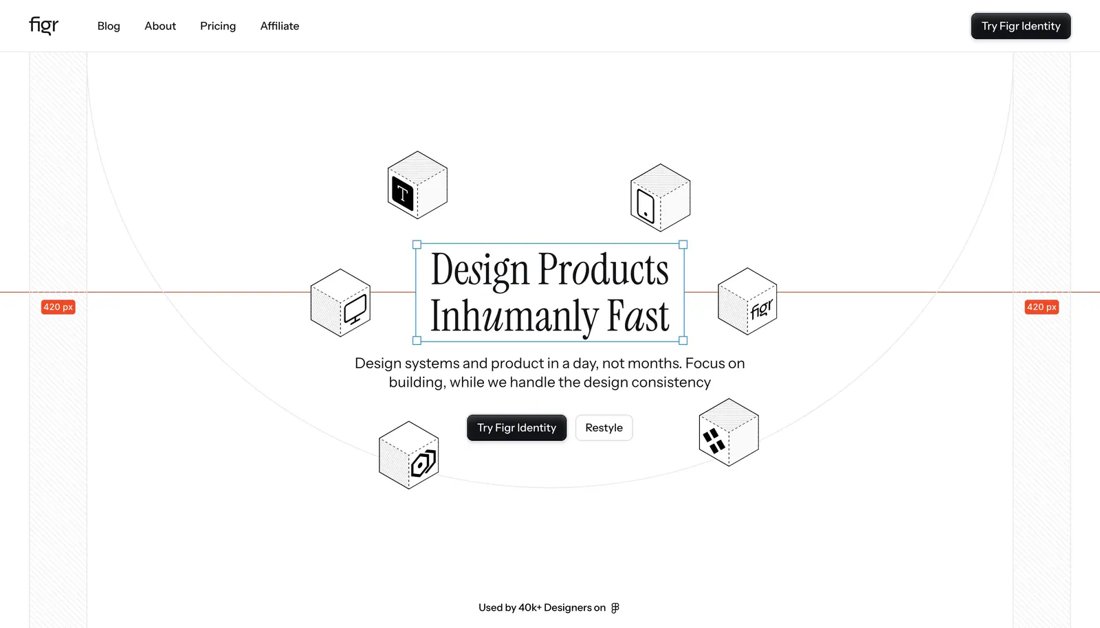
  43. Figr hero section: centered serif headline in a selection box ringed by isometric line-drawn cubes with measurement guides
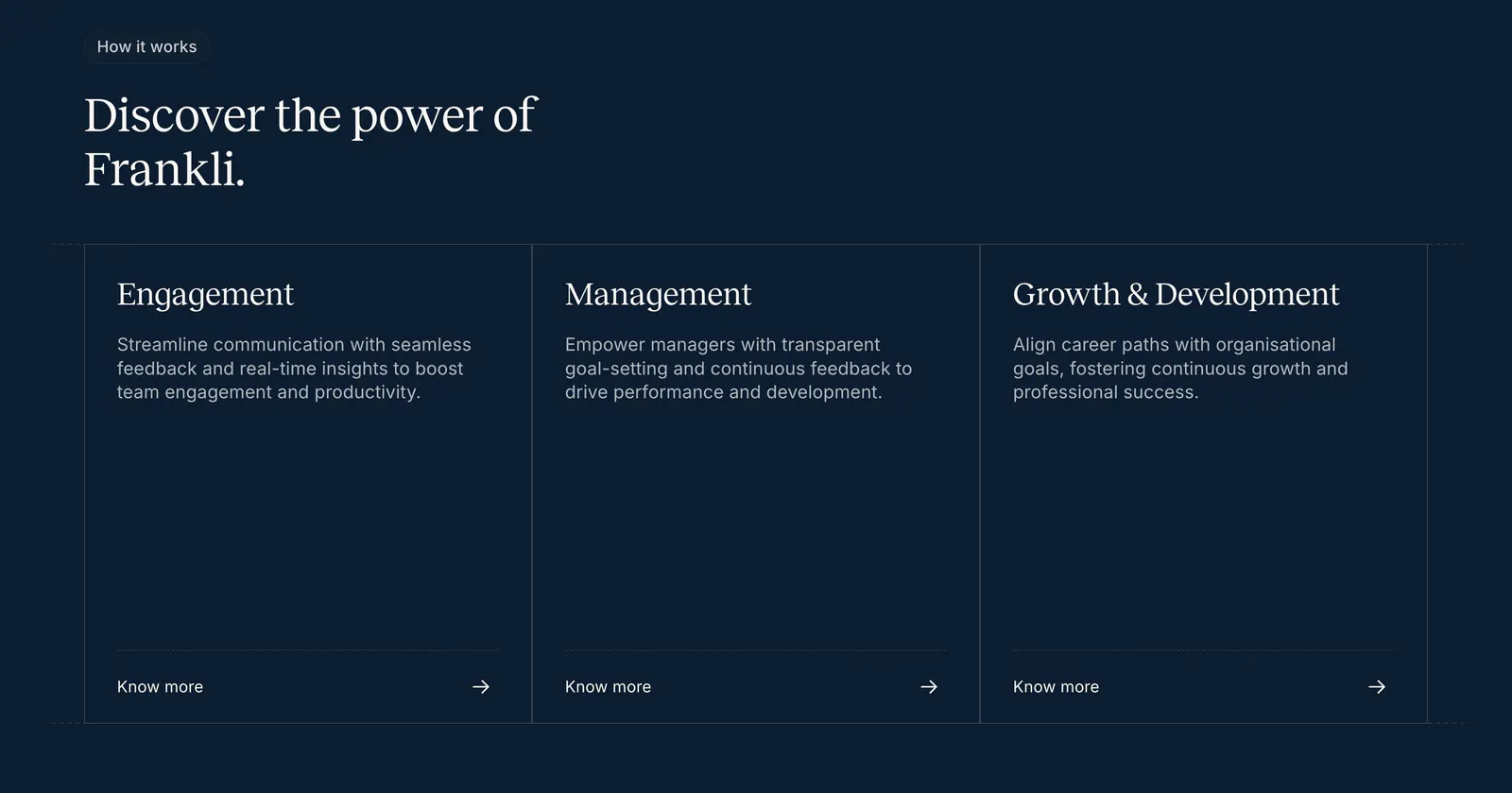
  44. Frankli how it works section: serif heading above three outlined cards for engagement, management and growth with links on navy
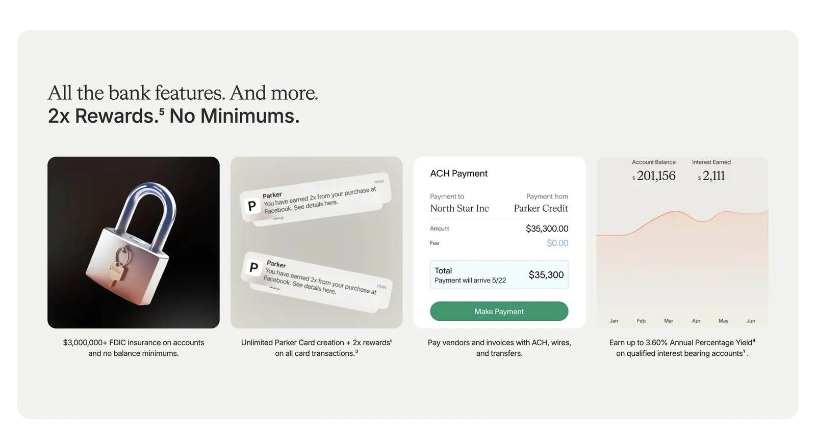
  45. Parker value proposition section: beige panel with headline above four cards showing a 3D padlock, notifications, payment UI and a yield chart
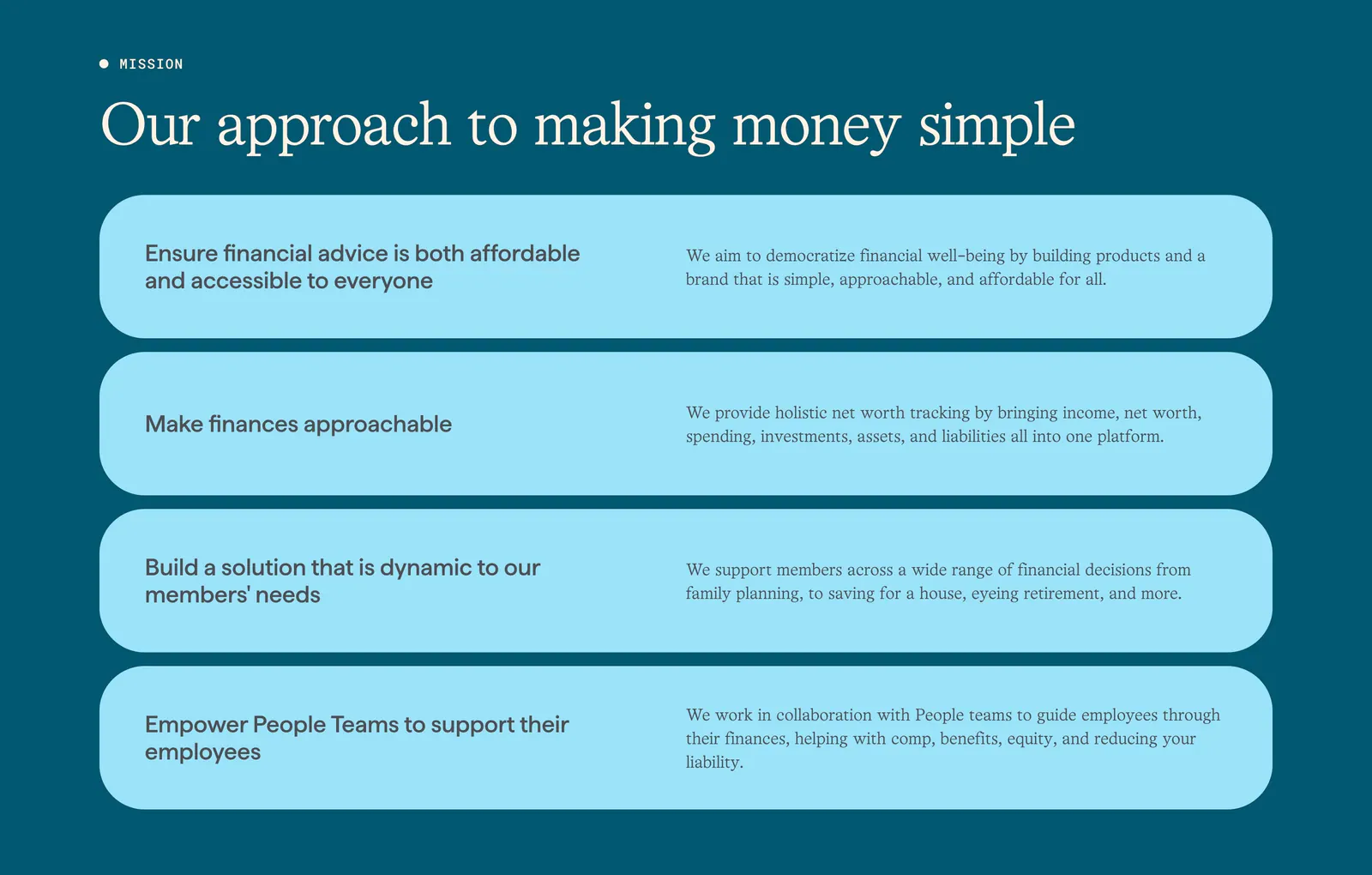
  46. Origin about & mission section: serif headline above four stacked light blue rounded rows of principles on a deep teal background
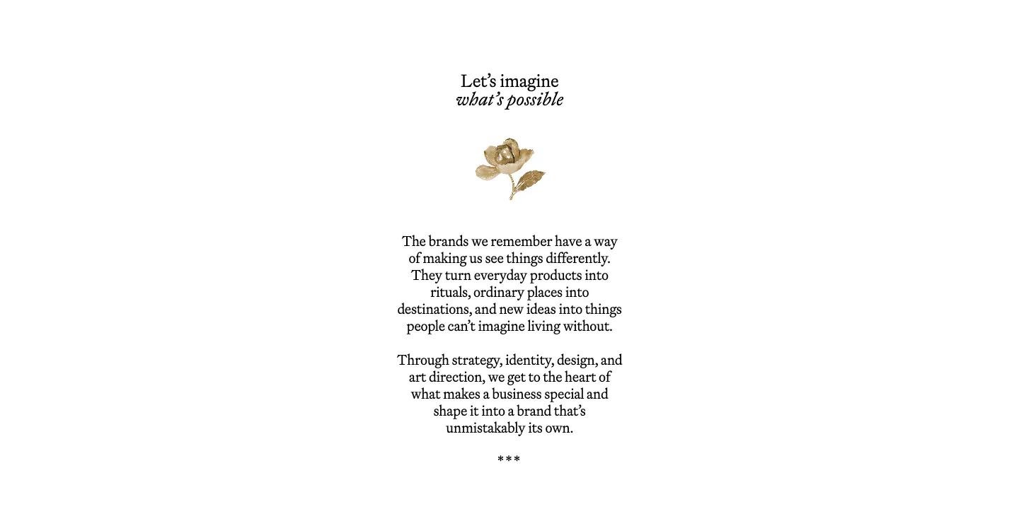
  47. Goodside about & mission section: centered serif heading, small gold flower ornament and short serif paragraphs on white
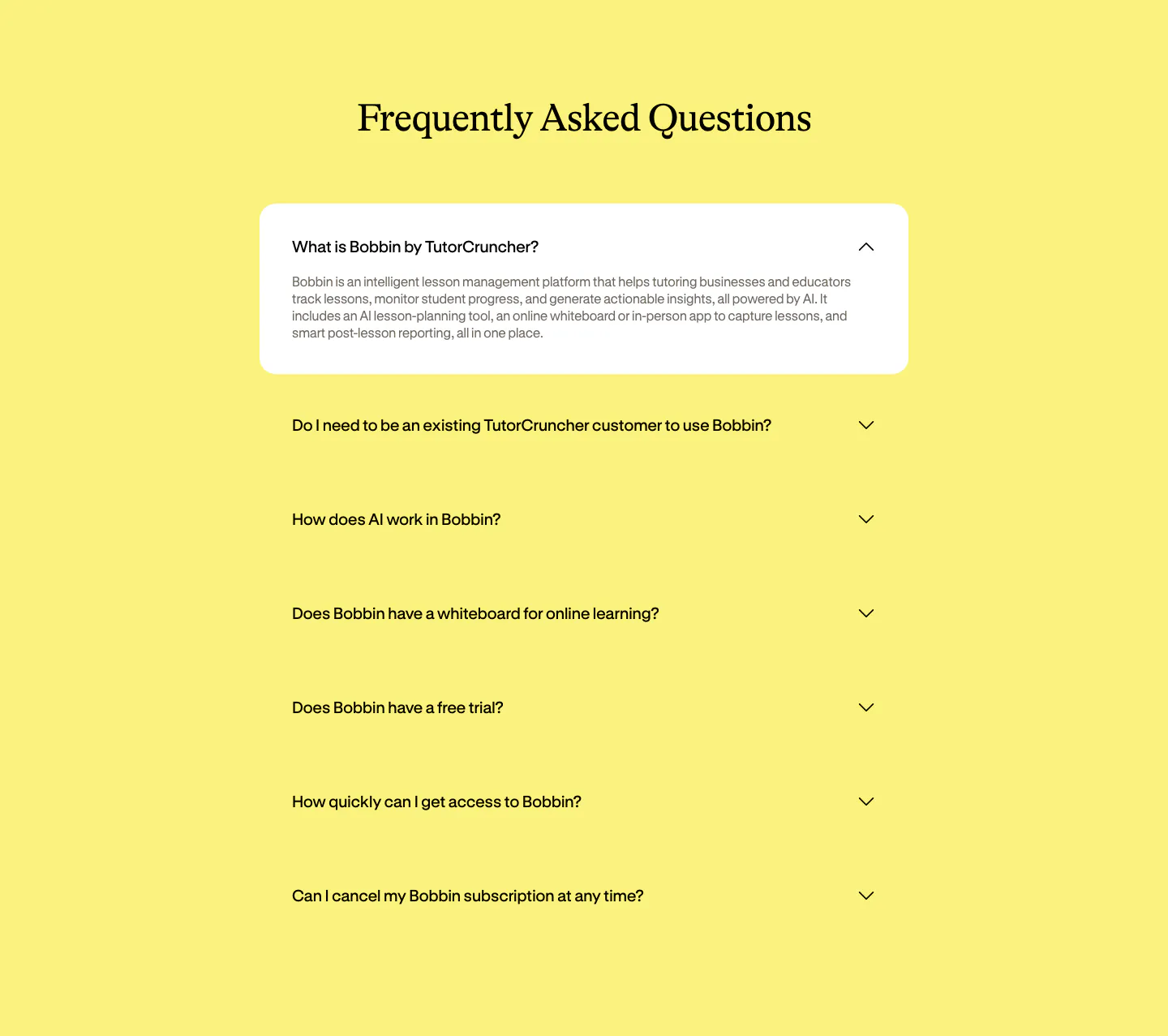
  48. Bobbin FAQ section: centered serif heading above an accordion of questions with the first expanded in a white card on yellow
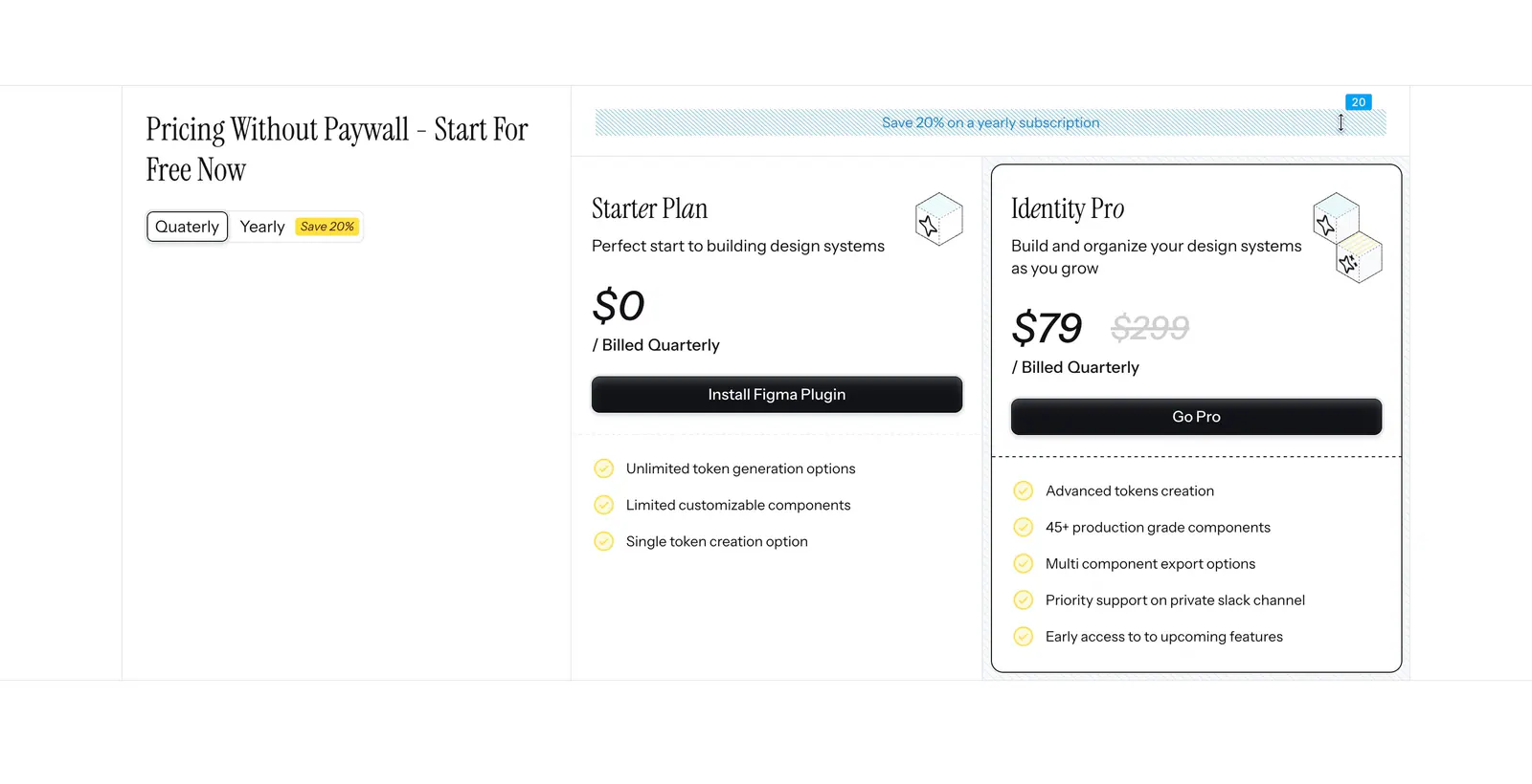
  49. Figr pricing section: serif heading with quarterly/yearly toggle on the left and Starter and Identity Pro plan cards on the right
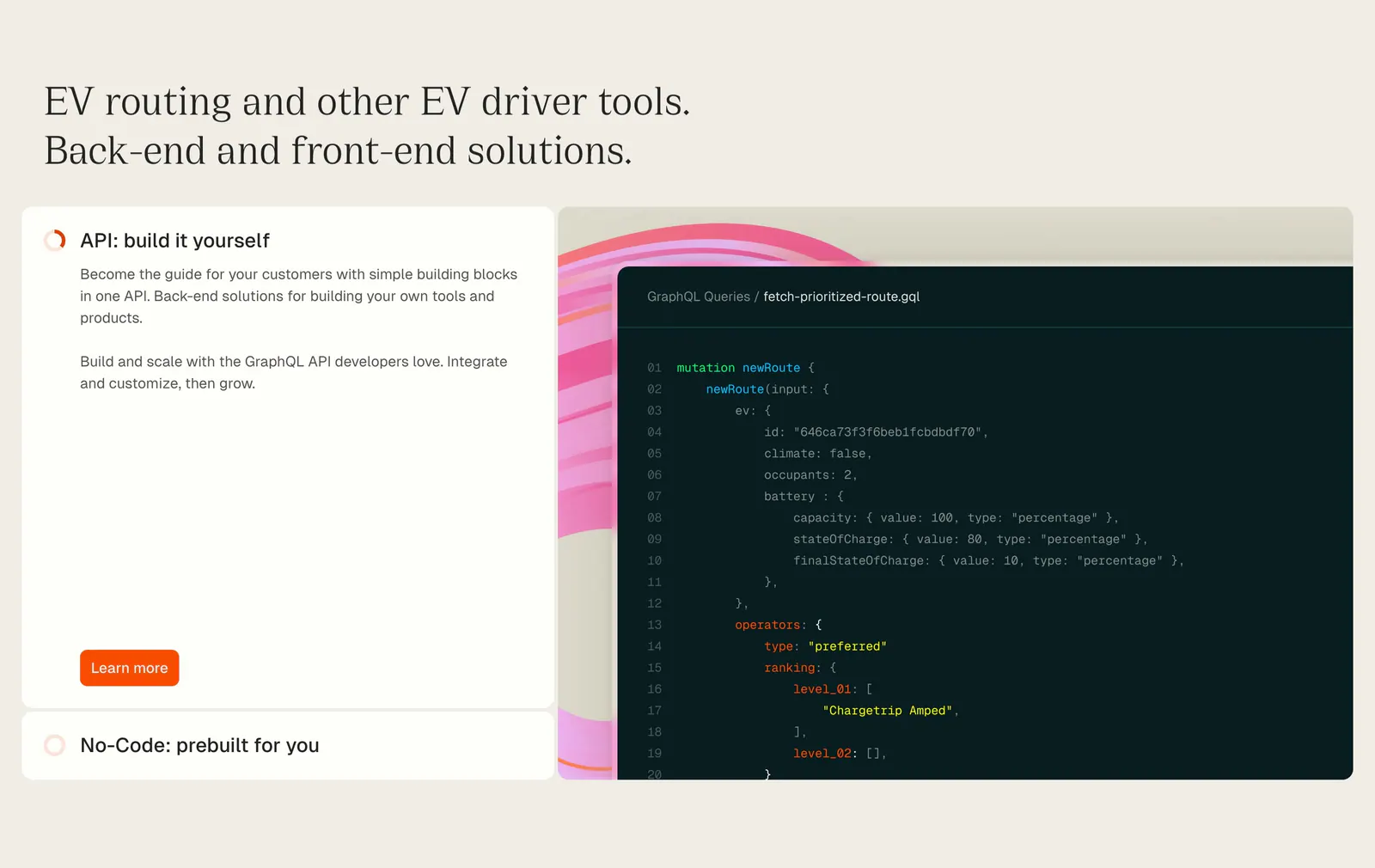
  50. Chargetrip features section: serif headline above an expandable option list beside a GraphQL code snippet on a beige background
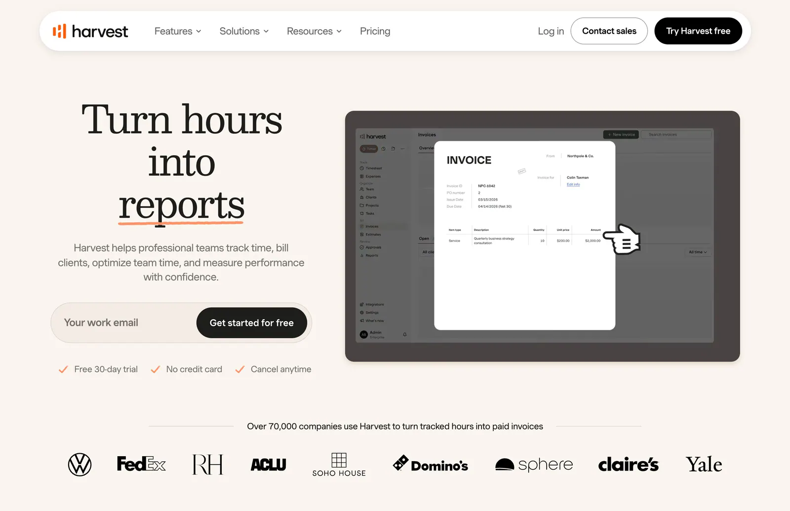
  51. Harvest hero section: serif headline with email signup field beside an invoice UI screenshot, customer logo row below on warm cream
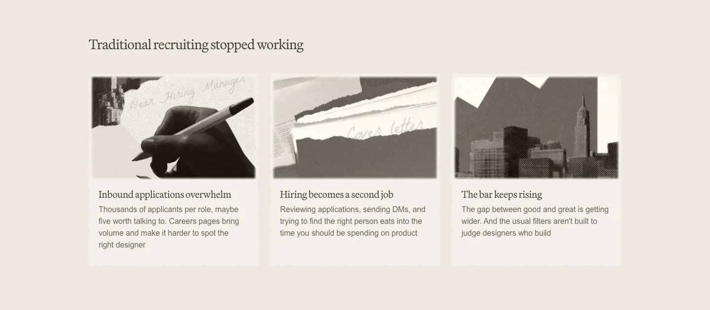
  52. Decimals value proposition section: serif heading above three cards with sepia photo collages and short problem descriptions on beige
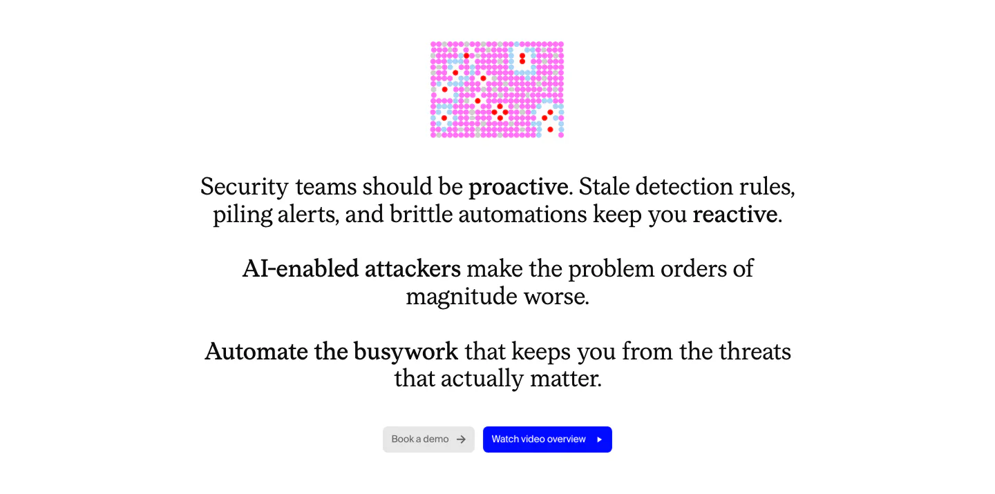
  53. Cotool value proposition section: centered serif problem statement with bolded phrases, small pink pixel graphic and two buttons on white
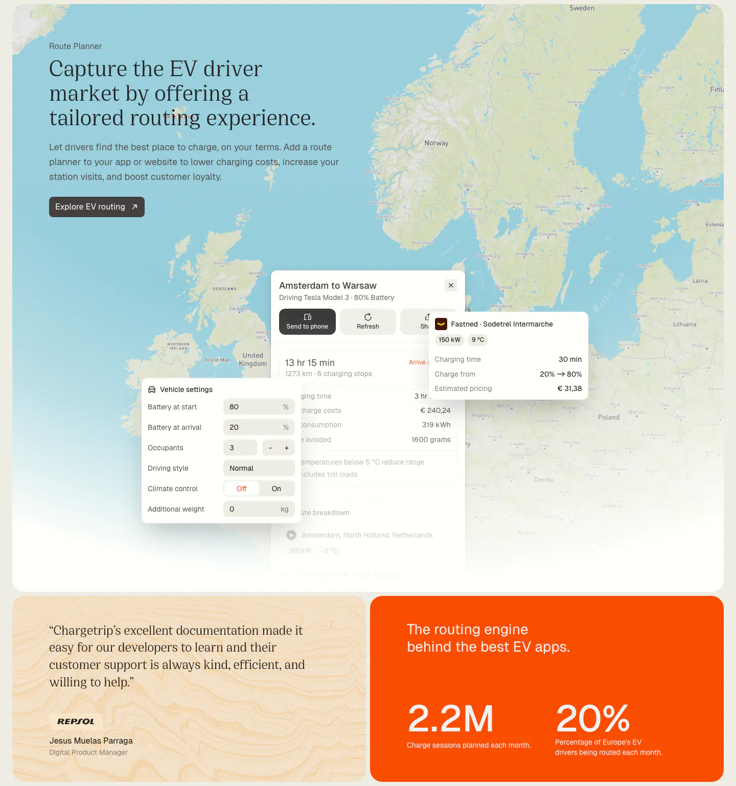
  54. Chargetrip features section: serif headline over a Europe map with route planner UI panels, above a quote card and an orange stats card
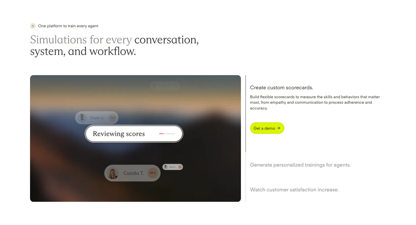
  55. Solidroad features section: two-tone serif headline above a blurred landscape card with score UI chips beside an expandable feature list
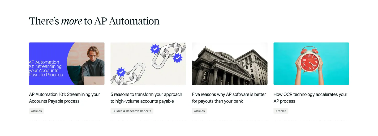
  56. Routable blog & resources section: serif headline above four article cards with photo and illustration thumbnails on white
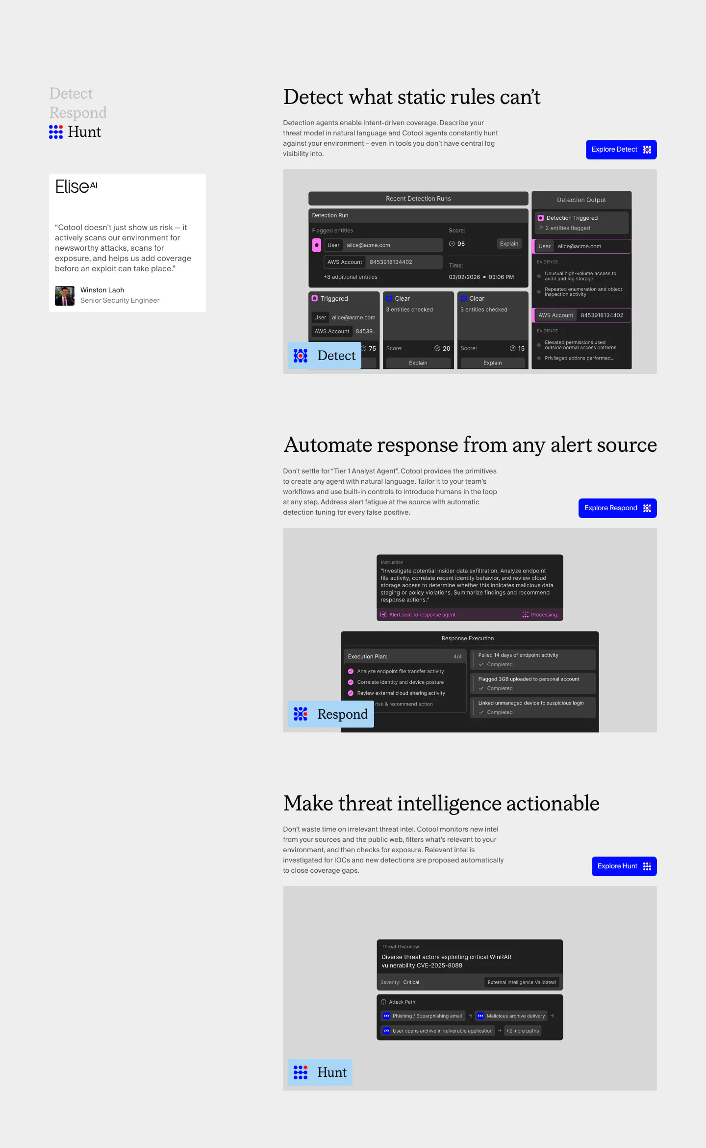
  57. Cotool features section: Detect, Respond and Hunt rows with serif headings, blue buttons and dark product UI screenshots beside a sticky side nav
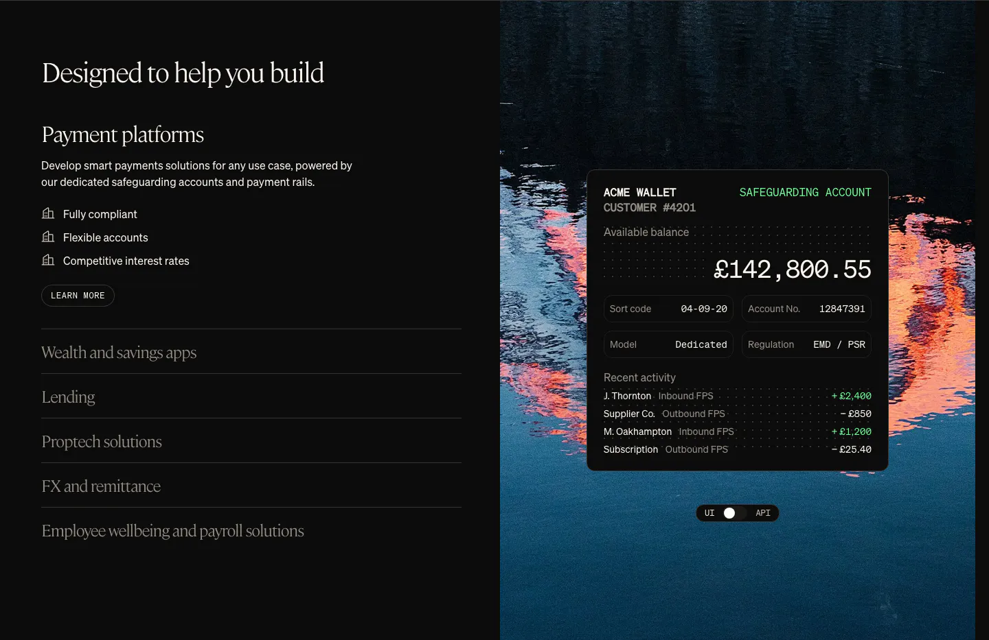
  58. Griffin use cases section: serif heading with use-case accordion on the left, wallet UI card over a lake photo on the right
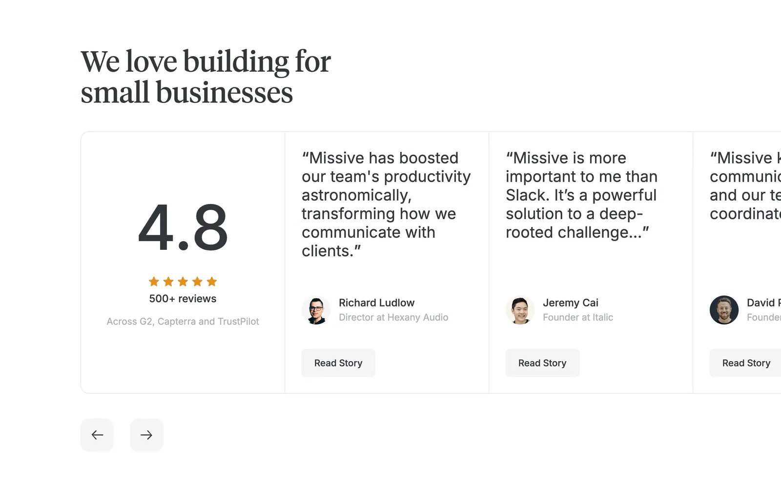
  59. Missive testimonials section: serif headline above a 4.8 rating card and edge-cropped quote cards with arrows on white
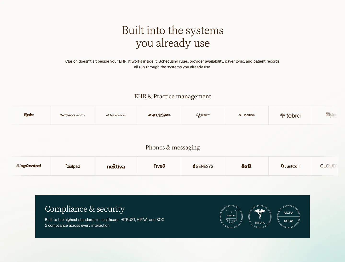
  60. Clarion integrations section: centered serif headline above two rows of EHR and phone system logos and a dark compliance badge banner
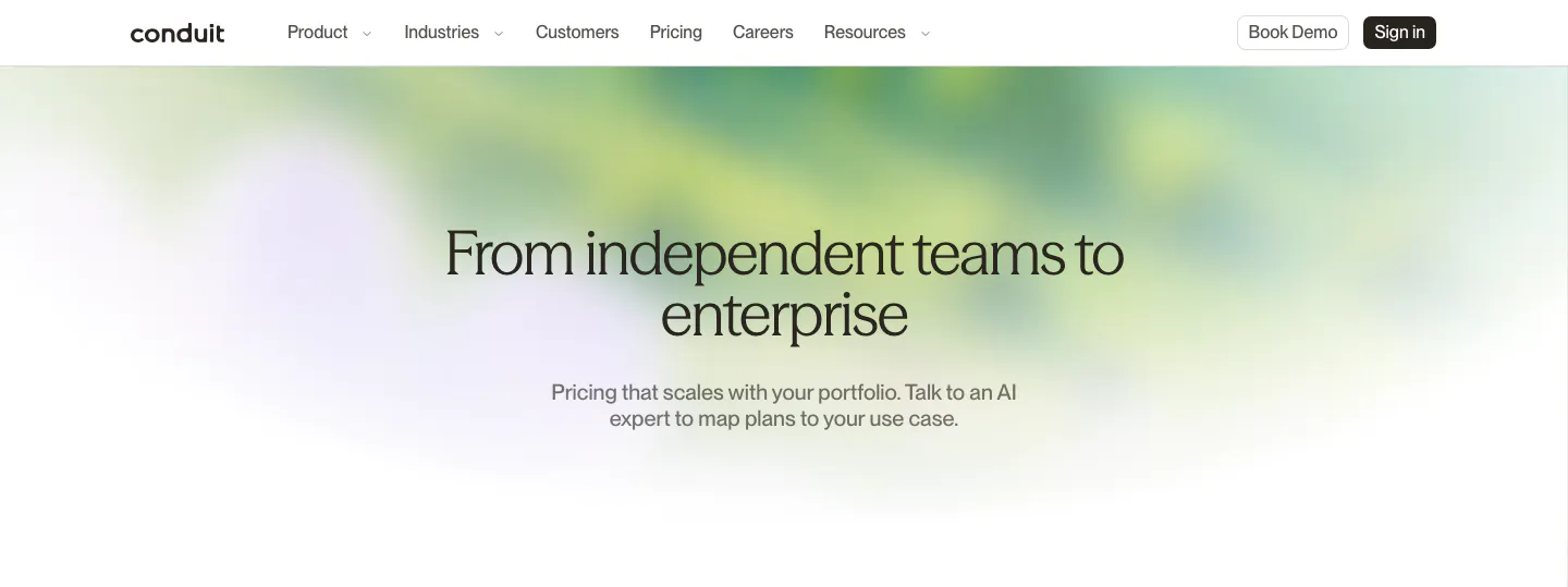
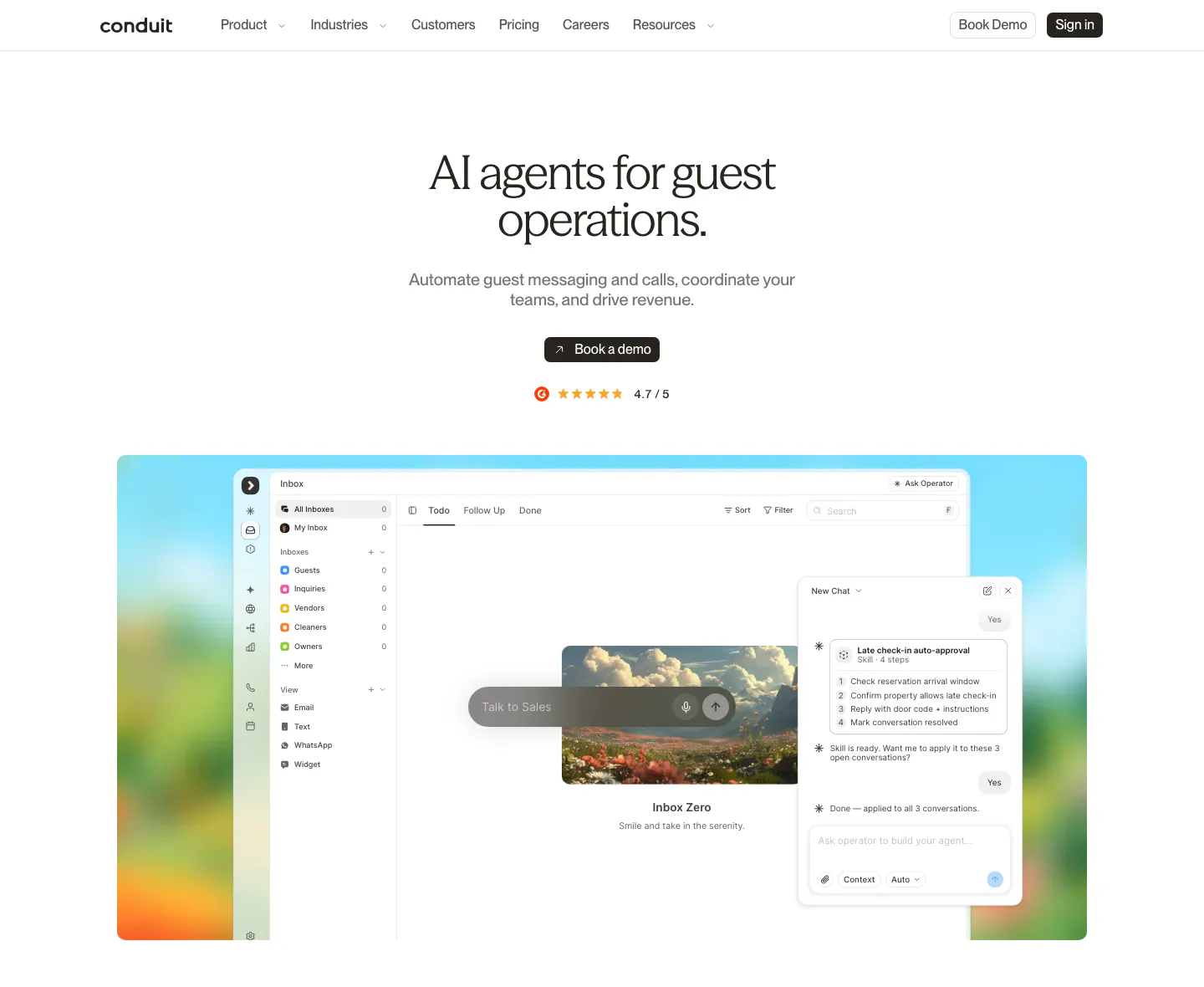
  61. Conduit hero section: centered serif pricing headline and subcopy over a soft green and lavender blurred gradient
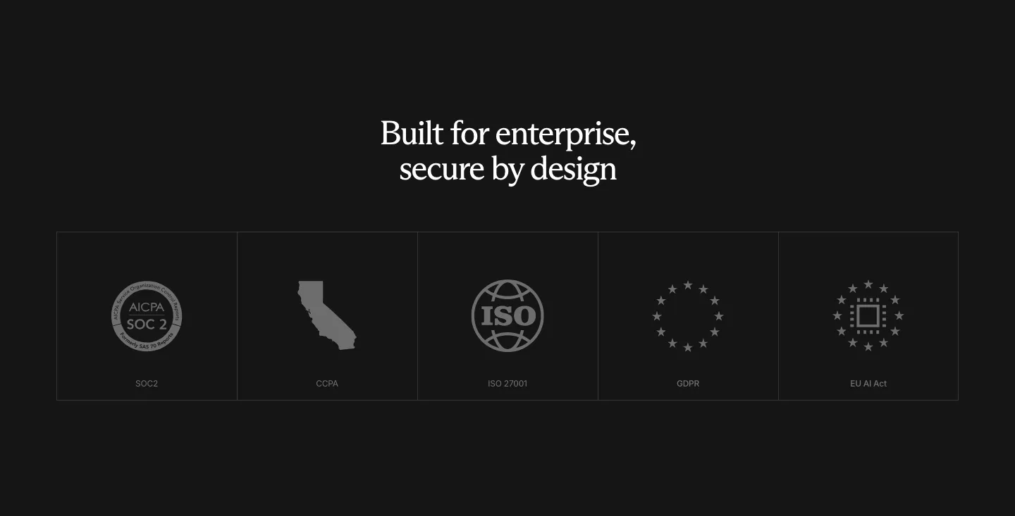
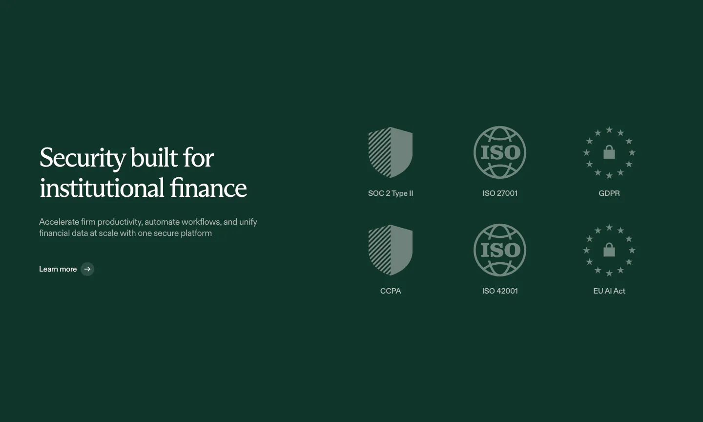
  62. Rogo security section: centered serif headline above a row of five compliance badge tiles (SOC 2, CCPA, ISO, GDPR, EU AI Act)
  63. Gradient Labs call-to-action section: centered serif headline and pill email field on a bright orange background with thin curved lines
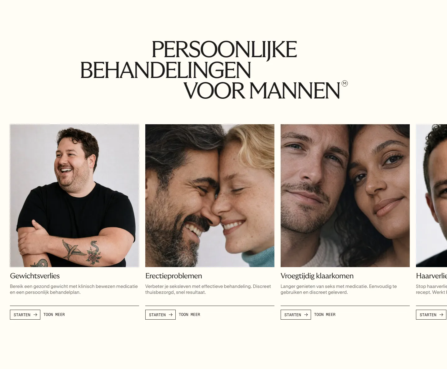
  64. Menkind features section: serif uppercase headline above a carousel of treatment cards with portrait photos and start buttons on cream
  65. Heidi call to action section: cream rounded band with centered serif headline, Get Remote button and faint curved line decorations
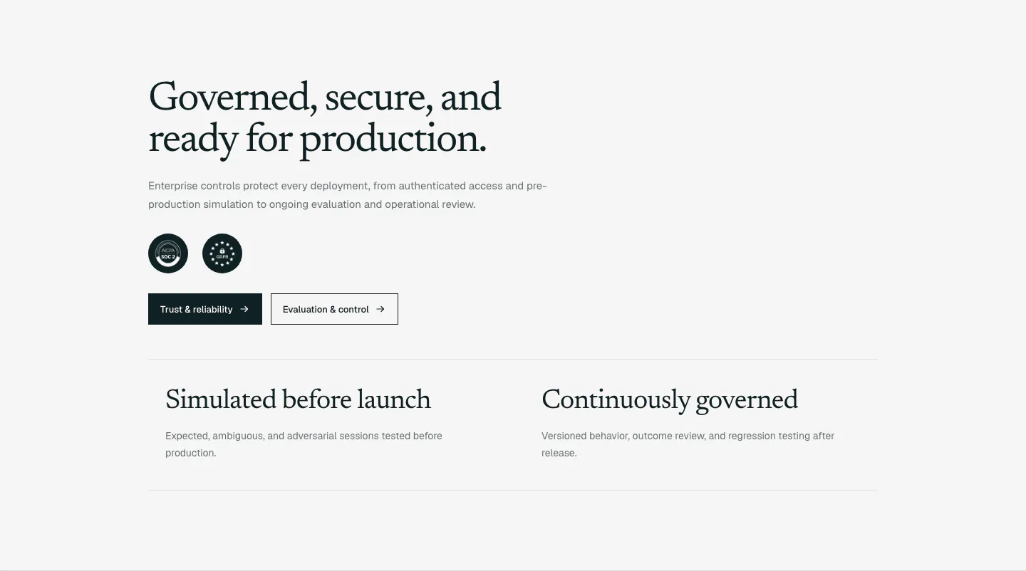
  66. Supersonik security section: serif headline, copy, SOC 2 and GDPR badges and two buttons above two governance points on light gray
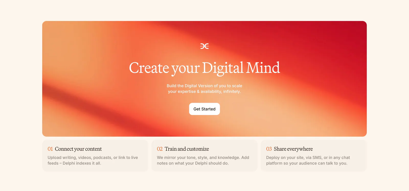
  67. Delphi call-to-action section: centered serif headline and Get Started button on an orange-red gradient card above three numbered step cards
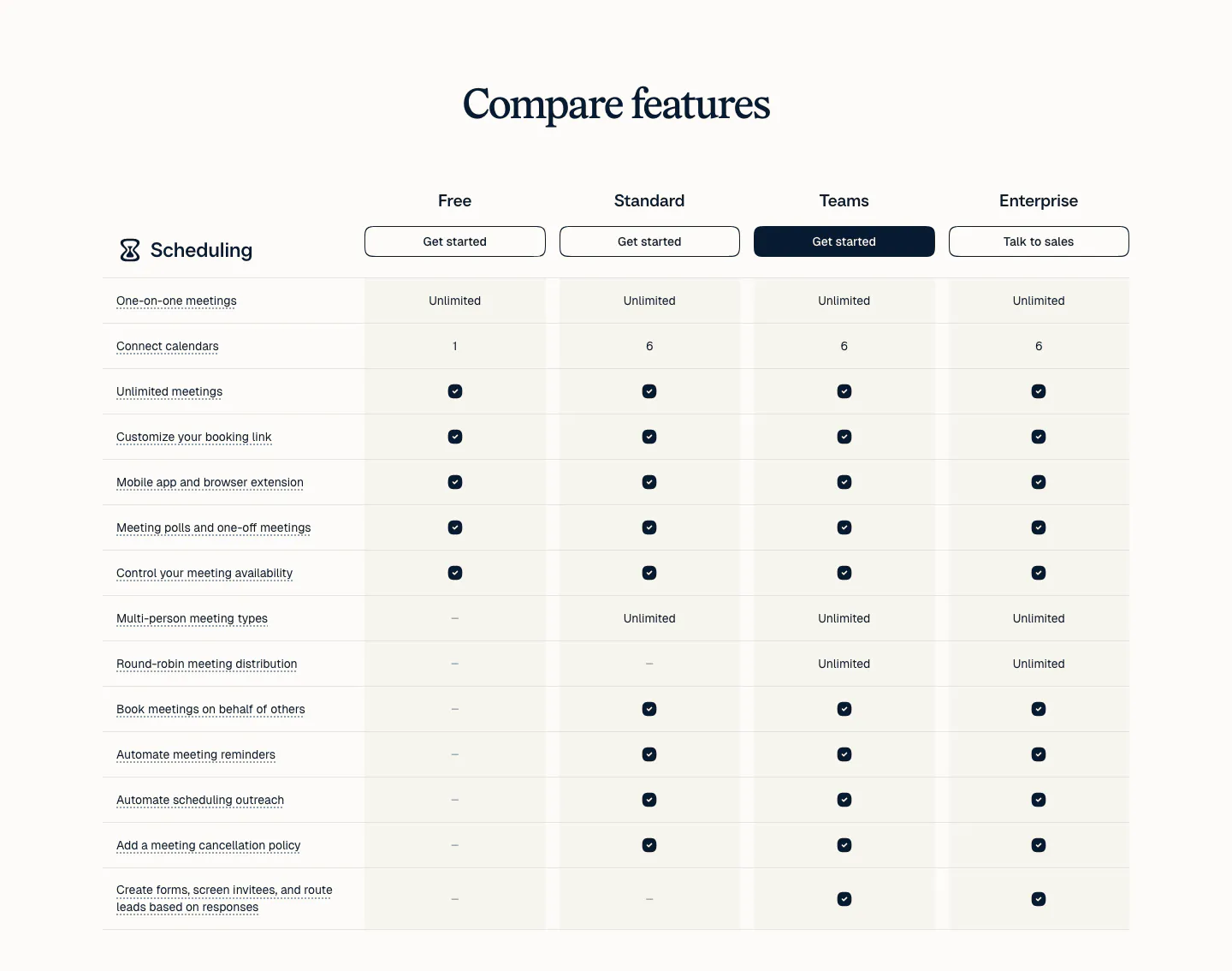
  68. Calendly pricing section: serif heading above a plan comparison table with four plan columns, buttons and check marks on a light background
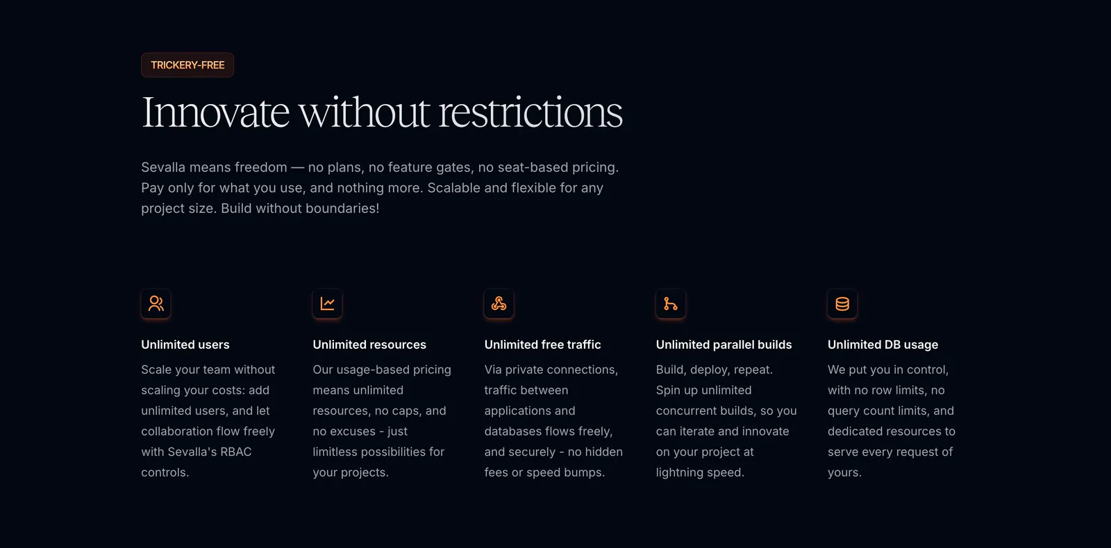
  69. Sevalla features section: serif headline and intro above five icon columns of unlimited usage benefits on a near-black background
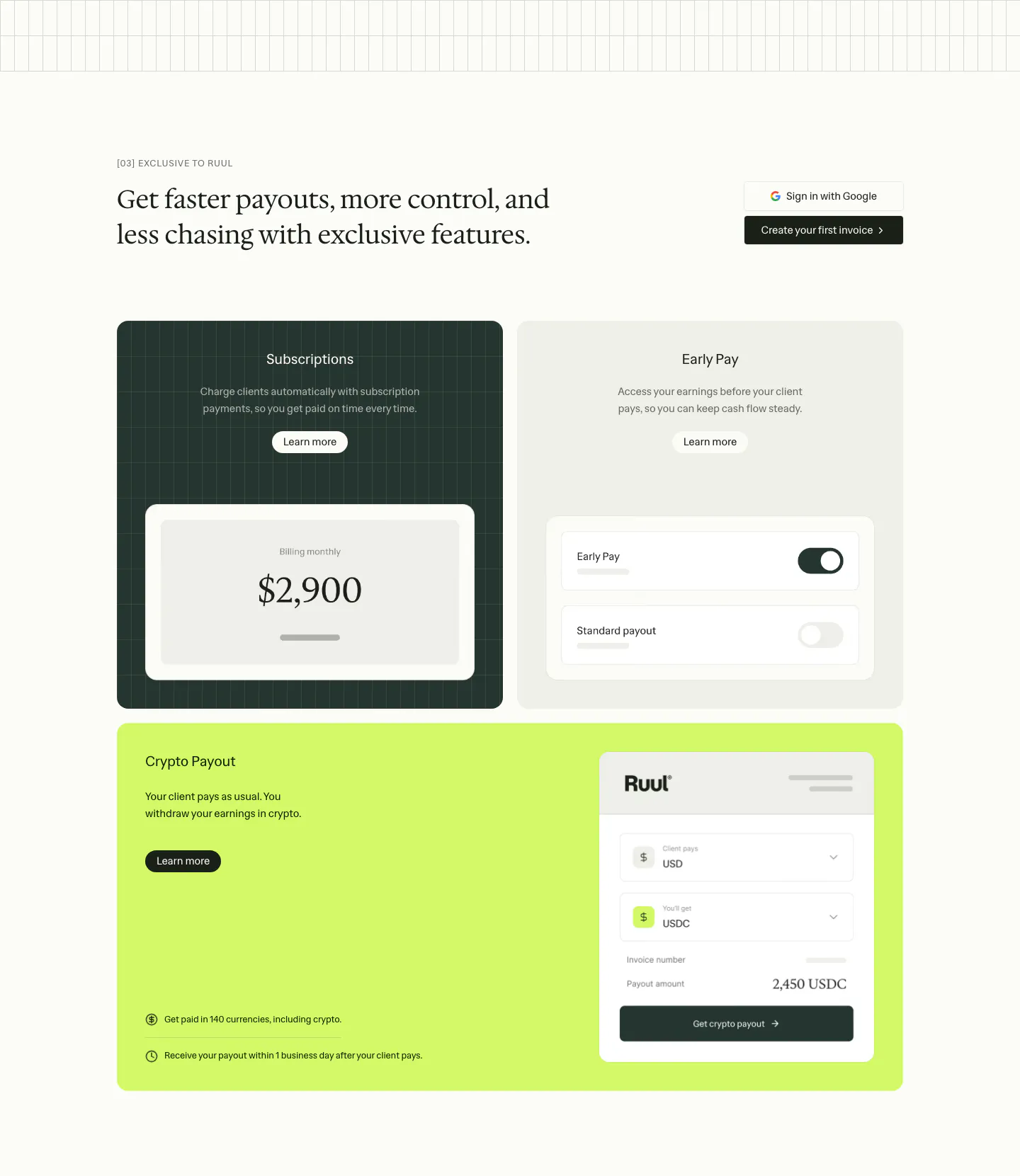
  70. Ruul features section: serif headline above three feature cards in dark green, gray and lime with payout and toggle UI mockups
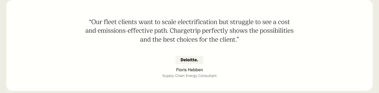
  71. Chargetrip testimonials section: centered serif quote from a Deloitte consultant with company badge and name on a white rounded panel
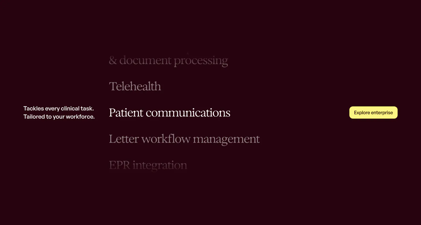
  72. Heidi features section: dark plum background with a scrolling serif list of clinical tasks and a yellow Explore enterprise button
  73. Gradient Labs logo cloud section: serif heading above a single row of white customer logos on a near-black background
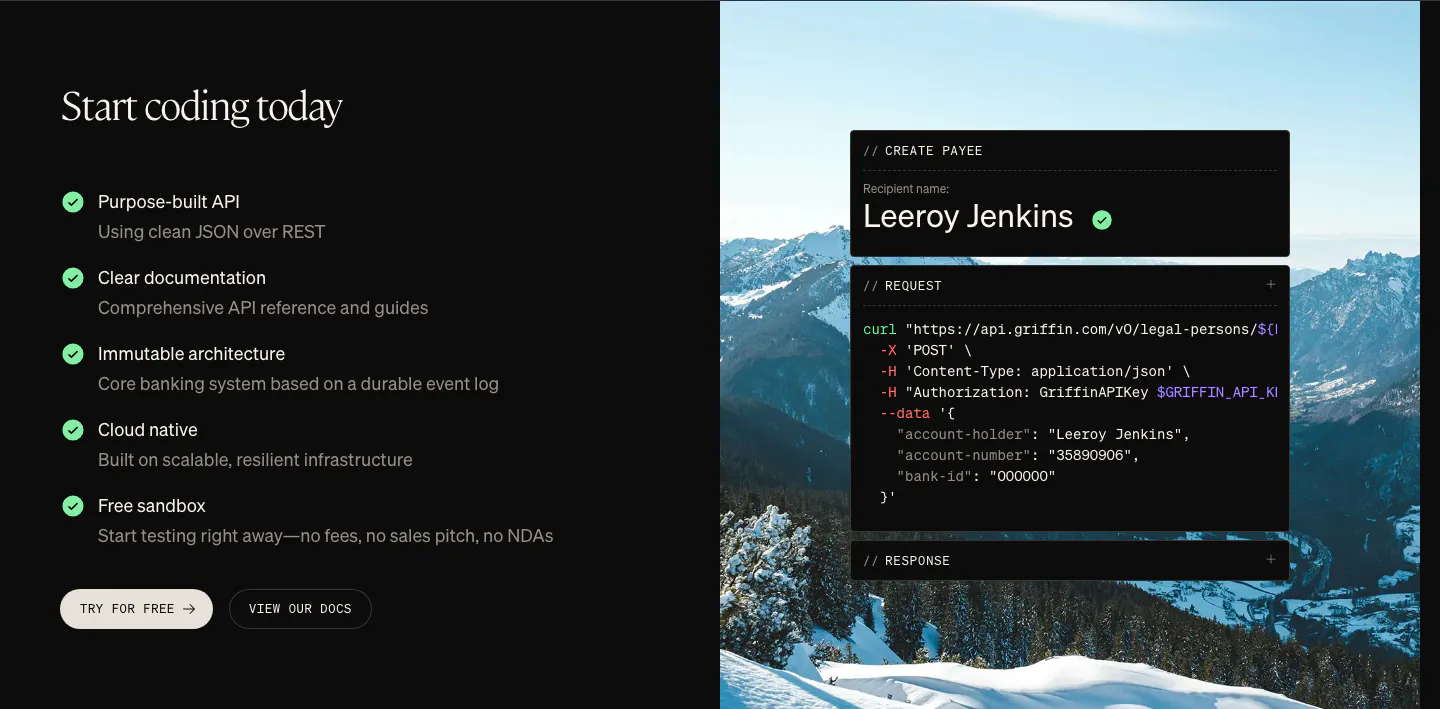
  74. Griffin features section: checklist of API benefits and two buttons beside a curl code card over a mountain photo
  75. Chargetrip blog & resources section: webinar banner with serif title and orange button over a full-bleed night photo of an EV charging lot
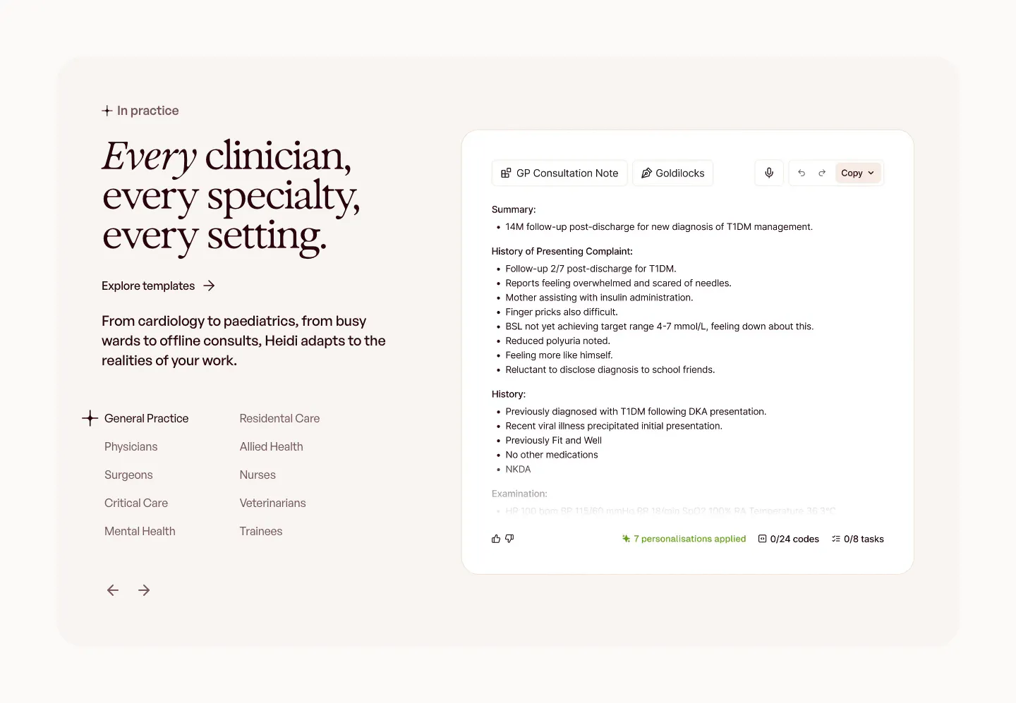
  76. Heidi use cases section: serif headline with a specialty list and arrows on the left, GP consultation note UI on the right
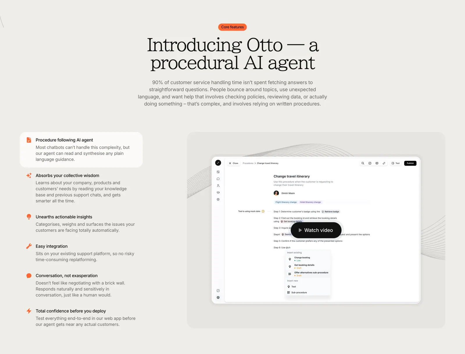
  77. Gradient Labs features section: centered serif headline above a feature list on the left and a product screenshot with video button
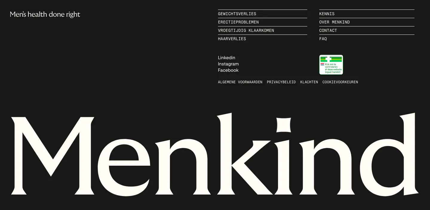
  78. Menkind footer section: tagline and monospace link columns above a giant serif Menkind wordmark on a black background
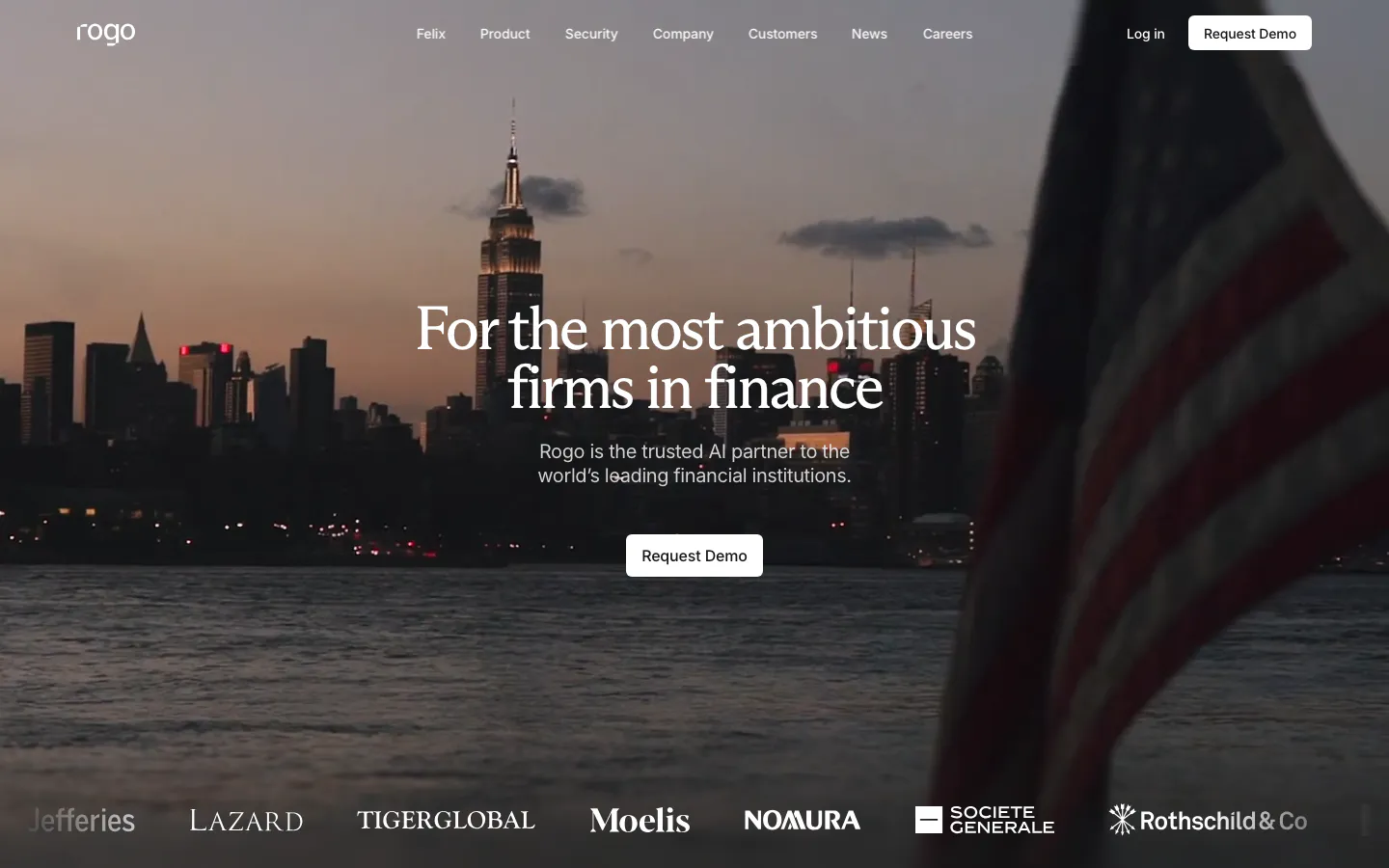
  79. Rogo hero section: centered serif headline and demo button over a full-bleed dusk photo of a city skyline, logo strip at the bottom
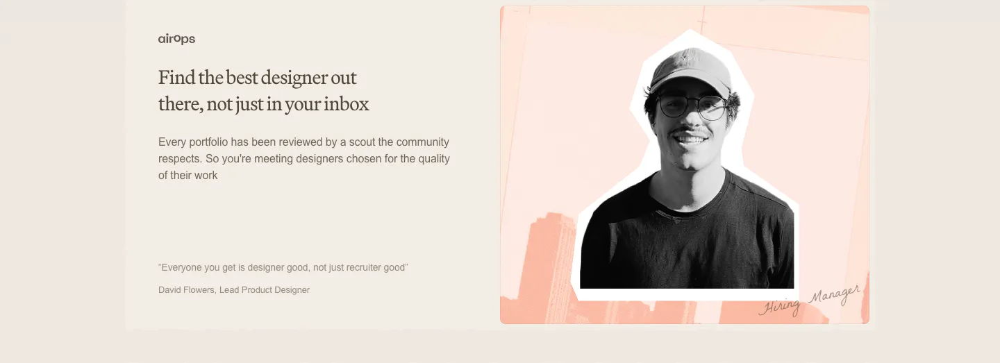
  80. Decimals testimonials section: serif headline, copy and short quote on the left beside a cutout photo of a hiring manager on a peach collage
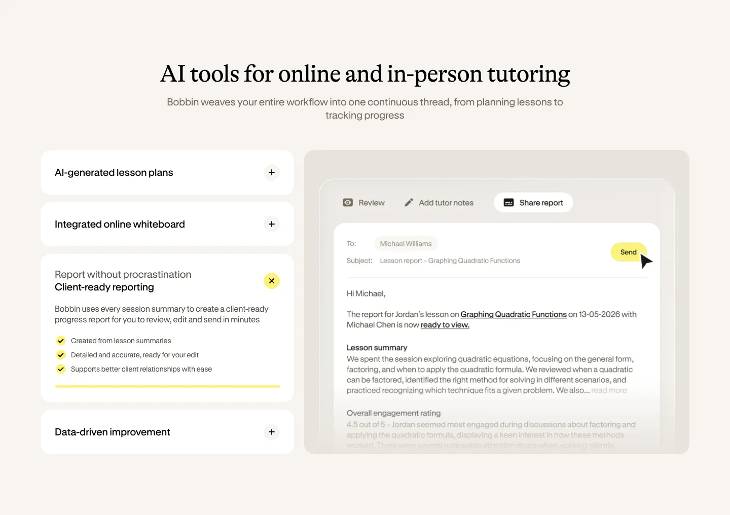
  81. Bobbin features section: serif heading over an accordion of features on the left and a lesson report email UI on the right, cream background
  82. Voiceflow use cases section: centered serif headline, four role tabs over a large green hills photo, three feature notes below
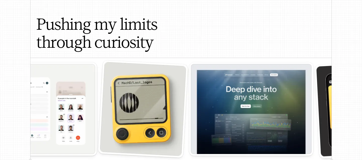
  83. Daniel Sun other section: left serif headline above a horizontal carousel of exploration cards showing app and device mockups
    Daniel Sun Other
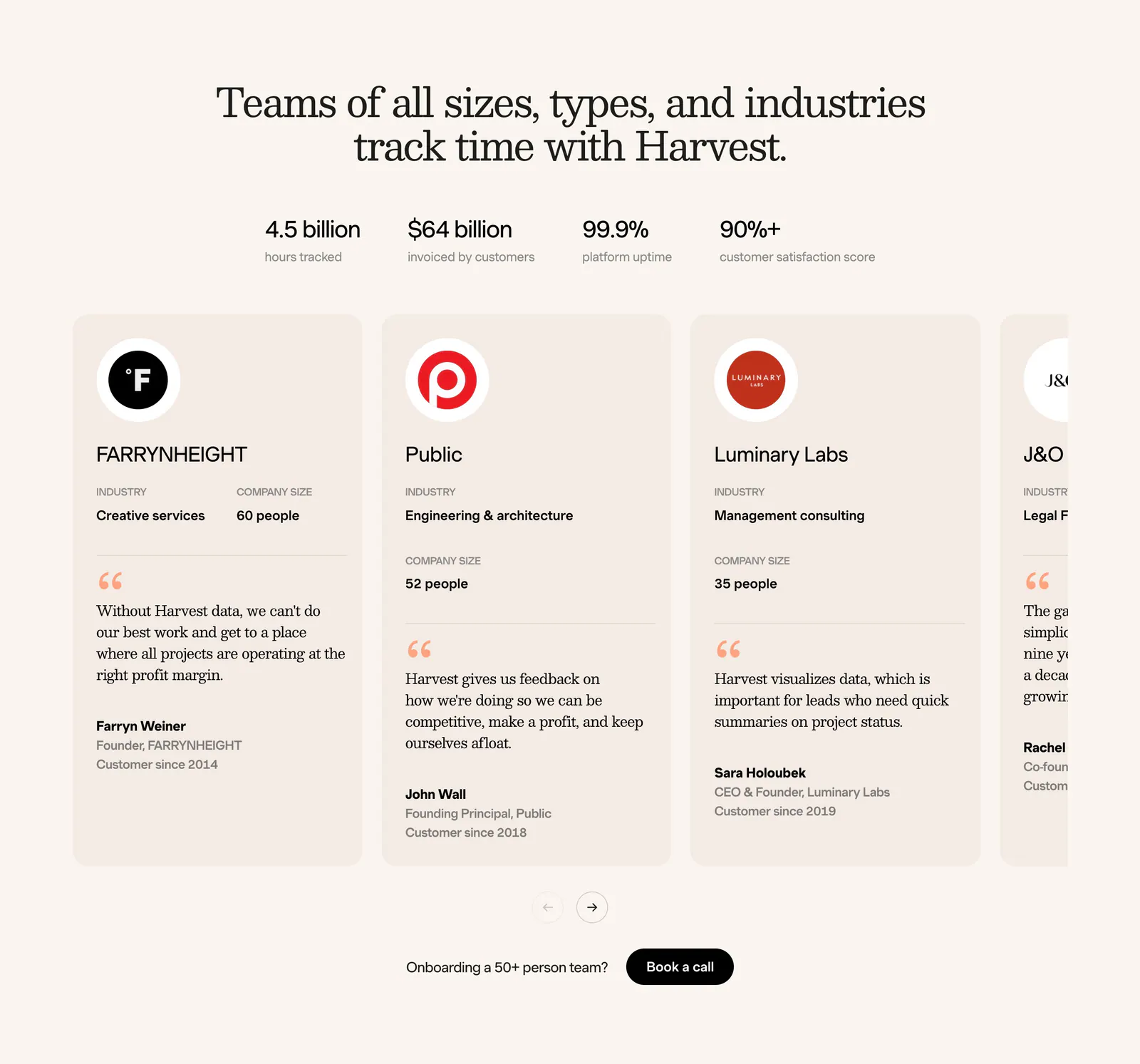
  84. Harvest footer section: serif headline, four stats and a carousel of customer testimonial cards with logos on a cream background
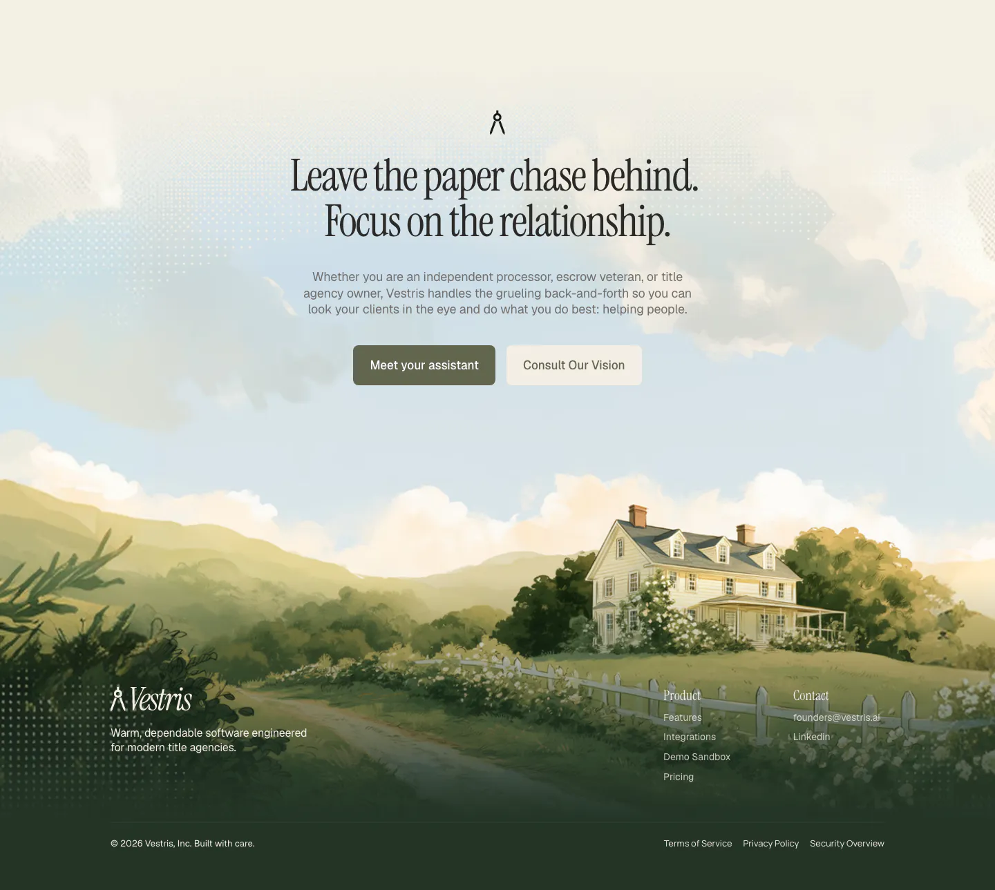
  85. Vestris call-to-action section: centered serif headline and two buttons over a painted countryside house scene that flows into the footer
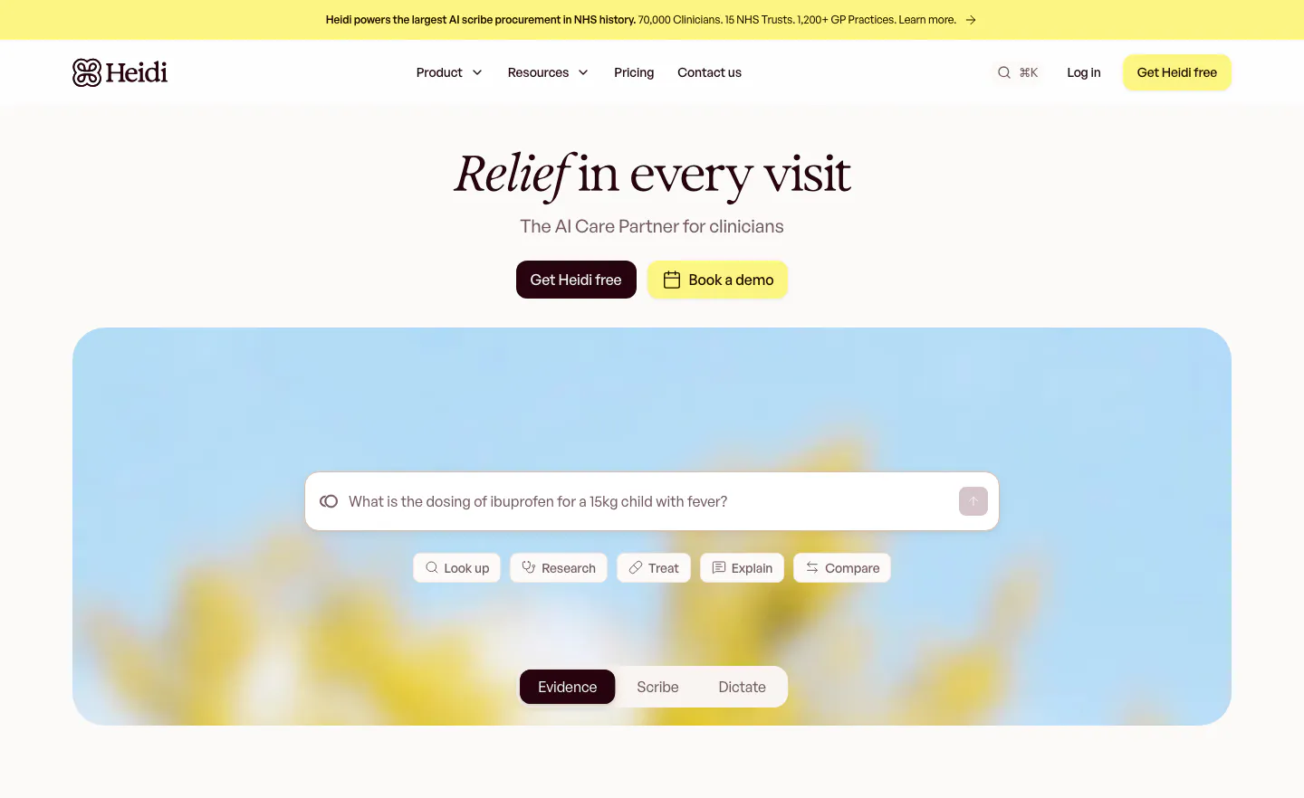
  86. Heidi hero section: centered serif headline with two buttons above a search prompt box and mode tabs on a blurred flower photo
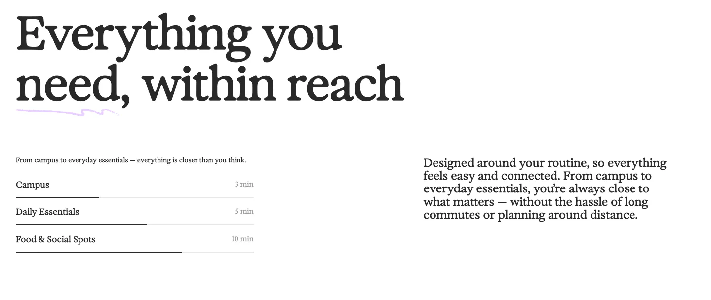
  87. 21Oaks value proposition section: oversized serif headline above a distance list with progress bars and a paragraph on the right
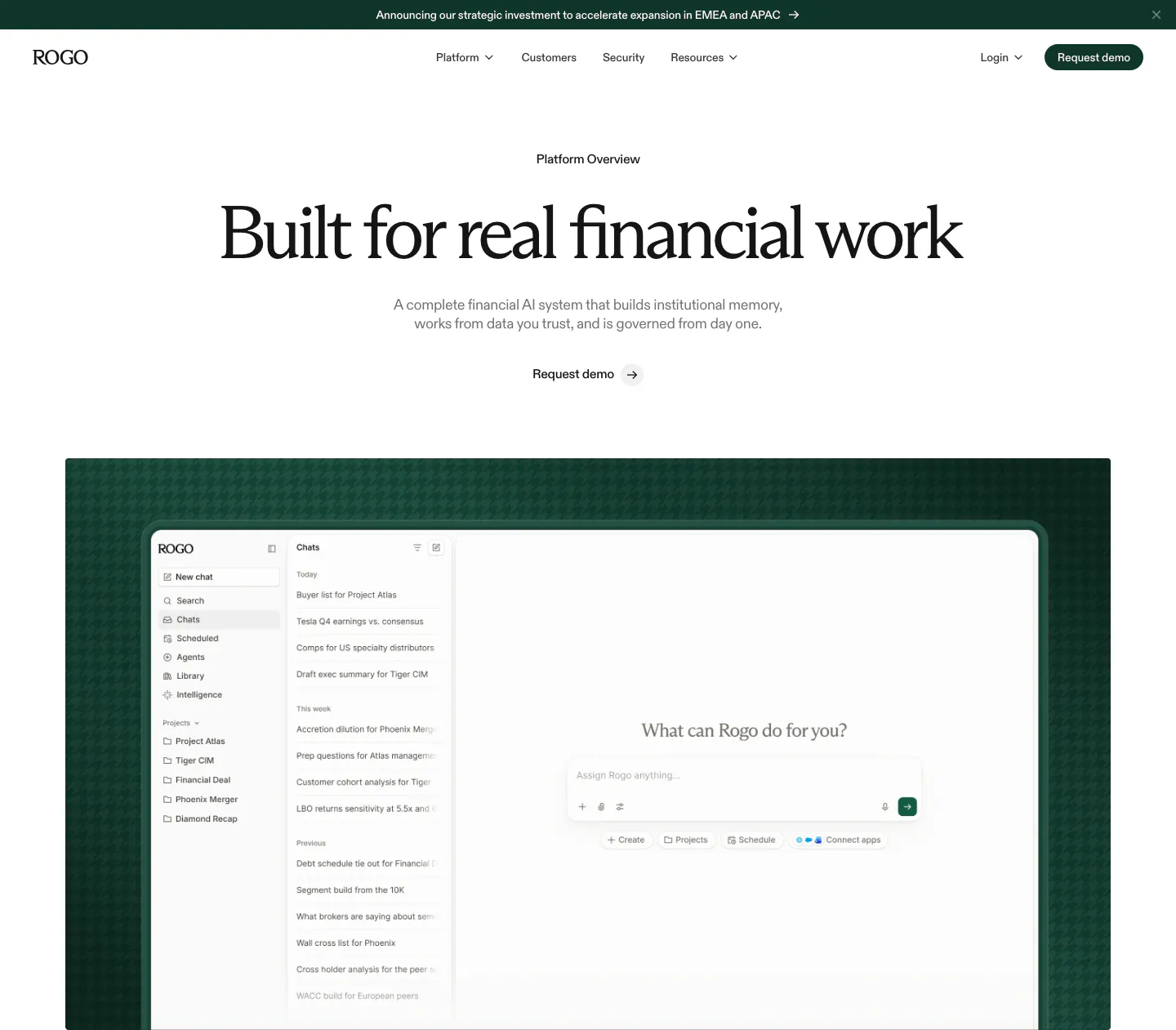
  88. Rogo hero section: announcement bar, nav, centered serif headline and demo link above a chat app screenshot on dark green
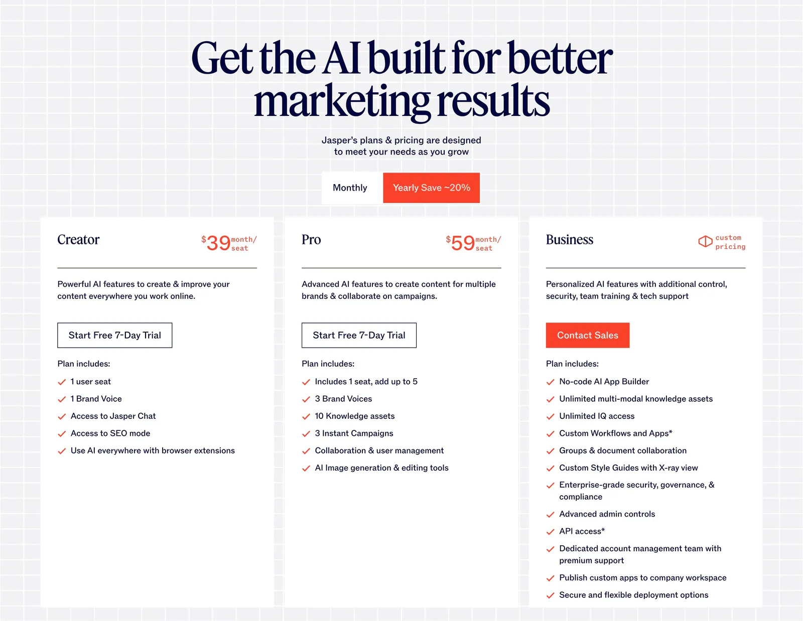
  89. Jasper pricing section: centered serif headline and monthly/yearly toggle above three white plan cards on a light grid background
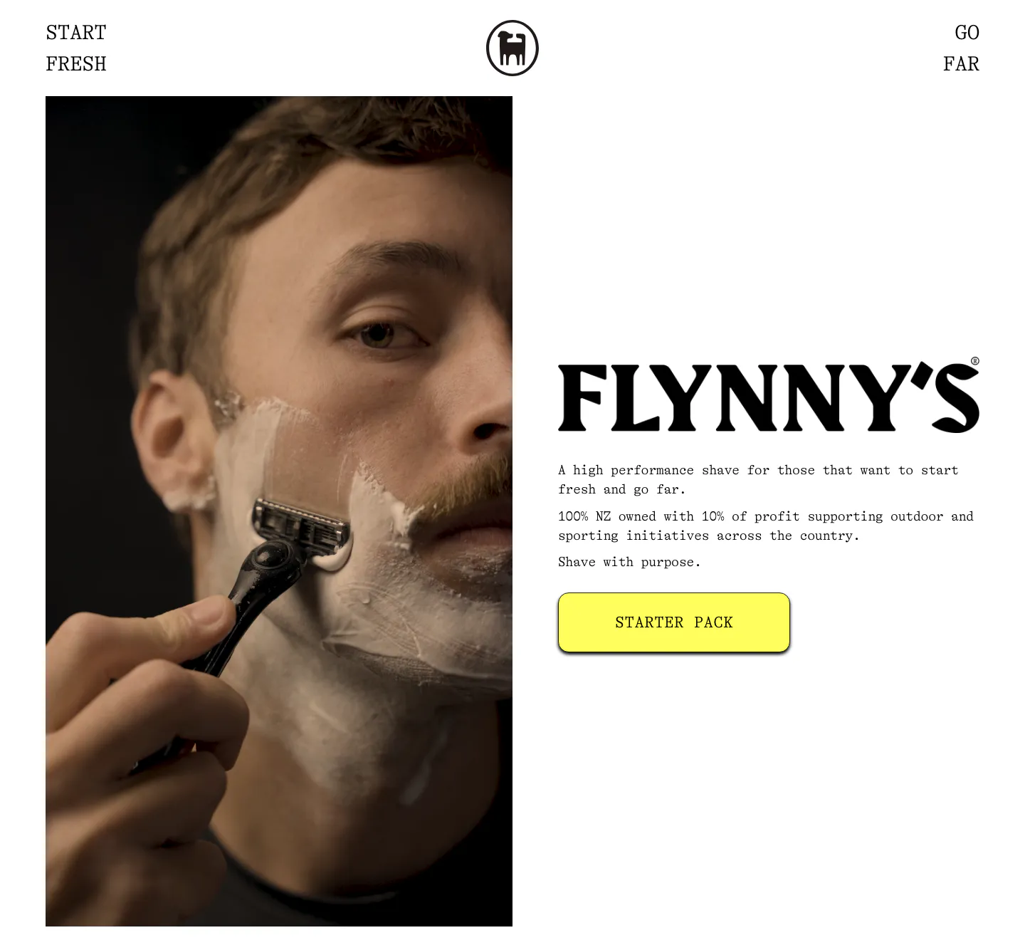
  90. Flynny's about & mission section: tall photo of a man shaving left, large serif wordmark, short brand copy and yellow Starter Pack button right
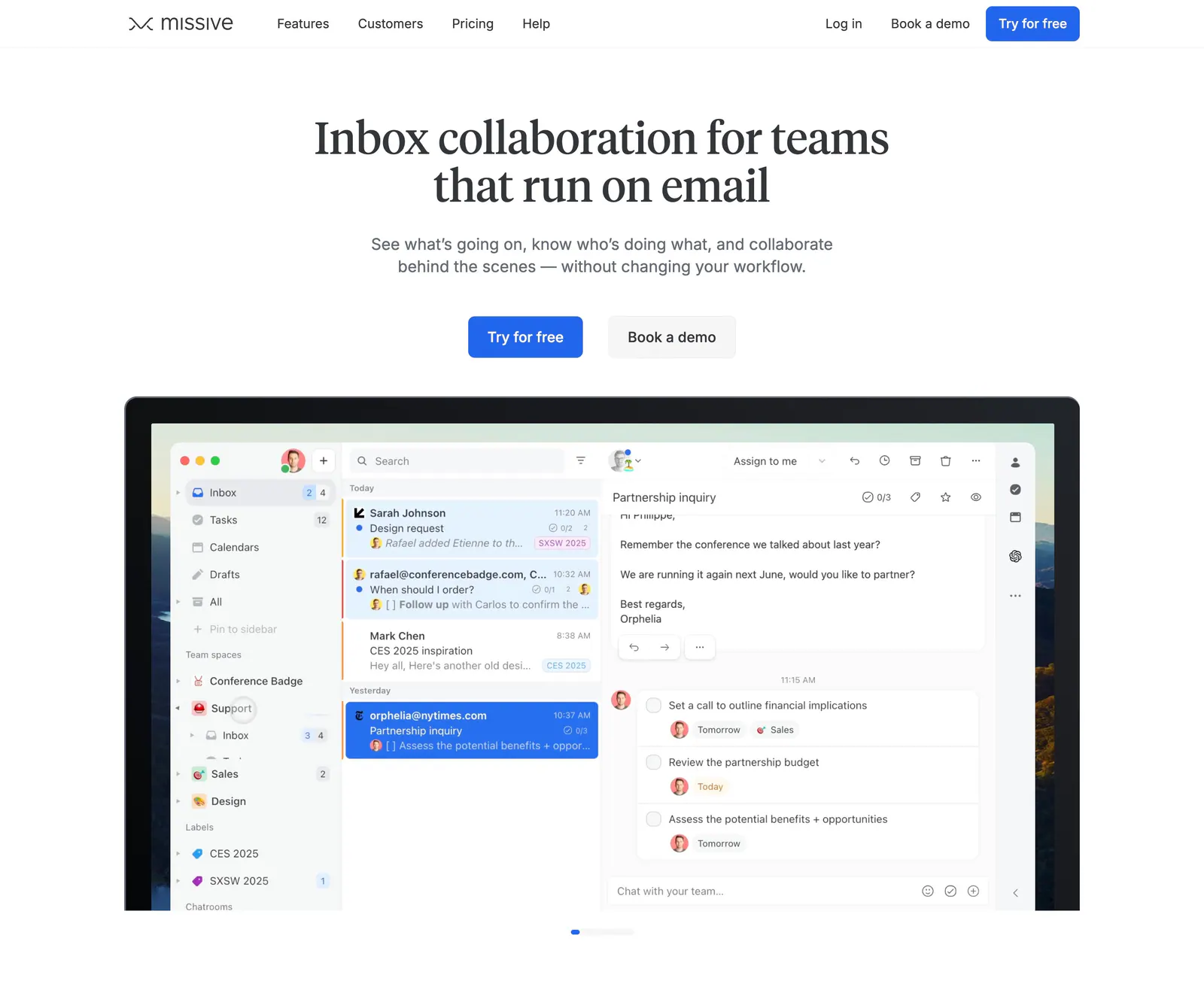
  91. Missive hero section: centered serif headline and two CTAs above a laptop-framed shared inbox app screenshot on white
  92. Cluster footer section: logo and copyright left, link columns right over a giant faded serif Cluster wordmark on beige
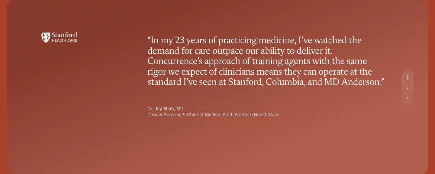
  93. Concurrence testimonials section: serif quote from a Stanford Health Care surgeon on a rust gradient card with vertical pagination dots
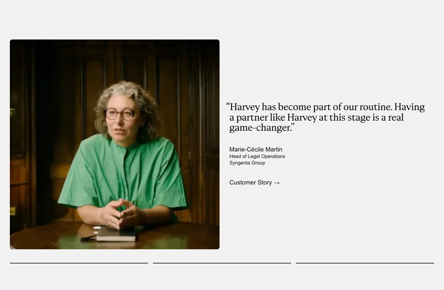
  94. Harvey testimonials section: photo of a customer at a table beside a serif quote with name and customer story link
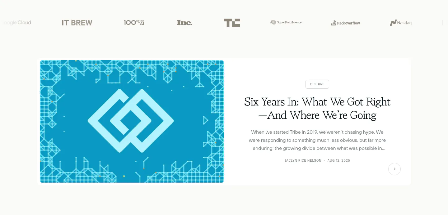
  95. Tribe AI blog & resources section: press logo row above a featured article card with a blue geometric cover left and serif title right
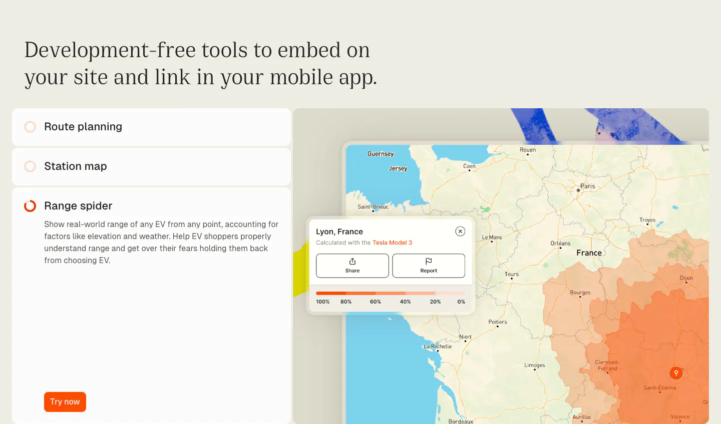
  96. Chargetrip features section: serif headline over an accordion list of embeddable tools beside a France map with an EV range overlay
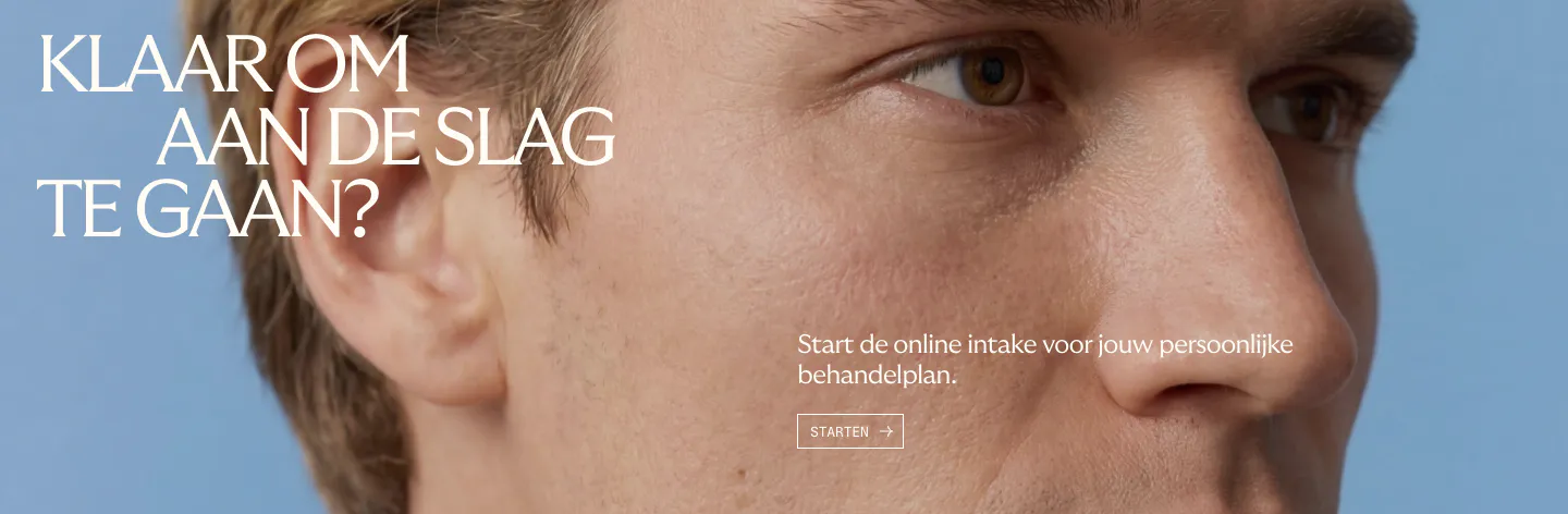
  97. Menkind call-to-action section: white serif headline and start button over a full-bleed close-up face photo on blue
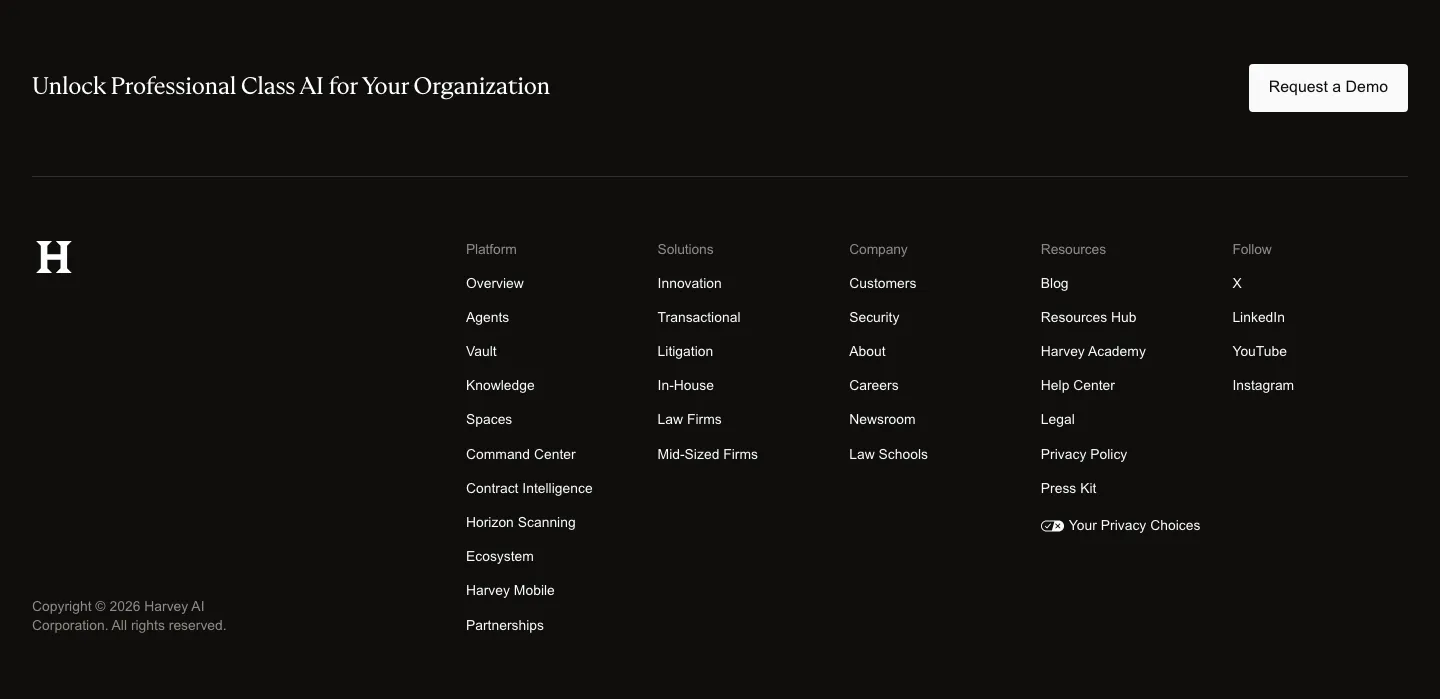
  98. Harvey footer section: dark band with serif closing line and demo button above an H logo and five link columns
  99. Ferndesk hero section: serif headline, checklist and CTAs on the left beside an AI chat prompt over a pixel-art garden scene
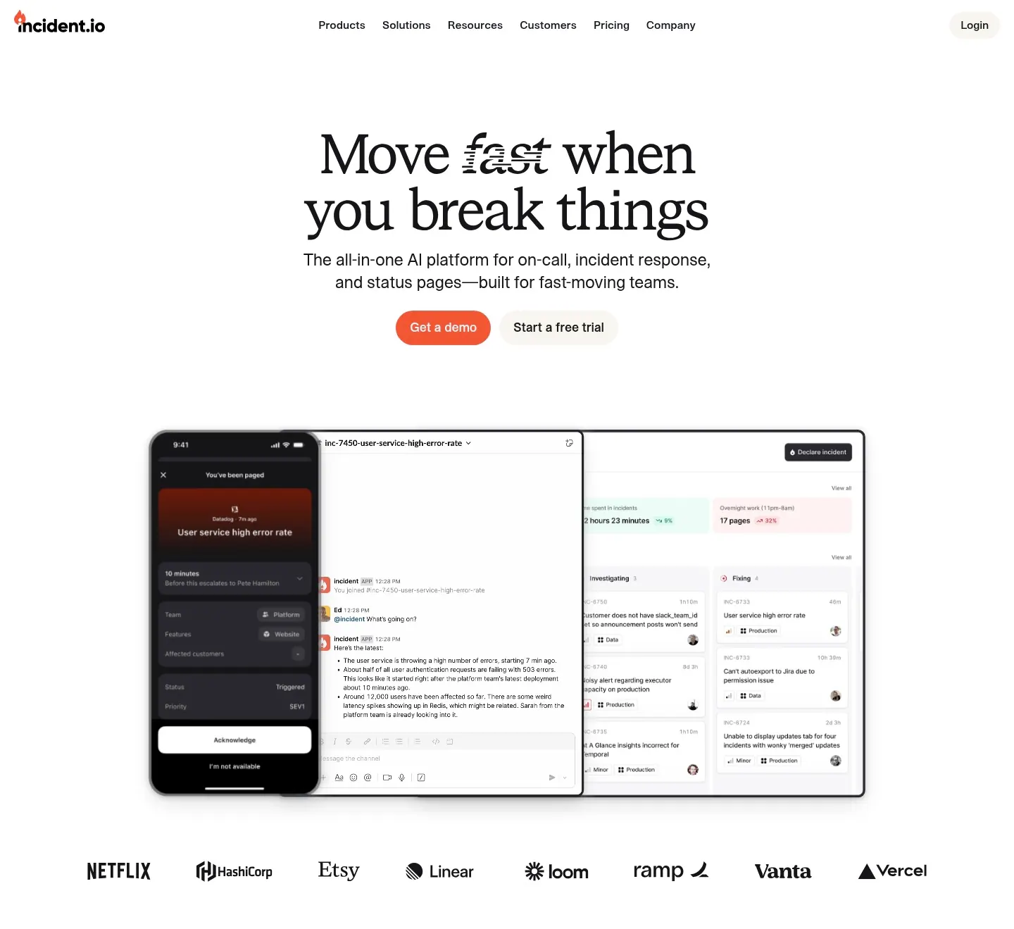
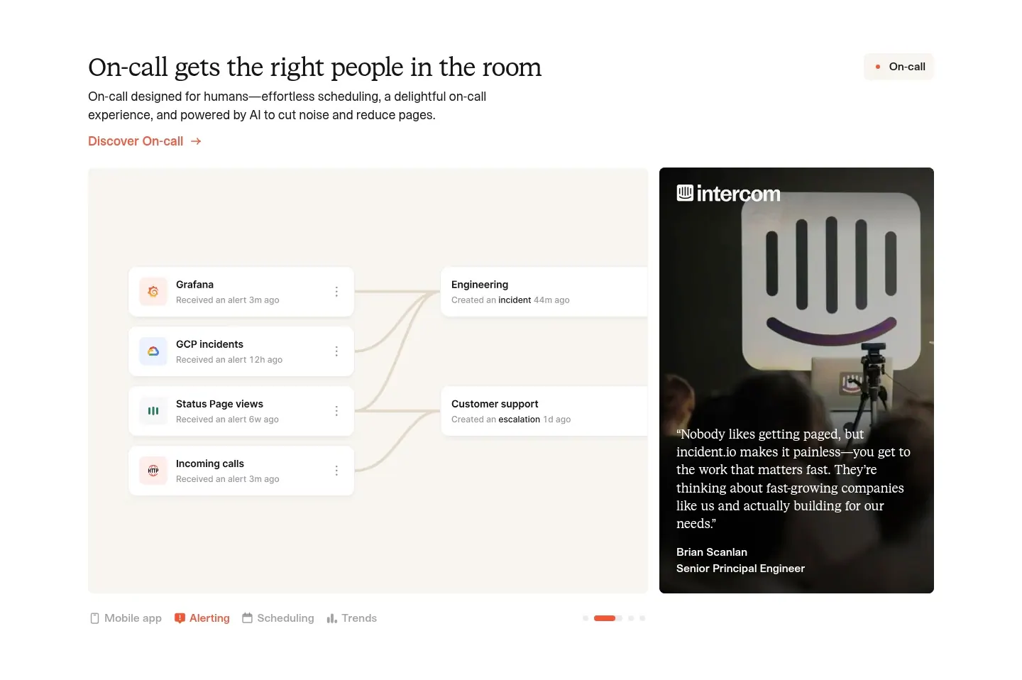
  100. incident.io hero section: serif centered headline and orange CTA above mobile and desktop app screenshots and a customer logo row
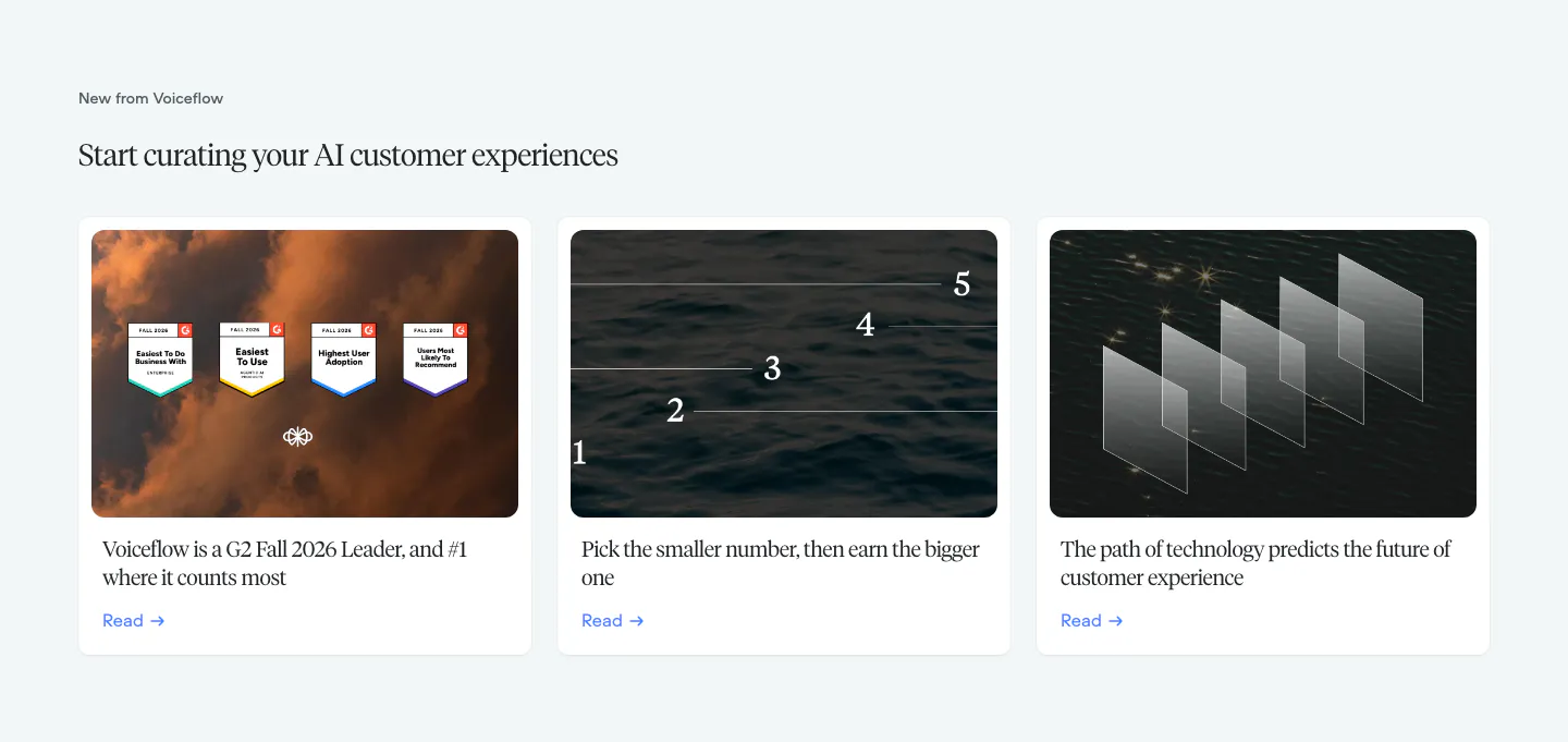
  101. Voiceflow blog & resources section: serif headline above three article cards with photographic thumbnails on a pale gray background
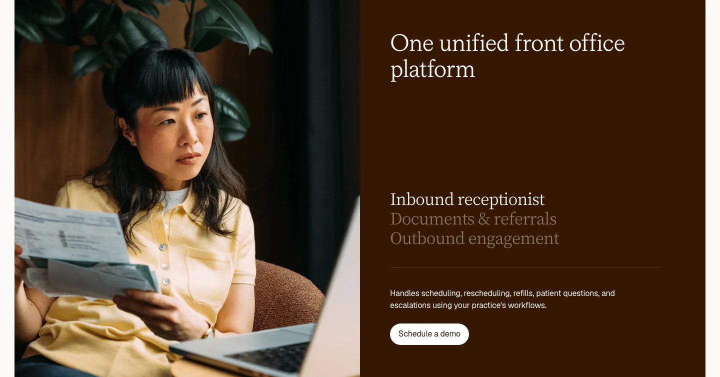
  102. Clarion features section: split card with a photo of a woman reviewing papers beside a dark brown panel with a serif tab list and button
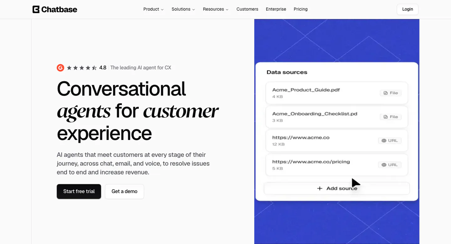
  103. Chatbase hero section: left headline with italic serif words and CTAs, right blue patterned panel with a data sources UI card
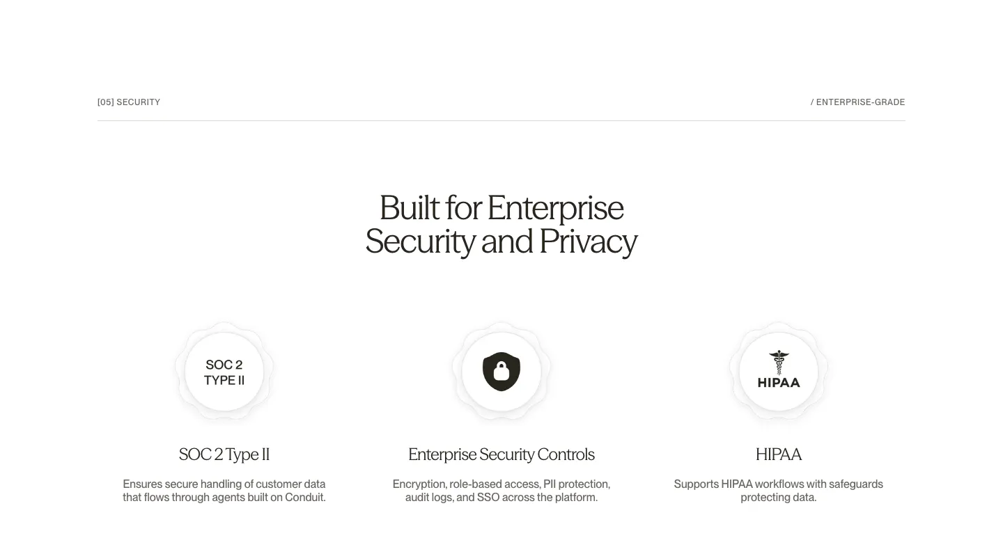
  104. Conduit security section: centered serif headline above SOC 2, security controls and HIPAA badge columns on white
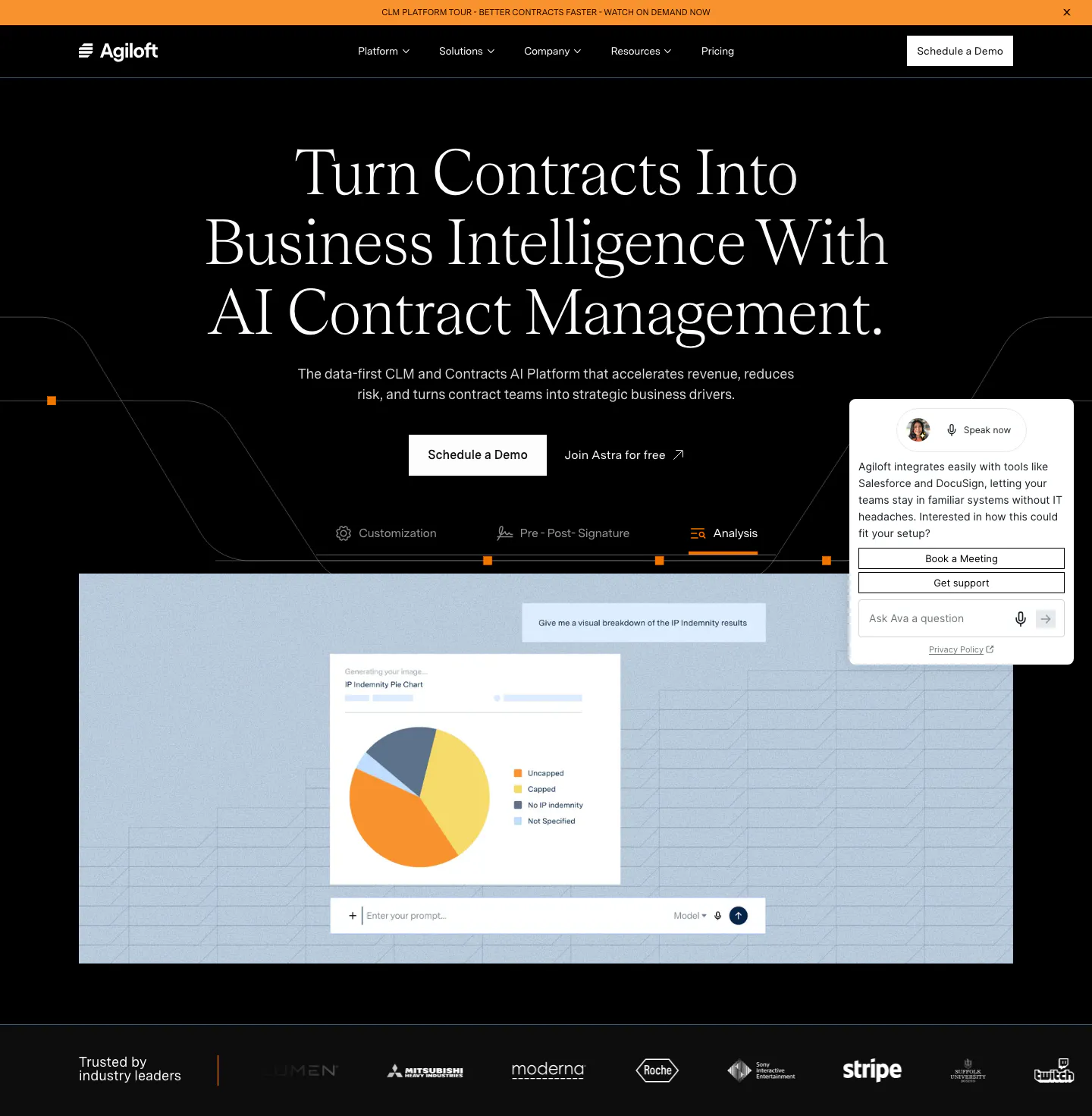
  105. Agiloft hero section: centered serif headline on black above feature tabs, a pie chart product screenshot and a customer logo strip
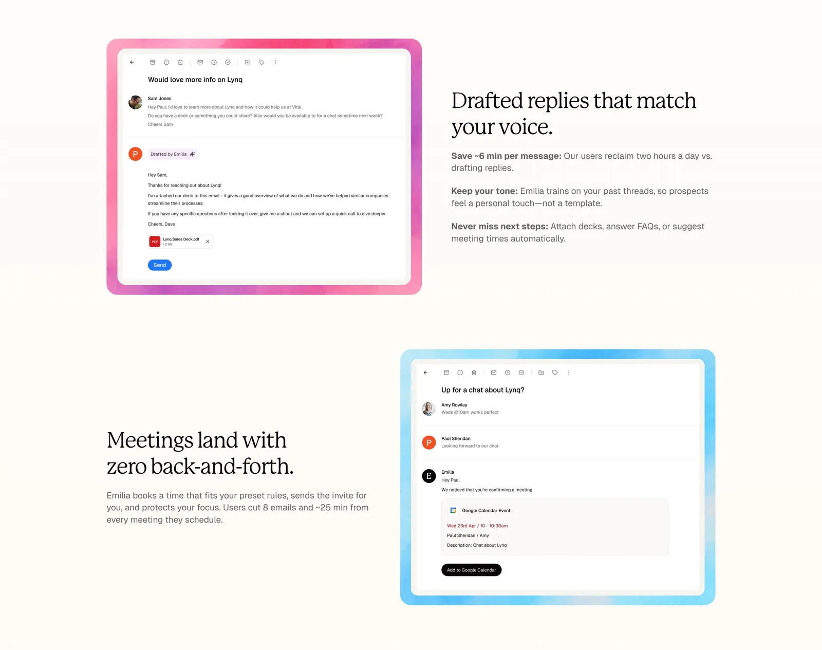
  106. Lynq features section: alternating rows of serif headlines and email UI screenshots in watercolor frames on a cream background
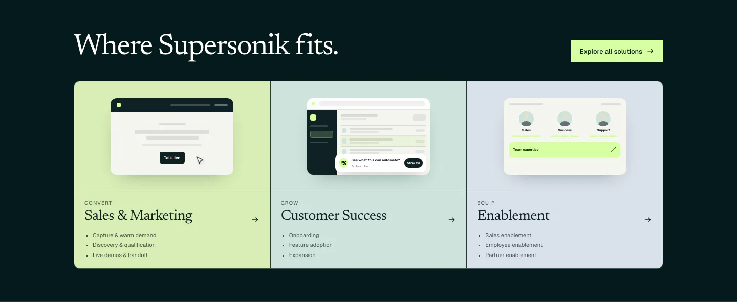
  107. Supersonik use cases section: serif headline over three pastel panels for sales, customer success and enablement with UI sketches
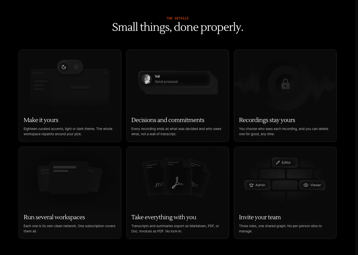
  108. Arke features section: centered serif headline above a three-by-two grid of dark cards with subtle UI vignettes and short descriptions
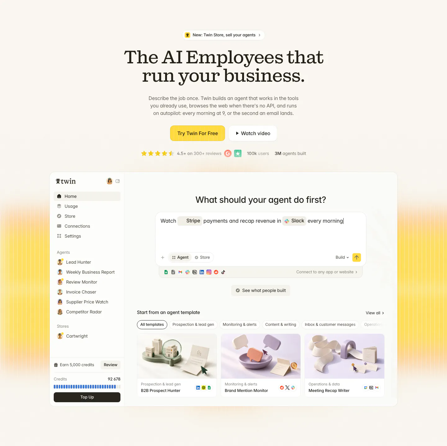
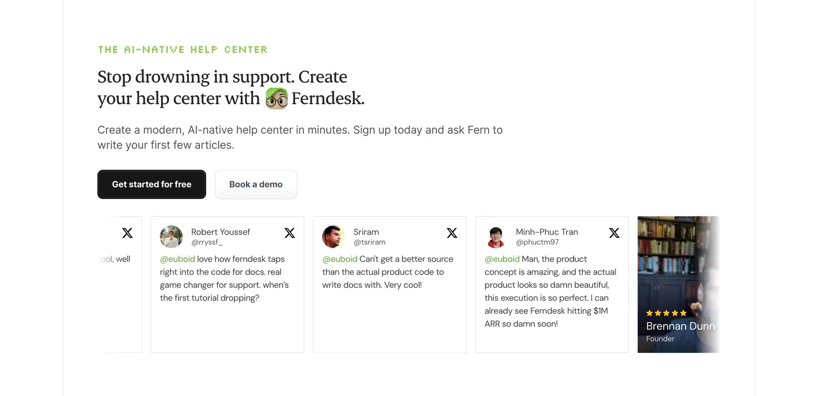
  109. Twin hero section: centered serif headline with yellow CTA and ratings above an agent builder app screenshot on cream with yellow glow
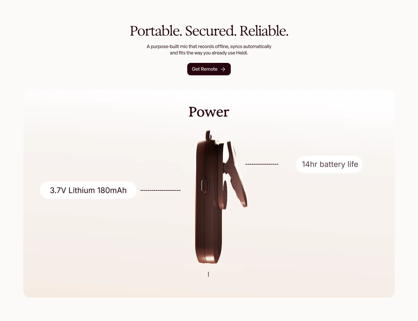
  110. Heidi features section: centered serif headline above a rendered side view of the clip-on mic with battery spec callouts
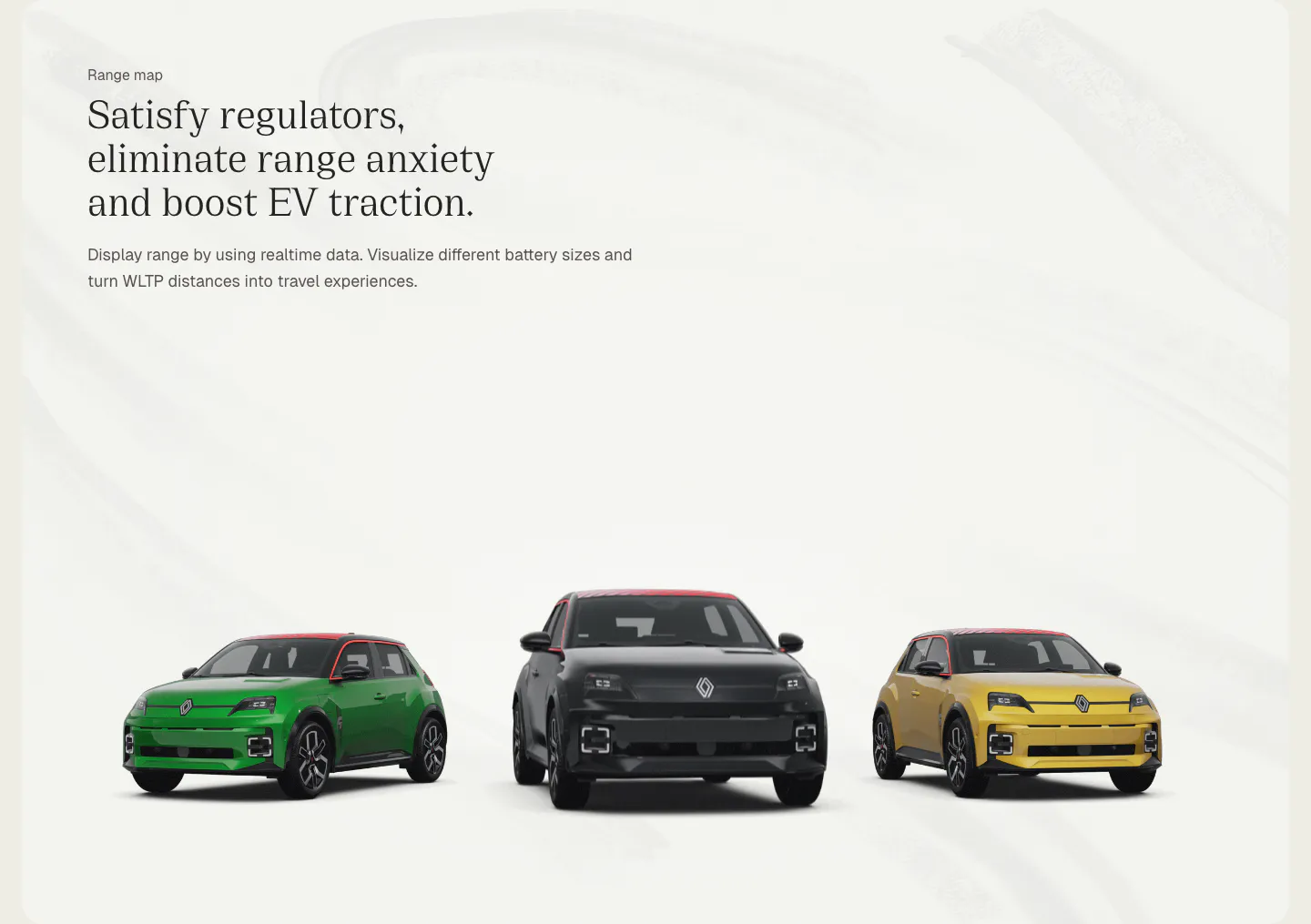
  111. Chargetrip features section: left-aligned serif headline above three Renault 5 electric cars in green, black and yellow on a light gray backdrop
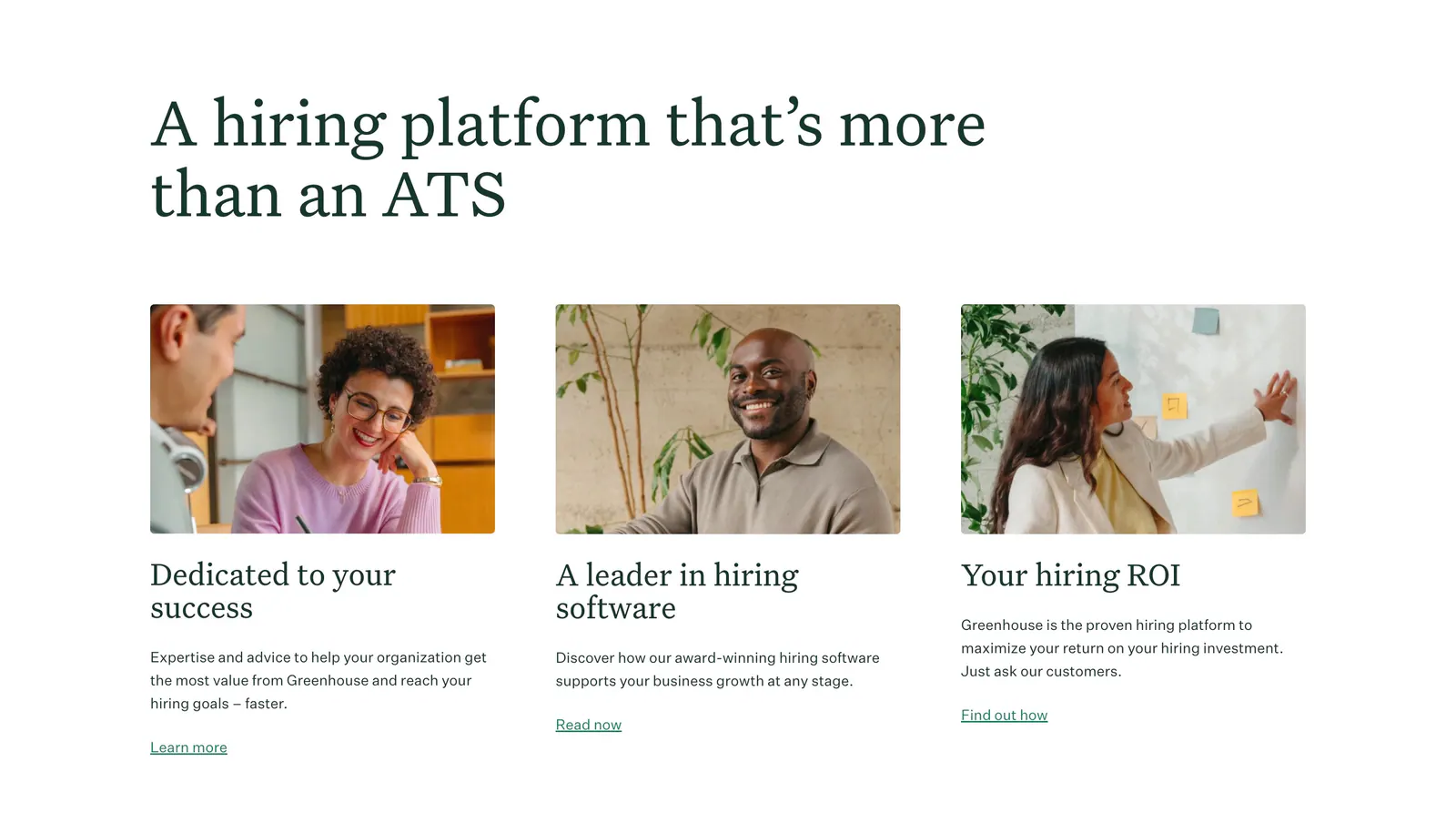
  112. Greenhouse features section: large serif headline above three cards with workplace photos, serif titles, copy and text links
  113. Ferndesk testimonials section: serif headline and two CTAs above a horizontally scrolling row of tweet cards on white
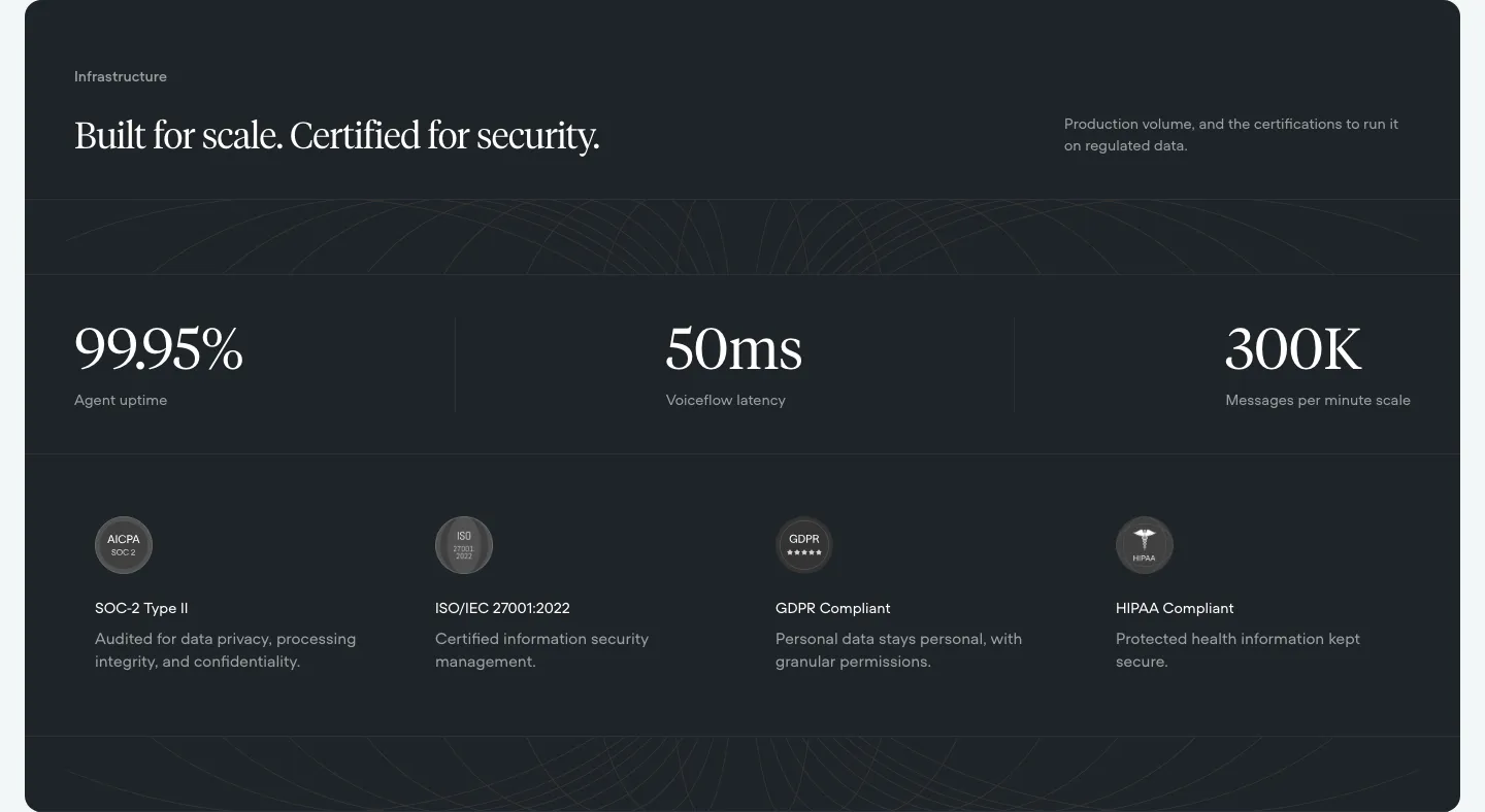
  114. Voiceflow security section: dark panel with serif headline, three large uptime and latency stats and four compliance badges
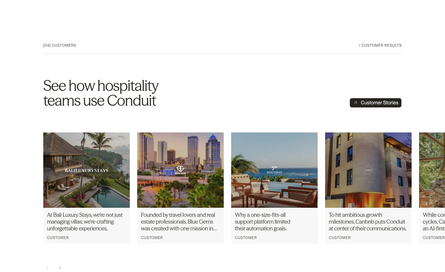
  115. Conduit testimonials section: serif headline above a carousel of customer story cards with hotel and resort photos
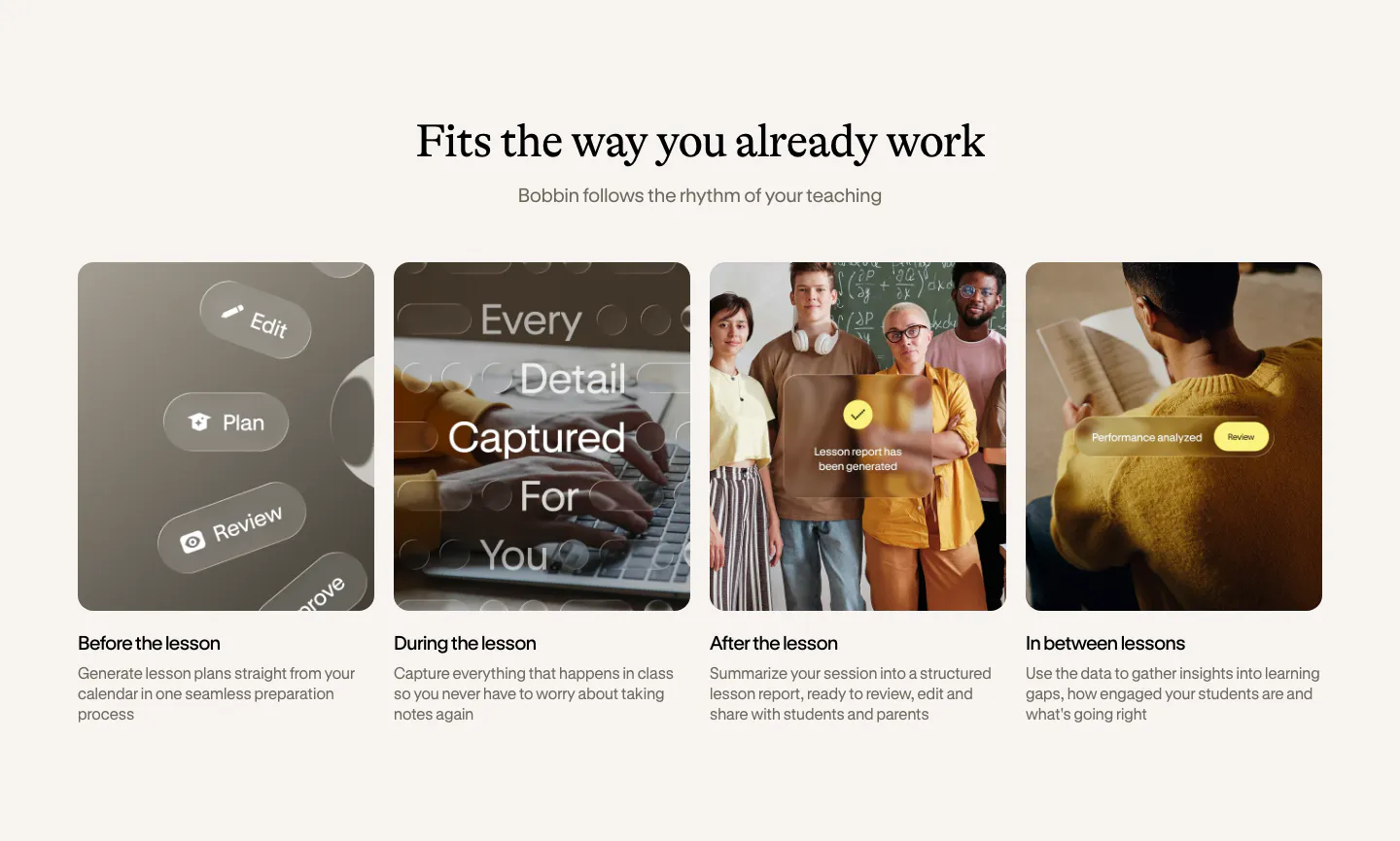
  116. Bobbin how it works section: serif heading above four equal photo cards for before, during, after and between lessons
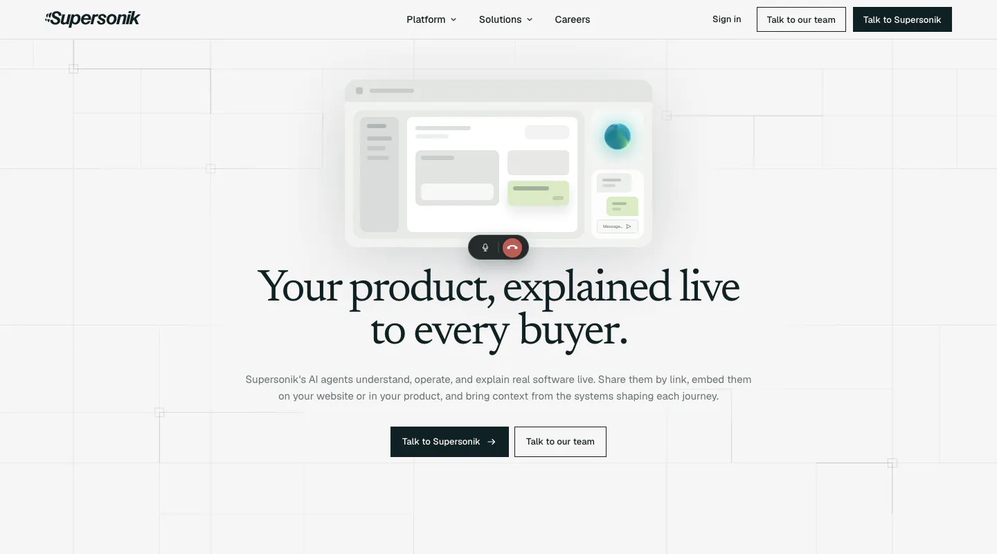
  117. Supersonik hero section: centered serif headline and two CTAs below a soft UI mockup with call controls on a light grid background
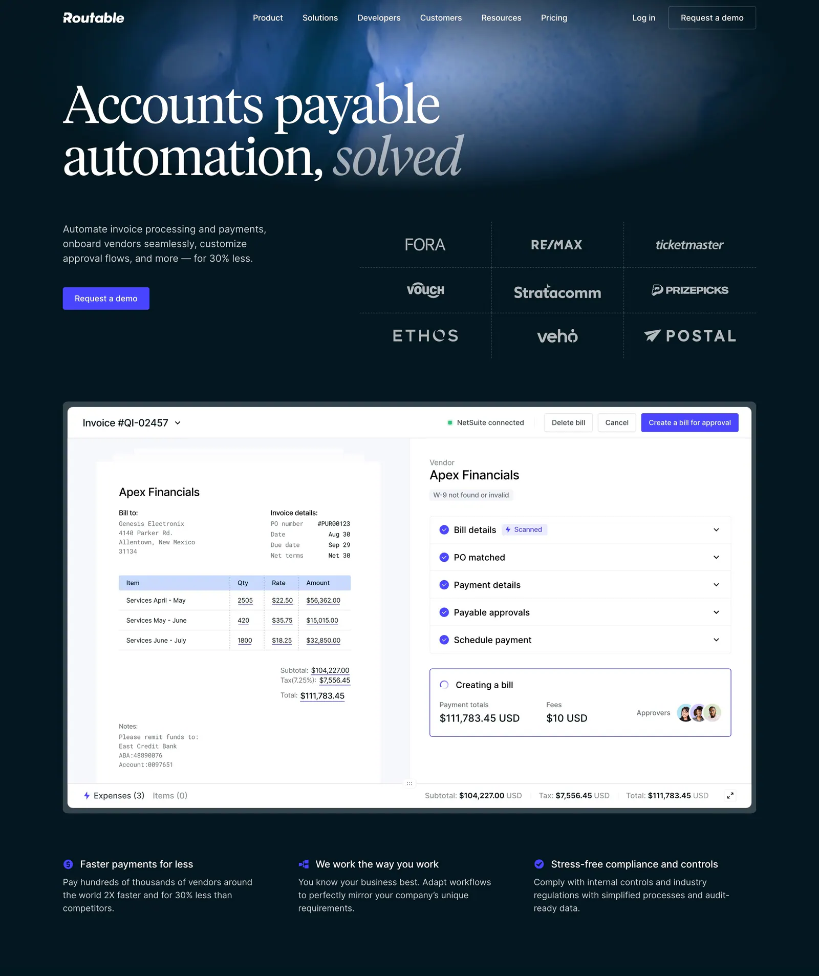
  118. Routable hero section: serif headline and demo button beside a customer logo grid, above an invoice approval screenshot on dark navy
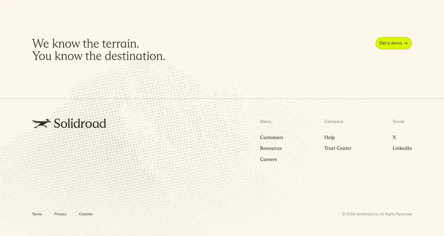
  119. Solidroad footer section: serif CTA headline and lime button above logo and link columns on cream with a faint halftone dot texture
  120. Cluster call-to-action section: centered serif headline and dark pill button on a beige panel framed by dark edges
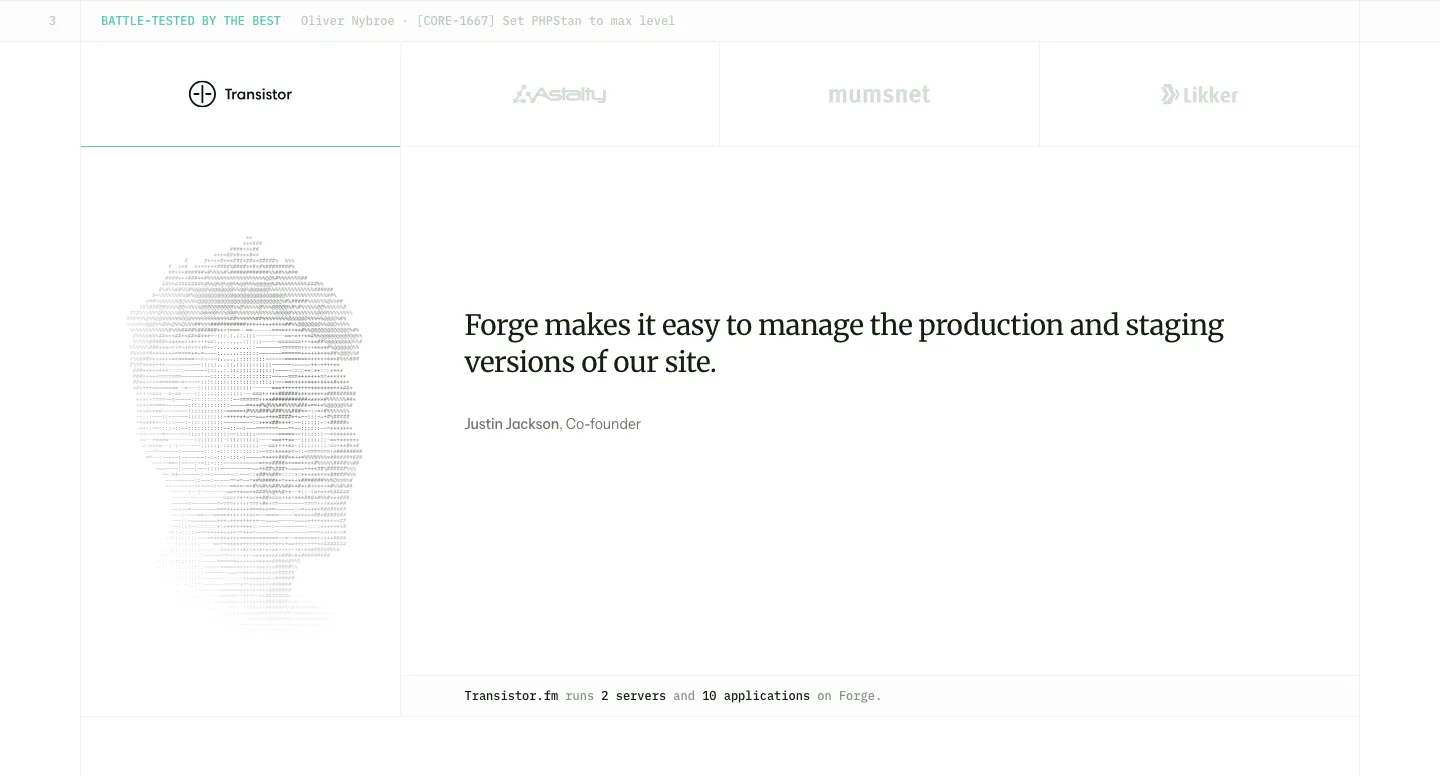
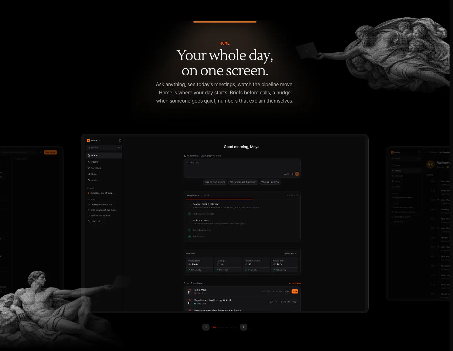
  121. Laravel Forge testimonials section: customer logo tabs above a serif quote with an ASCII-art portrait on the left
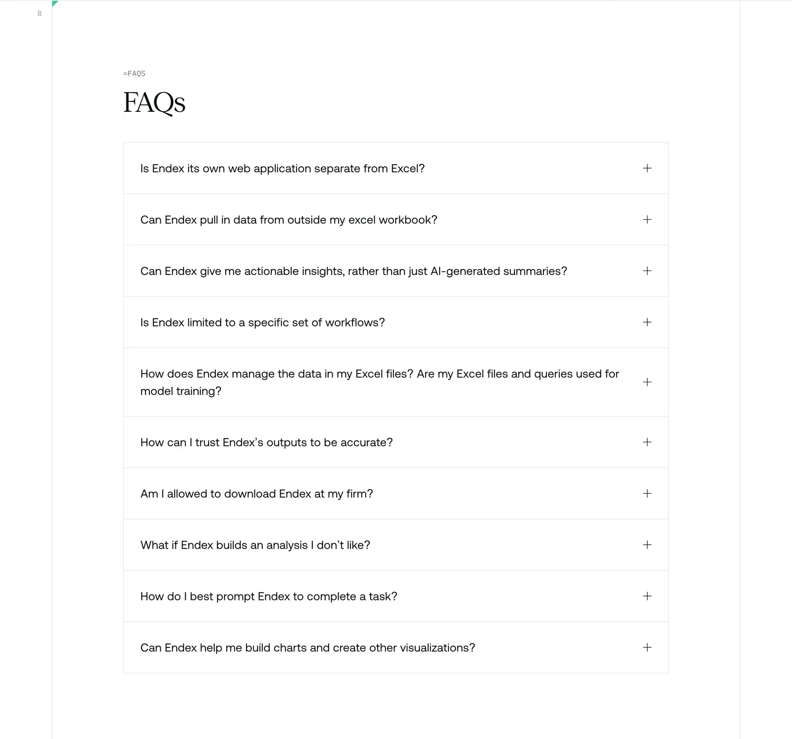
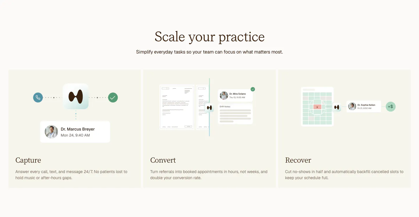
  122. Endex FAQ section: serif FAQs heading above a bordered accordion list of ten questions with plus icons on white
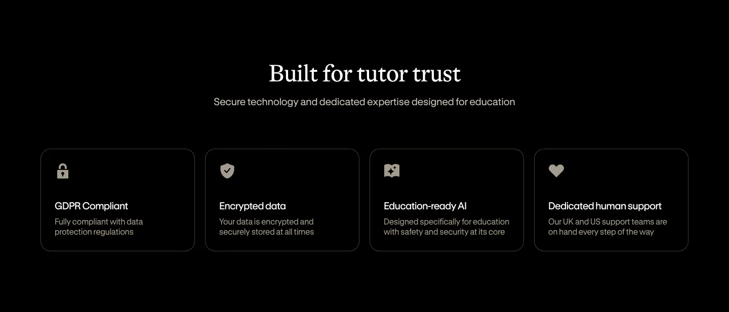
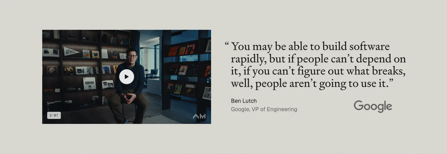
  123. Bobbin security section: centered serif heading above four outlined cards for GDPR, encryption, AI and support on black
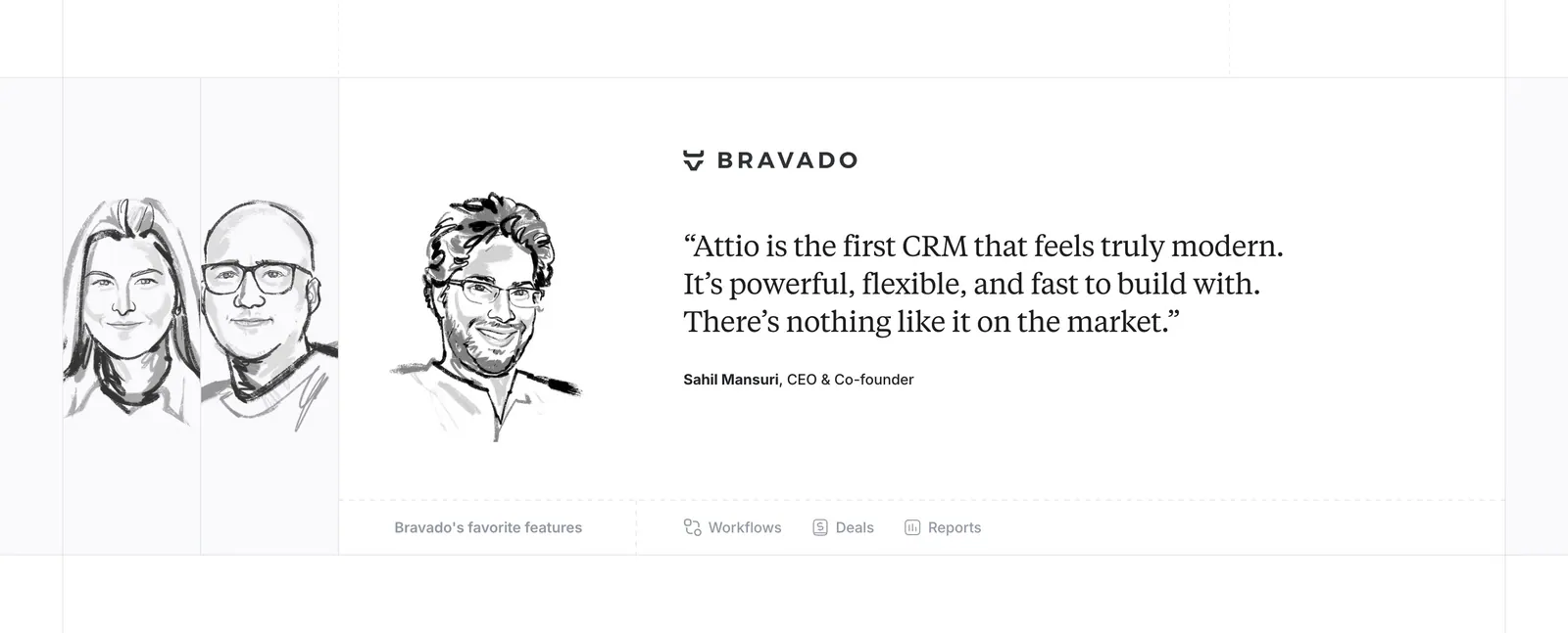
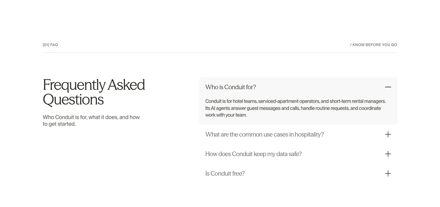
  124. Attio testimonials section: hand-drawn grayscale portrait sketches beside a serif customer quote with company logo and feature links
  125. Arke features section: centered serif headline above a dark dashboard screenshot carousel framed by halftone Renaissance figures
  126. Clarion features section: centered serif headline above three cream cards for Capture, Convert and Recover with light UI mockups
  127. Antimetal testimonials section: video thumbnail of a speaker at left, large serif quote from a Google VP with Google logo at right
  128. Conduit FAQ section: serif heading on the left beside an accordion with the first answer expanded on white
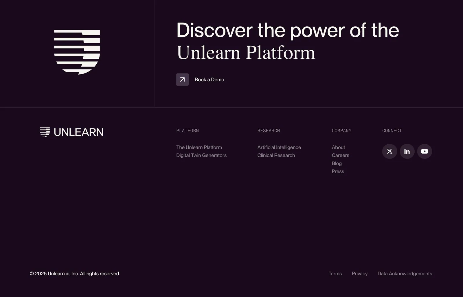
  129. Unlearn footer section: logo mark and mixed sans/serif CTA headline with demo link above link columns and social icons on dark plum
    Unlearn Footer
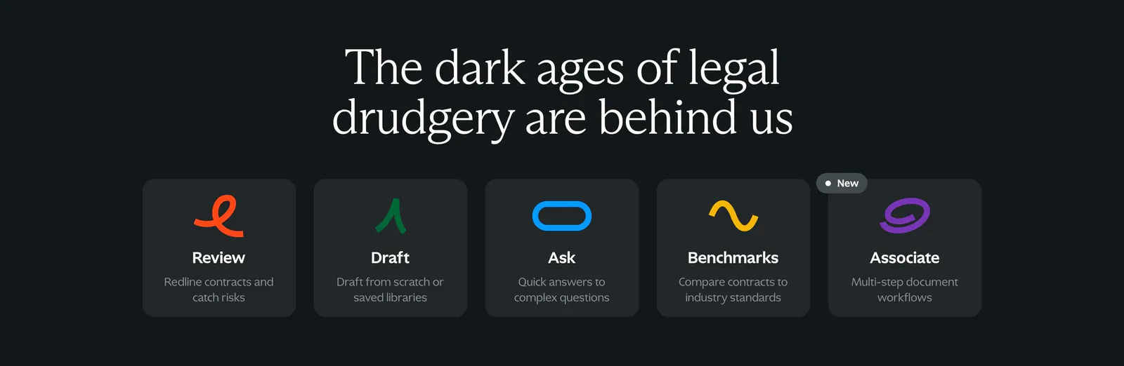
  130. Spellbook features section: centered serif headline above five equal dark cards with colorful squiggle icons on a charcoal background
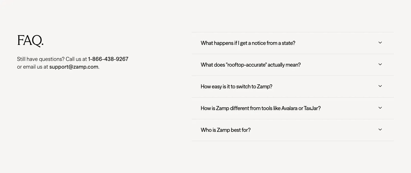
  131. Zamp FAQ section: serif FAQ heading with contact details on the left and an accordion of five questions on the right
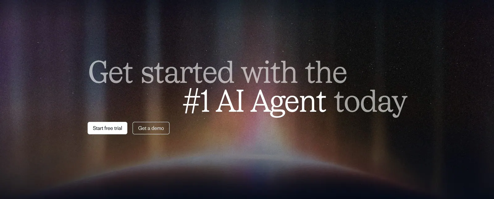
  132. Fin call-to-action section: two-tone serif headline with trial and demo buttons over a glowing aurora on a dark background
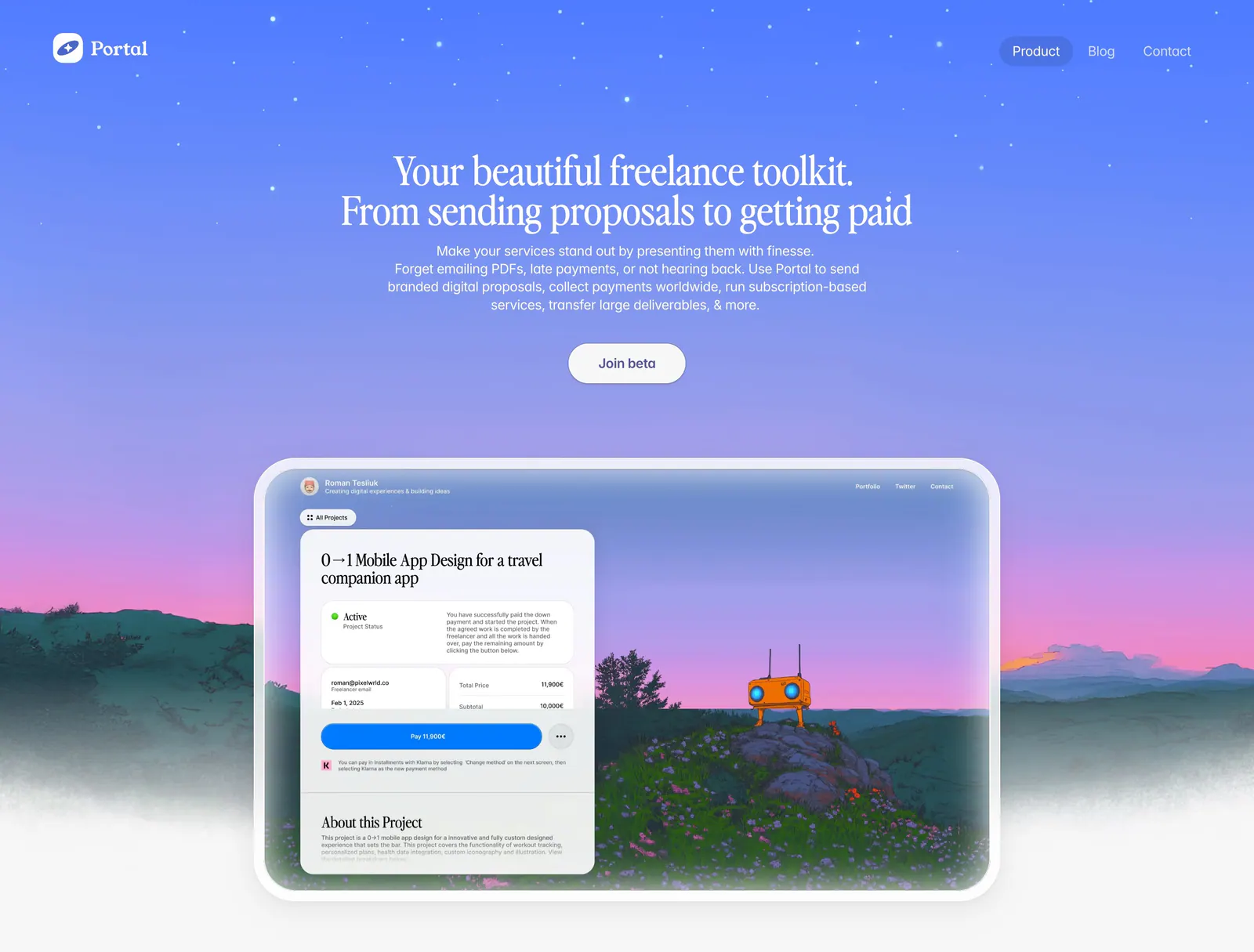
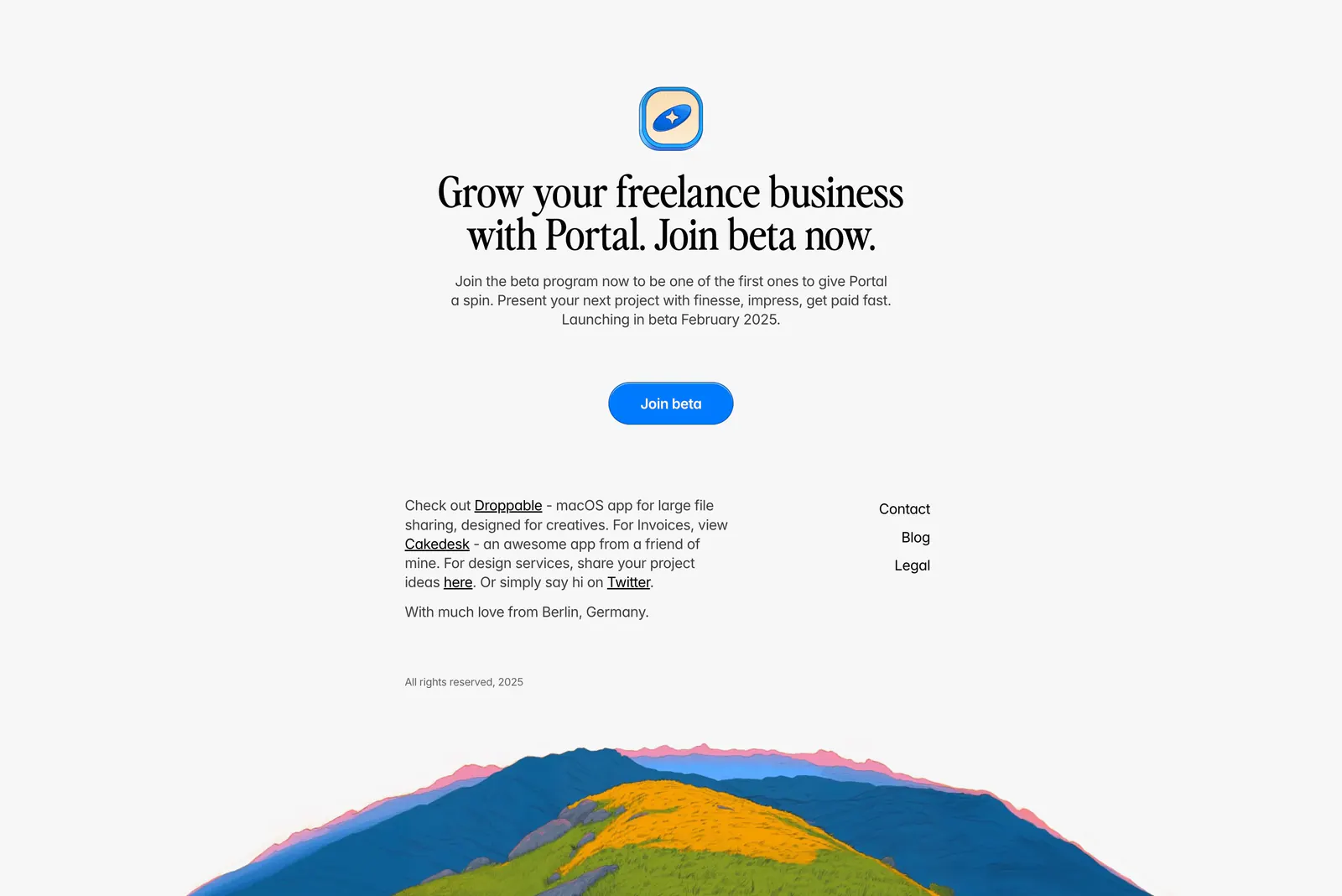
  133. Portal hero section: centered serif headline on a blue-to-purple sky gradient above a proposal UI framed in a painted landscape
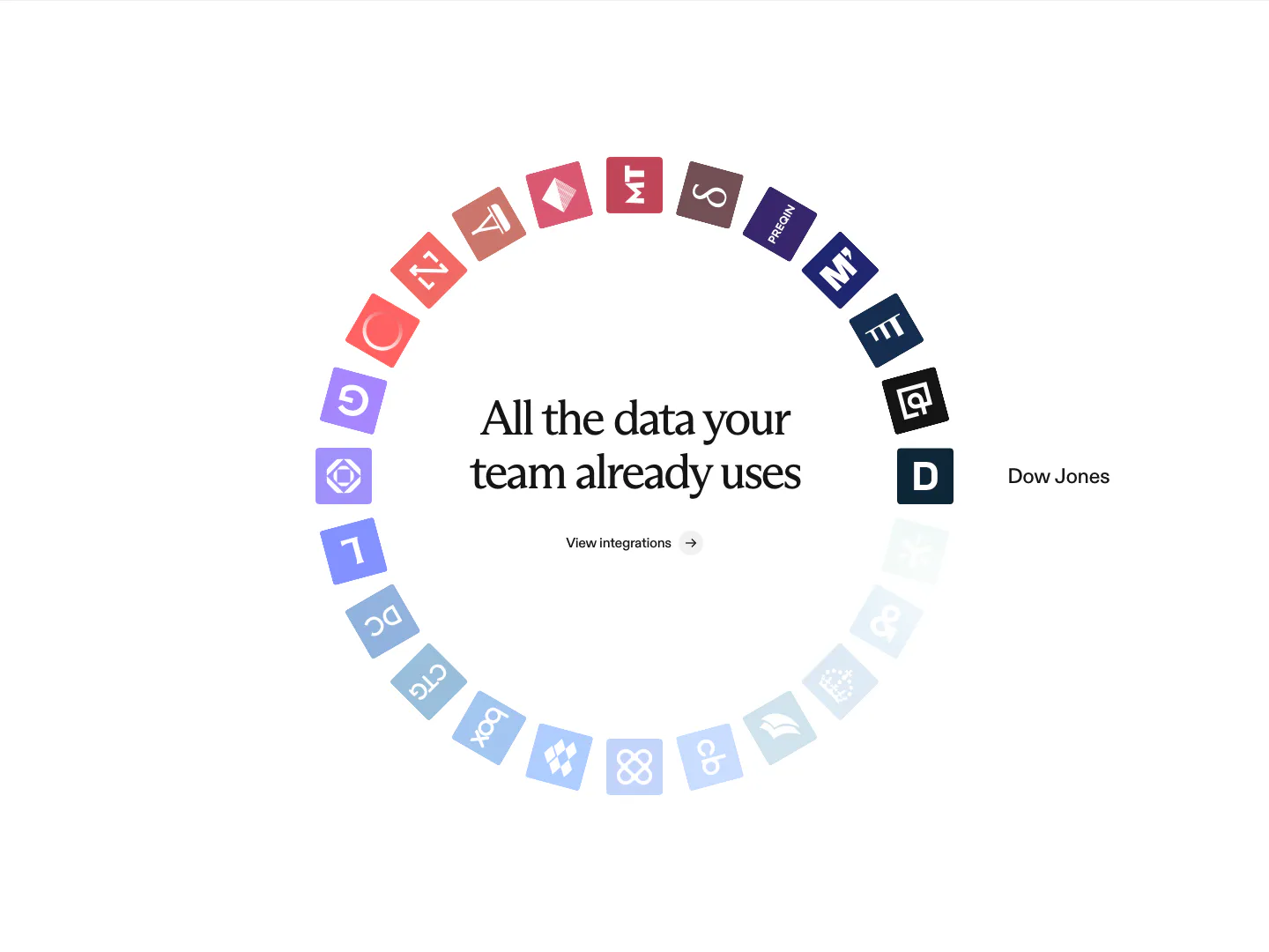
  134. Rogo integrations section: centered serif headline inside a ring of colored data provider app icons fading to light blue
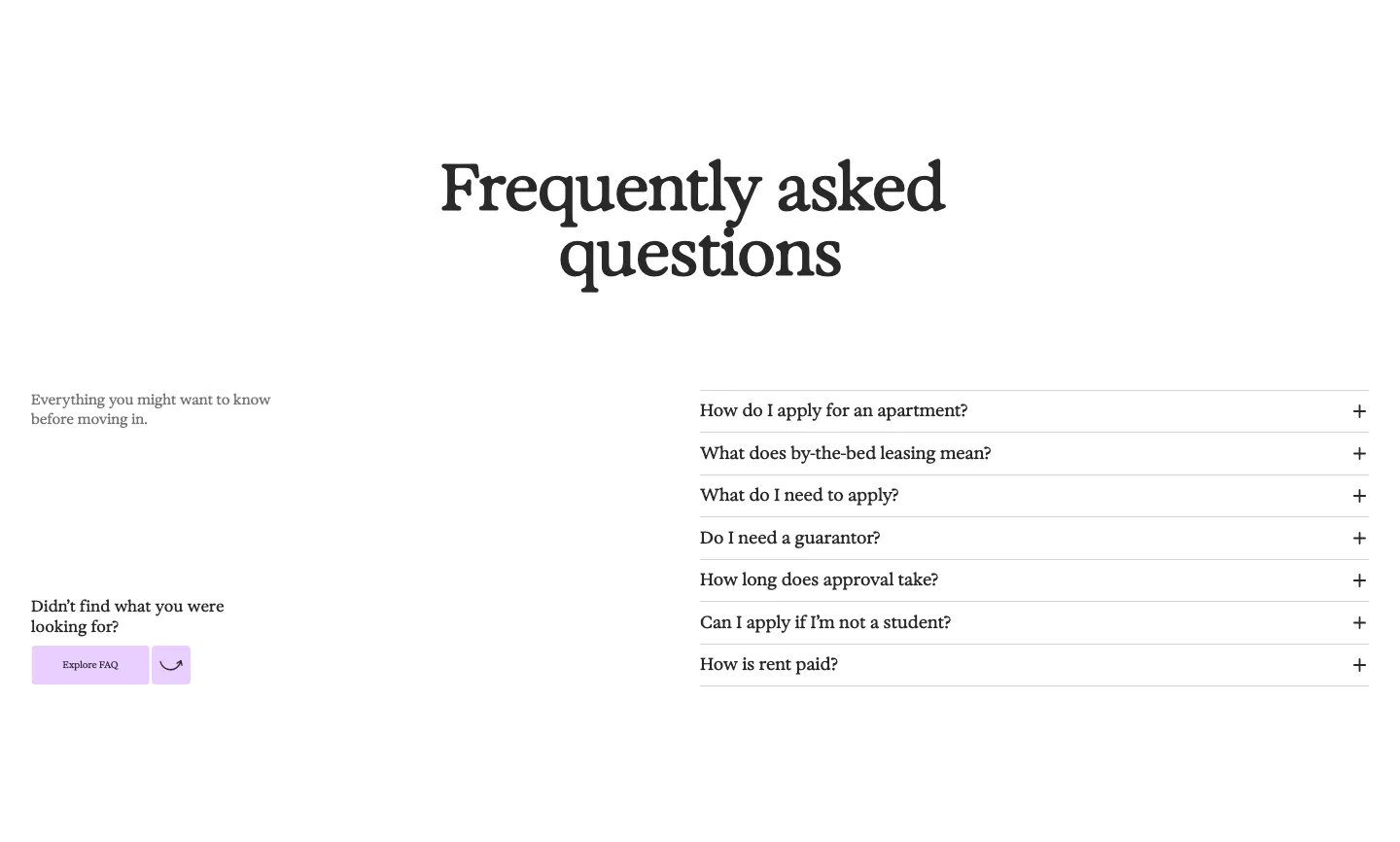
  135. 21Oaks FAQ section: centered serif heading, intro and button on the left, accordion question list on the right on white
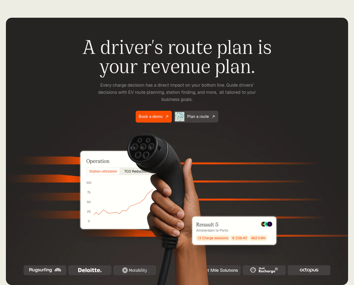
  136. Chargetrip hero section: centered serif headline above a hand holding an EV charger, floating UI cards and a logo strip on a dark panel
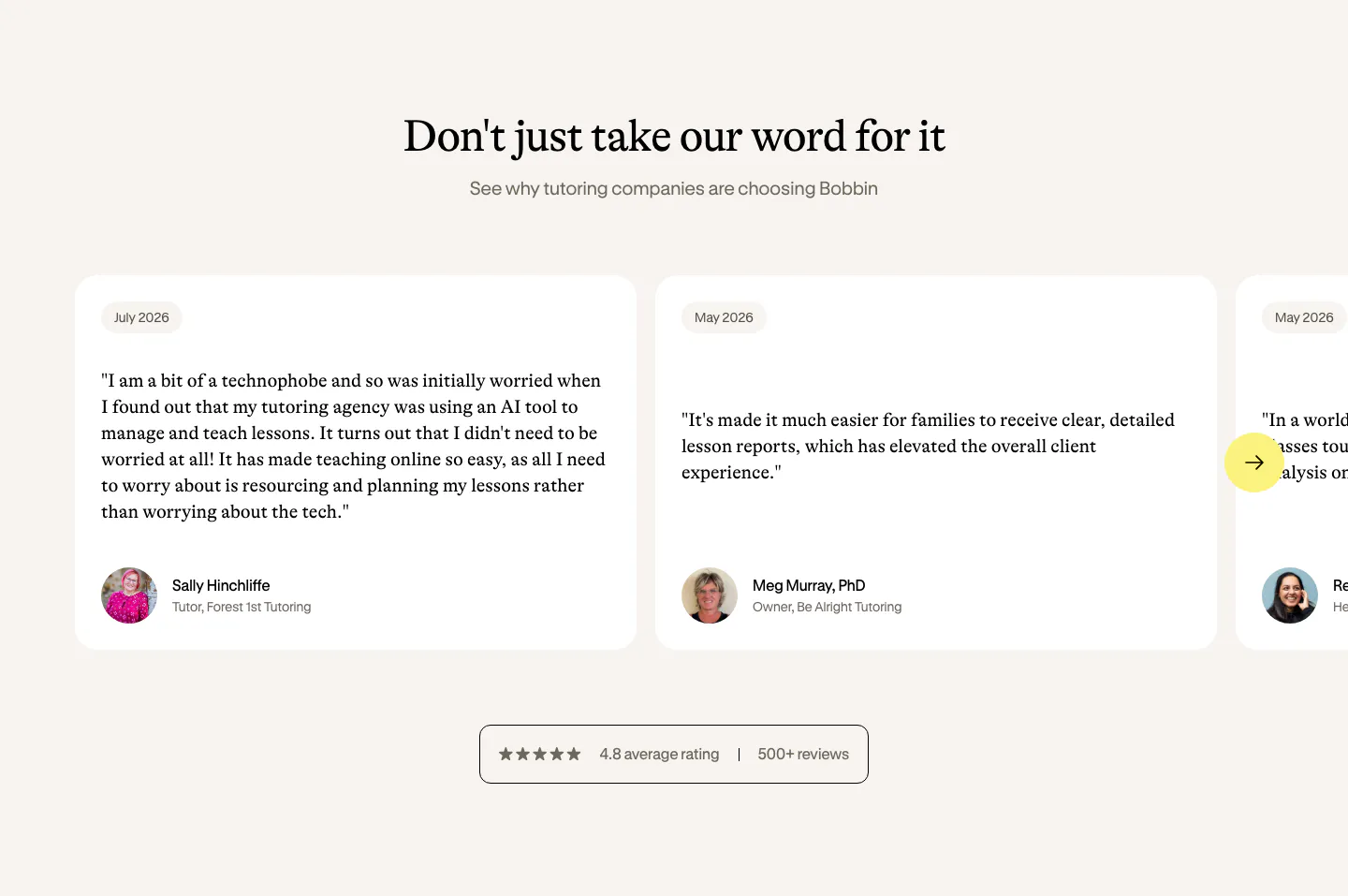
  137. Bobbin testimonials section: serif heading above a carousel of white quote cards with avatars and a rating badge on cream
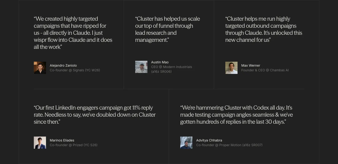
  138. Cluster testimonials section: grid of five serif customer quotes with small avatar photos and titles on a charcoal background
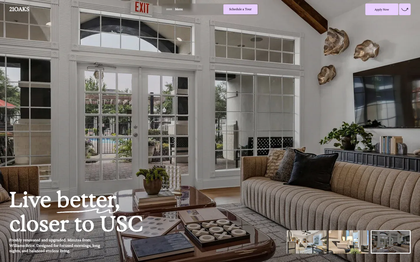
  139. 21Oaks hero section: full-bleed living room photo with serif headline bottom-left, lavender nav buttons and gallery thumbnails
  140. Greenhouse testimonials section: serif heading and customer stories button on the left, two-column grid of customer logos on the right
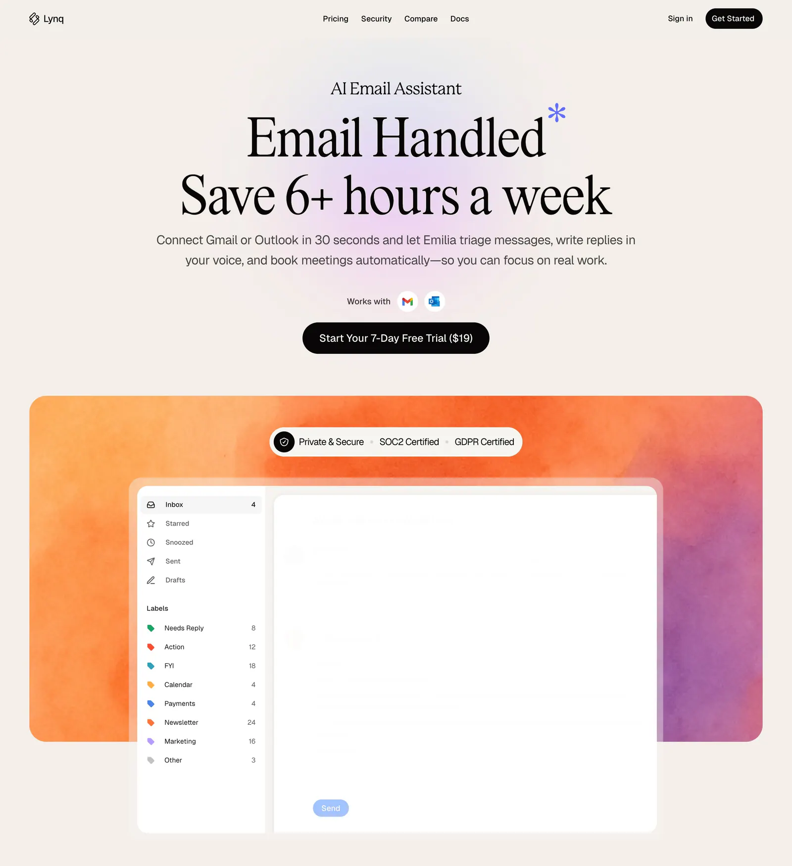
  141. Lynq hero section: centered serif headline and CTA on cream above an inbox UI mockup on an orange-purple watercolor panel
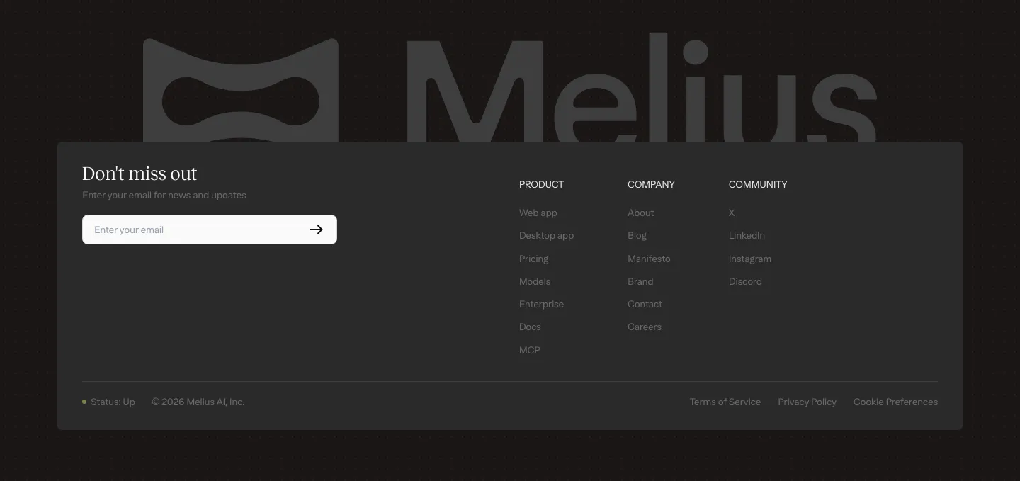
  142. Melius footer section: large gray Melius wordmark behind a dark card with email signup field, three link columns and legal row
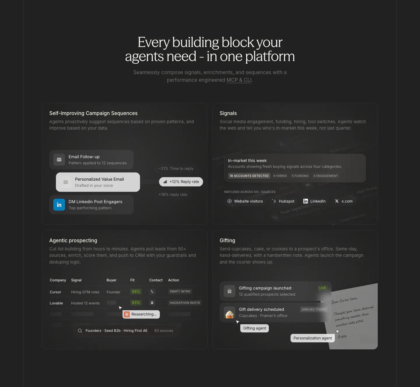
  143. Cluster features section: centered serif headline above a 2x2 grid of dark cards with sequence, signal, prospect table and gifting UI
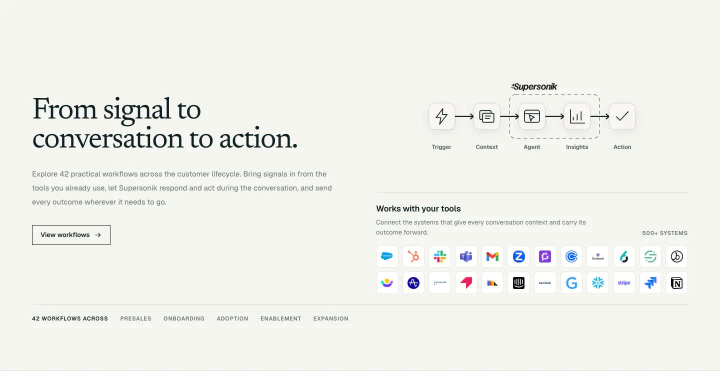
  144. Supersonik integrations section: serif headline and button at left, workflow step diagram and grid of app icons at right
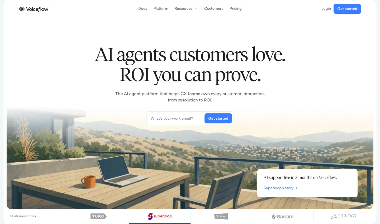
  145. Voiceflow hero section: centered serif headline and email signup field over a painted terrace landscape, customer logo tabs below
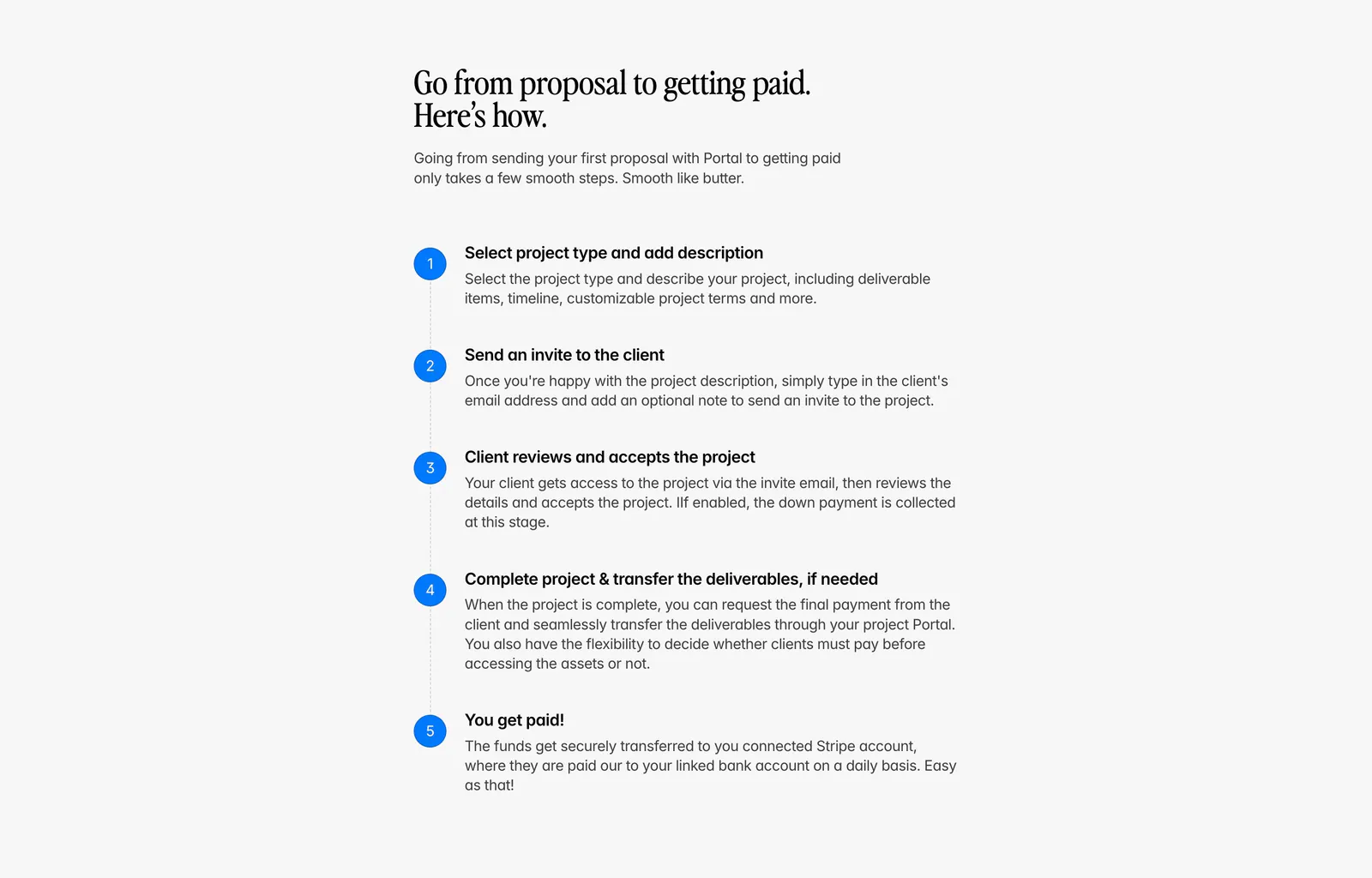
  146. Portal how it works section: serif headline above a vertical five-step list with blue numbered circles on a light gray background
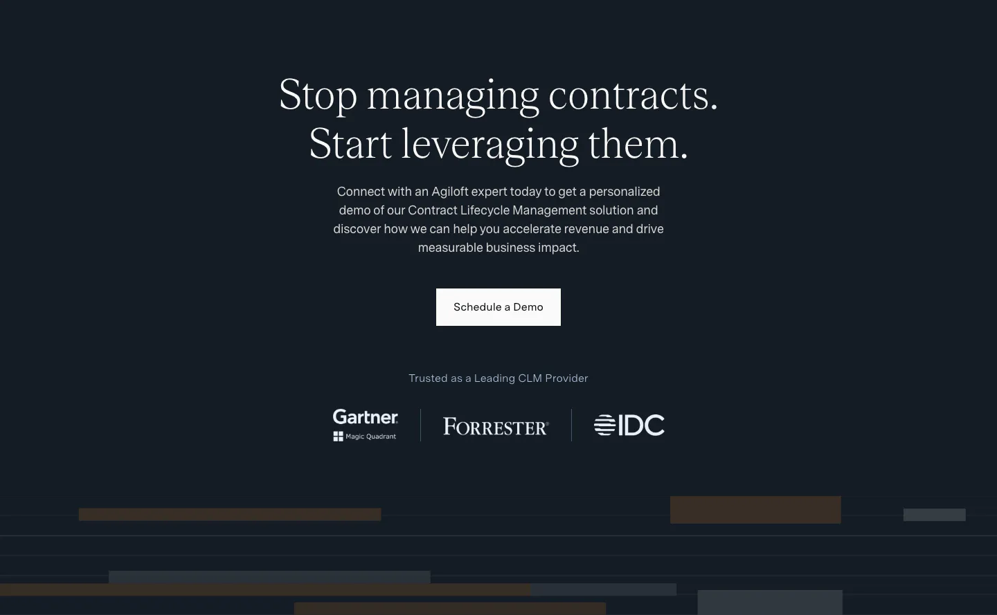
  147. Agiloft call-to-action section: centered serif headline and Schedule a Demo button on dark navy above Gartner, Forrester and IDC logos
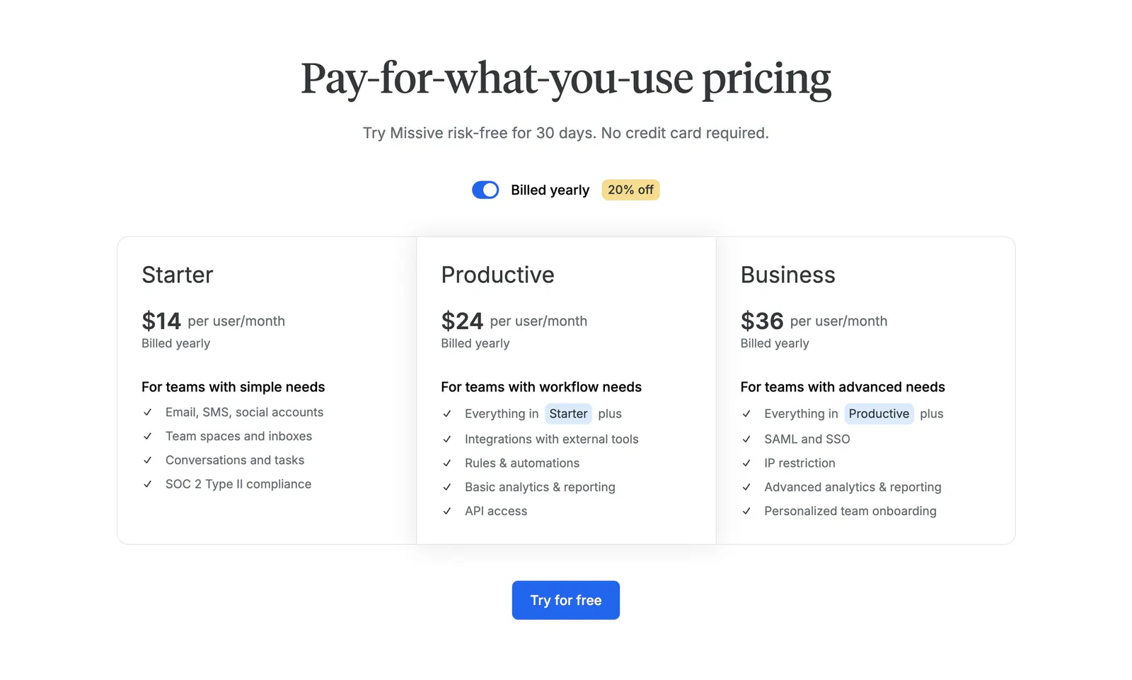
  148. Missive pricing section: centered serif headline with billing toggle above three plan columns and a Try for free button
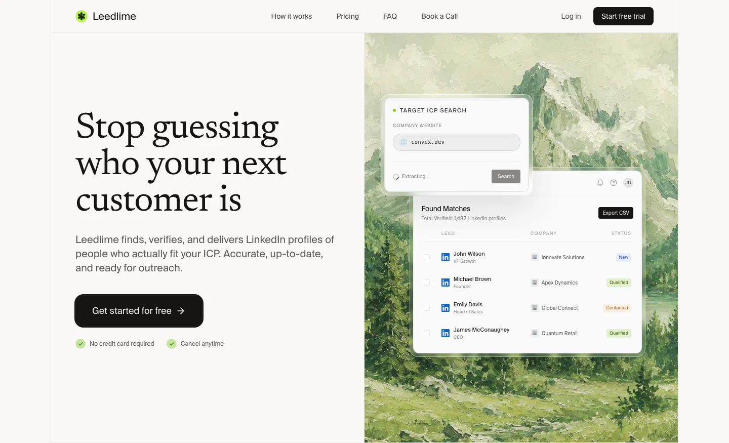
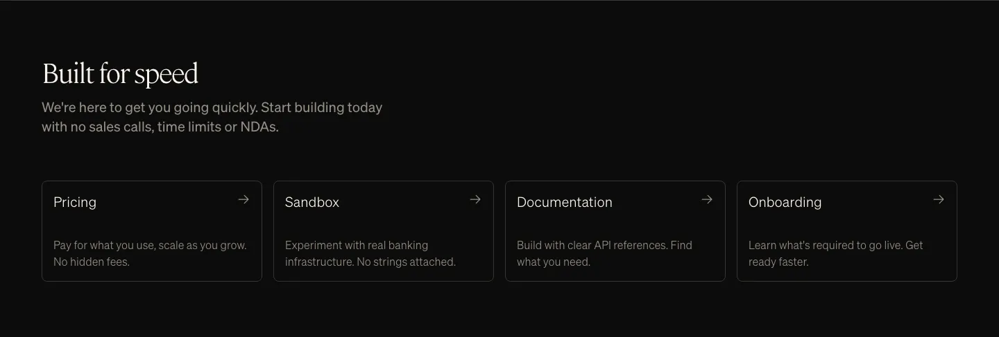
  149. Leedlime hero section: serif headline and Get started button at left, lead-search UI cards over a painted mountain landscape at right
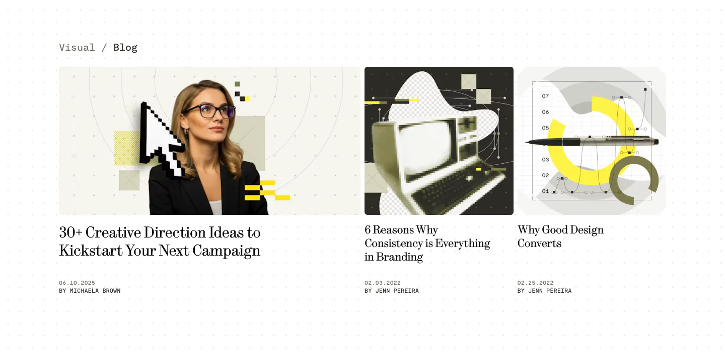
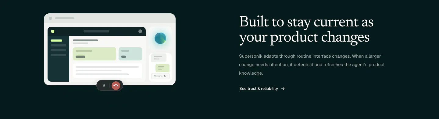
  150. Supersonik features section: serif headline and link at left, glowing sphere of chat bubbles linked to a logo at right on dark teal
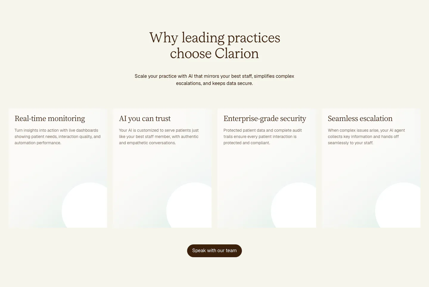
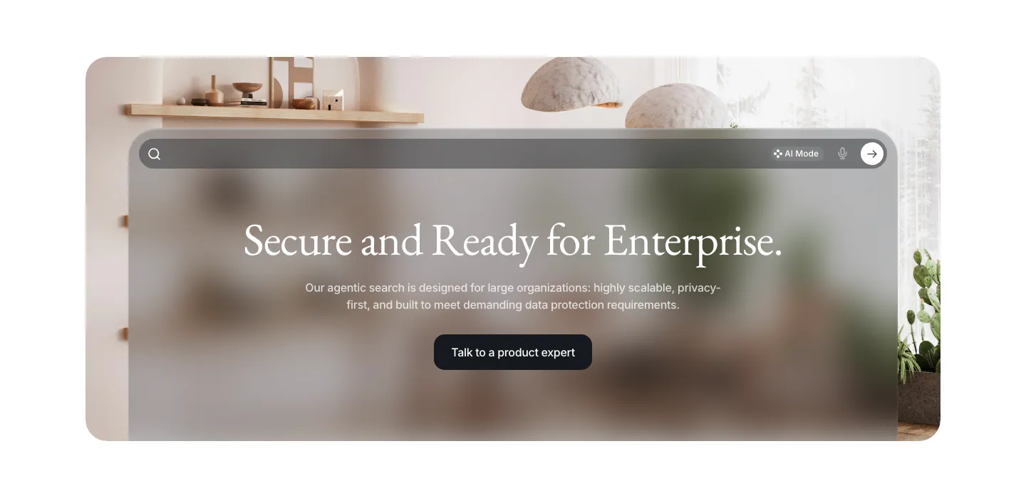
  151. Clarion value proposition section: centered serif headline above four tall cream cards with soft circle shapes and a brown button
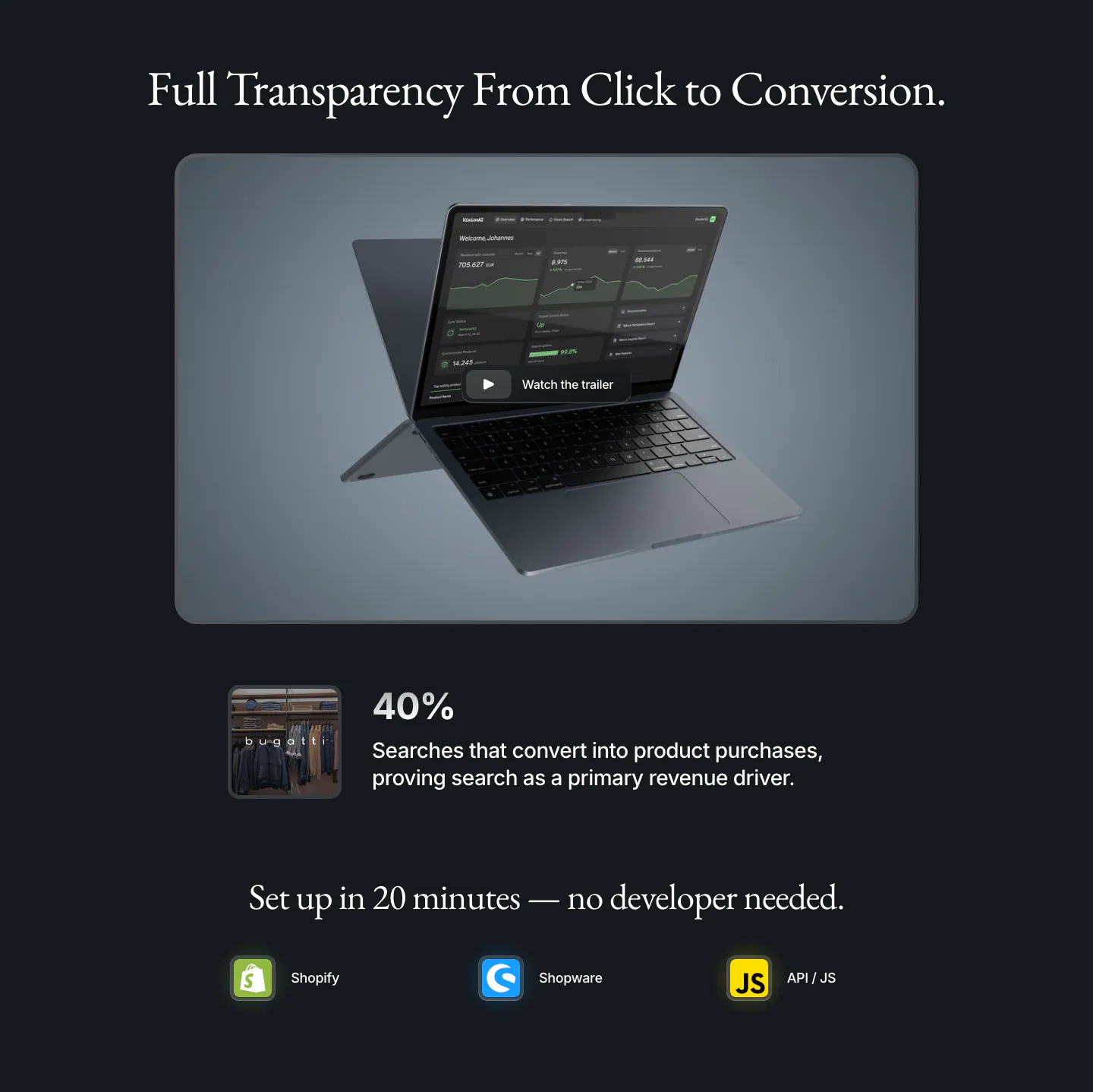
  152. VisionAI features section: serif headline over a laptop dashboard with trailer button, a 40% stat and platform icons on navy
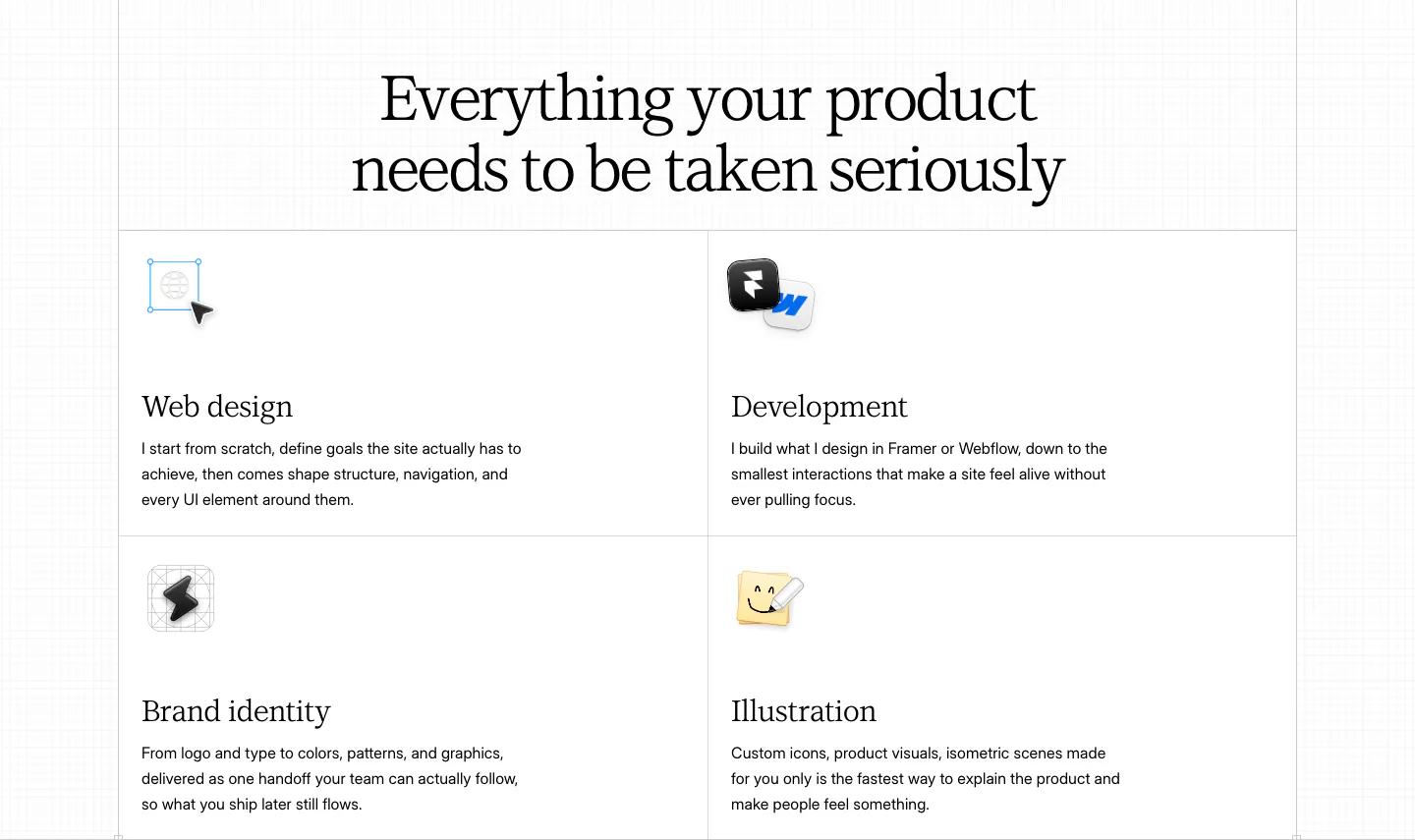
  153. Daniel Sun features section: centered serif headline above a bordered 2x2 grid of services with small icons on white
  154. Griffin value proposition section: serif heading and copy above four dark outlined link cards with arrows
  155. Visual blog & resources section: one wide and two narrow article cards with collage cover images, serif titles and authors on a dotted white page
  156. VisionAI call-to-action section: centered serif headline and button on a frosted glass search panel over an interior photo
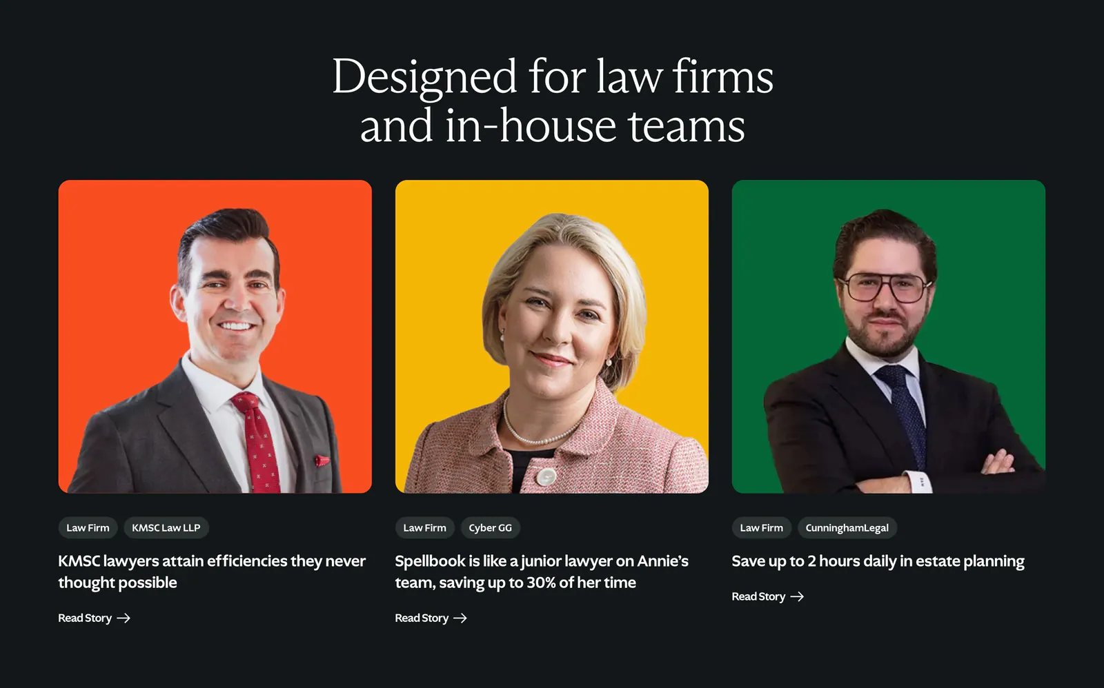
  157. Spellbook testimonials section: serif headline above three customer story cards with lawyer portraits on orange, yellow and green backdrops
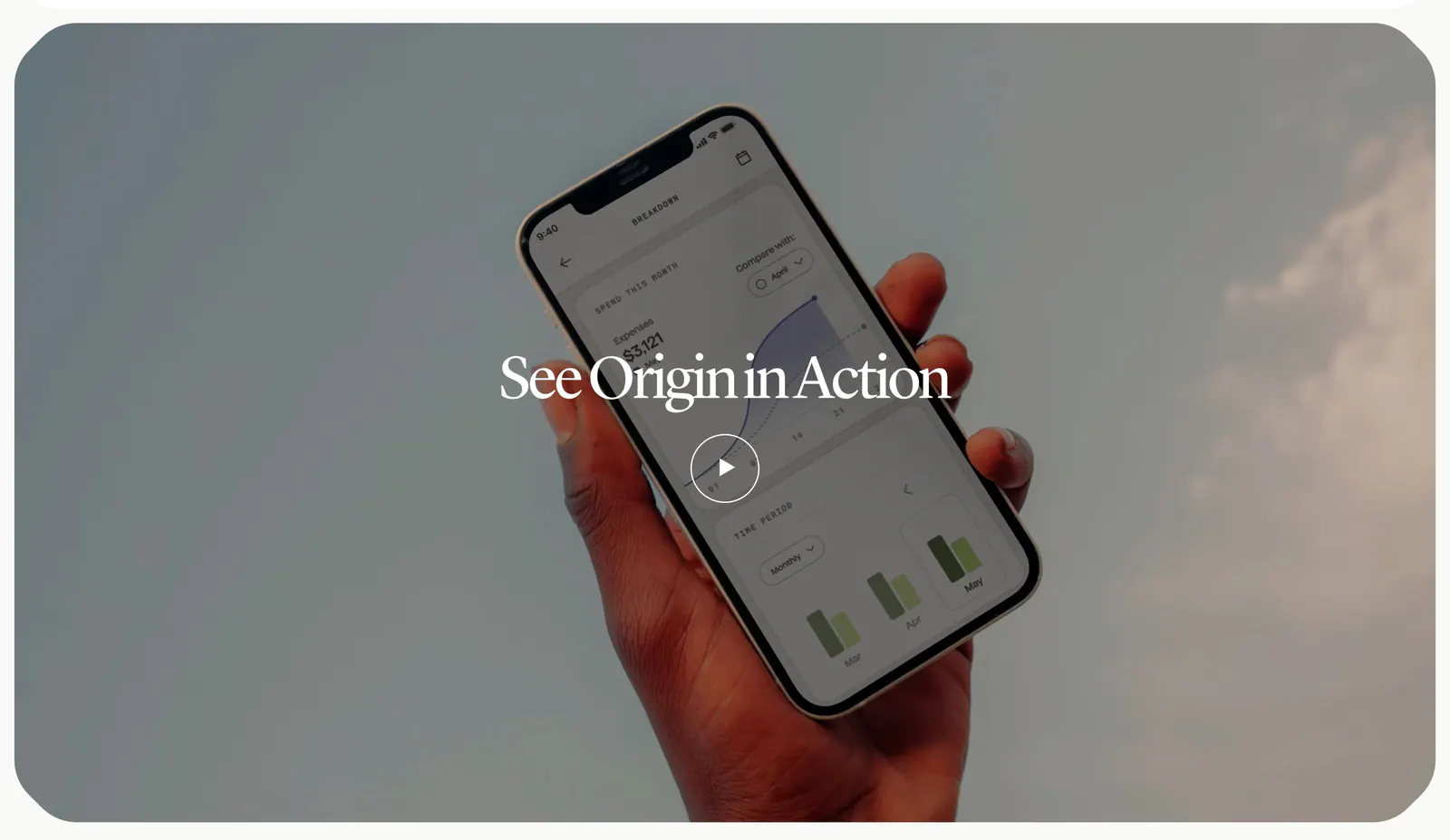
  158. Origin how it works section: serif title and play button over a full-width photo of a hand holding a phone with the app against the sky
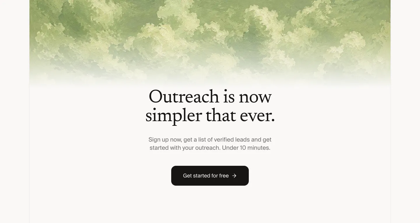
  159. Leedlime call to action section: centered serif headline and Get started button below a band of painted green clouds on off-white
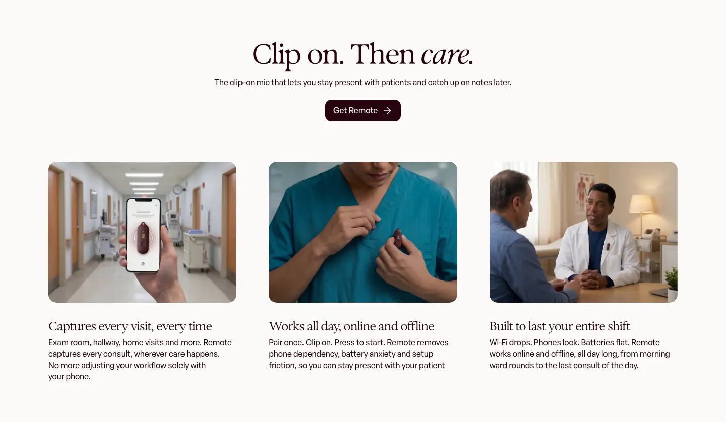
  160. Heidi features section: centered serif headline and button above three photo cards of the clip-on mic in clinical settings
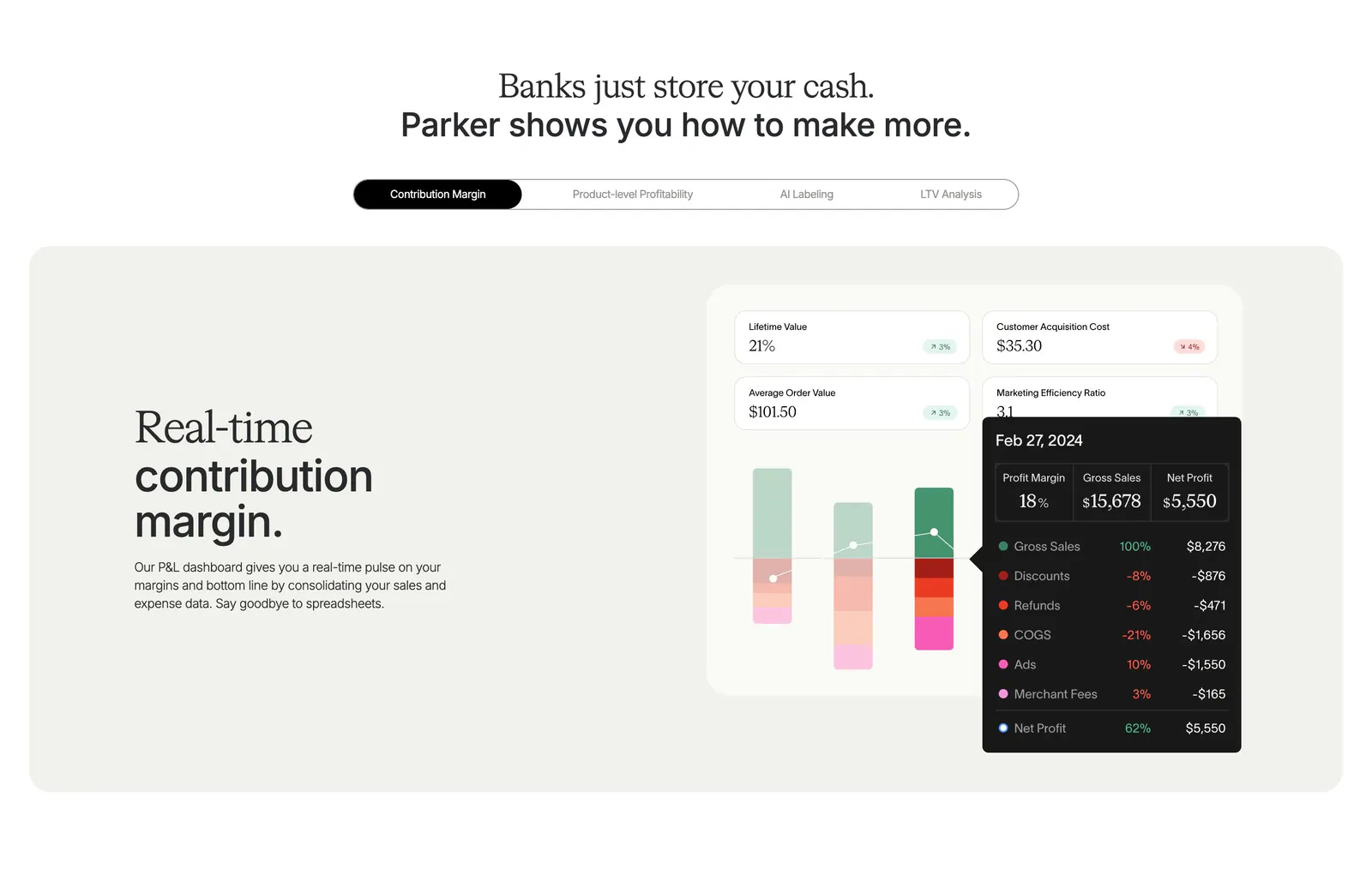
  161. Parker features section: centered headline over a pill tab bar and beige panel with text beside a contribution margin dashboard UI
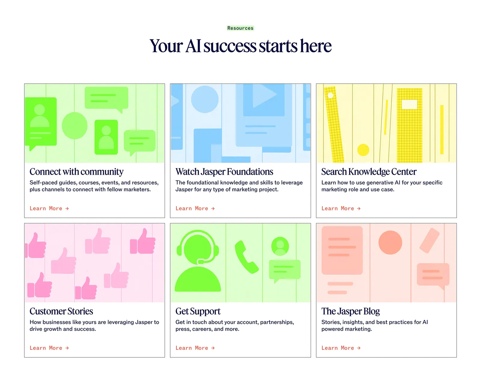
  162. Jasper blog & resources section: centered serif headline above six cards with colorful flat illustrations and Learn More links
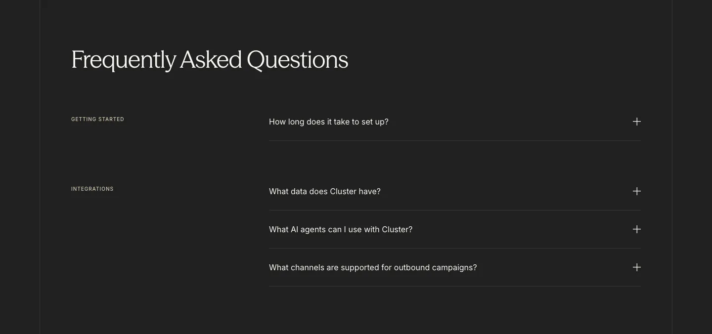
  163. Cluster FAQ section: serif headline above category-labelled accordion questions with plus icons on a charcoal background
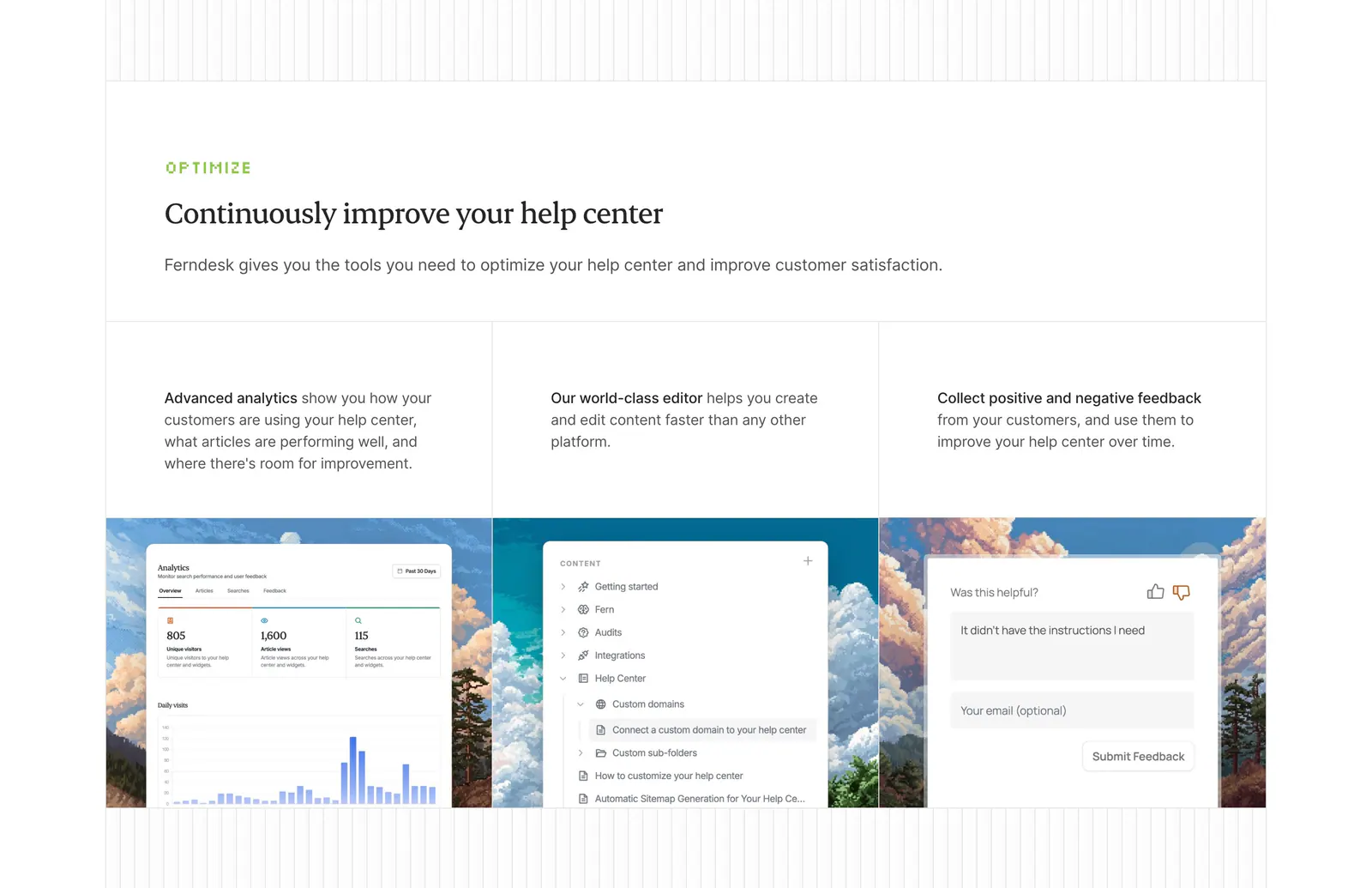
  164. Ferndesk features section: serif headline above three columns with analytics, editor and feedback UI over pixel-art landscapes
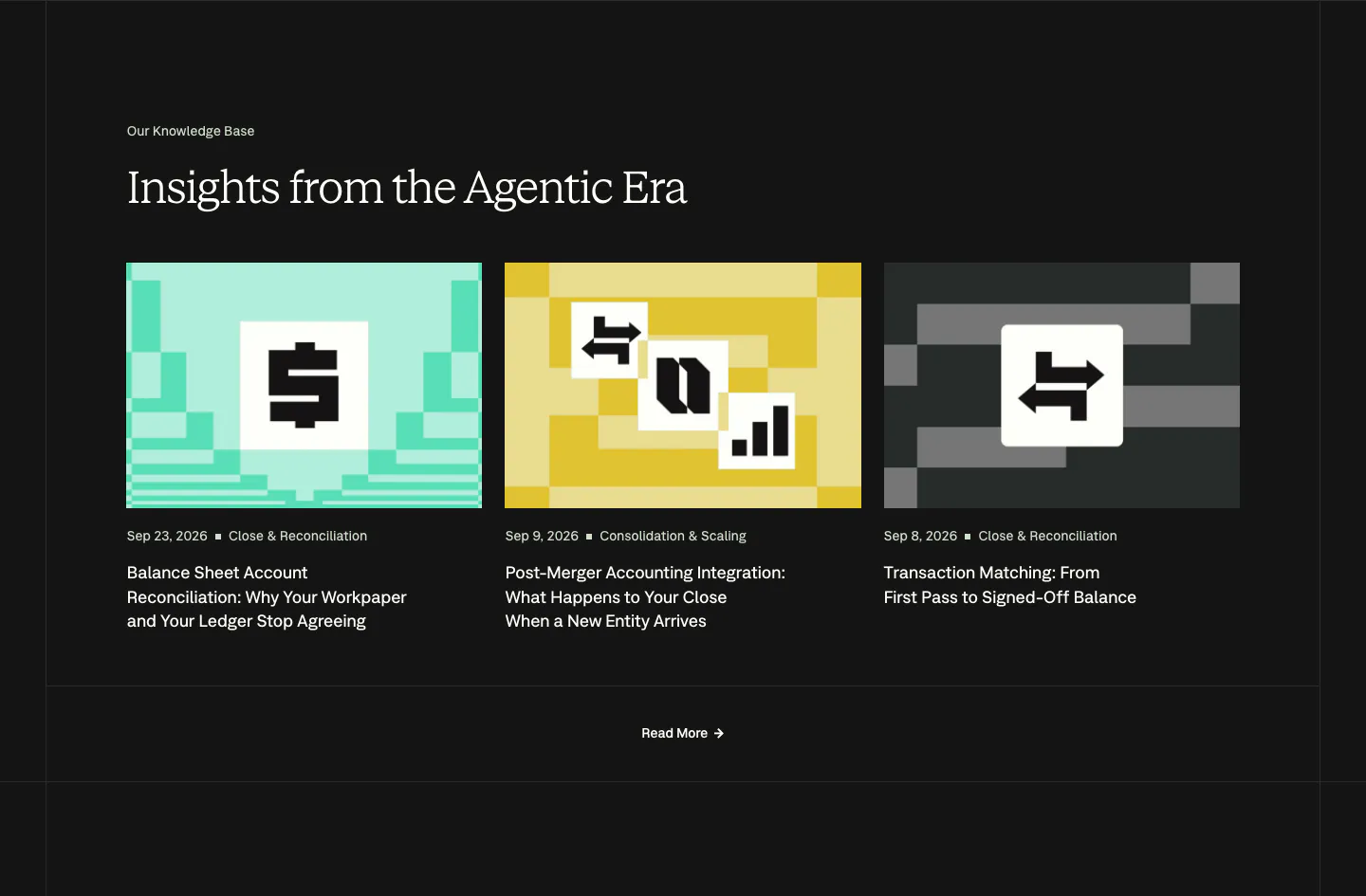
  165. Nominal blog & resources section: serif headline over three article cards with pixel-art thumbnails on a near-black background
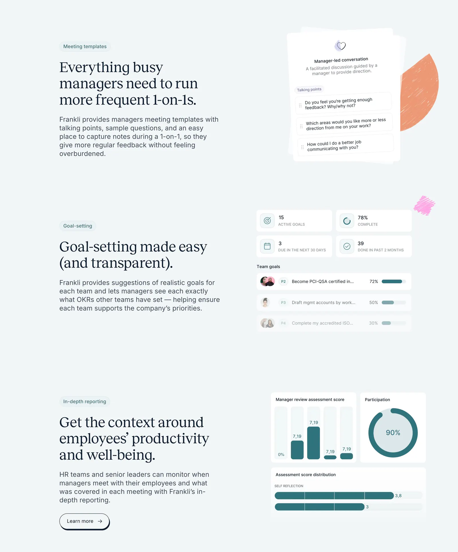
  166. Frankli features section: three stacked rows of serif headings and copy on the left with meeting, goal and reporting UI cards on the right
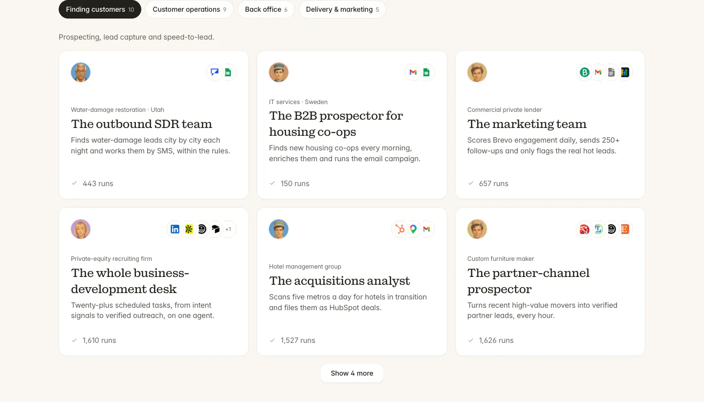
  167. Twin use cases section: tab bar of categories above a three-column grid of agent cards with avatars, app icons and run counts
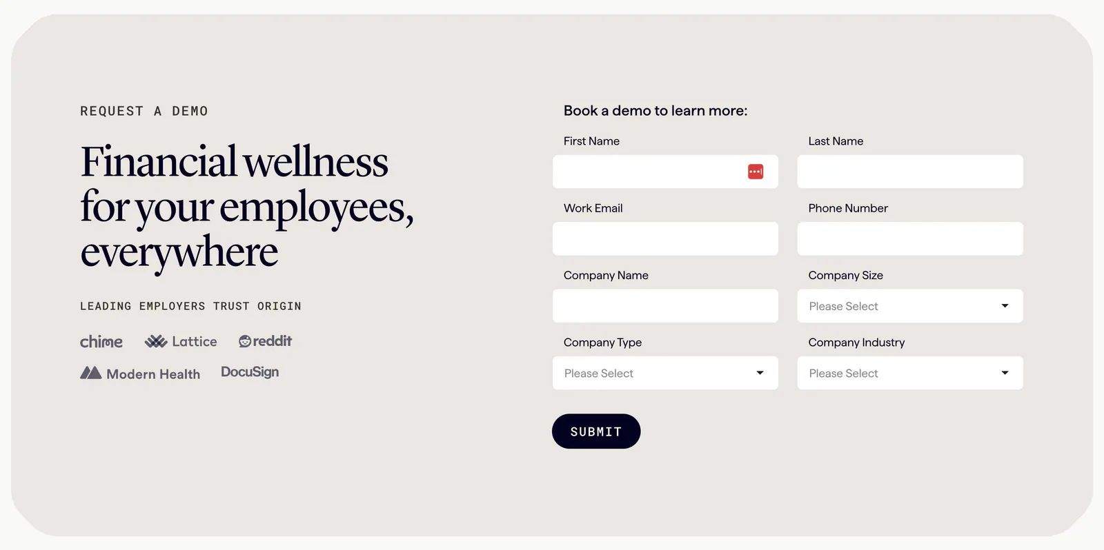
  168. Origin contact section: serif headline and employer logos on the left beside a two-column demo request form in a beige rounded panel
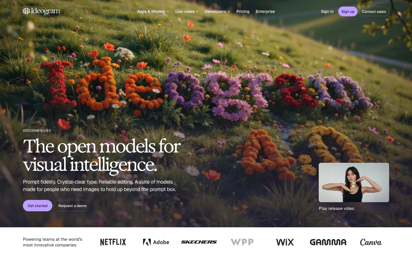
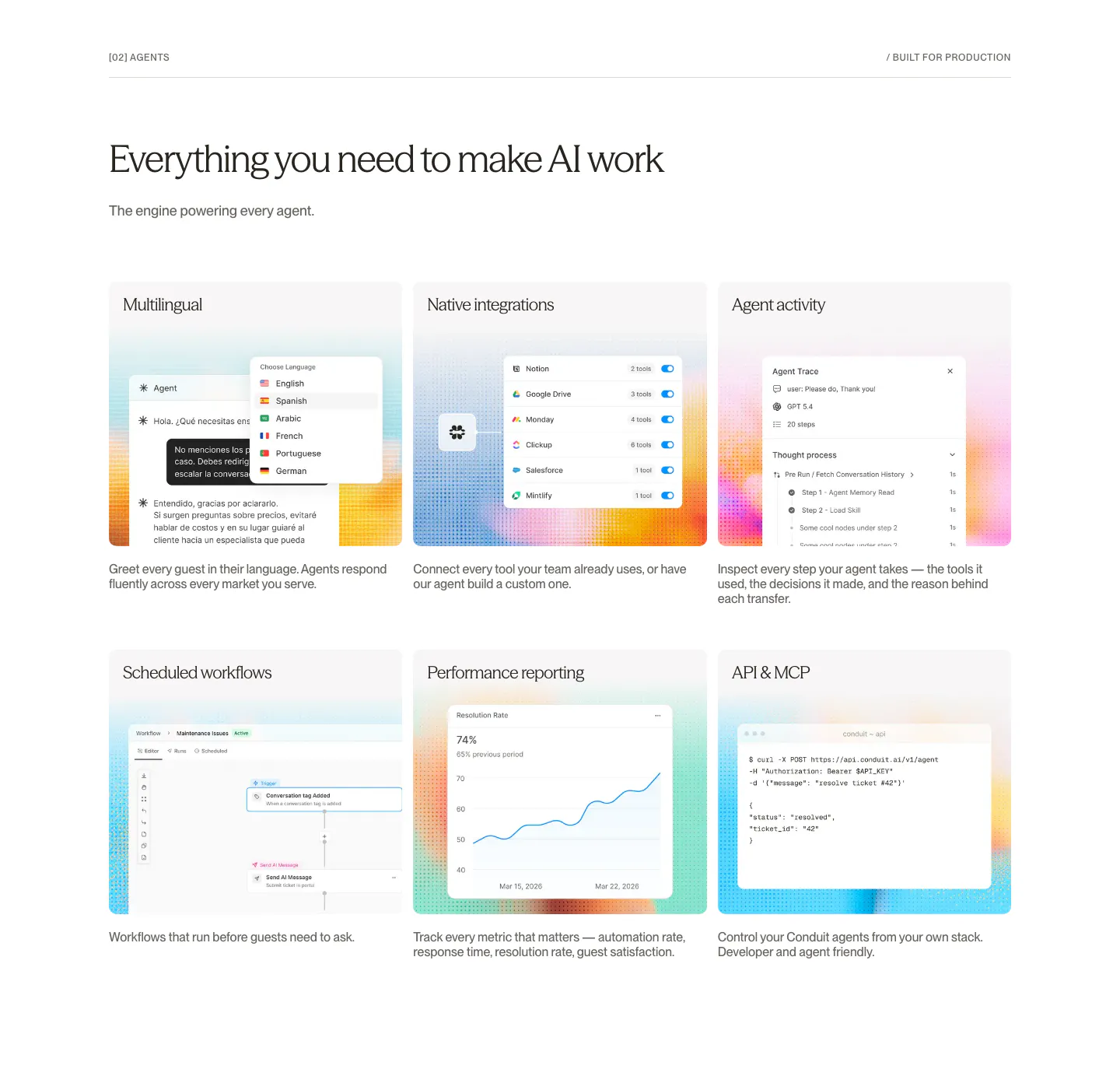
  169. Ideogram hero section: serif headline and buttons over a full-bleed hillside of flowers, release video thumbnail, logo strip below
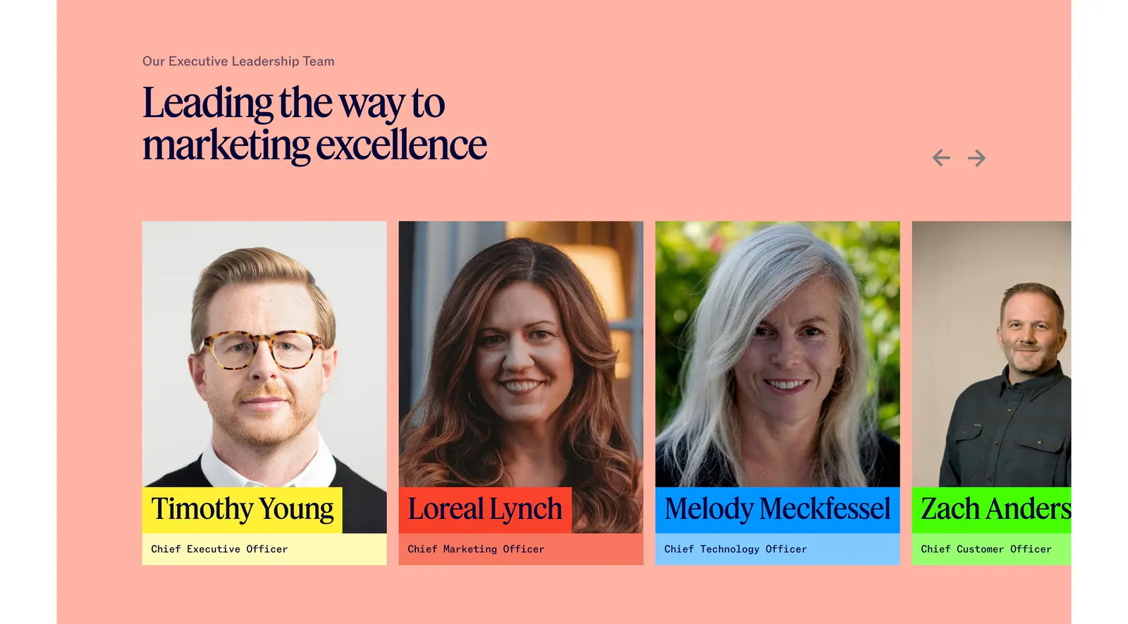
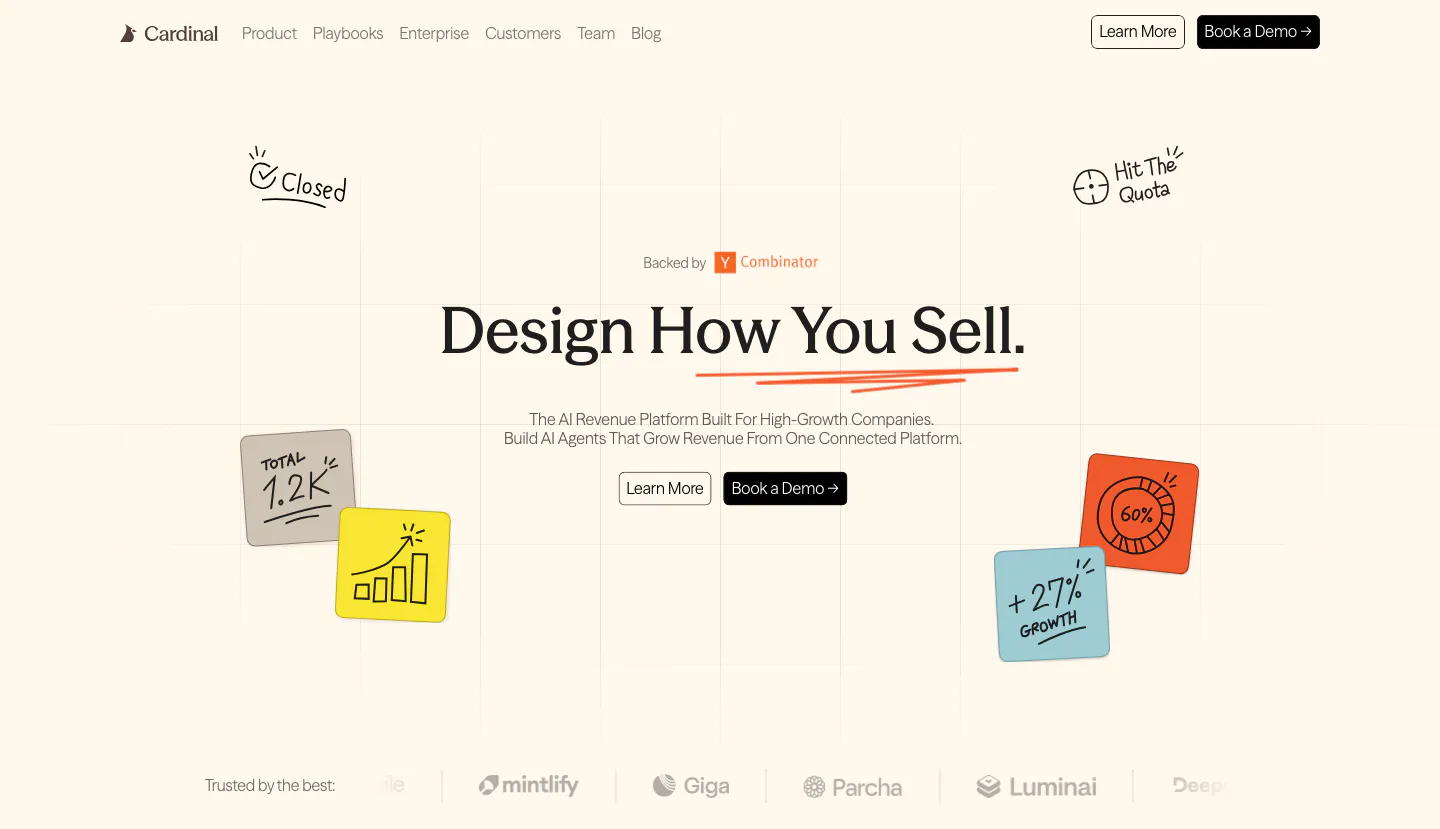
  170. Jasper team section: serif headline and arrows above executive portrait cards with colored name labels on a salmon background
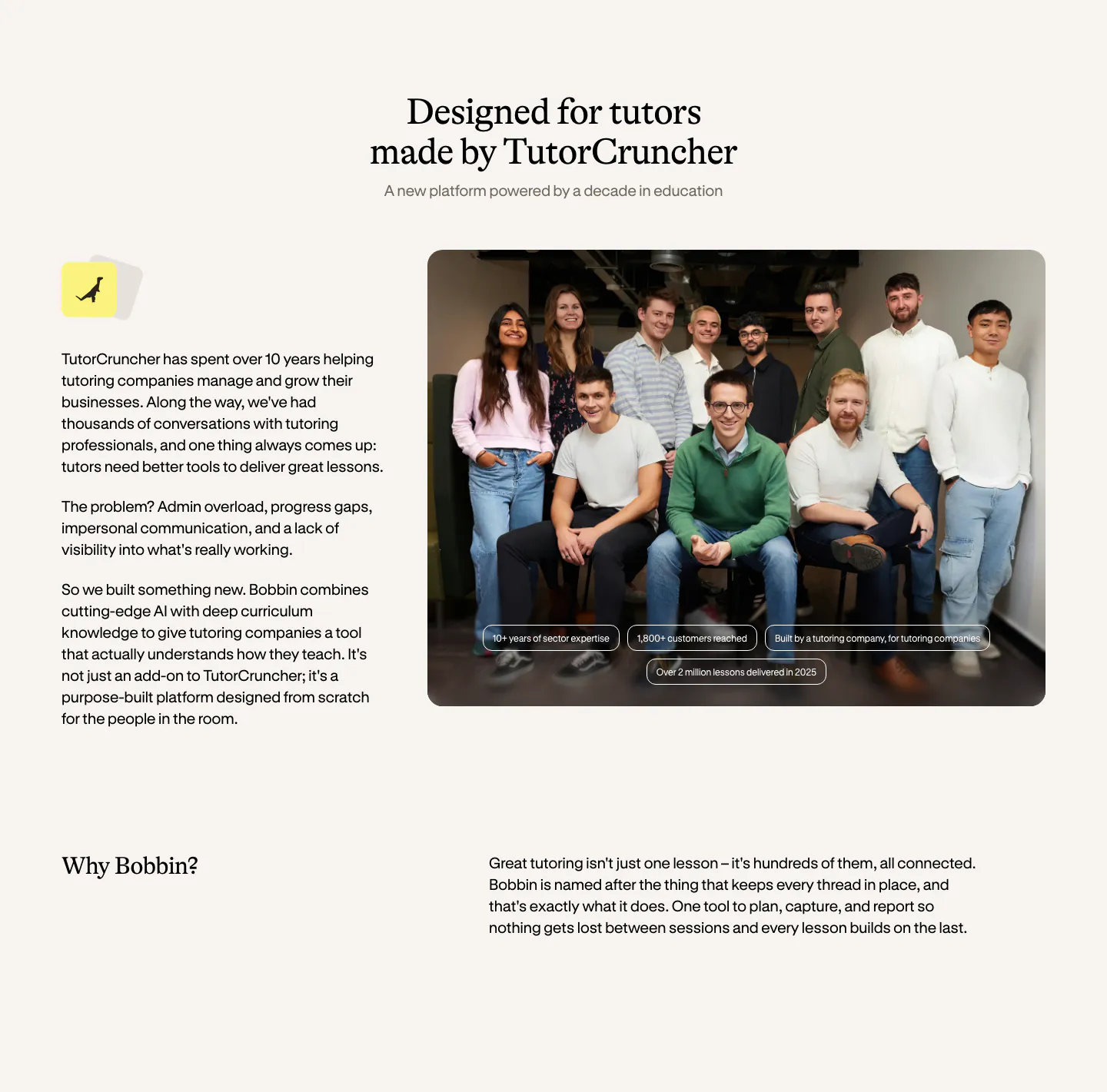
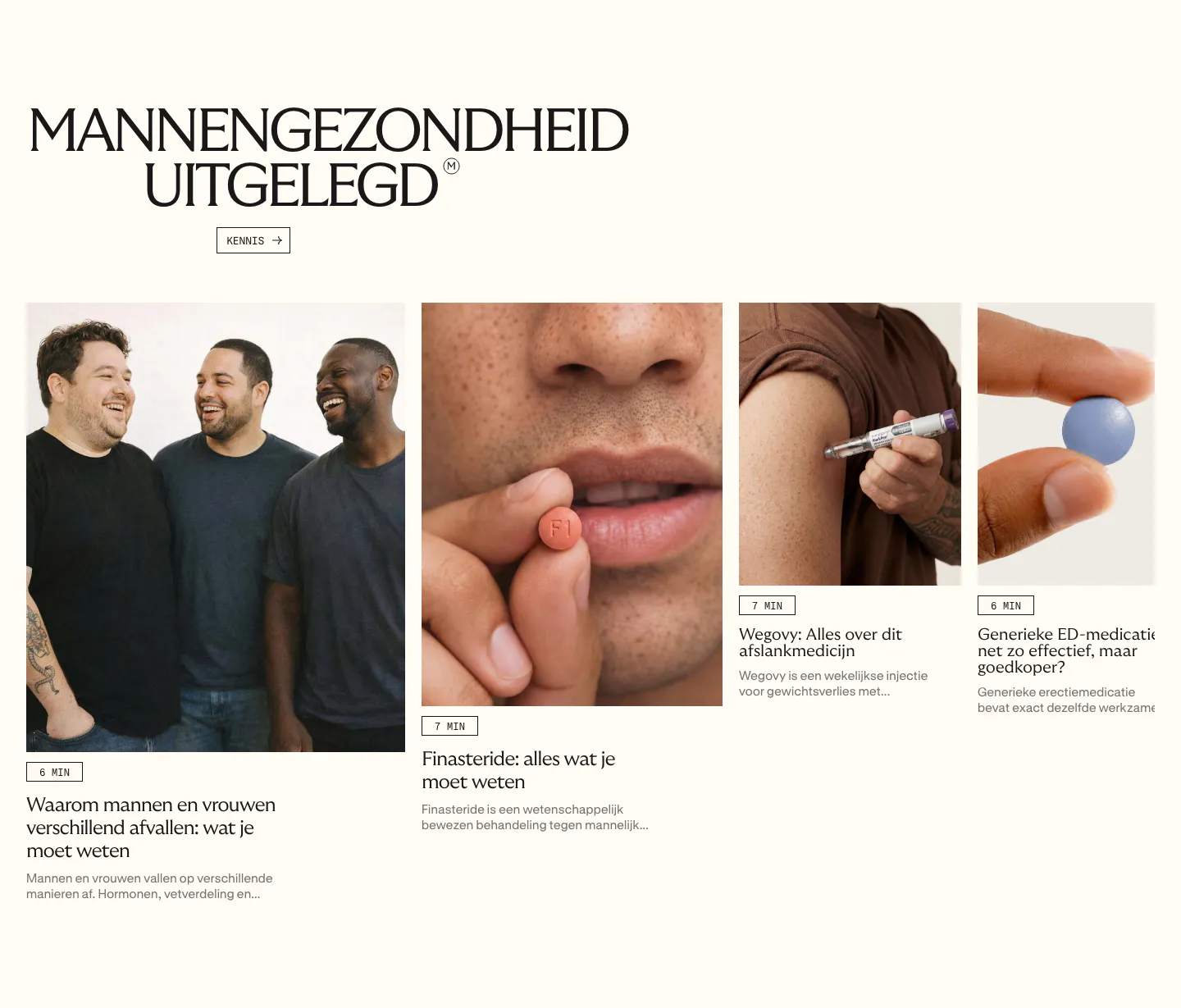
  171. Bobbin about & mission section: serif heading, company story text left and a team group photo right, with a Why Bobbin row below
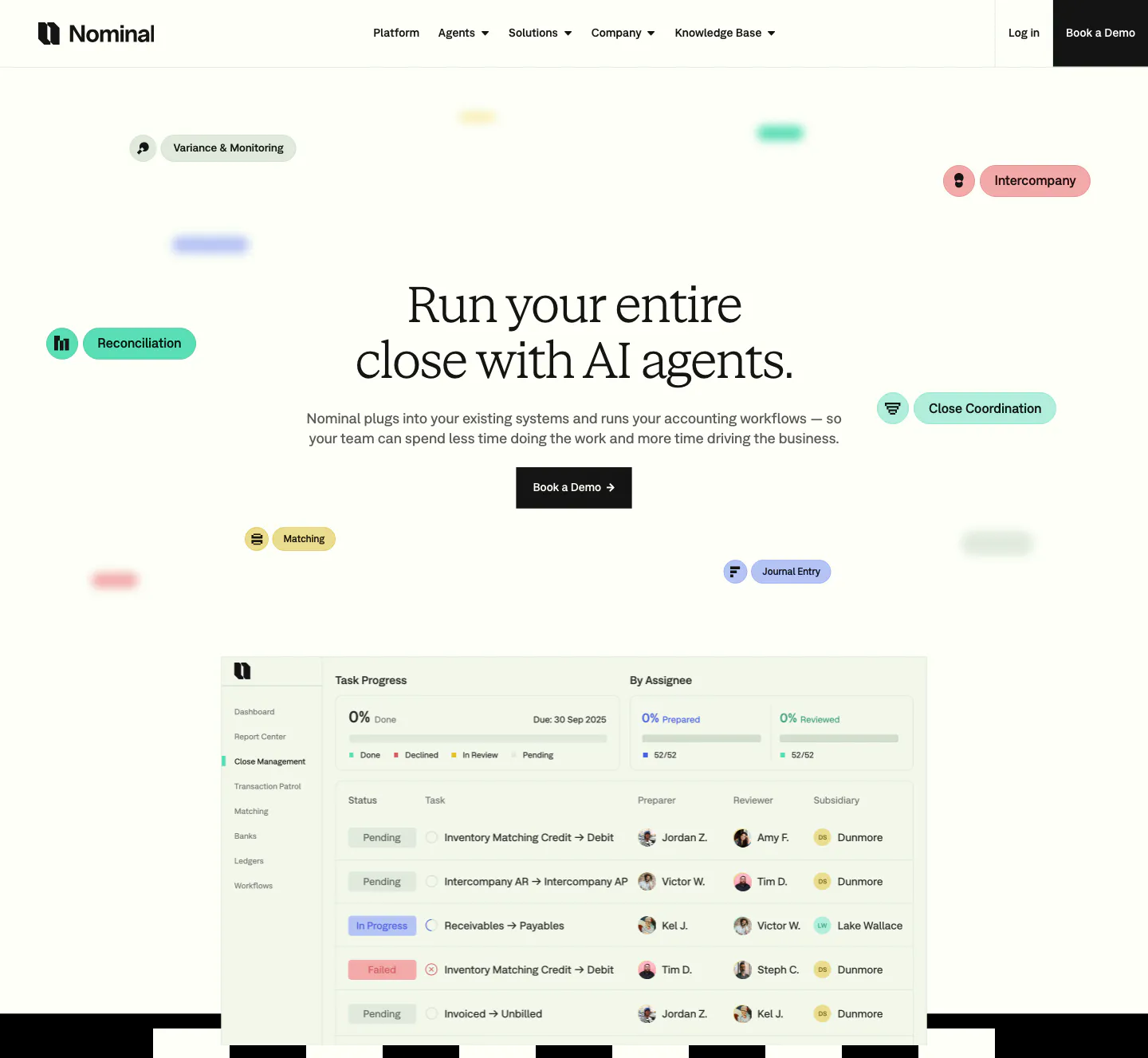
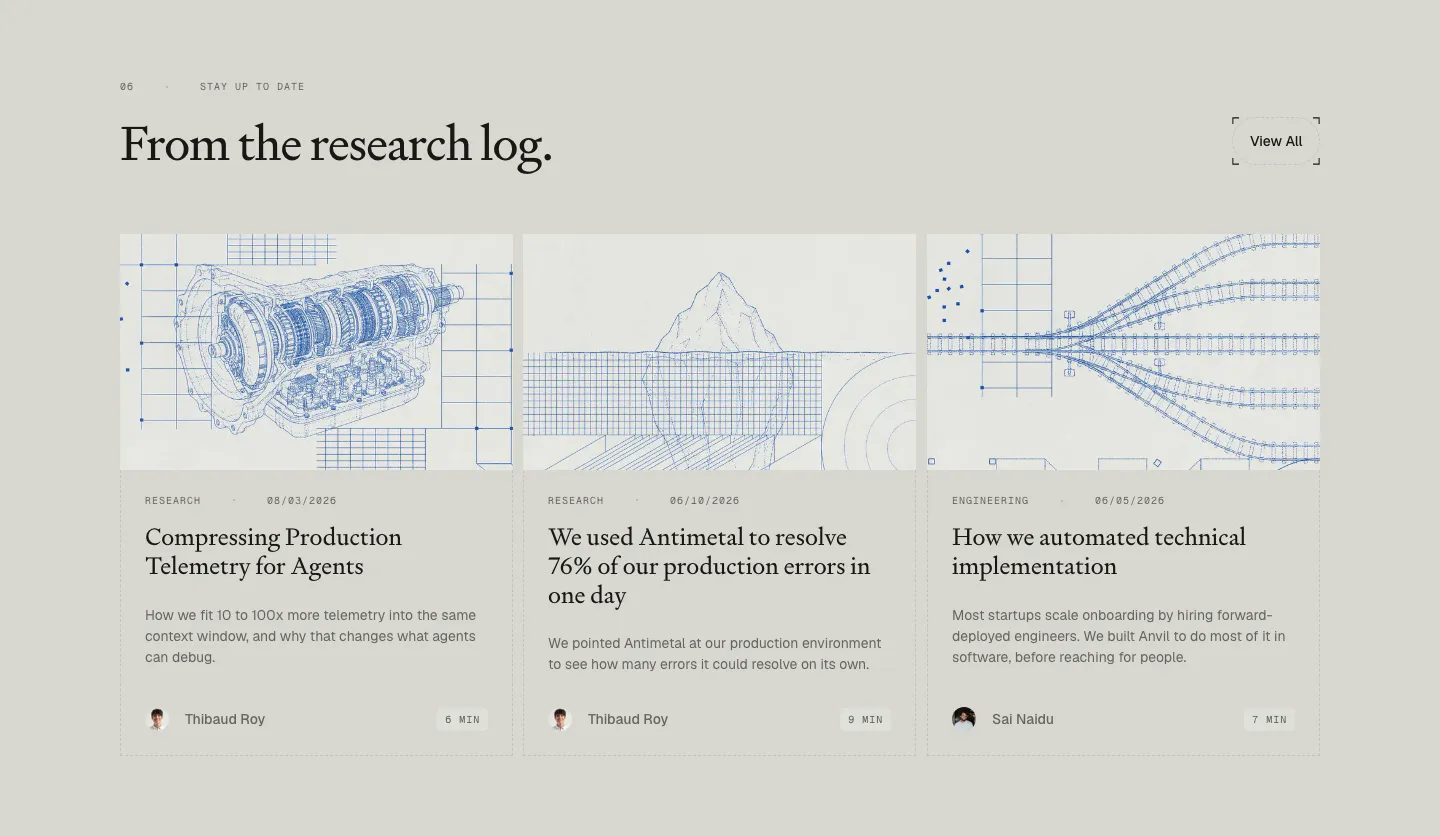
  172. Nominal hero section: centered serif headline with floating colored workflow pills above a close-management task table screenshot
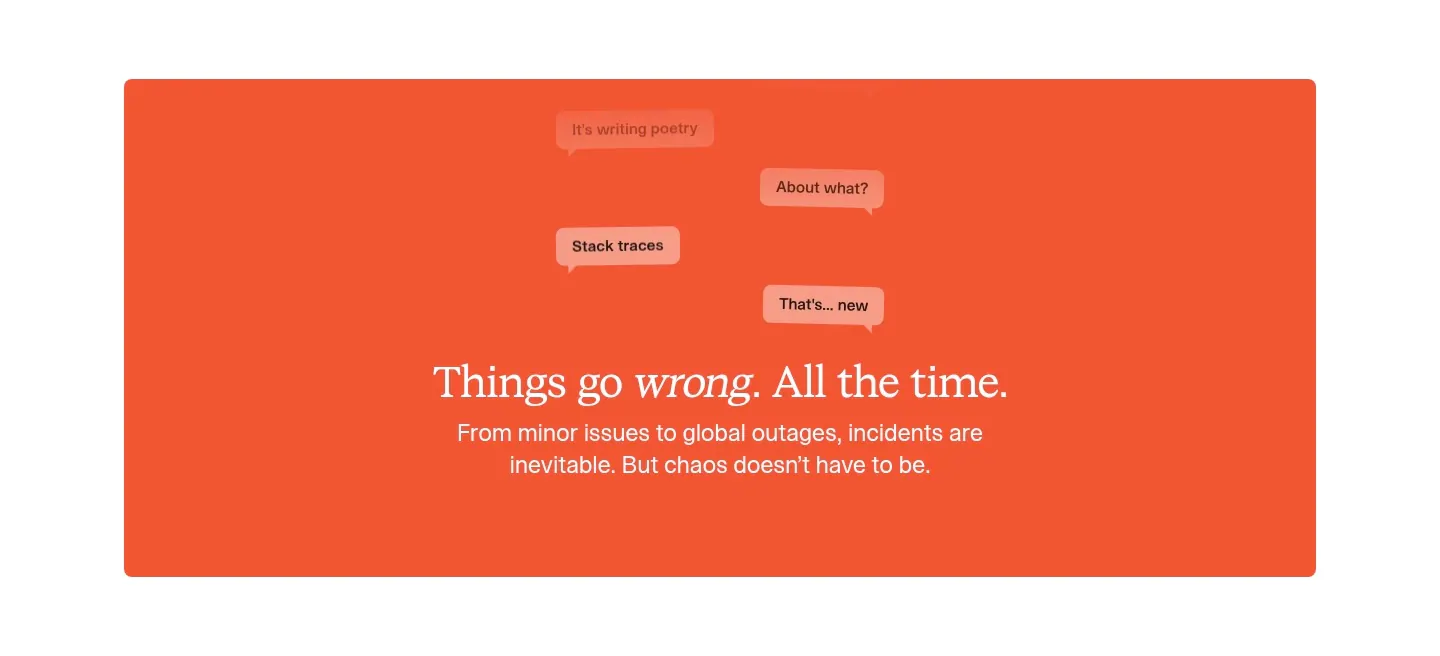
  173. incident.io value proposition section: serif centered headline below floating chat bubbles on a large orange panel
  174. Conduit features section: serif headline above a 3x2 card grid of agent UI mockups on dithered gradient tiles
  175. Cardinal hero section: centered serif headline with two buttons, hand-drawn sticky-note doodles on a faint grid and a logo strip on cream
    Cardinal Hero
  176. Menkind blog & resources section: serif headline above a row of article cards with photos and read times, cut off at the edge
  177. Antimetal blog & resources section: serif headline with View All button over three article cards with blue blueprint line drawings
  178. Endex footer section: serif CTA headline with two buttons, teal pixel-grid strip, link rows and a huge faded Endex wordmark on dark green
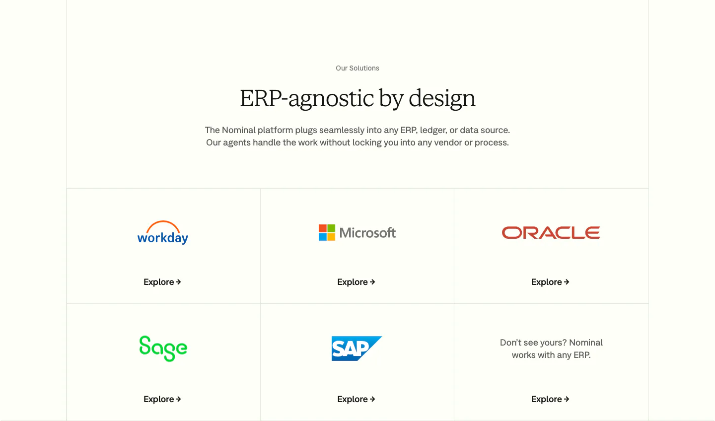
  179. Nominal integrations section: centered serif headline above a bordered grid of ERP logo tiles with Explore links on an off-white background
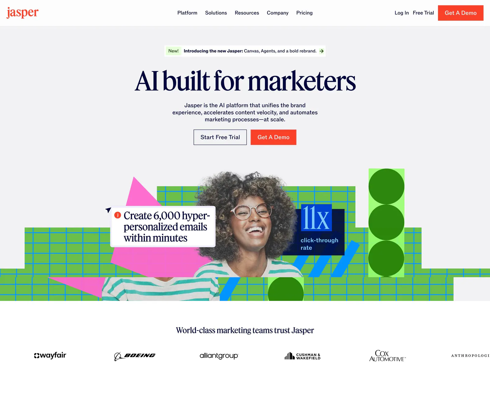
  180. Jasper hero section: nav and centered serif headline over a photo of a smiling woman with green grid shapes, customer logo row below
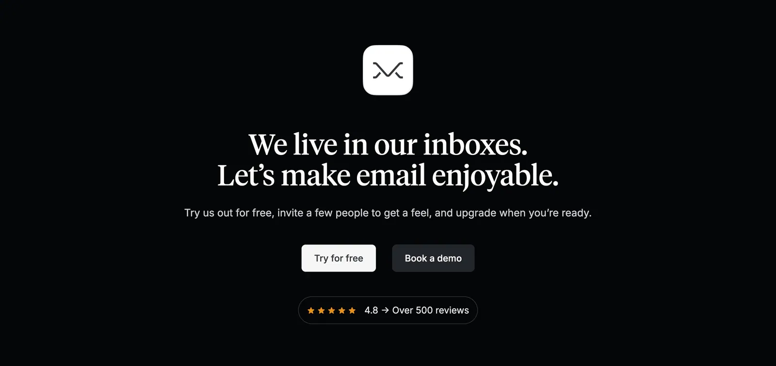
  181. Missive call-to-action section: centered app icon and serif headline with two buttons and a review rating badge on black
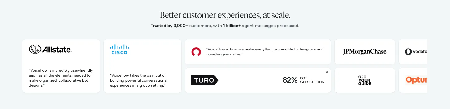
  182. Voiceflow testimonials section: centered serif headline above a row of logo and quote cards cut off at the right edge
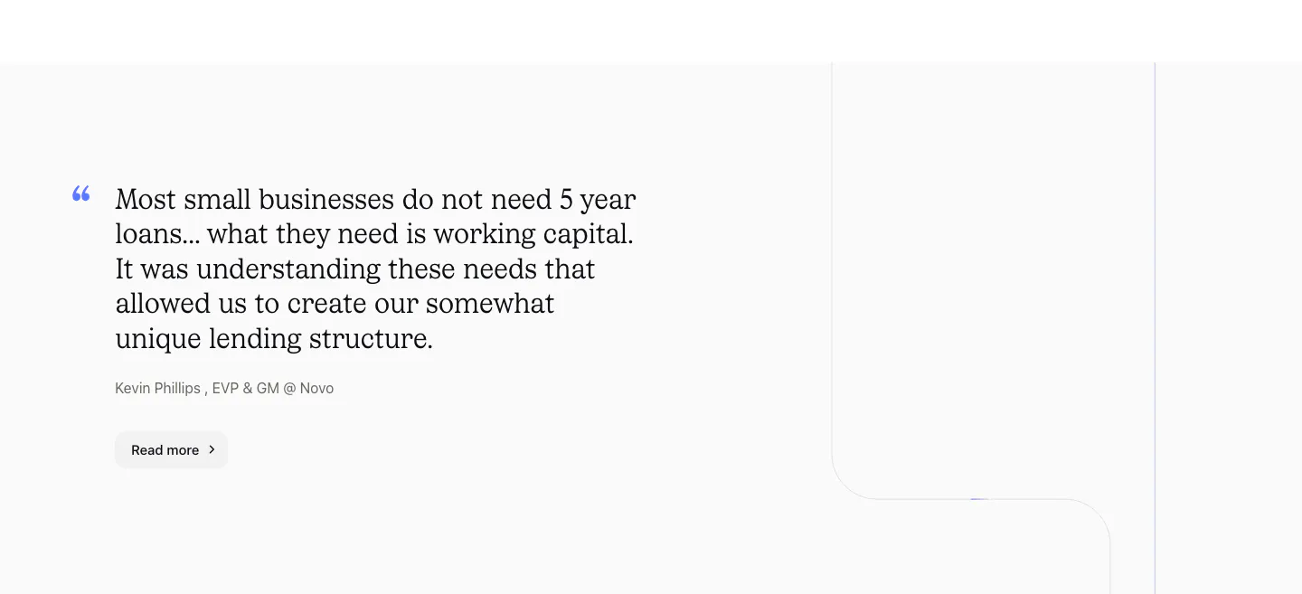
  183. Canopy testimonials section: large serif customer quote with attribution and Read more button on a light gray background
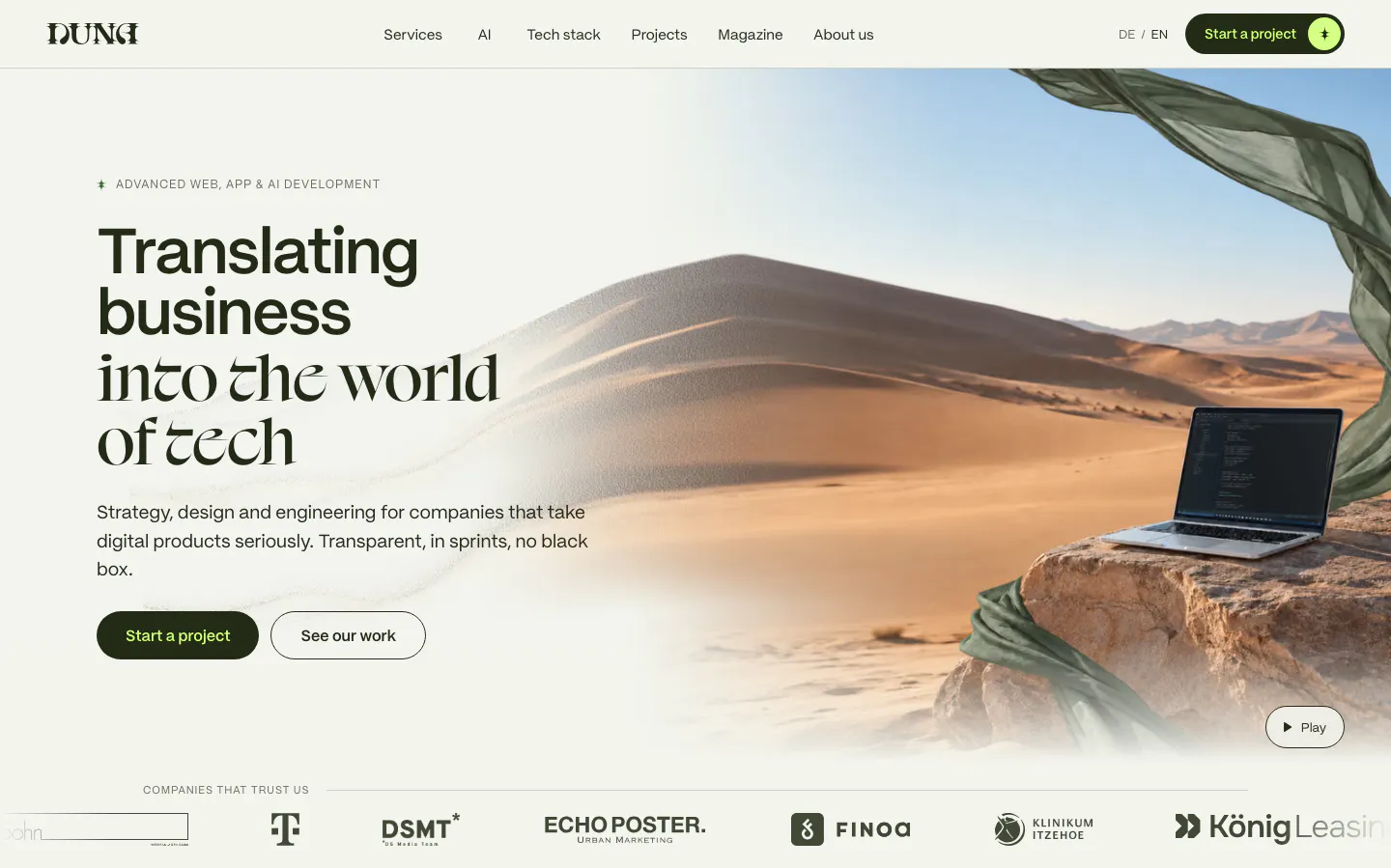
  184. DUNA hero section: mixed sans and serif headline with two buttons beside a desert dune photo with laptop, client logo strip below
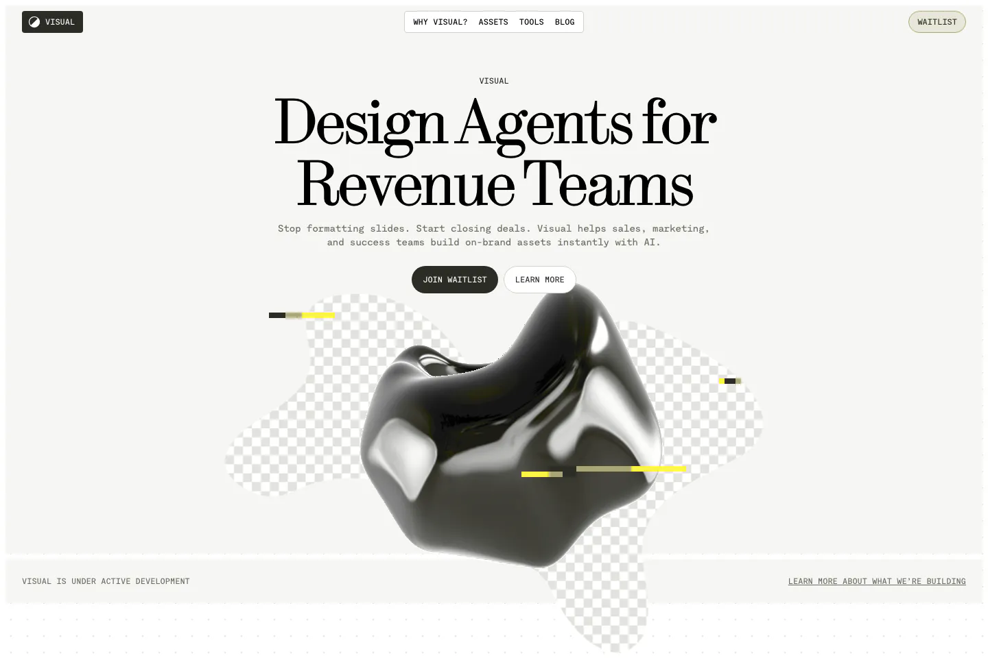
  185. Visual hero section: nav bar and centered serif headline with two buttons above a glossy black 3D blob on checkerboard shapes
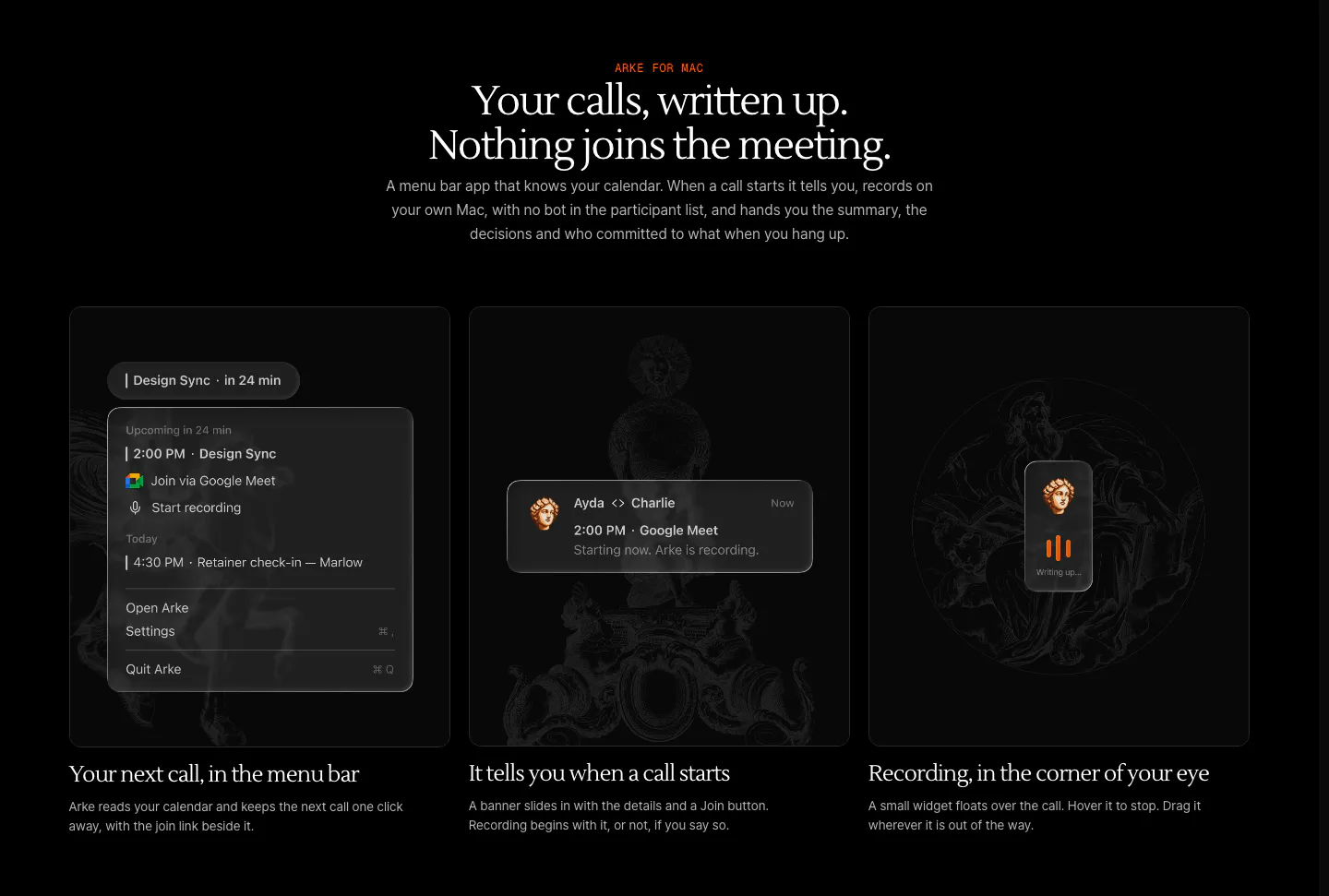
  186. Arke features section: centered serif headline above three dark cards showing a menu bar call reminder, notification and recording widget
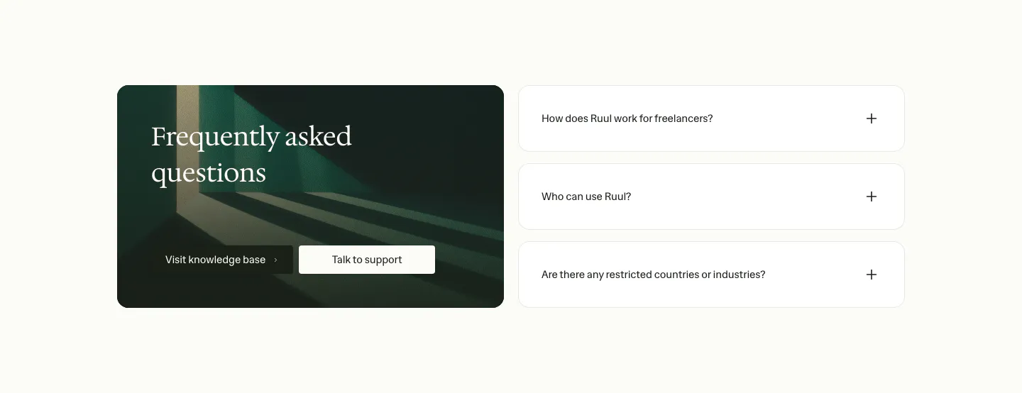
  187. Ruul FAQ section: dark green image card with serif headline and buttons on the left, three collapsed question rows on the right
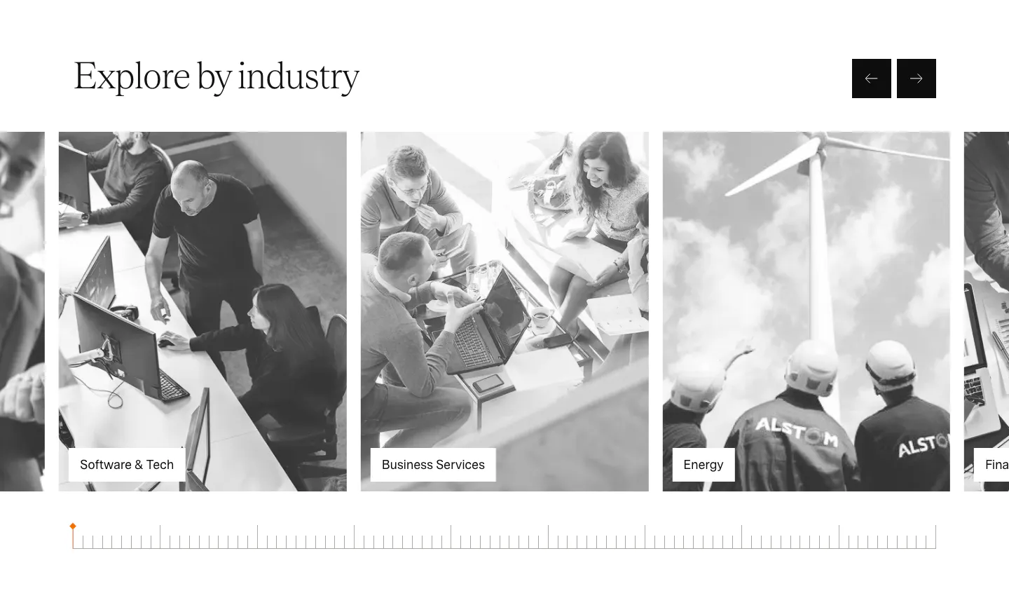
  188. Agiloft use cases section: serif heading with arrow buttons above a carousel of grayscale industry photo cards
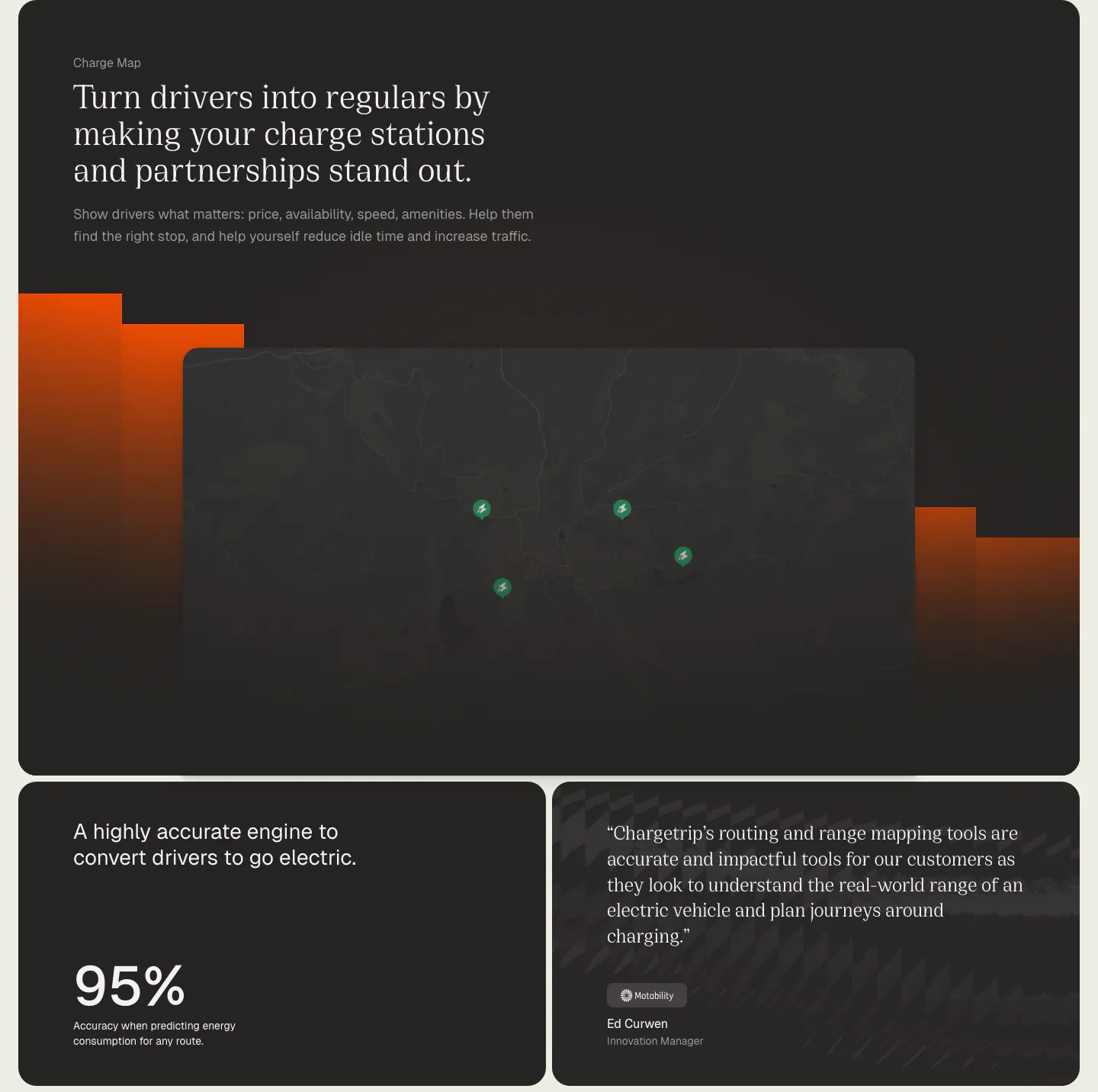
  189. Chargetrip features section: serif headline over a dark charge station map with orange bars, above a 95% accuracy stat card and a quote card
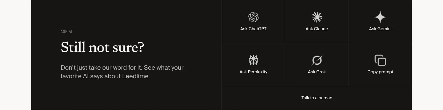
  190. Leedlime call to action section: serif Still not sure? headline at left beside a grid of Ask ChatGPT, Claude, Gemini and Grok buttons on black
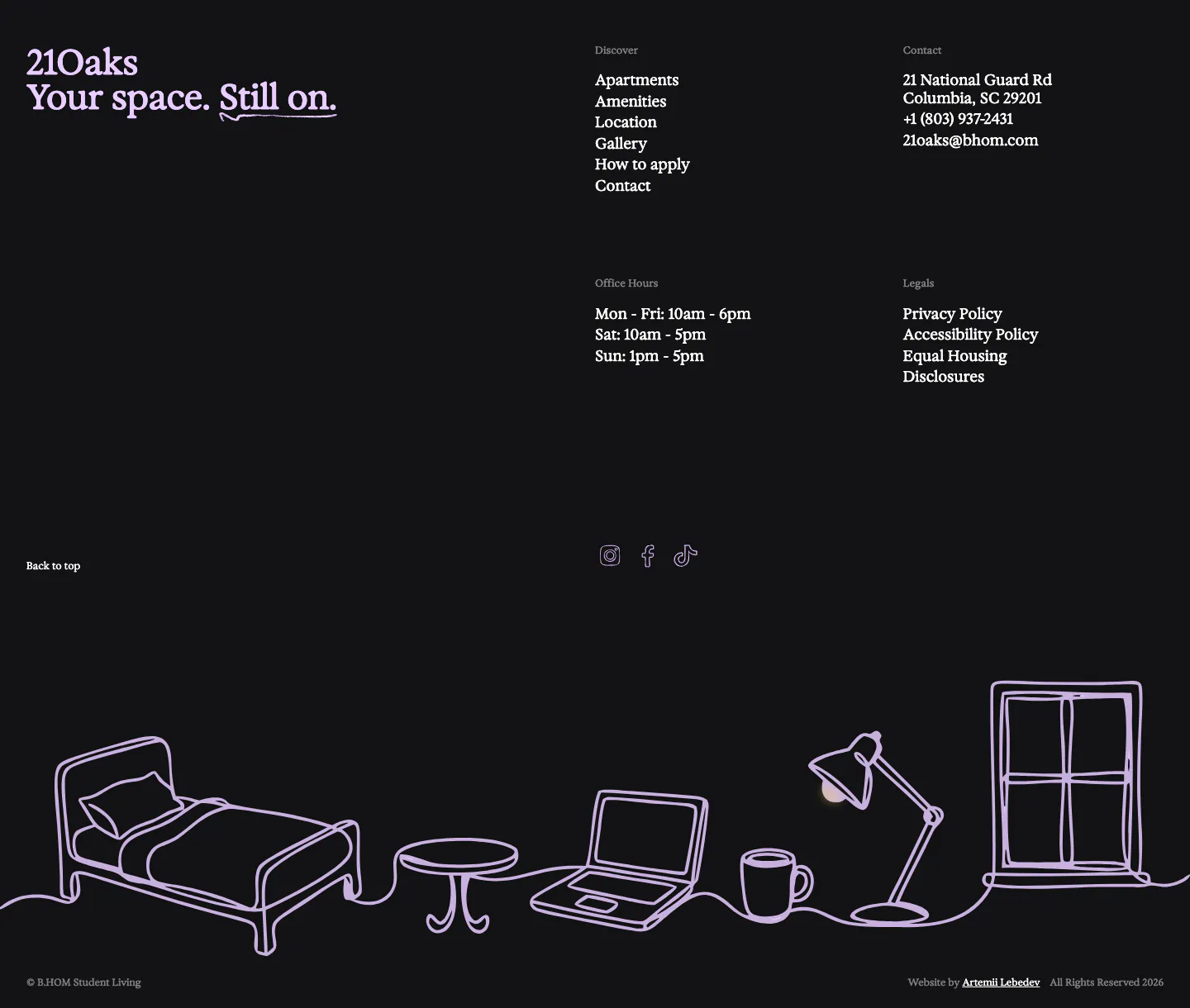
  191. 21Oaks footer section: dark background with serif wordmark, link and contact columns, and a lavender line drawing of a room
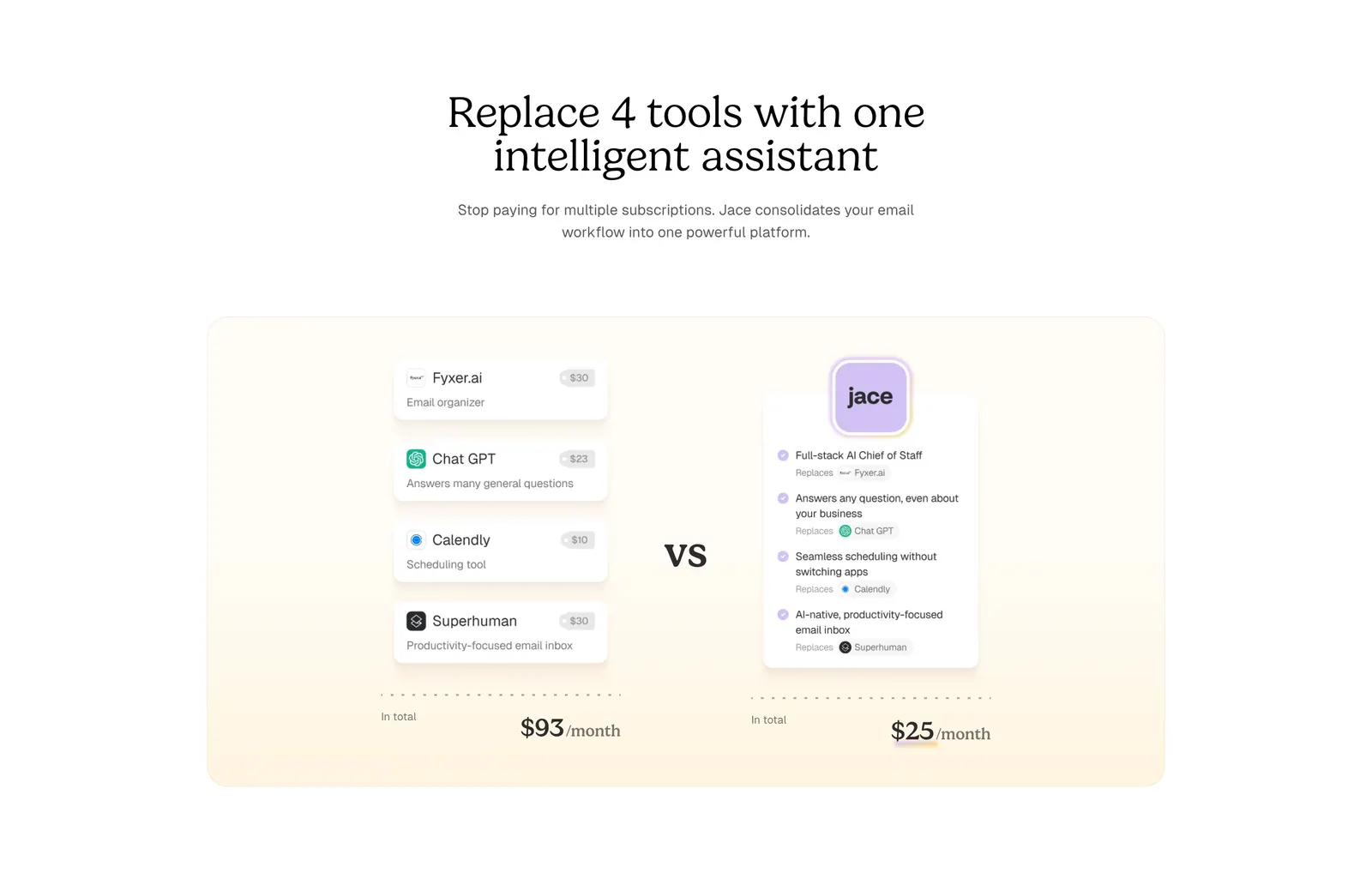
  192. Jace comparison section: serif centered headline above a cream panel comparing four tool cards and prices vs one Jace card
    Jace Comparison
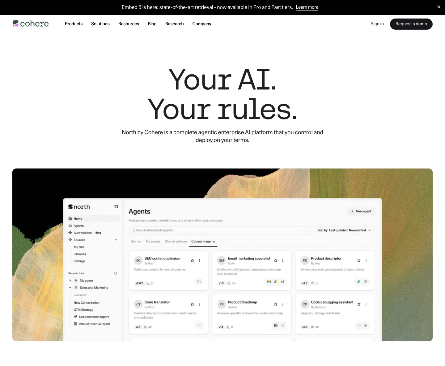
  193. Cohere hero section: centered headline and subcopy above an agents dashboard screenshot on an abstract painted backdrop
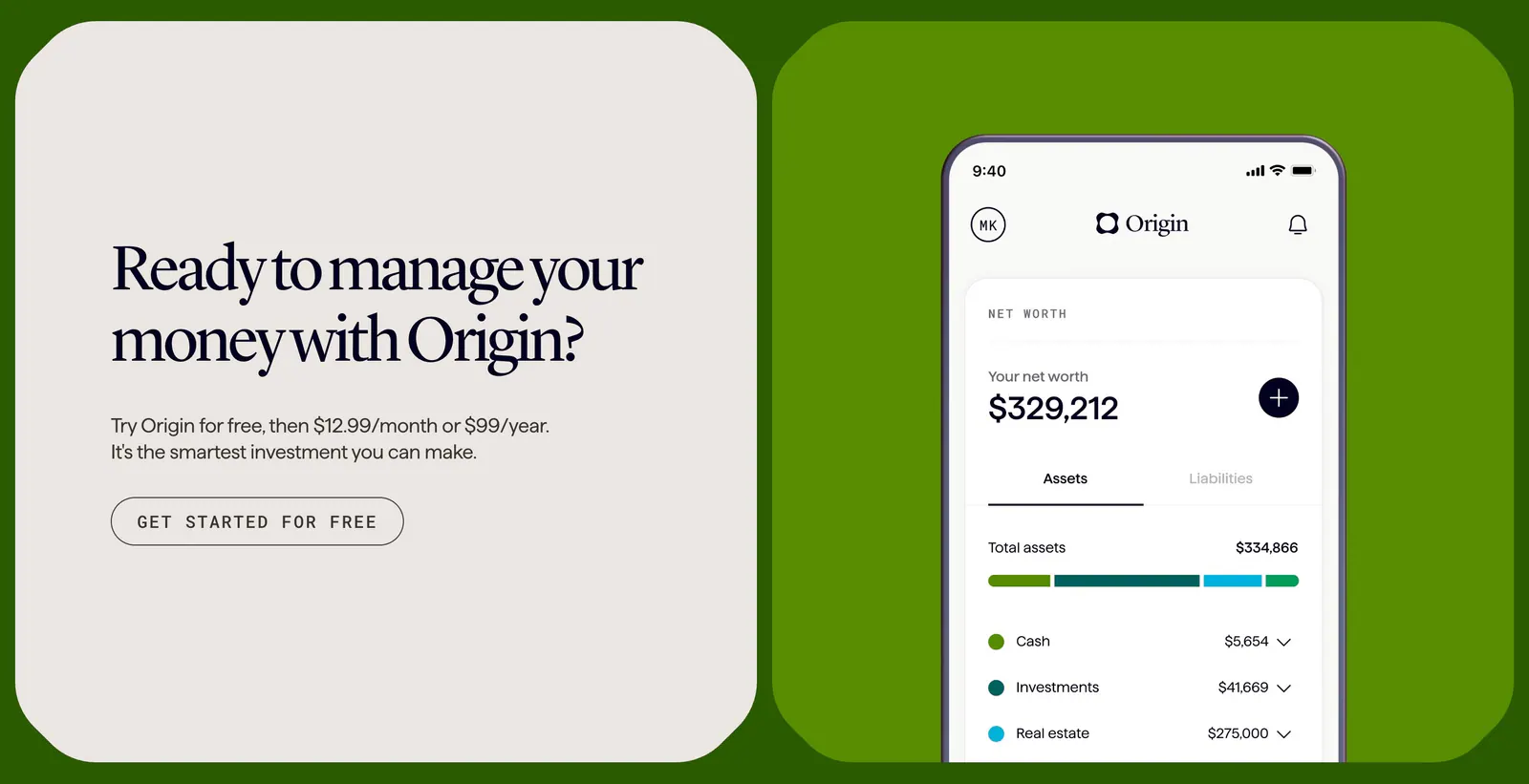
  194. Coframe call-to-action section: serif headline card beside a phone app screenshot on a bright green background, branded as Origin
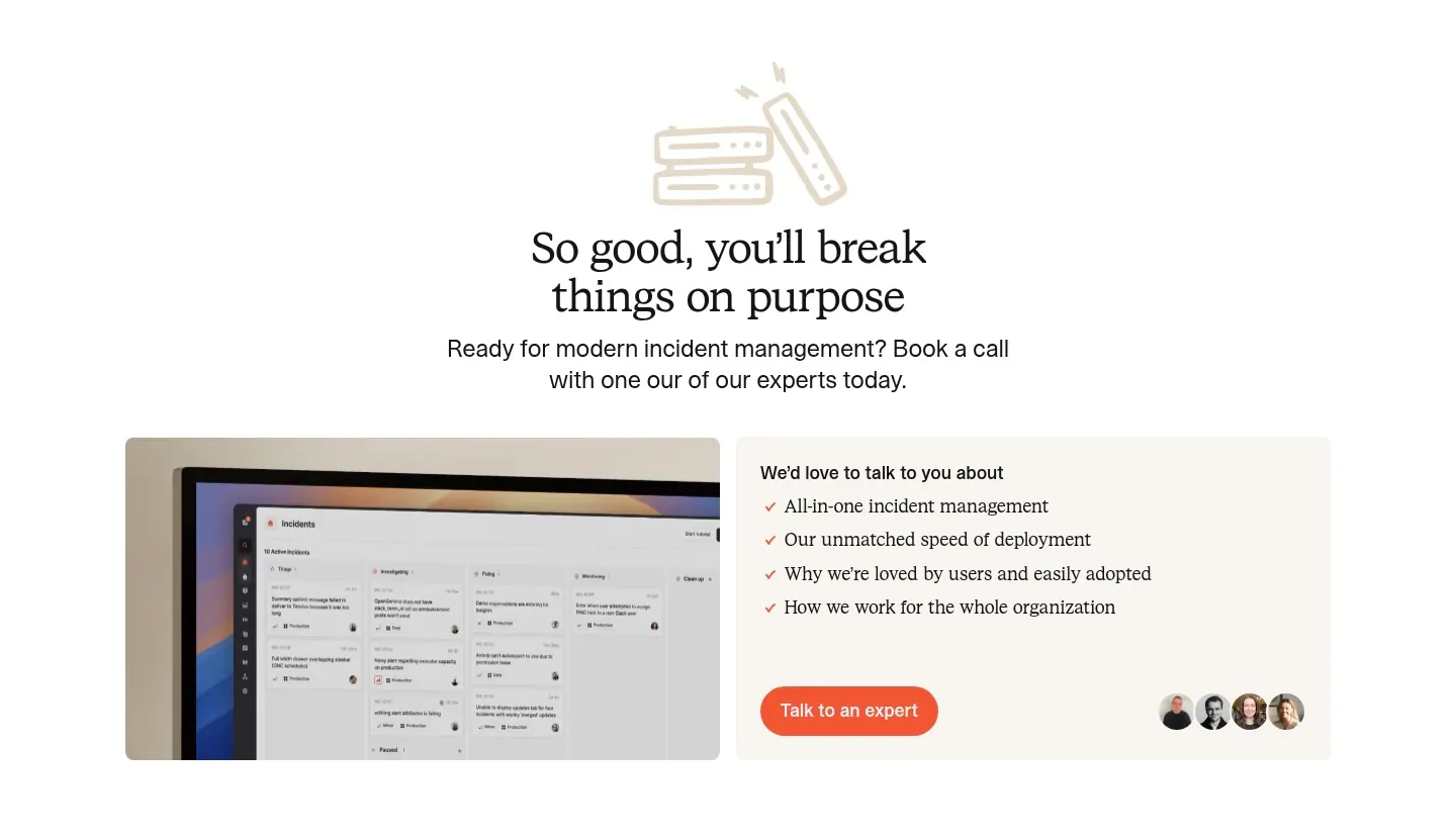
  195. incident.io call-to-action section: serif centered headline with line-art icon above a monitor screenshot and a talk-to-an-expert card
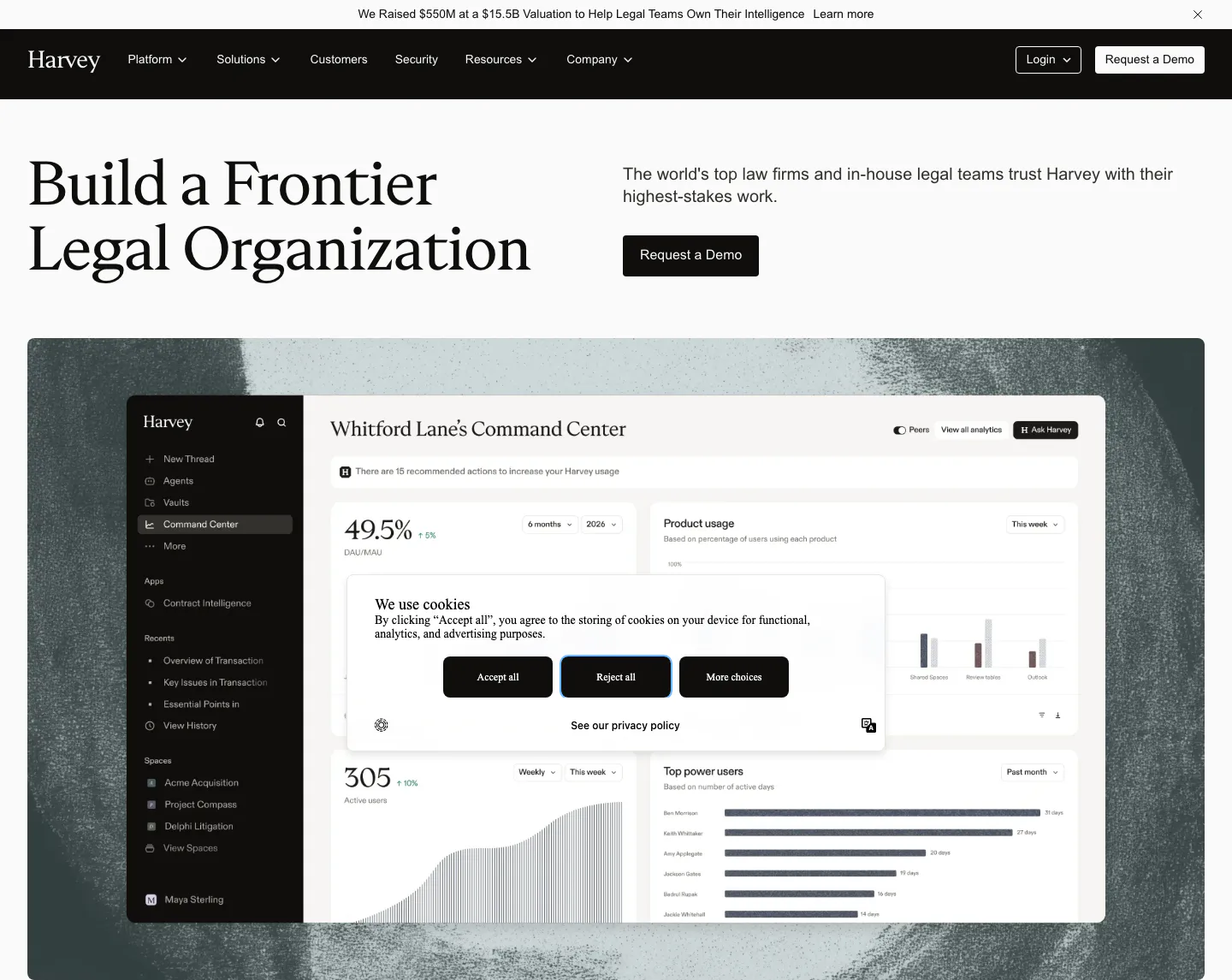
  196. Harvey hero section: serif headline left, copy and demo button right, above a dashboard screenshot on a textured backdrop
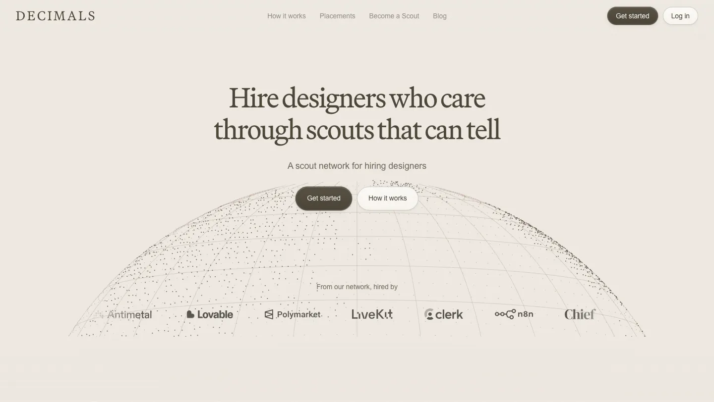
  197. Decimals hero section: centered serif headline and buttons over a dotted wireframe globe with a customer logo row on a beige background
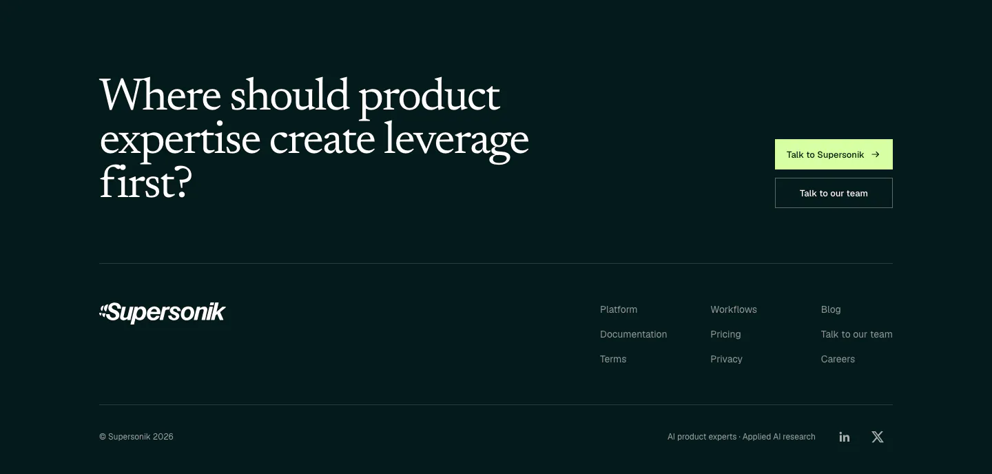
  198. Supersonik footer section: large serif question with two CTA buttons above a wordmark, three link columns and copyright on dark teal
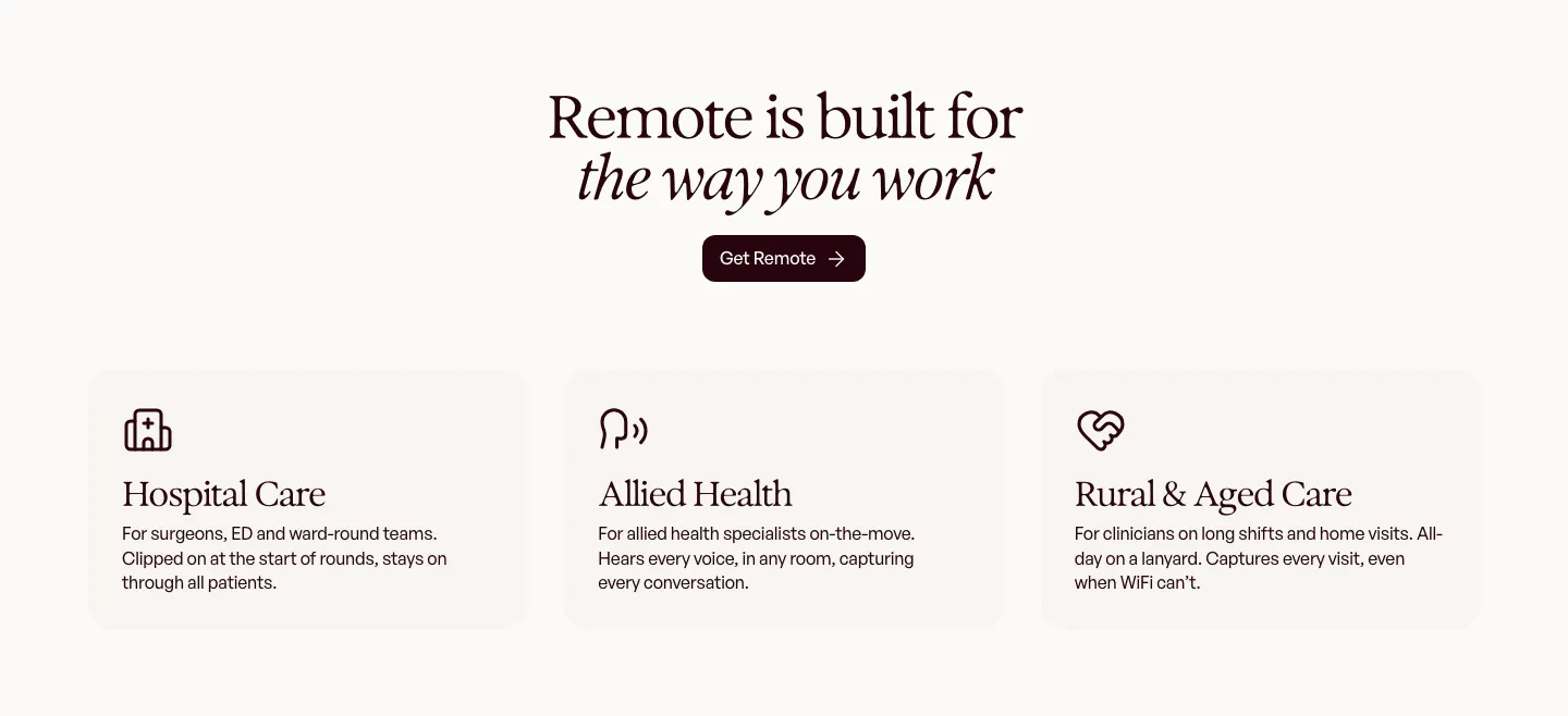
  199. Heidi use cases section: centered serif headline and Get Remote button above three cream cards for hospital, allied and rural care
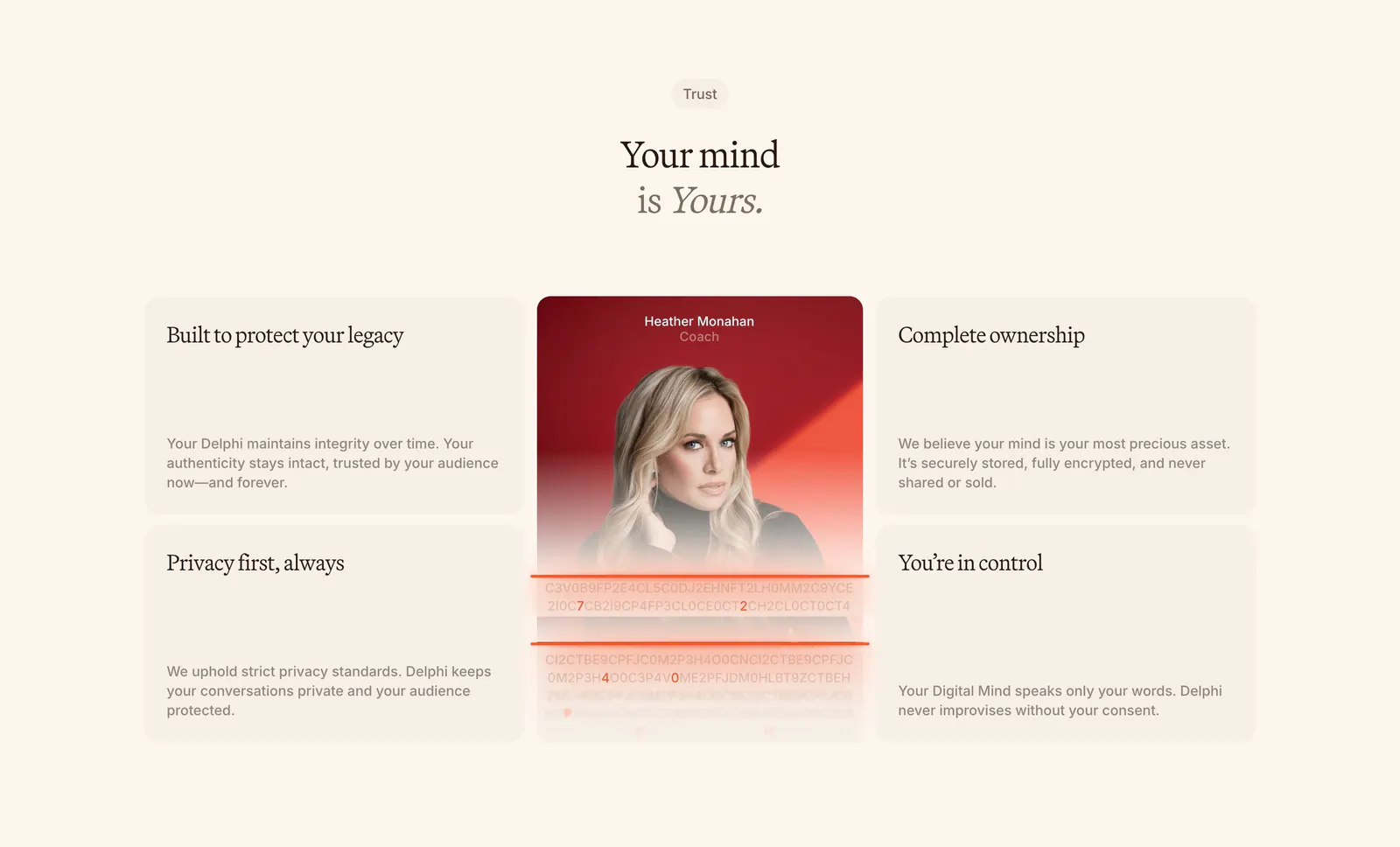
  200. Delphi features section: centered serif headline above a bento of four trust cards around a tall portrait card with an encryption text effect
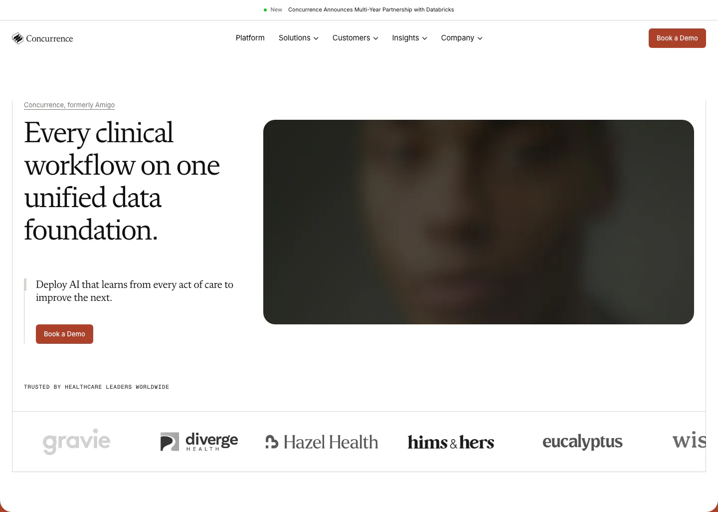
  201. Concurrence hero section: serif headline and rust Book a Demo button beside a blurred dark portrait image, healthcare logo row below
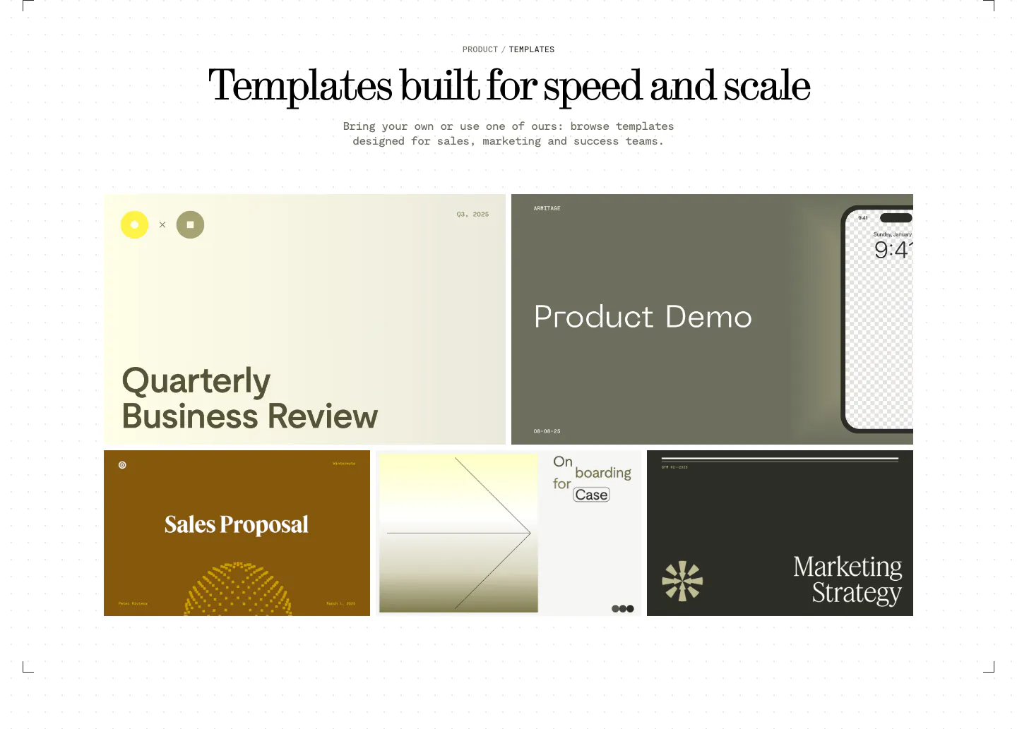
  202. Visual features section: centered serif headline above a bento grid of presentation template previews in olive, cream, brown and charcoal
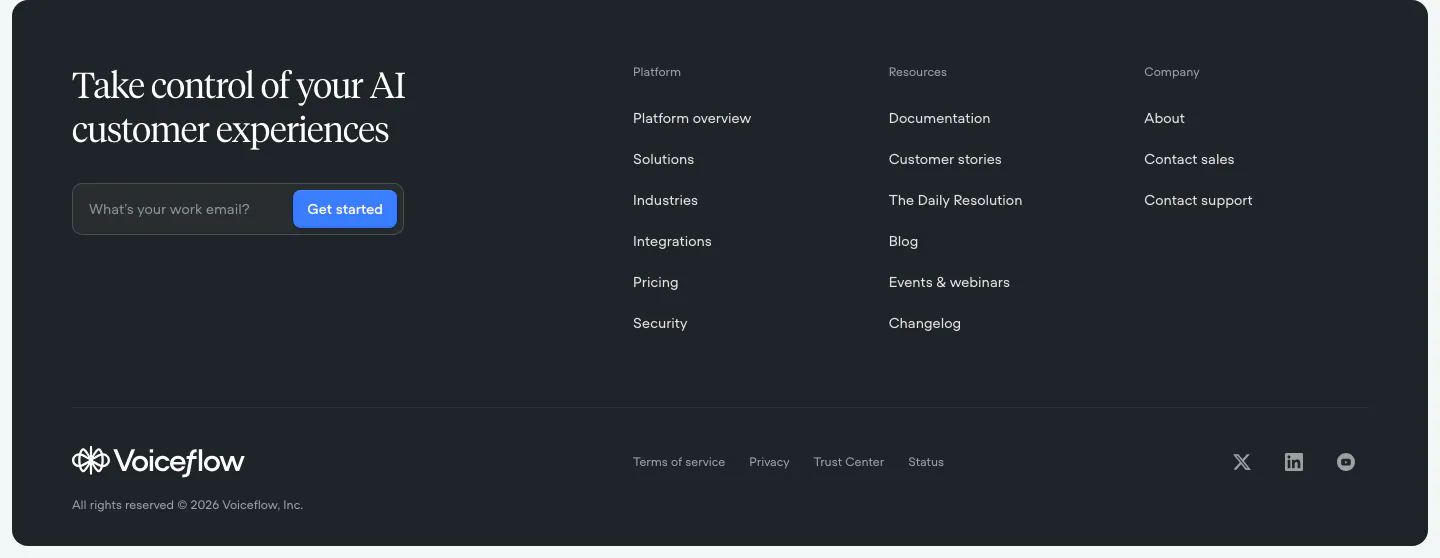
  203. Voiceflow footer section: dark rounded panel with serif headline and email field on the left, three link columns and social icons
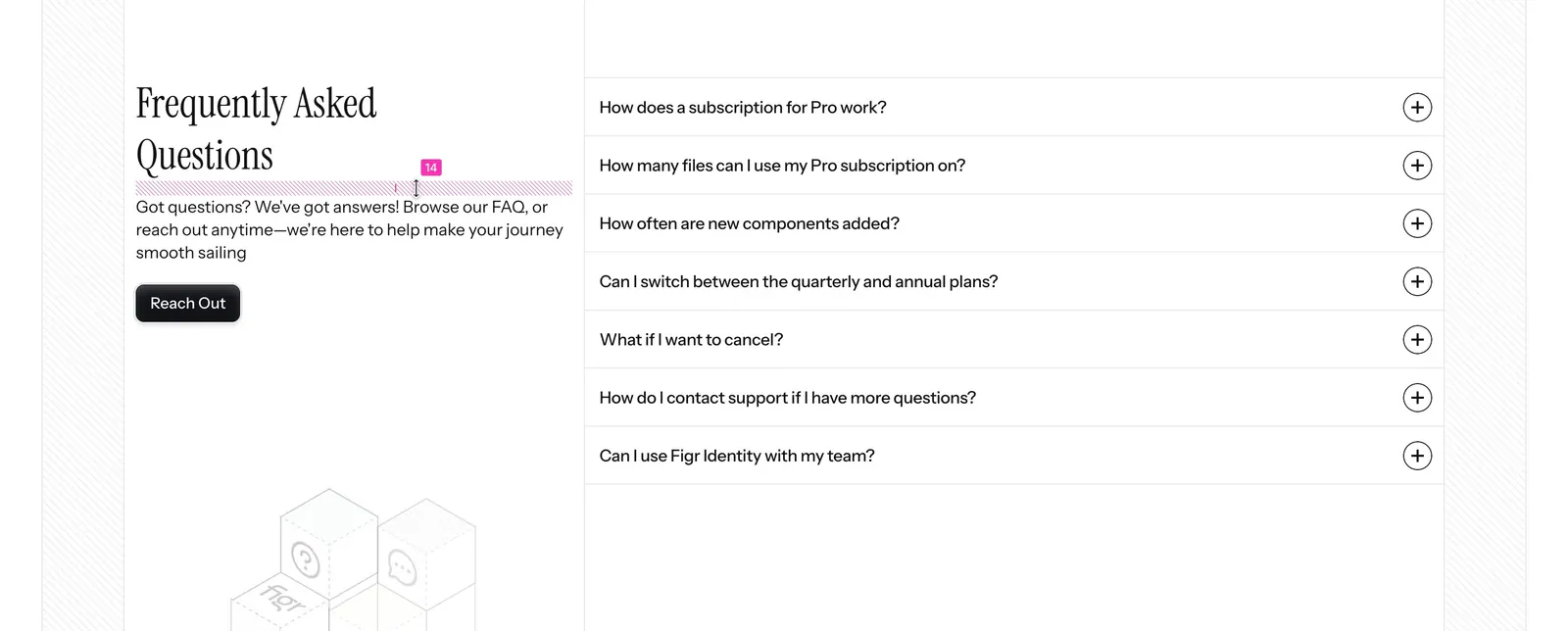
  204. Figr FAQ section: serif heading, intro and Reach Out button on the left with a seven-question accordion on the right
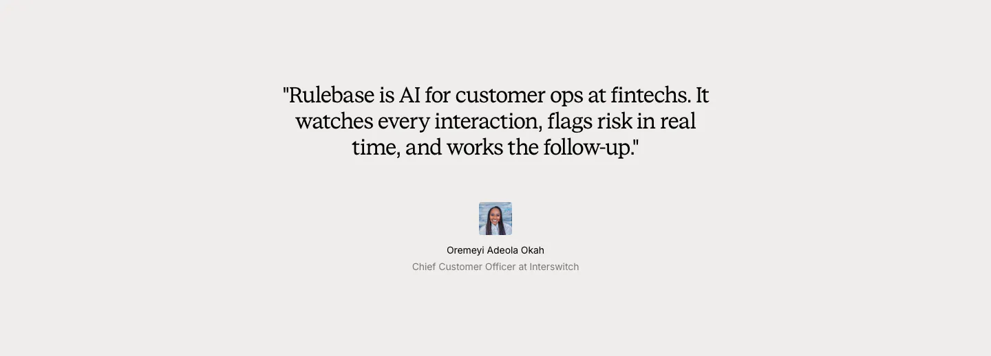
  205. Rulebase testimonials section: centered serif customer quote with a small avatar, name and title on a light gray background
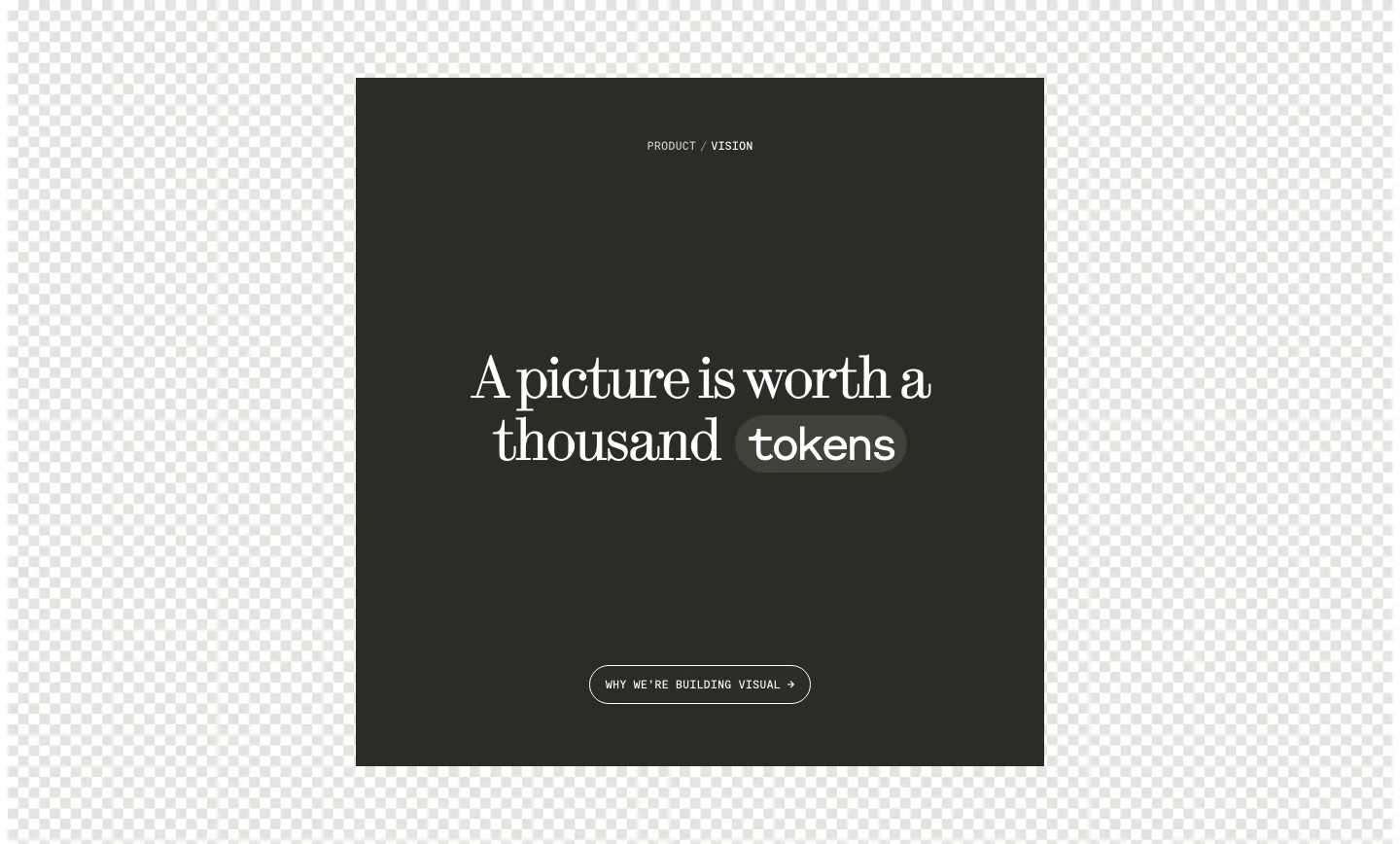
  206. Visual call to action section: dark square panel with centered serif headline, a tokens pill and outline button over a checkerboard background
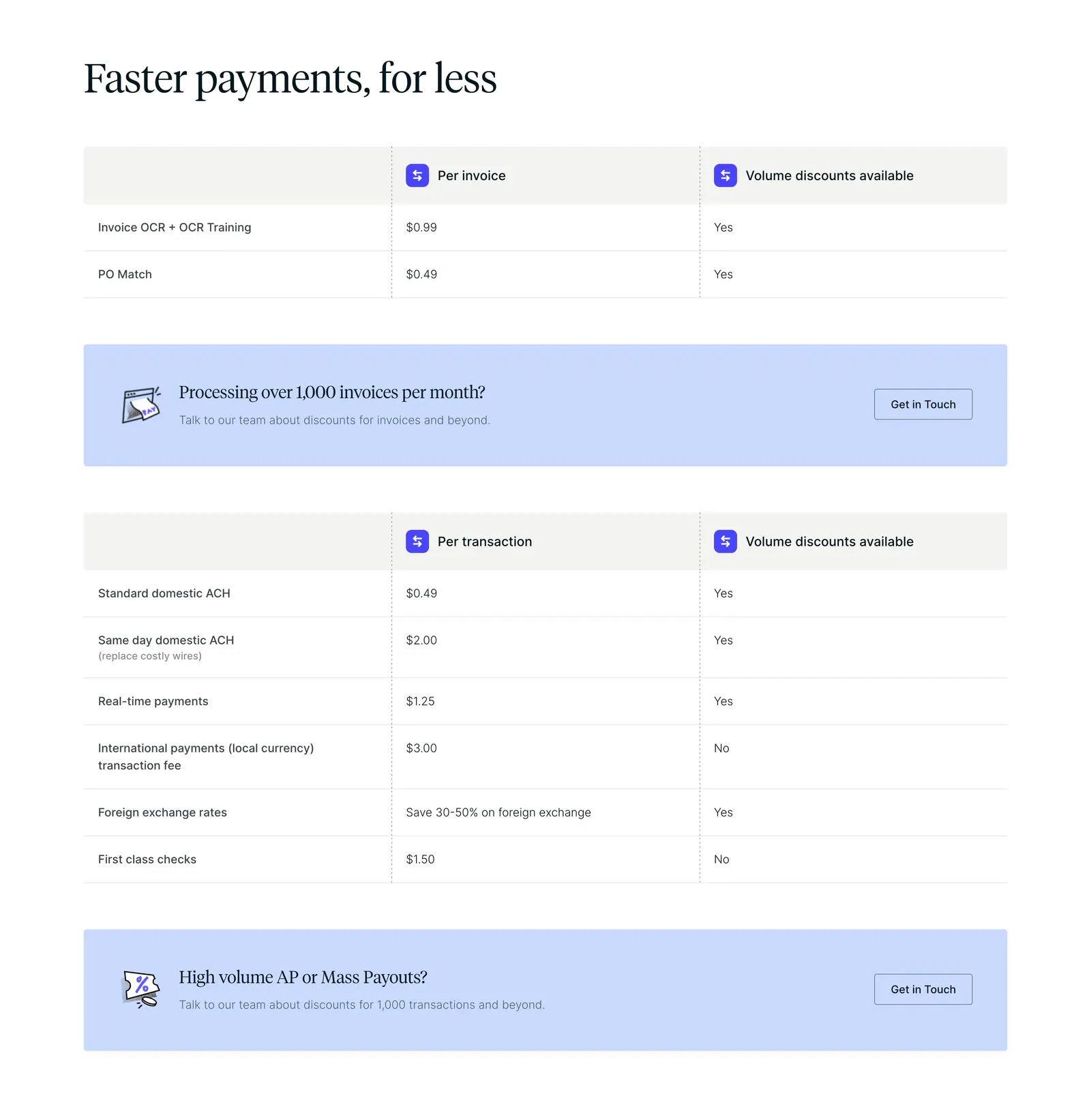
  207. Routable pricing section: serif headline above per-invoice and per-transaction fee tables with light blue contact banners on white
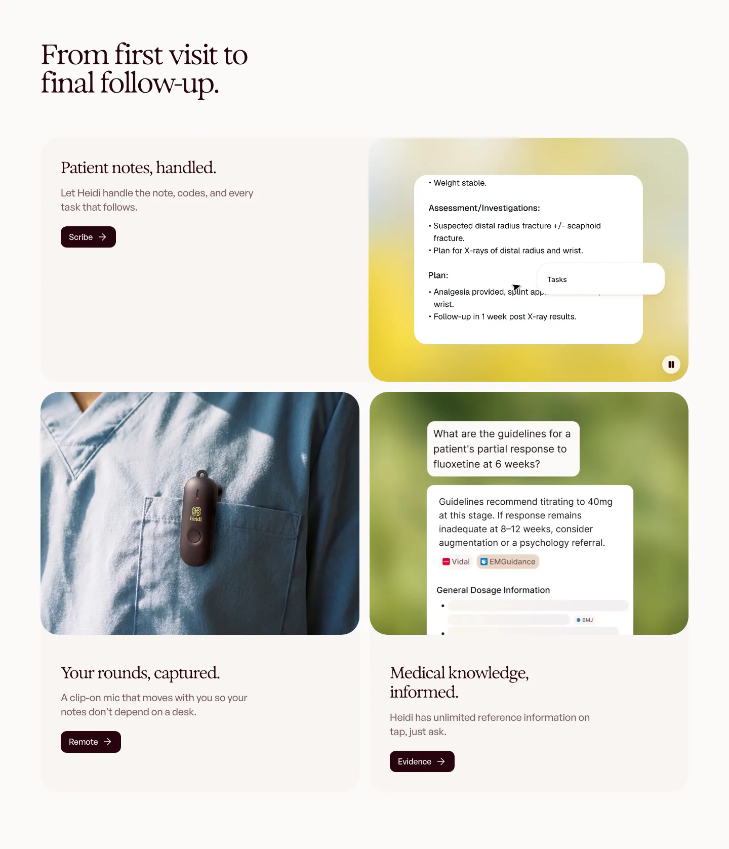
  208. Heidi features section: serif headline over rounded cards pairing text with a clinical notes UI, a clip-on mic photo and a chat answer
  209. Daniel Sun logo cloud section: italic serif label above a bordered 5x3 grid of black client logos on white
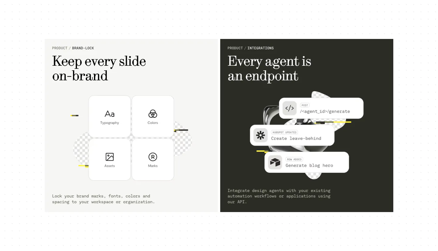
  210. Visual features section: two side-by-side panels, a light one with four brand-lock tiles and a dark one with stacked API endpoint cards
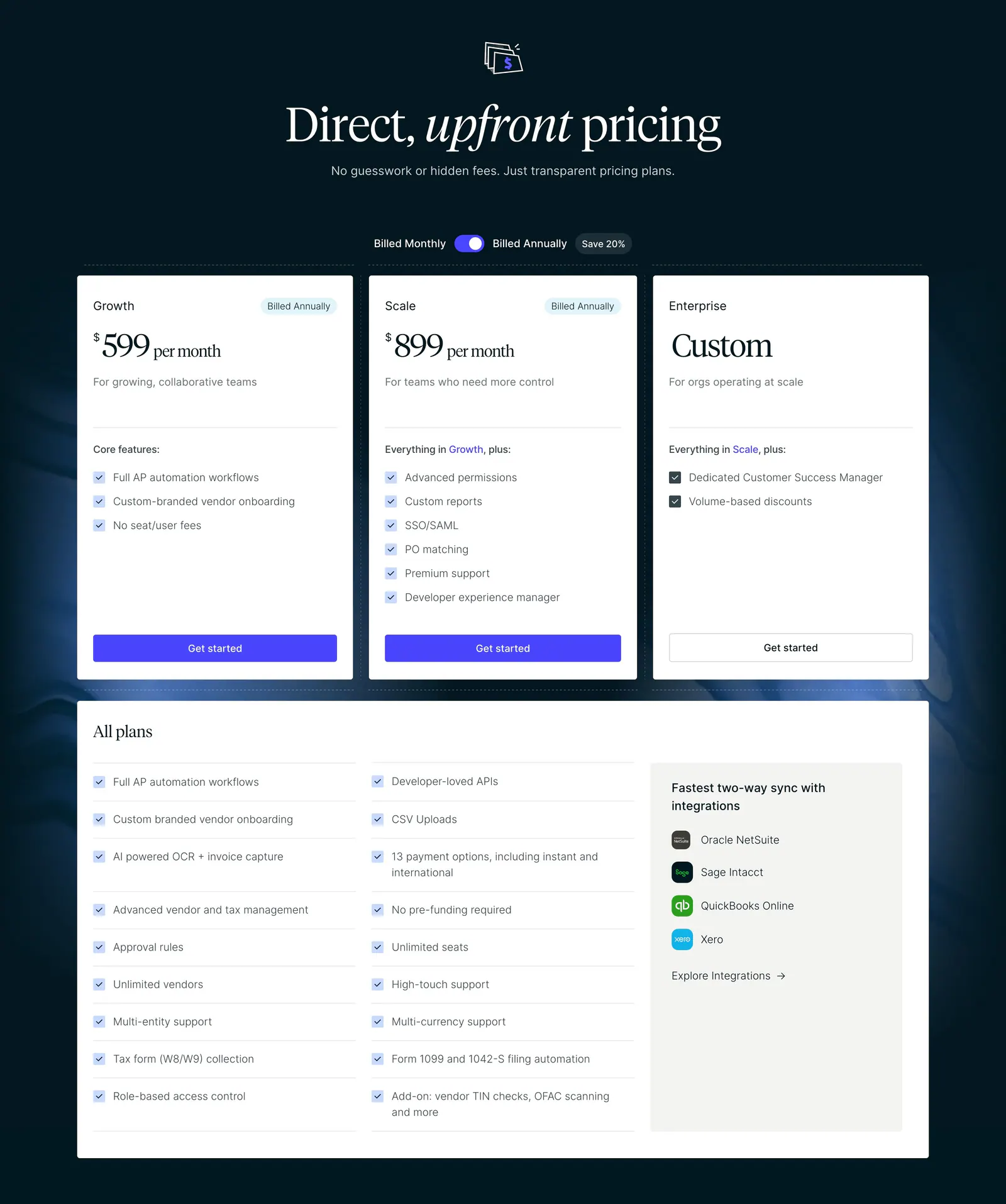
  211. Routable pricing section: serif headline and billing toggle above three plan cards and an all-plans checklist on a dark navy background
  212. Ruul how it works section: serif headline above three numbered rows with text left and UI cards on grid panels right, plus a flags strip
  213. Attio call-to-action section: centered headline and two buttons below a grayscale mosaic of customer logo tiles on white
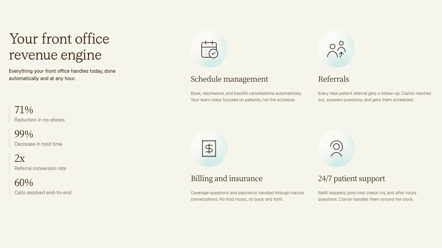
  214. Clarion features section: serif headline and four stacked metrics on the left, a 2x2 grid of icon features on the right, cream background
  215. Plumb logo cloud section: italic serif heading above investor logos fading at the edges and four pastel angel investor cards with headshots
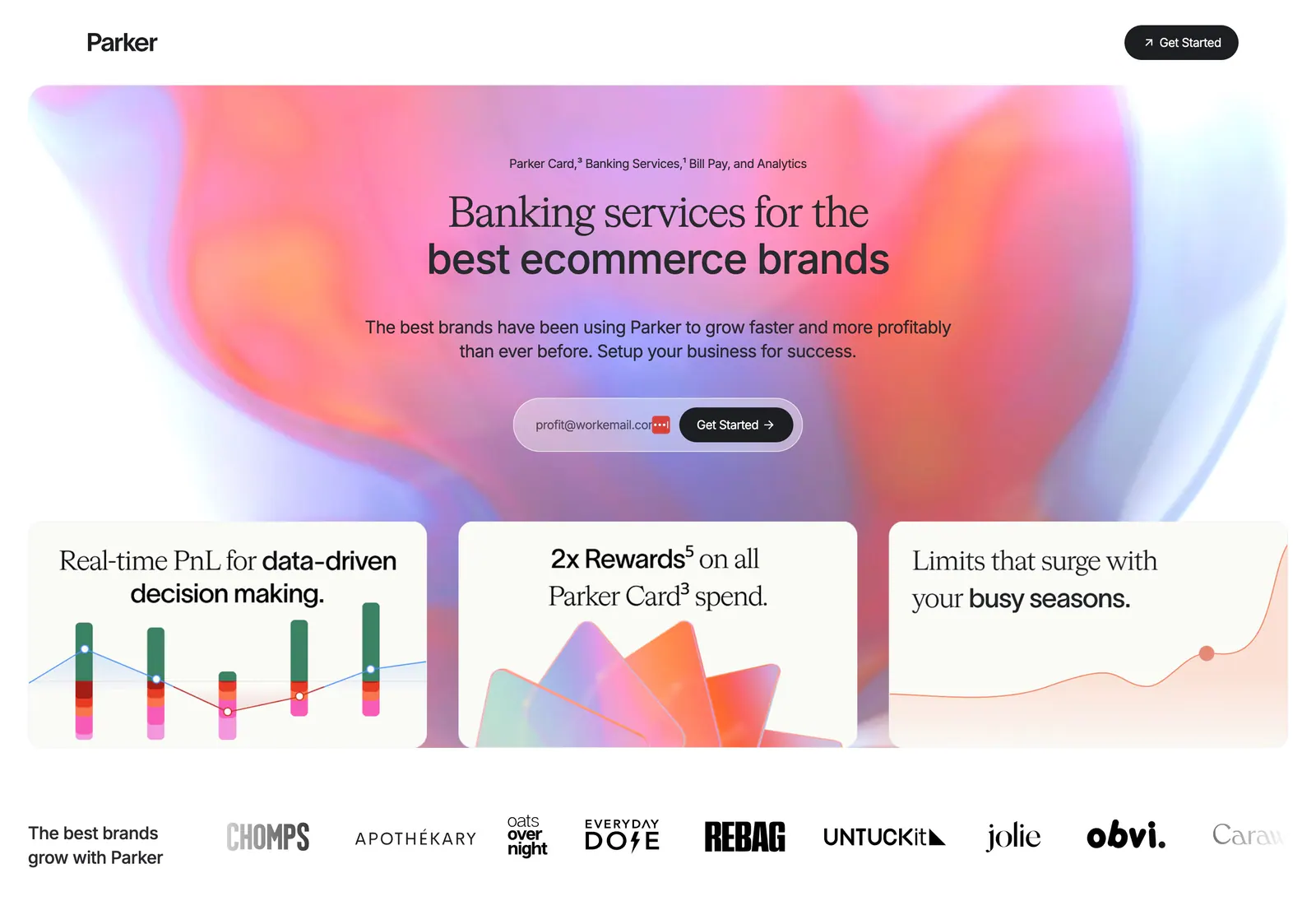
  216. Parker hero section: centered headline and email signup on a pink-orange aurora gradient above three feature cards and a brand logo row
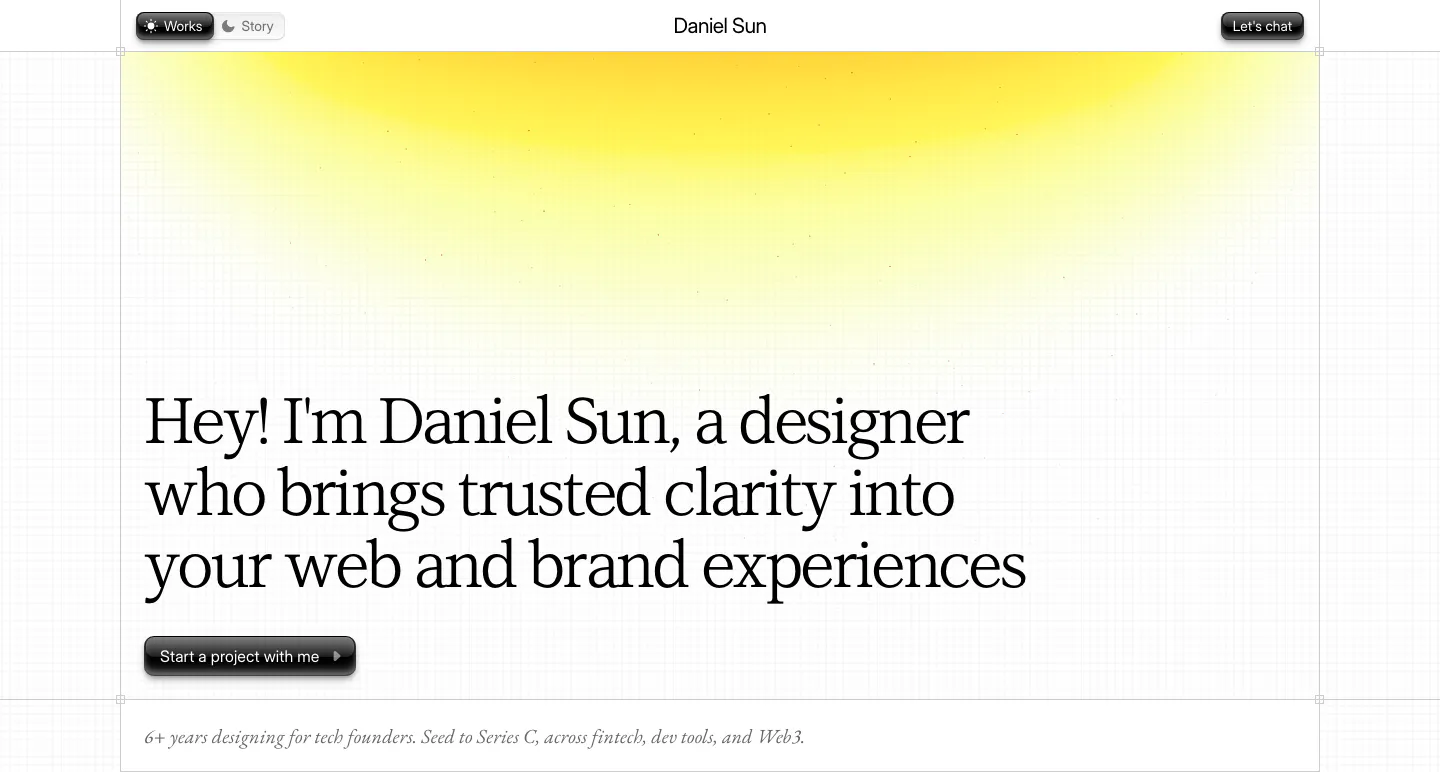
  217. Daniel Sun hero section: left-aligned serif headline and dark pill button under a yellow glow on a faint grid-line background
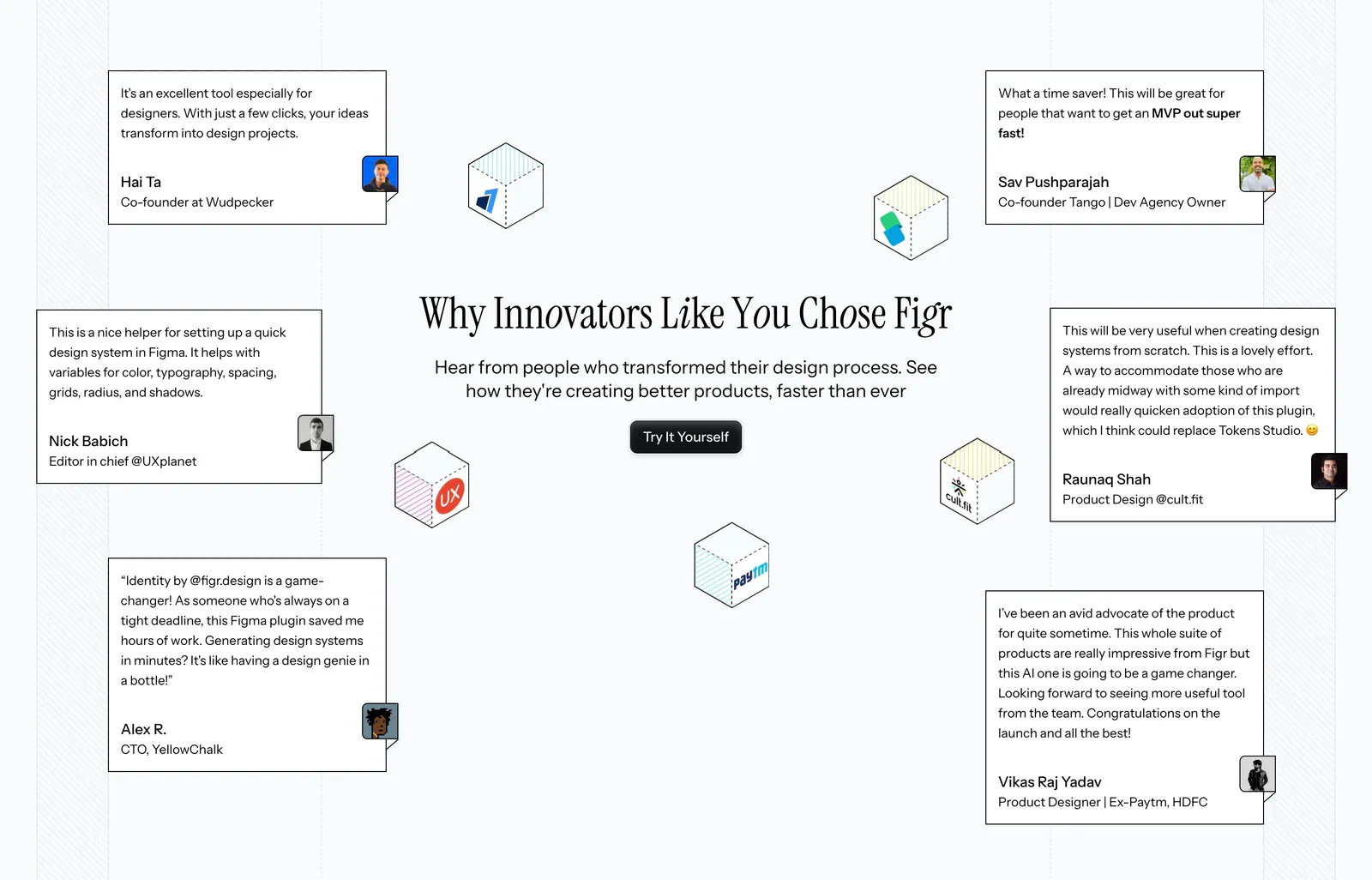
  218. Figr testimonials section: centered serif headline and button surrounded by scattered quote cards and isometric logo cubes
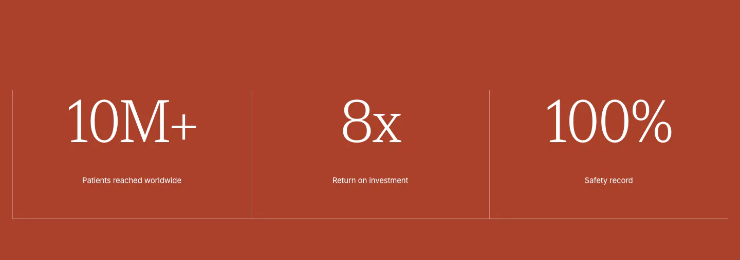
  219. Concurrence stats section: three large serif metrics with small labels split by thin dividers on a solid rust-red background
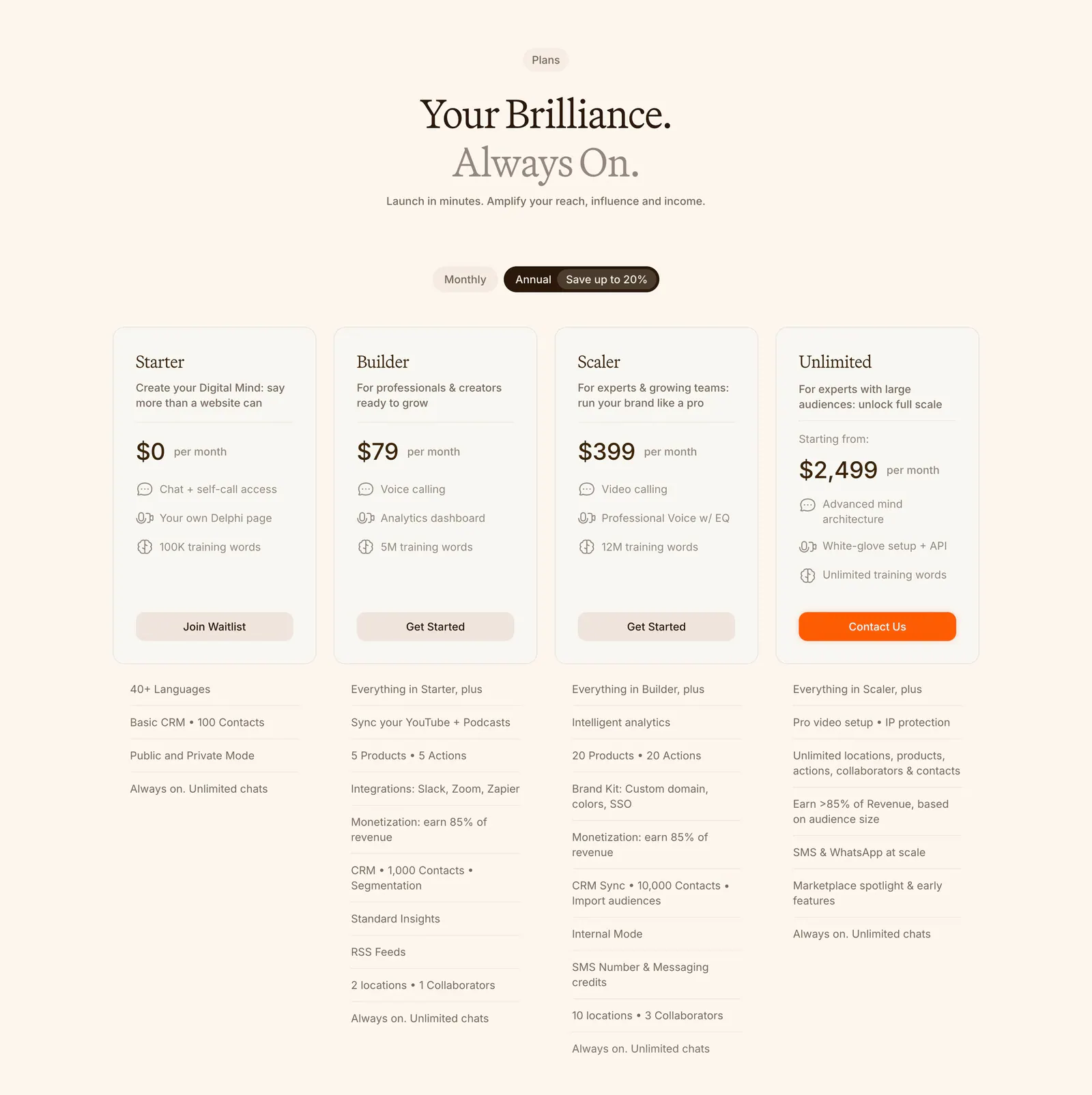
  220. Delphi pricing section: centered serif headline, monthly/annual toggle and four plan cards with feature lists below on a cream background
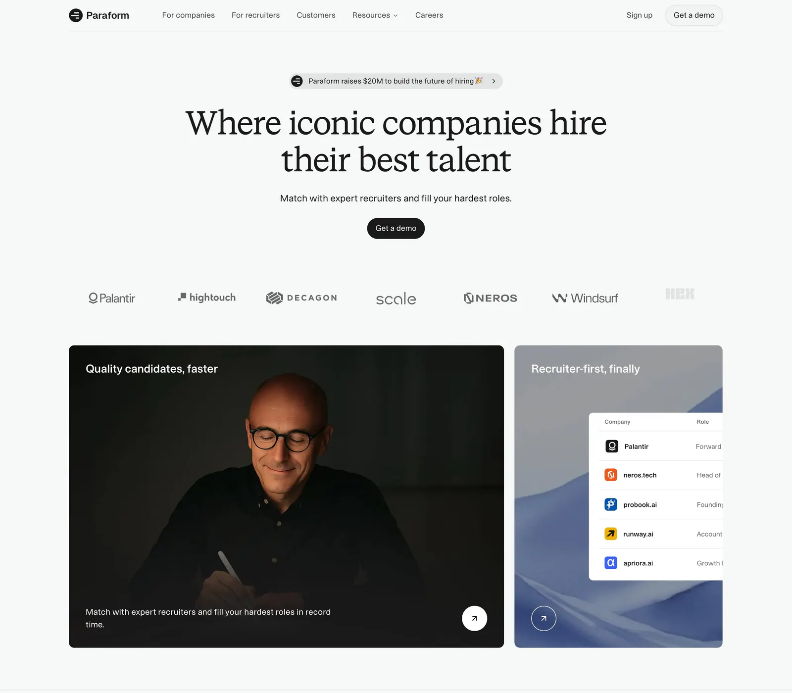
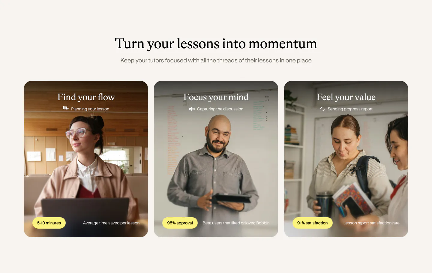
  221. Paraform hero section: centered serif headline with demo button above a customer logo row and two cards with a portrait photo and UI table
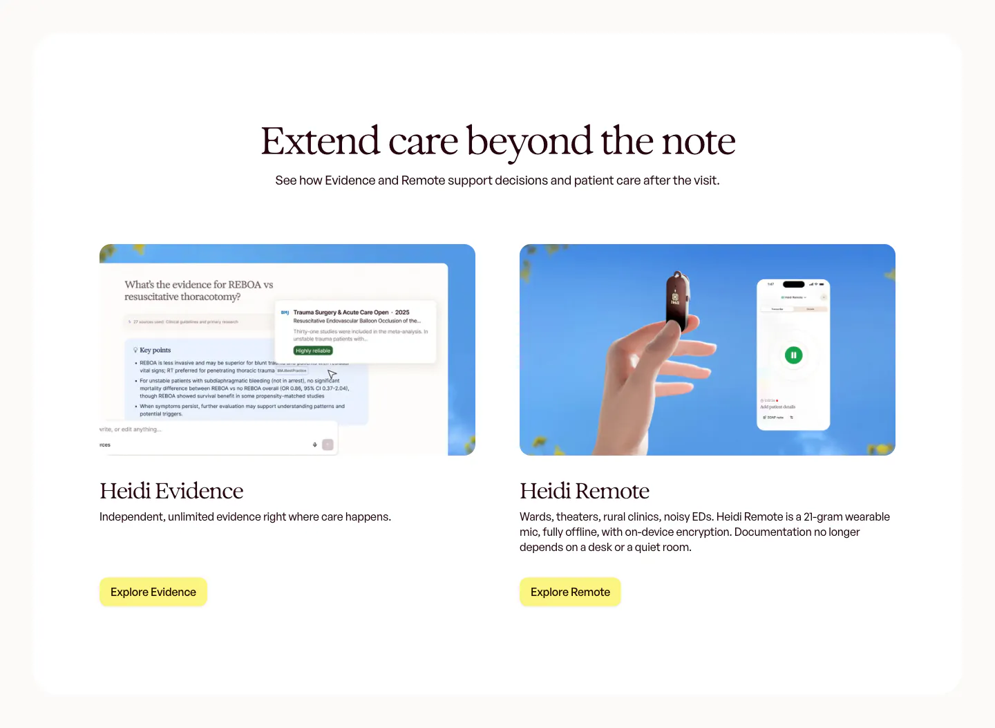
  222. Heidi features section: centered serif headline above two product cards, an Evidence answer UI and a hand holding the Remote mic
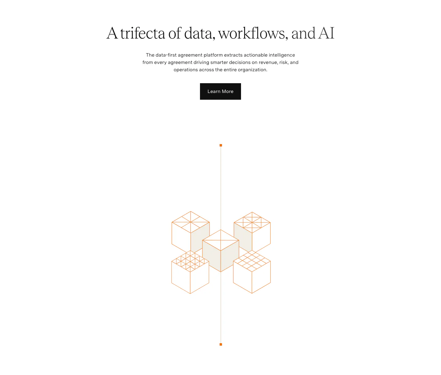
  223. Conduit hero section: centered serif headline and demo button above an inbox app screenshot on a painterly landscape backdrop
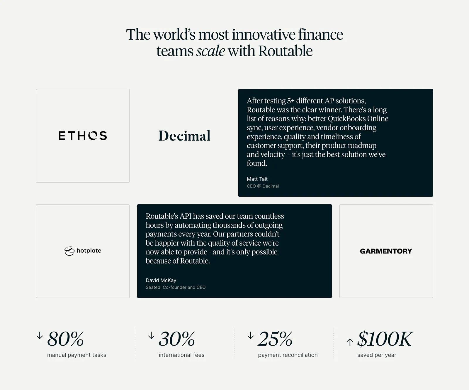
  224. Greenhouse call-to-action section: white serif headline and blue button on the left with a fingerprint flower artwork on dark green
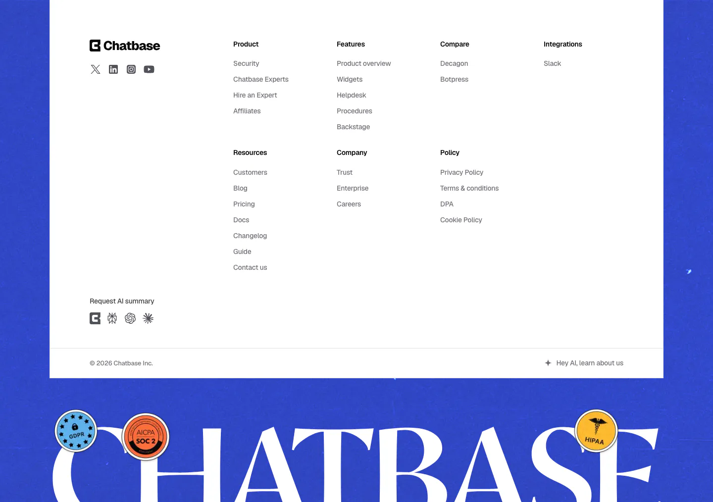
  225. Chatbase footer section: white link-column panel on a blue background above a giant serif Chatbase wordmark with compliance stickers
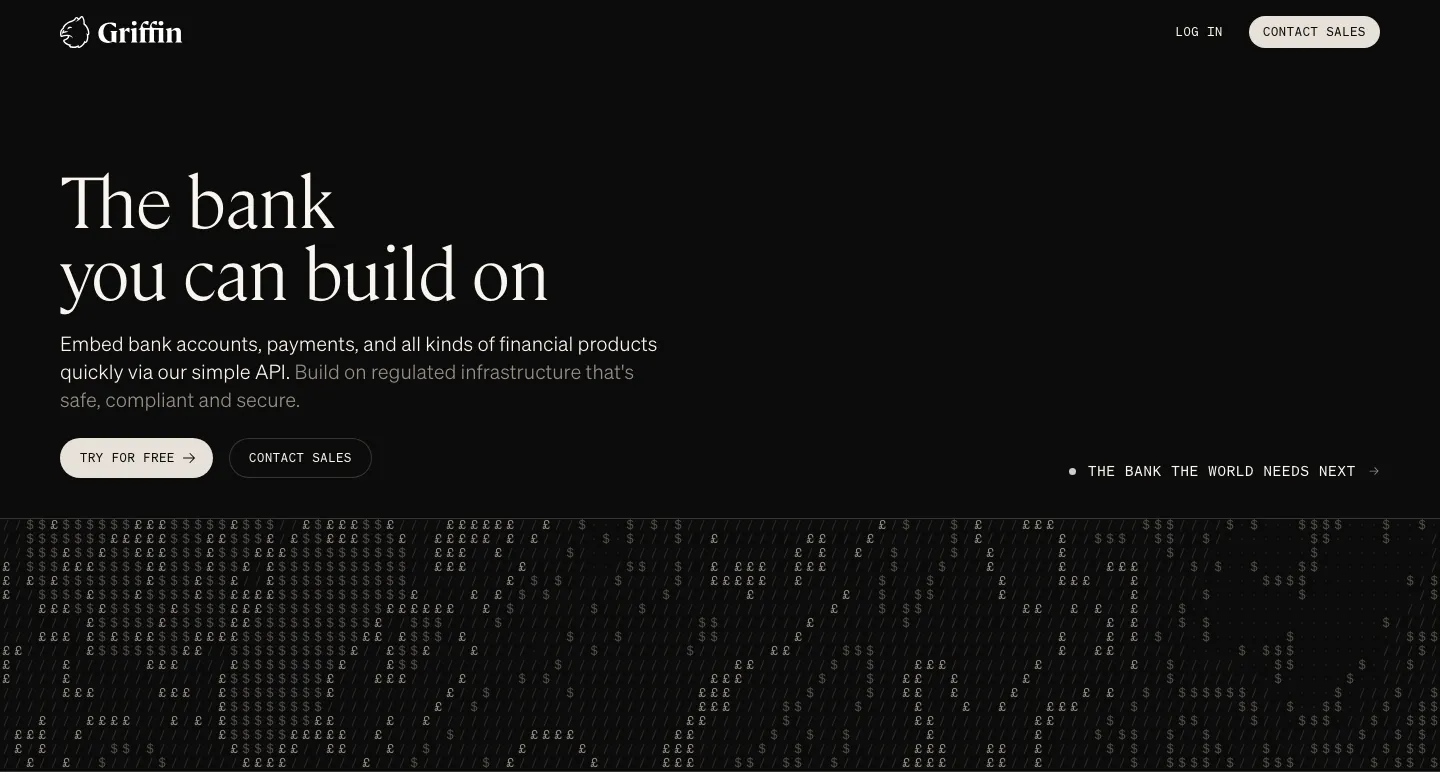
  226. Griffin hero section: large serif headline, copy and two buttons on black above a field of £ and $ characters
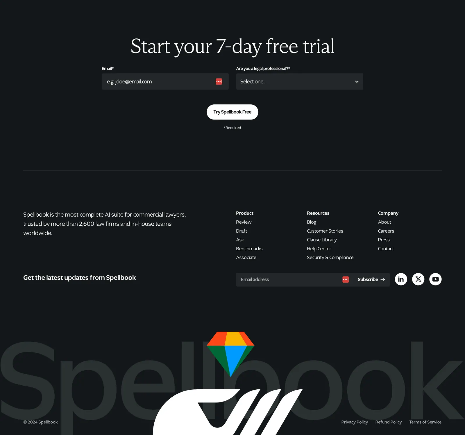
  227. Spellbook footer section: trial signup form, link columns, newsletter field and a huge faded Spellbook wordmark with logo on dark charcoal
  228. Bobbin value proposition section: serif heading above three photo cards of tutors with yellow stat pills on a cream background
  229. Visual features section: charcoal split layout with serif headline and numbered accordion left, floating AI editing UI cards and portrait right
  230. Agiloft value proposition section: centered serif headline, copy and button above an orange isometric line drawing of cubes on white
  231. Routable testimonials section: serif headline over a grid of logo tiles and dark quote cards, with four savings metrics below on light gray
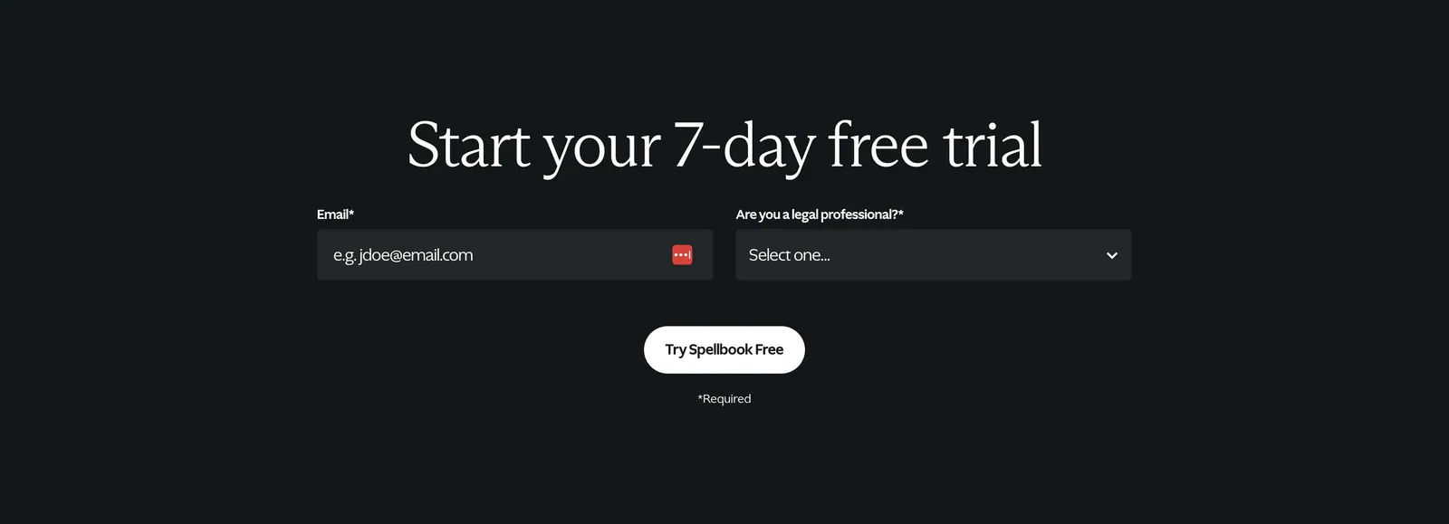
  232. Spellbook call-to-action section: centered serif headline above an email field and select dropdown with a white button on a dark background
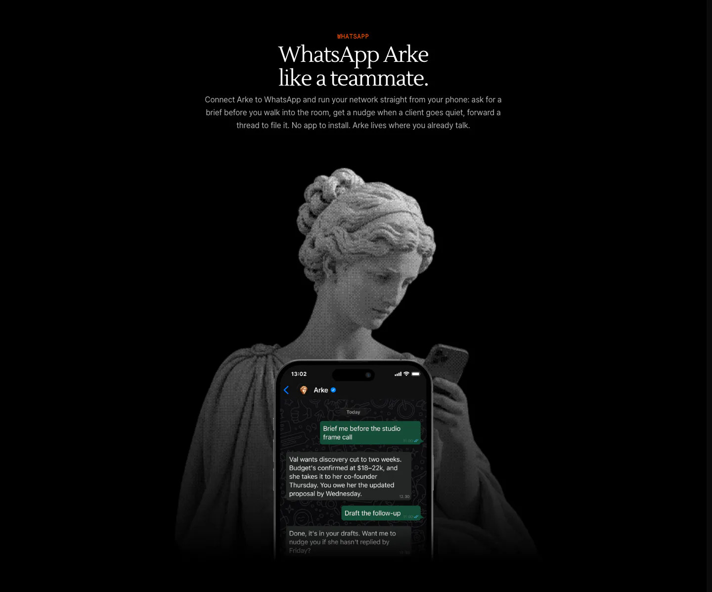
  233. Arke features section: centered serif headline above a halftone marble statue holding a phone showing a WhatsApp chat with Arke
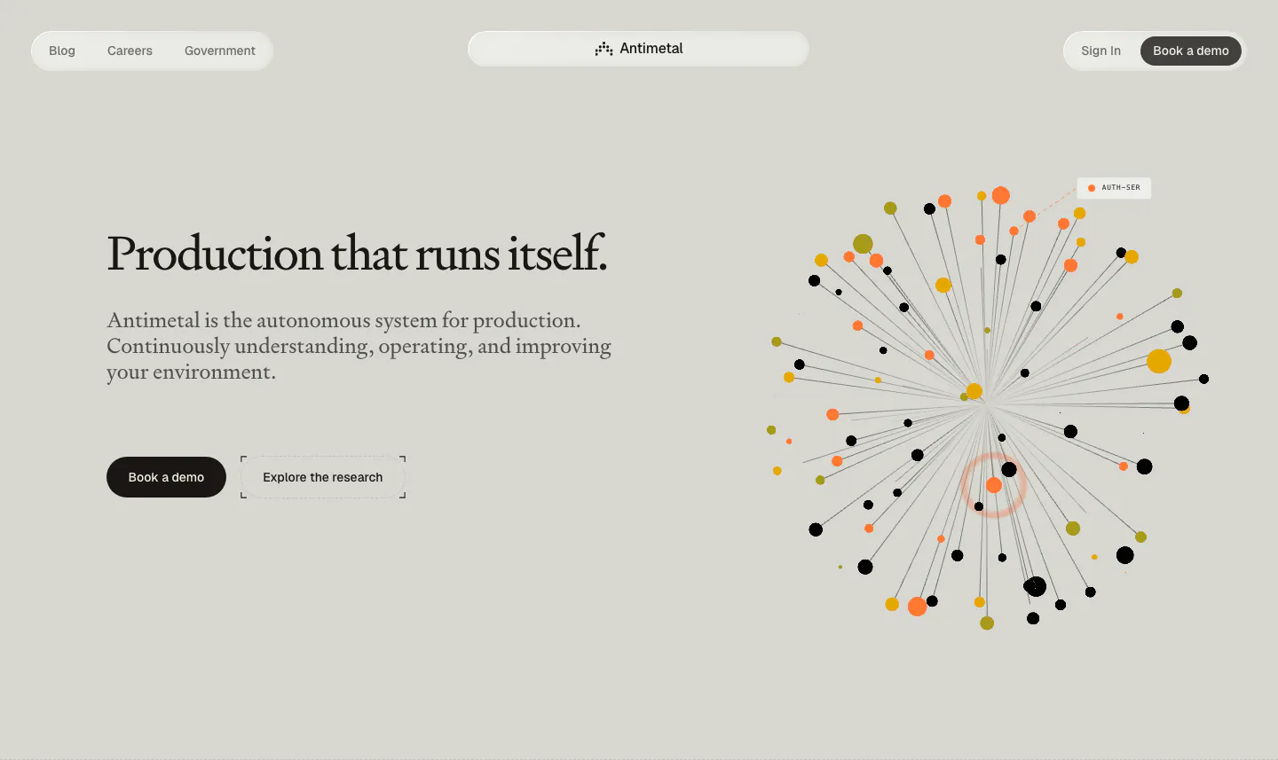
  234. Antimetal hero section: pill nav, serif headline with two buttons at left, radial burst of orange, yellow and black dots at right
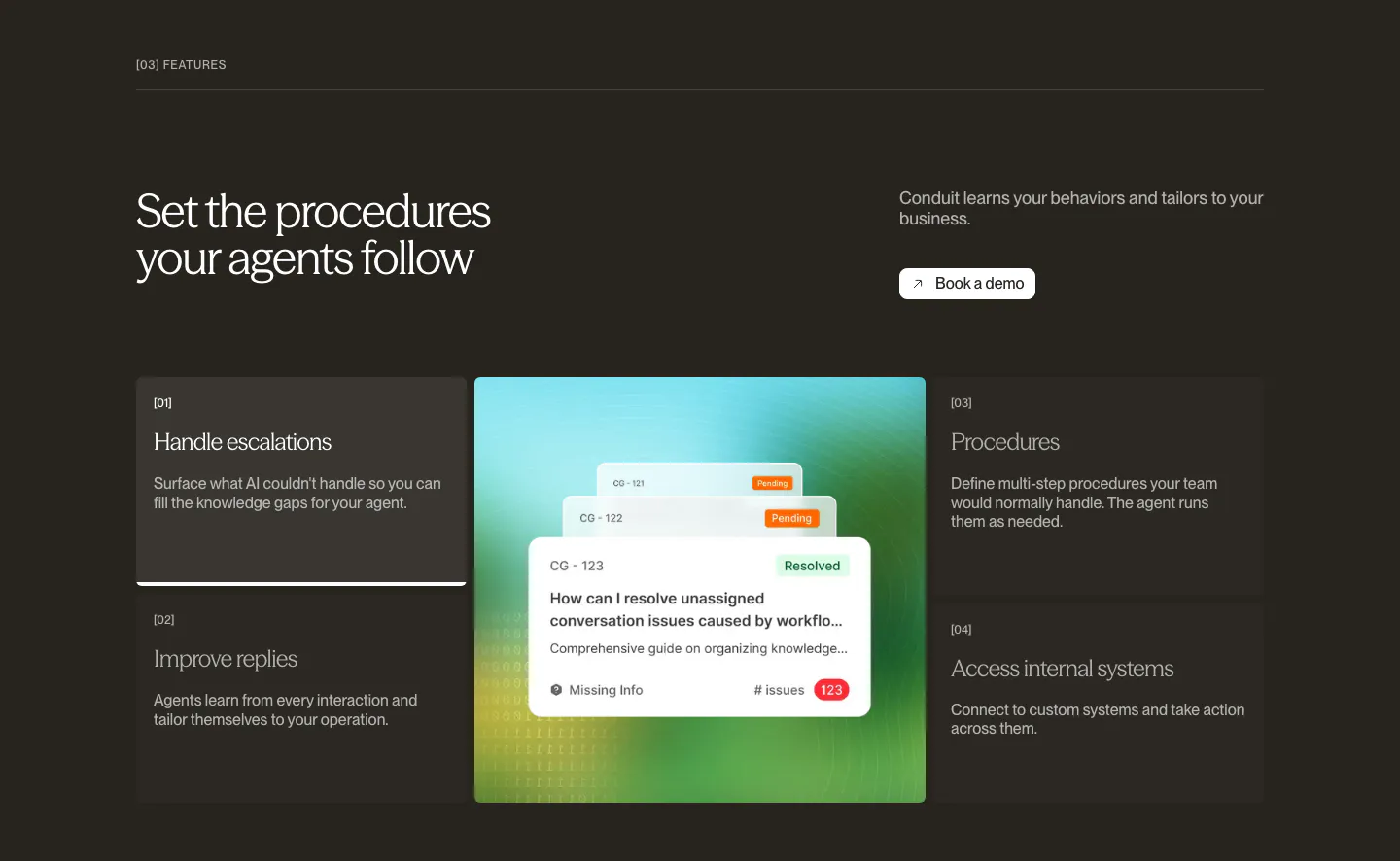
  235. Conduit features section: dark brown panel with numbered feature list flanking a central resolved-ticket UI card
  236. Routable value proposition section: strip of four serif italic metrics with arrows and labels separated by dotted dividers on light gray
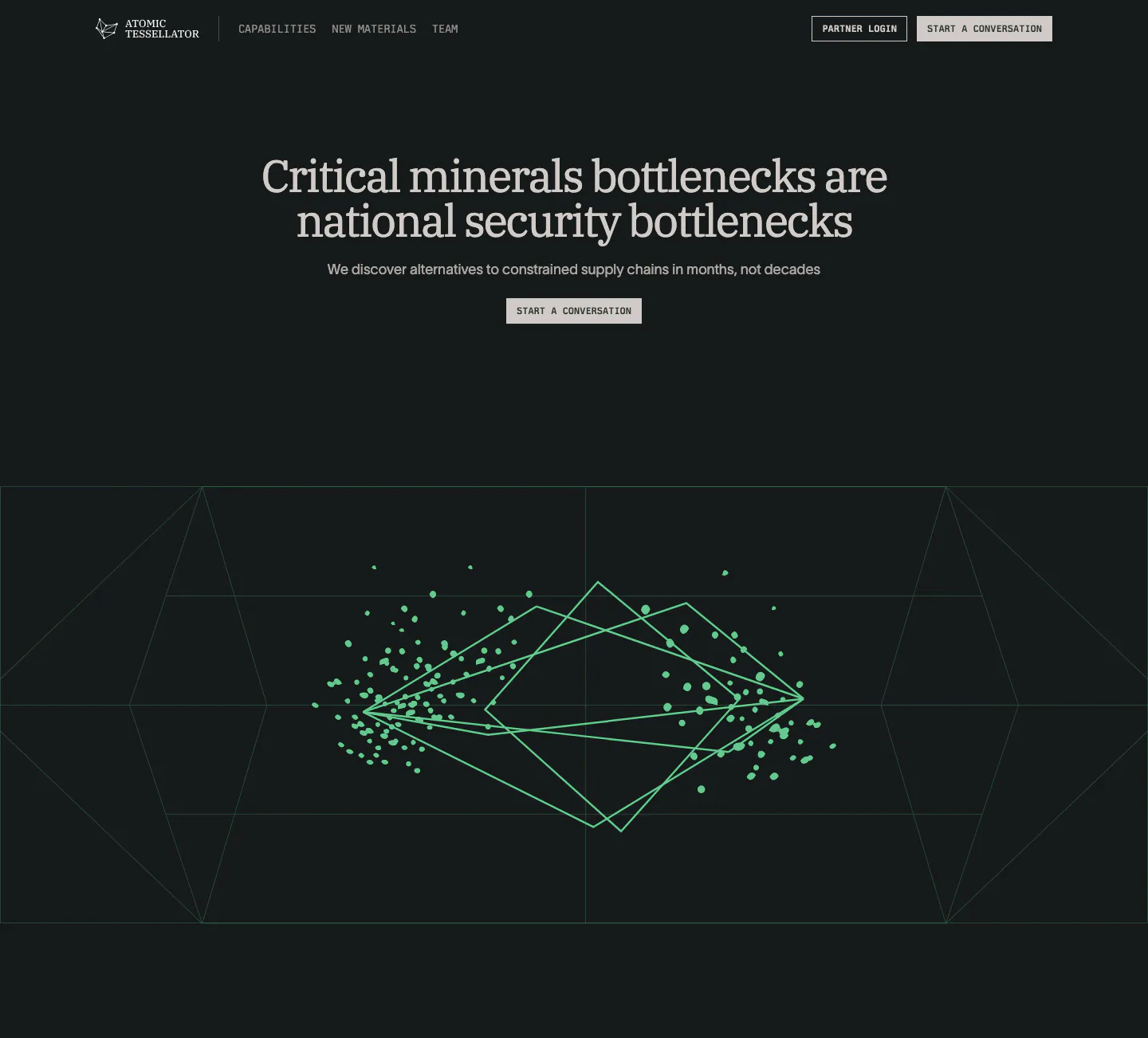
  237. Atomic Tessellator hero section: centered serif headline and Start a conversation button above a green wireframe crystal graphic on near-black
    Atomic Tessellator Hero
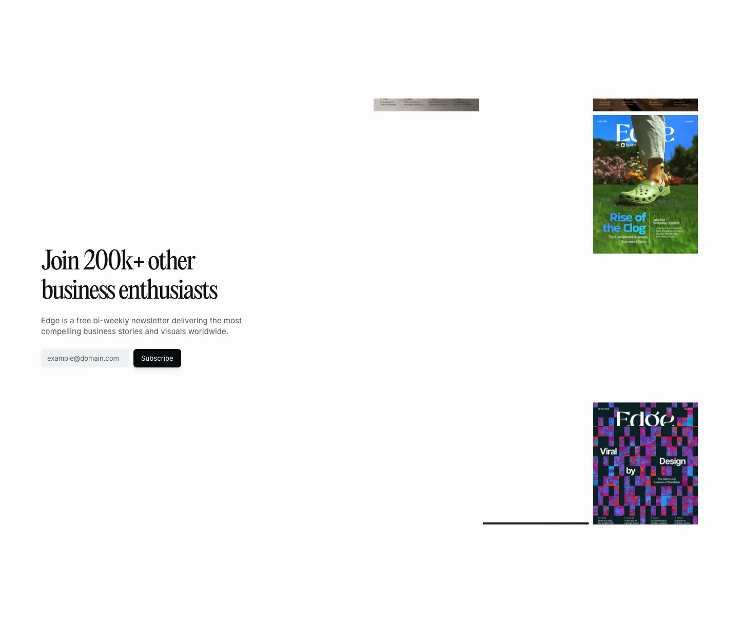
  238. Quartr newsletter section: serif headline and email subscribe field on the left, scattered Edge magazine covers on the right
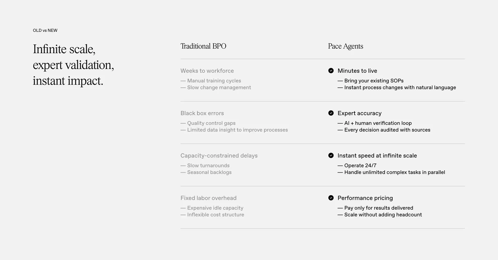
  239. Pace comparison section: serif headline on the left beside a two-column Traditional BPO vs Pace Agents table with checkmarks on light gray
    Pace Comparison
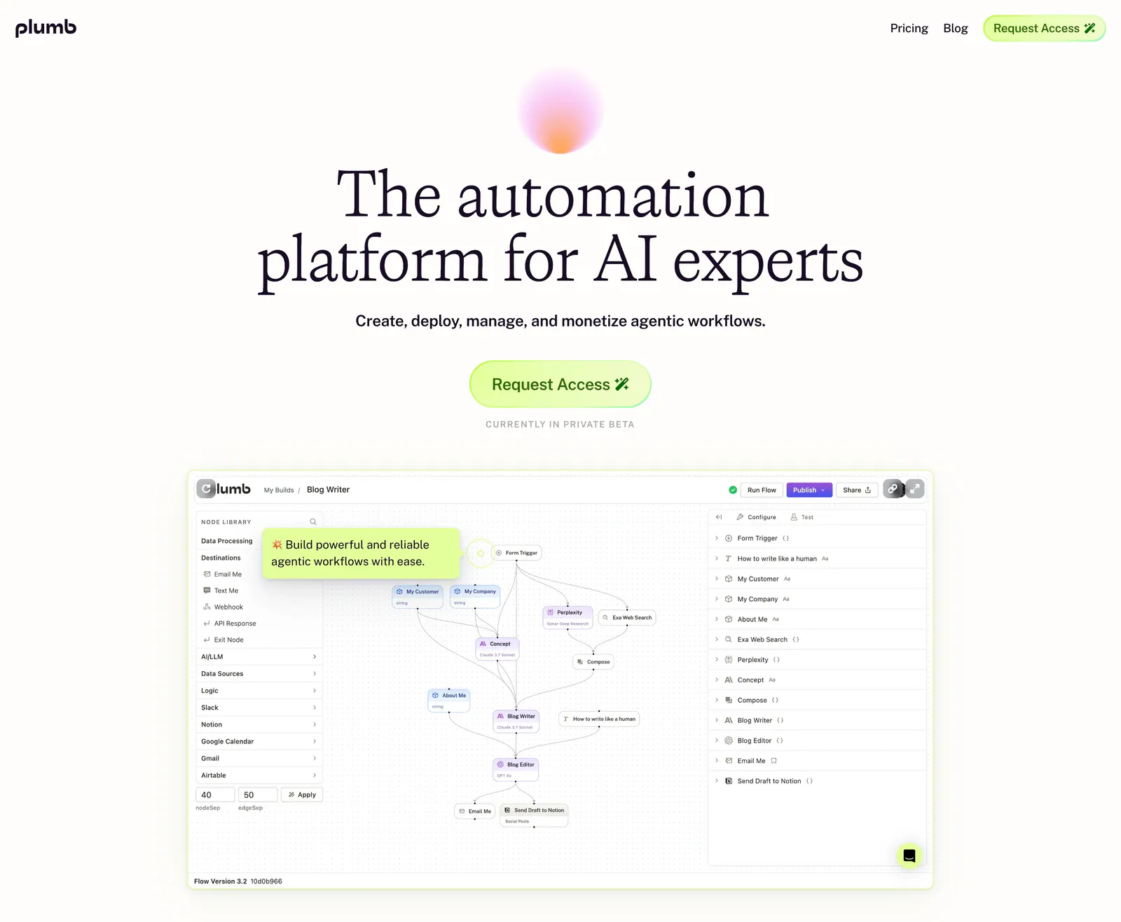
  240. Plumb hero section: centered serif headline under a soft gradient orb with lime Request Access button above a workflow builder screenshot
  241. Heidi call to action section: short serif customer quote above a rounded panel with blurred sky photo, serif headline and two buttons
  242. Rogo security section: serif headline on dark green beside a grid of six compliance badges such as SOC 2, ISO and GDPR
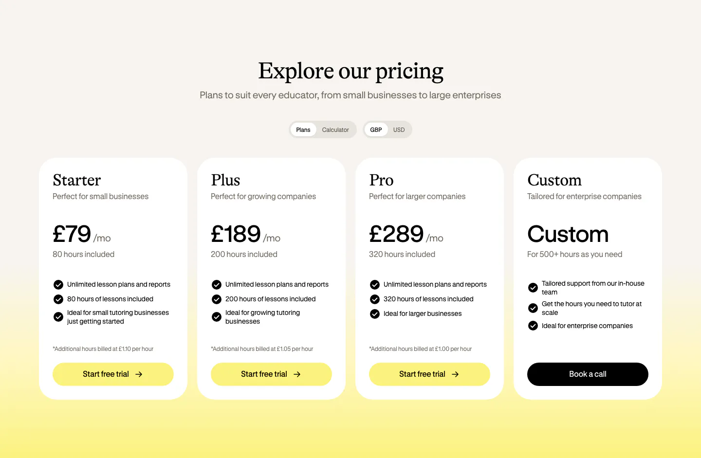
  243. Bobbin pricing section: serif heading, plan and currency toggles, and four white pricing cards on a cream-to-yellow background
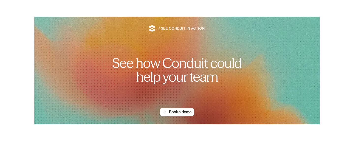
  244. Conduit call-to-action section: centered serif headline and button on an orange and teal gradient panel with dot texture
  245. Arke hero section: centered serif headline with email waitlist field, orbiting app icons and three step cards on a dark textured background
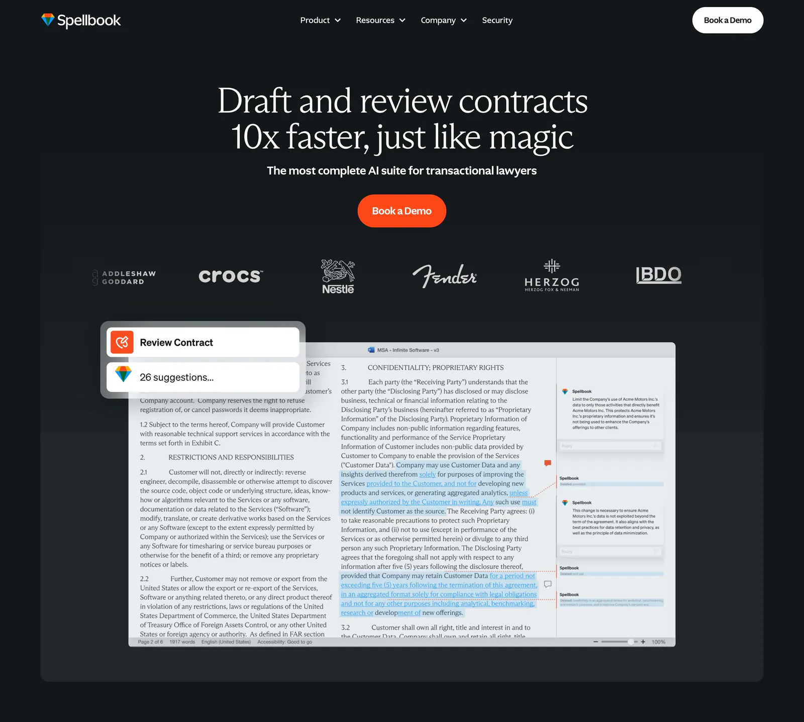
  246. Spellbook hero section: centered serif headline, orange demo button, customer logo row and a contract review UI screenshot on dark background
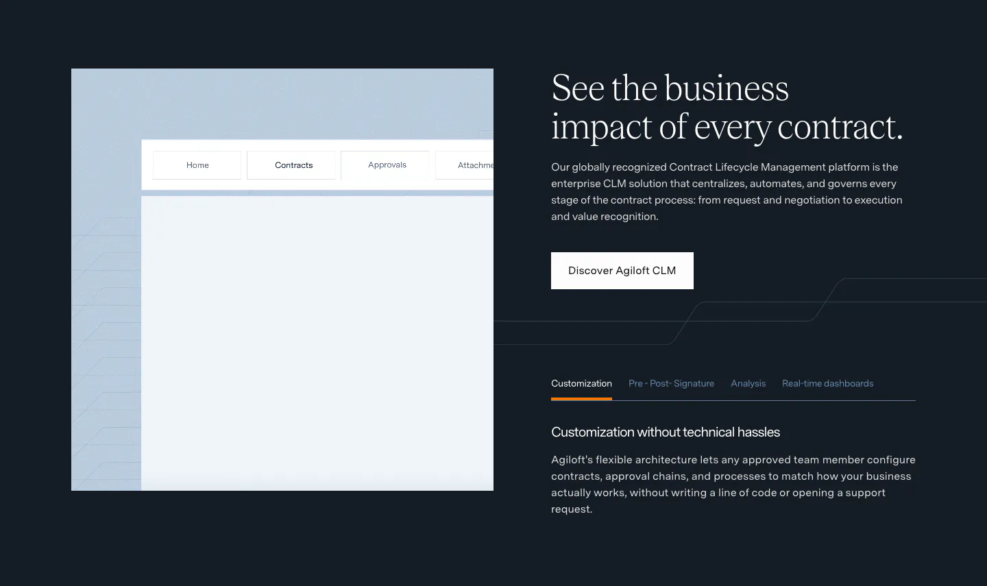
  247. Agiloft features section: product UI frame left, serif headline, button and feature tabs right on a dark navy background
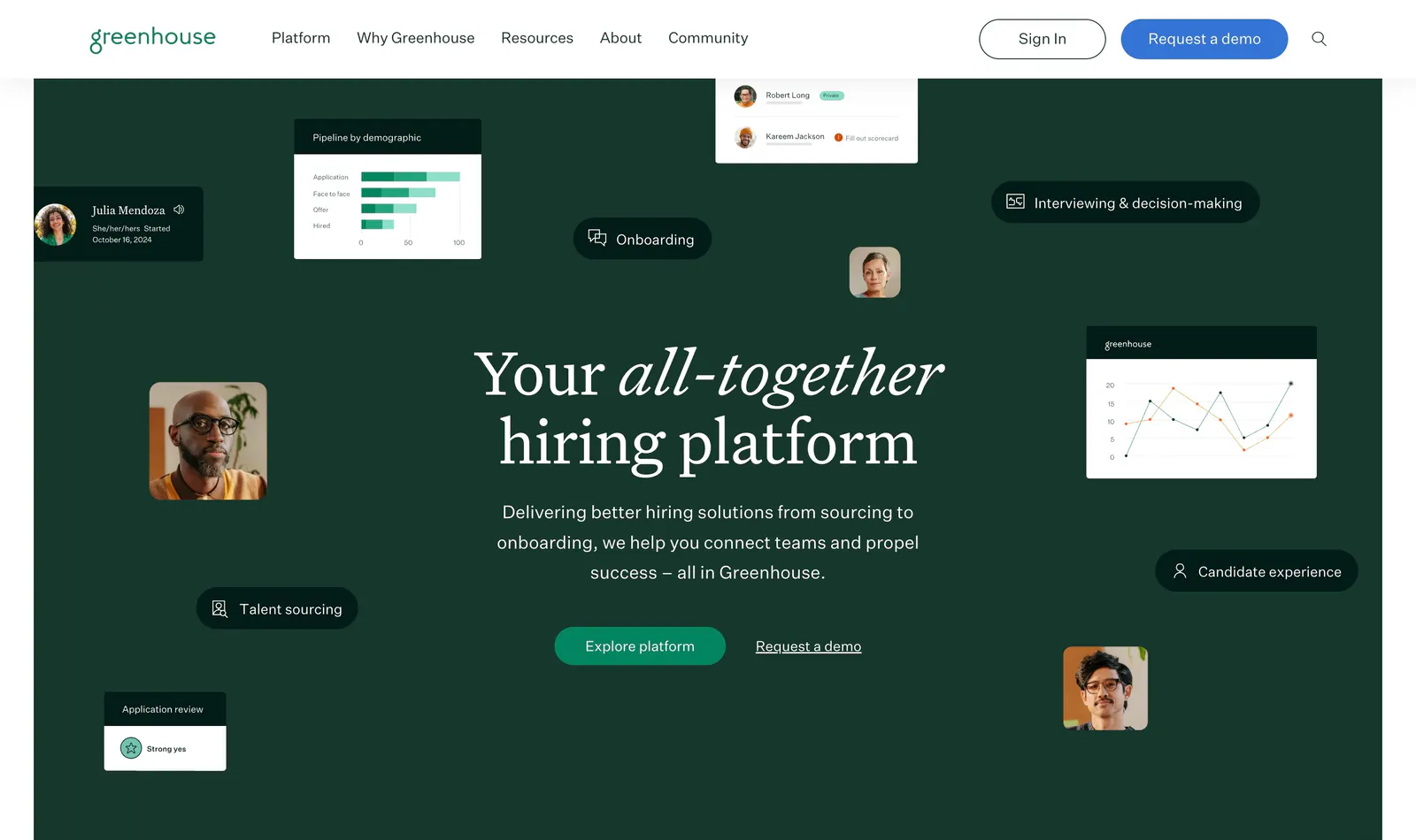
  248. Greenhouse hero section: centered serif headline and buttons on dark green surrounded by floating UI cards, charts and portraits
  249. VisionAI features section: centered serif headline above a two-column grid of eight gray cards with search UI mockups
  250. Ruul hero section: audience toggle and centered serif headline above a dark green panel with a portrait photo and invoice UI card
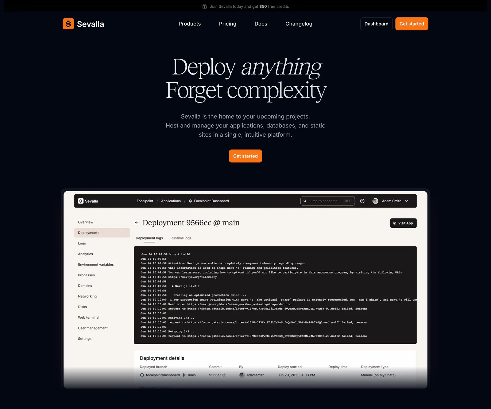
  251. Sevalla hero section: centered serif headline and orange button above a deployment logs dashboard screenshot on a near-black background
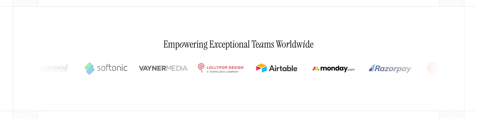
  252. Figr logo cloud section: centered serif heading above a single fading row of customer logos like Airtable and monday.com
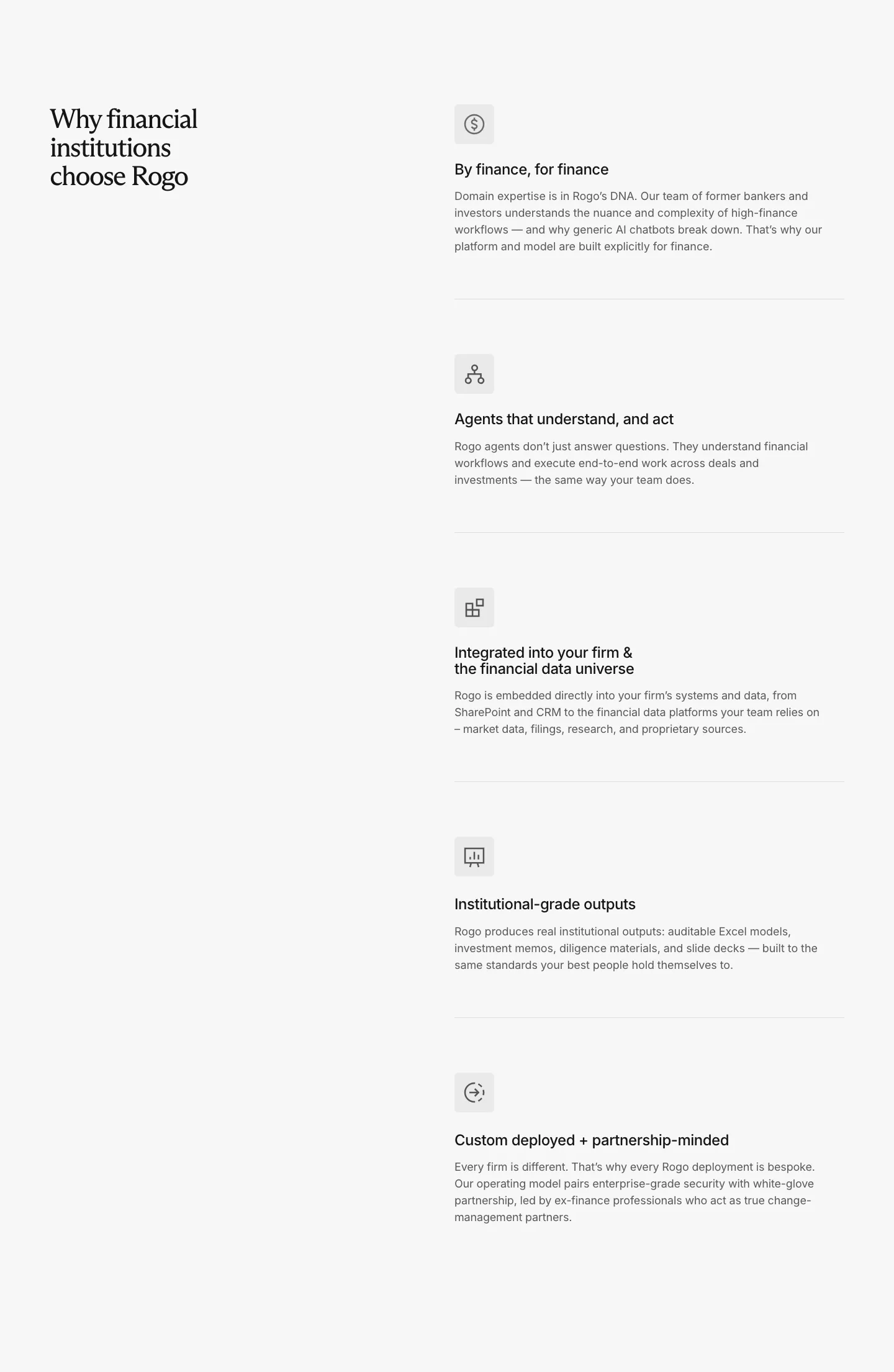
  253. Rogo value proposition section: serif headline on the left, five stacked benefit rows with icons and descriptions on the right
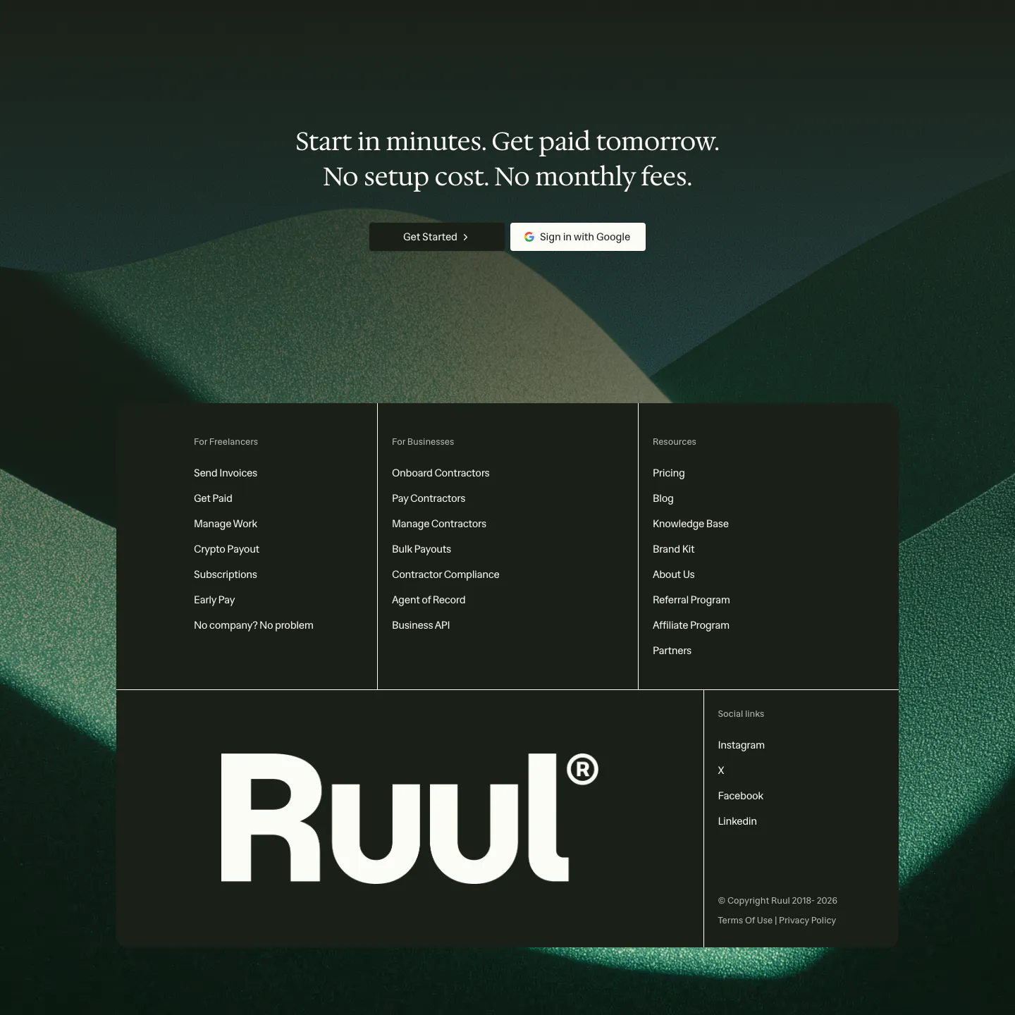
  254. Ruul footer section: serif CTA over dark green hills artwork, with a dark panel of link columns and a large Ruul wordmark
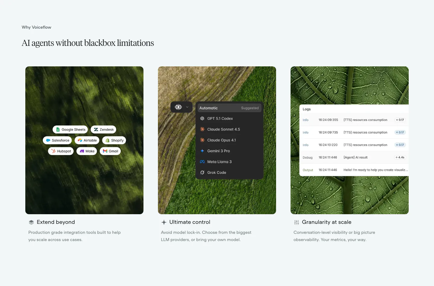
  255. Voiceflow features section: serif headline above three cards pairing nature photos with integration, model picker and log UI overlays
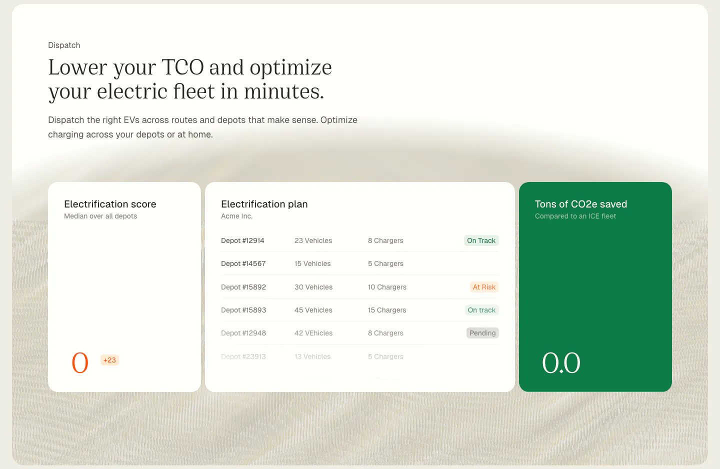
  256. Chargetrip features section: serif headline above electrification score, depot plan and CO2 savings UI cards on a cream textured background
  257. Bobbin call to action section: centered serif heading above a lesson prompt input field with a soft yellow glow on cream
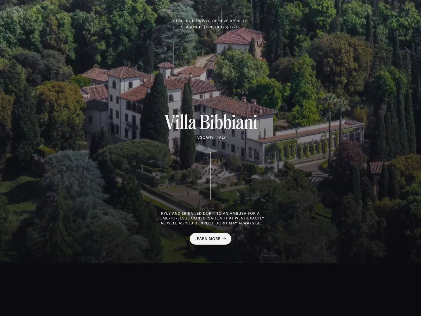
  258. The Real Hotels features section: full-bleed aerial photo of a Tuscan villa with centered serif title, episode note and Learn more button
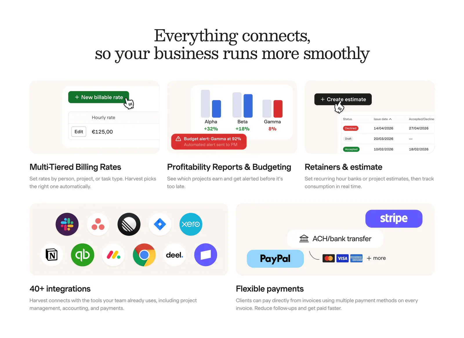
  259. Harvest integrations section: serif headline above a bento grid of billing, reporting and estimate UI tiles plus app-icon and payment tiles
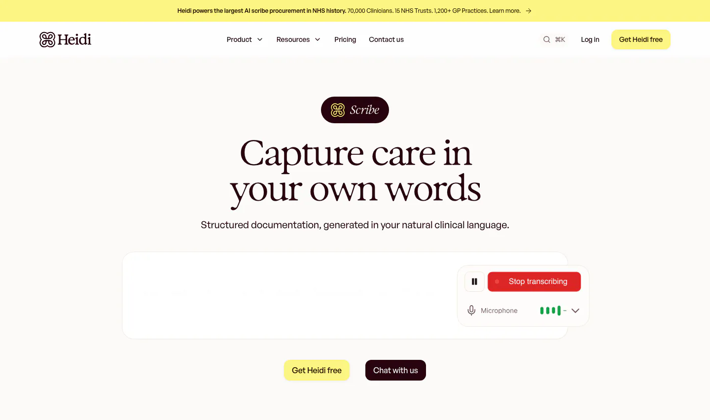
  260. Heidi hero section: Scribe badge and centered serif headline above a transcription box with a Stop transcribing control
  261. Jasper testimonials section: centered serif headline above a bento grid of pastel stat tiles and customer quote cards with portraits
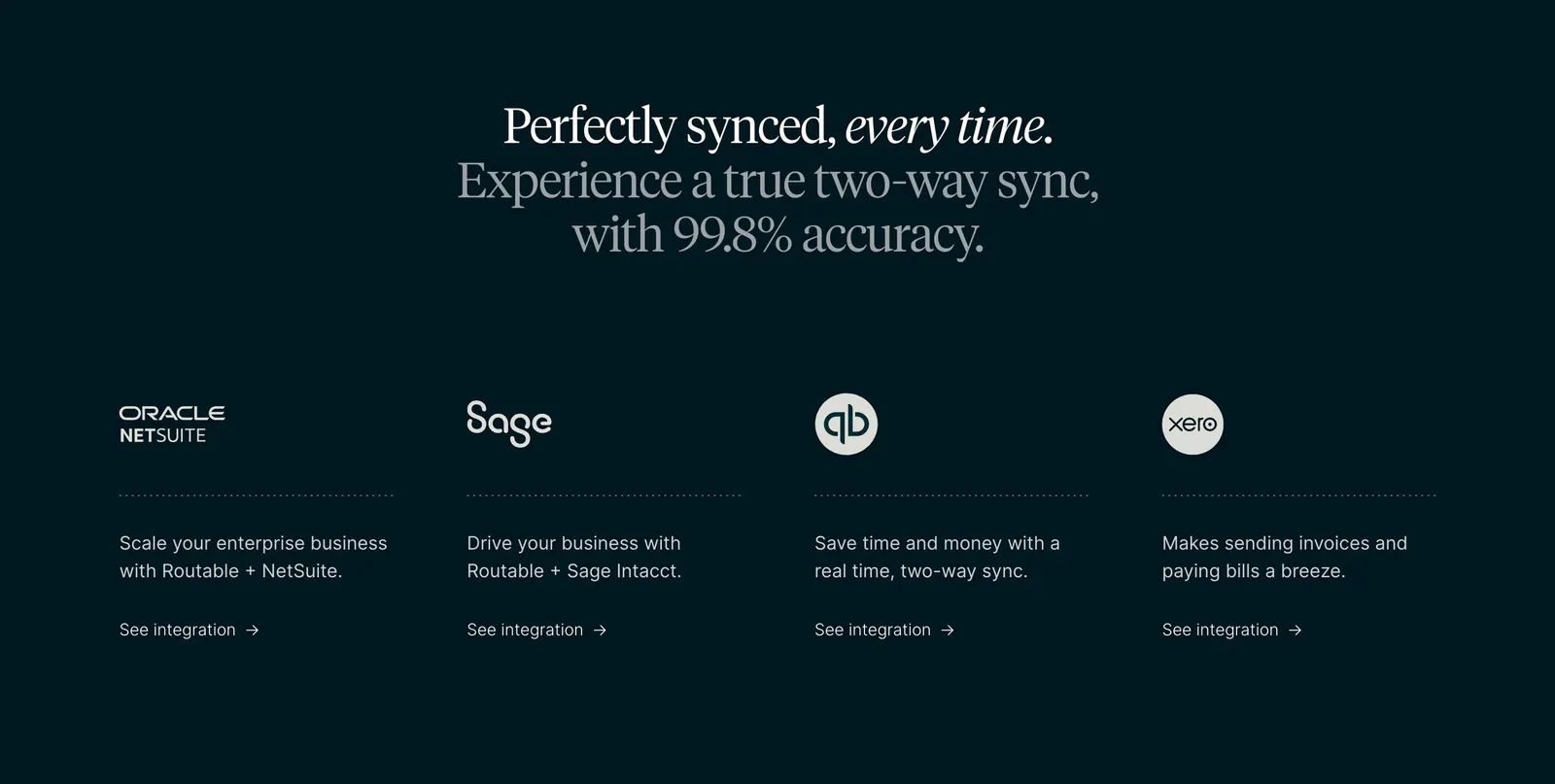
  262. Routable integrations section: centered serif headline above four columns with NetSuite, Sage, QuickBooks and Xero logos on dark
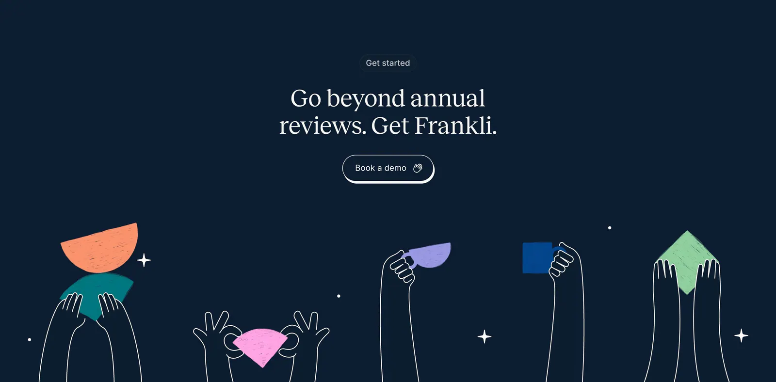
  263. Frankli call-to-action section: centered serif headline and demo button above hand-drawn hands holding colorful shapes on navy
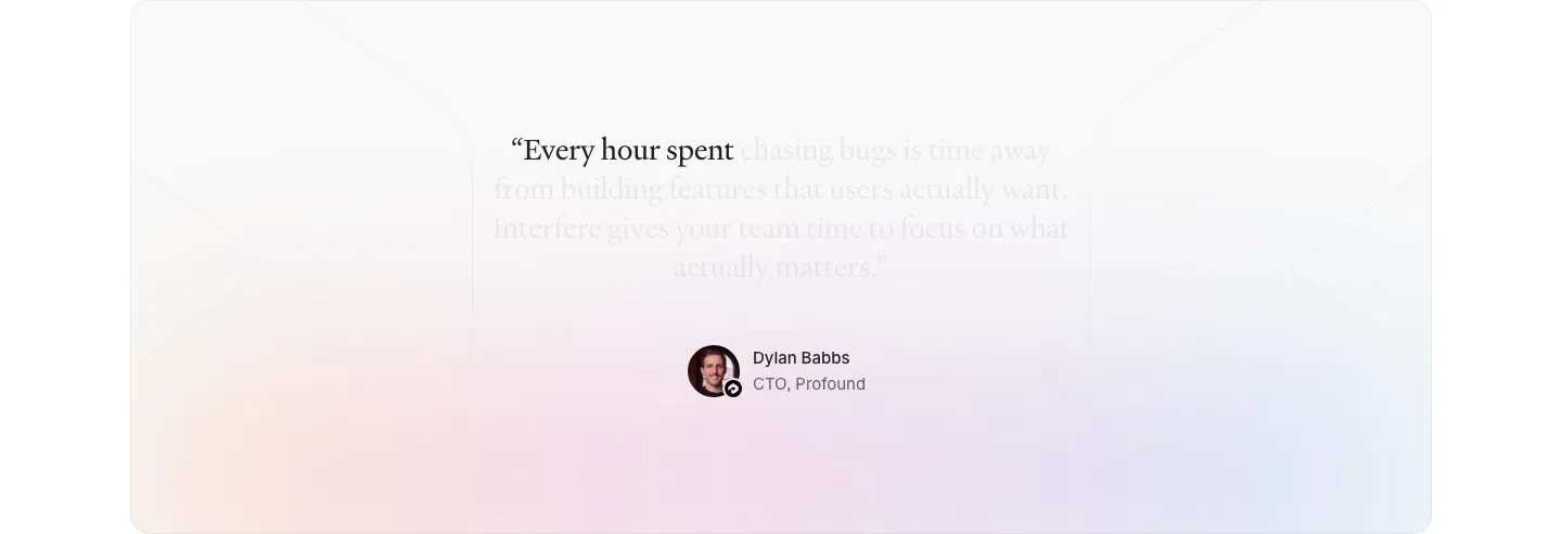
  264. Interfere testimonials section: centered serif quote fading in over a soft pastel gradient card with author avatar below
  265. Portal footer section: centered serif join-beta headline and blue button above small link columns and a painted hillside illustration
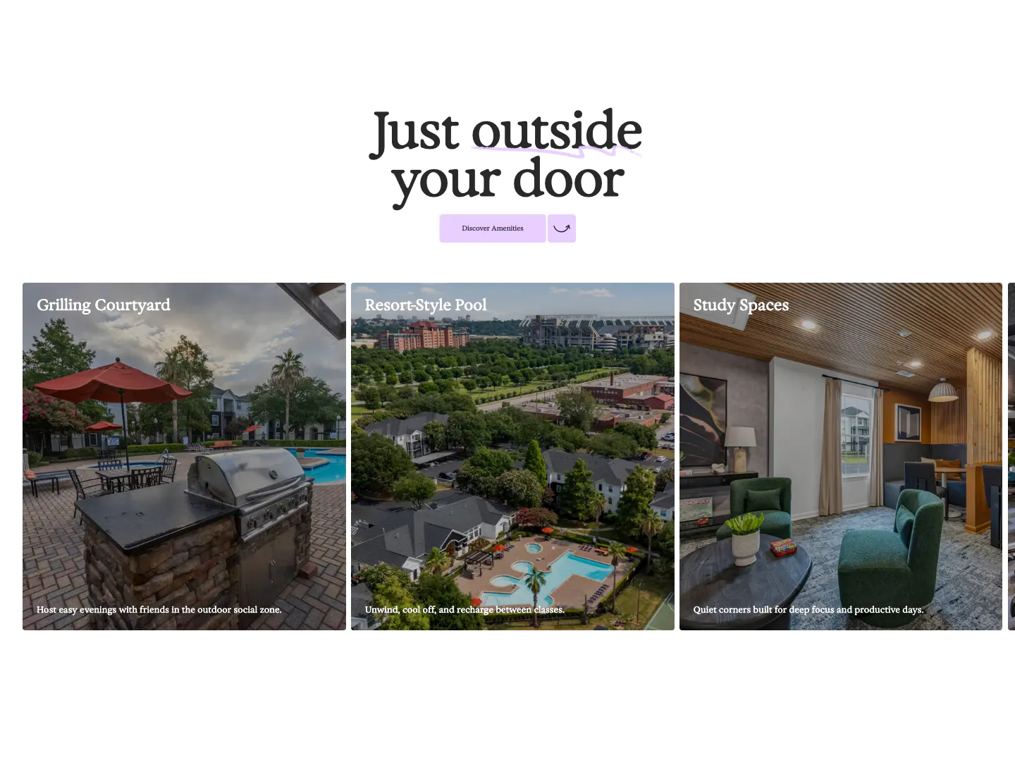
  266. 21Oaks features section: centered serif heading and button above a carousel of amenity photo cards with captions
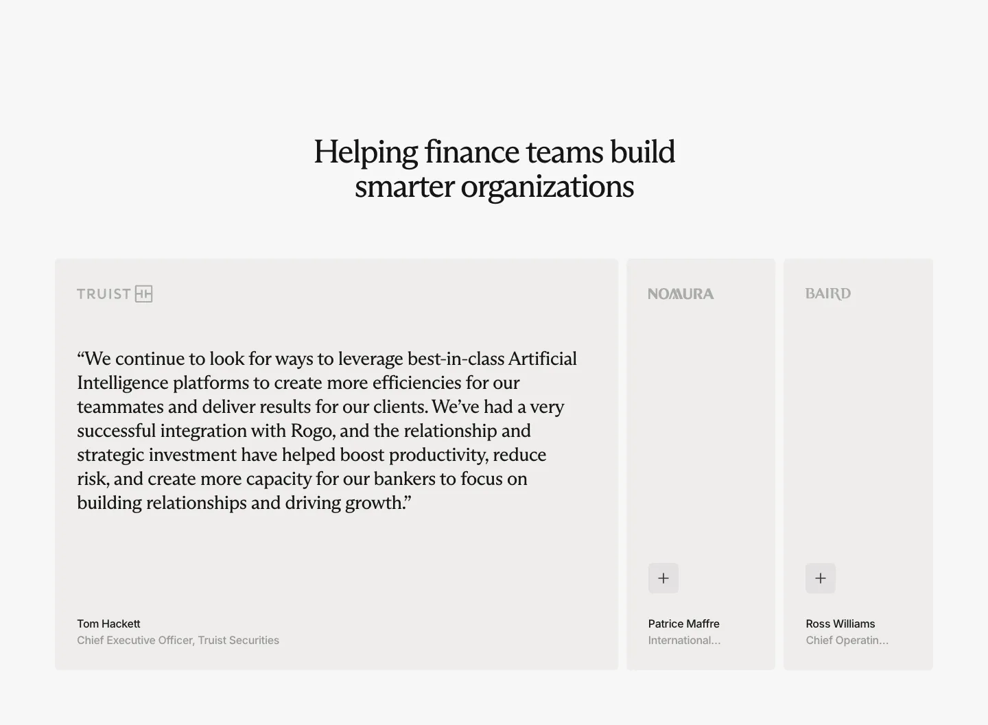
  267. Rogo testimonials section: centered serif headline above one expanded quote card and two collapsed cards with company logos
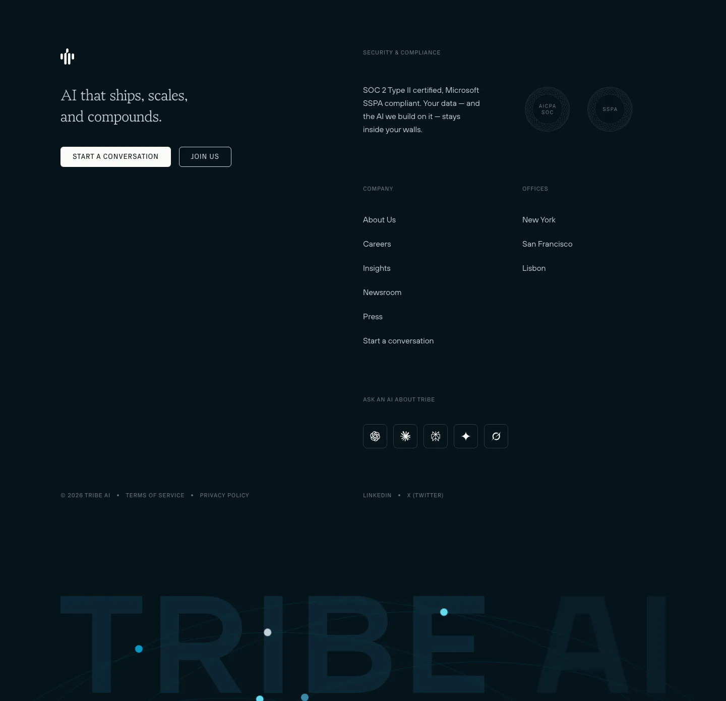
  268. Tribe AI footer section: dark navy footer with serif tagline, two buttons, security badges, link columns and a giant faded TRIBE AI wordmark
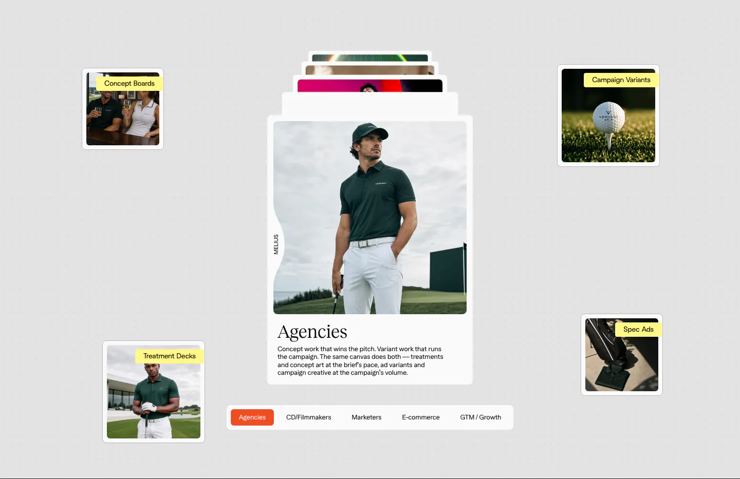
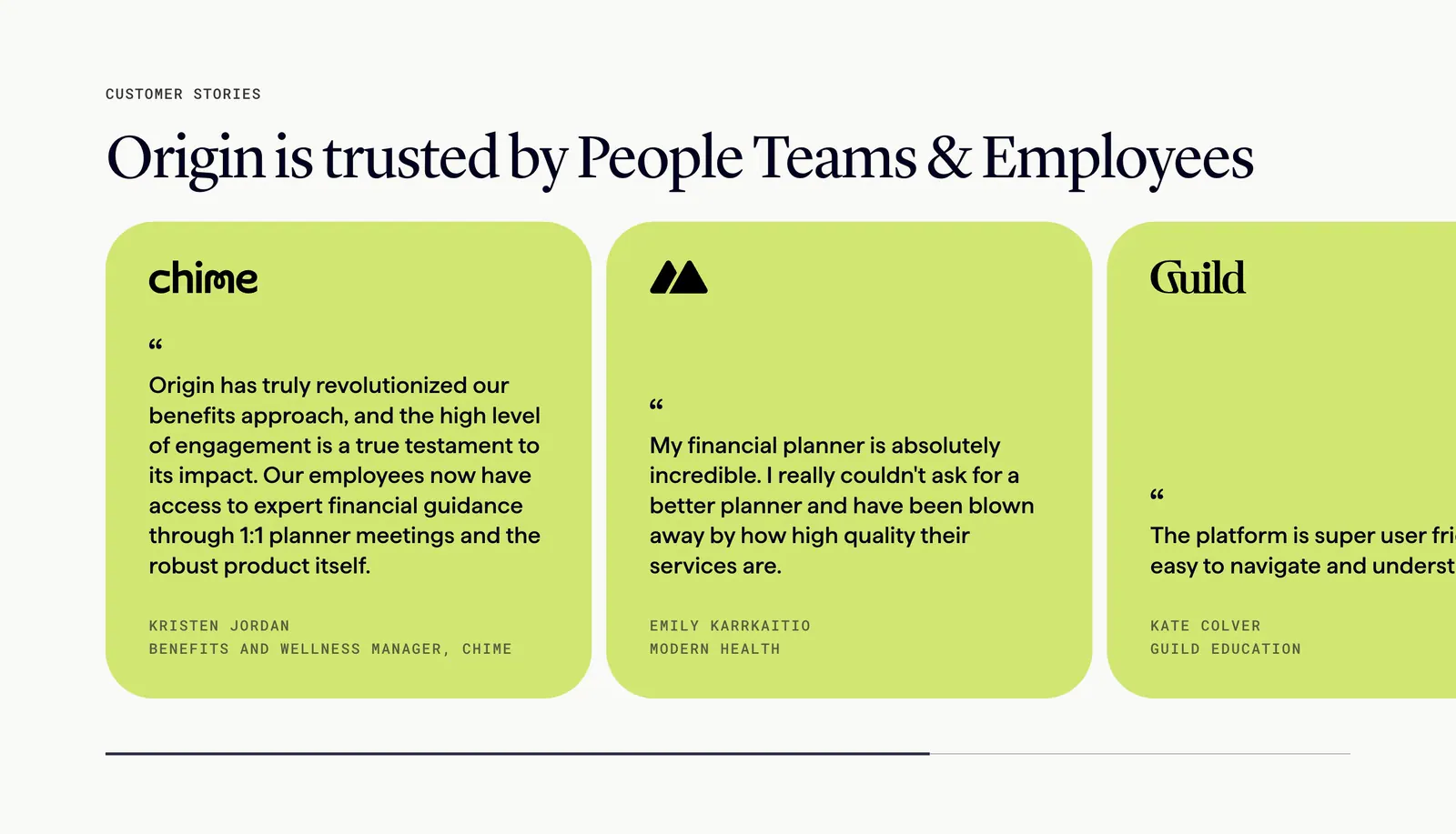
  269. Melius use cases section: stacked card with a golf apparel photo and serif Agencies copy, floating labeled thumbnails, persona tab bar
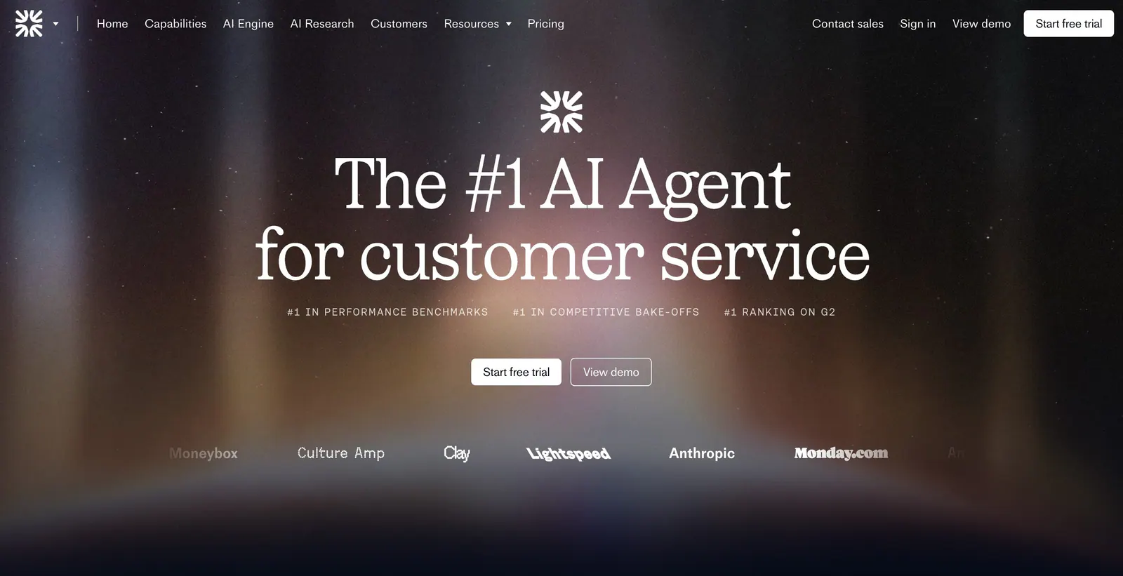
  270. Griffin call-to-action section: centered serif headline and Contact sales pill button on a black background
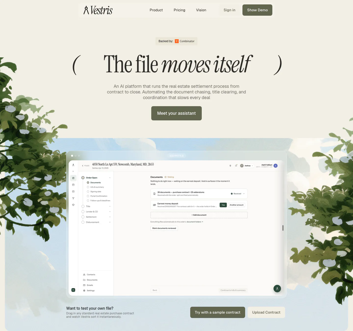
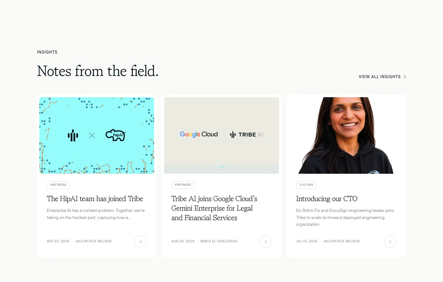
  271. Vestris hero section: nav and centered serif headline with button above an app screenshot framed by painted trees and sky
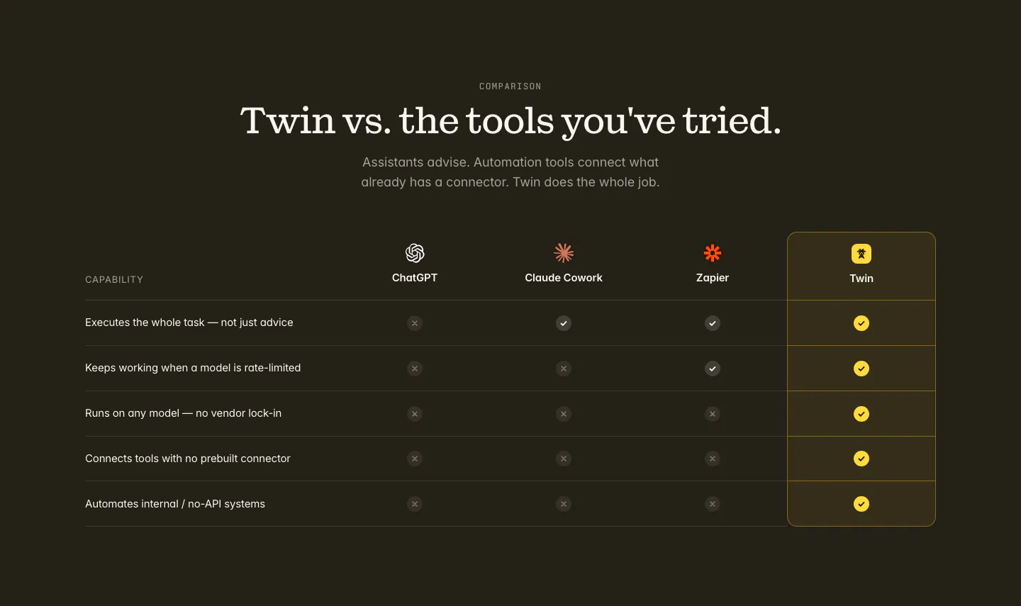
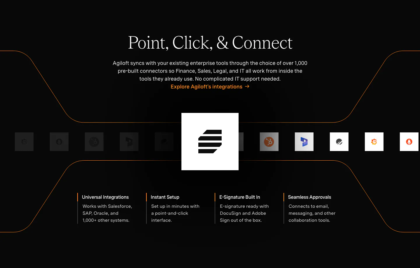
  272. Twin comparison section: centered serif headline above a check and cross table versus ChatGPT, Claude Cowork and Zapier on dark
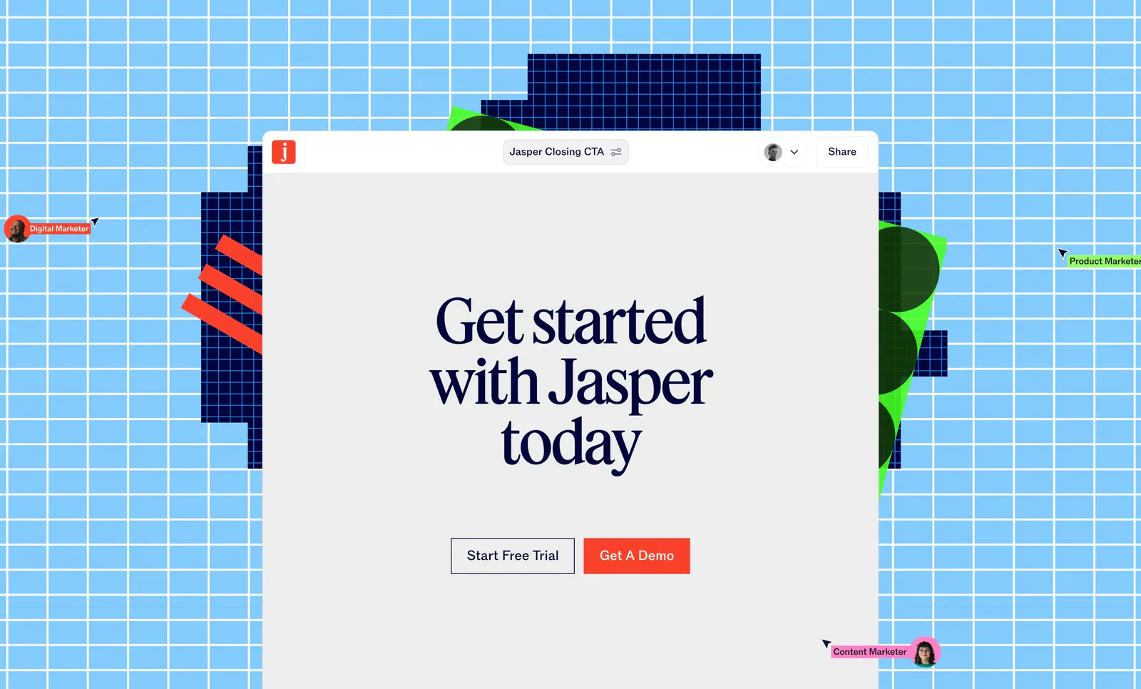
  273. Jasper call-to-action section: serif headline and two buttons in an editor window over a sky-blue grid with pixel shapes and cursors
  274. Routable features section: centered serif headline above a feature list and a lavender panel with an invoice scanning mockup
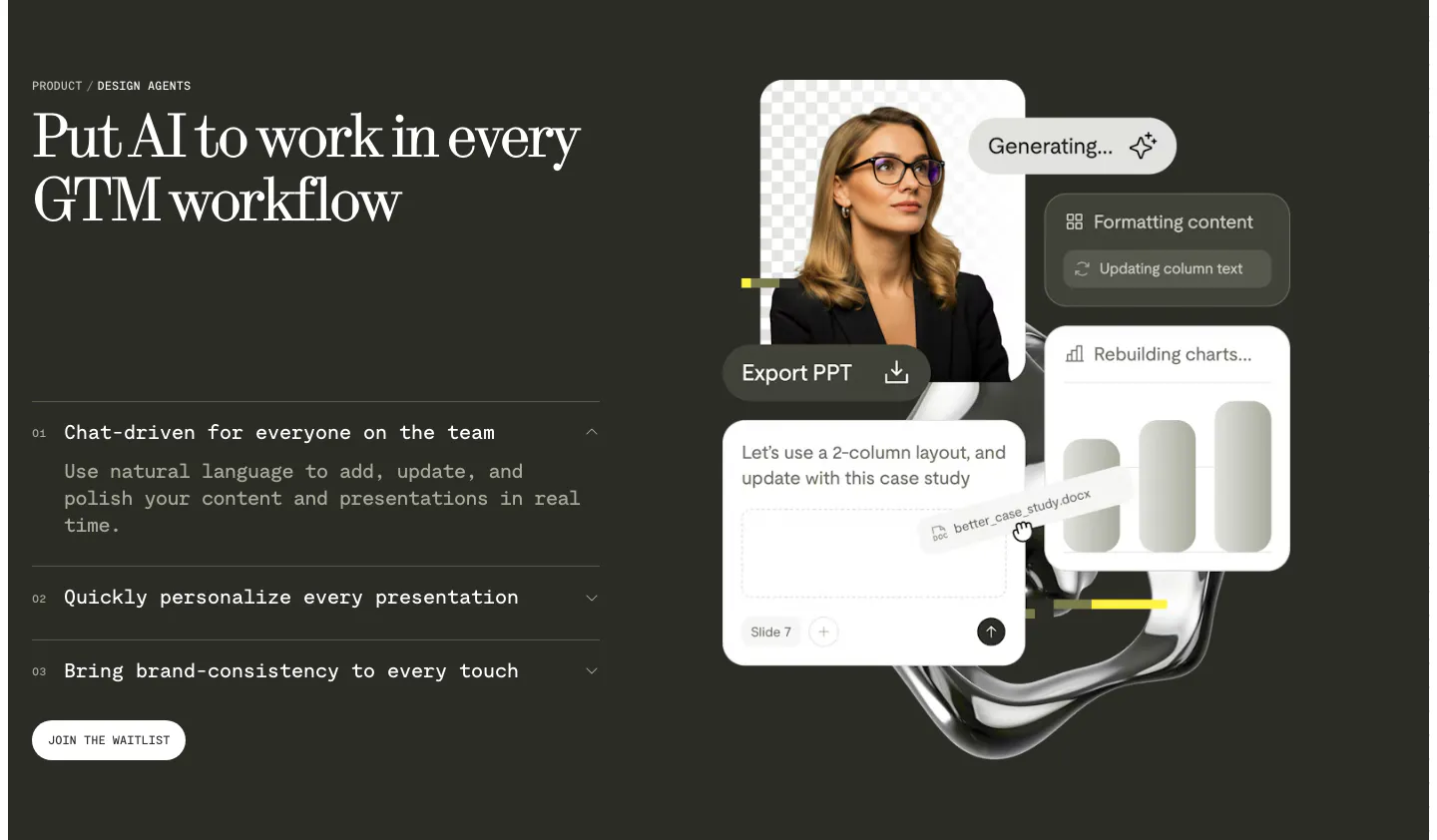
  275. Supersonik features section: UI mockup with call controls at left, serif headline, copy and link at right on dark teal
  276. Conduit features section: serif headline above three agent cards with chat, voice and analytics UI on colorful blurred tiles
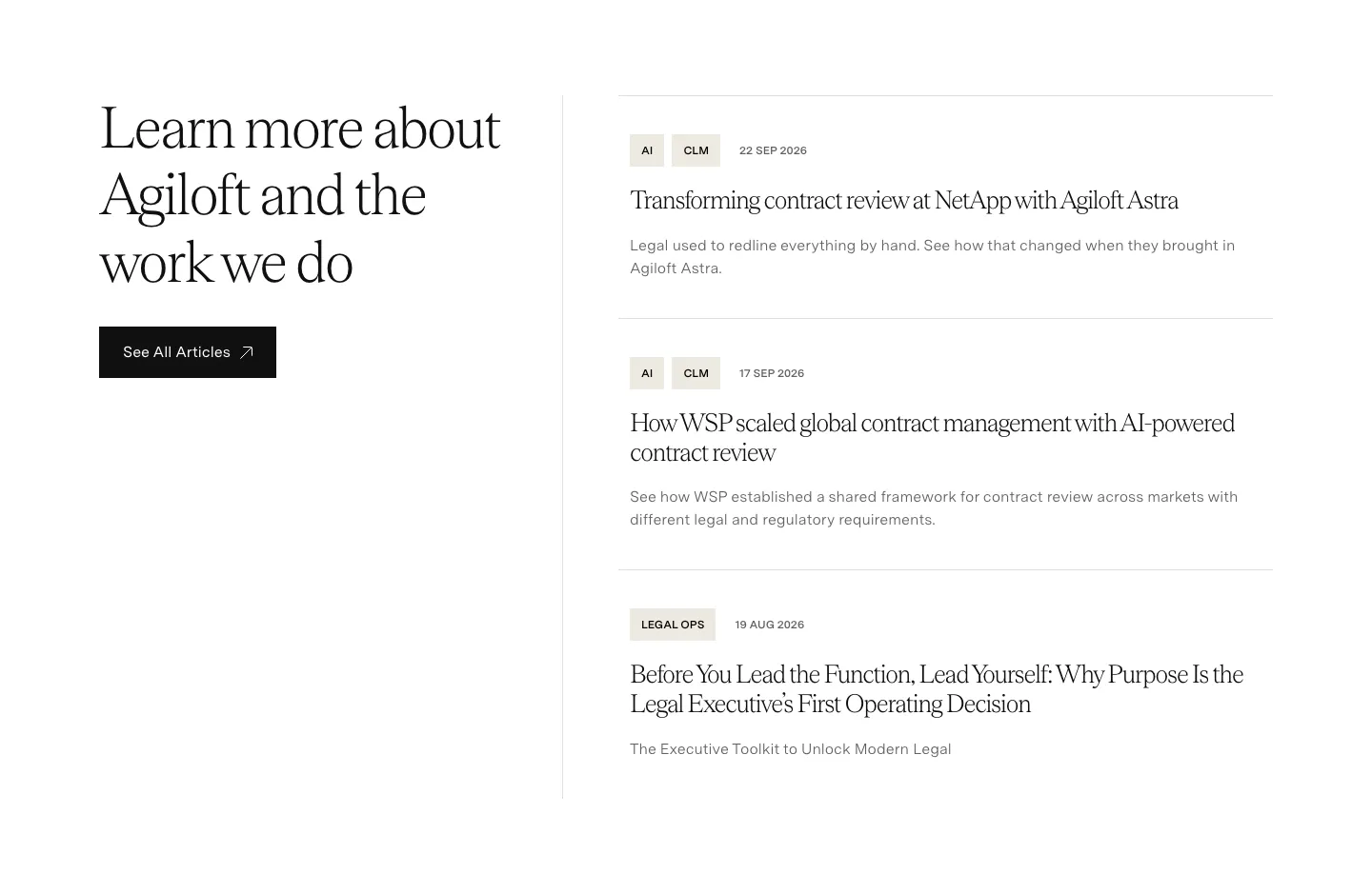
  277. Agiloft blog & resources section: serif heading and See All Articles button left, list of three tagged article entries right
  278. Origin testimonials section: serif headline above a scrolling row of lime quote cards with company logos and progress bar on off-white
  279. Fin hero section: nav bar, centered serif headline, ranking labels and CTAs over a dark aurora glow with a customer logo row
  280. Tribe AI blog & resources section: serif headline above three insight cards with cover images, tag pills, dates and authors on off-white
  281. Agiloft integrations section: centered serif headline on black above a row of app icons around the Agiloft logo and four feature columns
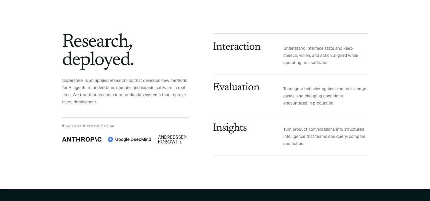
  282. Supersonik about & mission section: serif headline, lab description and investor logos at left, three research areas listed at right
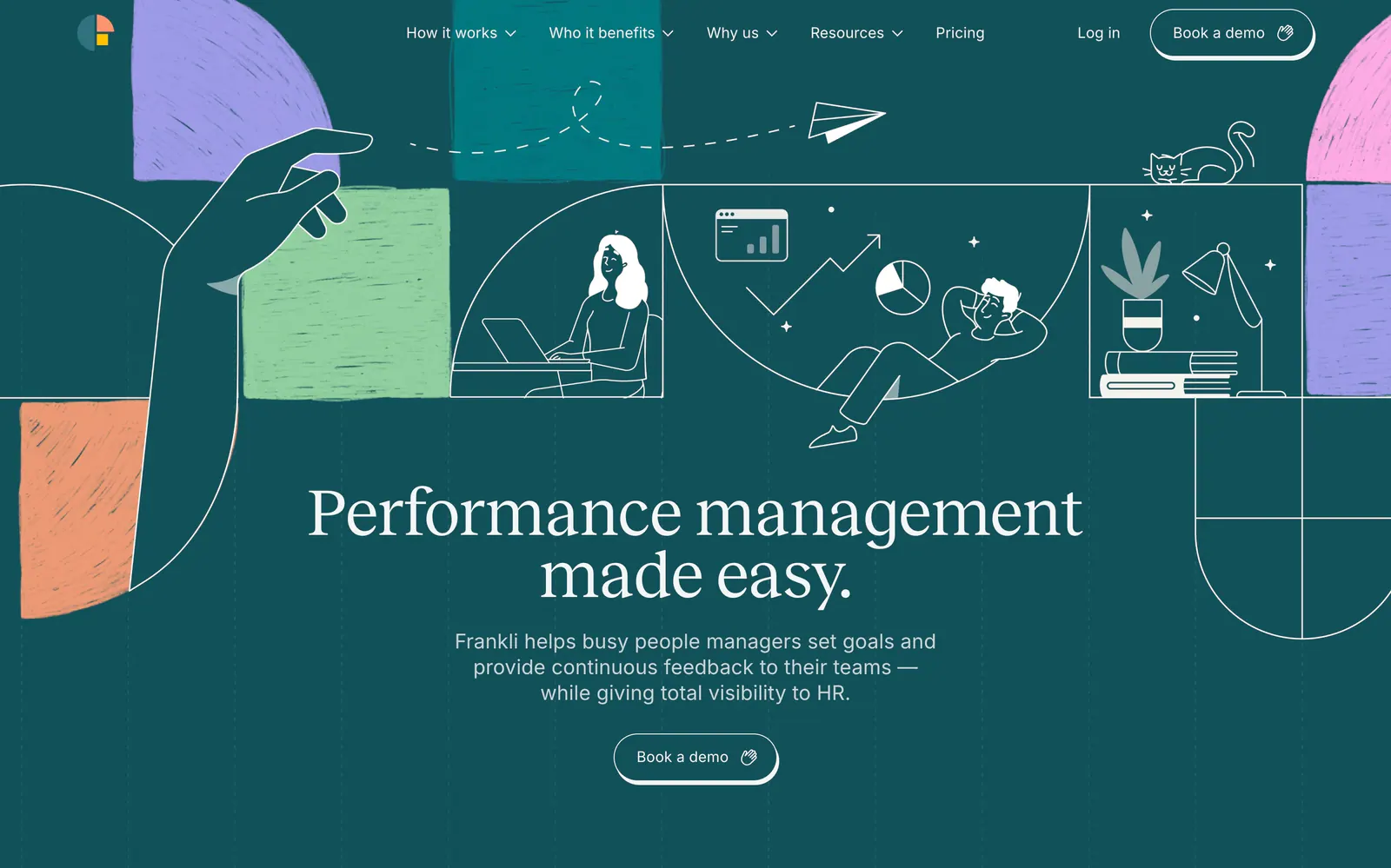
  283. Frankli hero section: centered serif headline and demo button below a band of line-drawn people and textured color blocks on deep teal
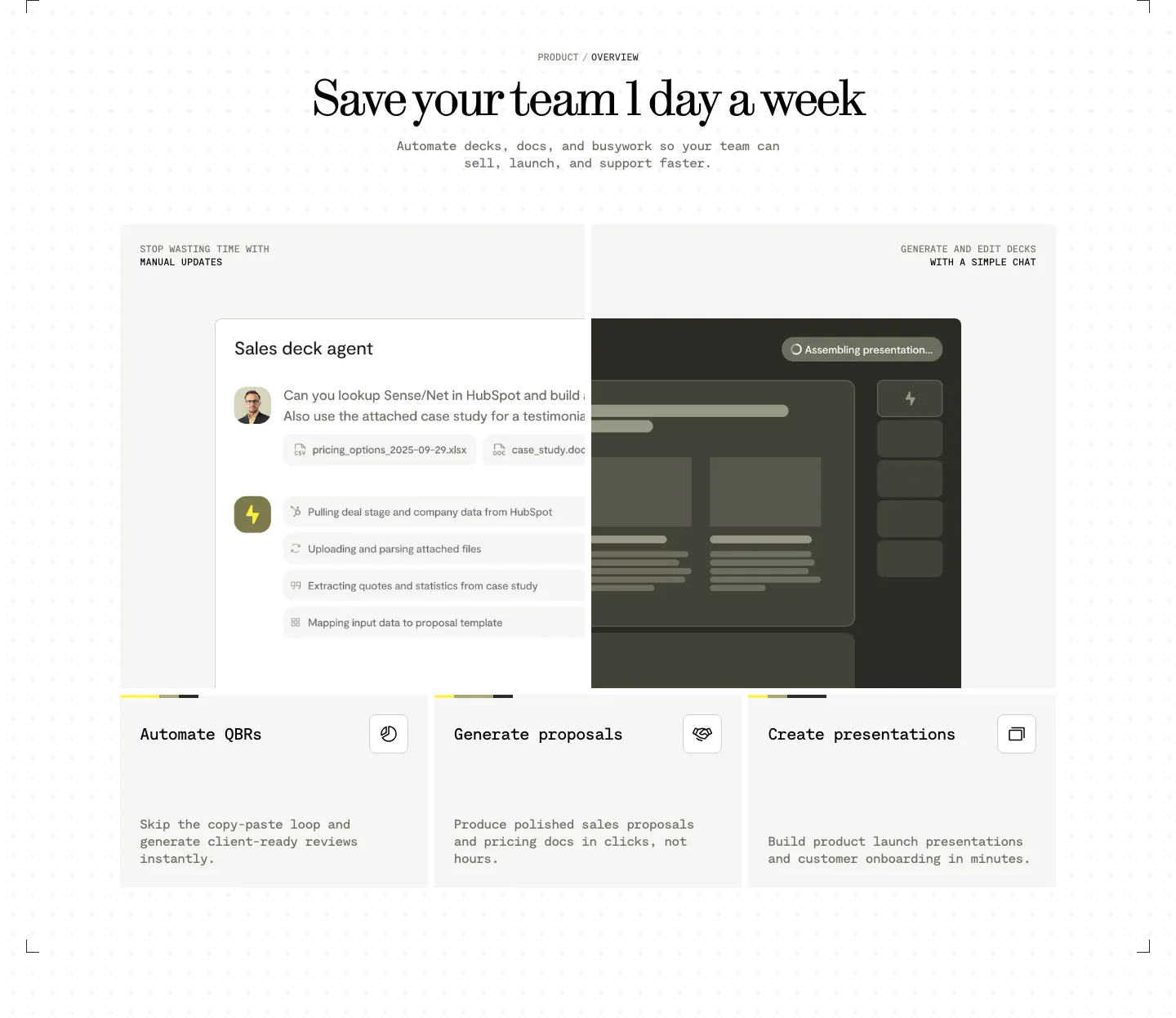
  284. Visual features section: centered serif headline above a sales deck agent chat UI and three cards for QBRs, proposals and presentations
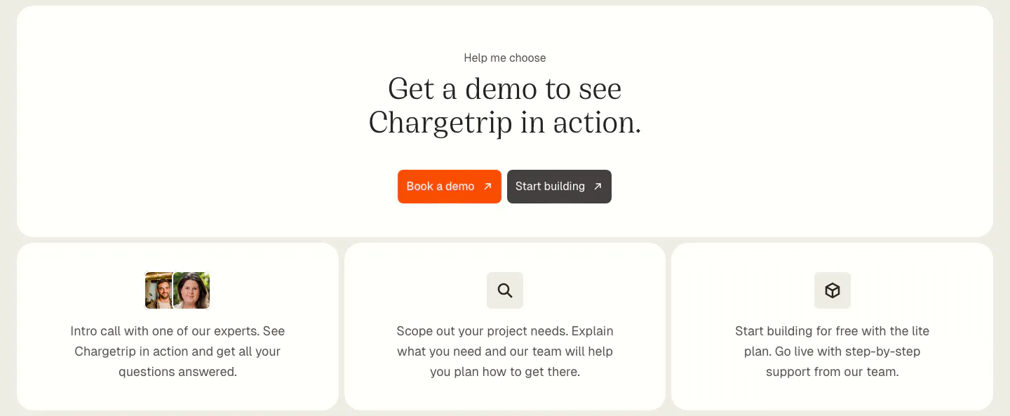
  285. Chargetrip call-to-action section: centered serif headline with orange demo button above three cards outlining next steps
  286. Routable footer section: serif headline with demo button above five link columns and a copyright line on a dark navy background
  287. Cotool features section: centered serif heading over three dark cards with product UI screenshots on a charcoal panel with pixel-dot accents
  288. incident.io features section: serif headline above an alert-routing UI panel beside a customer quote photo card, with tabs below
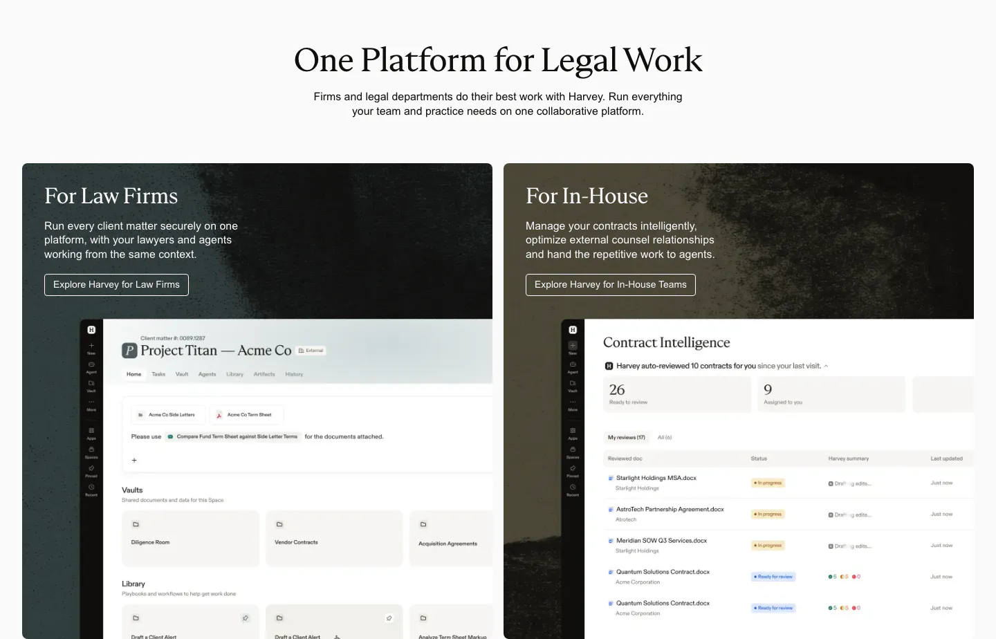
  289. Harvey use cases section: centered serif headline above two dark textured cards for law firms and in-house teams with product UI
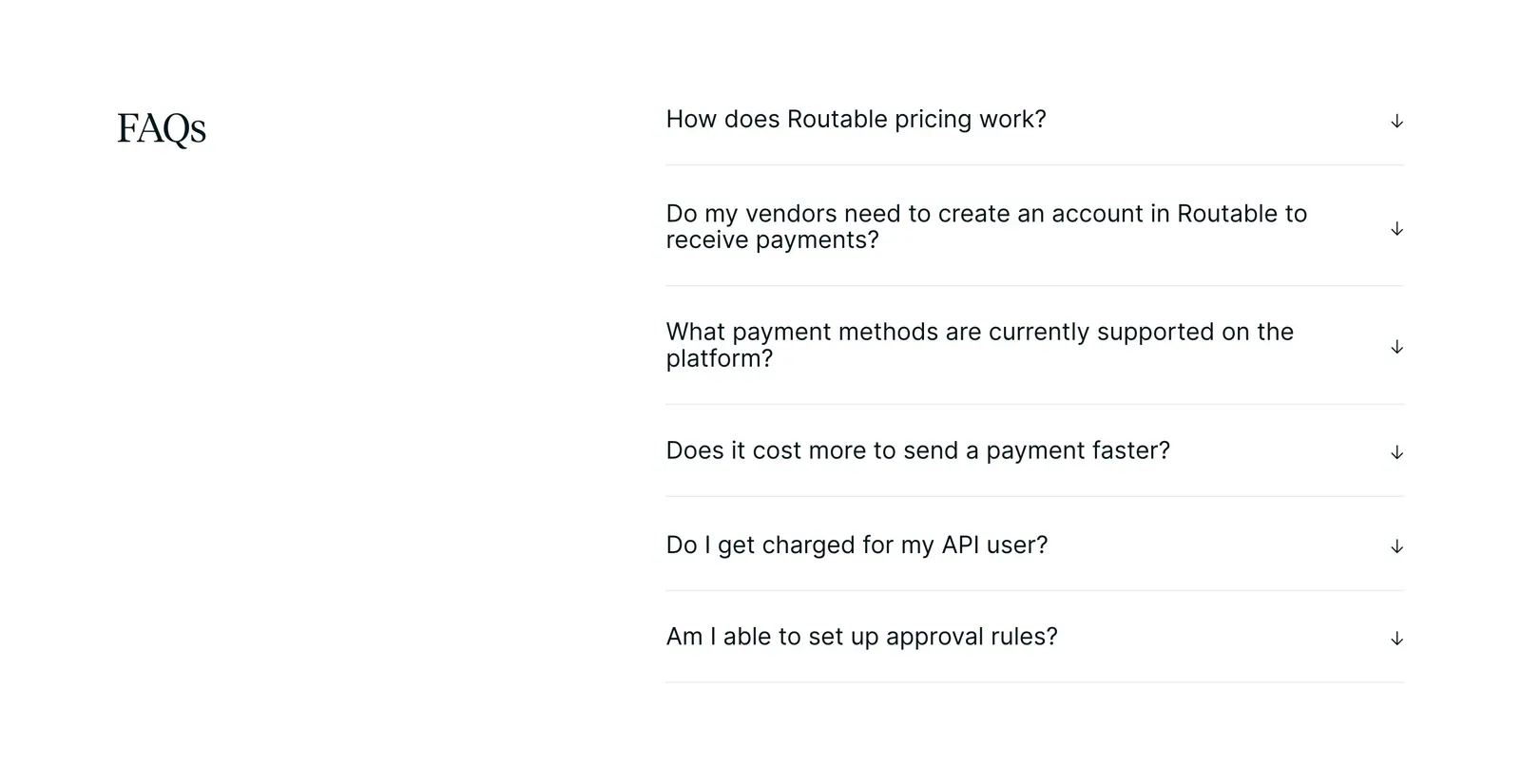
  290. Routable FAQ section: serif FAQs heading on the left beside a six-question accordion with arrow toggles on a white background
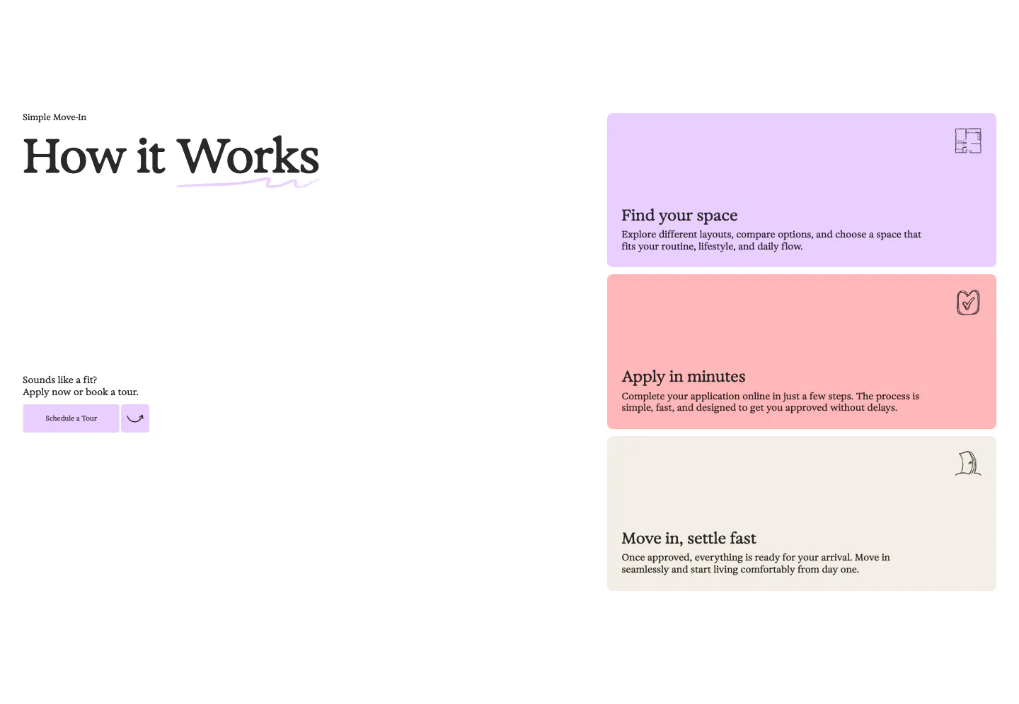
  291. 21Oaks how it works section: serif heading and tour button on the left, three stacked pastel step cards on the right
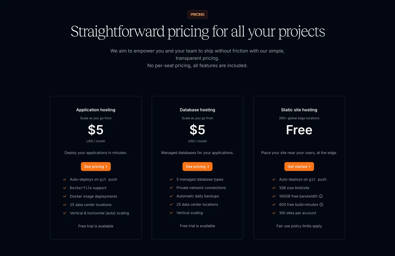
  292. Sevalla pricing section: centered serif headline above three outlined hosting plan cards with orange buttons on a near-black background
  293. Goodside footer section: slim strip with italic inquiry note and email, a gold dandelion mark and stacked social links
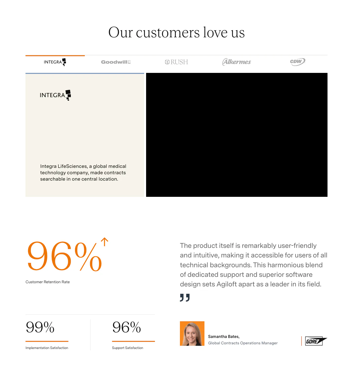
  294. Agiloft testimonials section: customer logo tabs above a case study card, large orange retention stats and a quote with headshot
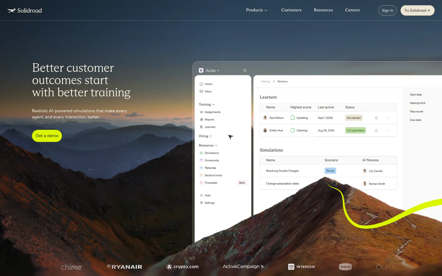
  295. Solidroad hero section: serif headline and lime button over a mountain landscape photo beside a training dashboard UI, logo row below
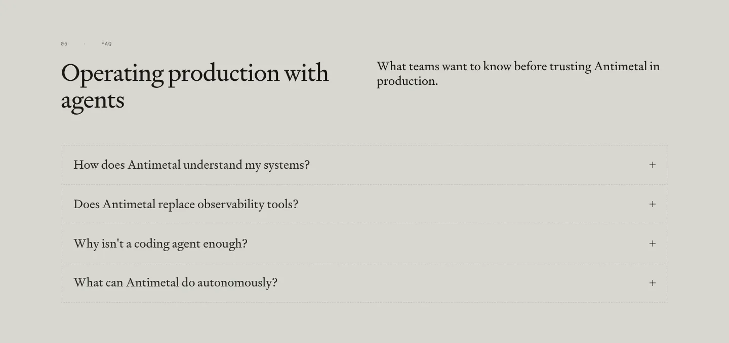
  296. Antimetal FAQ section: serif headline and intro side by side above a bordered accordion of four serif questions on warm gray
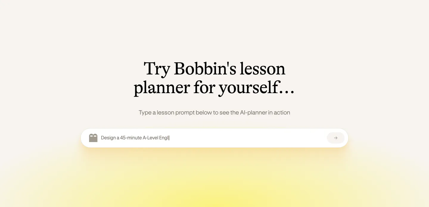
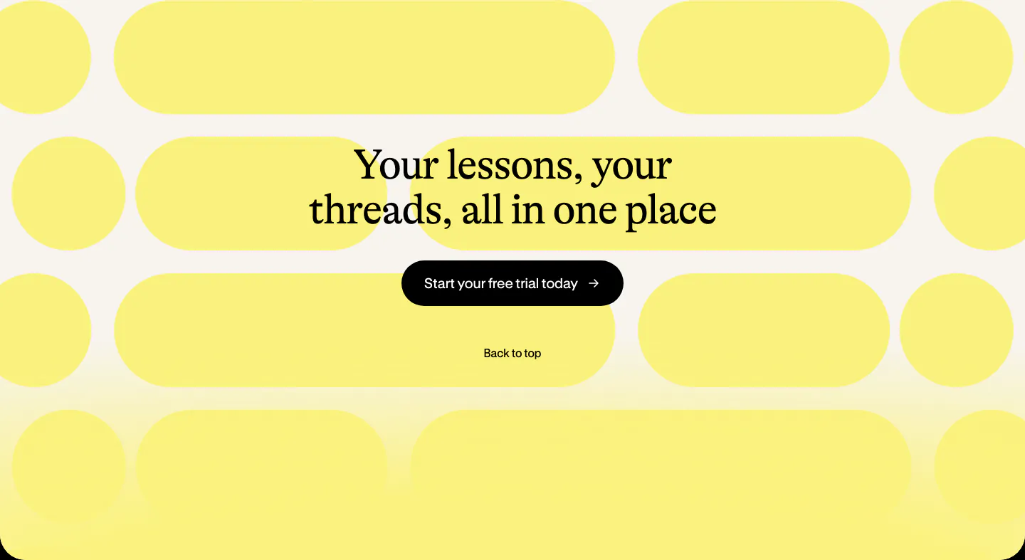
  297. Bobbin call to action section: centered serif heading and black button over a pattern of yellow pill shapes on cream
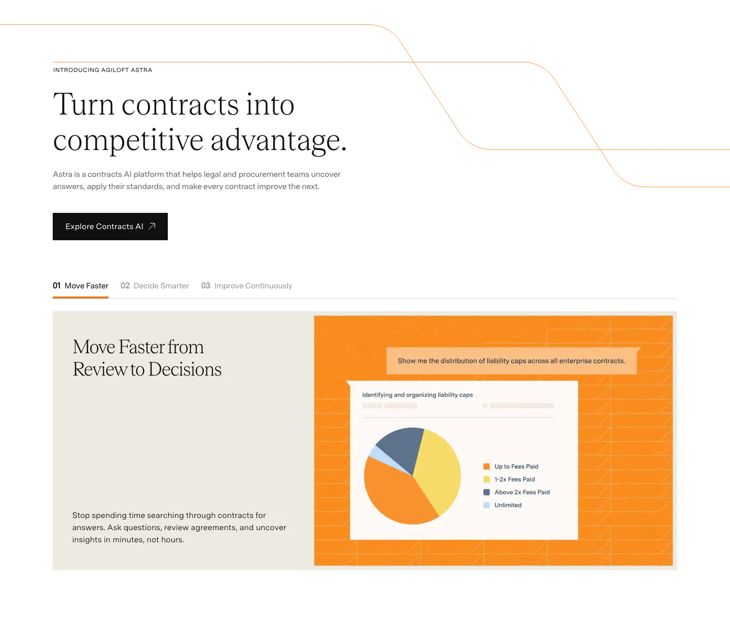
  298. Agiloft features section: serif headline and button above numbered tabs and a pie chart UI mockup on an orange panel
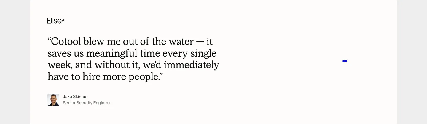
  299. Cotool testimonials section: large serif customer quote with EliseAI logo, avatar and name on an off-white card
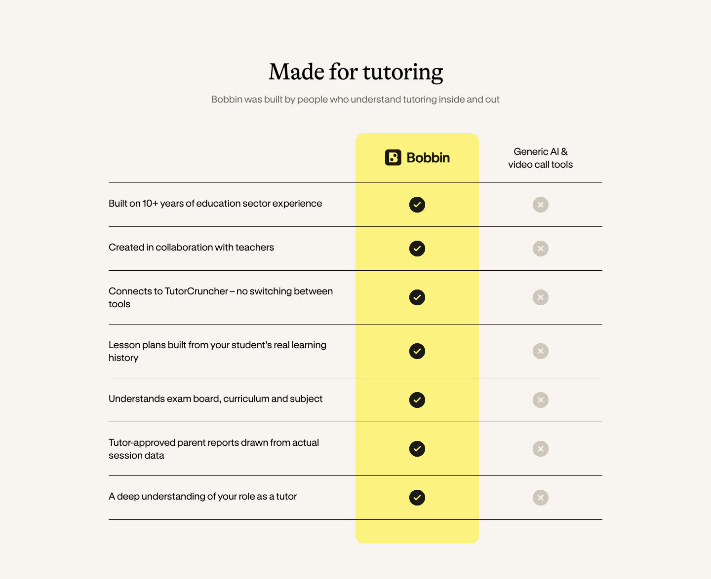
  300. Bobbin comparison section: serif heading above a check-versus-cross table with a highlighted yellow Bobbin column on cream

Where serif type shows up

Often paired with

Share of serif type sections that also use each style

How to pair serif headlines with UI text

  1. Choose a serif built for display

    Display serifs have refined details that shine at large sizes, while text serifs are sturdier when small. Use a display cut for headlines and check that thin hairlines survive on low-resolution screens. Variable fonts with optical sizing handle both cases well.

  2. Pair it with a neutral sans

    Let the serif carry the personality and keep body copy, buttons, and navigation in a simple sans-serif. Match x-heights roughly so the two families feel related. Avoid pairing two expressive typefaces, which makes the section feel noisy and unsure of itself.
  3. Fit the serif's character to the brand
    Serifs carry different associations. Old-style faces feel literary and warm, high-contrast Didone styles suggest fashion and luxury, and slab serifs feel sturdy and practical. Pick the one that fits what the product promises, and test it on the real headline, not a pangram.

  4. Save italics for one key word

    A single italic word in a serif headline adds rhythm and draws the eye. Use it on the word that holds the main point. Italicizing whole phrases or mixing several styles in one headline dilutes the effect and slows reading.
Companies using serif type

All styles
    ↑↓ Navigate ↵ Open

    Section preview

    Website section