Carousel Website Design Examples

A carousel saves vertical space by moving content sideways. Arrows, pagination dots, or cards cut off at the edge signal that more sits to the side, and carousels in website design often hold testimonials, case studies, or product cards when there are more items than room. Most visitors see only the first slide or two, so later items are easy to miss, and autoplay makes reading harder still.
151 sections

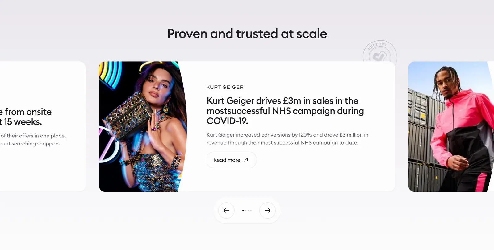
  1. Gocertify testimonials section: centered heading above a case-study carousel with fashion photography, cut-off side cards and arrows
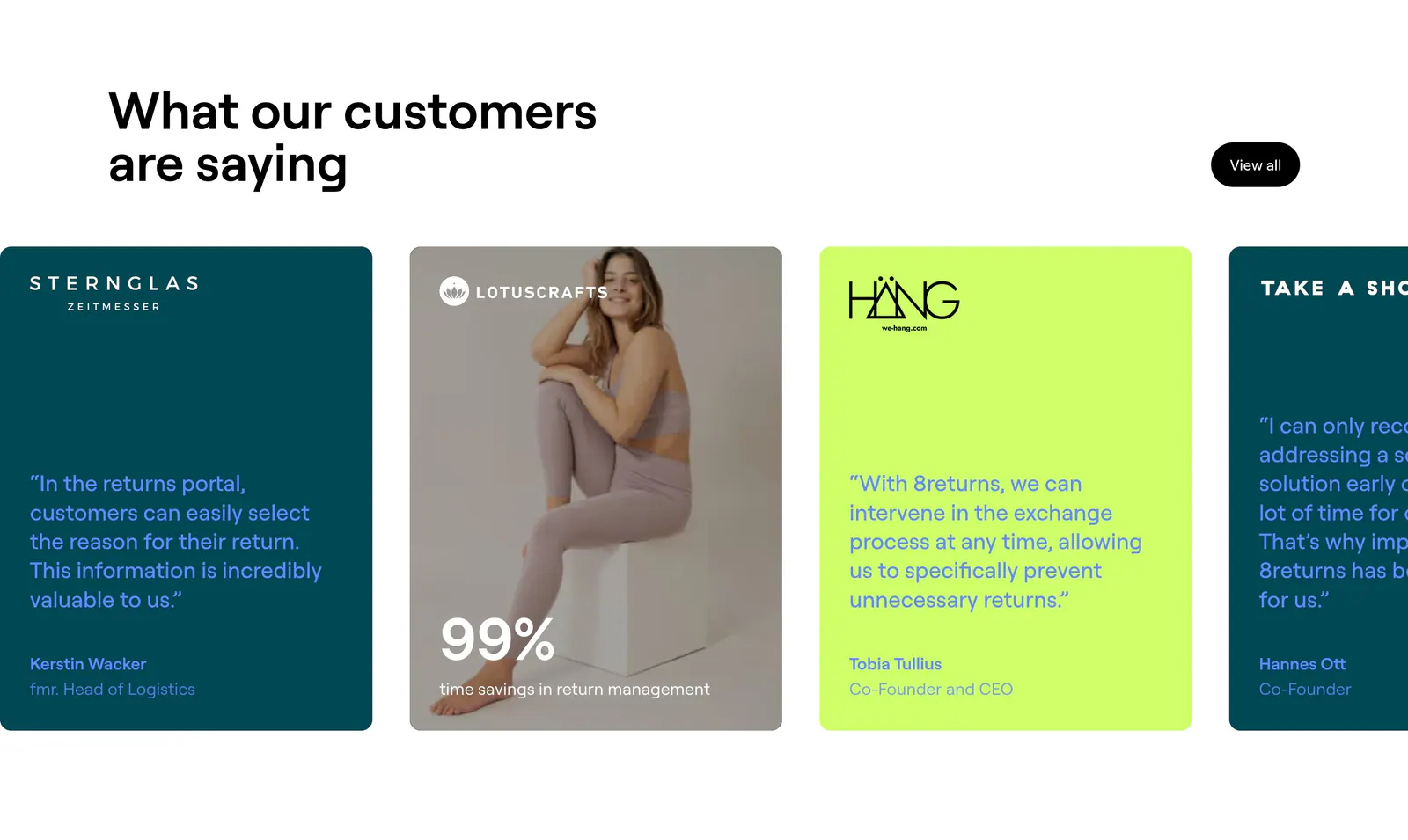
  2. 8returns testimonials section: headline above a horizontal carousel of teal, lime and photo quote cards cut off at the right edge
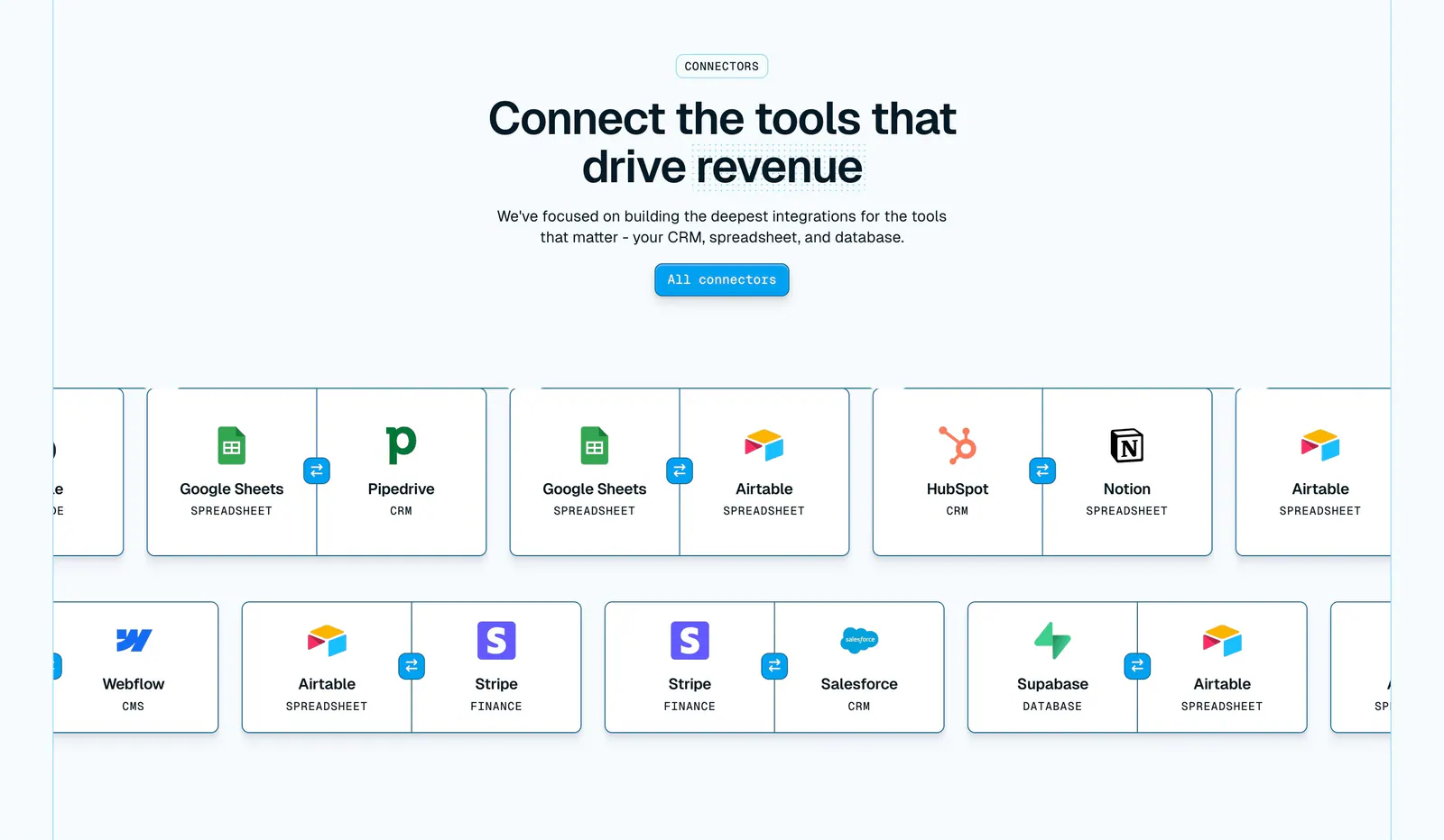
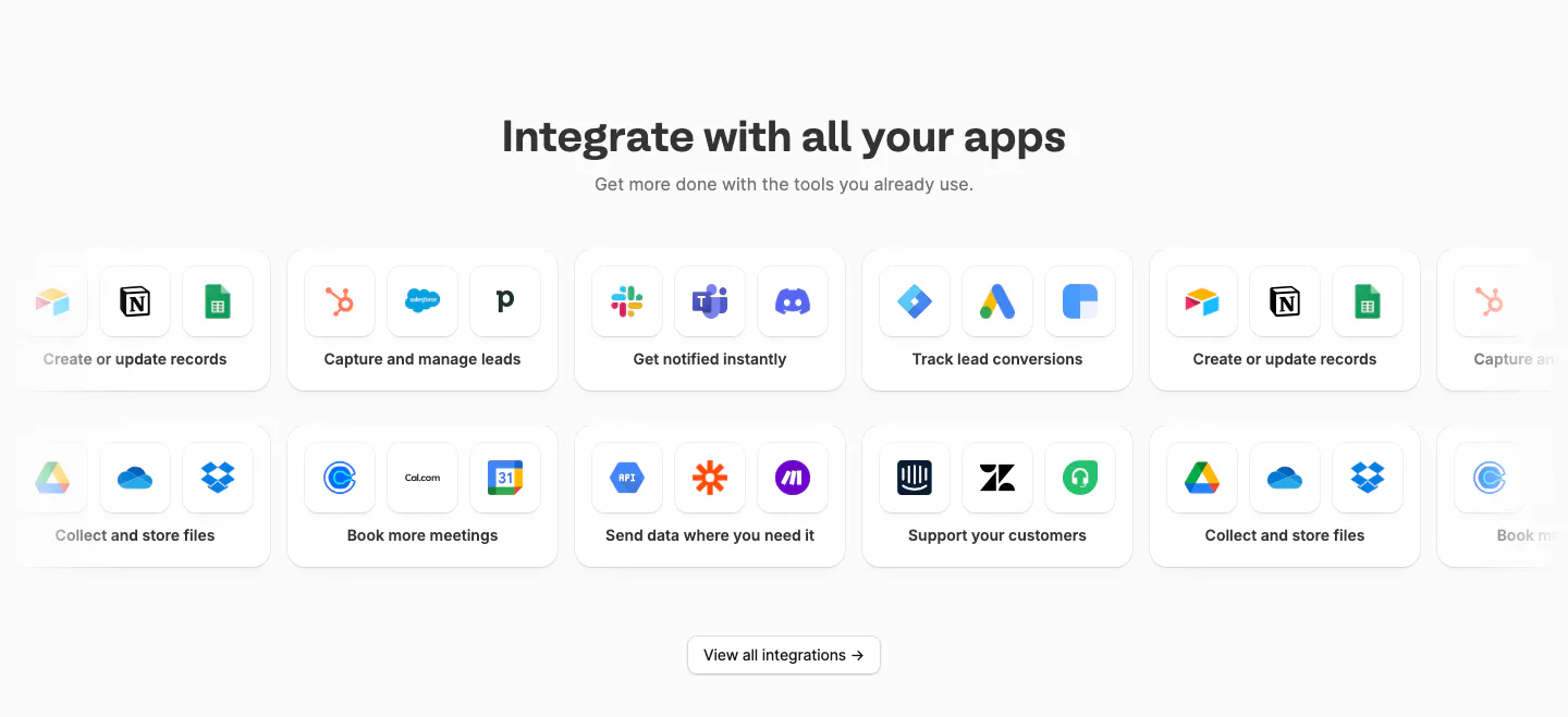
  3. Whalesync integrations section: centered headline above two scrolling rows of paired connector cards like Google Sheets and Pipedrive
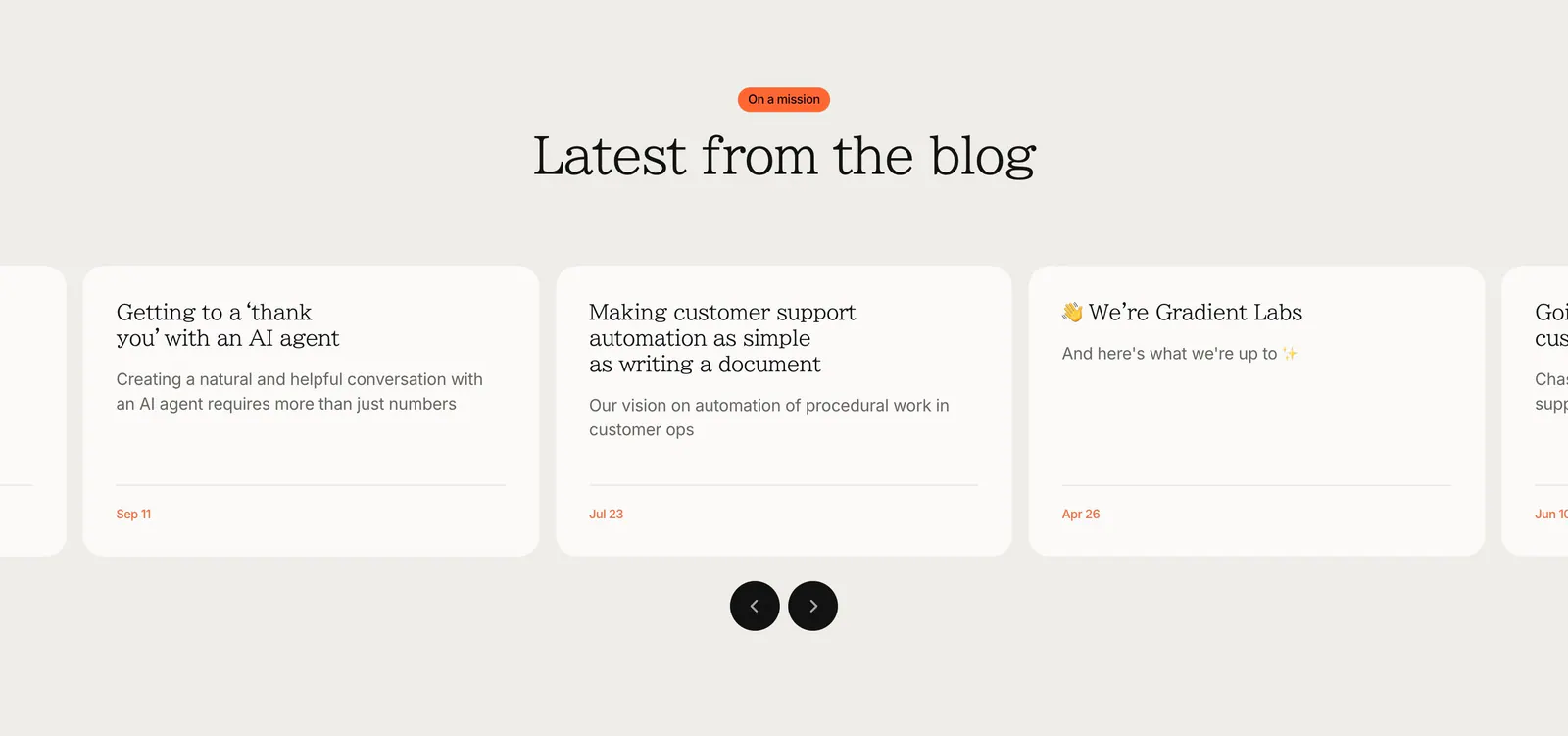
  4. Gradient Labs blog & resources section: centered serif heading above a carousel of off-white article cards with round arrow buttons
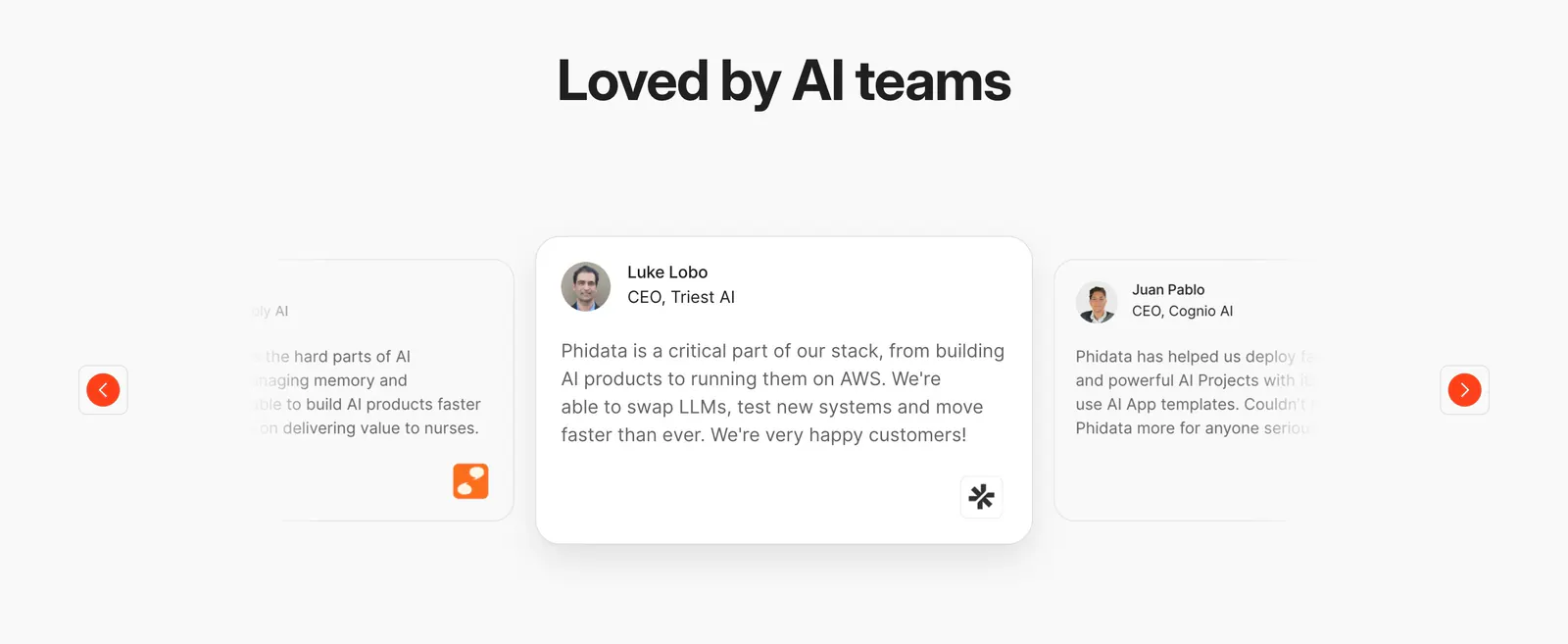
  5. Phidata testimonials section: centered heading above a quote card carousel with faded side cards and orange arrow buttons
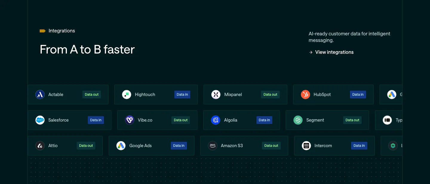
  6. Customer.io integrations section: dark teal band with headline and rows of integration pills tagged Data in or Data out
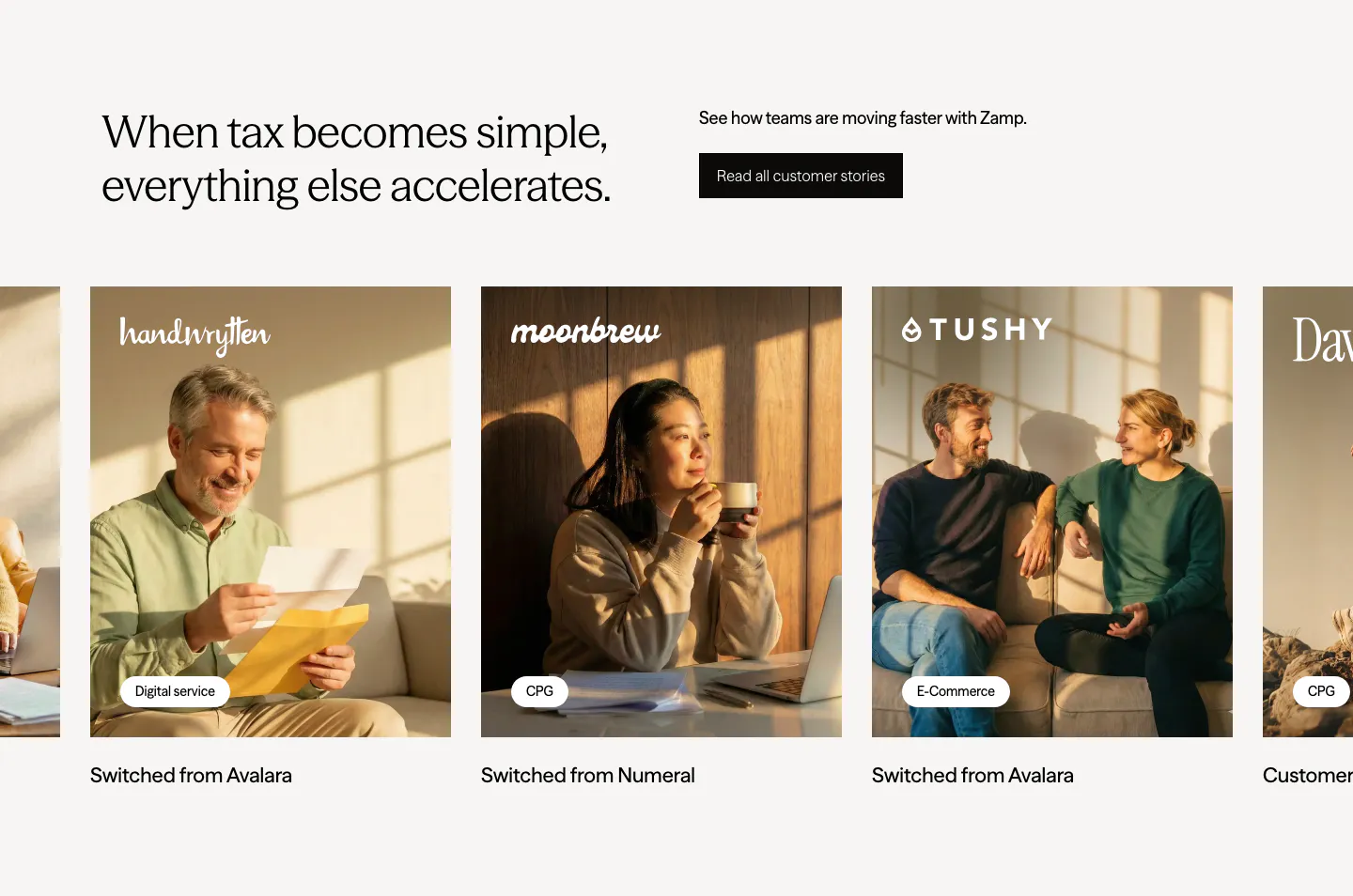
  7. Zamp testimonials section: headline and stories button above a carousel of customer photo cards with brand logos and tags
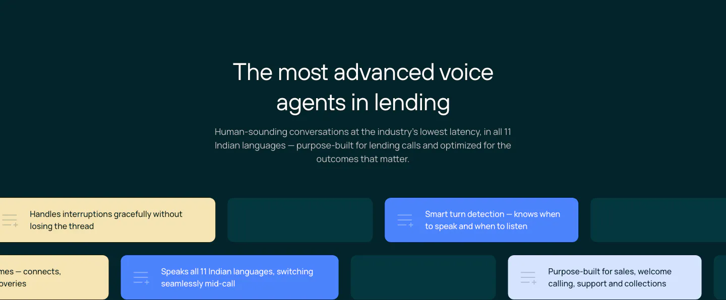
  8. Rezolv features section: centered headline above staggered rows of yellow, blue and teal capability chips on a dark teal background
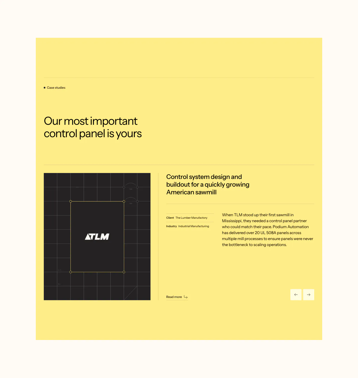
  9. Podium Automation testimonials section: yellow panel with case study heading, client logo image, story text and arrow controls
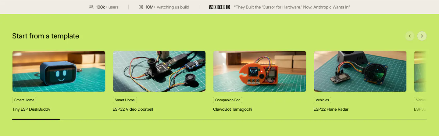
  10. Schematik features section: stats bar above a carousel of hardware template photo cards on a lime green background
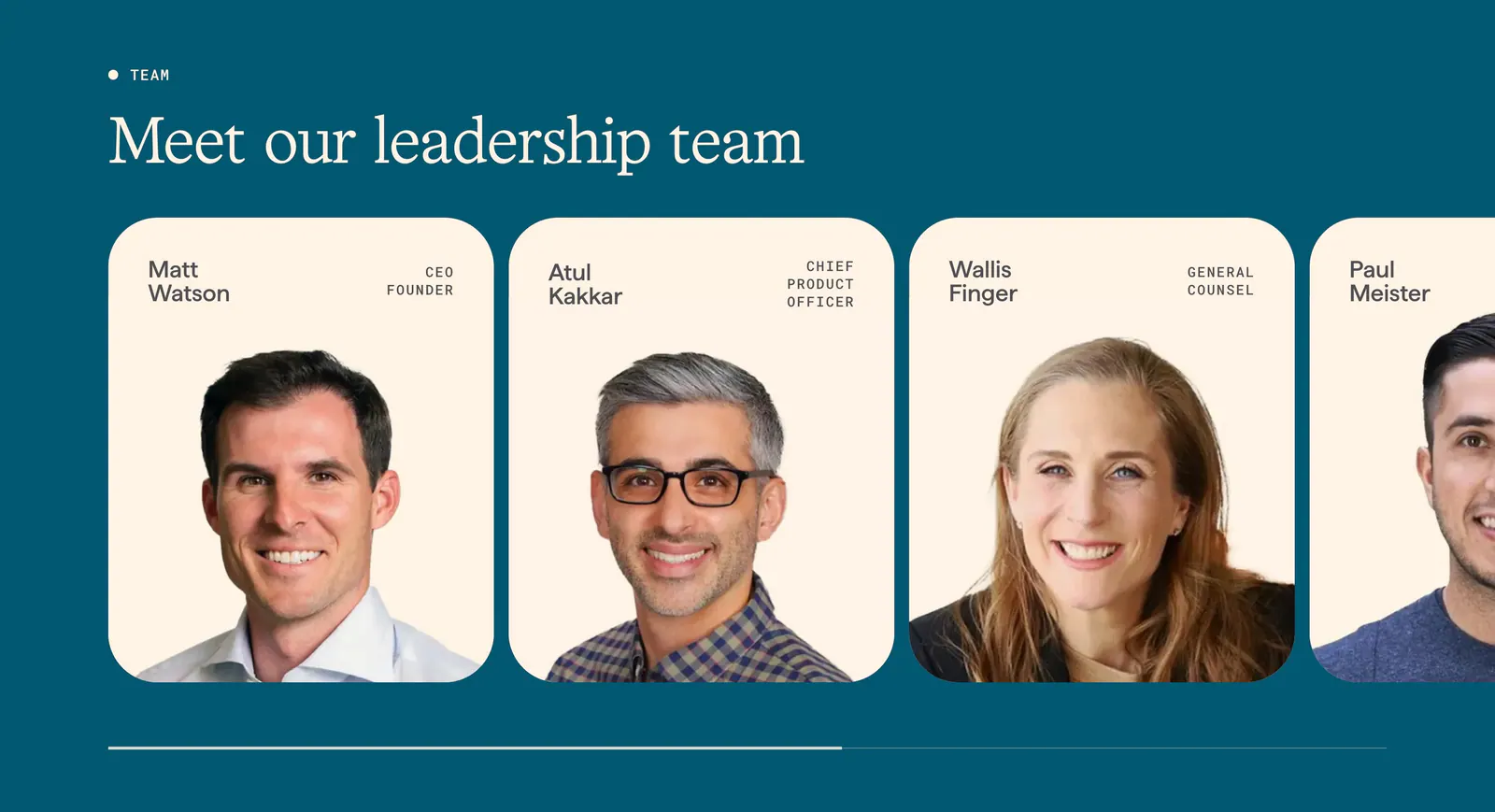
  11. Origin team section: serif headline above a scrolling row of cream leadership cards with portrait photos and titles on deep teal
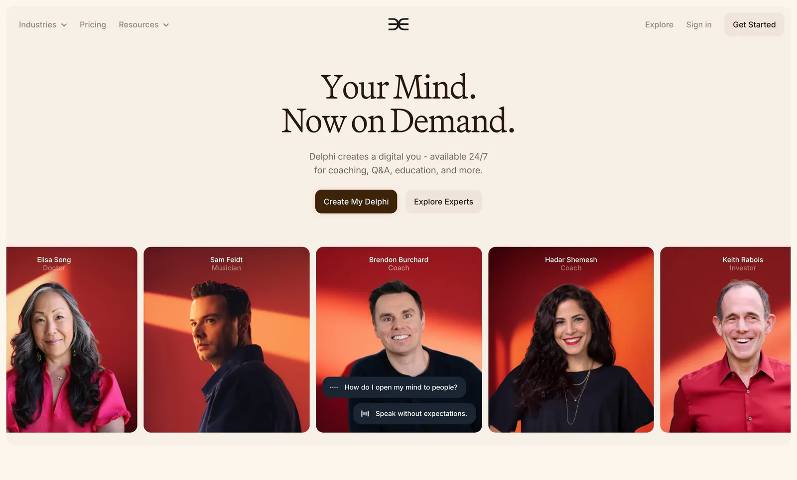
  12. Delphi hero section: centered serif headline with two buttons above a row of expert portrait cards on red backgrounds, on a cream page
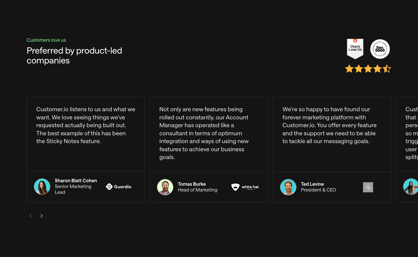
  13. Customer.io testimonials section: charcoal carousel of quote cards with avatars and company logos, plus G2 and Inc. 5000 badges and stars
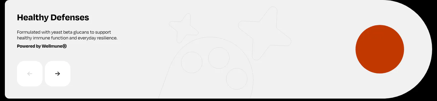
  14. Watts features section: Healthy Defenses slide with short copy, prev/next arrow buttons and an orange circle on a light gray card
  15. Fillout integrations section: centered heading above two rows of cards grouping app icons by task, cut off at the edges, and a view-all button
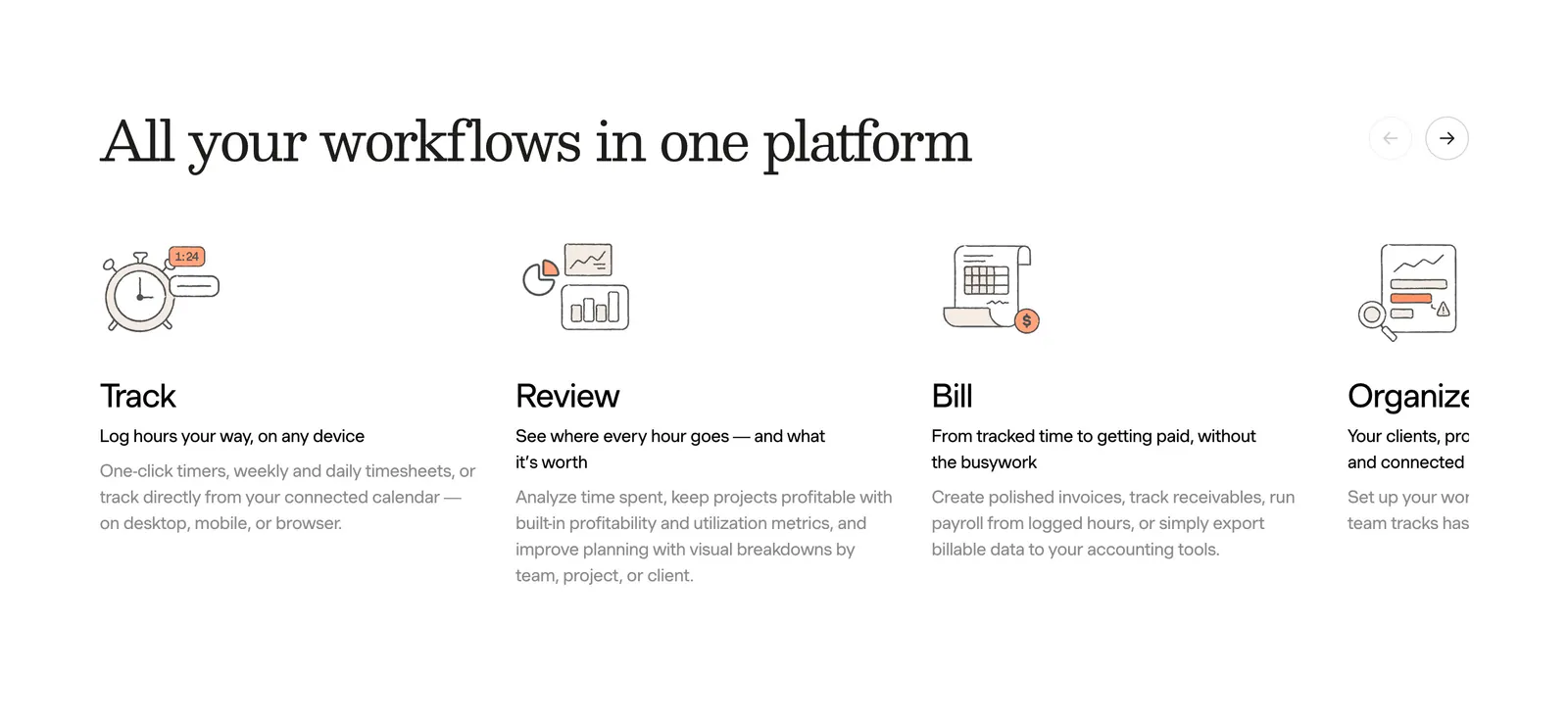
  16. Harvest features section: serif heading with arrow controls above a sliding row of track, review, bill and organize columns with line drawings
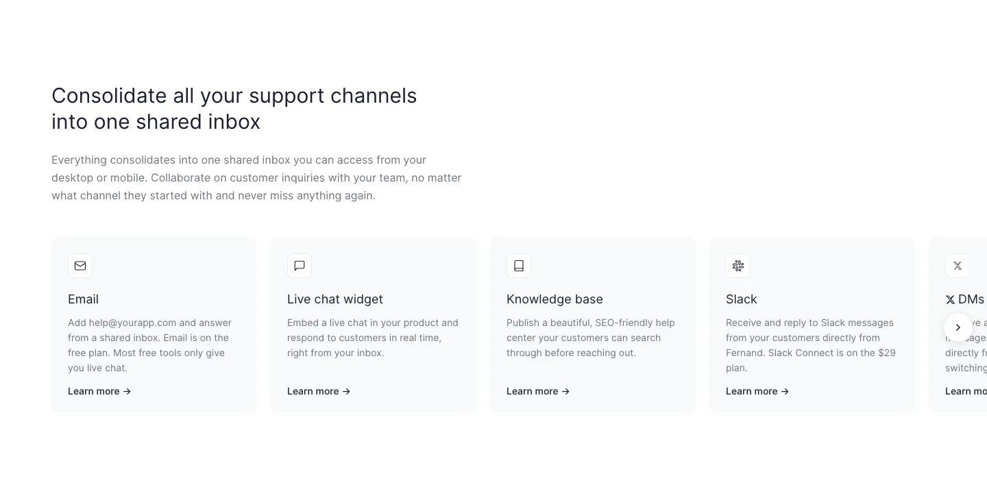
  17. Fernand features section: left-aligned headline above a row of support channel cards cut off at the right edge with a next arrow
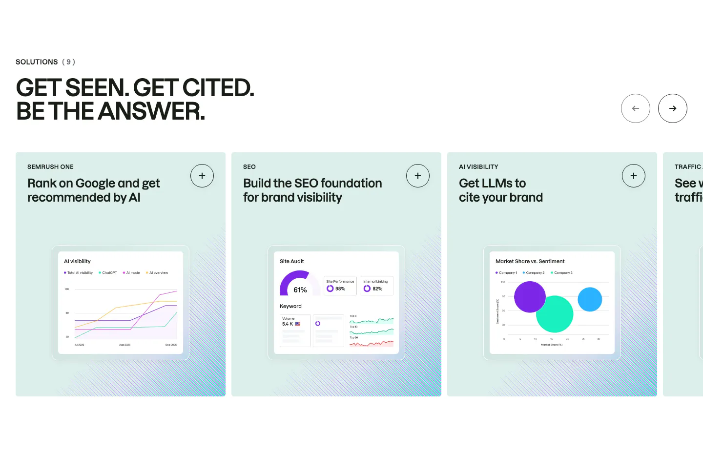
  18. Semrush features section: uppercase headline above a carousel of mint solution cards, each with a chart-based product UI mockup
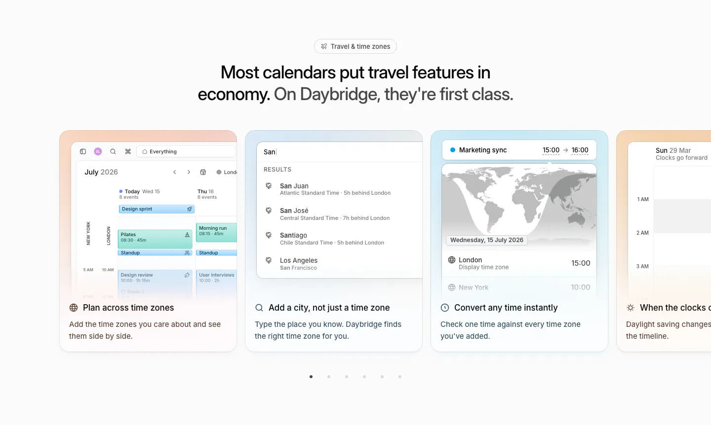
  19. Daybridge features section: centered headline above a carousel of pastel cards showing time zone UI, with pagination dots
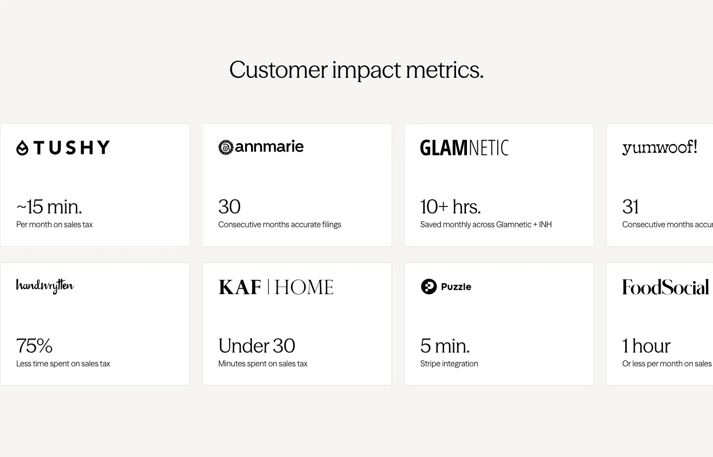
  20. Zamp stats section: centered heading above two rows of white cards pairing customer logos with time-saved figures, cut off at the right edge
  21. Secoda integrations section: centered headline and button above two rows of integration app icons fading at the edges on white
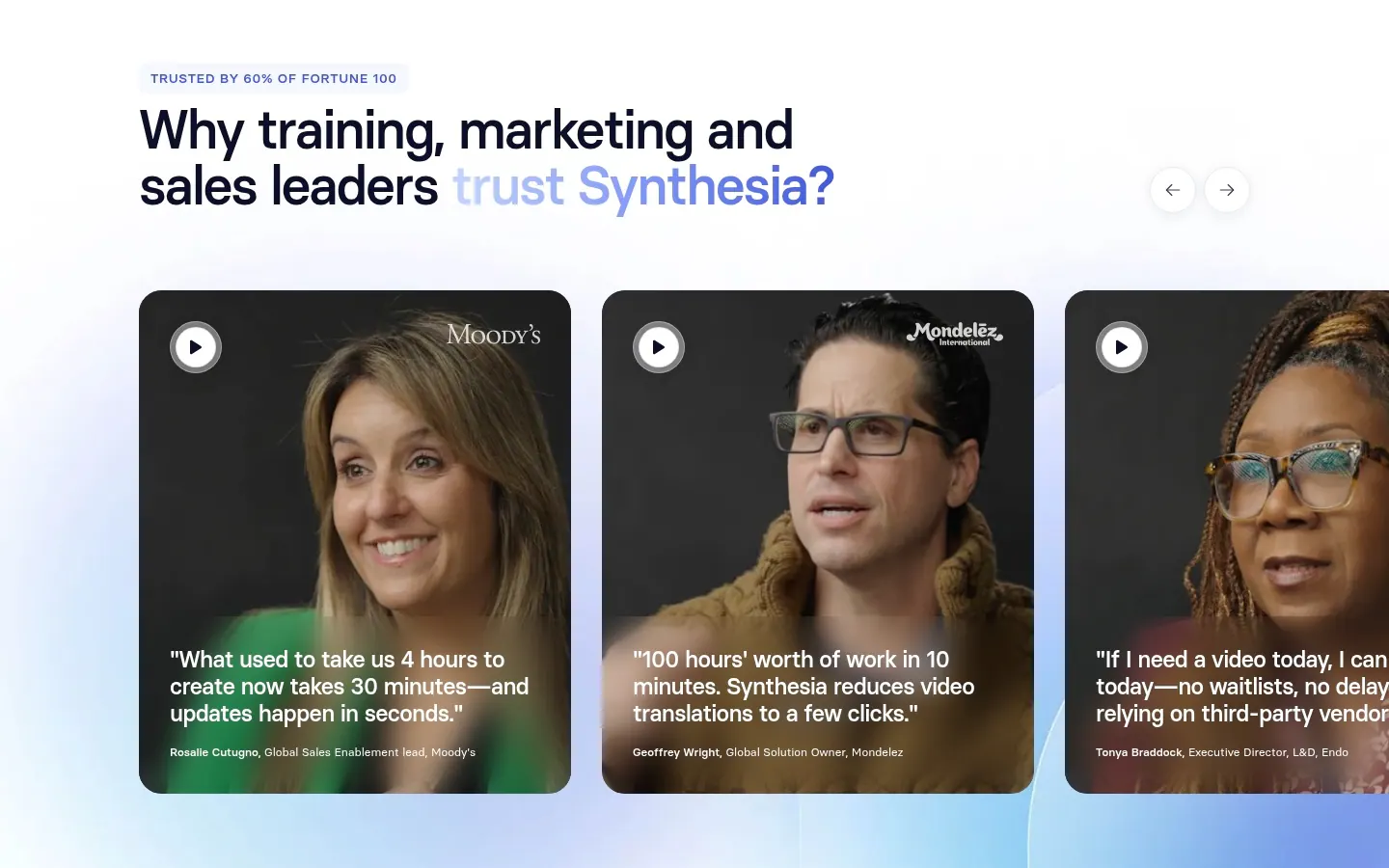
  22. Synthesia testimonials section: headline with arrow controls above a carousel of video testimonial cards with customer portraits and quotes
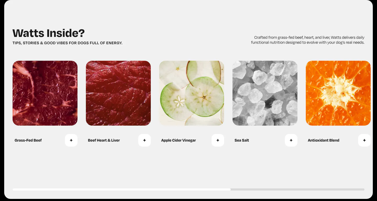
  23. Watts features section: horizontal row of ingredient photo cards with plus buttons and a scroll progress bar on light gray
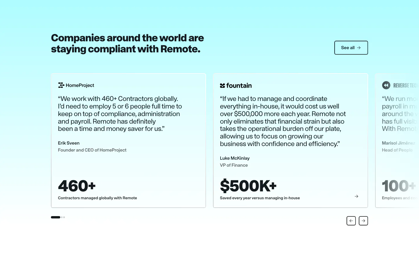
  24. Remote testimonials section: headline and See all button above a carousel of quote cards with large metrics on cyan
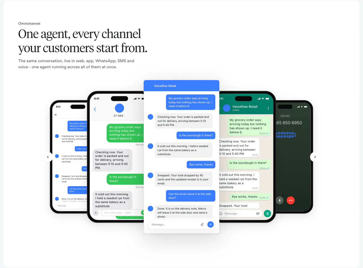
  25. Voiceflow features section: left-aligned serif headline above a carousel of phone and chat UI mockups with arrow controls
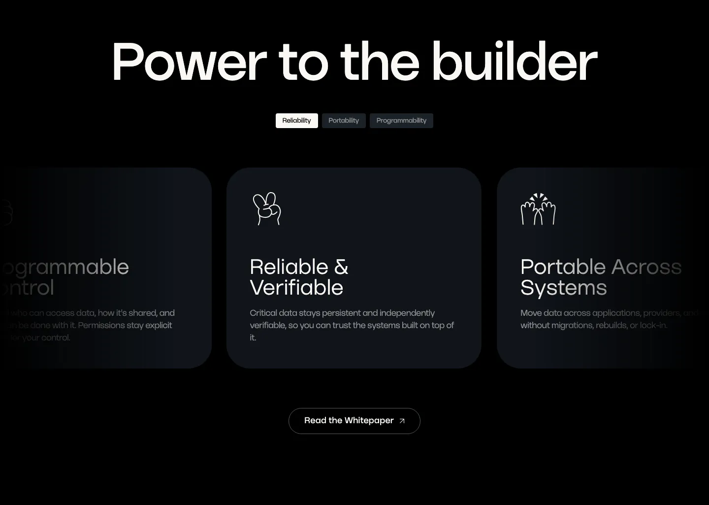
  26. Walrus value proposition section: large headline over tab pills and a carousel of dark benefit cards with line icons
  27. Nory logo cloud section: centered headline above a row of restaurant brand logos in white cards on a cream background
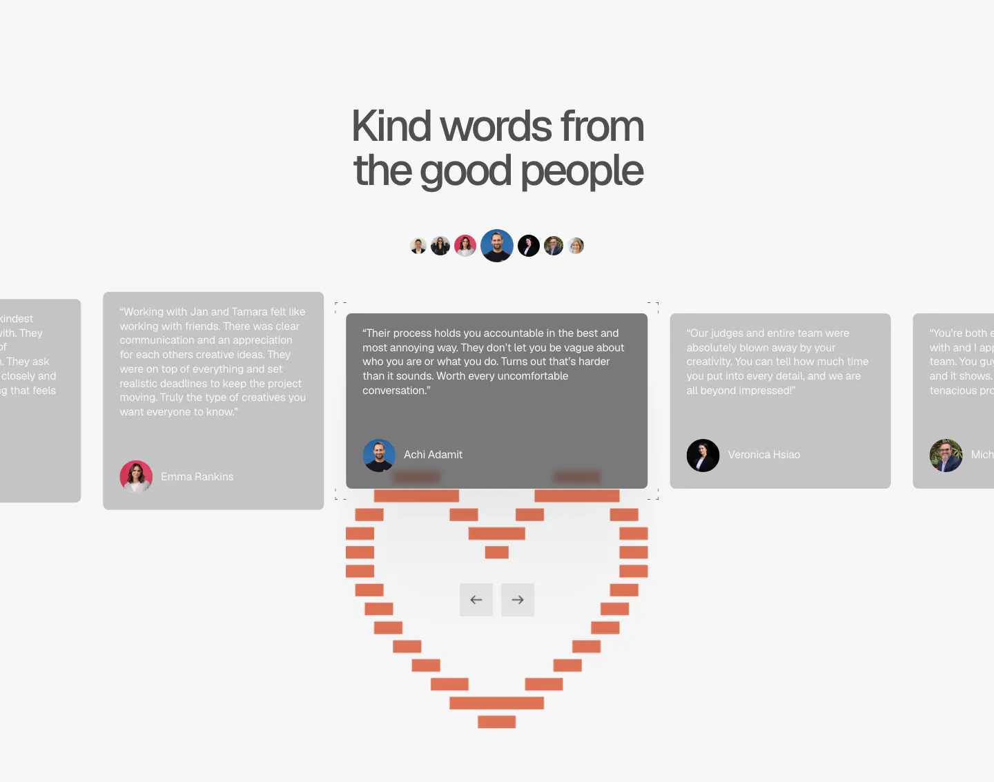
  28. A-LIGN testimonials section: centered headline, avatar row and a quote card carousel with arrows above a pixel-style orange heart
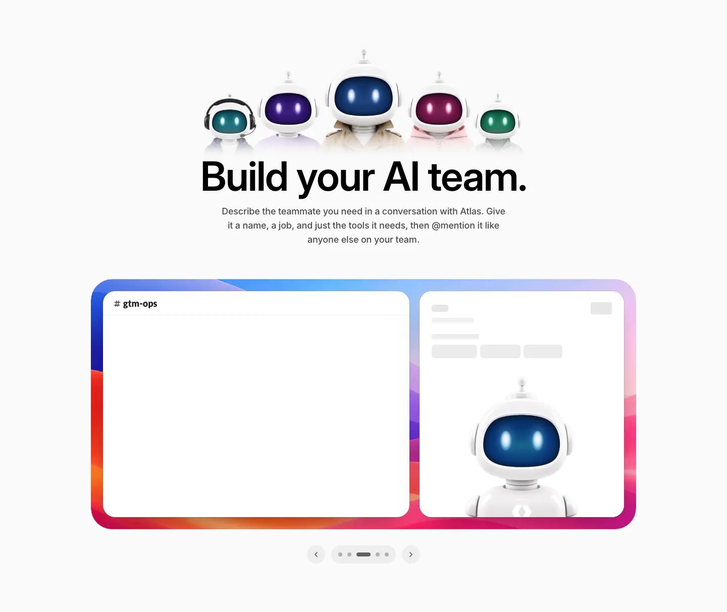
  29. WorkOS features section: row of 3D robot characters above a centered headline and a Slack mockup carousel
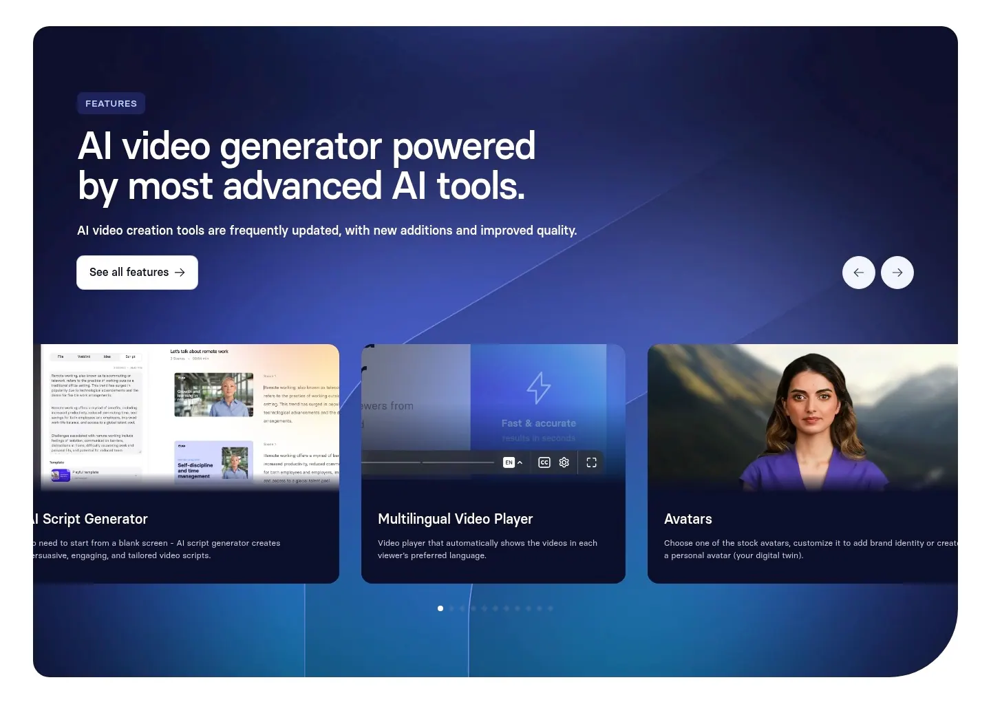
  30. Synthesia features section: navy-to-blue gradient panel with headline, arrow controls and a carousel of feature cards with UI and avatars
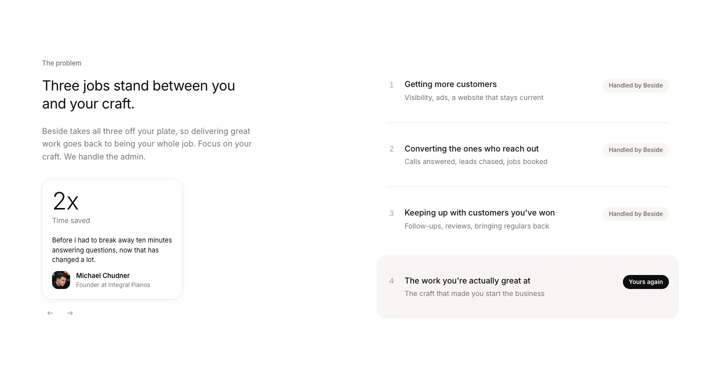
  31. Beside value proposition section: headline and testimonial stat card on the left, four numbered job rows with status pills on the right
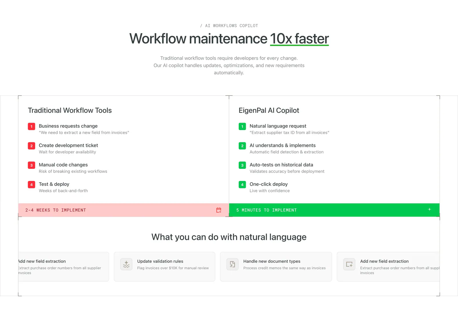
  32. EigenPal comparison section: centered headline above two columns contrasting traditional workflow steps in red with AI copilot steps in green
    EigenPal Comparison
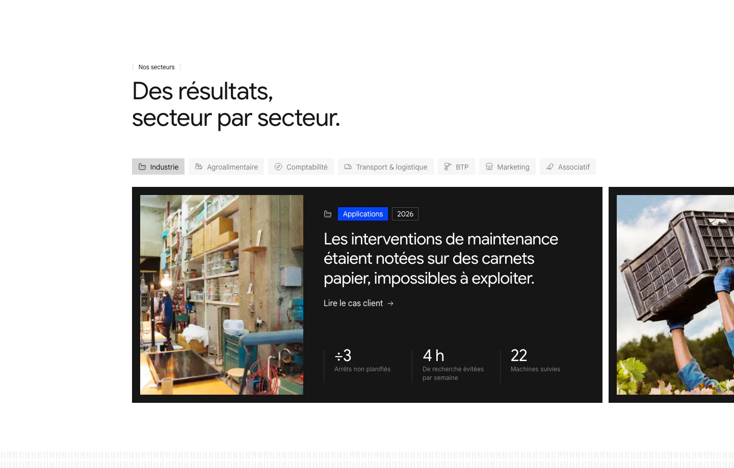
  33. Raneo use cases section: industry tab bar above a carousel of dark case-study cards with photos, headlines and three result metrics
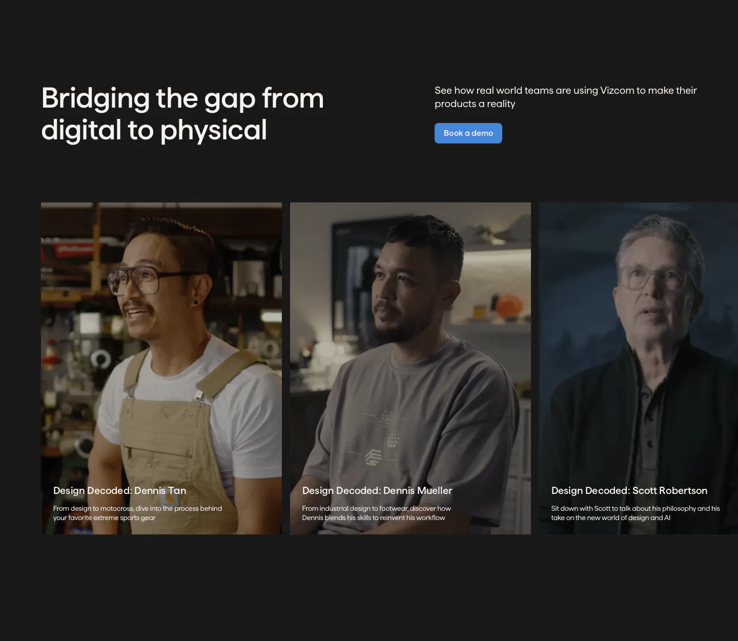
  34. Vizcom testimonials section: headline and demo button above a row of customer video story cards with portrait photos on a charcoal background
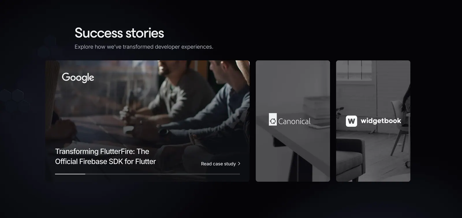
  35. Invertase testimonials section: headline above an expanded case-study card and two narrow photo cards with client logos on dark
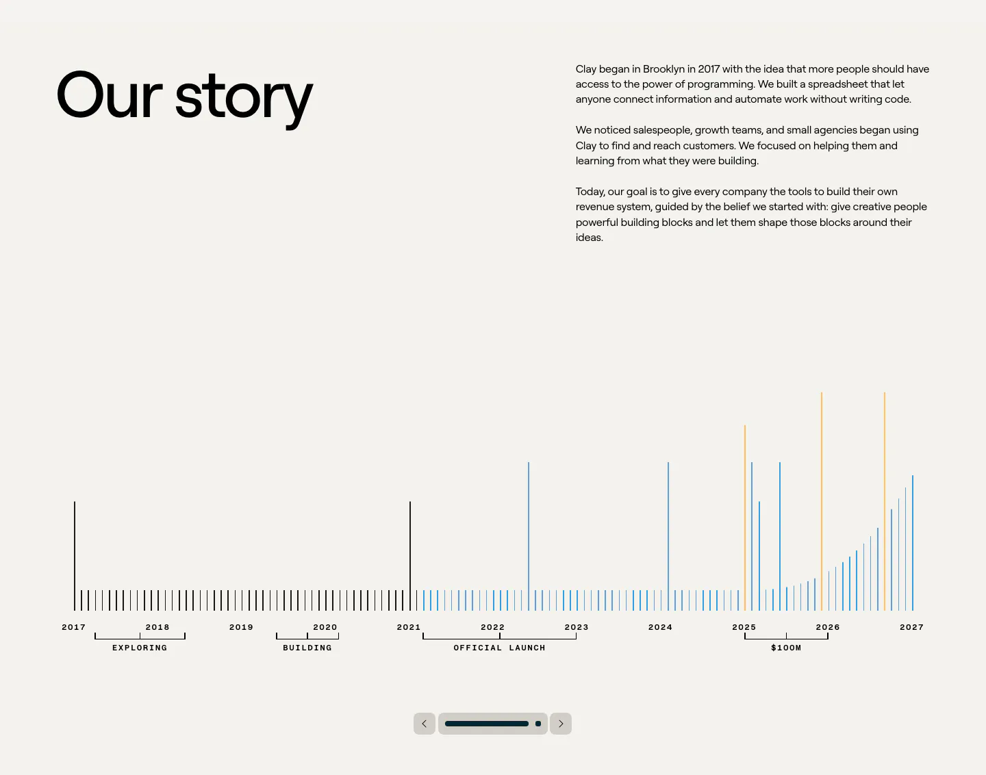
  36. Clay about & mission section: large heading beside story copy above a 2017-2027 bar timeline with slider controls on beige
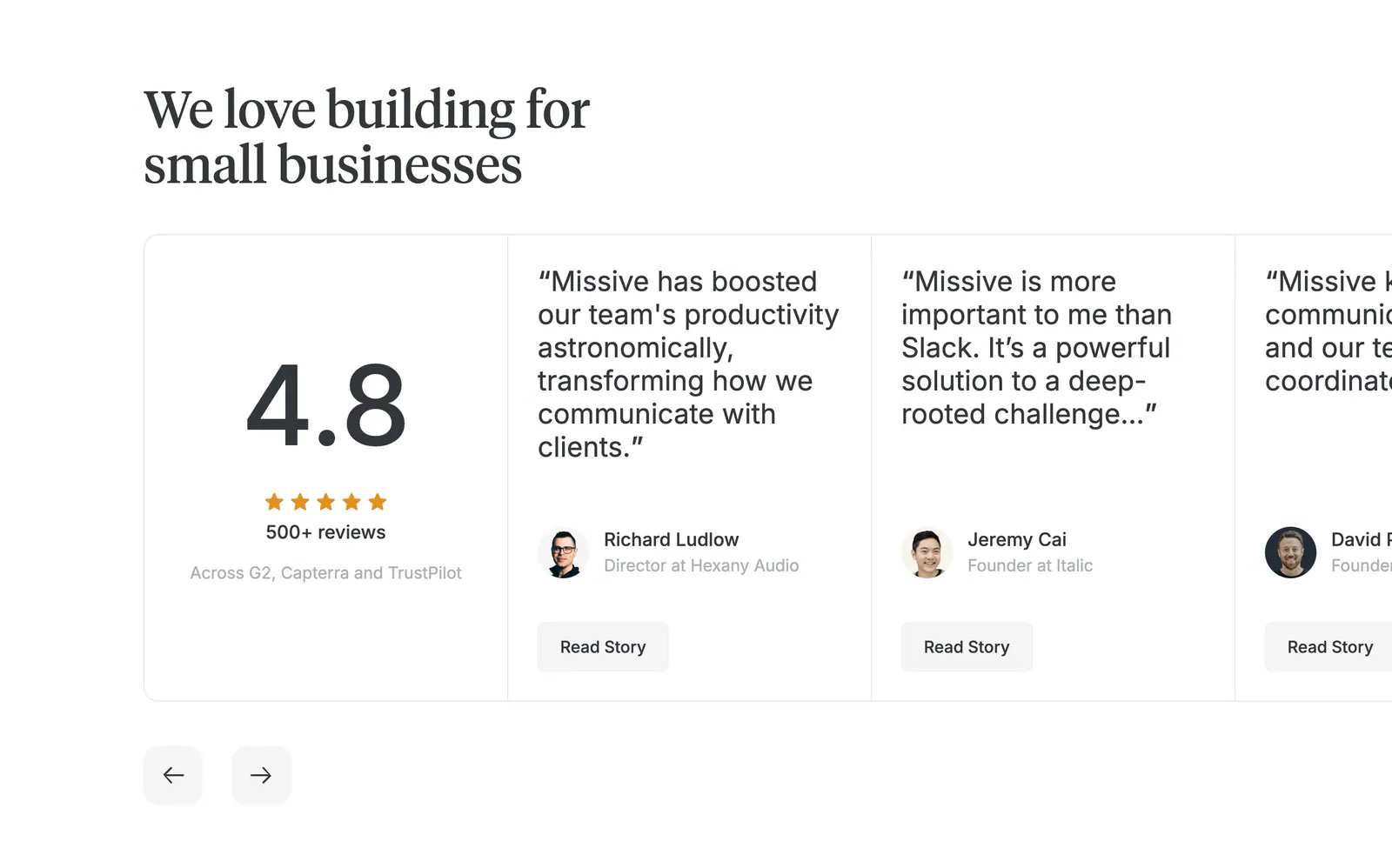
  37. Missive testimonials section: serif headline above a 4.8 rating card and edge-cropped quote cards with arrows on white
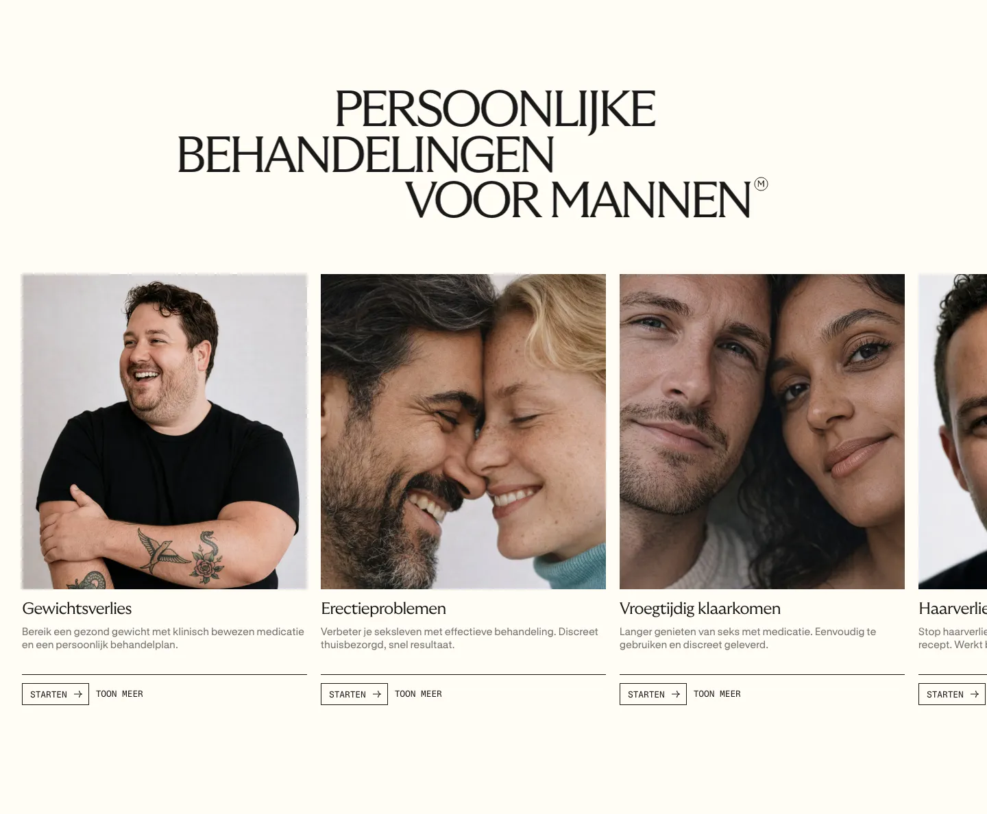
  38. Menkind features section: serif uppercase headline above a carousel of treatment cards with portrait photos and start buttons on cream
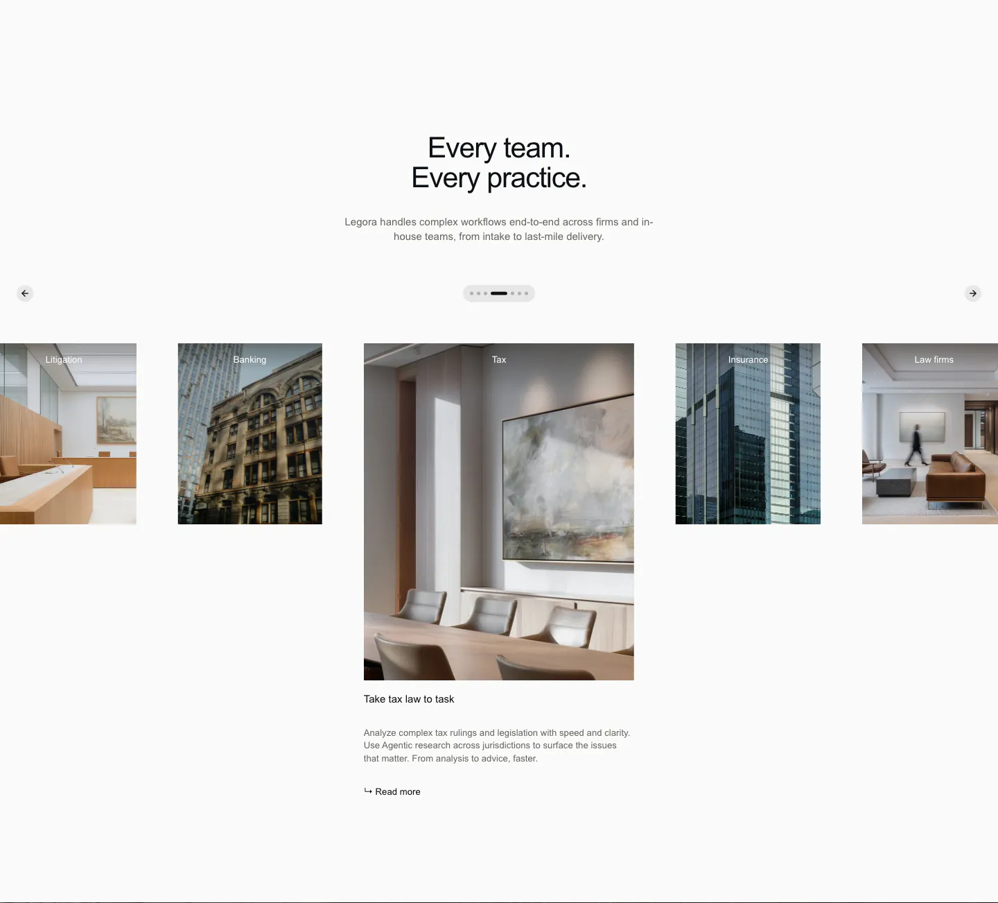
  39. Legora use cases section: centered headline above a photo carousel of practice areas with arrows and pagination dots
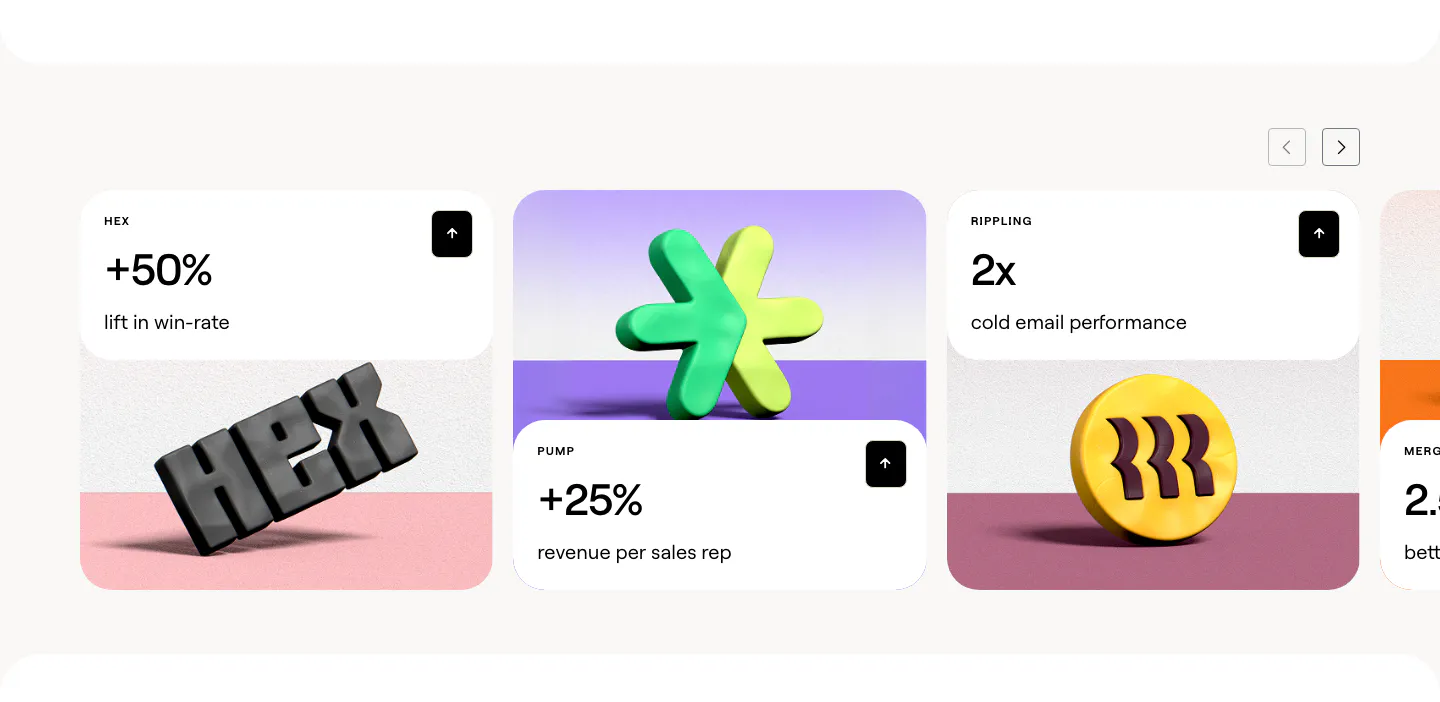
  40. Clay stats section: slider of customer result cards with large percentages above 3D rendered brand logos on colored stages
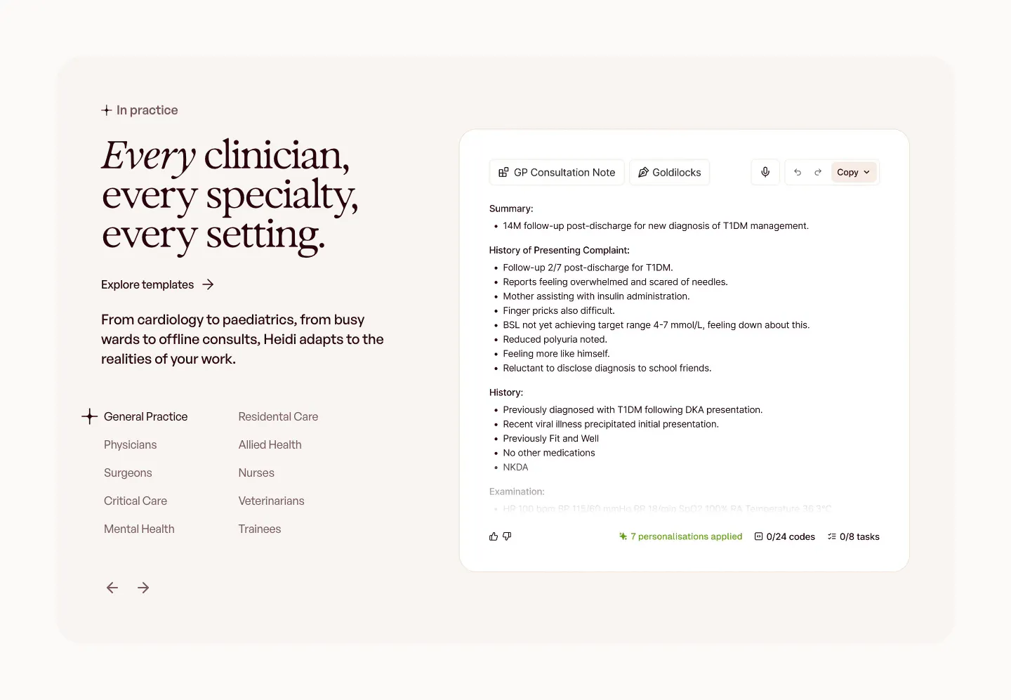
  41. Heidi use cases section: serif headline with a specialty list and arrows on the left, GP consultation note UI on the right
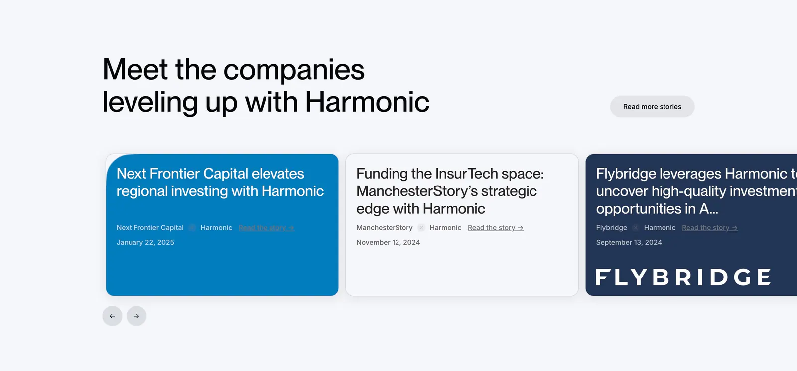
  42. Harmonic testimonials section: left-aligned headline above a carousel of customer story cards in blue, white and navy with arrows
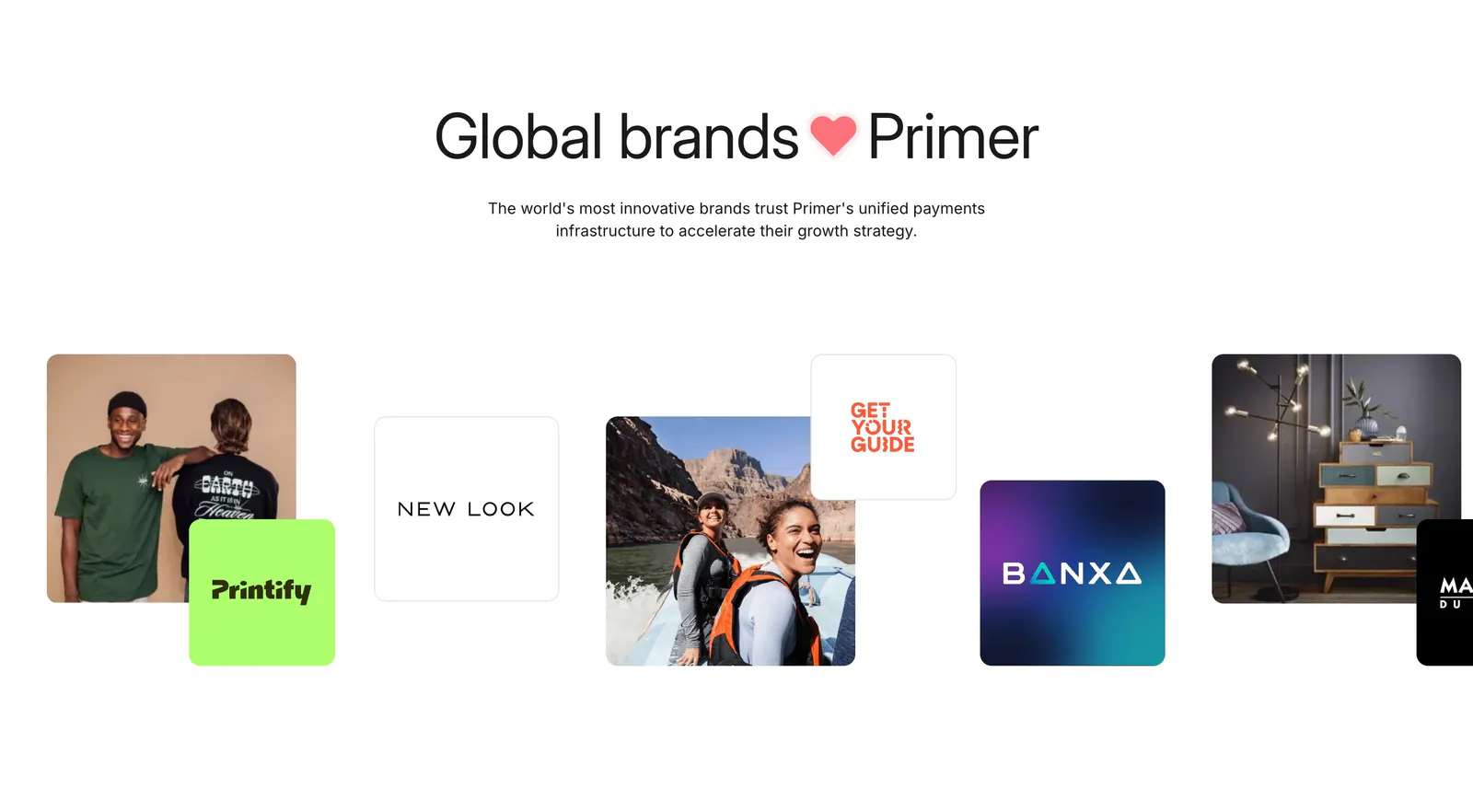
  43. Primer logo cloud section: centered headline above a staggered row of customer logo tiles mixed with lifestyle photos
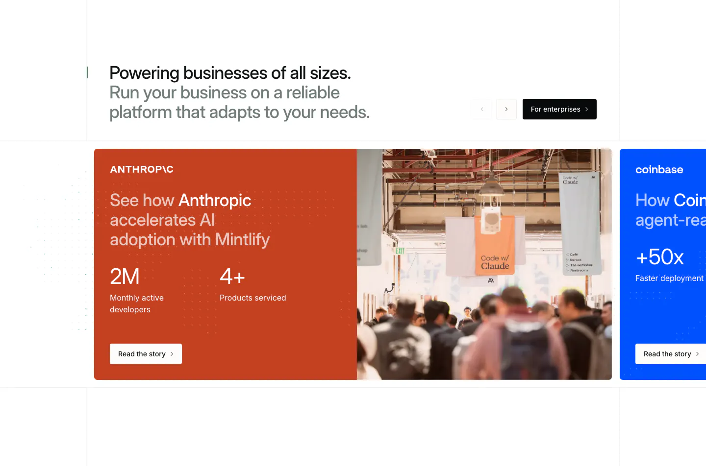
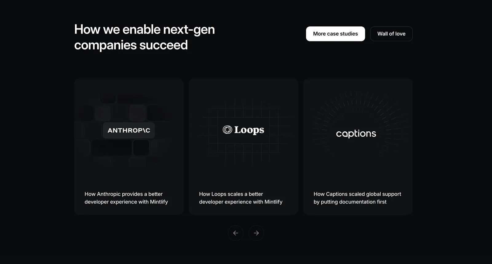
  44. Mintlify testimonials section: headline with arrows above a carousel of customer story cards, orange Anthropic card with stats and photo
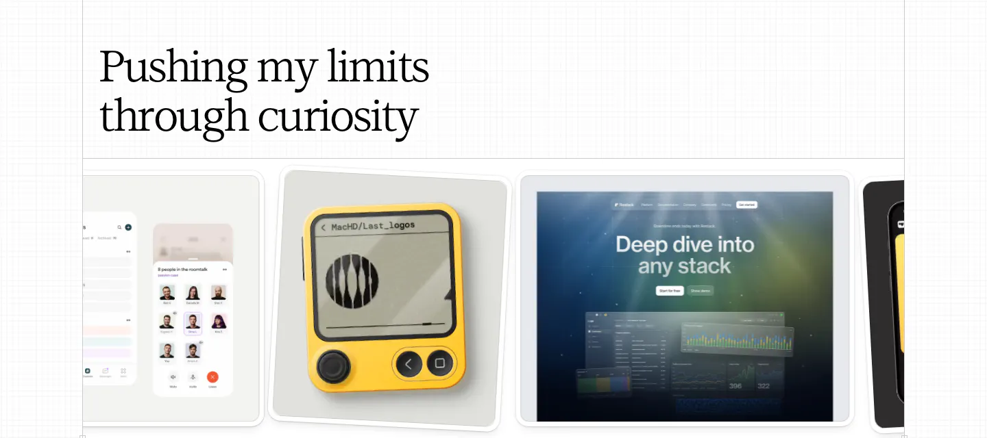
  45. Daniel Sun other section: left serif headline above a horizontal carousel of exploration cards showing app and device mockups
    Daniel Sun Other
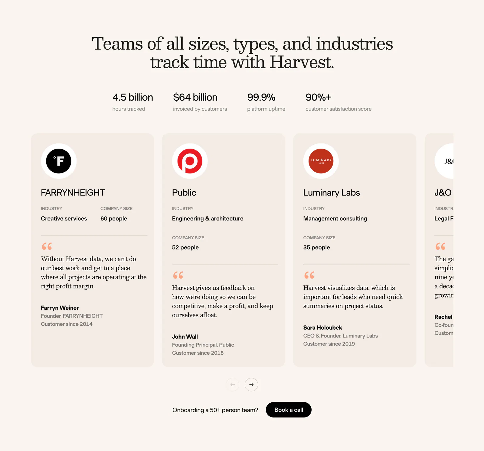
  46. Harvest footer section: serif headline, four stats and a carousel of customer testimonial cards with logos on a cream background
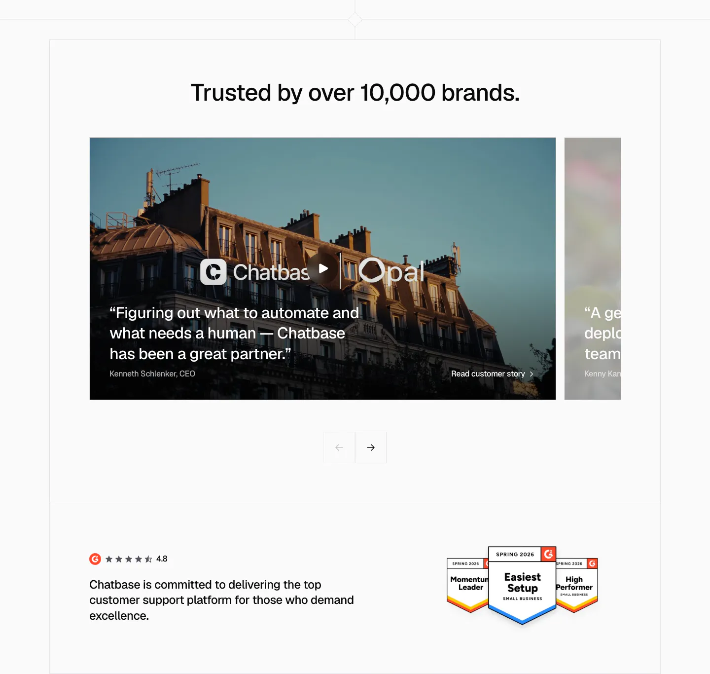
  47. Chatbase testimonials section: slider of photo-backed customer story cards with arrows, G2 rating and badges below
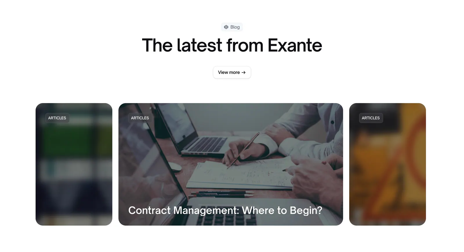
  48. Exante blog & resources section: centered heading and view more button above a carousel of photo article cards with blurred edges
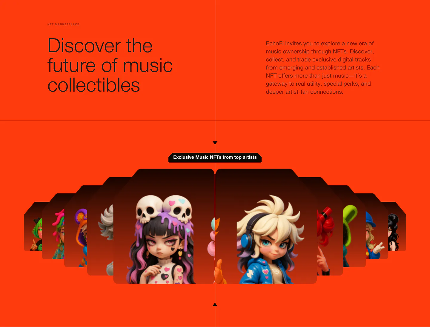
  49. EchoFi features section: headline and copy split over orange, above a fanned carousel of 3D character NFT cards
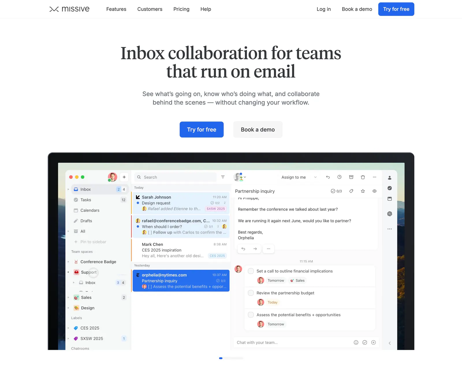
  50. Missive hero section: centered serif headline and two CTAs above a laptop-framed shared inbox app screenshot on white
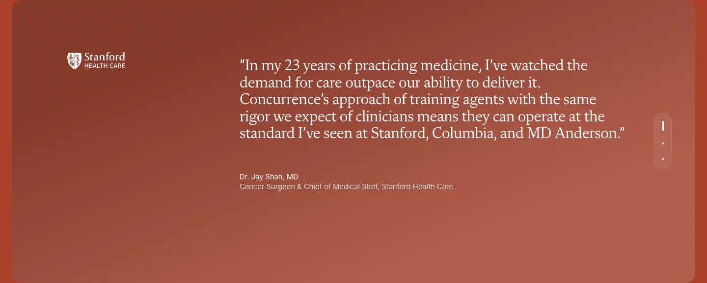
  51. Concurrence testimonials section: serif quote from a Stanford Health Care surgeon on a rust gradient card with vertical pagination dots
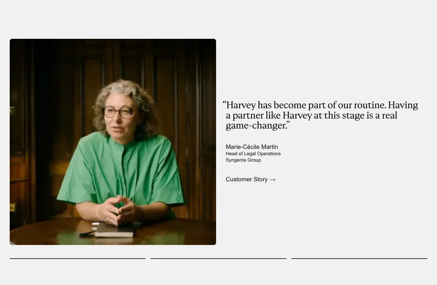
  52. Harvey testimonials section: photo of a customer at a table beside a serif quote with name and customer story link
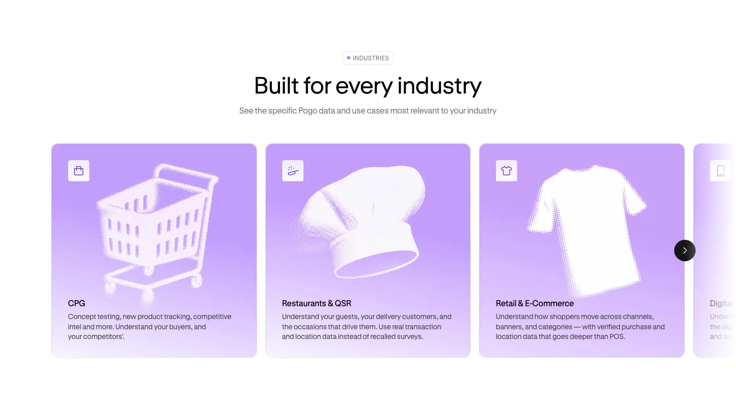
  53. Pogo use cases section: centered headline above a carousel of lavender industry cards with halftone object artwork
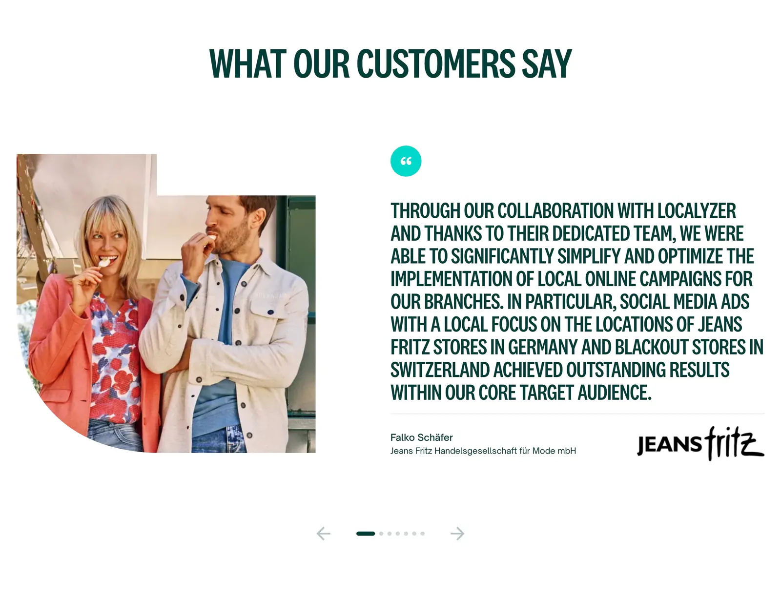
  54. Localyzer testimonials section: customer photo beside a large uppercase quote with client logo and carousel arrows on white
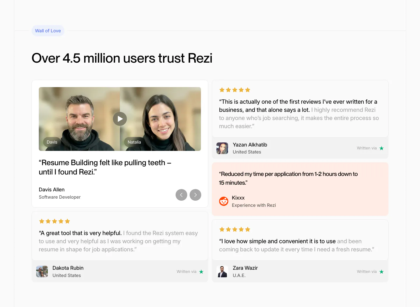
  55. Rezi testimonials section: two-column review wall with a video testimonial card, star-rated quote cards and a peach Reddit quote
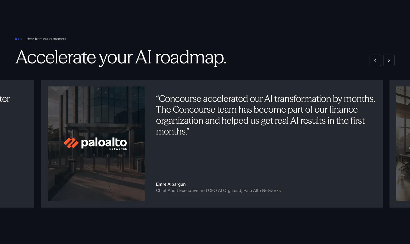
  56. Concourse testimonials section: headline with arrow buttons above a carousel of quote cards with a Palo Alto Networks photo on dark navy
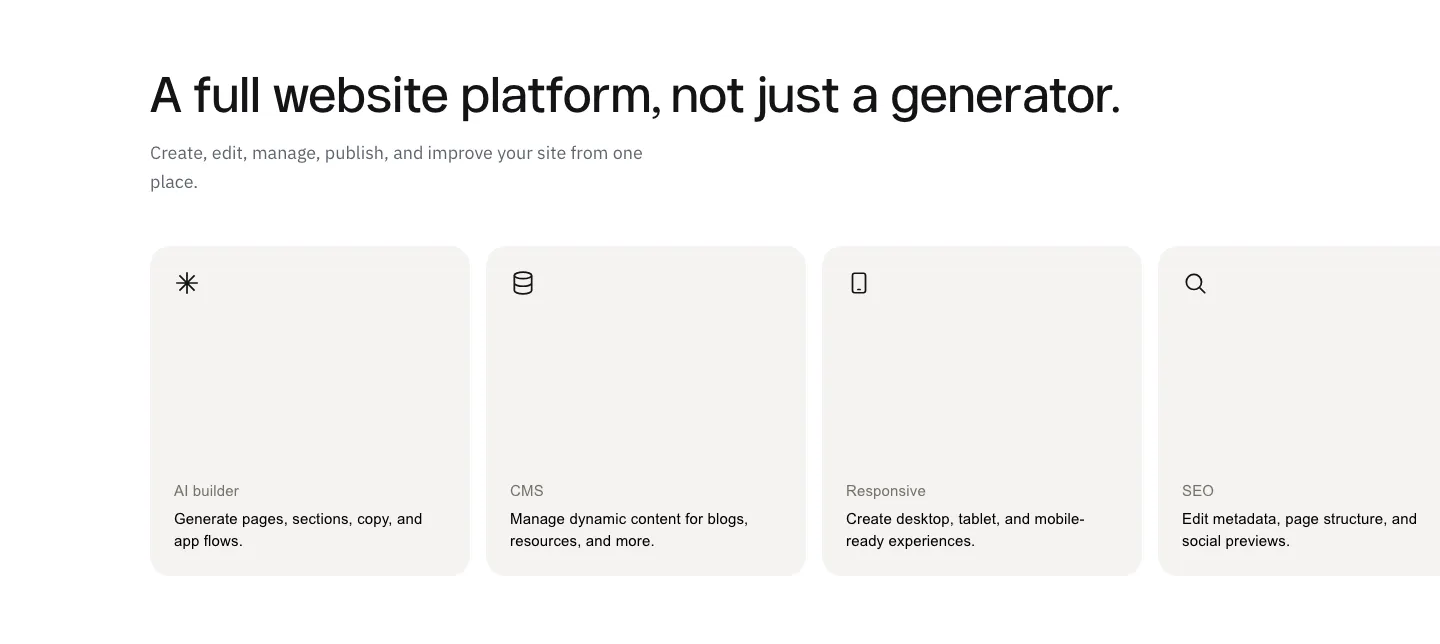
  57. Modulify features section: left-aligned headline above a row of four gray icon cards on white, the last card cut off
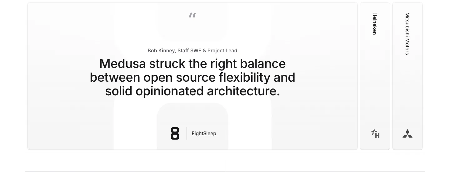
  58. Medusa testimonials section: large centered quote card with EightSleep logo beside collapsed Heineken and Mitsubishi Motors tabs
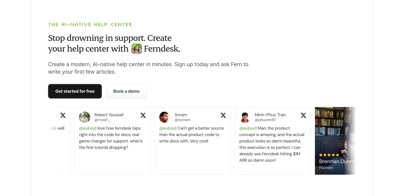
  59. Ferndesk testimonials section: serif headline and two CTAs above a horizontally scrolling row of tweet cards on white
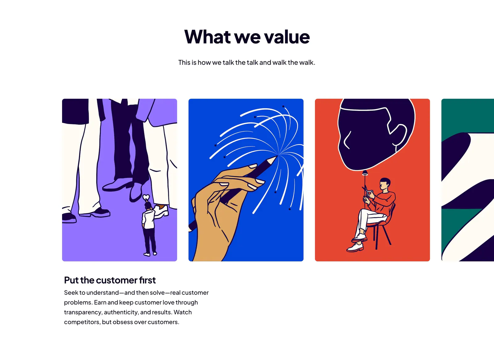
  60. Dovetail value proposition section: centered headline above a carousel of bold illustrated value cards with the first value's text below
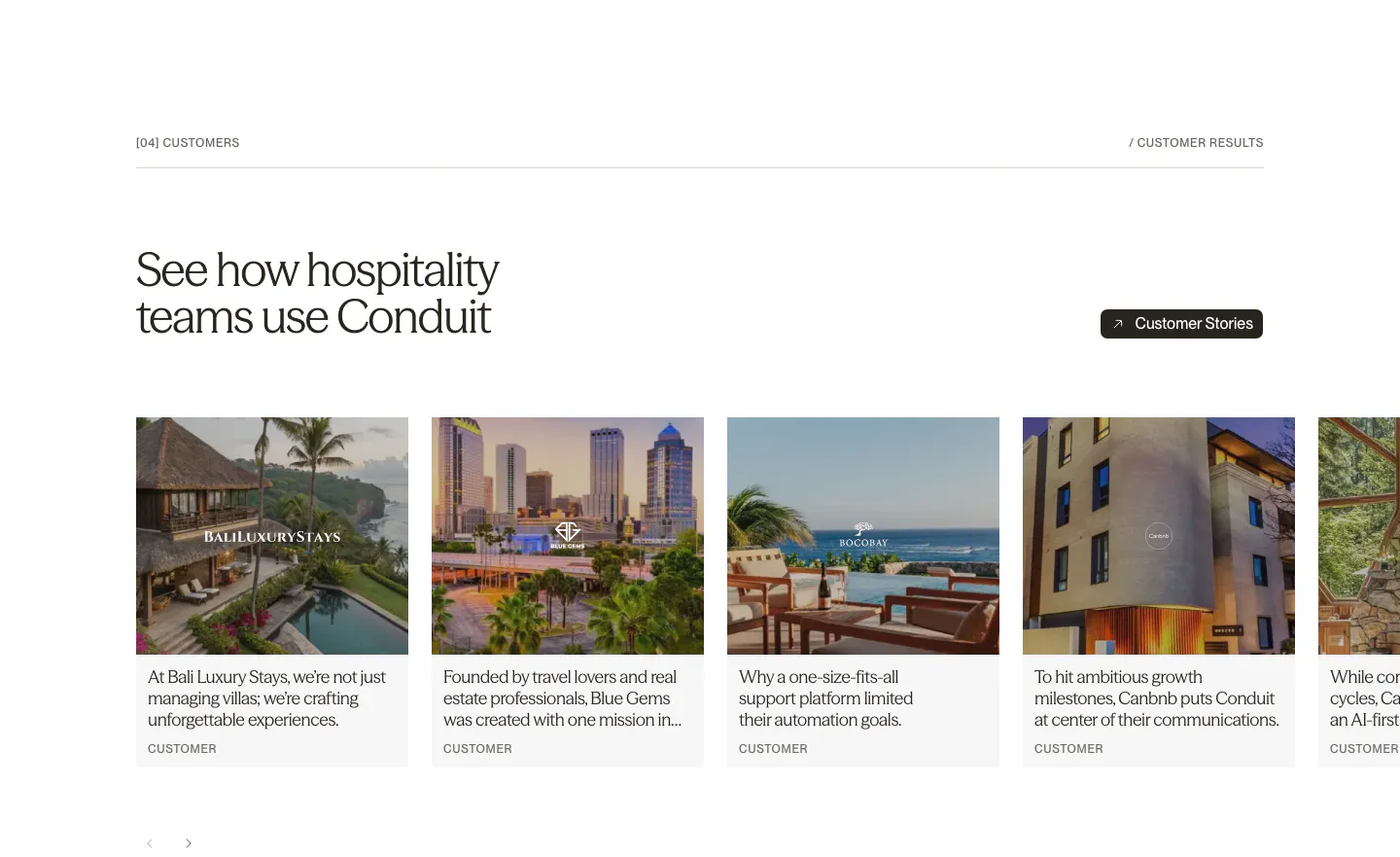
  61. Conduit testimonials section: serif headline above a carousel of customer story cards with hotel and resort photos
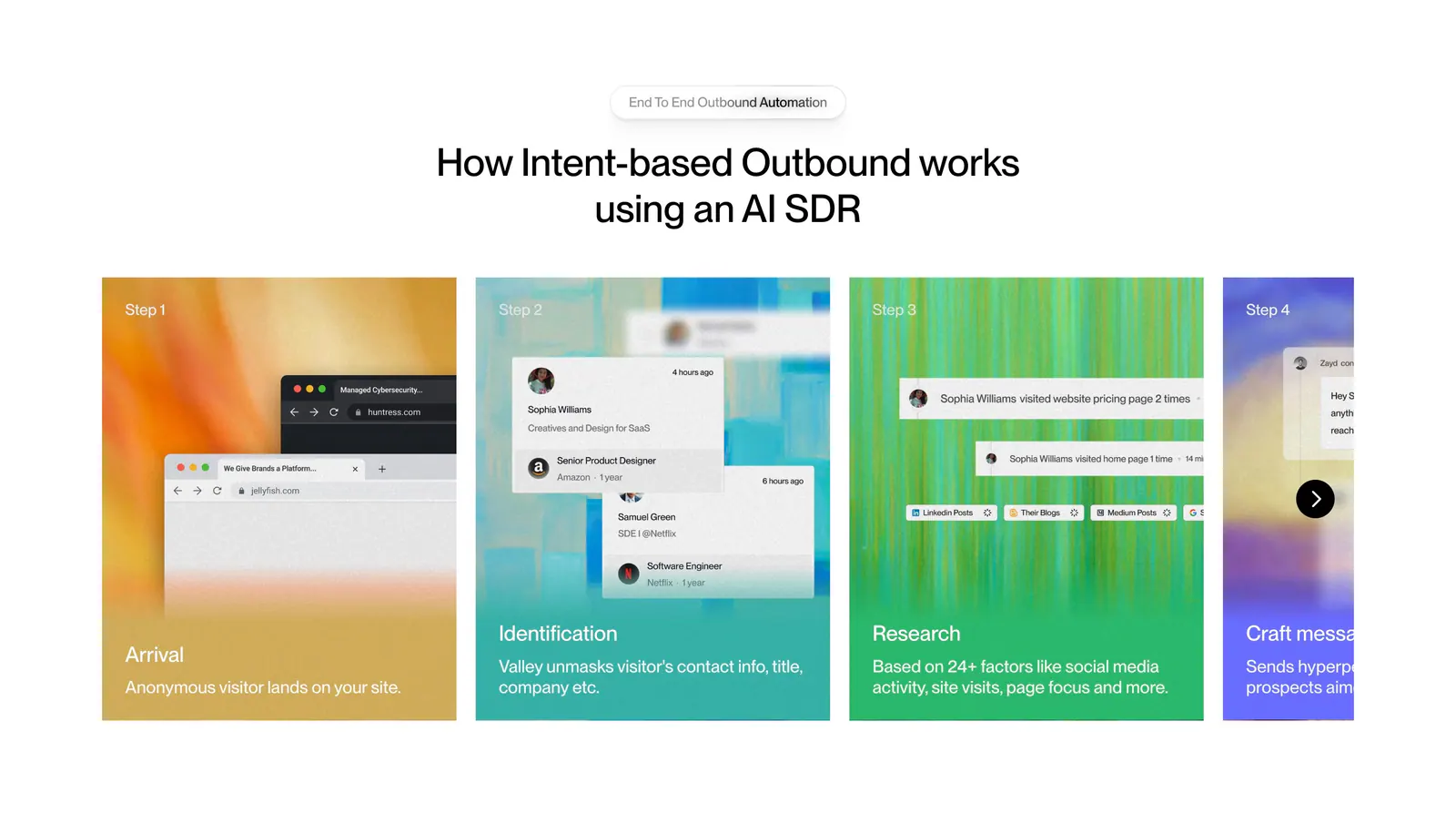
  62. Valley how it works section: centered headline above a carousel of numbered step cards with colorful textured backgrounds and UI snippets
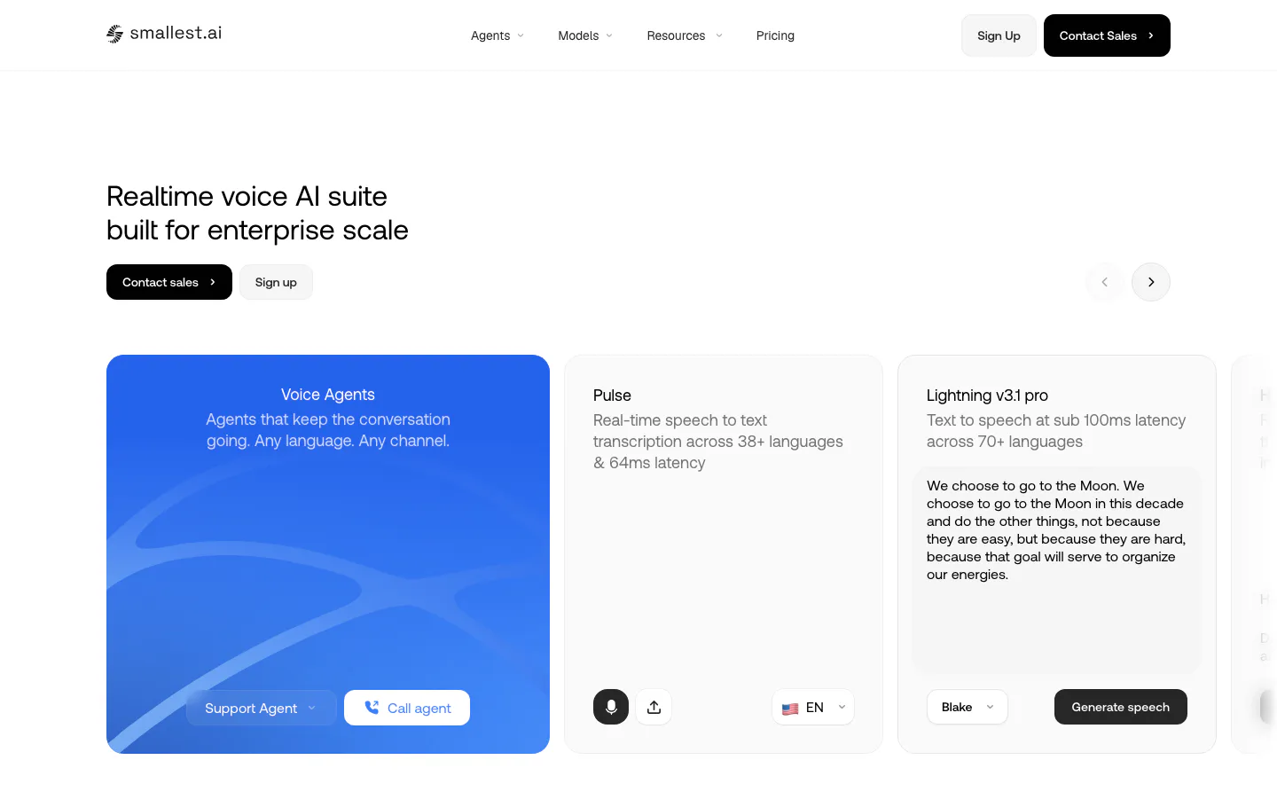
  63. Smallest.ai hero section: left-aligned headline with sales buttons above a carousel of product demo cards for voice agents and speech models
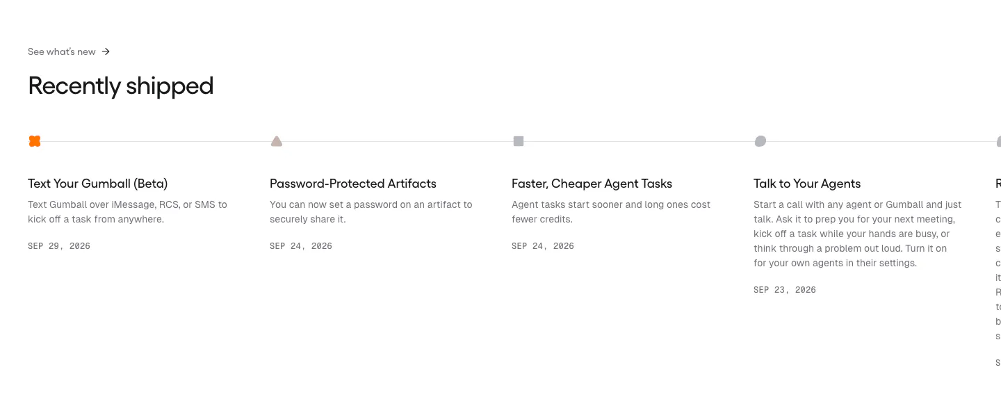
  64. Gumloop blog & resources section: changelog timeline of dated release entries running off the right edge
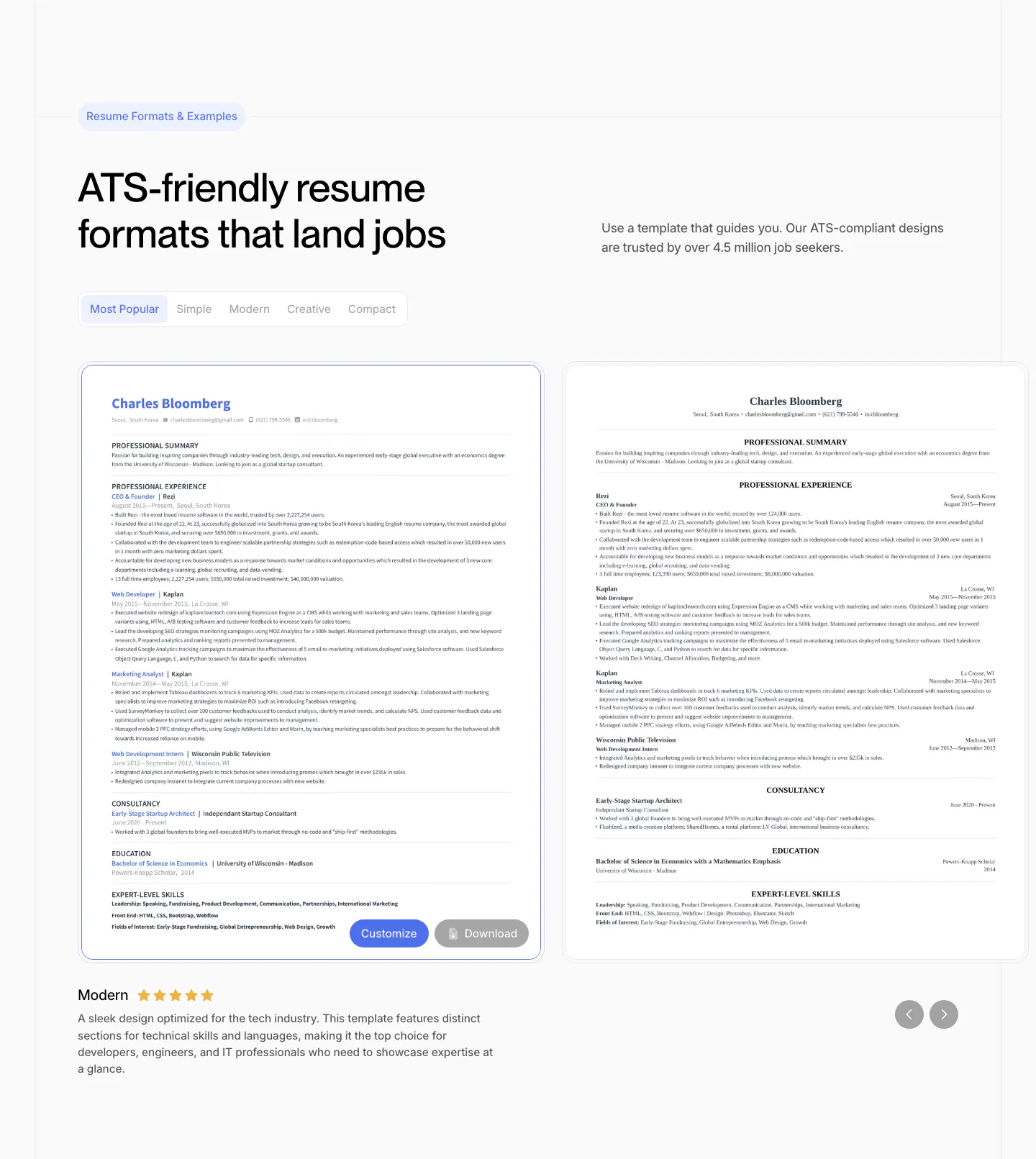
  65. Rezi features section: resume template gallery with style tabs, two resume previews in a slider with arrows and a rated description
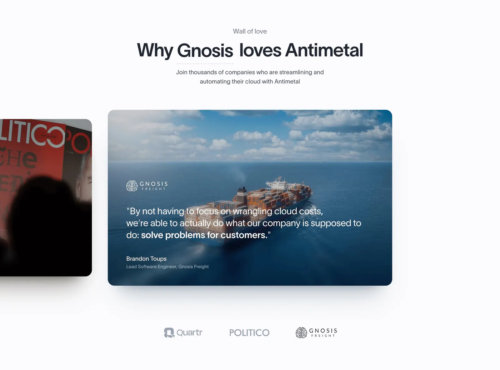
  66. Antimetal testimonials section: centered headline above a carousel of photo quote cards with a cargo ship image and logo selectors
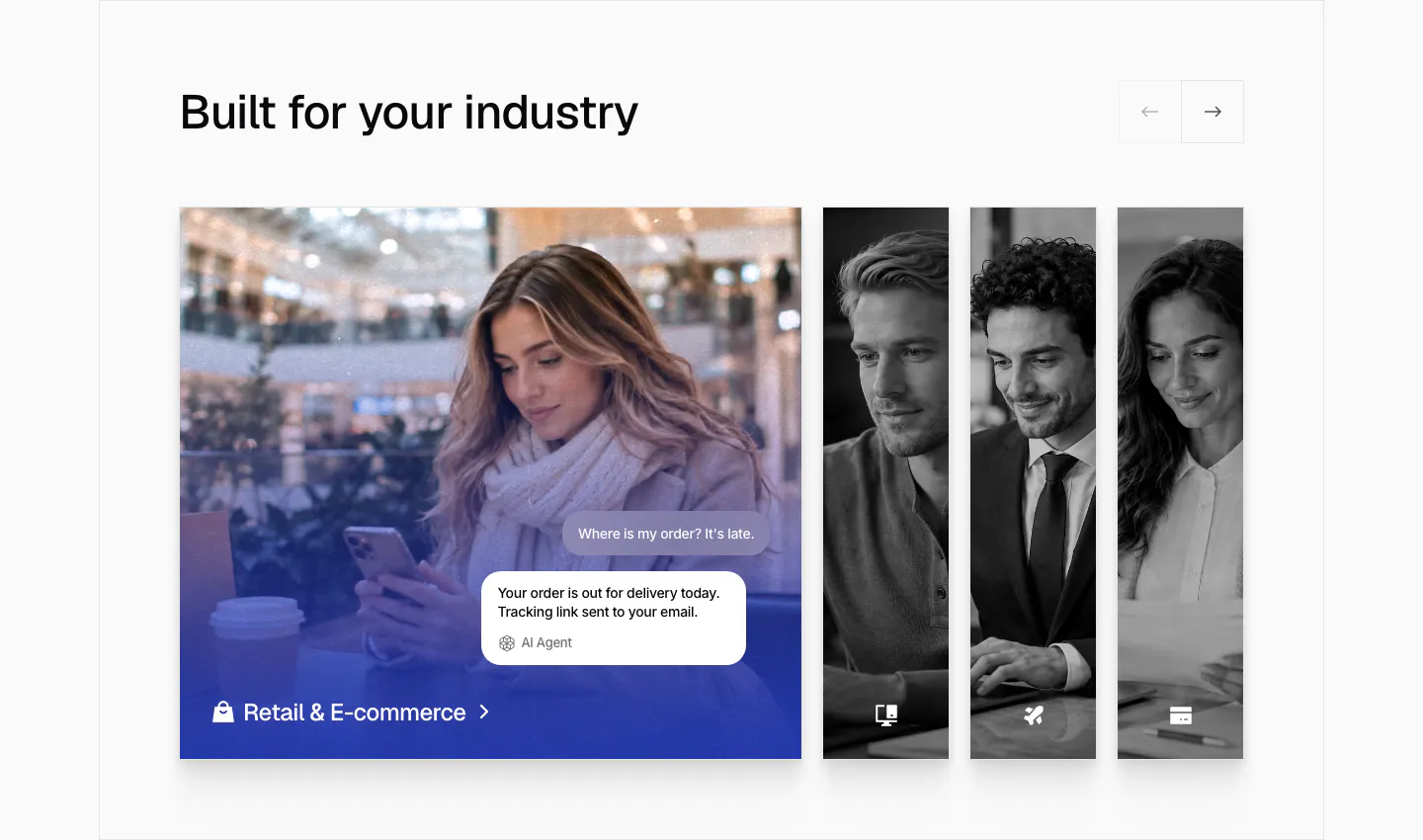
  67. Chatbase use cases section: industry slider with an expanded retail photo card with chat bubbles and narrow grayscale photo cards
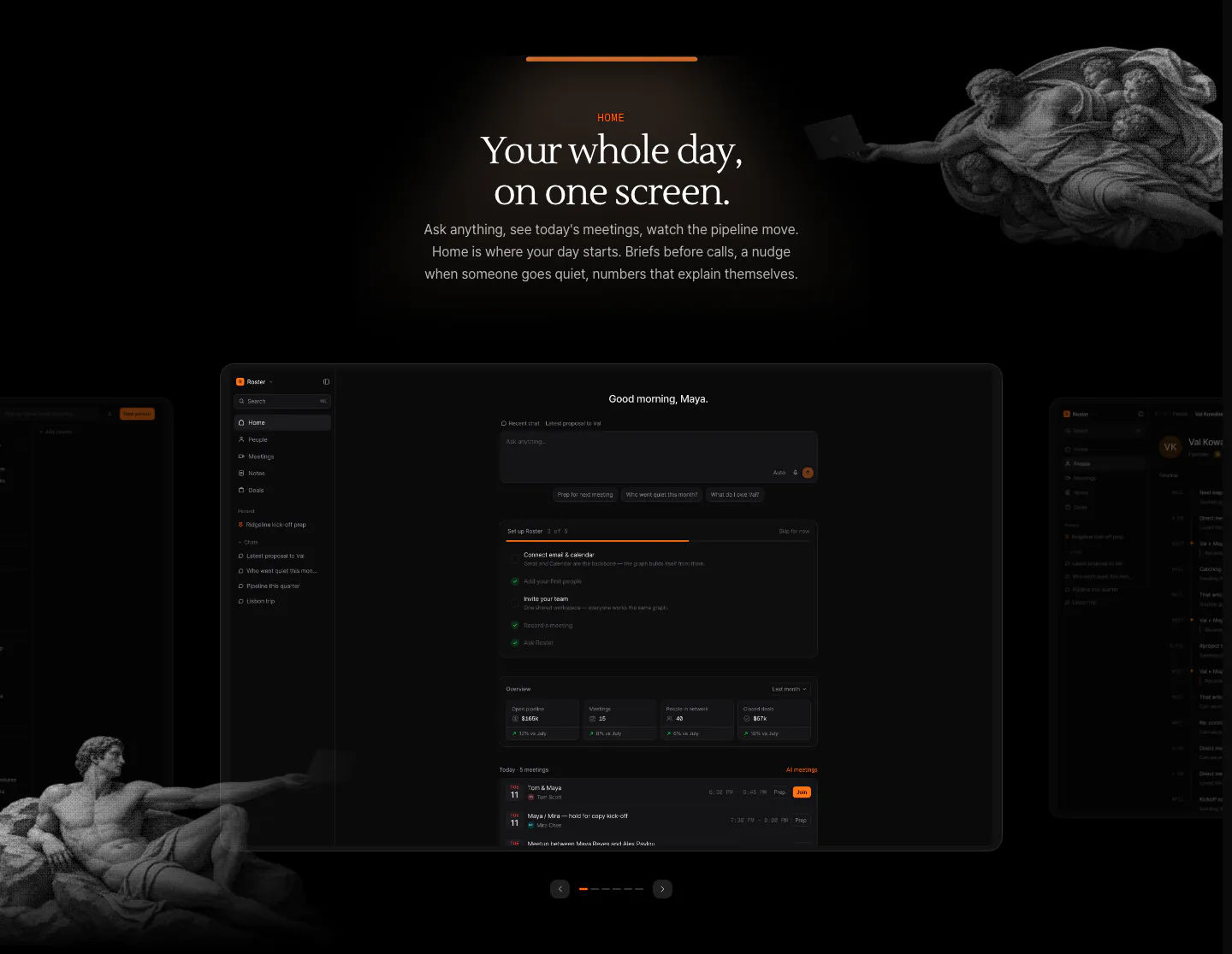
  68. Arke features section: centered serif headline above a dark dashboard screenshot carousel framed by halftone Renaissance figures
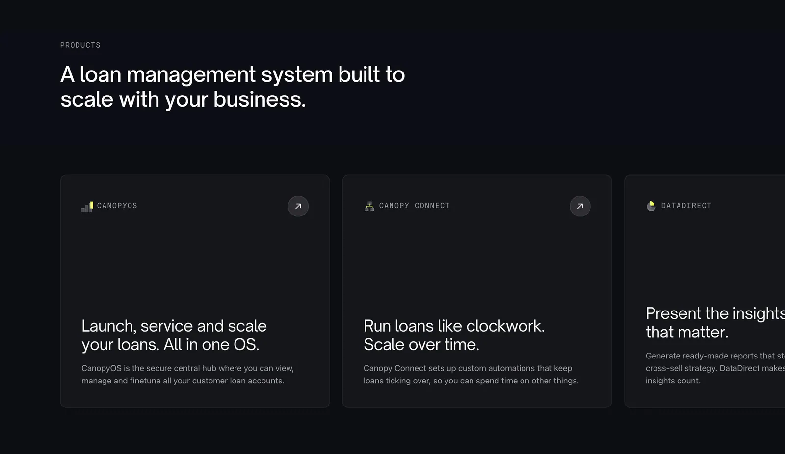
  69. Canopy features section: left-aligned headline above a horizontally scrolling row of dark product cards, the last cut off
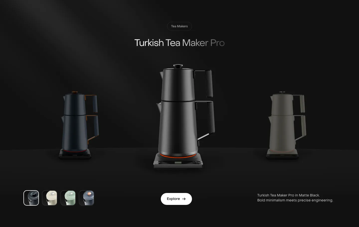
  70. Saki features section: centered product name above a black tea maker flanked by dimmed variants, color swatches and an Explore button on black
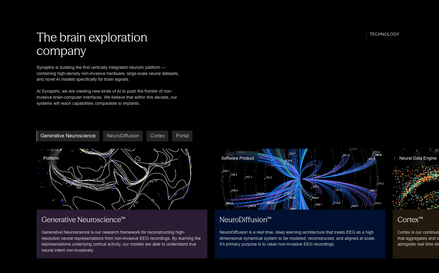
  71. Synaptrix features section: heading and intro copy above a tab bar and cut-off product cards with neural data visualizations on black
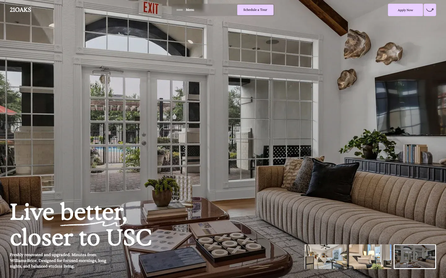
  72. 21Oaks hero section: full-bleed living room photo with serif headline bottom-left, lavender nav buttons and gallery thumbnails
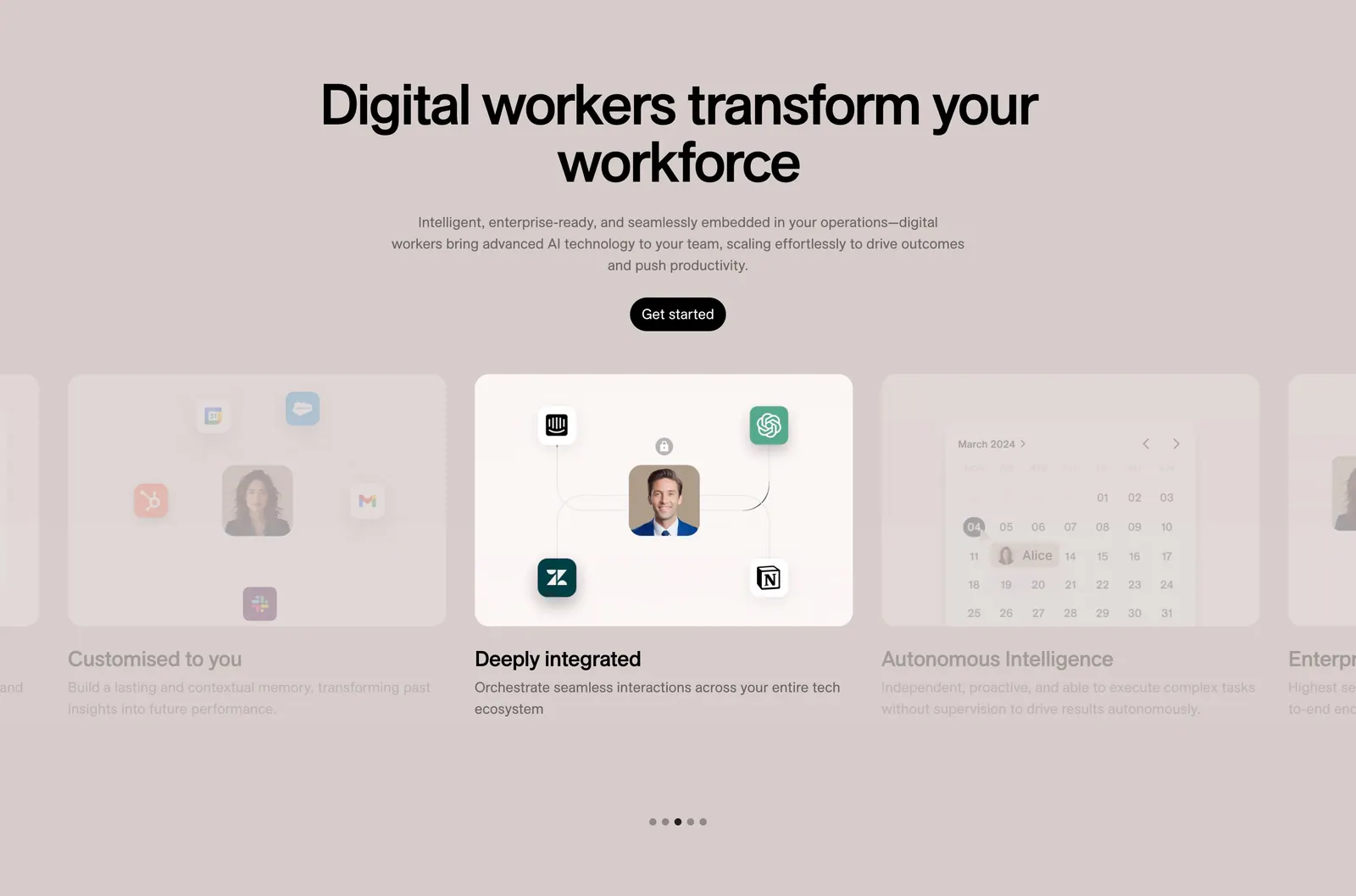
  73. 11x features section: centered headline and button above a card carousel with integration and calendar visuals and dot pagination on taupe
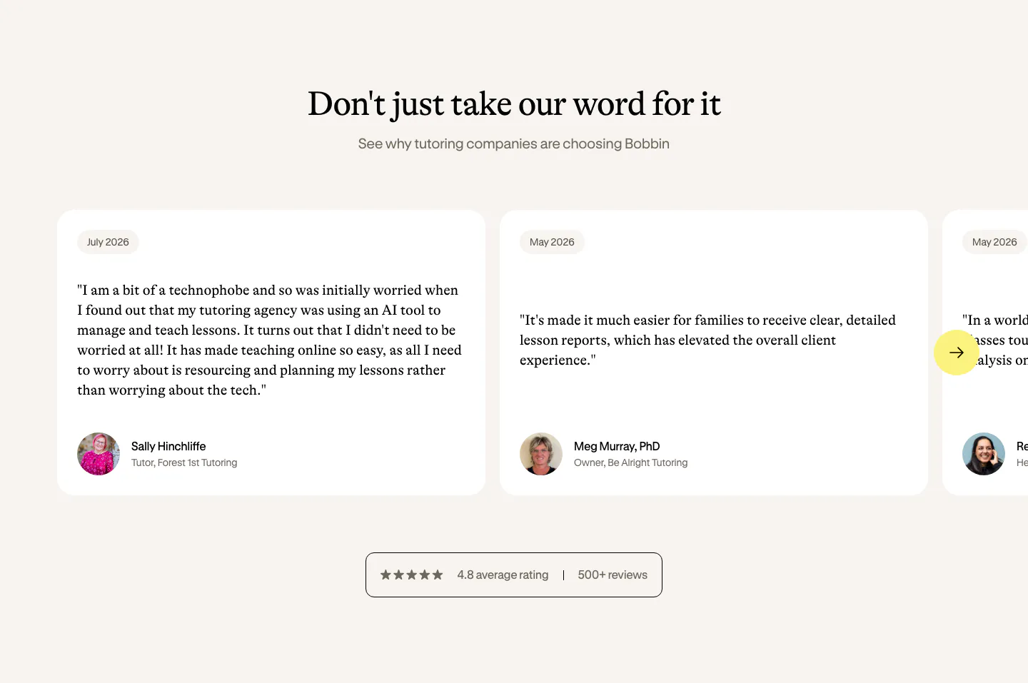
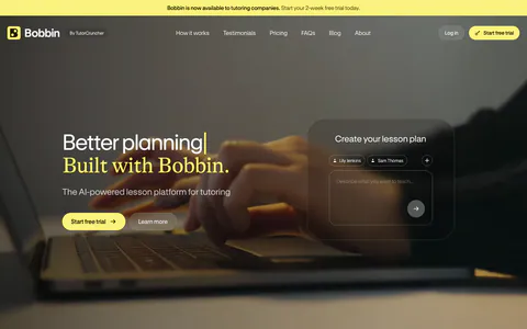
  74. Bobbin testimonials section: serif heading above a carousel of white quote cards with avatars and a rating badge on cream
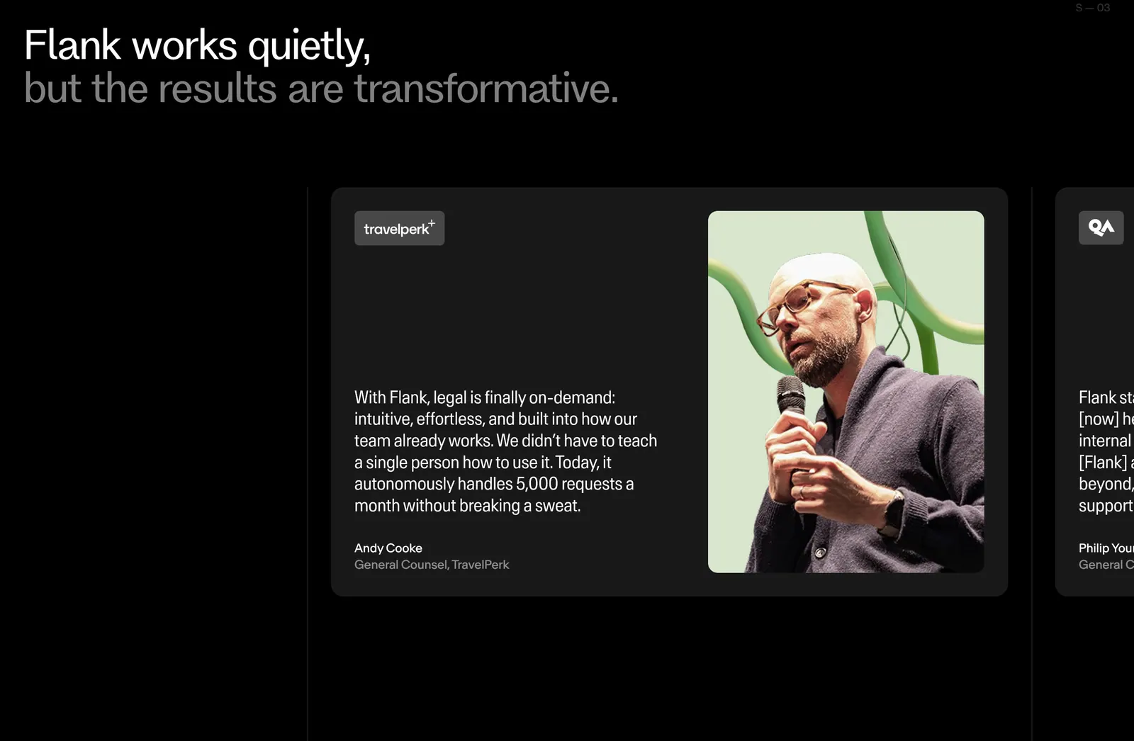
  75. Flank testimonials section: two-tone headline above a carousel of quote cards with a large speaker photo, next card cut off, on black
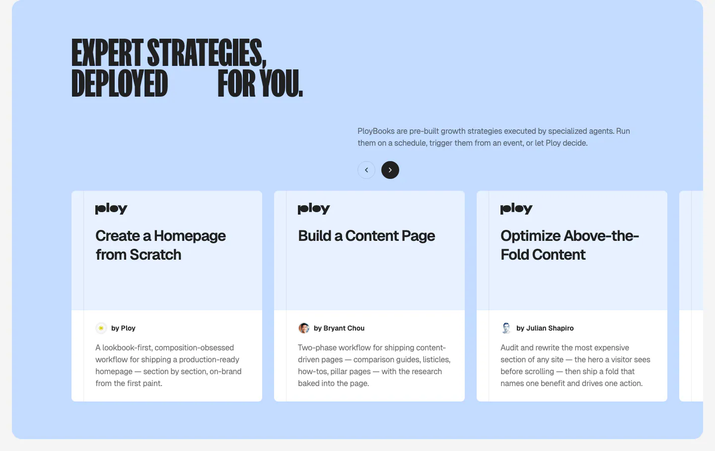
  76. Ploy features section: condensed headline and arrow controls above a carousel of PloyBooks strategy cards on a light blue panel
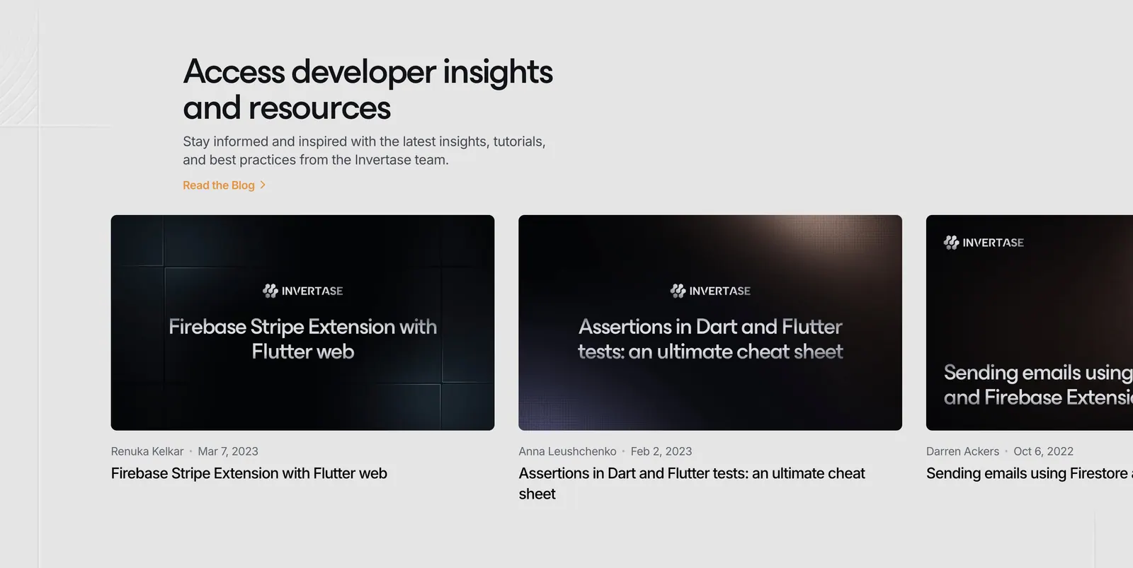
  77. Invertase blog & resources section: left headline above a row of dark article thumbnail cards cut off at the right edge on light gray
  78. Ruul integrations section: small caption above a row of grayscale bank and wallet logos on an off-white background
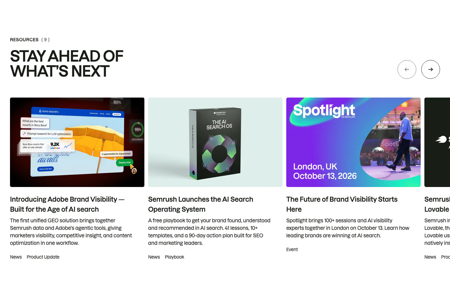
  79. Semrush blog & resources section: uppercase headline and arrow buttons above a carousel of news, playbook and event cards with thumbnails
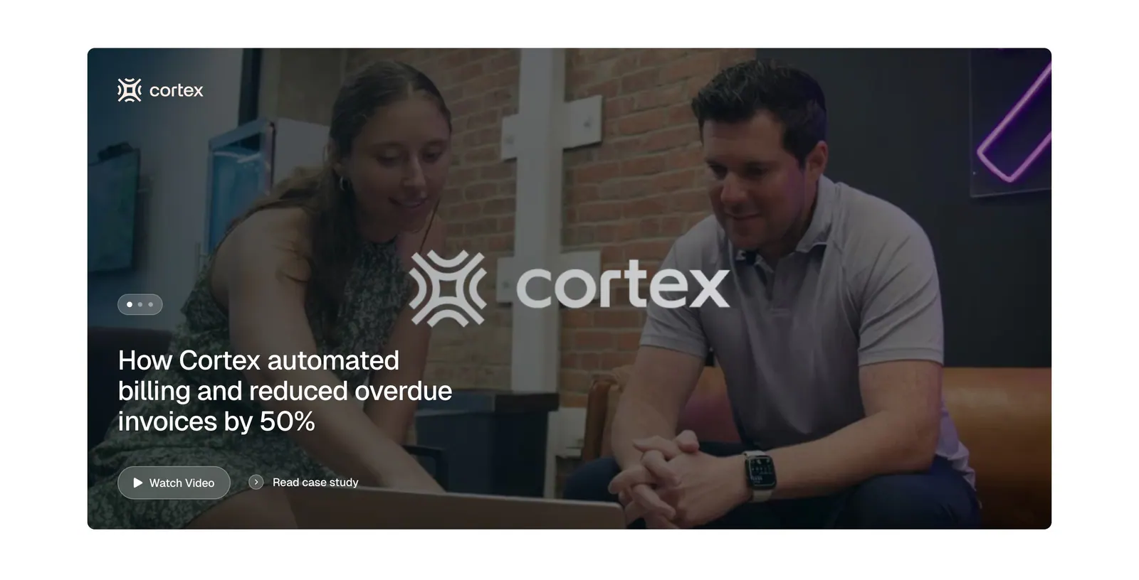
  80. Tabs testimonials section: full-width case study card with an office photo of two people, Cortex logo, headline and watch video button
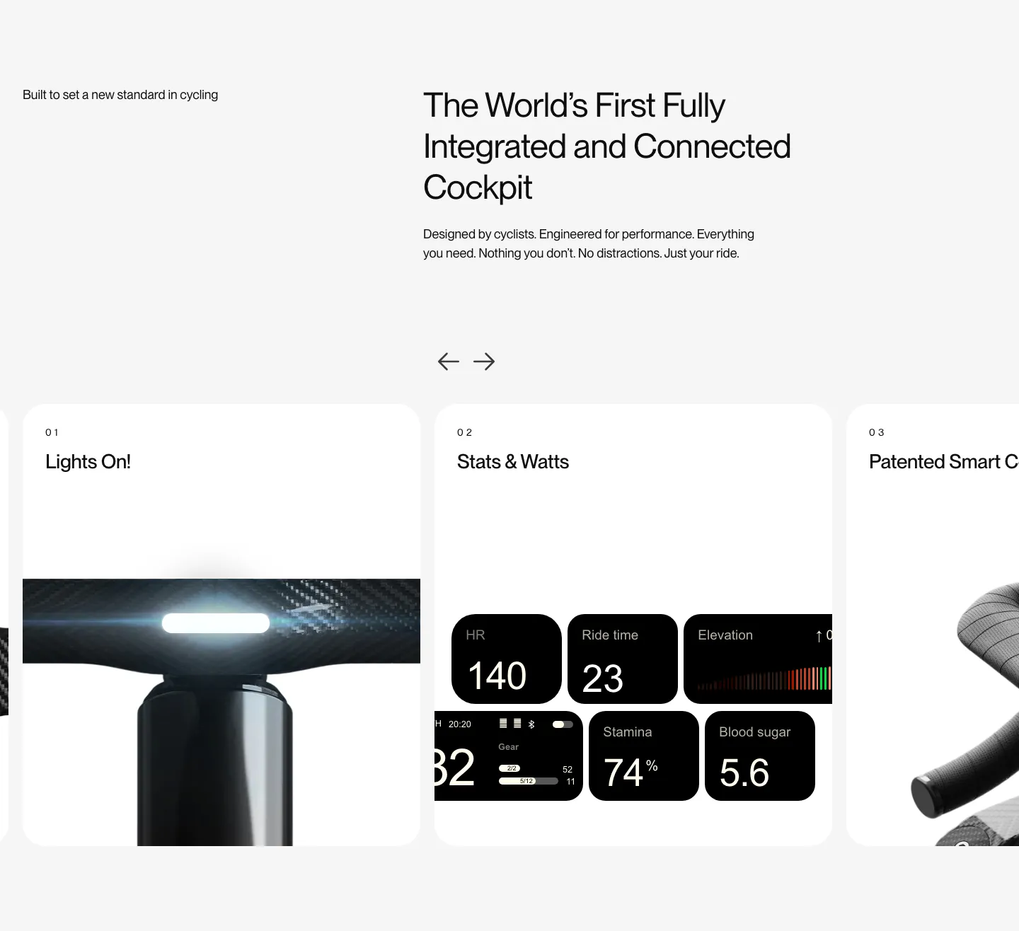
  81. FLITEDECK features section: heading on light gray above a numbered card carousel with arrows showing light, stats and handlebar photos
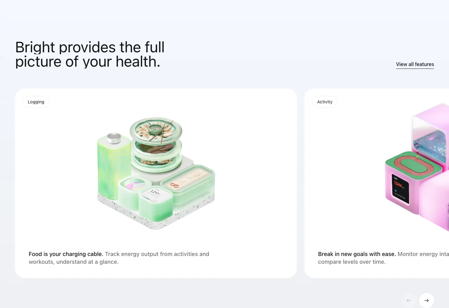
  82. Bright features section: headline with View all link above a carousel of white cards with 3D renders for logging and activity
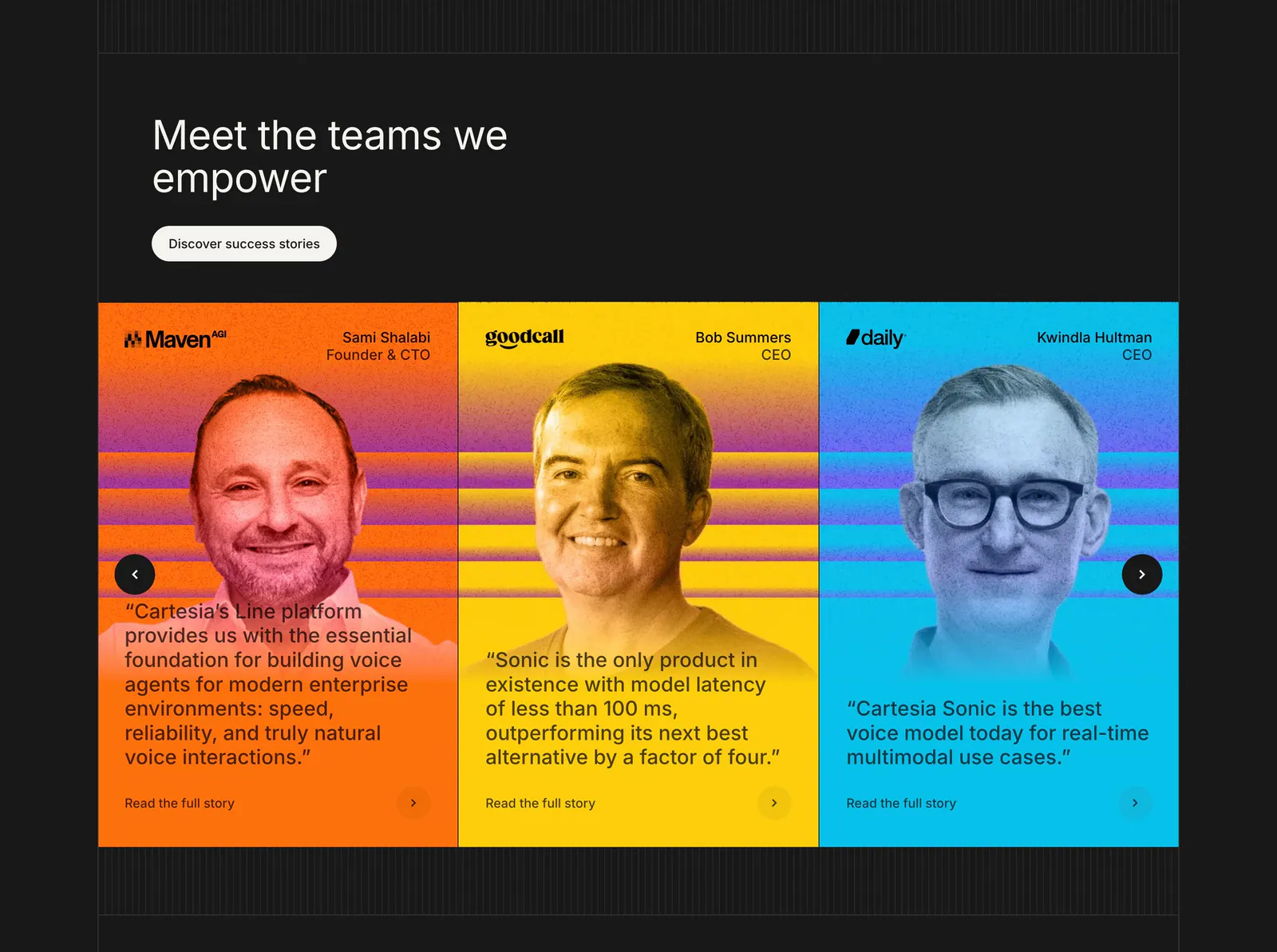
  83. Cartesia testimonials section: carousel of three bright orange, yellow and blue cards with tinted portraits and quotes on a dark background
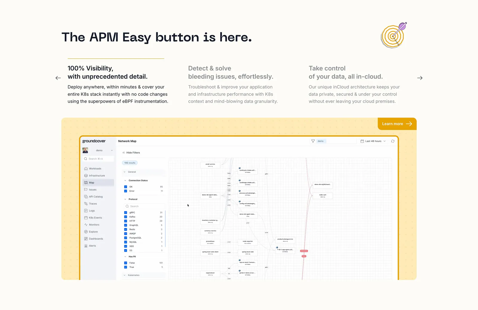
  84. groundcover features section: headline over three feature columns with arrows above a network map screenshot in a yellow dotted panel
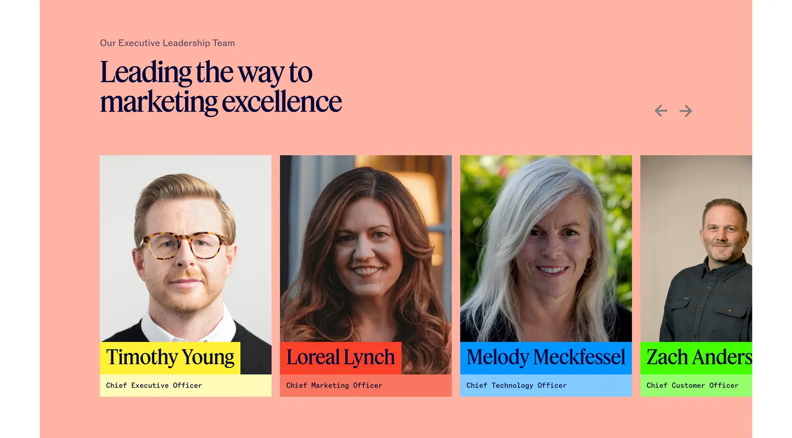
  85. Jasper team section: serif headline and arrows above executive portrait cards with colored name labels on a salmon background
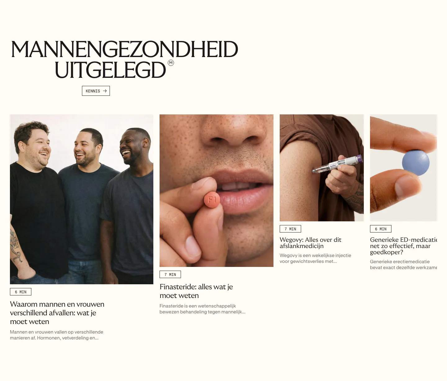
  86. Menkind blog & resources section: serif headline above a row of article cards with photos and read times, cut off at the edge
  87. Teton logo cloud section: two-tone headline above a scrolling row of gray tiles with black healthcare and municipality logos
  88. Ruul logo cloud section: small caption above a single row of grayscale organisation logos on an off-white background
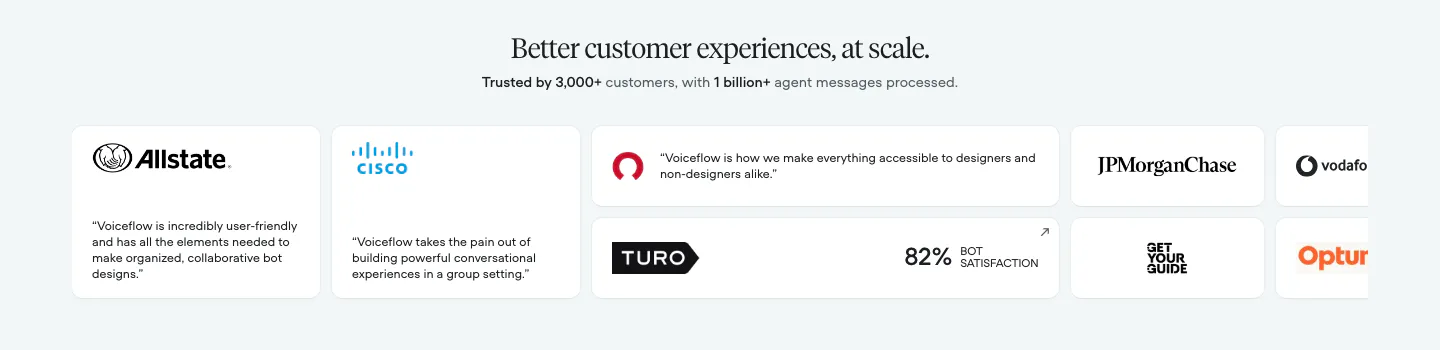
  89. Voiceflow testimonials section: centered serif headline above a row of logo and quote cards cut off at the right edge
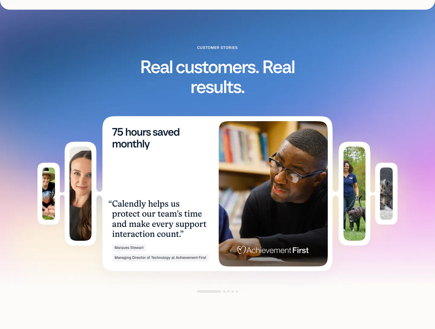
  90. Calendly testimonials section: centered headline on a blue-purple gradient above a quote card carousel with customer photos and pagination dots
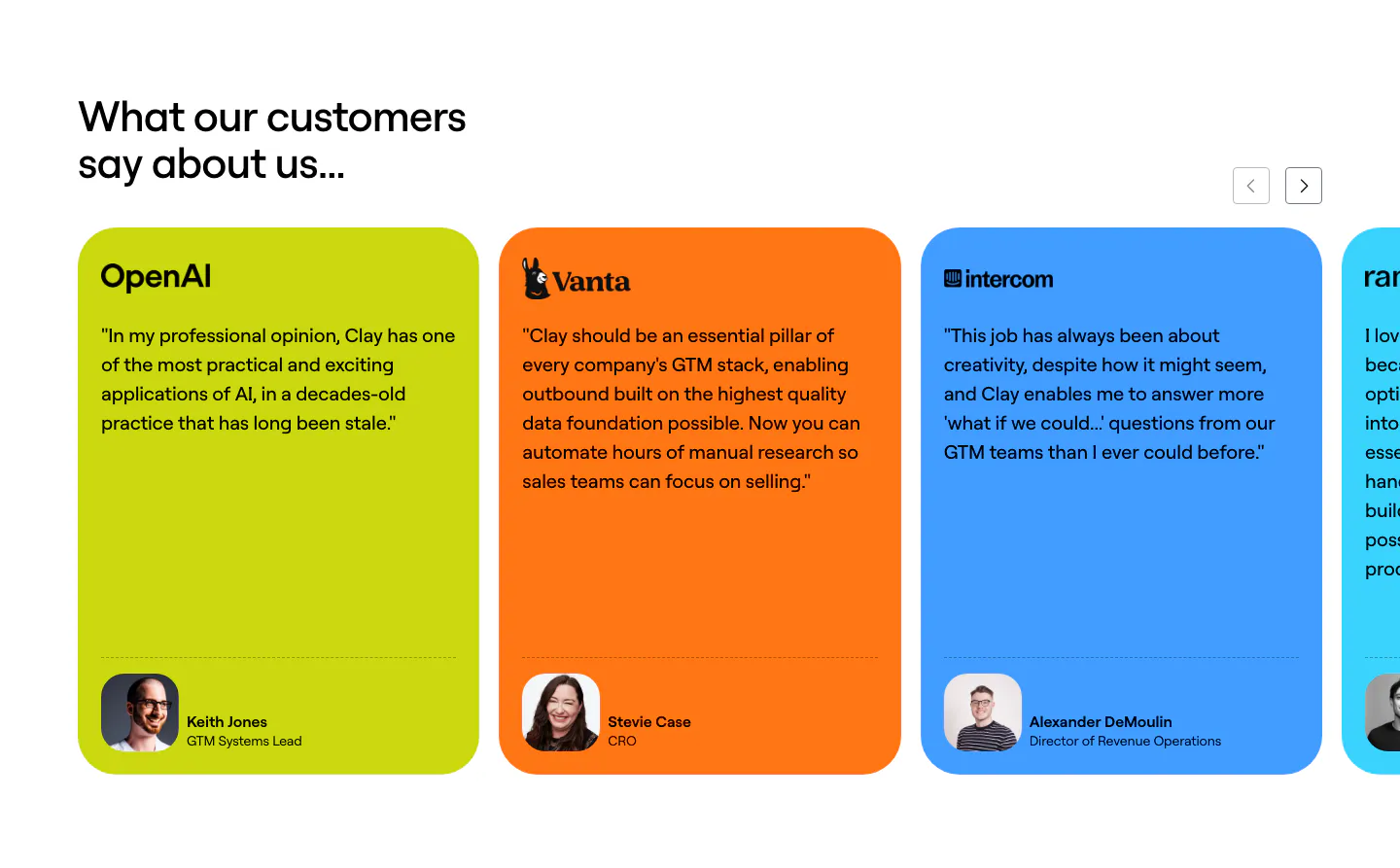
  91. Clay testimonials section: left heading with arrow controls above a slider of lime, orange and blue quote cards with logos and headshots
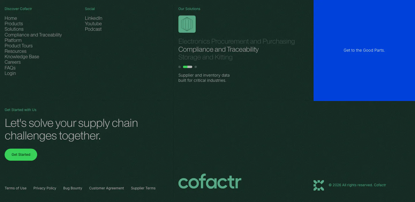
  92. Cofactr footer section: dark green link columns, solutions slider, blue promo block, Get Started CTA and a green cofactr wordmark
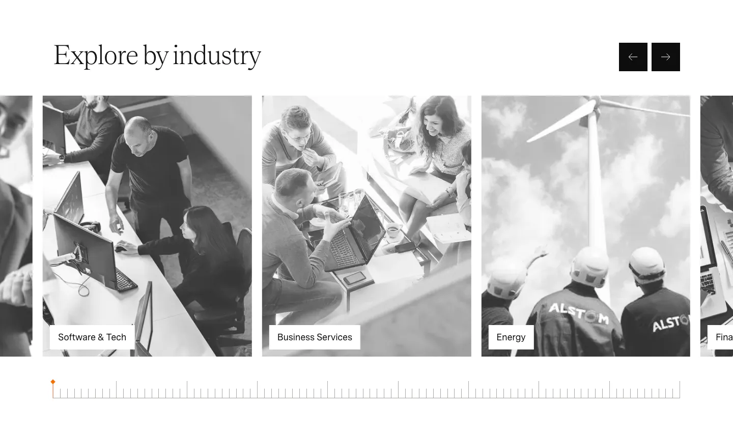
  93. Agiloft use cases section: serif heading with arrow buttons above a carousel of grayscale industry photo cards
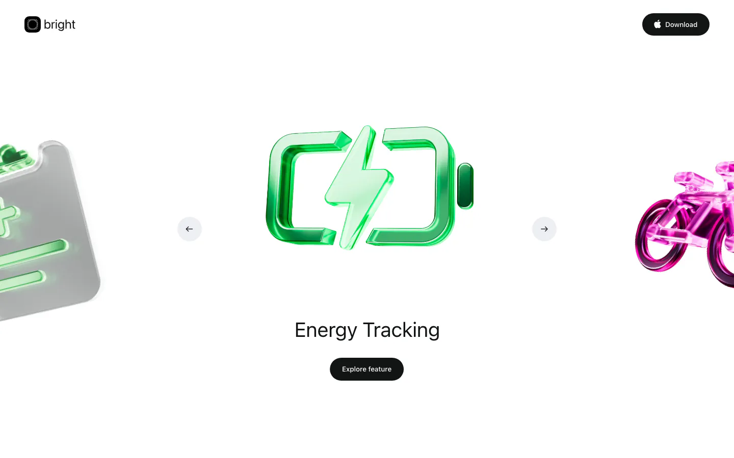
  94. Bright hero section: logo nav above a carousel of glossy 3D icons with a green battery centered, Energy Tracking label and button
  95. Aria features section: centered headline above a pill tab bar and a carousel of cards with text and a dark teal visual panel
  96. Linear features section: dark headline and copy above a row of agent chat windows fading off both edges, feature links below
  97. Palette hero section: centered headline with match counter badge and Get Matched button above a carousel of studio photo cards on dark
  98. Rezolv logo cloud section: centered Our Clients label above two scrolling rows of lender logos on white
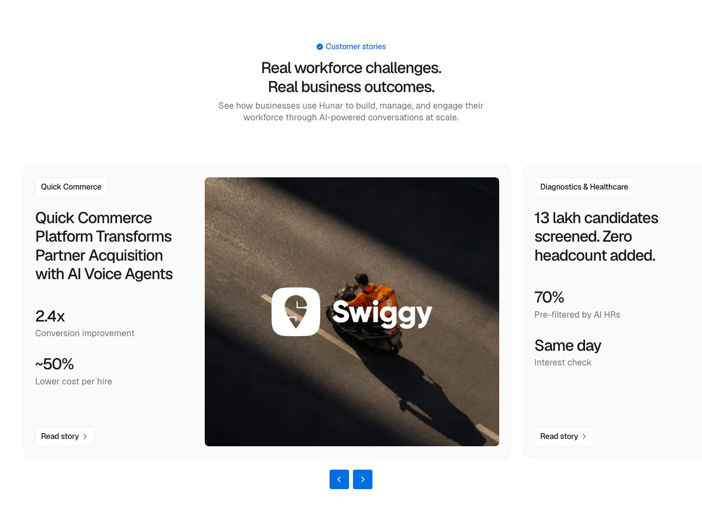
  99. Hunar testimonials section: centered heading above a case-study carousel card with metrics, a Swiggy delivery photo and arrow controls
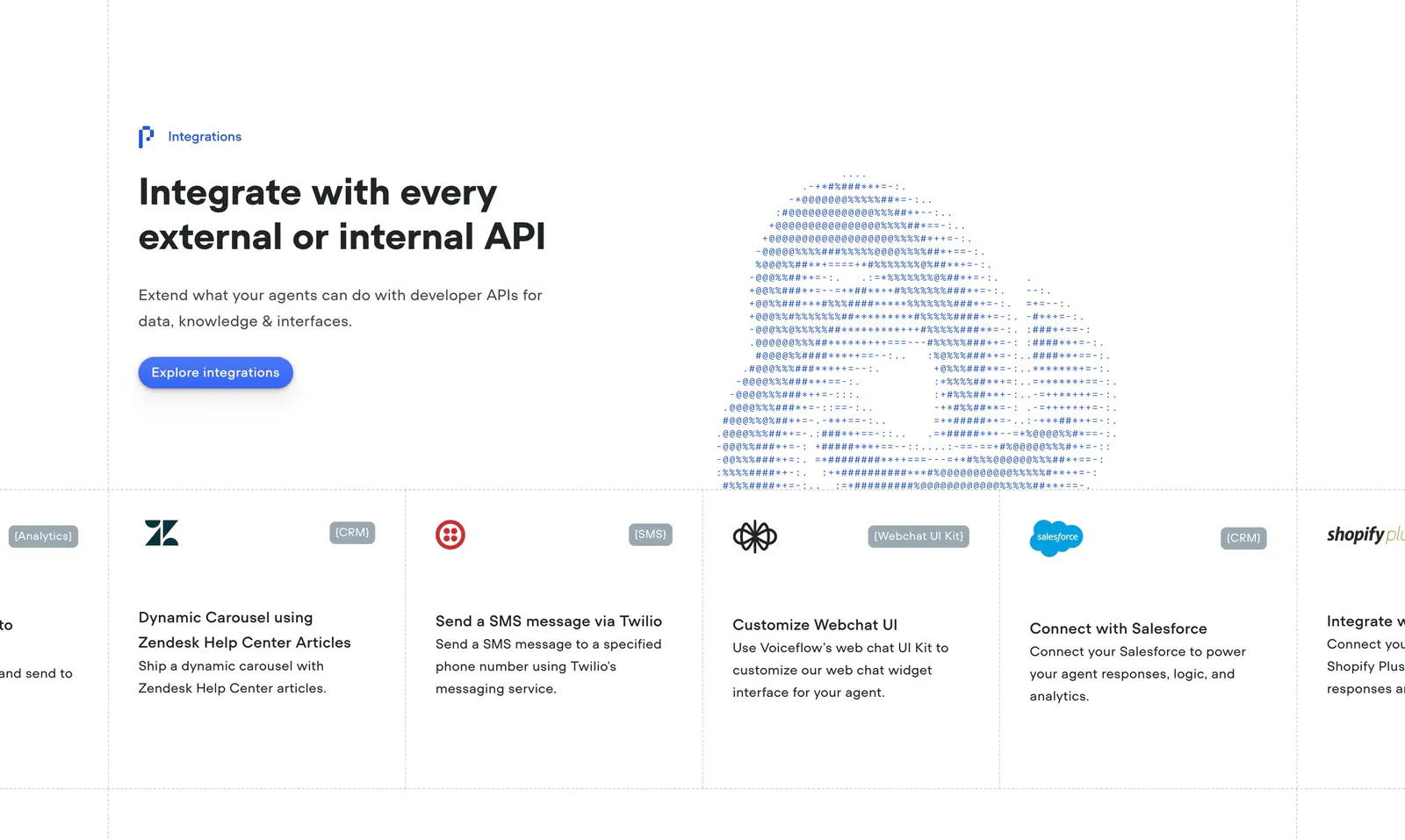
  100. Voiceflow integrations section: headline left and ASCII-art cloud right above a scrolling row of integration cards like Zendesk and Twilio
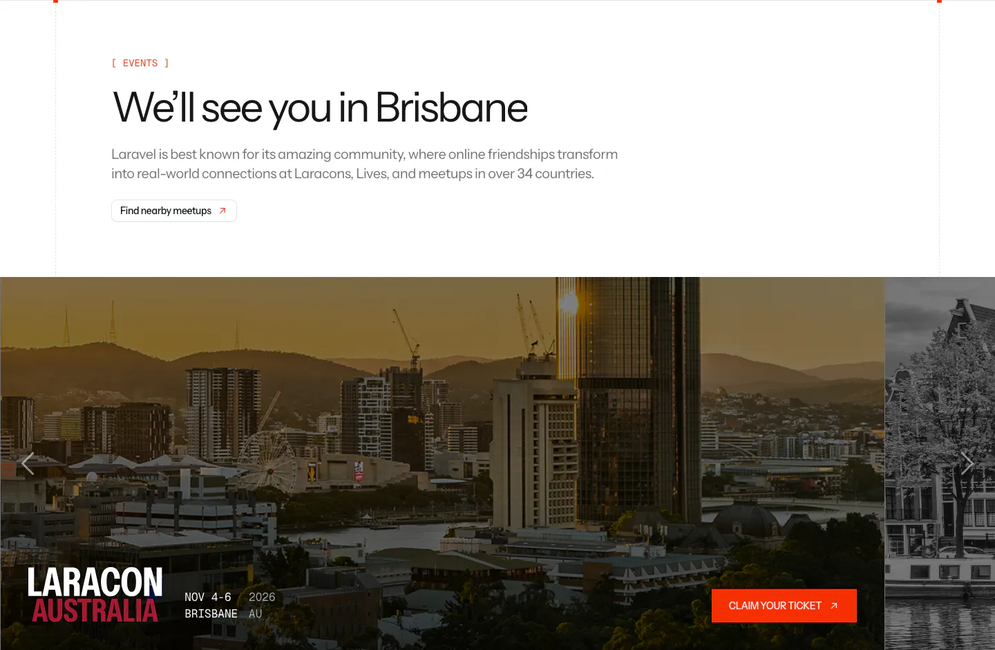
  101. Laravel blog & resources section: events headline above a photo carousel card for Laracon Australia in Brisbane with a ticket button
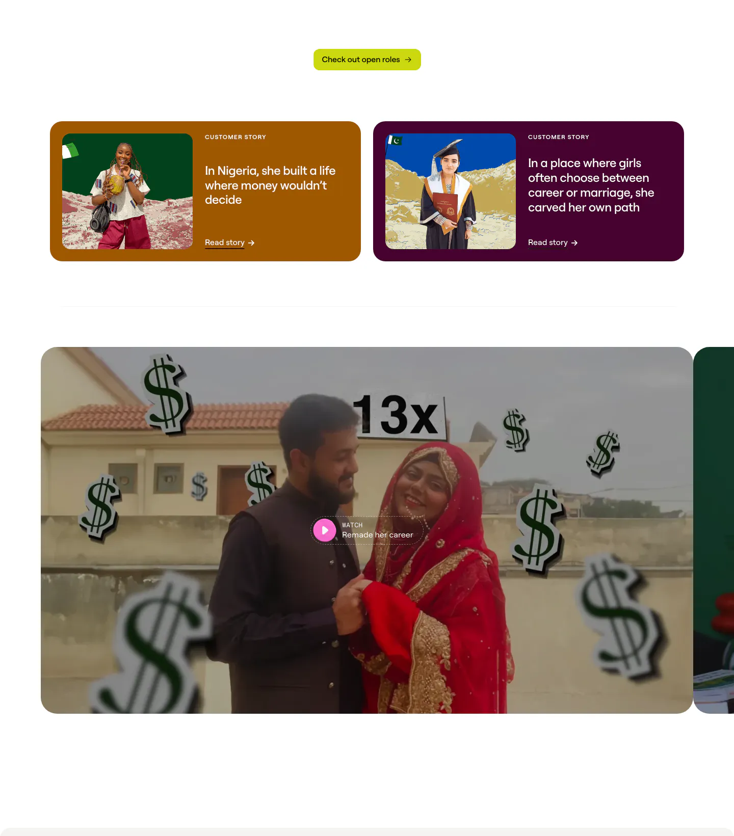
  102. Clay testimonials section: two colored customer story cards with photos above a large video thumbnail with play button, cut off at the right
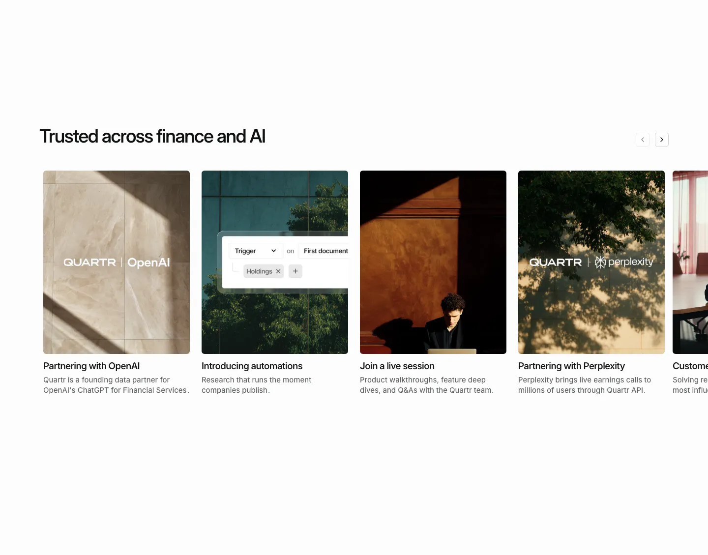
  103. Quartr blog & resources section: horizontal carousel of photo cards for partnership news, automations and a live session
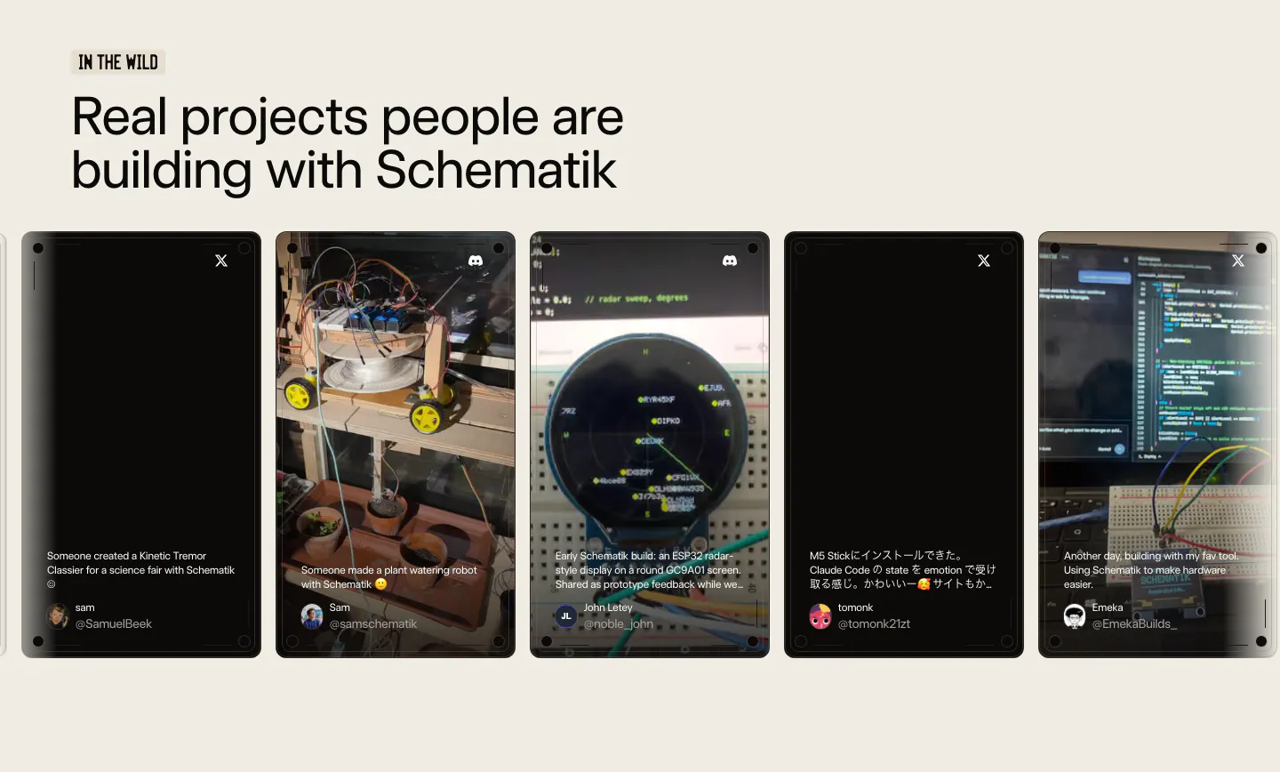
  104. Schematik testimonials section: headline above a carousel of user post cards with project photos on a beige background
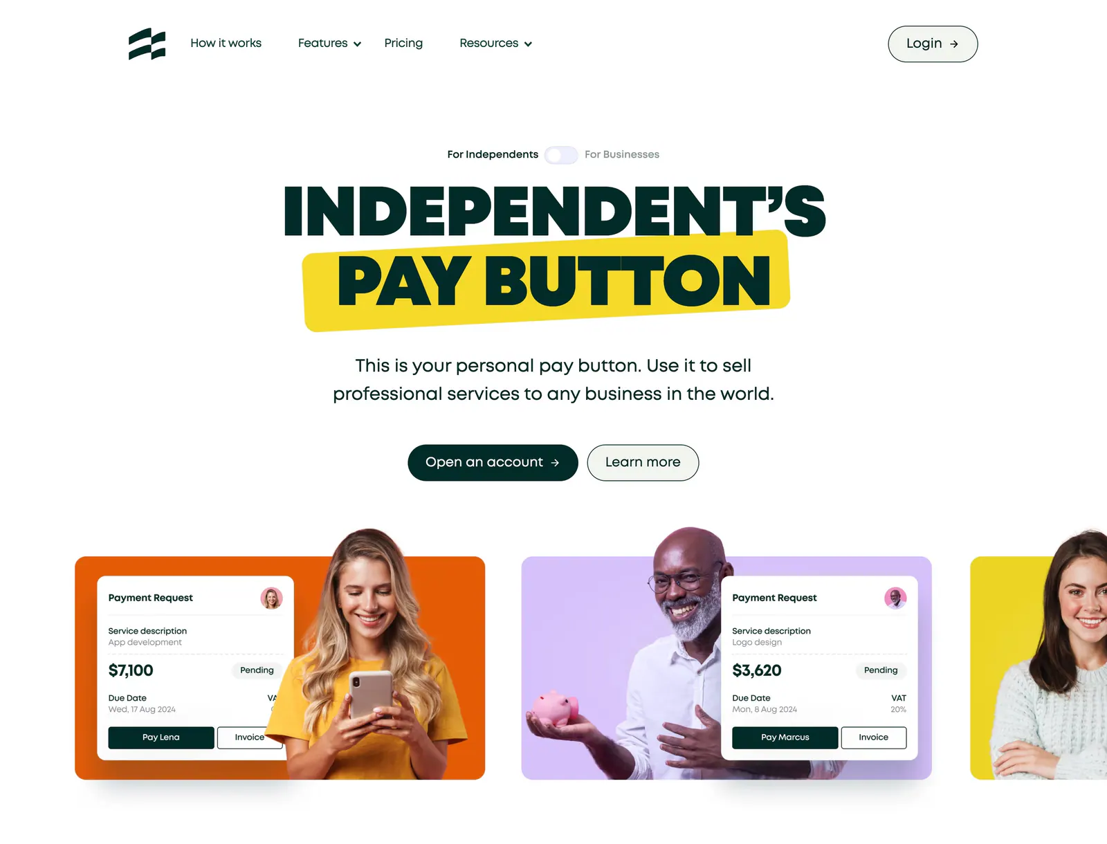
  105. Ruul hero section: centered uppercase headline with yellow highlight above colored cards pairing people photos with payment request UI
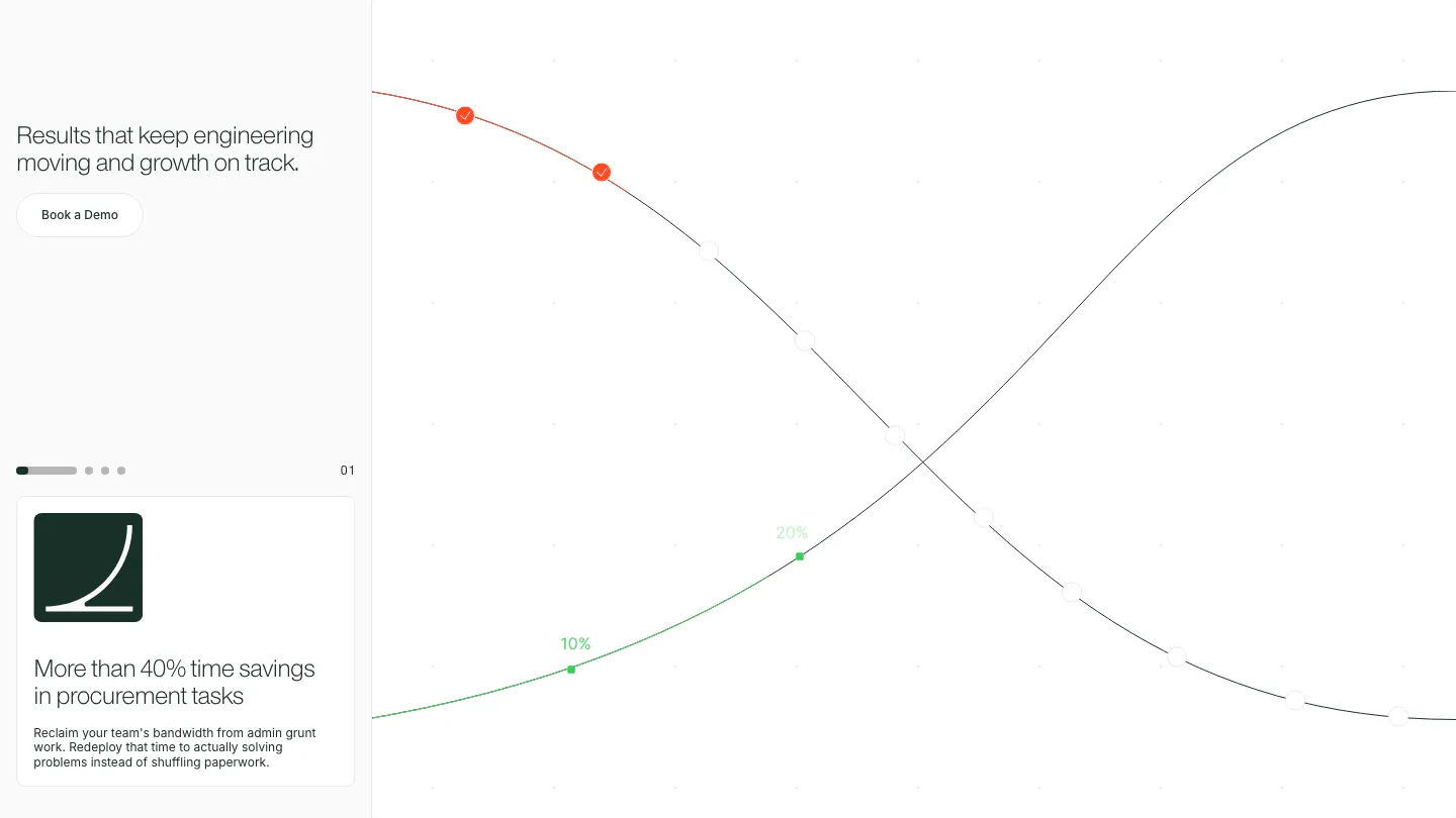
  106. Cofactr value proposition section: left column with headline, demo button and a paged outcome card, beside crossing growth curves on white
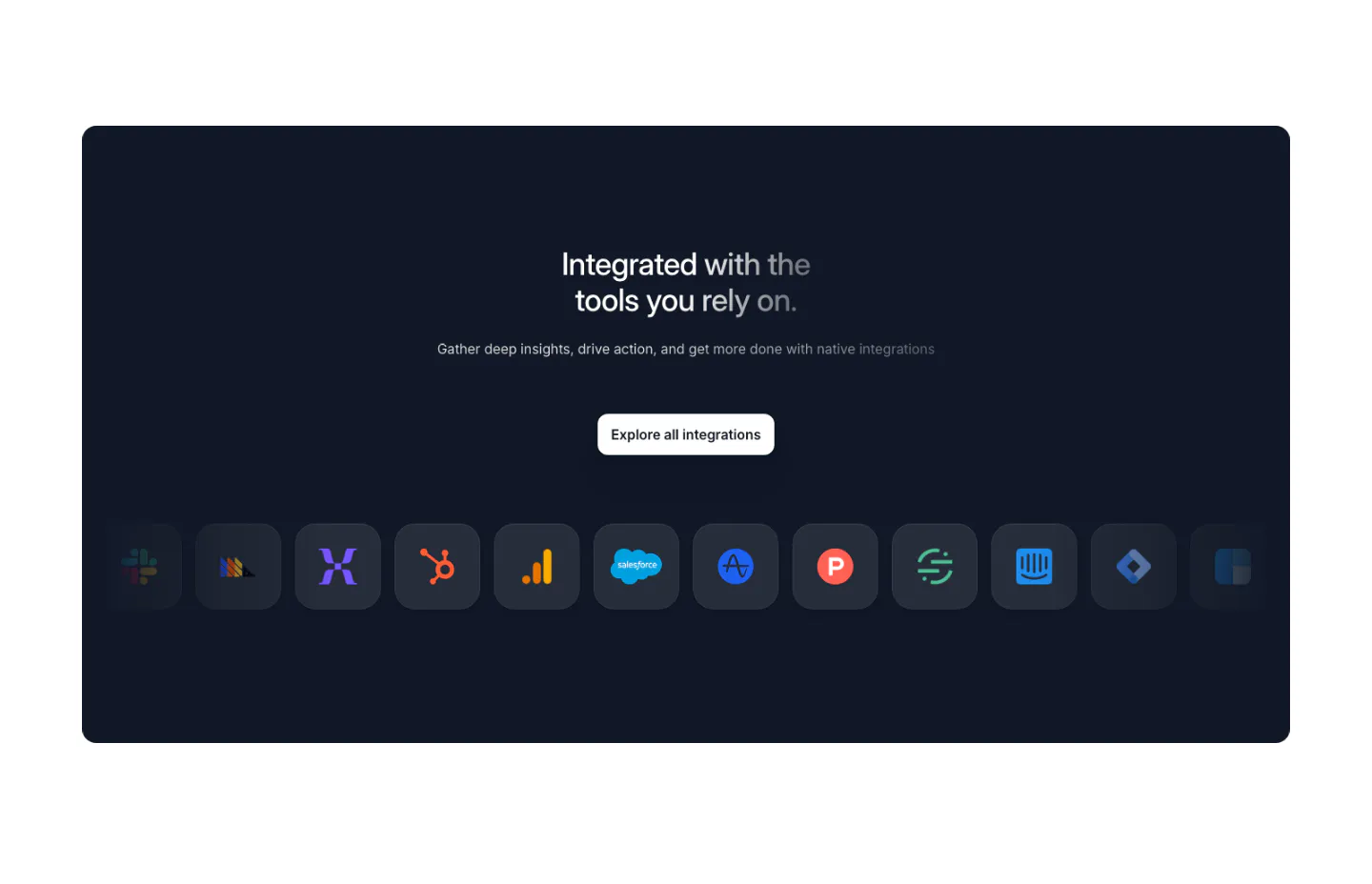
  107. Arcade integrations section: dark navy panel with centered headline, Explore button and a row of app icon tiles fading at the edges
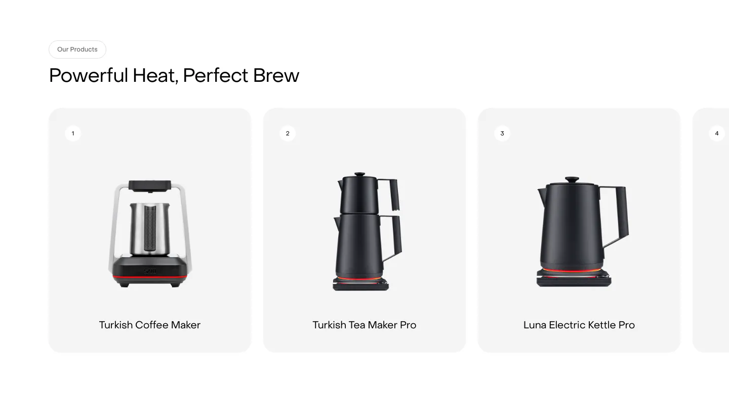
  108. Saki features section: headline above a row of numbered product cards showing kettles and coffee makers, with a fourth card cut off at the edge
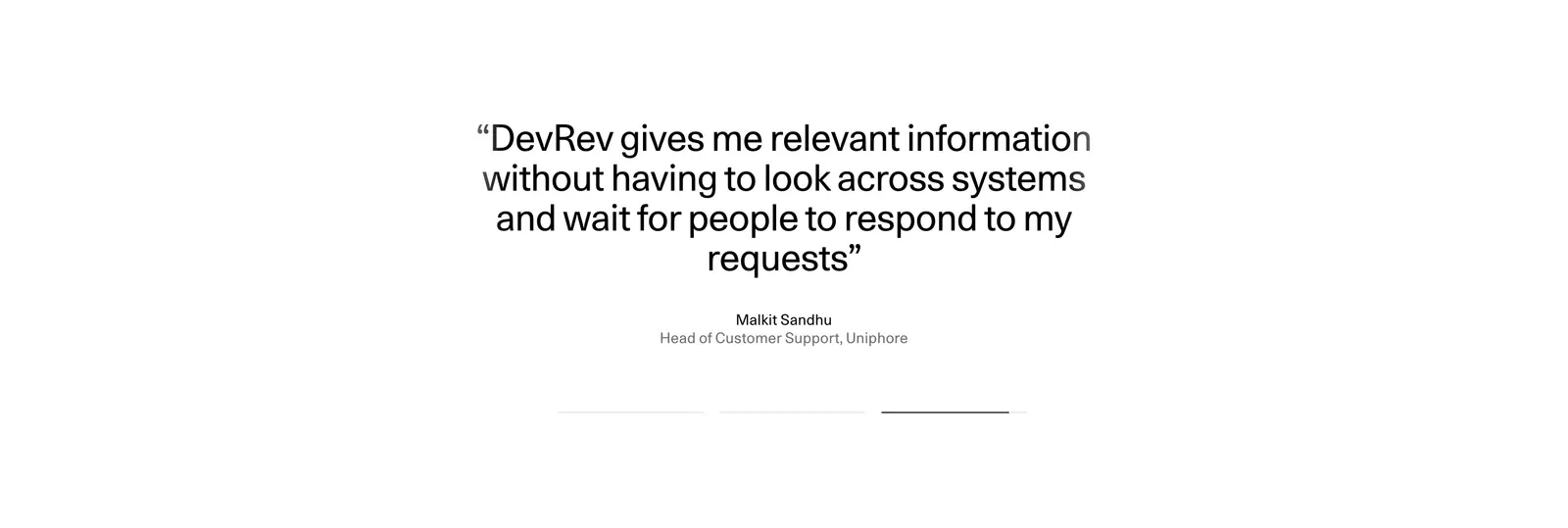
  109. DevRev testimonials section: centered large customer quote with name and title above three pagination bars on a plain white background
  110. Pogo logo cloud section: grayscale customer logos in rounded cards along a single row cut off at the edges on white
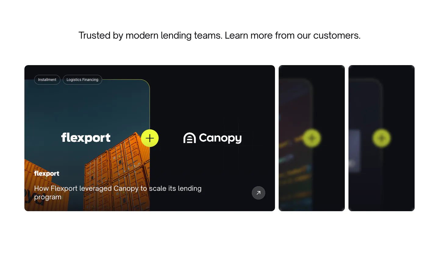
  111. Canopy testimonials section: centered heading above a case study carousel with a Flexport container photo card and blurred cards
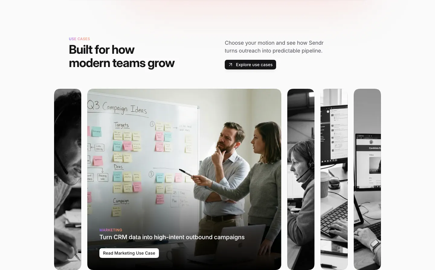
  112. Sendr use cases section: headline and Explore button above expanding photo cards, the Marketing card open showing a whiteboard
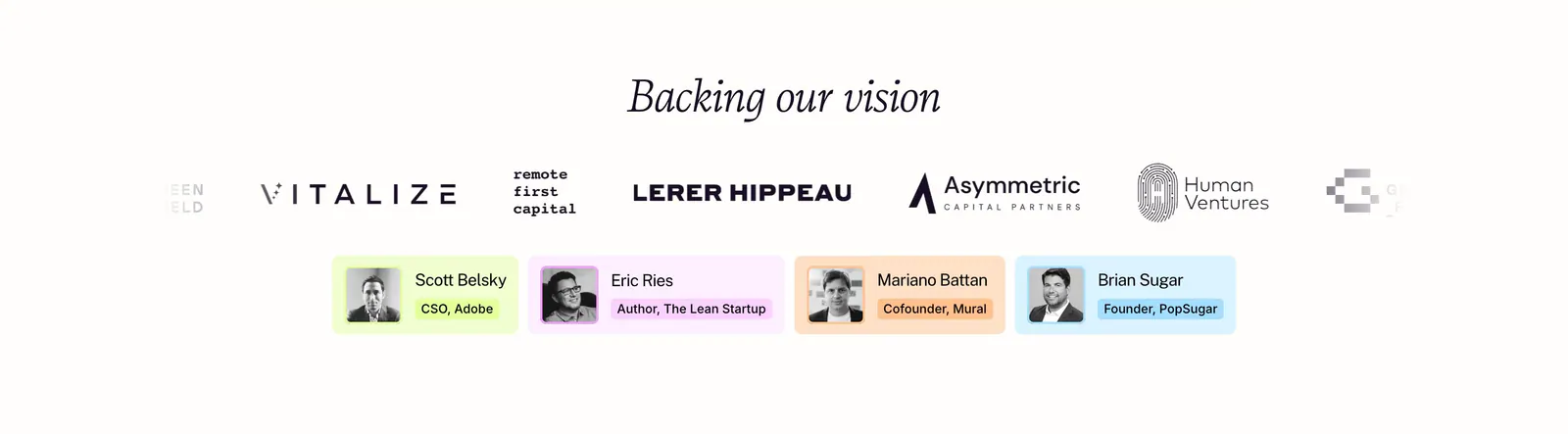
  113. Plumb logo cloud section: italic serif heading above investor logos fading at the edges and four pastel angel investor cards with headshots
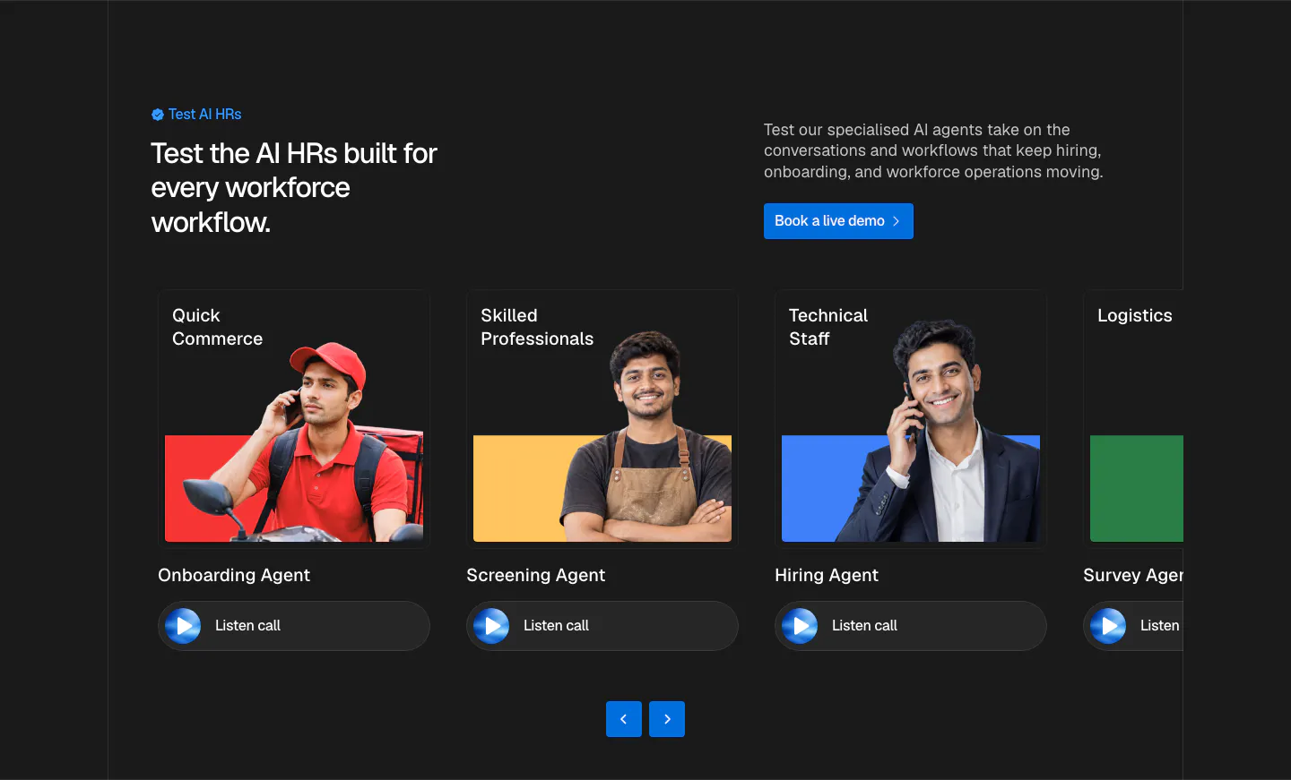
  114. Hunar use cases section: dark background with split header and a carousel of agent cards showing worker photos and listen-call buttons
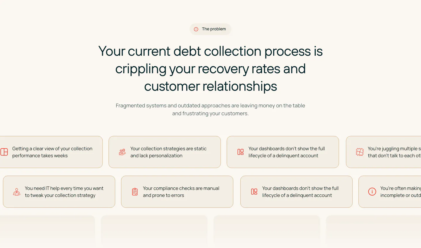
  115. Rezolv value proposition section: centered problem headline above scrolling rows of beige pain-point chips with icons on cream
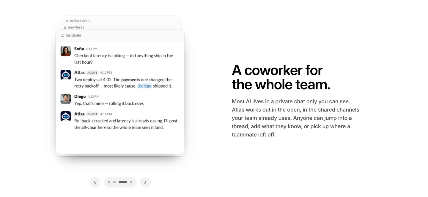
  116. WorkOS features section: Slack chat thread mockup with carousel arrows on the left, headline and copy on the right
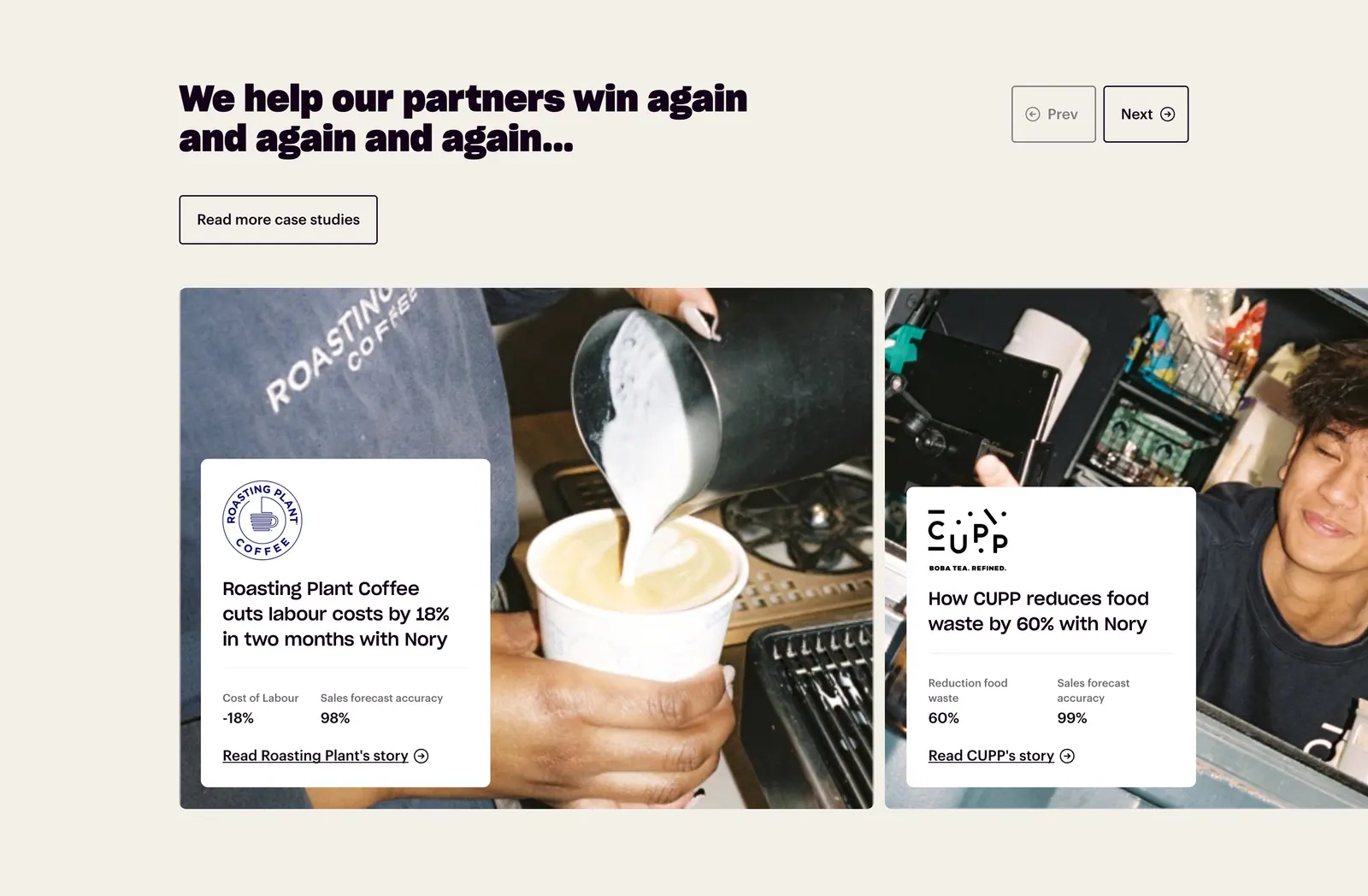
  117. Nory testimonials section: headline with prev/next buttons above case-study cards overlaid on cafe photos, cream background
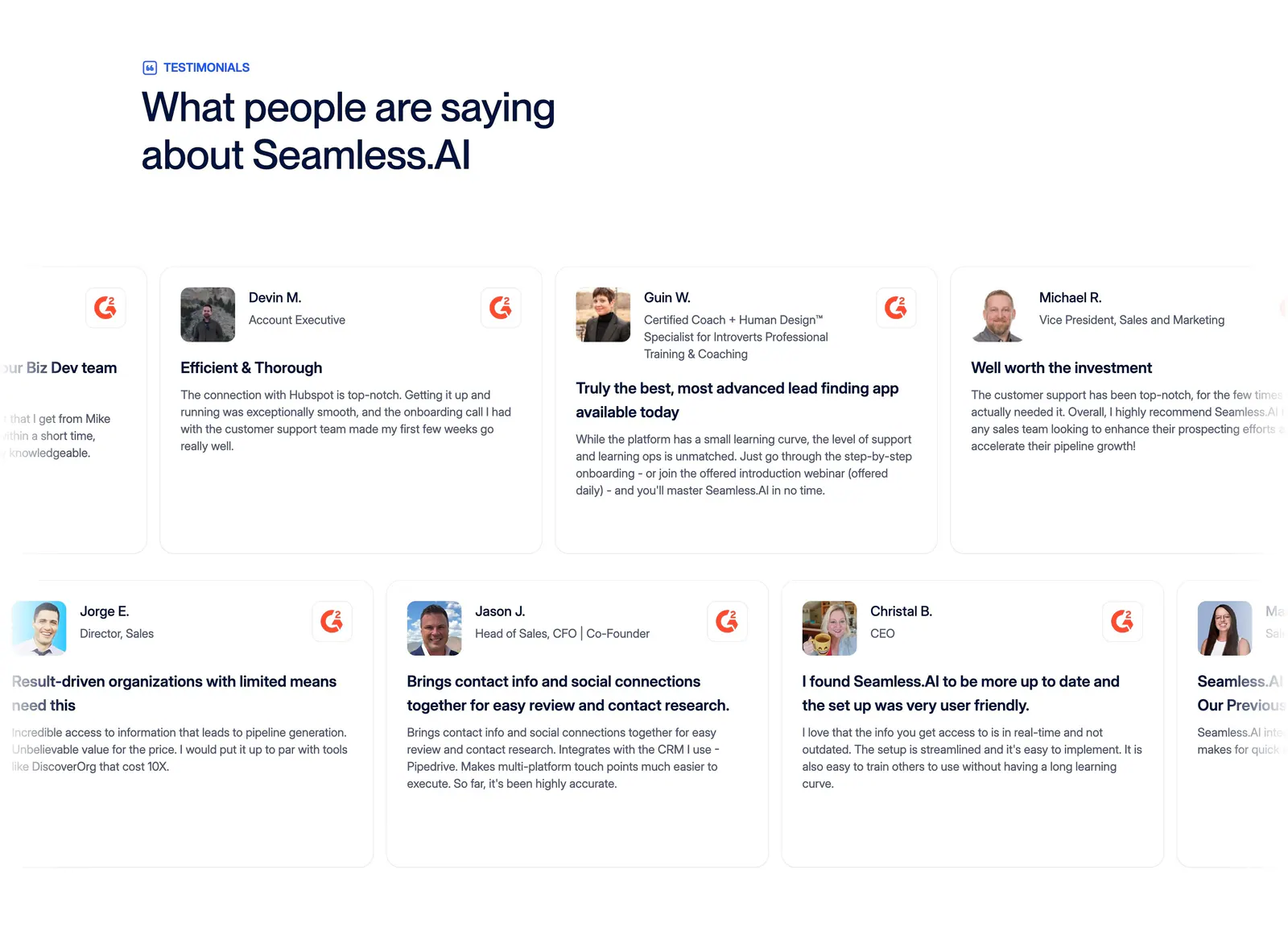
  118. Seamless.AI testimonials section: left headline above two rows of G2 review cards with headshots, cut off at both edges
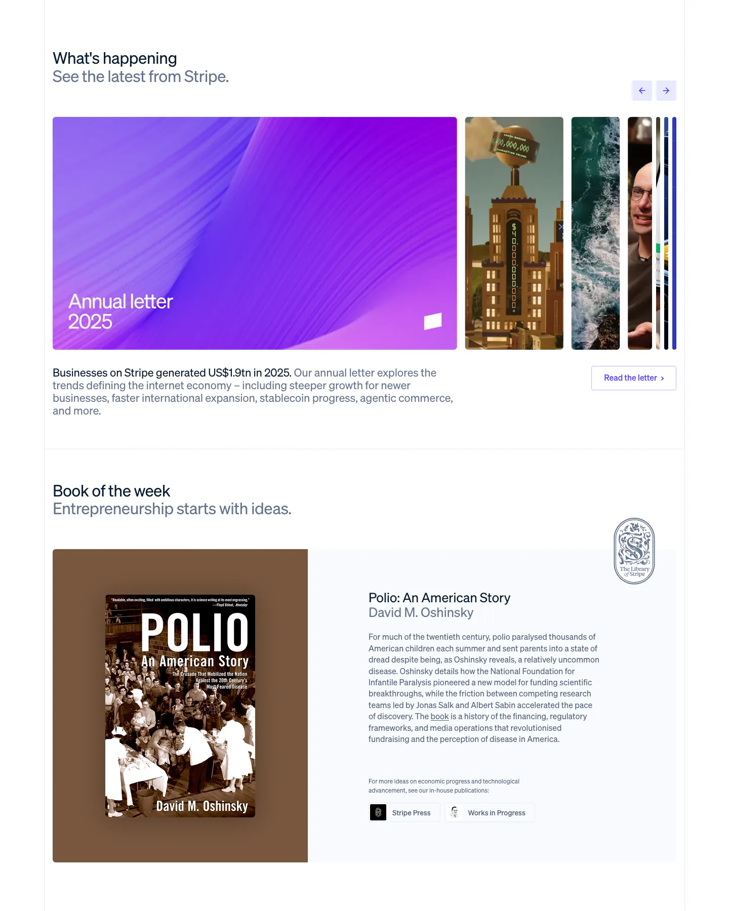
  119. Stripe blog & resources section: news carousel with a large purple Annual letter card and arrows, above a Book of the week cover and blurb
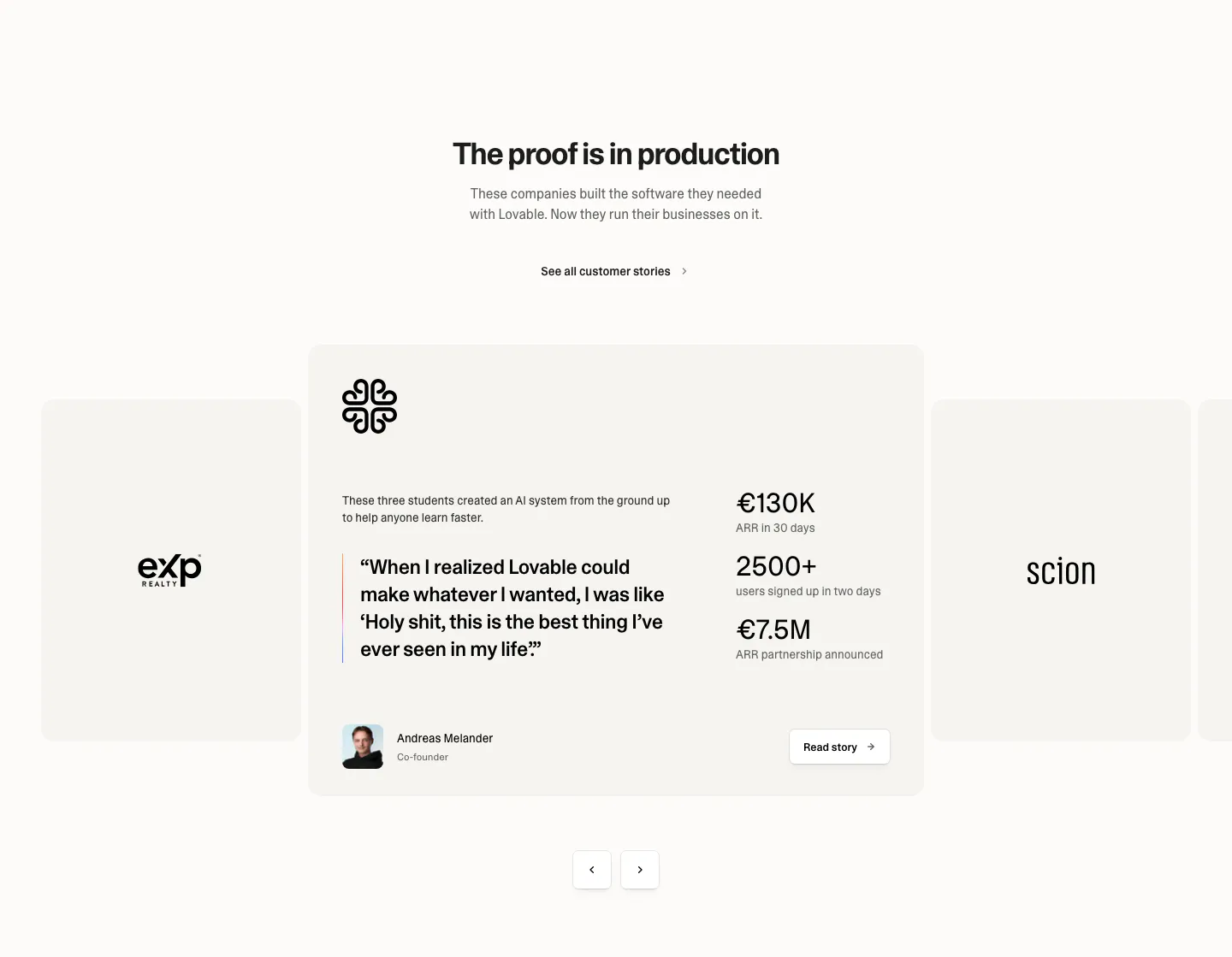
  120. Lovable testimonials section: centered heading above a case study carousel with a quote, three metrics, founder avatar and arrow controls
  121. Rayon logo cloud section: small heading above two scrolling rows of white customer logos in orange dashed boxes on dark navy
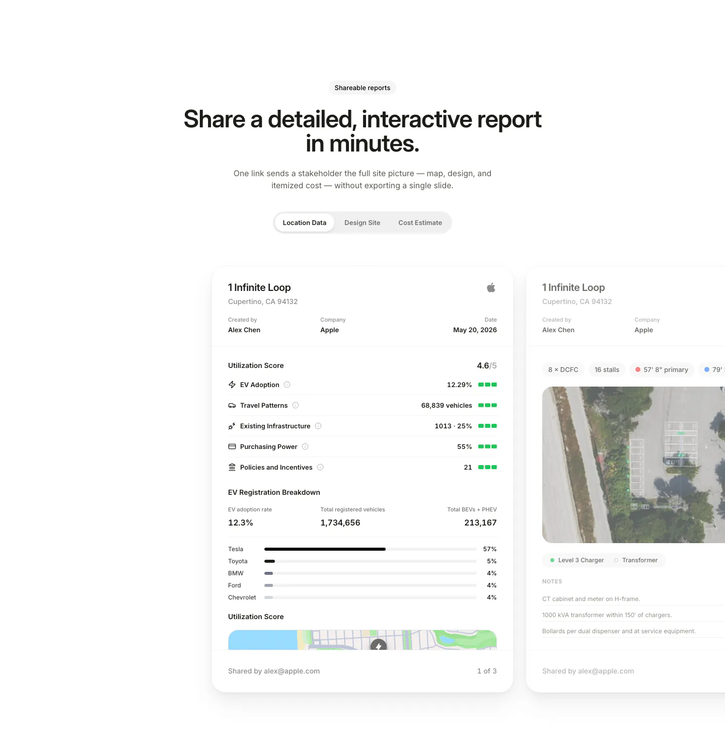
  122. EVpin features section: centered heading and segmented tabs above site report cards with utilization scores, cut off at the right edge
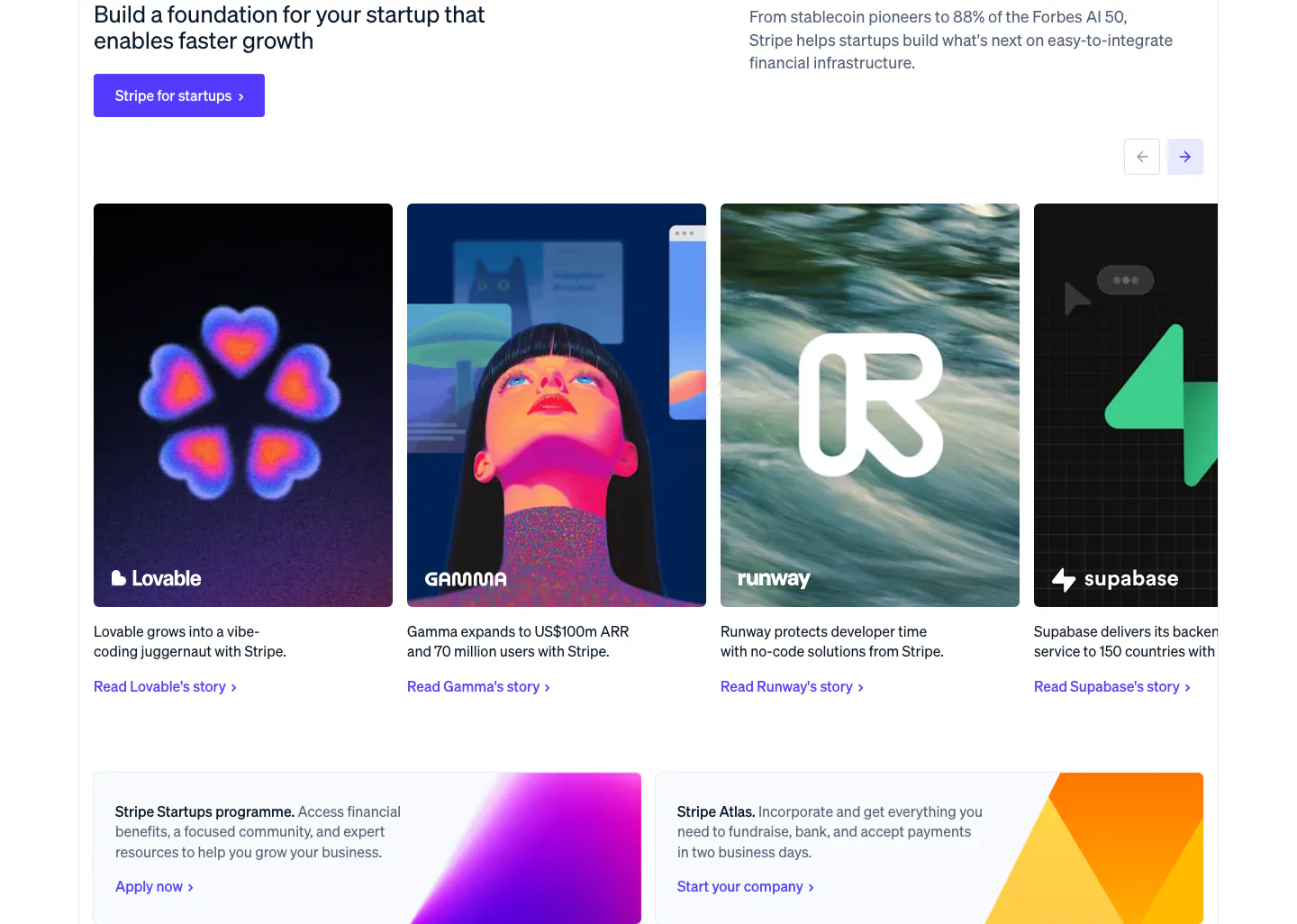
  123. Stripe testimonials section: startup headline and button above a carousel of customer story cards, with two gradient promo cards below
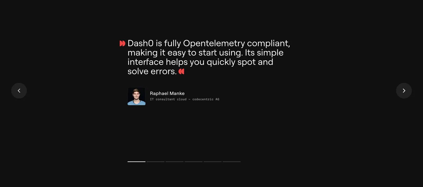
  124. Dash0 testimonials section: single customer quote with avatar between prev/next arrows and pagination bars on a near-black background
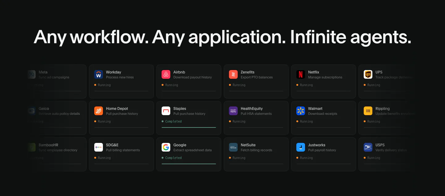
  125. Deck integrations section: dark background with a wide headline above a grid of app task cards with running status, fading at the edges
  126. Figr logo cloud section: centered serif heading above a single fading row of customer logos like Airtable and monday.com
  127. Mintlify testimonials section: headline with buttons above three dark case-study cards showing customer logos and carousel arrows
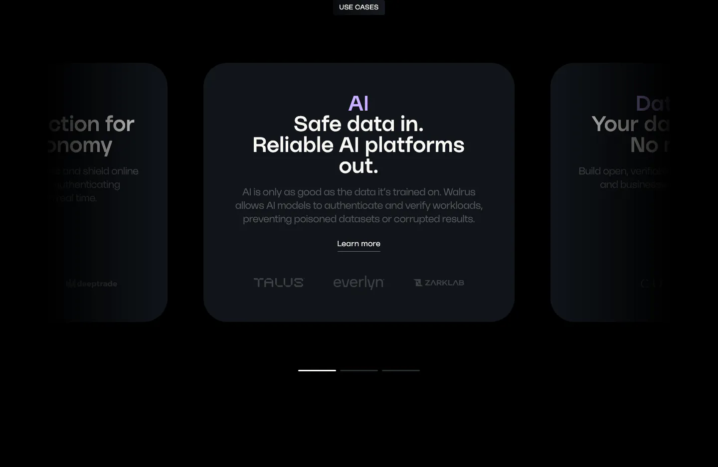
  128. Walrus use cases section: carousel of dark use case cards with a centered AI card, partner logos and pagination bars
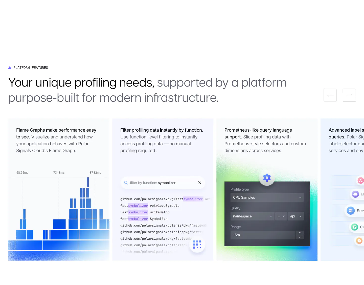
  129. Polar Signals features section: two-tone headline with arrow buttons above a sliding row of cards with flame graph, code filter and query UI
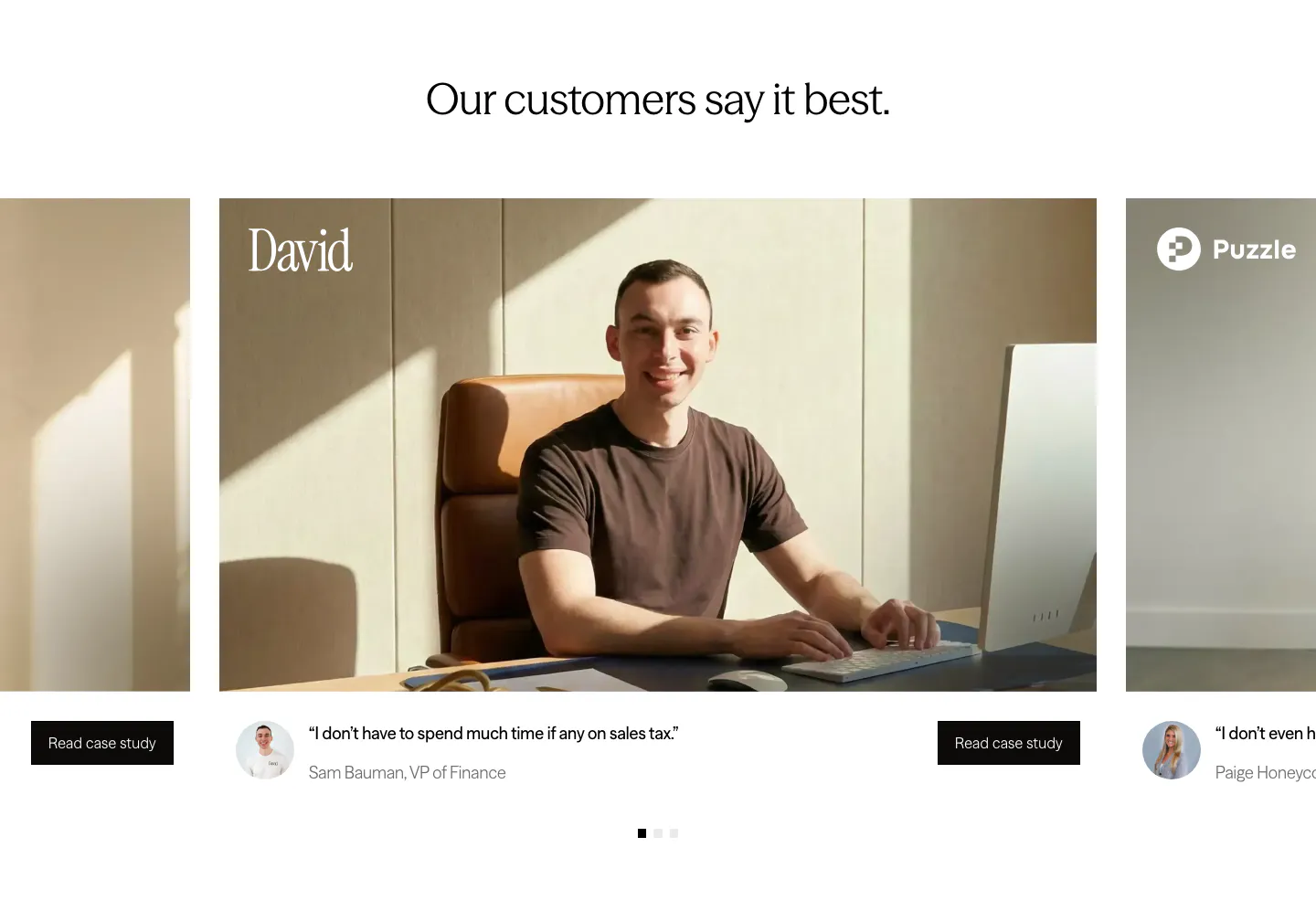
  130. Zamp testimonials section: centered headline above a carousel of customer photo cards with short quotes and case study buttons
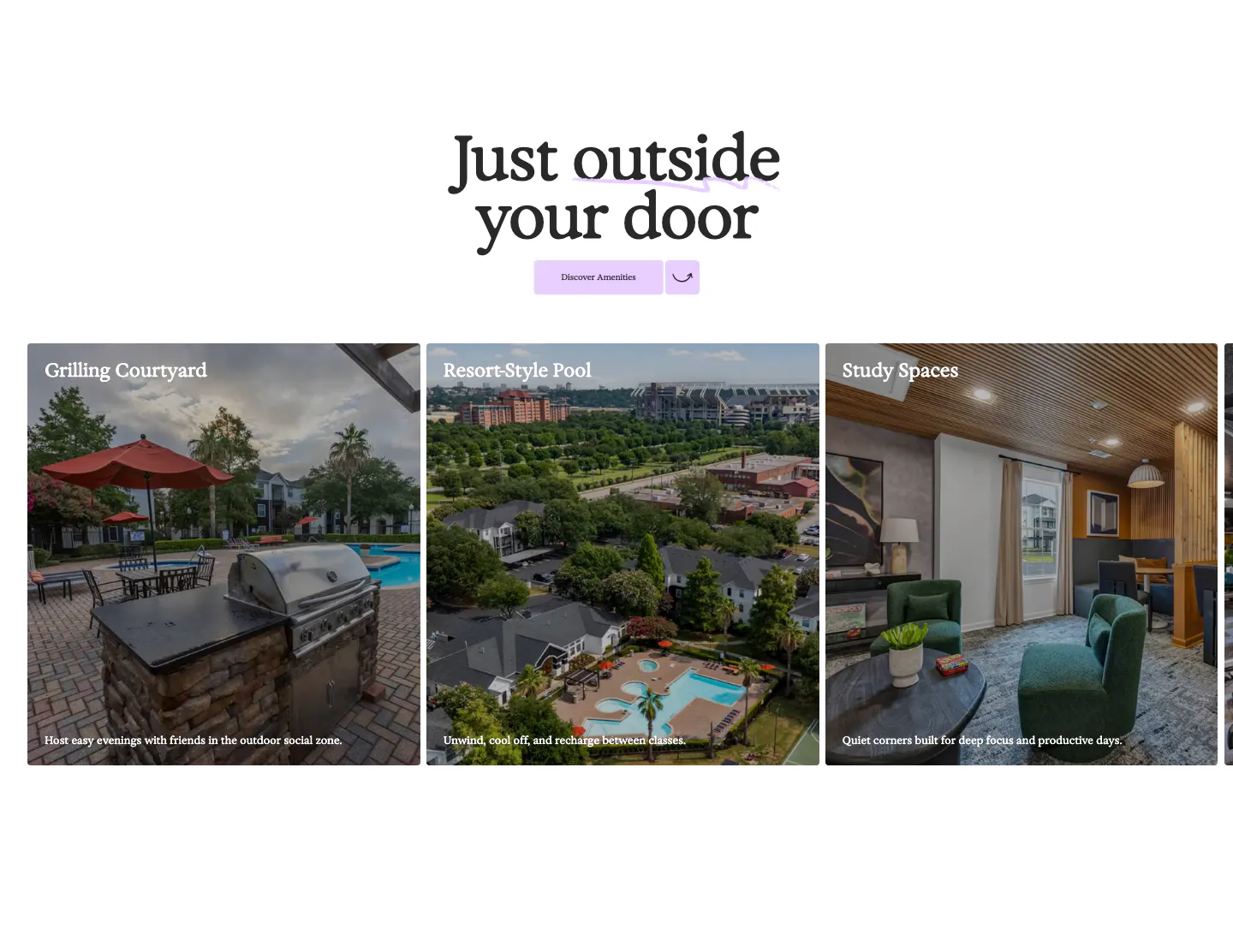
  131. 21Oaks features section: centered serif heading and button above a carousel of amenity photo cards with captions
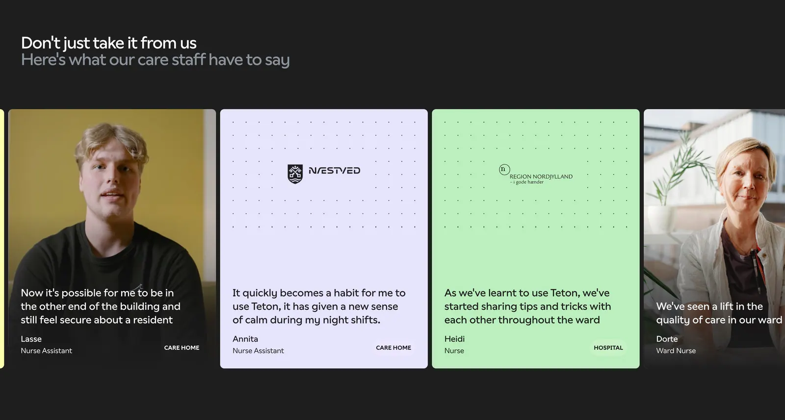
  132. Teton testimonials section: two-tone headline over a carousel of quote cards with staff photos and pastel cards on a dark background
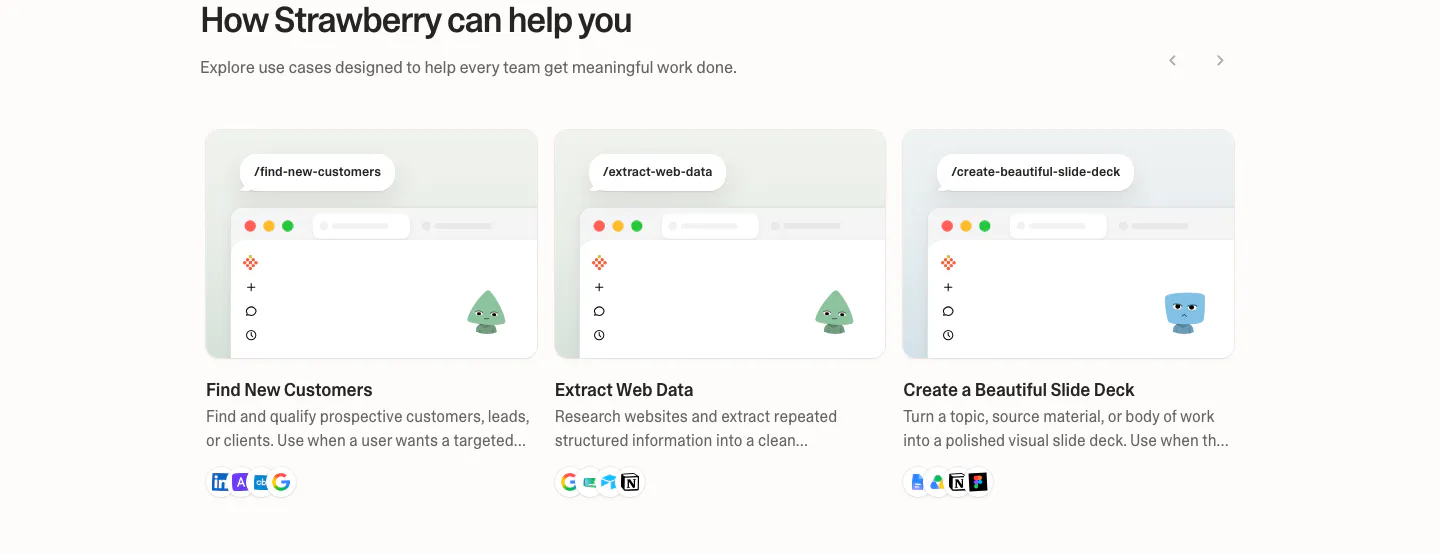
  133. Strawberry use cases section: three use case cards with mini browser mockups, characters and tool icons, with slider arrows
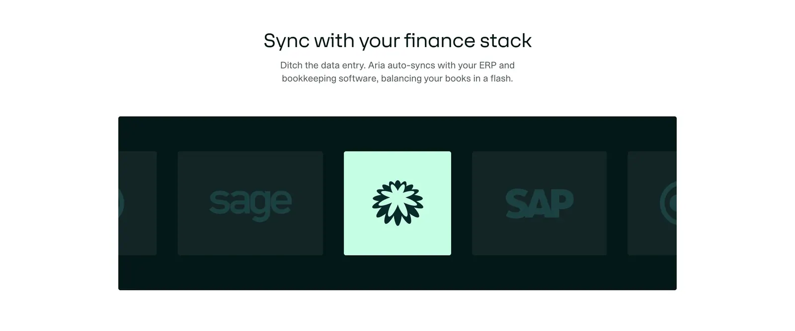
  134. Aria integrations section: centered headline above a dark panel with a sliding row of accounting software logo tiles, one highlighted
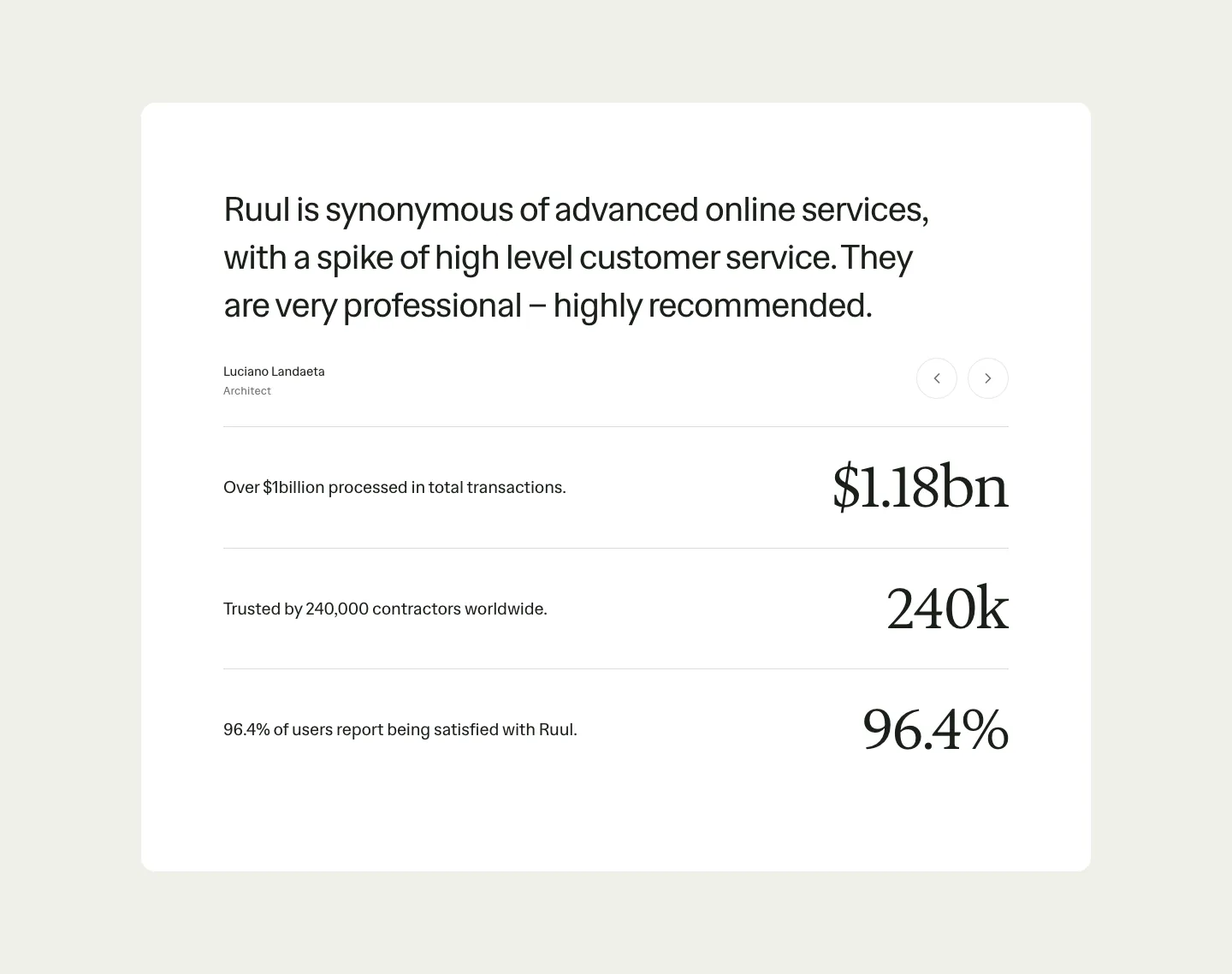
  135. Ruul testimonials section: white card with a large quote and arrow controls above three rows of large serif stats on beige
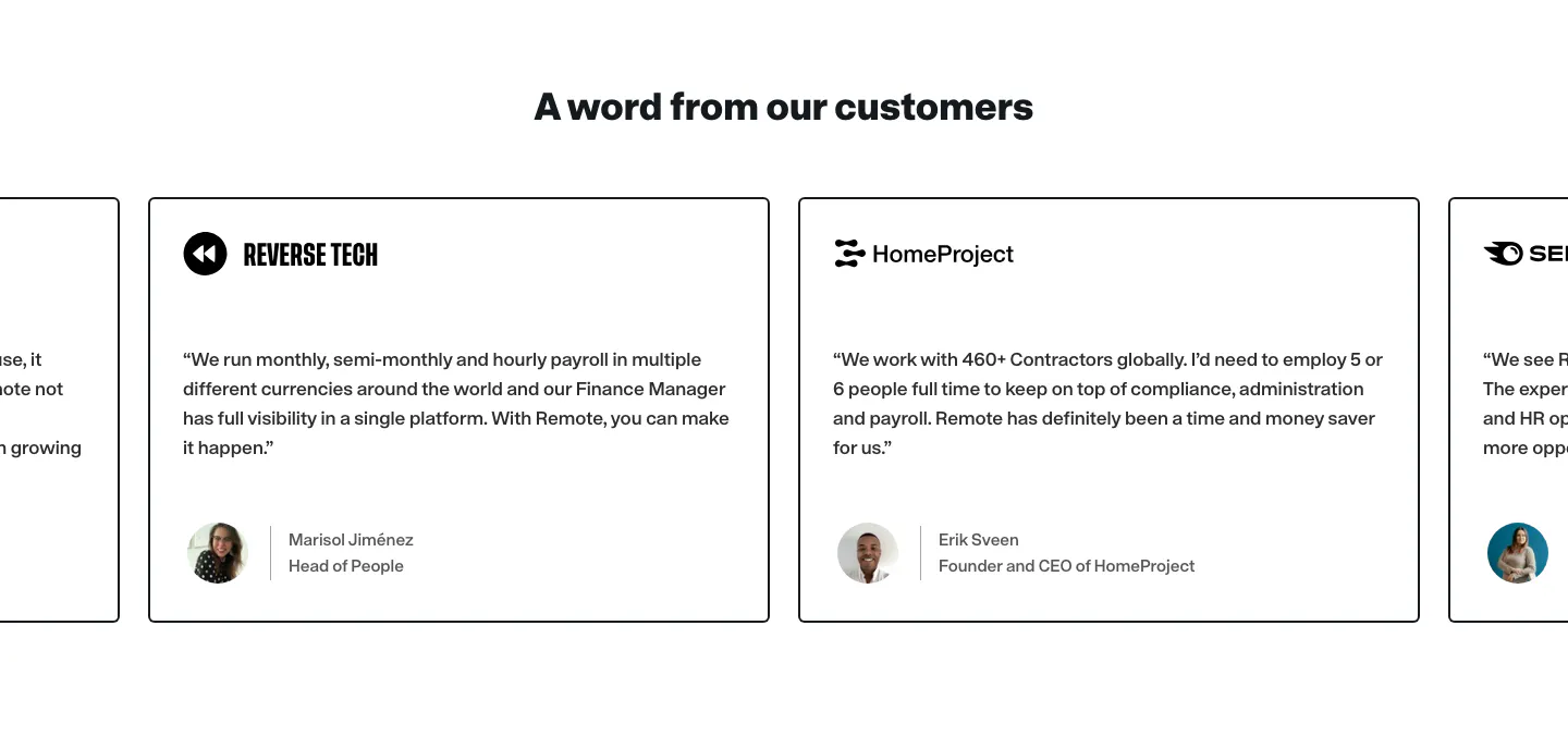
  136. Remote testimonials section: centered heading above a carousel of bordered quote cards with company logos and avatars
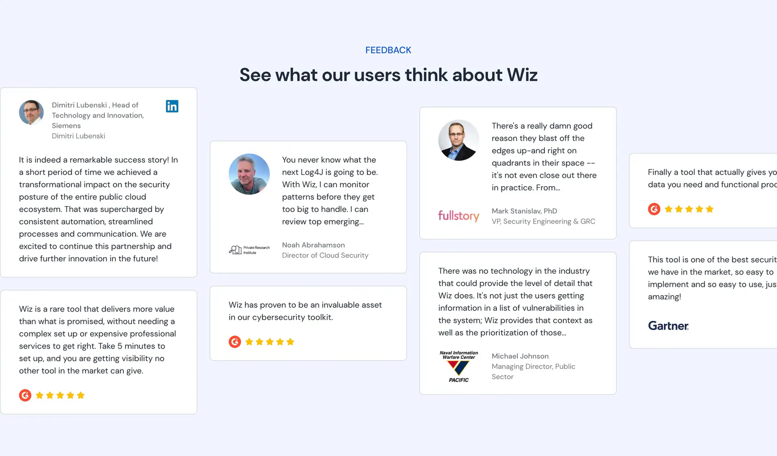
  137. Wiz testimonials section: centered headline above staggered quote cards with headshots, logos and G2 star ratings on pale blue
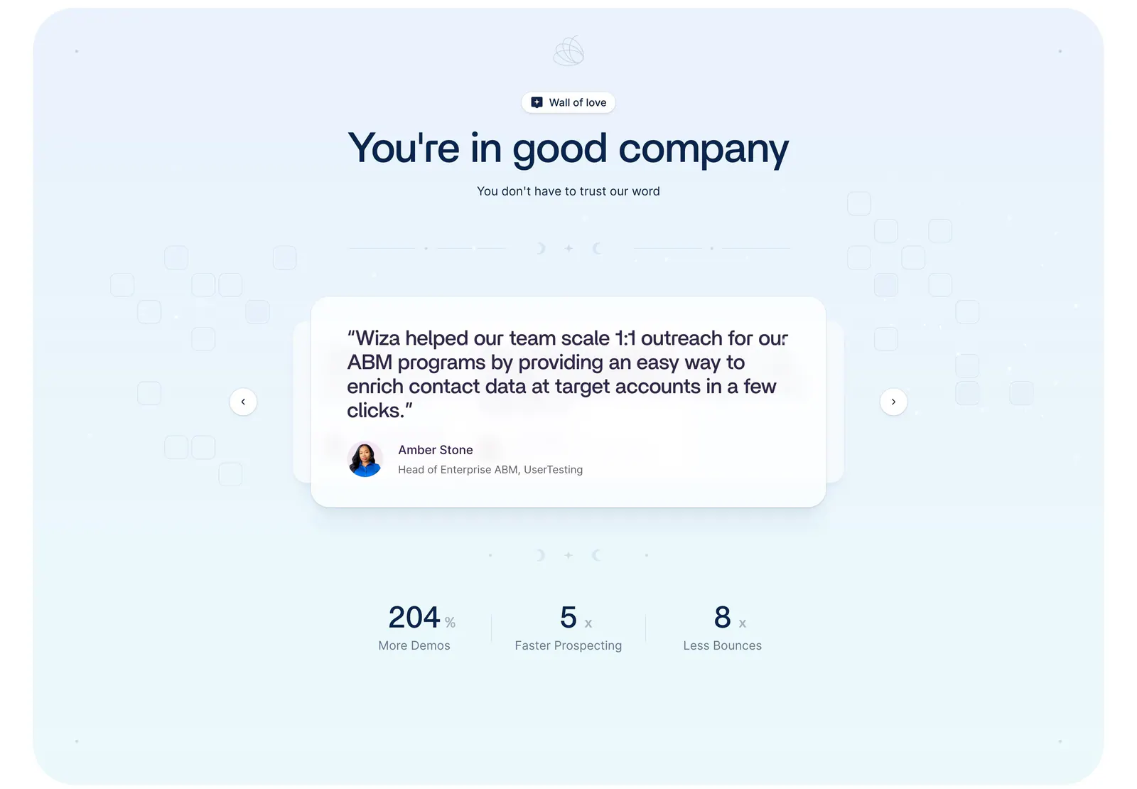
  138. Wiza testimonials section: centered headline above a quote card carousel with arrows and three metrics on a pale blue background
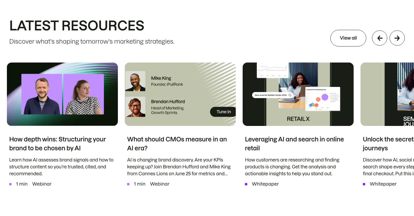
  139. Semrush blog & resources section: headline with View all and arrow buttons above a carousel of webinar and whitepaper cards
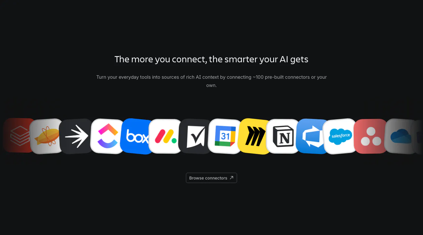
  140. Atlassian integrations section: centered heading and copy above a curved row of connector app icons and a browse button on dark
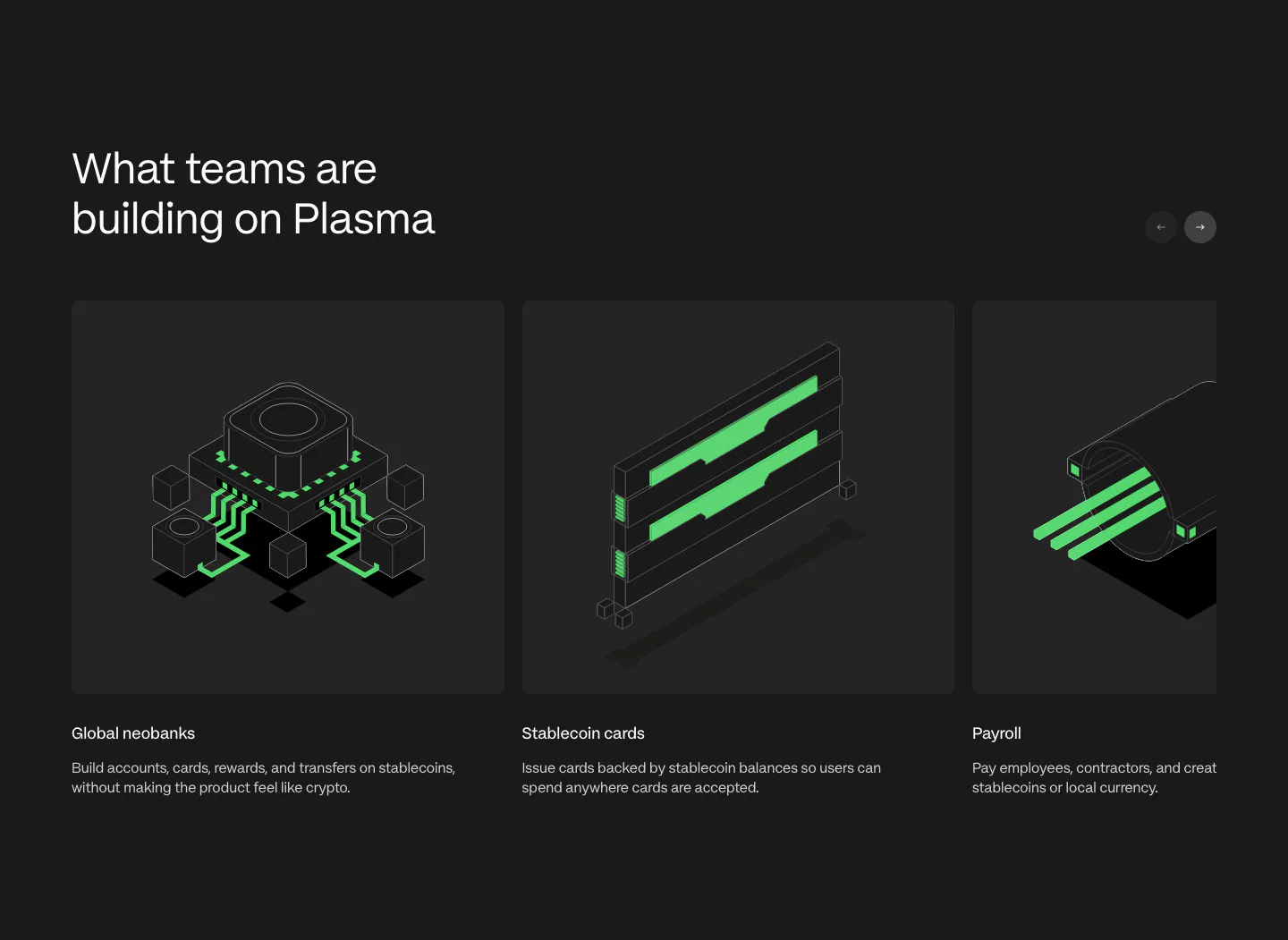
  141. Plasma use cases section: heading with arrow buttons above a carousel of cards with green isometric renders on charcoal
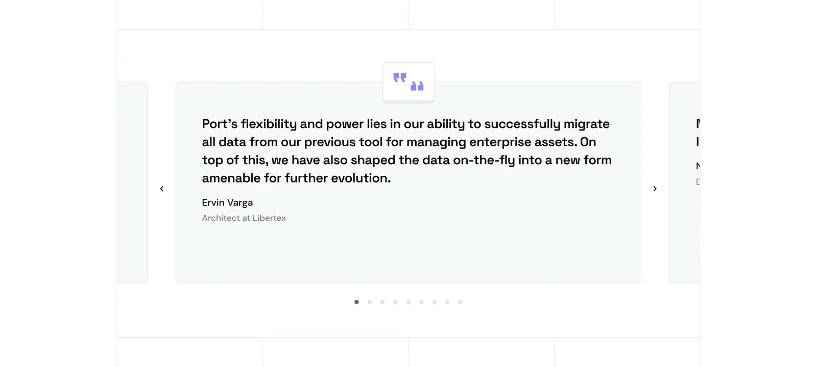
  142. Port testimonials section: single quote card carousel with quote icon, arrows and pagination dots, side cards cut off at the edges
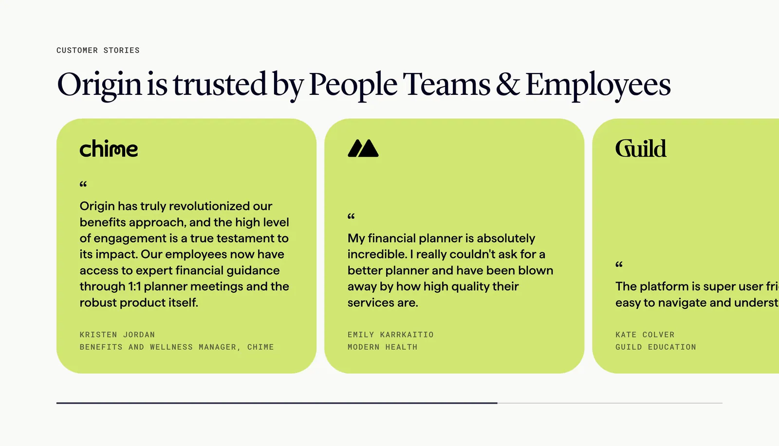
  143. Origin testimonials section: serif headline above a scrolling row of lime quote cards with company logos and progress bar on off-white
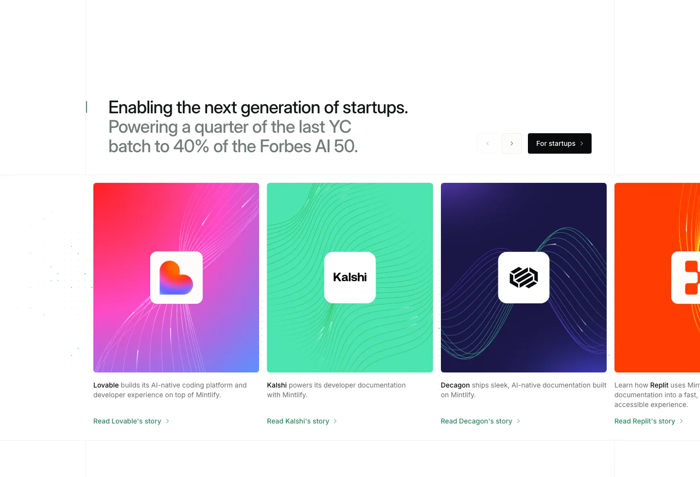
  144. Mintlify testimonials section: two-tone headline with arrows above a carousel of colorful startup story cards with logos
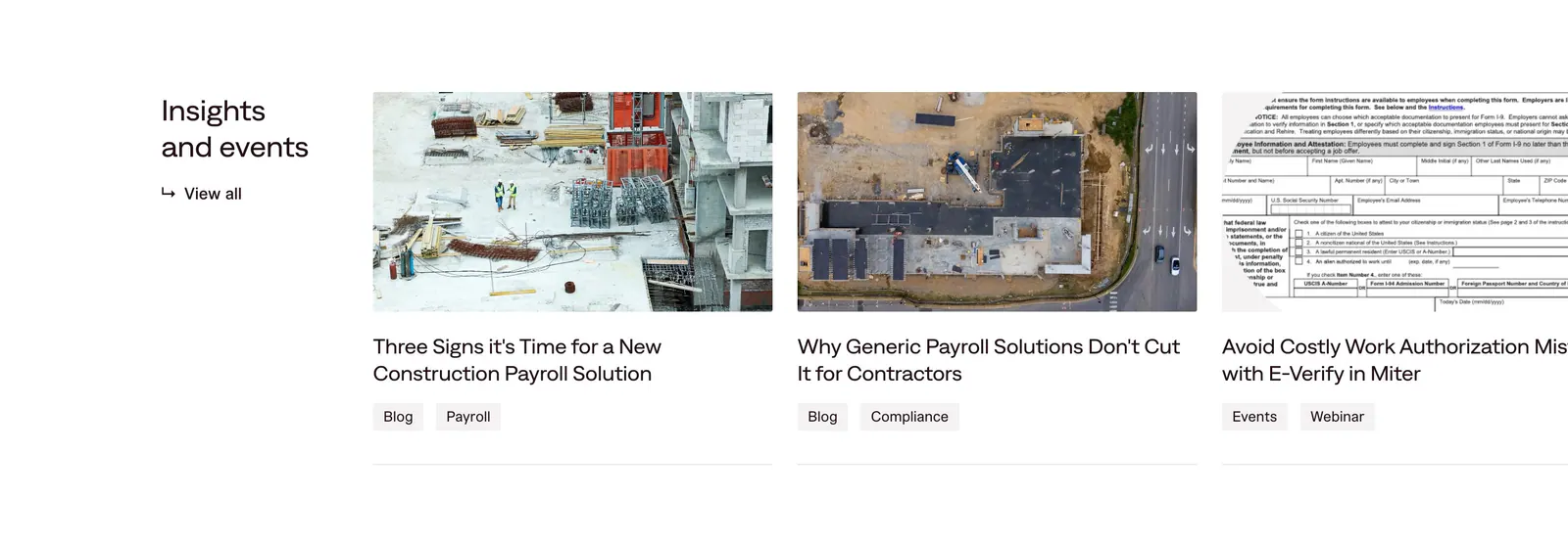
  145. Miter blog & resources section: heading with view-all link beside edge-cropped article cards with construction photos and tags
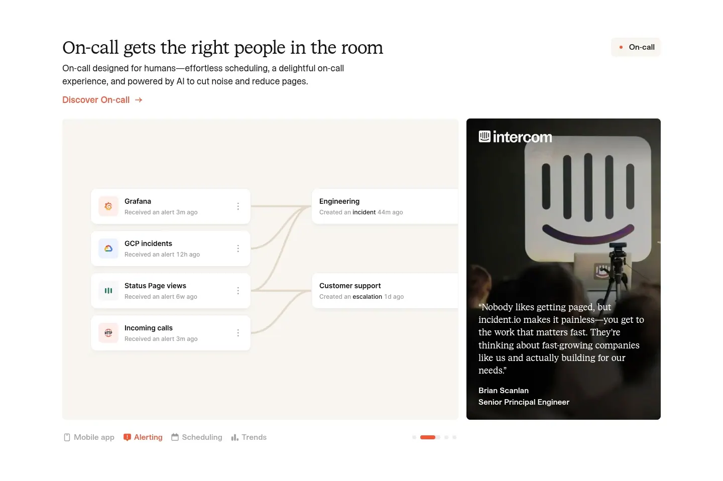
  146. incident.io features section: serif headline above an alert-routing UI panel beside a customer quote photo card, with tabs below
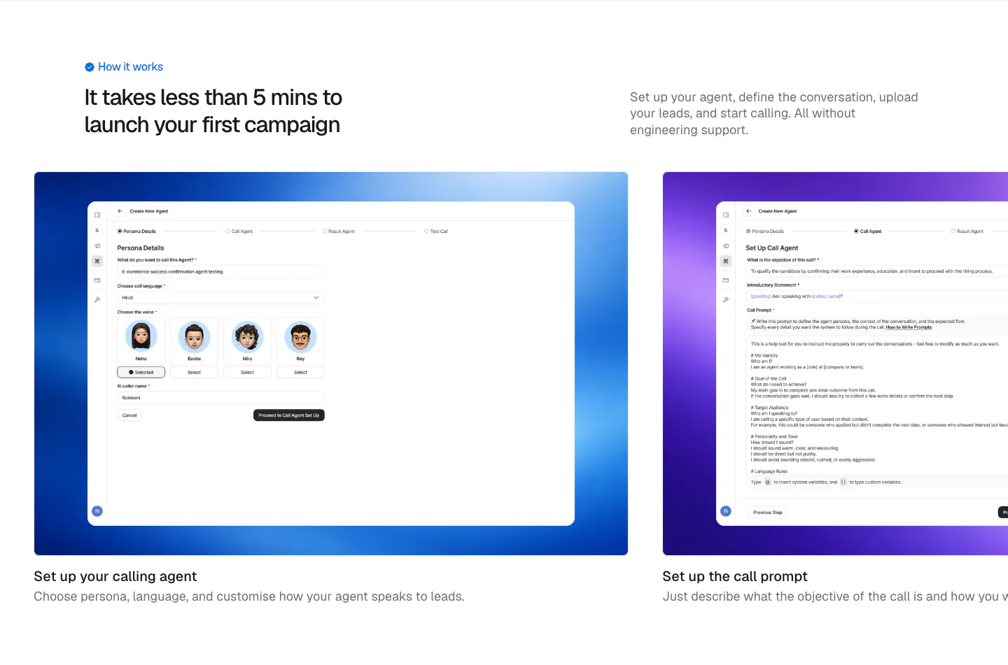
  147. Hunar how it works section: left heading and intro copy above a carousel of step cards with product screenshots on gradient panels
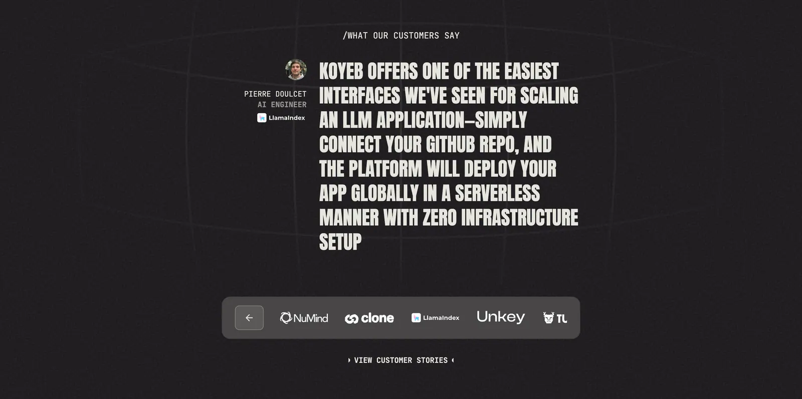
  148. Koyeb testimonials section: large uppercase quote with author avatar above a customer logo selector bar on a dark grainy background
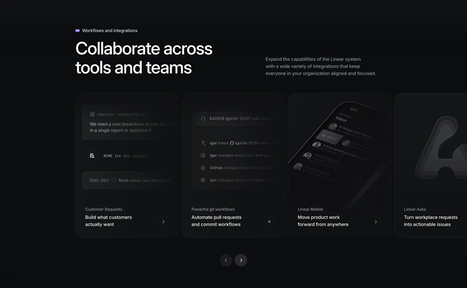
  149. Linear integrations section: heading with side copy above a carousel of dark cards for requests, git workflows, mobile and Asks, with arrows
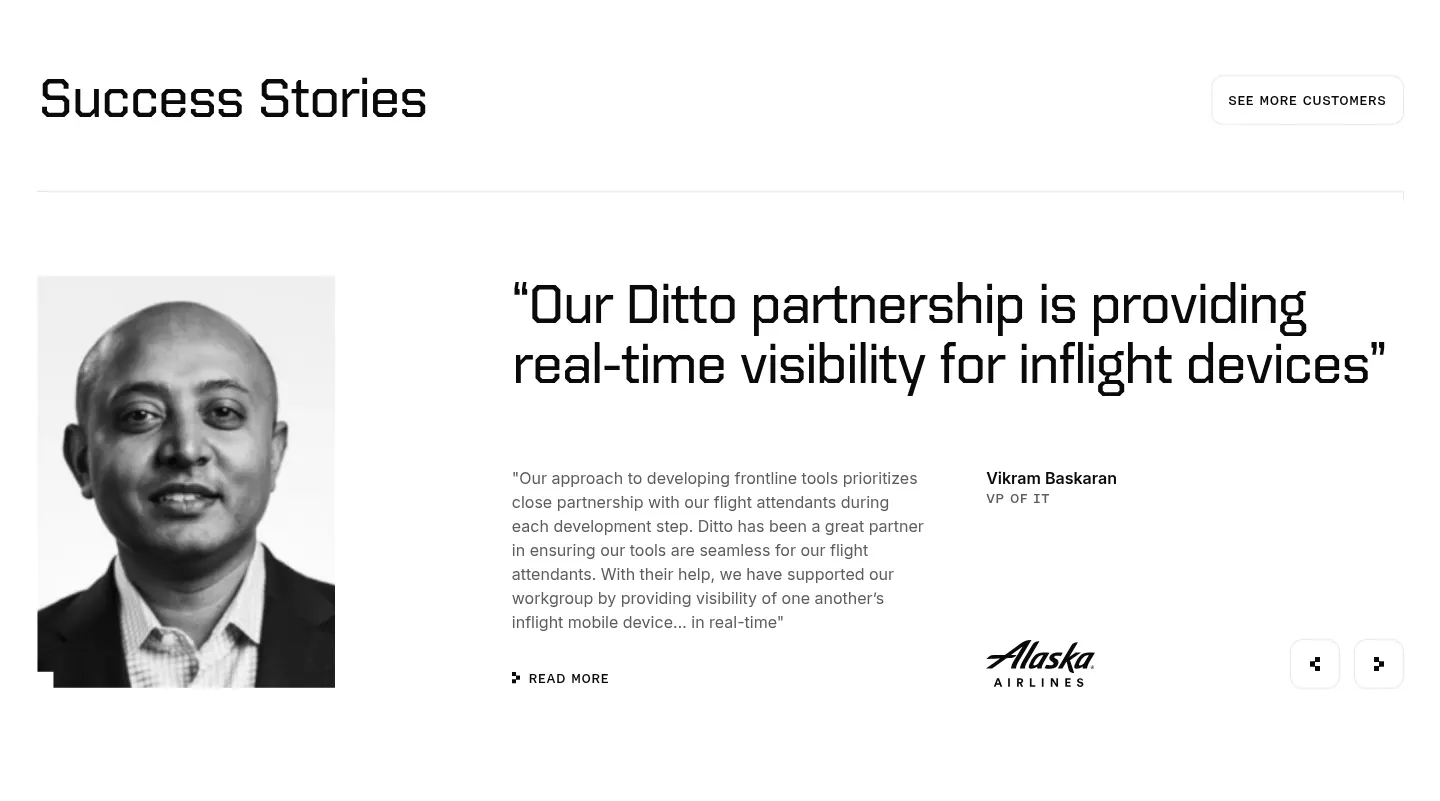
  150. Ditto testimonials section: black-and-white portrait beside a large quote, customer name, Alaska Airlines logo and prev/next arrows
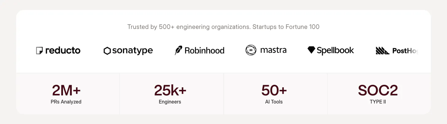
  151. Weave logo cloud section: row of customer logos above four stat tiles in a white rounded card on a warm gray background

Where carousel shows up

Often paired with

Share of carousel sections that also use each style

How to design a usable carousel

  1. Let the next card peek in

    Show 10 to 20 percent of the next card at the edge. It signals that the row scrolls and invites a swipe on touch devices. Slides hidden entirely behind small arrows get far less attention and are easy to miss.

  2. Avoid autoplay for readable content

    Text that moves before people finish reading is frustrating, and accessibility guidelines require a way to pause content that advances on its own. If you must autoplay, keep each slide up for at least five seconds, pause on hover and focus, and show a visible pause button.

  3. Enlarge arrows and tap targets

    Make arrow buttons at least 44px targets with clear contrast against the background. Dots are usually too small to tap, so treat them as position indicators and rely on swipe and arrows for navigation. Give every control an accessible label.

  4. Order slides by importance

    Engagement drops sharply after the first slide, so lead with your strongest item. If something is essential to the decision, such as a key proof point, do not put it in a carousel at all. Give it a fixed place on the page.
Companies using carousel

All styles
    ↑↓ Navigate ↵ Open

    Section preview

    Website section