3D Website Design Examples

Rendered objects, scenes, and isometric models give a page depth and a tactile quality. 3D website design can make abstract products such as infrastructure, security, or finance feel tangible and premium. It is also expensive to produce and easy to overdo. Heavy renders slow pages down. Shapes with no link to the product are worse, because they add weight and explain nothing.
98 sections

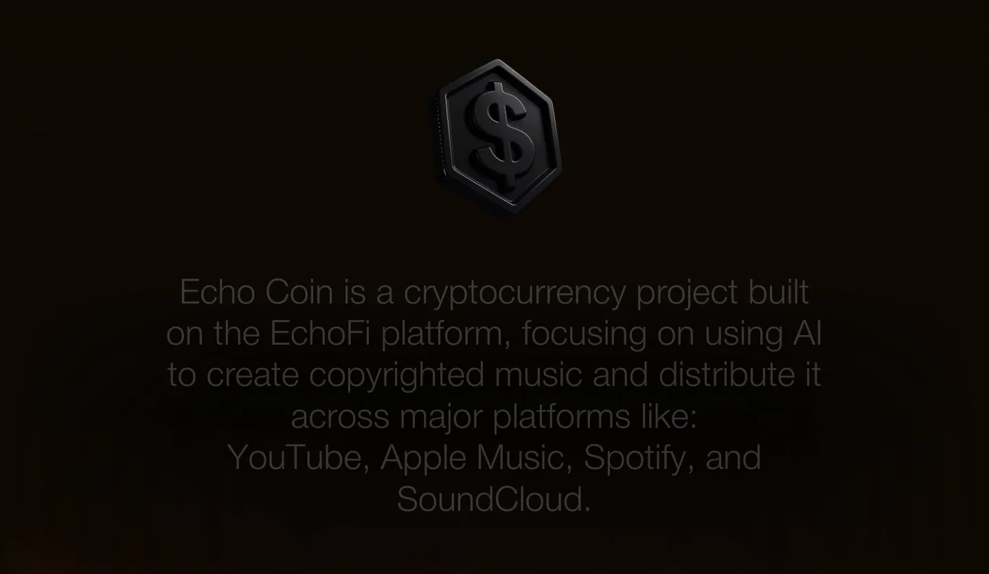
  1. EchoFi about & mission section: centered gray statement text below a dark 3D coin icon on a near-black background
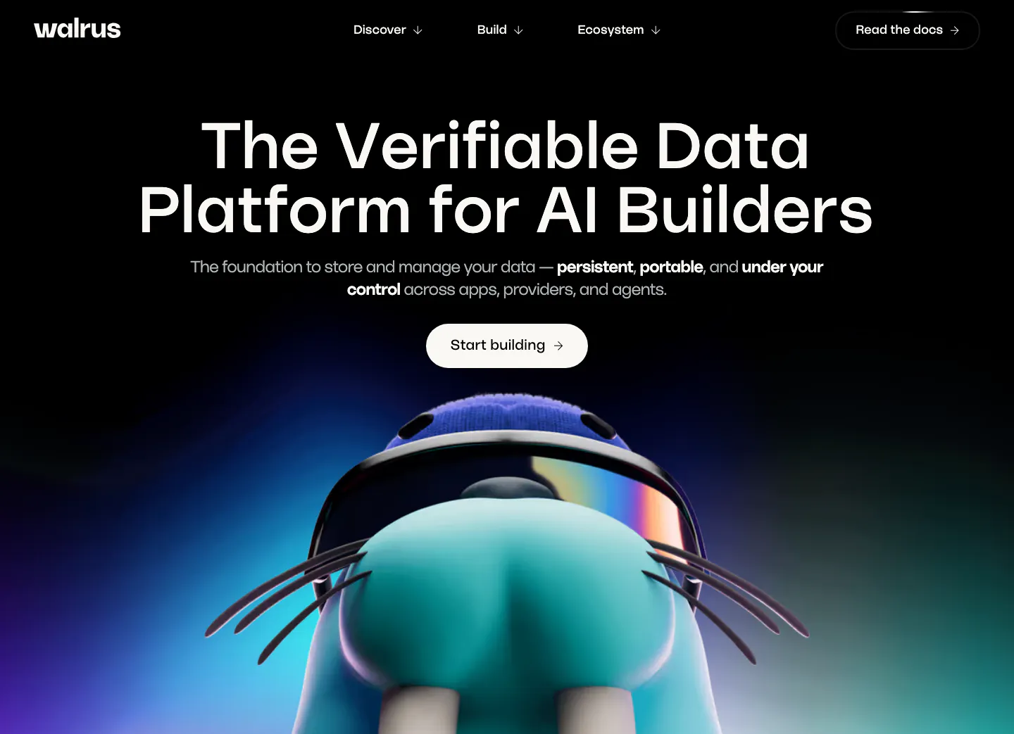
  2. Walrus hero section: centered headline and button on black above a 3D walrus mascot rising from a blue-purple glow
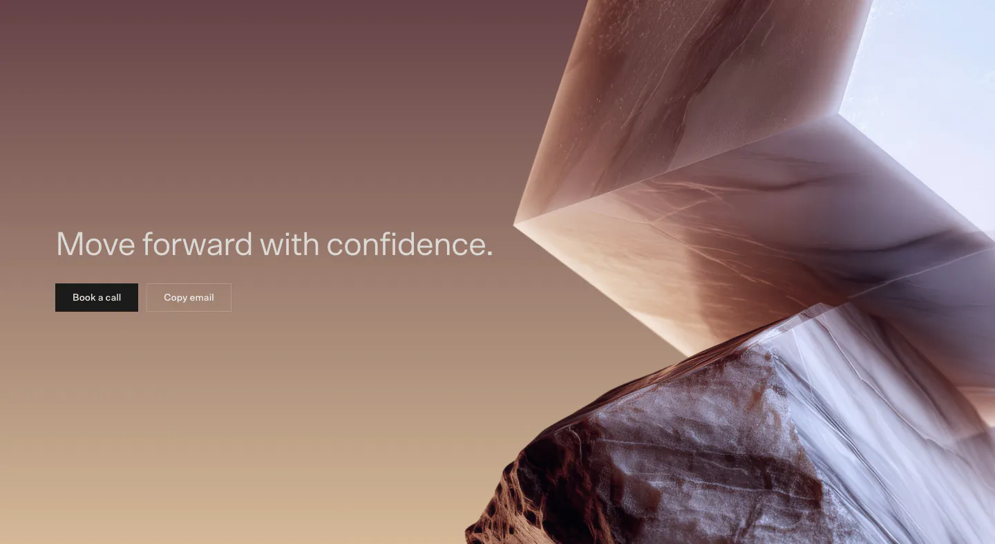
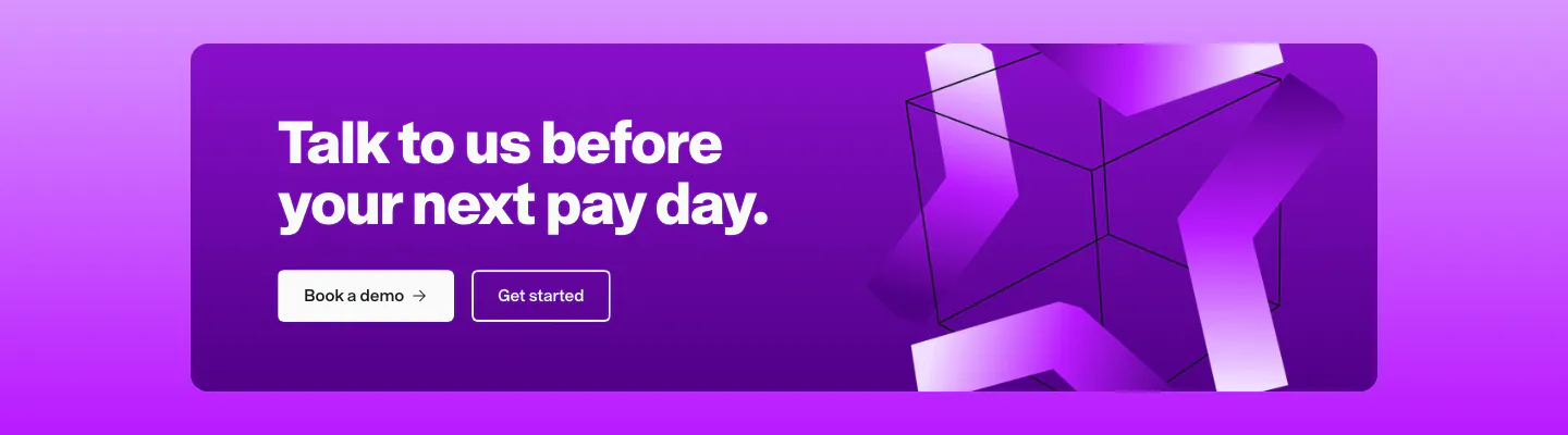
  3. Bayshore call-to-action section: headline with Book a call and Copy email buttons on a mauve-to-tan gradient beside 3D marble shapes
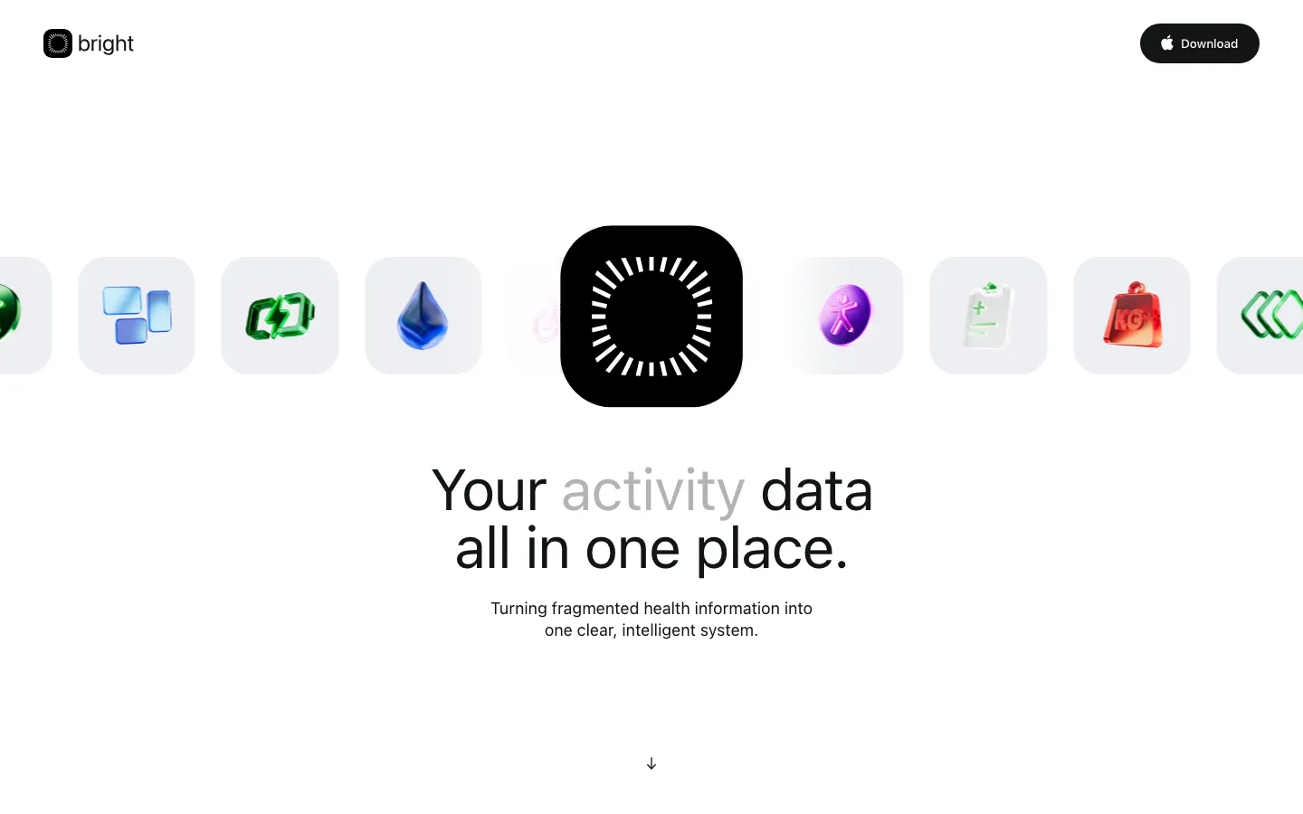
  4. Bright hero section: logo nav, a row of glossy 3D health icons around a black app icon, centered headline and subcopy below
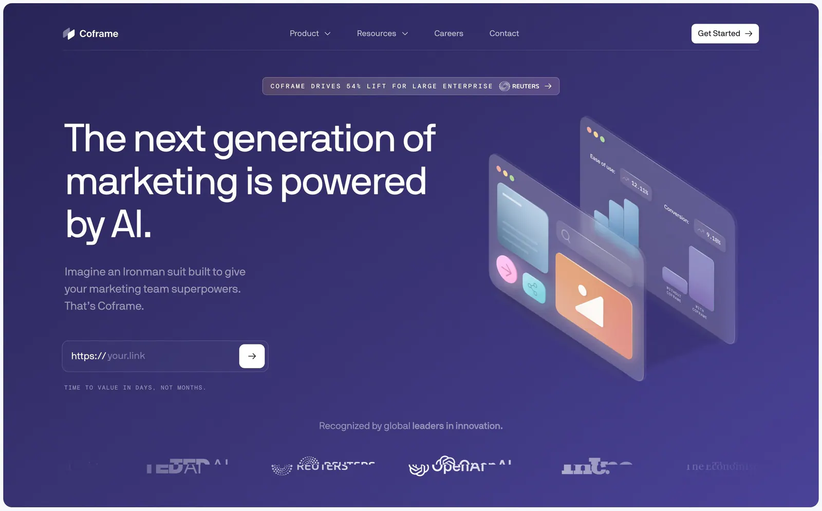
  5. Coframe hero section: left headline with URL input field beside isometric glass UI panels on purple, logo row below
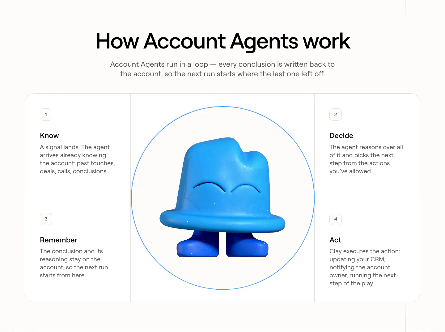
  6. Clay how it works section: centered heading over four numbered step cards arranged around a circle with a blue 3D clay mascot
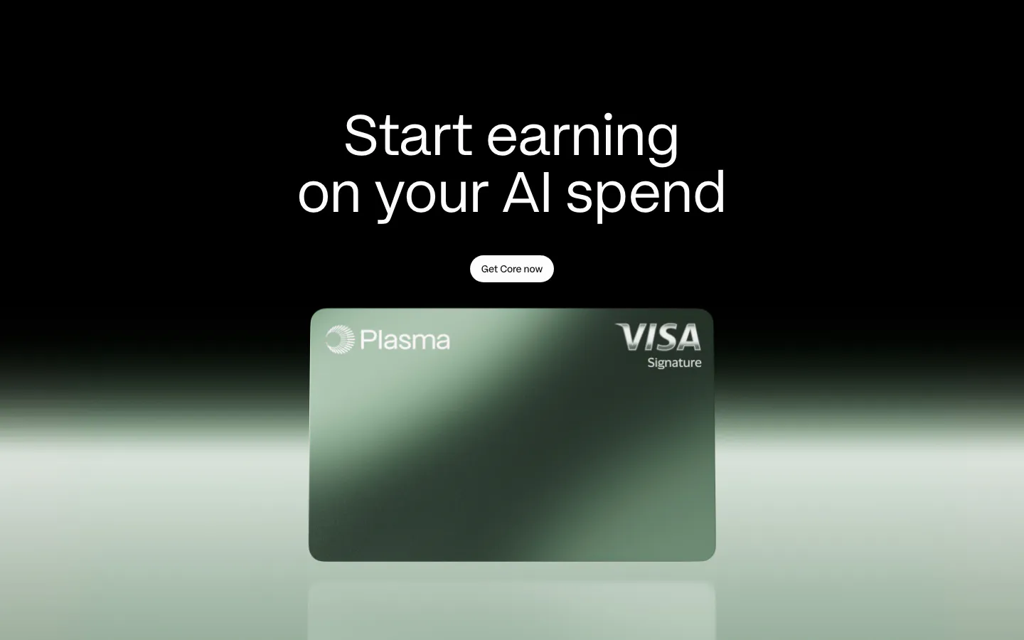
  7. Plasma call-to-action section: centered headline and button above a green Plasma card render with a green glow on black
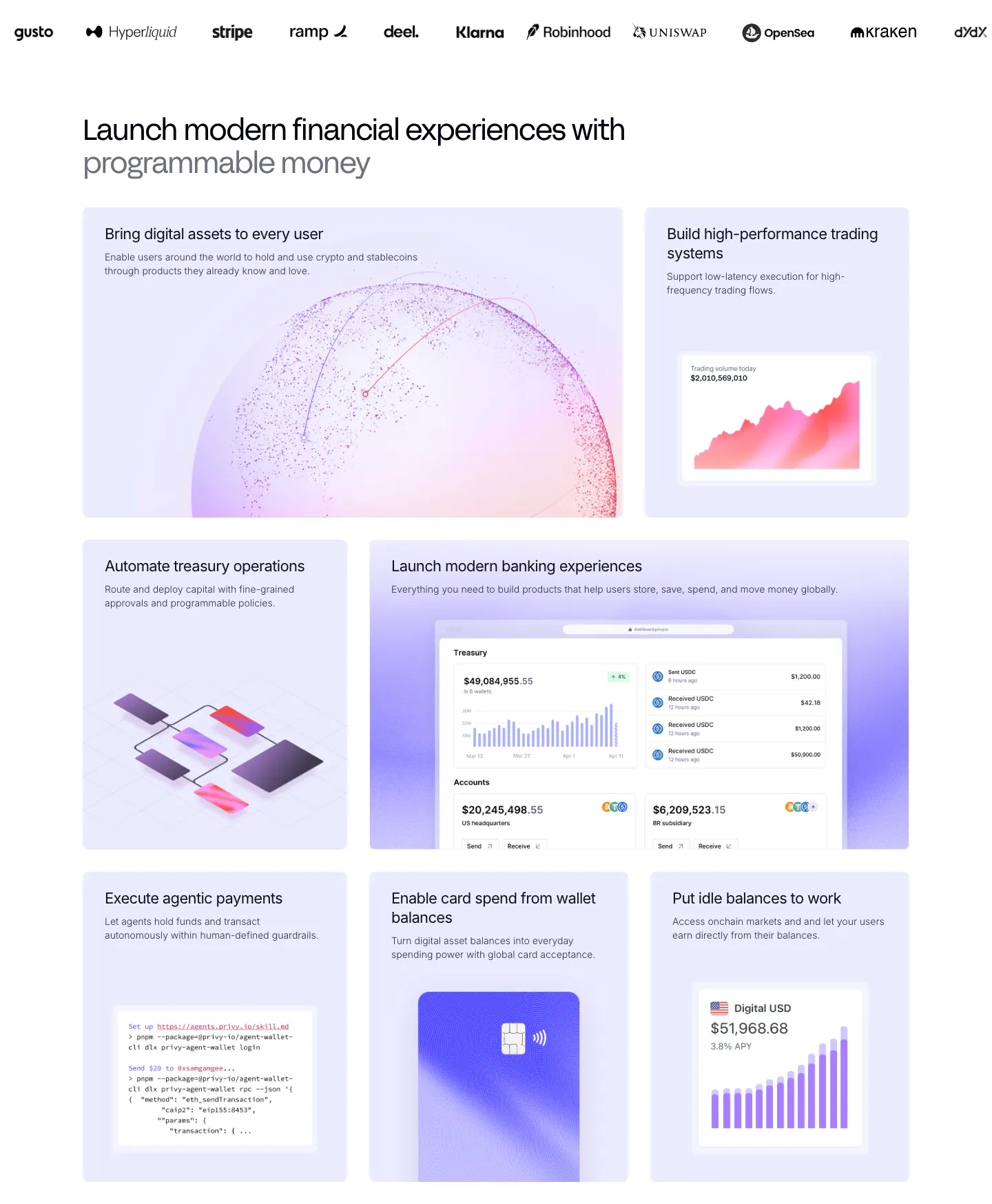
  8. Privy features section: customer logo strip above a bento grid of lavender tiles with dashboards, charts, a code snippet and a card visual
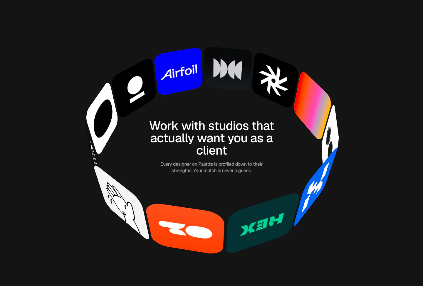
  9. Palette value proposition section: centered headline and copy inside a 3D ring of colorful studio logo tiles on a dark background
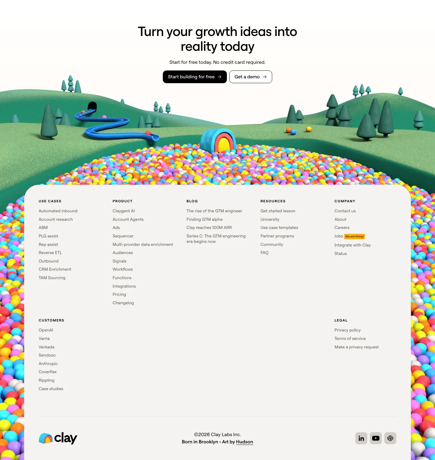
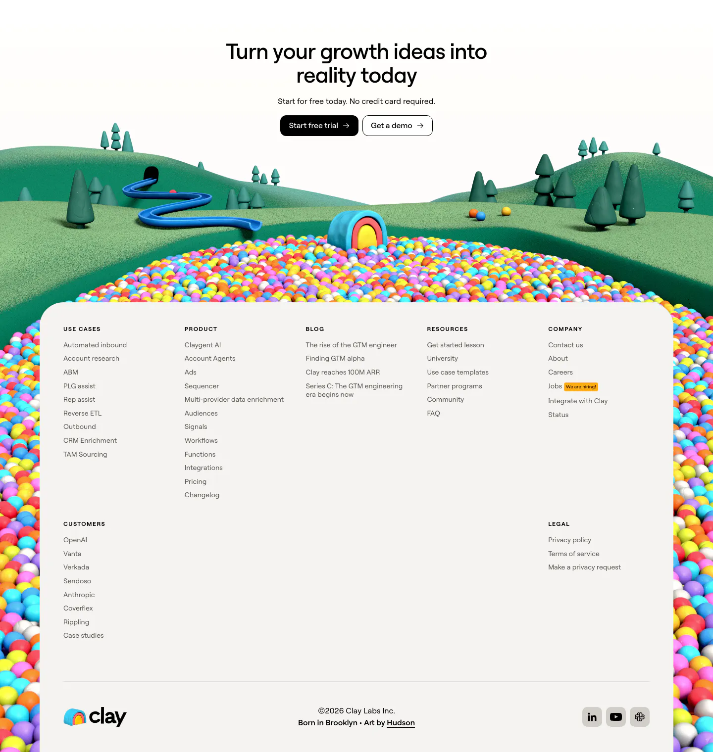
  10. Clay footer section: centered CTA over a 3D landscape of hills and colorful ball pit framing a light footer panel with link columns
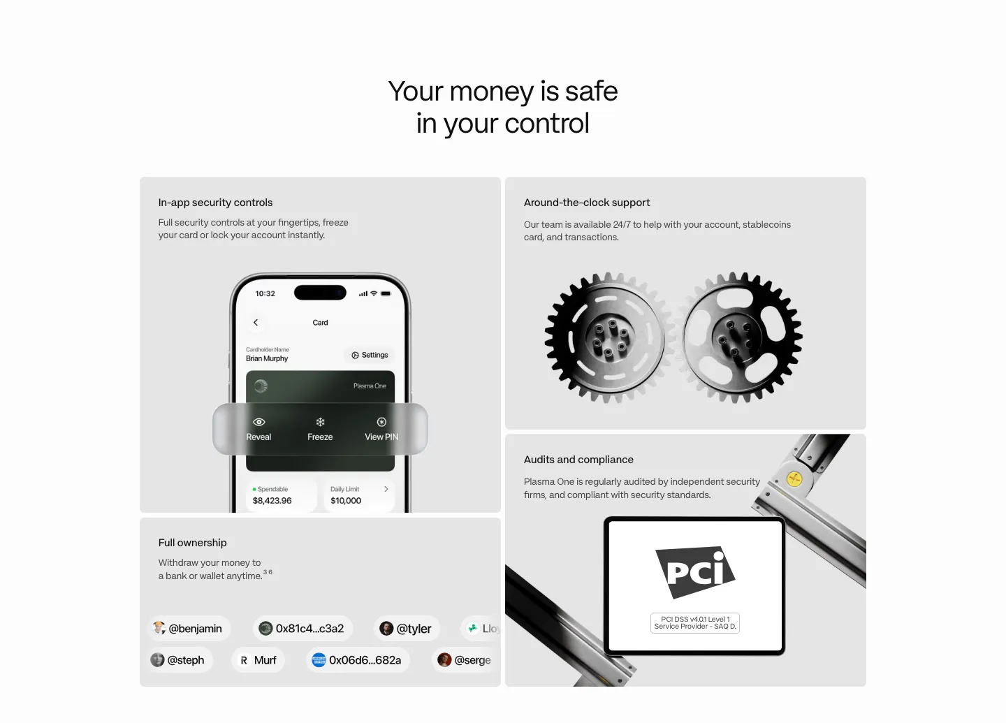
  11. Plasma security section: centered heading above a bento of gray tiles with a phone UI, 3D gears, a PCI badge and user handles
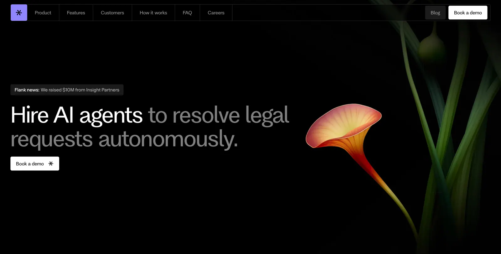
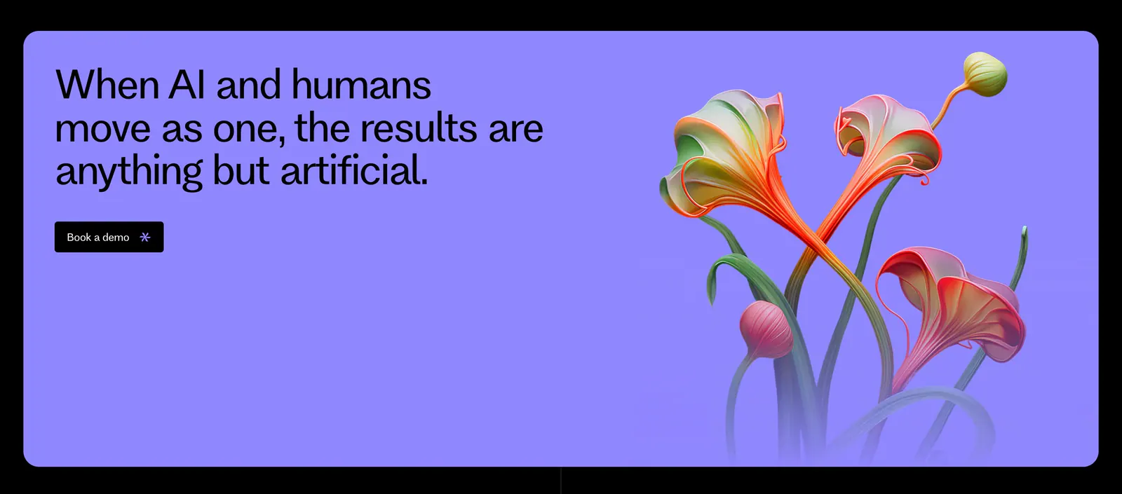
  12. Flank hero section: left-aligned headline with news pill and demo button beside a rendered orange flower on a black background
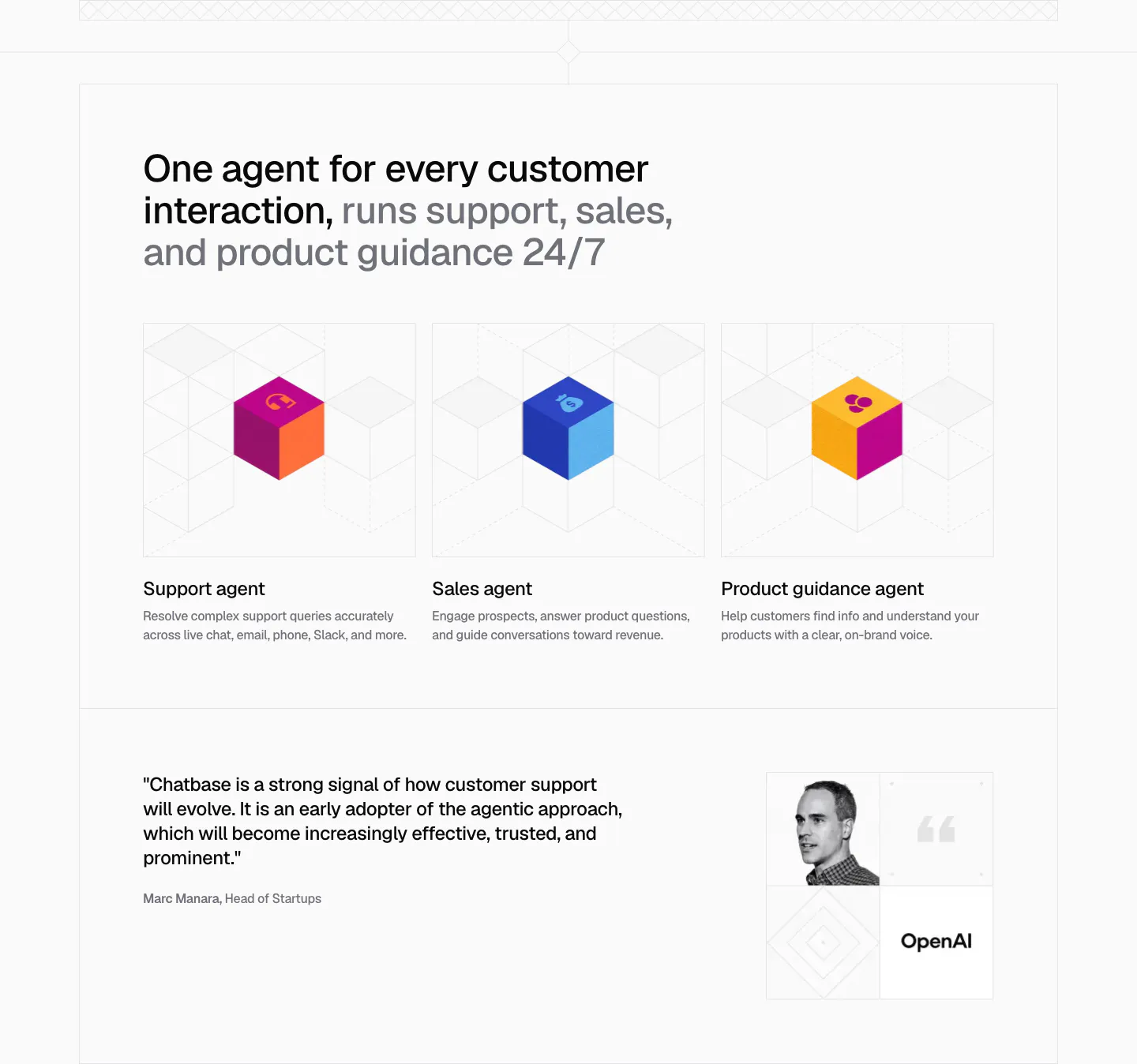
  13. Chatbase use cases section: three agent cards with colorful isometric cubes on line grids, plus an OpenAI quote with portrait below
  14. Clay footer section: centered closing CTA over a 3D clay landscape and ball pit, with a light card of link columns and wordmark
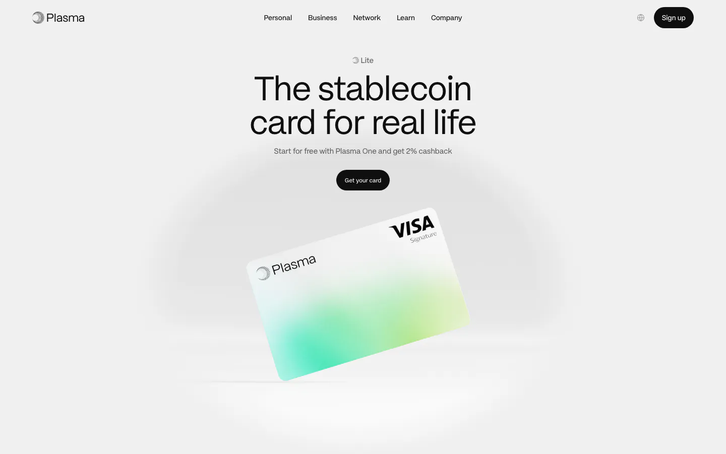
  15. Plasma hero section: nav, centered headline and black button above a tilted white-and-green Visa card render on light gray
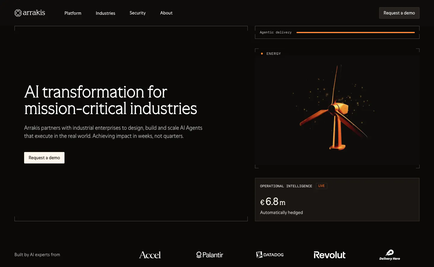
  16. Arrakis hero section: dark split layout with headline and demo button beside a 3D wind turbine render and data cards, logo row below
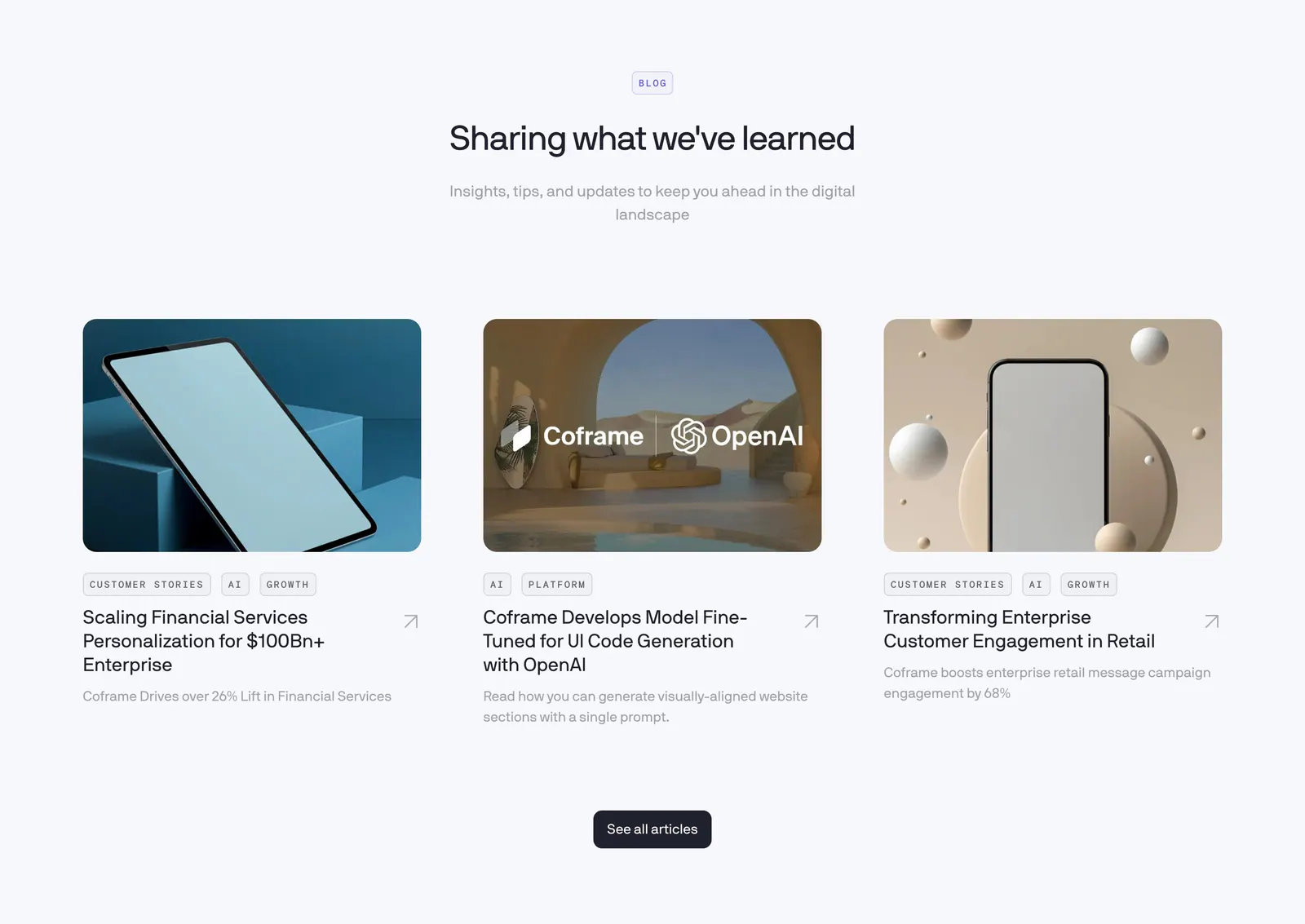
  17. Coframe blog & resources section: centered heading above three article cards with rendered device thumbnails and tags
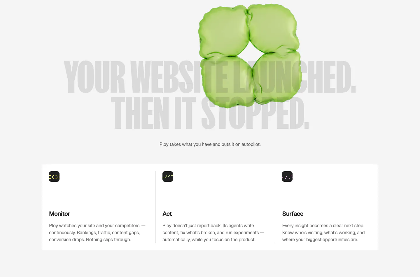
  18. Ploy features section: huge gray condensed headline behind a green 3D inflatable shape, above three columns for Monitor, Act and Surface
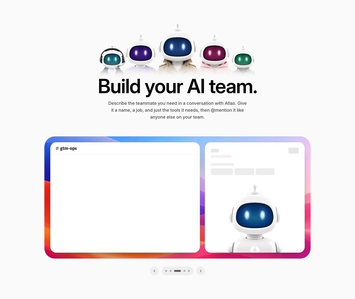
  19. WorkOS features section: row of 3D robot characters above a centered headline and a Slack mockup carousel
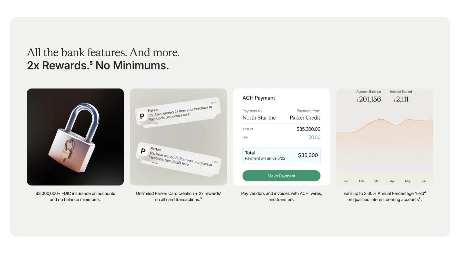
  20. Parker value proposition section: beige panel with headline above four cards showing a 3D padlock, notifications, payment UI and a yield chart
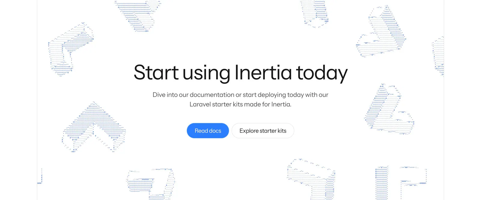
  21. Inertia.js call-to-action section: centered headline with blue and outline buttons amid scattered dotted isometric 3D shapes on white
    Inertia.js Call to action
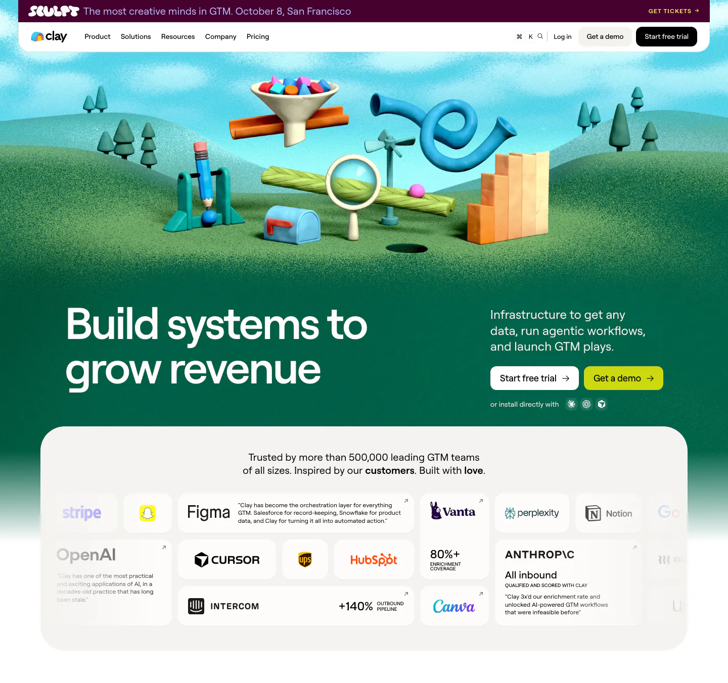
  22. Clay hero section: left headline on a green 3D clay landscape of GTM objects, above a rounded card grid of customer logos and quotes
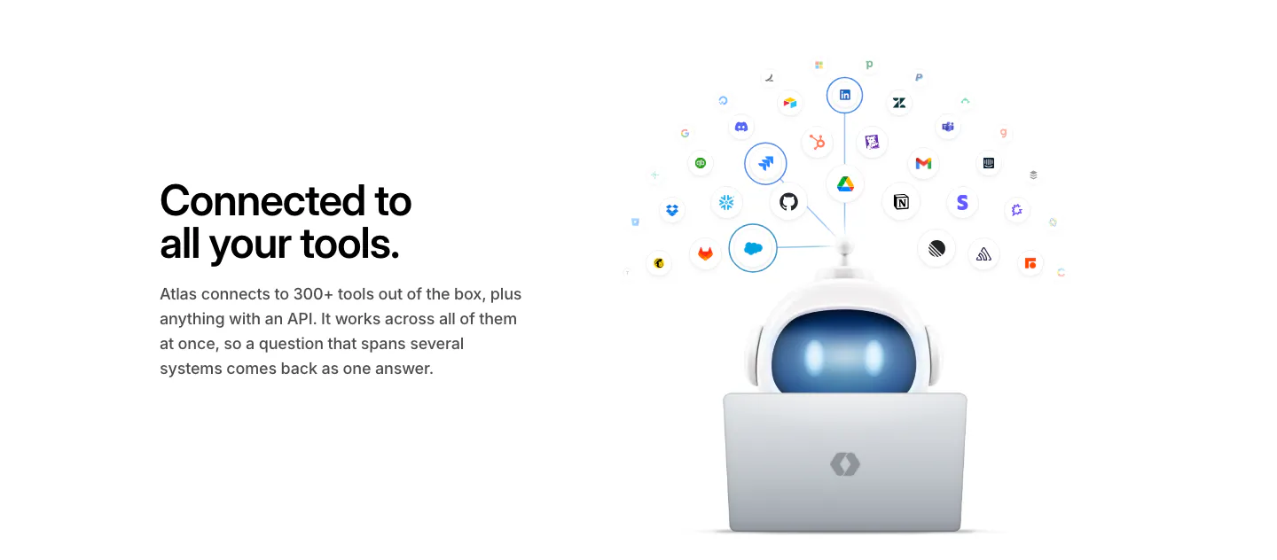
  23. WorkOS integrations section: headline on the left, 3D robot at a laptop under an arc of connected app icons on the right
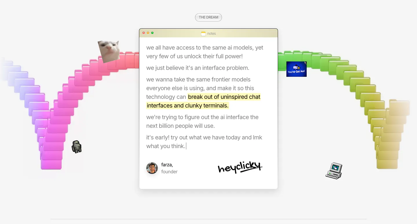
  24. heyclicky about & mission section: founder note in a mac notes window with signature, framed by a rainbow arc of 3D folders
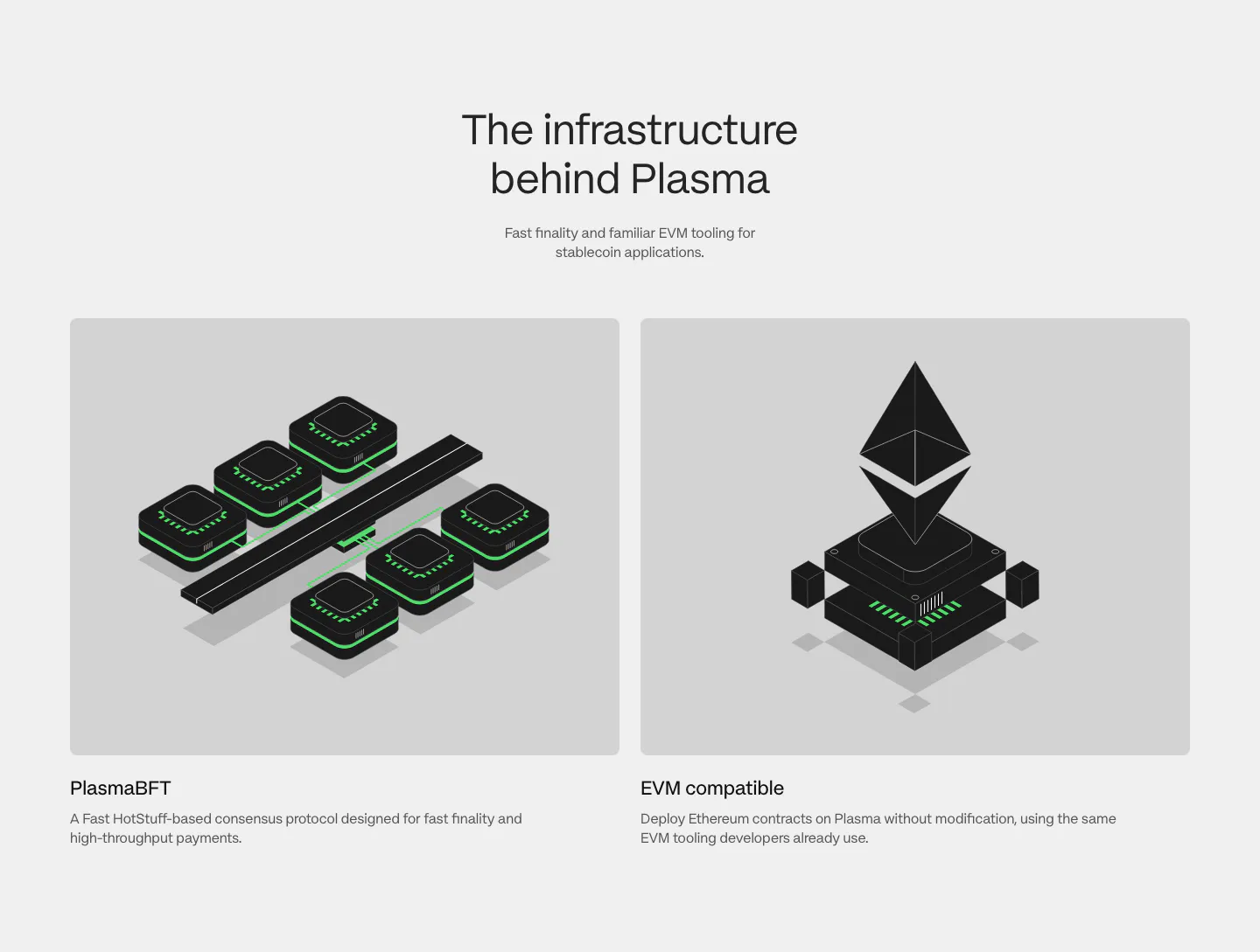
  25. Plasma features section: centered heading above two gray cards with black and green isometric renders of consensus and EVM
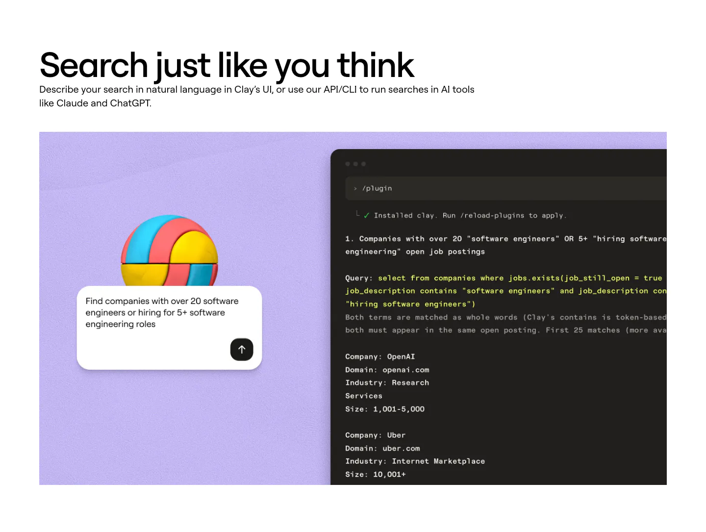
  26. Clay features section: left-aligned heading above a lavender panel with a 3D ball, a search prompt card and a dark terminal showing a query
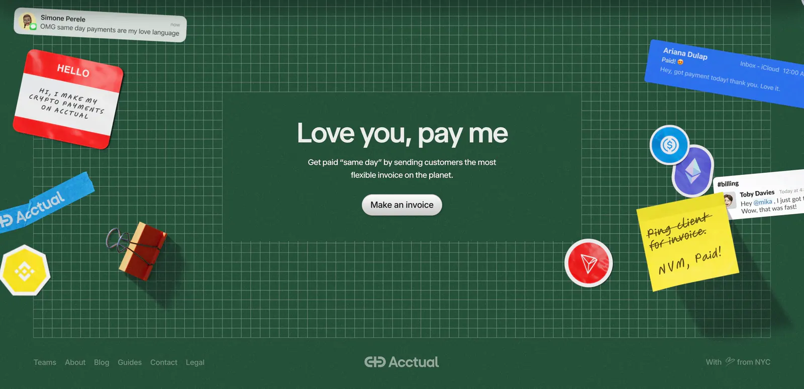
  27. Acctual footer section: centered closing headline on a dark green grid with 3D stickers and notes, plus a link row and wordmark
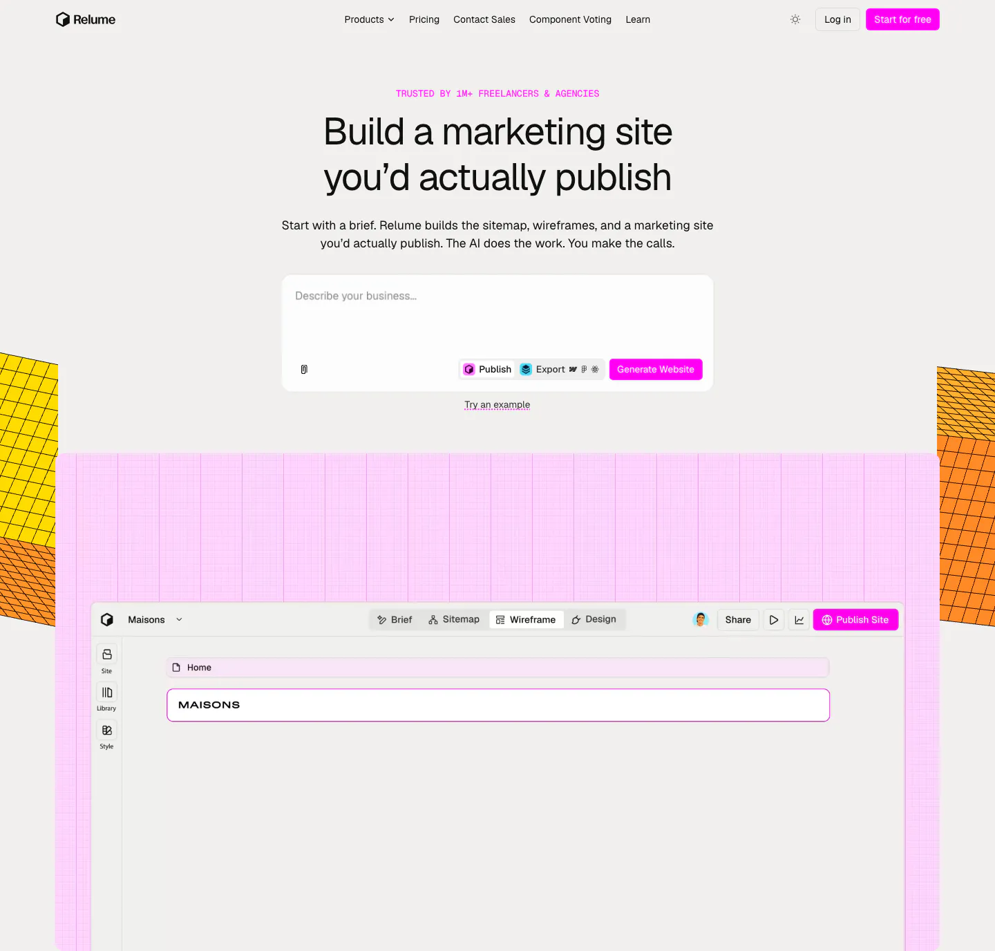
  28. Relume hero section: centered headline and AI prompt box above a wireframe editor screenshot on a pink grid, flanked by yellow isometric blocks
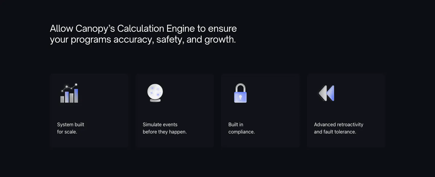
  29. Canopy features section: dark headline above four dark cards with 3D icons and short labels
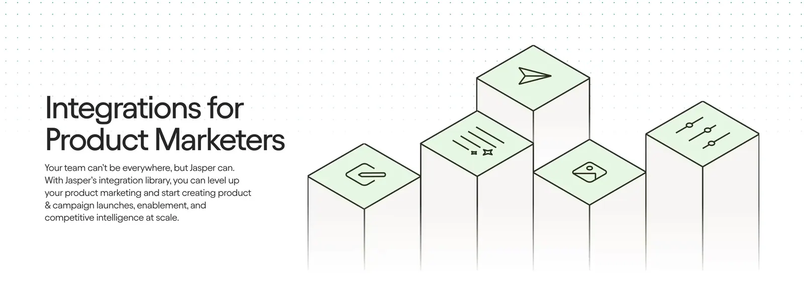
  30. Jasper integrations section: headline and copy on the left beside isometric pillars topped with green icon tiles on a light background
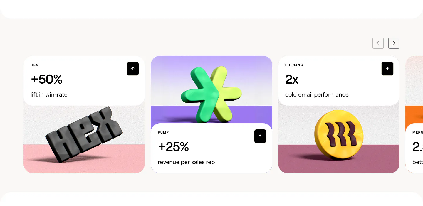
  31. Clay stats section: slider of customer result cards with large percentages above 3D rendered brand logos on colored stages
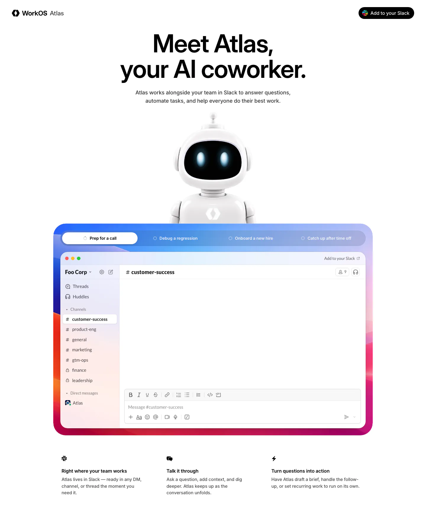
  32. WorkOS hero section: centered headline above a 3D robot mascot and a tabbed Slack app mockup in a colorful gradient frame
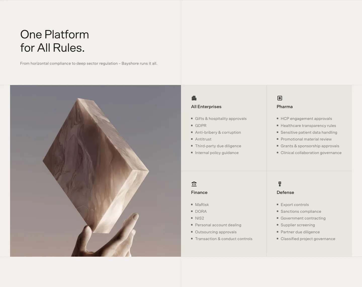
  33. Bayshore use cases section: headline above a 3D marble block held by a hand beside a 2x2 grid of industry cards with bullet lists
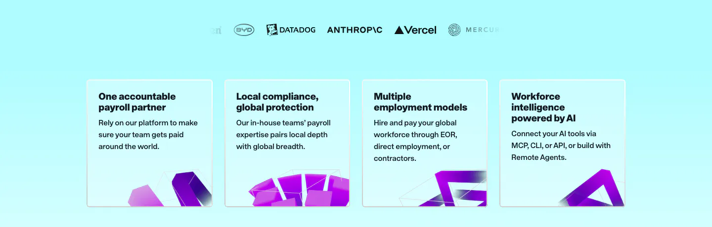
  34. Remote value proposition section: faded logo row above four light cyan benefit cards with purple 3D shapes at the bottom
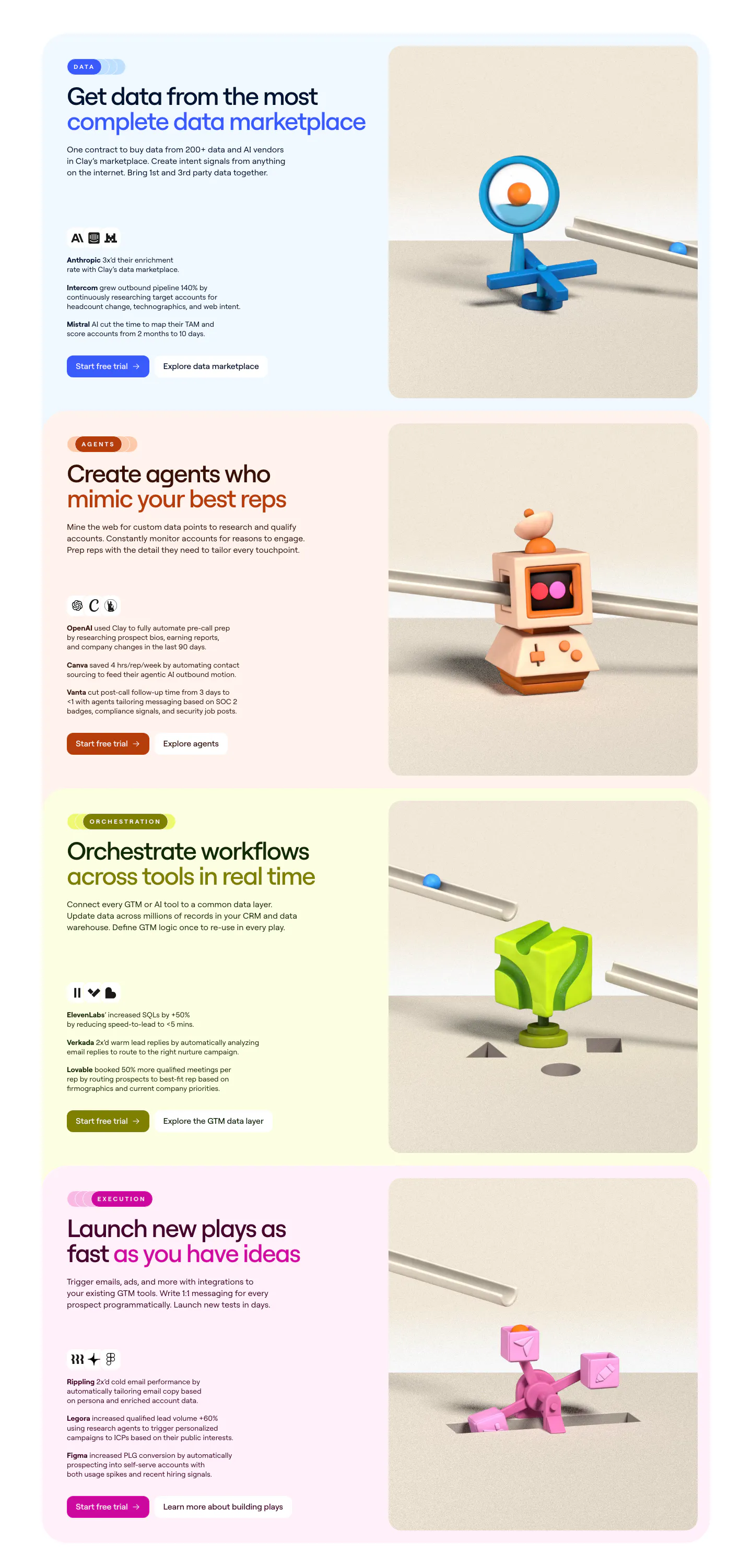
  35. Clay features section: stacked pastel cards, each with headline, customer results and buttons left and a 3D clay object render right
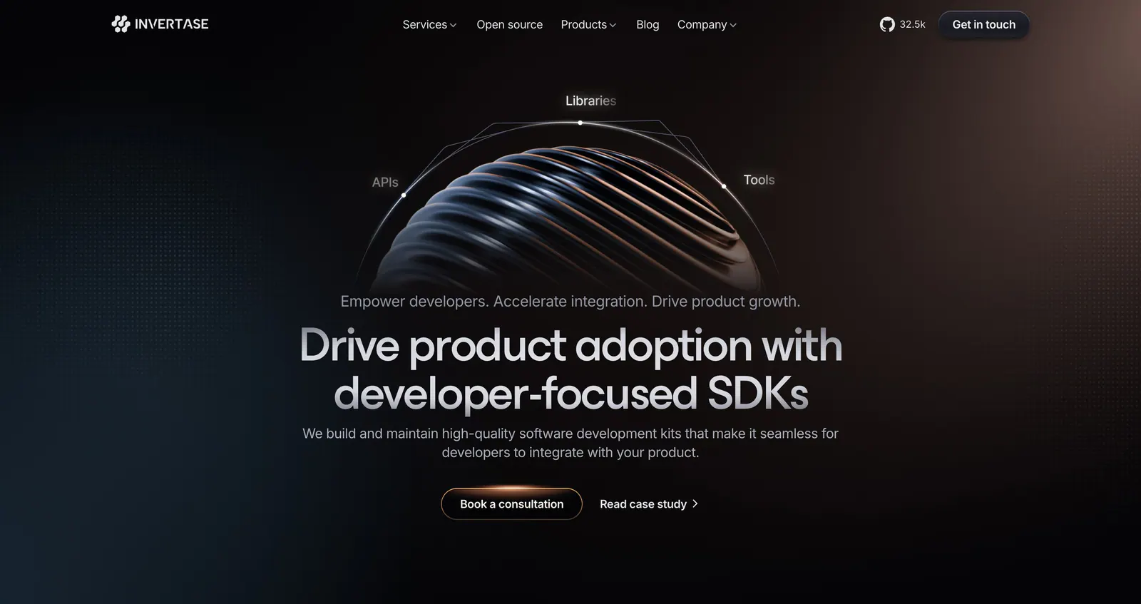
  36. Invertase hero section: centered headline below a ribbed 3D sphere with orbit labels on a dark background with a warm glow
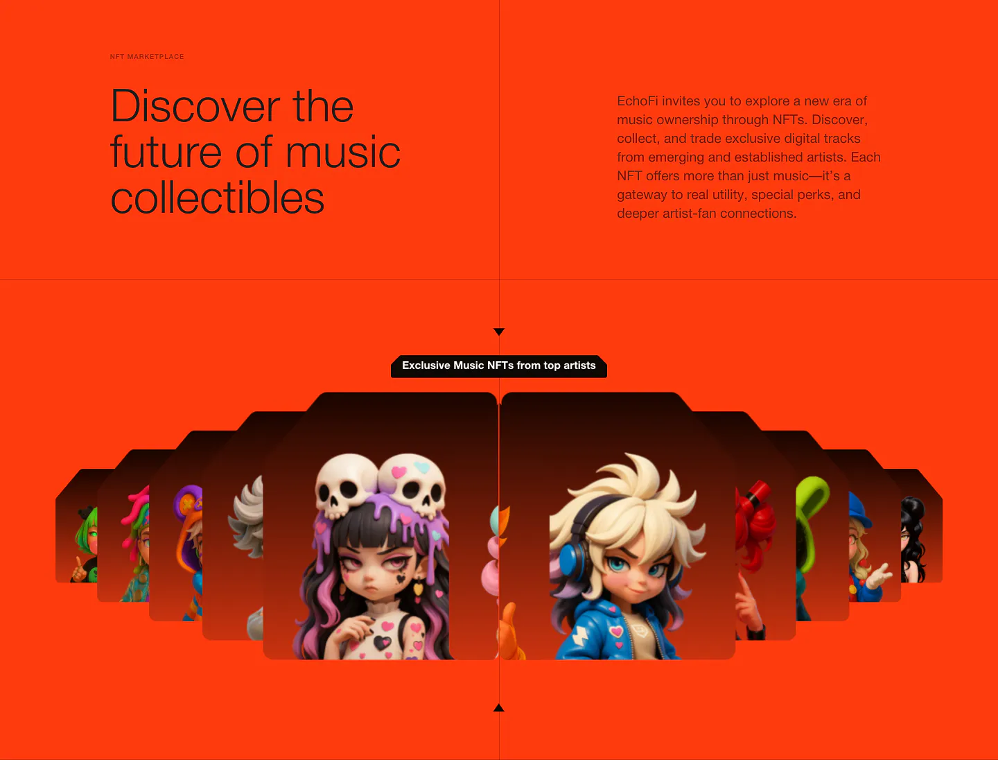
  37. EchoFi features section: headline and copy split over orange, above a fanned carousel of 3D character NFT cards
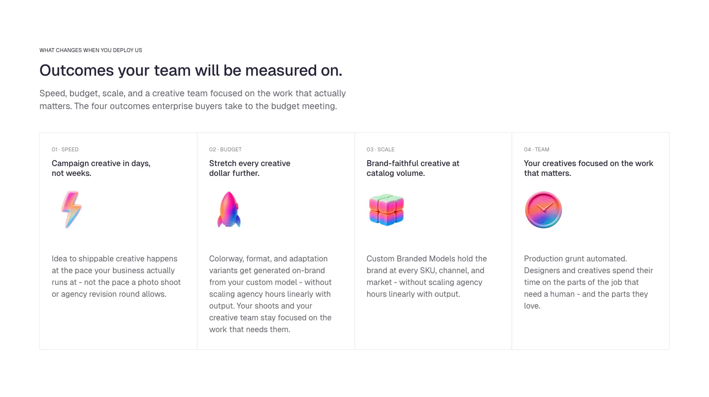
  38. Ideogram value proposition section: eyebrow, headline and intro above four bordered outcome cards with numbered labels and glossy 3D icons
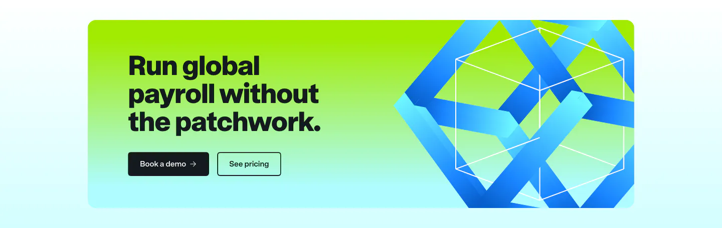
  39. Remote call to action section: dark headline and two buttons on a lime-to-cyan gradient card with a blue 3D ribbon cube
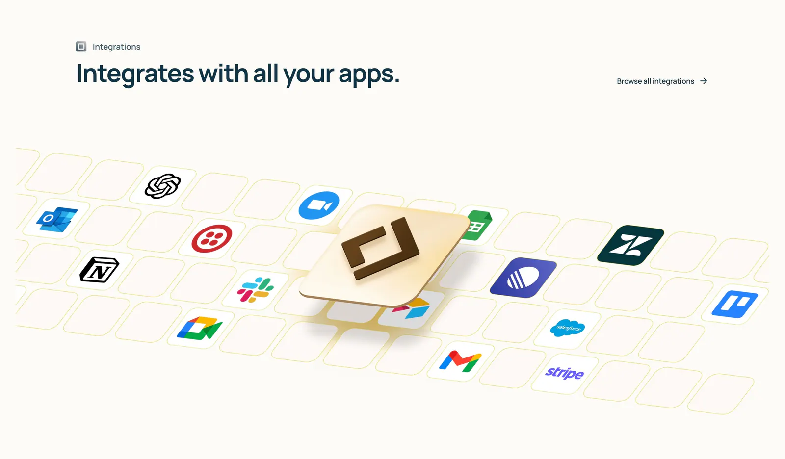
  40. Lindy integrations section: left-aligned heading above an isometric tile grid of app icons with a raised 3D Lindy logo tile on cream
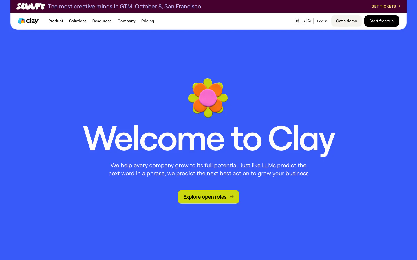
  41. Clay hero section: centered oversized headline under a 3D clay flower with lime careers button on a solid bright blue background
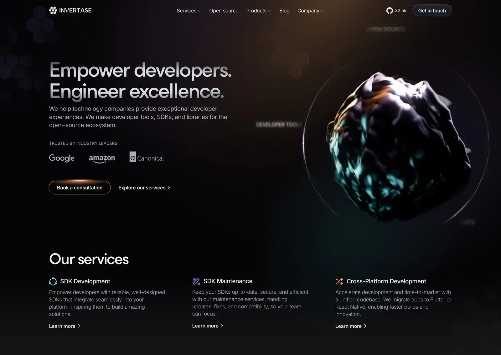
  42. Invertase hero section: left headline with logo strip and buttons beside a dark 3D rock render in a glowing ring, services row below
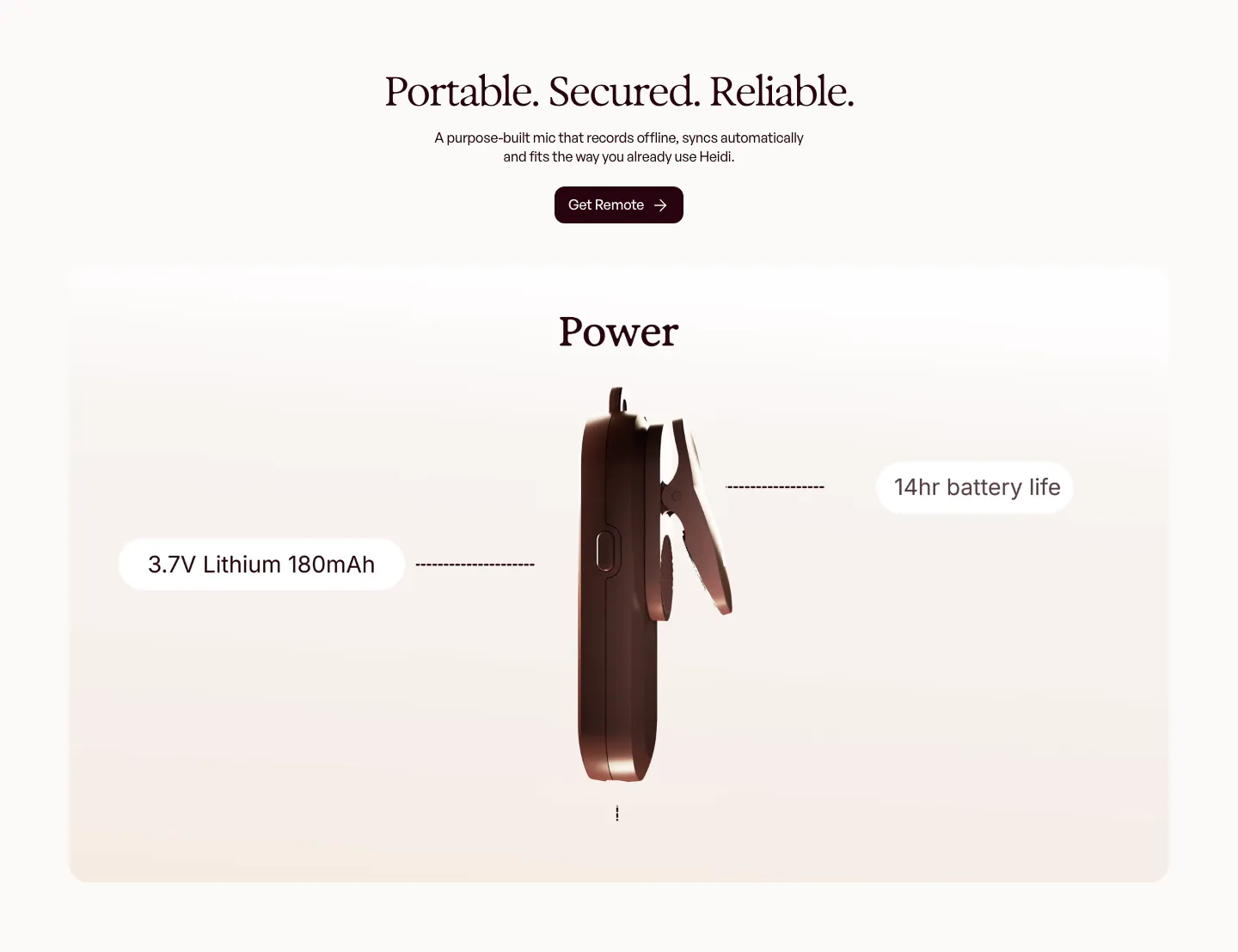
  43. Heidi features section: centered serif headline above a rendered side view of the clip-on mic with battery spec callouts
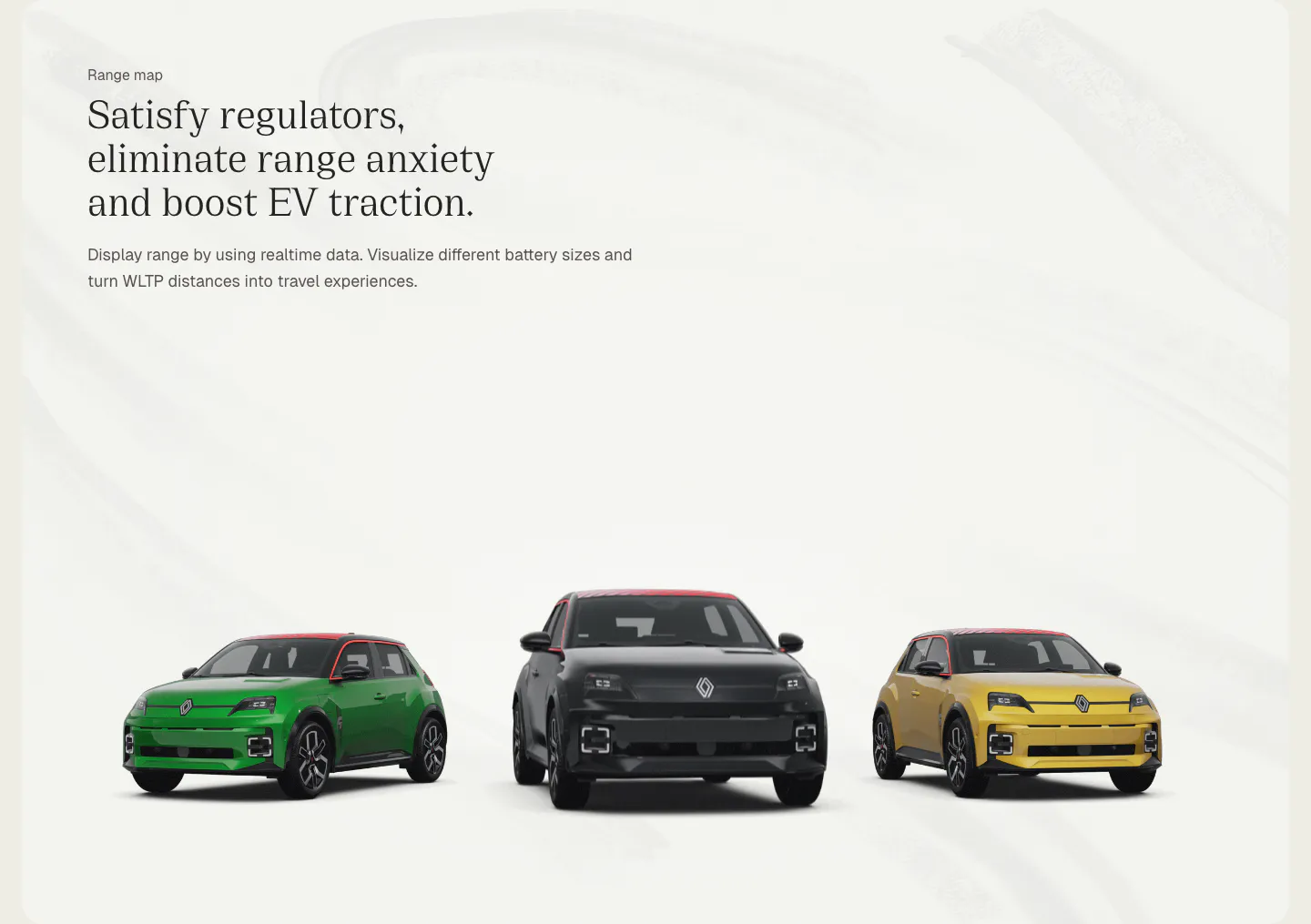
  44. Chargetrip features section: left-aligned serif headline above three Renault 5 electric cars in green, black and yellow on a light gray backdrop
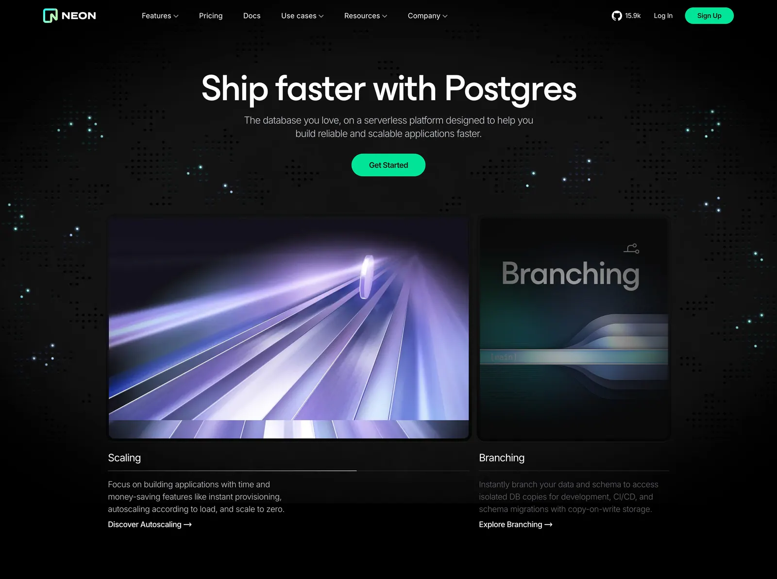
  45. Neon hero section: centered headline and green CTA above two rendered feature cards for Scaling and Branching on a dark dot-grid background
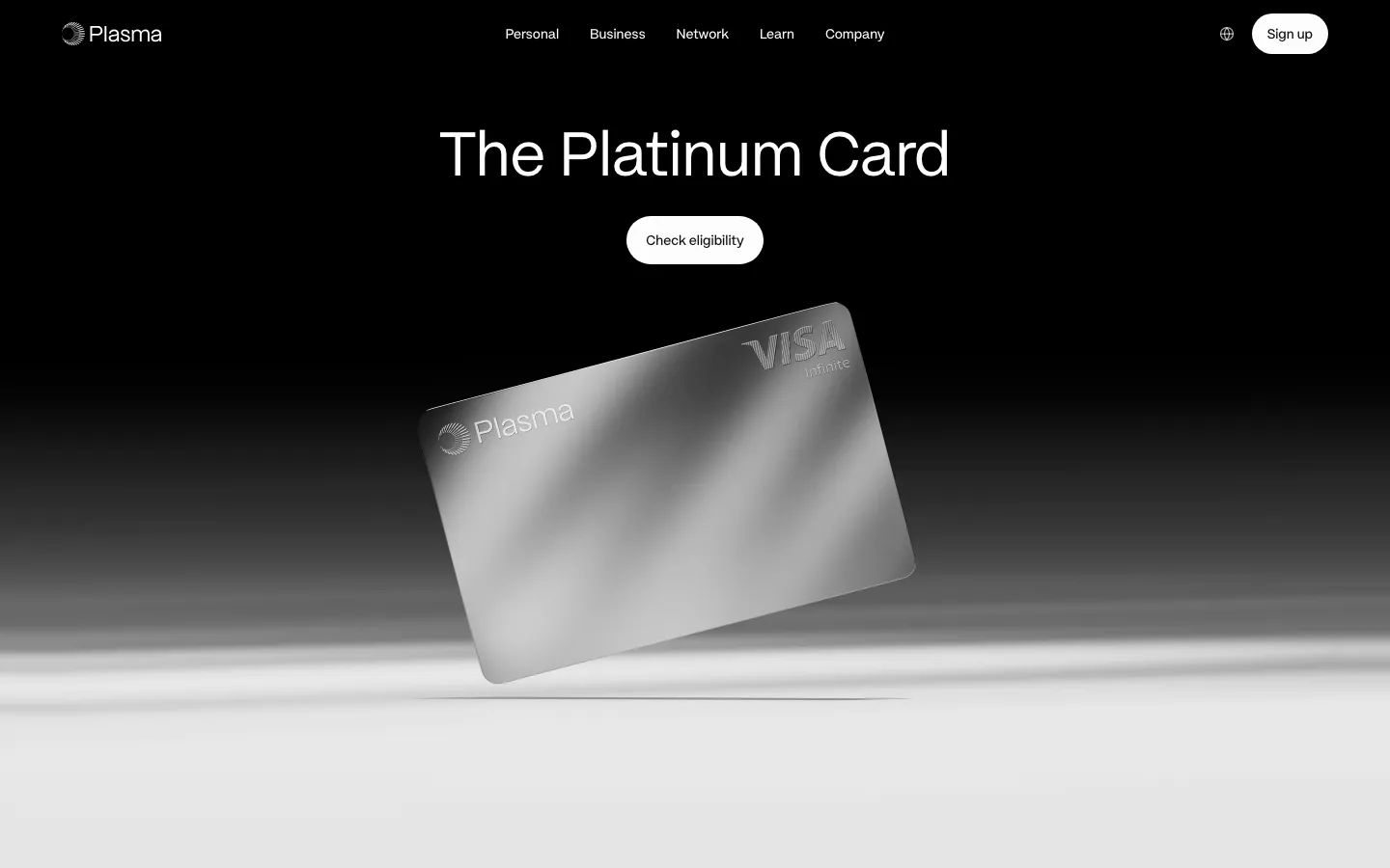
  46. Plasma hero section: nav and centered headline with Check eligibility button above a tilted silver card render on black-to-white
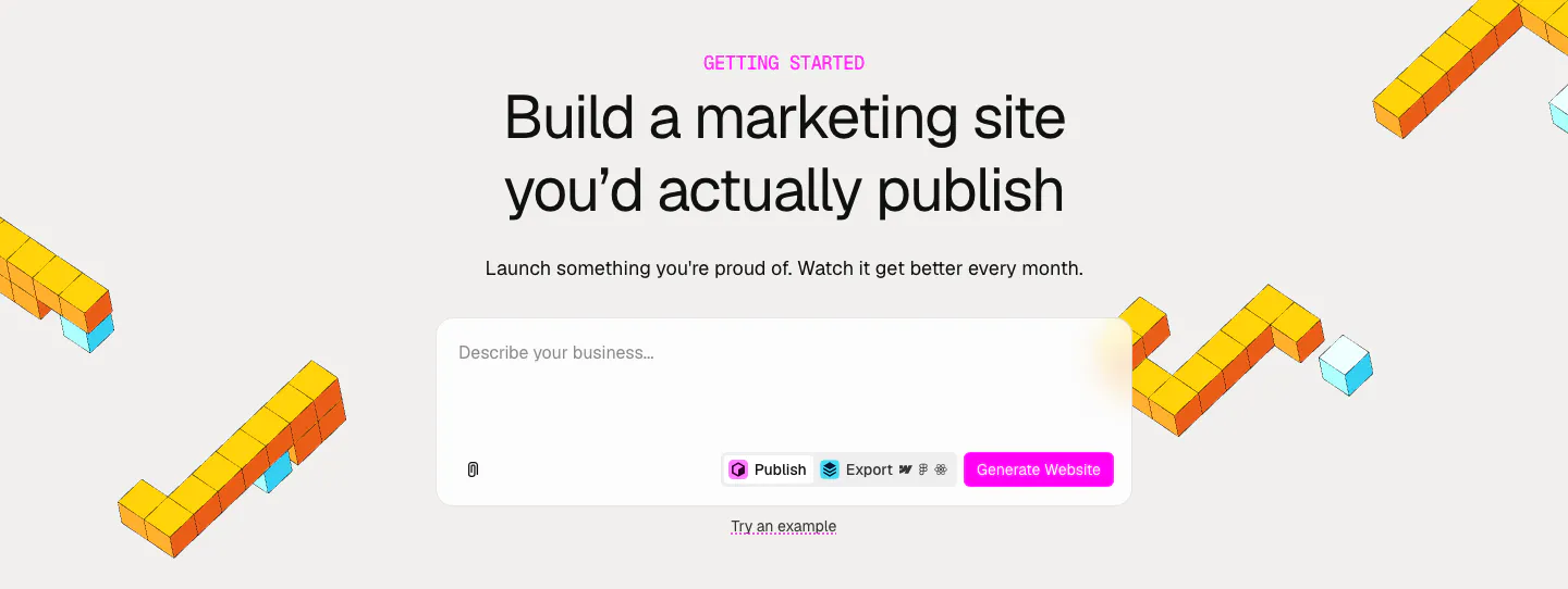
  47. Relume call-to-action section: centered headline and AI prompt box with a pink Generate Website button, framed by yellow isometric voxel shapes
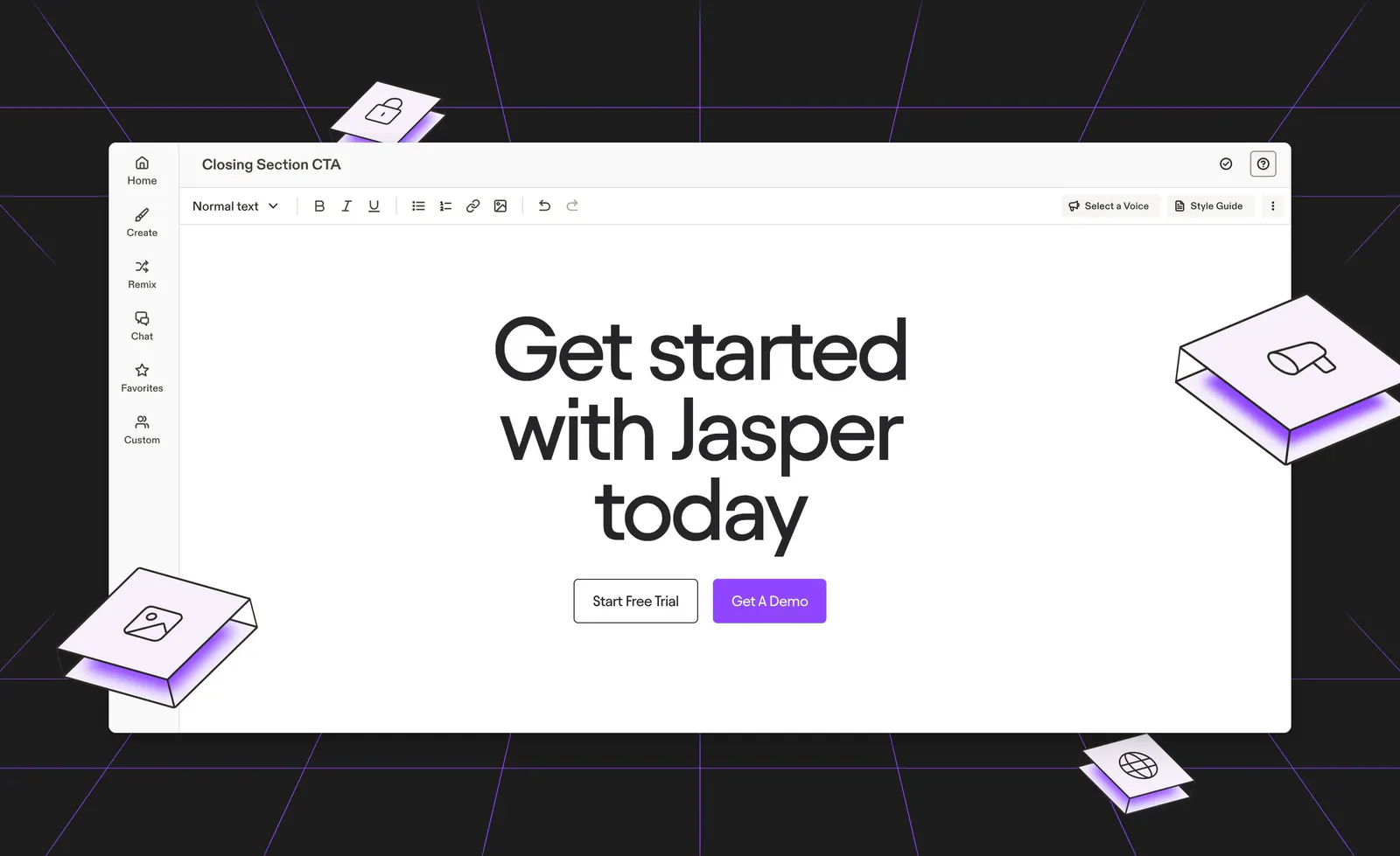
  48. Jasper call-to-action section: centered headline and buttons inside an editor mockup on a dark background with purple lines and isometric tiles
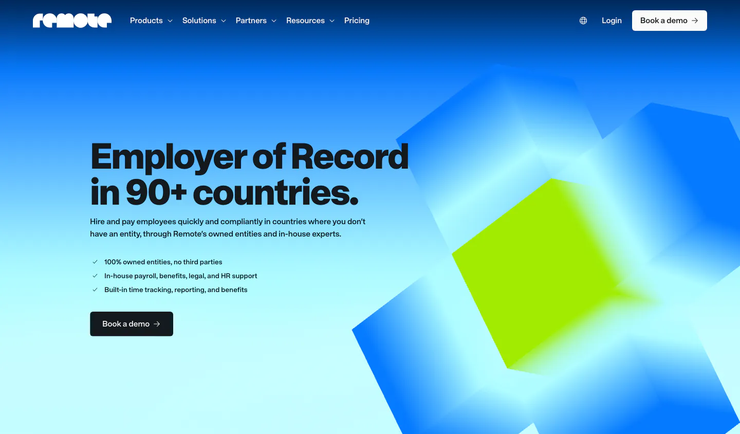
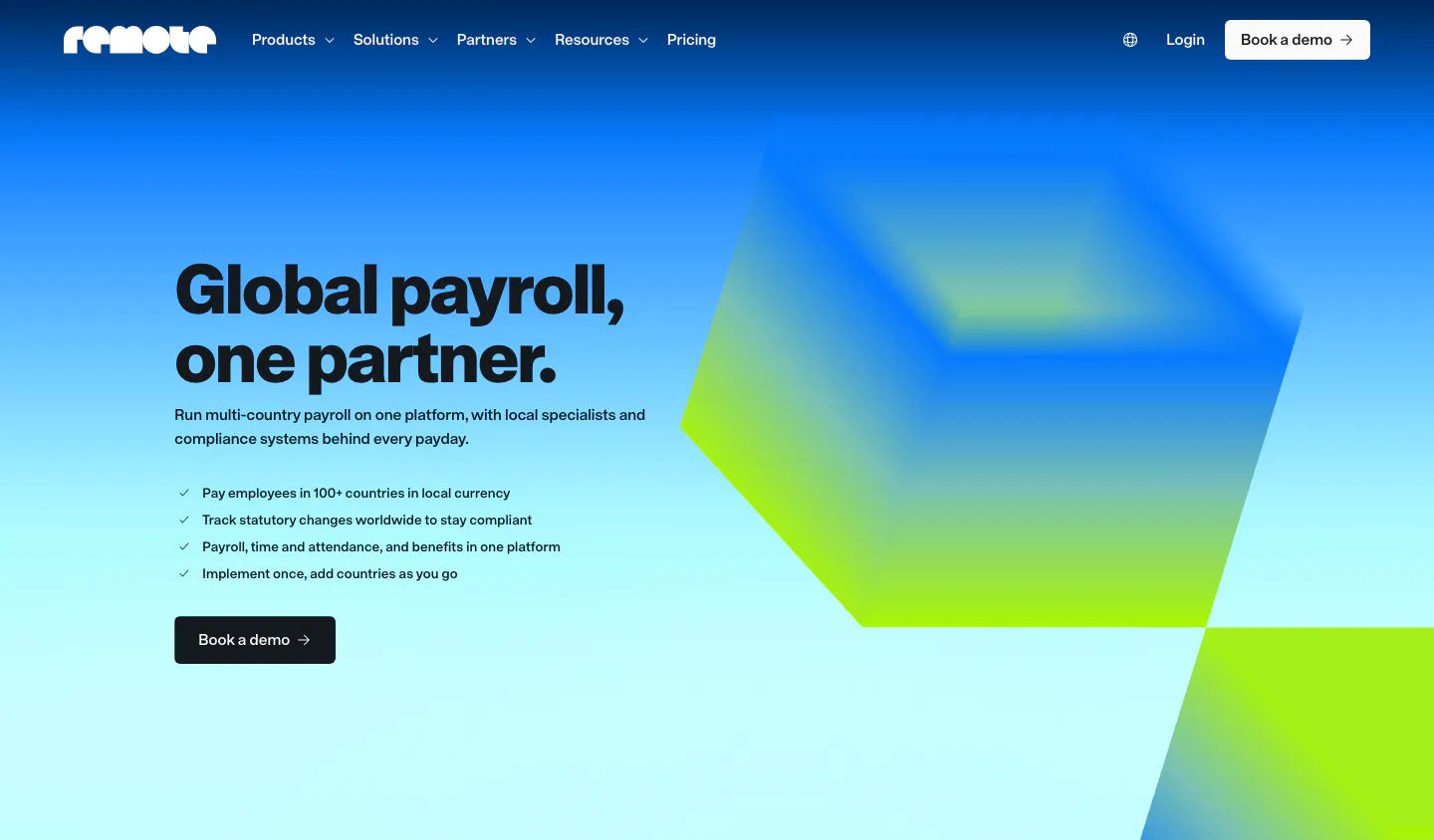
  49. Remote hero section: nav, left headline with checklist and demo button beside blurred blue and lime 3D cubes on gradient
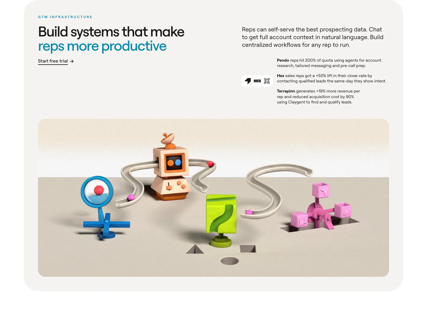
  50. Clay value proposition section: headline and customer outcomes above a wide 3D render of connected clay GTM objects in a rounded card
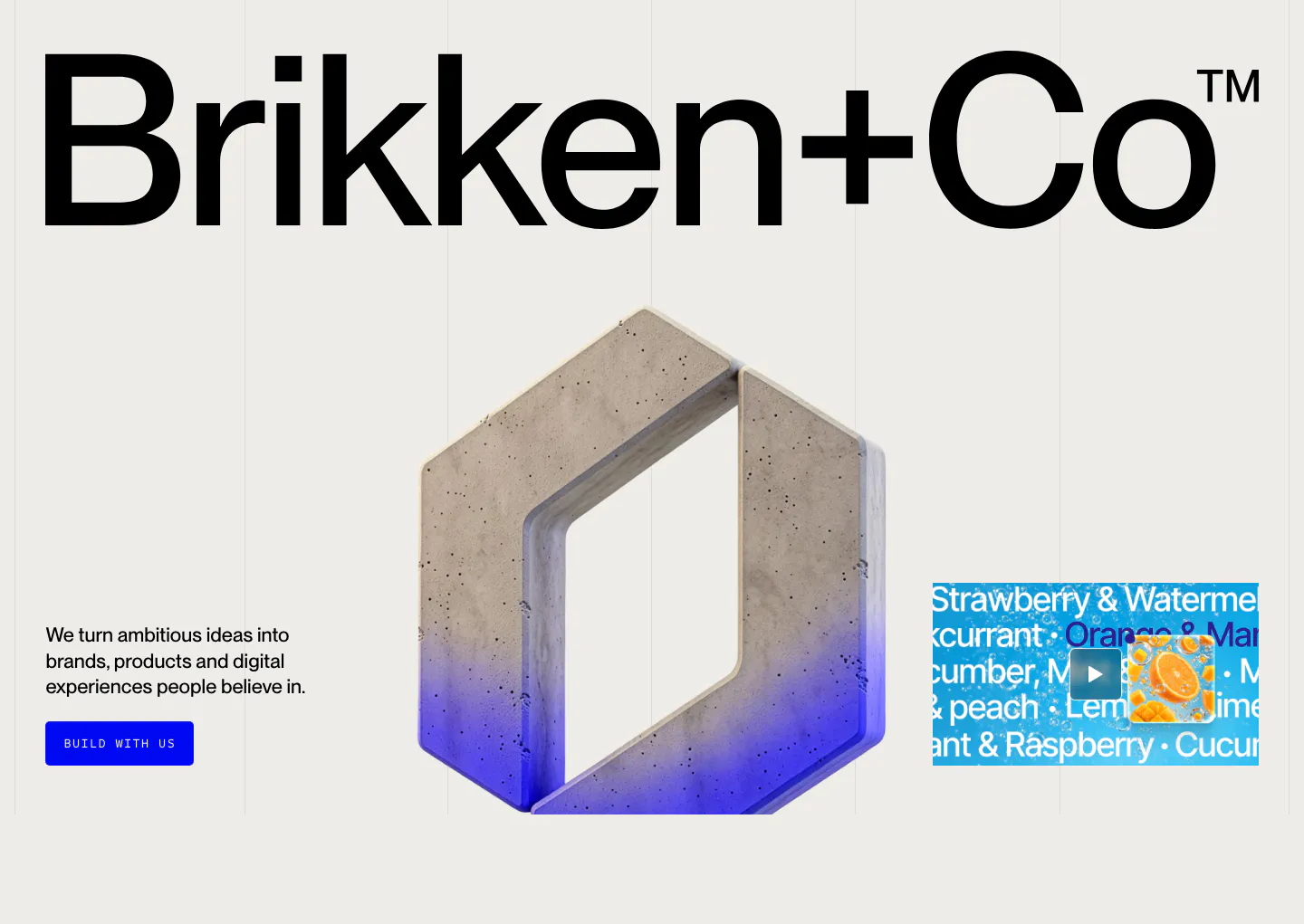
  51. Brikken+Co hero section: giant wordmark above a 3D concrete hexagon logo, short copy with blue button and video thumbnail
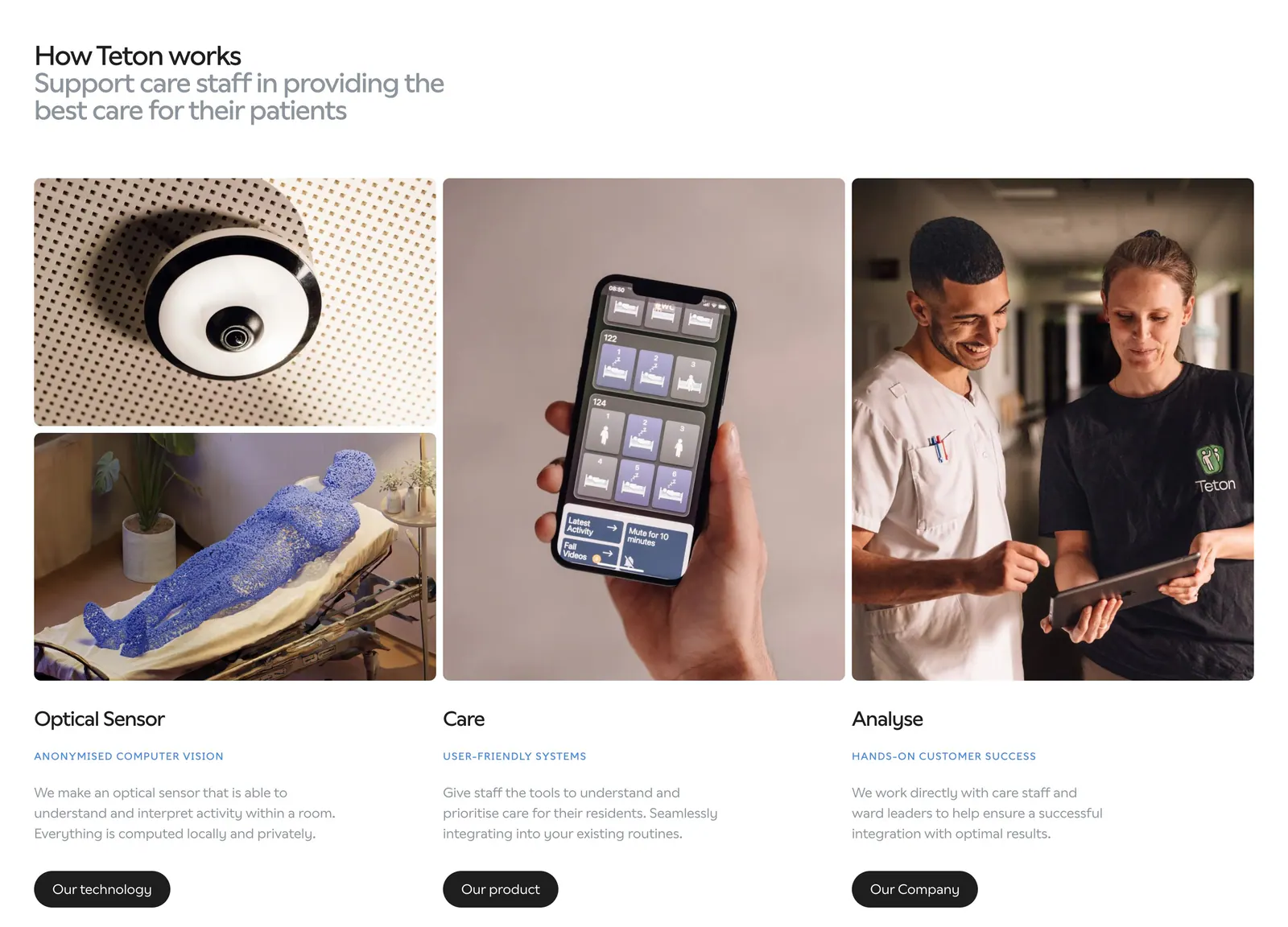
  52. Teton how it works section: headline above three columns of photos (sensor, phone app, care staff) with titles, descriptions and buttons
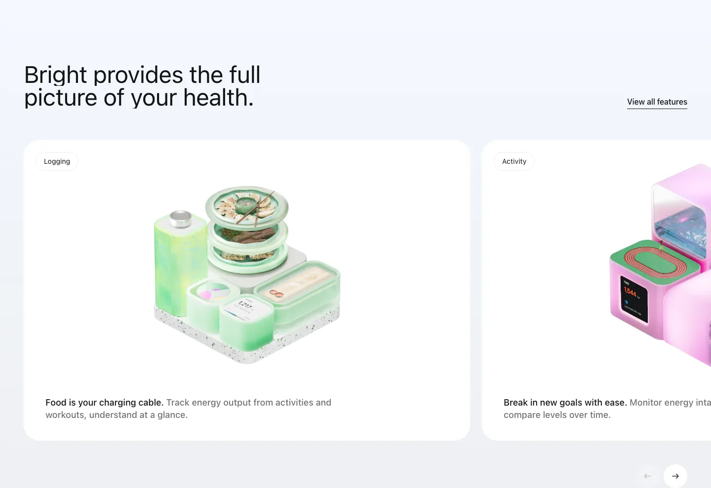
  53. Bright features section: headline with View all link above a carousel of white cards with 3D renders for logging and activity
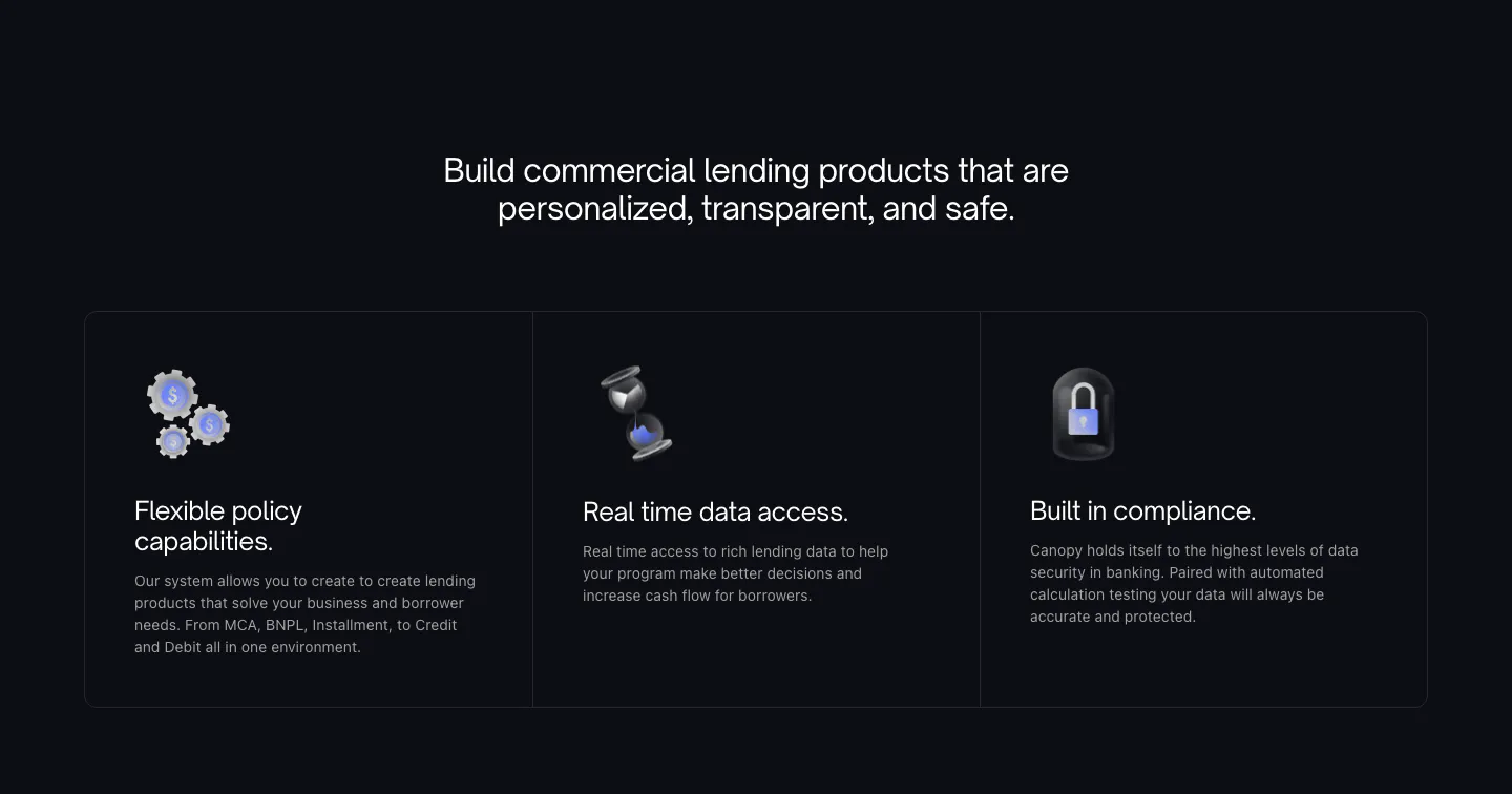
  54. Canopy features section: centered heading above three dark bordered cards with 3D icons on a near-black background
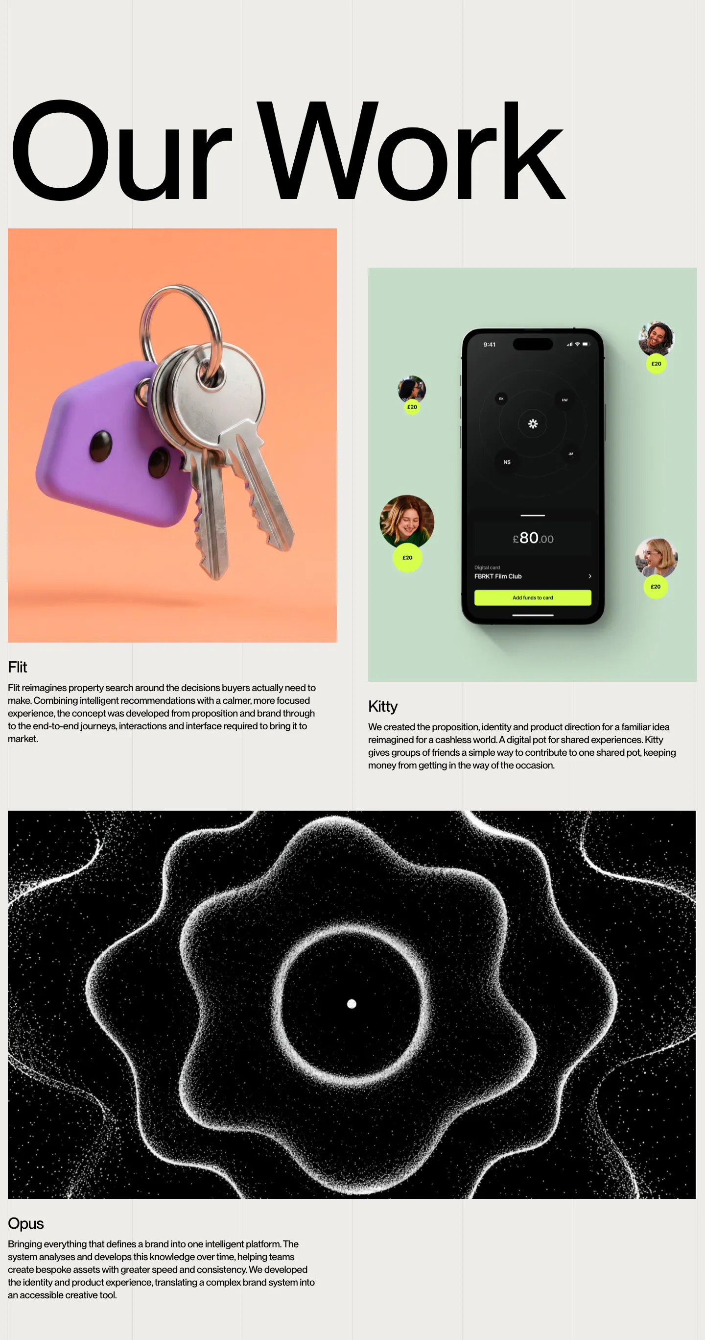
  55. Brikken+Co other section: oversized Our Work heading above project cards with 3D keys, a phone app and particle artwork
    Brikken+Co Other
  56. Remote call to action section: white headline and two buttons on a purple card with abstract 3D ribbon shapes on the right
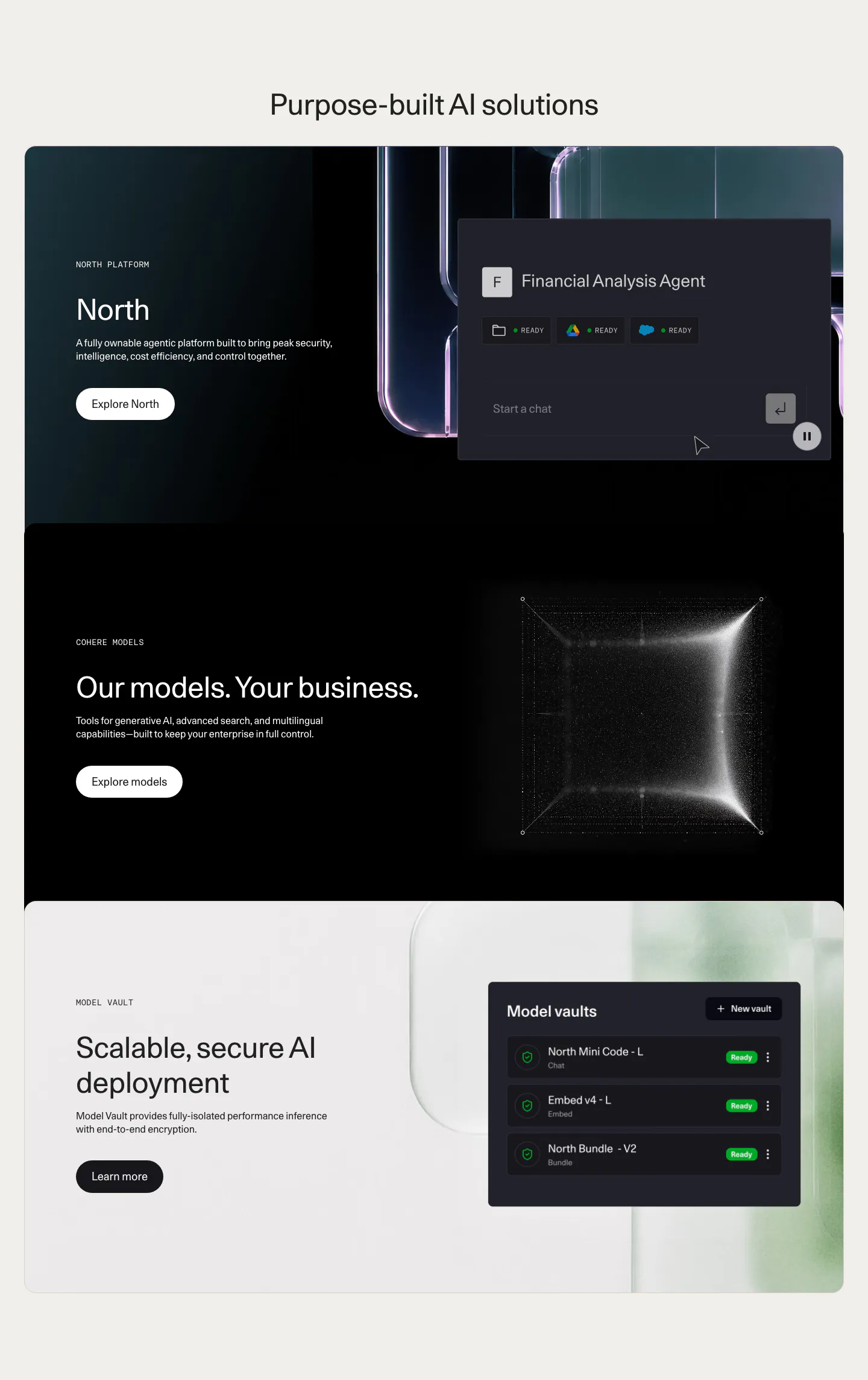
  57. Cohere features section: centered headline above three stacked cards with text left and agent UI, particle cube and vault UI right
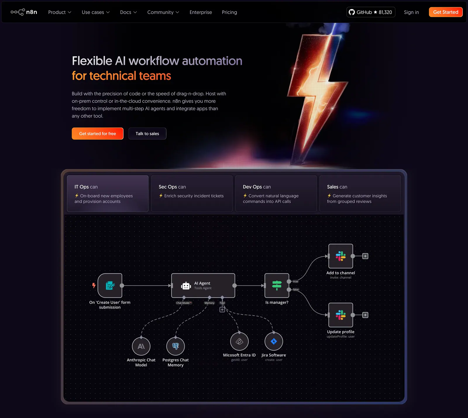
  58. n8n hero section: dark hero with headline and CTAs beside a 3D lightning bolt, above a tabbed AI agent workflow canvas
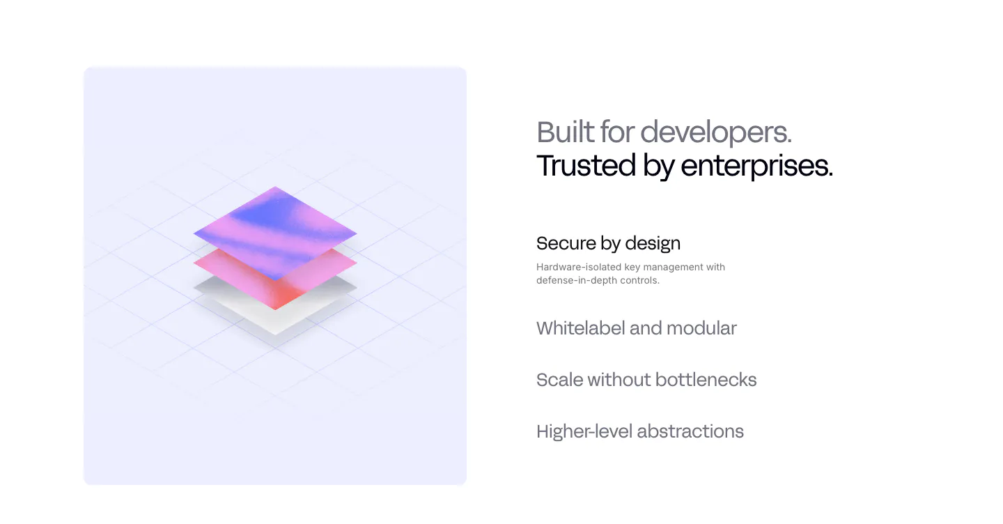
  59. Privy value proposition section: isometric 3D layered render on a lavender panel beside a headline and a list of selectable benefit items
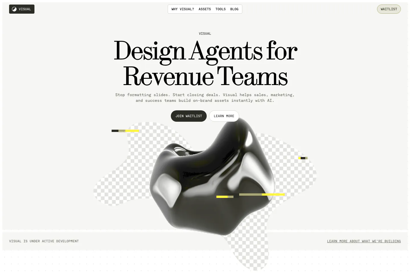
  60. Visual hero section: nav bar and centered serif headline with two buttons above a glossy black 3D blob on checkerboard shapes
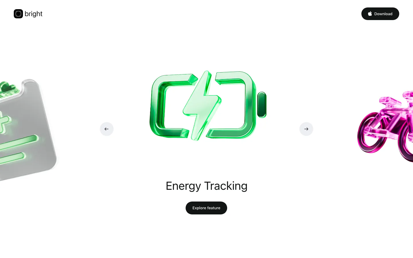
  61. Bright hero section: logo nav above a carousel of glossy 3D icons with a green battery centered, Energy Tracking label and button
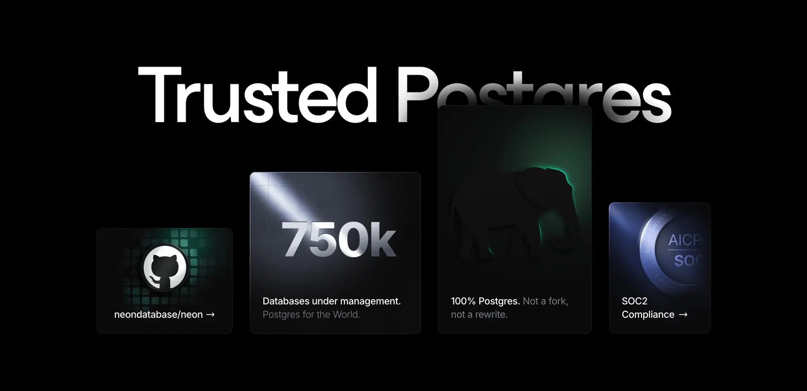
  62. Neon value proposition section: huge Trusted Postgres headline behind staggered dark cards for GitHub, 750k databases, Postgres and SOC2
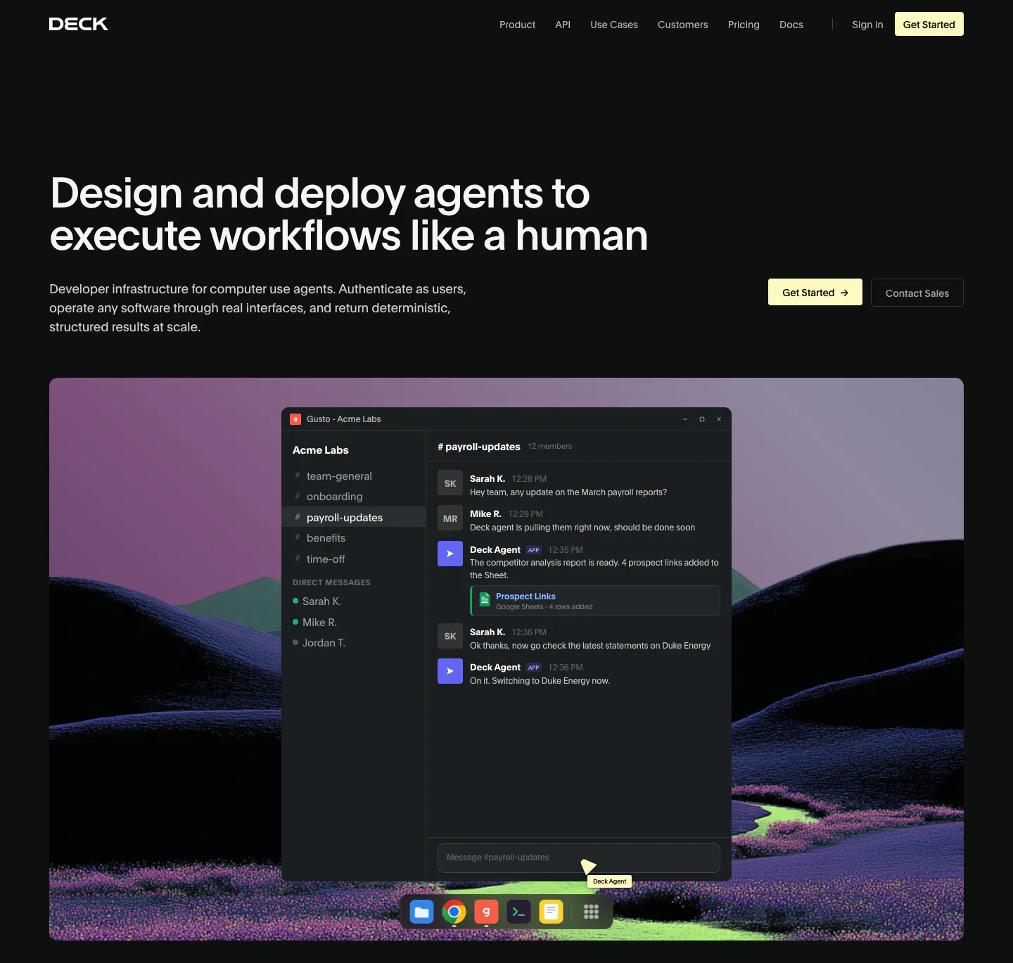
  63. Deck hero section: dark page with headline left and buttons right above a chat app window over a rendered purple hill landscape
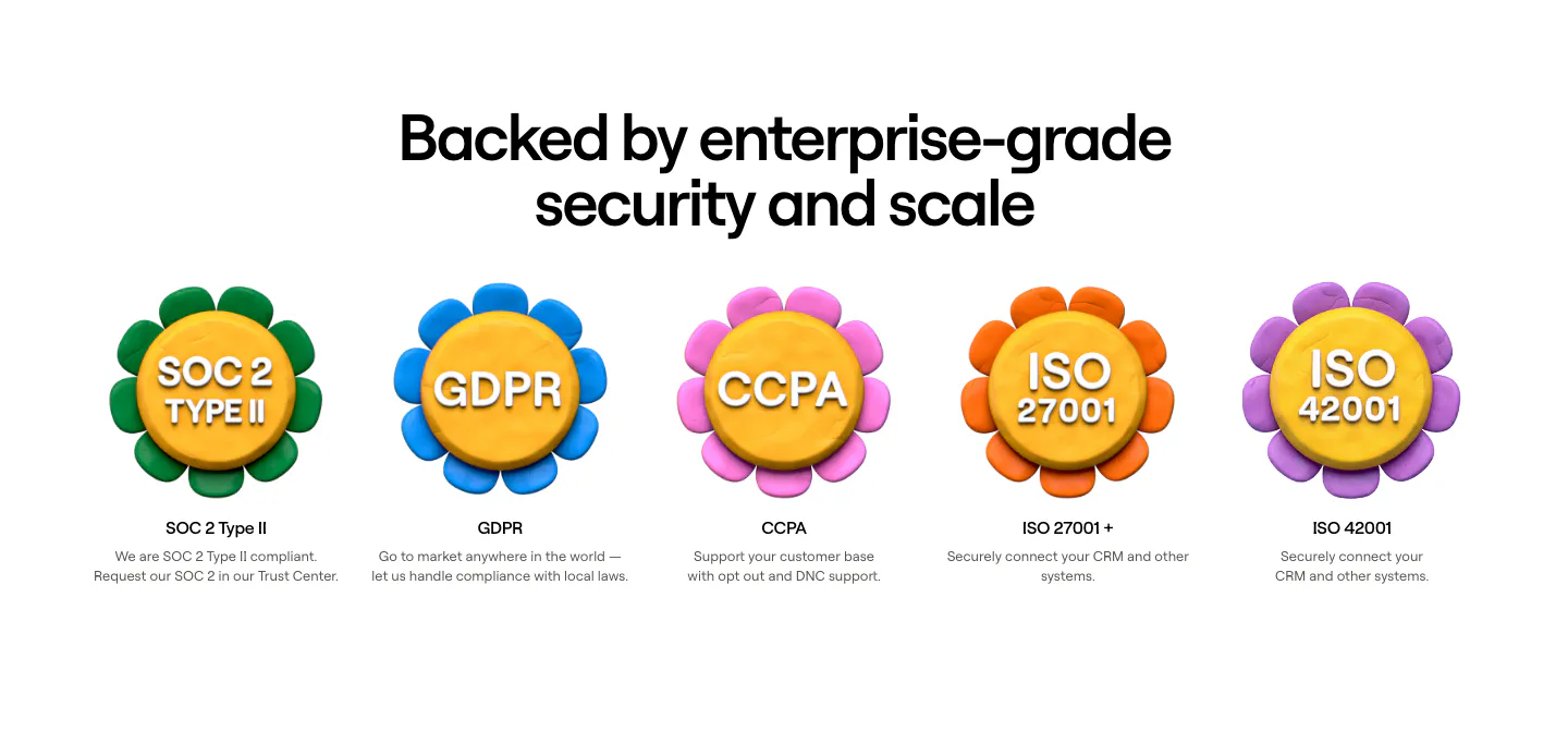
  64. Clay security section: centered heading above a row of five 3D clay flower badges for SOC 2, GDPR, CCPA and ISO certifications
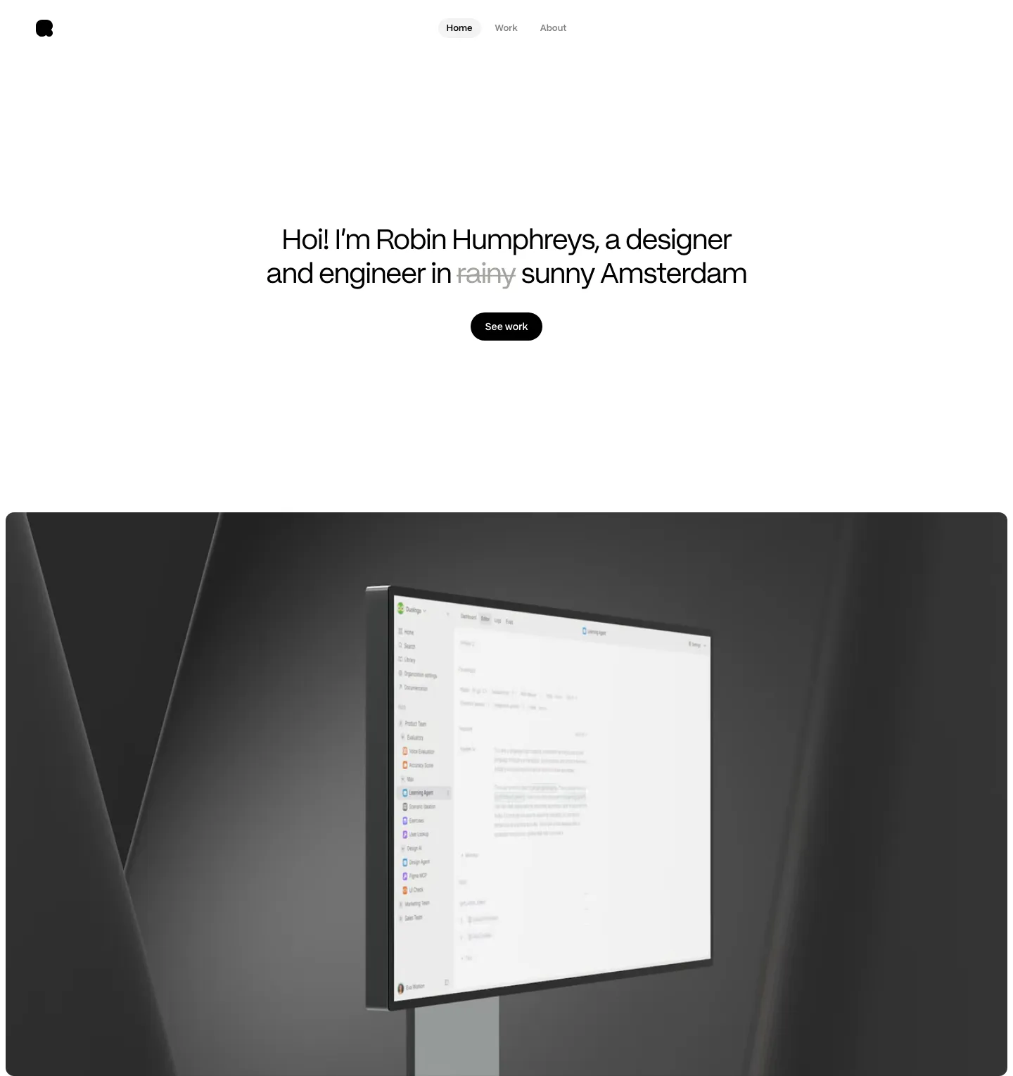
  65. Robin Humphreys hero section: centered greeting headline with a See work button above a dark 3D render of a monitor showing an app interface
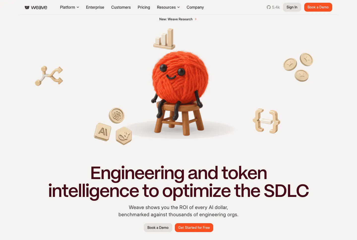
  66. Weave hero section: 3D yarn ball character and floating icons above a centered headline and two buttons on a warm light background
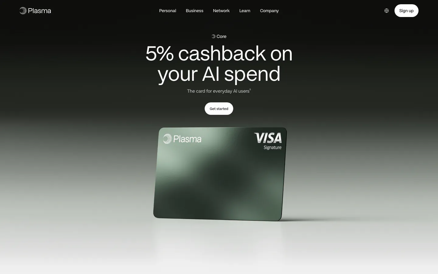
  67. Plasma hero section: centered headline and Get started button above a green Plasma Visa card render on a black-to-gray fade
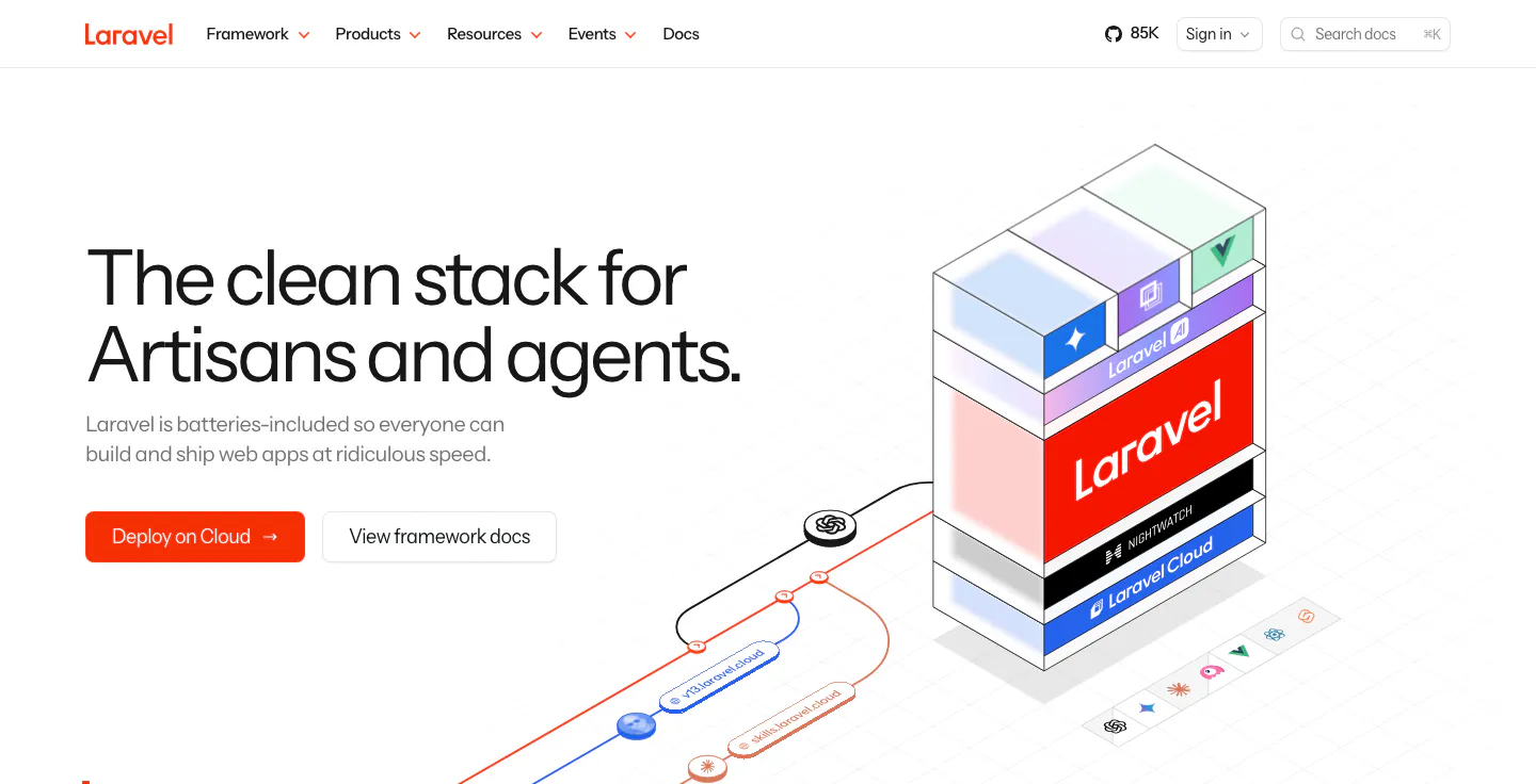
  68. Laravel hero section: left headline with an orange Deploy on Cloud button beside an isometric stack of Laravel, Nightwatch and Cloud layers
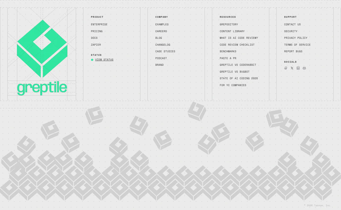
  69. Greptile footer section: large green logo beside four link columns, above a pile of gray isometric logo blocks on light gray
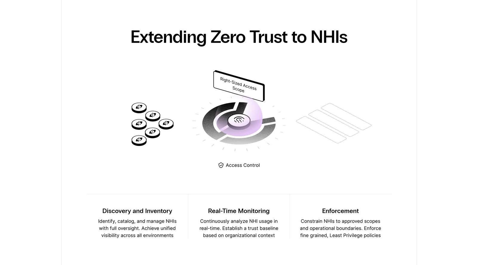
  70. Clutch Security features section: centered headline above a grayscale isometric access-control illustration and three capability columns
    Clutch Security Features
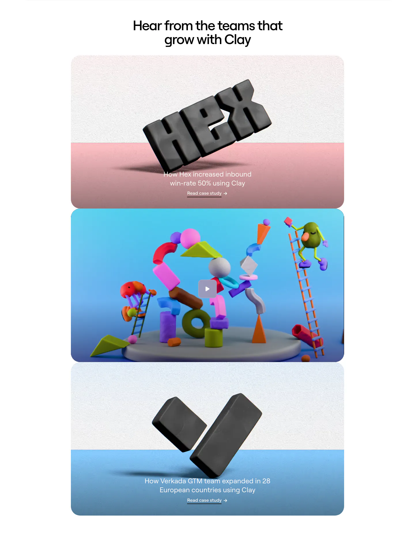
  71. Clay testimonials section: centered headline above three stacked case-study cards with 3D clay renders, one with a play button
  72. Flank call-to-action section: left-aligned headline and demo button on a lavender panel with rendered orange flowers on the right
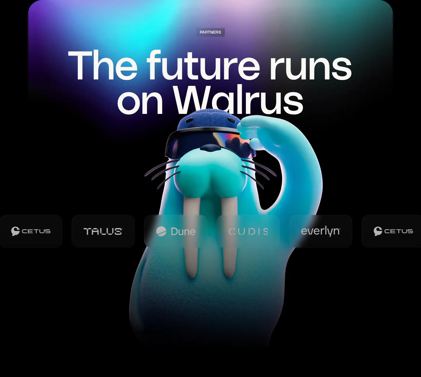
  73. Walrus logo cloud section: huge headline over aurora glow with a 3D walrus mascot behind a row of partner logos
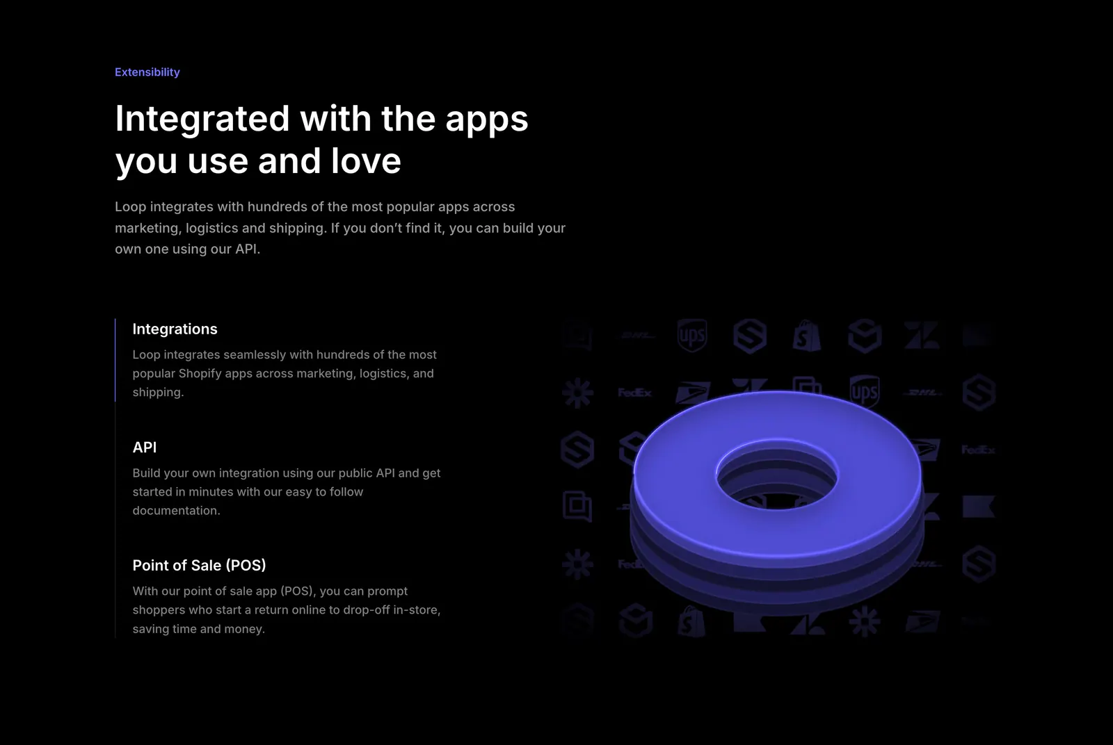
  74. Loop features section: dark split layout with integration, API and POS list beside a 3D purple ring over a grid of app logos
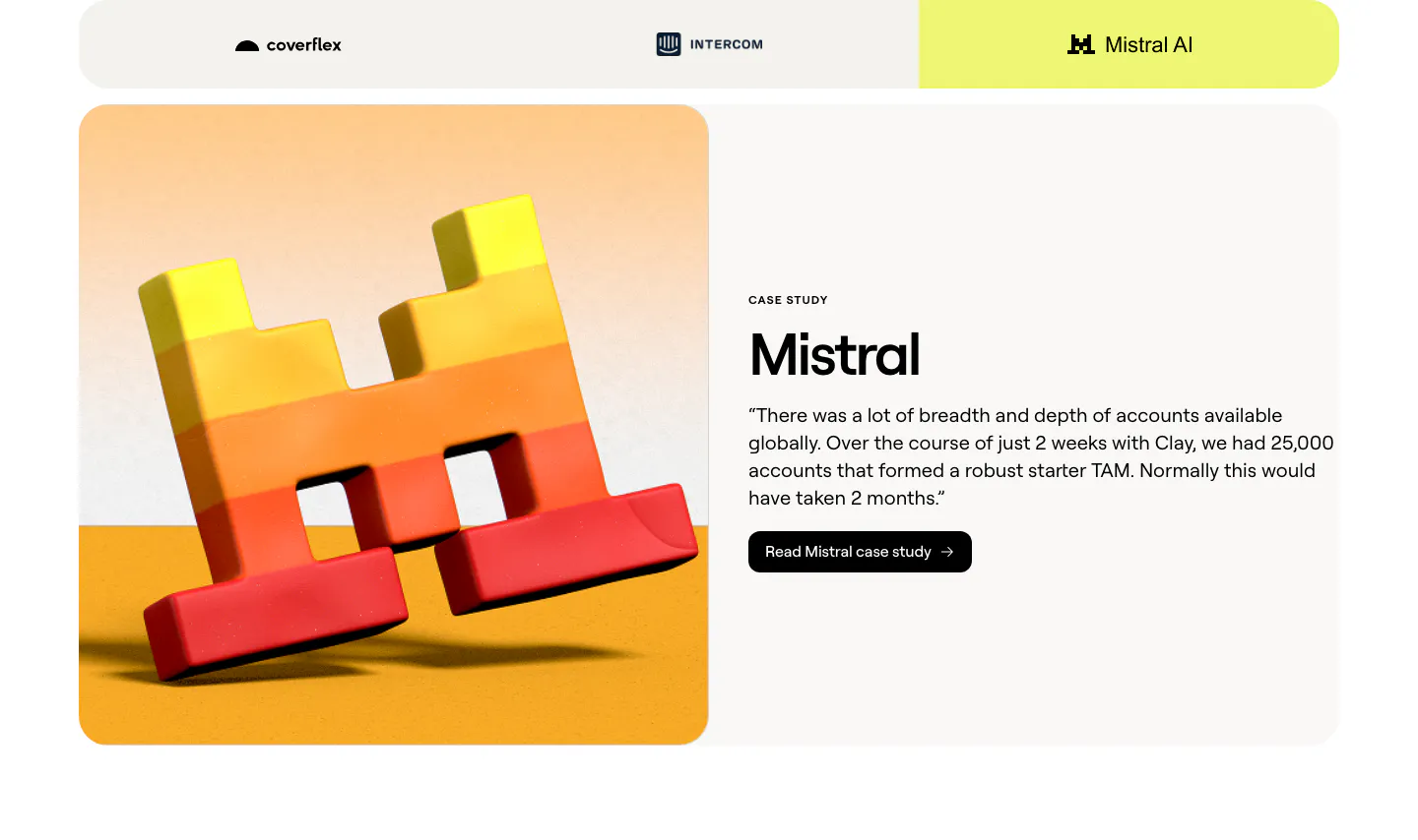
  75. Clay testimonials section: customer tab bar above a split case study card with a 3D Mistral logo render and a quote with case study button
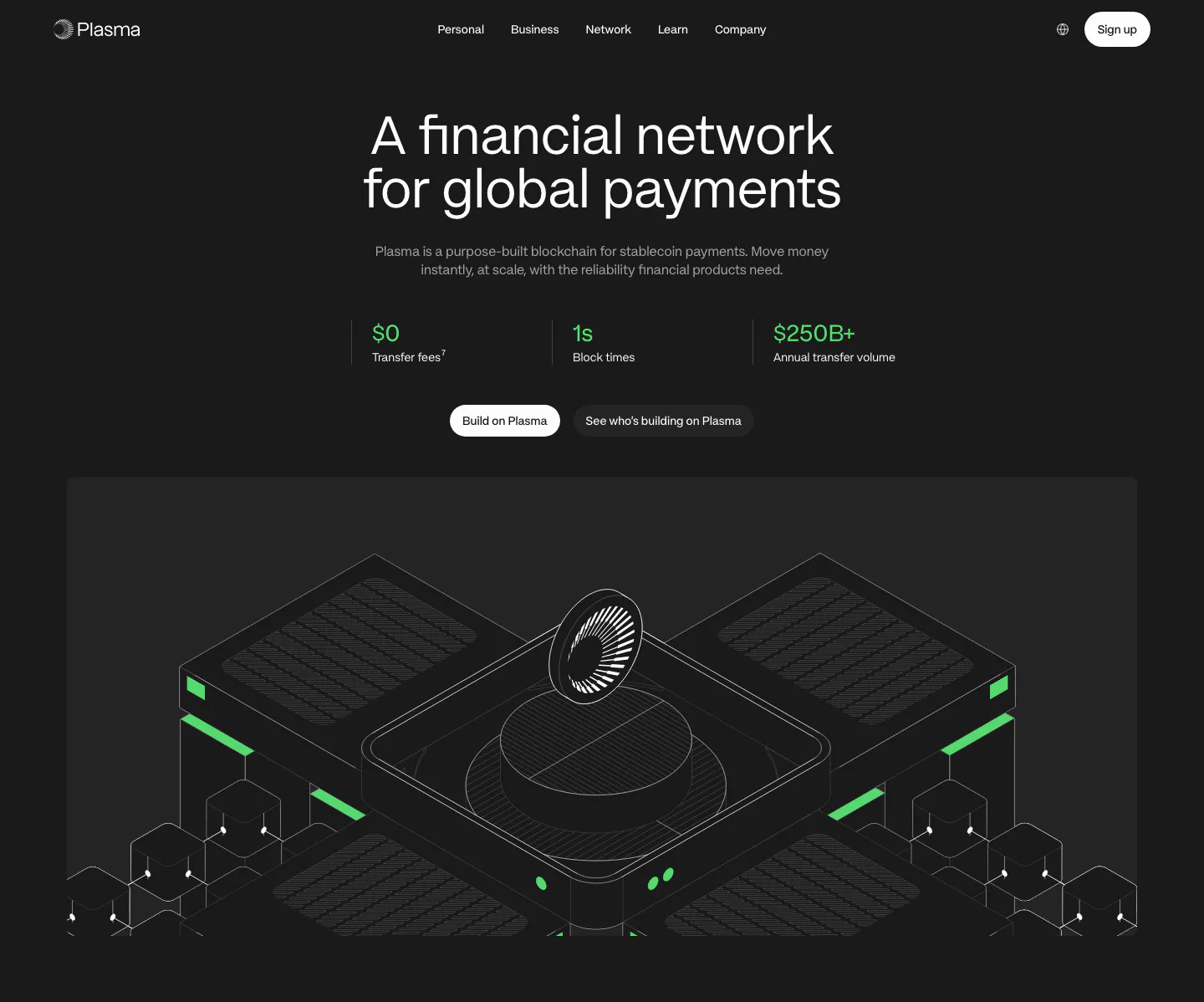
  76. Plasma hero section: centered headline, three green stats and buttons above an isometric line render of blockchain hardware on dark
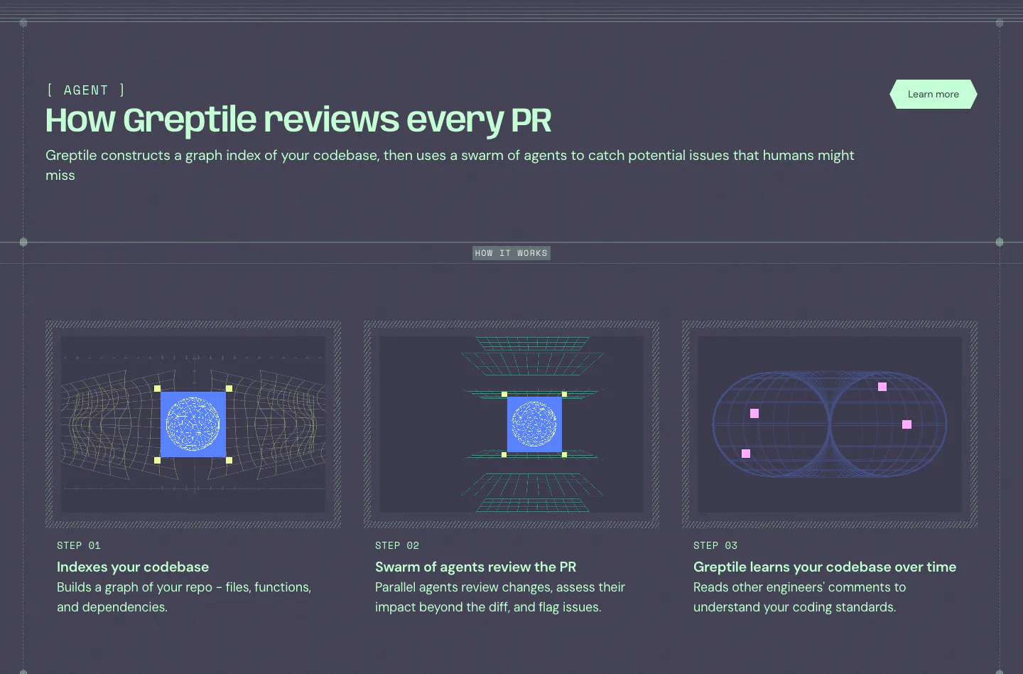
  77. Greptile how it works section: three step cards with wireframe graphics on a dark slate background below a mint headline
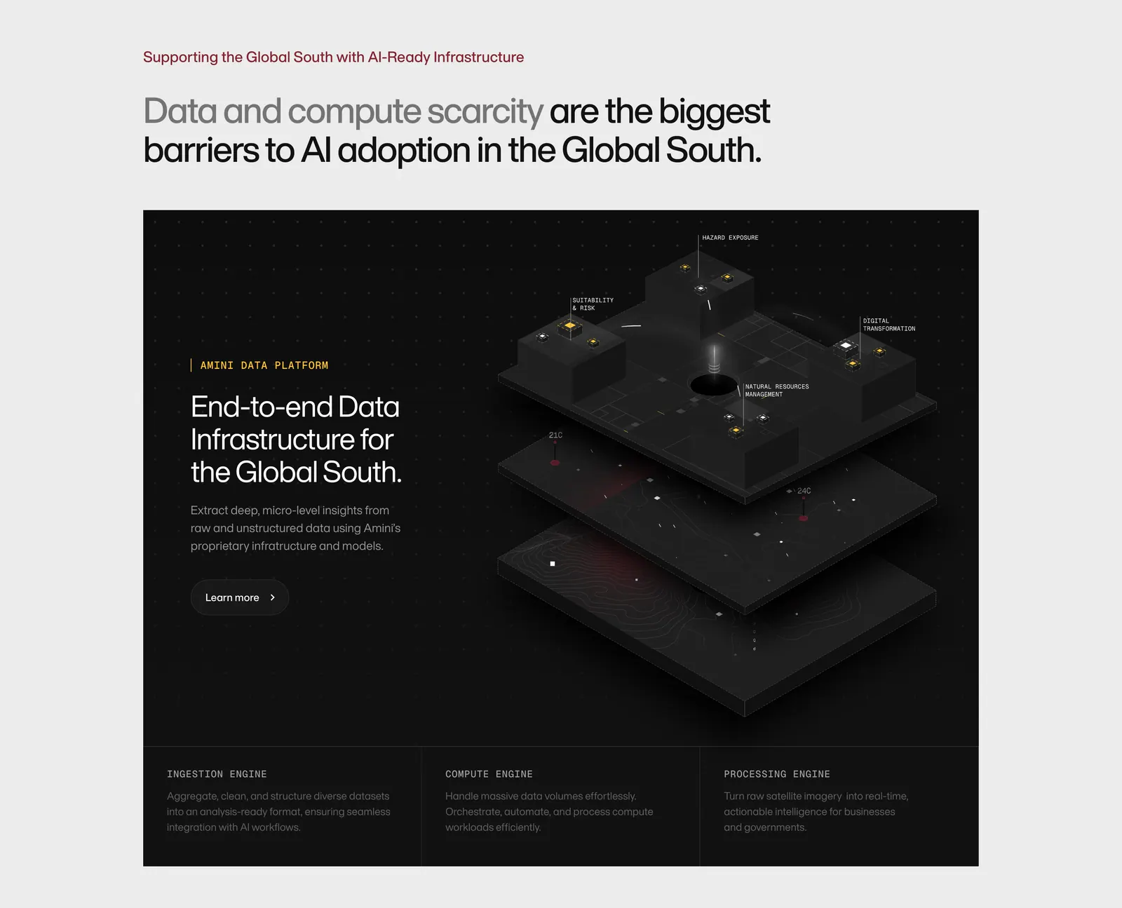
  78. Amini features section: headline on light gray above a dark panel with text and an isometric 3D data platform render, three engine columns
  79. Bayshore hero section: centered headline and Book a call button over a blue-to-sand gradient with a 3D marble column render
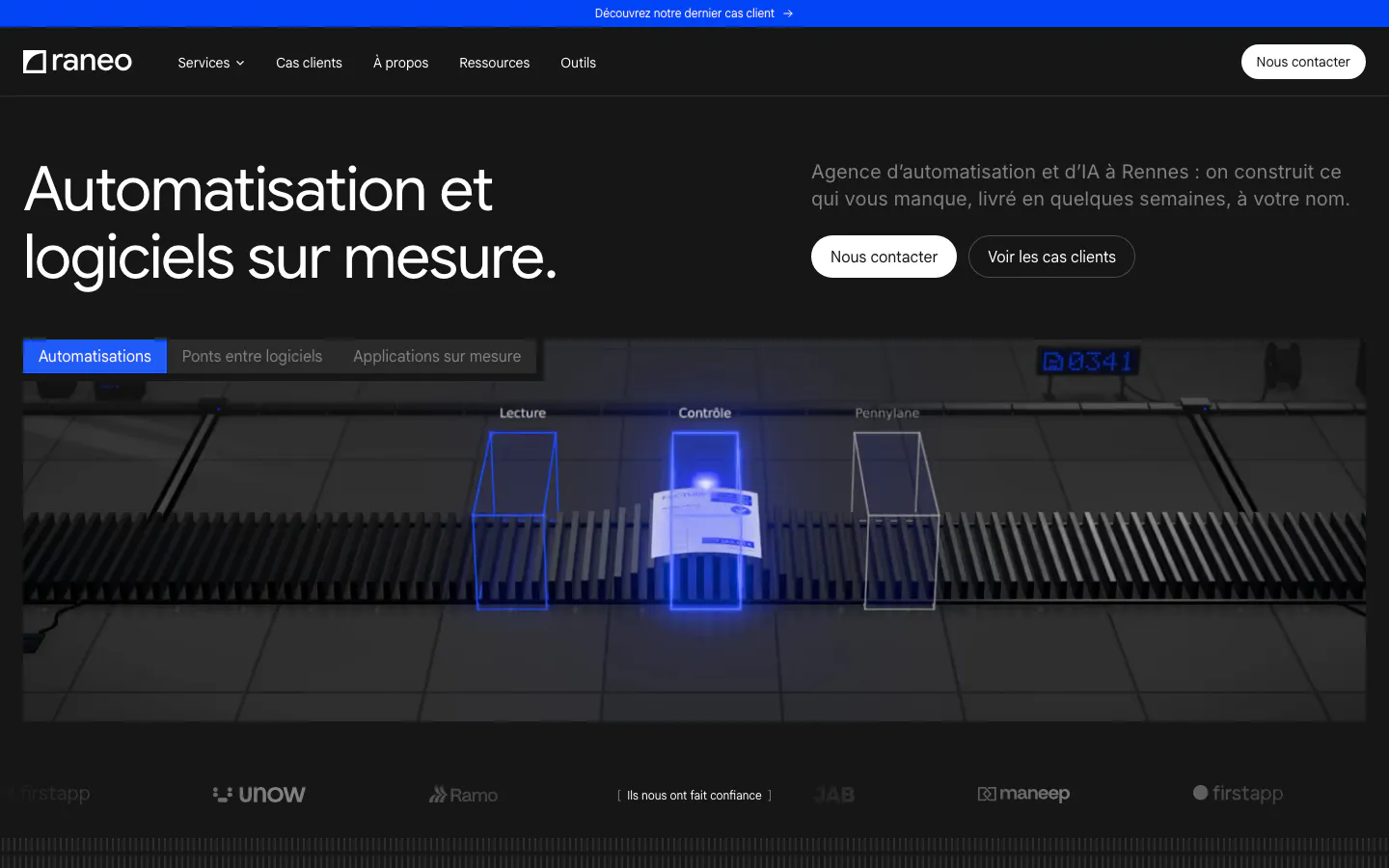
  80. Raneo hero section: dark headline row with contact buttons above a tabbed 3D conveyor scene with scan gates and a client logo strip
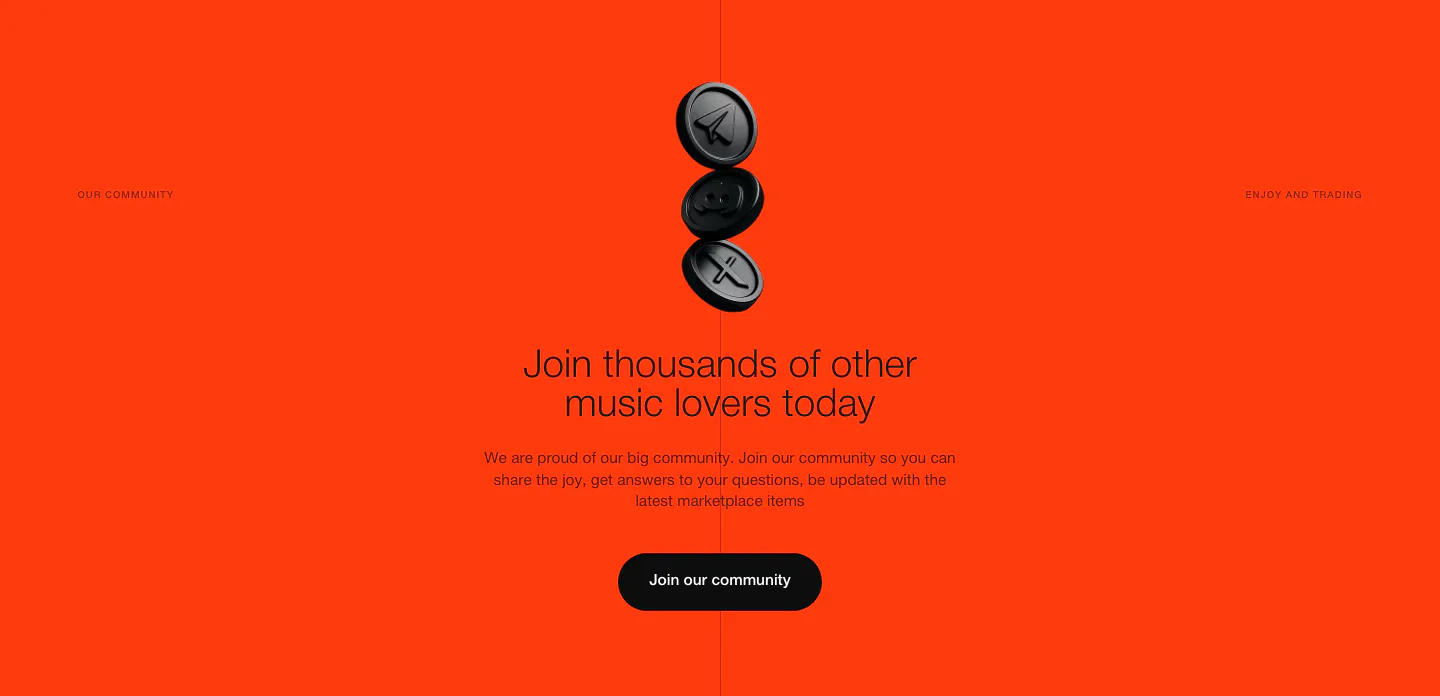
  81. EchoFi call-to-action section: stacked black 3D coins above a centered headline and community button on bright orange
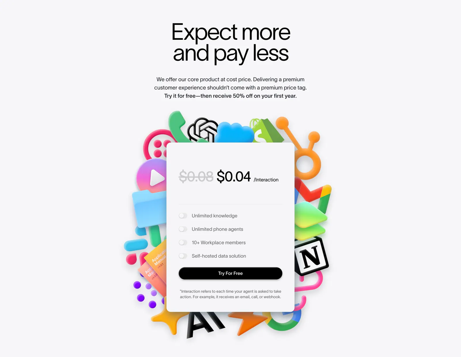
  82. Lemni pricing section: centered headline above a single per-interaction price card with toggle features, framed by colorful 3D app icons
    Lemni Pricing
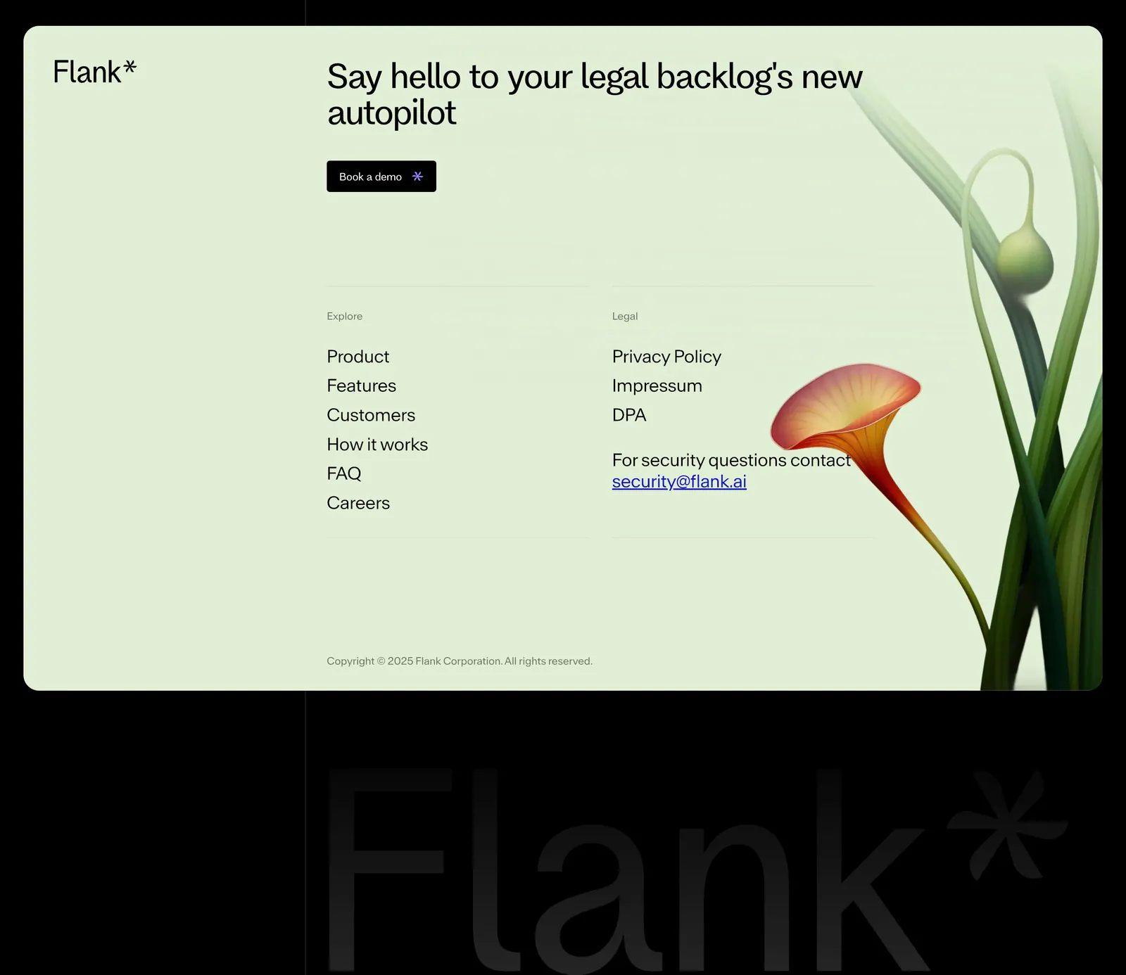
  83. Flank footer section: mint-green card with headline, demo button, link columns and a rendered flower above a giant faint wordmark on black
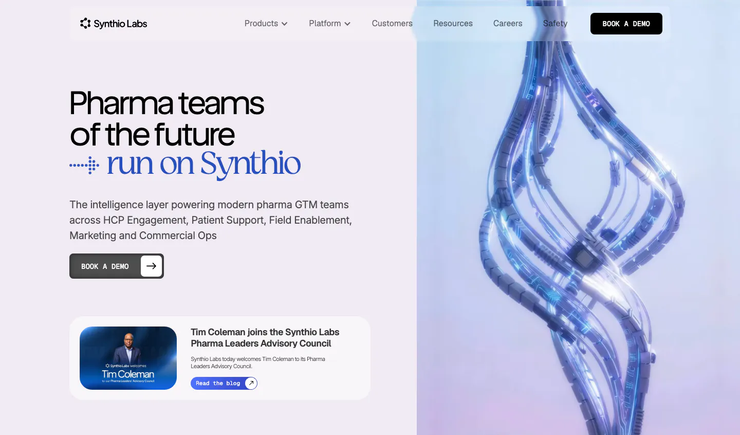
  84. Synthio Labs hero section: split layout with headline, demo button and news card on lavender beside a 3D render of twisting blue cables
    Synthio Labs Hero
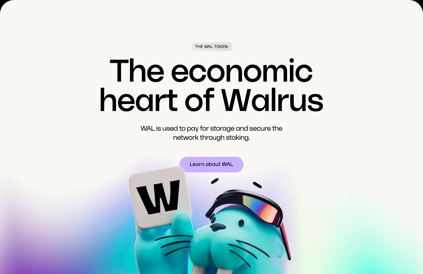
  85. Walrus features section: huge centered headline and lavender button above a 3D walrus holding a W tile on off-white
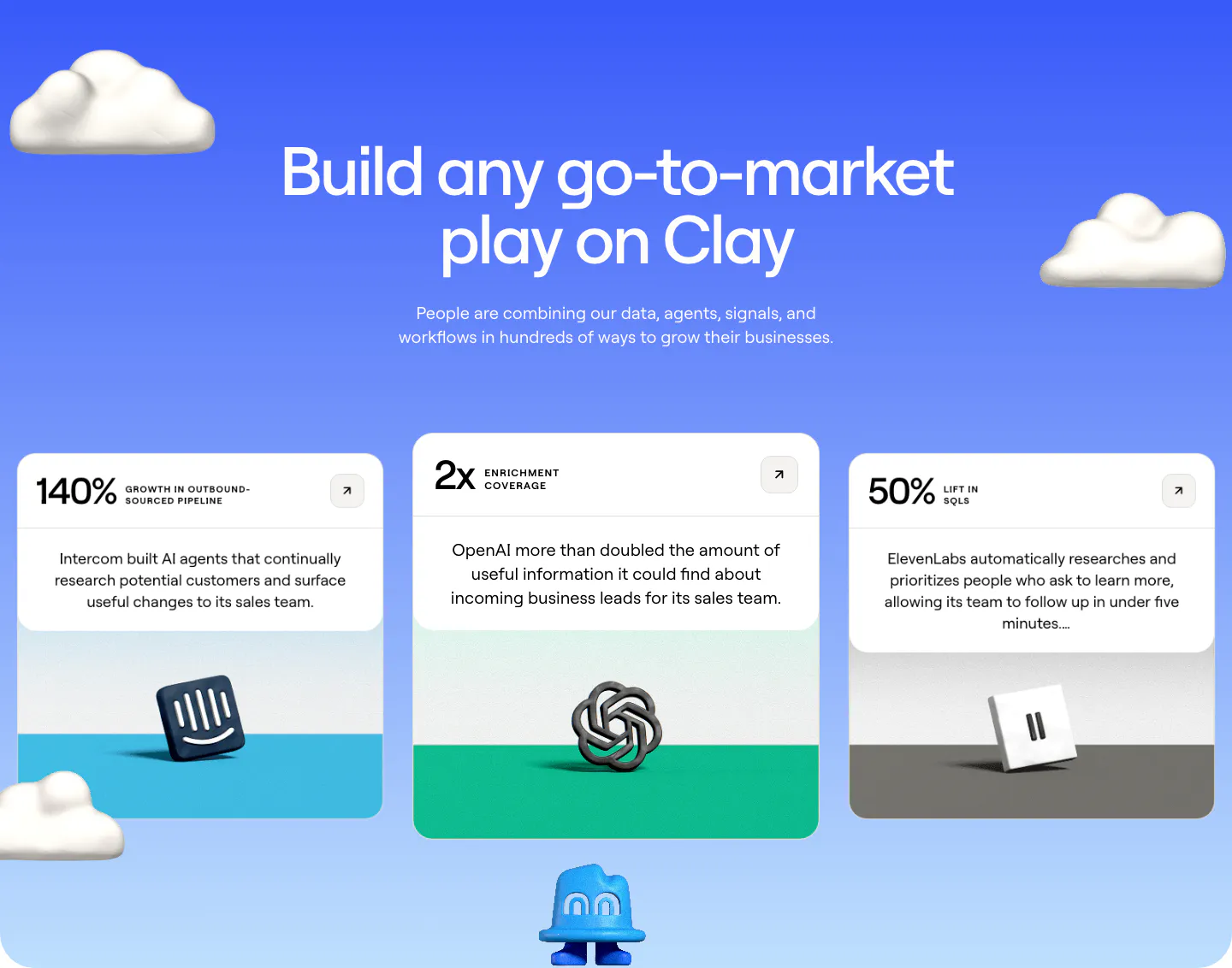
  86. Clay testimonials section: centered heading on a blue gradient with 3D clouds above three case study cards with metrics and 3D brand logos
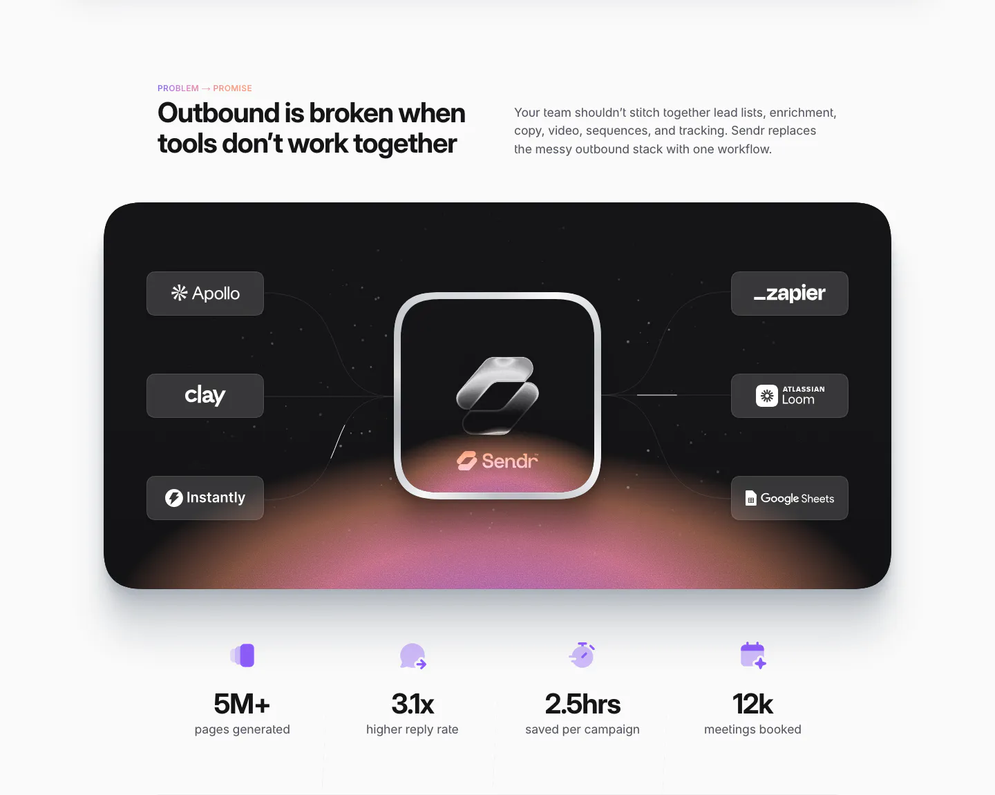
  87. Sendr value proposition section: dark card linking Apollo, Clay, Zapier and other tool chips to a glass Sendr icon, four stats below
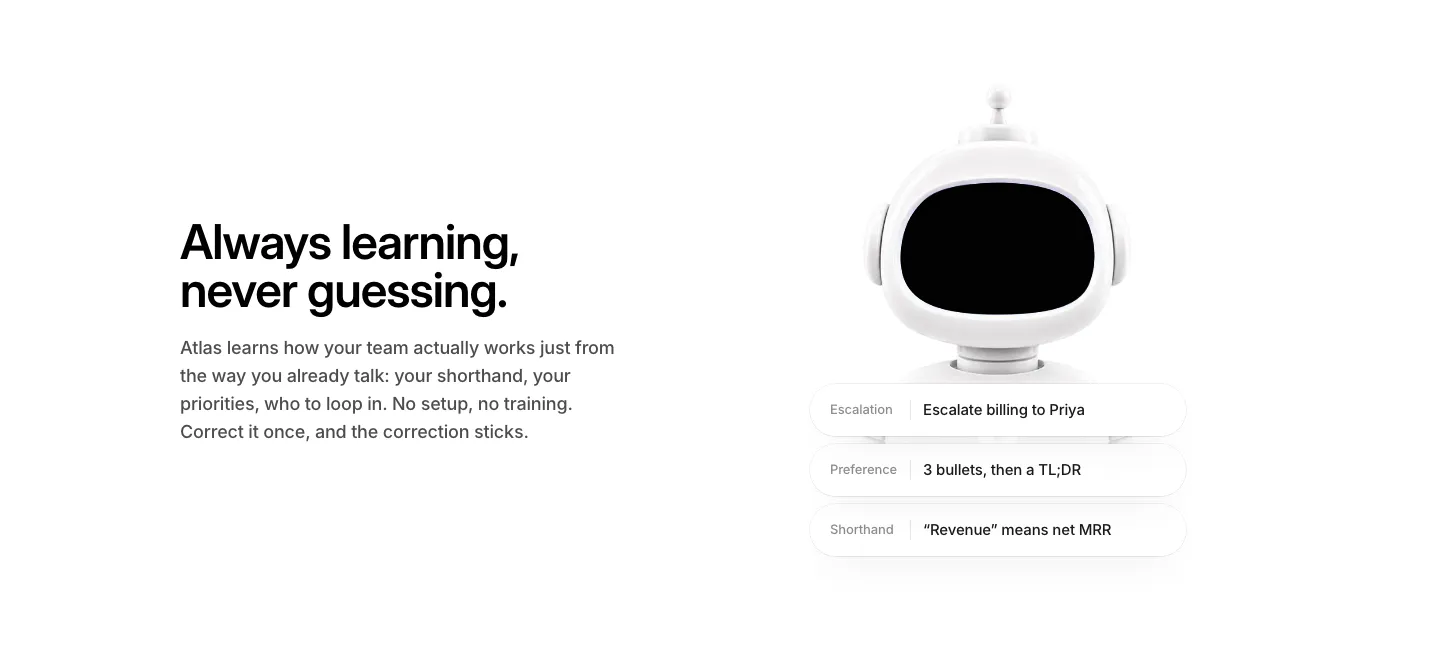
  88. WorkOS features section: headline and copy on the left, white 3D robot with memory chips on the right, on white
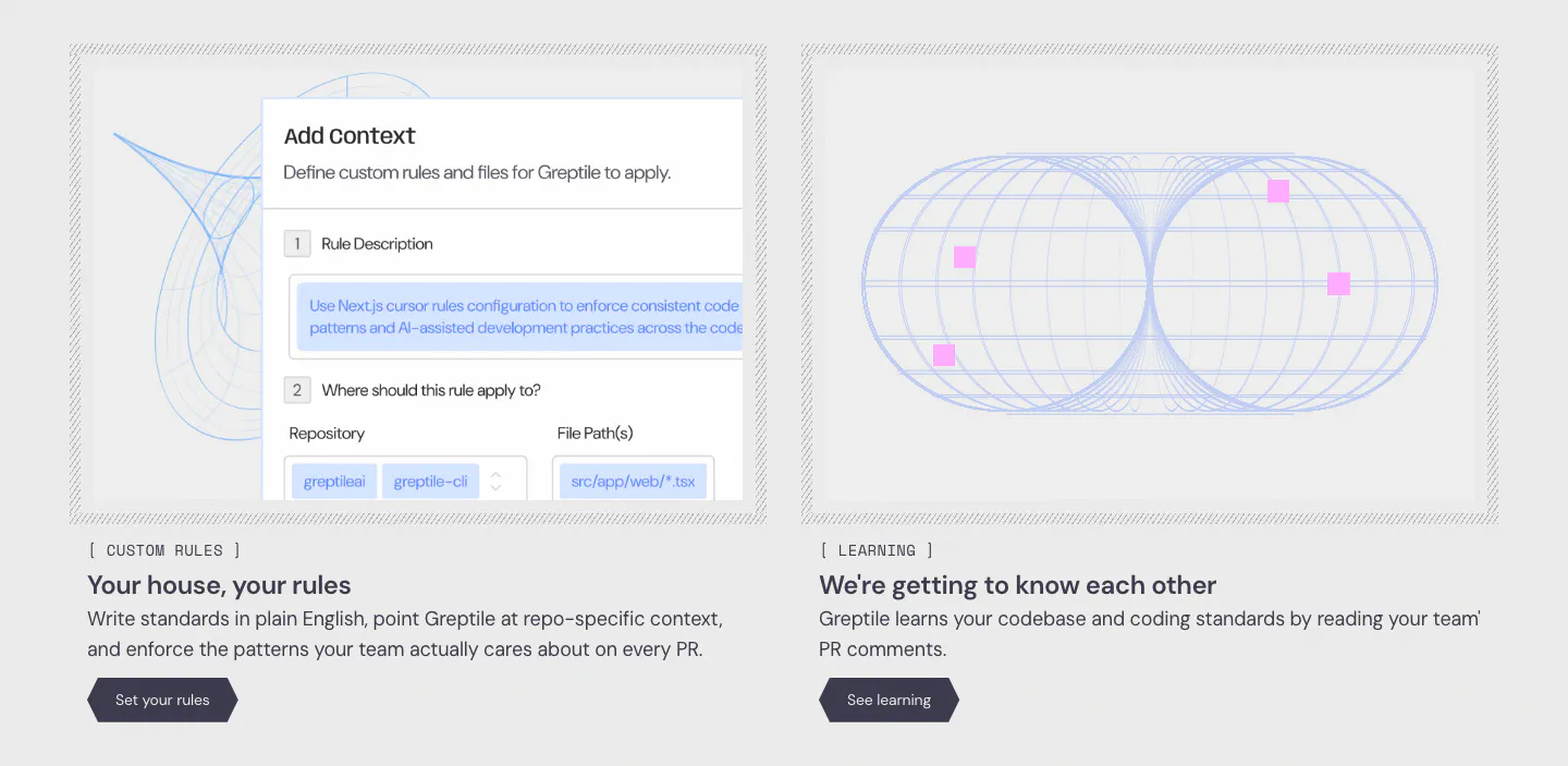
  89. Greptile features section: two cards side by side, one with a custom rules form UI, one with a blue wireframe torus graphic
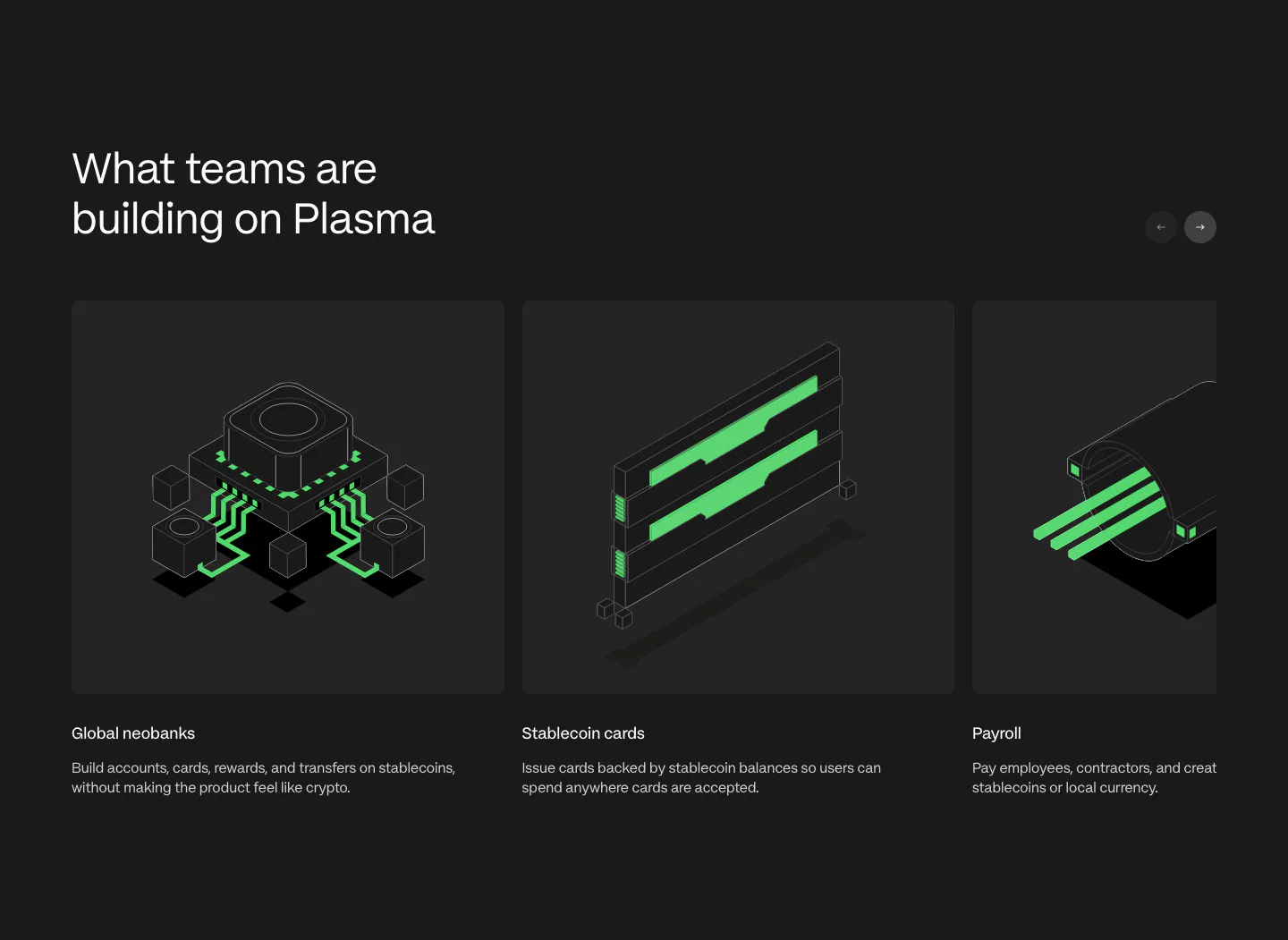
  90. Plasma use cases section: heading with arrow buttons above a carousel of cards with green isometric renders on charcoal
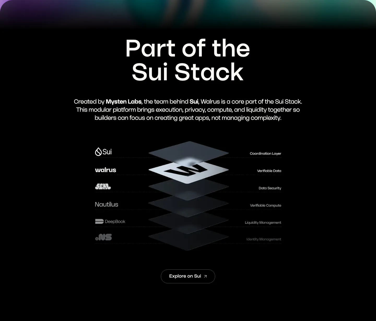
  91. Walrus integrations section: centered headline above an isometric stacked-layer diagram of Sui stack products on black
  92. Remote hero section: nav, left headline with checklist and demo button beside a blurred blue and lime 3D cube on gradient
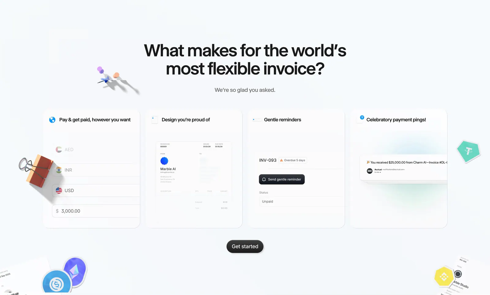
  93. Acctual features section: centered headline above four invoice feature cards with UI snippets, surrounded by 3D clips and crypto stickers
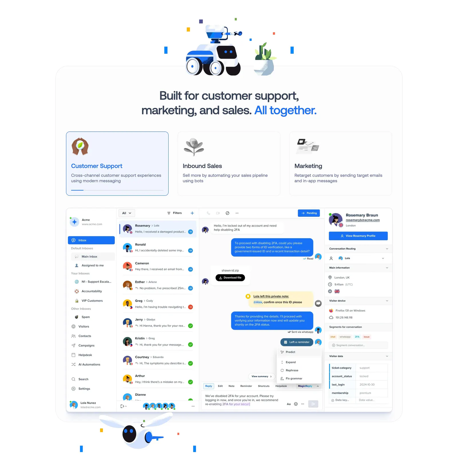
  94. Crisp features section: centered headline with robot renders above three selectable use-case cards and an inbox UI screenshot
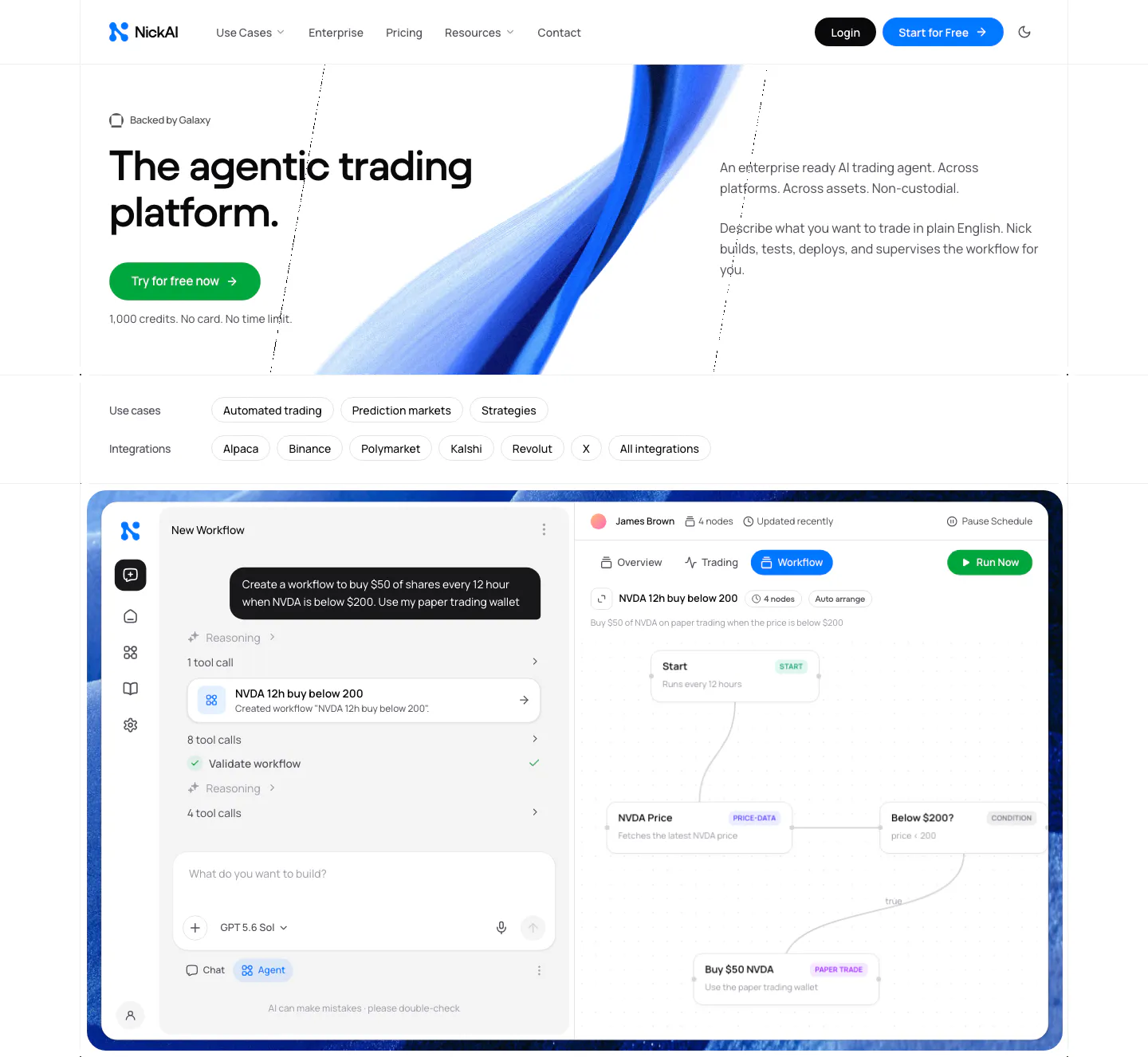
  95. NickAI hero section: nav, left headline with green button, blue ribbon artwork, use-case chips and a large agent workflow screenshot
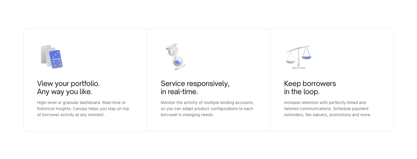
  96. Canopy features section: three bordered cards with small 3D object renders, titles and short descriptions on white
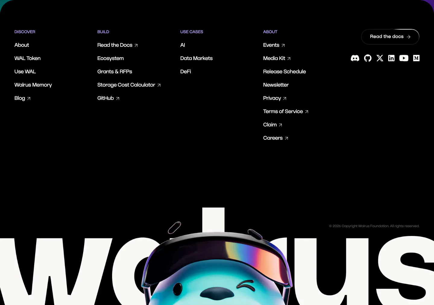
  97. Walrus footer section: black footer with link columns and social icons above a giant walrus wordmark with 3D mascot
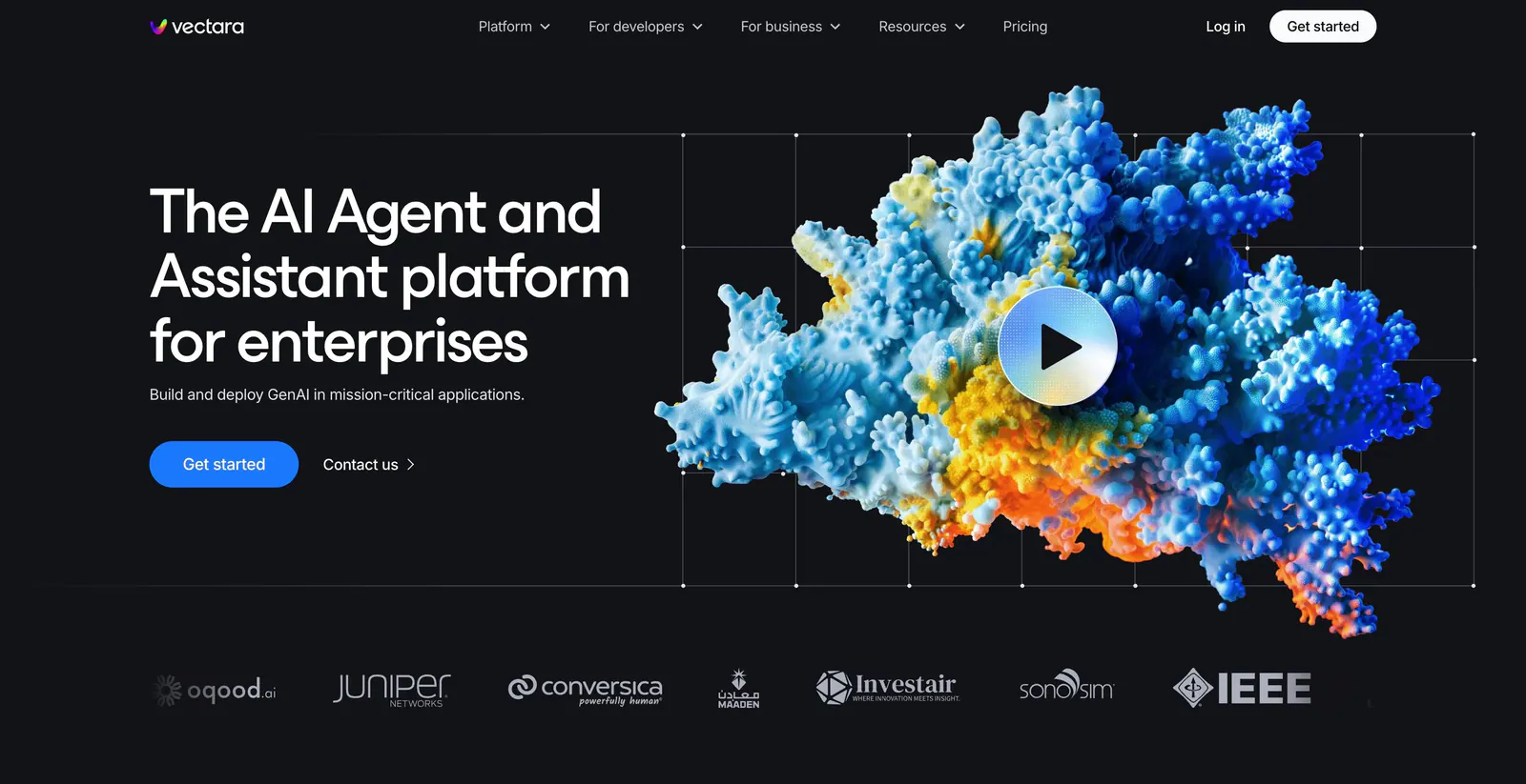
  98. Vectara hero section: headline left, colorful 3D coral-like render with a play button on grid lines right, logo strip below on black

Where 3D shows up

Often paired with

Share of 3D sections that also use each style

How to work with 3D renders

  1. Light every render the same way

    Use one light direction, color temperature, and material style across all 3D assets on the page. Inconsistent lighting makes objects look pasted in. Match shadow direction to any interface shadows so renders and UI elements appear to share the same space.

  2. Tie objects to product concepts

    Abstract blobs and floating spheres look nice but say little. Model objects that stand for real ideas, such as stacked layers for data, a lock for security, or the device itself for hardware. People should be able to guess the topic from the object alone.

  3. Ship static images before real-time 3D

    Pre-rendered images in WebP or AVIF load fast and look the same everywhere. Use real-time WebGL only when interaction adds real value, load it lazily after the main content, and keep a static fallback for low-power devices and reduced-motion settings.

  4. Leave room around the object

    3D renders need negative space to read as objects rather than clutter. Give them generous padding and avoid overlapping them with text. Use a soft ground shadow or reflection to anchor the render so it does not appear to float at random.


Companies using 3D

All styles
    ↑↓ Navigate ↵ Open

    Section preview

    Website section