Lindy website design

Every section we captured from the Lindy website, in page order, from the hero section down to the CTA section. Open any thumbnail to see it full size.

Sections 7

In page order, top to bottom

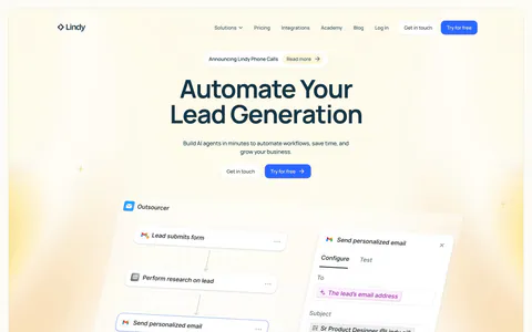
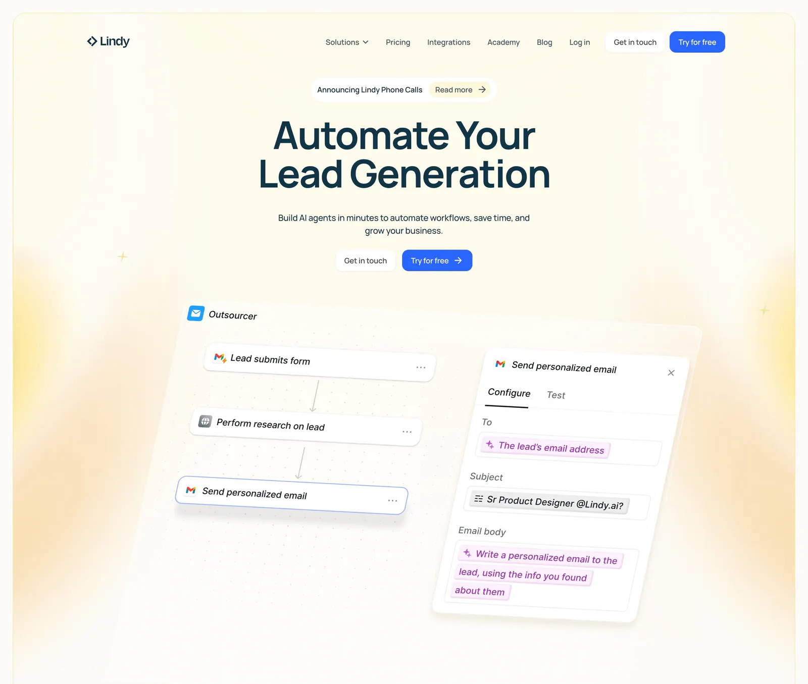
  1. Lindy hero section: nav bar, centered headline and two CTAs above a tilted workflow builder UI with an email step panel, framed by yellow glows
    01 Hero

    Automate Your Lead Generation

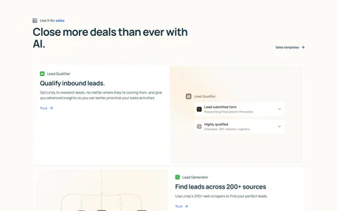
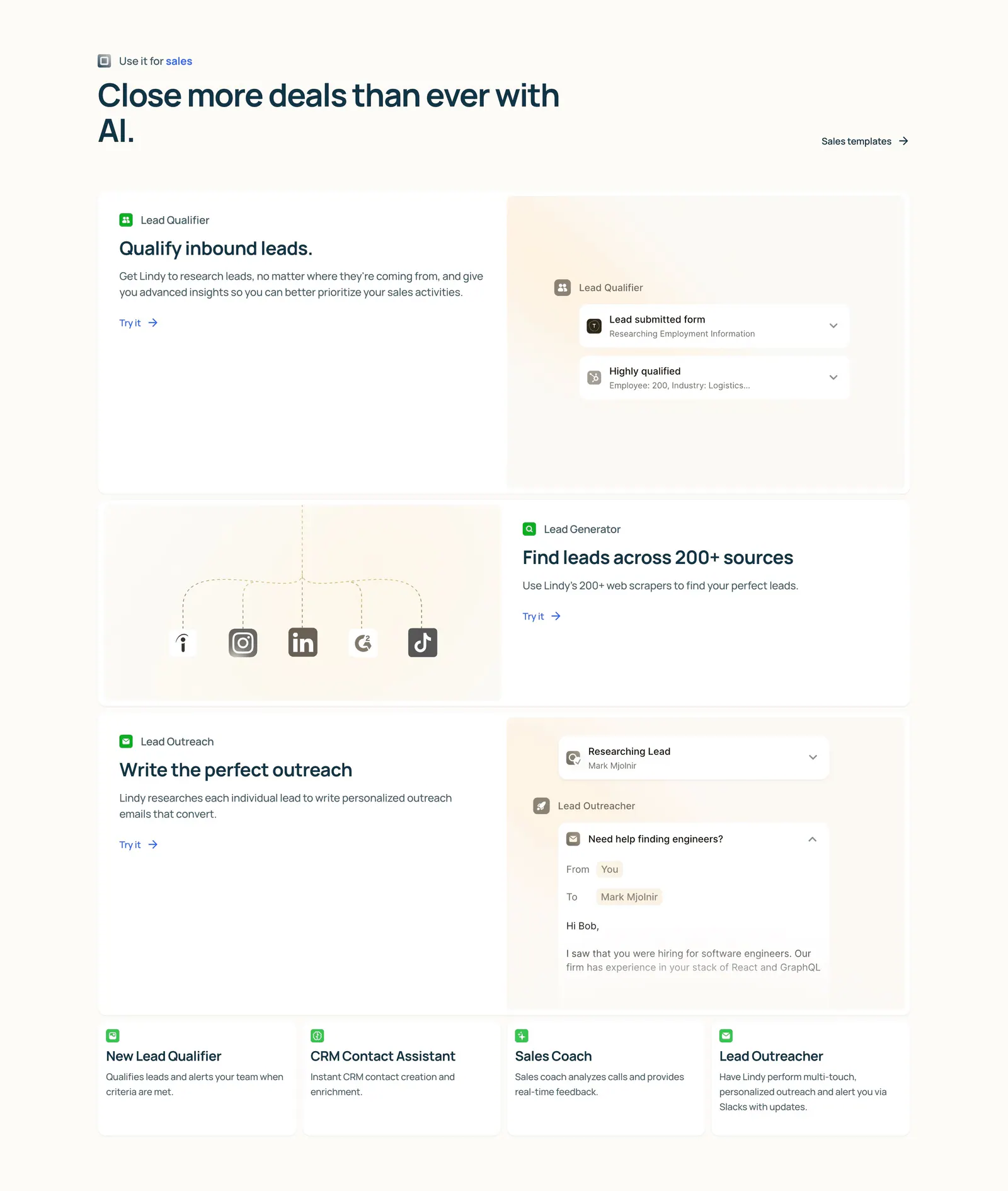
  2. Lindy features section: left-aligned heading above three alternating rows of copy and agent UI mockups, then four small template cards on cream

    Close more deals than ever with AI.

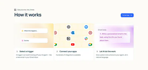
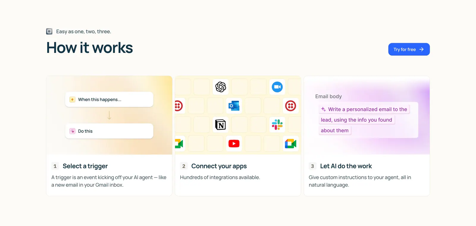
  3. Lindy how it works section: left-aligned heading and button above three numbered step cards with trigger, app icon grid and AI prompt visuals

    How it works

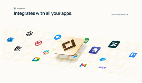
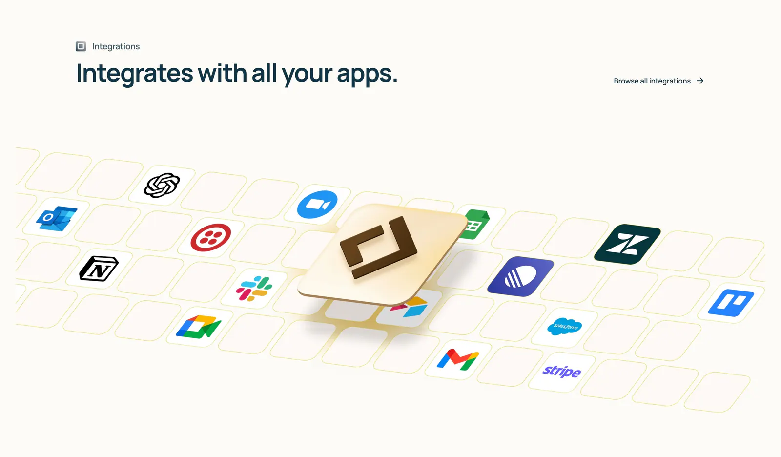
  4. Lindy integrations section: left-aligned heading above an isometric tile grid of app icons with a raised 3D Lindy logo tile on cream

    Integrates with all your apps.

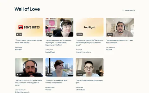
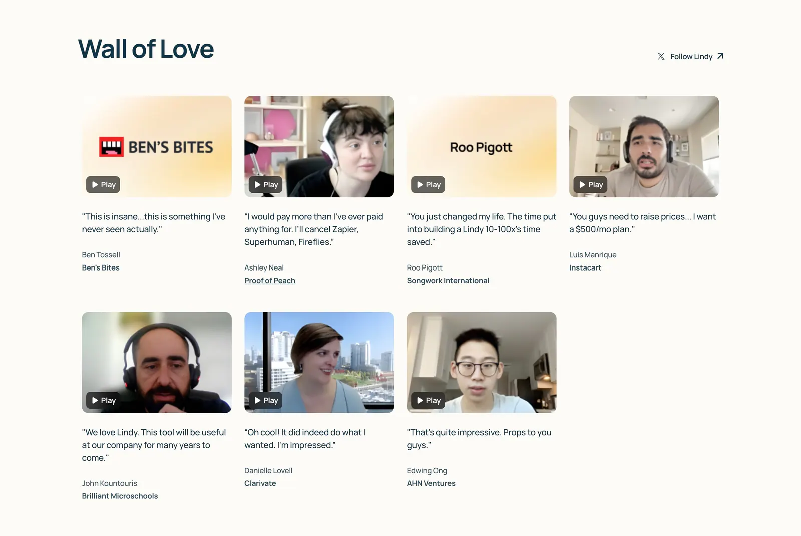
  5. Lindy testimonials section: Wall of Love heading above a four-column grid of video testimonial thumbnails with play buttons and quotes on cream

    Wall of Love

  6. Lindy about & mission section: large left-aligned mission statement with the first line faded to gray, on a warm off-white background

    Lindy is the simplest way to create AI agents — smart automations that integrate with all your apps, from Gmail to HubSpot, to save you hours a week and help you grow your business.

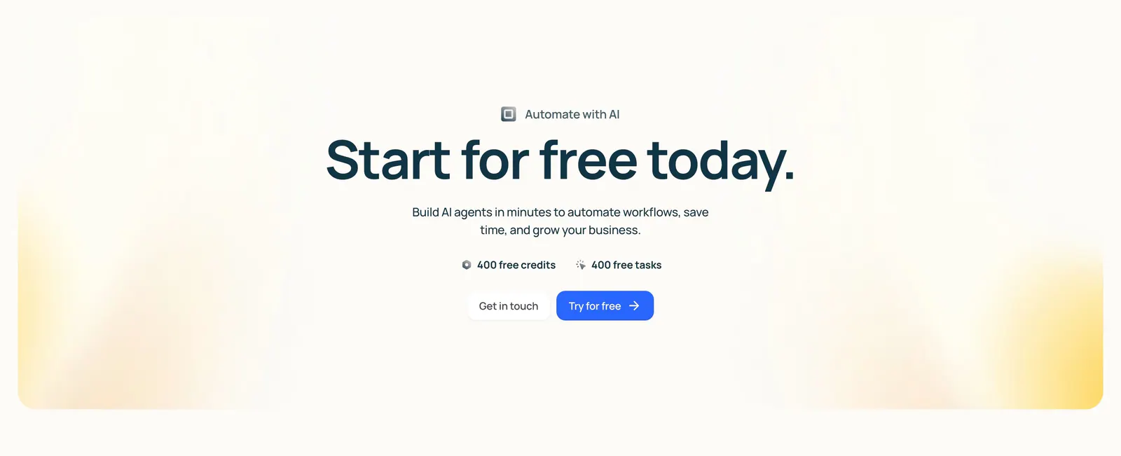
  7. Lindy call-to-action section: centered headline with free credit badges and two buttons inside a cream panel with soft yellow corner glows

    Start for free today.

Similar companies

All companies
    ↑↓ Navigate ↵ Open

    Section preview

    Website section