Integrations Section Examples
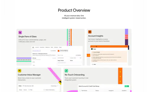
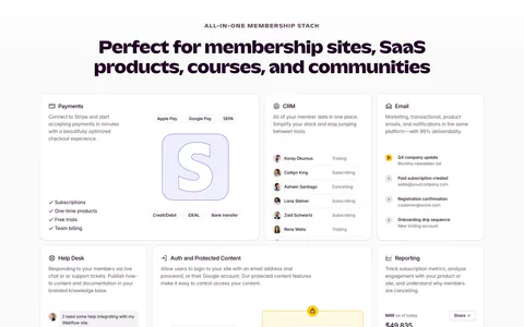
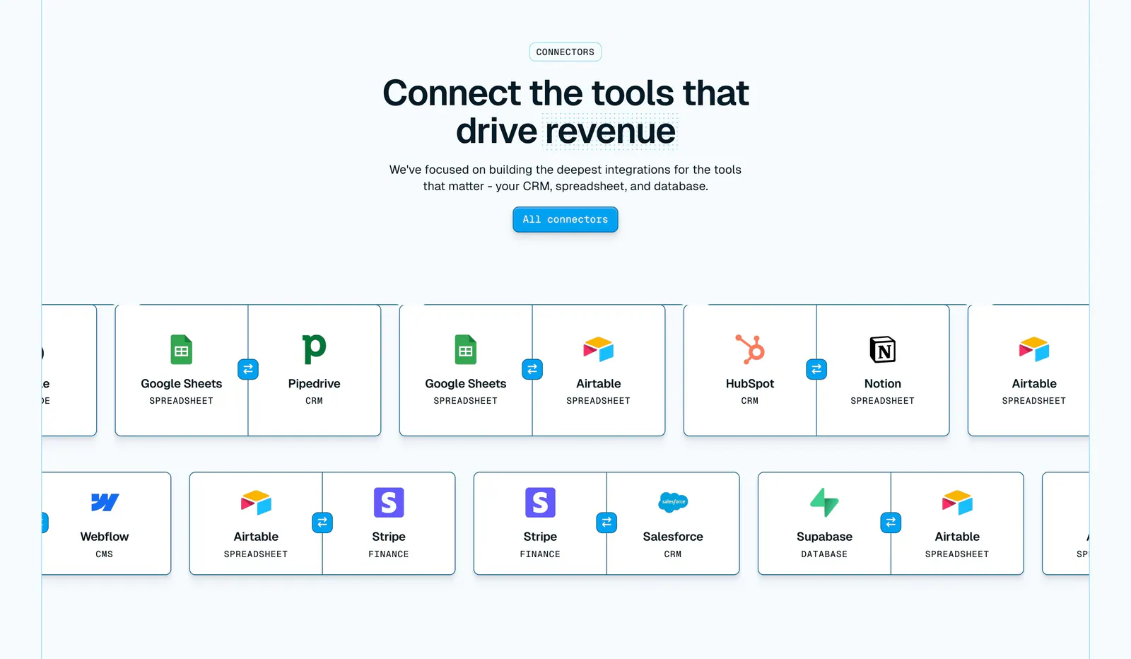
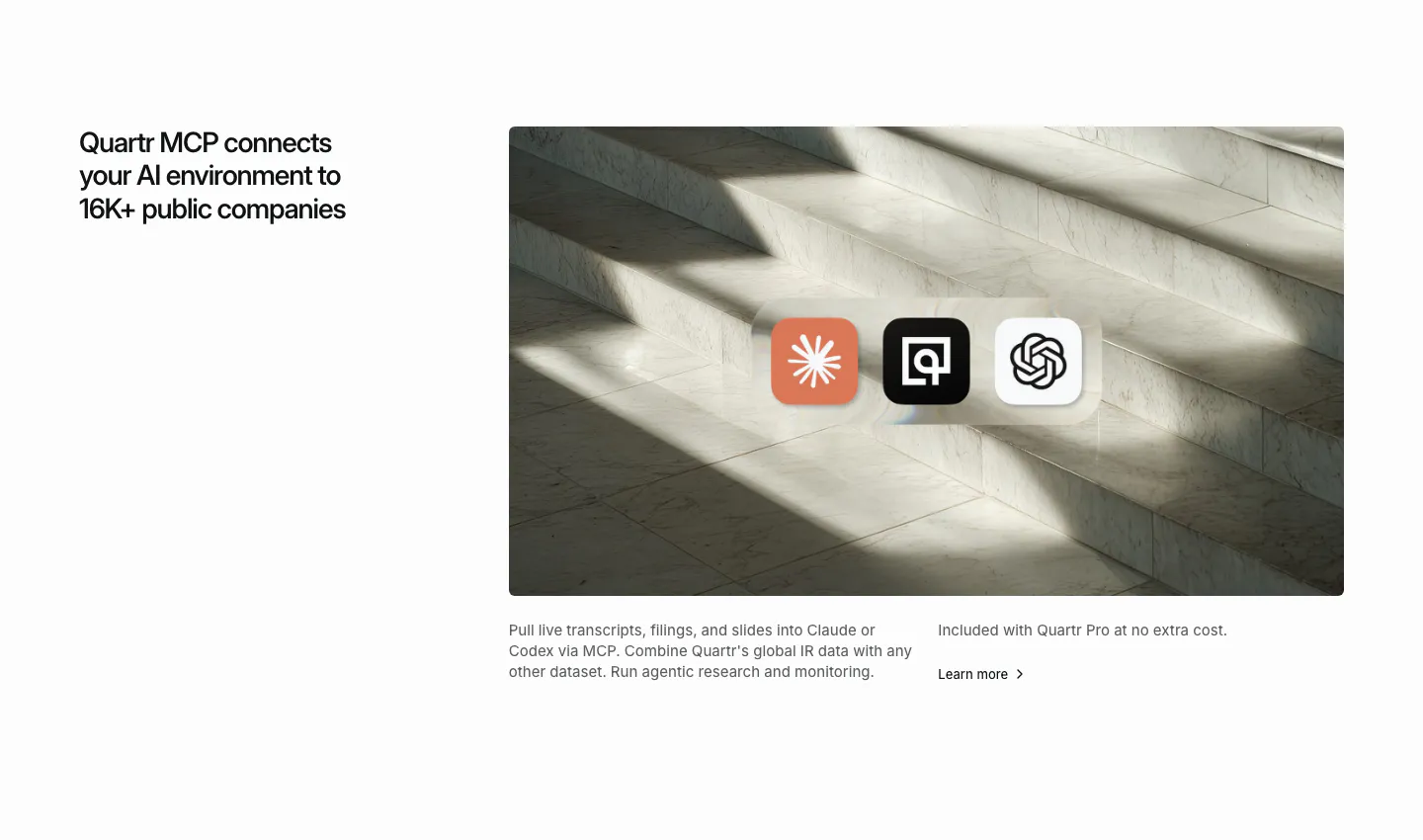
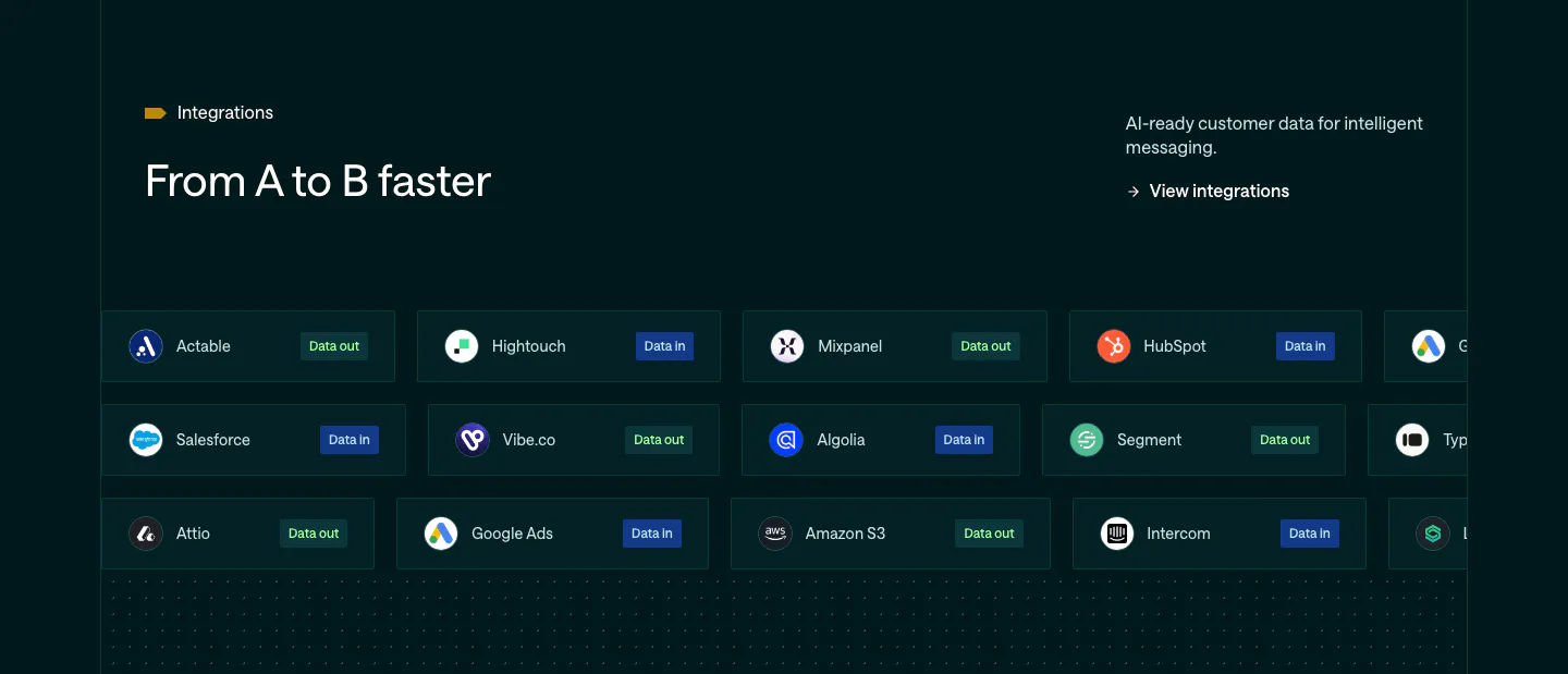
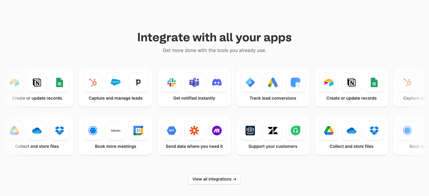
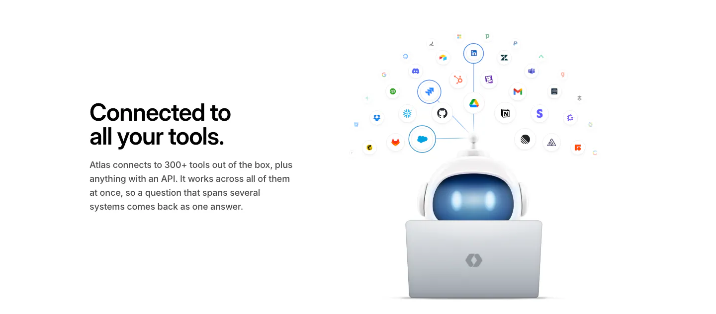
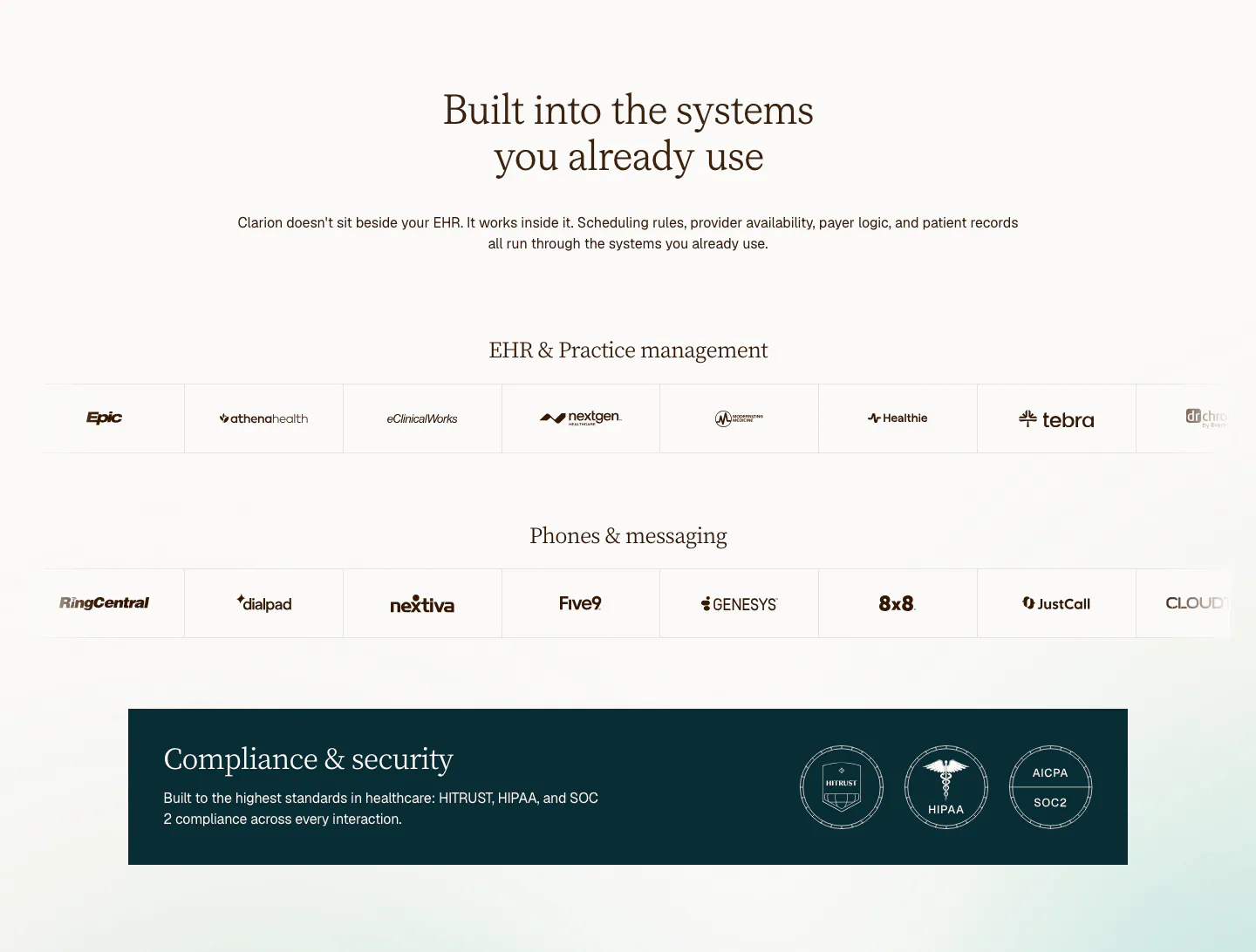
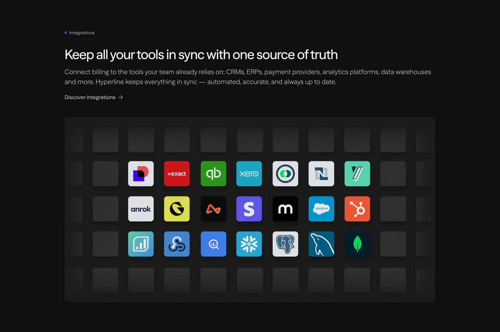
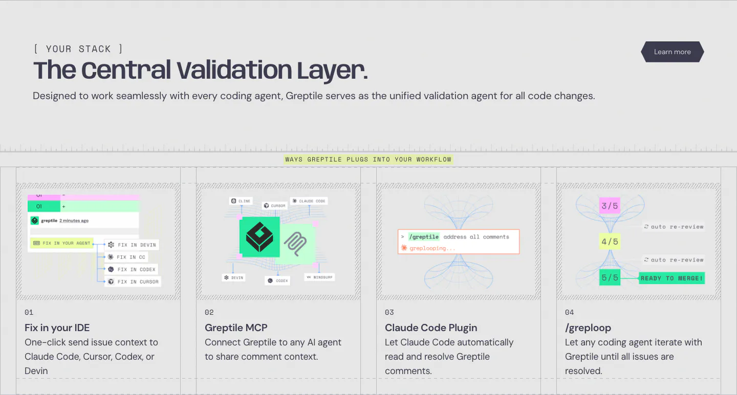
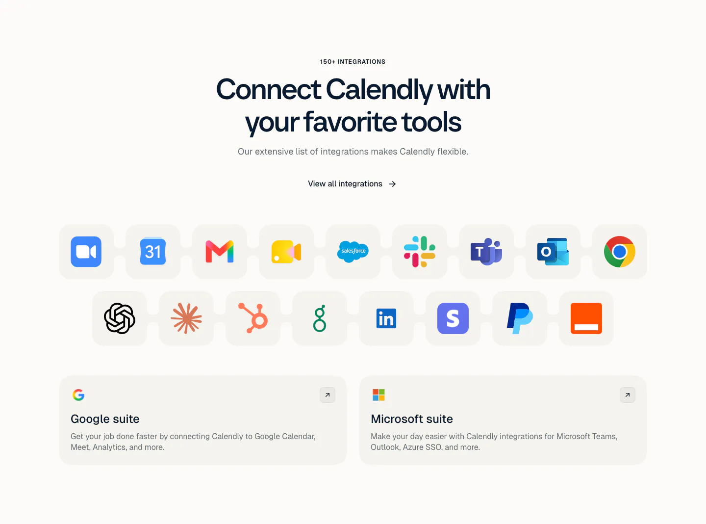
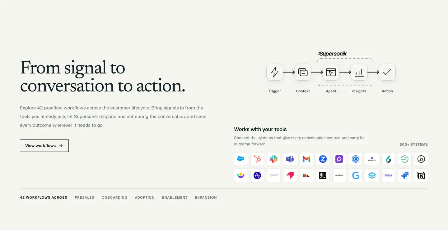
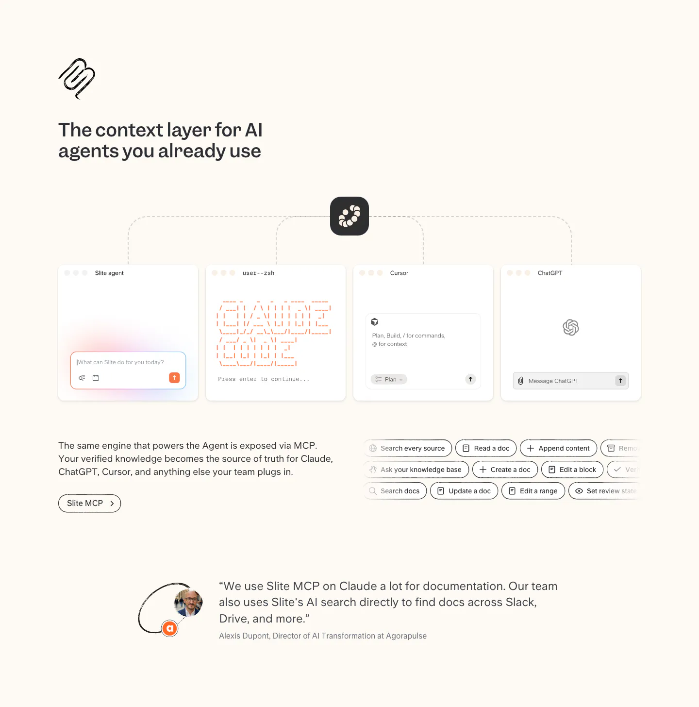
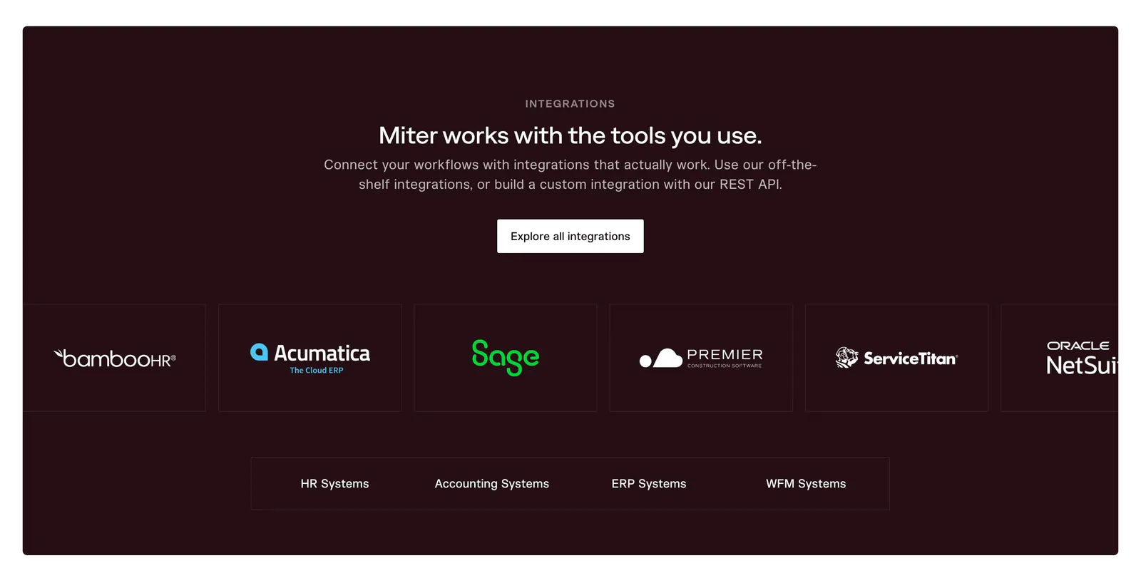
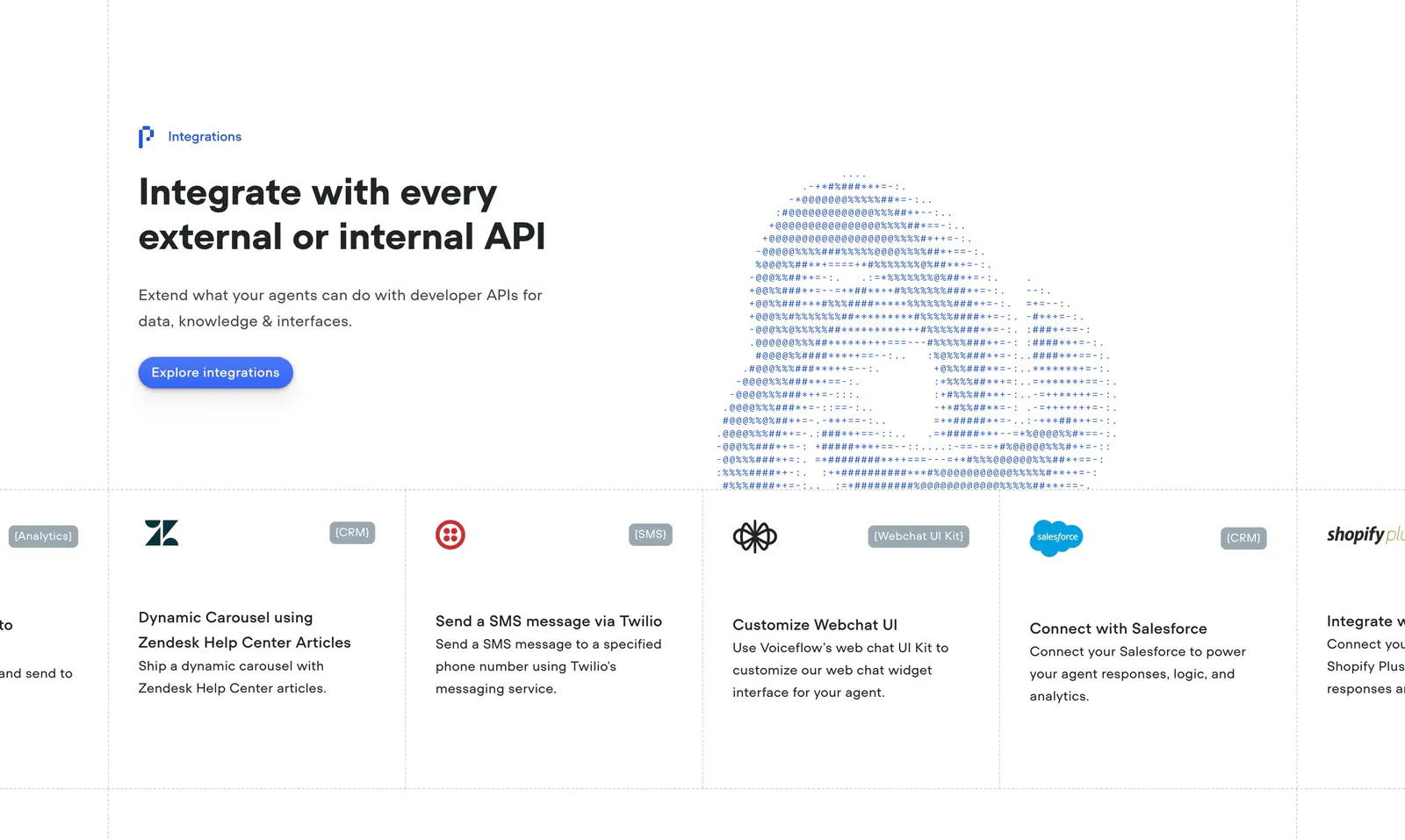
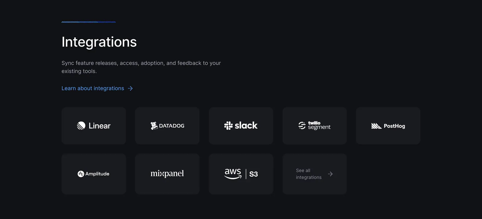
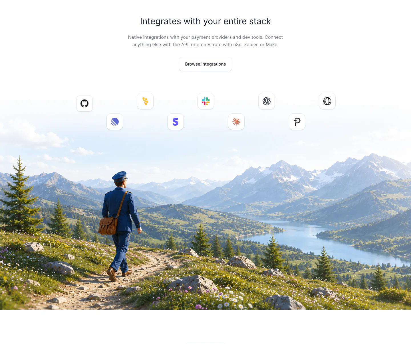
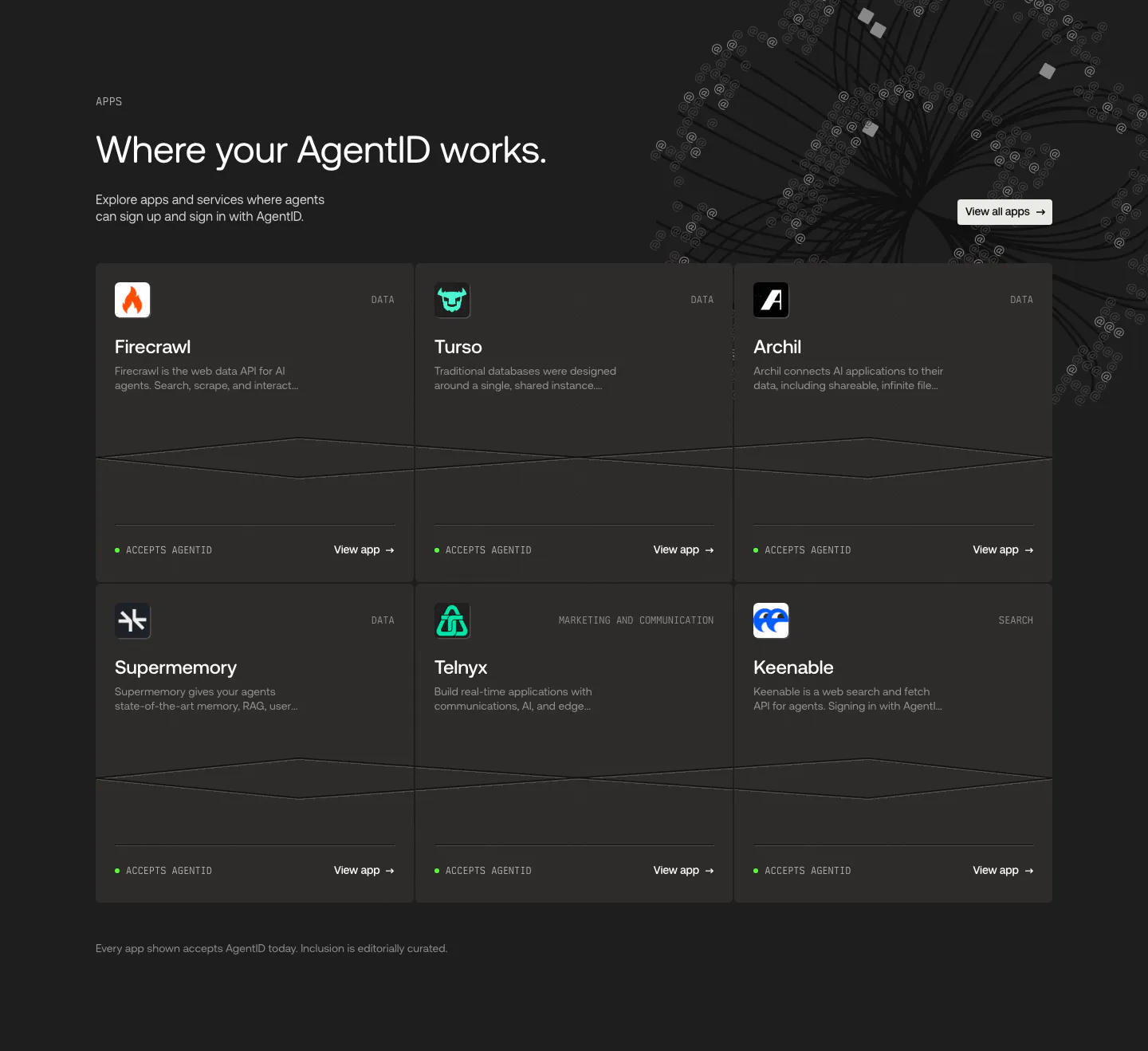
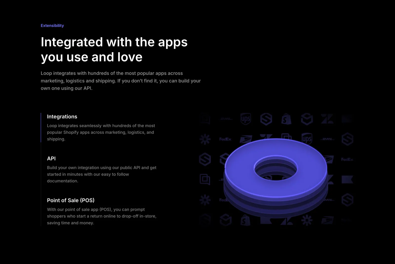
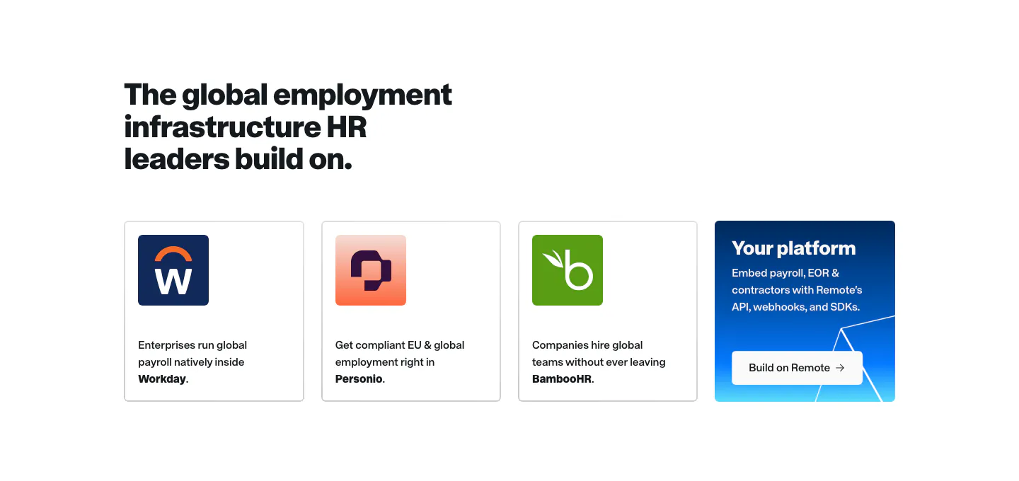
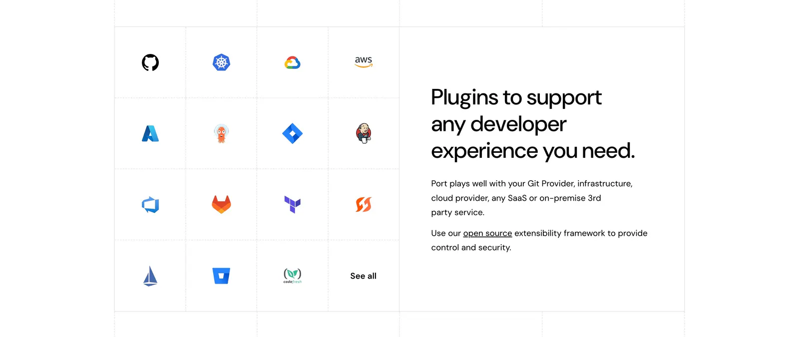
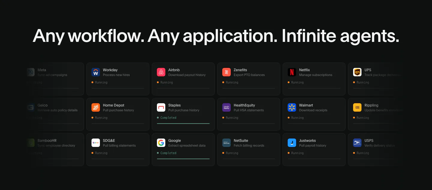
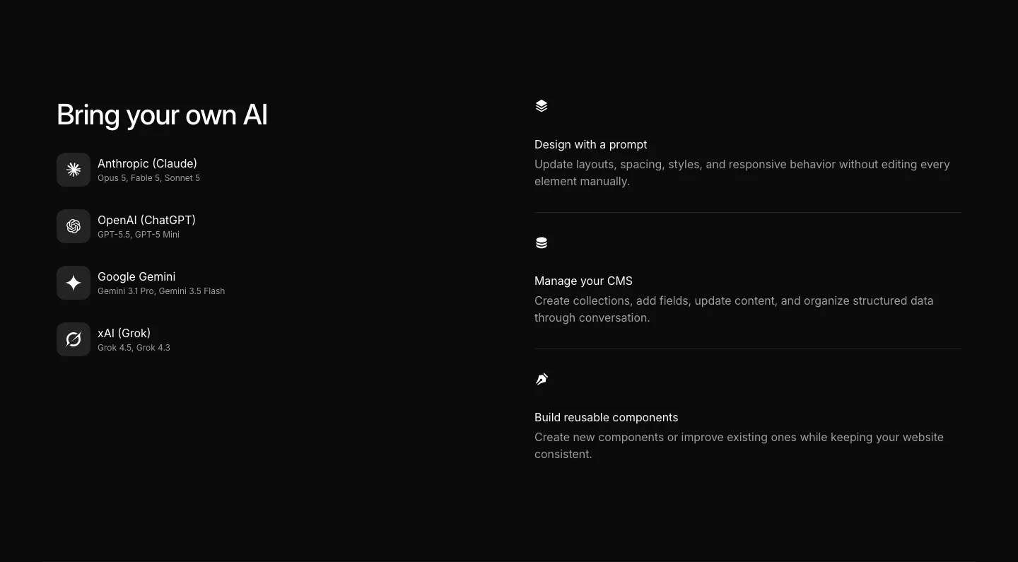
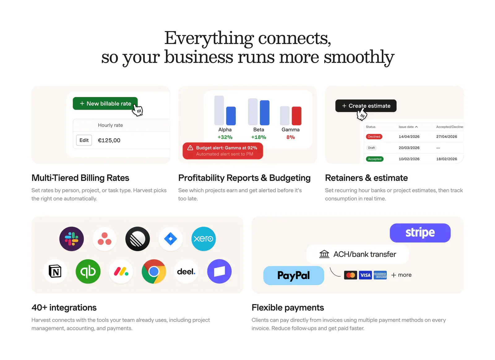
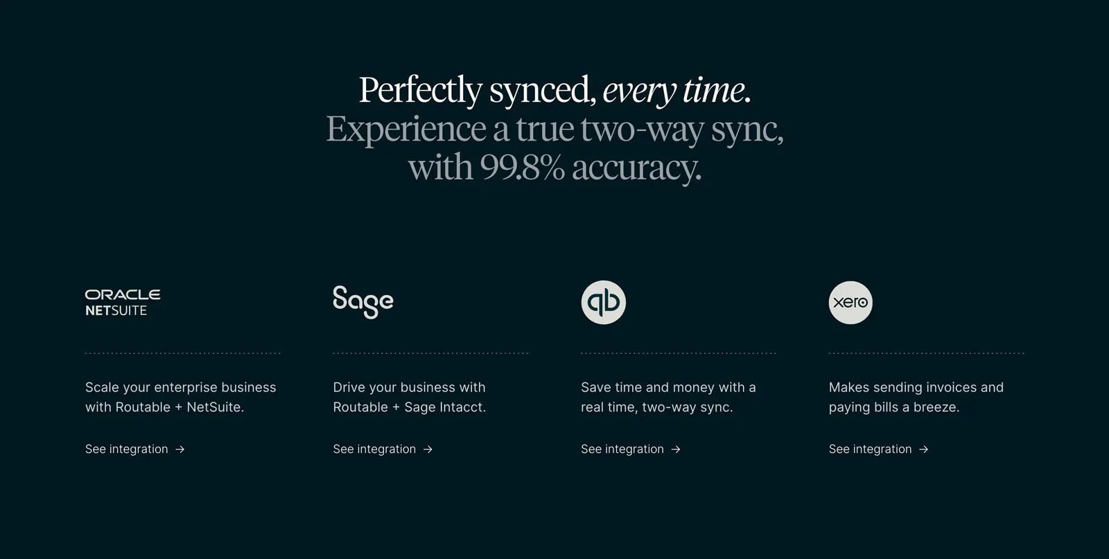
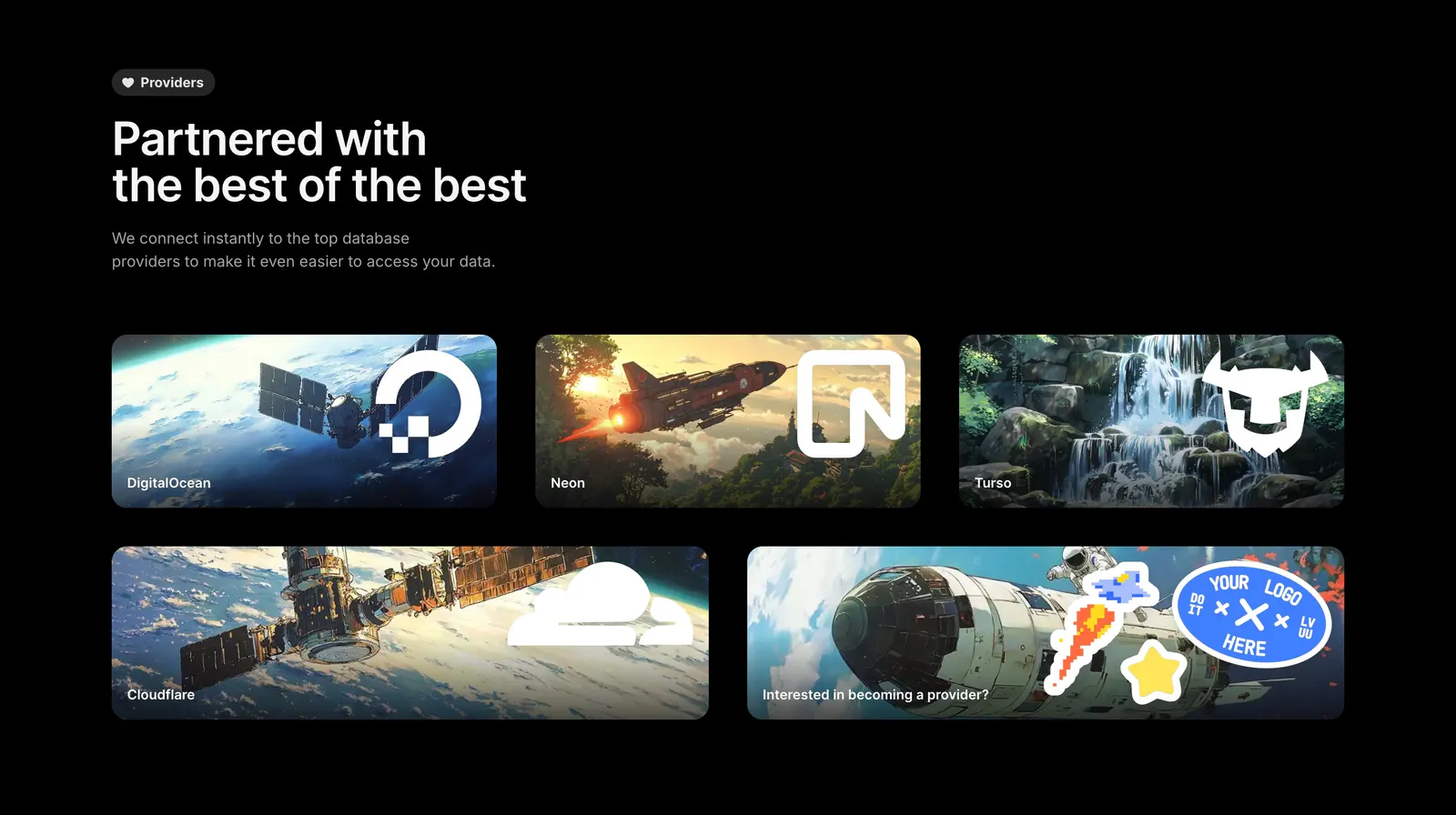
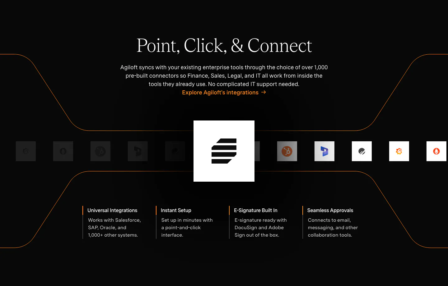
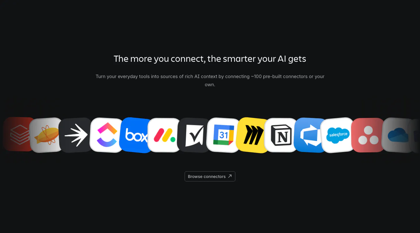
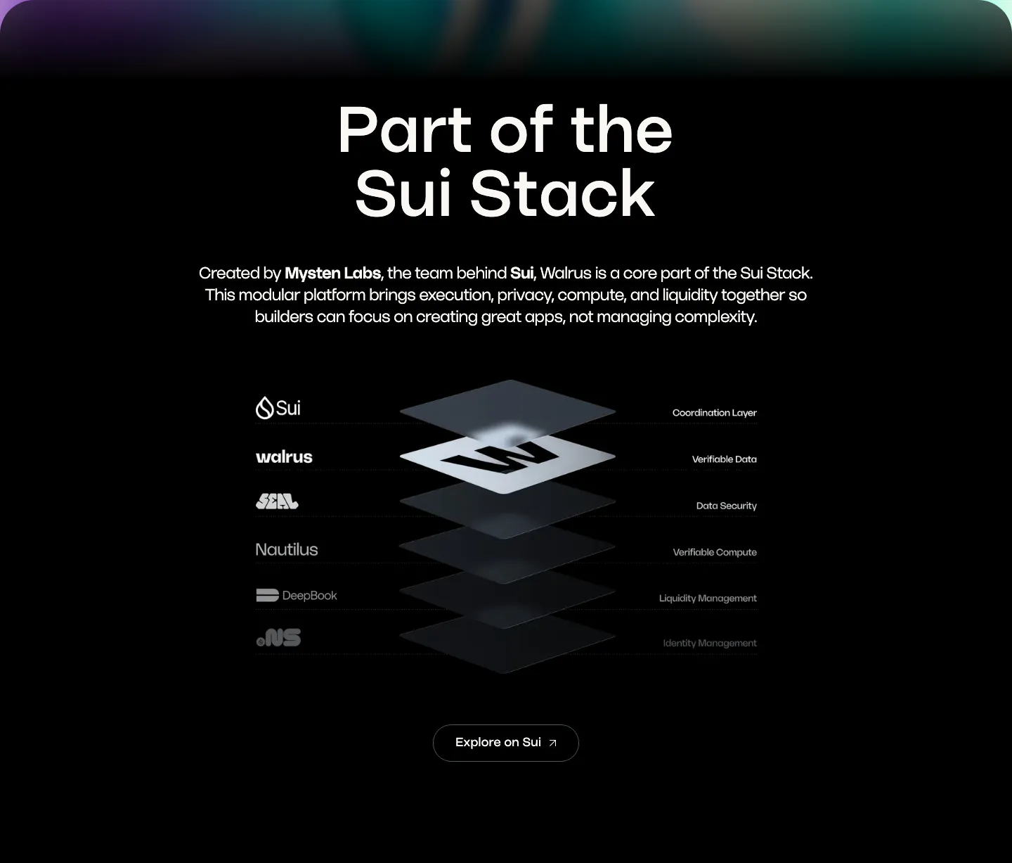
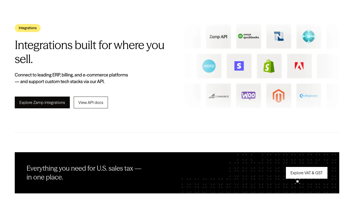
Before buying, most teams ask a practical question: will this work with the tools we already use? An integration section should answer it quickly, with familiar apps up front, sensible groups, and a hint of how data moves between systems. A crowded wall of unlabeled icons answers nothing. Compare how these integration section examples handle the job with icon grids, orbit diagrams, and connector flows.






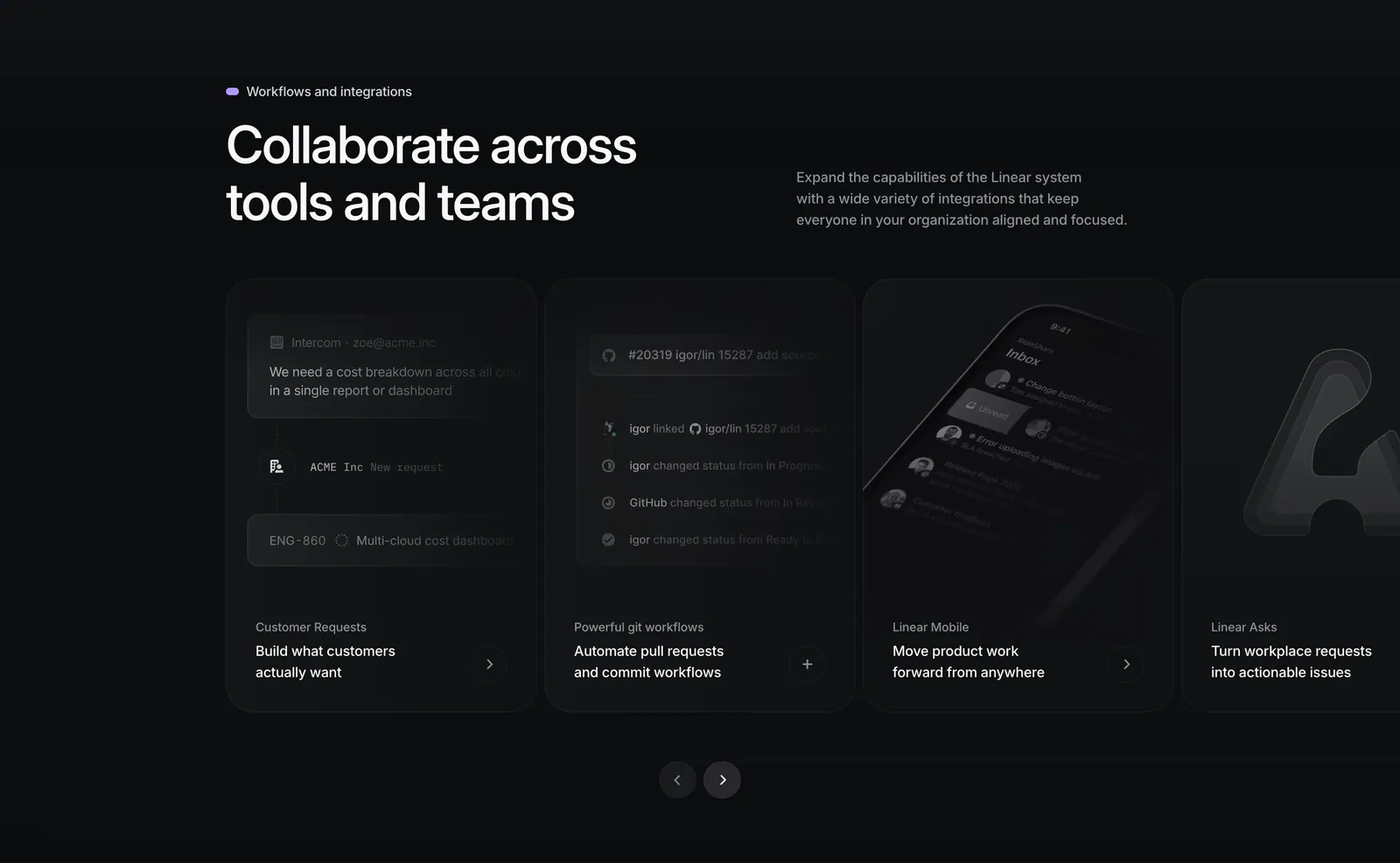

Common patterns in integrations sections
- Centered
- Dark mode
- Minimal
- Monochrome
- Card grid
- Split layout
- Carousel
How to show integrations clearly
-
Put the most requested tools first
Place the integrations your buyers ask about most first and largest. A visitor scanning for their CRM or chat app should spot it within a second. Less common connectors can sit behind a "See all integrations" link.
-
Label icons with app names
Many app icons are hard to recognize at small sizes. Add a short text label under each one, or show the name on hover and focus. Labels also help screen reader users and make the page searchable with find-in-page.
-
Group integrations by category
Sort connectors into clear groups such as data sources, messaging, and storage. Grouping lets buyers check coverage for each part of their stack and keeps a large catalog from looking like noise. Use small headings so groups scan quickly.
-
Explain what each connection does
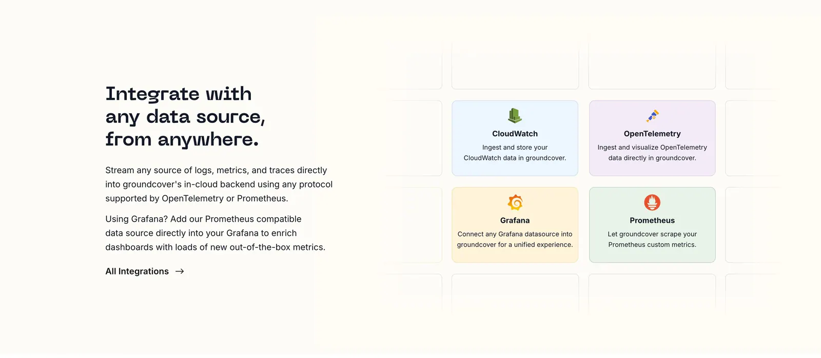
An icon alone does not tell a buyer whether data syncs both ways or imports once. Add a one-line description for key integrations, or a simple diagram showing direction, so technical evaluators can judge depth without leaving the page.