Clarion website design

Every section we captured from the Clarion website, in page order, from the hero section down to the footer. Open any thumbnail to see it full size.

Sections 7

In page order, top to bottom

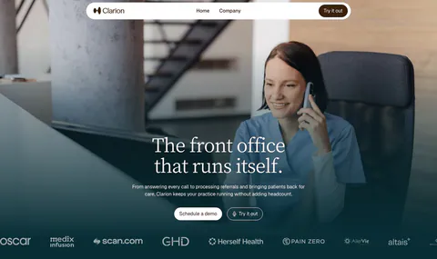
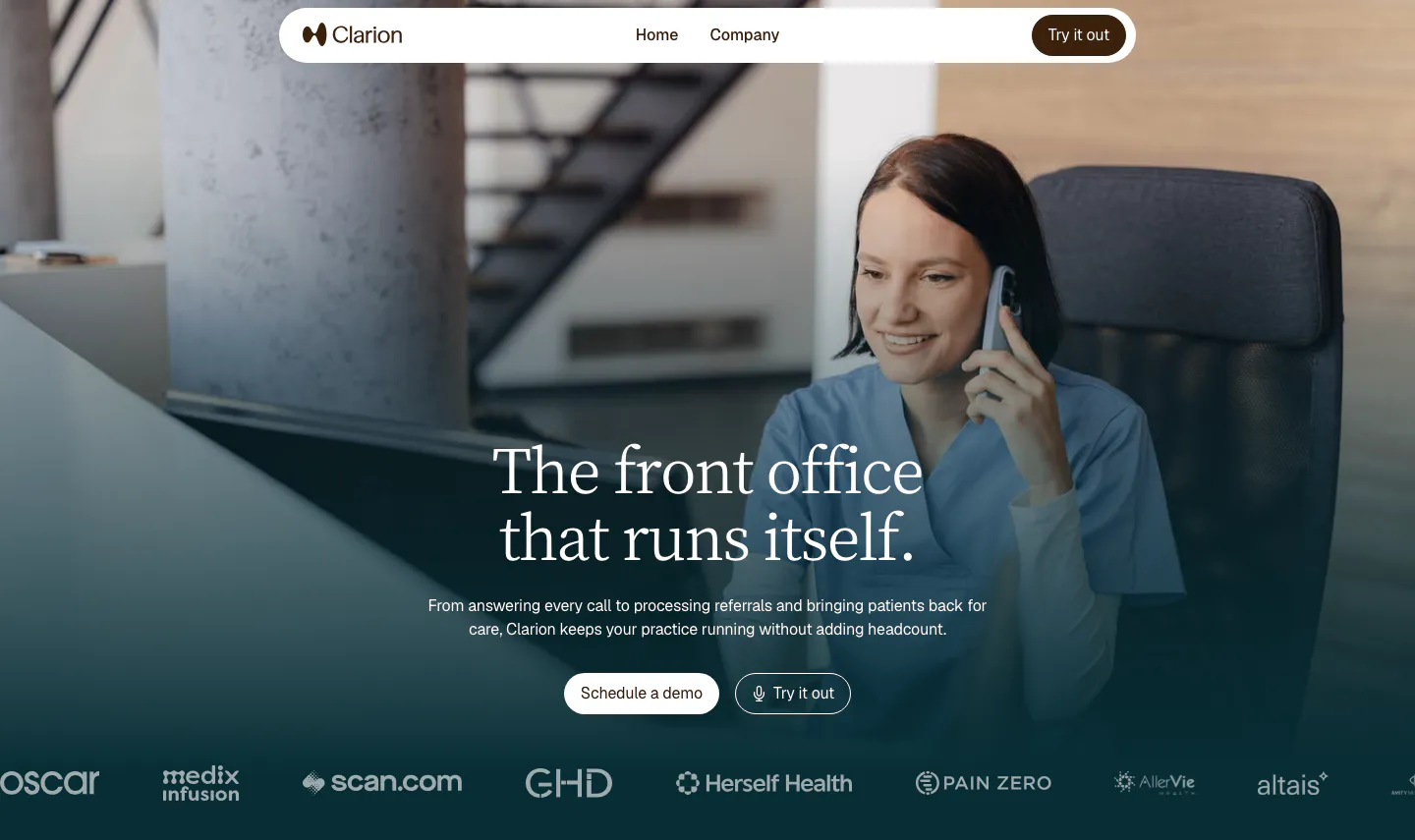
  1. Clarion hero section: full-bleed photo of a clinic worker on the phone, centered serif headline, two buttons and a customer logo row
    01 Hero

    The front office that runs itself.

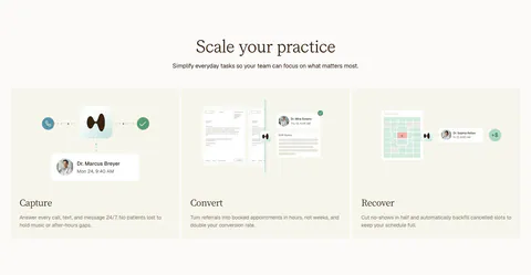
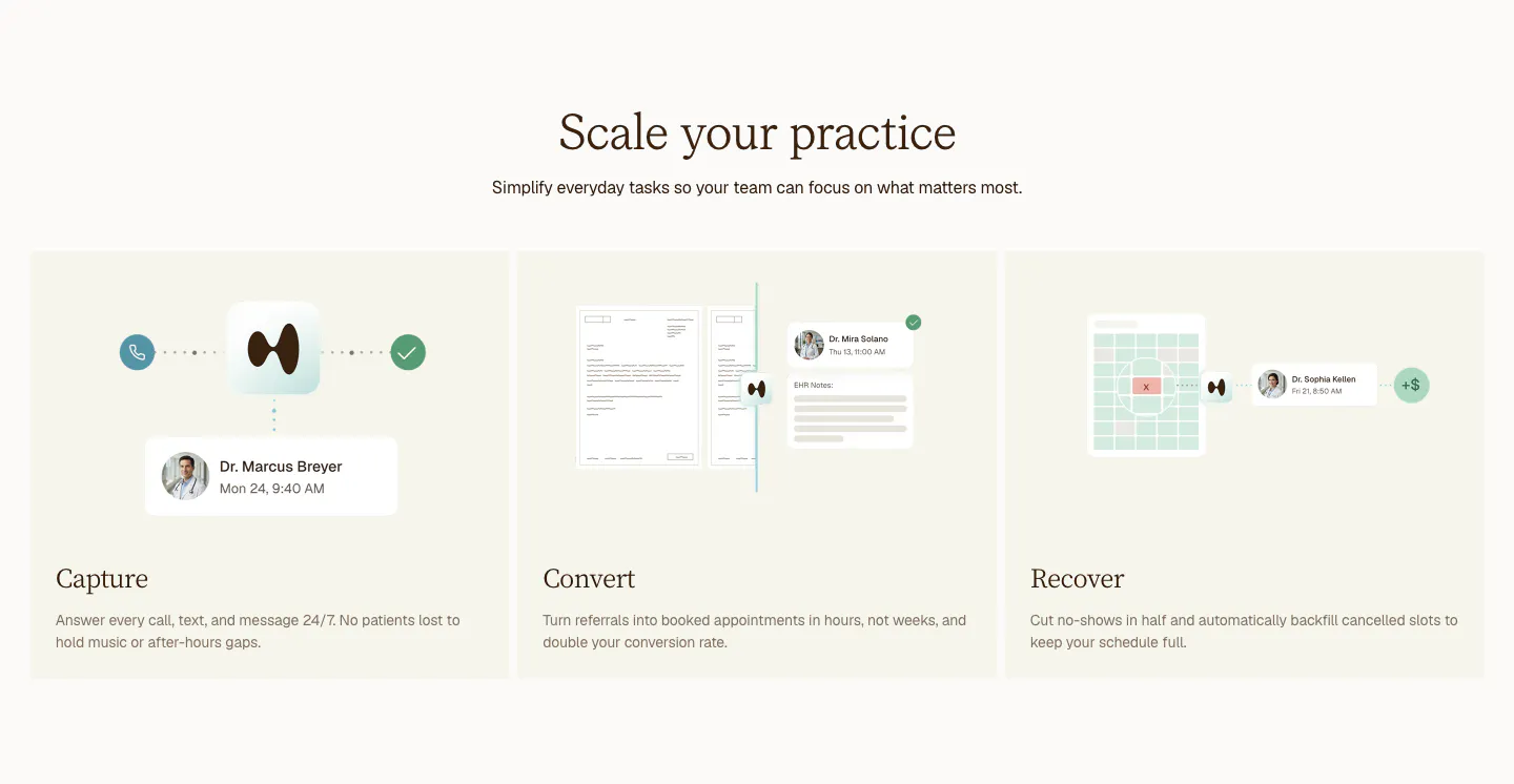
  2. Clarion features section: centered serif headline above three cream cards for Capture, Convert and Recover with light UI mockups

    Scale your practice

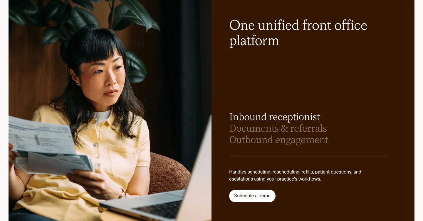
  3. Clarion features section: split card with a photo of a woman reviewing papers beside a dark brown panel with a serif tab list and button

    One unified front office platform

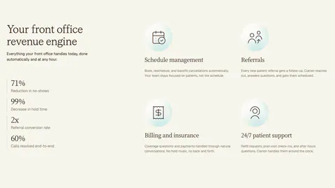
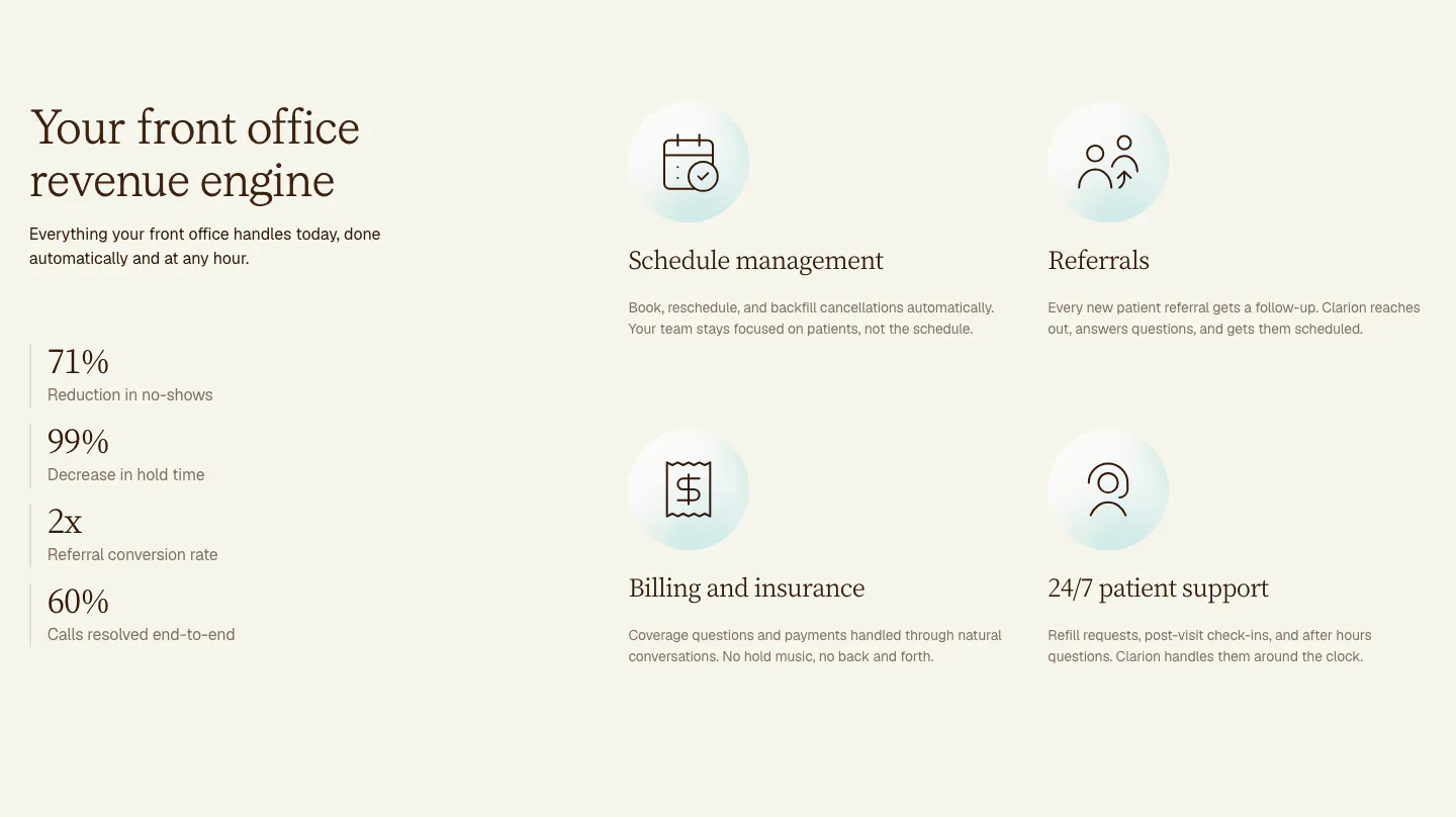
  4. Clarion features section: serif headline and four stacked metrics on the left, a 2x2 grid of icon features on the right, cream background

    Your front office revenue engine

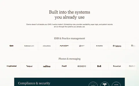
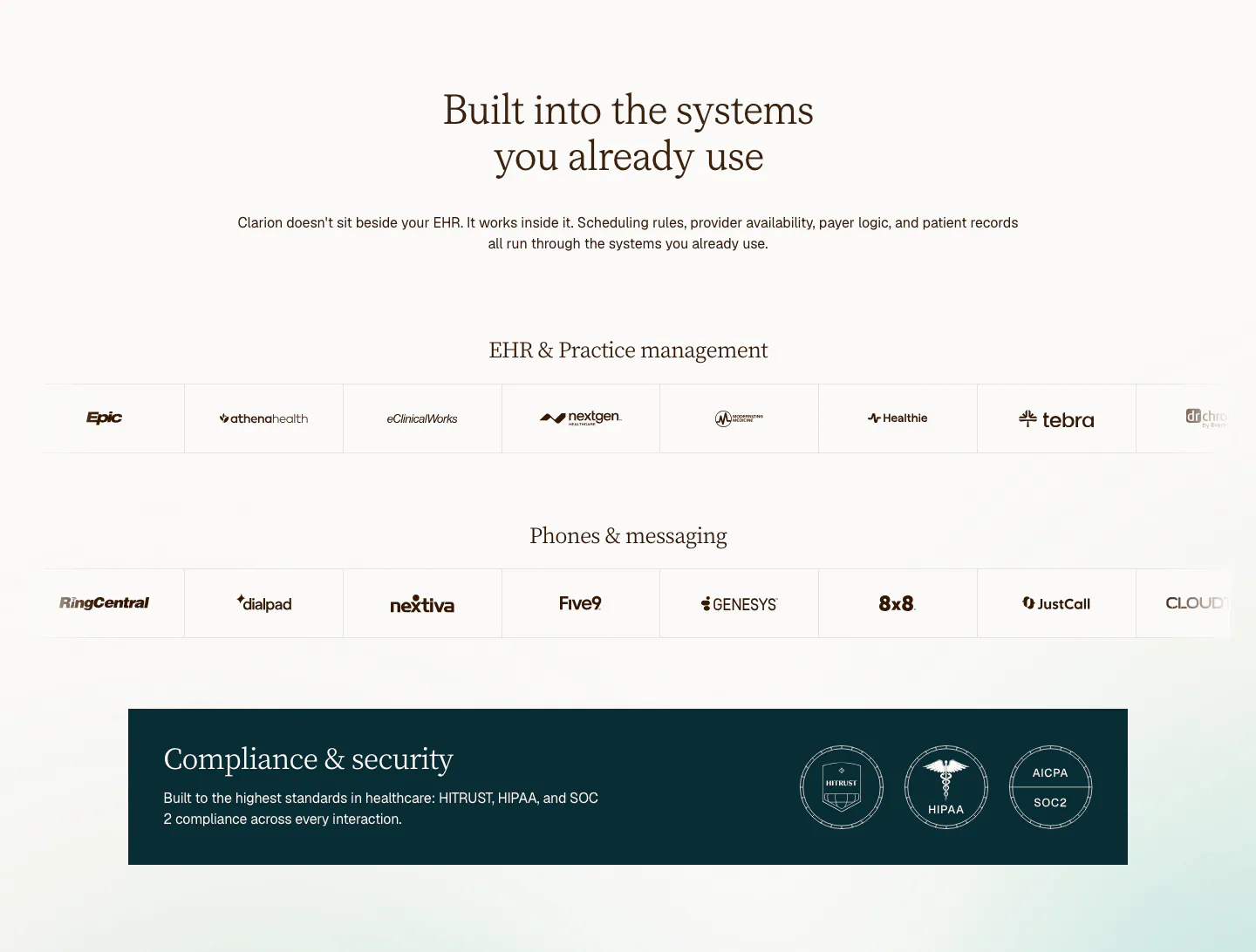
  5. Clarion integrations section: centered serif headline above two rows of EHR and phone system logos and a dark compliance badge banner

    Built into the systems you already use

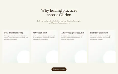
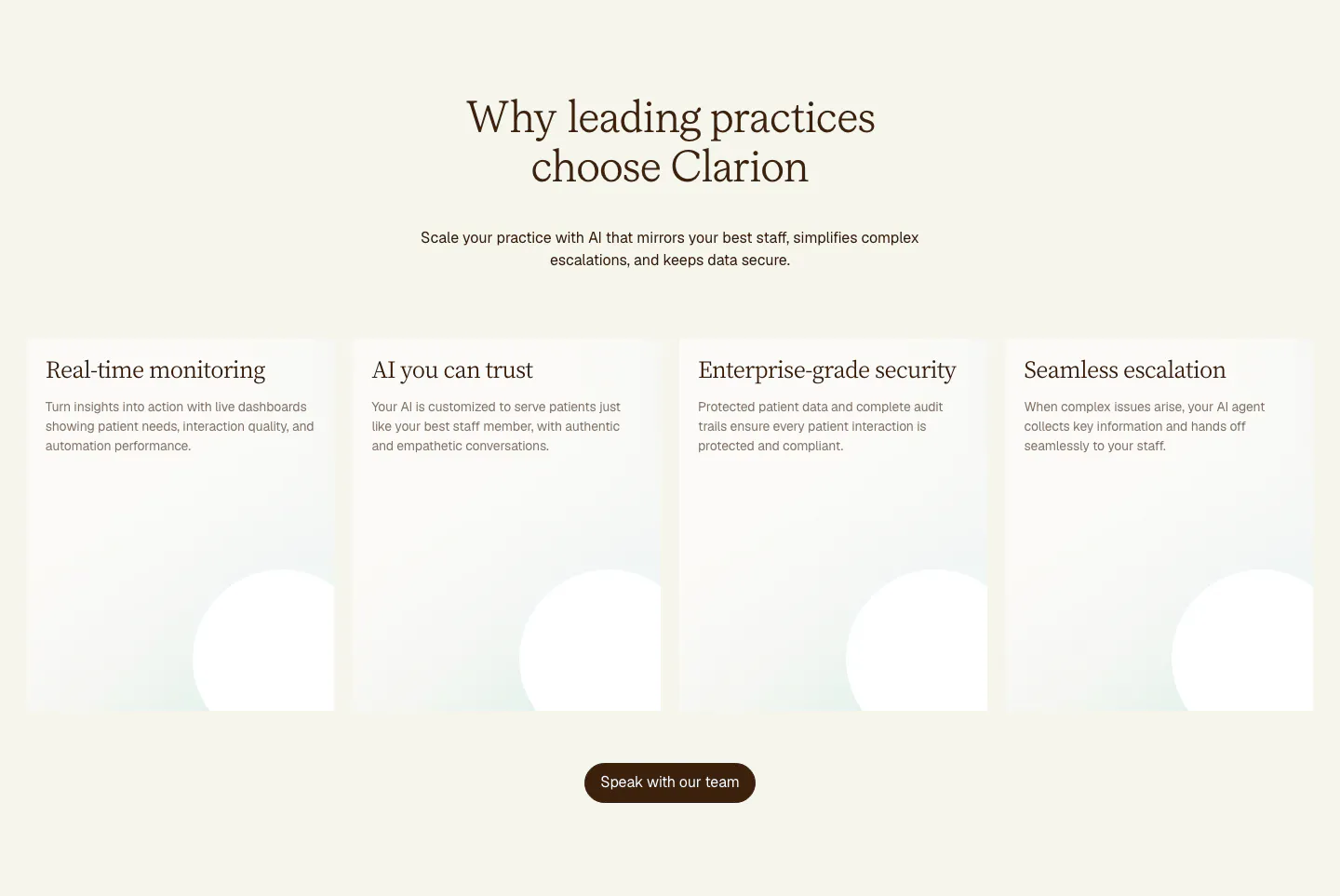
  6. Clarion value proposition section: centered serif headline above four tall cream cards with soft circle shapes and a brown button

    Why leading practices choose Clarion

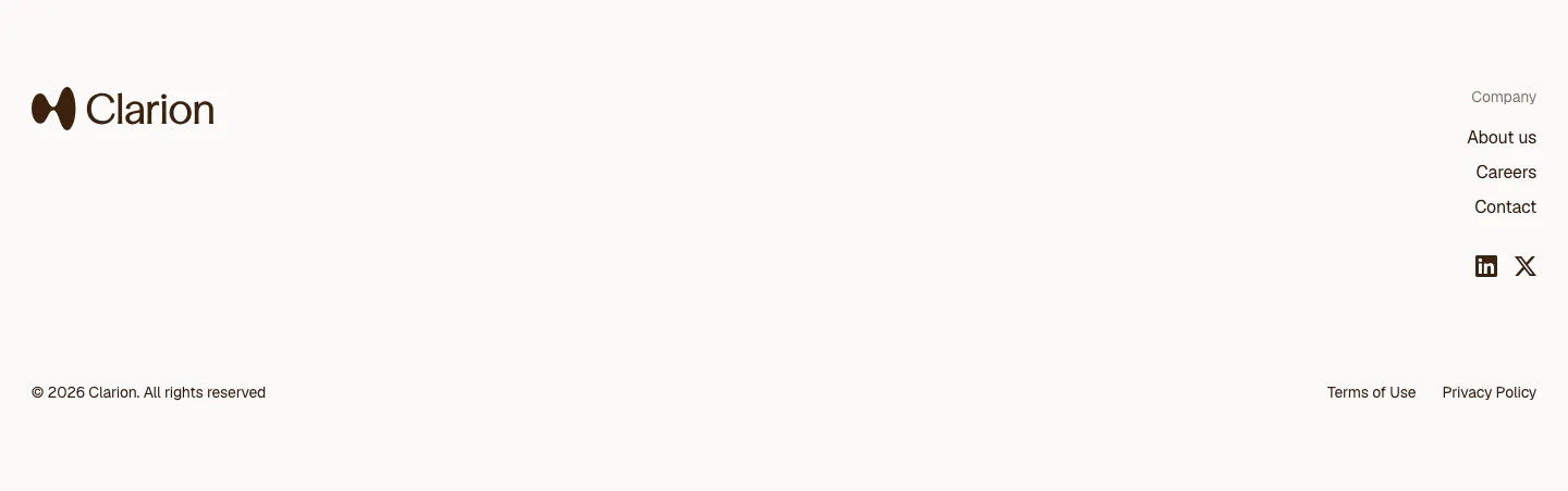
  7. Clarion footer section: light footer with logo at left, company links and social icons at right, and a copyright line
    07 Footer

Similar companies

All companies
    ↑↓ Navigate ↵ Open

    Section preview

    Website section