Calendly website design

Every section we captured from the Calendly website, in page order, from the hero section down to the footer. Open any thumbnail to see it full size.

Sections 7

In page order, top to bottom

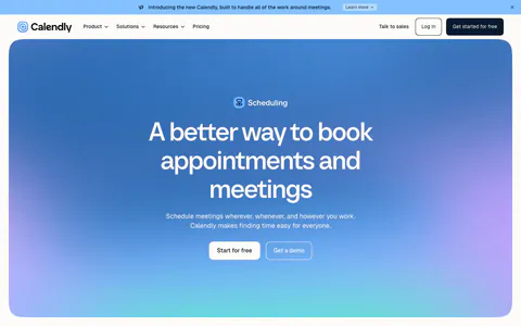
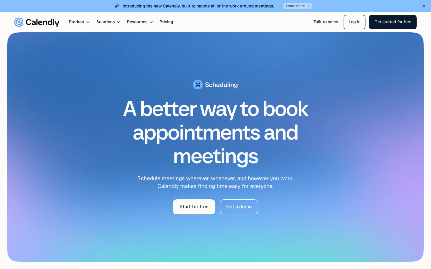
  1. Calendly hero section: centered headline and two buttons inside a rounded blue-to-purple gradient panel below the nav and announcement bar
    01 Hero

    A better way to book appointments and meetings

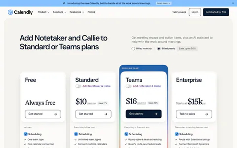
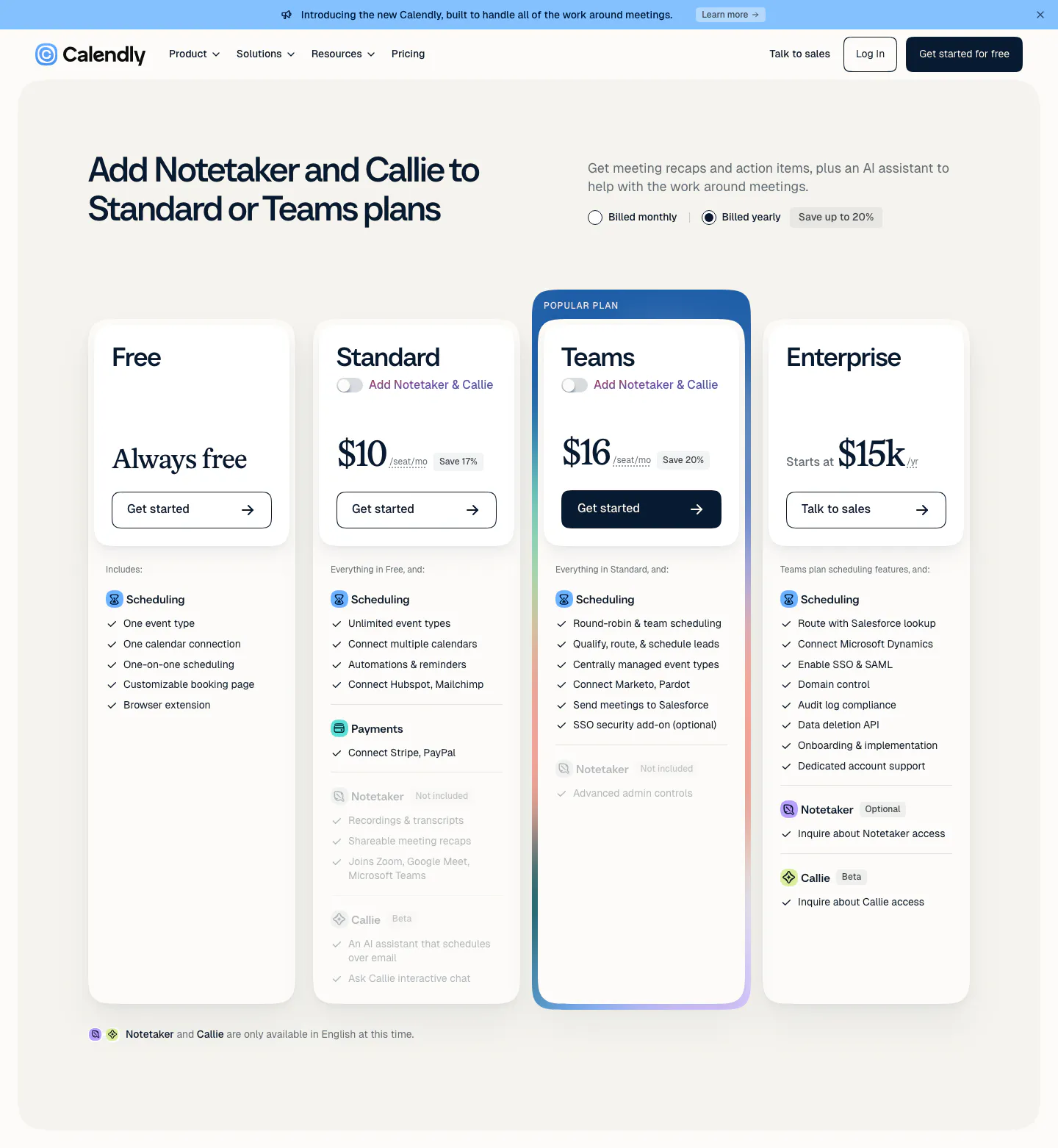
  2. Calendly pricing section: four plan cards with a highlighted Teams plan, monthly/yearly billing toggle and feature checklists below the nav
    02 Pricing

    Add Notetaker and Callie to Standard or Teams plans

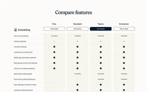
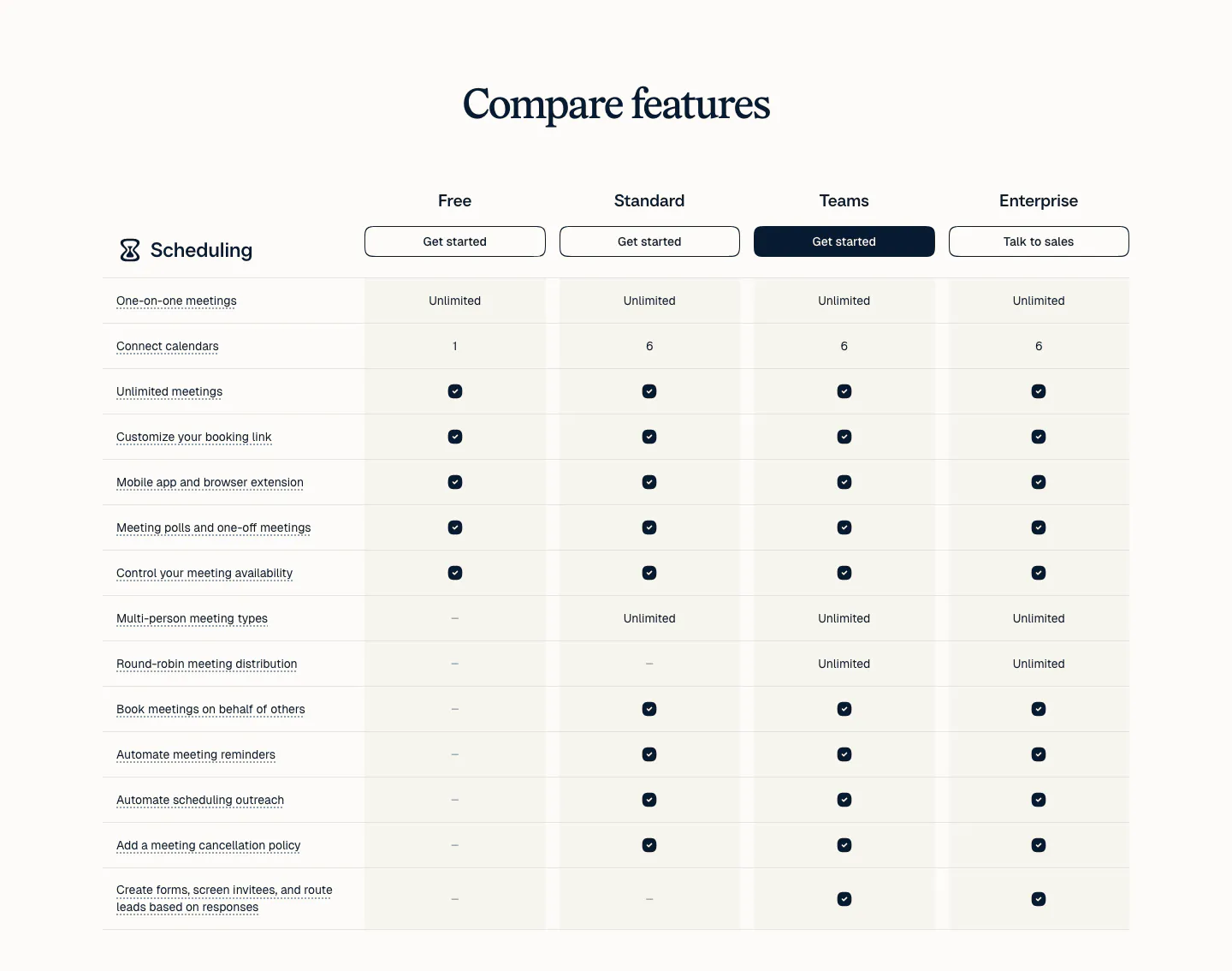
  3. Calendly pricing section: serif heading above a plan comparison table with four plan columns, buttons and check marks on a light background
    03 Pricing

    Compare features

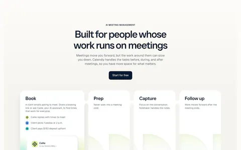
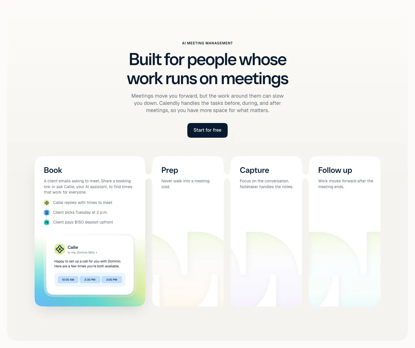
  4. Calendly features section: centered headline and button above four cards for Book, Prep, Capture and Follow up with a scheduling UI card

    Built for people whose work runs on meetings

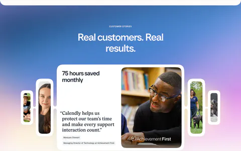
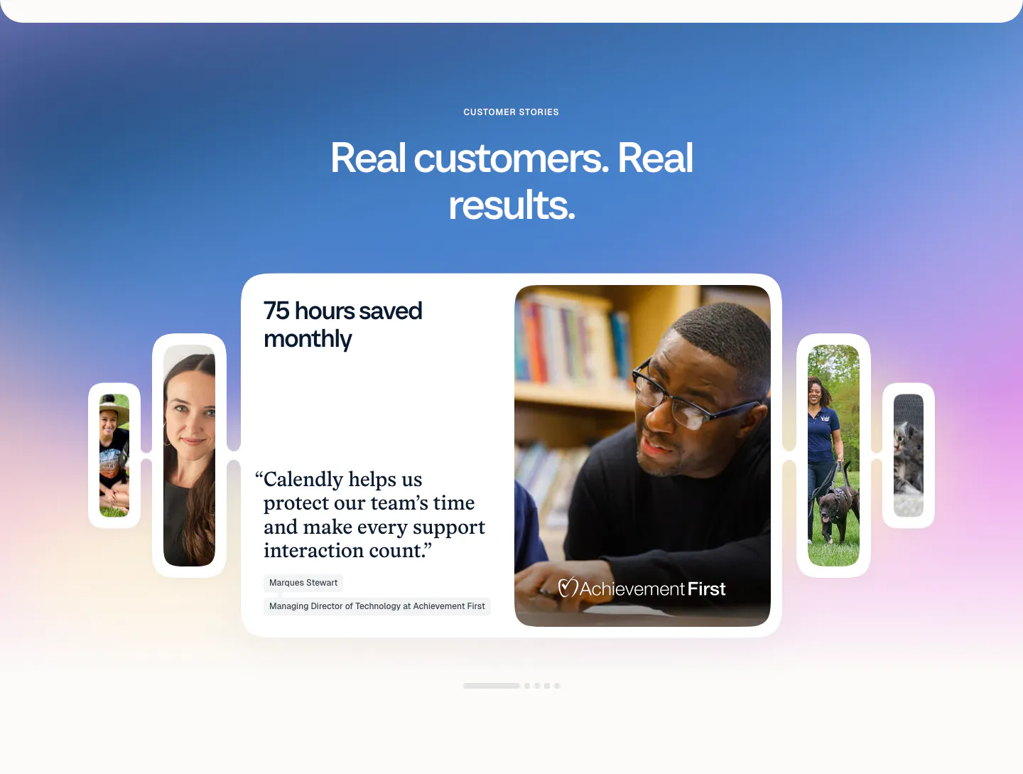
  5. Calendly testimonials section: centered headline on a blue-purple gradient above a quote card carousel with customer photos and pagination dots

    Real customers. Real results.

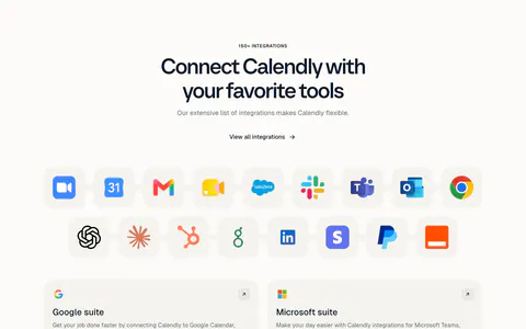
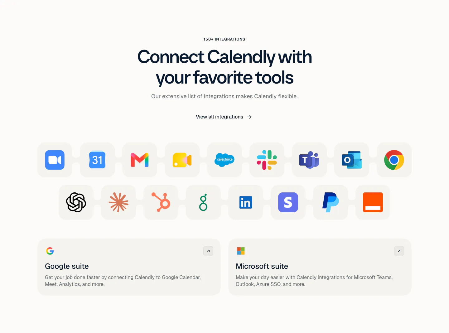
  6. Calendly integrations section: centered headline above a grid of app icon tiles and two cards for Google and Microsoft suites on a light background

    Connect Calendly with your favorite tools

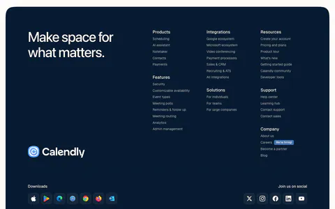
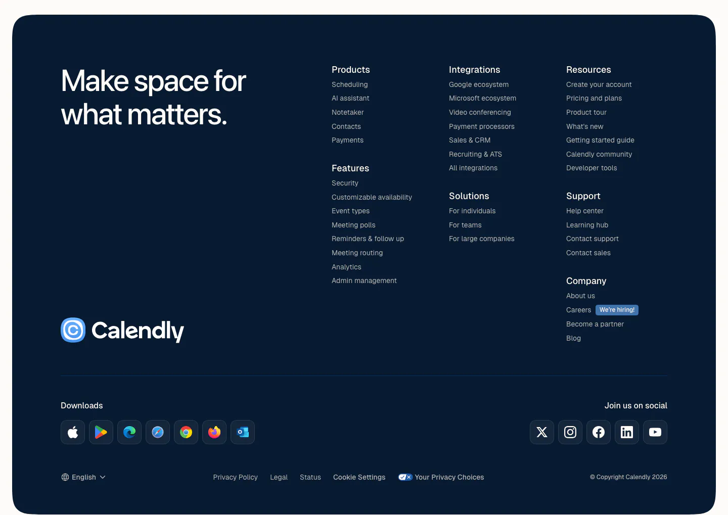
  7. Calendly footer section: rounded dark navy panel with a large tagline, logo, link columns, app download icons and social buttons
    07 Footer

    Make space for what matters.

Similar companies

All companies
    ↑↓ Navigate ↵ Open

    Section preview

    Website section