Port website design

Every section we captured from the Port website, in page order, from the hero section down to the footer. Open any thumbnail to see it full size.

Sections 10

In page order, top to bottom

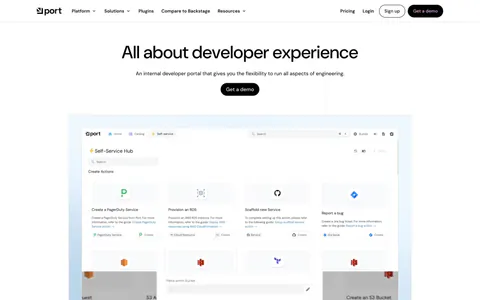
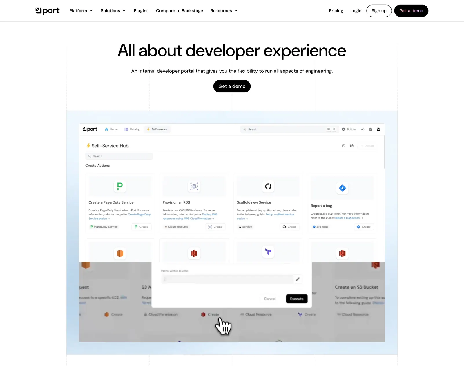
  1. Port hero section: centered headline with Get a demo button above a self-service hub product screenshot on a light blue grid-lined backdrop
    01 Hero

    All about developer experience

  2. Port logo cloud section: two rows of five black customer logos centered on a white background with faint grid lines
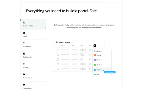
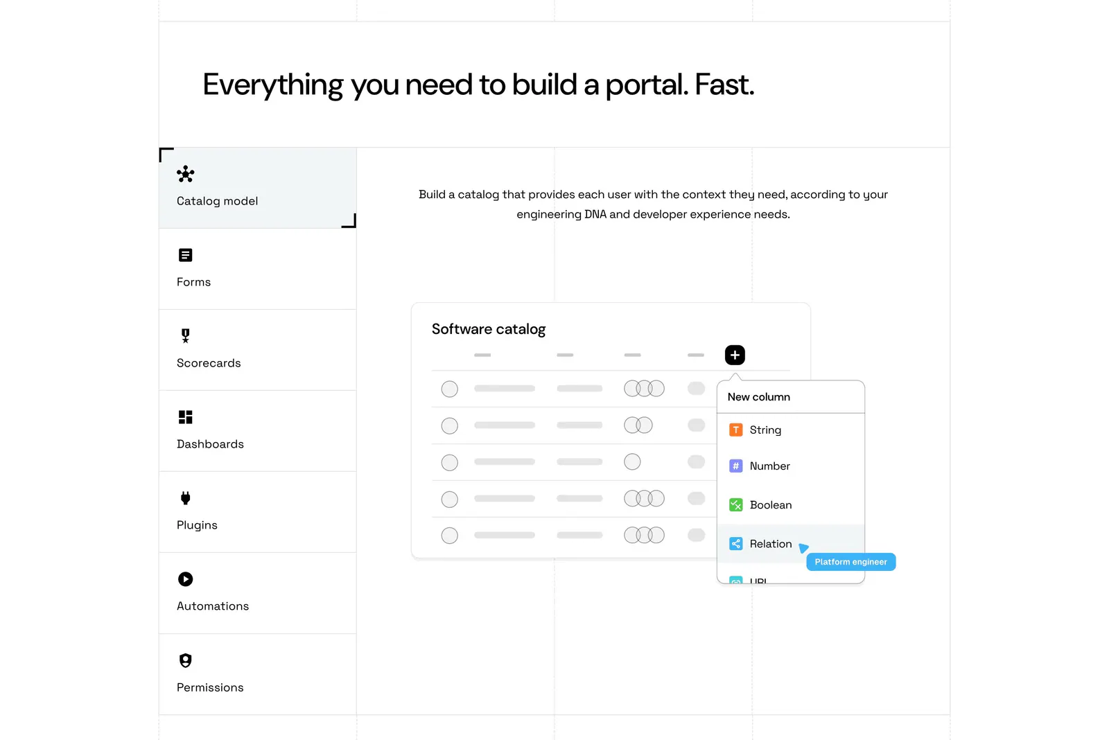
  3. Port features section: headline above a vertical tab list of capabilities beside a software catalog UI mockup on a grid-lined white page

    Everything you need to build a portal. Fast.

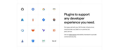
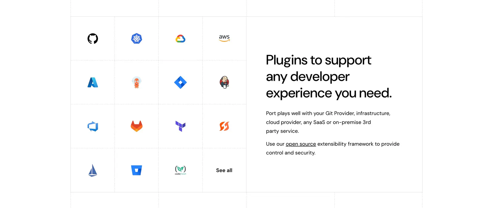
  4. Port integrations section: grid of developer tool icons on the left beside a headline and short copy on the right, white background

    Plugins to support any developer experience you need.

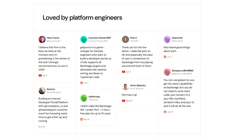
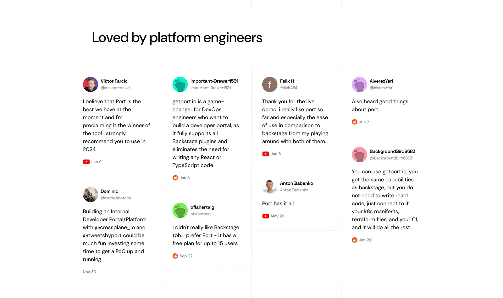
  5. Port testimonials section: headline above a four-column wall of social posts with avatars, handles and YouTube or Reddit source icons

    Loved by platform engineers

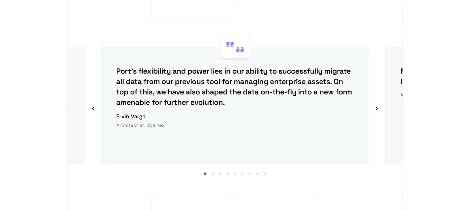
  6. Port testimonials section: single quote card carousel with quote icon, arrows and pagination dots, side cards cut off at the edges
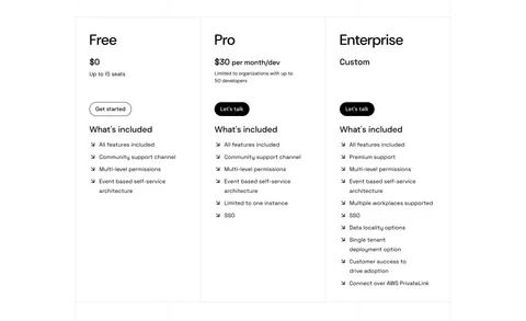
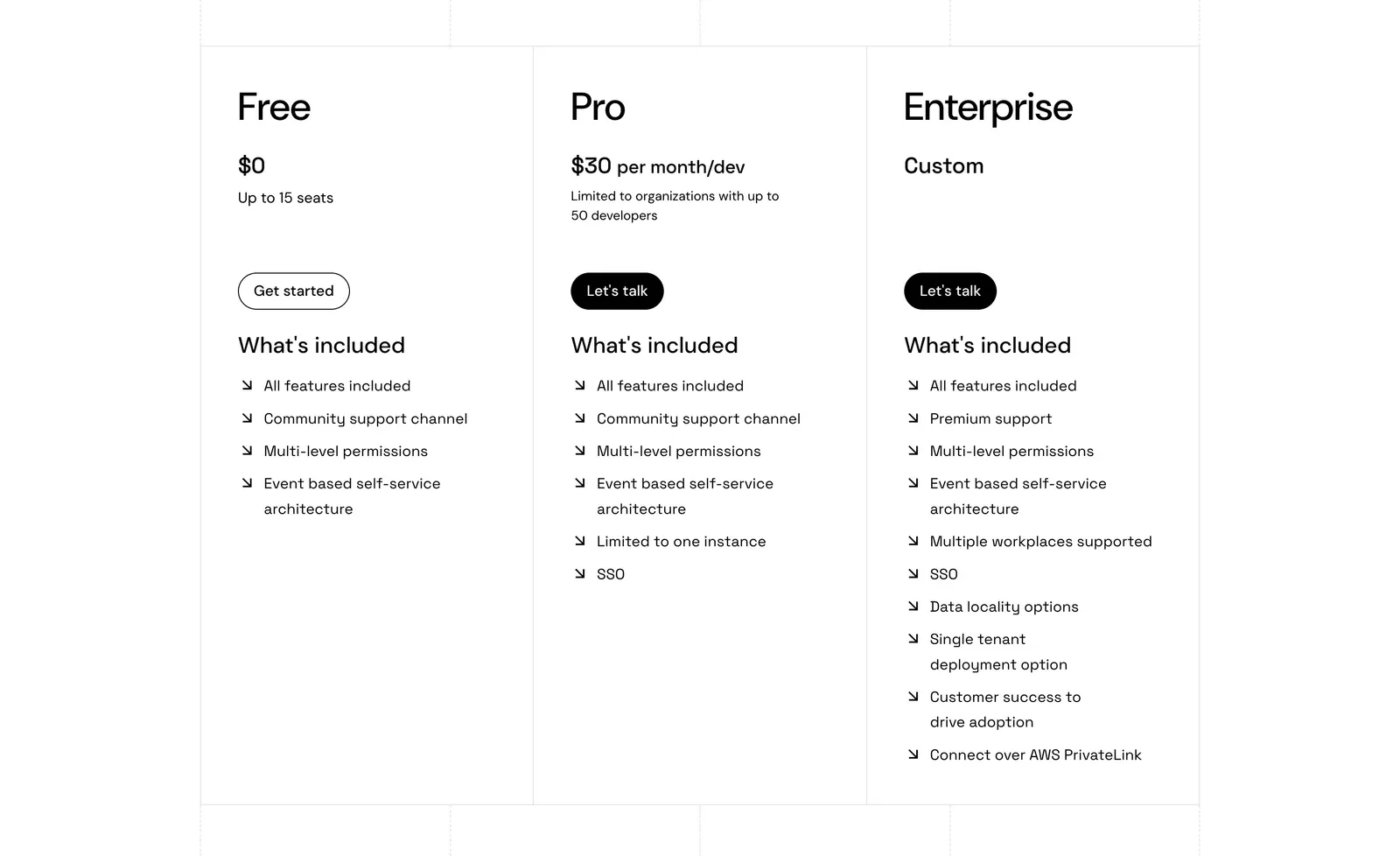
  7. Port pricing section: three bordered plan columns for Free, Pro and Enterprise with prices, buttons and arrow feature lists on white
    07 Pricing
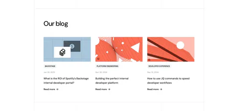
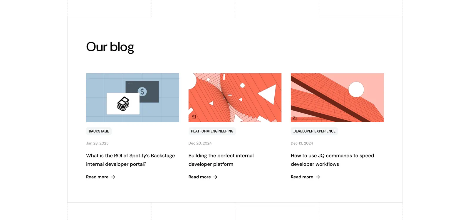
  8. Port blog & resources section: headline above three blog cards with abstract geometric artwork, category tags, dates and Read more links

    Our blog

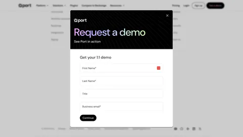
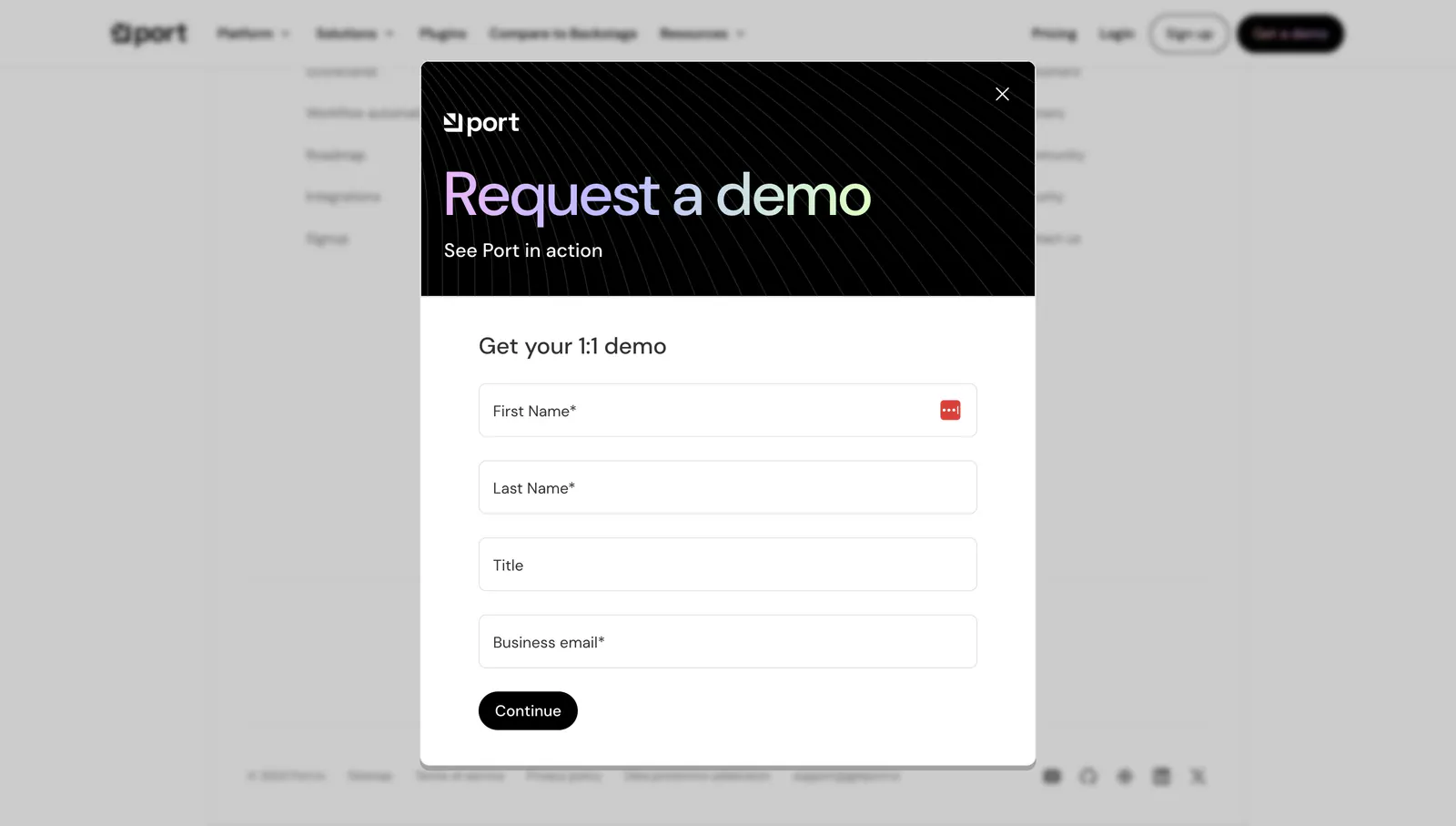
  9. Port contact section: modal over a dimmed page with dark header, gradient Request a demo text and a four-field form with Continue button
    09 Contact

    Request a demo

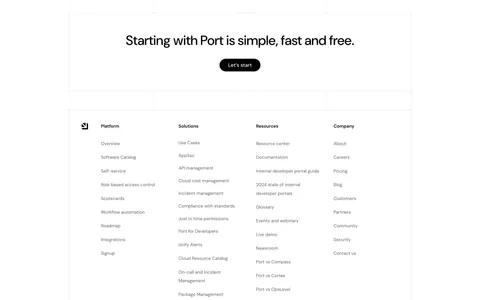
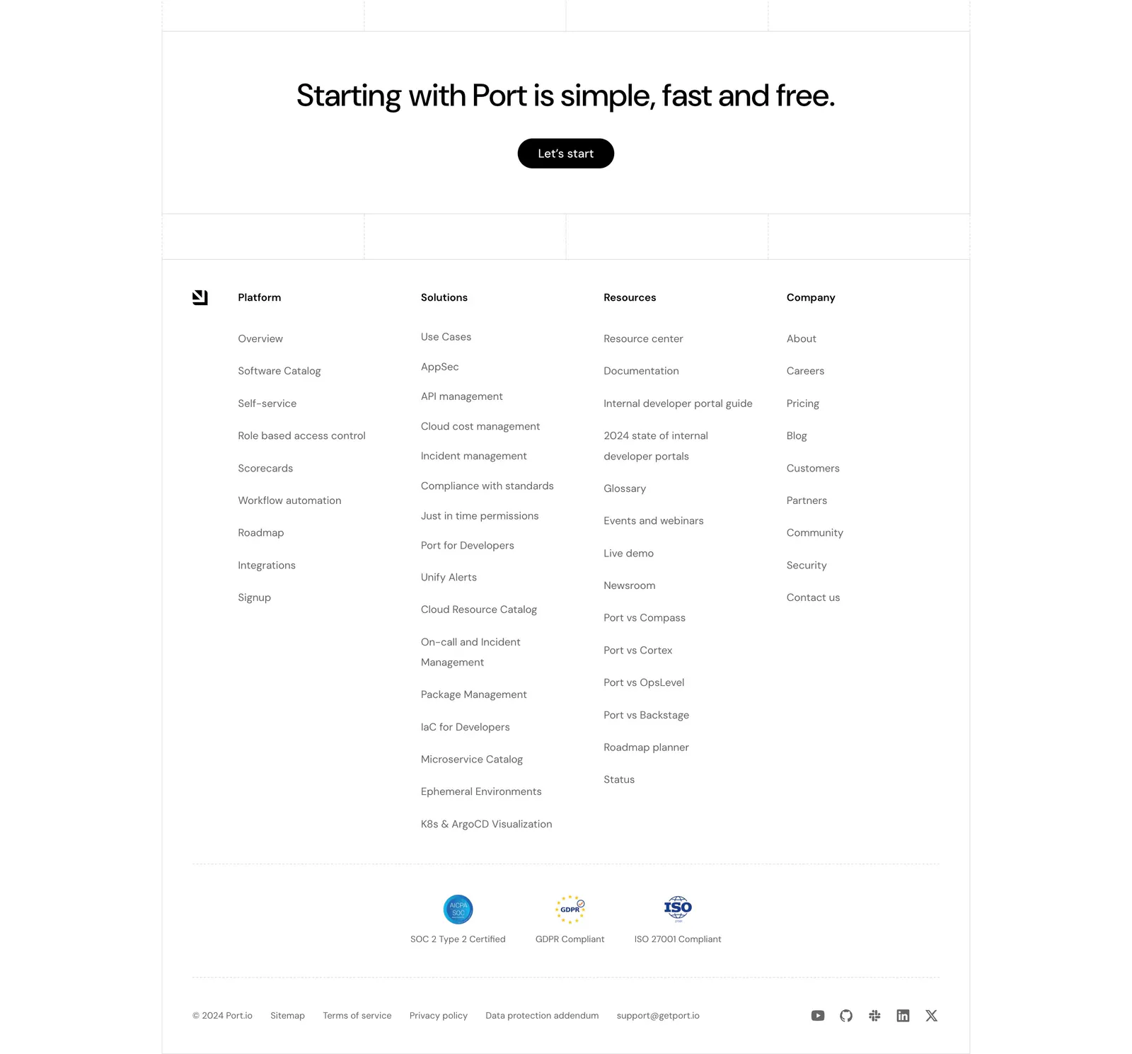
  10. Port footer section: centered CTA with Let's start button above four link columns, compliance badges, legal links and social icons
    10 Footer

    Starting with Port is simple, fast and free.
Similar companies

All companies
    ↑↓ Navigate ↵ Open

    Section preview

    Website section