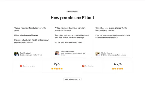
Contact Section Examples
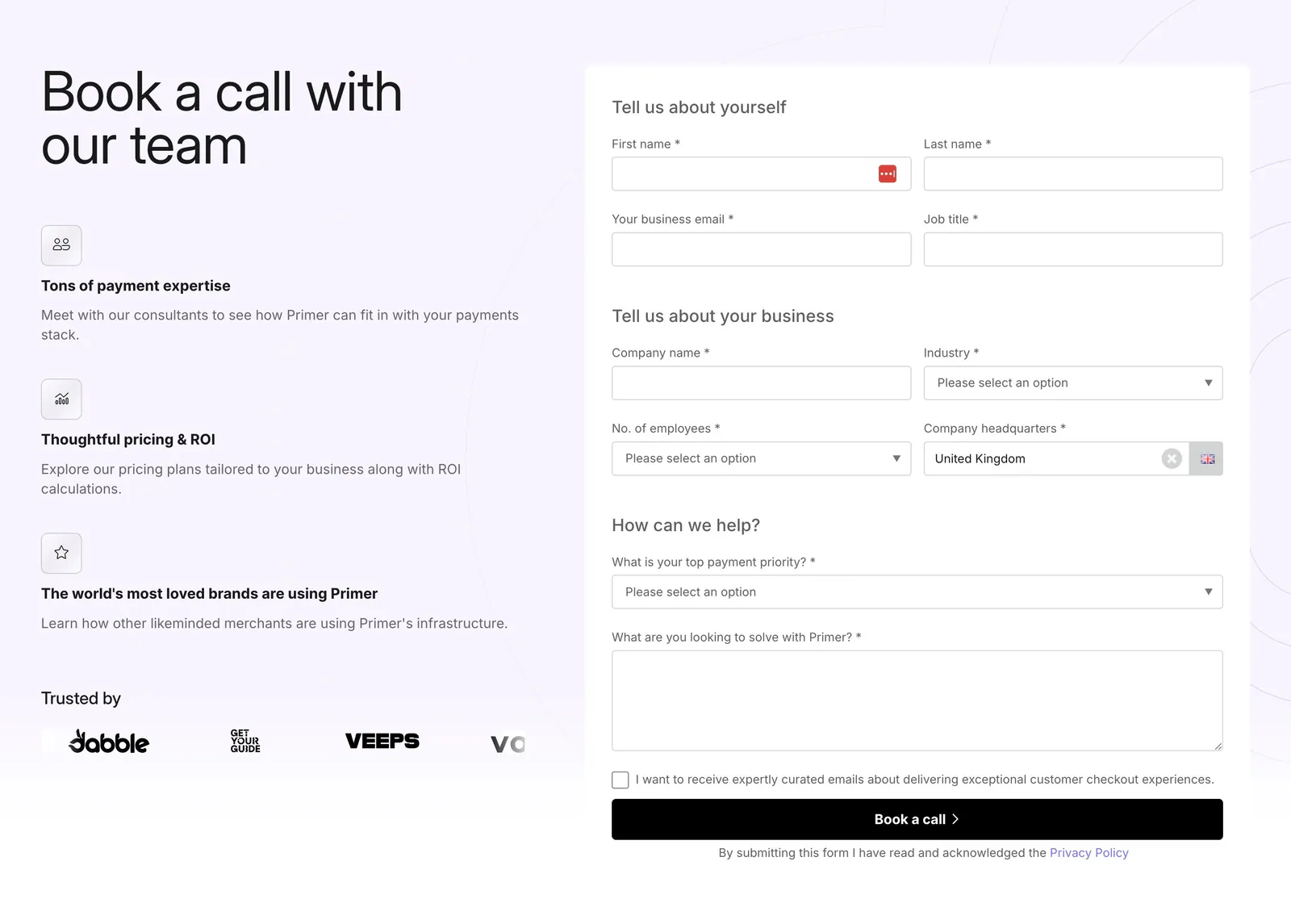
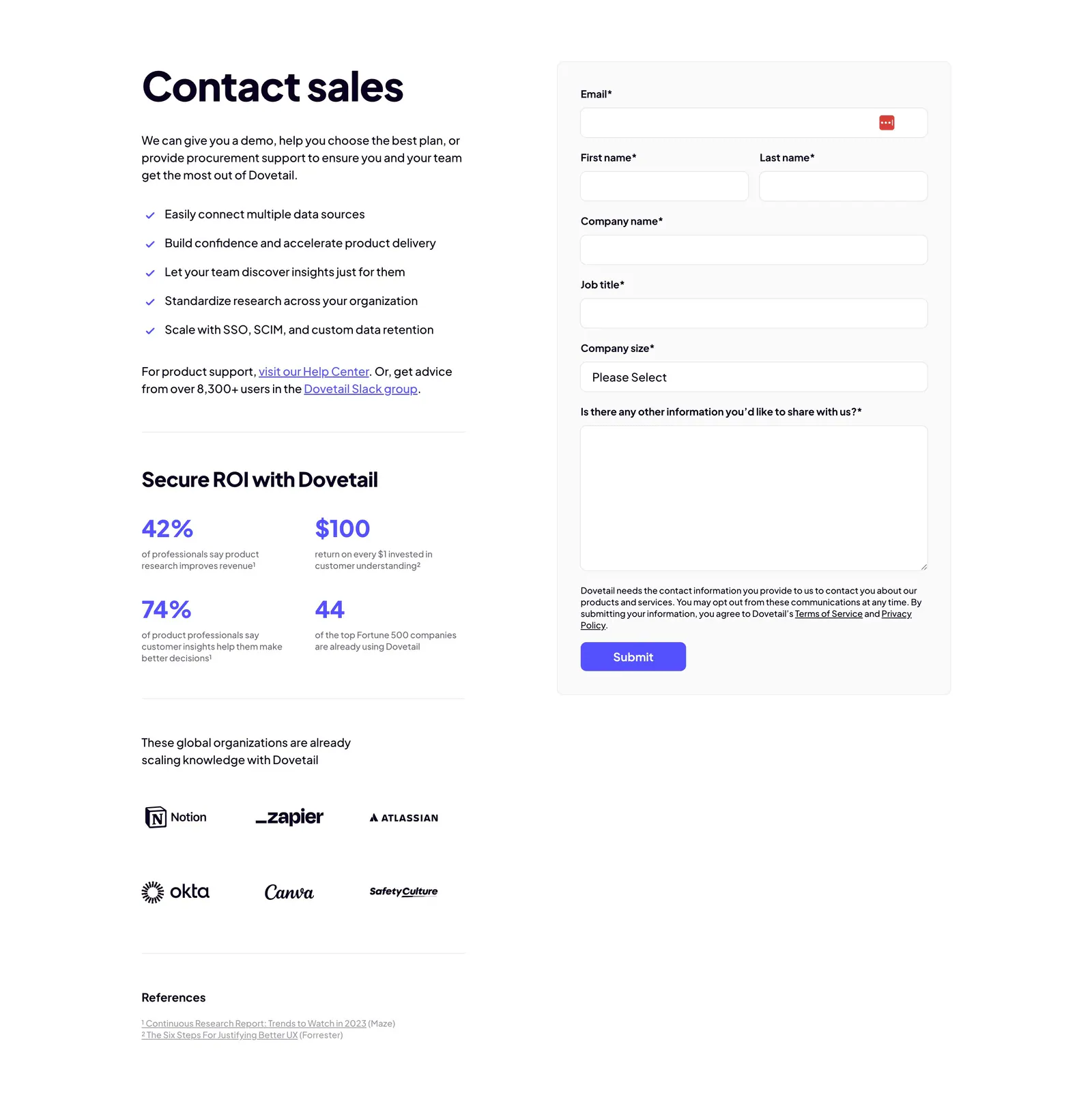
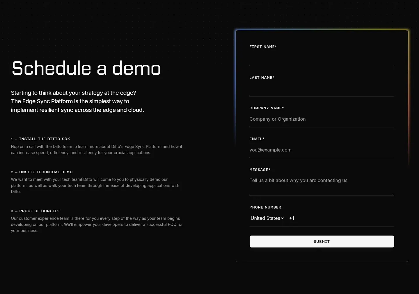
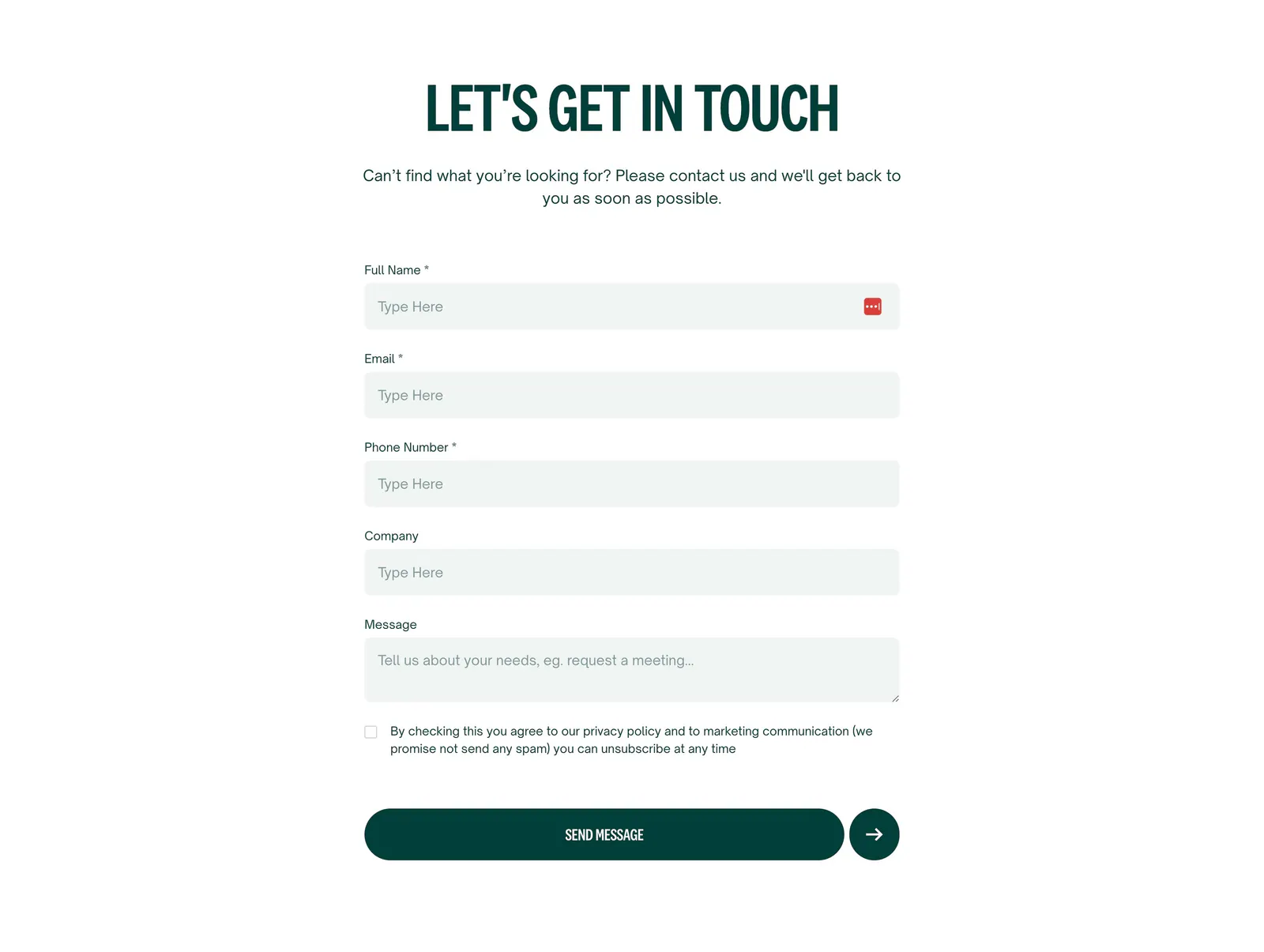
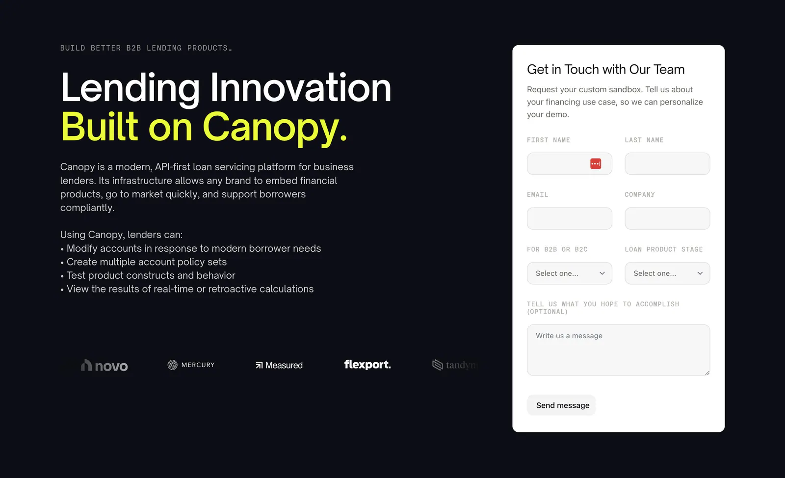
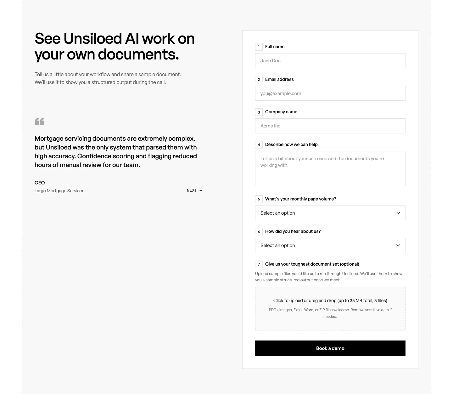
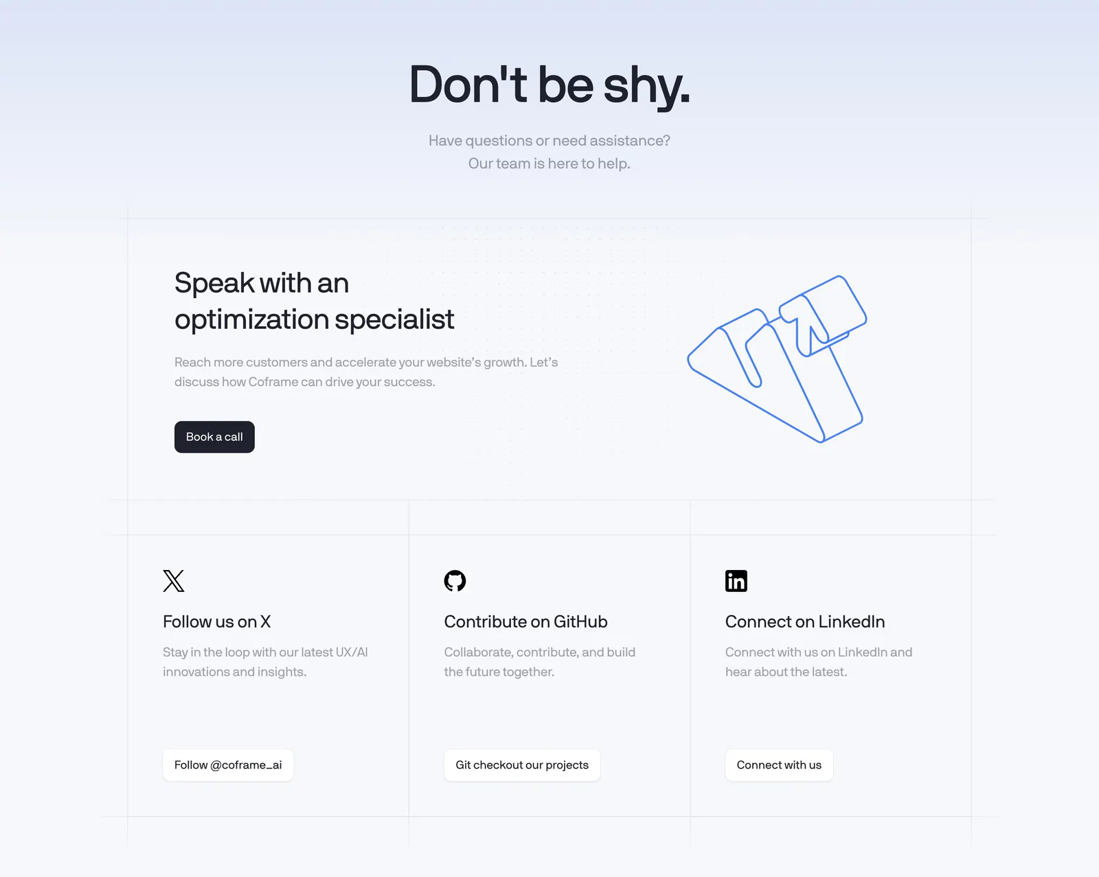
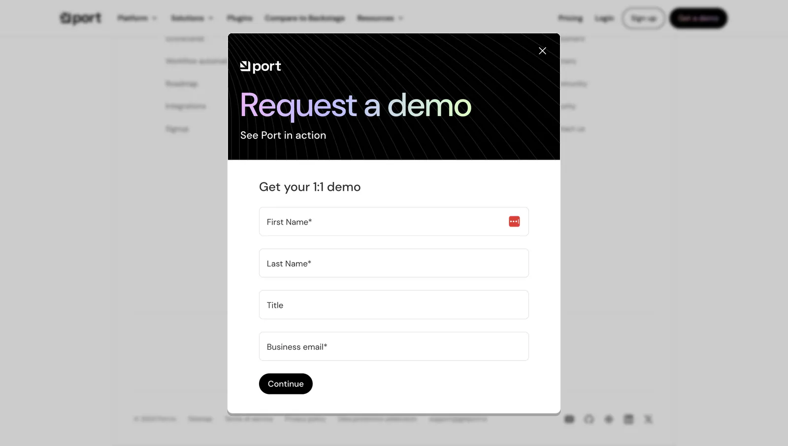
Contact and demo request sections turn interest into a conversation with your team. Every extra field and every paragraph above the form costs submissions, so the good ones ask for little, explain what happens after submit, and offer email or phone for people who avoid forms. Pay attention to form length, layout, and the trust details beside the fields as you go through these contact section examples.

Common patterns in contact sections
- Form
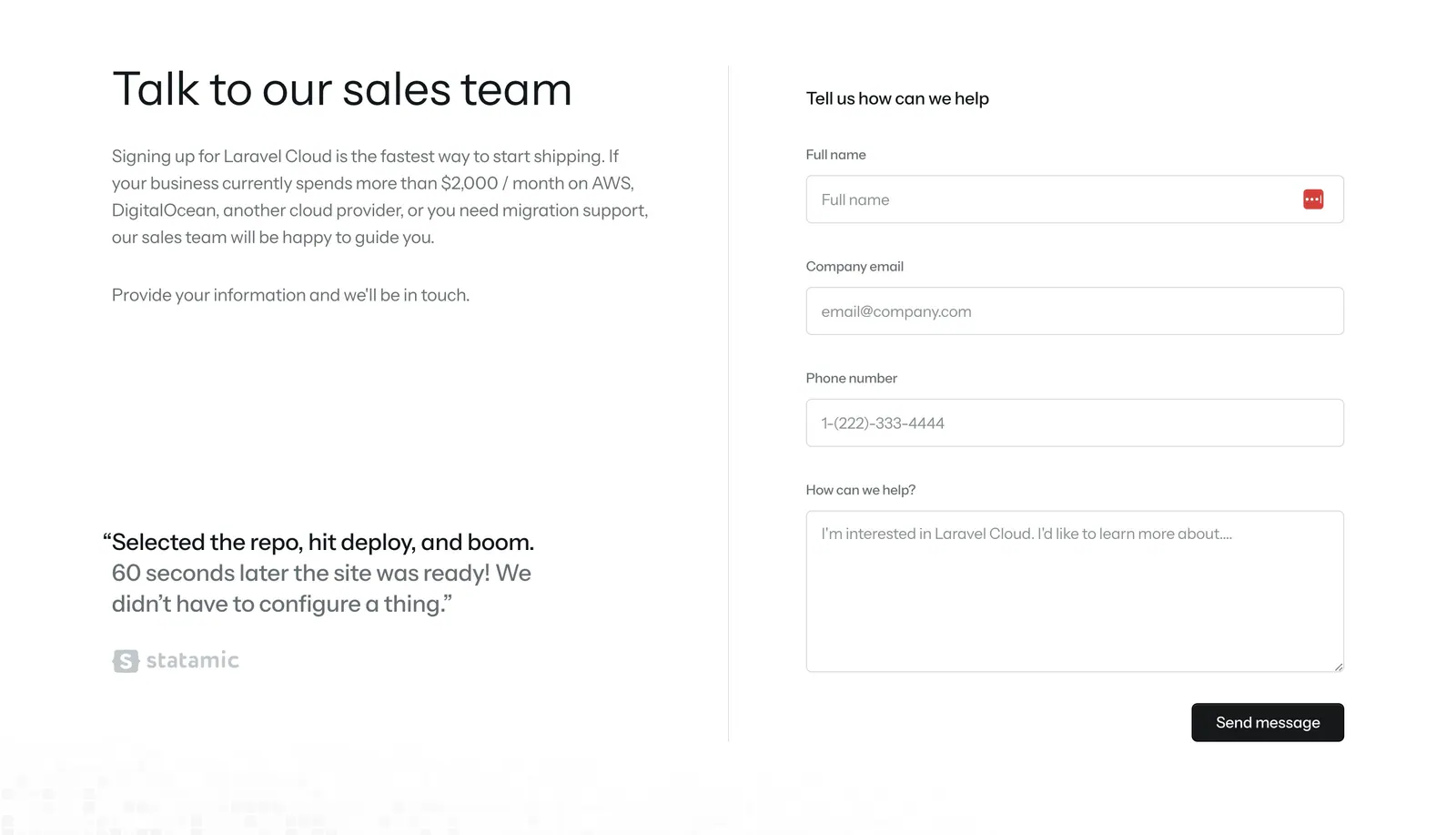
- Split layout
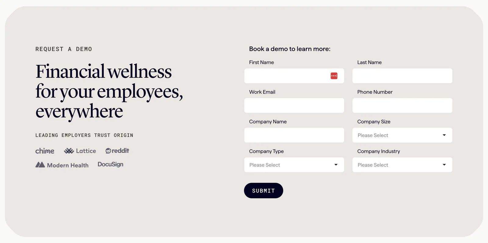
- Logo strip
- Minimal
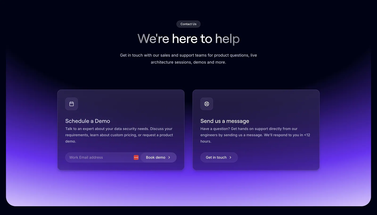
- Dark mode
- Centered
- Monochrome
How to design a contact or demo request form
-
Ask only for what you need
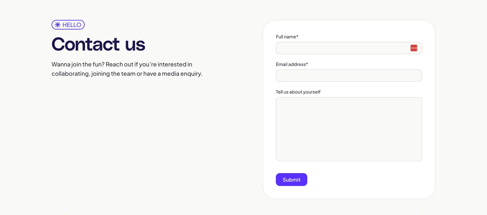
Start with name, work email, and one message box, then add company size or role only if it changes how you route the request. Mark optional fields as optional instead of starring required ones, and skip the phone number unless you will actually call.
-
Pair the form with context
On desktop, put the form on one side and context on the other: what the call covers, who will reply, and how quickly. A short customer quote helps here. On mobile, keep that context brief so the first field stays near the top.
-
Label every field and error
Use visible labels above inputs, not placeholder text that disappears while typing. Show errors inline beside the field, in plain words that explain the fix, and set input types and autocomplete attributes so browsers can fill name, email, and company.
-
Offer a direct alternative
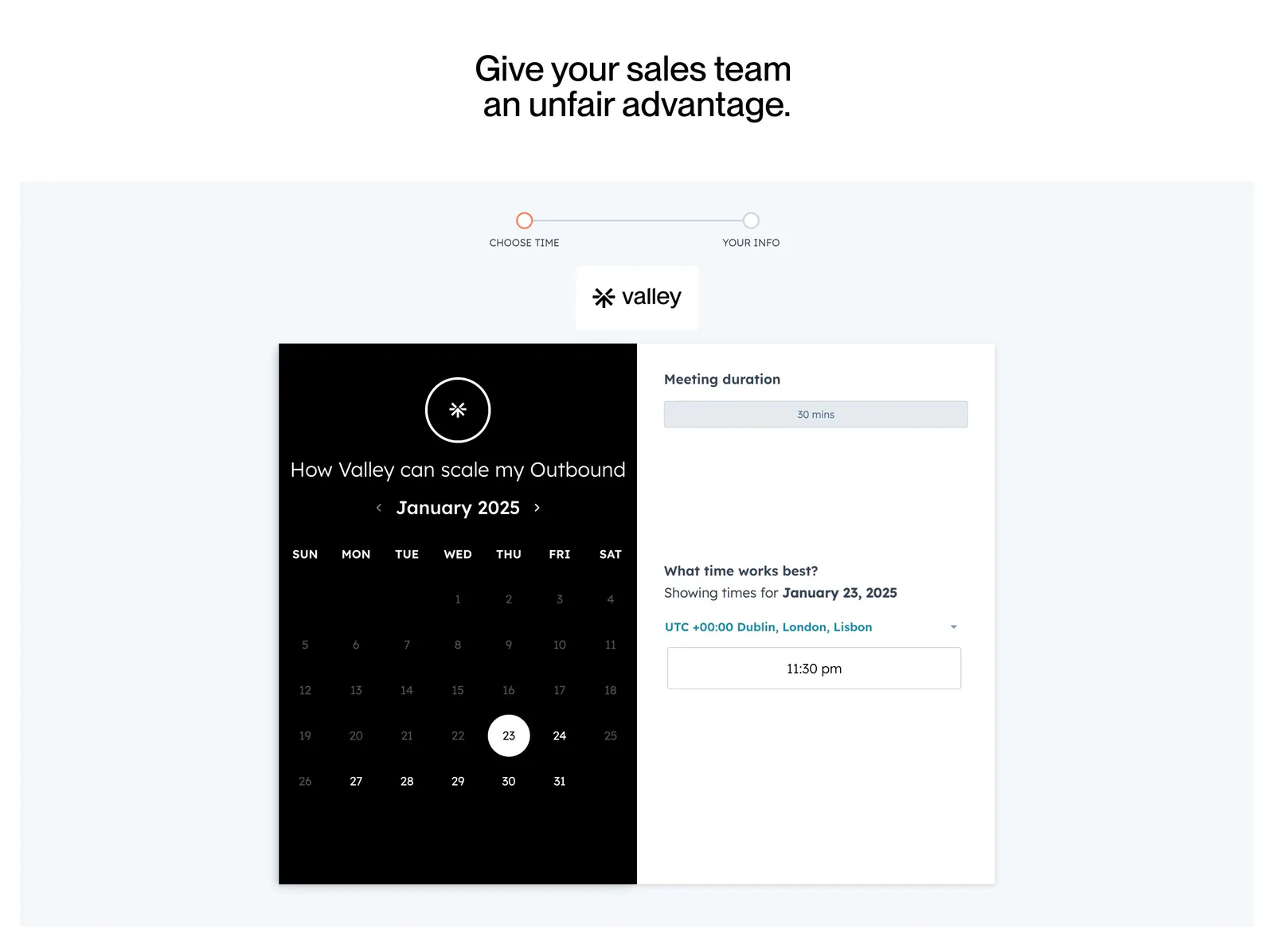
Some people will never fill in a form. List a sales email, phone number, or office address in a quieter style beside it. For demo requests, showing a scheduling calendar right after submit saves a round of back-and-forth email.