Bucket website design

Every section we captured from the Bucket website, in page order, from the hero section down to the FAQ section. Open any thumbnail to see it full size.

Sections 8

In page order, top to bottom

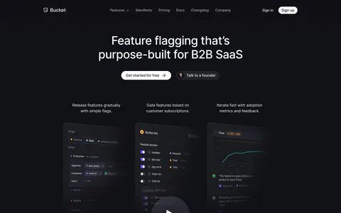
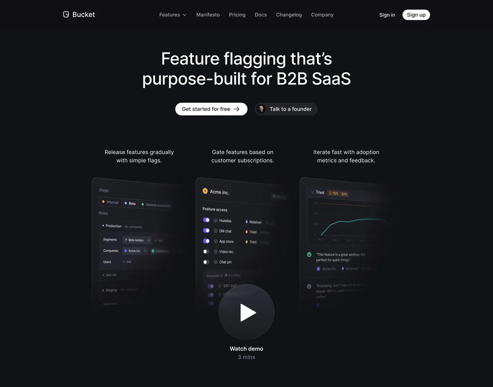
  1. Bucket hero section: centered headline and two buttons above three tilted product UI panels and a watch demo play button on dark
    01 Hero

    Feature flagging that’s purpose-built for B2B SaaS

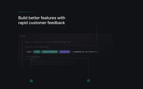
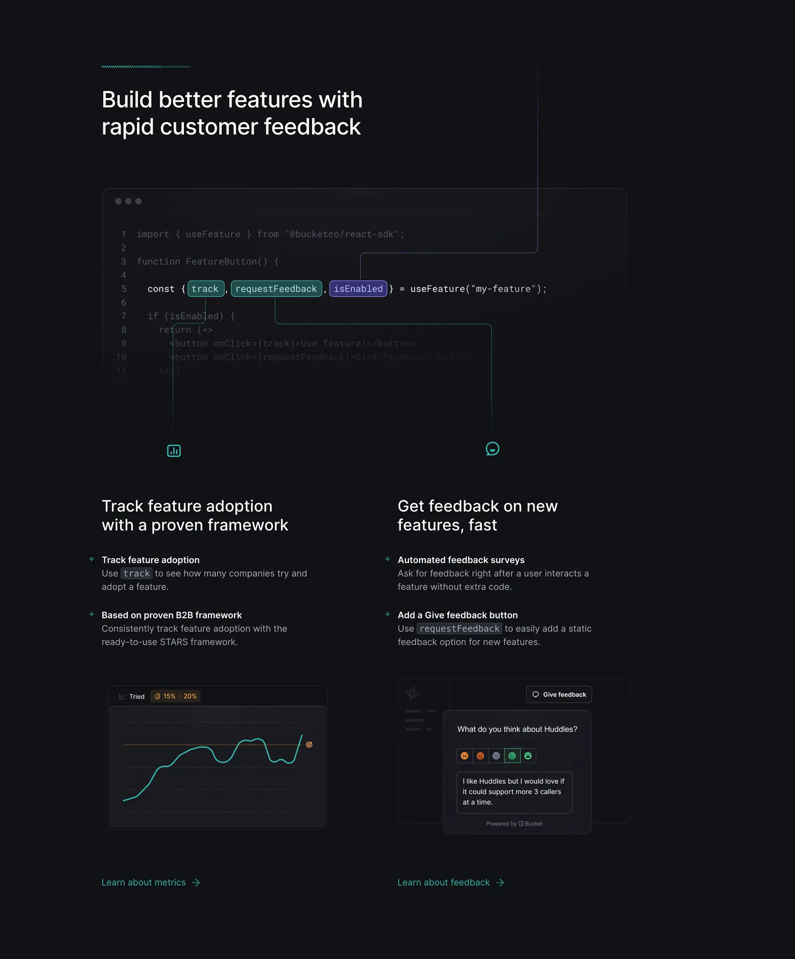
  2. Bucket features section: code snippet with highlighted hooks linked by lines to two feature columns with chart and feedback UI on dark

    Build better features with rapid customer feedback

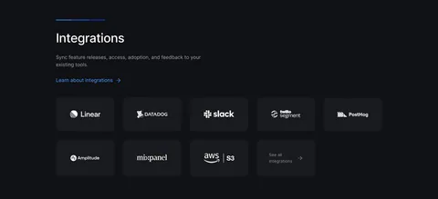
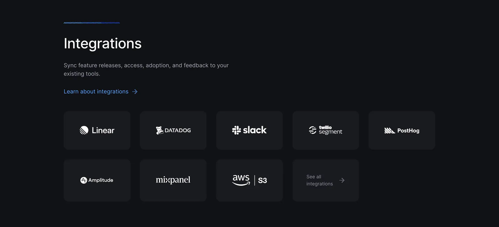
  3. Bucket integrations section: left-aligned heading above a grid of dark tiles with white logos for Linear, Datadog, Slack and more

    Integrations

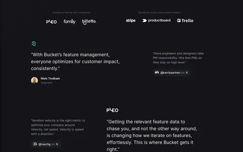
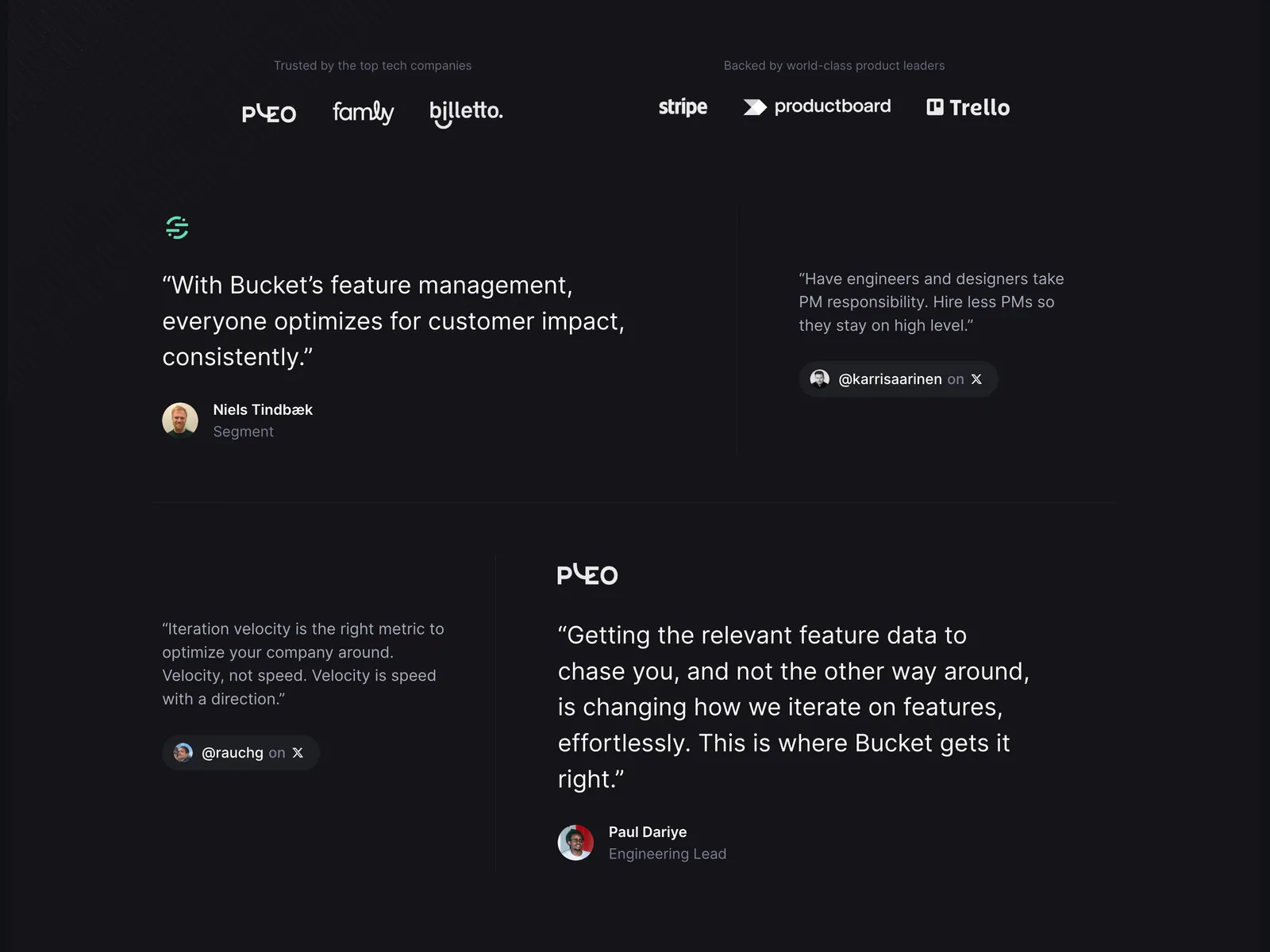
  4. Bucket testimonials section: customer and investor logo rows above a staggered layout of large and small quotes on a dark background

    “With Bucket’s feature management, everyone optimizes for customer impact, consistently.”

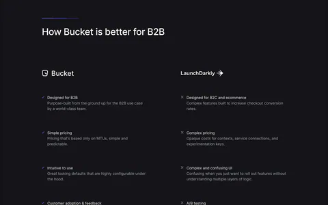
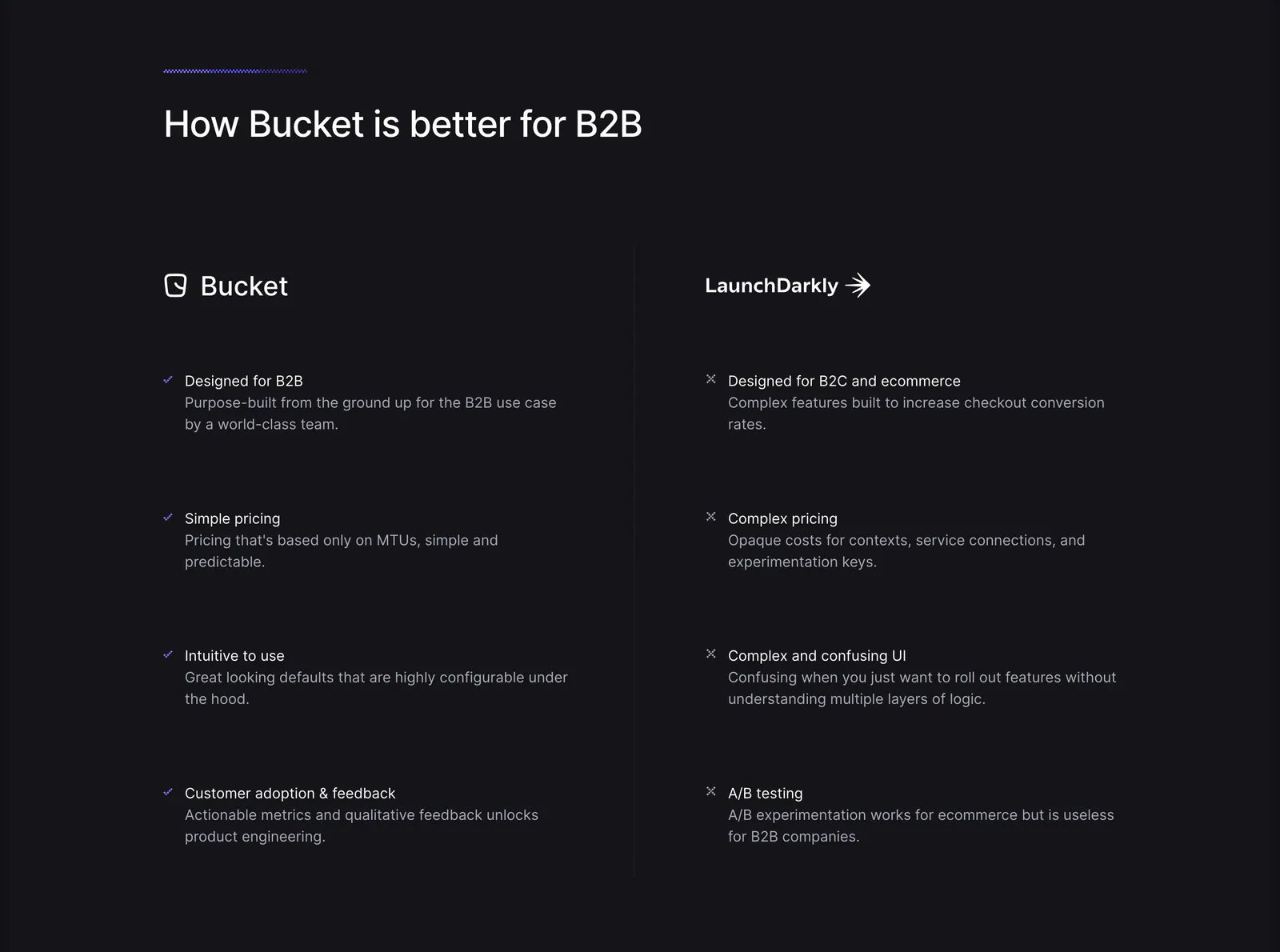
  5. Bucket comparison section: headline above two columns contrasting Bucket checkmarks with LaunchDarkly crosses on a dark background

    How Bucket is better for B2B

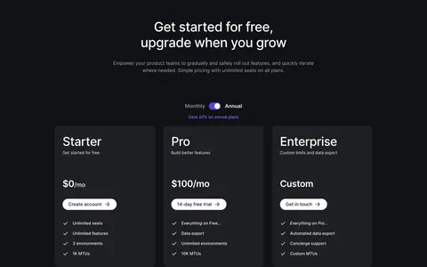
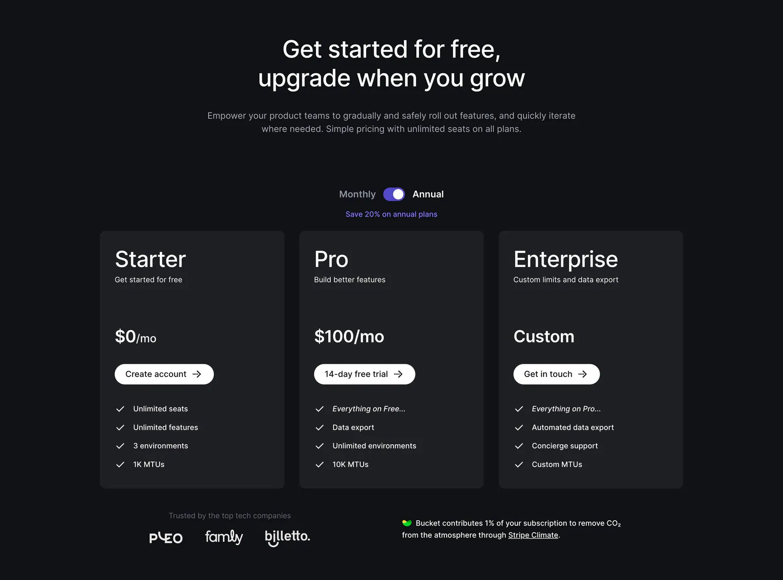
  6. Bucket pricing section: centered headline and monthly/annual toggle above three dark plan cards with checklists and a small logo row
    06 Pricing

    Get started for free, upgrade when you grow

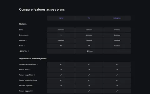
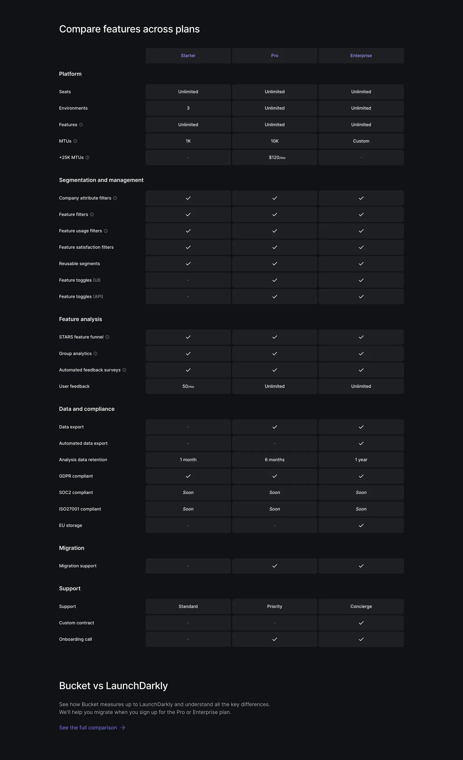
  7. Bucket pricing section: plan comparison table with Starter, Pro and Enterprise columns of checkmarks and limits on a dark background
    07 Pricing

    Compare features across plans

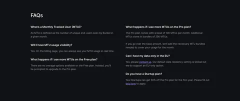
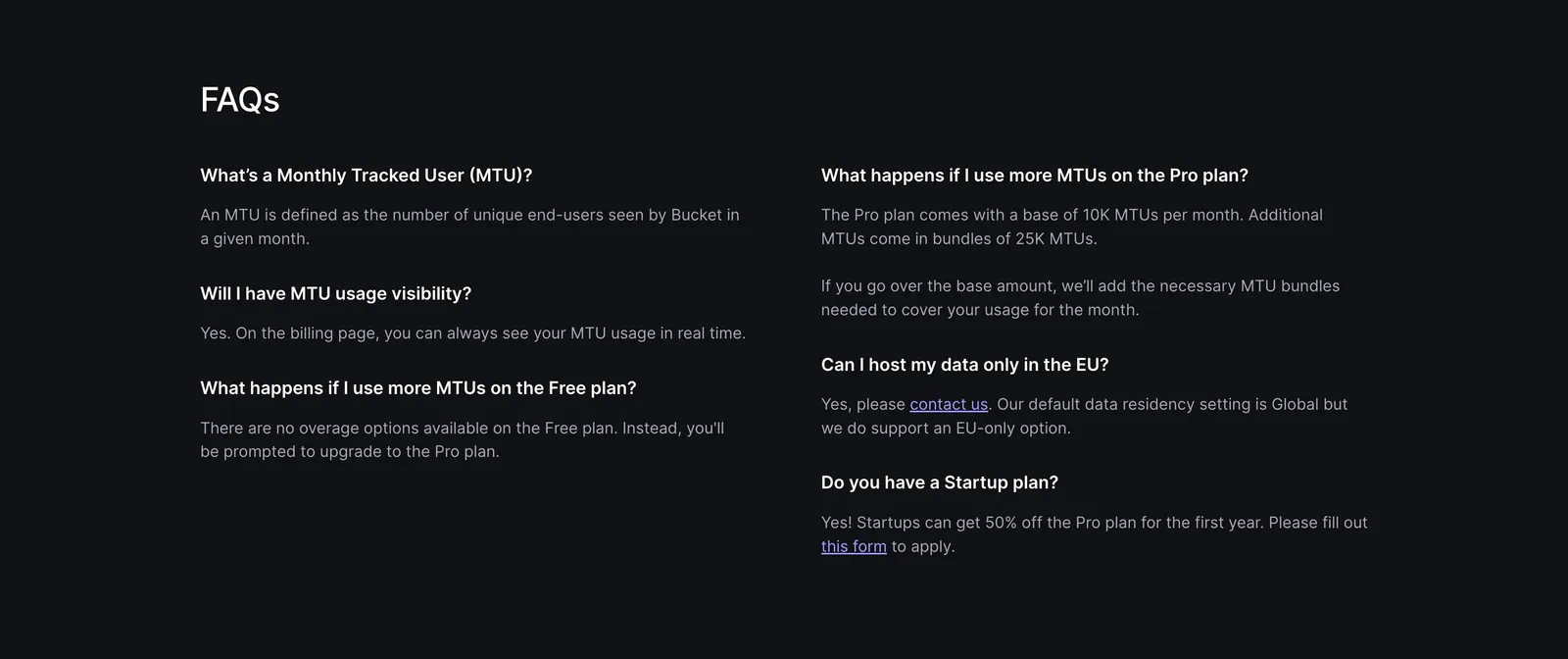
  8. Bucket FAQ section: FAQs heading above a two-column list of questions and answers on a dark background
    08 FAQ

    FAQs

Similar companies

All companies
    ↑↓ Navigate ↵ Open

    Section preview

    Website section