Supersonik website design

Every section we captured from the Supersonik website, in page order, from the hero section down to the footer. Open any thumbnail to see it full size.

Sections 9

In page order, top to bottom

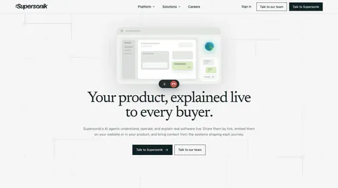
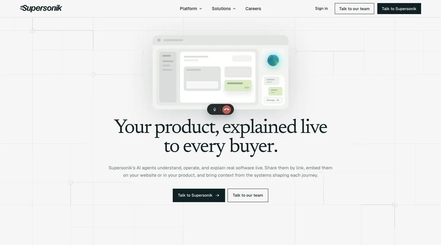
  1. Supersonik hero section: centered serif headline and two CTAs below a soft UI mockup with call controls on a light grid background
    01 Hero

    Your product, explained live to every buyer.

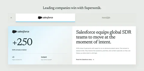
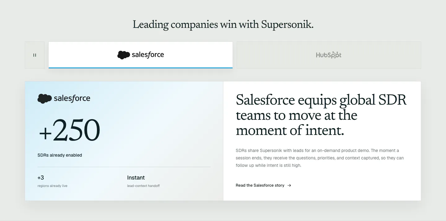
  2. Supersonik testimonials section: customer logo tabs above a Salesforce case study card with a large +250 metric and serif story headline

    Leading companies win with Supersonik.

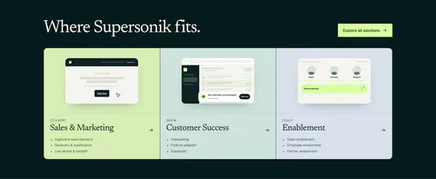
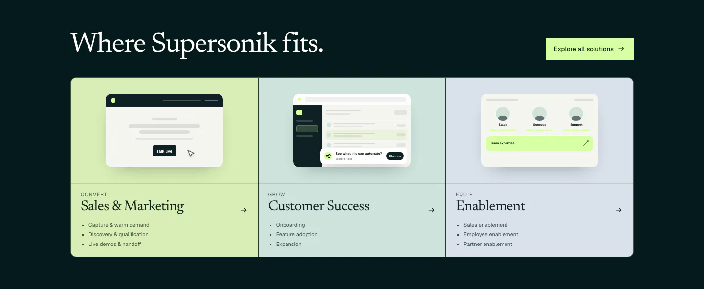
  3. Supersonik use cases section: serif headline over three pastel panels for sales, customer success and enablement with UI sketches

    Where Supersonik fits.

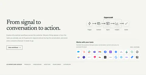
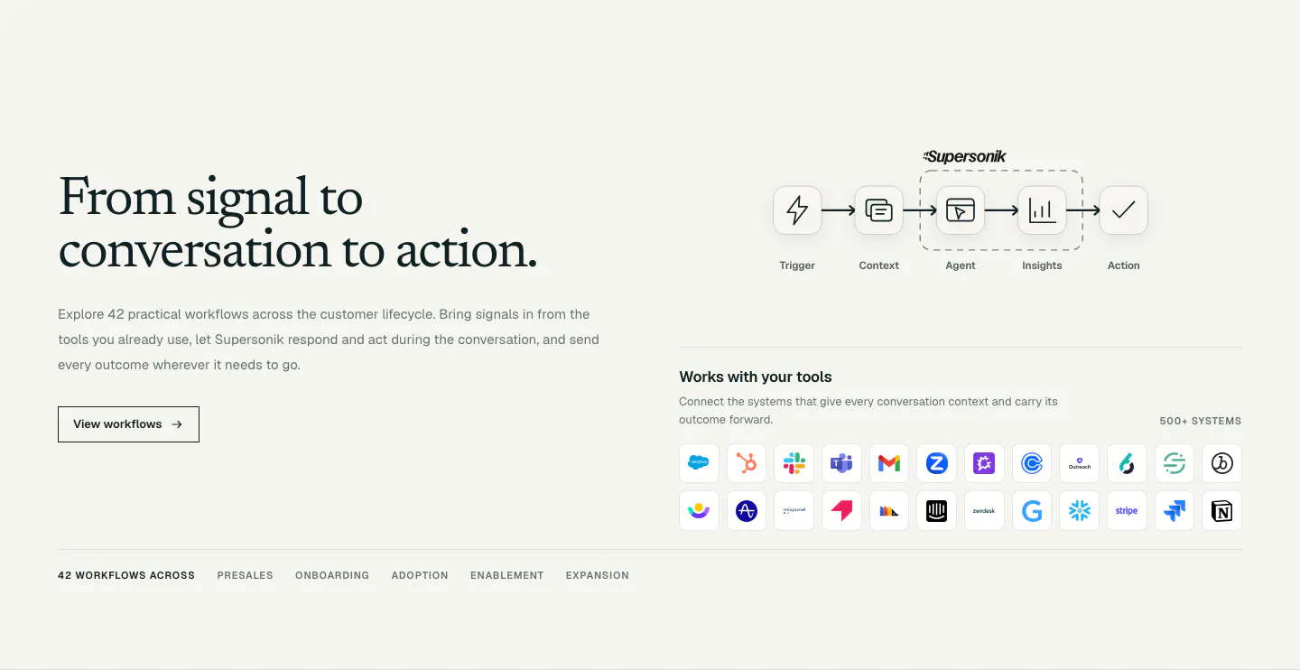
  4. Supersonik integrations section: serif headline and button at left, workflow step diagram and grid of app icons at right

    From signal to conversation to action.

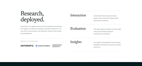
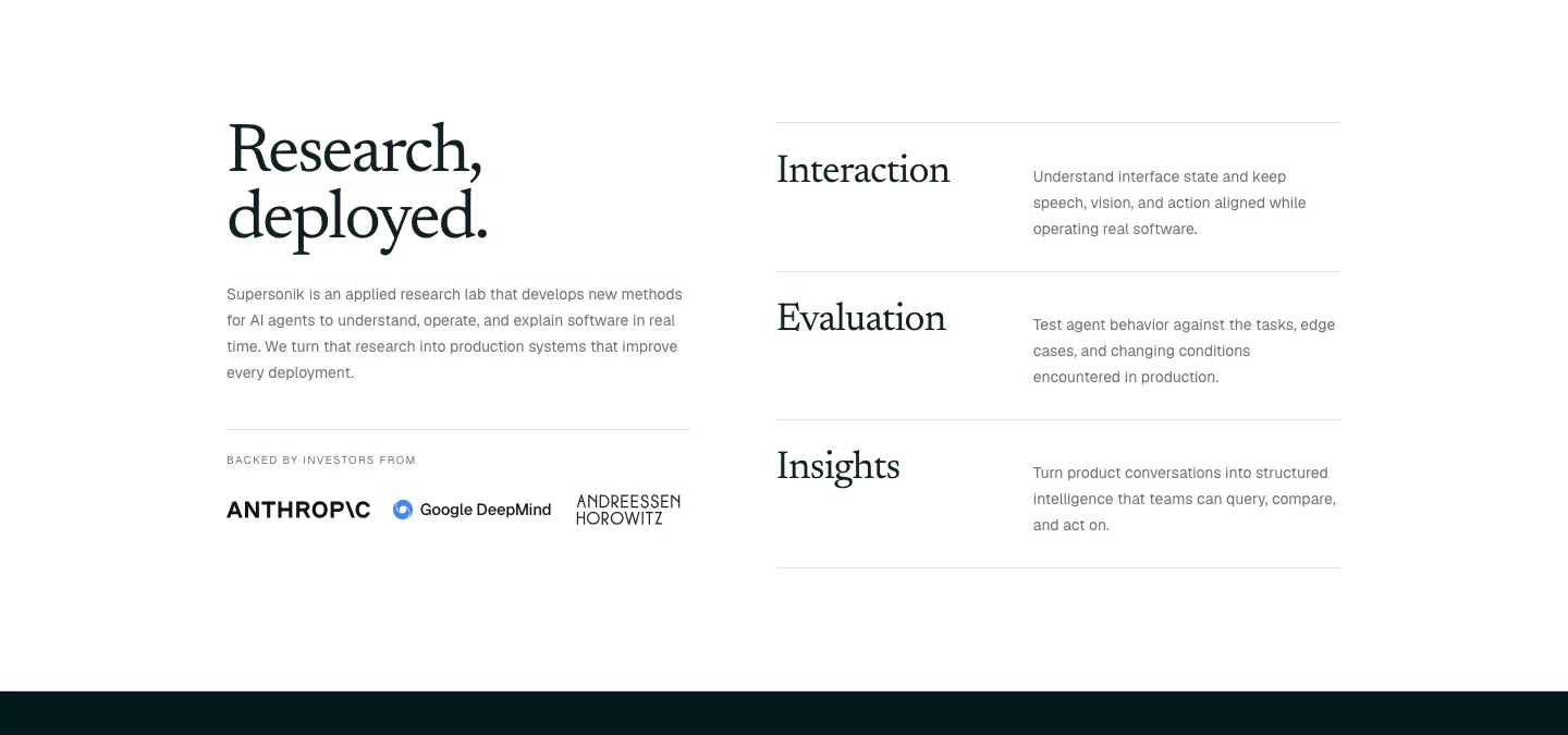
  5. Supersonik about & mission section: serif headline, lab description and investor logos at left, three research areas listed at right

    Research, deployed.

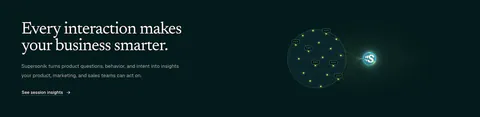
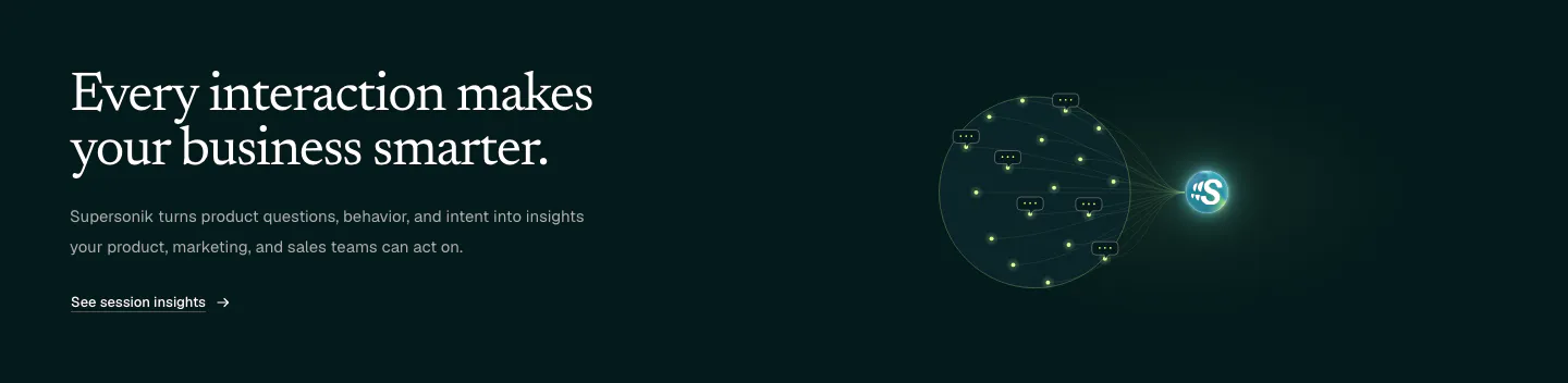
  6. Supersonik features section: serif headline and link at left, glowing sphere of chat bubbles linked to a logo at right on dark teal

    Every interaction makes your business smarter.

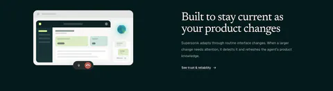
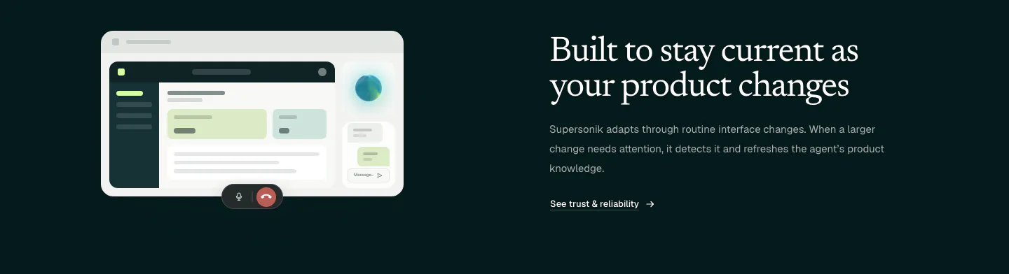
  7. Supersonik features section: UI mockup with call controls at left, serif headline, copy and link at right on dark teal

    Built to stay current as your product changes

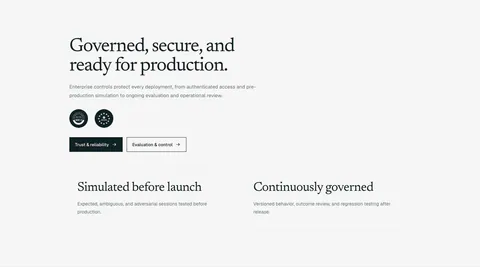
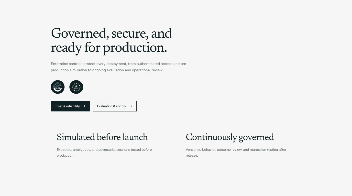
  8. Supersonik security section: serif headline, copy, SOC 2 and GDPR badges and two buttons above two governance points on light gray

    Governed, secure, and ready for production.

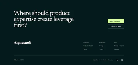
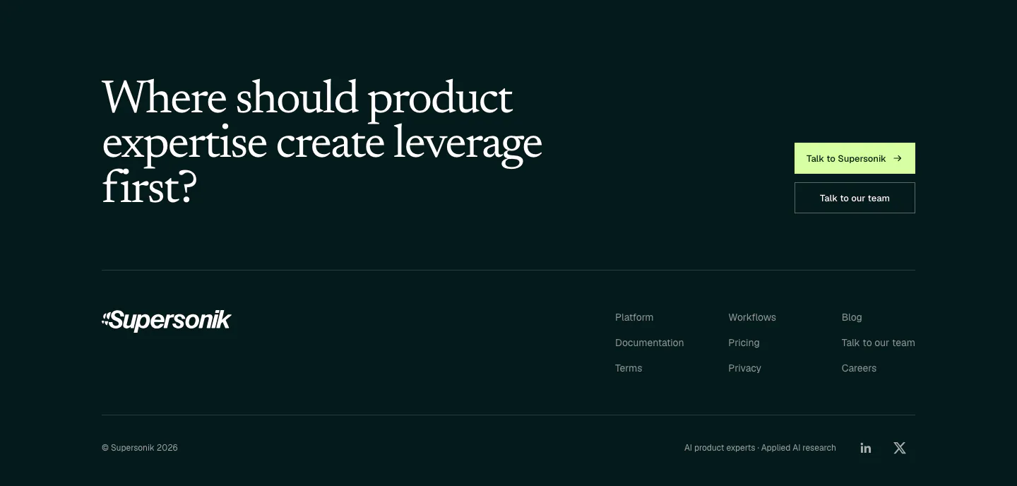
  9. Supersonik footer section: large serif question with two CTA buttons above a wordmark, three link columns and copyright on dark teal
    09 Footer

    Where should product expertise create leverage first?
Similar companies

All companies
    ↑↓ Navigate ↵ Open

    Section preview

    Website section