Security Section Examples

For larger companies and regulated industries, security is a gate rather than a feature. IT and procurement teams read this section to decide whether a product meets their bar, and they want concrete certifications, named controls, and links to documentation. Phrases like "bank-grade security" with nothing behind them slow that review down. You will find compliance badges, encryption details, and data handling presented calmly and credibly in these security section examples.
37 sections

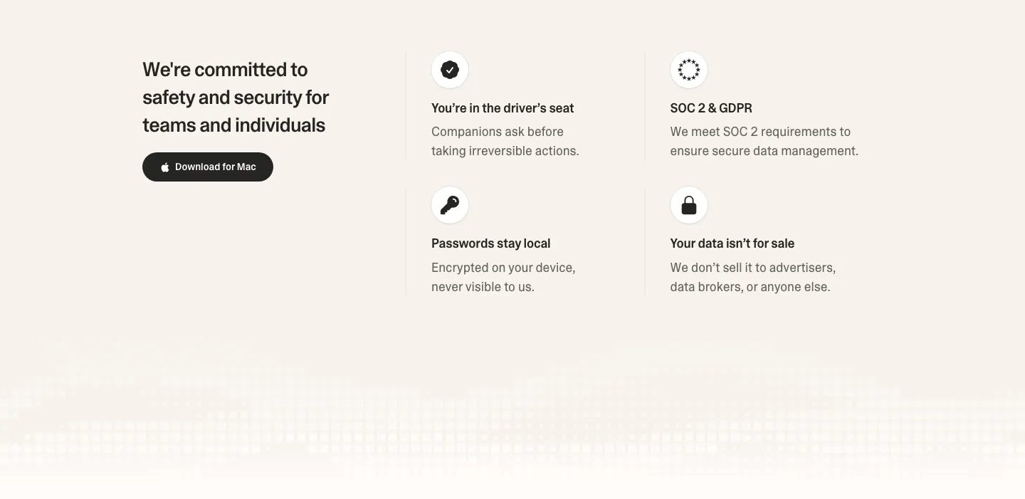
  1. Strawberry security section: headline and download button on the left, 2x2 grid of icon trust points on the right, pixel fade below
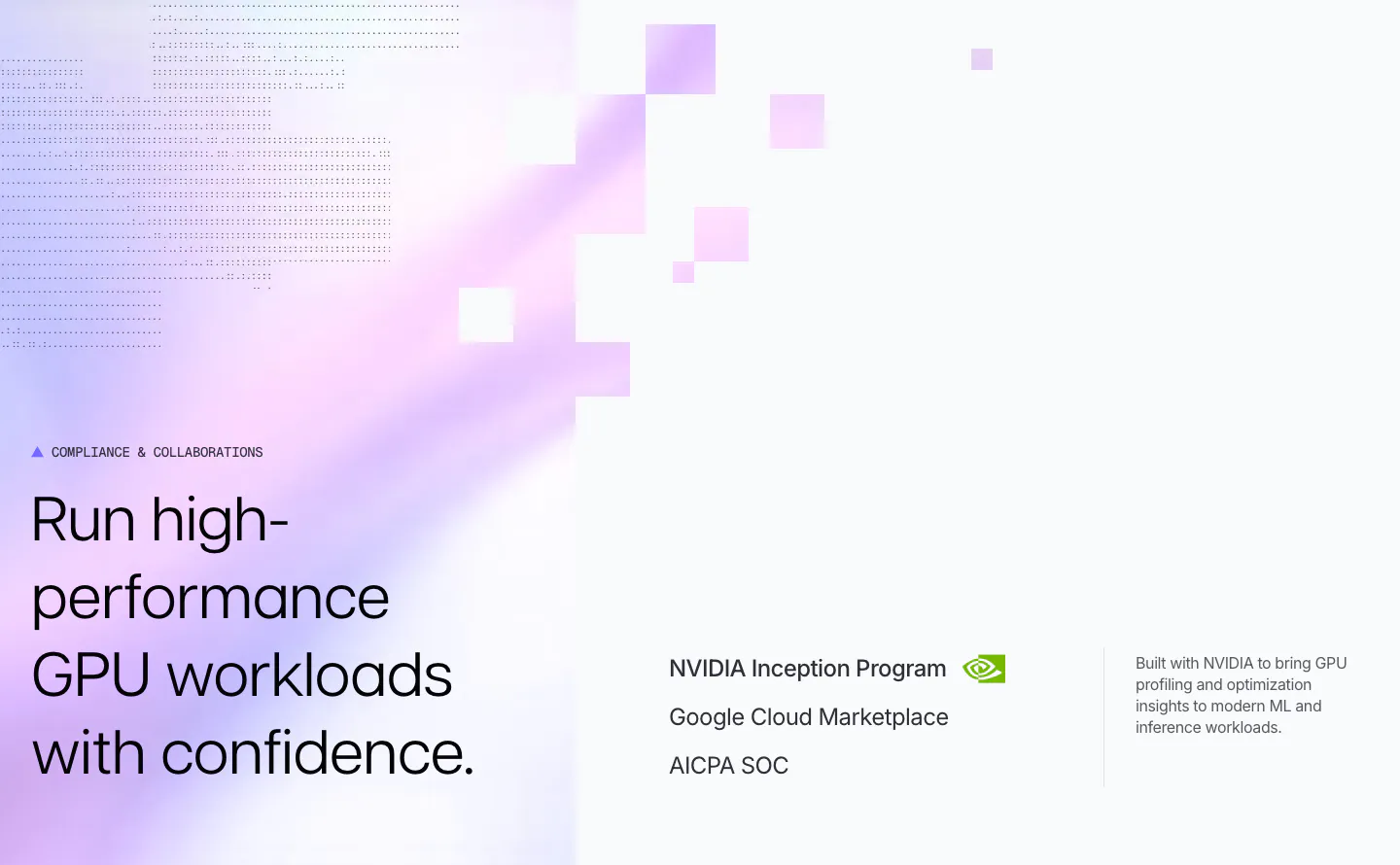
  2. Polar Signals security section: headline on a lavender gradient with pixel squares and dot texture, beside NVIDIA, Google Cloud and SOC credentials
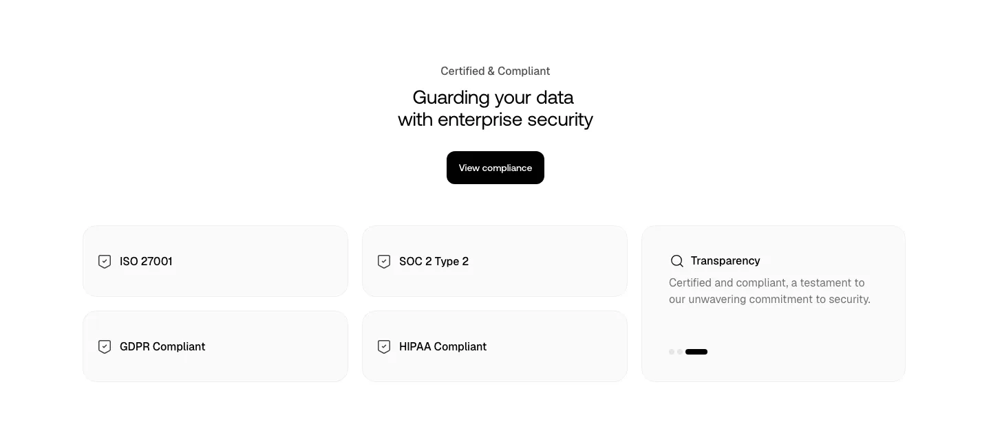
  3. Smallest.ai security section: centered headline and compliance button above light cards for ISO 27001, SOC 2, GDPR, HIPAA and transparency
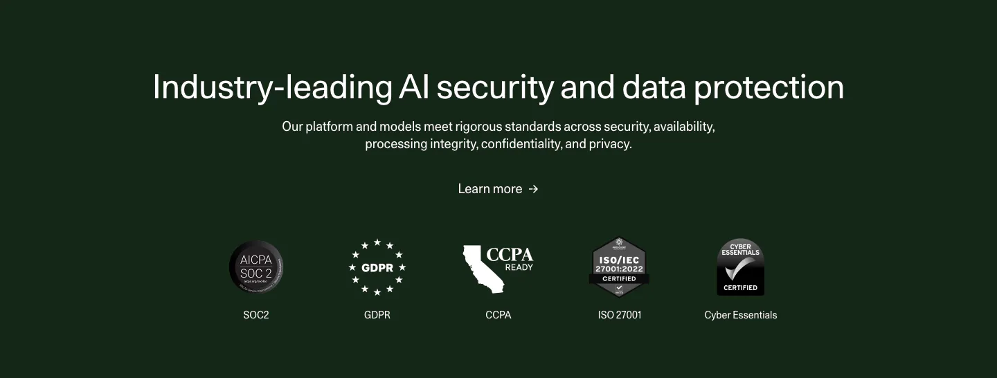
  4. Cohere security section: centered headline and learn more link above a row of compliance badges on a dark green background
  5. WorkOS security section: centered headline above a glowing blue wireframe robot on a dark navy background
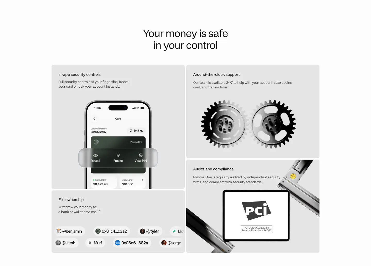
  6. Plasma security section: centered heading above a bento of gray tiles with a phone UI, 3D gears, a PCI badge and user handles
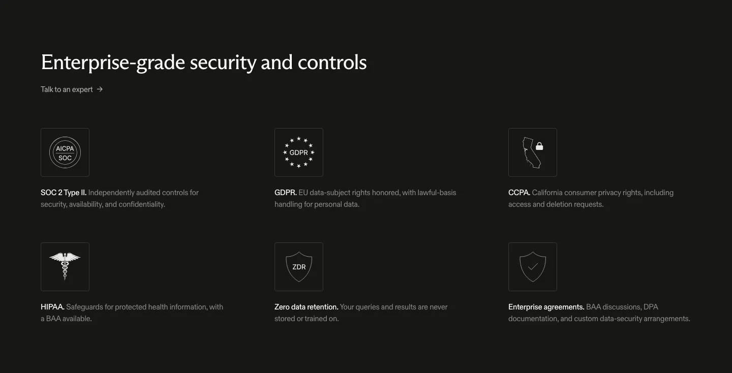
  7. Exa security section: dark background with headline and a three-by-two grid of outlined compliance icons for SOC 2, GDPR, CCPA and HIPAA
    Exa
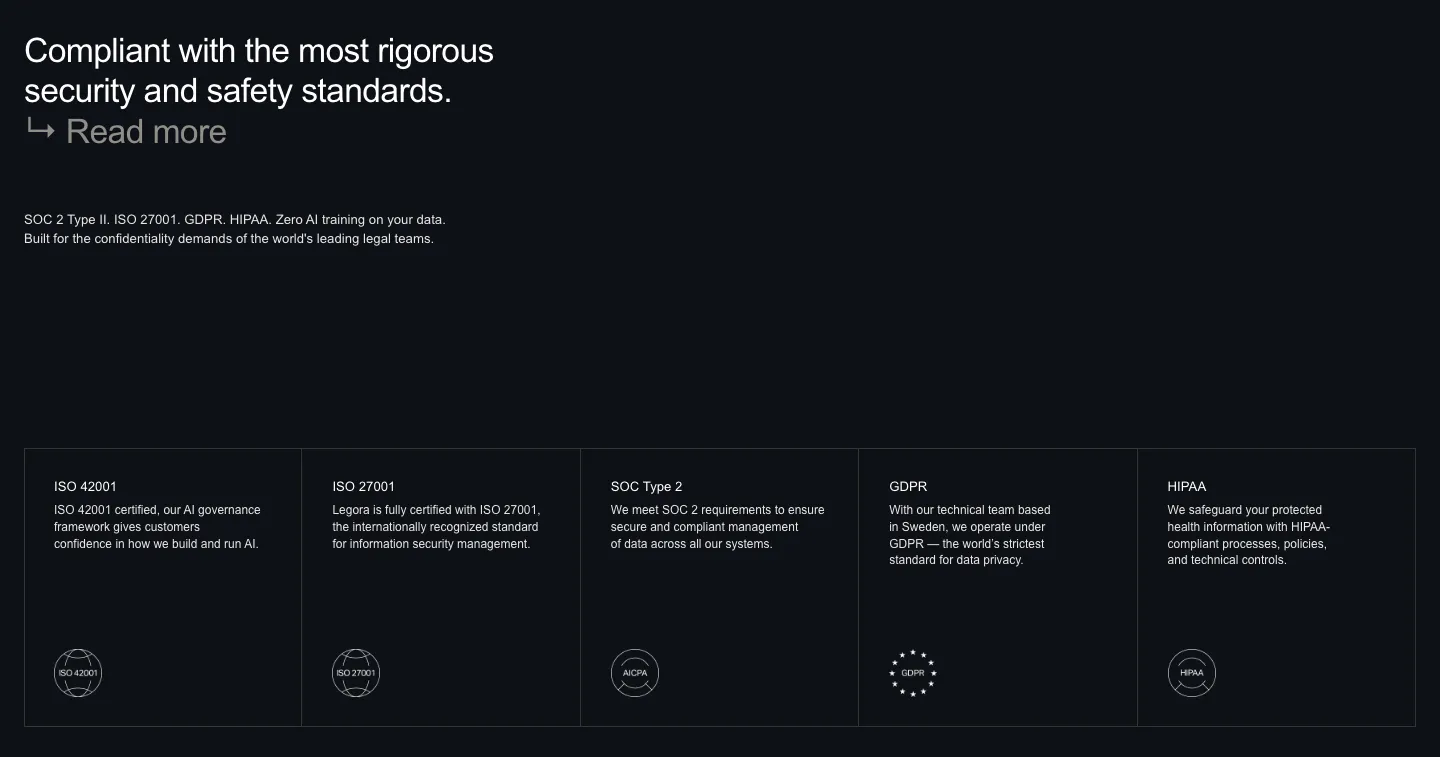
  8. Legora security section: left headline on a dark background above five bordered cells for ISO, SOC 2, GDPR and HIPAA badges
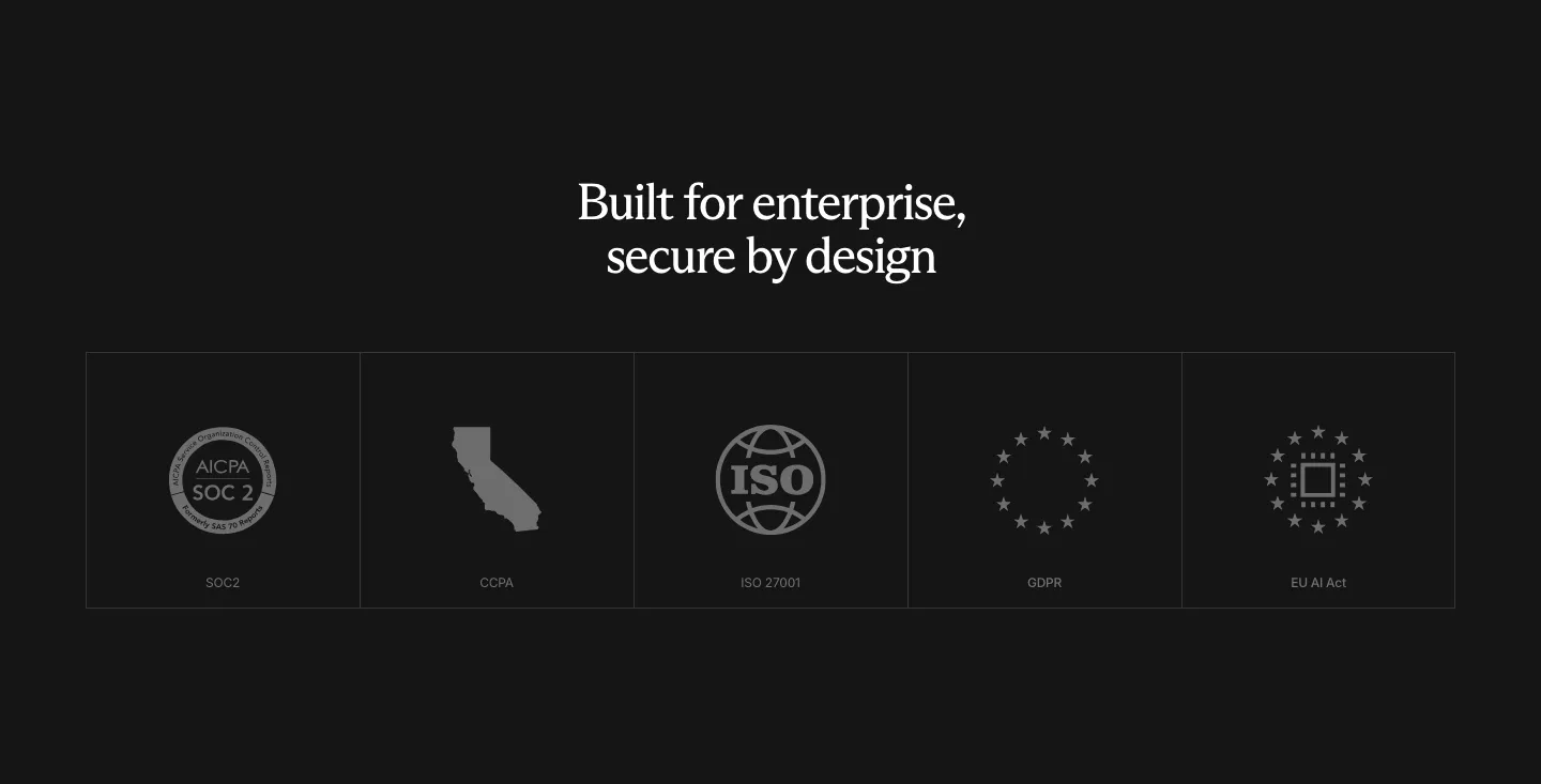
  9. Rogo security section: centered serif headline above a row of five compliance badge tiles (SOC 2, CCPA, ISO, GDPR, EU AI Act)
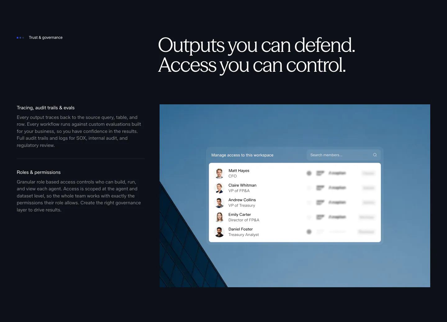
  10. Concourse security section: governance points left, access-control UI over a blue building photo right on a dark background
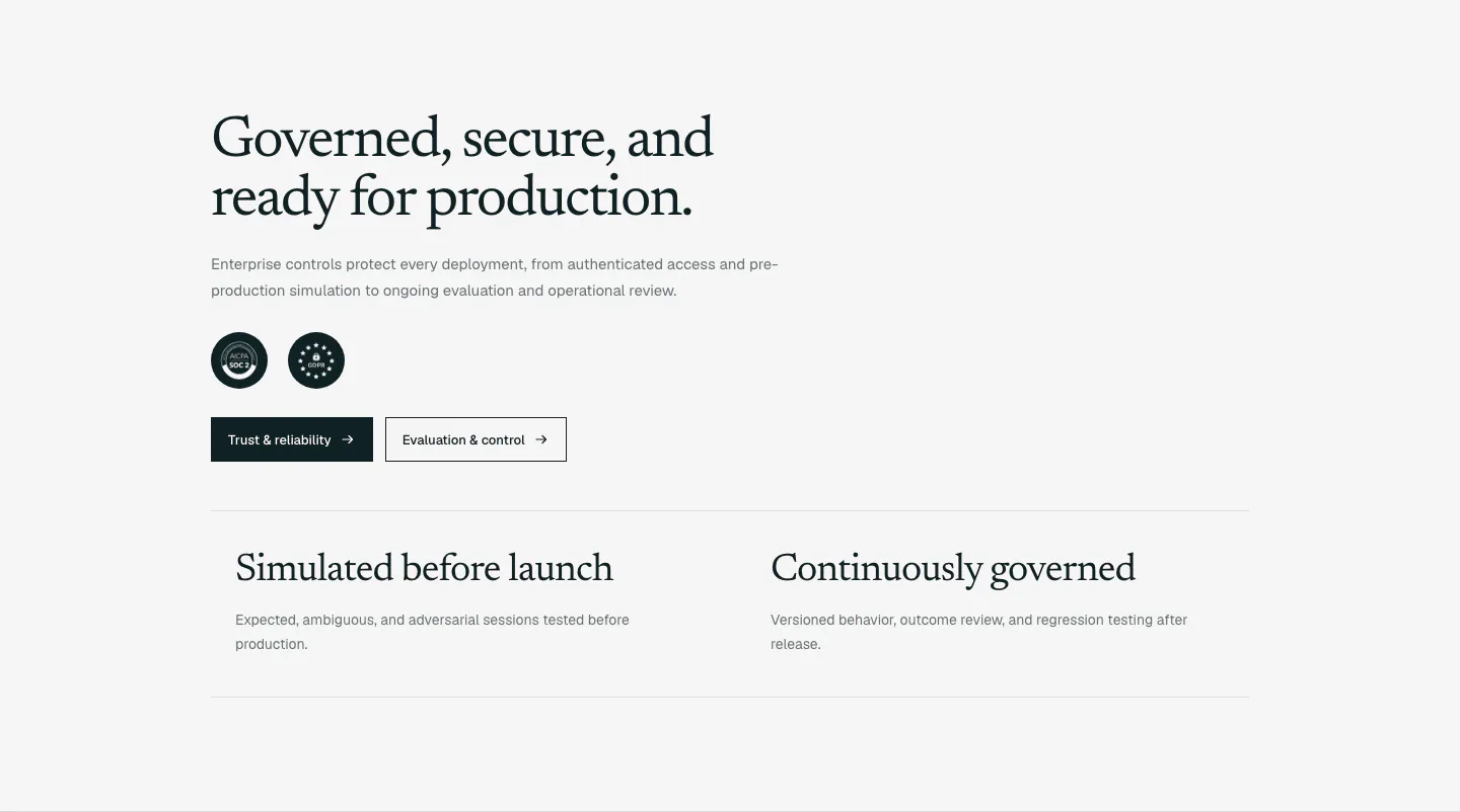
  11. Supersonik security section: serif headline, copy, SOC 2 and GDPR badges and two buttons above two governance points on light gray
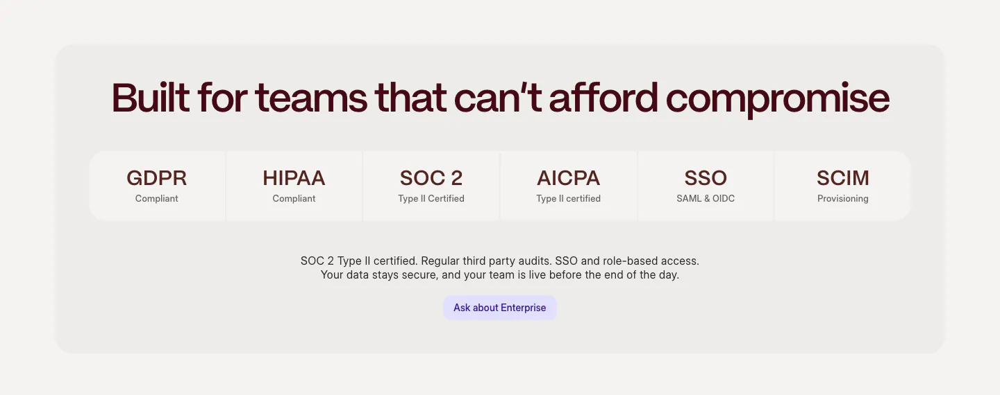
  12. Weave security section: centered headline above a row of compliance tiles (GDPR, HIPAA, SOC 2, SSO) and an enterprise button in a gray panel
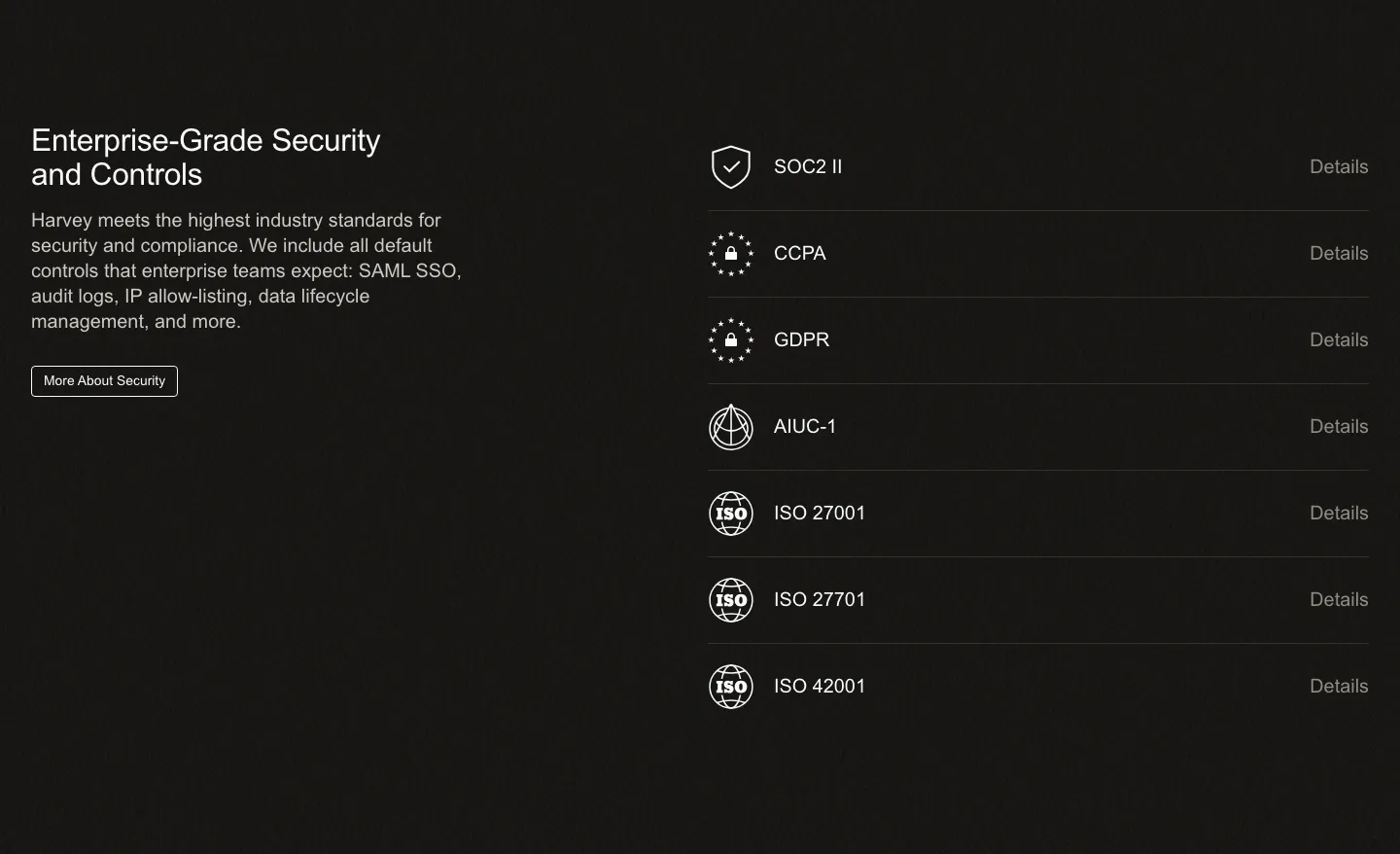
  13. Harvey security section: dark split layout with headline and copy left and a list of compliance certifications right
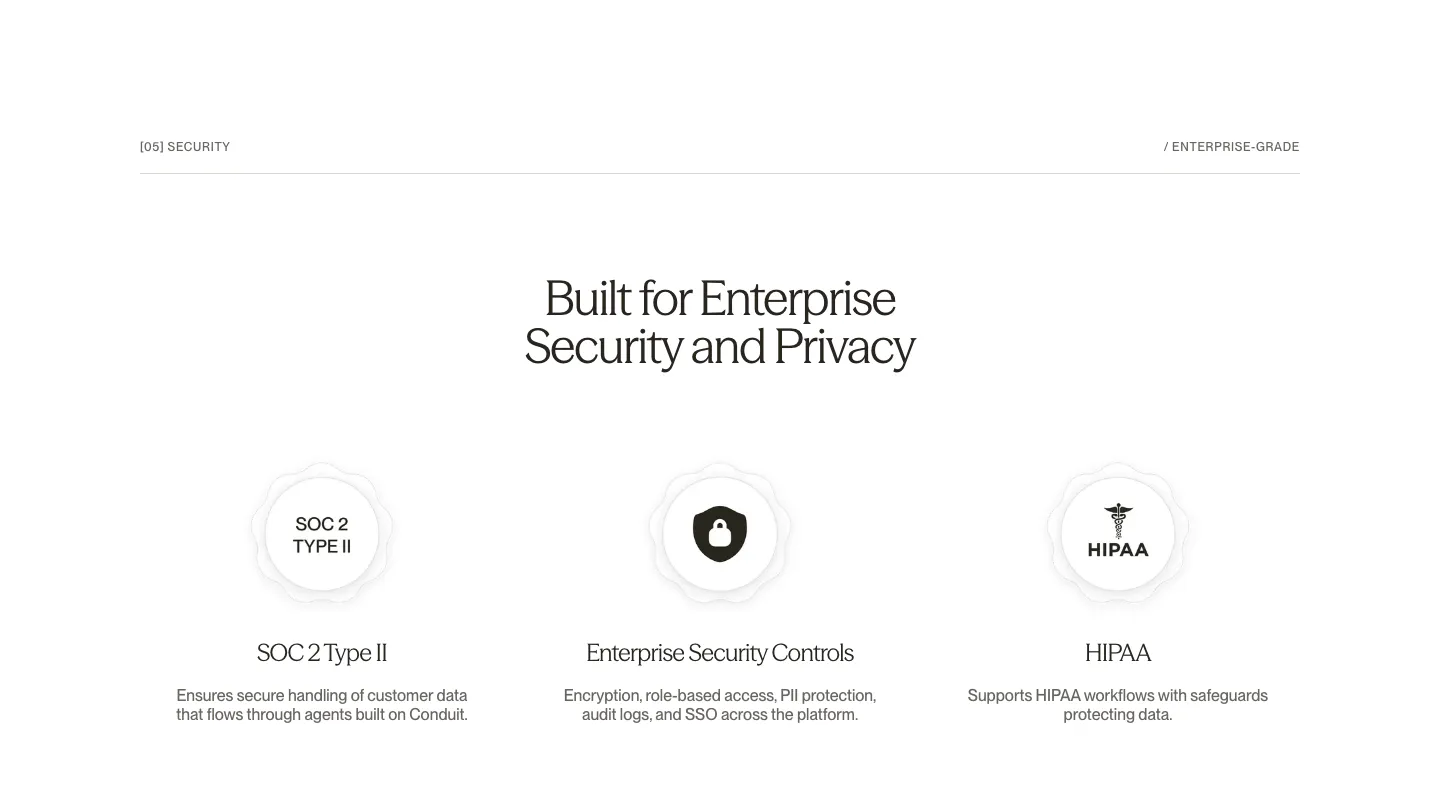
  14. Conduit security section: centered serif headline above SOC 2, security controls and HIPAA badge columns on white
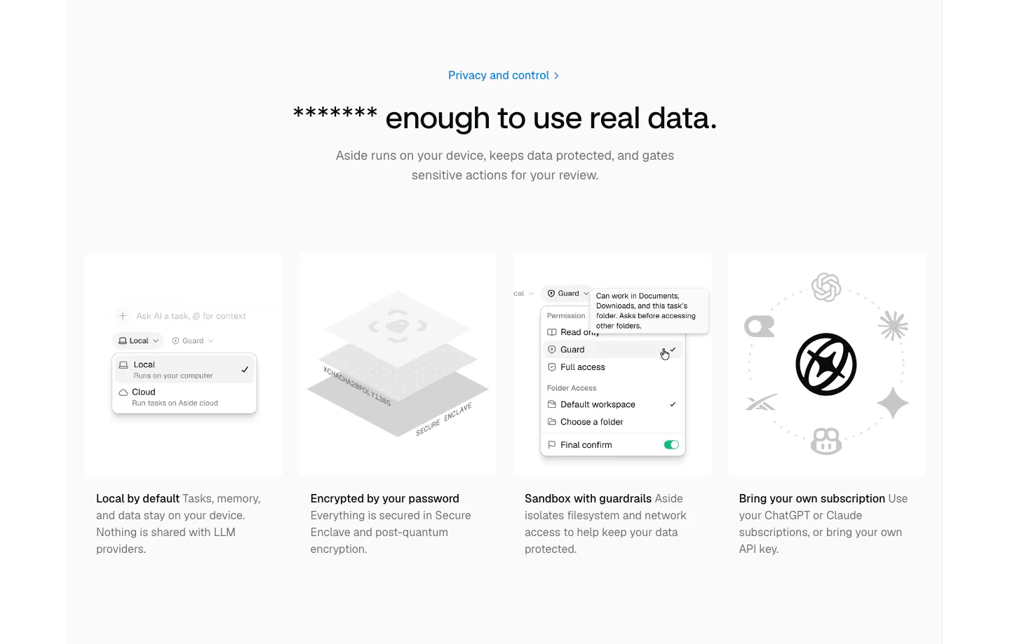
  15. Aside security section: centered headline above four gray cards with permission menu, encryption and AI model visuals
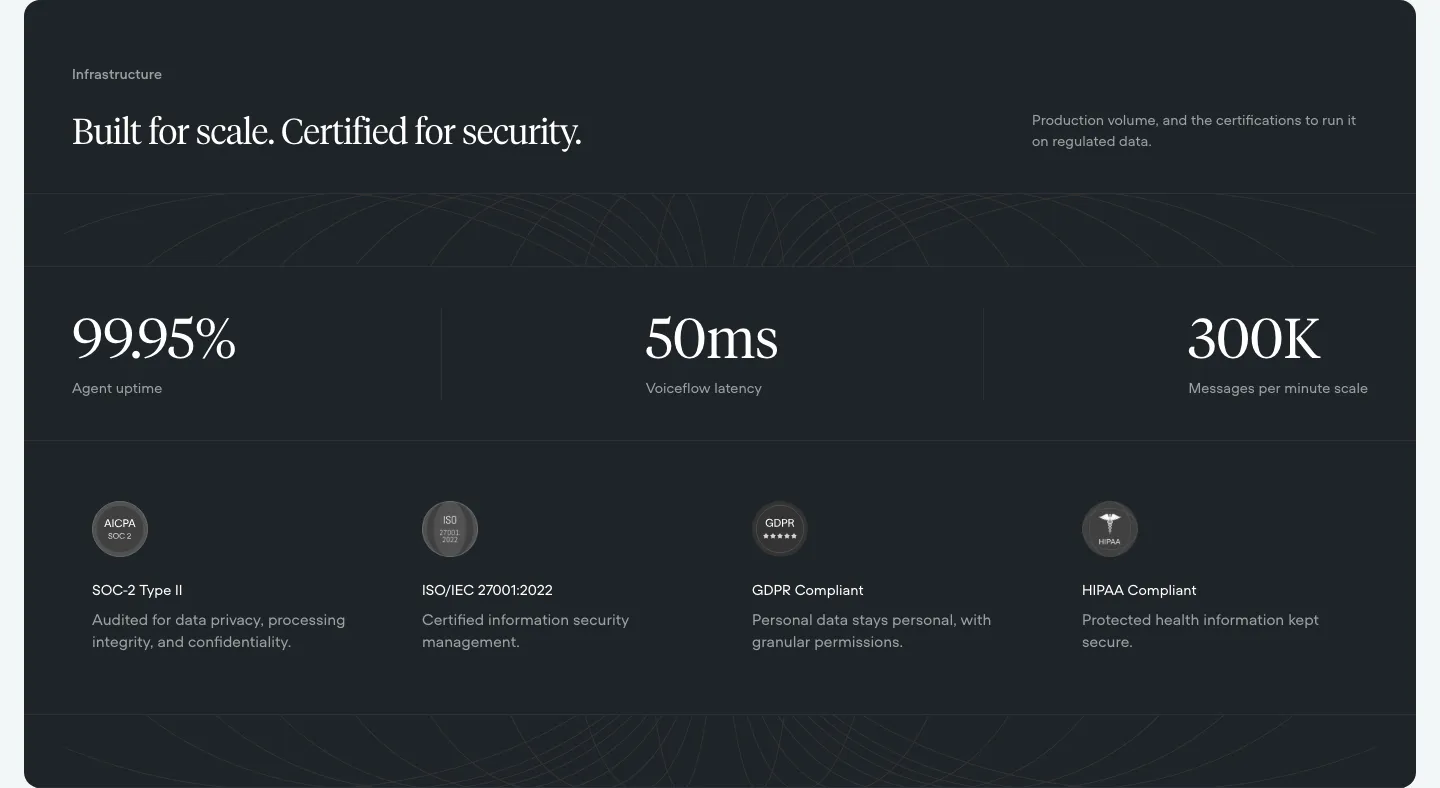
  16. Voiceflow security section: dark panel with serif headline, three large uptime and latency stats and four compliance badges
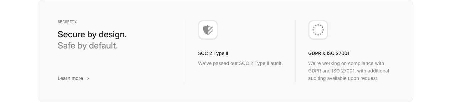
  17. Interfere security section: light gray card with headline left and SOC 2 and GDPR/ISO compliance columns with icons
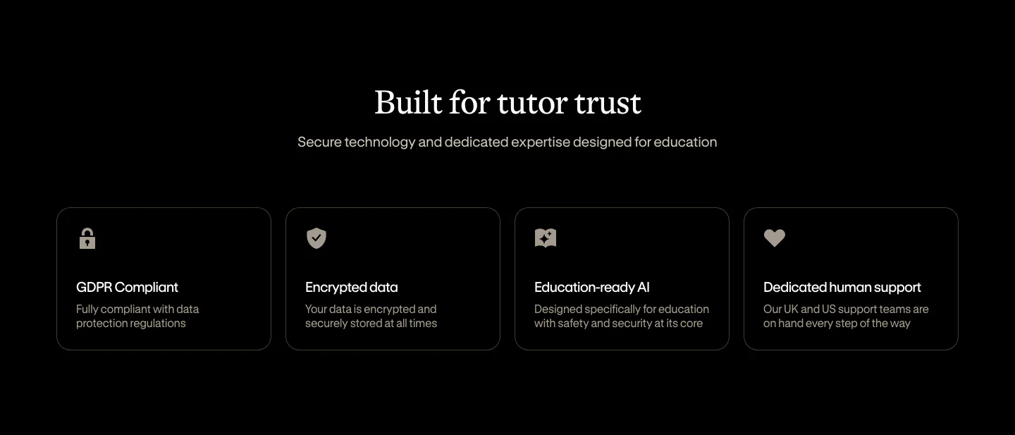
  18. Bobbin security section: centered serif heading above four outlined cards for GDPR, encryption, AI and support on black
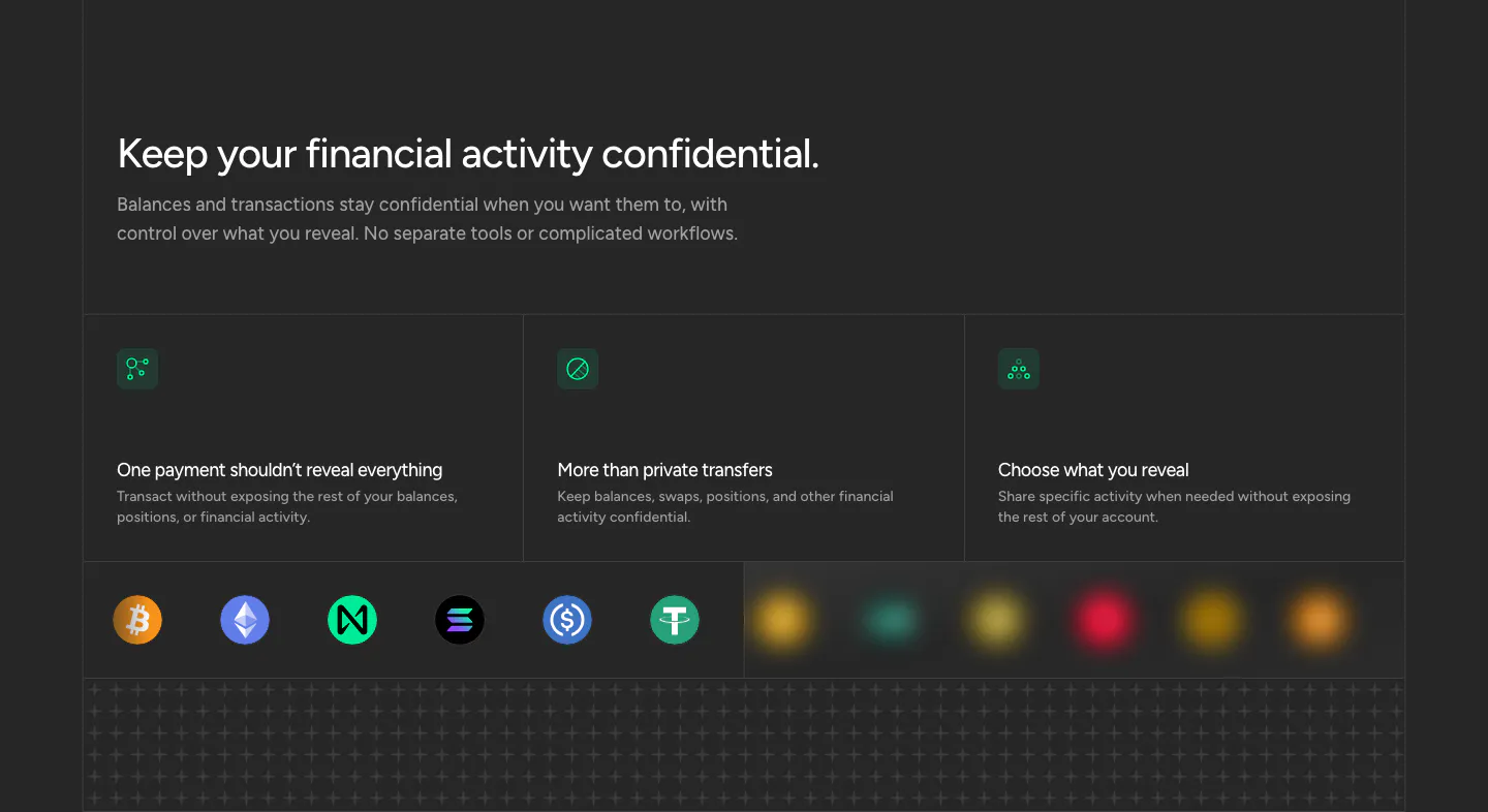
  19. NEAR security section: headline above three privacy cards with green icons and a row of crypto token icons on dark
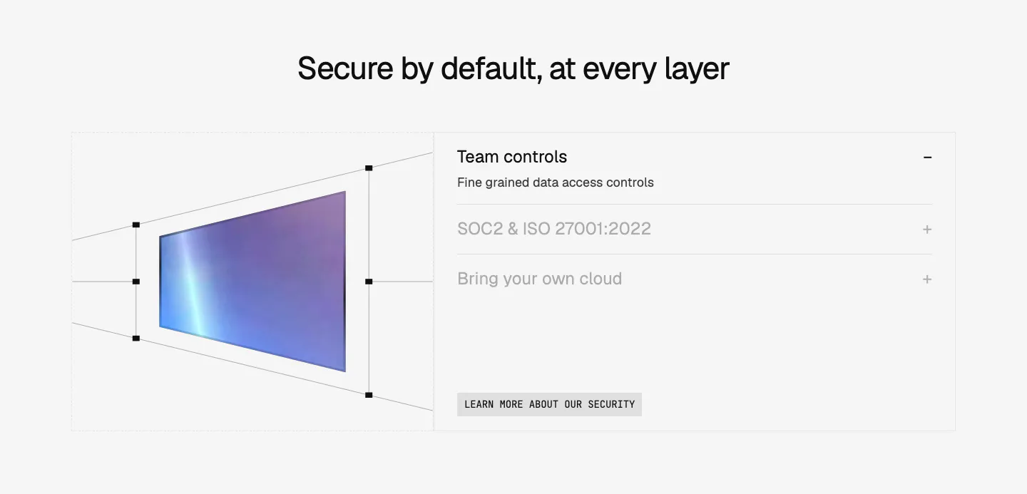
  20. Composio security section: perspective wireframe of a gradient panel at left and an accordion of security topics at right on light gray
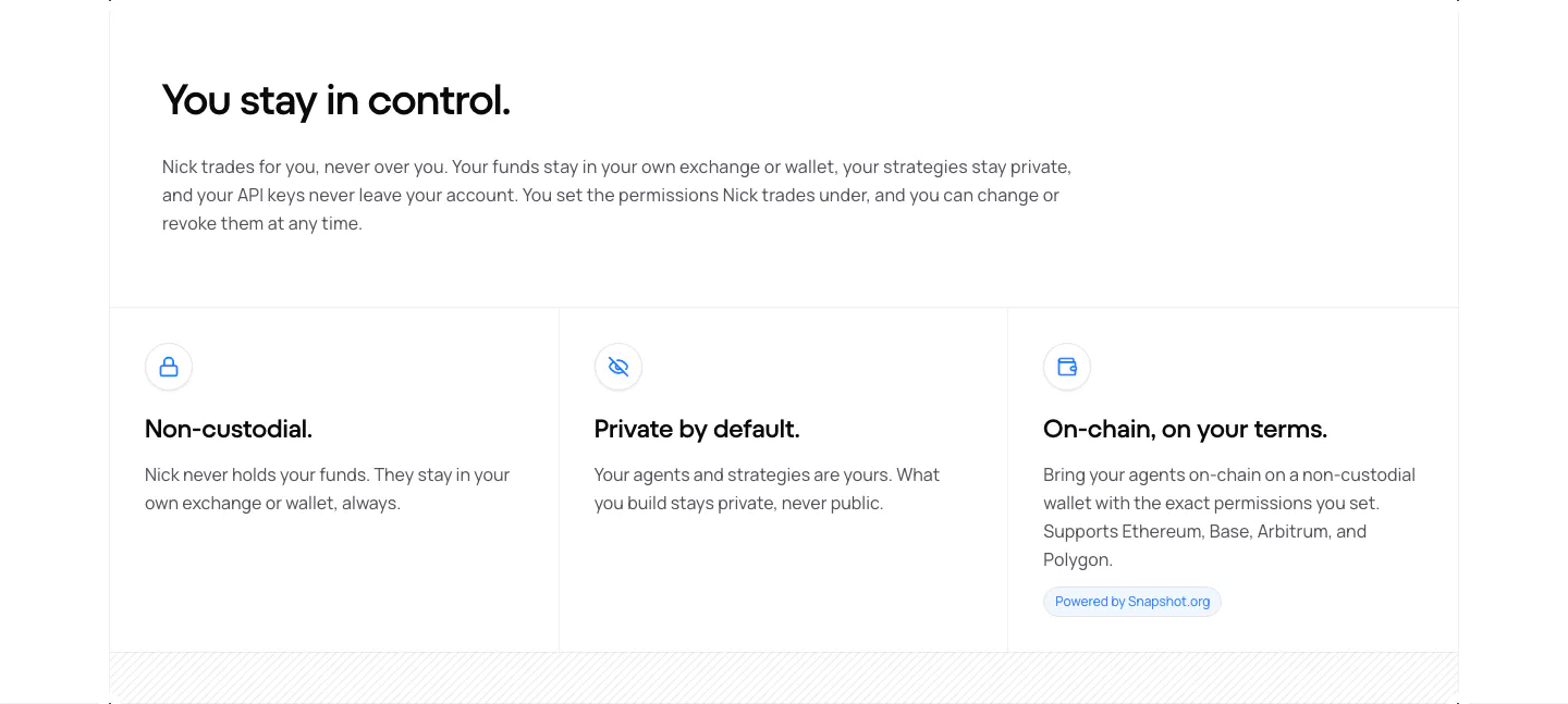
  21. NickAI security section: left heading and copy above three bordered cells with icons for non-custodial, private and on-chain
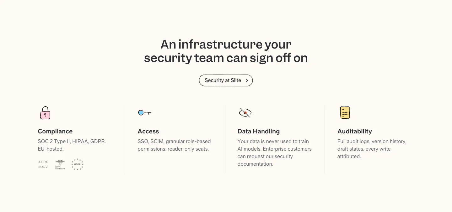
  22. Slite security section: centered headline and button above four columns for compliance, access, data handling and audit, with badges
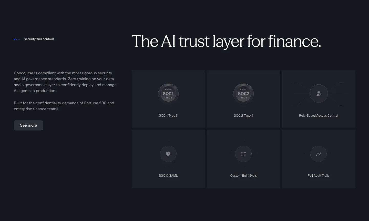
  23. Concourse security section: copy and button left, six dark tiles for SOC 1, SOC 2, RBAC, SSO, evals and audit trails right
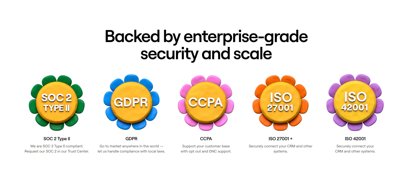
  24. Clay security section: centered heading above a row of five 3D clay flower badges for SOC 2, GDPR, CCPA and ISO certifications
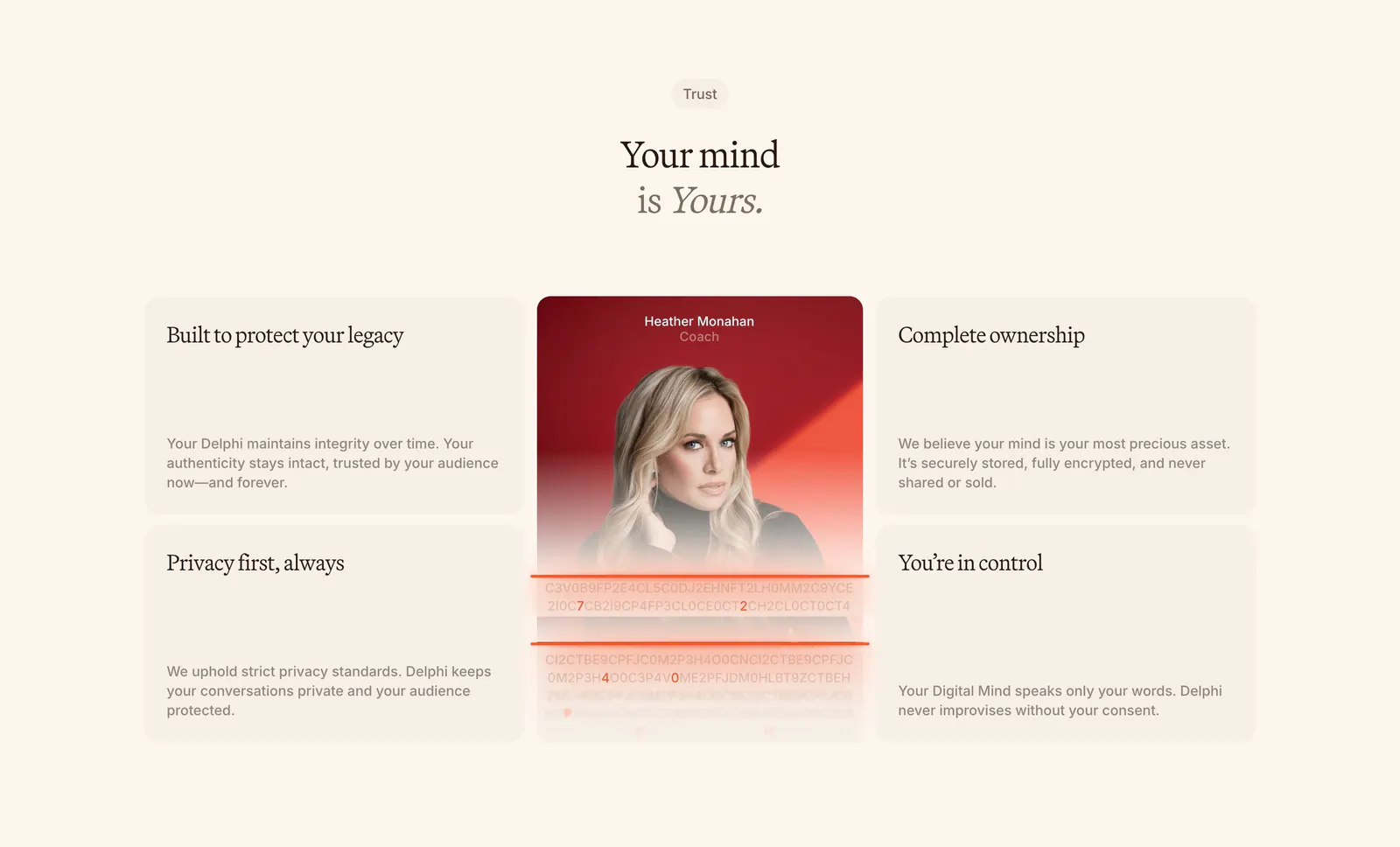
  25. Delphi features section: centered serif headline above a bento of four trust cards around a tall portrait card with an encryption text effect
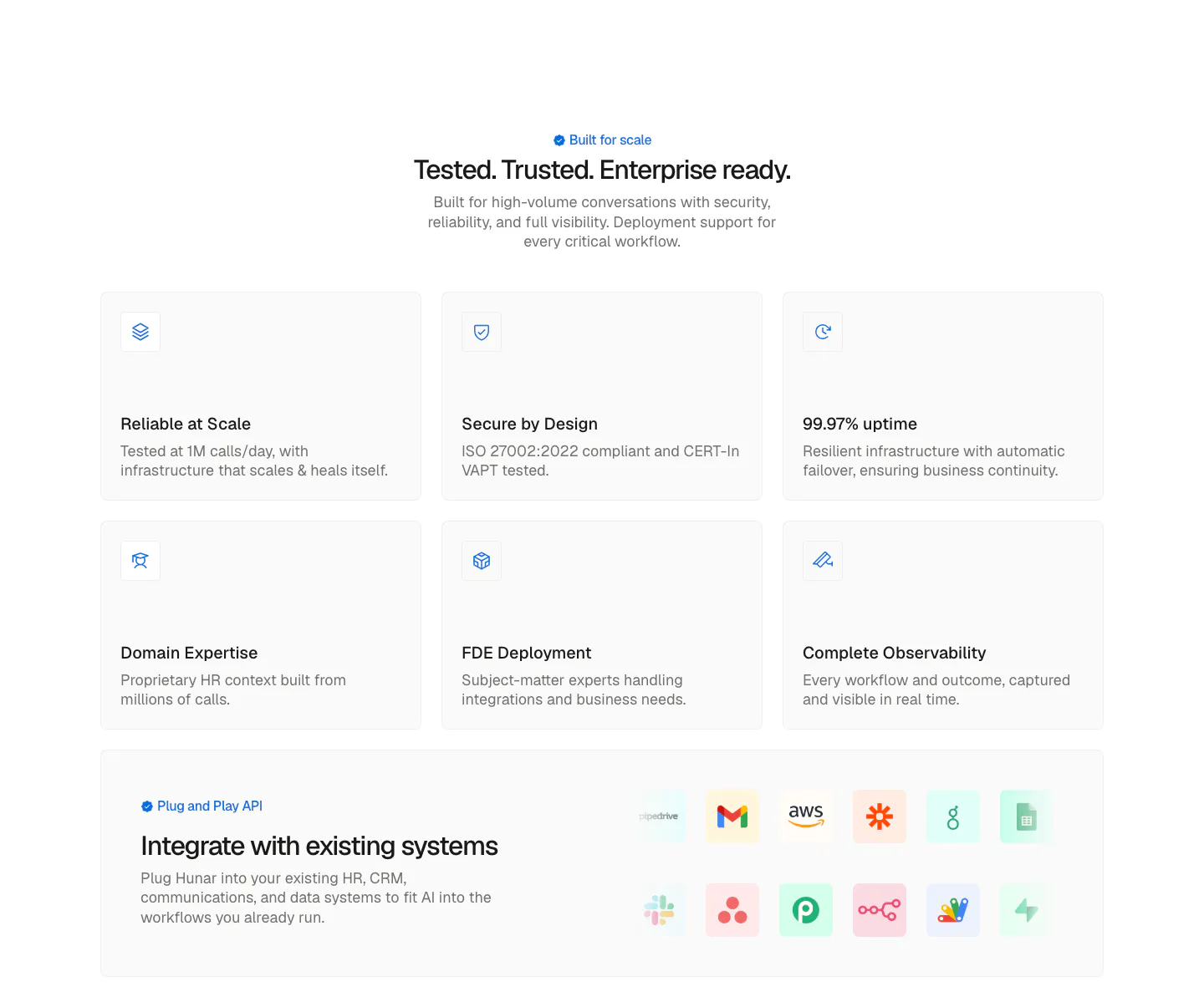
  26. Hunar security section: centered heading above six light icon cards and an integrations band with app icon tiles
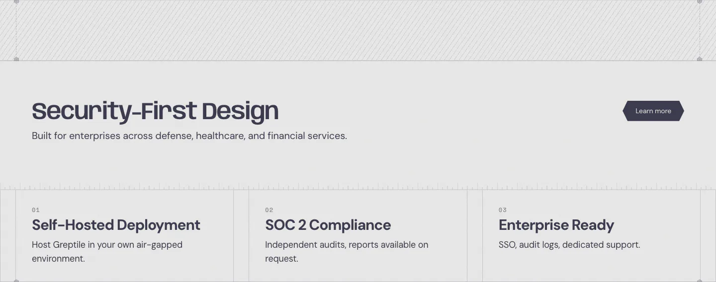
  27. Greptile security section: headline with learn more button above three numbered cards for self-hosting, SOC 2 and enterprise features
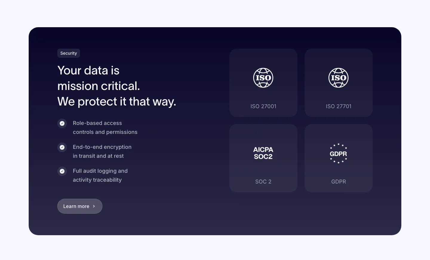
  28. Clarasight security section: dark navy card with headline, checklist and button on the left and a 2x2 grid of ISO, SOC 2 and GDPR badges
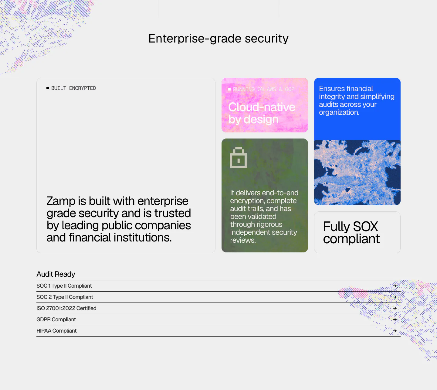
  29. Zamp security section: bento of textured color cards with encryption and SOX claims above a list of SOC, ISO, GDPR and HIPAA compliance rows
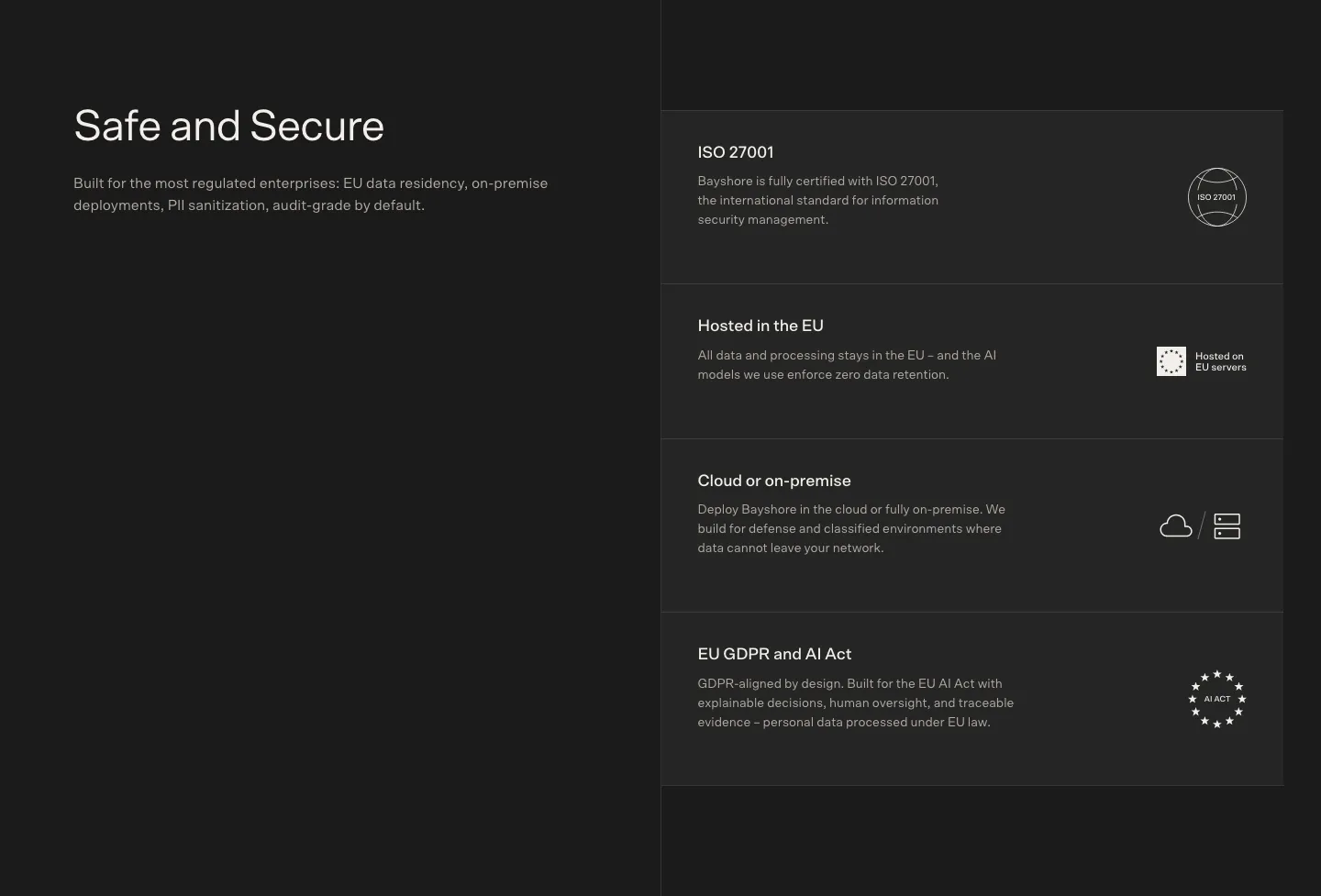
  30. Bayshore security section: heading left on charcoal, stacked cards for ISO 27001, EU hosting, on-premise and GDPR right
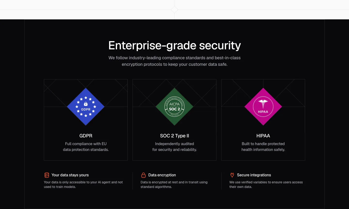
  31. Chatbase security section: dark centered headline over three cards with GDPR, SOC 2 and HIPAA diamond badges and a row of trust points
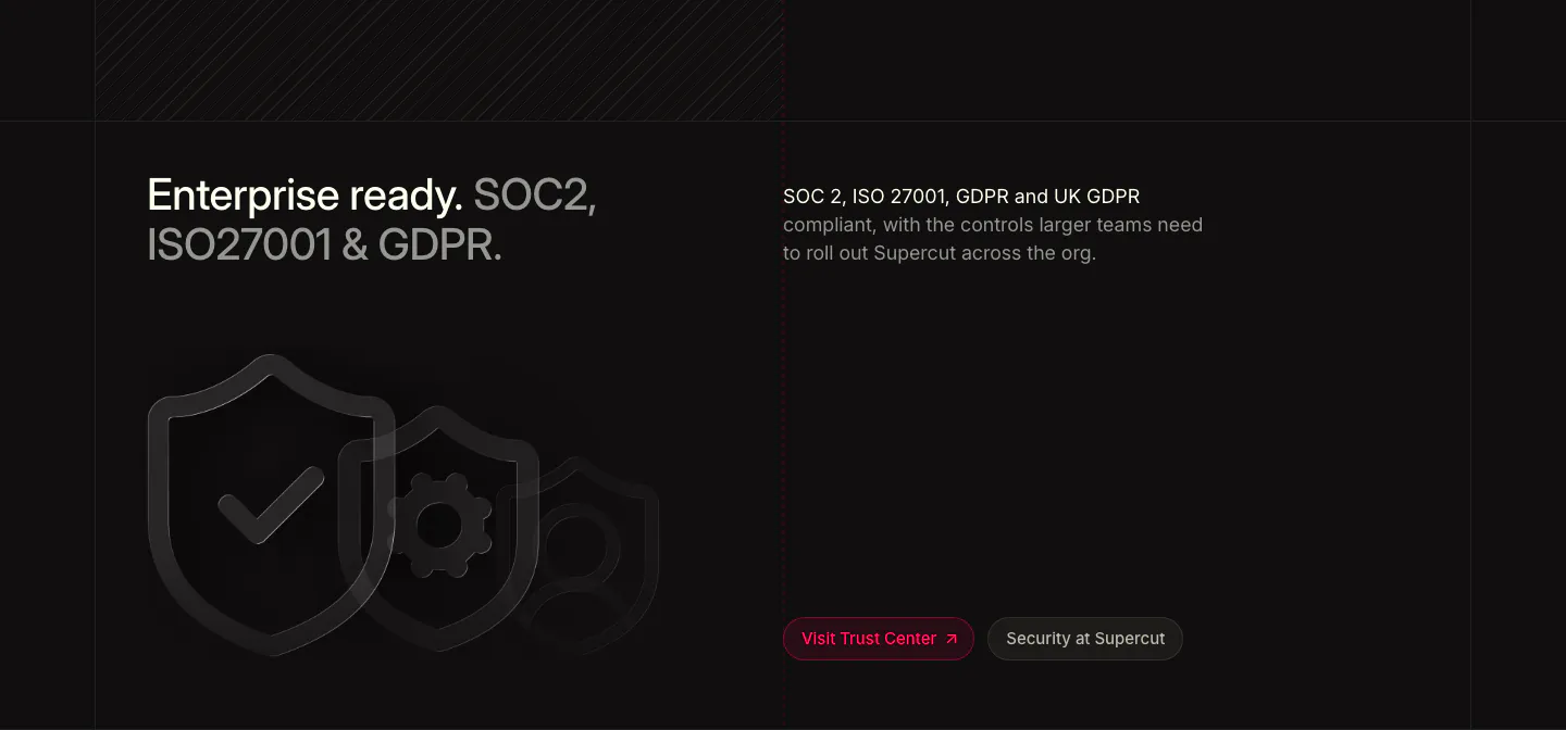
  32. Supercut security section: two-tone headline at left, compliance copy at right, outlined shield icons and Trust Center buttons
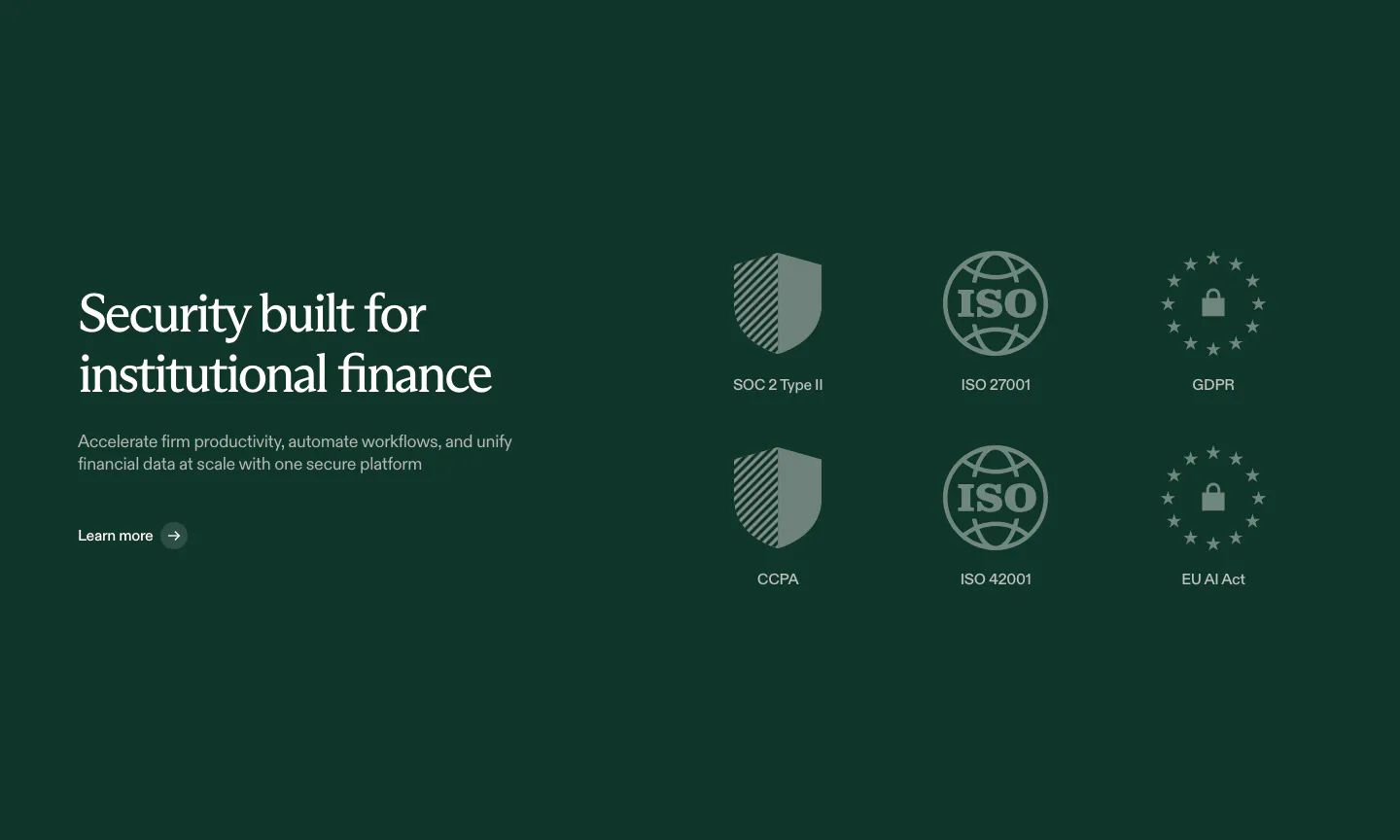
  33. Rogo security section: serif headline on dark green beside a grid of six compliance badges such as SOC 2, ISO and GDPR
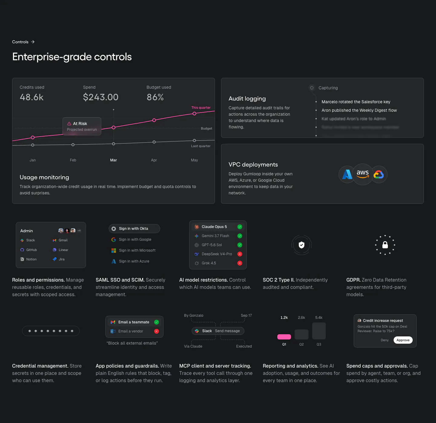
  34. Gumloop security section: dark bento of usage chart, audit log and VPC cards above a grid of small control tiles
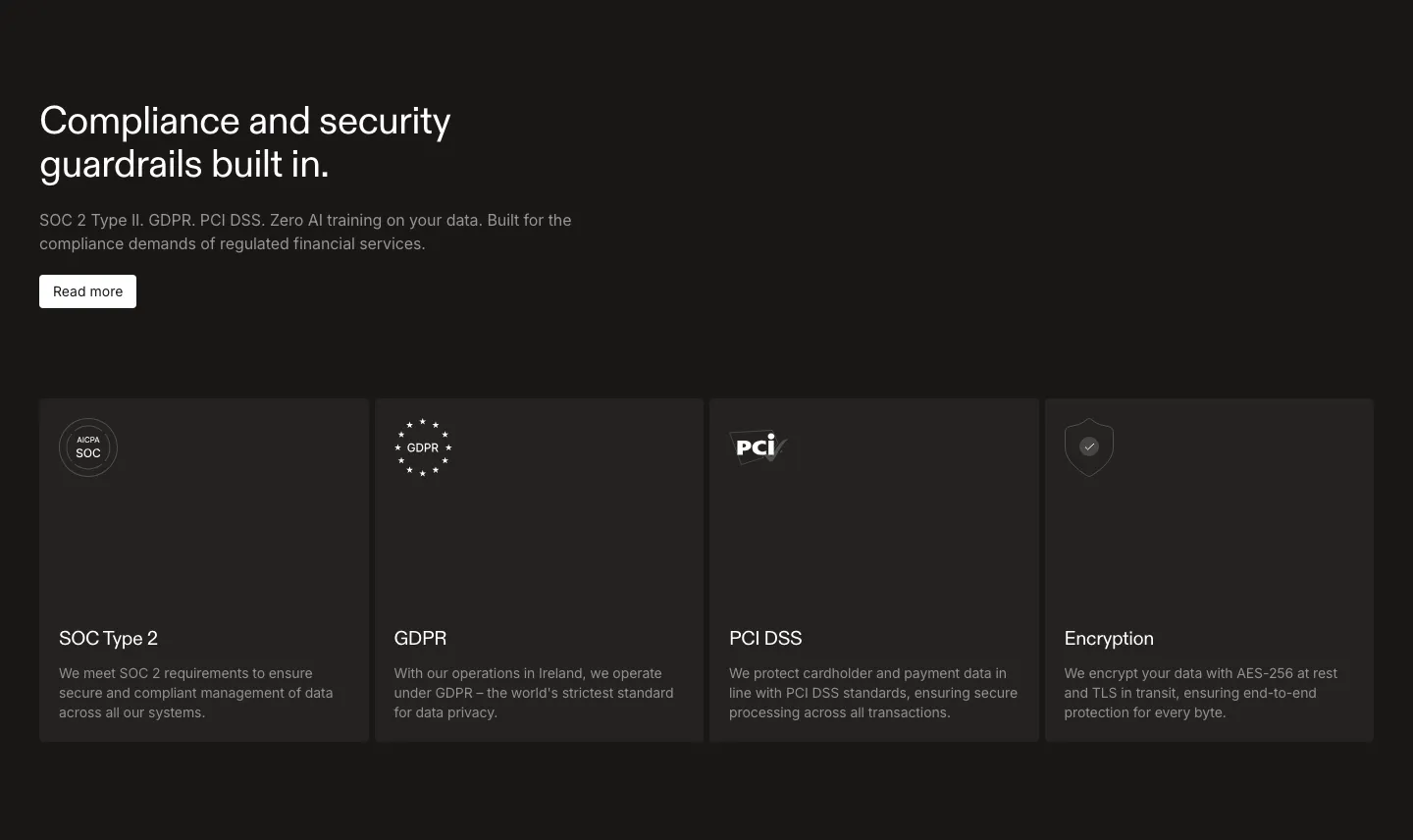
  35. Rulebase security section: left-aligned headline and Read more button above four dark cards for SOC 2, GDPR, PCI DSS and encryption
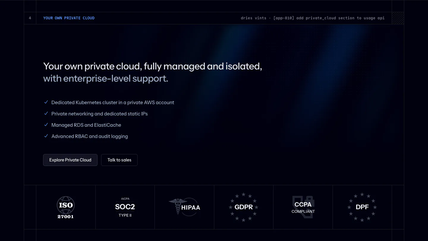
  36. Laravel Cloud security section: headline, private cloud checklist and buttons above a row of ISO, SOC 2, HIPAA and GDPR badges on dark navy
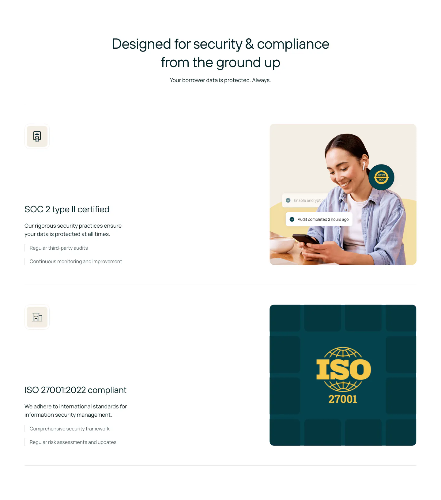
  37. Rezolv security section: centered headline above SOC 2 and ISO 27001 rows, each with text left and a photo or ISO badge right

Common patterns in security sections

How to build trust in a security section

  1. List only standards you actually meet

    Put the frameworks you comply with, such as SOC 2 Type II, ISO 27001, HIPAA, or GDPR, near the top of the section. Use official marks only where the issuing body allows them. If an audit is still underway, say so in text instead of showing a badge early.

  2. Describe controls in plain language

    Explain encryption at rest and in transit, access controls, SSO, and data residency in short, scannable rows. Skip jargon walls. A security reviewer should be able to answer most checklist questions from this section in about a minute.

  3. Link to deeper documentation

    Point every claim somewhere specific: a trust page, a security overview, or a form to request audit reports. This keeps the landing page short while giving evaluators the detail they need to approve a purchase.

  4. Choose calm visuals over padlocks

    Neutral colors, simple icons, and an orderly layout read as more credible than dramatic shields and glowing padlocks. Keep badges a consistent size, check their contrast in light and dark themes, and give each one alt text naming the standard.
Companies in this collection

All section types
    ↑↓ Navigate ↵ Open

    Section preview

    Website section