Clarasight website design

Every section we captured from the Clarasight website, in page order, from the hero section down to the footer. Open any thumbnail to see it full size.

Sections 7

In page order, top to bottom

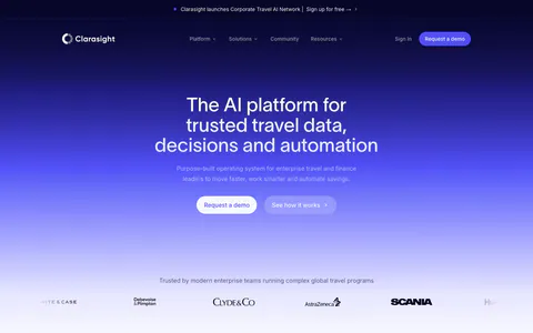
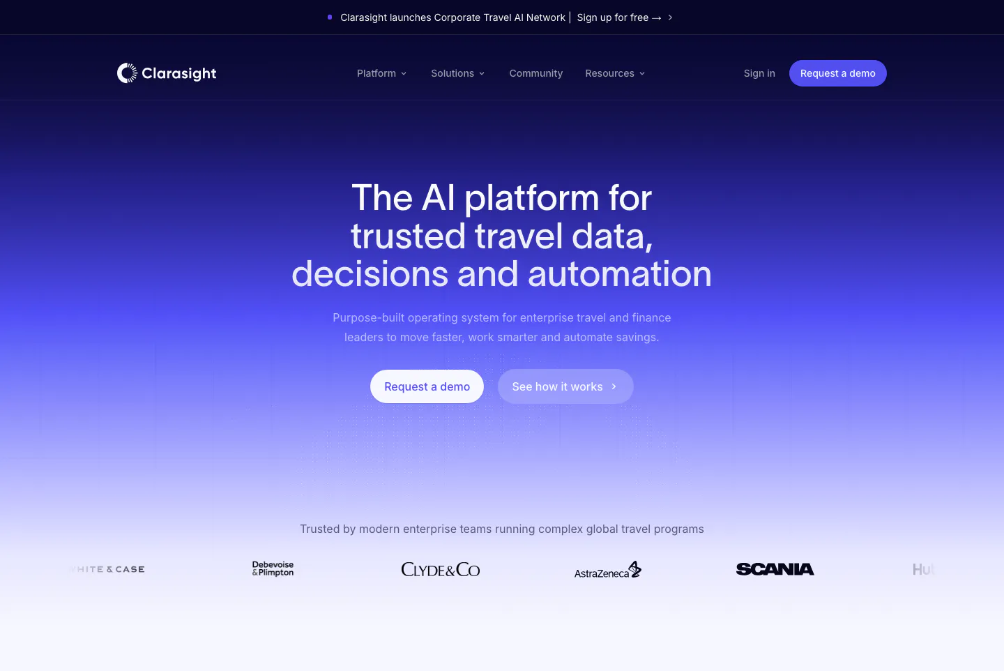
  1. Clarasight hero section: centered headline and two buttons on a navy-to-indigo gradient fading to white, above a customer logo row
    01 Hero

    The AI platform for trusted travel data, decisions and automation

  2. Clarasight value proposition section: small Why Clarasight label above a centered three-line statement on a pale lavender-white background

    $1.5T in corporate travel, meetings, and events spend still runs on disconnected systems and manual processes. Clarasight changes that.

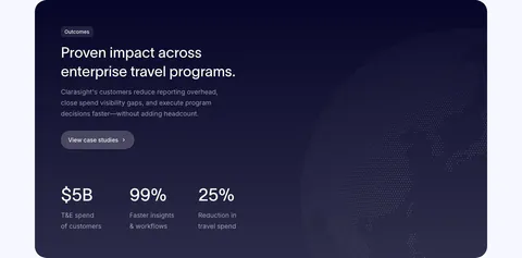
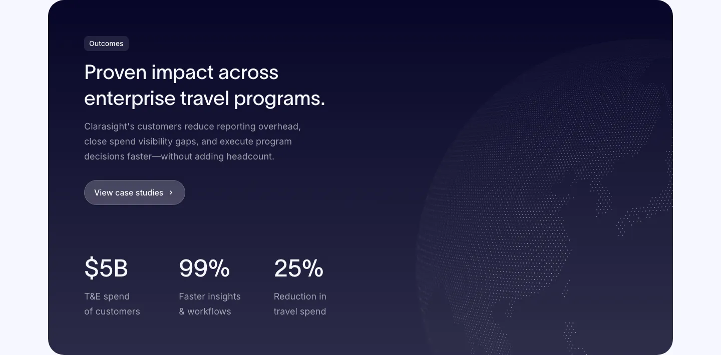
  3. Clarasight stats section: dark navy card with headline, copy and case study button above three large metrics, faint dotted globe at right
    03 Stats

    Proven impact across enterprise travel programs.

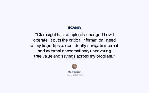
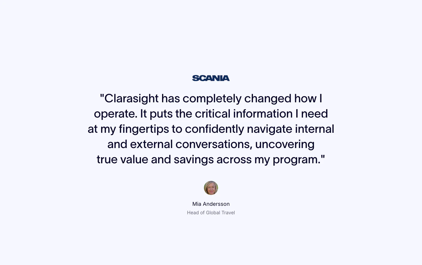
  4. Clarasight testimonials section: centered quote under a Scania logo with a round headshot, name and title below on a pale background

    "Clarasight has completely changed how I operate. It puts the critical information I need at my fingertips to confidently navigate internal and external conversations, uncovering true value and savings across my program."

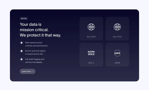
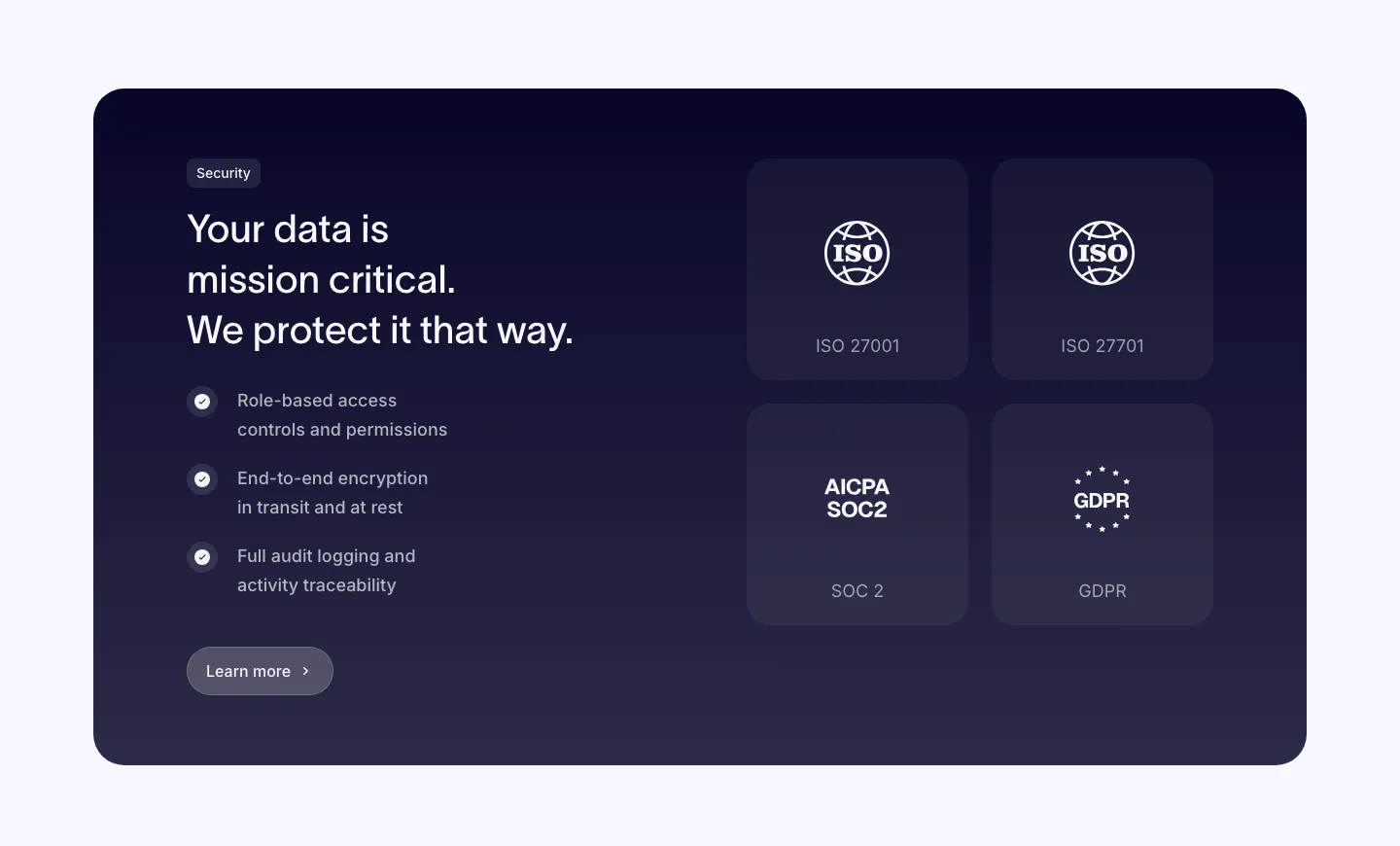
  5. Clarasight security section: dark navy card with headline, checklist and button on the left and a 2x2 grid of ISO, SOC 2 and GDPR badges

    Your data is mission critical. We protect it that way.

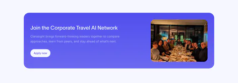
  6. Clarasight call to action section: indigo rounded banner with headline, copy and white button beside a photo of a group at a dinner table

    Join the Corporate Travel AI Network

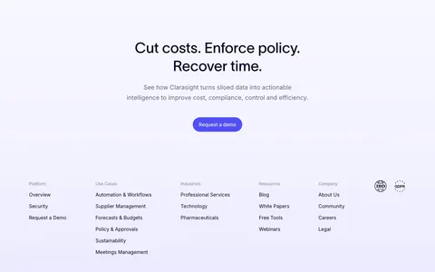
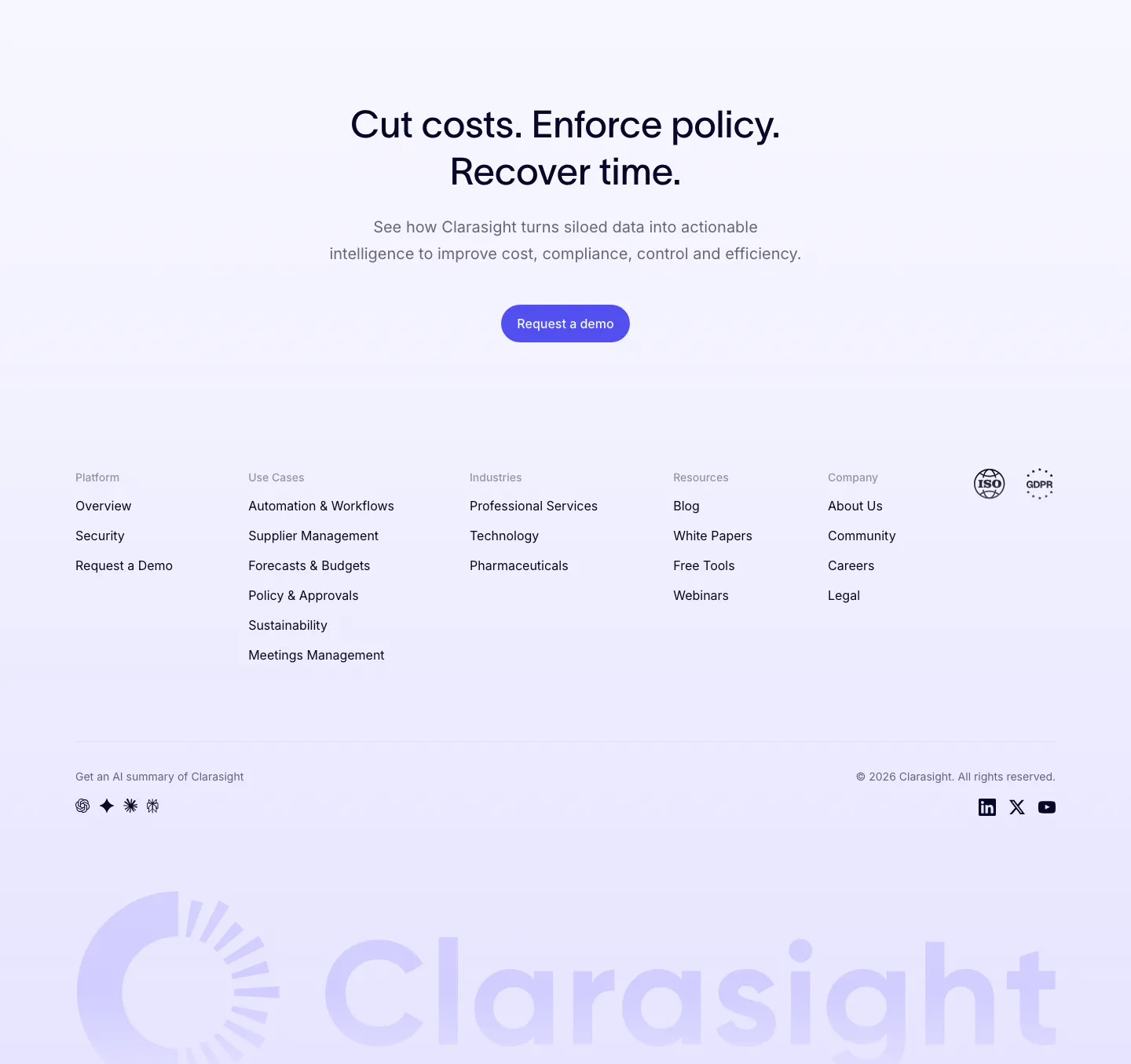
  7. Clarasight footer section: centered CTA headline and button above link columns, compliance badges and a huge faint lavender wordmark
    07 Footer

    Cut costs. Enforce policy. Recover time.
Similar companies

All companies
    ↑↓ Navigate ↵ Open

    Section preview

    Website section