Logistics Website Design Examples

Delays cost real money in logistics, so buyers want reliability shown, not promised. A useful page explains the network, coverage, and visibility the product provides, and how it connects to the systems a shipper, fleet operator, or traveler already relies on. Clear logistics website design uses maps, tracking views, and operational metrics to make a business full of moving parts easy to understand at a glance.

52 sections

  1. Clarasight value proposition section: small Why Clarasight label above a centered three-line statement on a pale lavender-white background
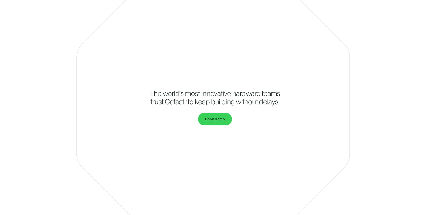
  2. Cofactr call to action section: centered one-line statement and green Book Demo button inside a faint octagon outline on white
  3. United Carriers call-to-action section: bold uppercase headline and short copy inside a thin circle outline on a dark background
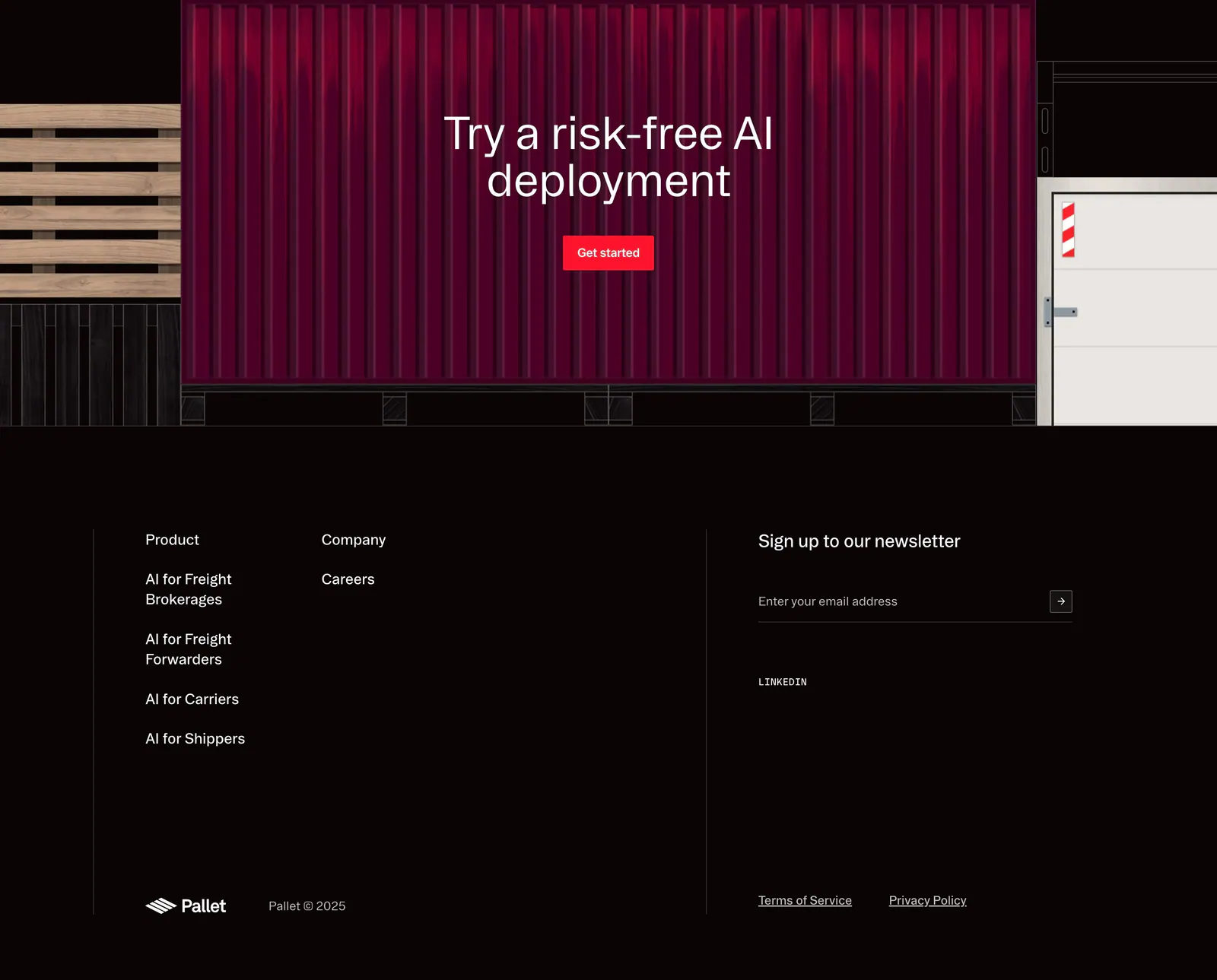
  4. Pallet footer section: CTA over a red shipping container illustration above dark link columns, newsletter email field and copyright
  5. Clarasight hero section: centered headline and two buttons on a navy-to-indigo gradient fading to white, above a customer logo row
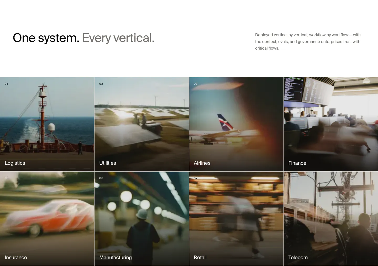
  6. HappyRobot use cases section: headline with side note above a 4x2 grid of numbered industry tiles on blurred photos, Logistics to Telecom
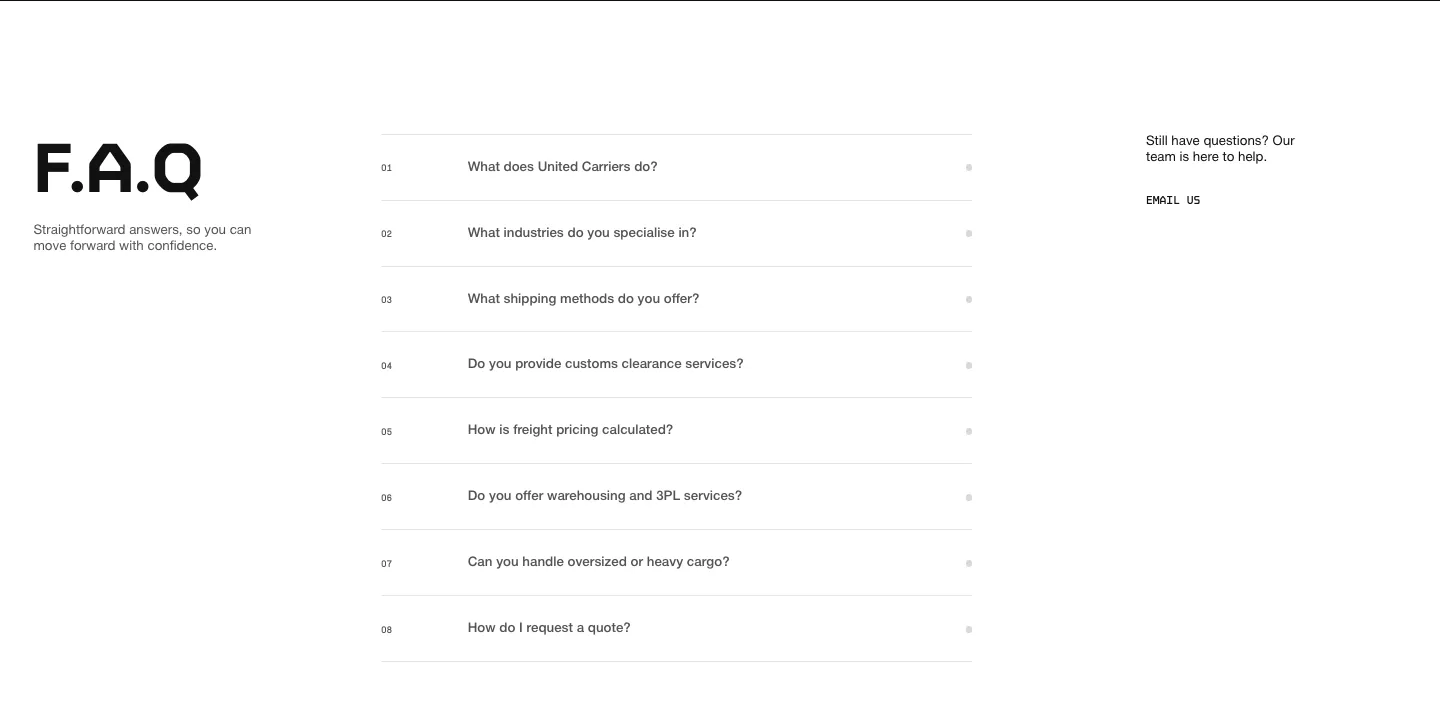
  7. United Carriers FAQ section: large F.A.Q heading left, numbered accordion questions center and an email link right on white
  8. The Real Hotels hero section: scattered hotel photos on black around a centered serif tagline, huge serif wordmark across the bottom
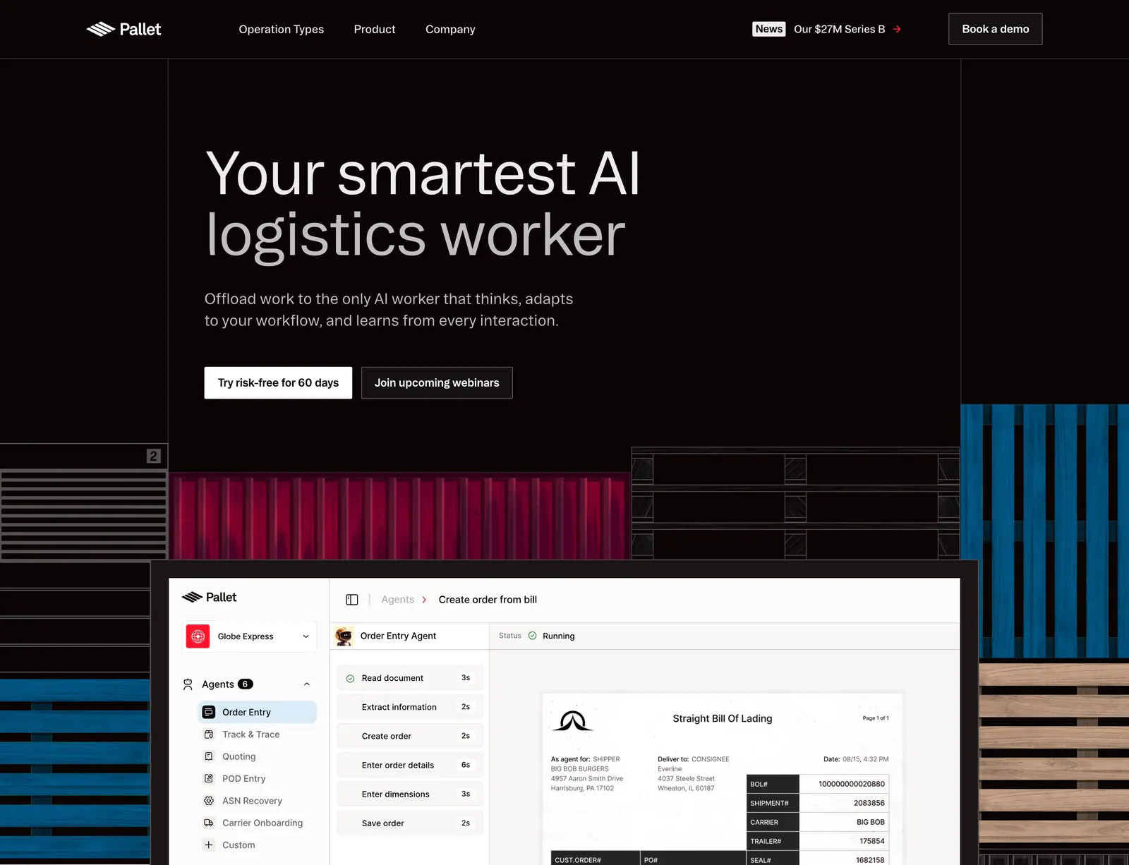
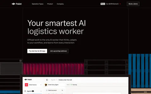
  9. Pallet hero section: dark left-aligned headline with two buttons above an agent product screenshot framed by container and pallet artwork
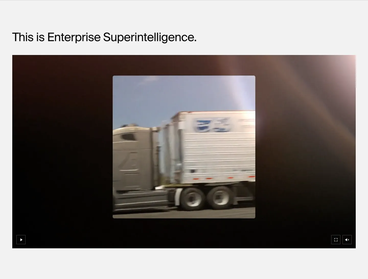
  10. HappyRobot features section: left-aligned headline above a wide dark video player showing footage of a moving truck, on light gray
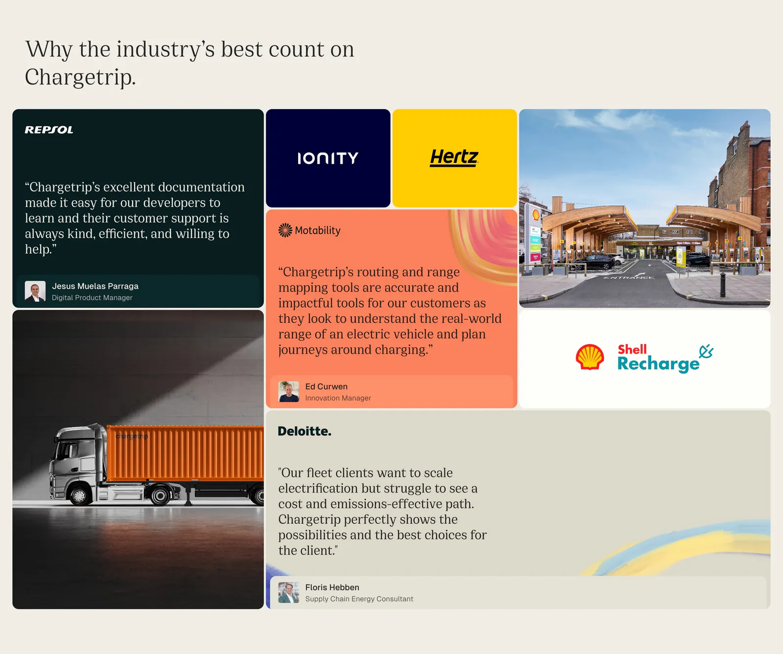
  11. Chargetrip testimonials section: bento grid of quote cards, partner logo tiles and photos of a truck and charging station on beige
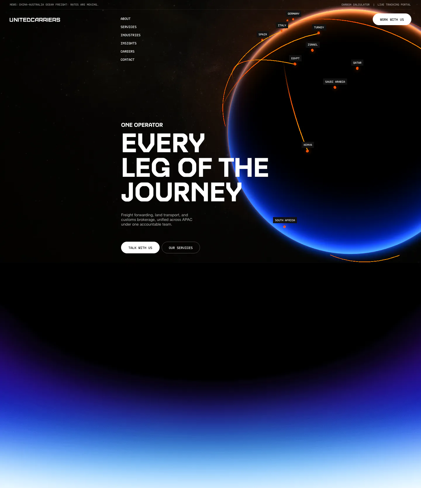
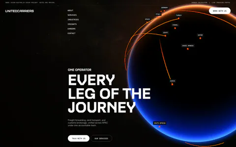
  12. United Carriers hero section: uppercase headline and two buttons beside a glowing globe with route arcs on black, fading into a blue glow
  13. Clarasight call to action section: indigo rounded banner with headline, copy and white button beside a photo of a group at a dinner table
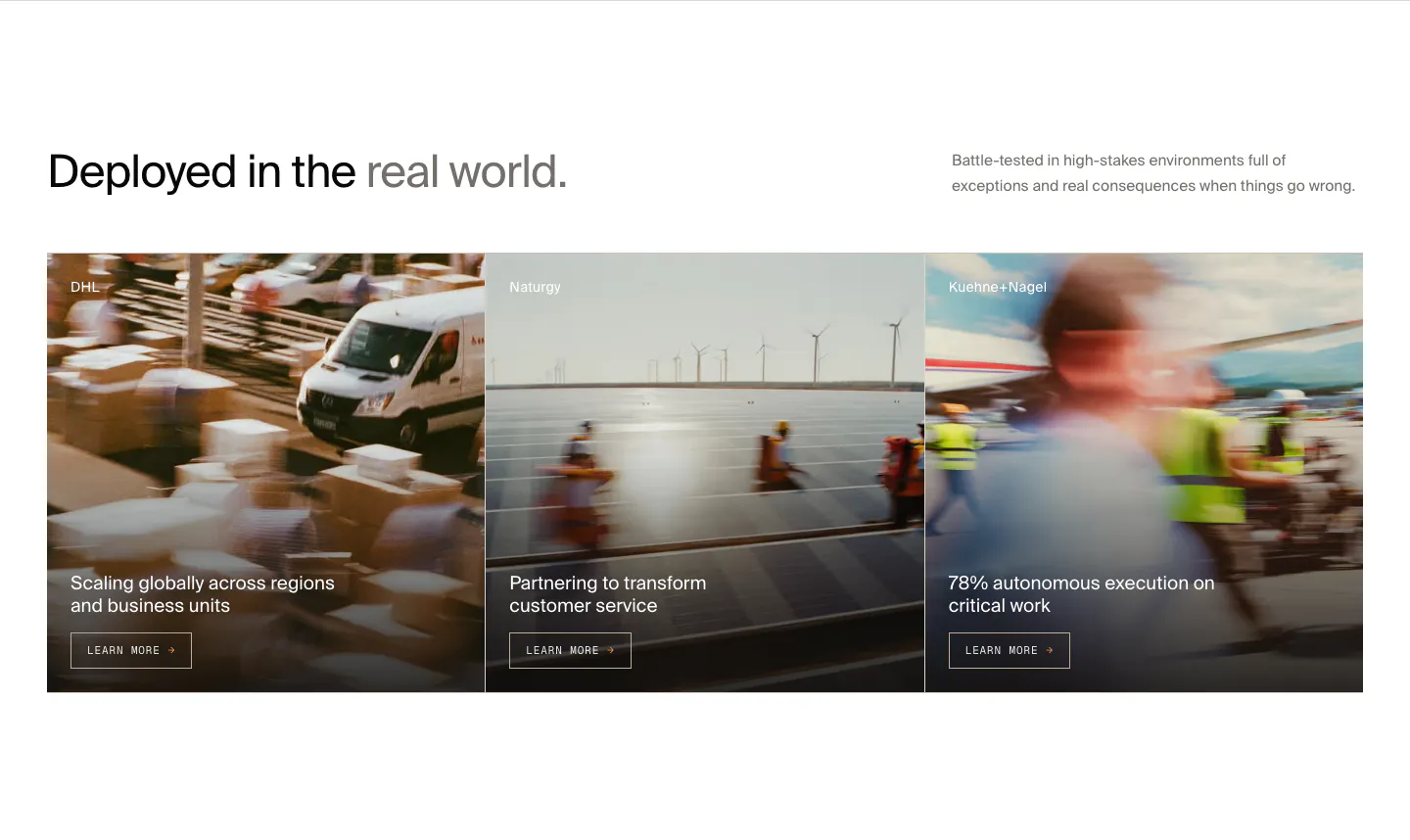
  14. HappyRobot features section: headline with side note above three customer story cards (DHL, Naturgy, Kuehne+Nagel) on motion-blurred photos
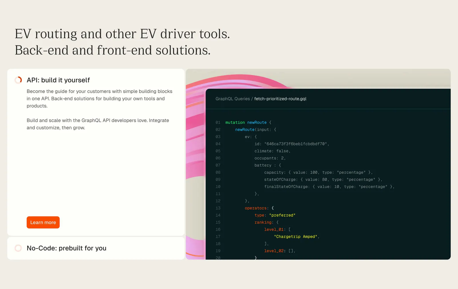
  15. Chargetrip features section: serif headline above an expandable option list beside a GraphQL code snippet on a beige background
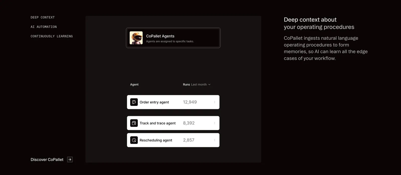
  16. Pallet features section: dark three-column layout with vertical tab labels, a CoPallet agents UI card and descriptive text on the right
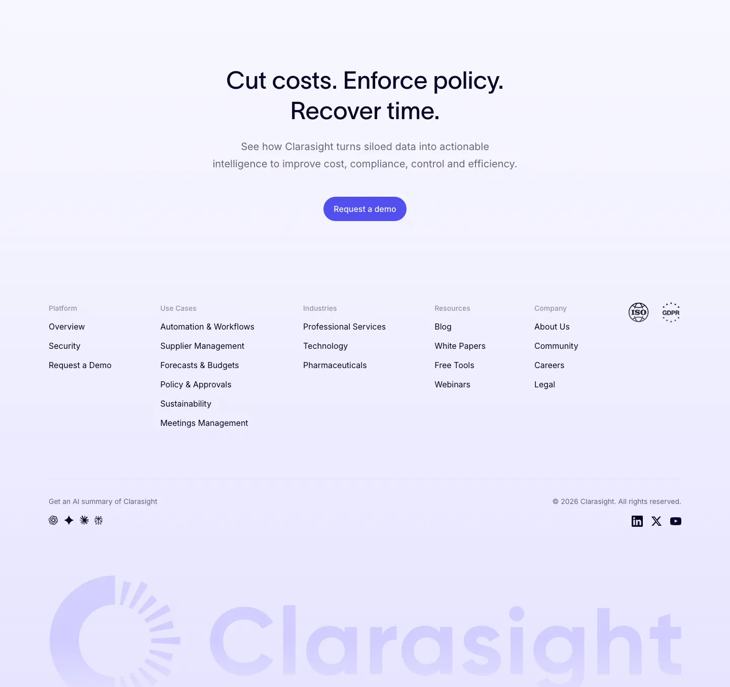
  17. Clarasight footer section: centered CTA headline and button above link columns, compliance badges and a huge faint lavender wordmark
  18. HappyRobot call to action section: centered two-tone headline in black and gray above a small black Book a demo button on white
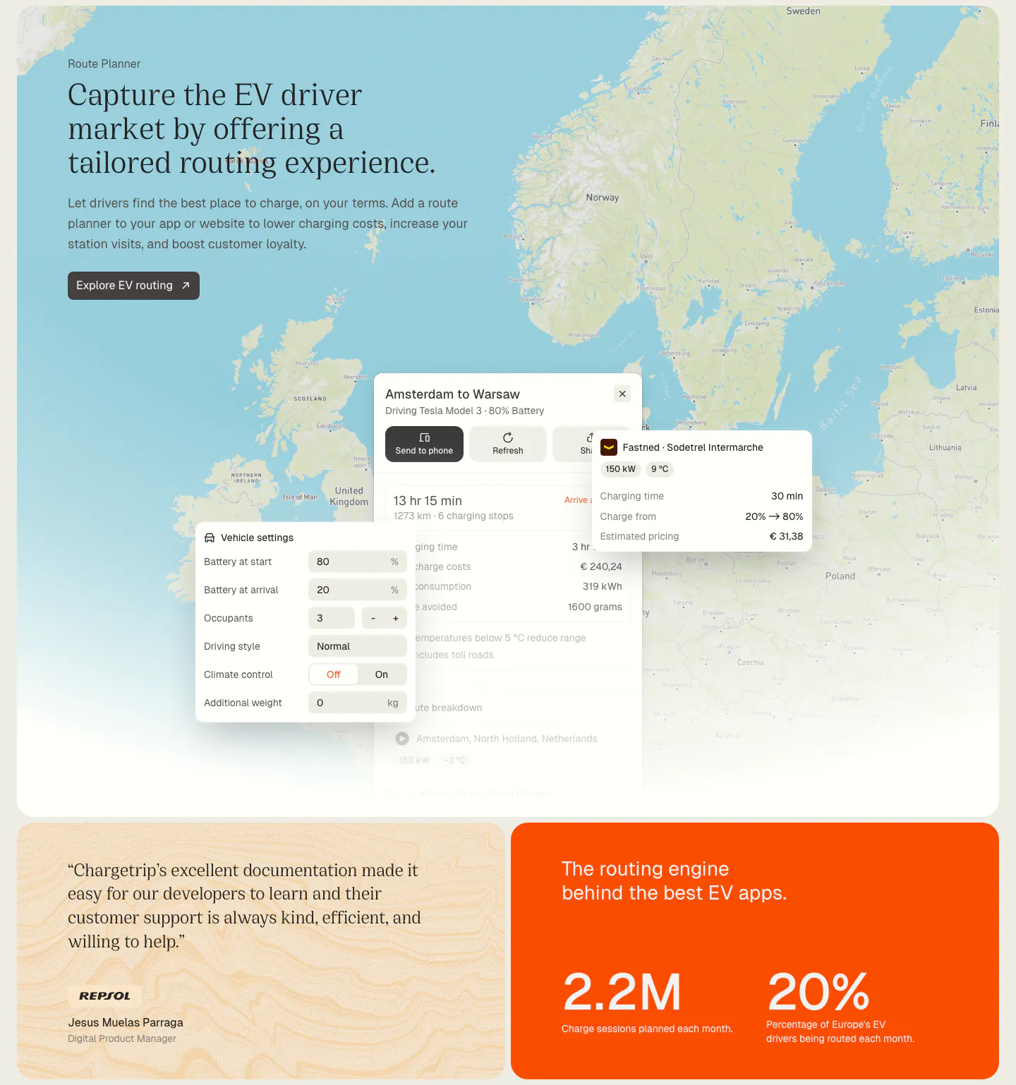
  19. Chargetrip features section: serif headline over a Europe map with route planner UI panels, above a quote card and an orange stats card
  20. United Carriers logo cloud section: bordered grid of airline and shipping line logos on white above a blue glow gradient
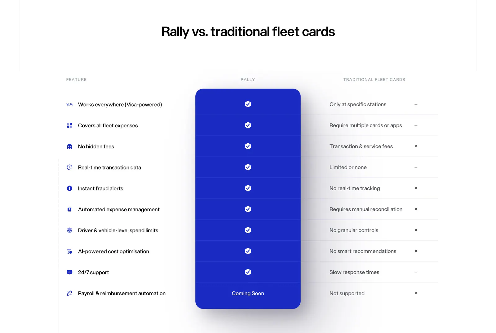
  21. Rally comparison section: centered headline above a feature comparison table with a highlighted blue Rally column of checkmarks
  22. Cofactr logo cloud section: centered two-line statement above a single row of gray customer logos like Snap Inc. and Neros on white
  23. Chargetrip testimonials section: centered serif quote from a Deloitte consultant with company badge and name on a white rounded panel
  24. HappyRobot logo cloud section: small eyebrow label above a 7x3 bordered grid of customer logos, some tiles on blurred photo backgrounds
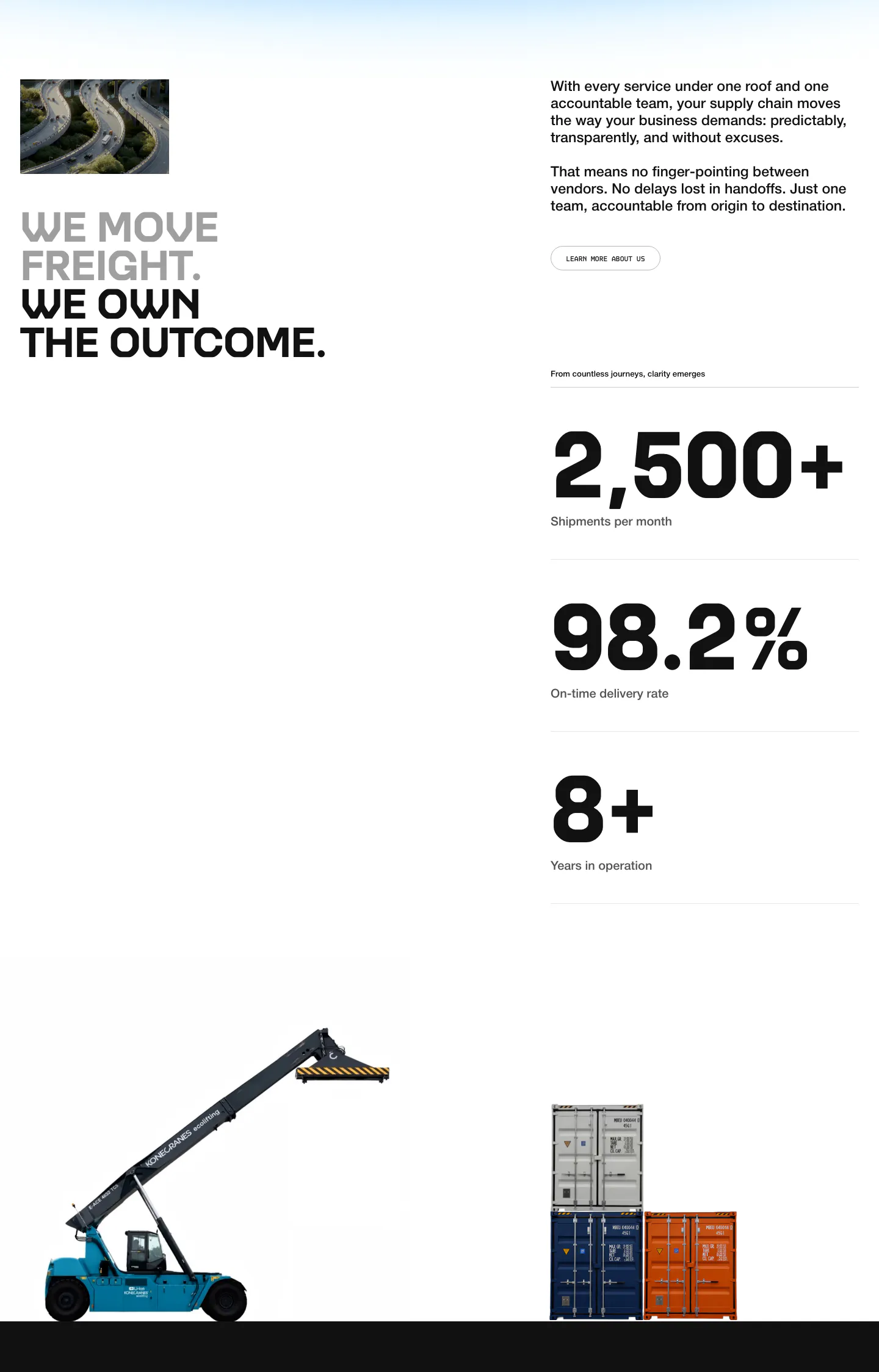
  25. United Carriers stats section: uppercase headline, intro copy and three large metrics with cutout photos of a reach stacker and containers
  26. Cofactr footer section: dark green link columns, solutions slider, blue promo block, Get Started CTA and a green cofactr wordmark
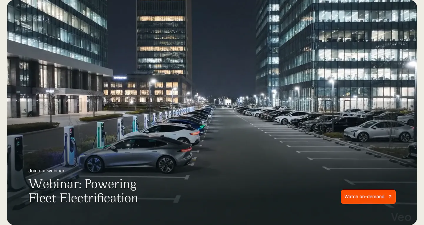
  27. Chargetrip blog & resources section: webinar banner with serif title and orange button over a full-bleed night photo of an EV charging lot
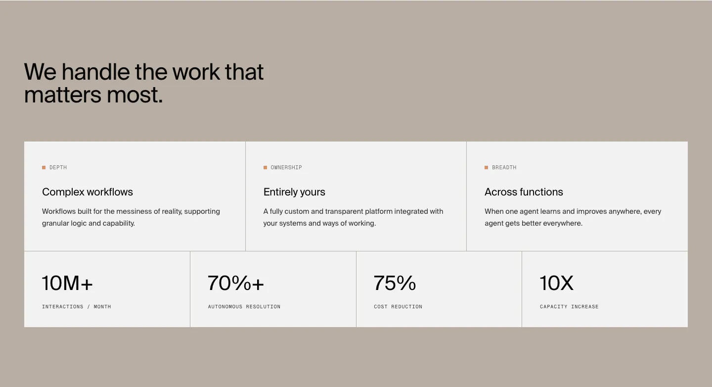
  28. HappyRobot value proposition section: headline on a taupe background above three benefit cards and a row of four large metrics
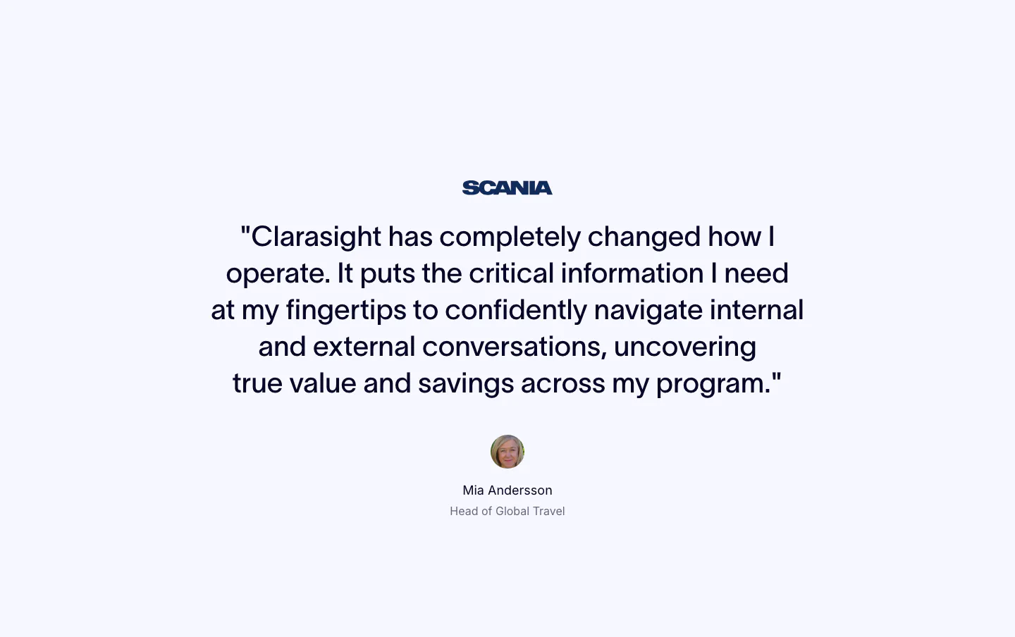
  29. Clarasight testimonials section: centered quote under a Scania logo with a round headshot, name and title below on a pale background
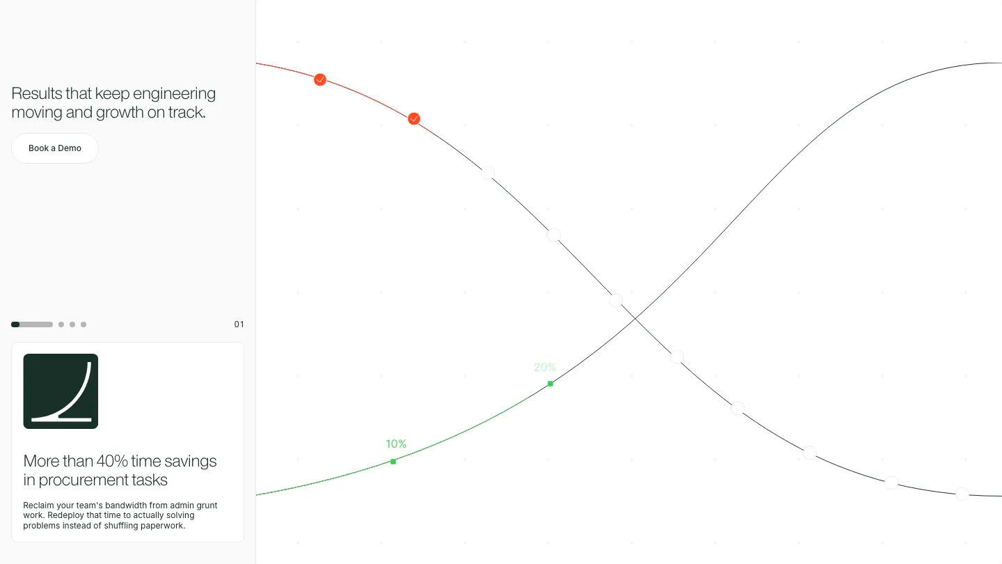
  30. Cofactr value proposition section: left column with headline, demo button and a paged outcome card, beside crossing growth curves on white
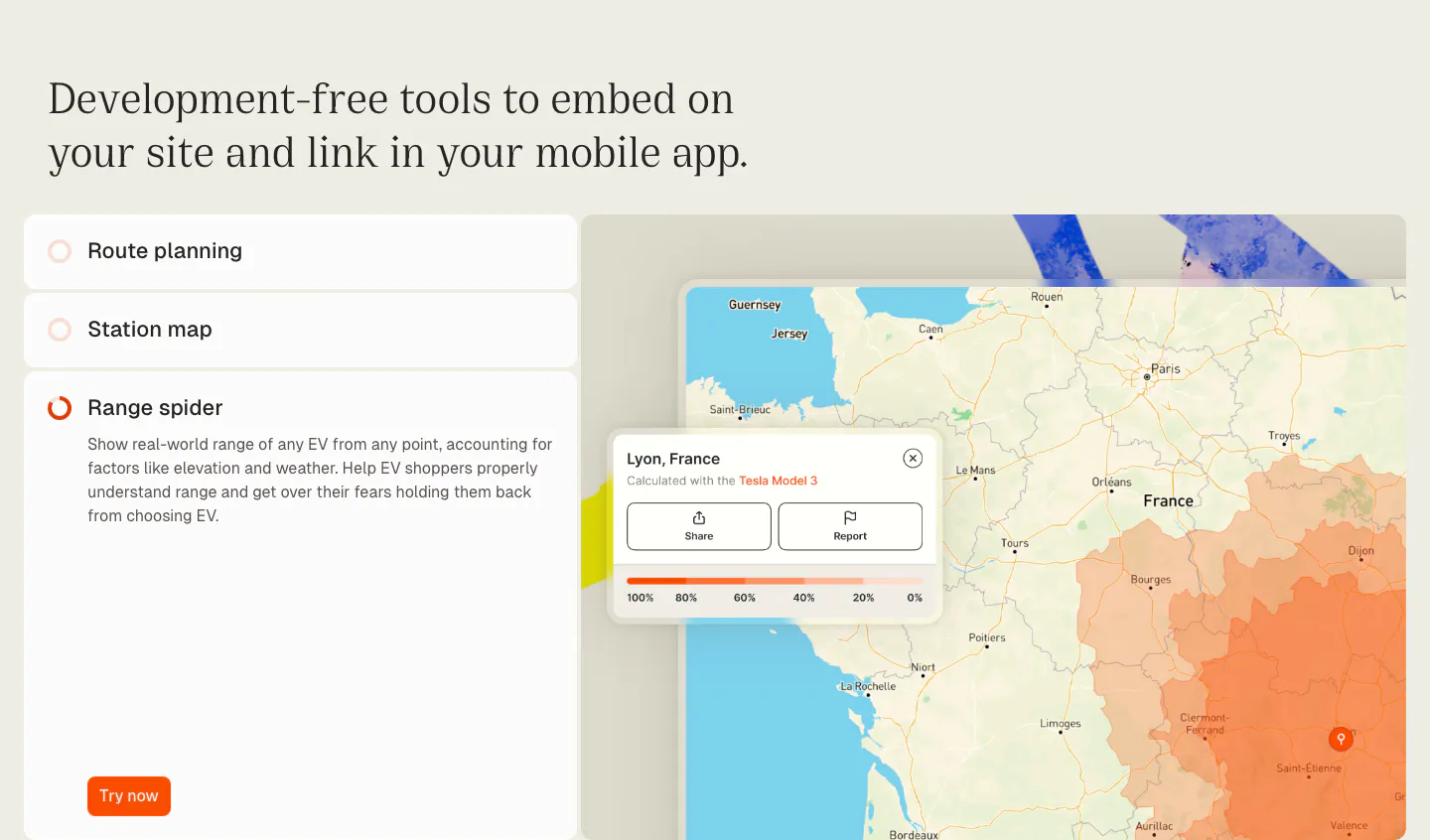
  31. Chargetrip features section: serif headline over an accordion list of embeddable tools beside a France map with an EV range overlay
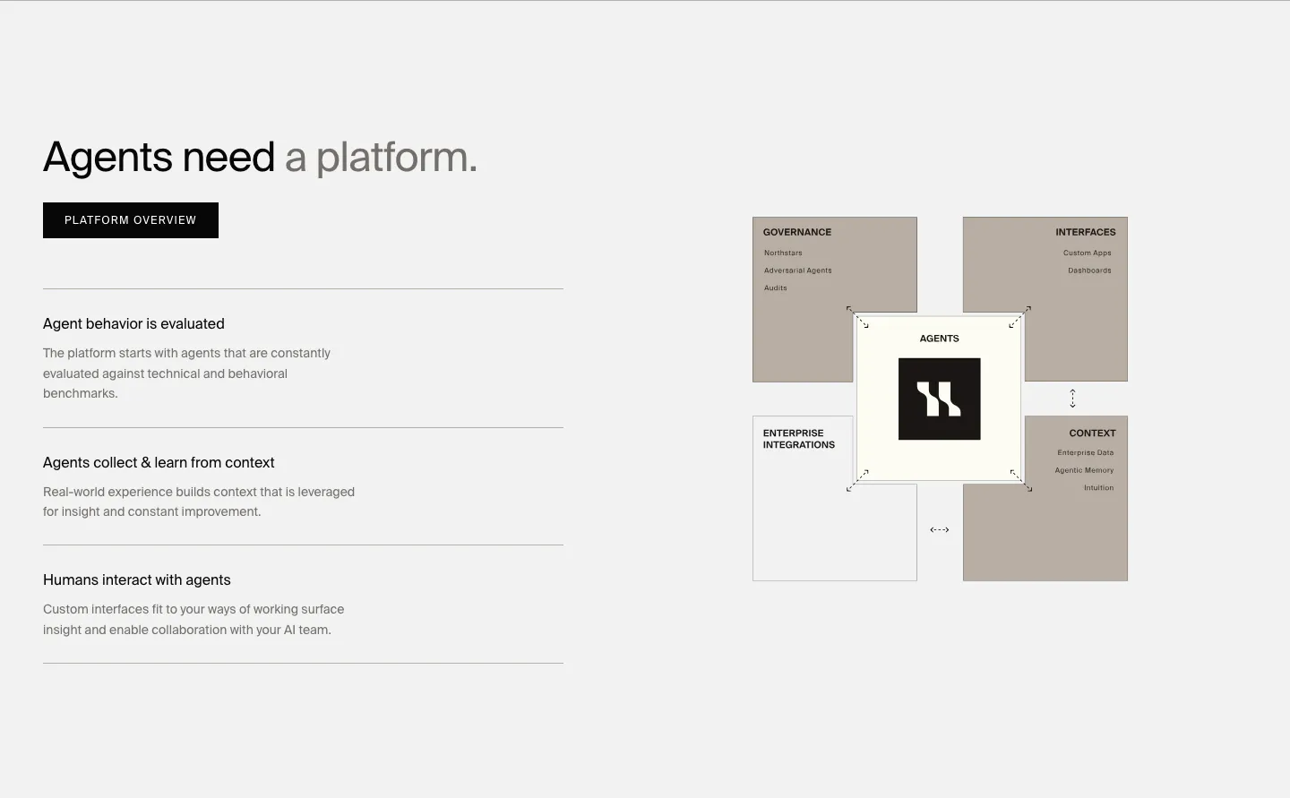
  32. HappyRobot features section: headline, button and three capability rows on the left, taupe block diagram of the agent platform on the right
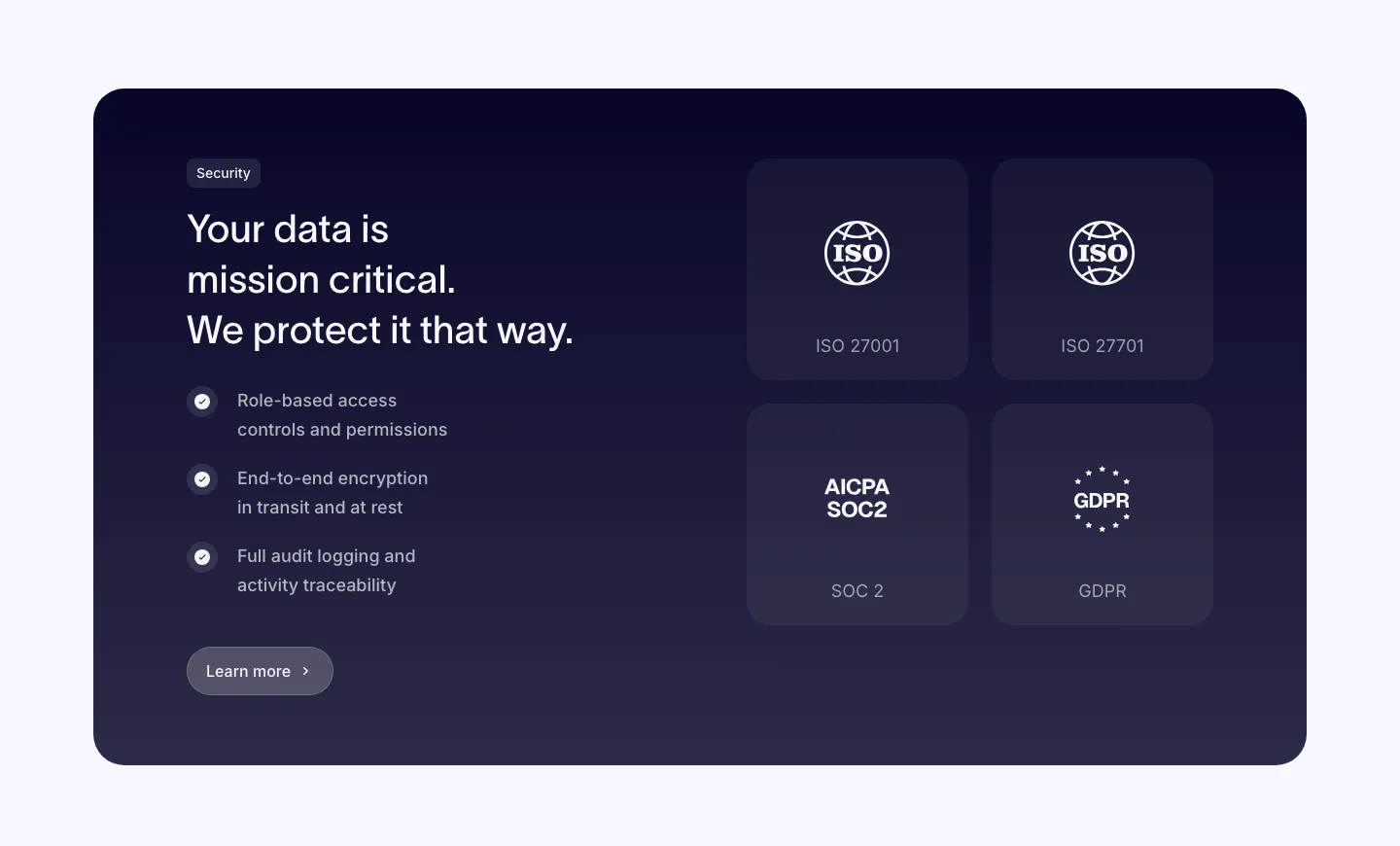
  33. Clarasight security section: dark navy card with headline, checklist and button on the left and a 2x2 grid of ISO, SOC 2 and GDPR badges
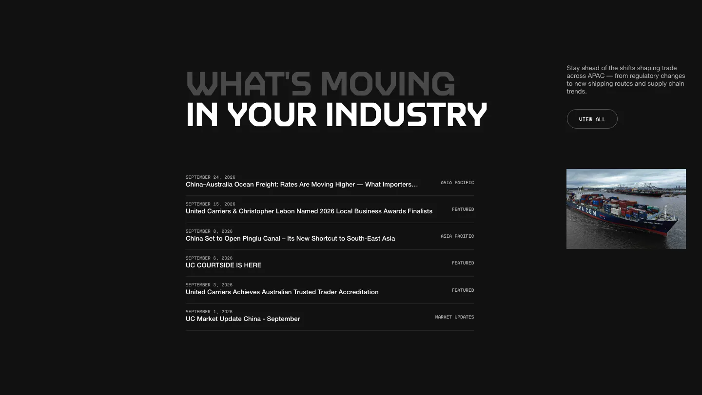
  34. United Carriers blog & resources section: uppercase heading over a dated news list with category labels and a ship photo on dark
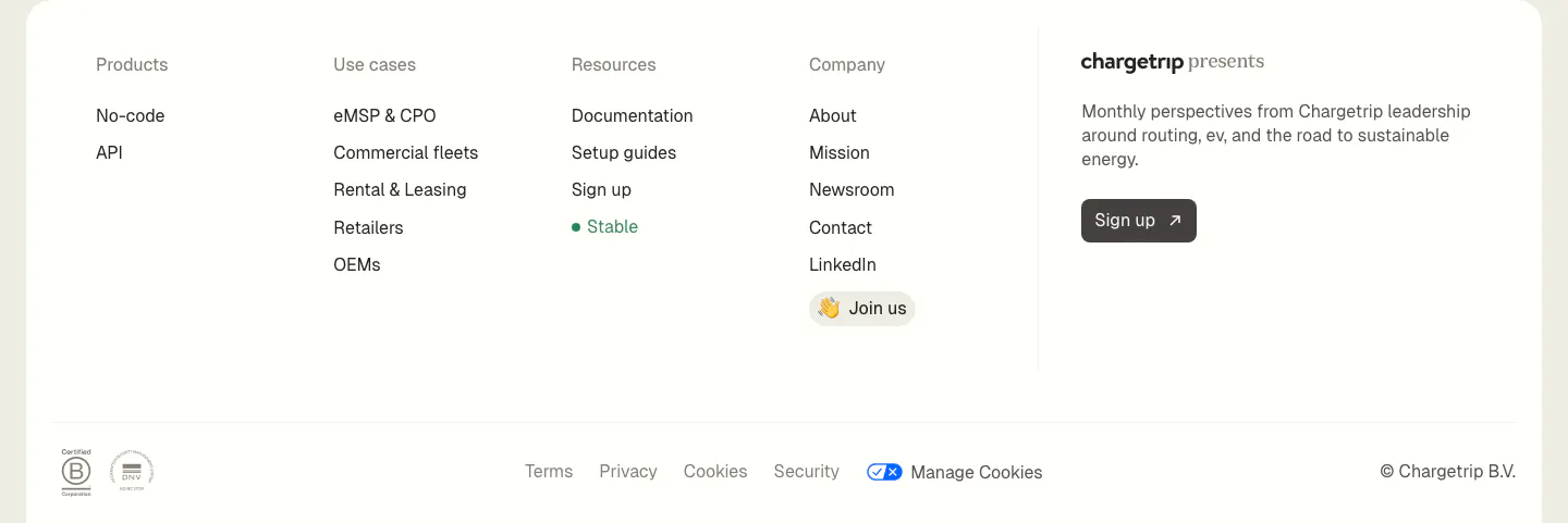
  35. Chargetrip footer section: four link columns beside a newsletter sign-up blurb, with legal links and certification badges on a white panel
  36. HappyRobot careers section: Join us eyebrow, headline and two buttons on the left, photo of a team in a timber-roofed office on the right
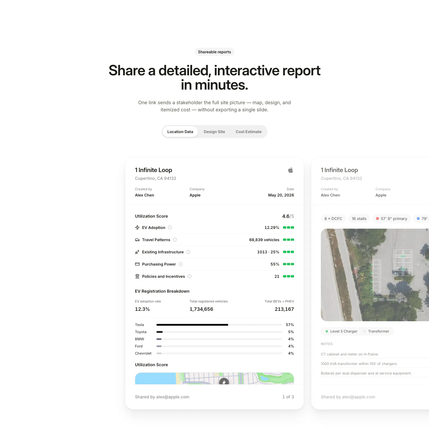
  37. EVpin features section: centered heading and segmented tabs above site report cards with utilization scores, cut off at the right edge
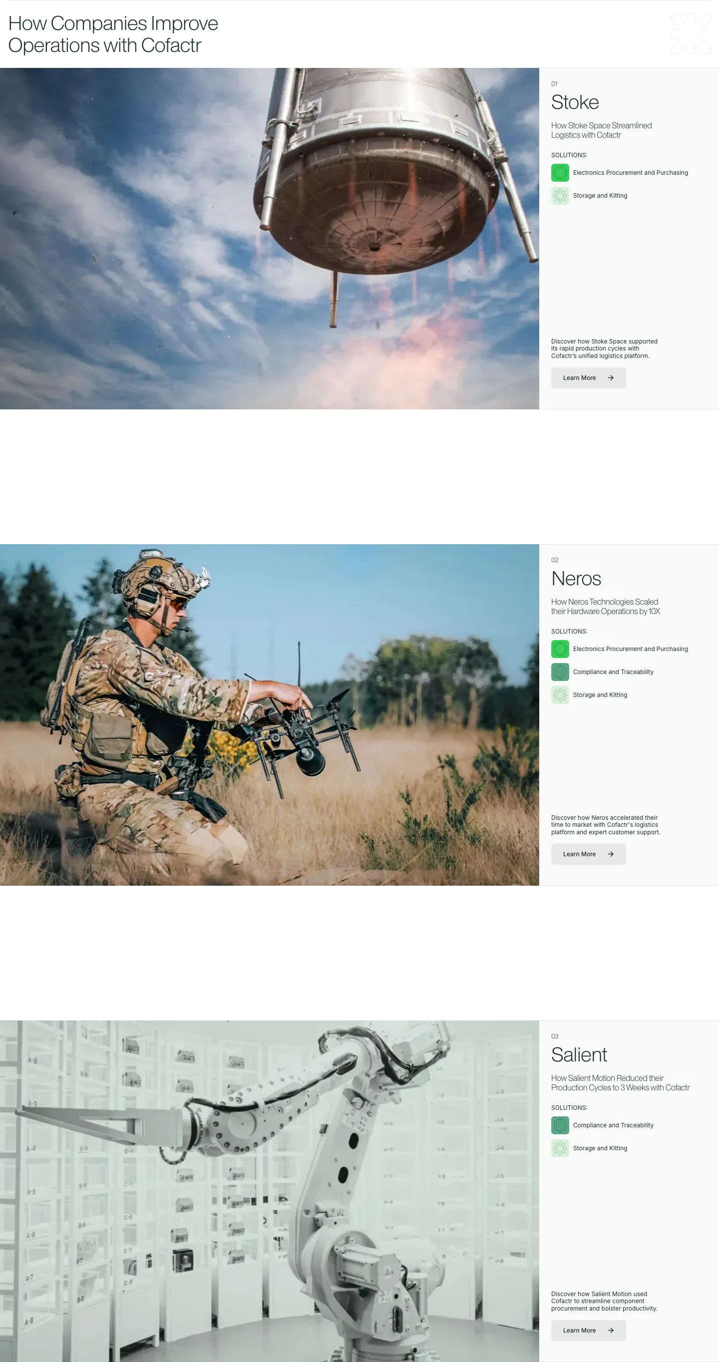
  38. Cofactr testimonials section: stacked customer case studies, each a large photo left with company name, solution chips and Learn More right
  39. Chargetrip features section: left-aligned serif headline above three Renault 5 electric cars in green, black and yellow on a light gray backdrop
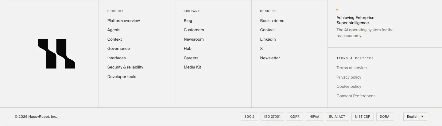
  40. HappyRobot footer section: large black logo mark, three link columns, tagline and policy links, compliance badge row and copyright on light gray
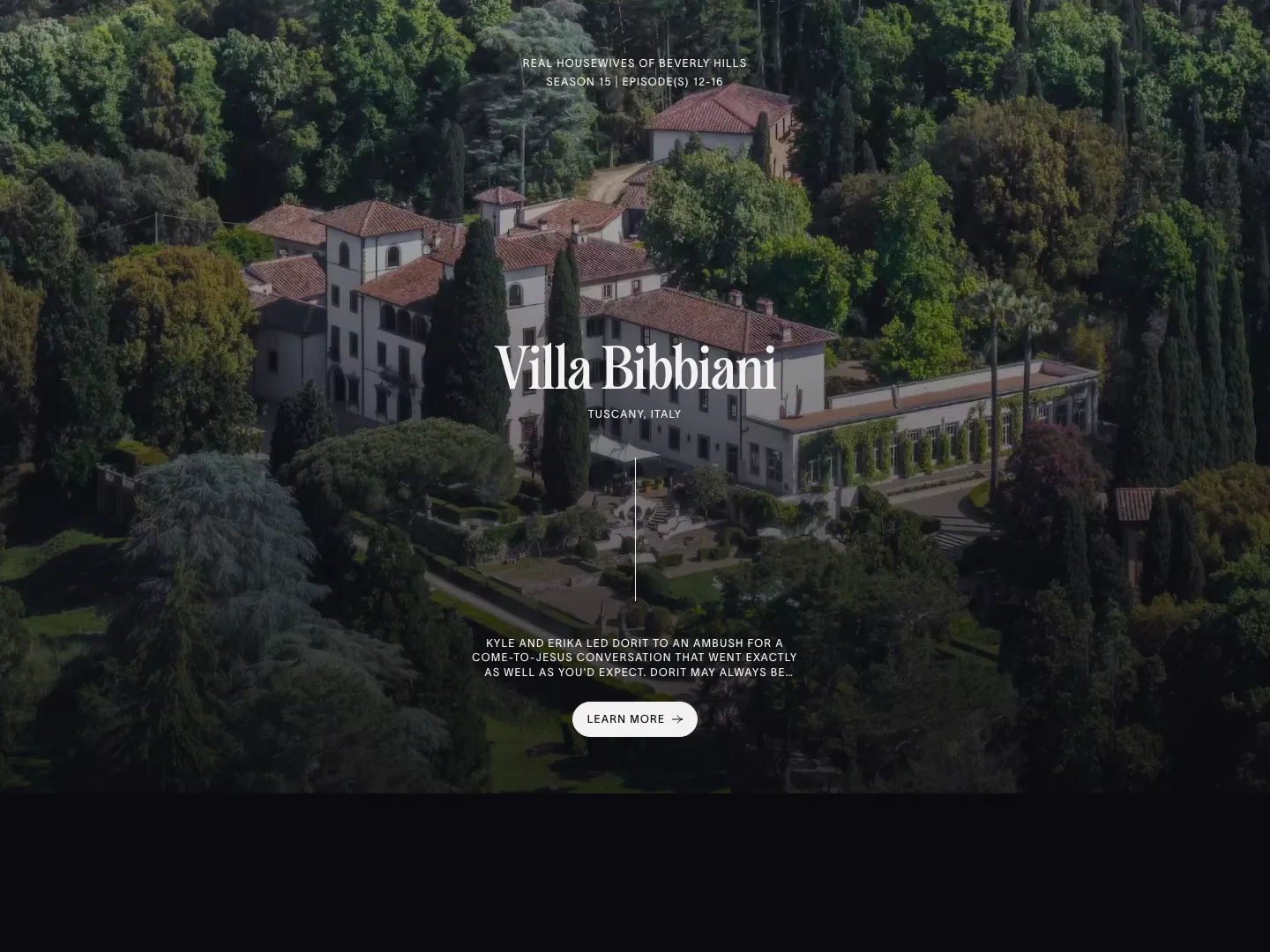
  41. The Real Hotels features section: full-bleed aerial photo of a Tuscan villa with centered serif title, episode note and Learn more button
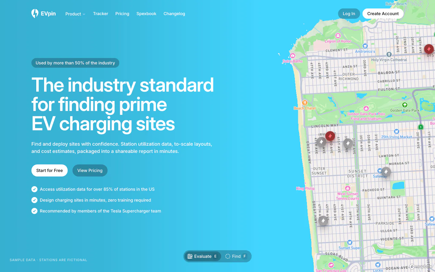
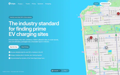
  42. EVpin hero section: headline, buttons and checklist on a bright cyan gradient beside a street map with charging station pins
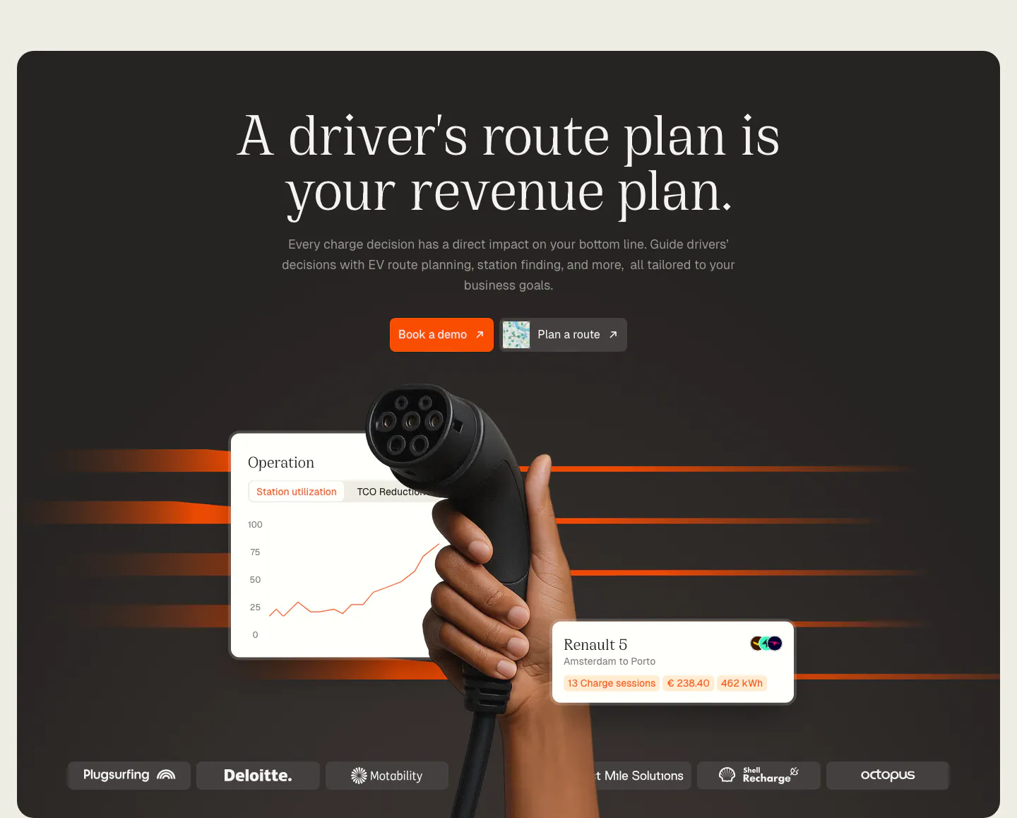
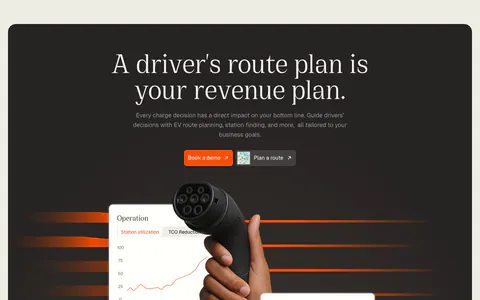
  43. Chargetrip hero section: centered serif headline above a hand holding an EV charger, floating UI cards and a logo strip on a dark panel
  44. Clarasight stats section: dark navy card with headline, copy and case study button above three large metrics, faint dotted globe at right
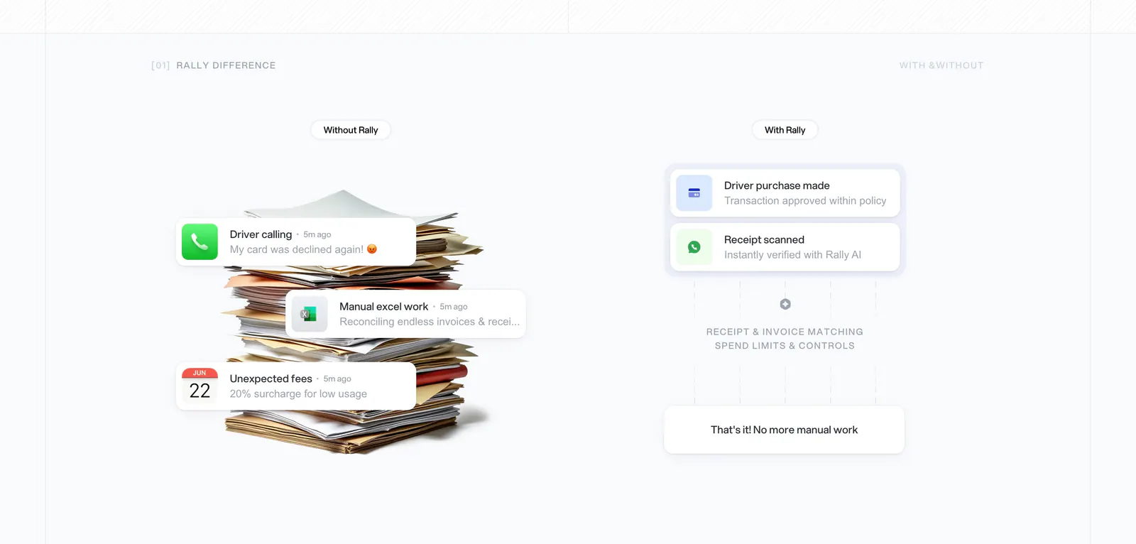
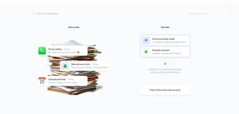
  45. Rally comparison section: without vs with columns, a paper stack with notification cards on the left and a clean approval flow on the right
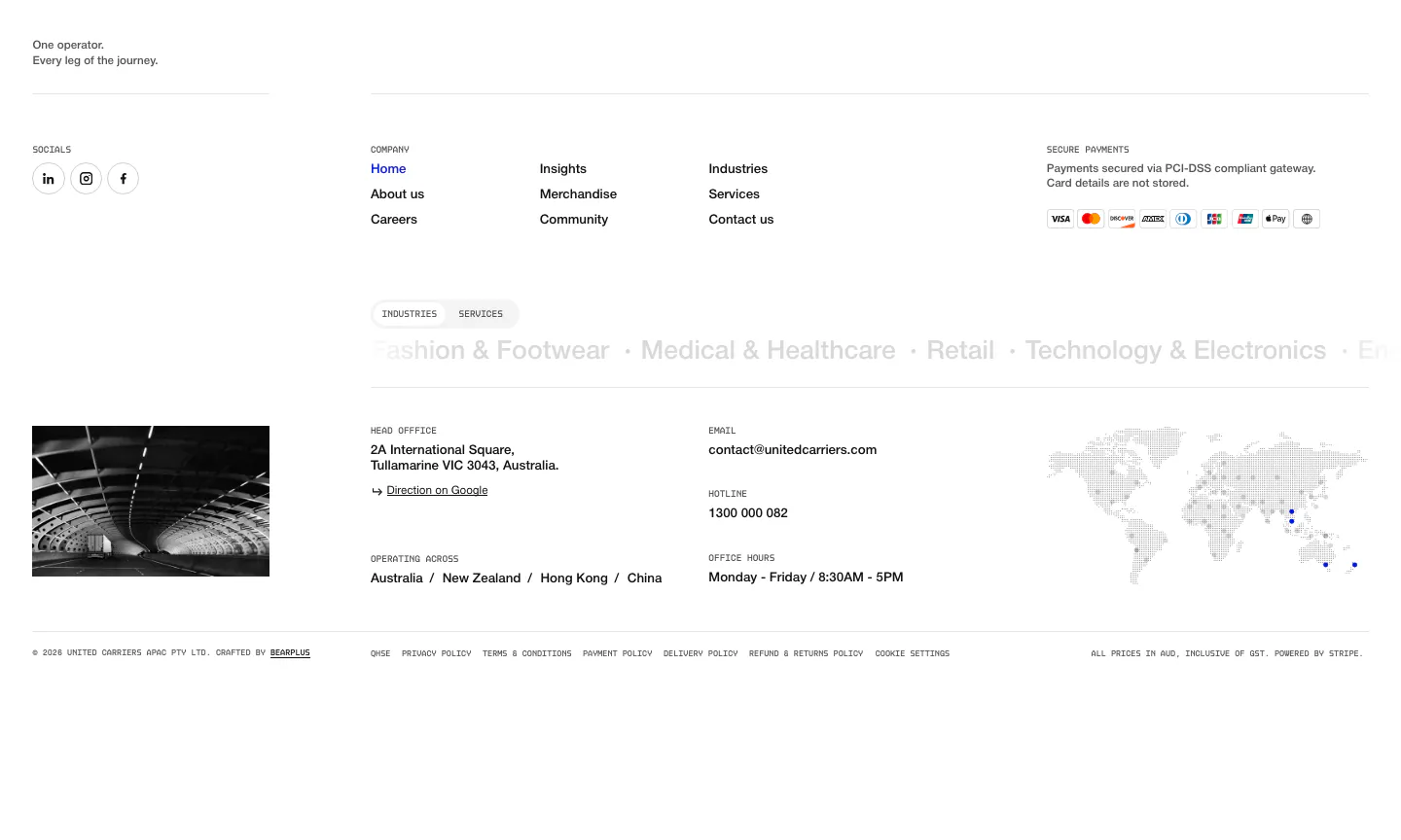
  46. United Carriers footer section: link columns, payment badges, industries marquee, office details and dotted world map on white
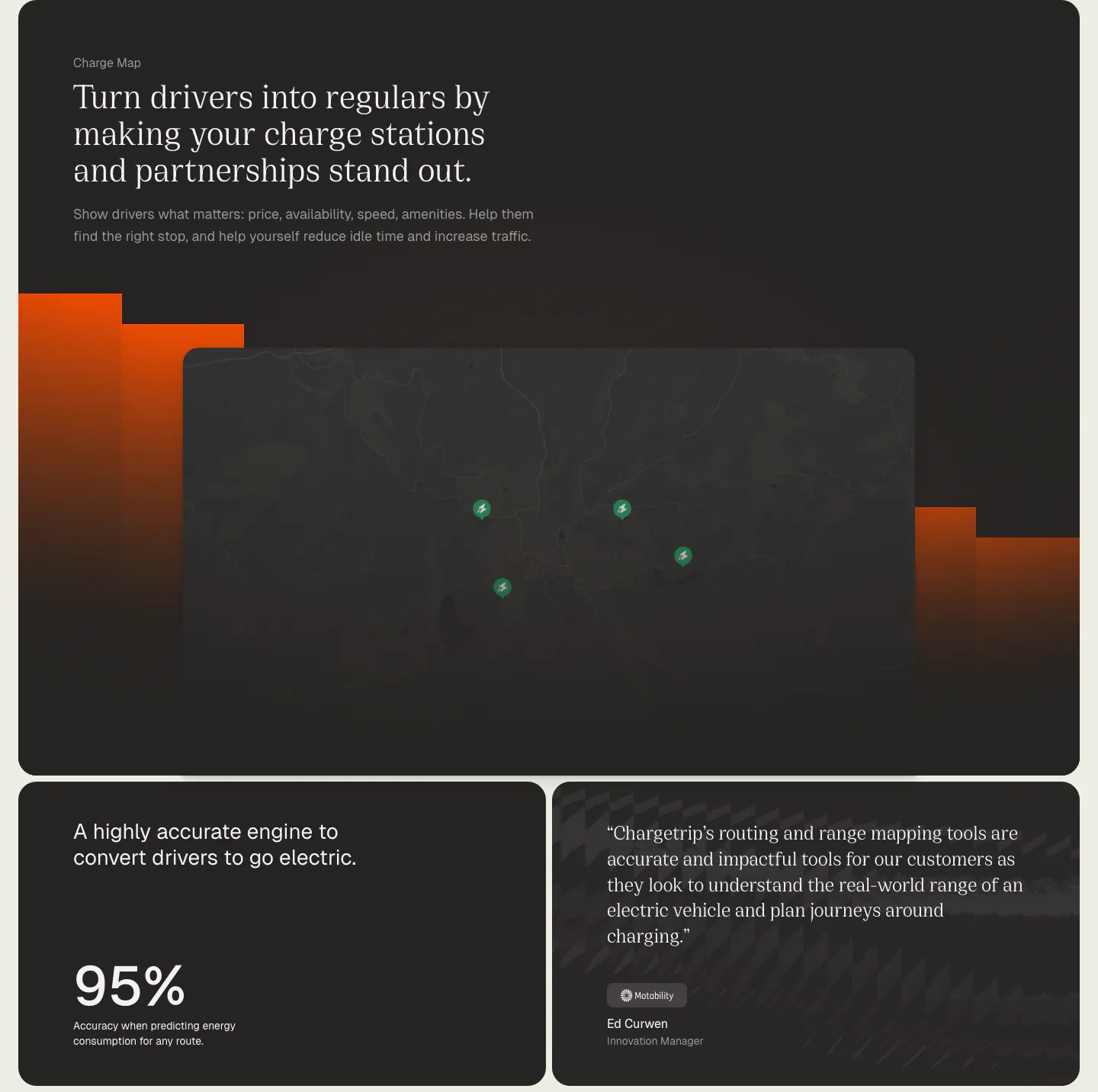
  47. Chargetrip features section: serif headline over a dark charge station map with orange bars, above a 95% accuracy stat card and a quote card
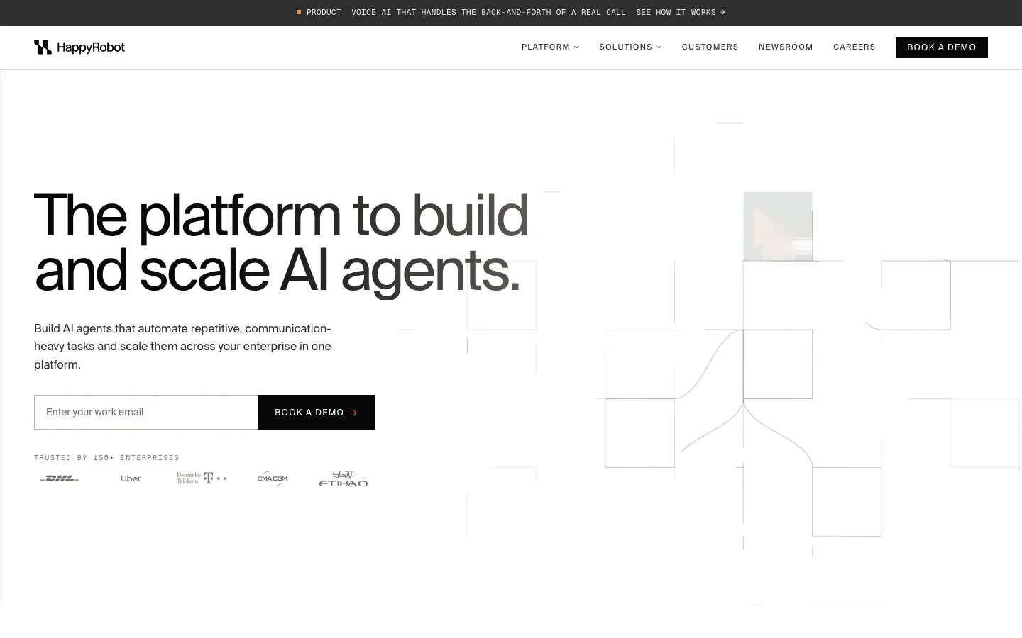
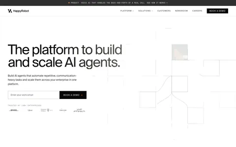
  48. HappyRobot hero section: announcement bar and nav over a left headline with email field and logo row, line-drawn grid of boxes on the right
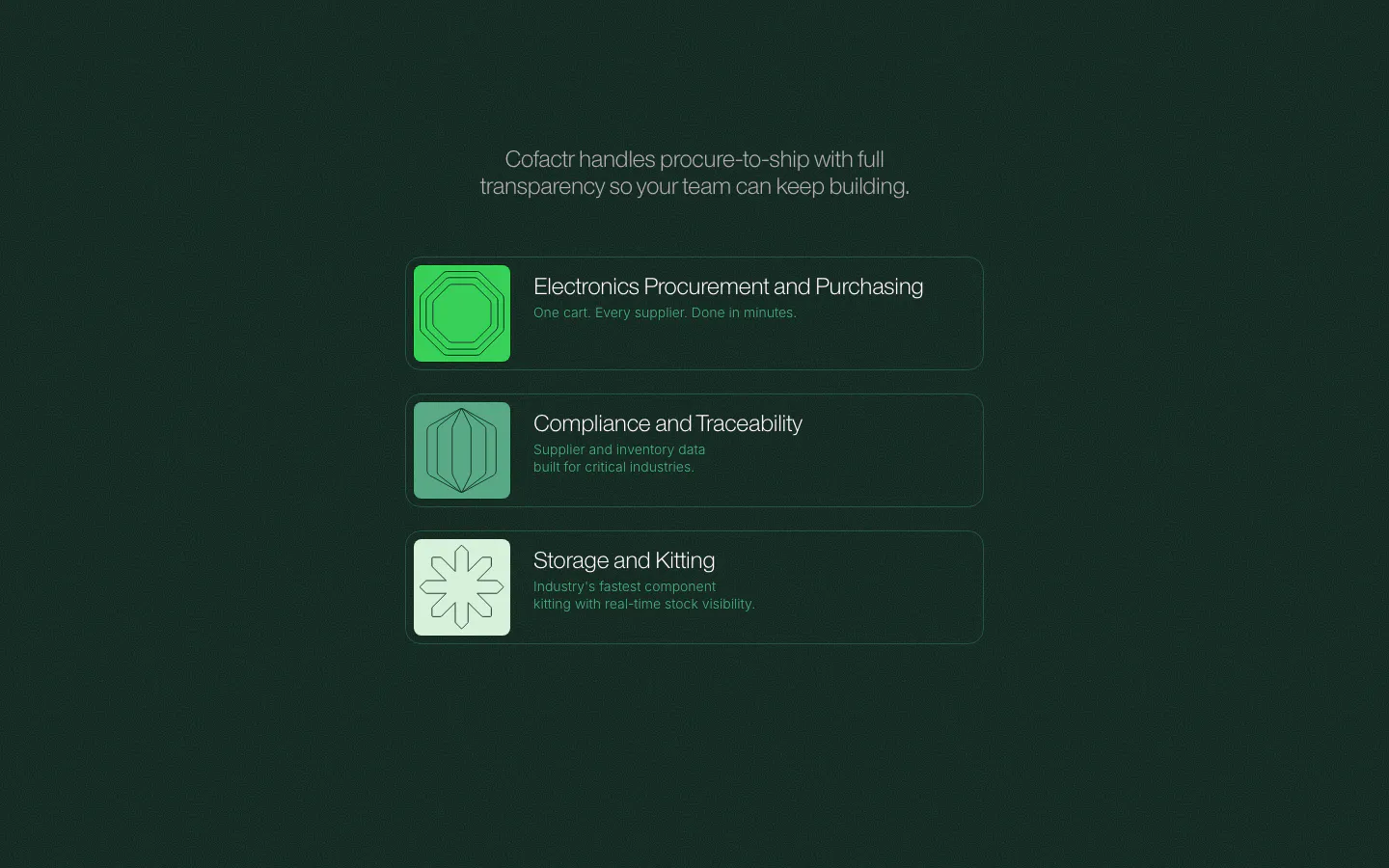
  49. Cofactr features section: dark green centered statement above three stacked product rows with green geometric icons and short descriptions
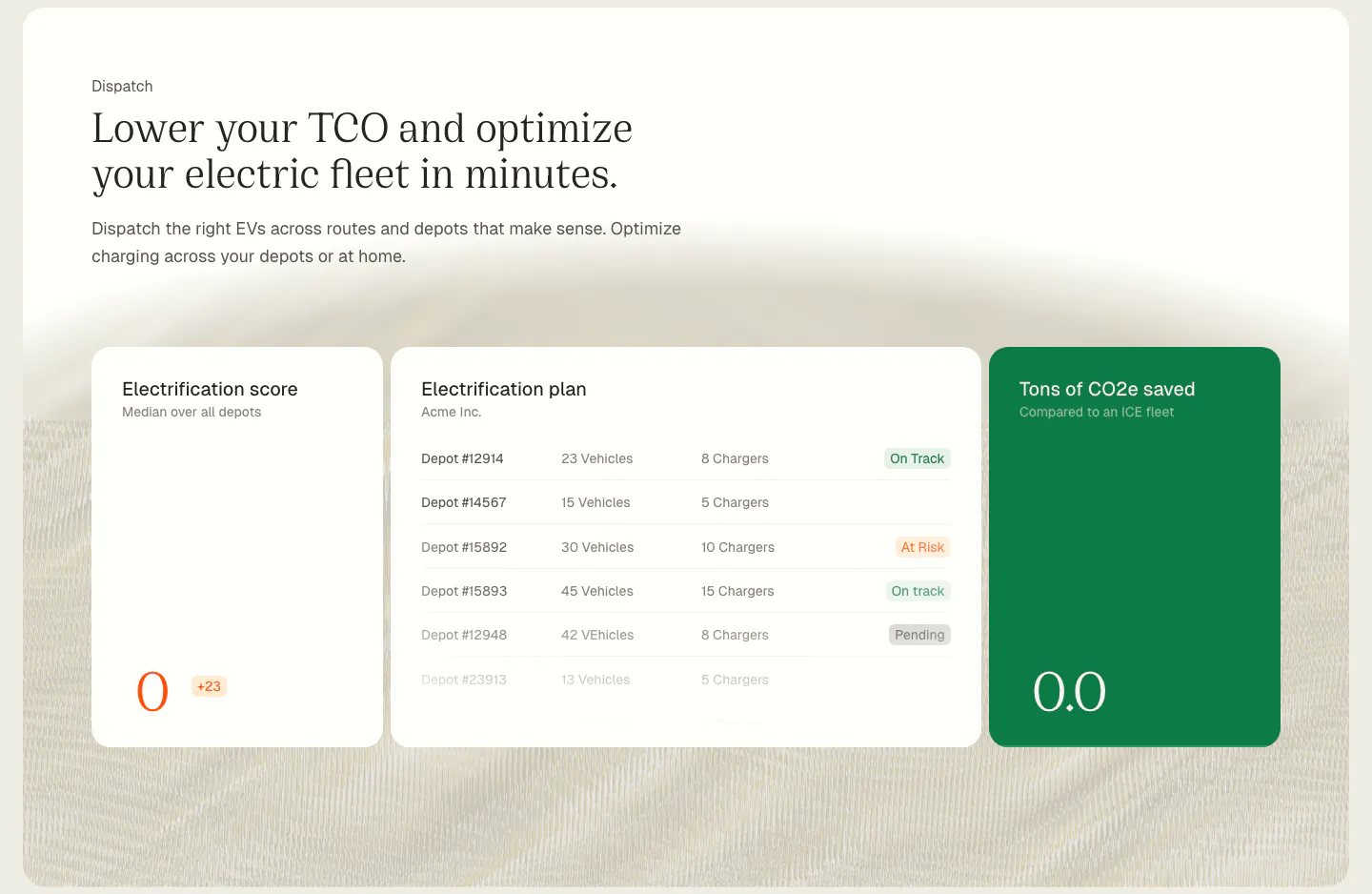
  50. Chargetrip features section: serif headline above electrification score, depot plan and CO2 savings UI cards on a cream textured background
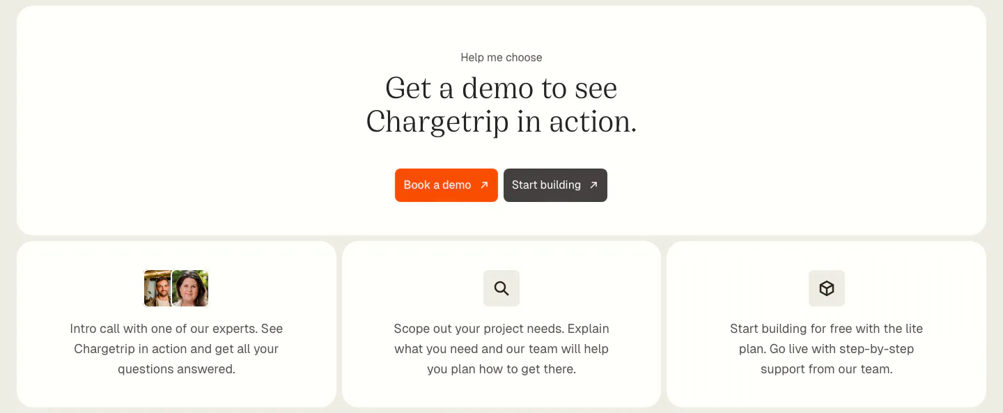
  51. Chargetrip call-to-action section: centered serif headline with orange demo button above three cards outlining next steps
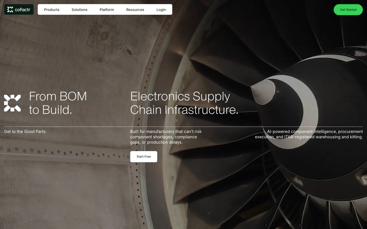
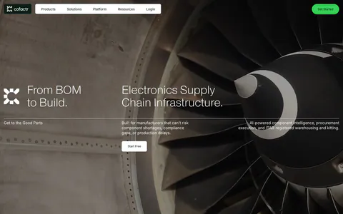
  52. Cofactr hero section: nav and two headlines over a full-bleed dark photo of a jet engine fan, with supporting copy and a Start Free button

Logistics & mobility companies

9 companies in this collection

All companies

Common styles in logistics & mobility websites

How to design a logistics website

  1. Show coverage on a map

    Lanes, regions, charging locations, and service areas are spatial information. A clear map communicates reach faster than a list of countries or cities. Keep it accurate, make it searchable where possible, and update it whenever coverage changes.

  2. Make tracking and exceptions concrete

    Operators want to know where things are and when they will arrive. Show a realistic tracking view with statuses, exceptions, and estimated times. Highlight how the product flags problems early, since exception handling is where most of the cost sits.

  3. Use the metrics operations leaders report

    Speak in on-time rate, cost per shipment, utilization, and dwell time. Customer results framed in these terms read as credible to operations leaders. Avoid vague efficiency claims that cannot be tied to a line on a monthly report.

  4. Explain integrations and onboarding time

    Shippers and fleets run on ERPs, warehouse systems, and telematics. Name the systems you connect to, how data moves between them, and how long onboarding takes. A heavy implementation is a common objection, and specifics make it smaller.

All industries
    ↑↓ Navigate ↵ Open

    Section preview

    Website section