NEAR website design

Every section we captured from the NEAR website, in page order, from the hero section down to the footer. Open any thumbnail to see it full size.

Sections 7

In page order, top to bottom

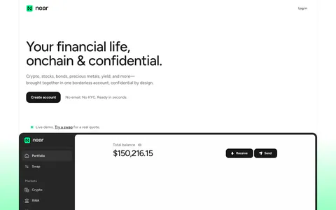
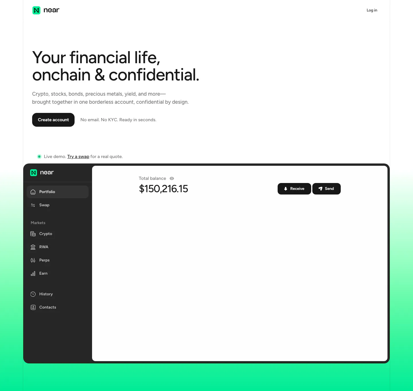
  1. NEAR hero section: left-aligned headline and Create account button above a portfolio app screenshot on a mint green gradient
    01 Hero

    Your financial life, onchain & confidential.

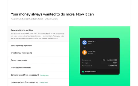
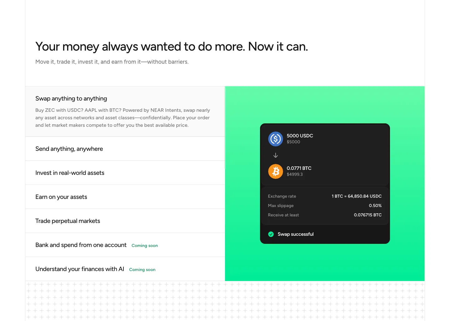
  2. NEAR features section: headline above a list of capabilities on the left and a swap UI card on a green gradient panel

    Your money always wanted to do more. Now it can.

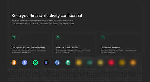
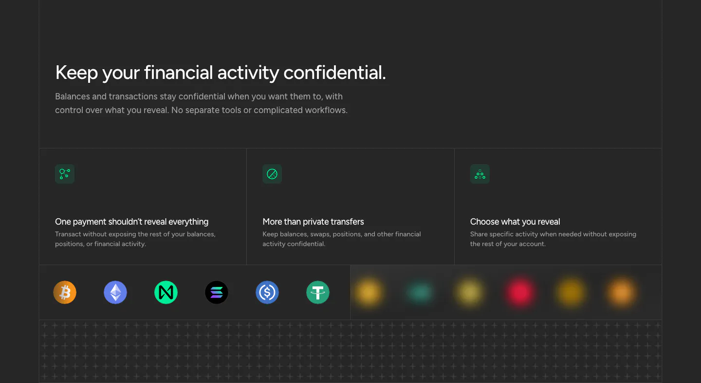
  3. NEAR security section: headline above three privacy cards with green icons and a row of crypto token icons on dark

    Keep your financial activity confidential.

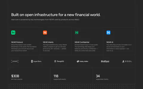
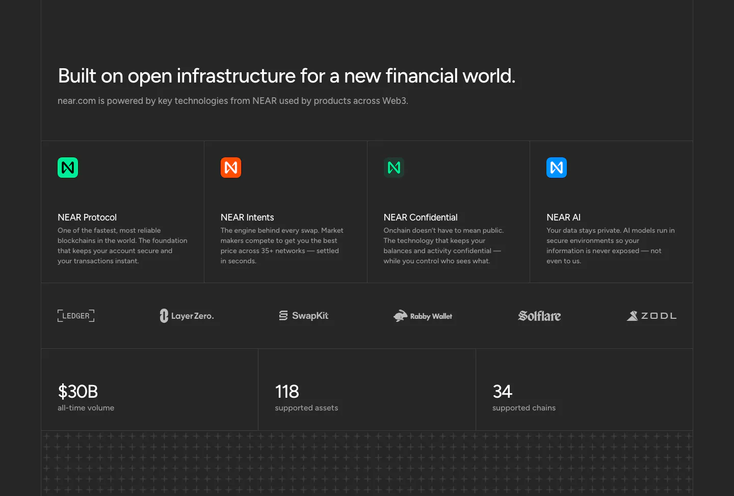
  4. NEAR features section: headline above four technology cards, a partner logo row and three large stats on a charcoal background

    Built on open infrastructure for a new financial world.

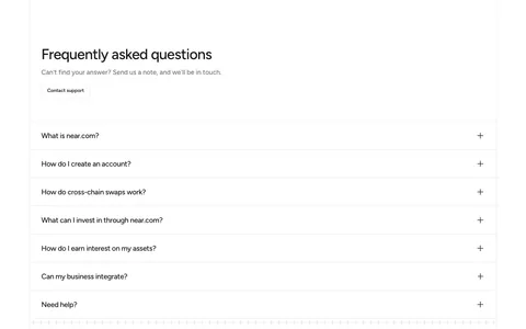
  5. NEAR FAQ section: headline with Contact support button above a full-width accordion of questions on white
    05 FAQ

    Frequently asked questions

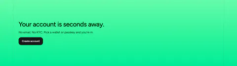
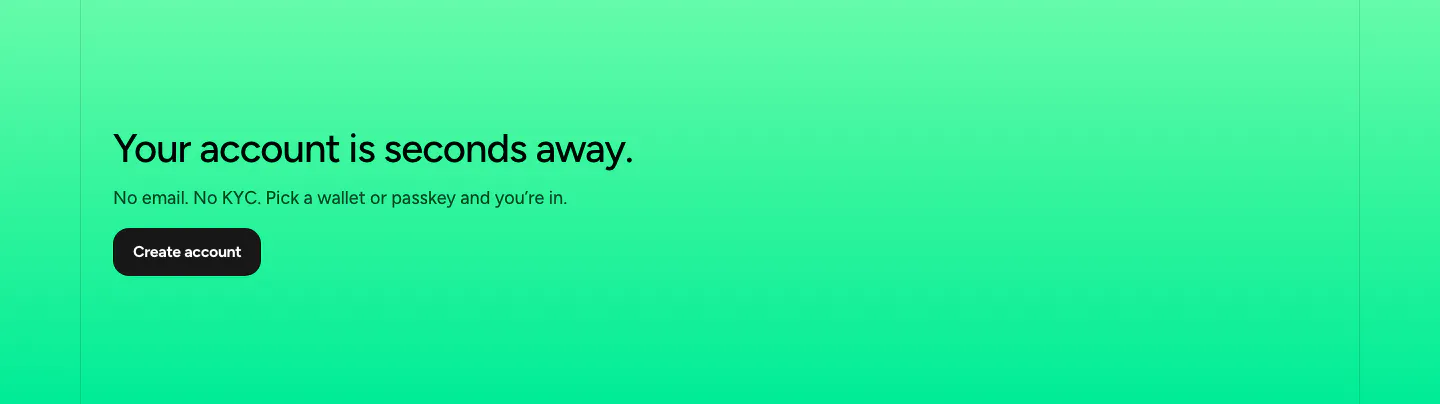
  6. NEAR call-to-action section: left-aligned headline, short copy and dark button on a bright green gradient band

    Your account is seconds away.

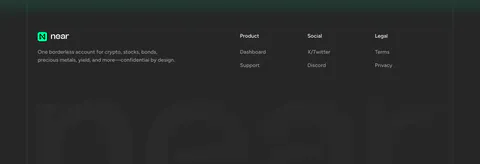
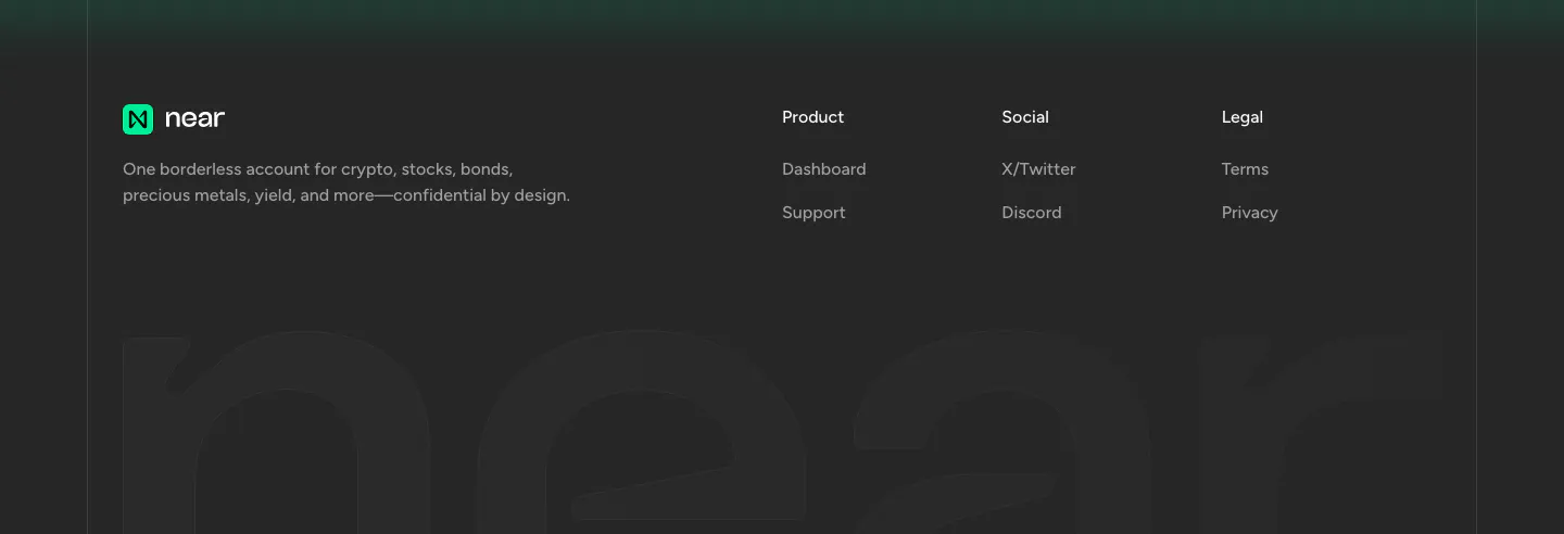
  7. NEAR footer section: logo, tagline and three link columns above a giant faded near wordmark on a charcoal background
    07 Footer

Similar companies

All companies
    ↑↓ Navigate ↵ Open

    Section preview

    Website section