Crypto Website Design Examples

Crypto audiences have seen plenty of polished sites behind failed projects, so they look for substance first. A credible page explains what the protocol or product actually does, who has audited it, and where custody sits. Strong crypto website design keeps the visual energy the space expects while making room for the details that matter: fees, supported chains, security reviews, and usage data people can verify.

86 sections

  1. EchoFi about & mission section: centered gray statement text below a dark 3D coin icon on a near-black background
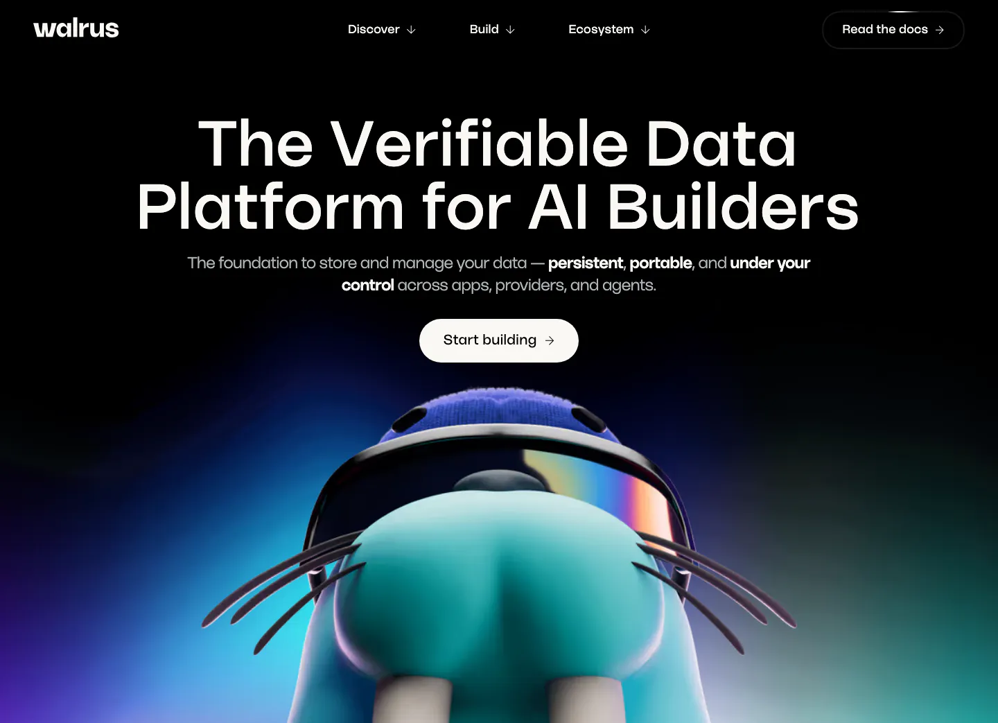
  2. Walrus hero section: centered headline and button on black above a 3D walrus mascot rising from a blue-purple glow
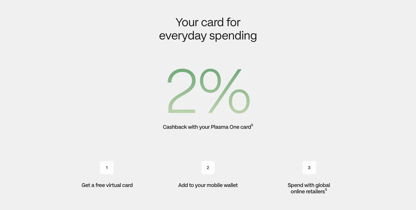
  3. Plasma how it works section: centered heading, giant green gradient 2% figure and three numbered steps on light gray
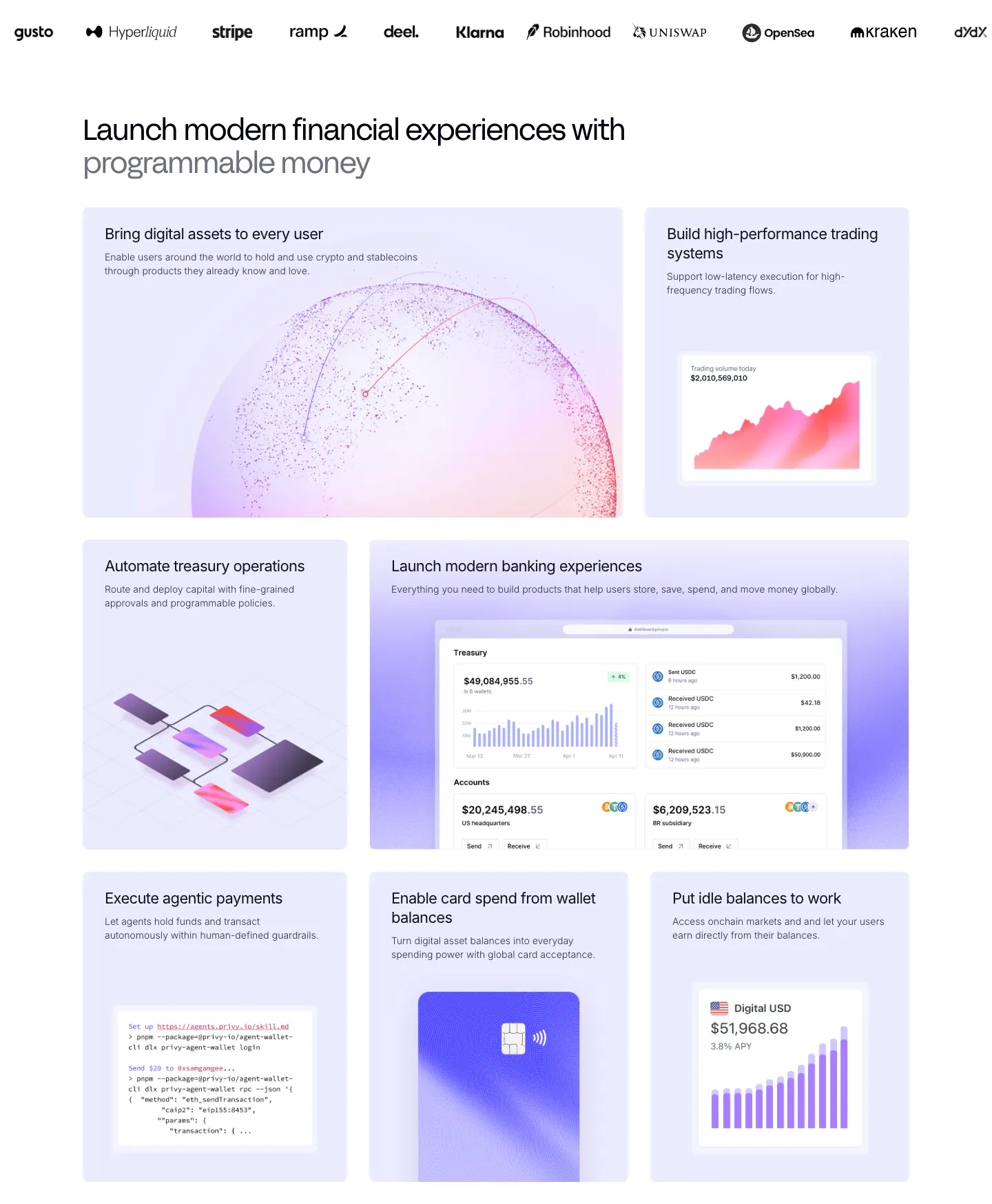
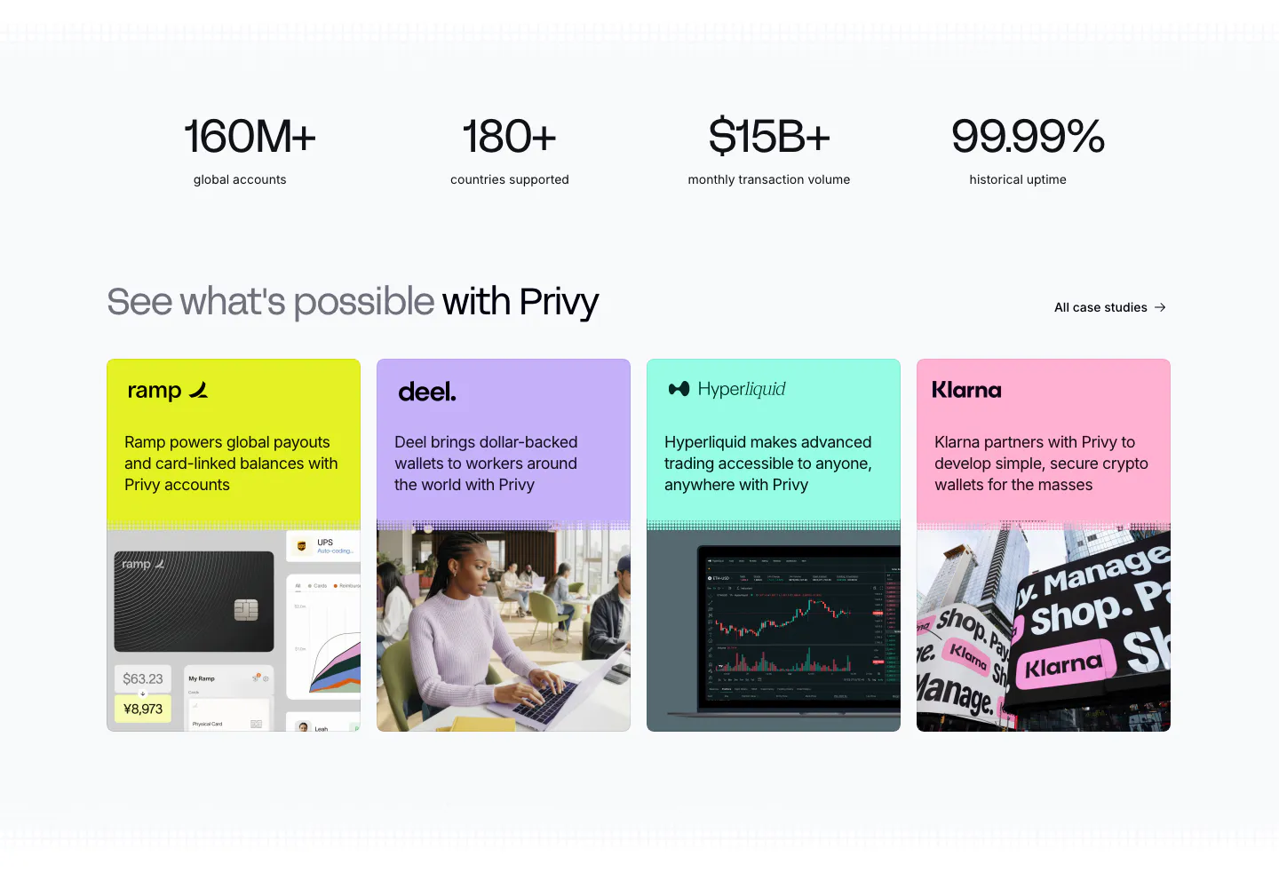
  4. Privy features section: customer logo strip above a bento grid of lavender tiles with dashboards, charts, a code snippet and a card visual
  5. EchoFi call-to-action section: centered headline and black pill button over a full-bleed red-lit concert crowd photo
  6. Shelby logo cloud section: single row of customer logos including NBCUniversal and Watchee inside a rounded bordered box on off-white
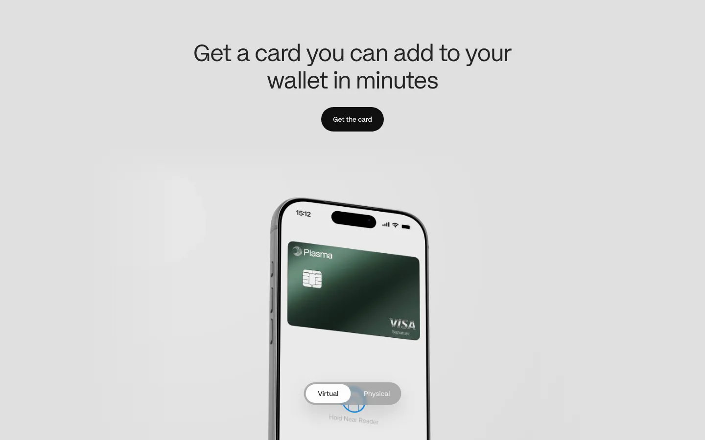
  7. Plasma features section: centered heading and button above a phone showing a green Visa card with a virtual/physical toggle
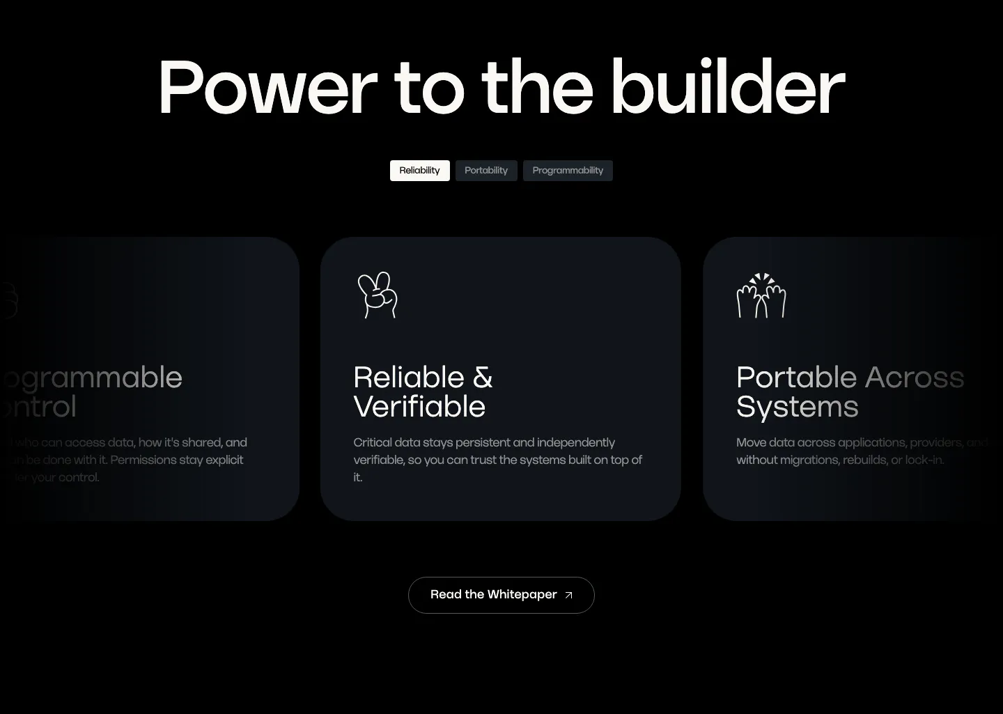
  8. Walrus value proposition section: large headline over tab pills and a carousel of dark benefit cards with line icons
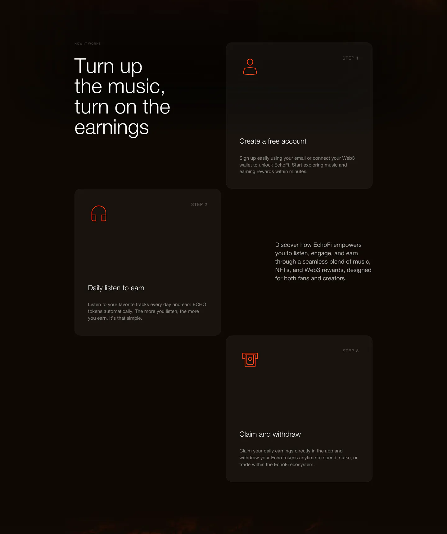
  9. EchoFi how it works section: headline at left with three staggered step cards and orange line icons on a dark background
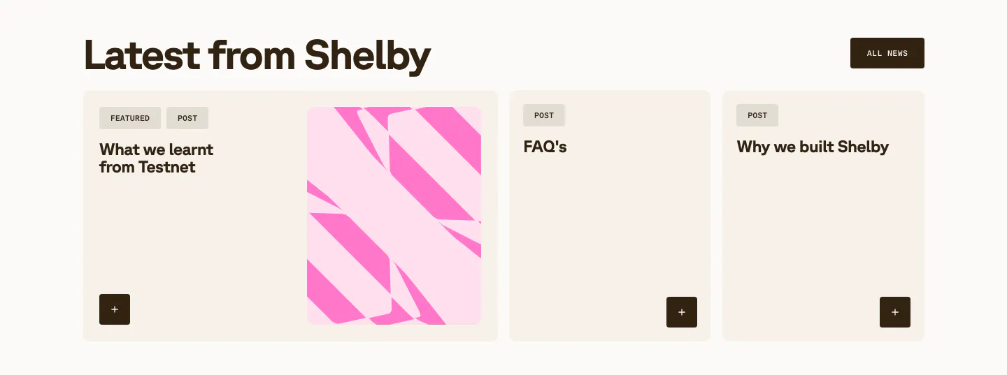
  10. Shelby blog & resources section: headline with All news button above a wide featured post card with pink abstract art and two post cards
  11. Plasma call-to-action section: centered headline and button above a green Plasma card render with a green glow on black
  12. NEAR footer section: logo, tagline and three link columns above a giant faded near wordmark on a charcoal background
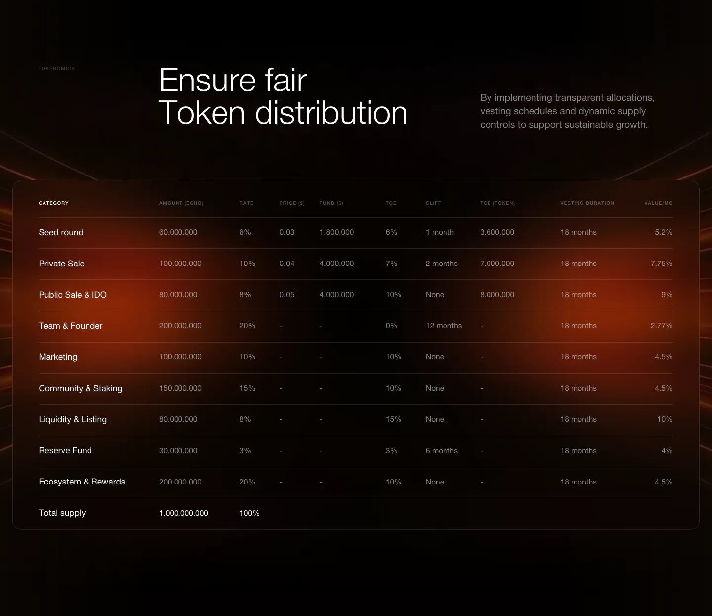
  13. EchoFi other section: headline beside short copy above a dark tokenomics allocation table with an orange glow
    EchoFi Other
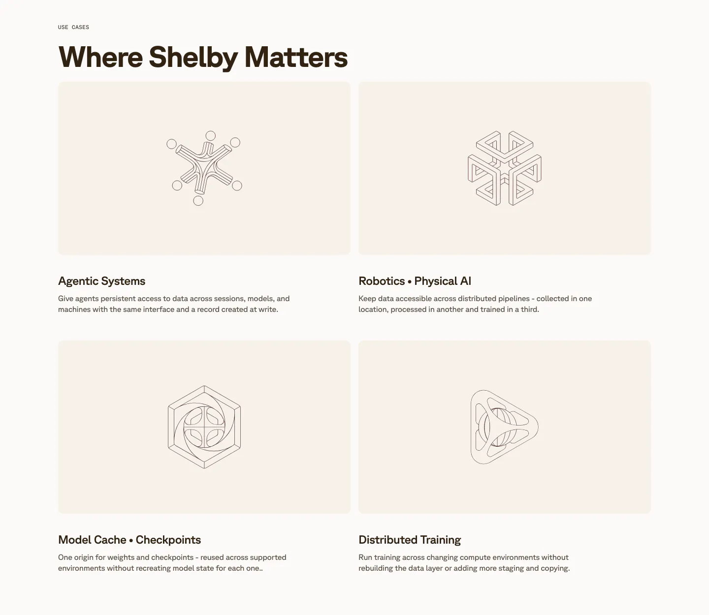
  14. Shelby use cases section: two-by-two grid of cream cards with line-drawn geometric artworks above titles like Agentic Systems
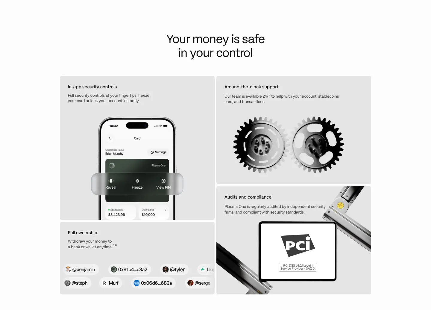
  15. Plasma security section: centered heading above a bento of gray tiles with a phone UI, 3D gears, a PCI badge and user handles
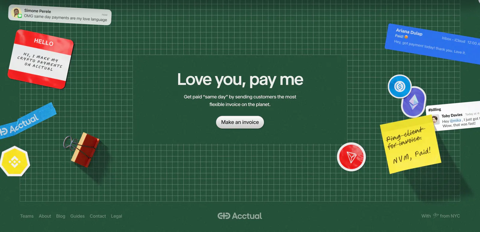
  16. Acctual footer section: centered closing headline on a dark green grid with 3D stickers and notes, plus a link row and wordmark
  17. Privy footer section: white footer with five link columns, Privy logo, tagline and social icons in a minimal grayscale layout
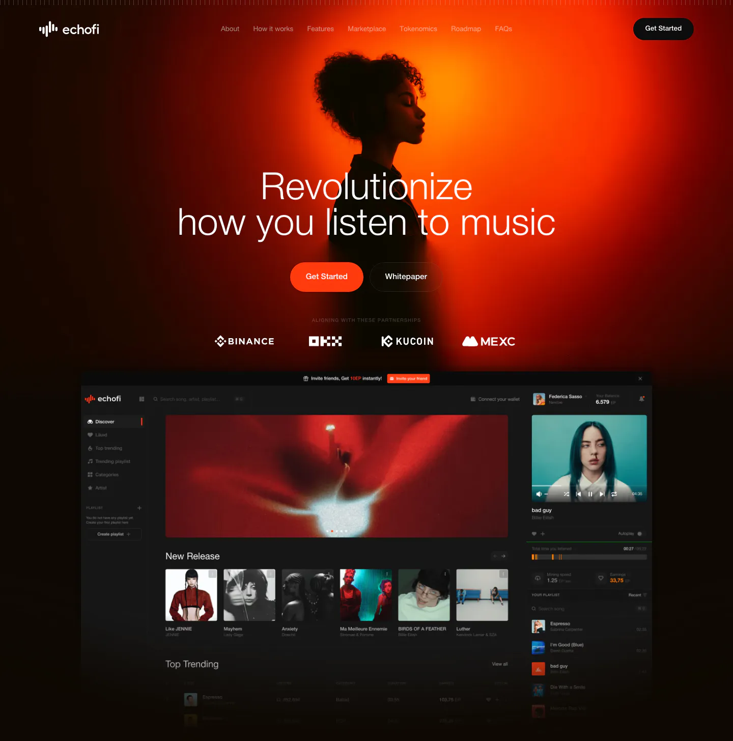
  18. EchoFi hero section: centered headline over an orange-lit portrait photo, exchange logo row and dark music app screenshot on black
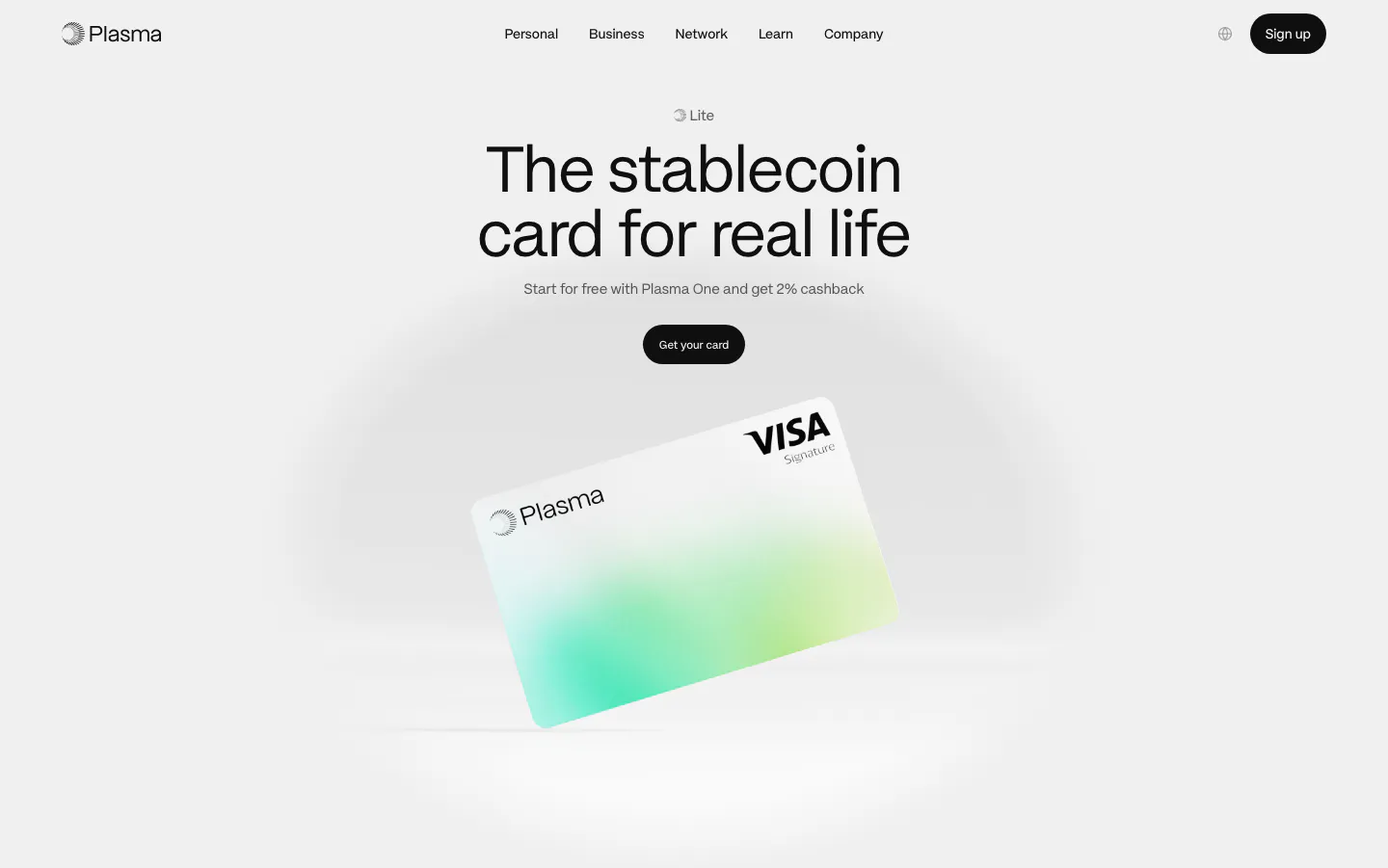
  19. Plasma hero section: nav, centered headline and black button above a tilted white-and-green Visa card render on light gray
  20. Acctual testimonials section: single centered quote with five orange stars and a script attribution in a light gray rounded panel
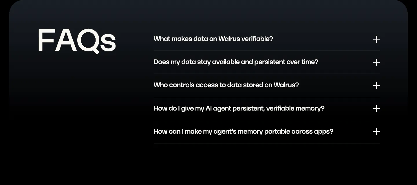
  21. Walrus FAQ section: oversized FAQs heading on the left beside a five-question accordion on a dark panel
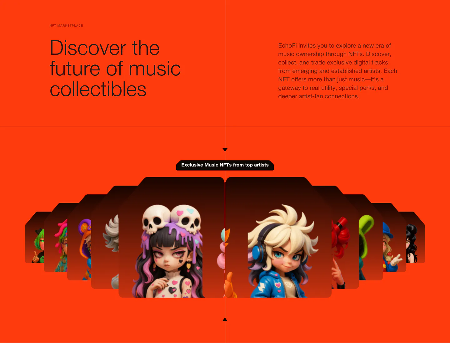
  22. EchoFi features section: headline and copy split over orange, above a fanned carousel of 3D character NFT cards
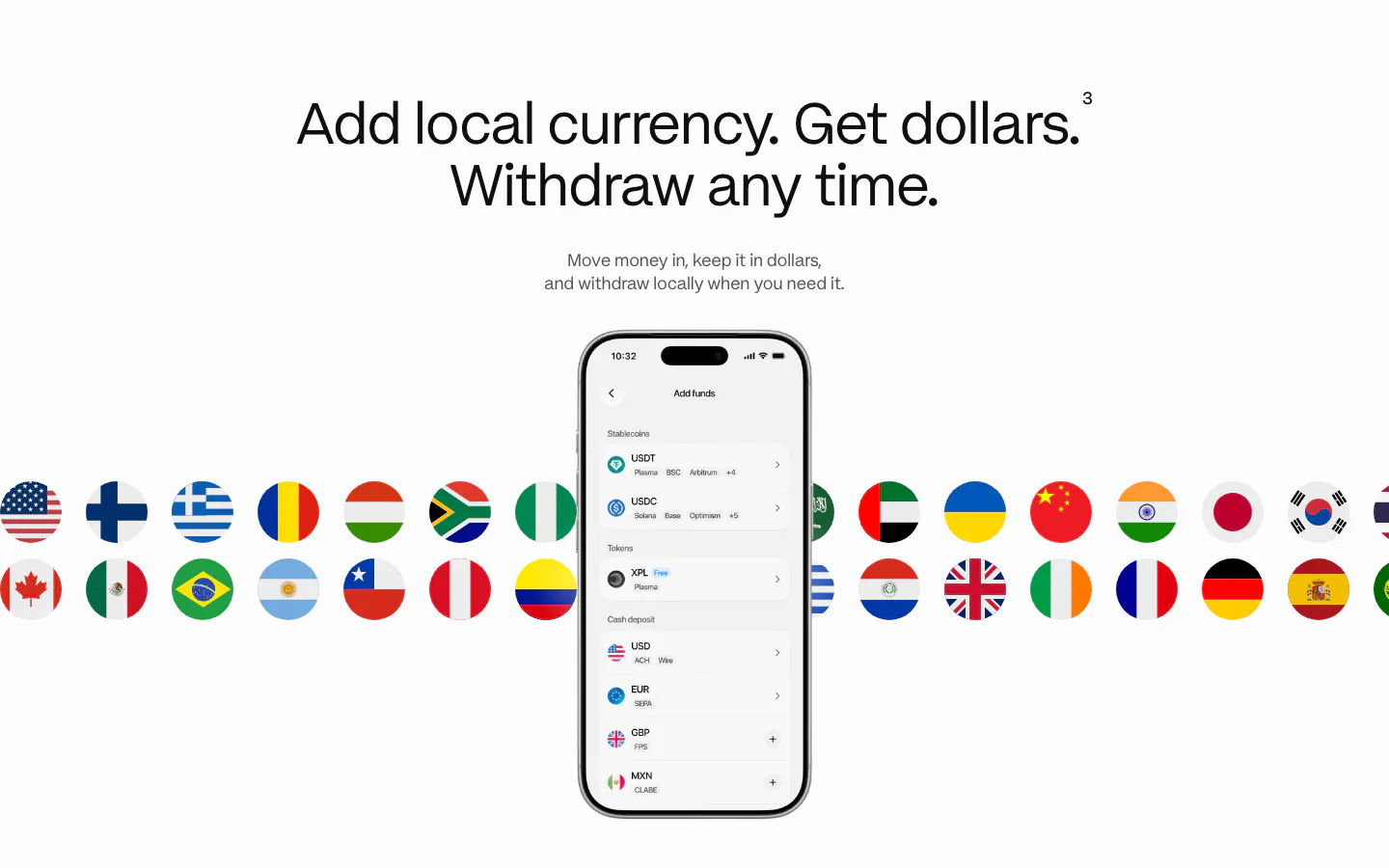
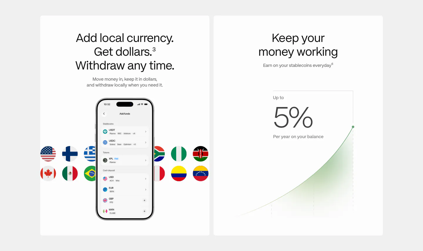
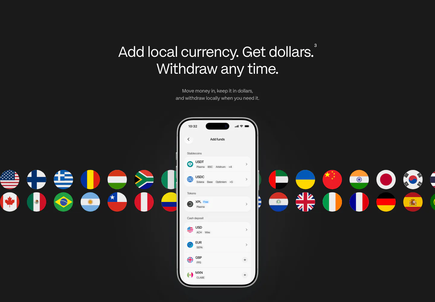
  23. Plasma features section: centered heading above a phone add-funds screen with two rows of country flag circles behind it
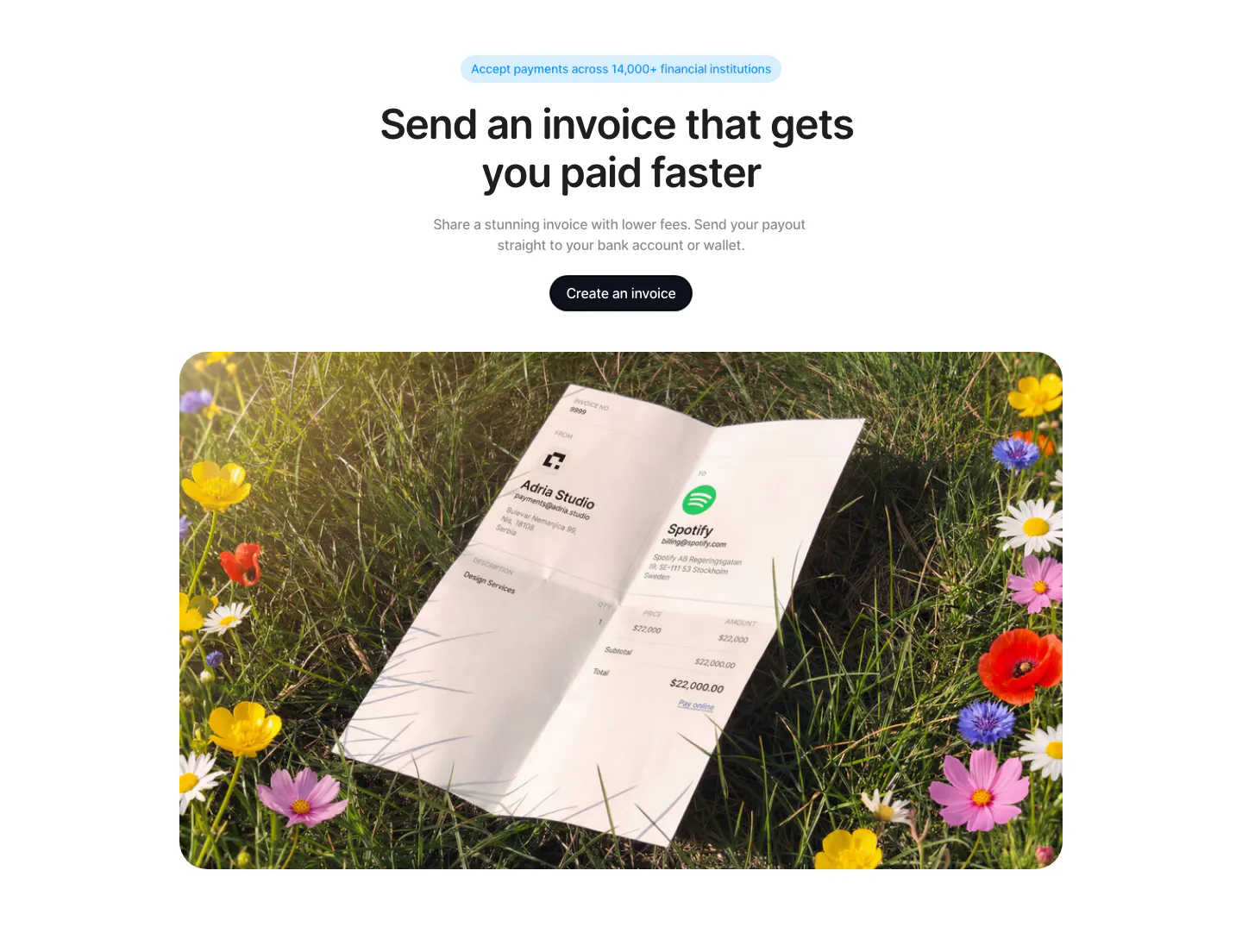
  24. Acctual call to action section: centered headline and button above a rounded photo of a printed invoice lying in a flower meadow
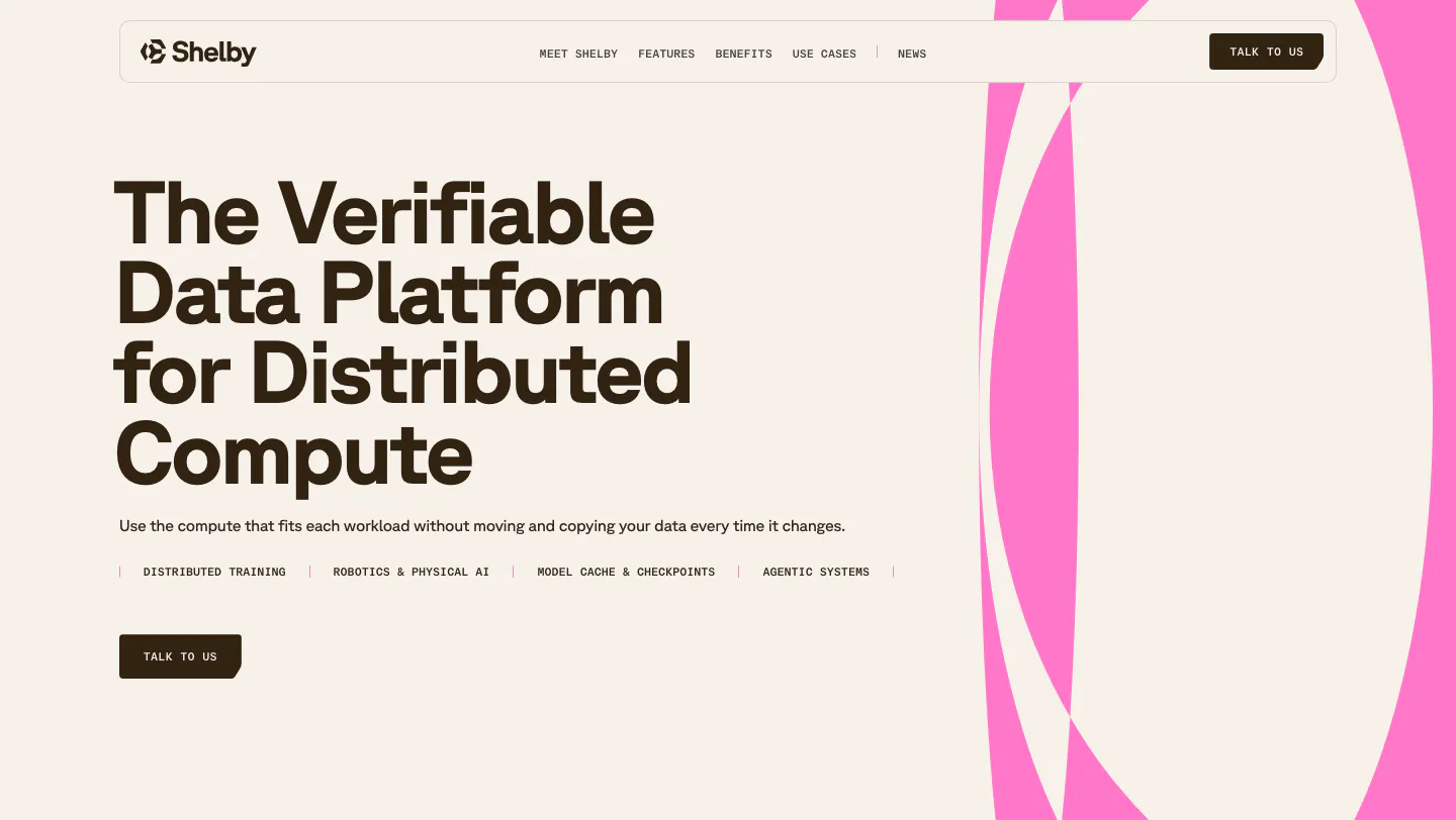
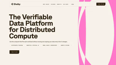
  25. Shelby hero section: left-aligned headline, use-case labels and Talk to us button beside large pink abstract curves on a cream background
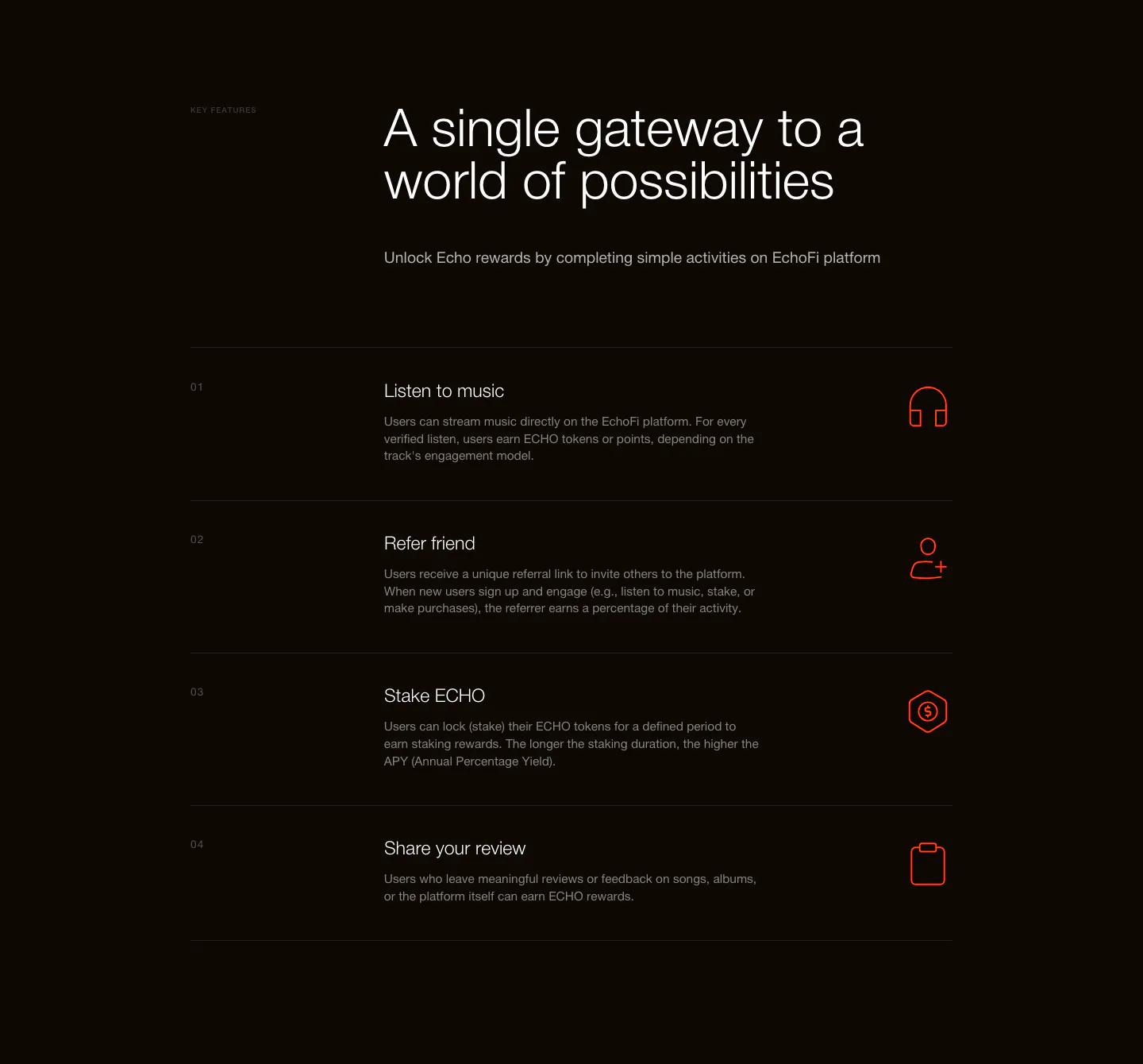
  26. EchoFi features section: headline above a numbered four-row list with orange line icons on a near-black background
  27. Plasma features section: two white cards, one with a phone add-funds UI and flags, one with a 5% yield growth chart
  28. Walrus value proposition section: centered three-line statement headline, copy and outline button on black
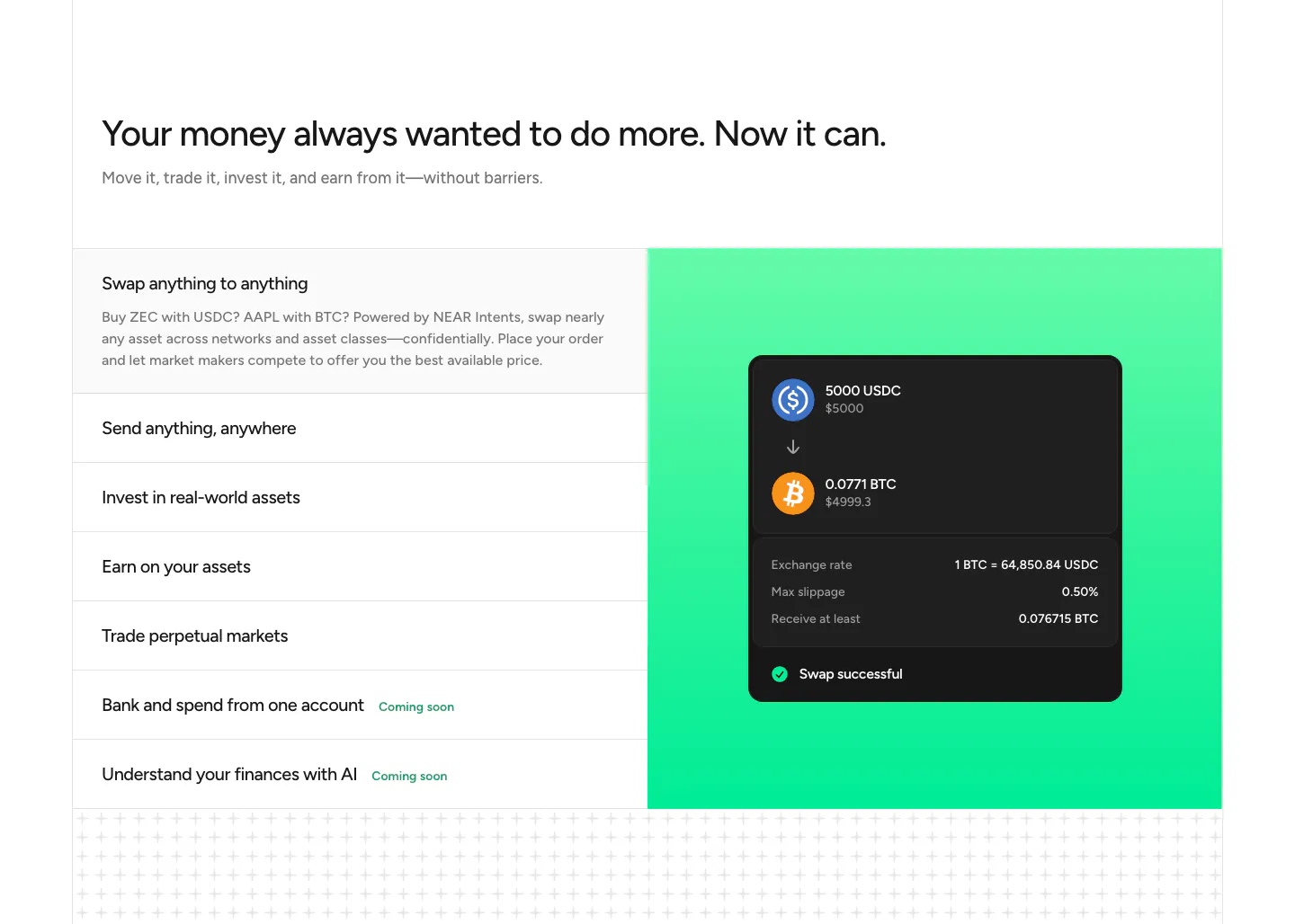
  29. NEAR features section: headline above a list of capabilities on the left and a swap UI card on a green gradient panel
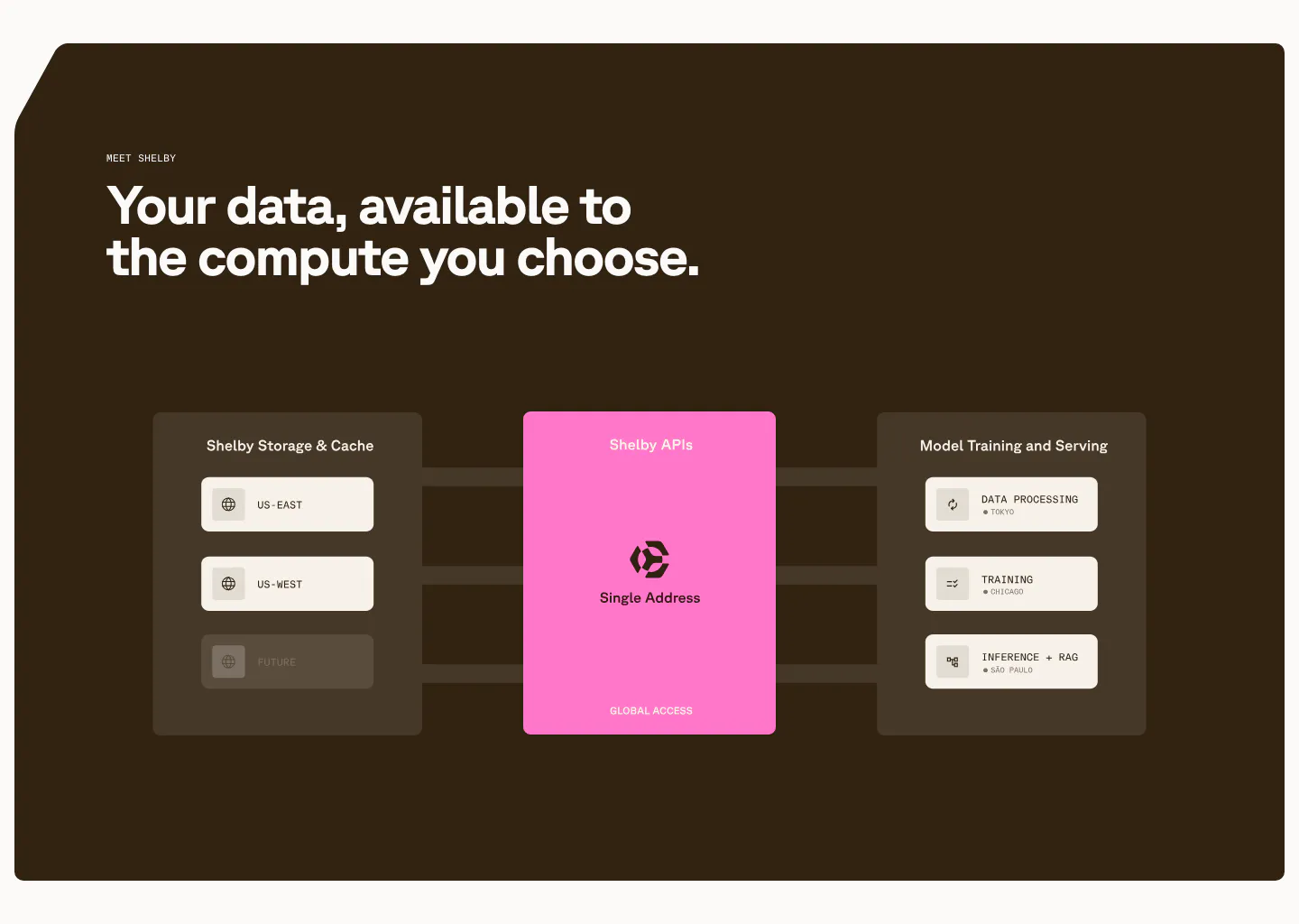
  30. Shelby features section: left headline above a diagram linking storage regions through a pink Shelby APIs card to workloads on dark brown
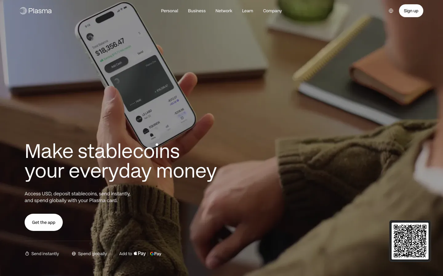
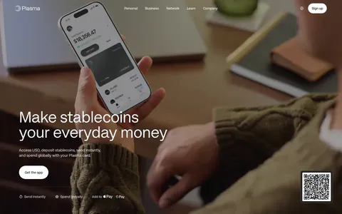
  31. Plasma hero section: large headline and app button bottom left over a full-bleed photo of a hand holding a phone with the app
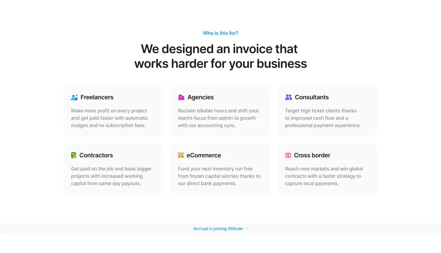
  32. Acctual use cases section: centered headline above a 3x2 grid of audience cards for freelancers, agencies, contractors and more
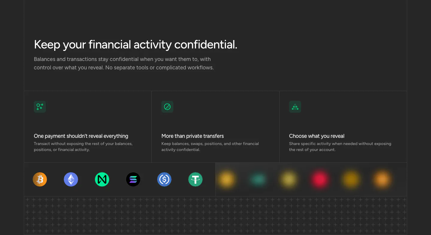
  33. NEAR security section: headline above three privacy cards with green icons and a row of crypto token icons on dark
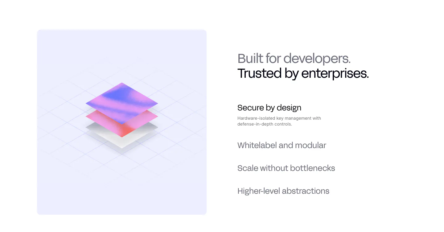
  34. Privy value proposition section: isometric 3D layered render on a lavender panel beside a headline and a list of selectable benefit items
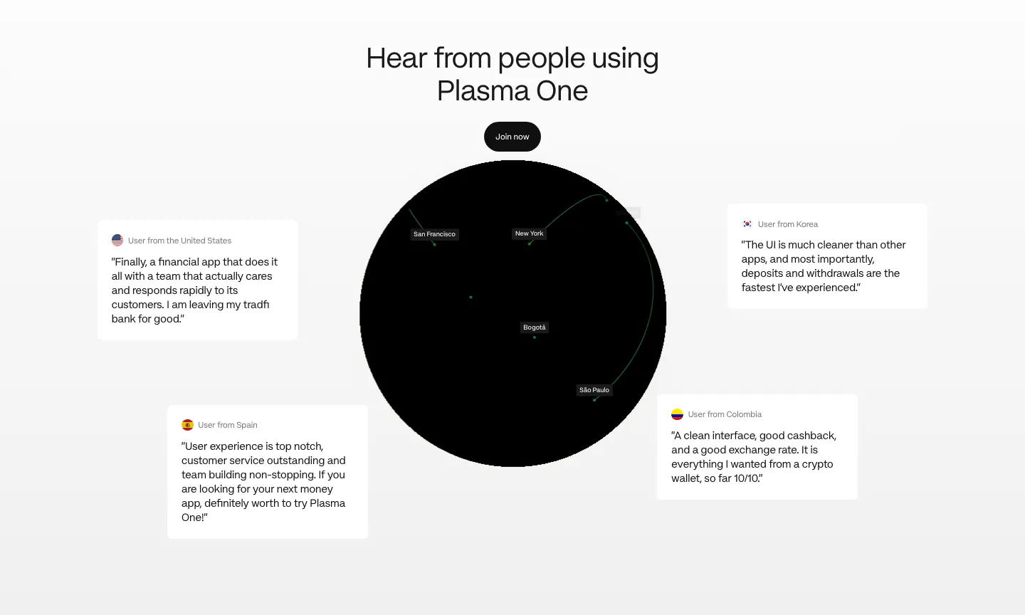
  35. Plasma testimonials section: centered heading and button above a black globe surrounded by four floating user quote cards
  36. Shelby about & mission section: large left-aligned statement naming Jump Trading Group and Aptos as underlined links on a pale pink panel
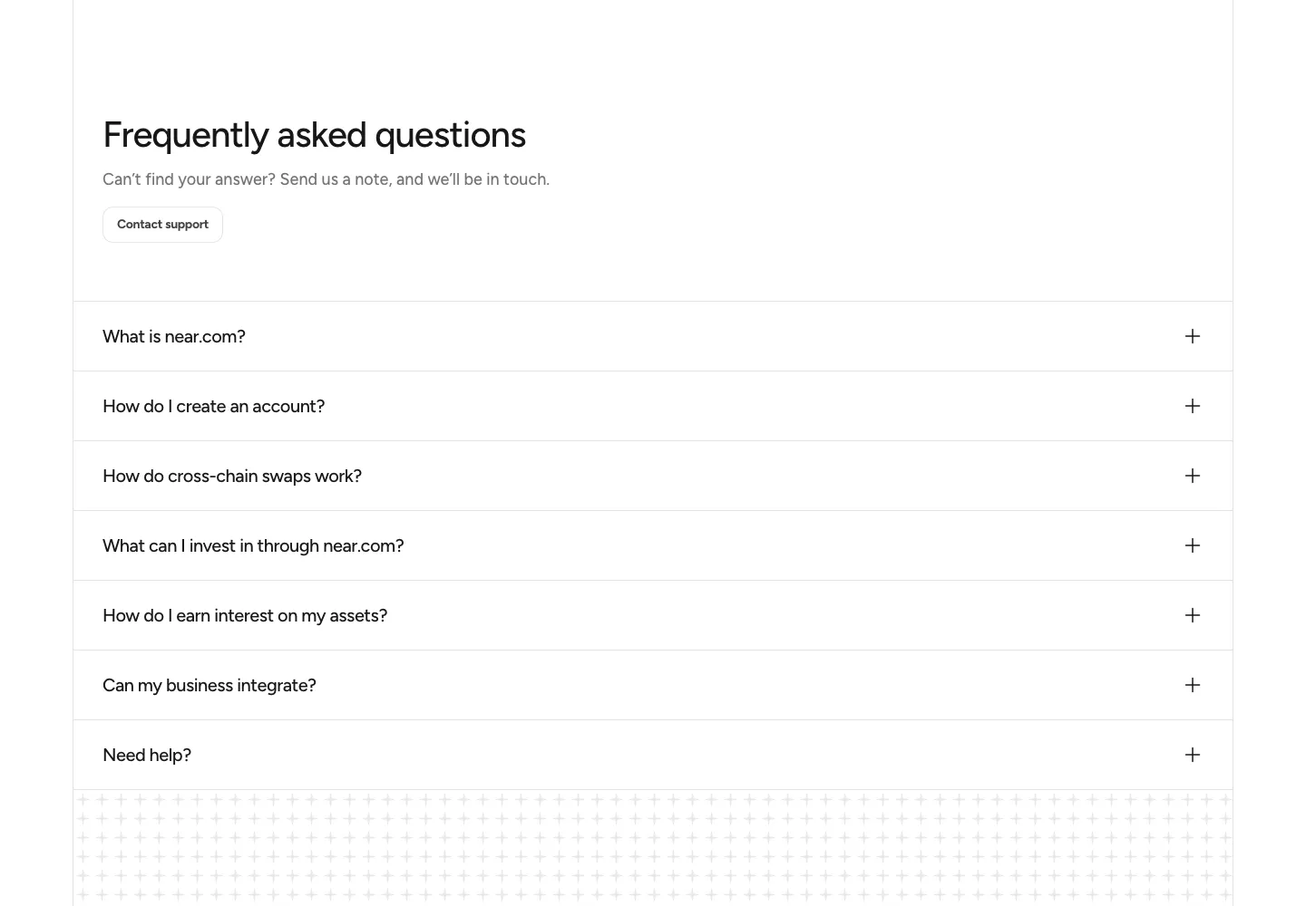
  37. NEAR FAQ section: headline with Contact support button above a full-width accordion of questions on white
  38. Privy testimonials section: four large metrics above a row of colorful customer case study cards with logos, short copy and photos
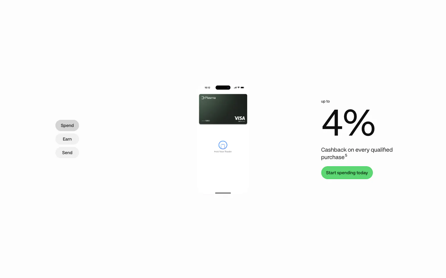
  39. Plasma features section: Spend/Earn/Send tabs left, phone with card center and a large 4% cashback figure right on white
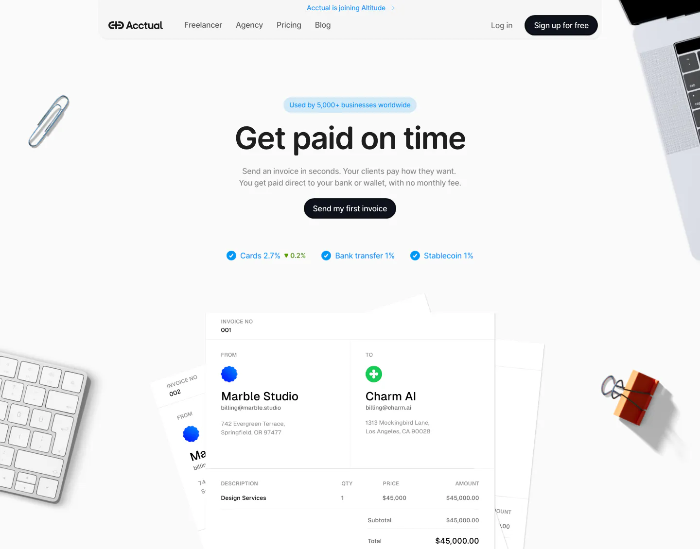
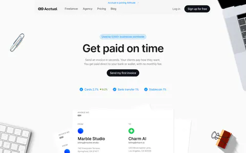
  40. Acctual hero section: centered headline, CTA and fee checklist above an invoice mockup framed by desk objects on light gray
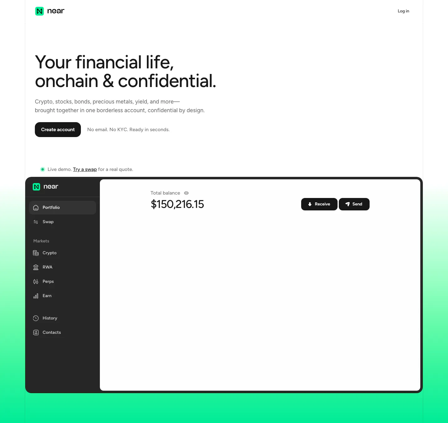
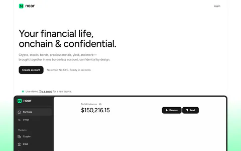
  41. NEAR hero section: left-aligned headline and Create account button above a portfolio app screenshot on a mint green gradient
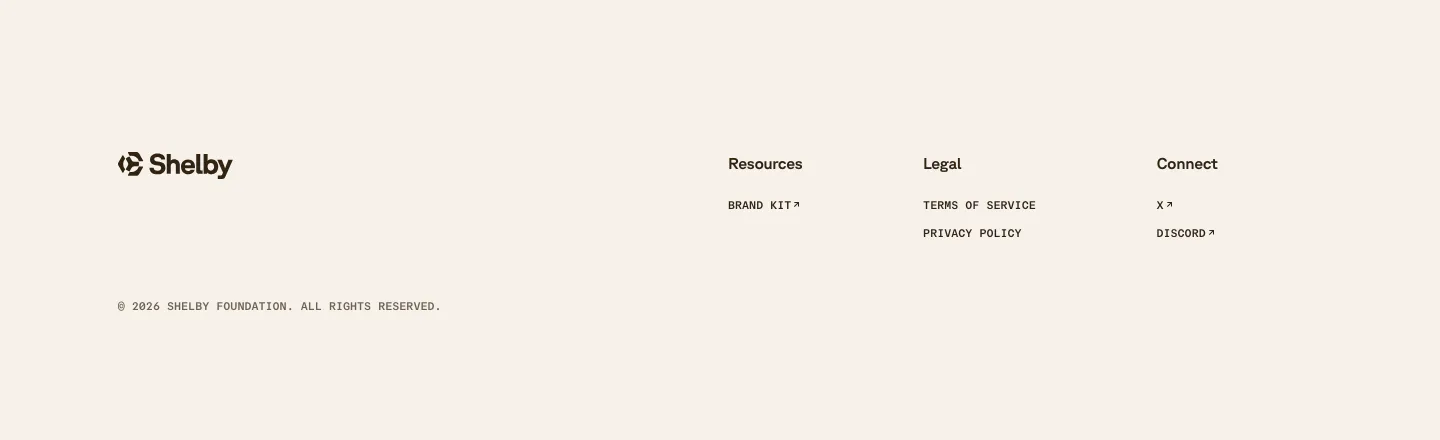
  42. Shelby footer section: logo at left with Resources, Legal and Connect link columns and a copyright line on a cream background
  43. Plasma features section: centered heading above a phone add-funds screen with rows of country flag circles on charcoal
  44. Proto footer section: newsletter email field with Subscribe button, Products and Company link columns, a dot pattern band and legal links on black
    Proto Footer
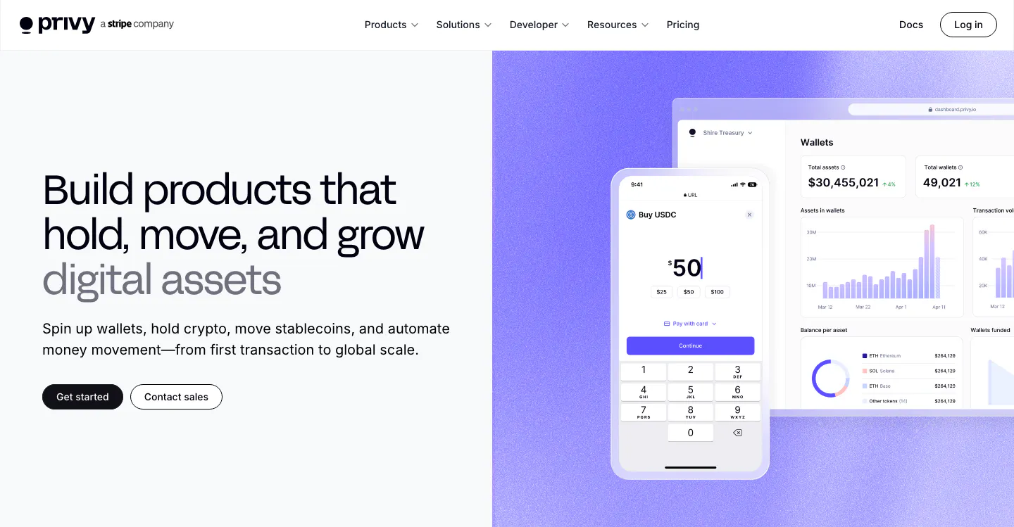
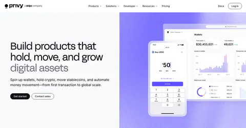
  45. Privy hero section: headline, copy and two buttons on the left beside phone and dashboard wallet UI mockups on a purple panel
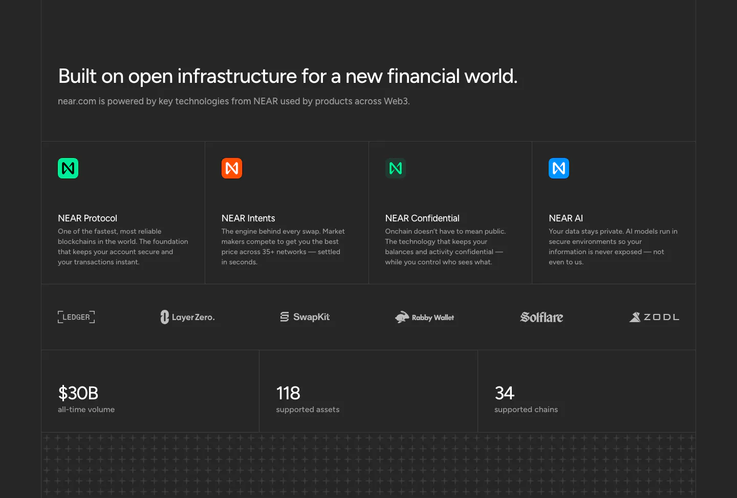
  46. NEAR features section: headline above four technology cards, a partner logo row and three large stats on a charcoal background
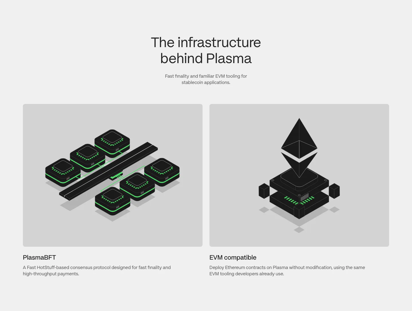
  47. Plasma features section: centered heading above two gray cards with black and green isometric renders of consensus and EVM
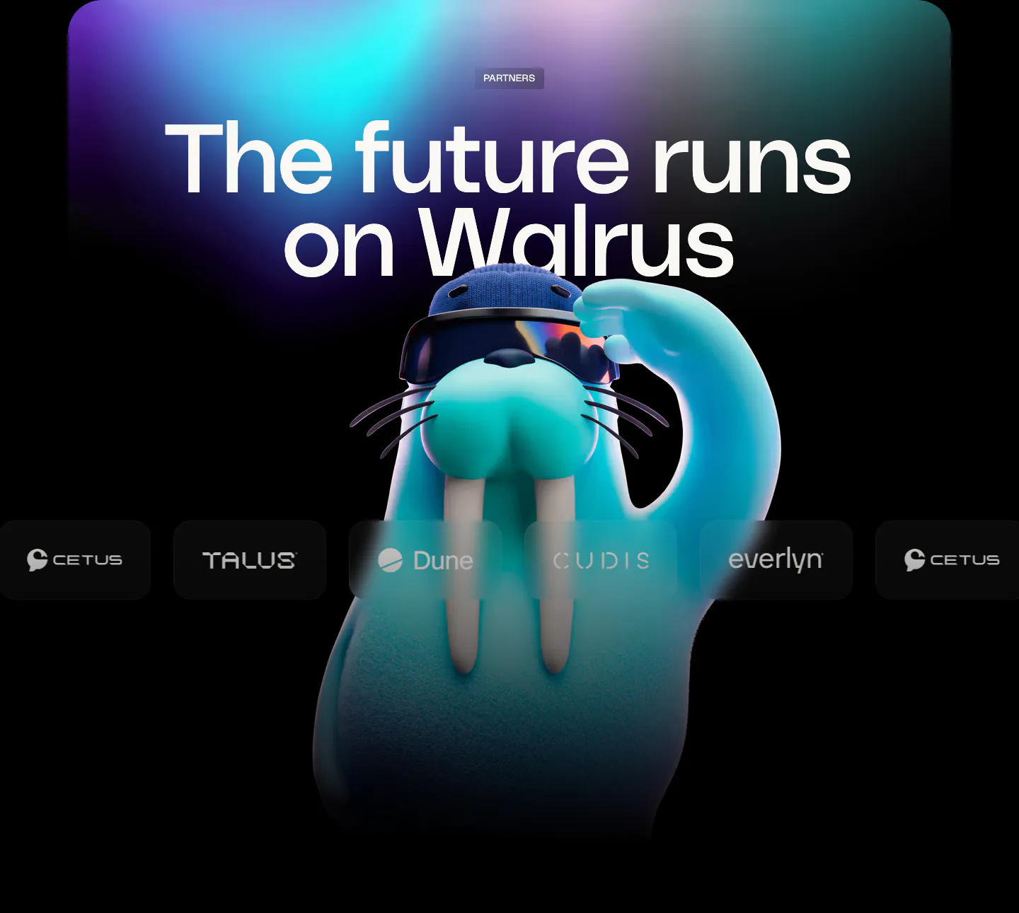
  48. Walrus logo cloud section: huge headline over aurora glow with a 3D walrus mascot behind a row of partner logos
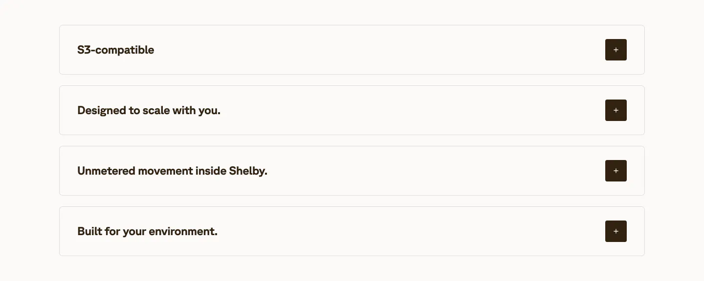
  49. Shelby value proposition section: four stacked accordion rows of benefit titles with dark plus buttons on an off-white background
  50. NEAR call-to-action section: left-aligned headline, short copy and dark button on a bright green gradient band
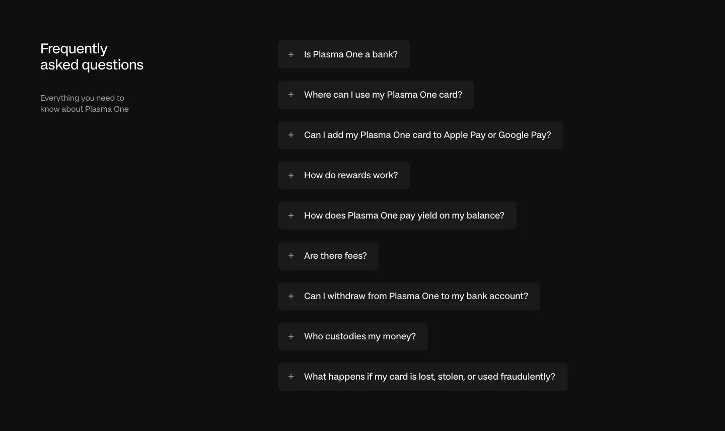
  51. Plasma FAQ section: heading and intro left, collapsed question pills stacked right on a near-black background
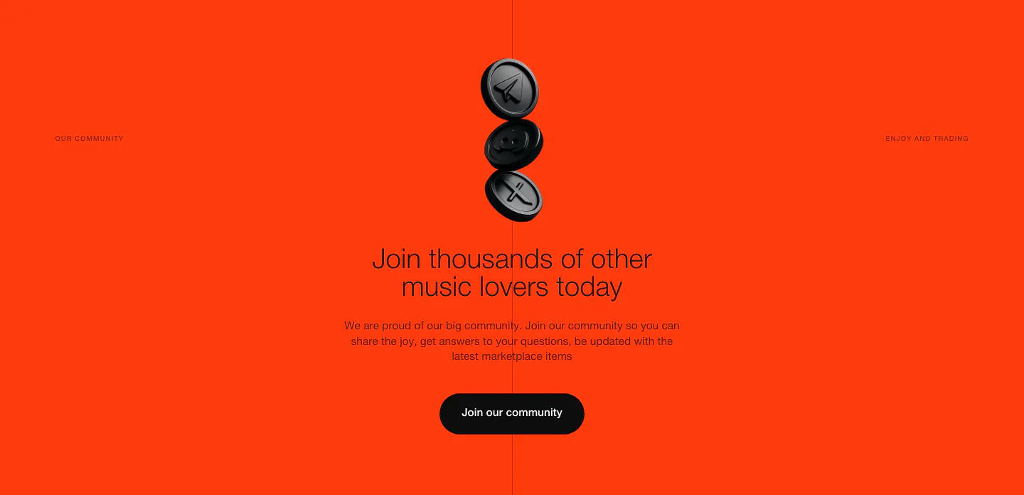
  52. EchoFi call-to-action section: stacked black 3D coins above a centered headline and community button on bright orange
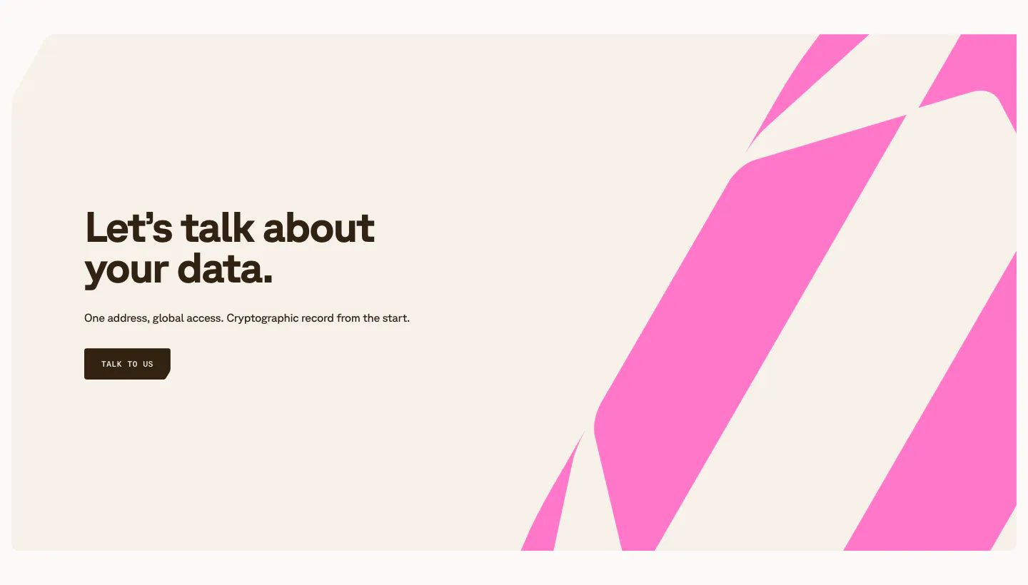
  53. Shelby call to action section: left headline, one-line copy and Talk to us button beside bold pink diagonal stripes on a cream panel
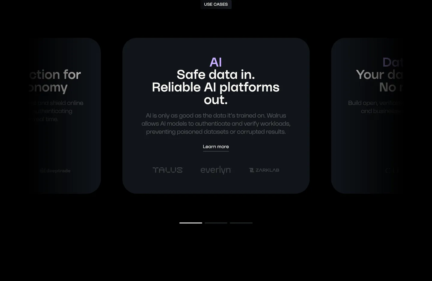
  54. Walrus use cases section: carousel of dark use case cards with a centered AI card, partner logos and pagination bars
  55. Plasma call to action section: slim dark band with a centered two-line heading and a white Get in touch button
  56. EchoFi call-to-action section: centered headline and black pill button over sweeping orange light streaks on black
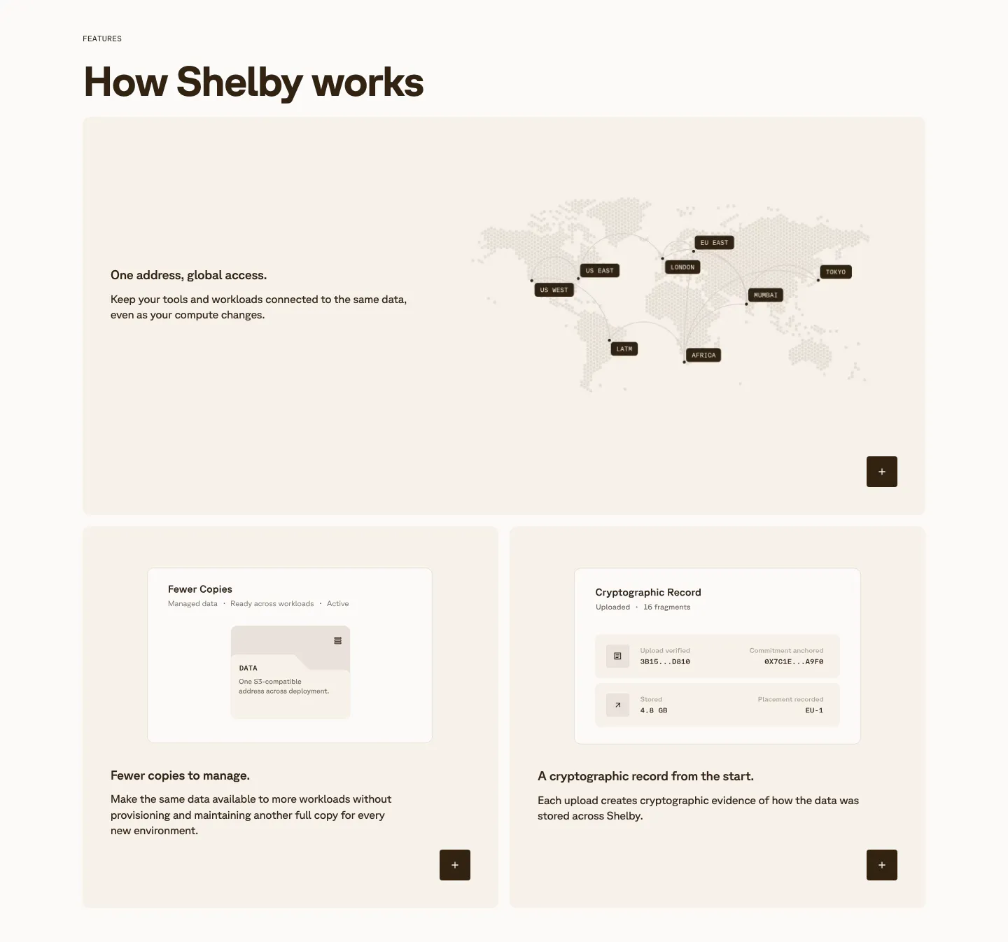
  57. Shelby features section: wide card with a dotted world map of data regions above two cards with small UI mockups on cream panels
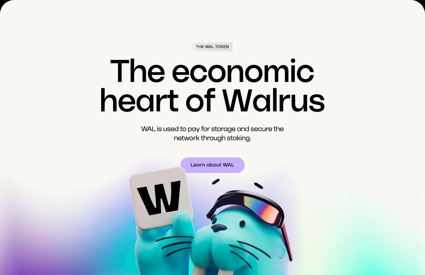
  58. Walrus features section: huge centered headline and lavender button above a 3D walrus holding a W tile on off-white
  59. Plasma hero section: centered headline and green button above a hand holding a phone over a full-bleed green sofa photo
  60. EchoFi footer section: office, contact email, navigation and community link columns with copyright on near-black
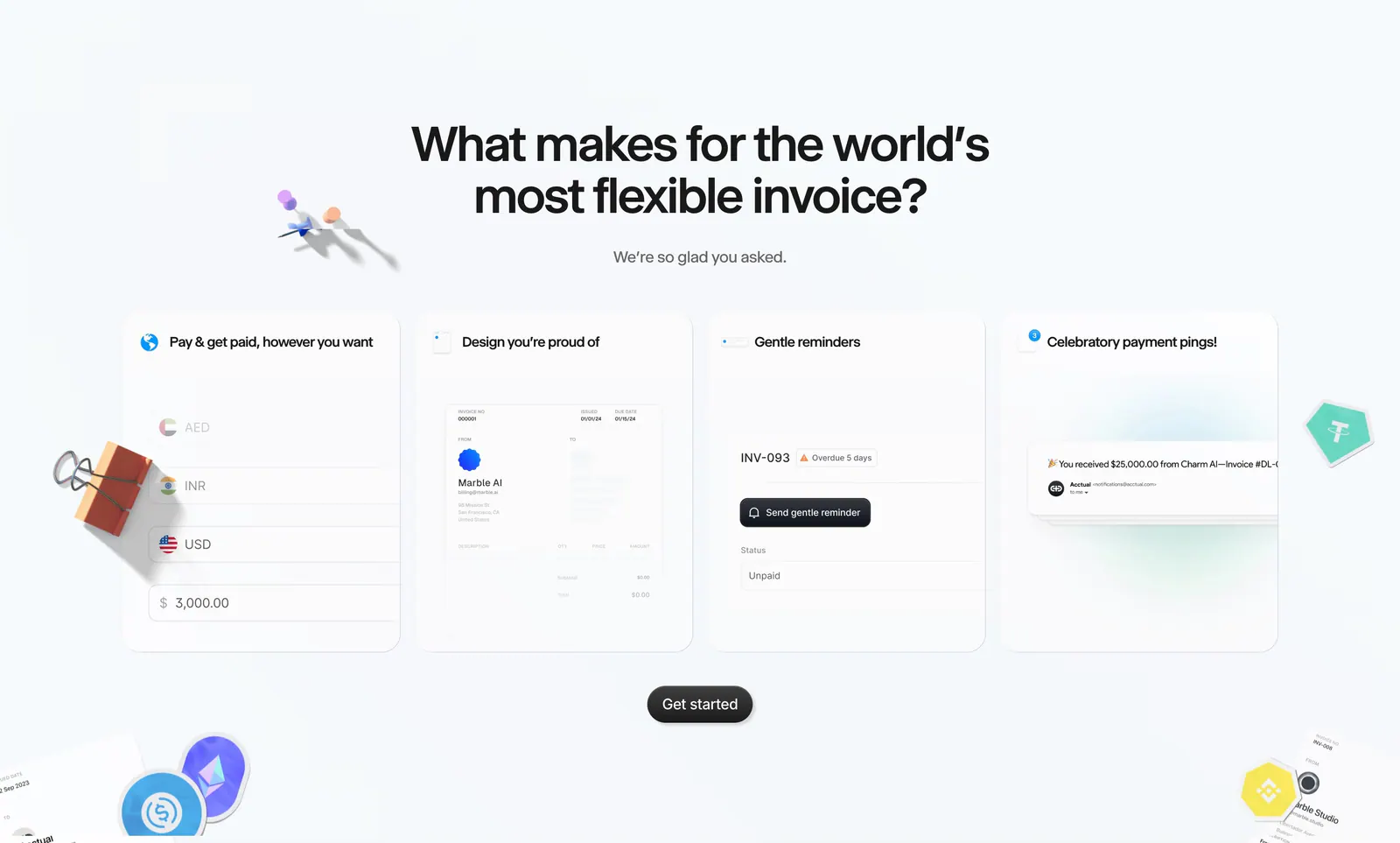
  61. Acctual features section: centered headline above four invoice feature cards with UI snippets, surrounded by 3D clips and crypto stickers
  62. Walrus features section: dark rounded banner with product intro on the left and a tabbed code snippet panel on the right
  63. Plasma hero section: nav and centered headline with Get in touch button over a full-bleed office photo of a woman holding a tablet
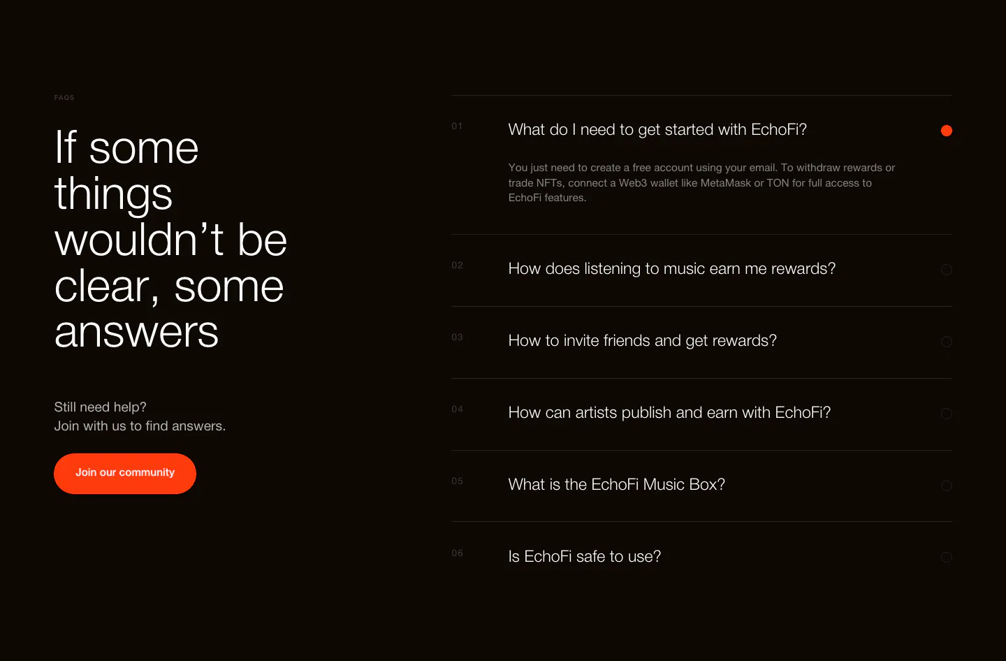
  64. EchoFi FAQ section: large headline and orange community button at left, numbered question accordion at right on black
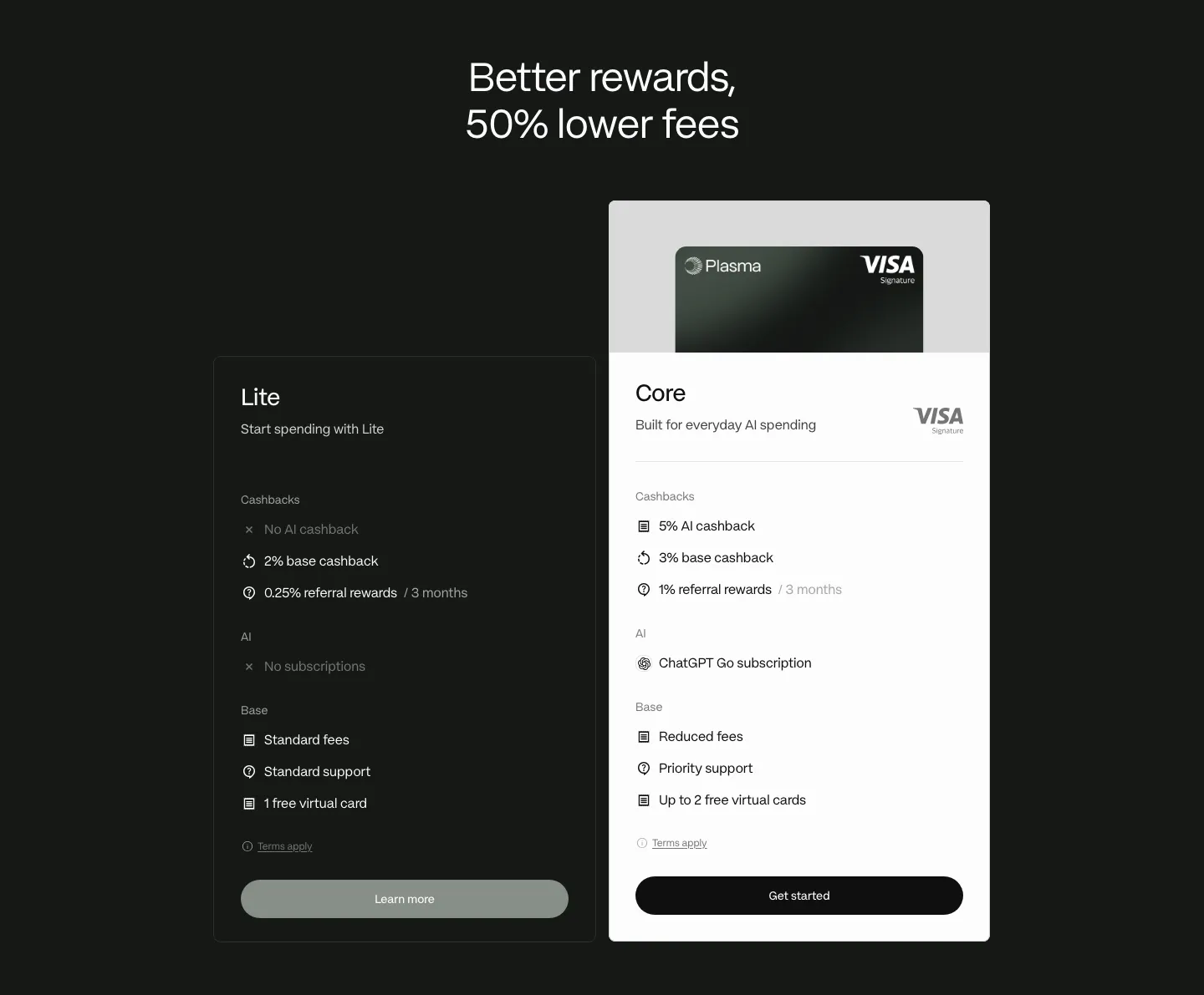
  65. Plasma pricing section: centered headline above dark Lite and white Core plan cards with feature lists on a dark background
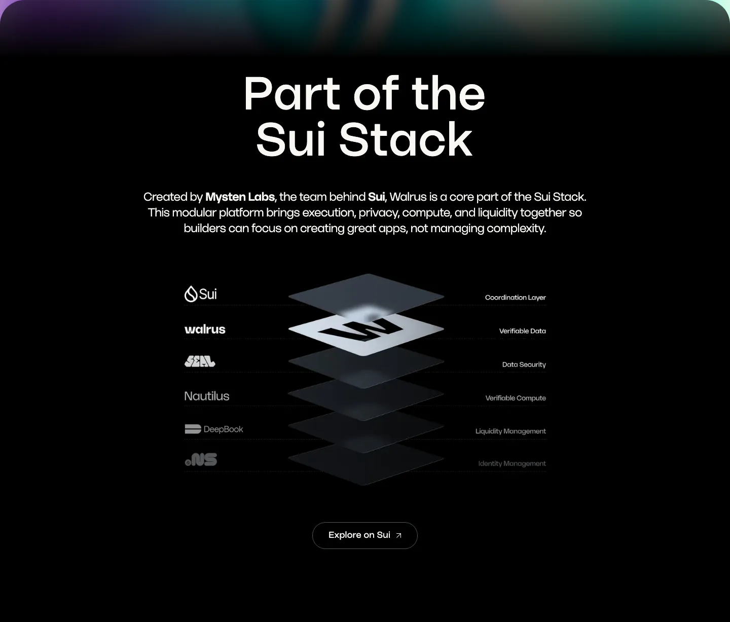
  66. Walrus integrations section: centered headline above an isometric stacked-layer diagram of Sui stack products on black
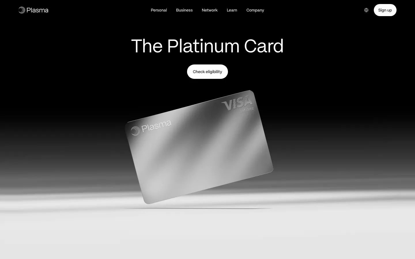
  67. Plasma hero section: nav and centered headline with Check eligibility button above a tilted silver card render on black-to-white
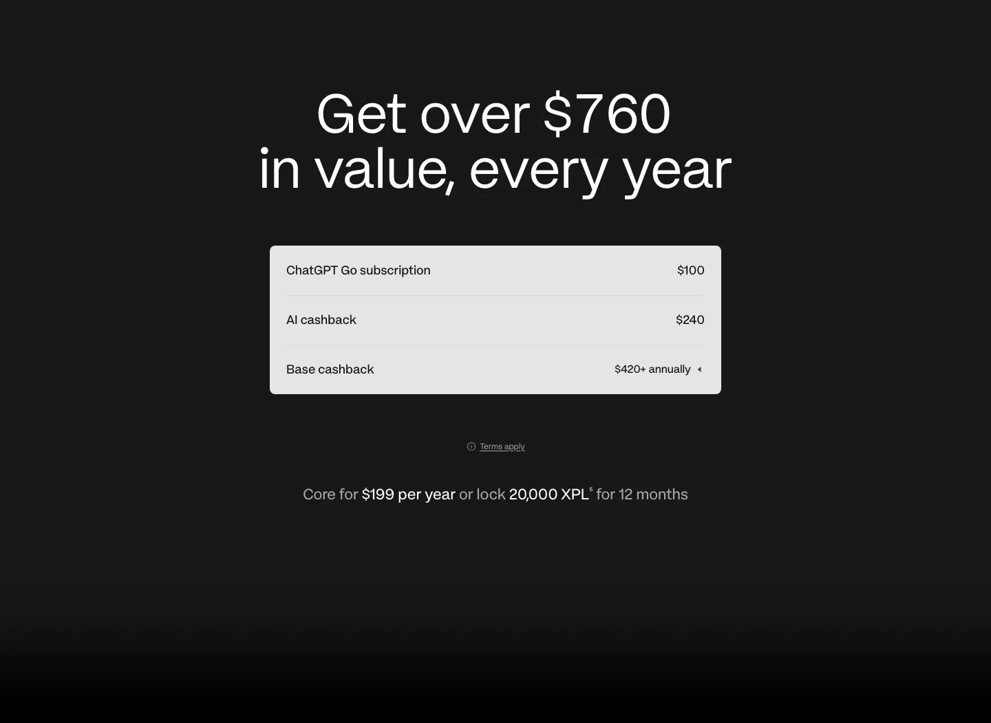
  68. Plasma pricing section: centered headline above a light value breakdown table with annual price line on a dark background
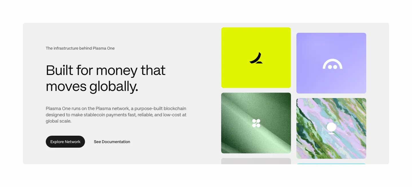
  69. Plasma features section: gray panel with heading and buttons left and a grid of colorful brand tiles right
  70. Walrus footer section: black footer with link columns and social icons above a giant walrus wordmark with 3D mascot
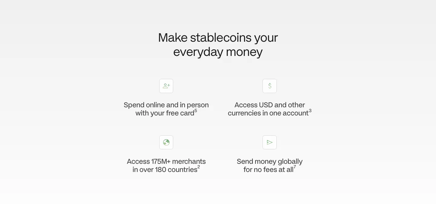
  71. Plasma value proposition section: centered heading above a 2x2 grid of icon benefit points on a light gray fade
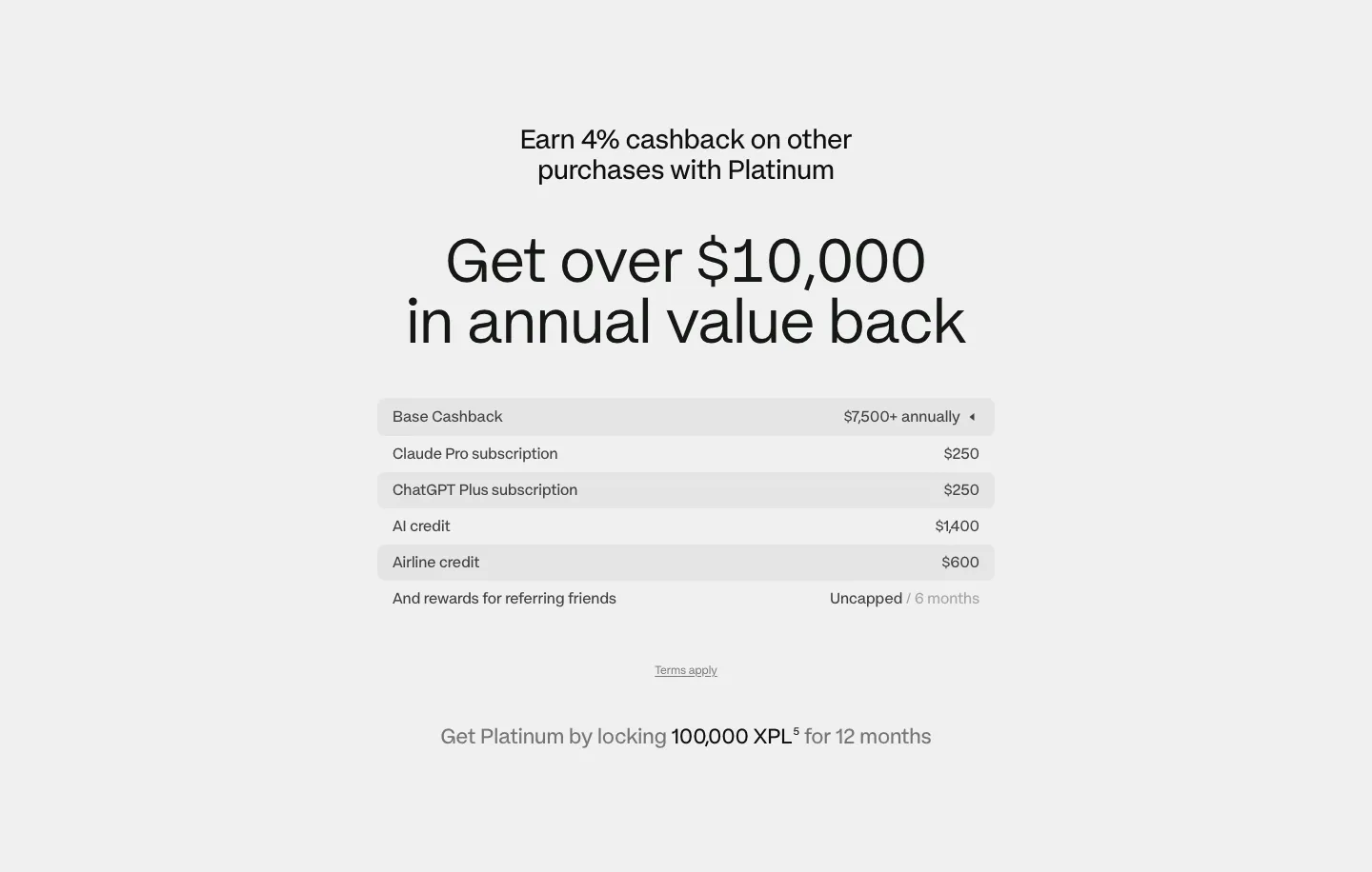
  72. Plasma pricing section: centered headline above a striped value breakdown table and lock requirement note on light gray
  73. Plasma features section: centered heading above two large cards, a dark card with AI app icons and a light card with a traveler photo
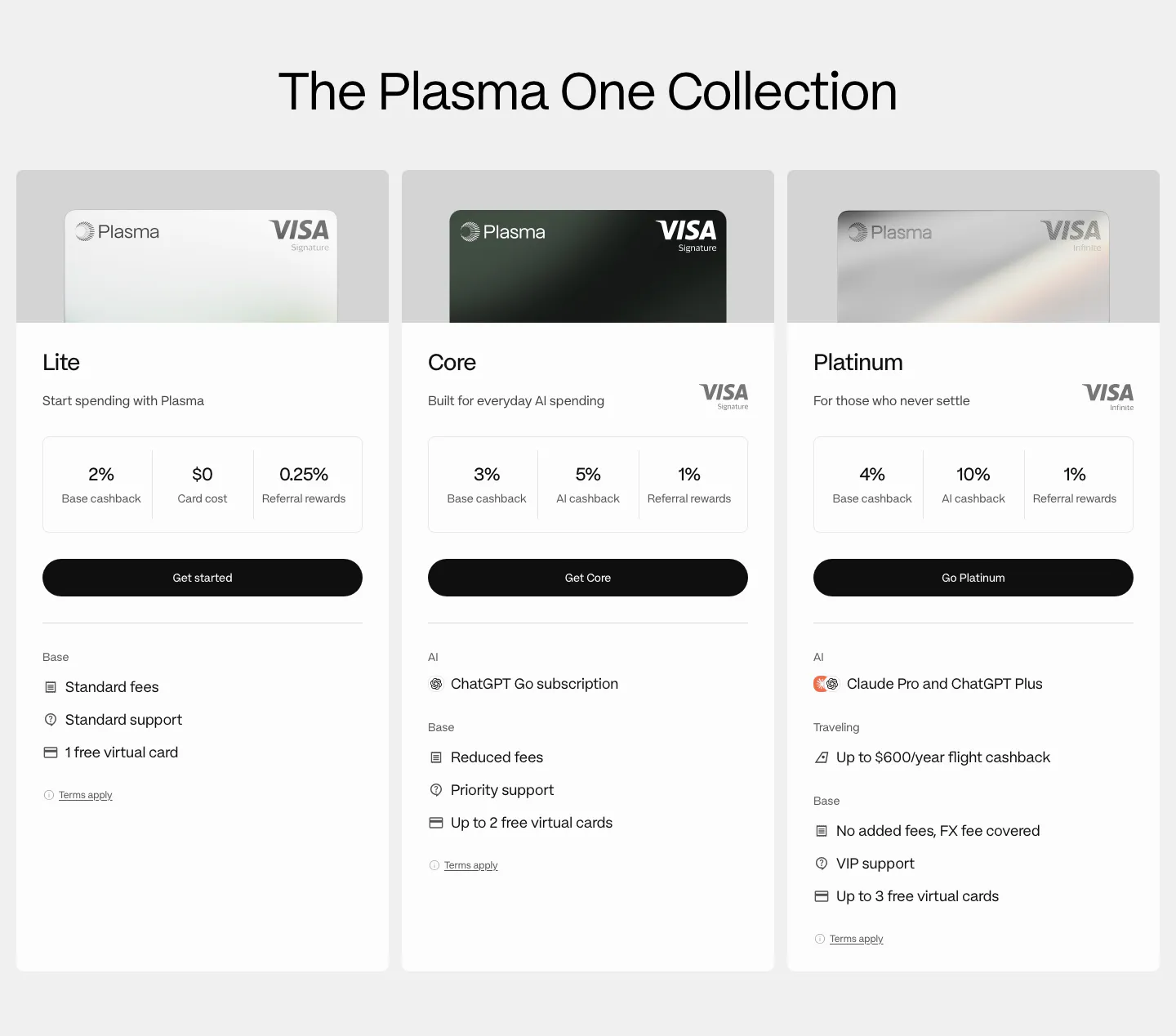
  74. Plasma pricing section: centered heading above three card tier columns with Visa card images, cashback figures and perks
  75. Plasma call to action section: centered Plasma One logo, large headline and green Get Plasma One button on white
  76. Plasma footer section: logo, five link columns, numbered legal disclosures, app store badges and a QR code on near-black
  77. Plasma hero section: centered headline and Get started button above a green Plasma Visa card render on a black-to-gray fade
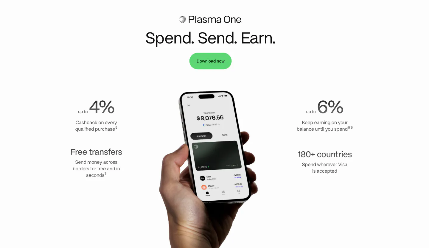
  78. Plasma value proposition section: centered heading and green button above a hand holding a phone flanked by four benefit stats
  79. Plasma value proposition section: oversized silver 10% figure and centered tagline over white light streaks on black
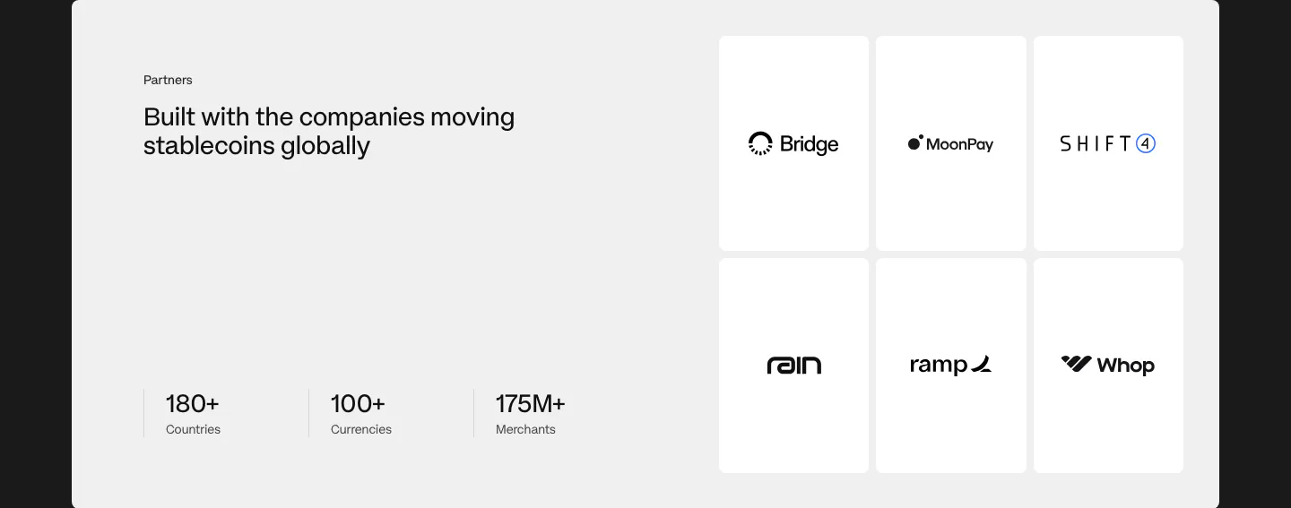
  80. Plasma logo cloud section: gray panel with heading and three stats left and a 3x2 grid of partner logo tiles right
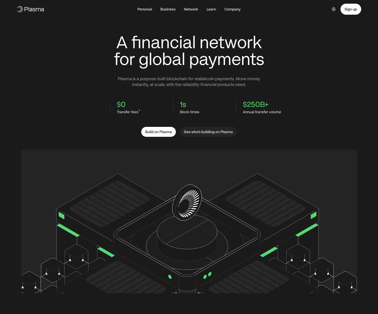
  81. Plasma hero section: centered headline, three green stats and buttons above an isometric line render of blockchain hardware on dark
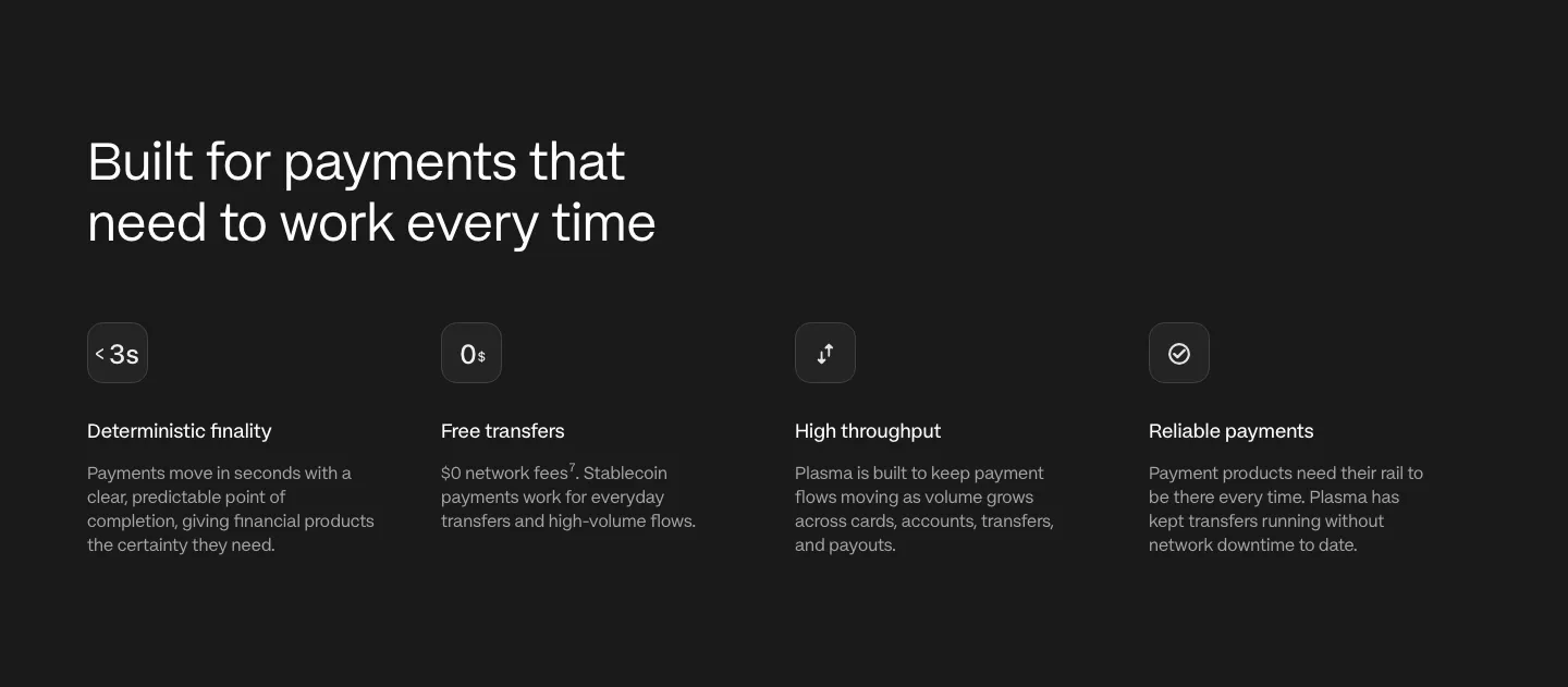
  82. Plasma stats section: white panel with three large green gradient figures for cost, setup minutes and cashback
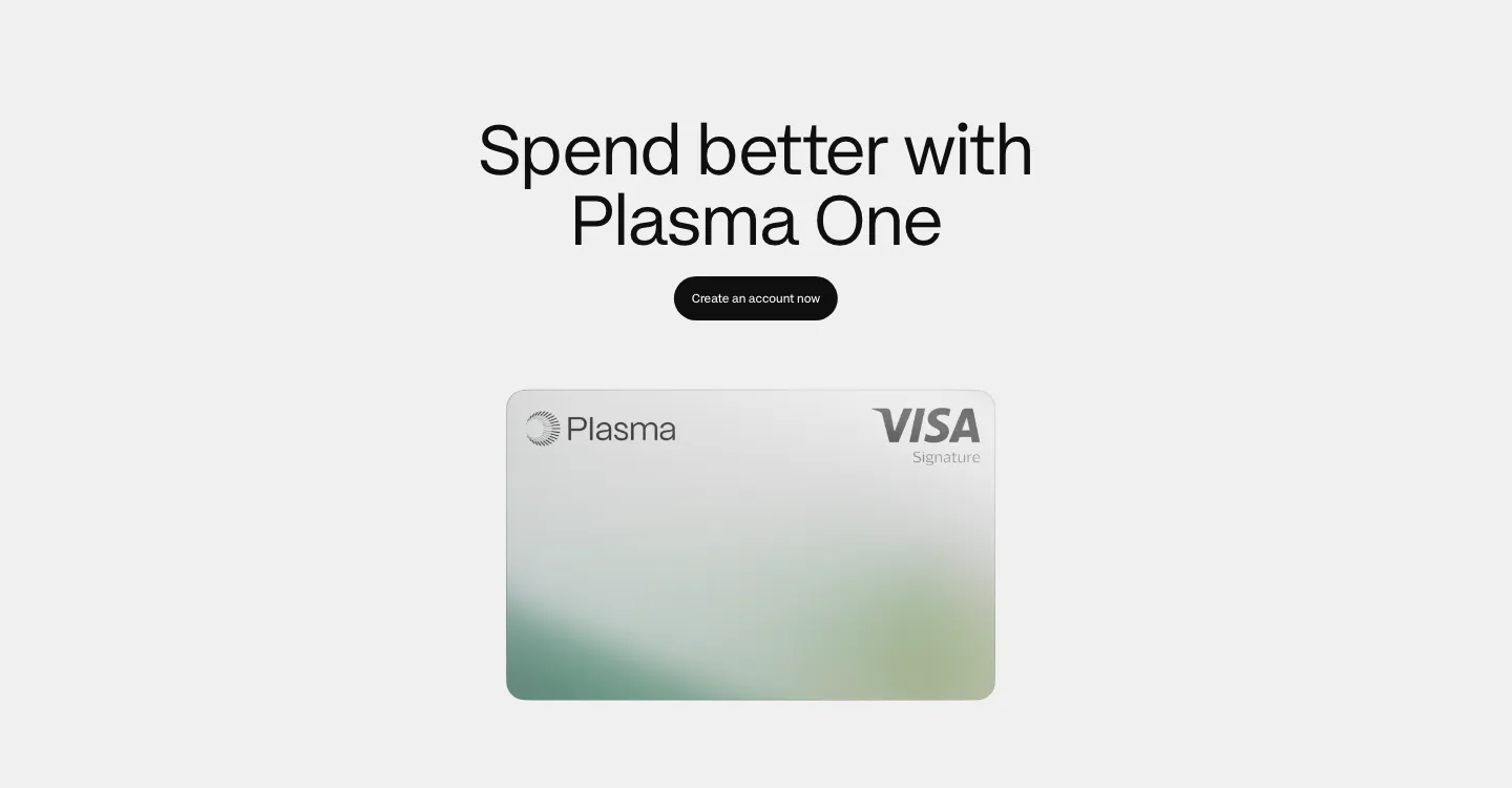
  83. Plasma call to action section: centered heading and black button above a silver Plasma Visa card on light gray
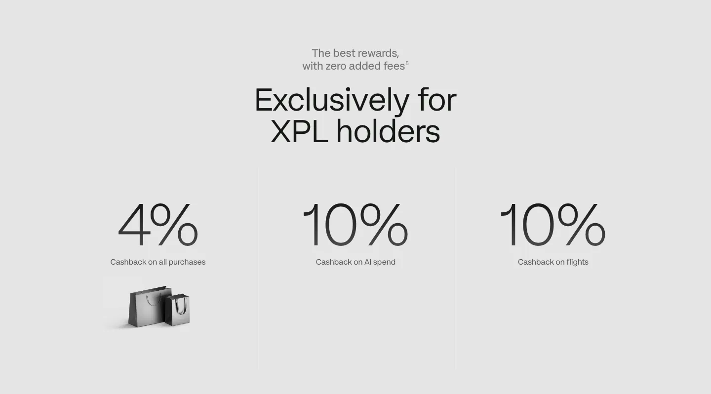
  84. Plasma stats section: centered headline above three large cashback percentages with labels on a light gray background
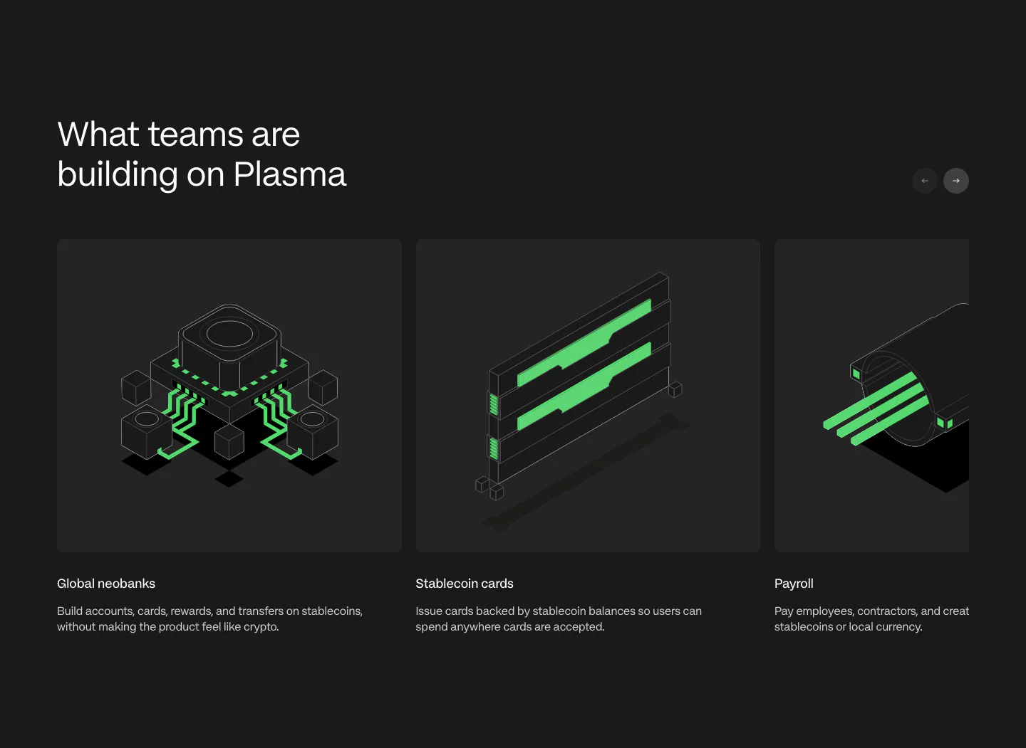
  85. Plasma use cases section: heading with arrow buttons above a carousel of cards with green isometric renders on charcoal
  86. Plasma features section: left-aligned heading above four icon columns describing payment capabilities on a charcoal background

Crypto & Web3 companies

8 companies in this collection

All companies

Common styles in crypto & web3 websites

How to design a crypto website

  1. Explain the product before the protocol

    Open with what a user can do, such as send dollars abroad or earn yield on idle funds, before naming the chain or token standard. Then offer a technical layer for people who want it. Newcomers and experienced users can both follow a page built this way.
  2. Link audits and contracts directly
    List security audits with each report linked, plus contract addresses and a bug bounty page. Experienced users check these before they connect a wallet. A security section that only says "audited" without a link reads as a warning sign, not a reassurance.

  3. Show on-chain data people can verify

    If you cite total value locked, volume, or active wallets, link to the explorer or dashboard where the figure comes from. Live numbers pulled from the chain carry more weight than static claims, and they keep the page accurate without manual updates.

  4. Write risk disclosures people will read

    Regulators and careful users both expect clear notes on volatility, custody, and regional availability. Write them in plain sentences, place them near the claim they qualify, and avoid burying them in light gray microcopy. Honest risk language makes the rest of the page more believable.
All industries
    ↑↓ Navigate ↵ Open

    Section preview

    Website section