Shelby website design

Every section we captured from the Shelby website, in page order, from the hero section down to the footer. Open any thumbnail to see it full size.

Sections 10

In page order, top to bottom

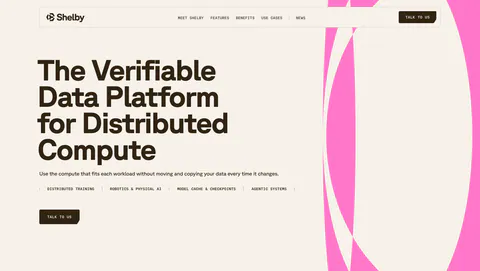
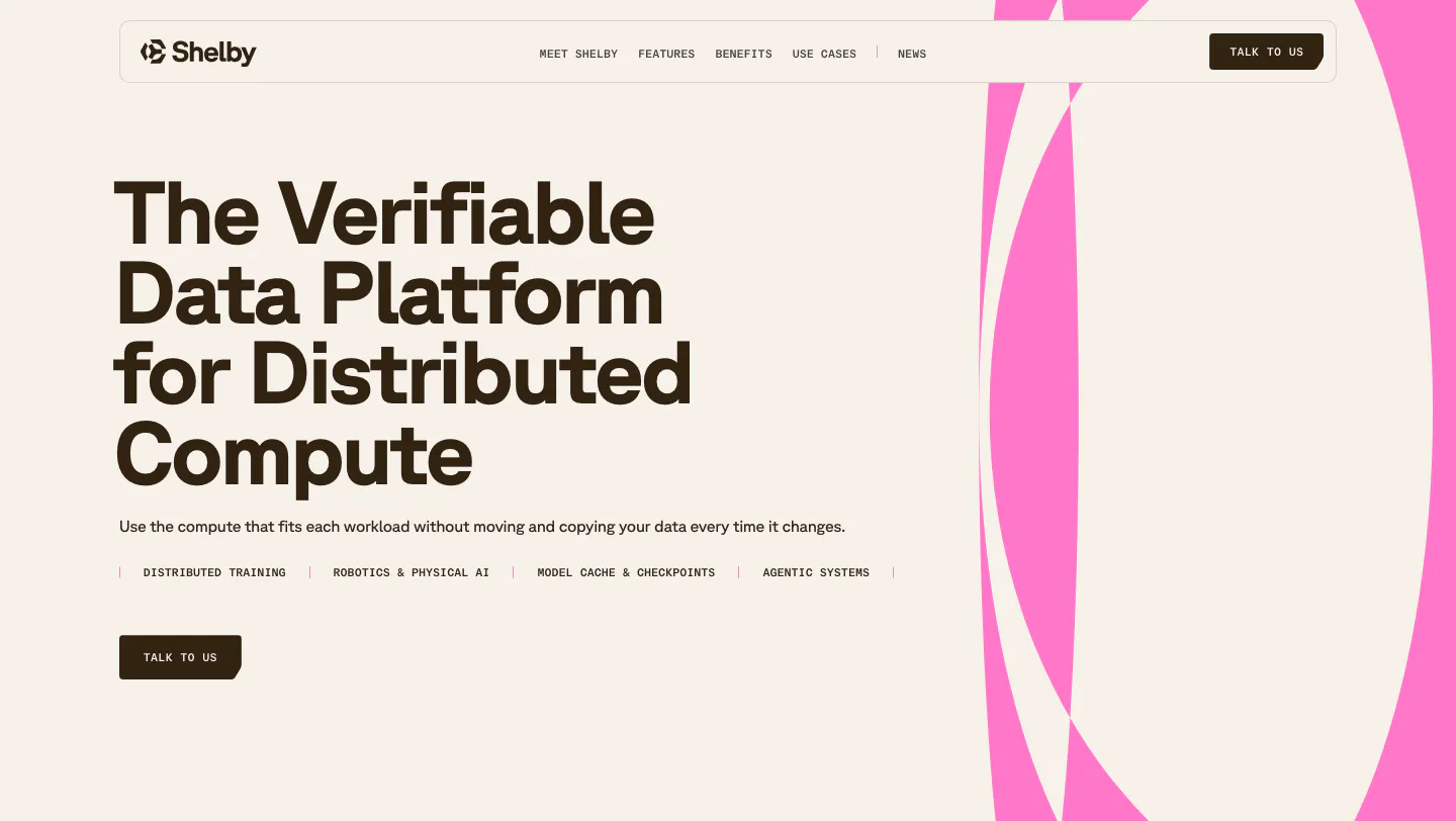
  1. Shelby hero section: left-aligned headline, use-case labels and Talk to us button beside large pink abstract curves on a cream background
    01 Hero

    The Verifiable Data Platform for Distributed Compute

  2. Shelby logo cloud section: single row of customer logos including NBCUniversal and Watchee inside a rounded bordered box on off-white
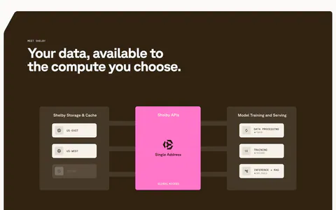
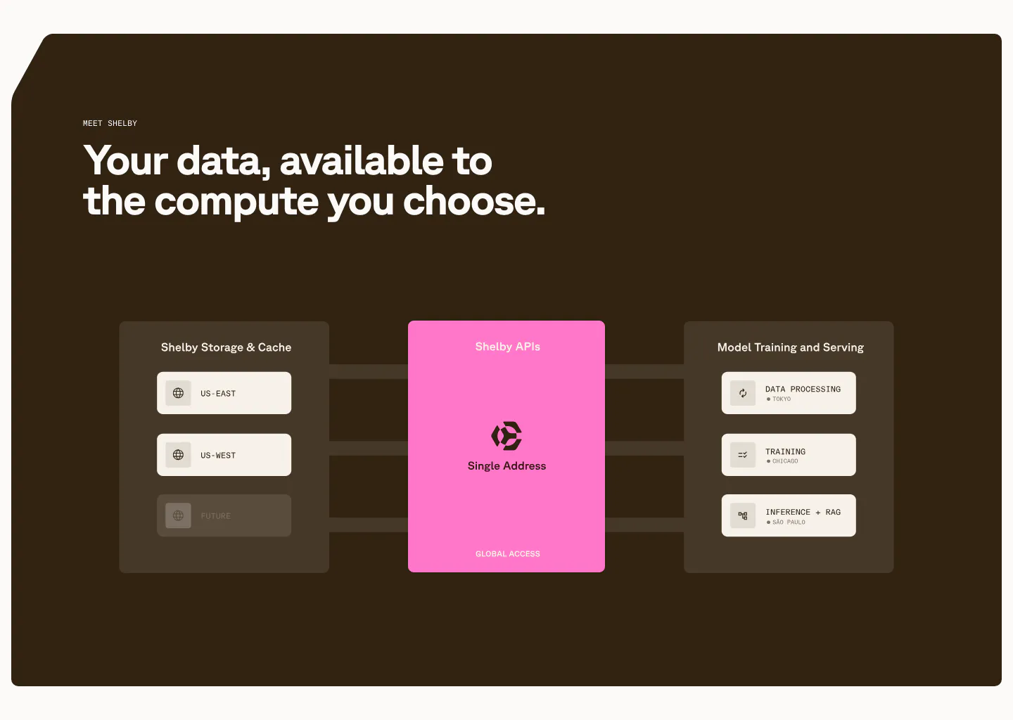
  3. Shelby features section: left headline above a diagram linking storage regions through a pink Shelby APIs card to workloads on dark brown

    Your data, available to the compute you choose.

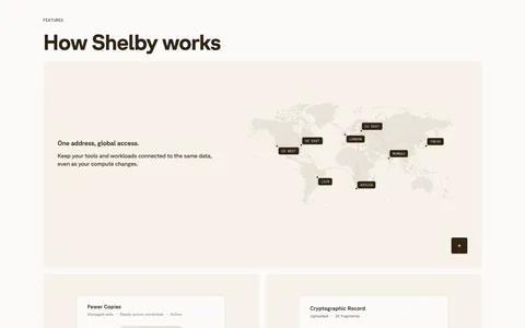
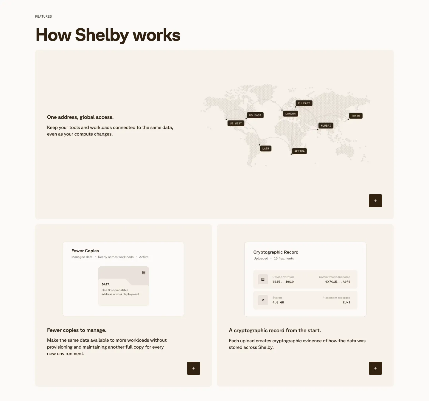
  4. Shelby features section: wide card with a dotted world map of data regions above two cards with small UI mockups on cream panels

    How Shelby works

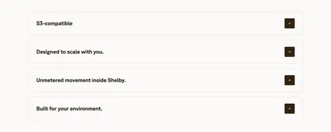
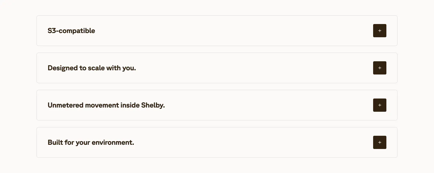
  5. Shelby value proposition section: four stacked accordion rows of benefit titles with dark plus buttons on an off-white background
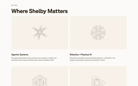
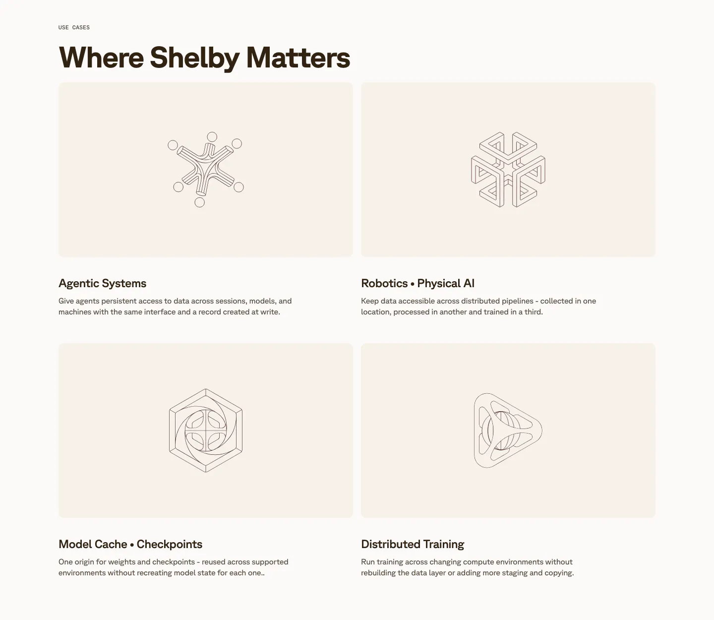
  6. Shelby use cases section: two-by-two grid of cream cards with line-drawn geometric artworks above titles like Agentic Systems

    Where Shelby Matters

  7. Shelby about & mission section: large left-aligned statement naming Jump Trading Group and Aptos as underlined links on a pale pink panel

    Engineered by Jump Trading Group's high-frequency systems and Aptos’ global infra experience.

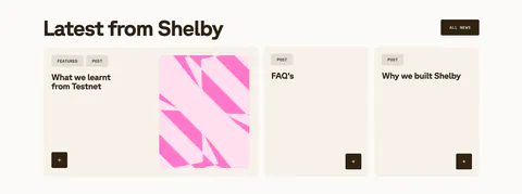
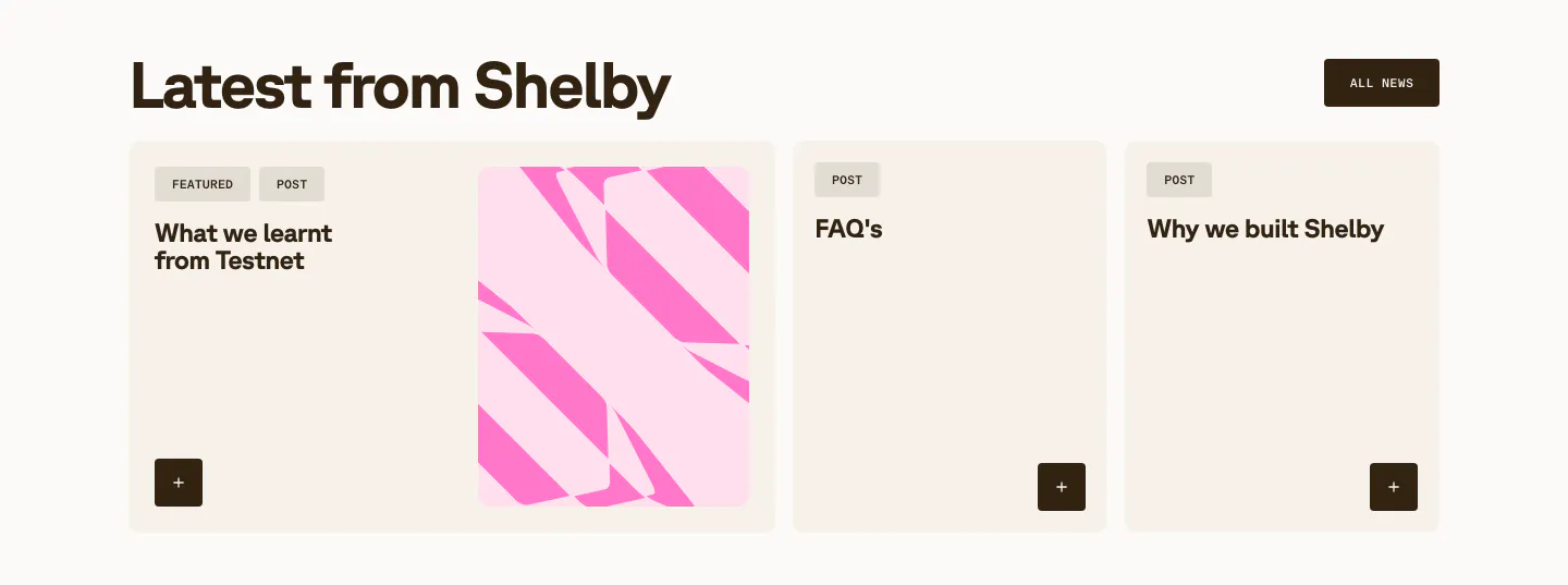
  8. Shelby blog & resources section: headline with All news button above a wide featured post card with pink abstract art and two post cards

    Latest from Shelby

  9. Shelby call to action section: left headline, one-line copy and Talk to us button beside bold pink diagonal stripes on a cream panel

    Let’s talk about your data.

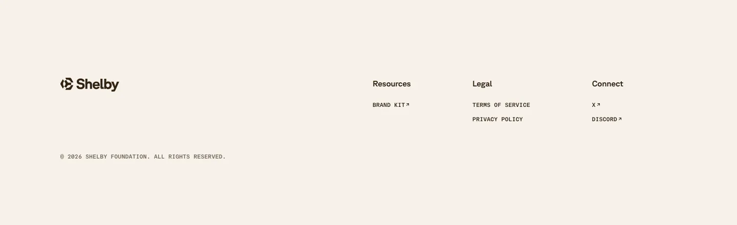
  10. Shelby footer section: logo at left with Resources, Legal and Connect link columns and a copyright line on a cream background
    10 Footer

Similar companies

All companies
    ↑↓ Navigate ↵ Open

    Section preview

    Website section