Vectara website design

Every section we captured from the Vectara website, in page order, from the hero section down to the footer. Open any thumbnail to see it full size.

Sections 8

In page order, top to bottom

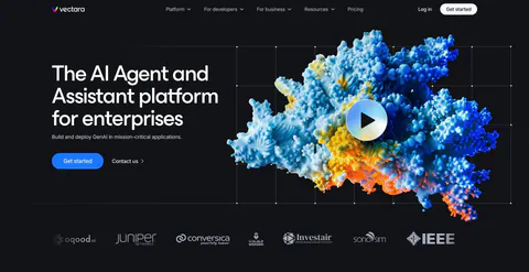
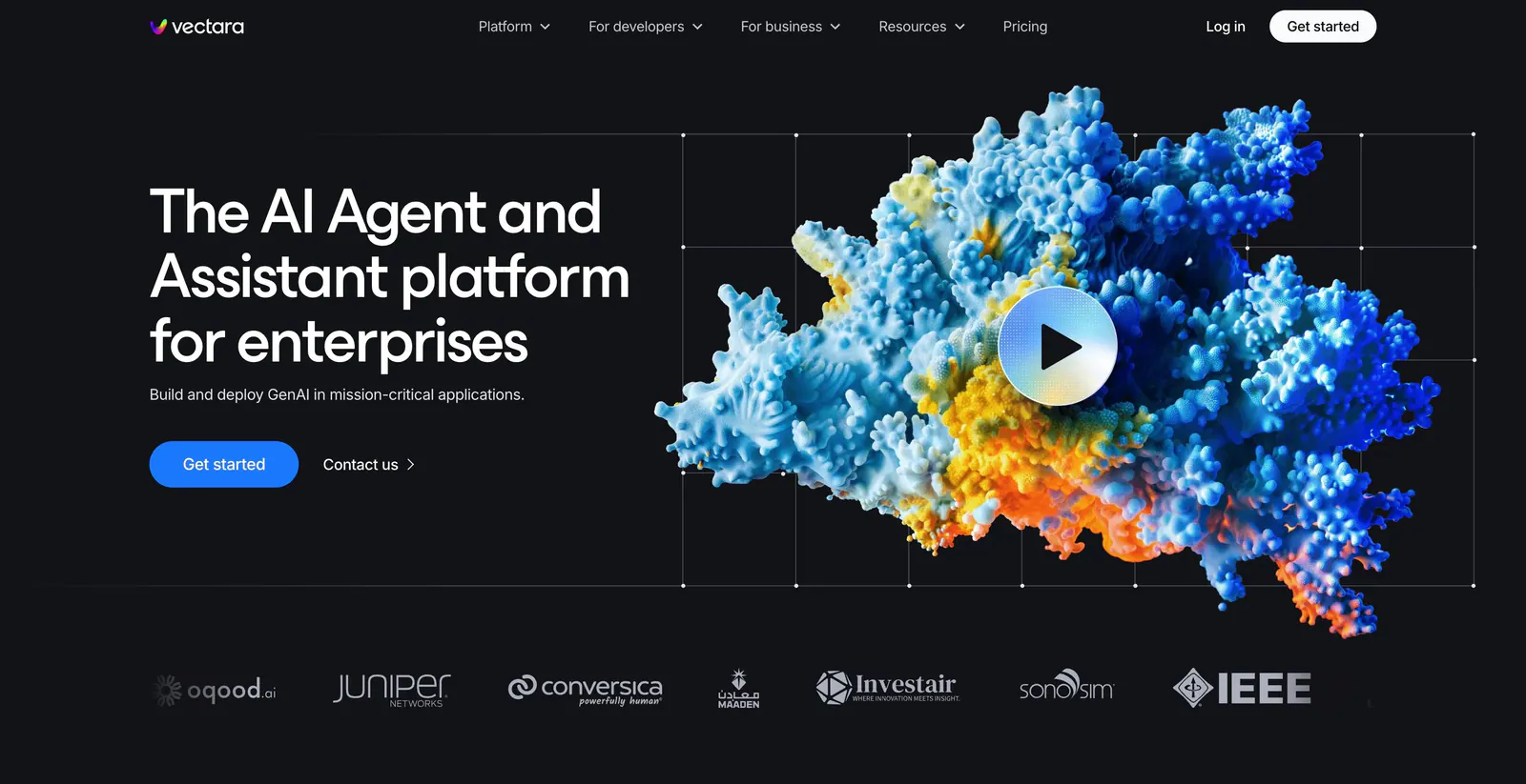
  1. Vectara hero section: headline left, colorful 3D coral-like render with a play button on grid lines right, logo strip below on black
    01 Hero

    The AI Agent and Assistant platform for enterprises

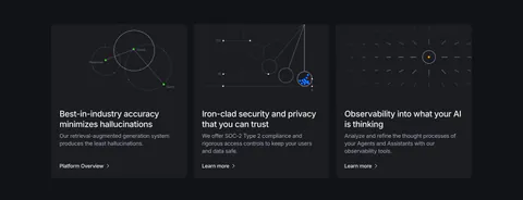
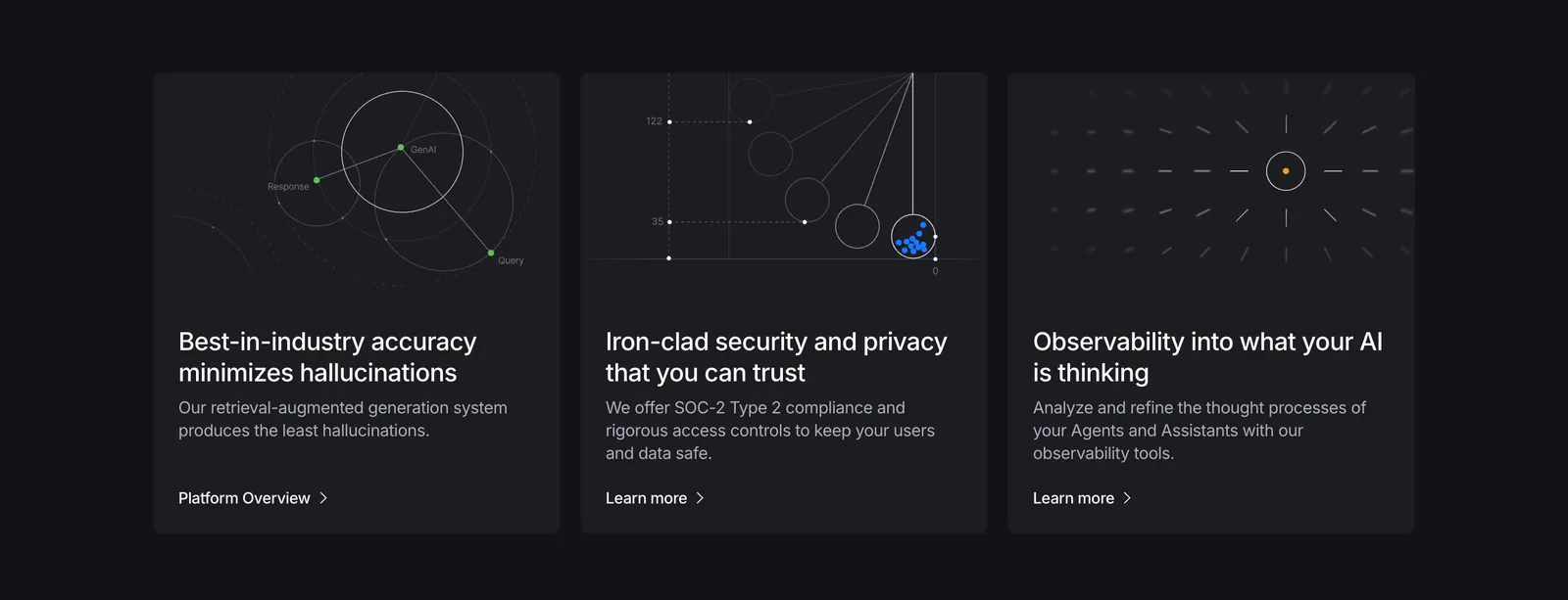
  2. Vectara features section: three dark cards with thin line-diagram graphics, titles and links on a near-black background
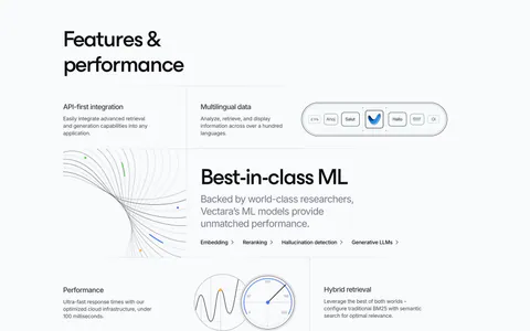
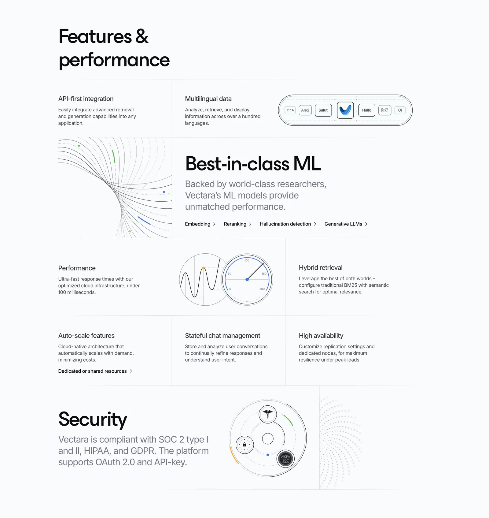
  3. Vectara features section: grid of feature cells in mixed sizes with line-art diagrams, a gauge and a security badge graphic on light gray

    Features & performance

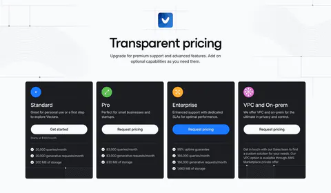
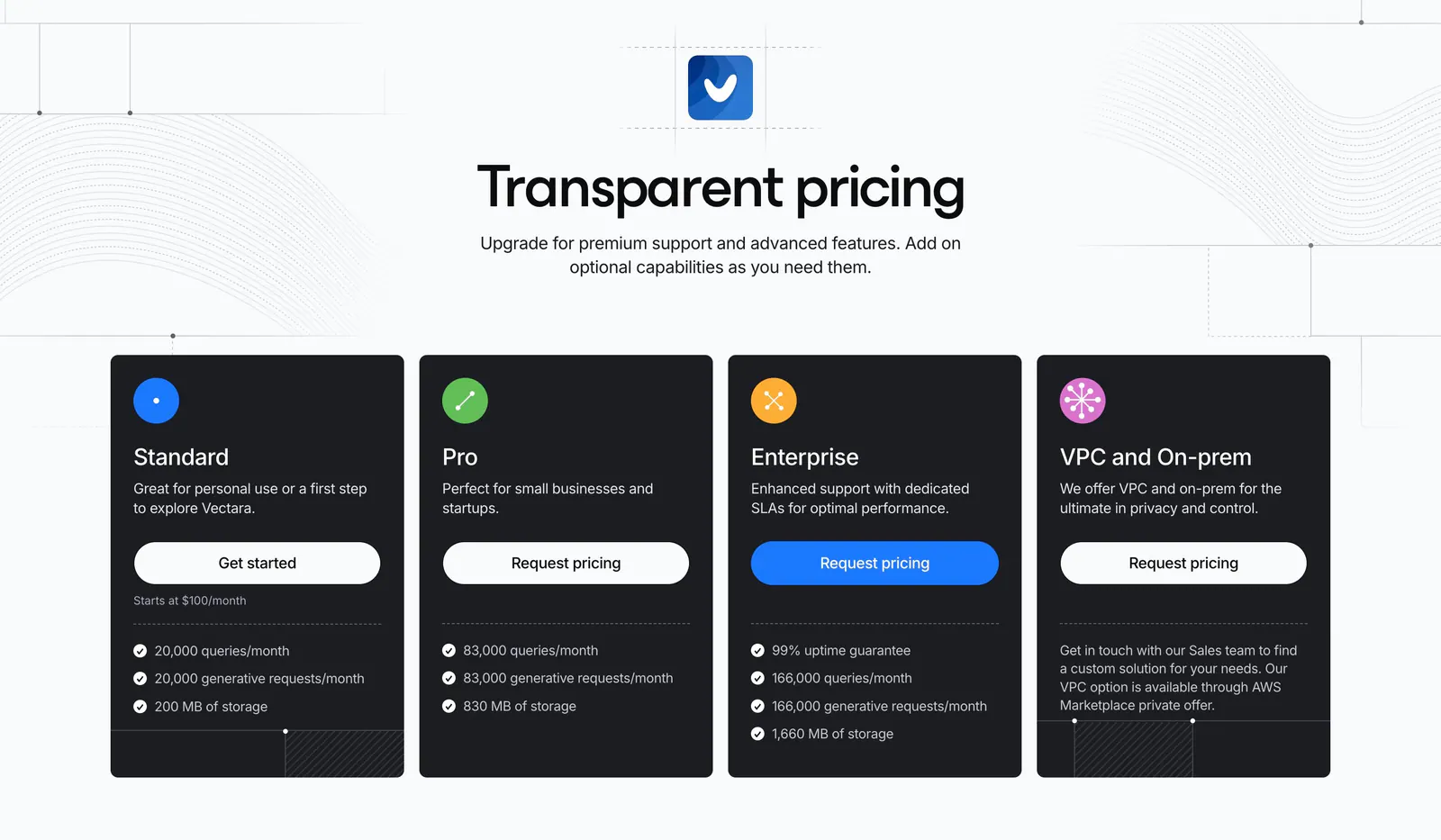
  4. Vectara pricing section: centered headline above four dark plan cards with icons and buttons, on light gray with line-pattern accents
    04 Pricing

    Transparent pricing

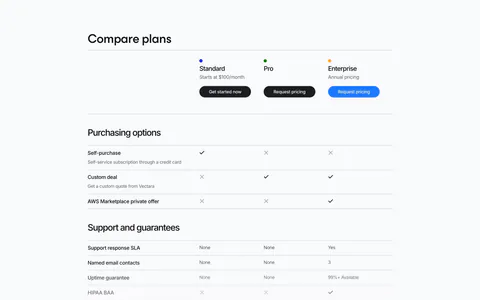
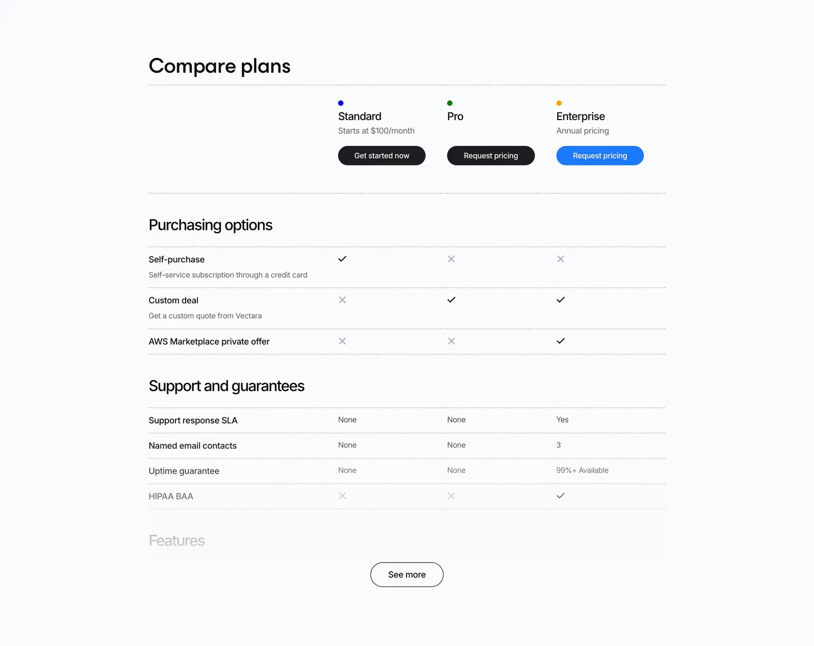
  5. Vectara pricing section: plan comparison table with check and cross marks for Standard, Pro and Enterprise and a See more button
    05 Pricing

    Compare plans

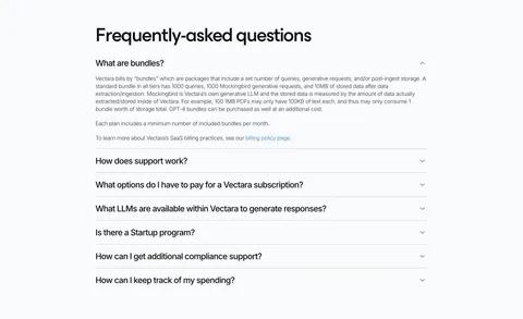
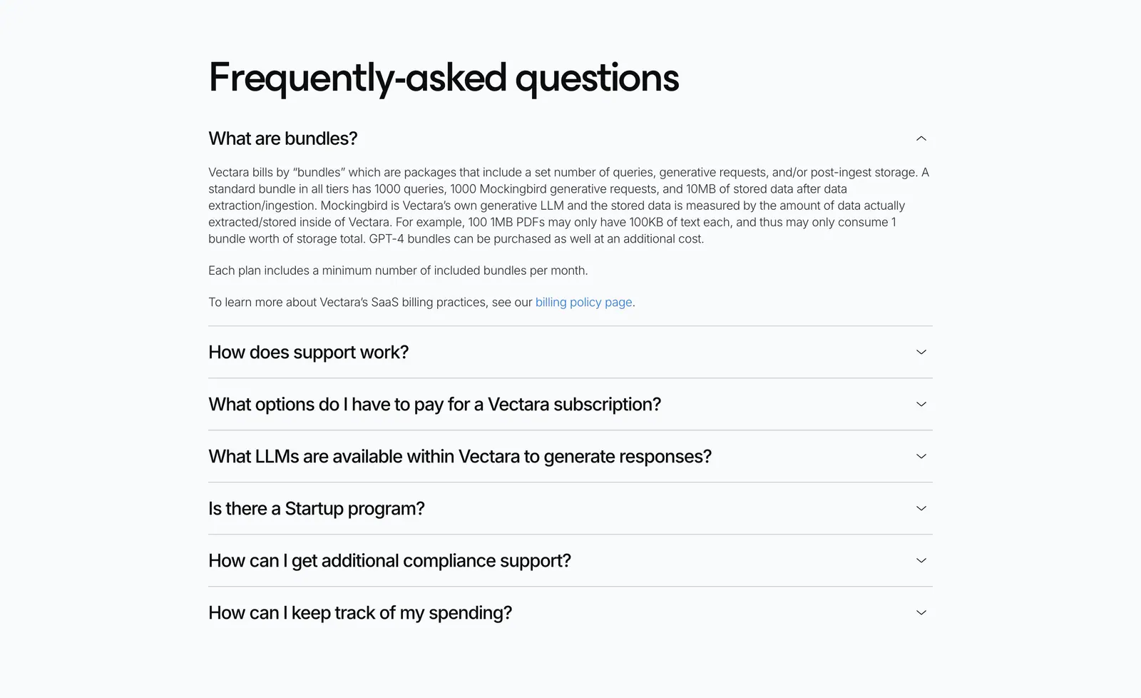
  6. Vectara FAQ section: left-aligned heading above an accordion of questions with the first answer expanded on a light gray background
    06 FAQ

    Frequently-asked questions

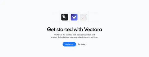
  7. Vectara call-to-action section: three app icons in a dashed grid above a centered headline with blue Contact us button on light gray

    Get started with Vectara

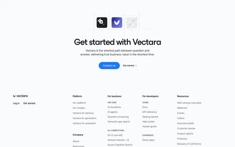
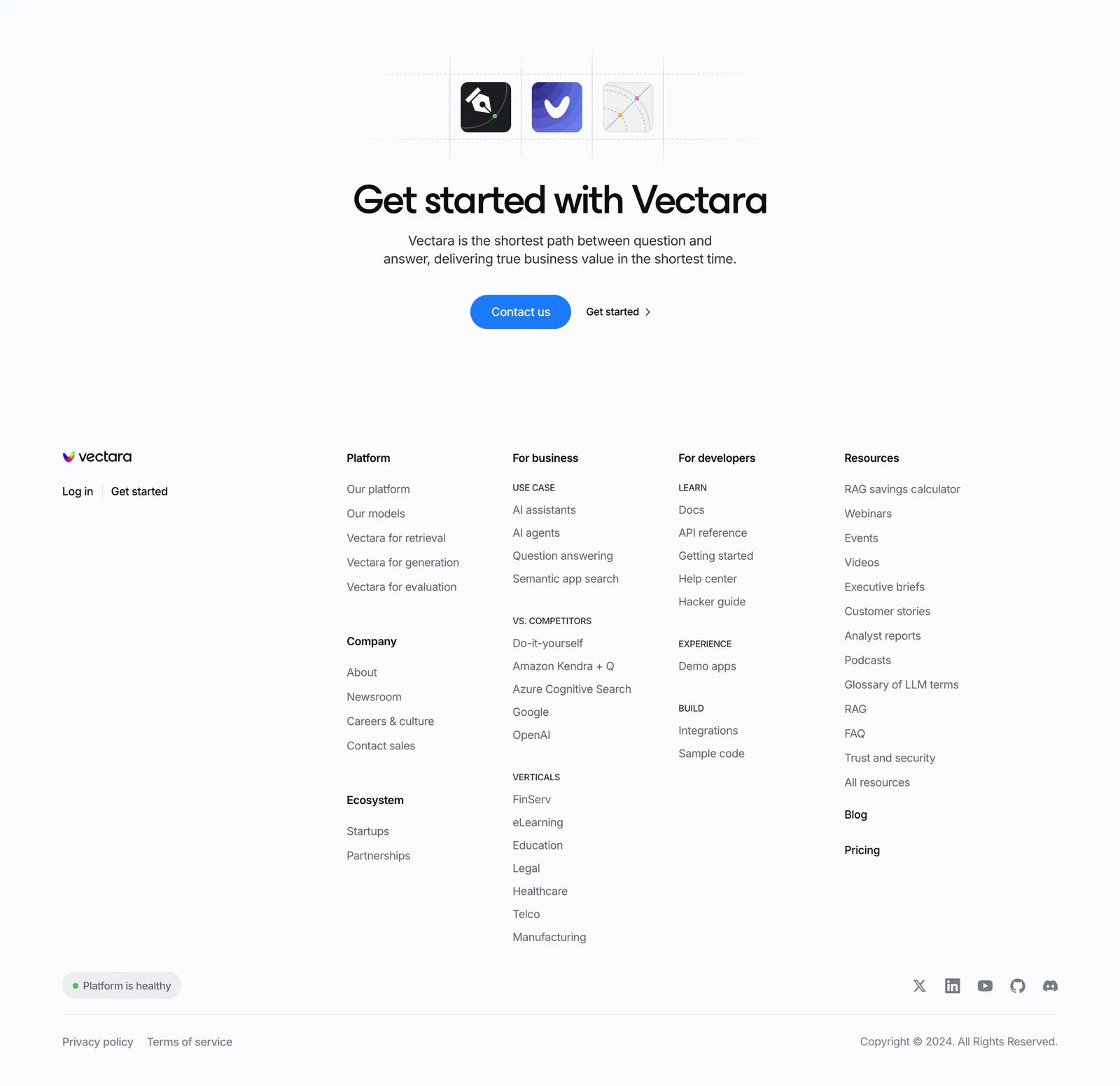
  8. Vectara footer section: centered CTA with app icons above a logo and five link columns, status pill, social icons and copyright on light gray
    08 Footer

    Get started with Vectara

Similar companies

All companies
    ↑↓ Navigate ↵ Open

    Section preview

    Website section