Pogo website design

Every section we captured from the Pogo website, in page order, from the hero section down to the footer. Open any thumbnail to see it full size.

Sections 10

In page order, top to bottom

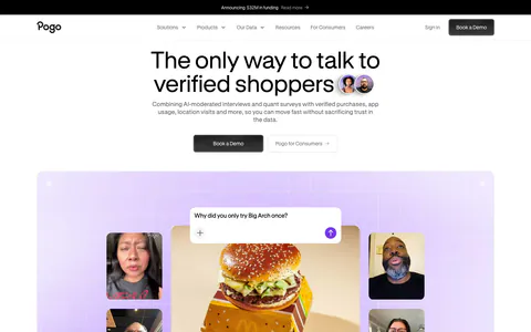
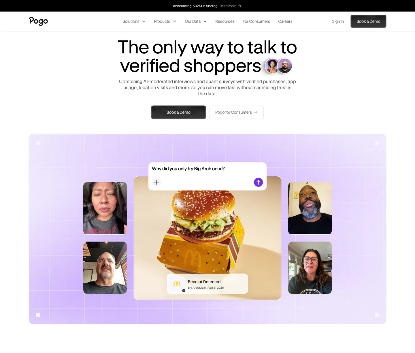
  1. Pogo hero section: centered headline and demo buttons above a lavender grid panel of video interview tiles around a burger photo
    01 Hero

    The only way to talk to verified shoppers

  2. Pogo logo cloud section: grayscale customer logos in rounded cards along a single row cut off at the edges on white
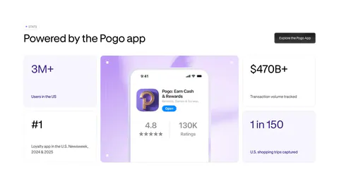
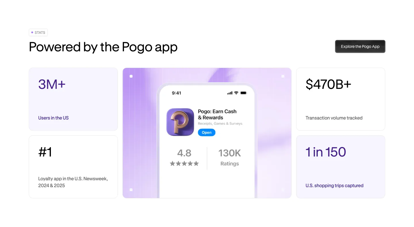
  3. Pogo stats section: bento grid of four metric cards around a lavender panel with a phone showing the Pogo app store listing
    03 Stats

    Powered by the Pogo app

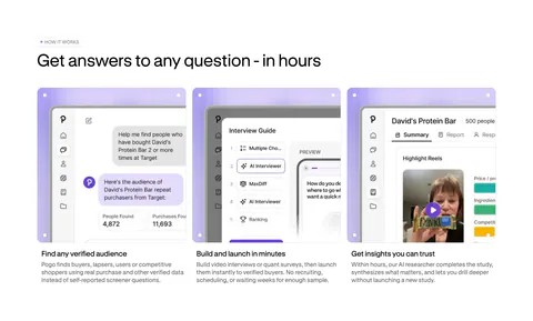
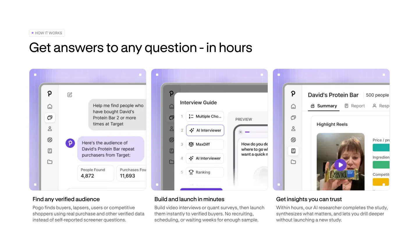
  4. Pogo how it works section: three cards with lavender-framed product screenshots and short step descriptions below a left-aligned headline

    Get answers to any question - in hours

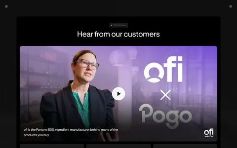
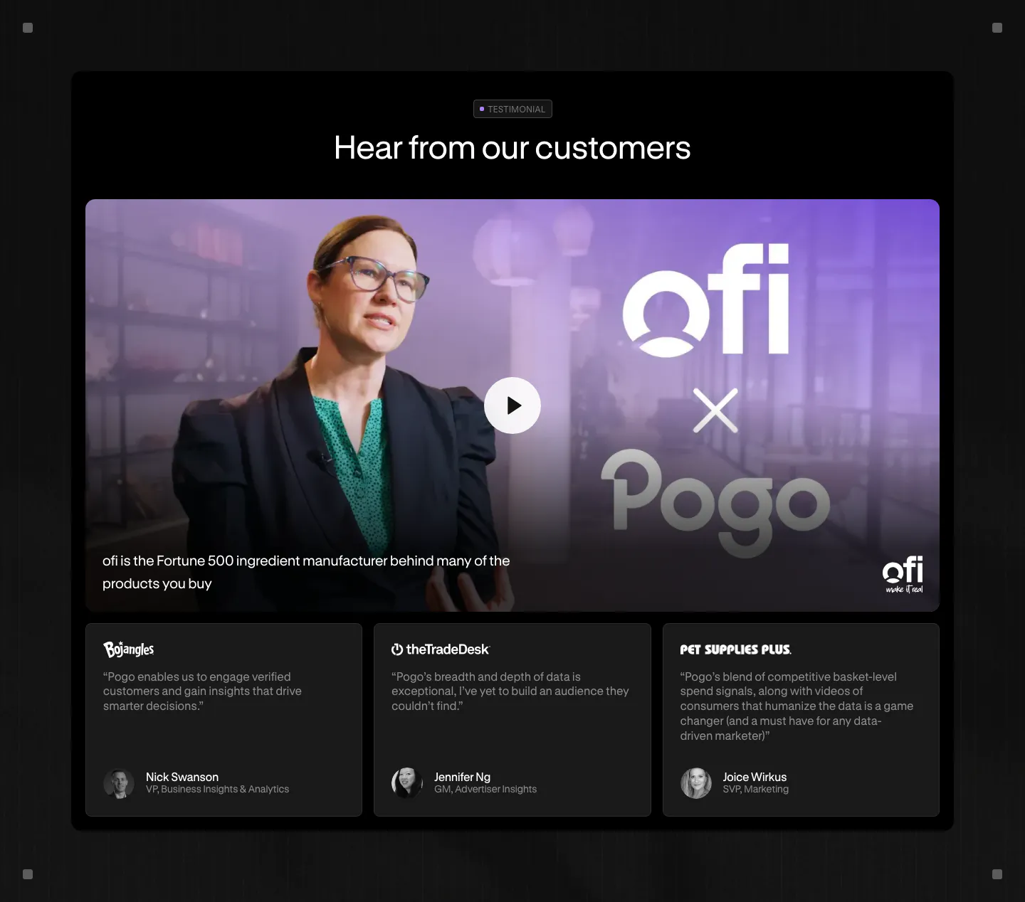
  5. Pogo testimonials section: dark panel with a video thumbnail and play button above three customer quote cards

    Hear from our customers

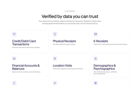
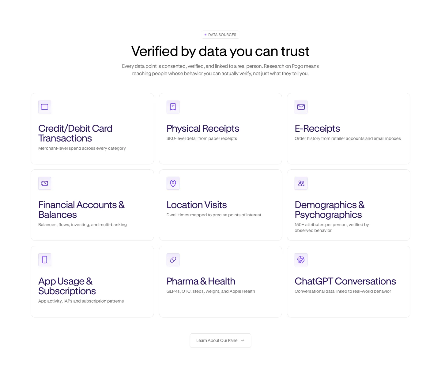
  6. Pogo features section: centered headline over a 3x3 grid of data source cards with purple line icons on white

    Verified by data you can trust

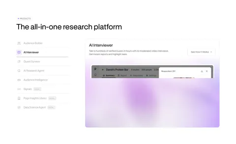
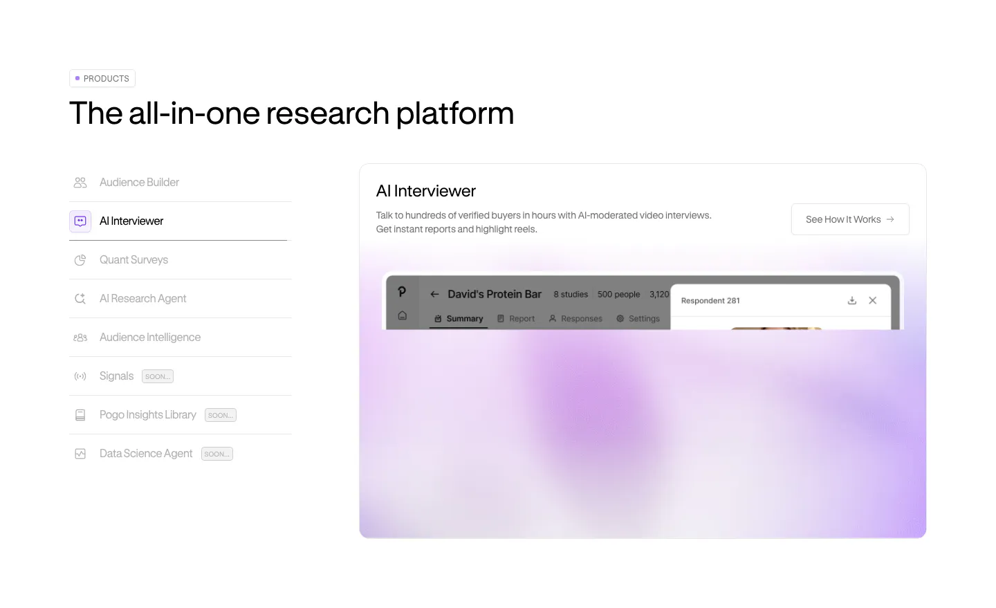
  7. Pogo features section: vertical product tab list on the left beside a panel with a blurred lavender product screenshot

    The all-in-one research platform

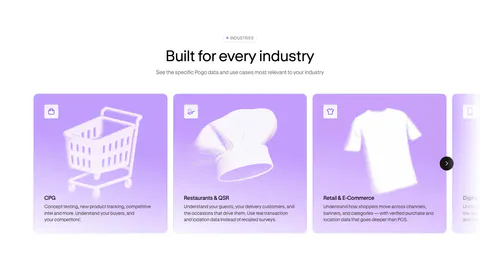
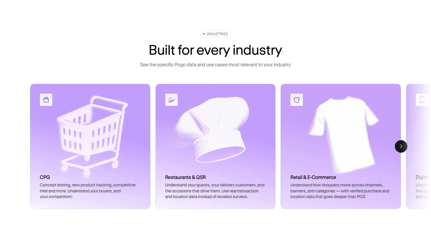
  8. Pogo use cases section: centered headline above a carousel of lavender industry cards with halftone object artwork

    Built for every industry

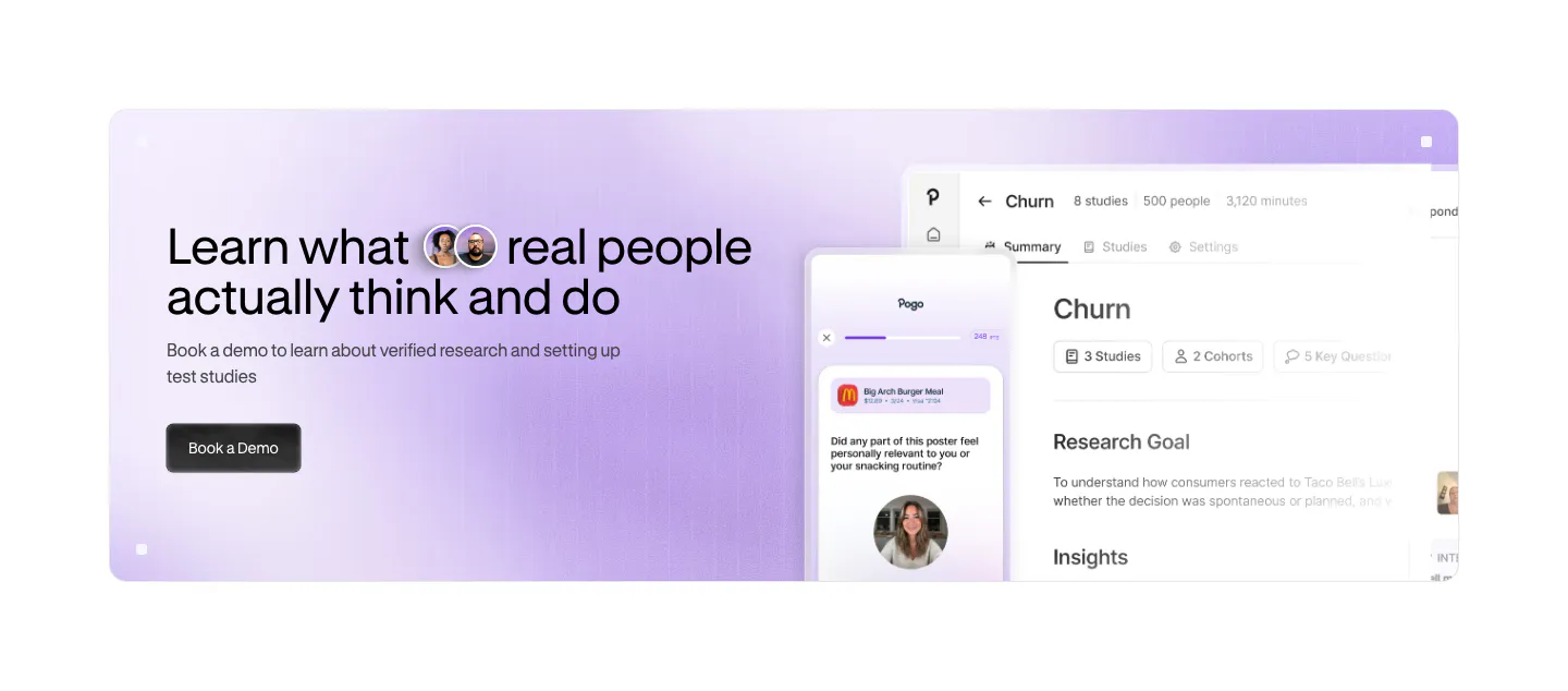
  9. Pogo call to action section: lavender gradient banner with headline and demo button left and app and phone UI screenshots right

    Learn what real people actually think and do

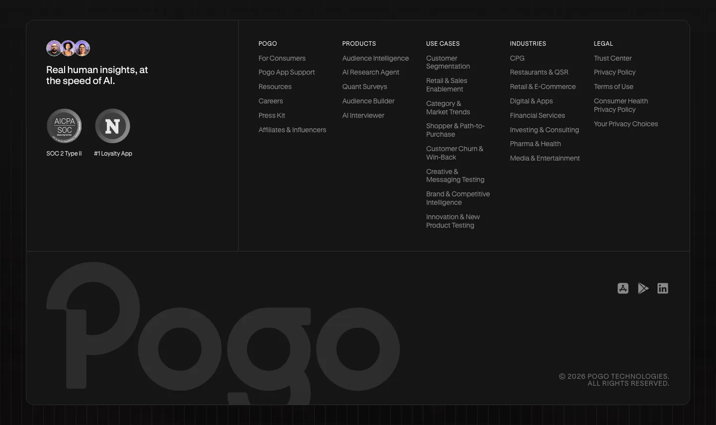
  10. Pogo footer section: dark rounded panel with tagline, compliance badges, five link columns and a large faded Pogo wordmark
    10 Footer

    Real human insights, at the speed of AI.
Similar companies

All companies
    ↑↓ Navigate ↵ Open

    Section preview

    Website section