Watts website design

Every section we captured from the Watts website, in page order, from the hero section down to the footer. Open any thumbnail to see it full size.

Sections 8

In page order, top to bottom

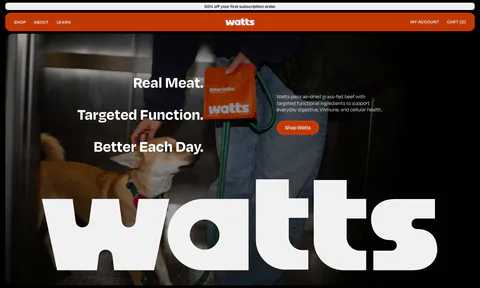
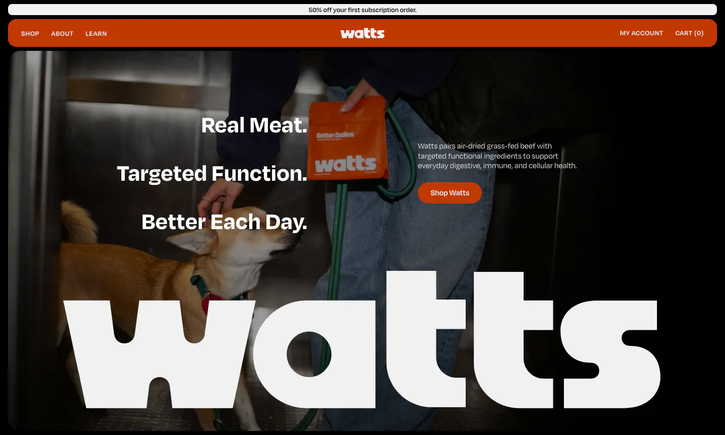
  1. Watts hero section: stacked headline and shop button over a full-bleed photo of a dog and owner, with a giant white watts wordmark
    01 Hero

    Real Meat. Targeted Function. Better Each Day.

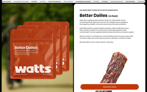
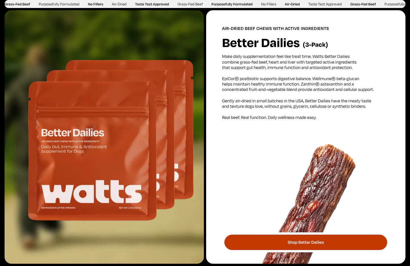
  2. Watts features section: product bag photo on the left, Better Dailies details, jerky photo and shop button on a white card on the right

    Better Dailies (3-Pack)

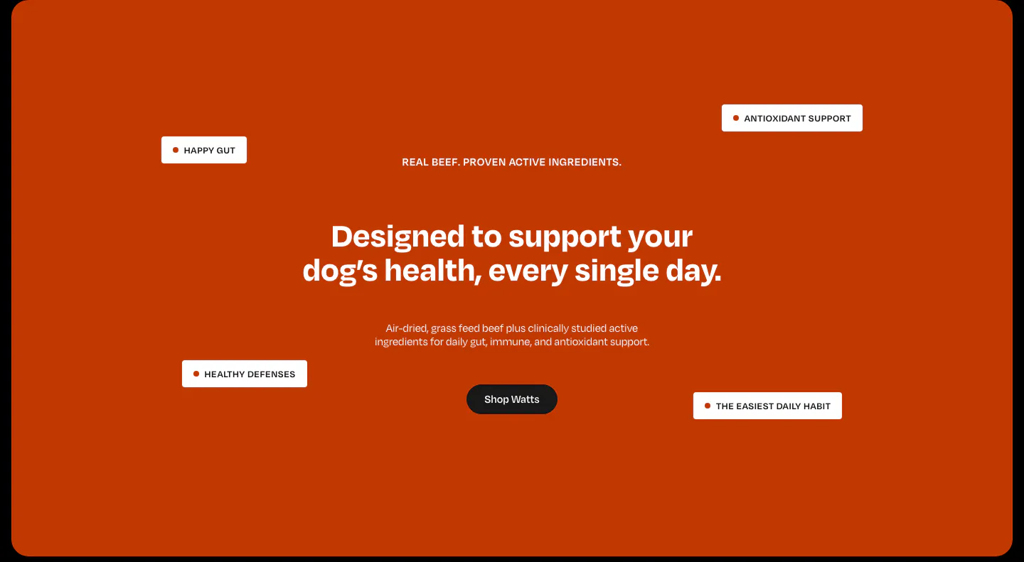
  3. Watts value proposition section: centered headline and shop button on a burnt-orange panel with floating benefit tags

    Designed to support your dog's health, every single day.

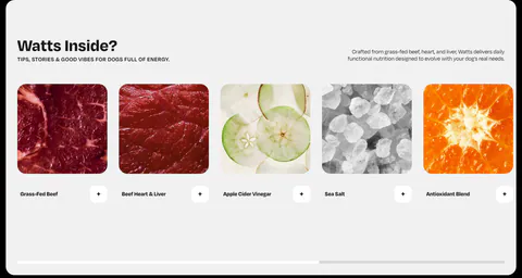
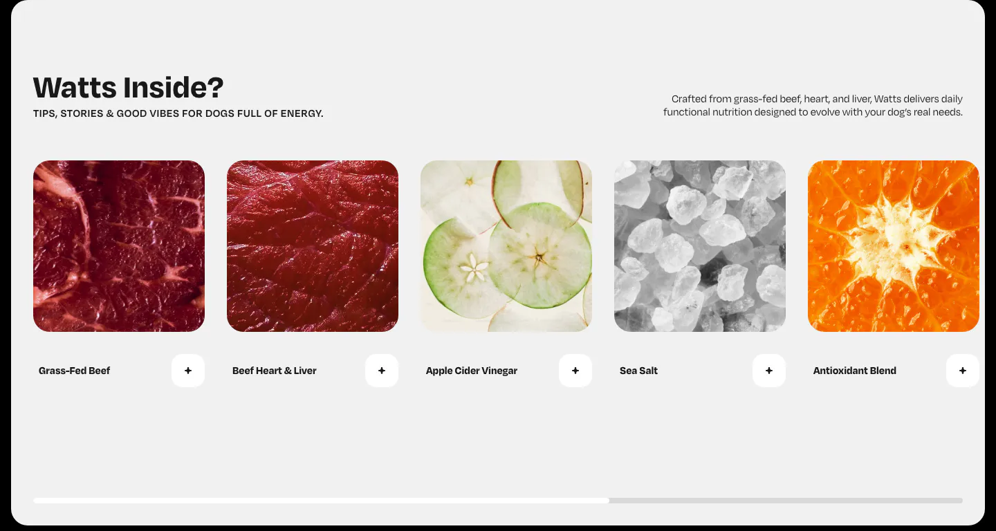
  4. Watts features section: horizontal row of ingredient photo cards with plus buttons and a scroll progress bar on light gray

    Watts Inside?

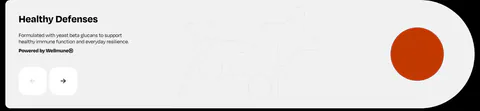
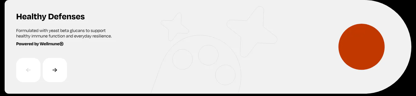
  5. Watts features section: Healthy Defenses slide with short copy, prev/next arrow buttons and an orange circle on a light gray card

    Healthy Defenses

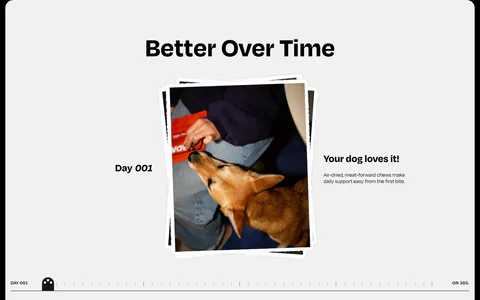
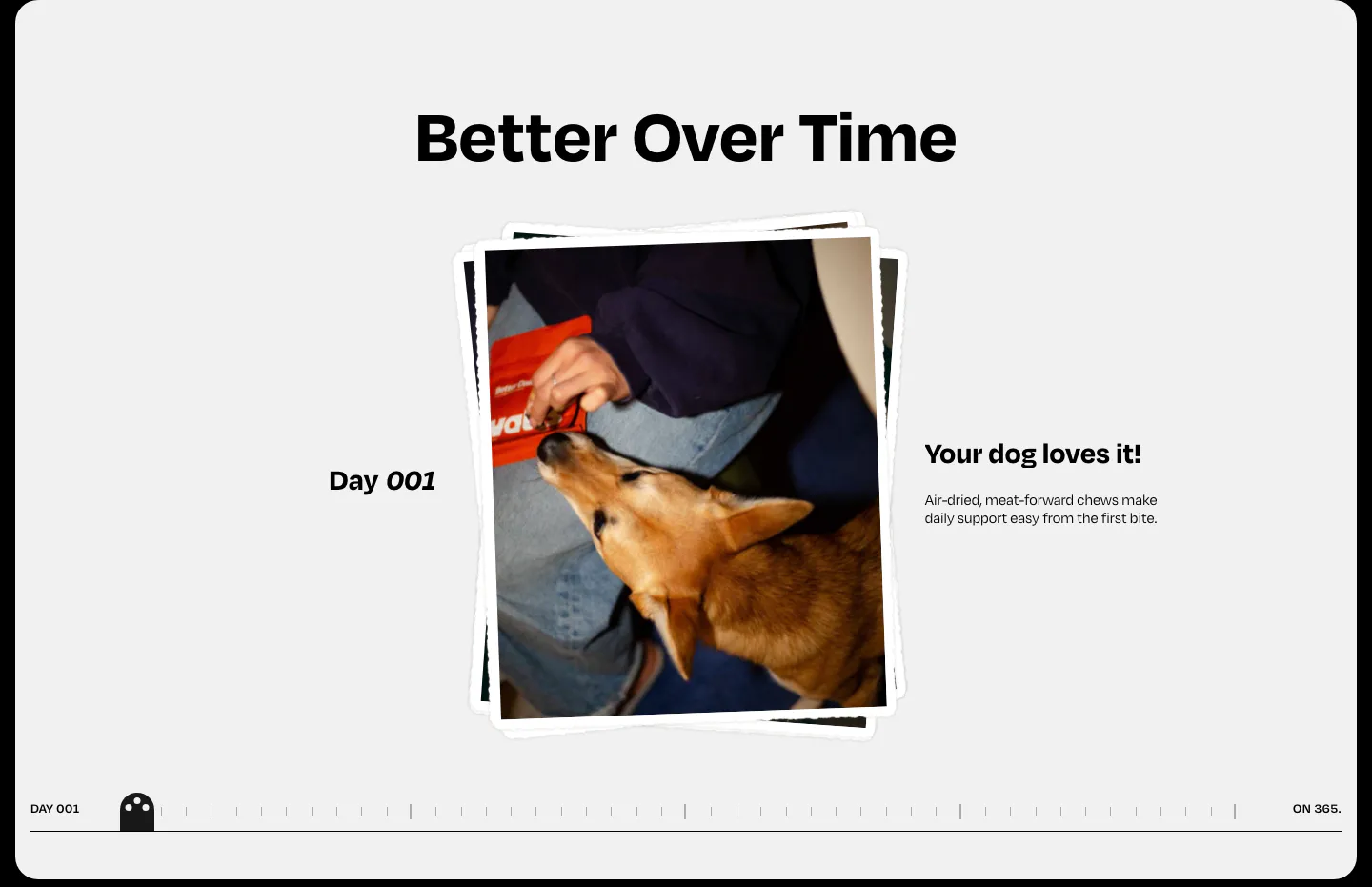
  6. Watts how it works section: centered heading over a stacked dog photo, day label and caption with a day-by-day timeline scrubber

    Better Over Time

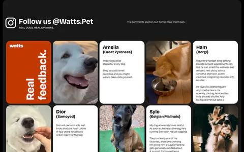
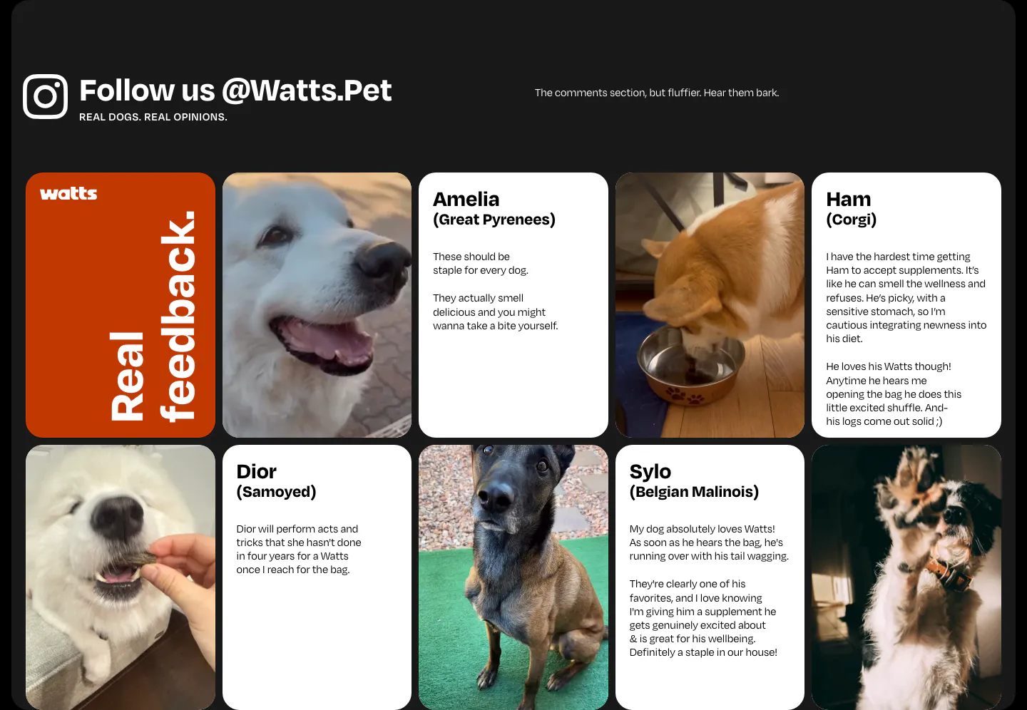
  7. Watts testimonials section: grid of dog photos and customer review cards under an Instagram handle heading on a dark frame

    Follow us @Watts.Pet

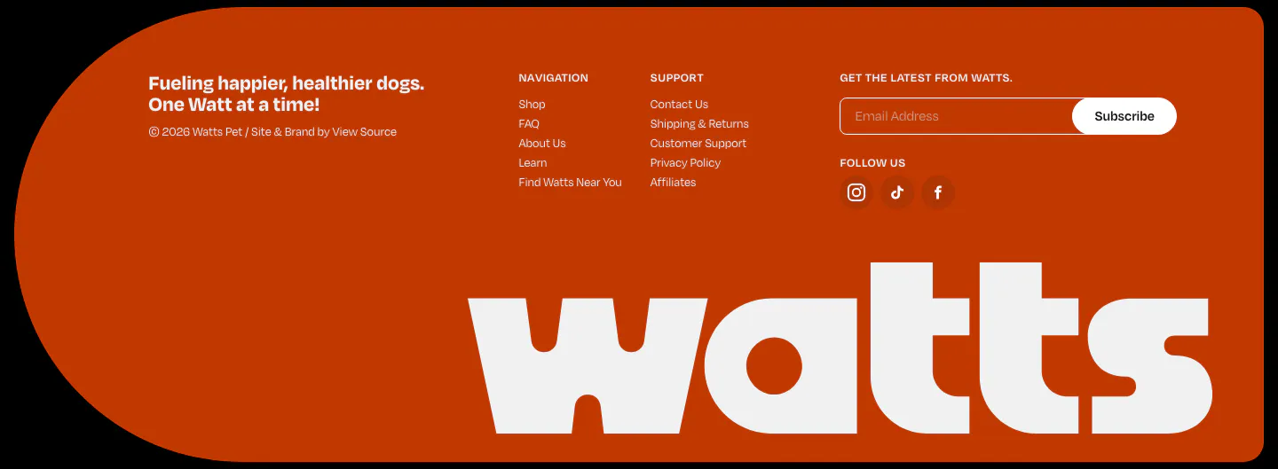
  8. Watts footer section: burnt-orange rounded panel with link columns, email subscribe field, social icons and a giant white watts wordmark
    08 Footer

    Fueling happier, healthier dogs. One Watt at a time!
Similar companies

All companies
    ↑↓ Navigate ↵ Open

    Section preview

    Website section