E-commerce Website Design Examples

Selling online means making products feel real through a screen. That applies to consumer brands and to the tools merchants use to run their stores. Brands need photography, clear pricing, and easy returns. Merchant tools need to prove they lift conversion or order value and work with the platform already in place. Strong e-commerce website design treats the shopping experience itself as the main proof.
74 sections

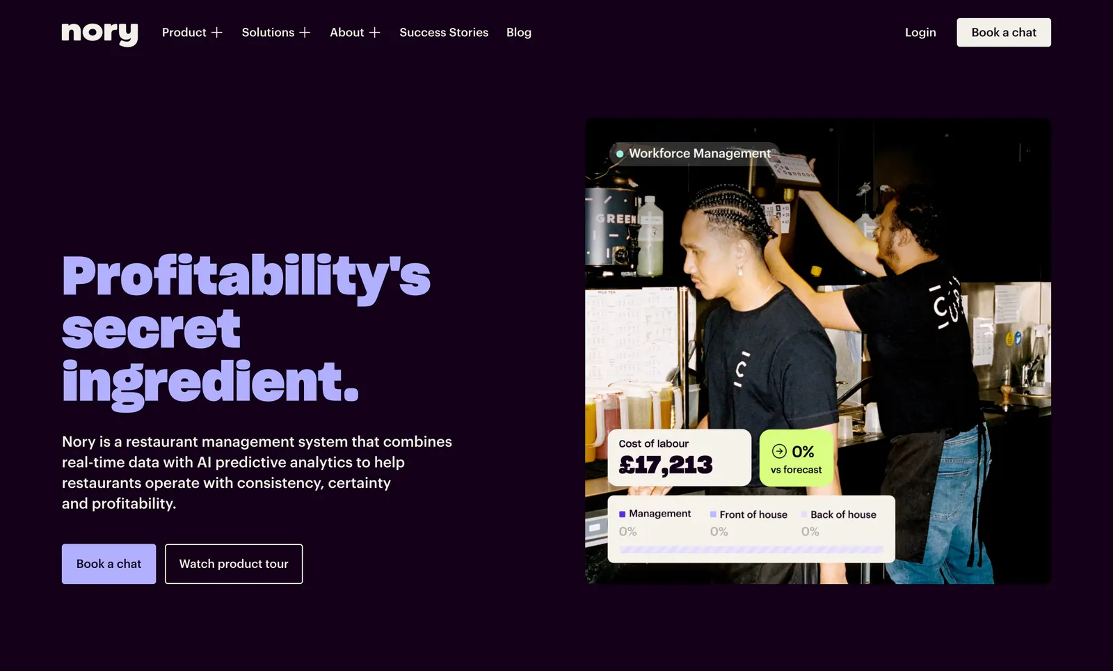
  1. Nory hero section: lavender headline, copy and two buttons left of a kitchen staff photo with labour-cost UI cards on dark purple
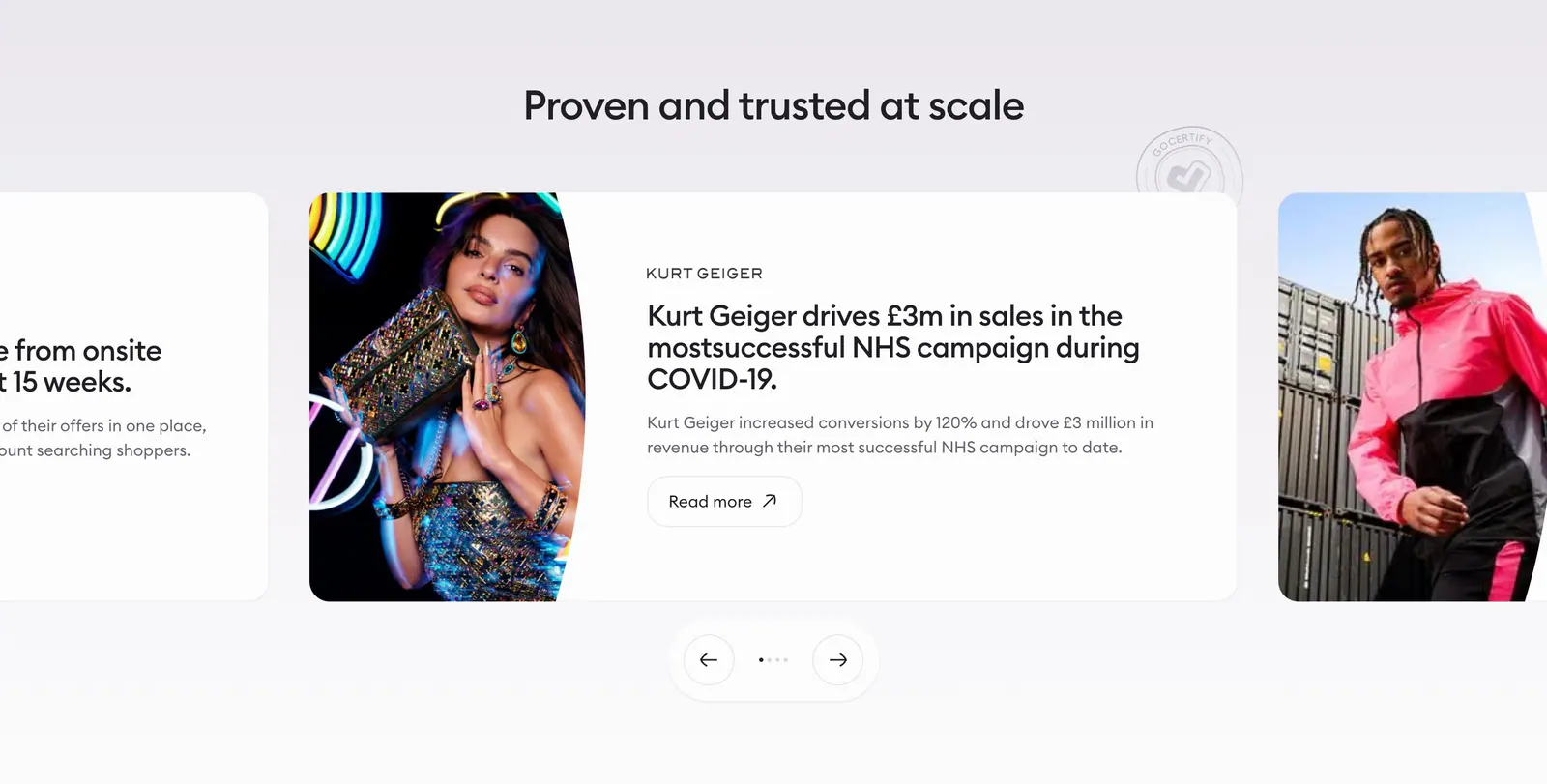
  2. Gocertify testimonials section: centered heading above a case-study carousel with fashion photography, cut-off side cards and arrows
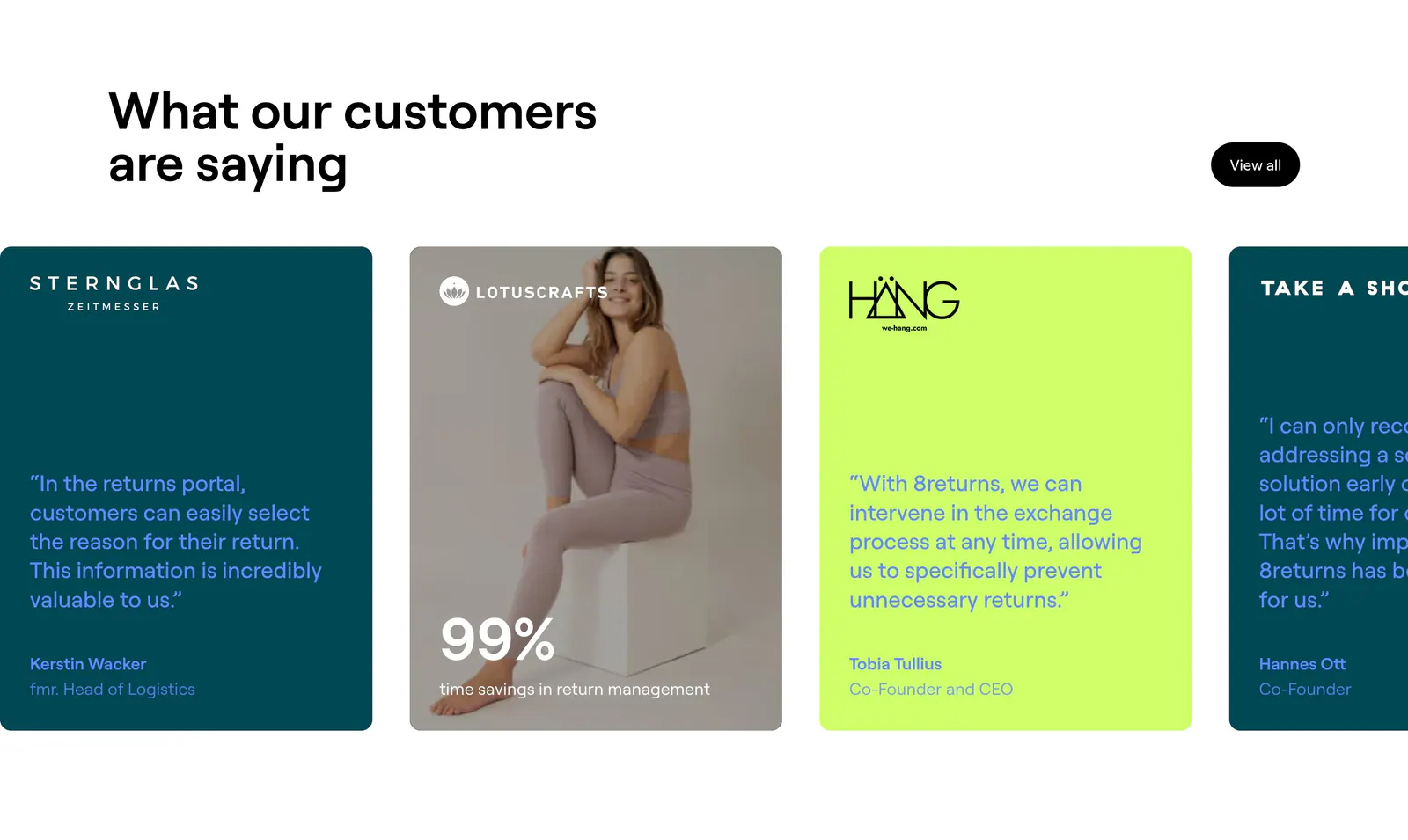
  3. 8returns testimonials section: headline above a horizontal carousel of teal, lime and photo quote cards cut off at the right edge
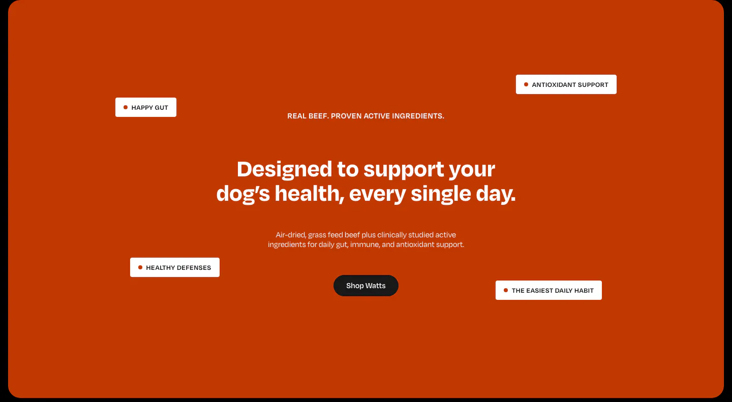
  4. Watts value proposition section: centered headline and shop button on a burnt-orange panel with floating benefit tags
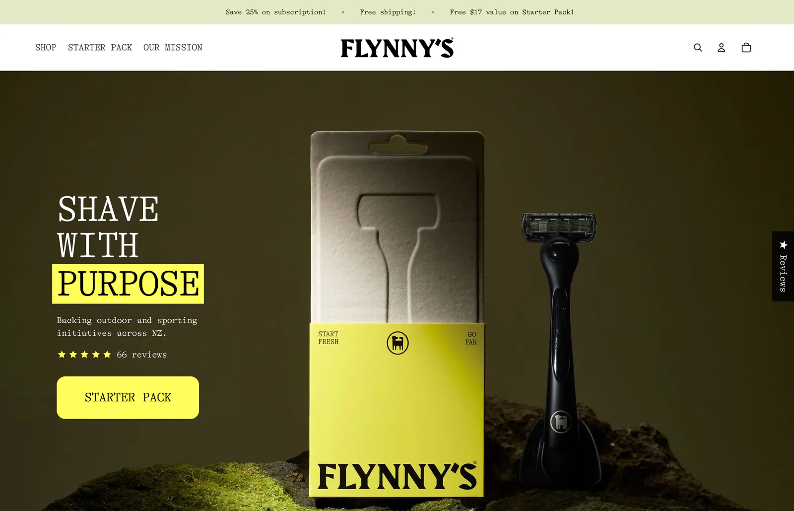
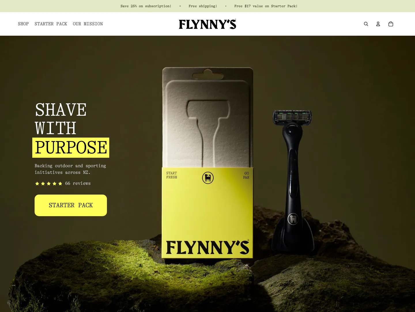
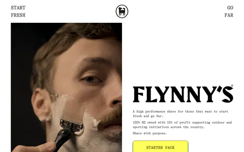
  5. Flynny's hero section: serif headline with a yellow-highlighted word, star rating and yellow CTA over a dark photo of a razor and its box on moss
  6. VisionAI footer section: logo, social icons and three link columns above a large faint wordmark on white
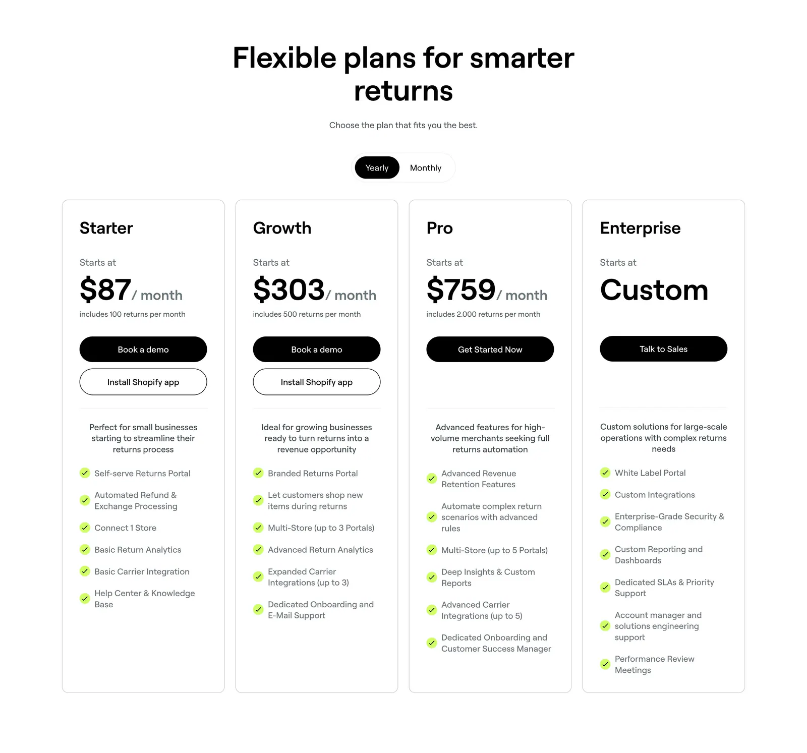
  7. 8returns pricing section: centered headline with yearly/monthly toggle above four white plan cards with prices and checklists
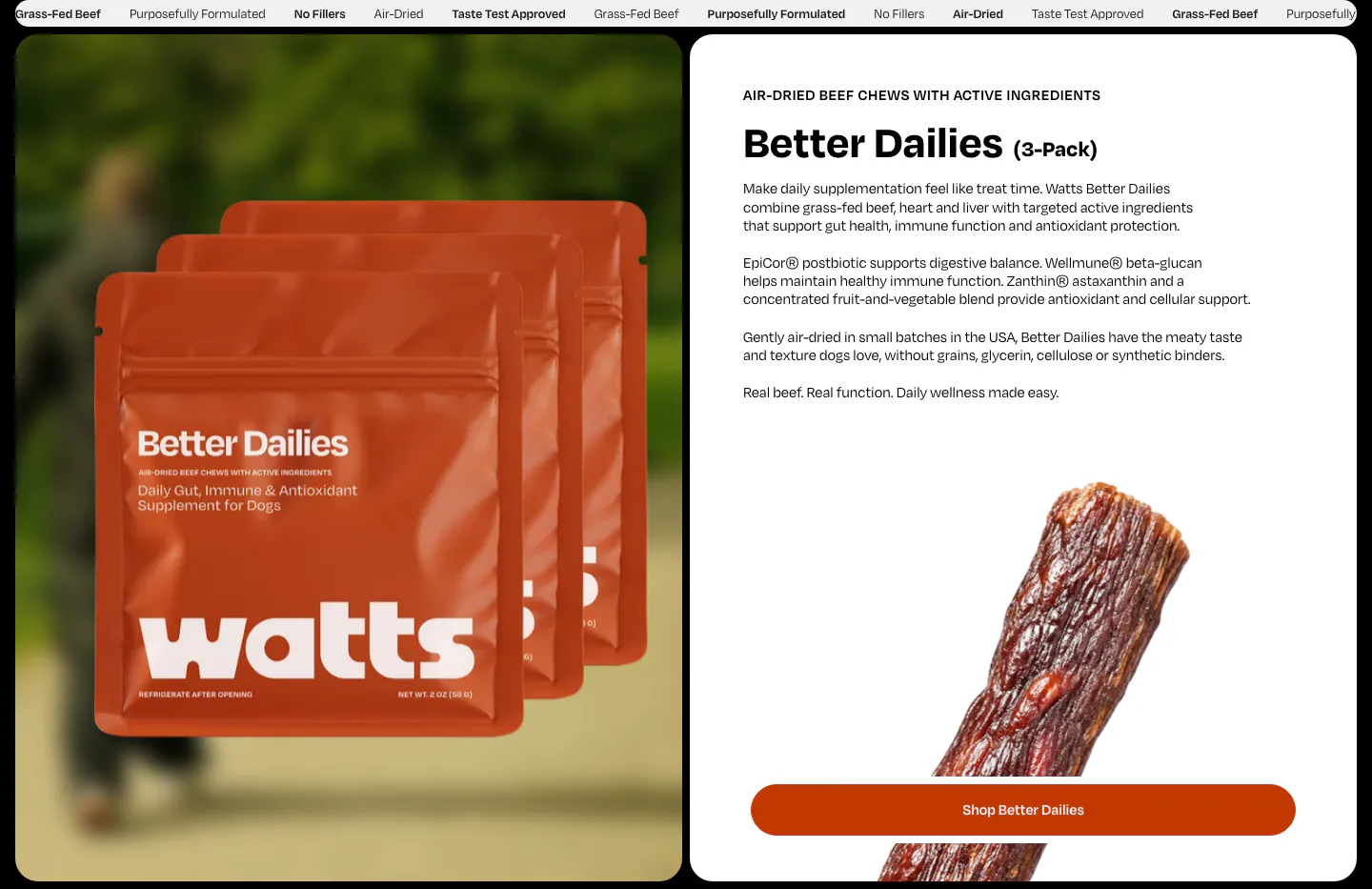
  8. Watts features section: product bag photo on the left, Better Dailies details, jerky photo and shop button on a white card on the right
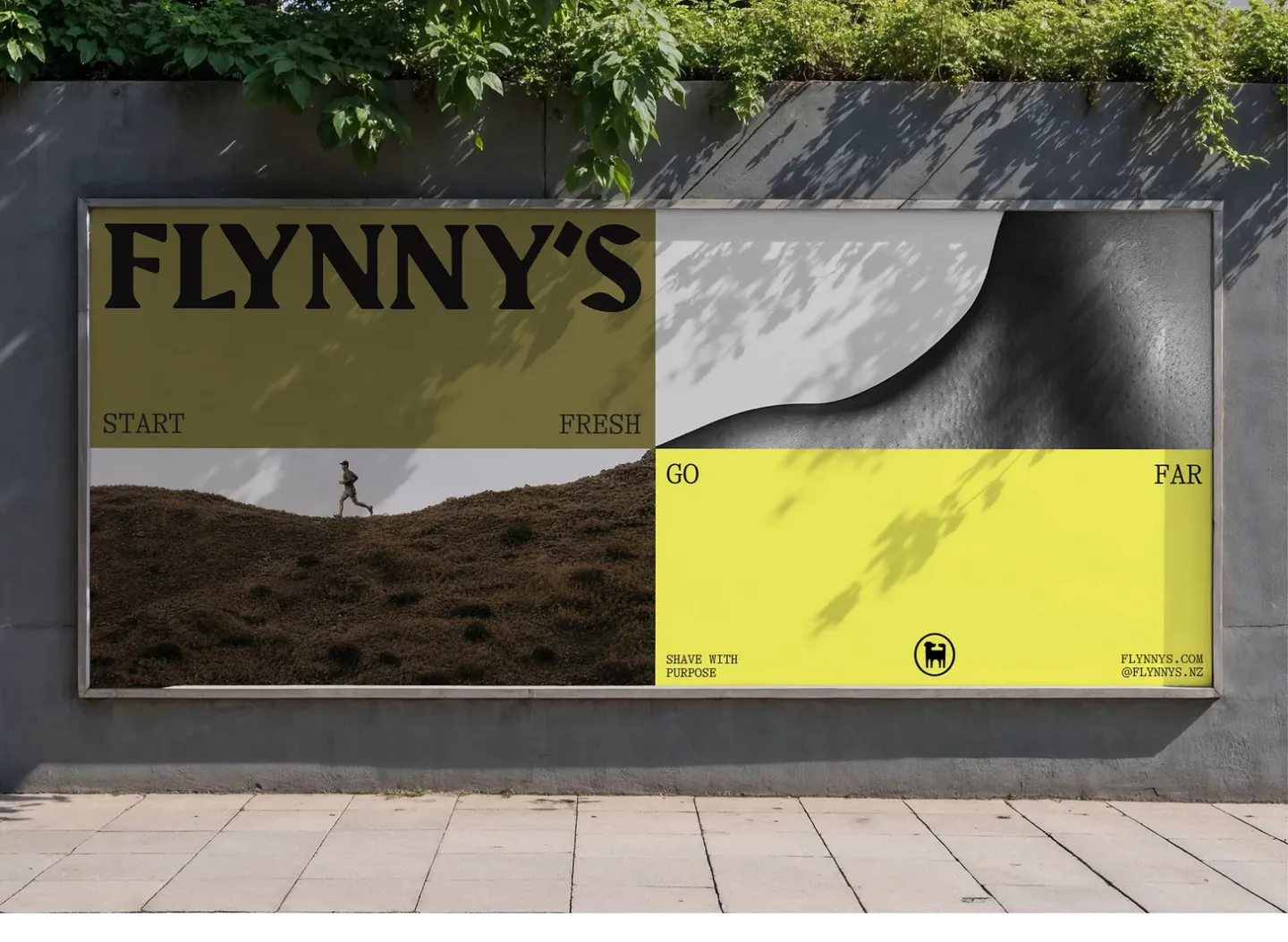
  9. Flynny's other section: photo of a street billboard showing the olive and yellow Flynny's campaign with a runner and wordmark
    Flynny's Other
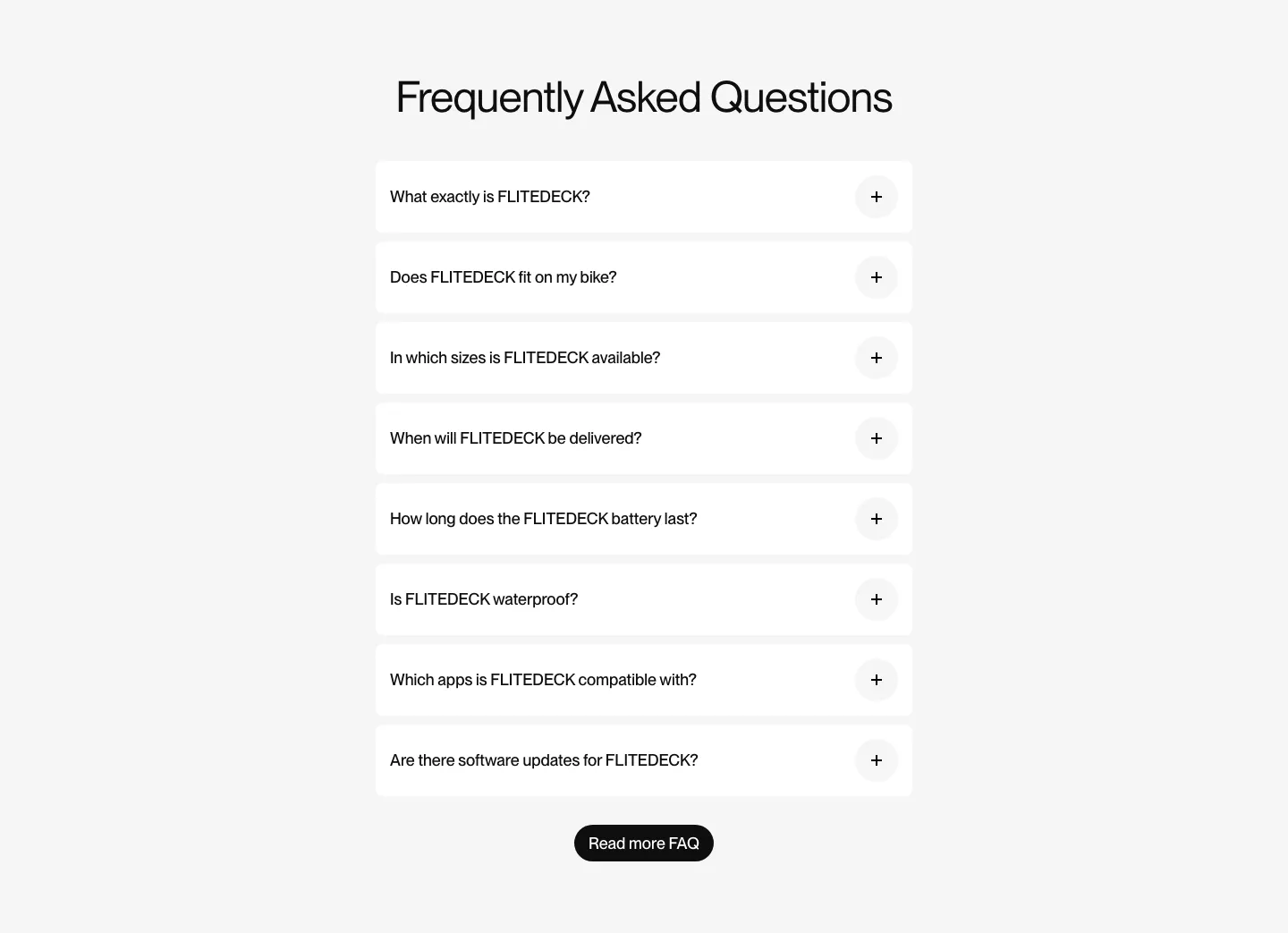
  10. FLITEDECK FAQ section: centered heading above a single column of white accordion questions and a black button on light gray
  11. Nory logo cloud section: centered headline above a row of restaurant brand logos in white cards on a cream background
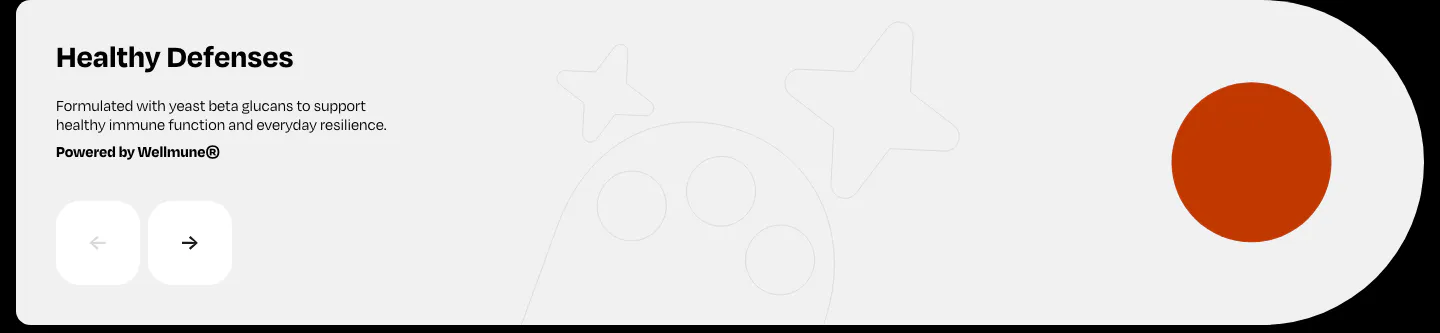
  12. Watts features section: Healthy Defenses slide with short copy, prev/next arrow buttons and an orange circle on a light gray card
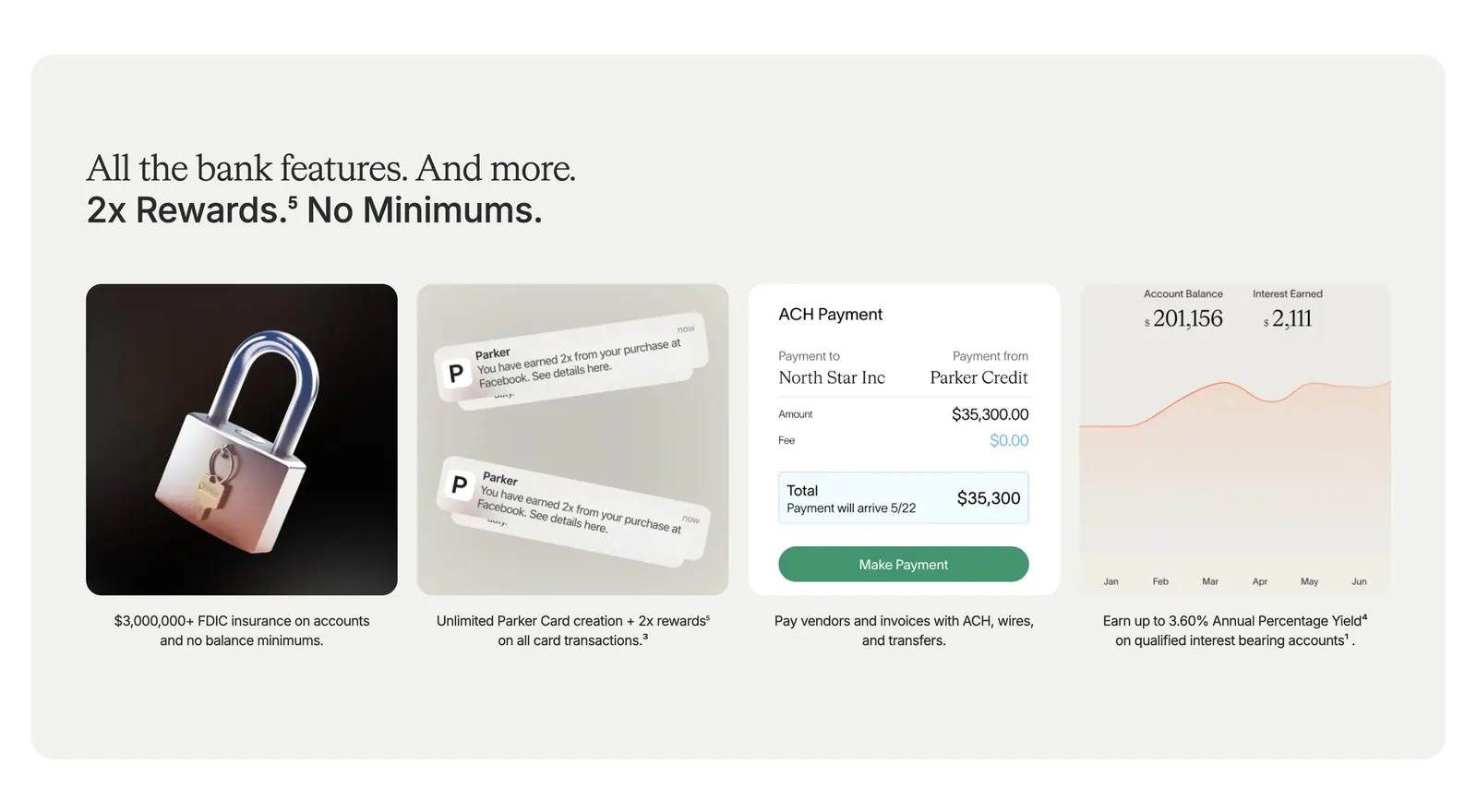
  13. Parker value proposition section: beige panel with headline above four cards showing a 3D padlock, notifications, payment UI and a yield chart
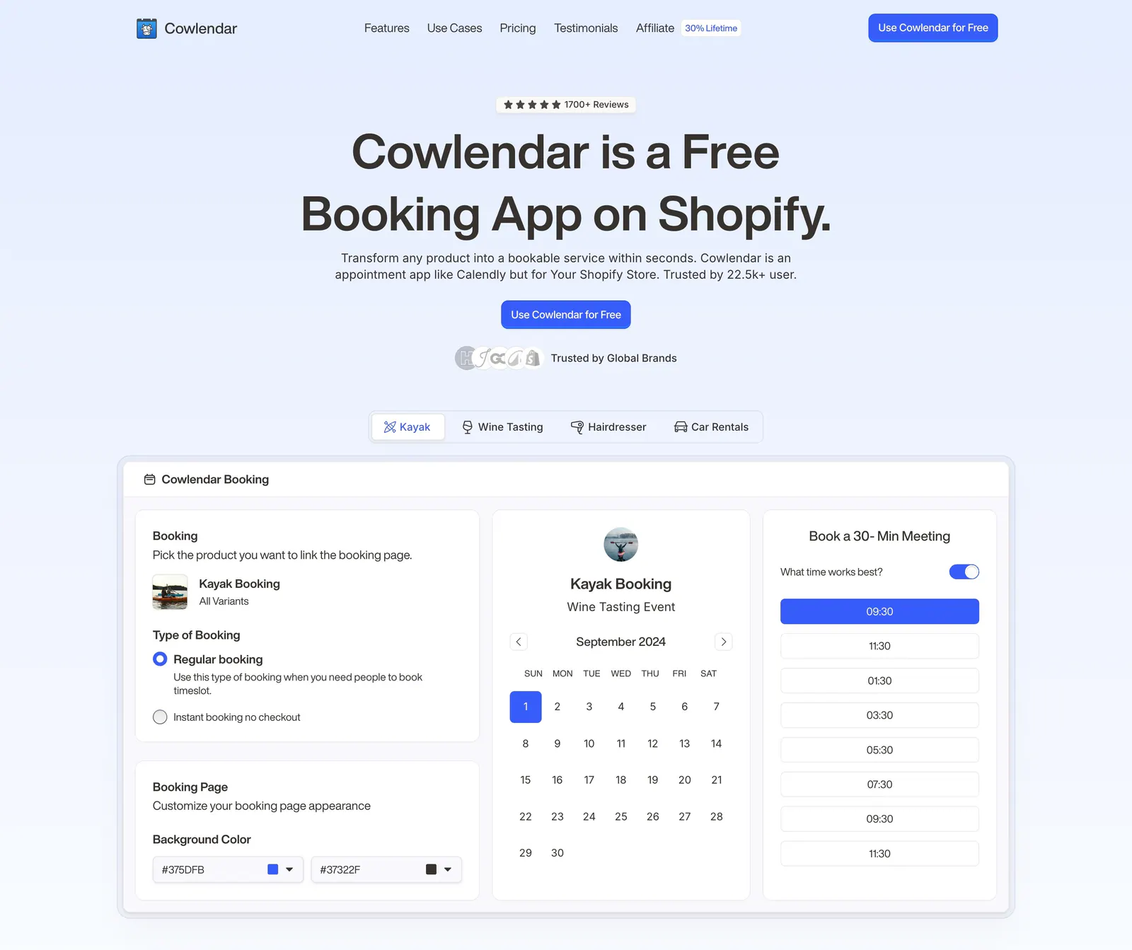
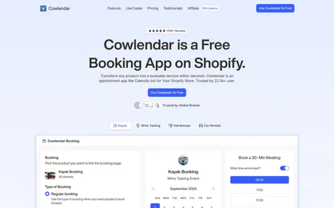
  14. Cowlendar hero section: centered headline and CTA above use-case tabs and a booking calendar product screenshot
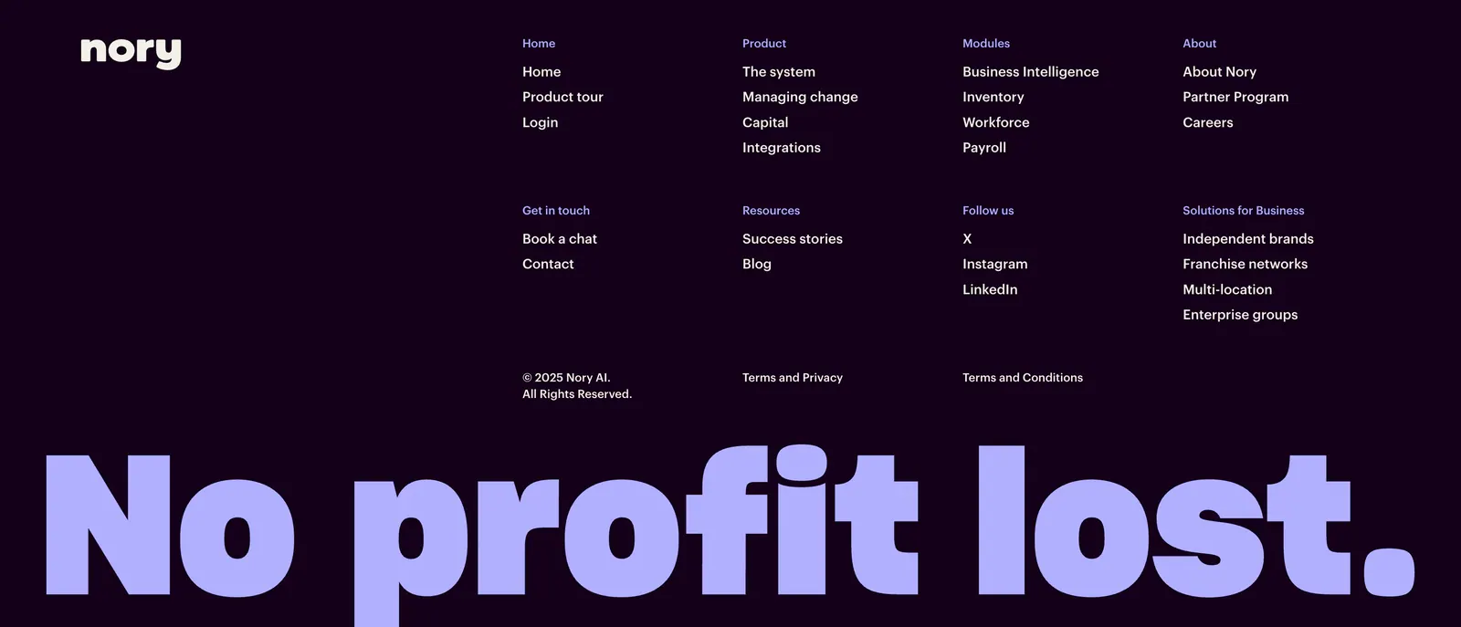
  15. Nory footer section: dark purple footer with wordmark, link columns and copyright above a giant lavender No profit lost. slogan
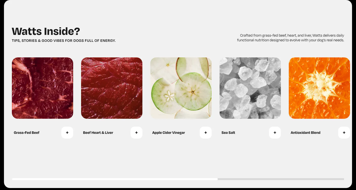
  16. Watts features section: horizontal row of ingredient photo cards with plus buttons and a scroll progress bar on light gray
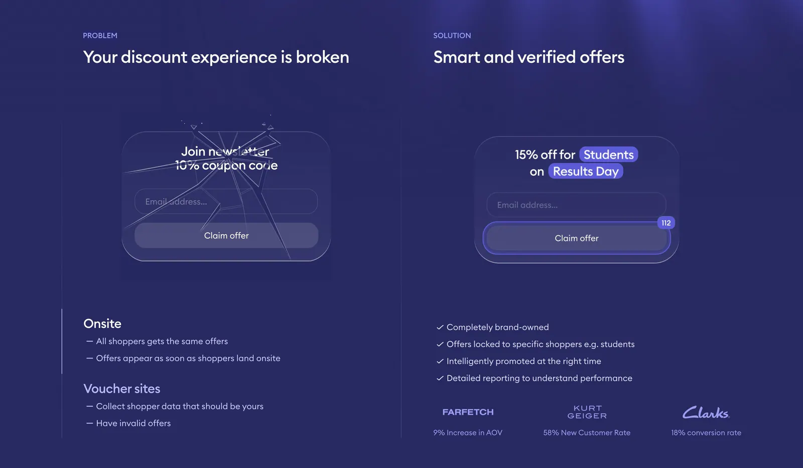
  17. Gocertify comparison section: problem vs solution columns with a cracked and a verified offer widget mockup and checklists on deep indigo
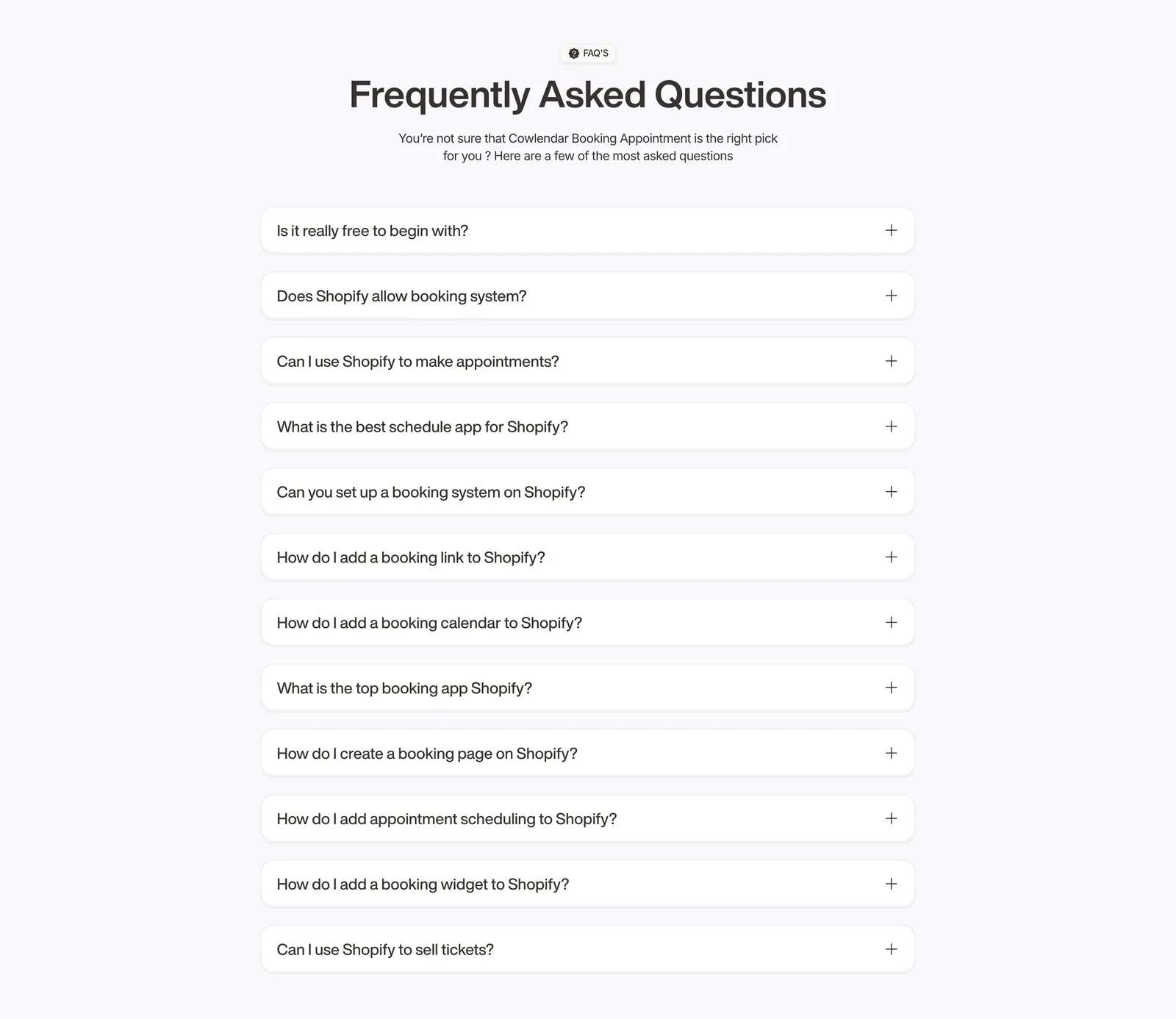
  18. Cowlendar FAQ section: centered heading above a single column of twelve collapsed question accordions on light gray
  19. Fourmula footer section: wordmark, small link columns and legal text above a gray dot-matrix field forming a halftone shape
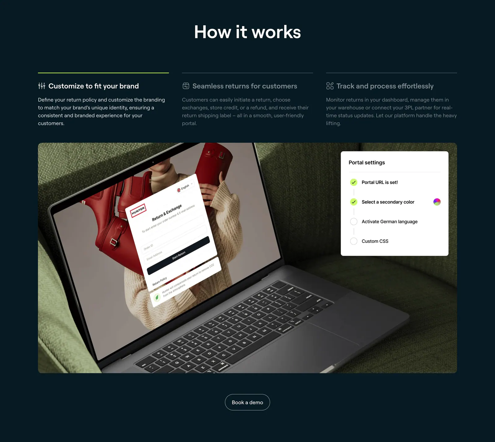
  20. 8returns how it works section: three step tabs on dark navy above a photo of a laptop showing a returns portal with a settings card
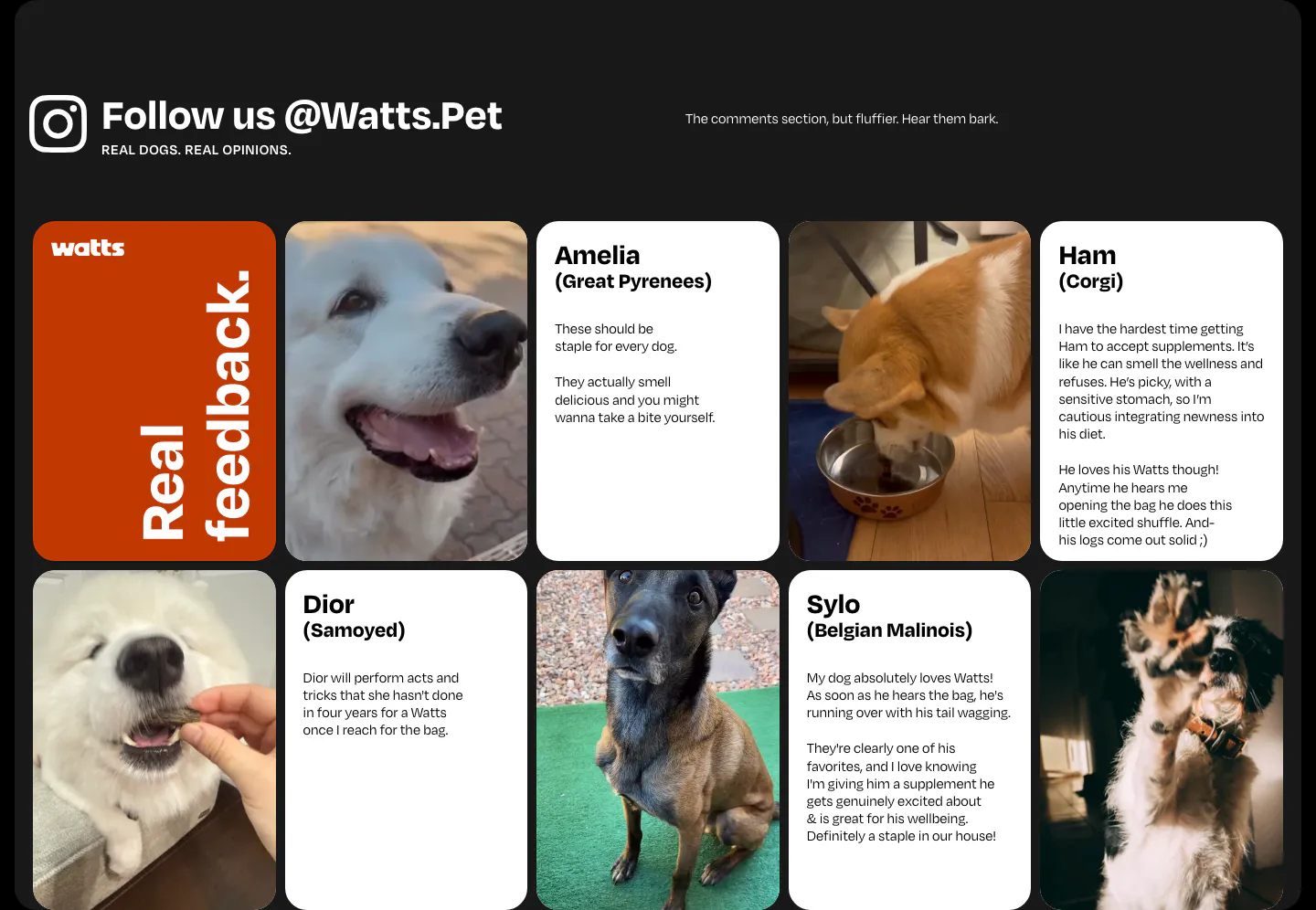
  21. Watts testimonials section: grid of dog photos and customer review cards under an Instagram handle heading on a dark frame
  22. Cowlendar call-to-action section: centered headline and blue button with calendar icon in a pale blue rounded panel
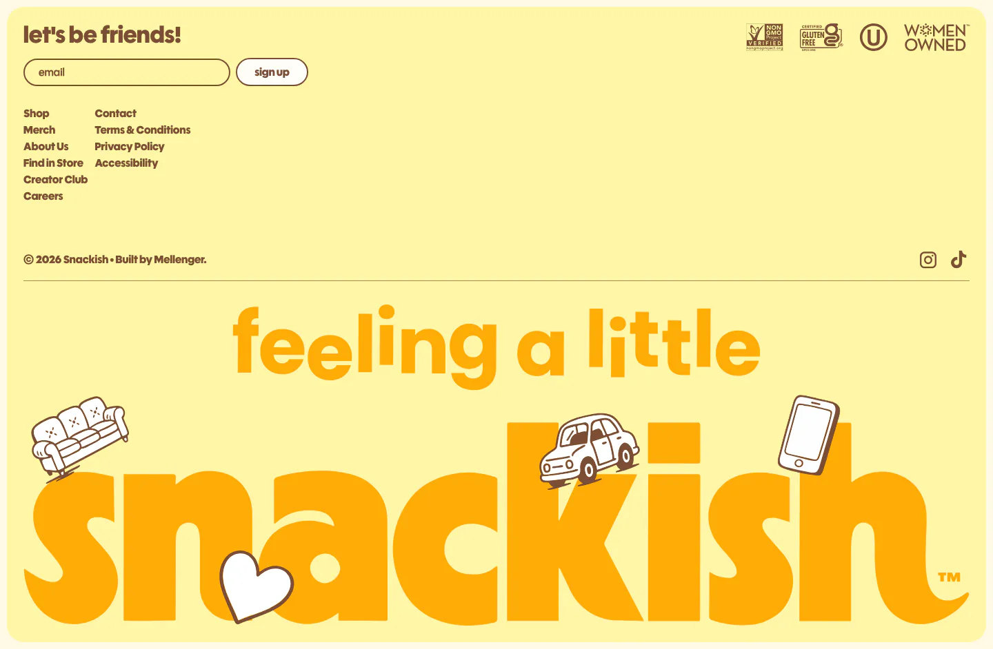
  23. Snackish footer section: pale yellow footer with email signup, link columns, certification badges and a giant illustrated snackish wordmark
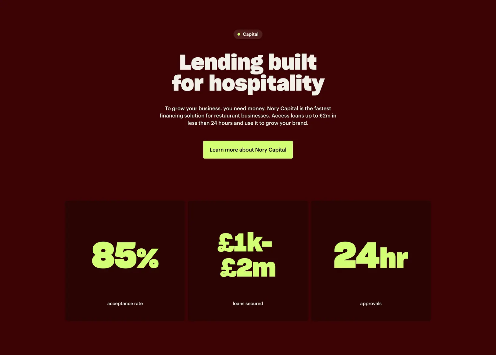
  24. Nory value proposition section: centered Capital headline and lime button above three dark cards with large lime stats on deep maroon
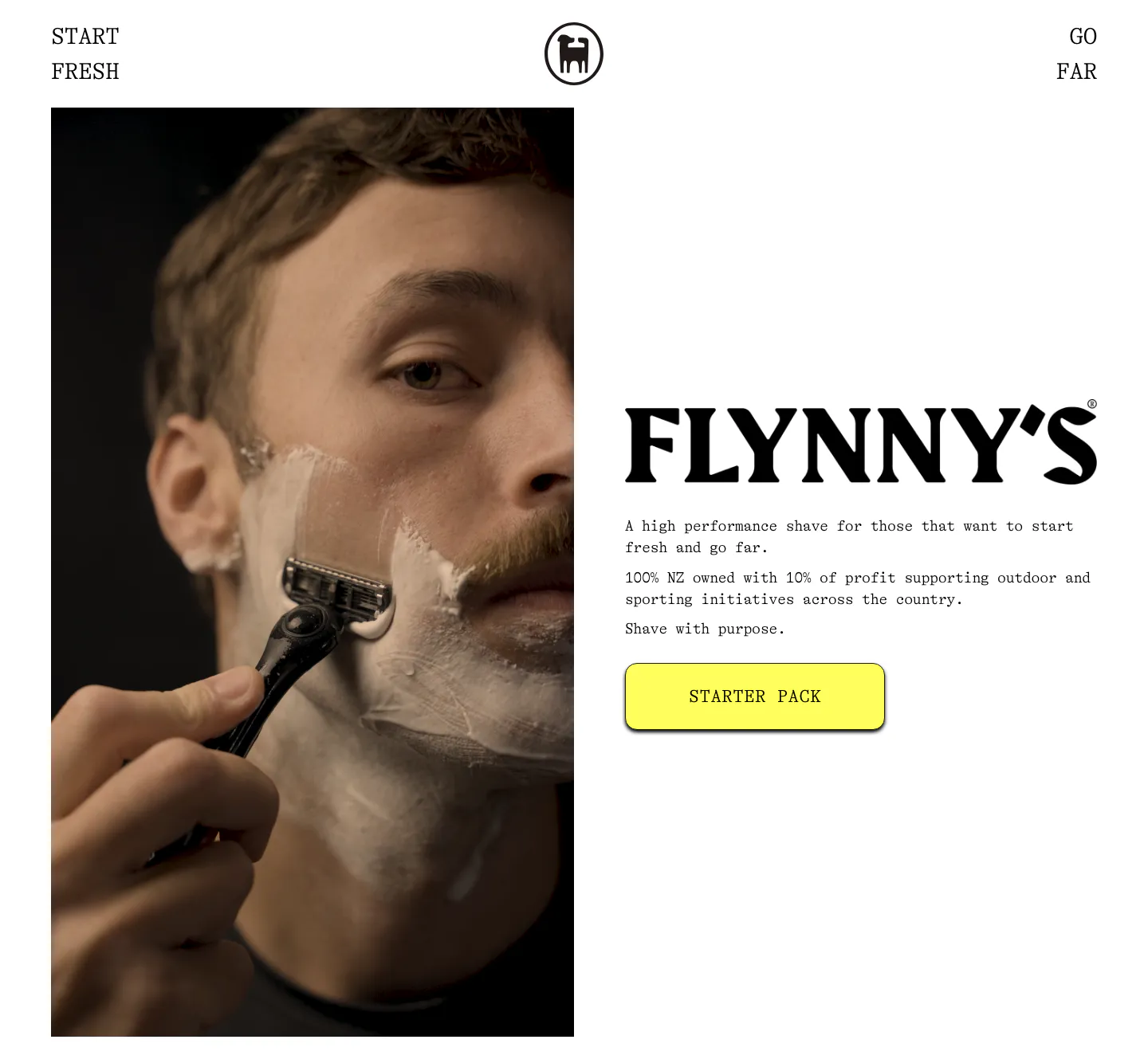
  25. Flynny's about & mission section: tall photo of a man shaving left, large serif wordmark, short brand copy and yellow Starter Pack button right
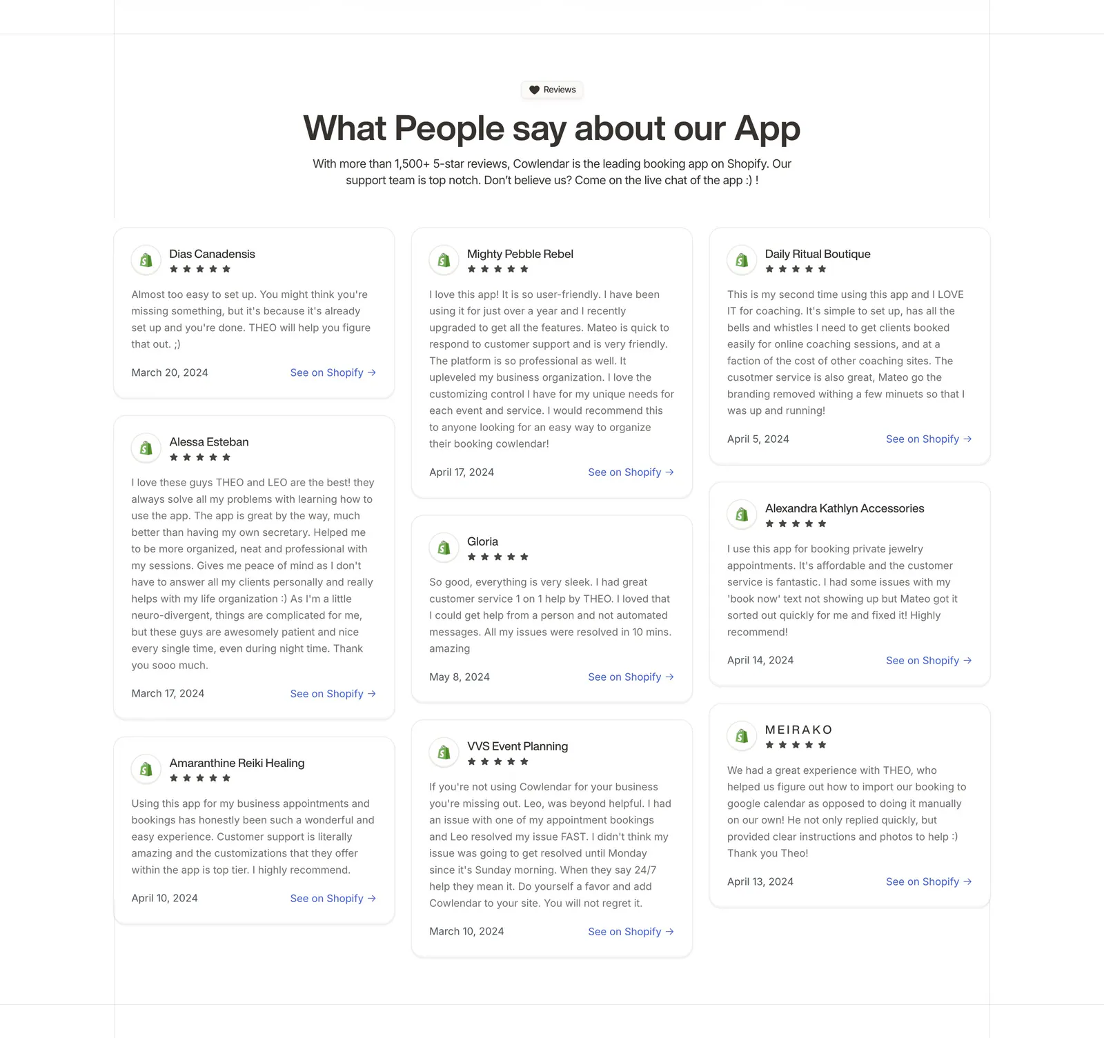
  26. Cowlendar testimonials section: centered heading above a three-column masonry grid of Shopify review cards with stars
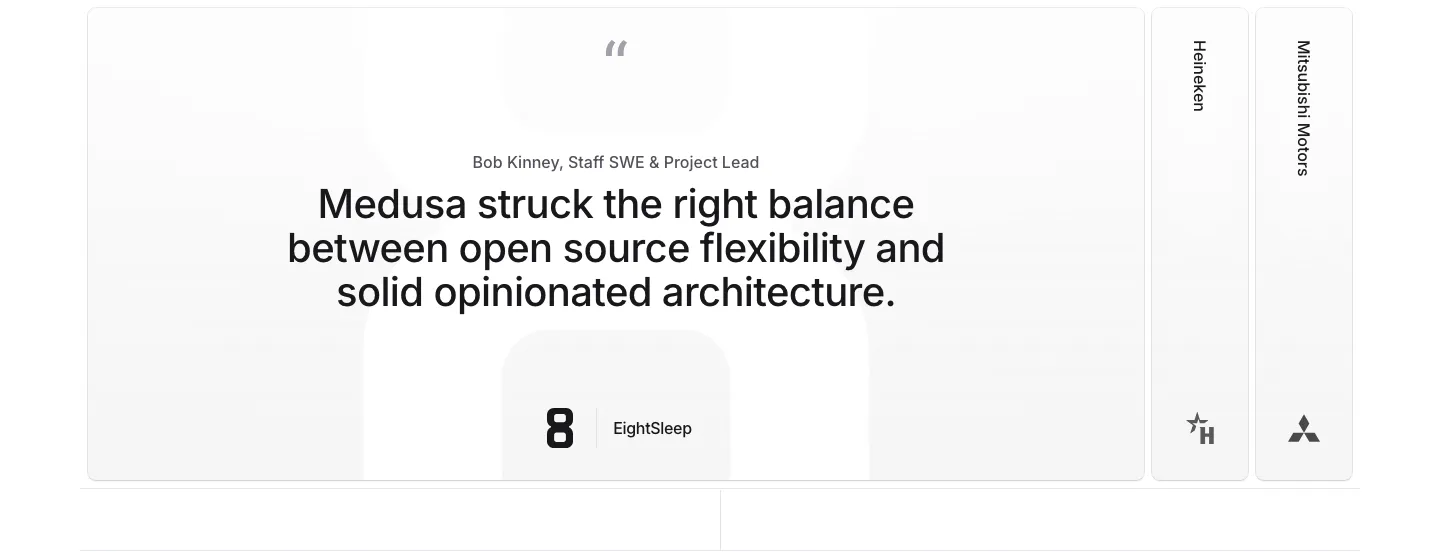
  27. Medusa testimonials section: large centered quote card with EightSleep logo beside collapsed Heineken and Mitsubishi Motors tabs
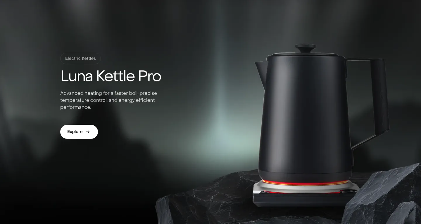
  28. Saki features section: headline, copy and Explore button on the left beside a black kettle on a rock over a dark misty photo background
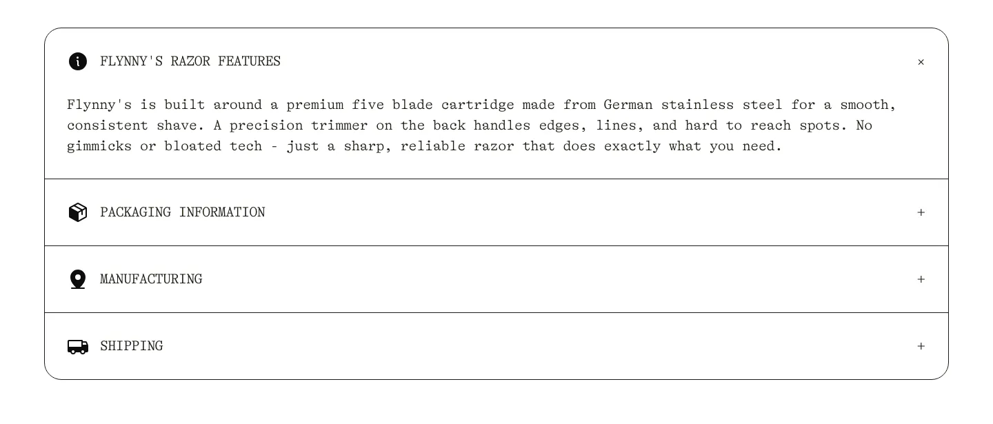
  29. Flynny's FAQ section: rounded bordered accordion in typewriter type with razor features open and packaging, manufacturing, shipping closed
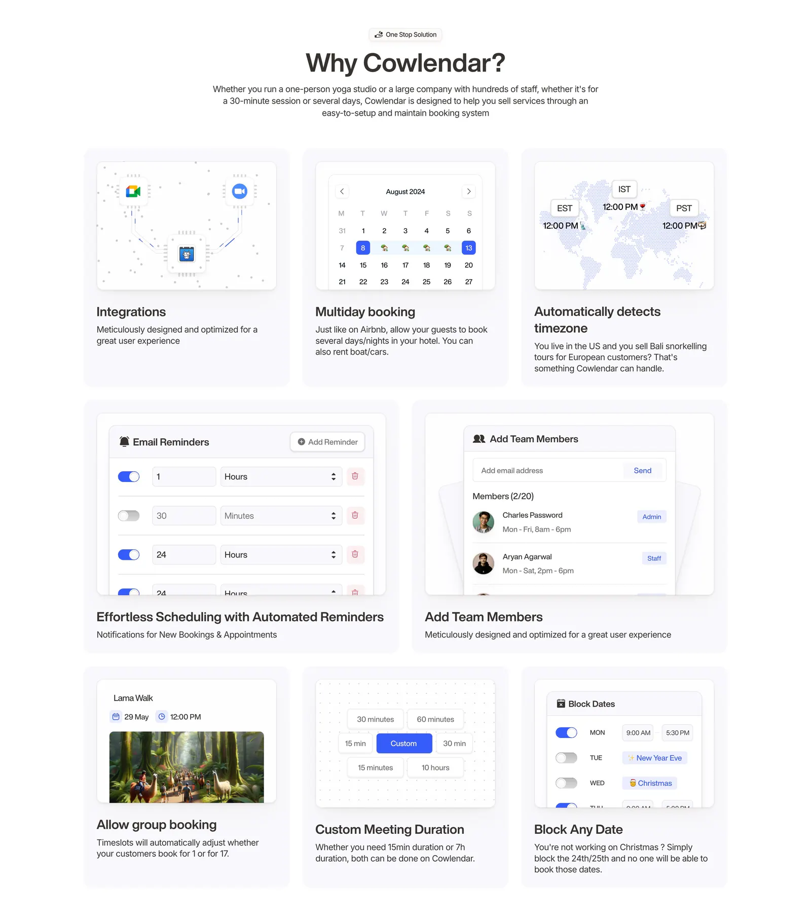
  30. Cowlendar features section: centered heading above a bento grid of eight booking feature cards with UI snippets
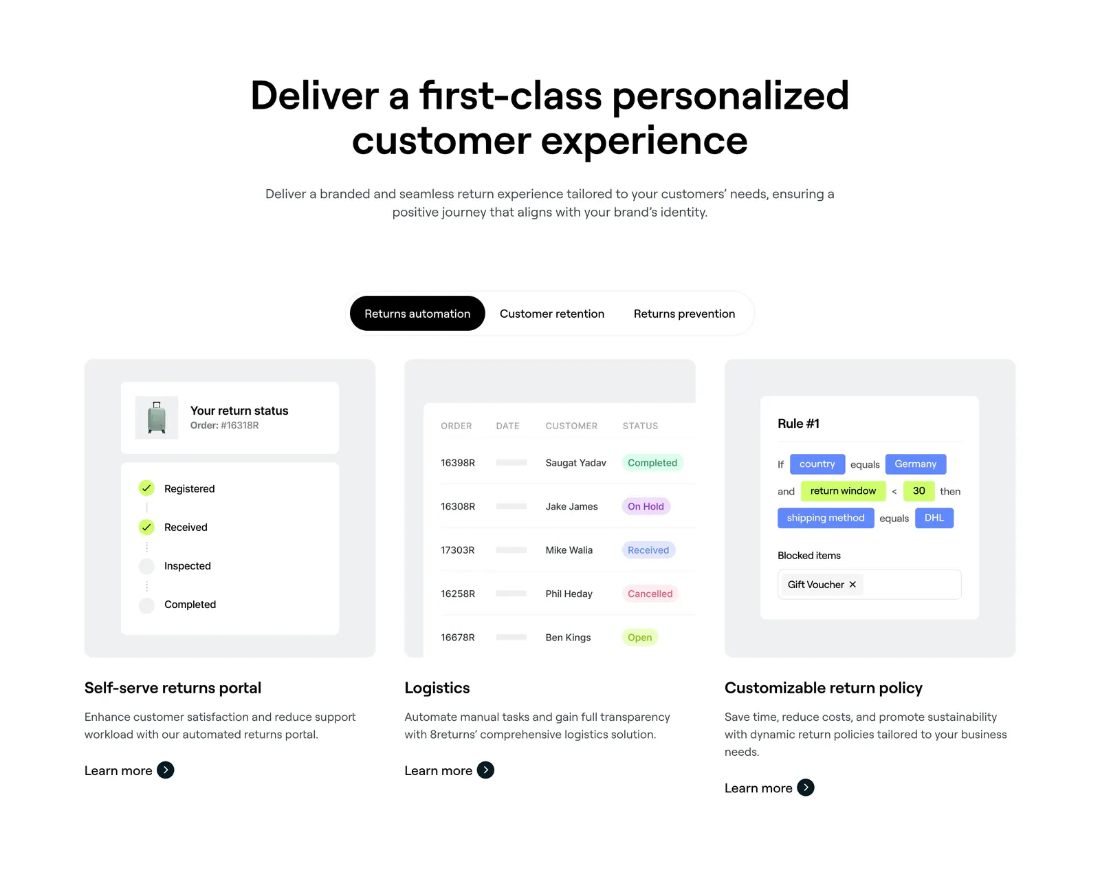
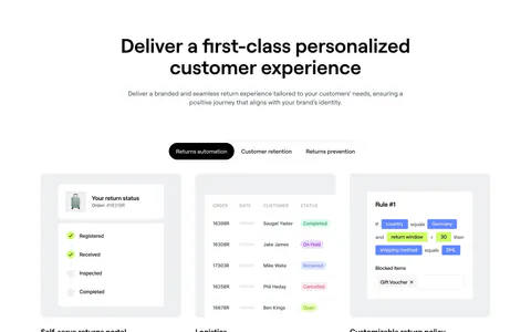
  31. 8returns features section: centered headline, segmented tab control and three cards with returns portal, logistics table and rule UI
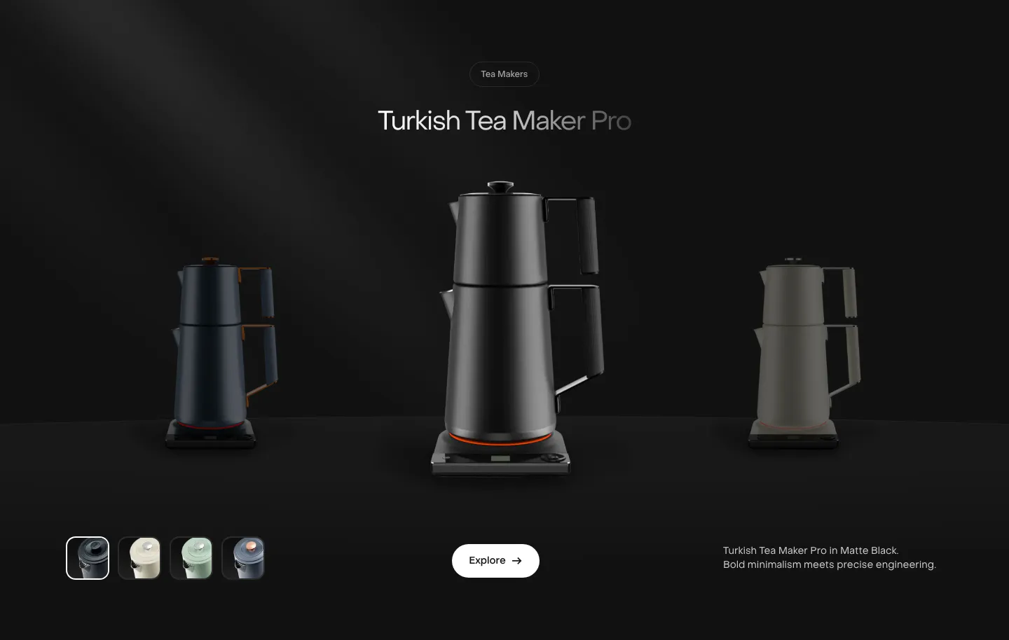
  32. Saki features section: centered product name above a black tea maker flanked by dimmed variants, color swatches and an Explore button on black
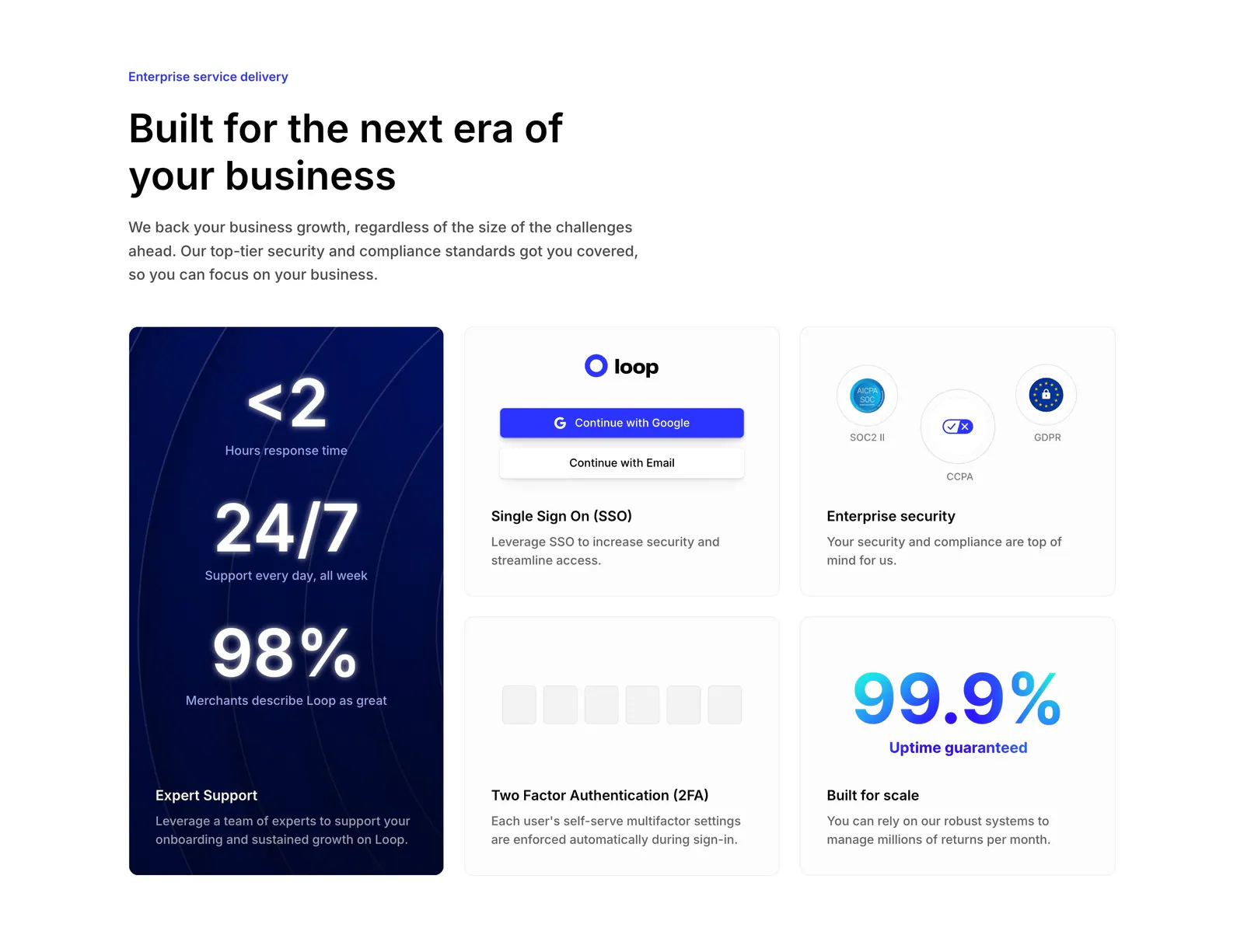
  33. Loop value proposition section: headline above a bento grid with a tall navy stats card and SSO, security, 2FA and uptime tiles
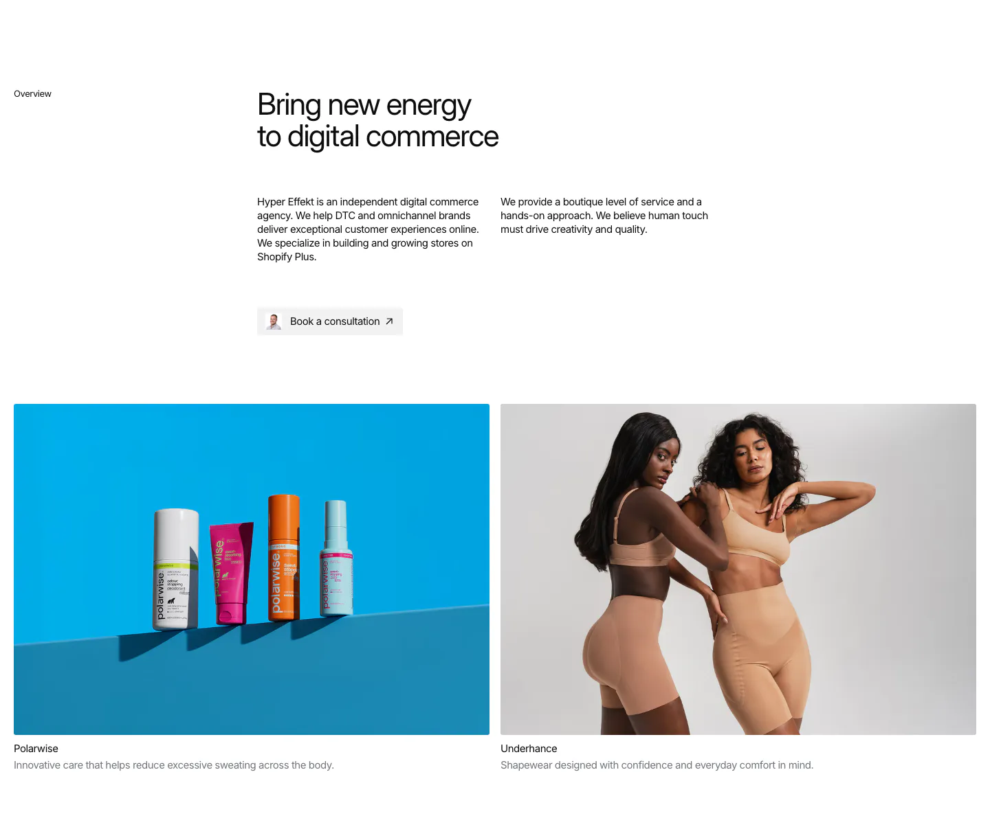
  34. Hyper Effekt about & mission section: agency overview text and consultation button above two client photo cards for Polarwise and Underhance
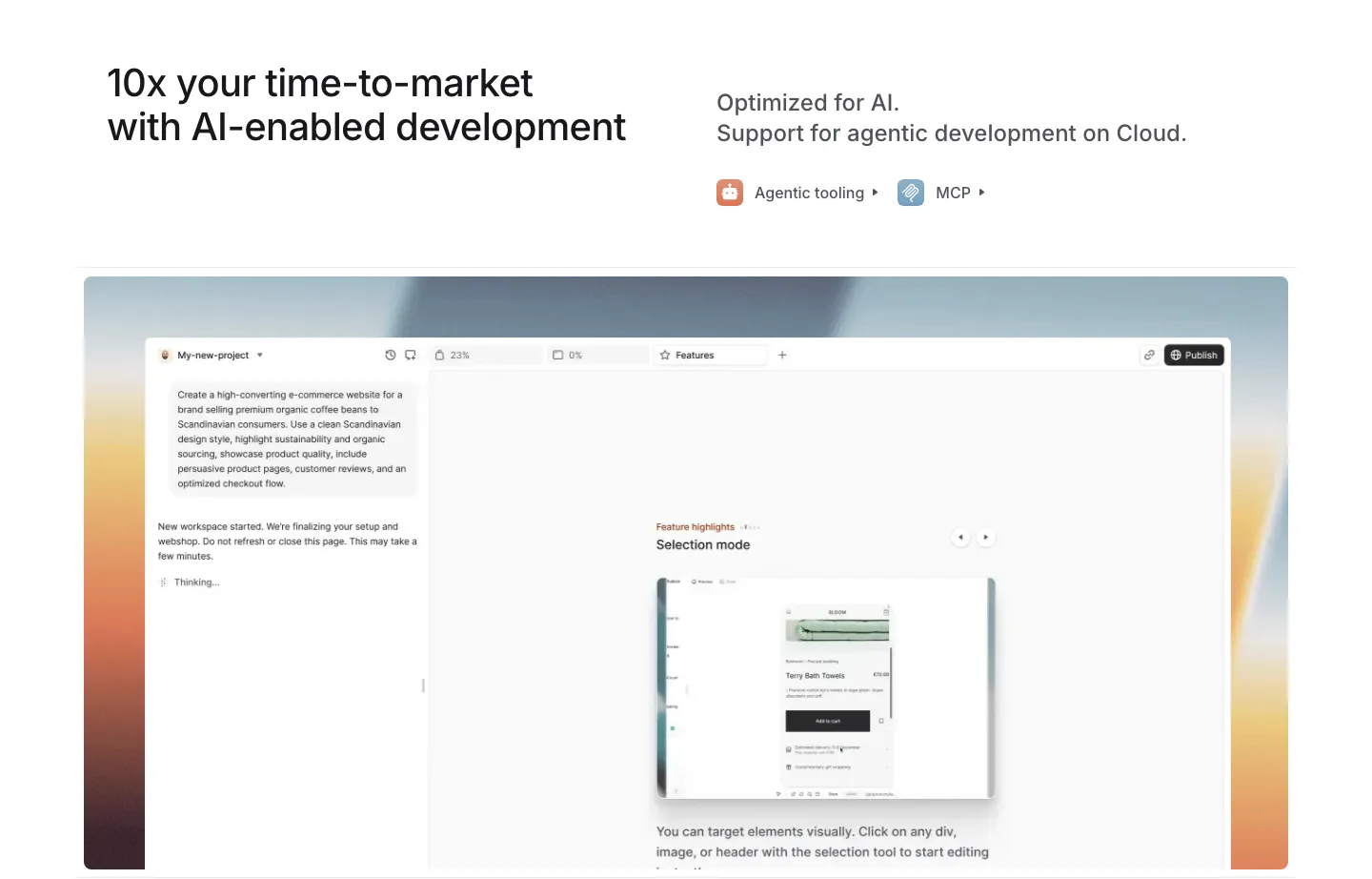
  35. Medusa features section: headline with agentic tooling and MCP links above an AI site builder UI on a warm sunset gradient
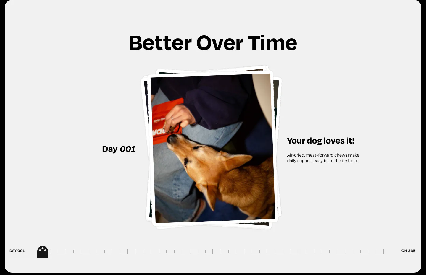
  36. Watts how it works section: centered heading over a stacked dog photo, day label and caption with a day-by-day timeline scrubber
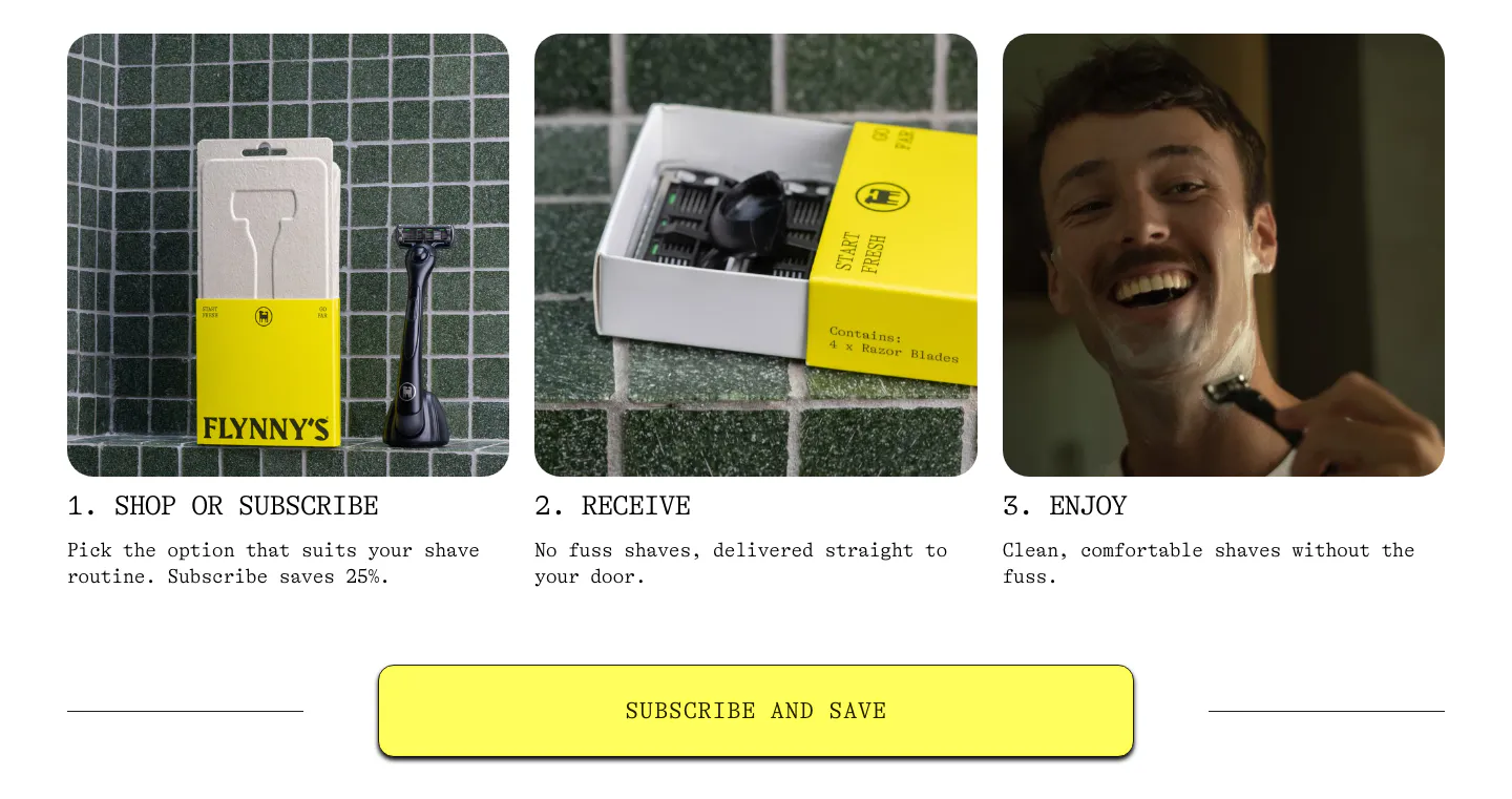
  37. Flynny's how it works section: three numbered step cards with product and lifestyle photos above a wide yellow Subscribe and Save button
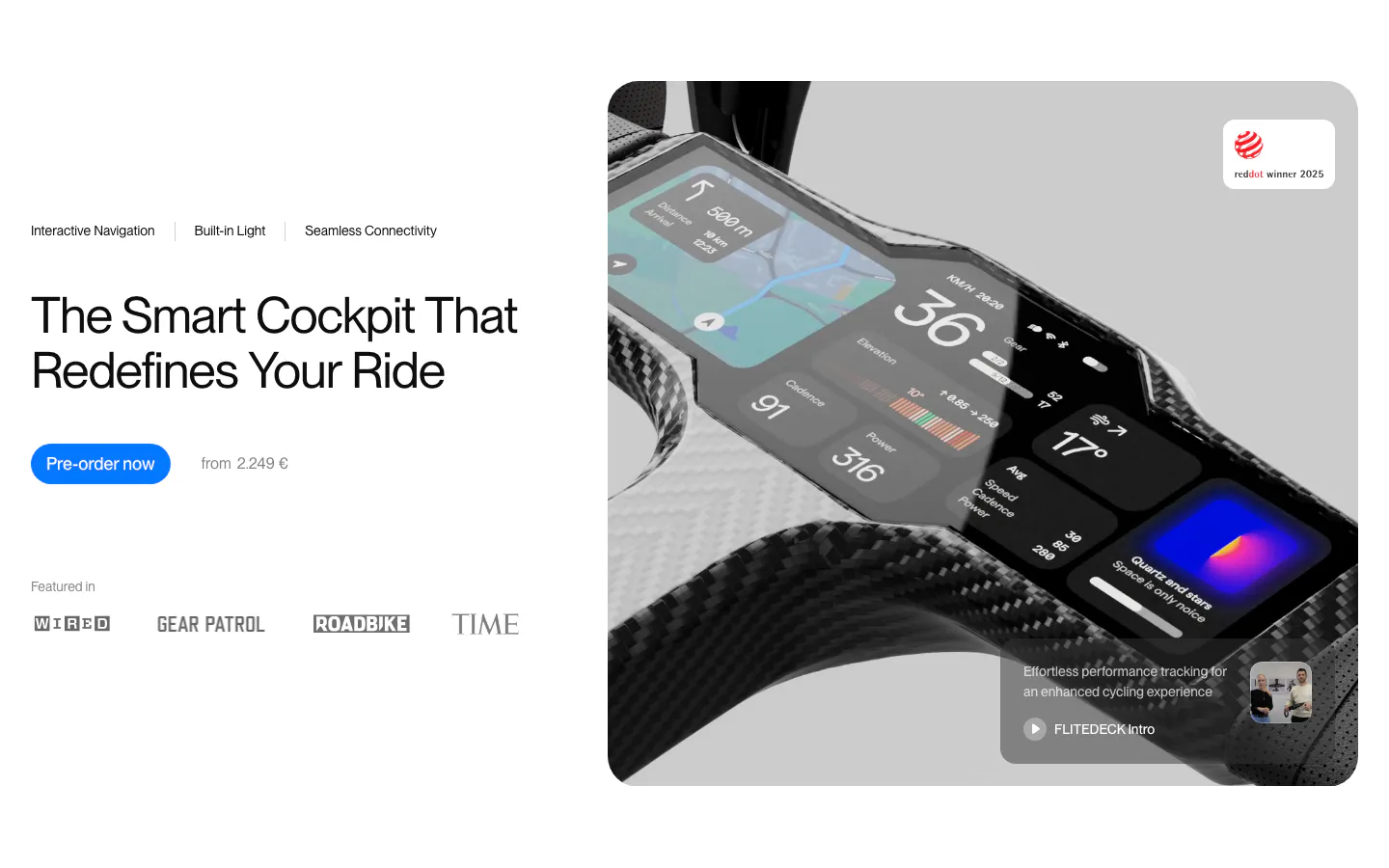
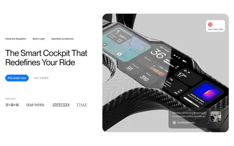
  38. FLITEDECK hero section: headline, pre-order button and press logos on the left, large carbon bike cockpit product photo on the right
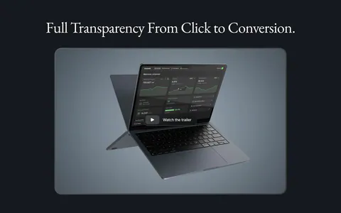
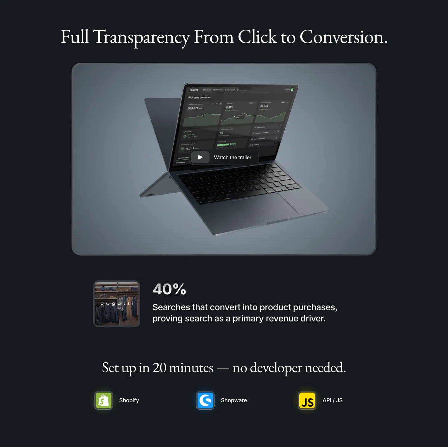
  39. VisionAI features section: serif headline over a laptop dashboard with trailer button, a 40% stat and platform icons on navy
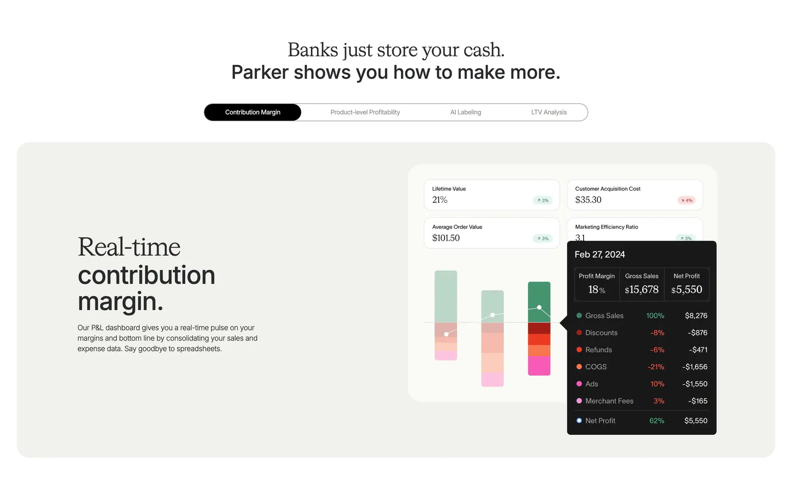
  40. Parker features section: centered headline over a pill tab bar and beige panel with text beside a contribution margin dashboard UI
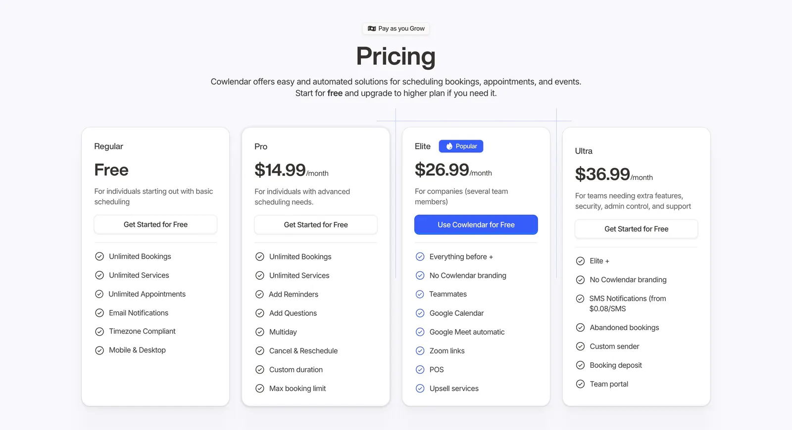
  41. Cowlendar pricing section: centered heading above four plan cards with checklists and a highlighted blue Elite plan
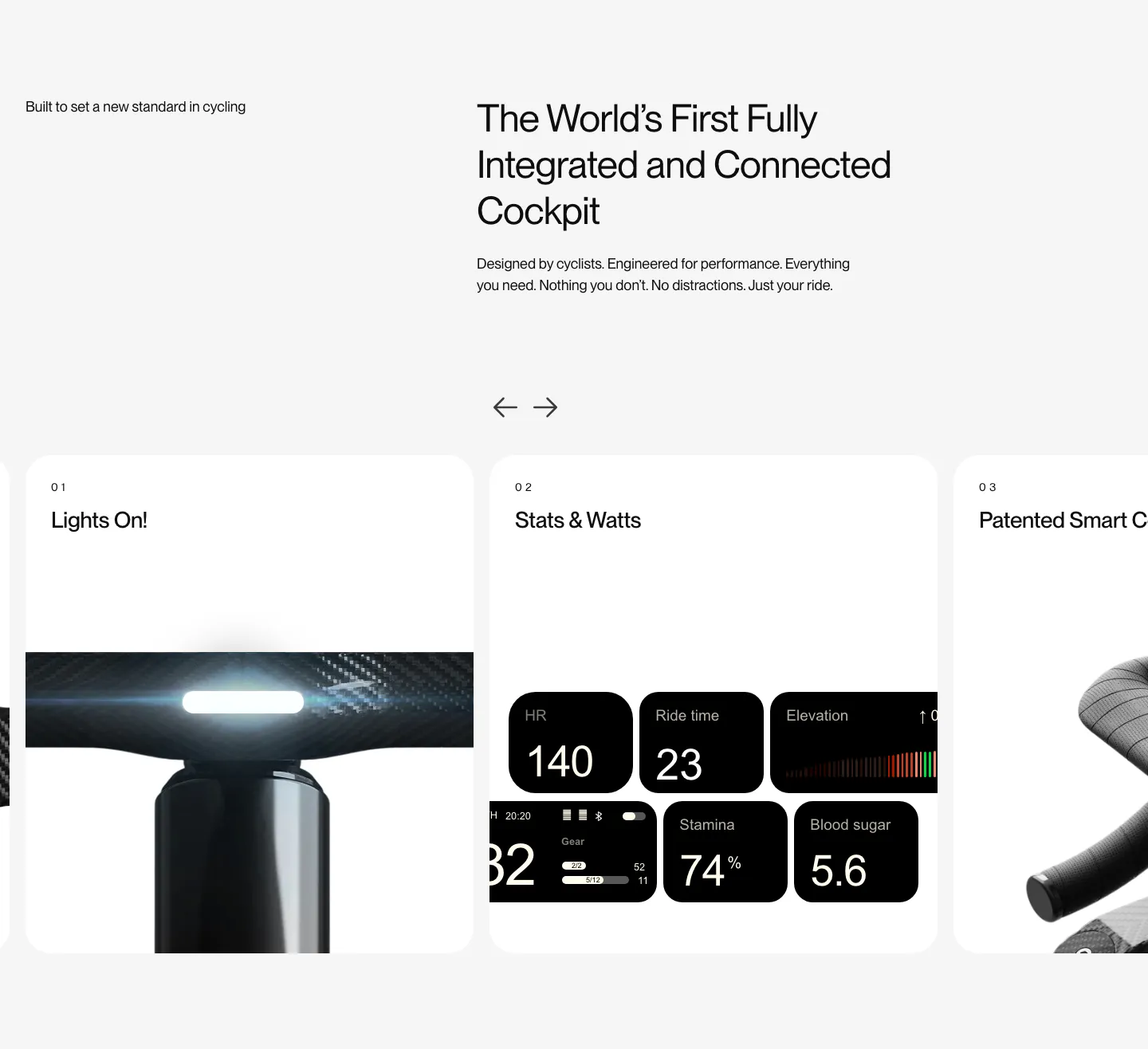
  42. FLITEDECK features section: heading on light gray above a numbered card carousel with arrows showing light, stats and handlebar photos
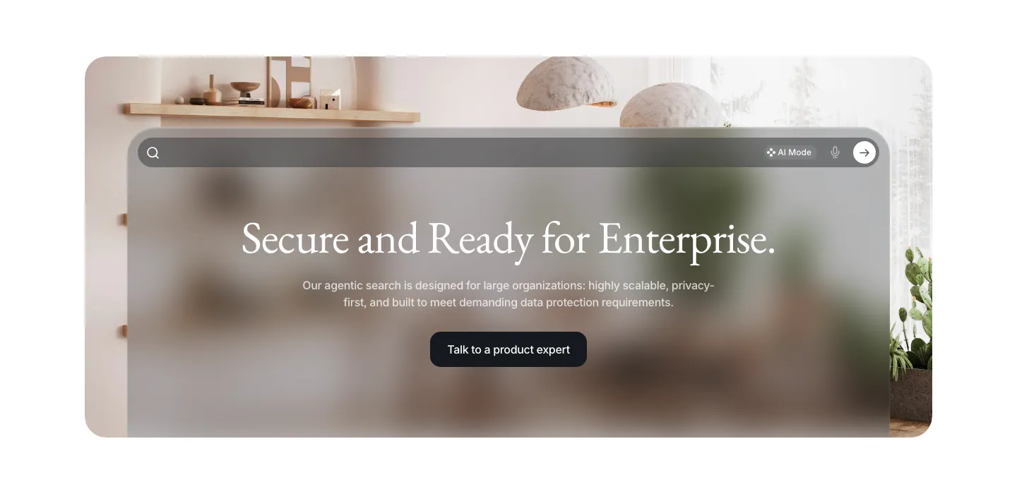
  43. VisionAI call-to-action section: centered serif headline and button on a frosted glass search panel over an interior photo
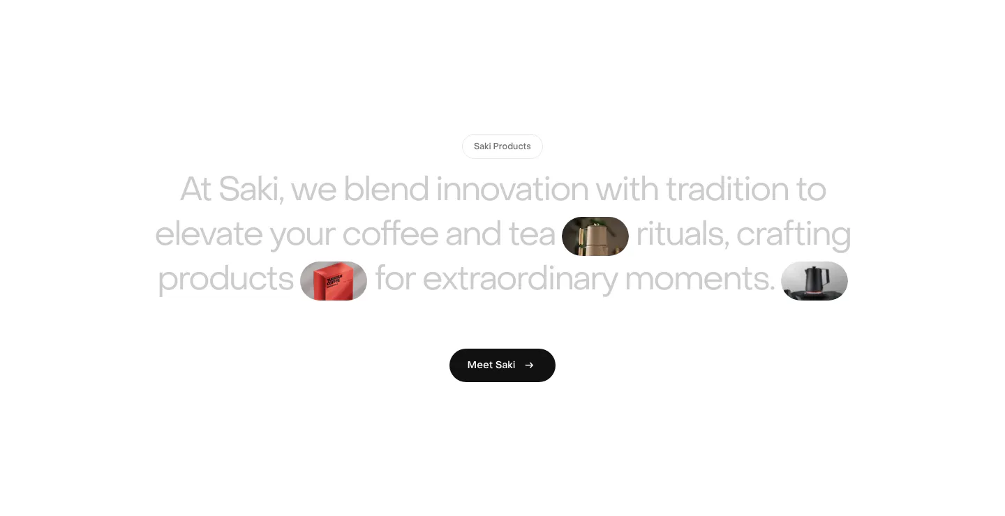
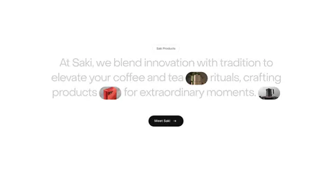
  44. Saki about & mission section: centered gray statement with inline product image pills and a black Meet Saki button on white
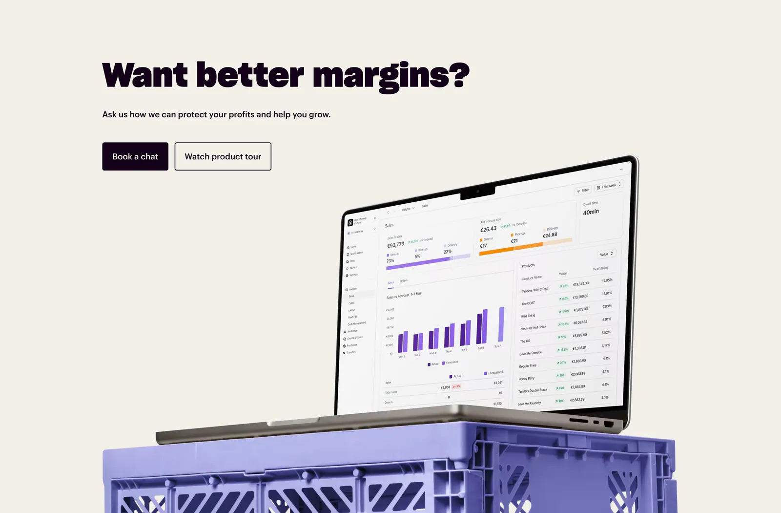
  45. Nory call-to-action section: bold headline with two buttons above a laptop showing a sales dashboard on a purple crate, cream background
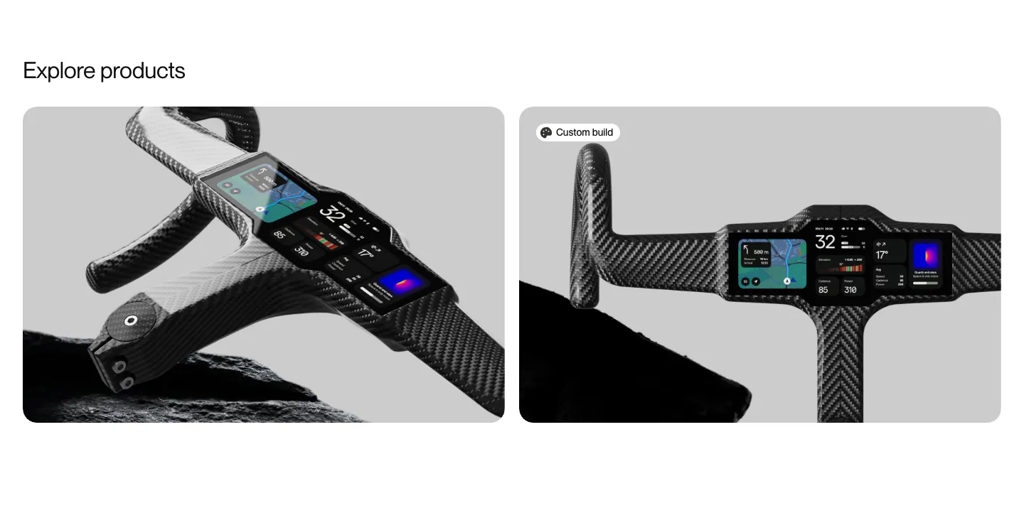
  46. FLITEDECK other section: Explore products heading above two rounded cards with carbon handlebar cockpit product photos on gray
    Flitedeck Other
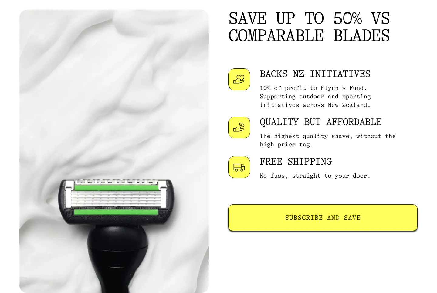
  47. Flynny's value proposition section: razor head on shaving foam photo left, benefit list with yellow icons and a Subscribe and Save button right
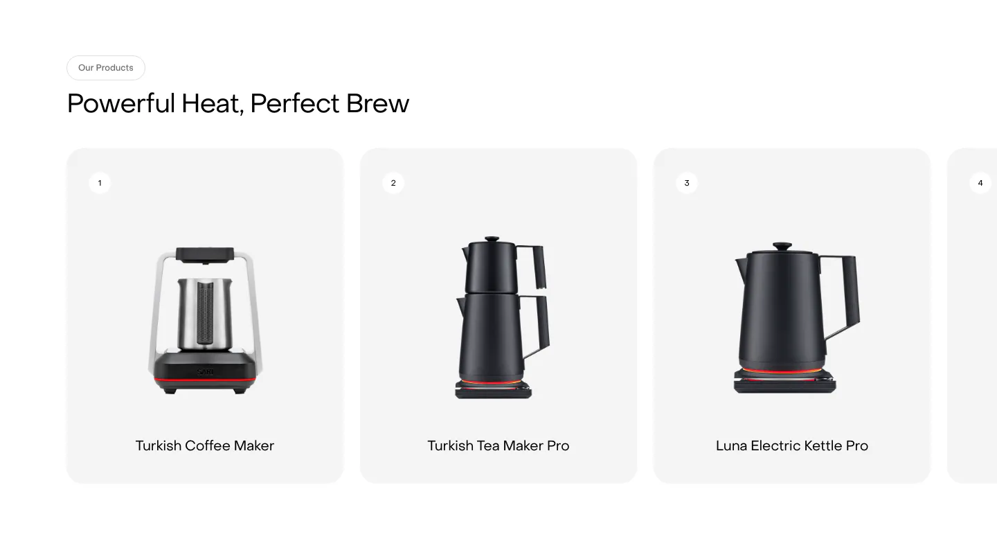
  48. Saki features section: headline above a row of numbered product cards showing kettles and coffee makers, with a fourth card cut off at the edge
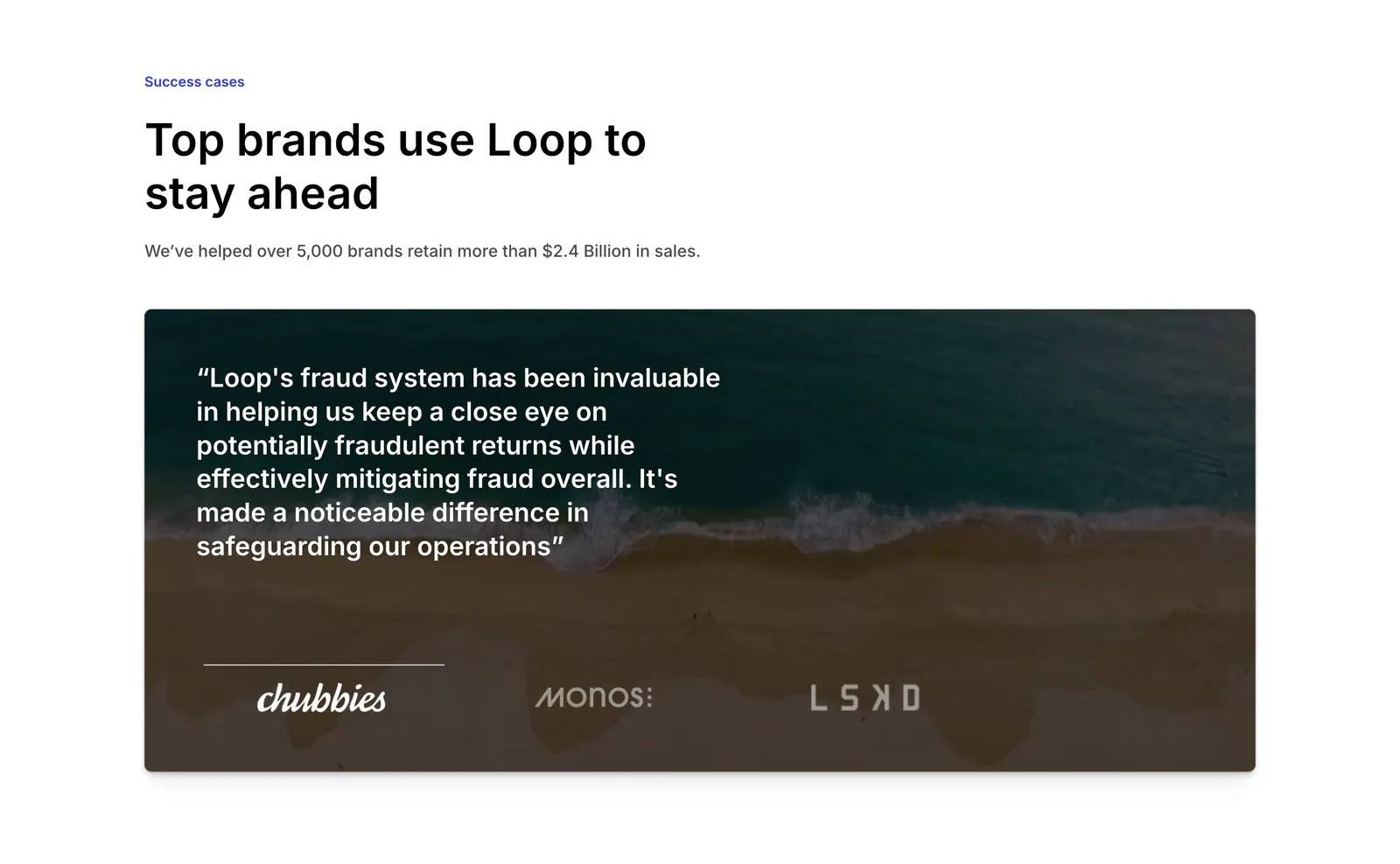
  49. Loop testimonials section: left-aligned headline above a quote card over an aerial beach photo with brand logo tabs
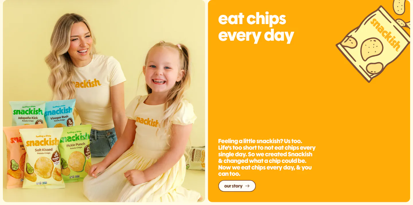
  50. Snackish about & mission section: photo of a woman and girl with chip bags beside an orange panel with headline, story copy and button
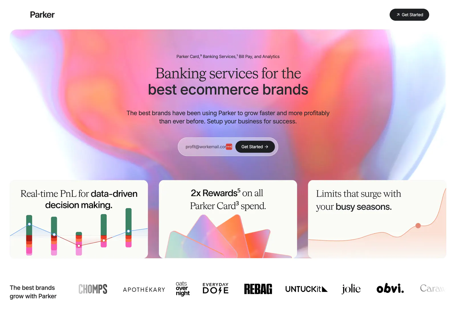
  51. Parker hero section: centered headline and email signup on a pink-orange aurora gradient above three feature cards and a brand logo row
  52. Flynny's hero section: promo bar and centered logo nav over a dark moss photo of a razor and yellow box, headline, reviews and button left
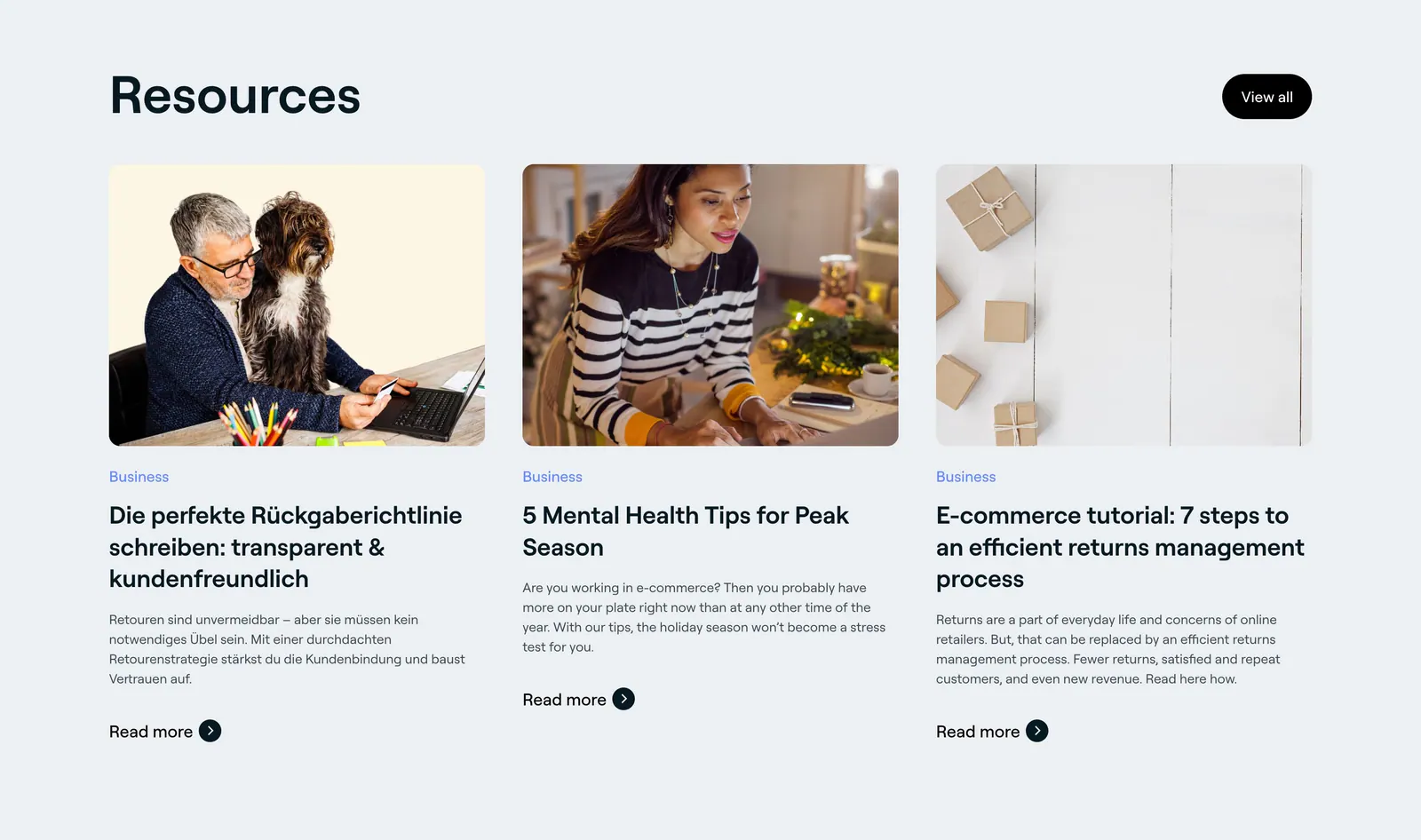
  53. 8returns blog & resources section: left headline with View all button above three article cards with photos on light gray
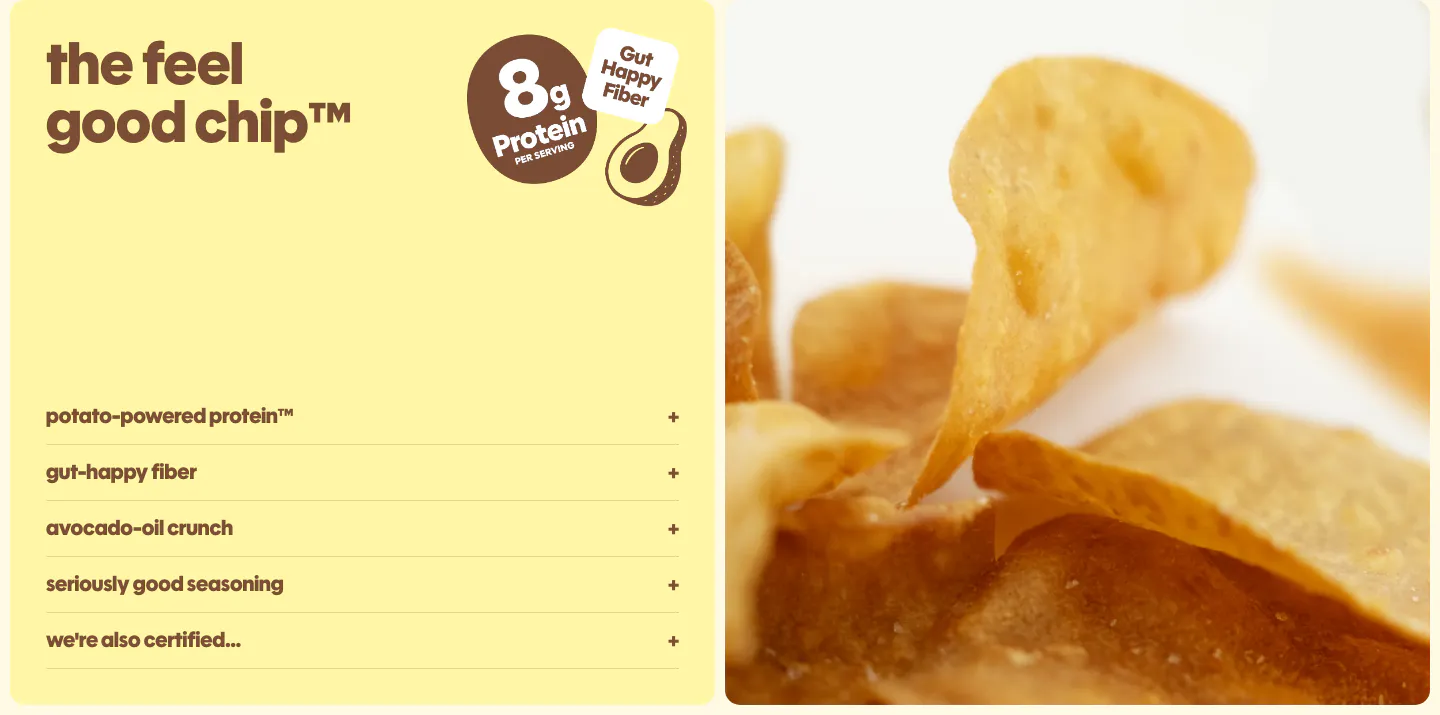
  54. Snackish features section: pale yellow panel with headline, protein badge and accordion list beside a close-up photo of potato chips
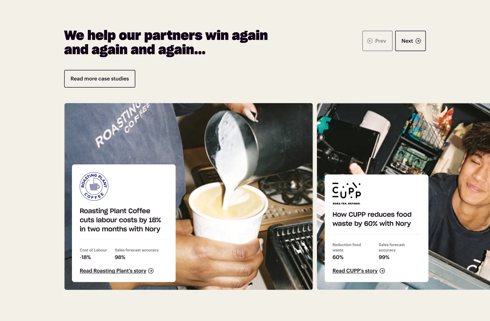
  55. Nory testimonials section: headline with prev/next buttons above case-study cards overlaid on cafe photos, cream background
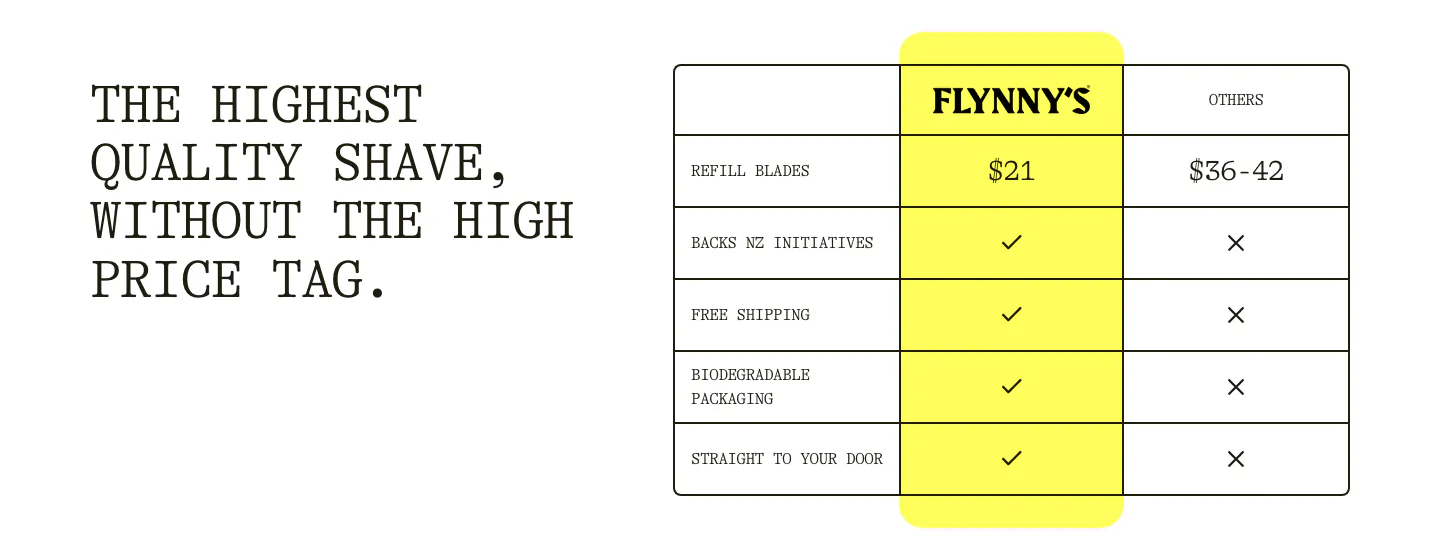
  56. Flynny's comparison section: typewriter headline left, table right comparing a yellow Flynny's column against others with prices and checks
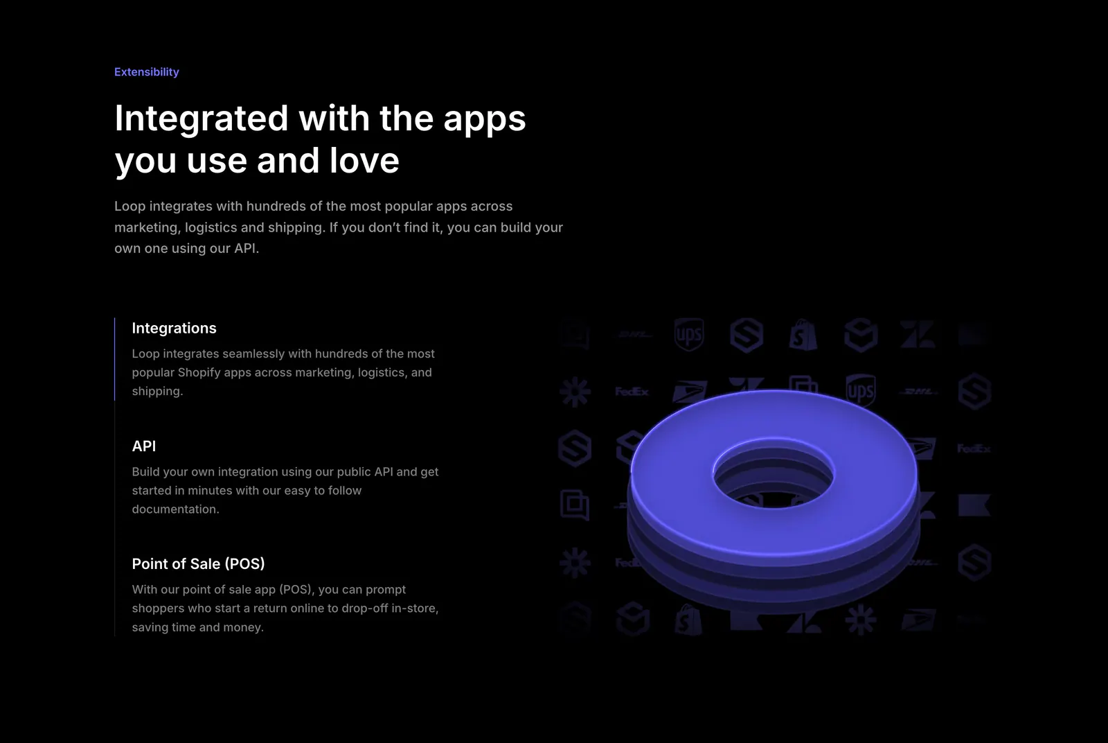
  57. Loop features section: dark split layout with integration, API and POS list beside a 3D purple ring over a grid of app logos
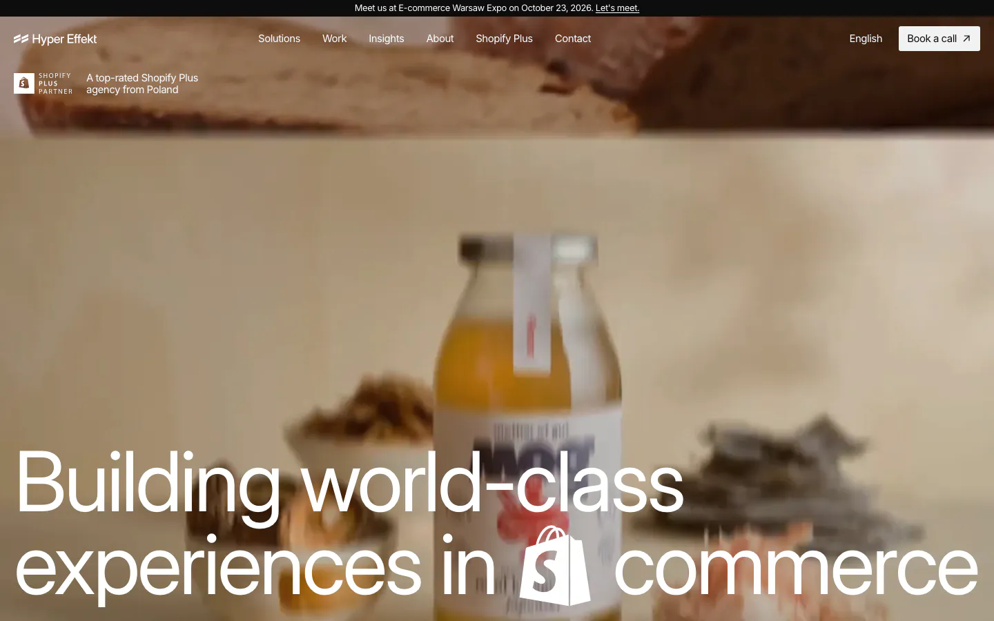
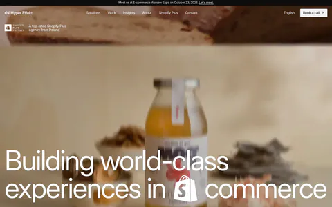
  58. Hyper Effekt hero section: oversized white headline with an inline Shopify icon over a full-bleed blurred product photo, with nav
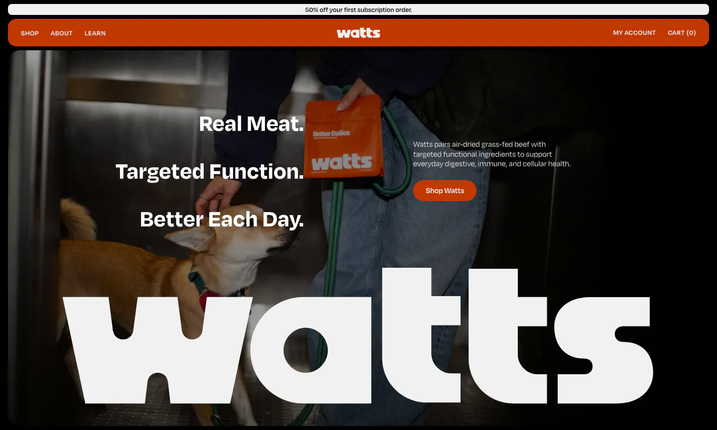
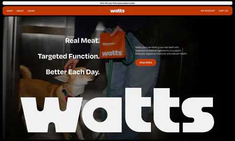
  59. Watts hero section: stacked headline and shop button over a full-bleed photo of a dog and owner, with a giant white watts wordmark
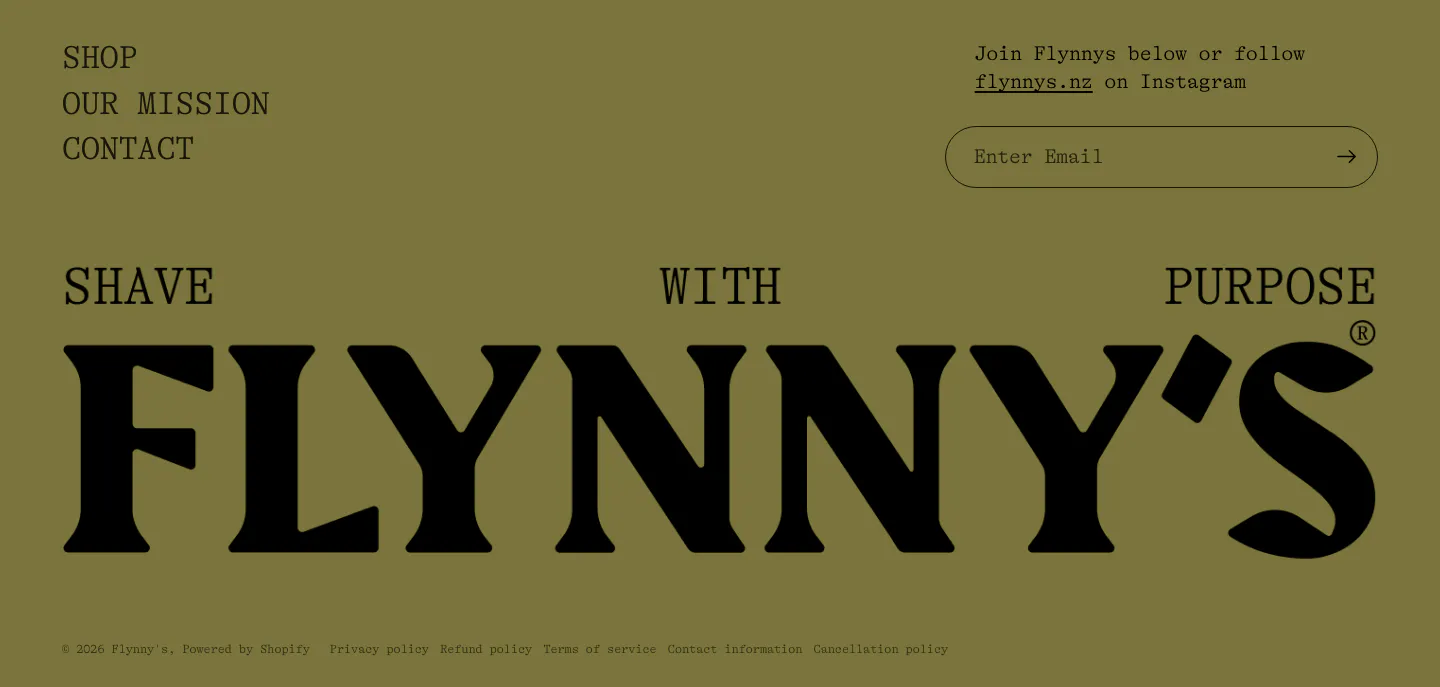
  60. Flynny's footer section: olive background with nav links, email signup field and a giant full-width black serif wordmark above legal links
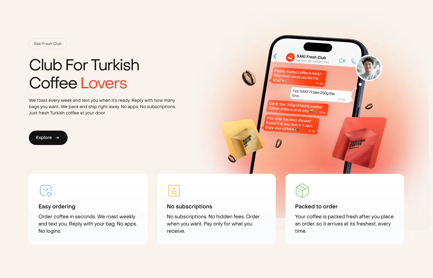
  61. Saki features section: headline and copy left of a phone chat mockup with coffee bags, above three benefit cards on a warm cream background
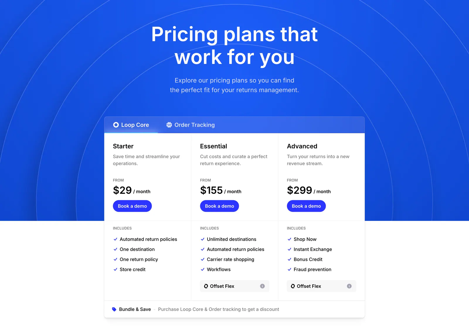
  62. Loop pricing section: centered headline on blue arc background above a tabbed three-tier pricing card with feature checklists
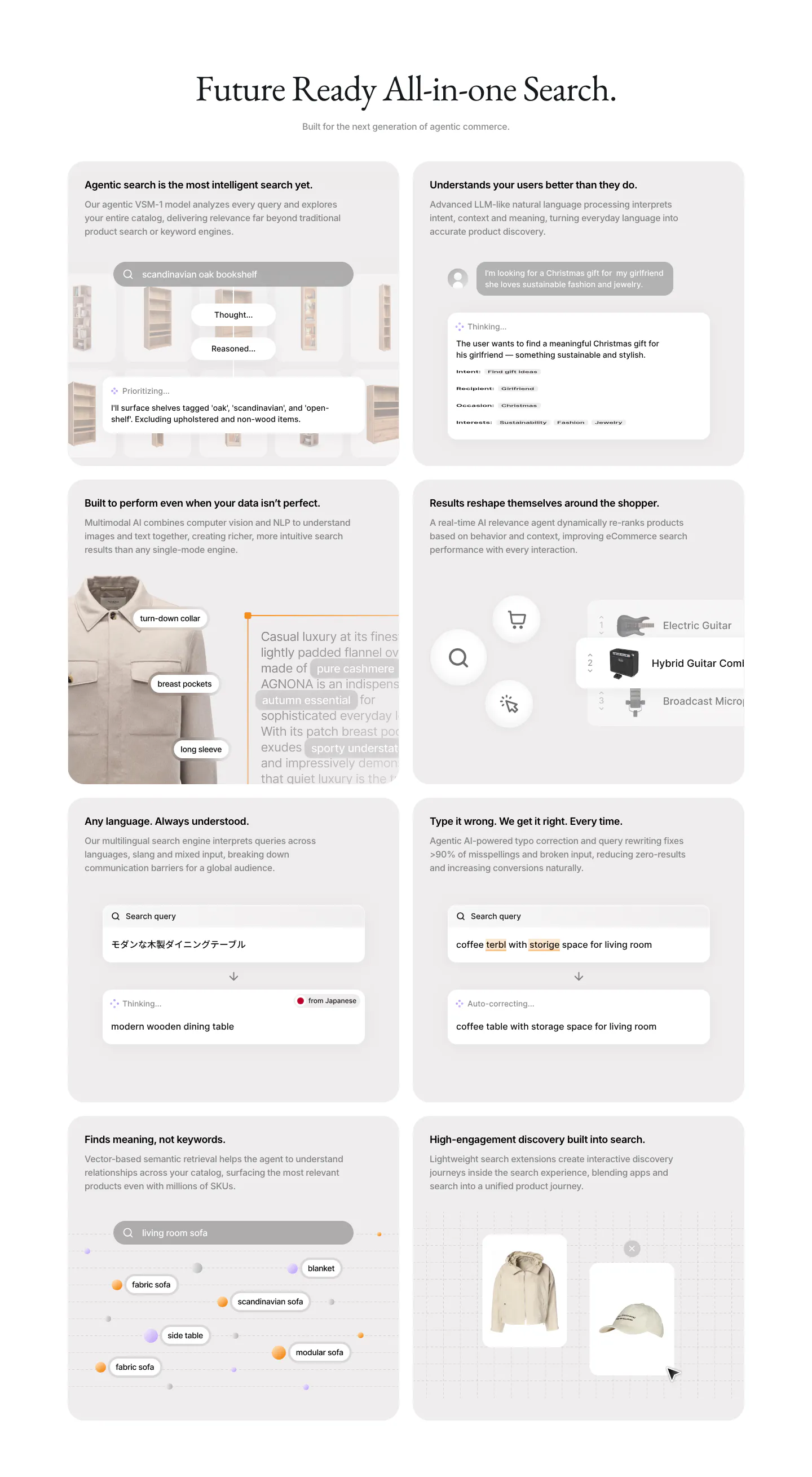
  63. VisionAI features section: centered serif headline above a two-column grid of eight gray cards with search UI mockups
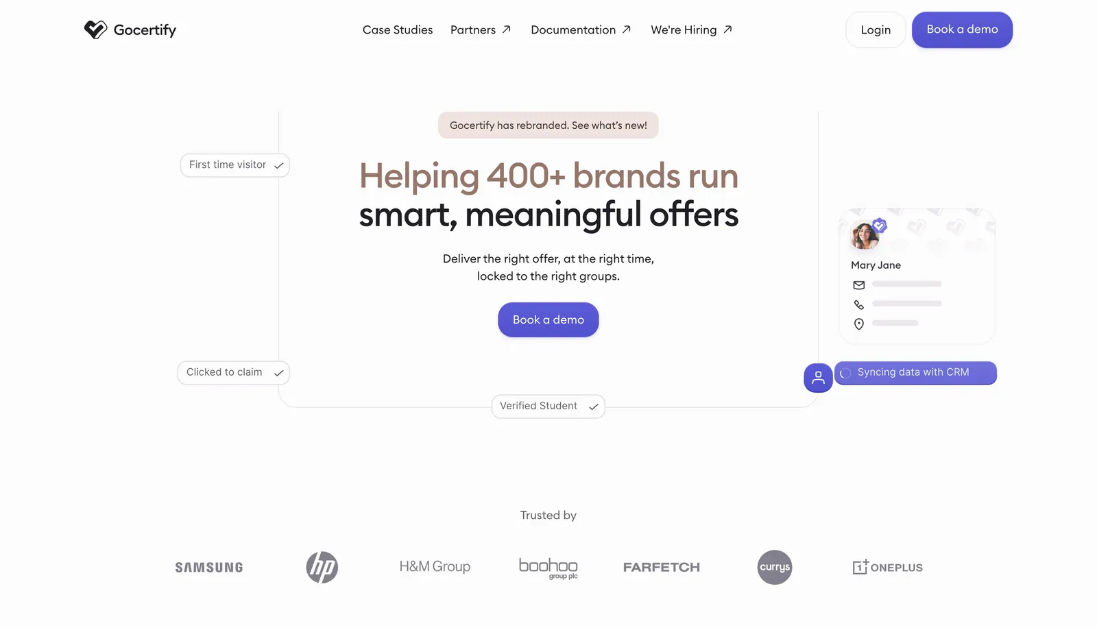
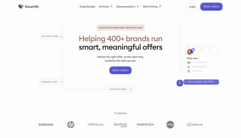
  64. Gocertify hero section: centered two-tone headline with demo button framed by floating verification chips and a profile card, logo row below
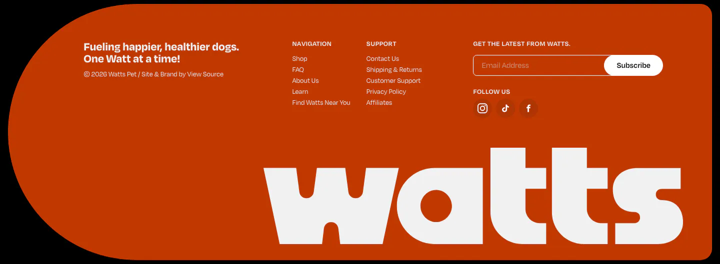
  65. Watts footer section: burnt-orange rounded panel with link columns, email subscribe field, social icons and a giant white watts wordmark
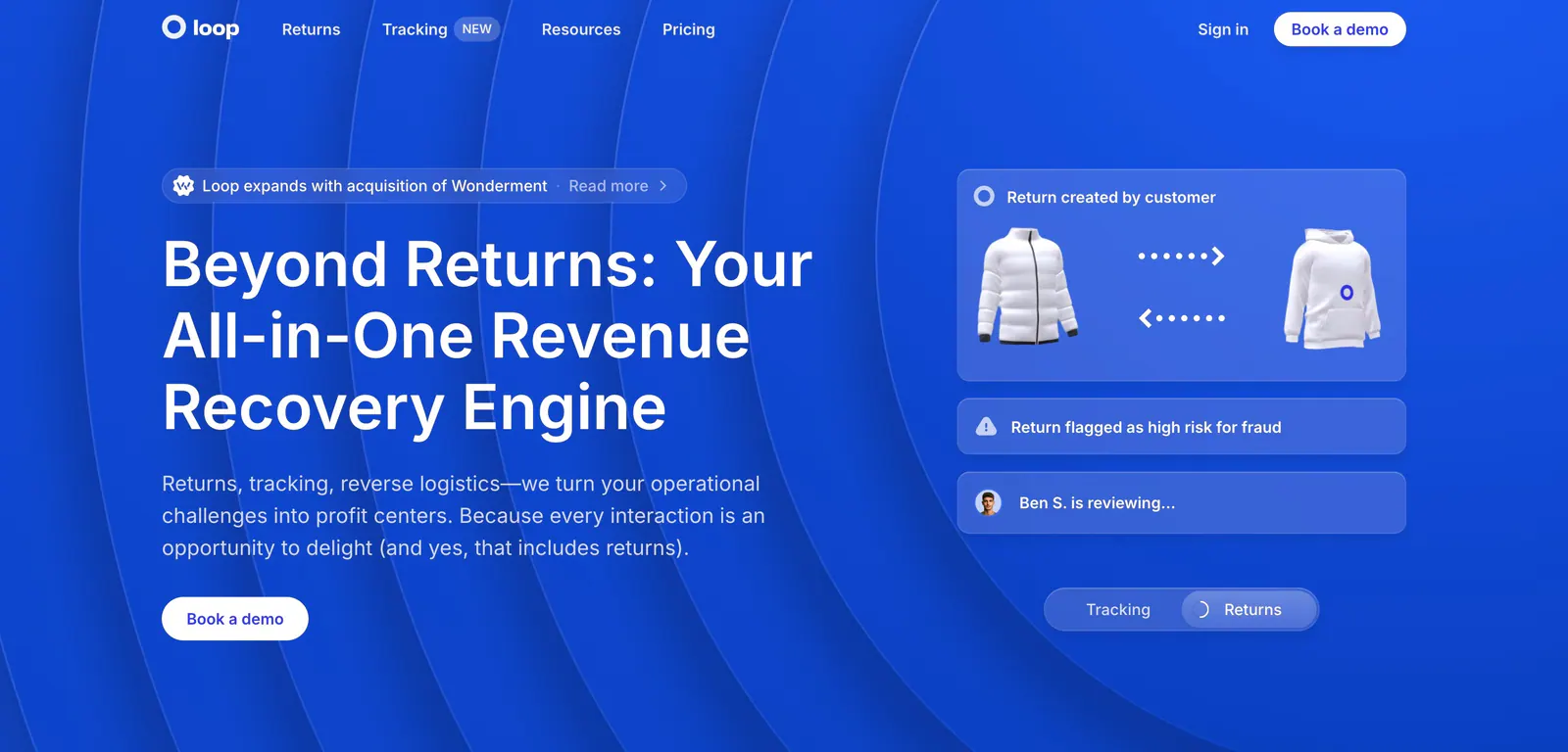
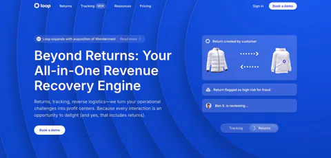
  66. Loop hero section: split layout on bright blue with concentric arcs, headline and CTA left, translucent returns workflow cards right
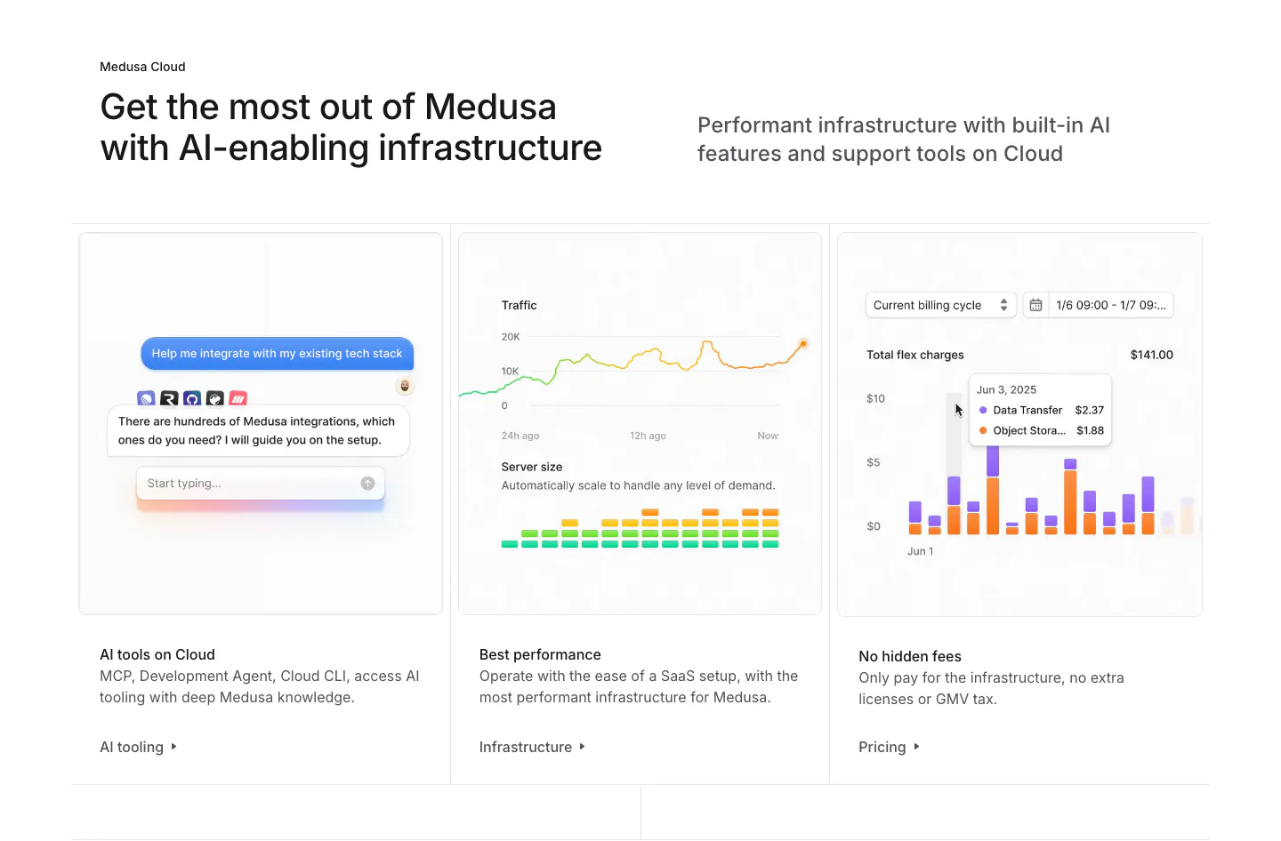
  67. Medusa features section: headline above three cards showing an AI chat, traffic and server charts, and a billing bar chart
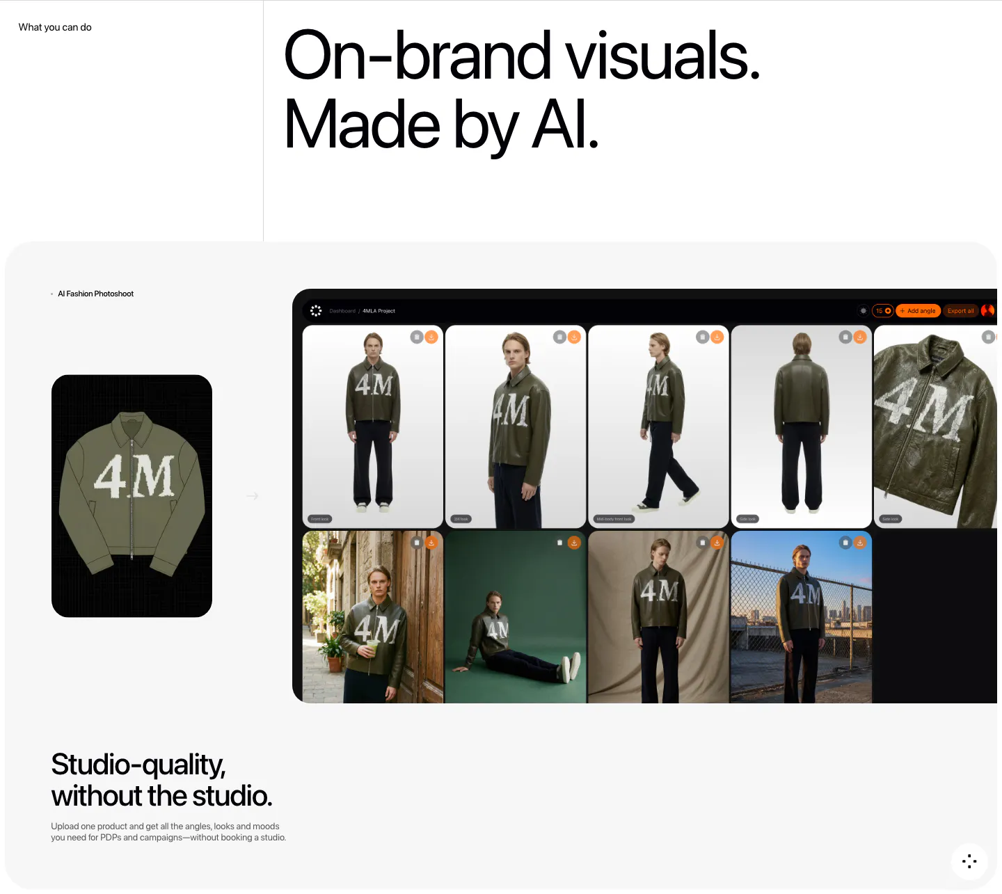
  68. Fourmula features section: large headline above a gray card showing a jacket product image turned into a dashboard grid of AI model photos
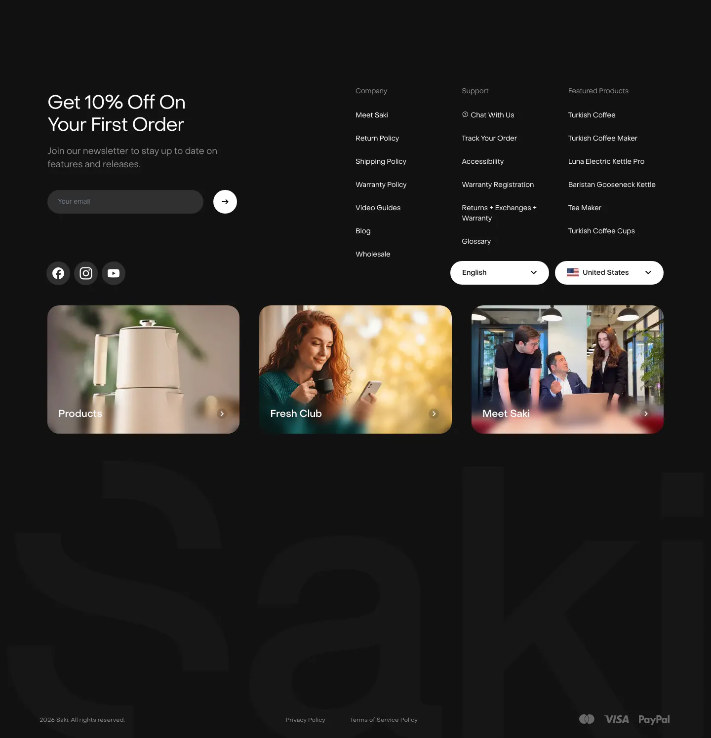
  69. Saki footer section: dark footer with newsletter email field, link columns, three photo cards and a giant faint Saki wordmark
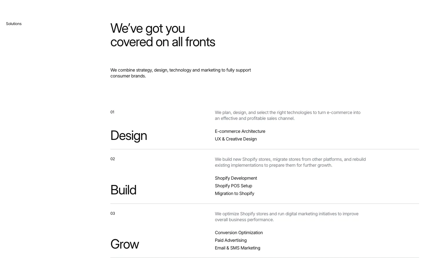
  70. Hyper Effekt features section: headline above three numbered service rows, Design, Build and Grow, each with a short list on white
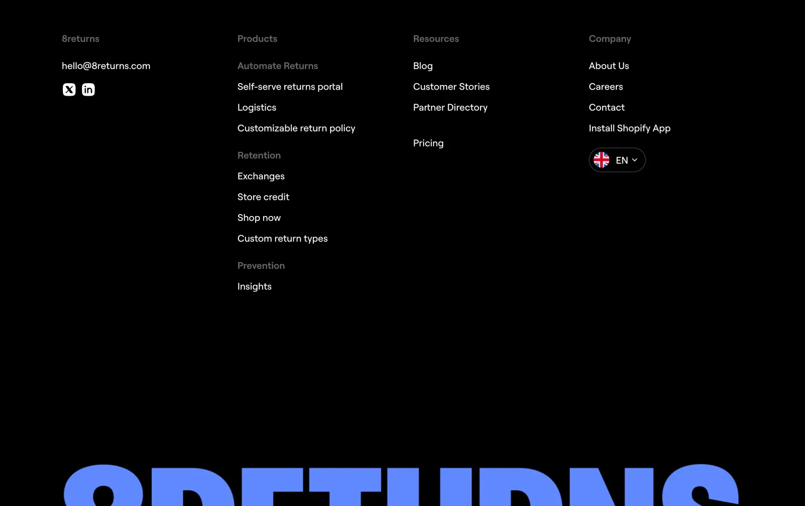
  71. 8returns footer section: black background with four link columns and a huge blue 8RETURNS wordmark cropped at the bottom
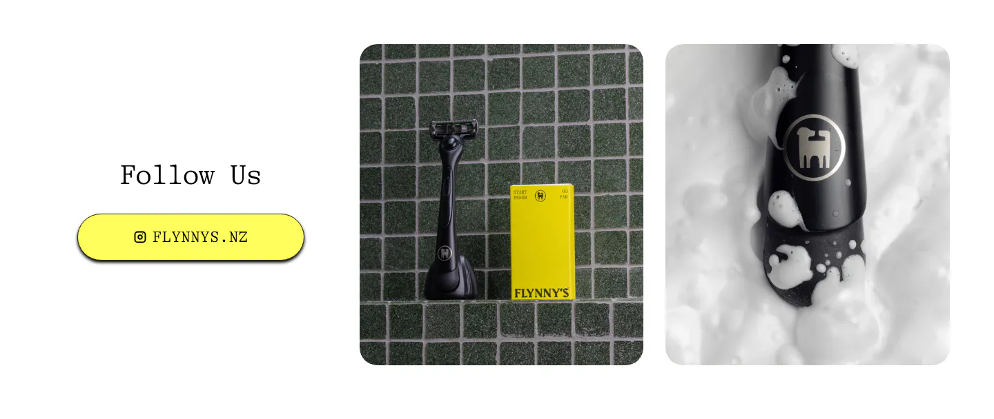
  72. Flynny's call to action section: Follow Us heading and yellow Instagram button left, two product photos of a black razor and yellow box right
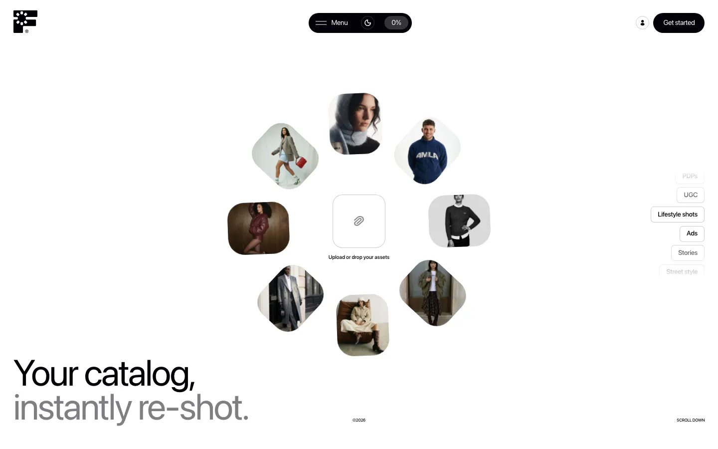
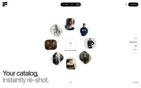
  73. Fourmula hero section: ring of rounded fashion model photos around an upload box, with a large two-tone headline at bottom left on white
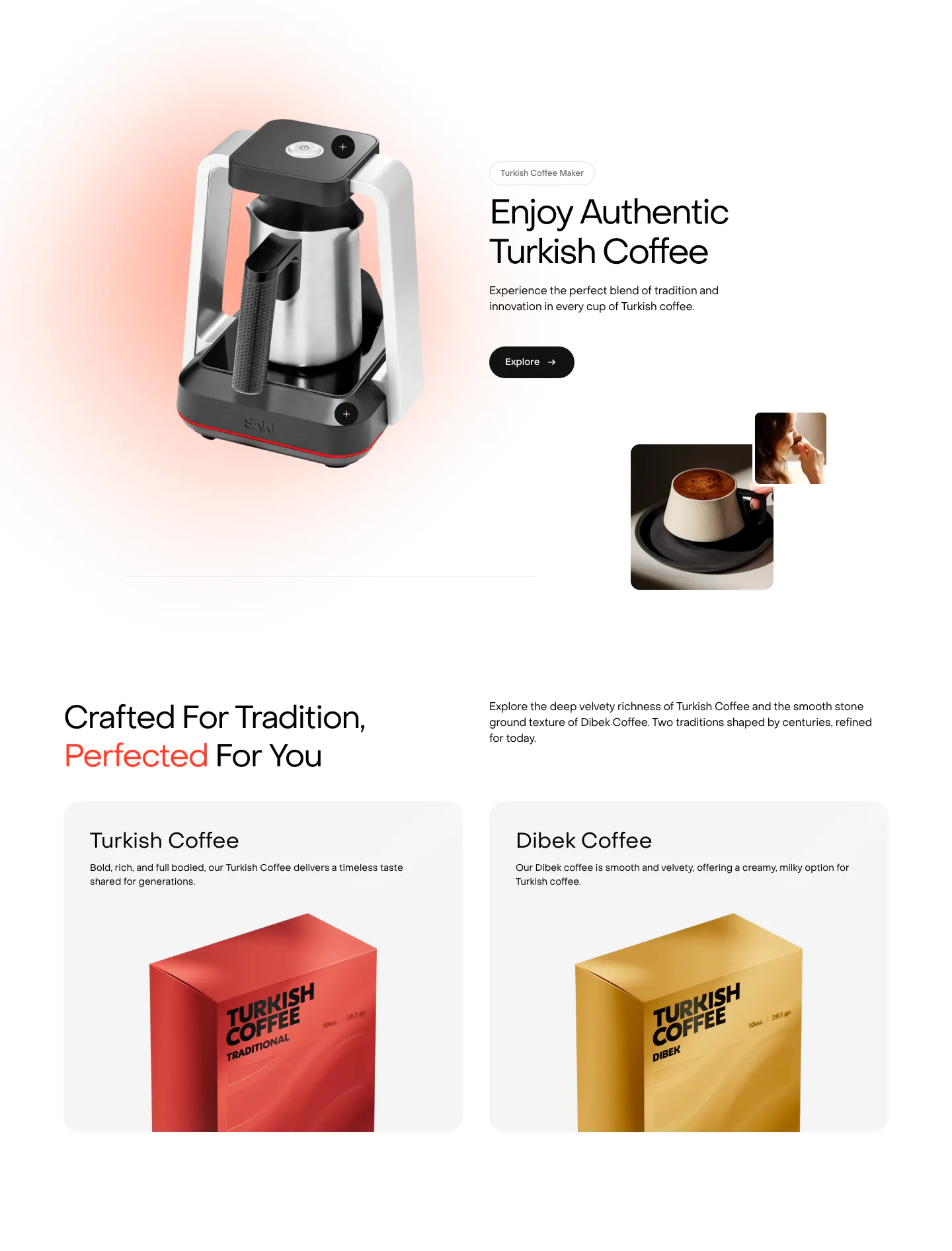
  74. Saki features section: coffee maker product shot beside headline and Explore button, then two product cards with coffee packaging boxes

E-commerce & retail companies
15 companies in this collection

All companies

Common styles in E-commerce & retail websites

  • Photography 47% · 35
  • Split layout 20% · 15
  • Centered 20% · 15
  • Product UI 19% · 14
  • Monochrome 19% · 14
  • Minimal 19% · 14
  • Card grid 19% · 14

How to design an e-commerce website

  1. Pair the storefront with the admin

    For merchant tools, show the shopper-facing result next to the dashboard that controls it. Merchants want to picture what their customers will see and how much work setup takes. Showing only one side leaves half the question unanswered.

  2. Invest in consistent product photography

    For brands, photos do most of the selling. Shoot products in use, at true scale, and from several angles, with consistent lighting across the catalog. A coherent image system makes a small brand look established, while mismatched shots make it look like a side project.

  3. Lead with revenue impact

    Merchants measure tools by conversion rate, average order value, and return rate. Show the expected lift with a customer example and explain how it was measured. Tie each feature to the metric it moves instead of describing it in isolation.

  4. Keep shipping and return policies visible

    Delivery times, return windows, and guarantees answer the last objections before checkout. Keep them near prices and in the footer, not hidden in a help center. Clear policies lower hesitation for first-time buyers who don't know the brand yet.

All industries
    ↑↓ Navigate ↵ Open

    Section preview

    Website section