Apollo website design

Every section we captured from the Apollo website, in page order, from the hero section down to the CTA section. Open any thumbnail to see it full size.

Sections 3

In page order, top to bottom

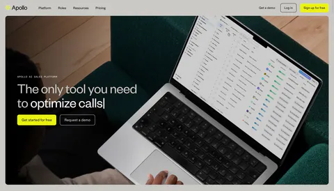
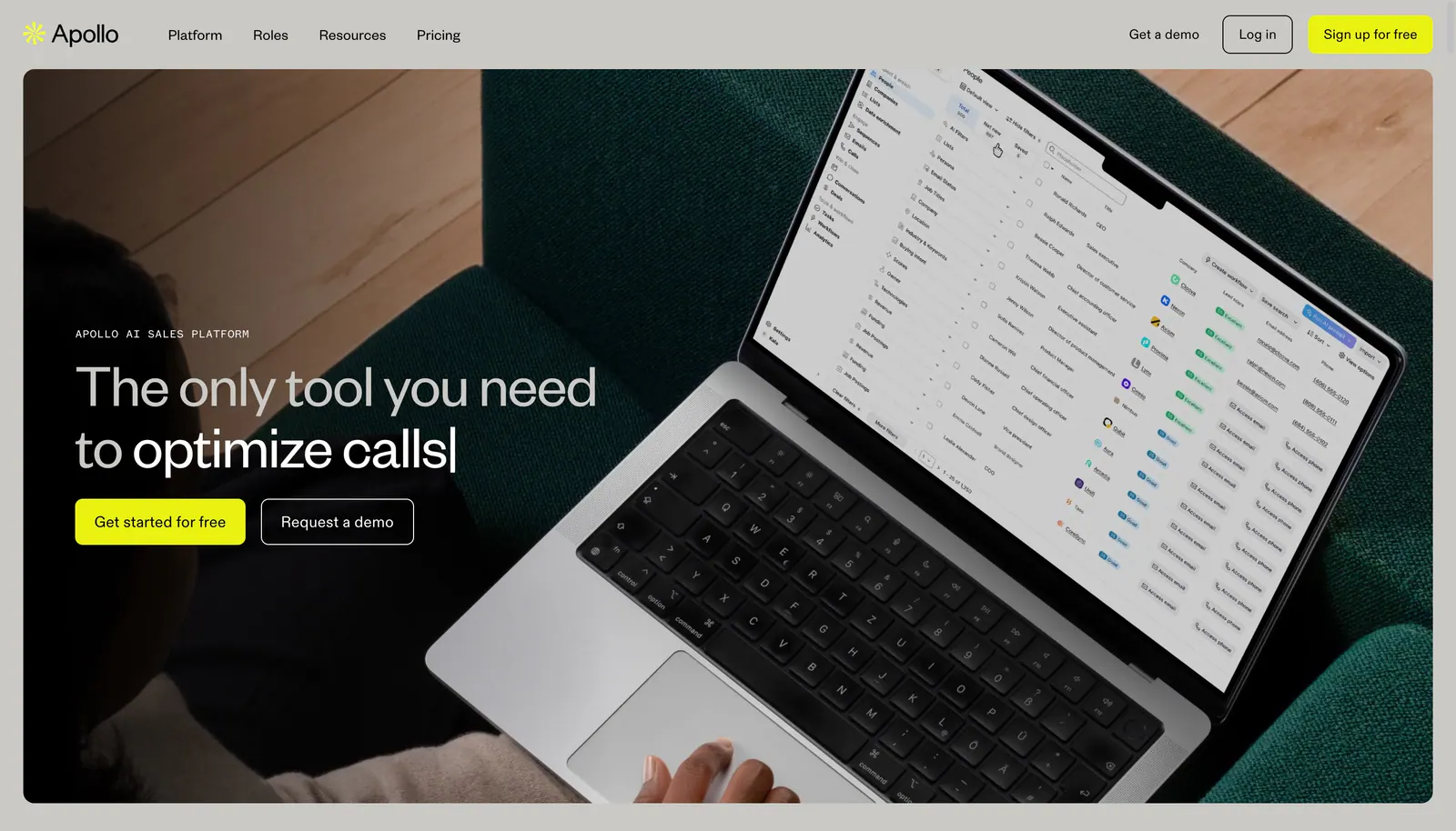
  1. Apollo hero section: nav bar above a headline and two buttons overlaid on a full-bleed photo of a laptop showing a sales app
    01 Hero

    The only tool you need to optimize calls

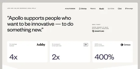
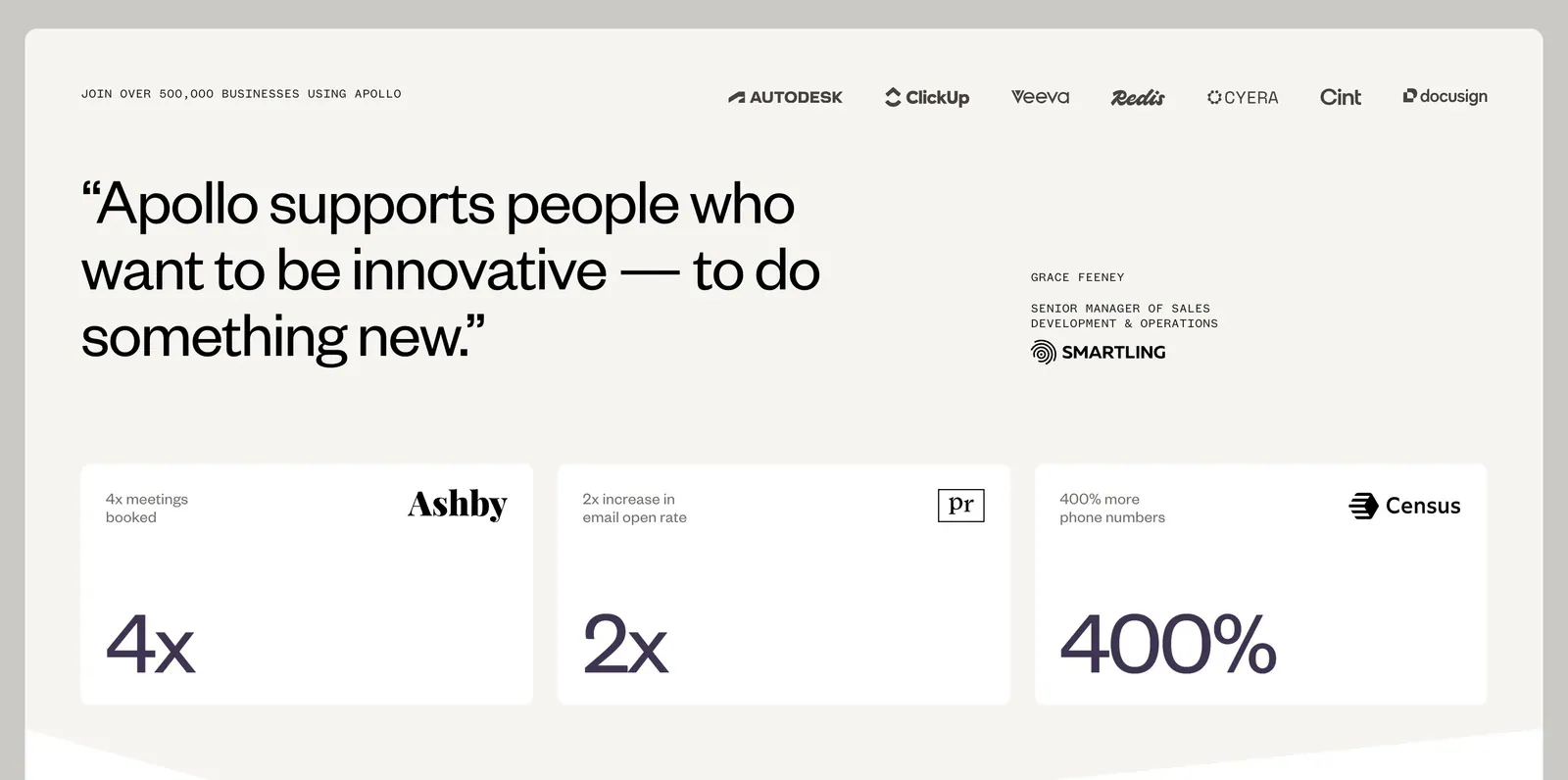
  2. Apollo value proposition section: logo row above a large customer quote and three stat cards (4x, 2x, 400%) on a warm off-white background

    “Apollo supports people who want to be innovative — to do something new.”

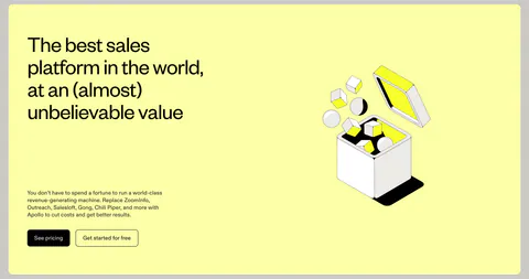
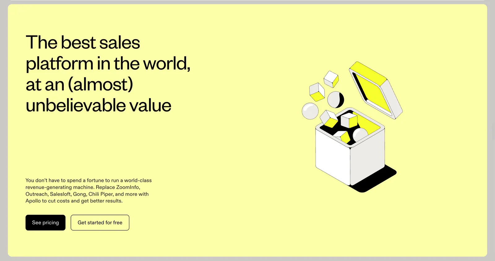
  3. Apollo call-to-action section: headline, copy and two buttons left with an isometric line-art box illustration right on a pale yellow panel

    The best sales platform in the world, at an (almost) unbelievable value
Similar companies

All companies
    ↑↓ Navigate ↵ Open

    Section preview

    Website section