Outseta website design

Every section we captured from the Outseta website, in page order, from the hero section down to the CTA section. Open any thumbnail to see it full size.

Sections 6

In page order, top to bottom

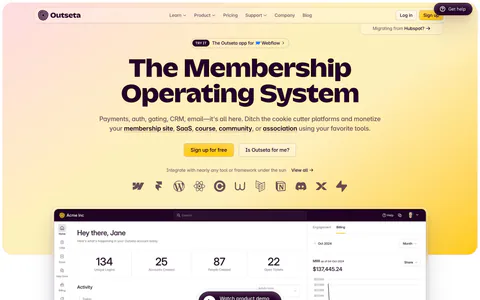
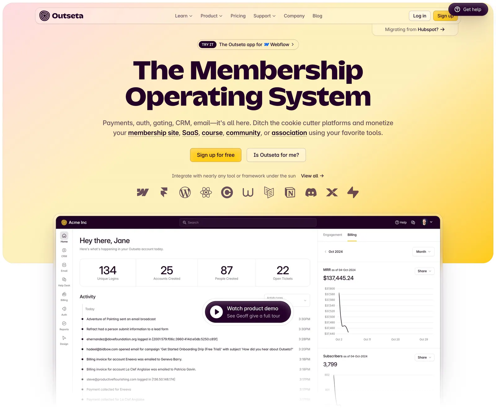
  1. Outseta hero section: centered headline, two buttons and integration icons on a peach-to-yellow gradient above a dashboard with demo button
    01 Hero

    The Membership Operating System

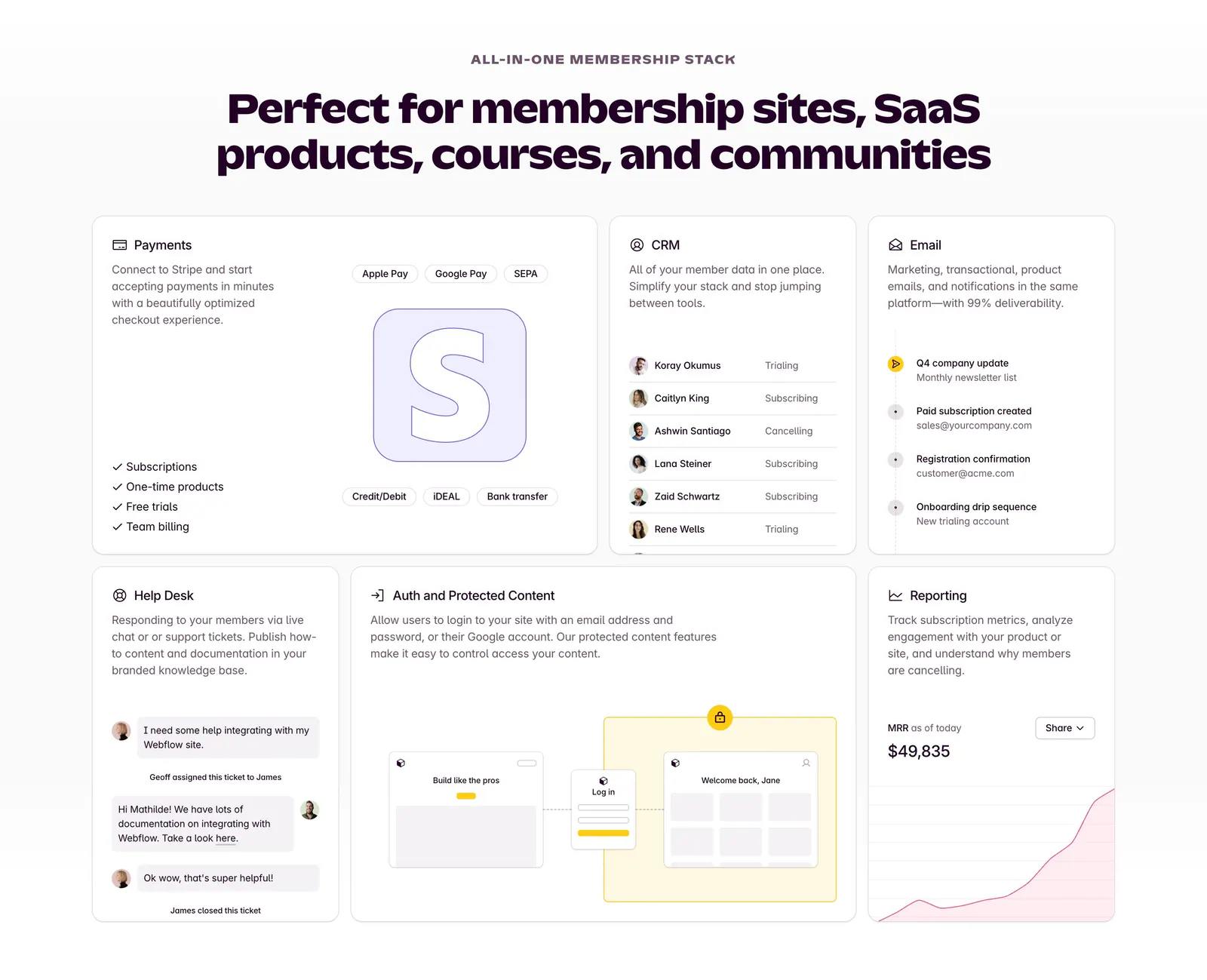
  2. Outseta features section: centered headline above a bento grid of cards for payments, CRM, email, help desk, auth and reporting

    Perfect for membership sites, SaaS products, courses, and communities

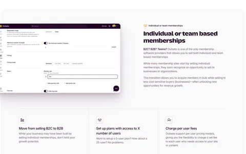
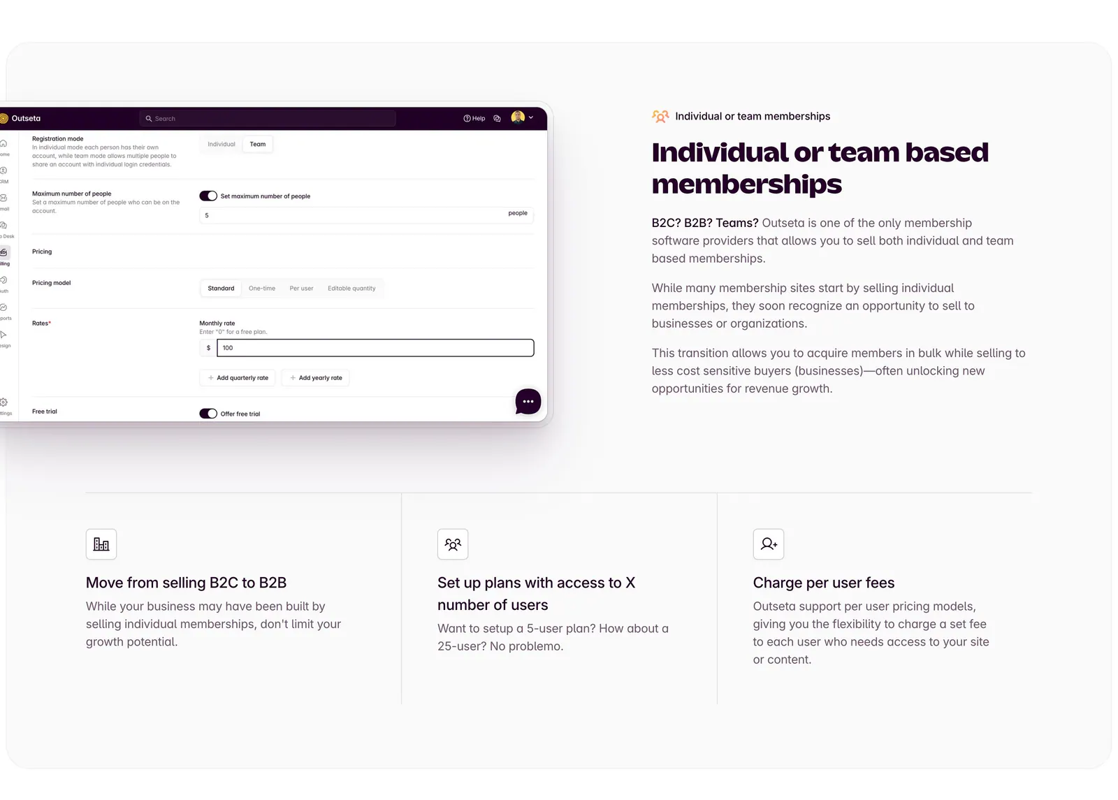
  3. Outseta features section: settings UI screenshot left of headline and copy, three icon feature columns below on a light gray panel

    Individual or team based memberships

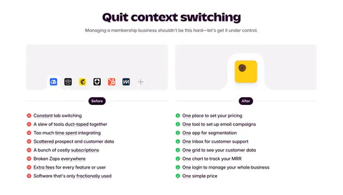
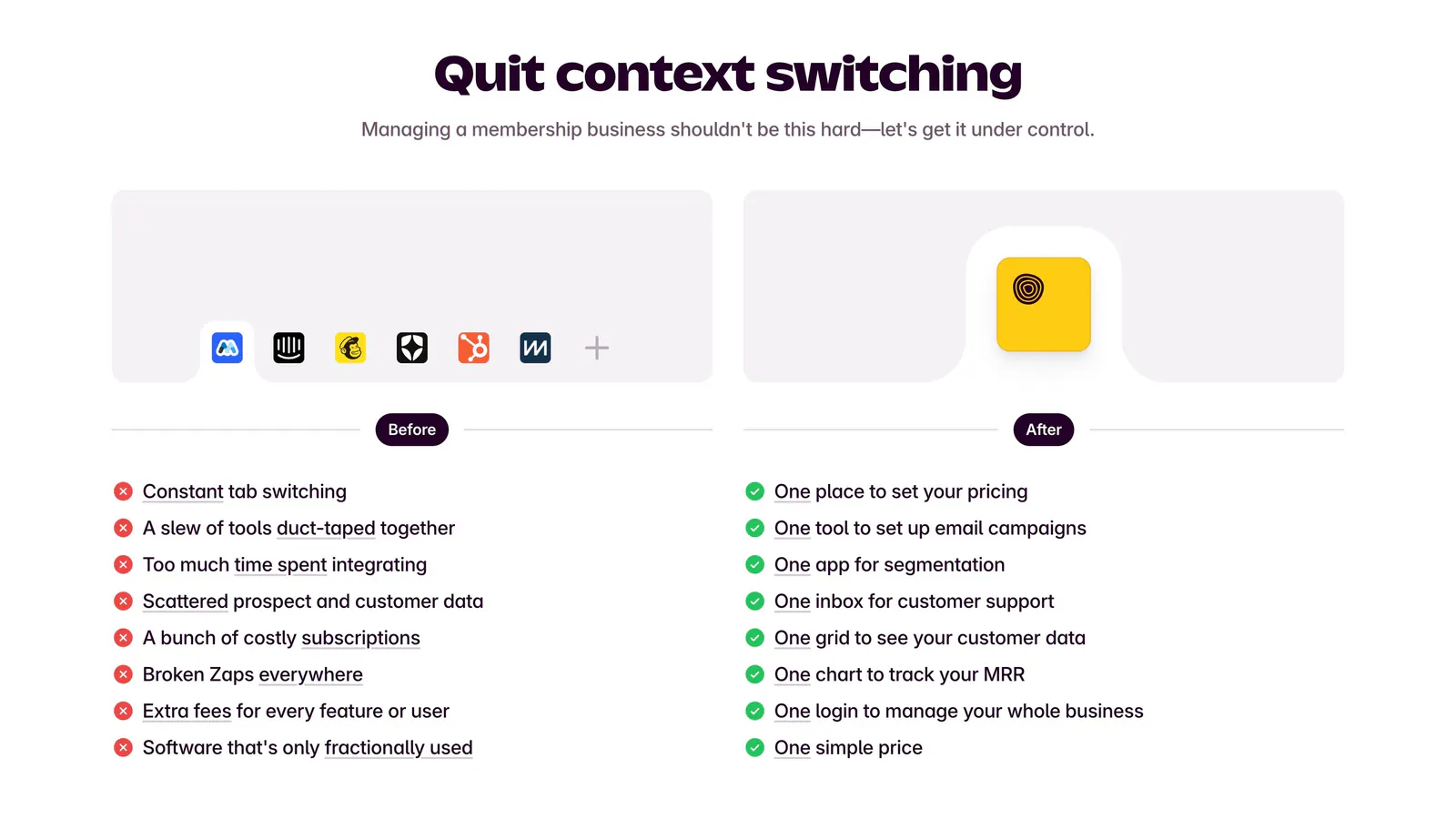
  4. Outseta comparison section: centered headline above Before and After columns contrasting tool clutter and red crosses with green checks

    Quit context switching

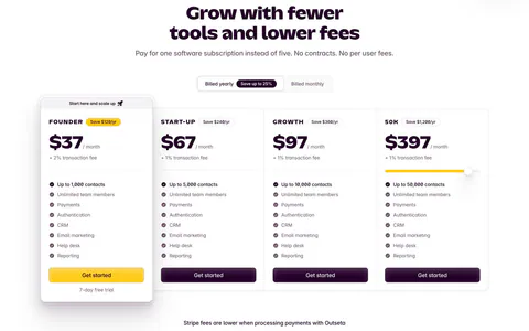
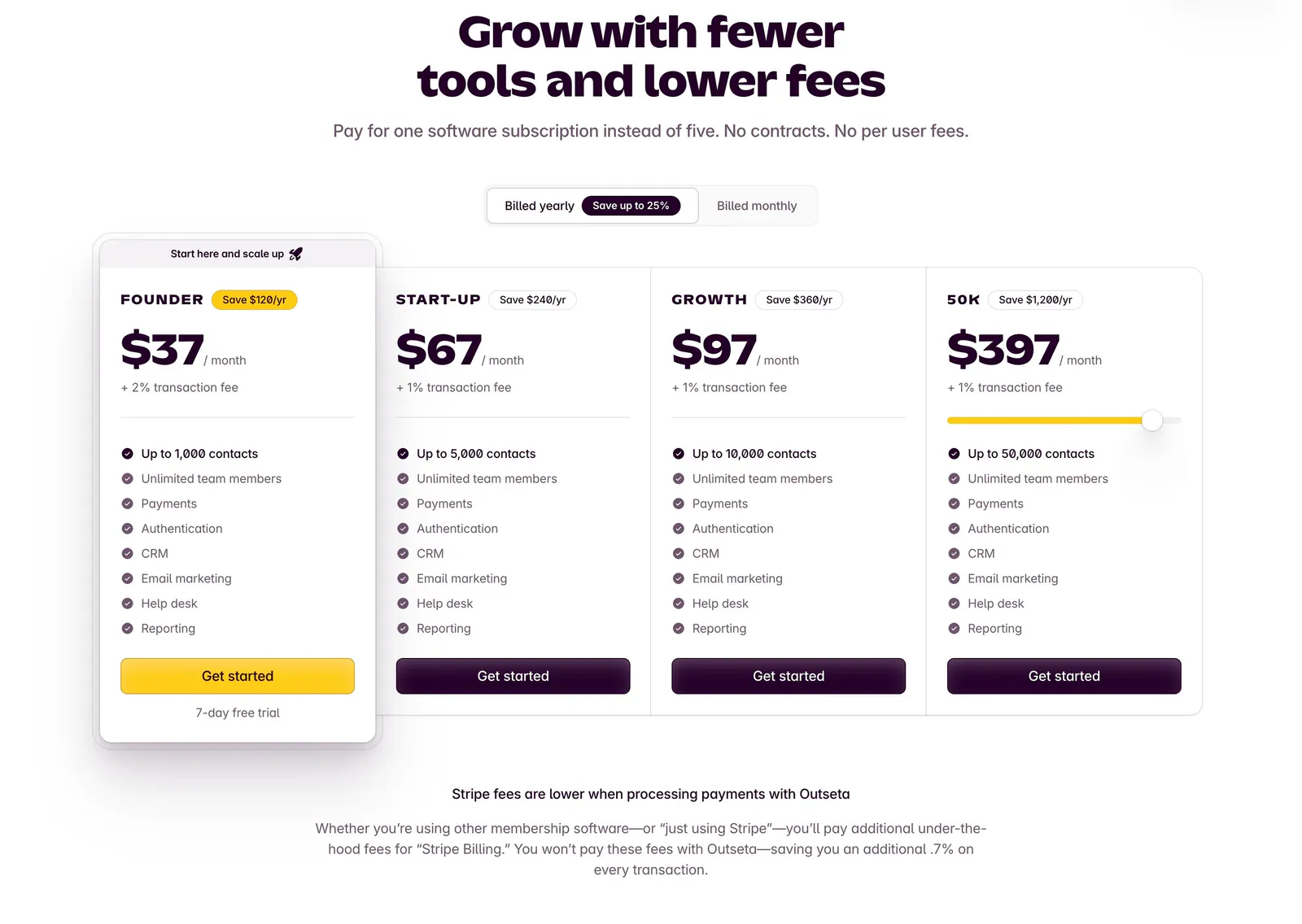
  5. Outseta pricing section: centered headline and billed yearly/monthly toggle above four plan cards with prices and feature checklists
    05 Pricing

    Grow with fewer tools and lower fees

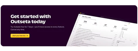
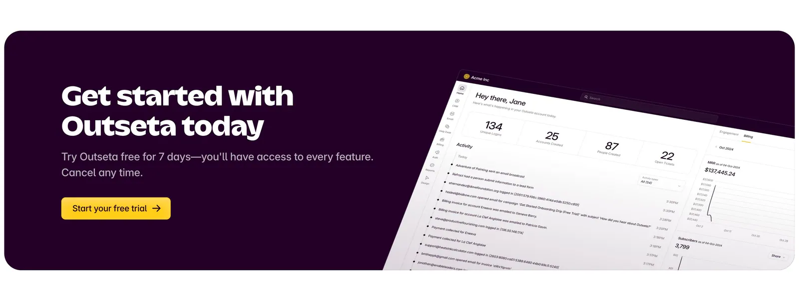
  6. Outseta call-to-action section: dark aubergine banner with headline, copy and yellow trial button beside a tilted dashboard screenshot

    Get started with Outseta today
Similar companies

All companies
    ↑↓ Navigate ↵ Open

    Section preview

    Website section