Equals website design

Every section we captured from the Equals website, in page order, from the hero section down to the footer. Open any thumbnail to see it full size.

Sections 6

In page order, top to bottom

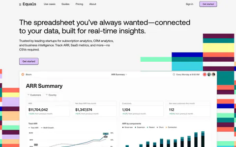
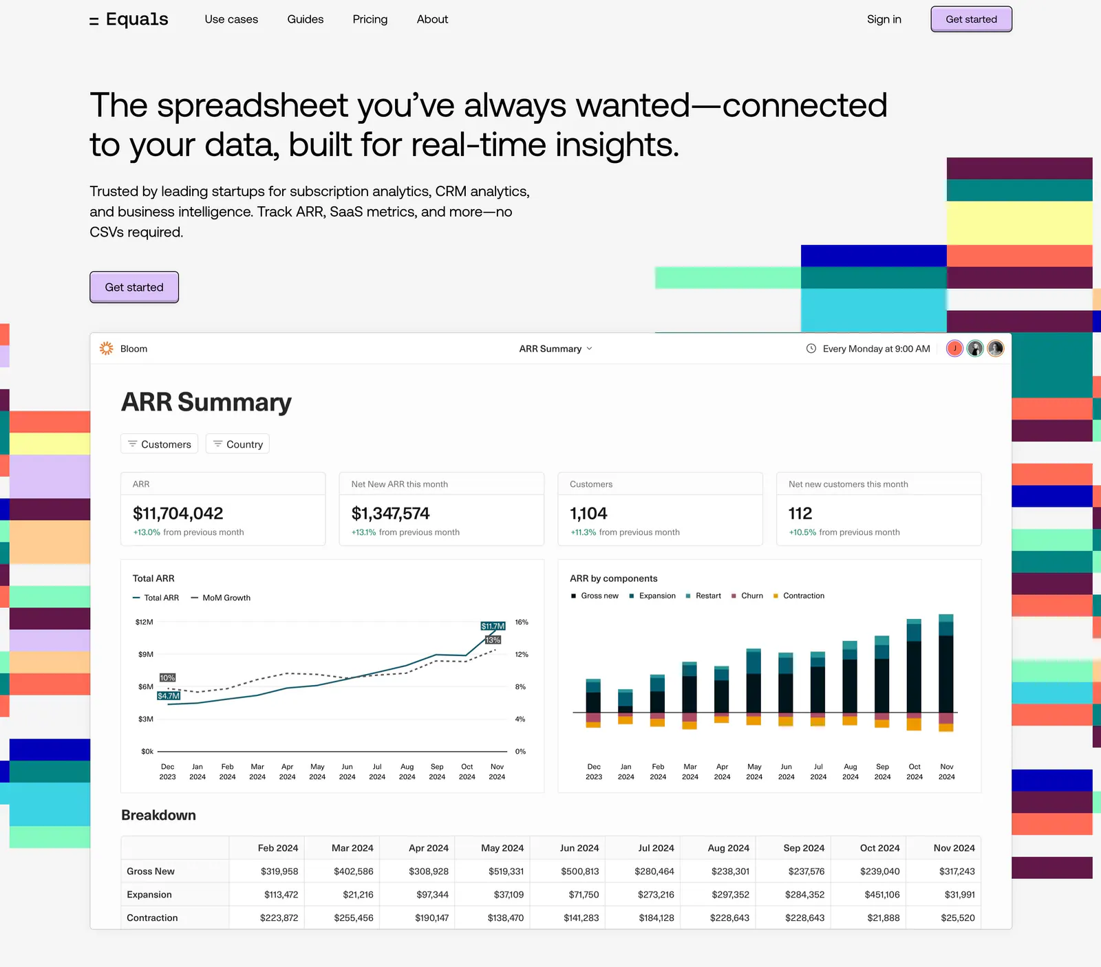
  1. Equals hero section: nav bar and left-aligned headline above an ARR dashboard screenshot flanked by colorful stepped block graphics
    01 Hero

    The spreadsheet you’ve always wanted—connected to your data, built for real-time insights.

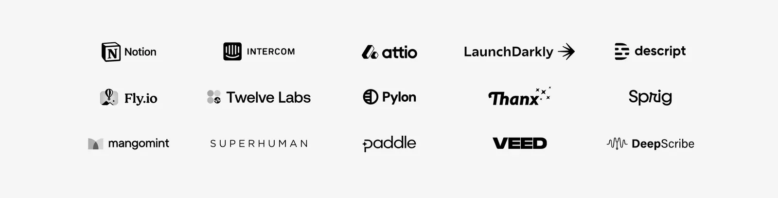
  2. Equals logo cloud section: three rows of five grayscale customer logos including Notion, Intercom and Attio on a light gray background
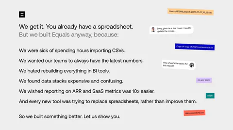
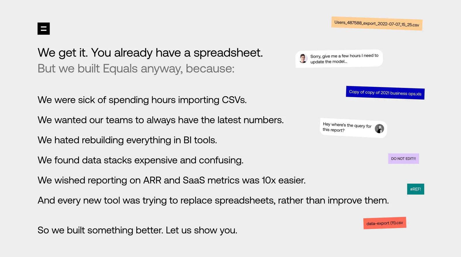
  3. Equals about & mission section: left-aligned list of reasons for building Equals beside floating file-name chips and chat bubbles

    We get it. You already have a spreadsheet.

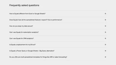
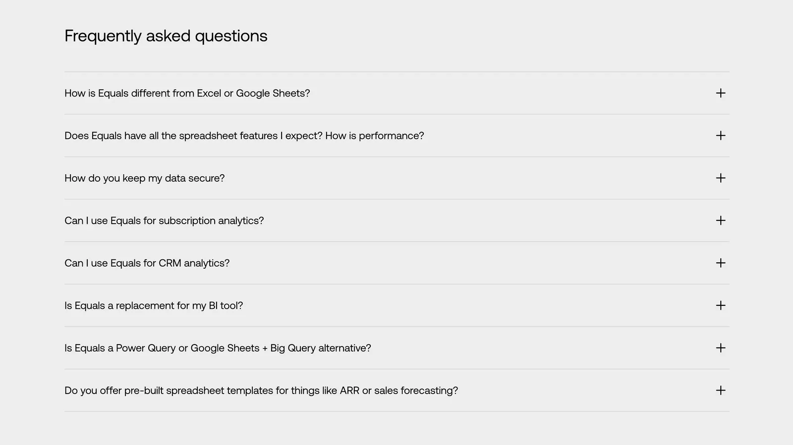
  4. Equals FAQ section: left-aligned heading above an eight-question accordion with plus icons on a light gray background
    04 FAQ

    Frequently asked questions

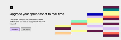
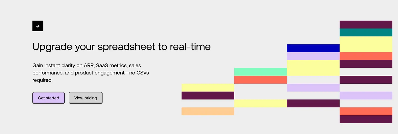
  5. Equals call-to-action section: left-aligned headline with two buttons beside a stepped grid of colorful blocks on a light gray background

    Upgrade your spreadsheet to real-time

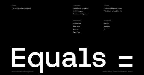
  6. Equals footer section: link columns above a giant monospace Equals wordmark and copyright line on a black background
    06 Footer

Similar companies

All companies
    ↑↓ Navigate ↵ Open

    Section preview

    Website section