Glassmorphism Website Design Examples

Frosted, translucent panels with visible blur behind them are the signature of glassmorphism. The style needs something behind it for the blur to reveal, such as a gradient, a photo, or colorful artwork; on a flat background, glassmorphism website design just looks gray. The effect has real costs too. Contrast shifts across each panel, and heavy blur can make scrolling stutter on modest phones.
11 sections

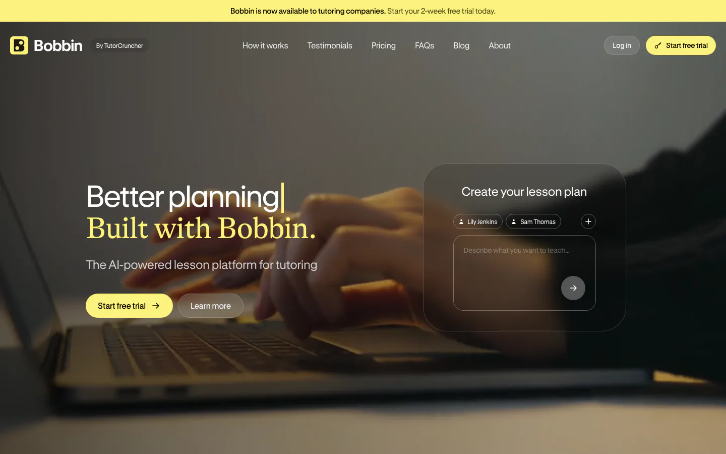
  1. Bobbin hero section: headline and buttons left, frosted lesson-plan prompt card right, over a dim full-bleed photo of hands on a laptop
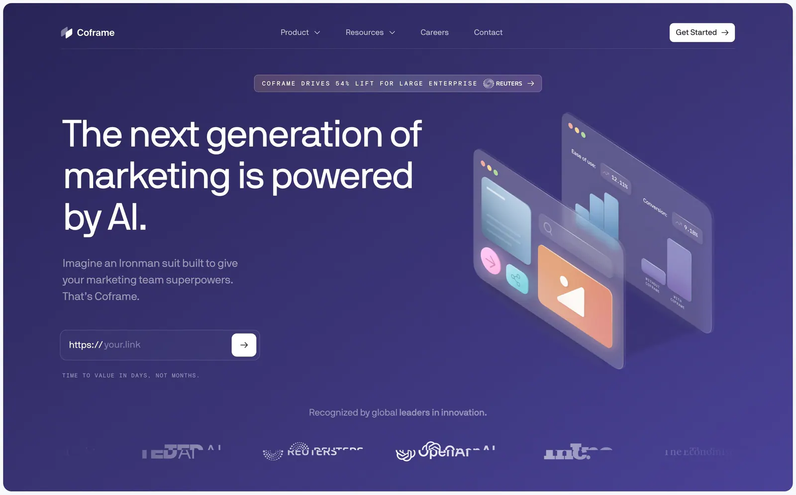
  2. Coframe hero section: left headline with URL input field beside isometric glass UI panels on purple, logo row below
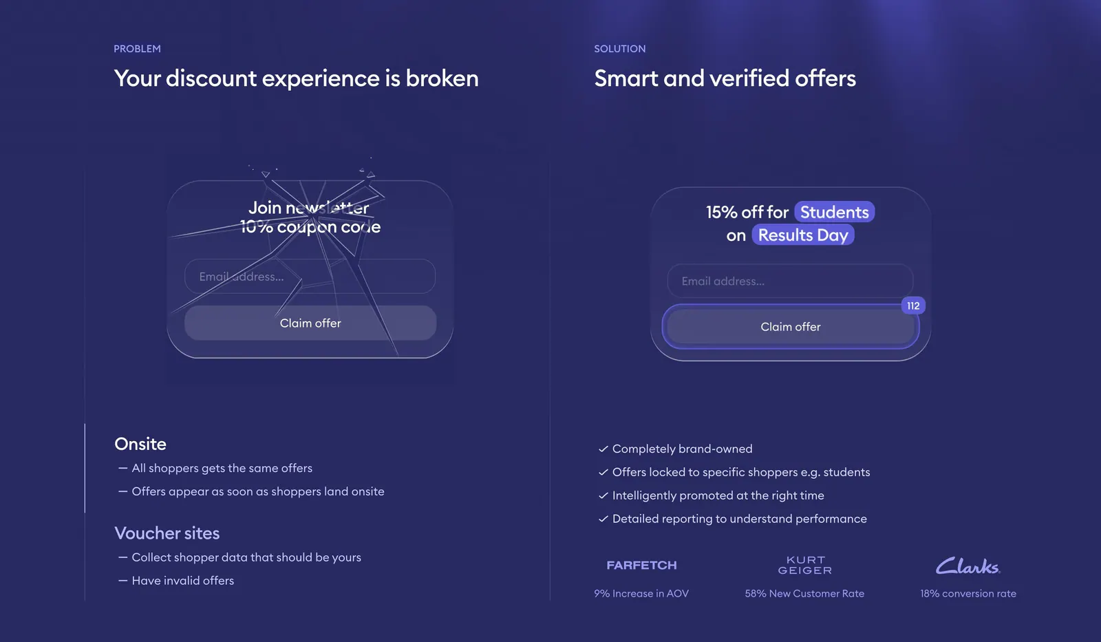
  3. Gocertify comparison section: problem vs solution columns with a cracked and a verified offer widget mockup and checklists on deep indigo
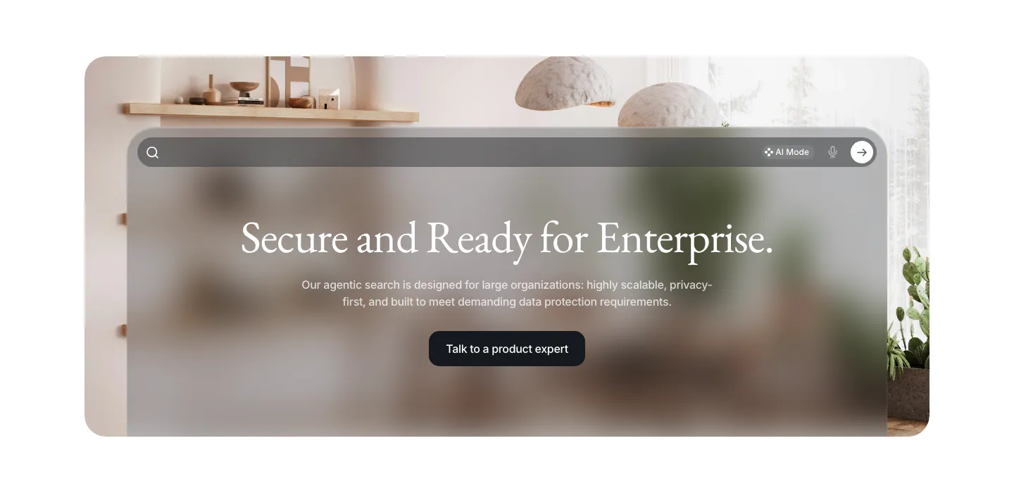
  4. VisionAI call-to-action section: centered serif headline and button on a frosted glass search panel over an interior photo
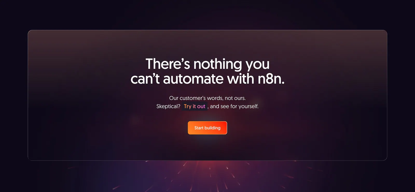
  5. n8n call-to-action section: centered headline and orange button in a translucent panel over a dark purple glow with sparks
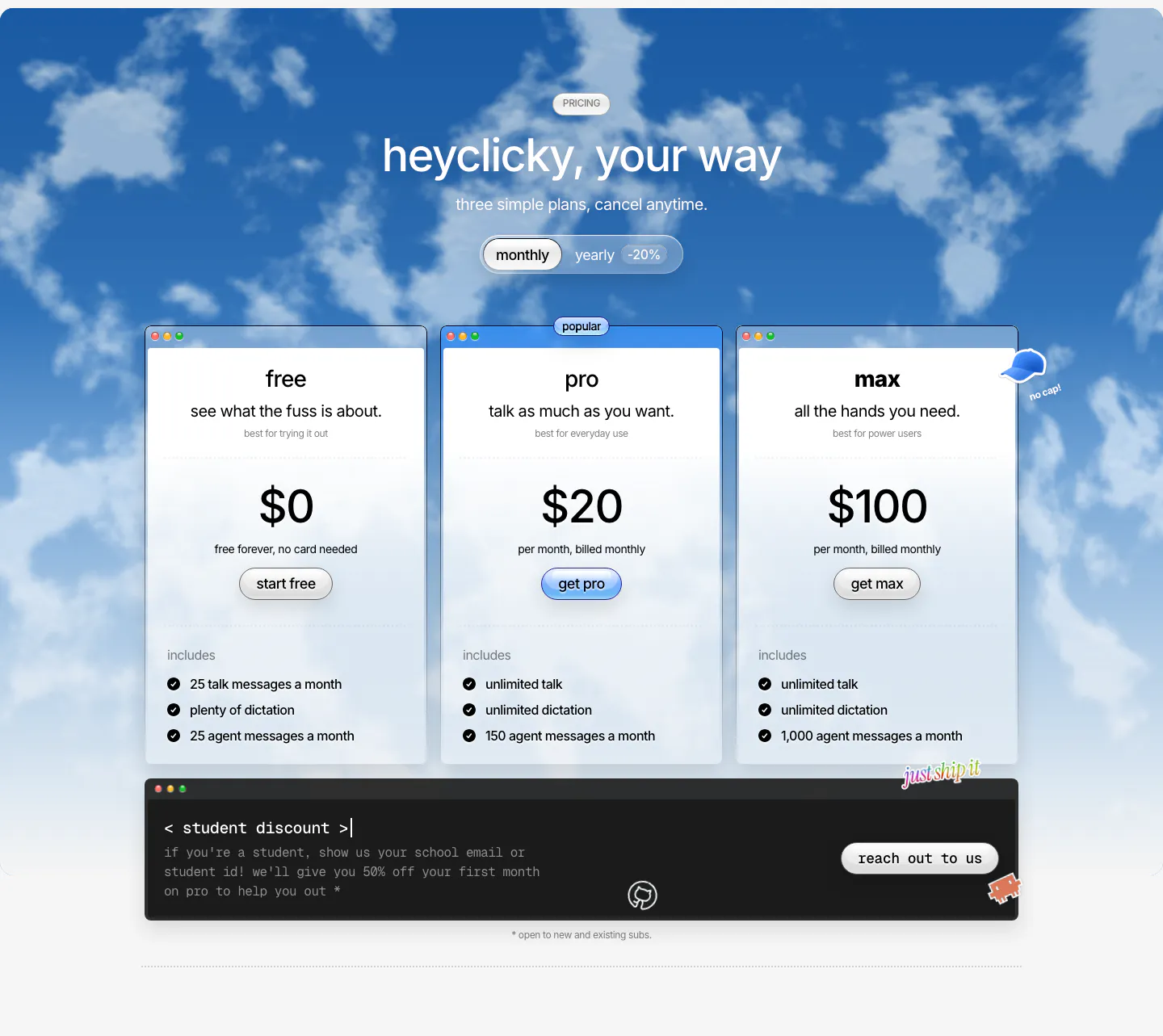
  6. heyclicky pricing section: three plan cards with monthly/yearly toggle over a blue cloudy sky photo, dark student discount bar below
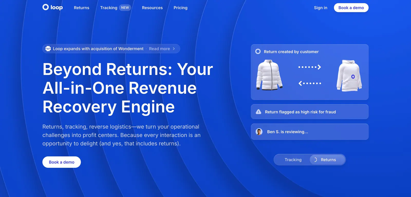
  7. Loop hero section: split layout on bright blue with concentric arcs, headline and CTA left, translucent returns workflow cards right
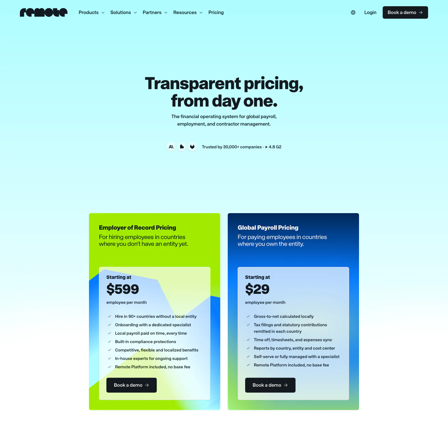
  8. Remote pricing section: nav and centered headline above two plan cards, lime EOR and blue Global Payroll, on cyan gradient
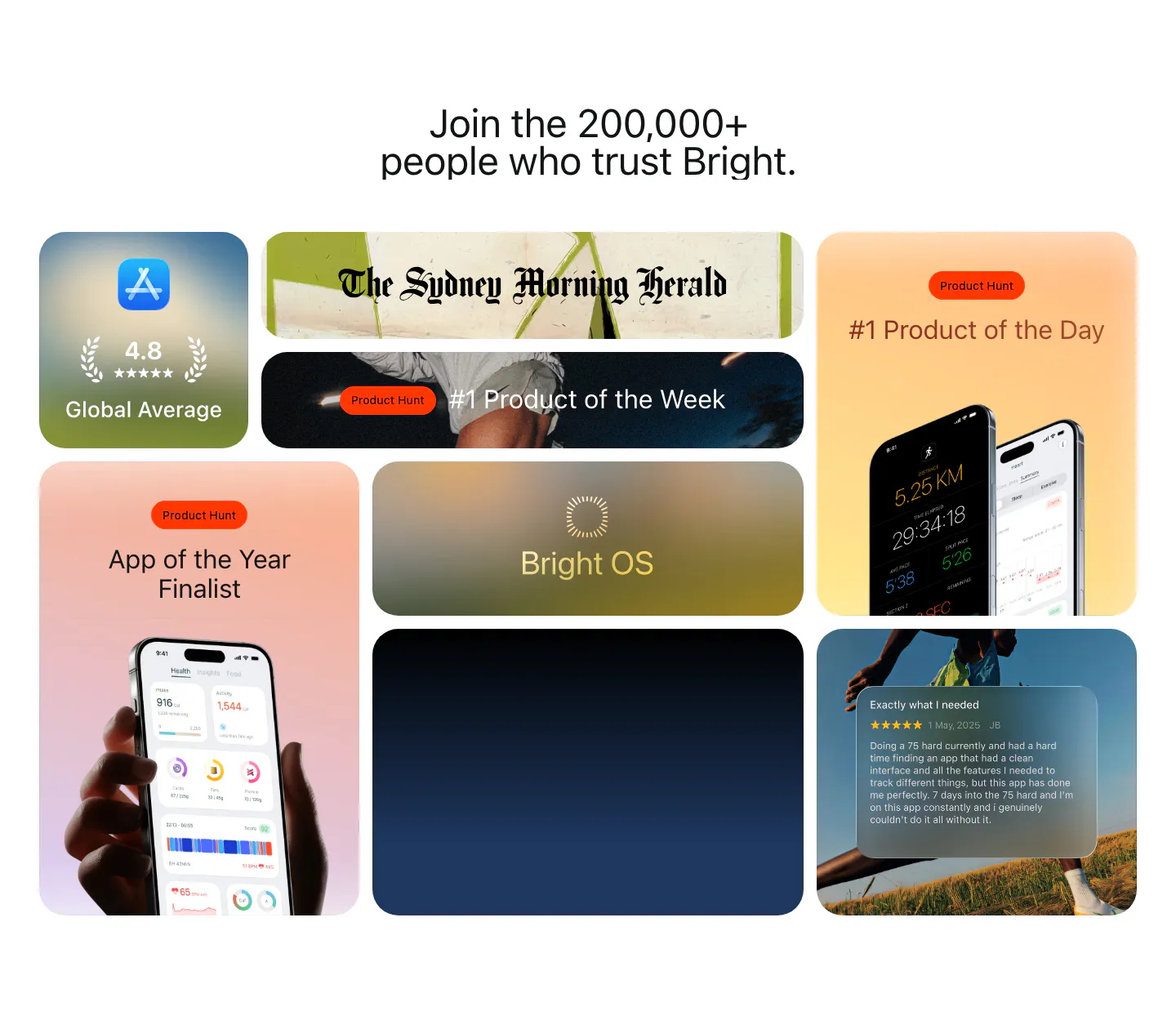
  9. Bright testimonials section: centered headline above a bento grid of App Store rating, Product Hunt awards, press logo and a review card
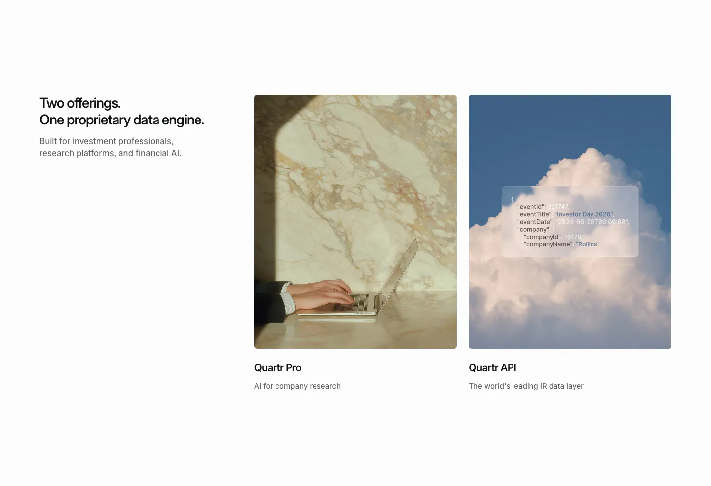
  10. Quartr features section: headline on the left beside two photo cards for Quartr Pro and Quartr API, one with a frosted JSON snippet
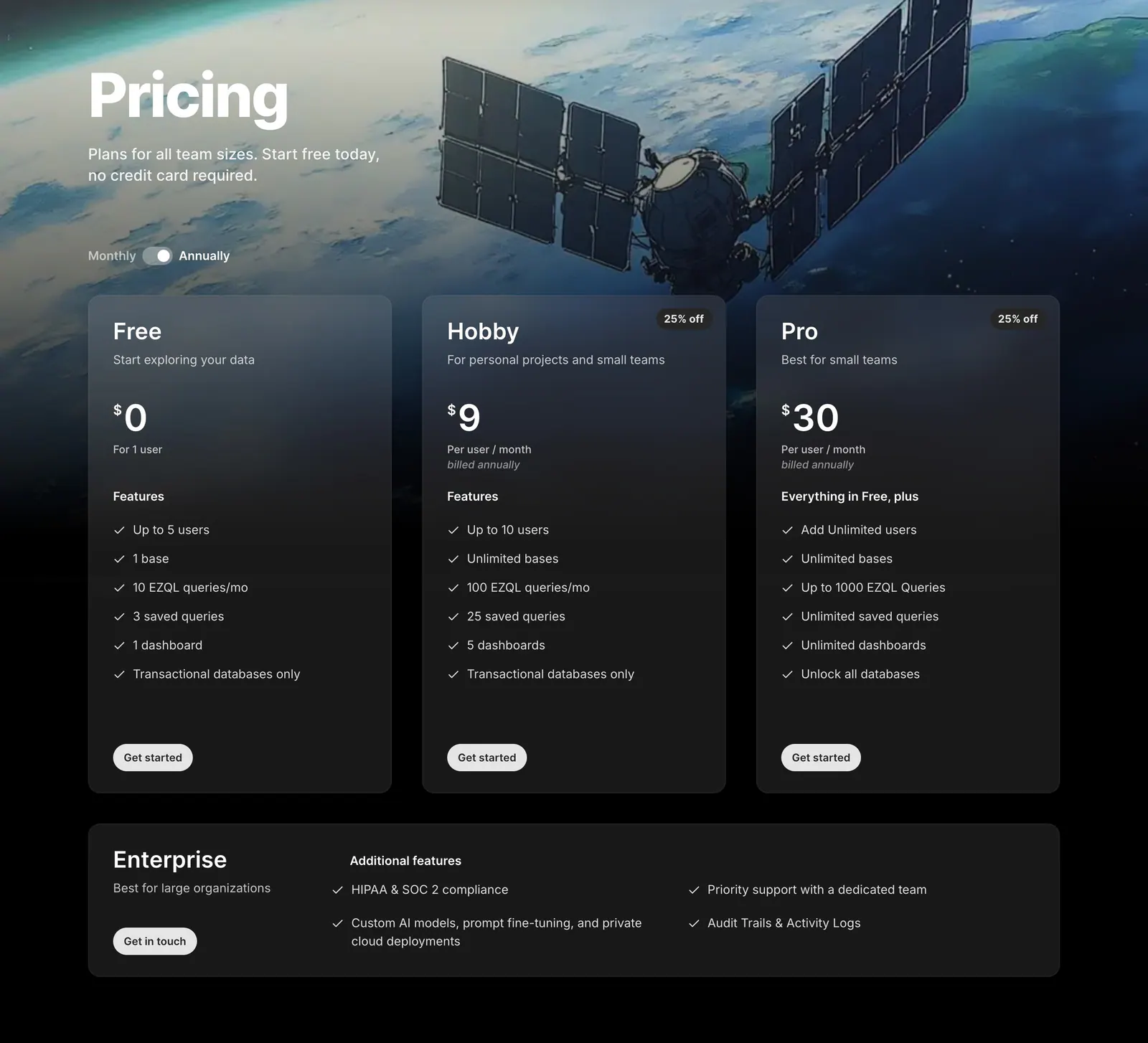
  11. Outerbase pricing section: headline and monthly/annual toggle over satellite artwork, three translucent plan cards and an Enterprise row

Where glassmorphism shows up

Often paired with

Share of glassmorphism sections that also use each style

How to design glassmorphism panels

  1. Place glass over a rich background

    The effect only works when there is color or shape behind the panel to blur. Put glass cards over gradients, photos, or soft blobs of color. Without that, the translucency is invisible and the panel reads as a dull gray box.

  2. Edge each panel with light

    A 1px semi-transparent white border and a subtle top highlight make glass panels read as physical surfaces. They also separate each panel from a busy background. Keep shadows soft and wide rather than dark and tight, so the panel feels light.

  3. Increase panel opacity behind text

    Text on glass sits over a changing background, so contrast varies across the panel. Raise the fill opacity behind body copy until it passes 4.5:1 at the busiest point. Provide a solid fallback for browsers without backdrop-filter and for people who prefer reduced transparency.

  4. Limit how many layers use blur

    The backdrop-filter property is costly to render, especially on large areas and older phones. Apply it to a few key panels rather than every card. Avoid stacking blurred layers on top of each other, and check scrolling smoothness on a mid-range device.
Companies using glassmorphism

All styles
    ↑↓ Navigate ↵ Open

    Section preview

    Website section