Education Website Design Examples
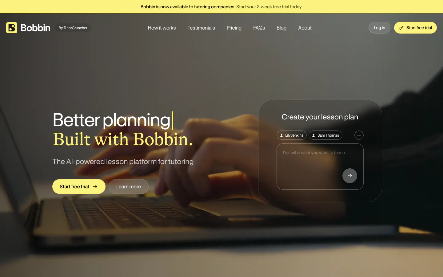
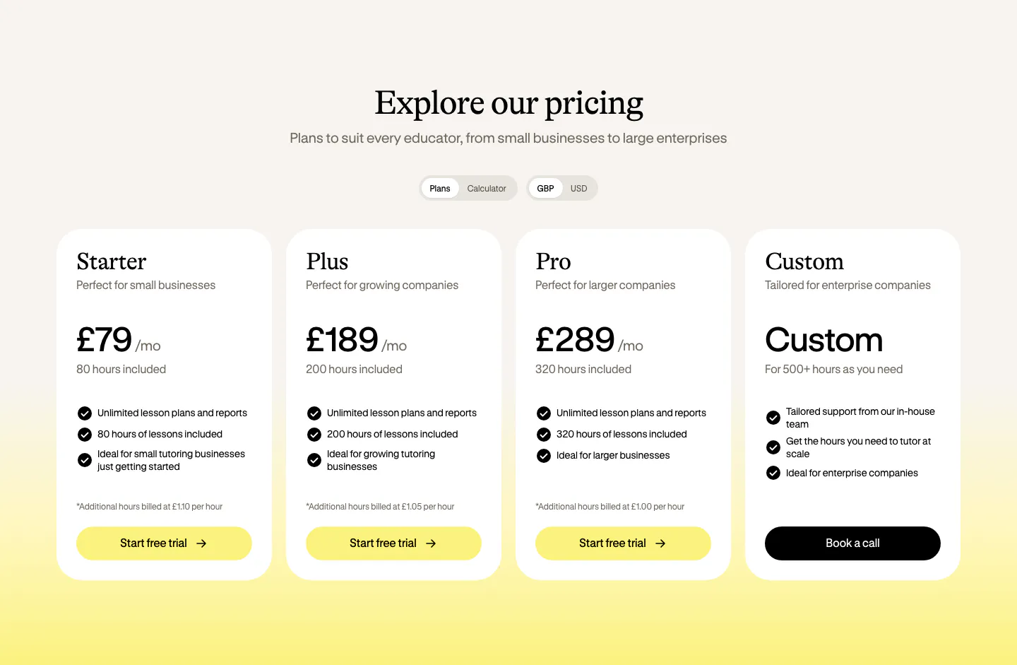
Learning products serve students, teachers, and often a separate buyer such as a school, an employer, or a parent. Each wants proof that learning actually happens. Good education website design shows the learning experience itself, from lessons to progress tracking, presents outcomes in concrete terms, and keeps the tone encouraging without talking down to anyone. Clear pricing and course structure matter as much as any illustration.

Education companies
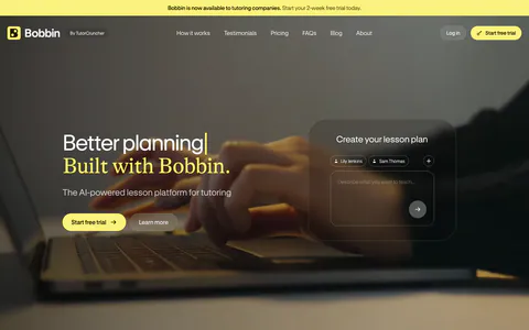
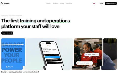
Common styles in education websites
- Serif type
- Photography
- Warm neutral
- Card grid
- Split layout
- Form
- Product UI
How to design an education website
-
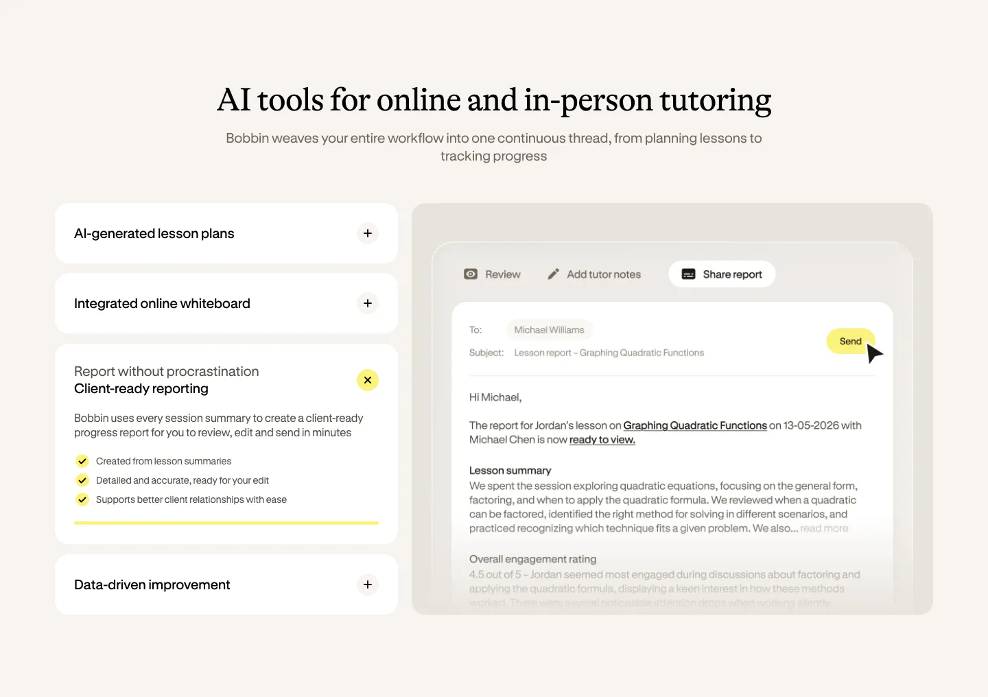
Show a lesson, not just a catalog
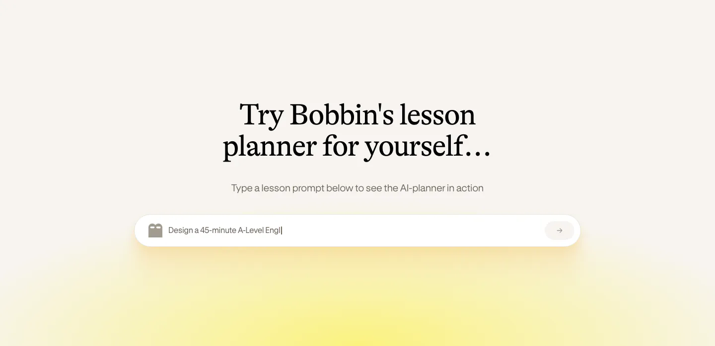
Let visitors see what learning looks like inside the product: a sample lesson, an exercise, or a moment of feedback. A short preview or free module answers the question of quality better than course titles and instructor photos alone.
-
Report outcomes learners care about
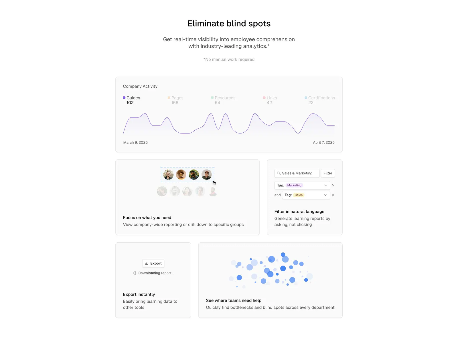
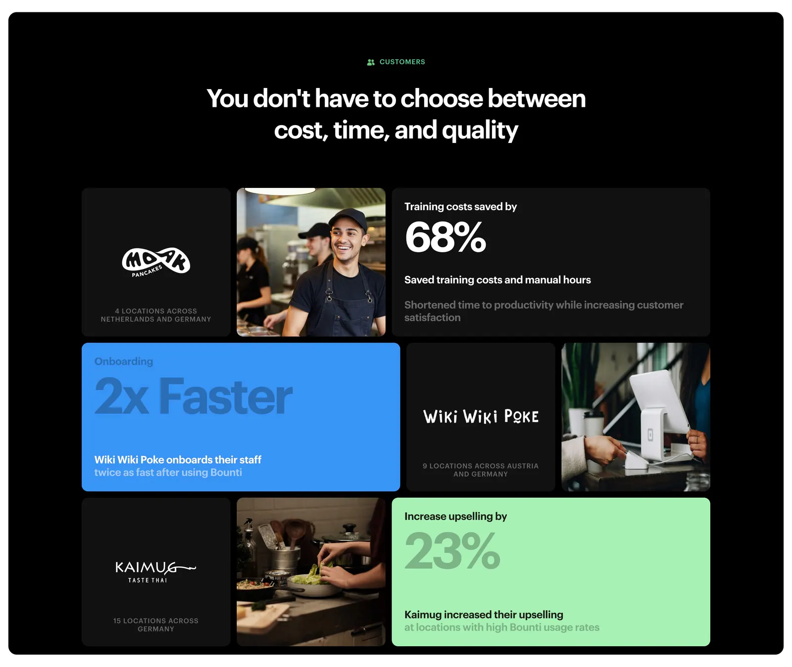
Completion, skills gained, certifications earned, and career results are what learners and employers want to see. Present them with context, such as who was measured and over what period. Unsupported promises about salaries or jobs damage trust quickly.
-
Give institutional buyers their own path
A learner, a teacher, a parent, and a training manager all decide differently. Give buyers a separate section with admin features, reporting, and group pricing. Keep the learner-facing pages focused on motivation and the experience of studying.
-
Make the time commitment clear
Learners want to know how long a course takes, how many hours a week it needs, and what they will be able to do at the end. Show the syllabus, format, and pace up front. Uncertainty about commitment is a common reason people put off signing up.