HR & Recruiting Website Design Examples

People software has two audiences: the HR or talent team that buys it and the employees or candidates who use it. Both care about fairness, privacy, and time saved. Effective HR & recruiting website design shows the product from each side, uses warm but realistic imagery of actual workplaces, and handles compliance topics like payroll accuracy and data protection in calm, specific language.
88 sections

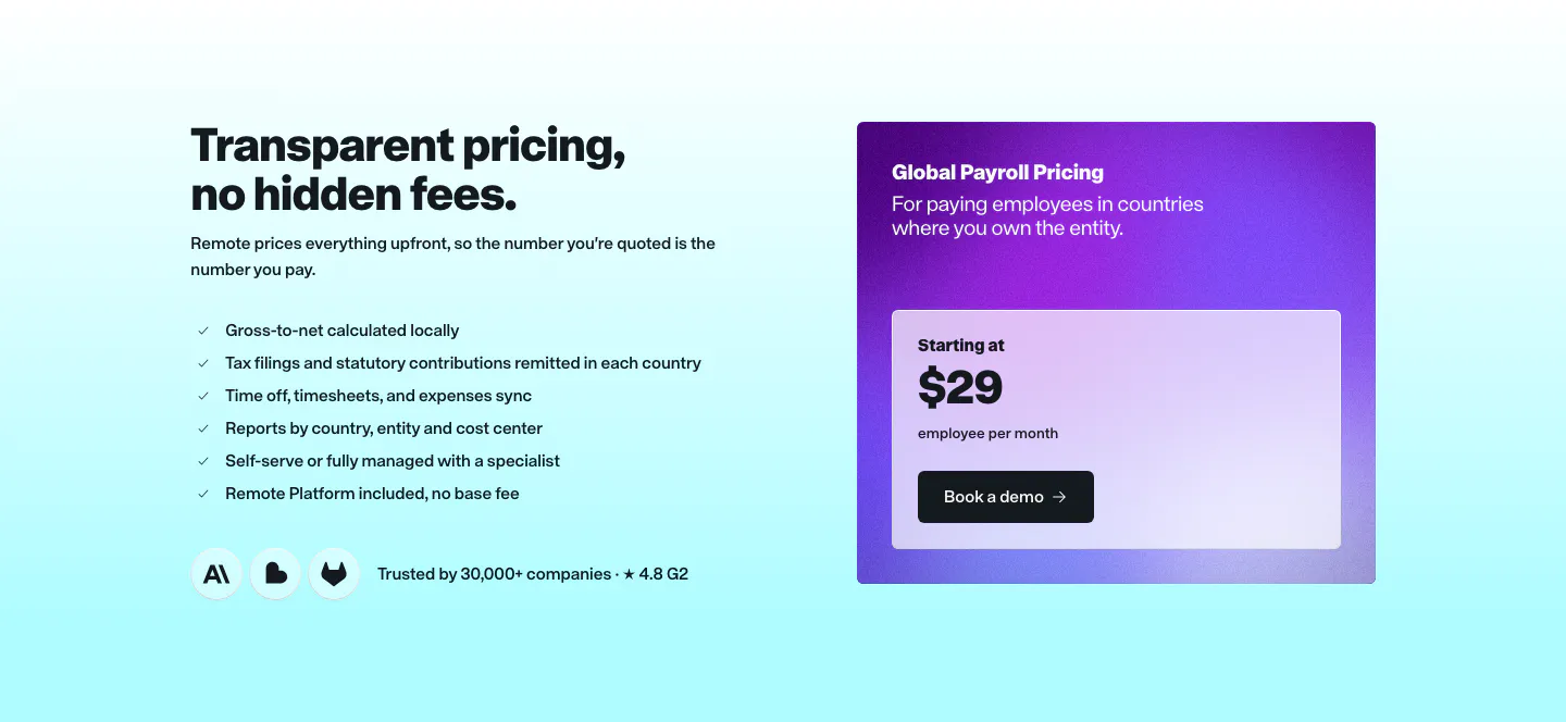
  1. Remote pricing section: headline and checklist on the left beside a purple gradient Global Payroll price card on cyan
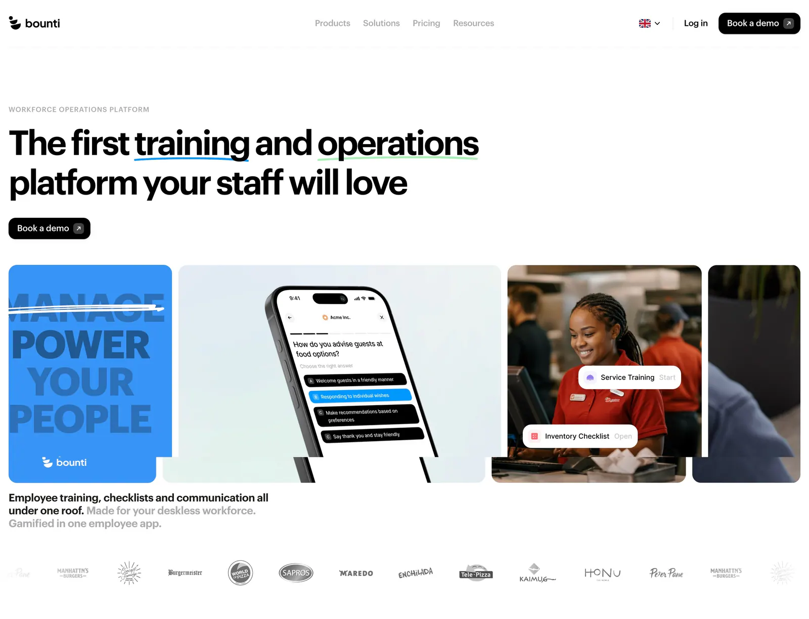
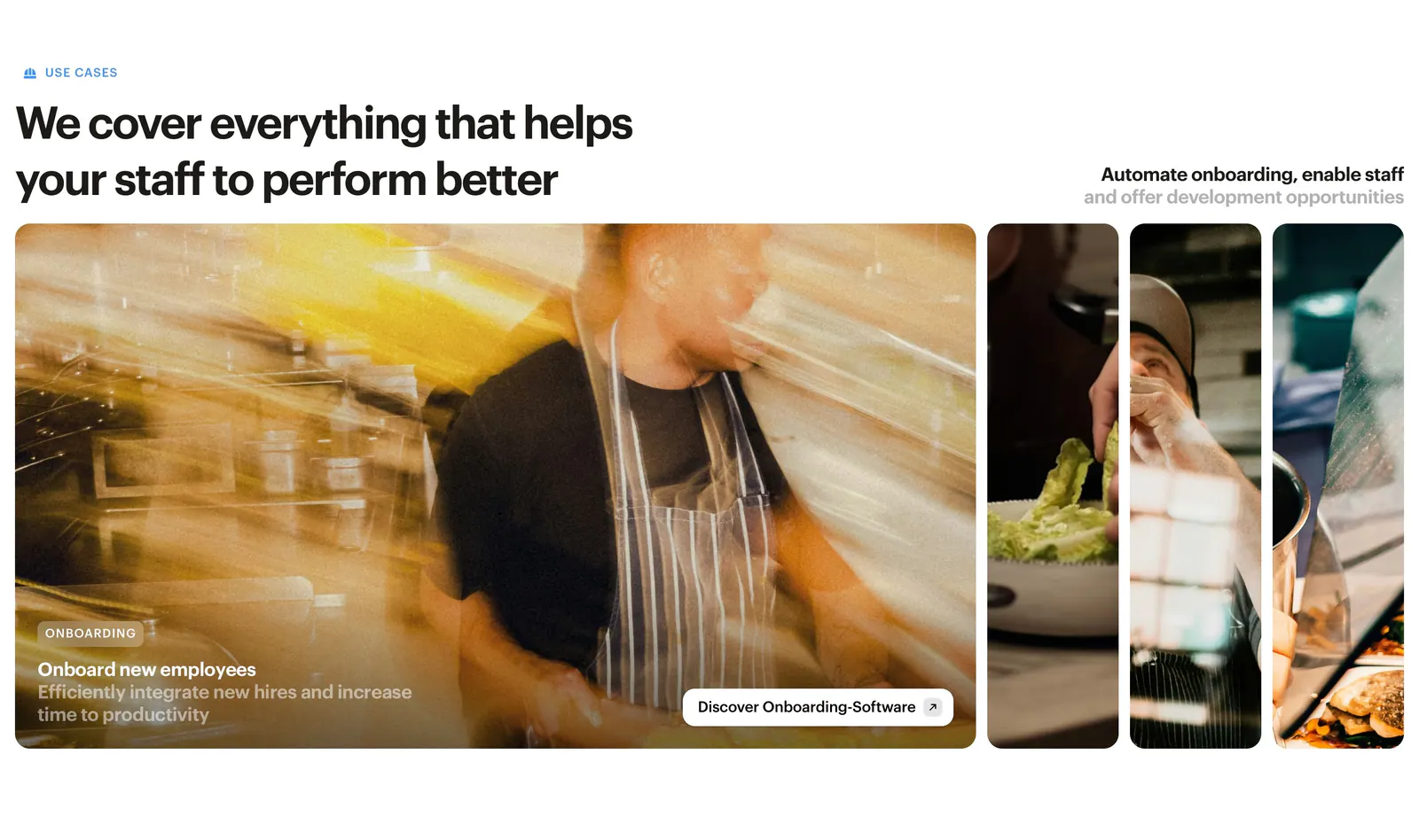
  2. Bounti features section: left headline above expanding photo panels of restaurant staff, the first open with an onboarding caption
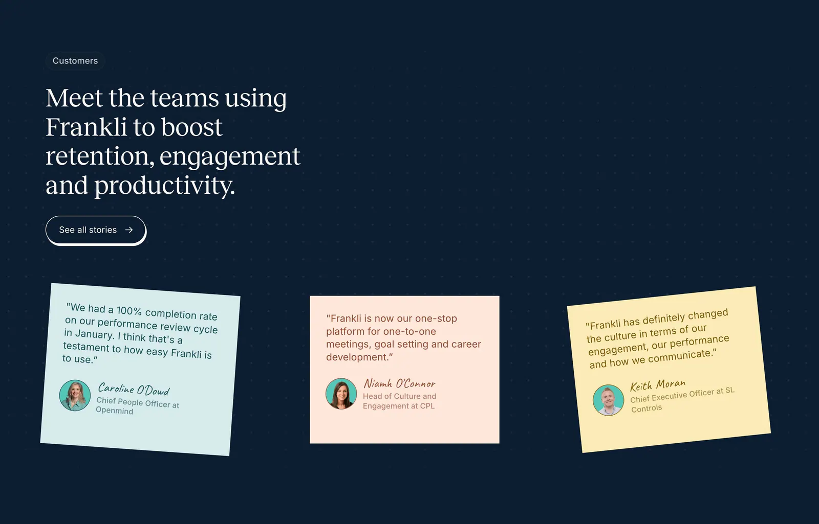
  3. Frankli testimonials section: serif headline with stories button above three tilted pastel sticky-note quote cards on a navy dot grid
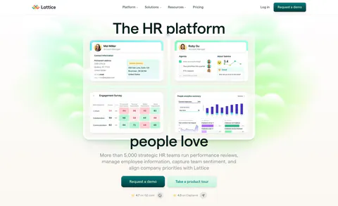
  4. Lattice call-to-action section: centered headline, demo button and G2 and Capterra ratings over a soft green cloud glow background
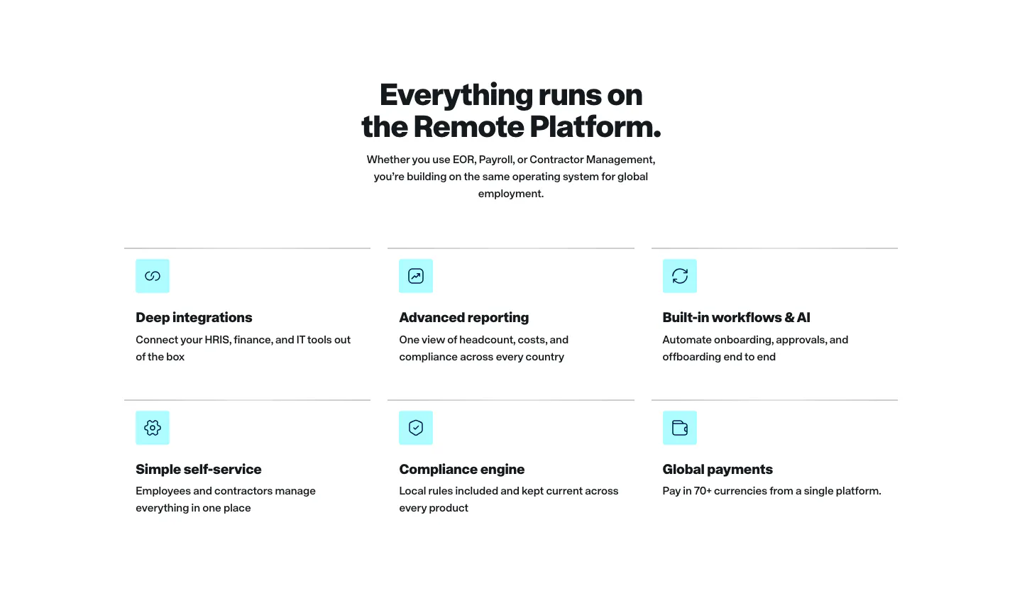
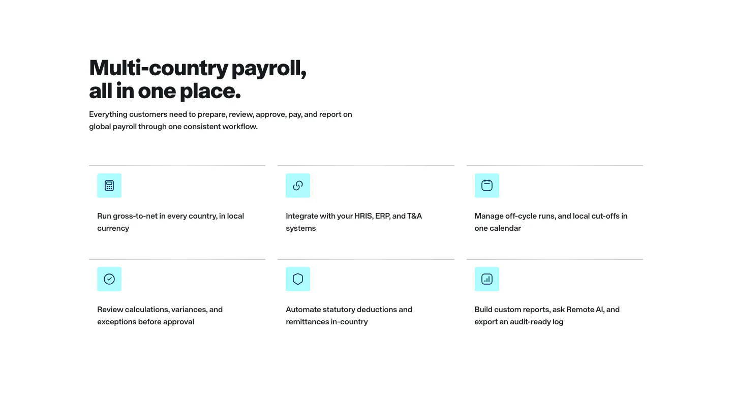
  5. Remote features section: centered headline above a two-row grid of six features with cyan icon tiles on white
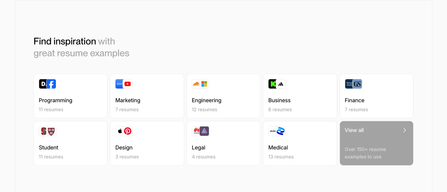
  6. Rezi blog & resources section: two-row grid of resume example category cards with company logos and a gray view-all tile
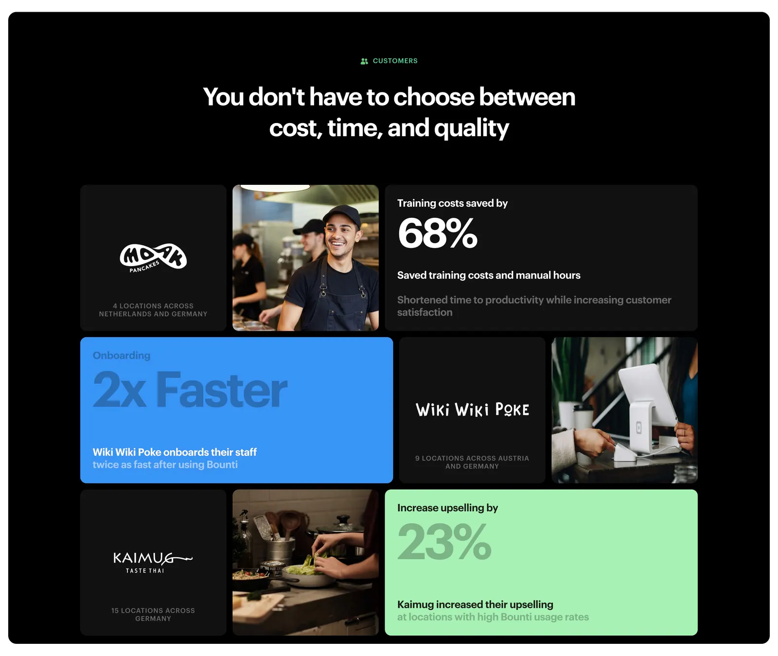
  7. Bounti value proposition section: centered headline over a bento grid of customer logos, kitchen photos and stat tiles on a black panel
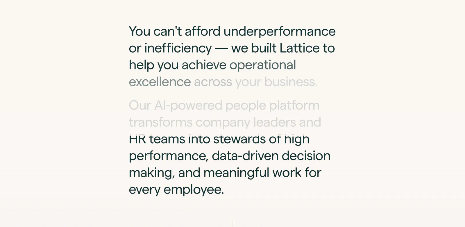
  8. Lattice about & mission section: large two-paragraph mission statement with scroll-fade text in a narrow column on warm off-white
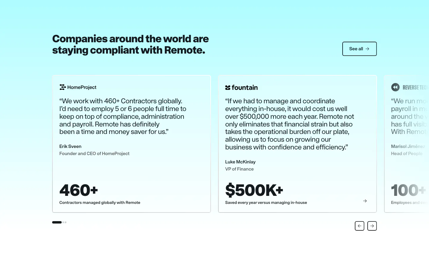
  9. Remote testimonials section: headline and See all button above a carousel of quote cards with large metrics on cyan
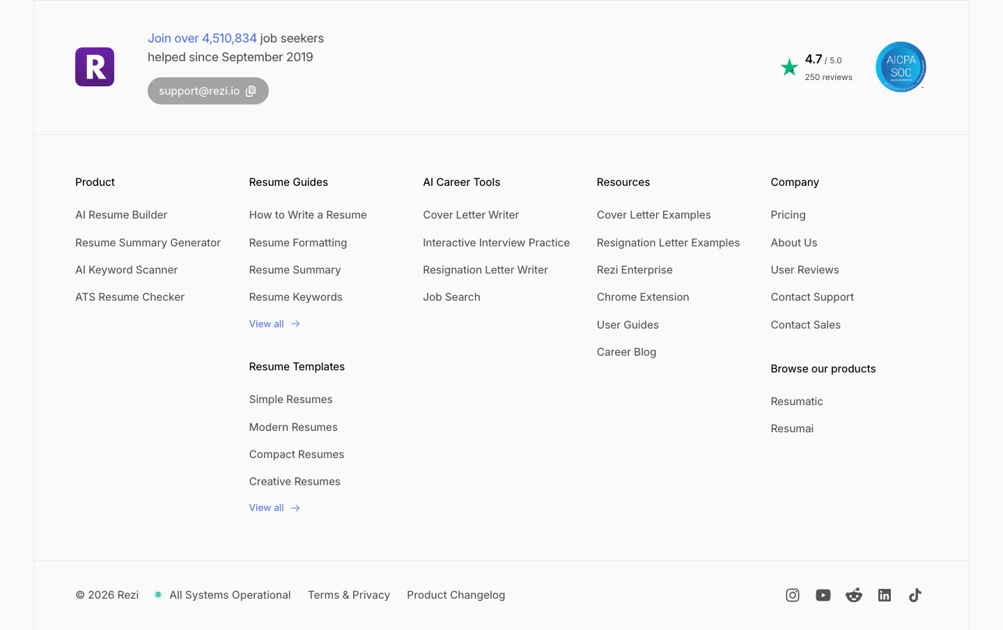
  10. Rezi footer section: logo with user count and support email, five link columns, rating and SOC badge, copyright and social icons
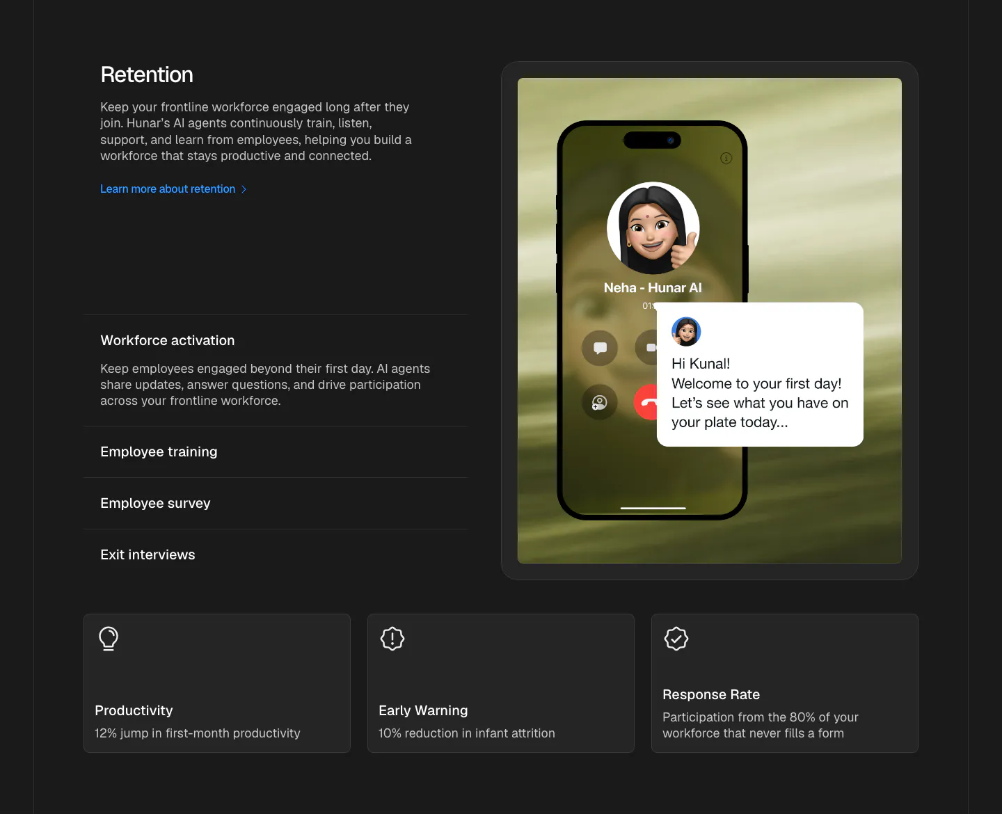
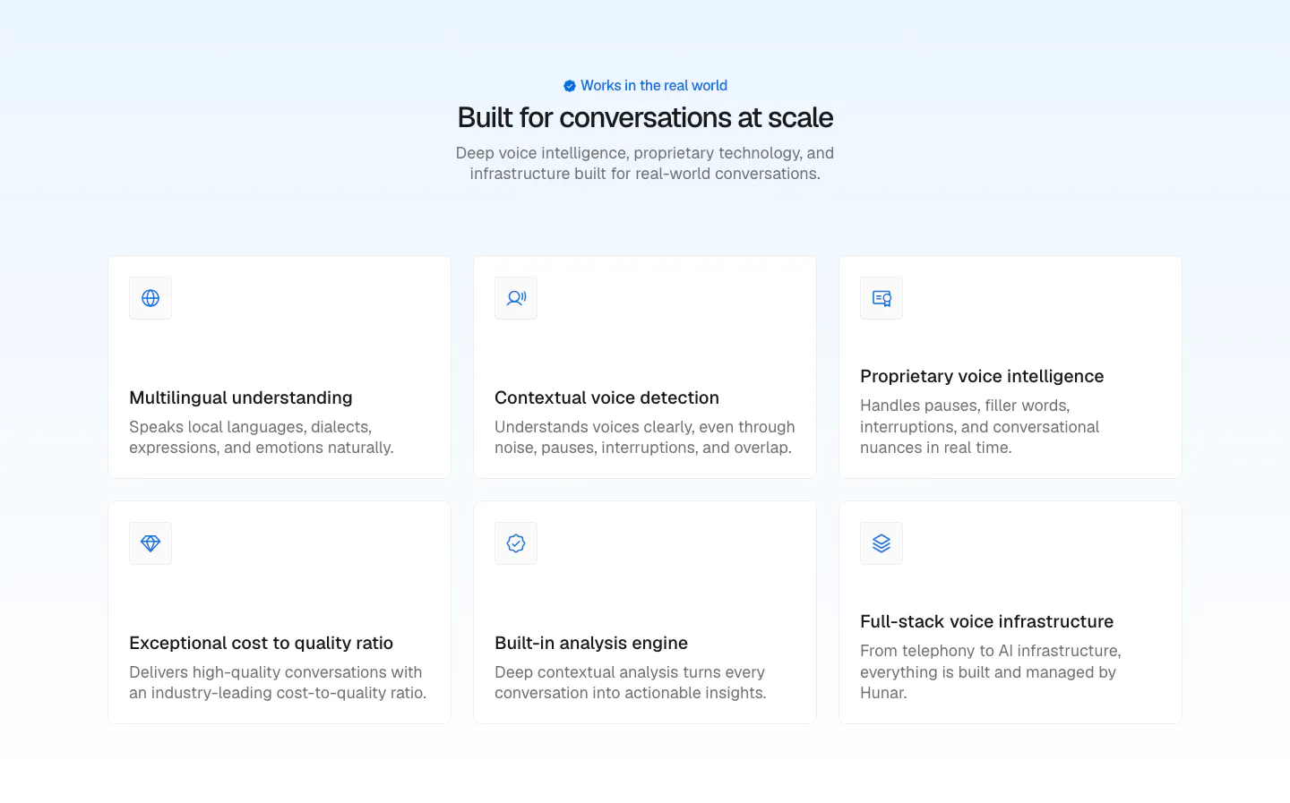
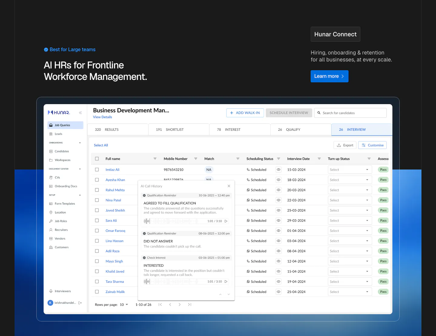
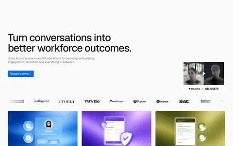
  11. Hunar features section: dark background with retention copy and accordion list beside a phone call mockup, three outcome cards below
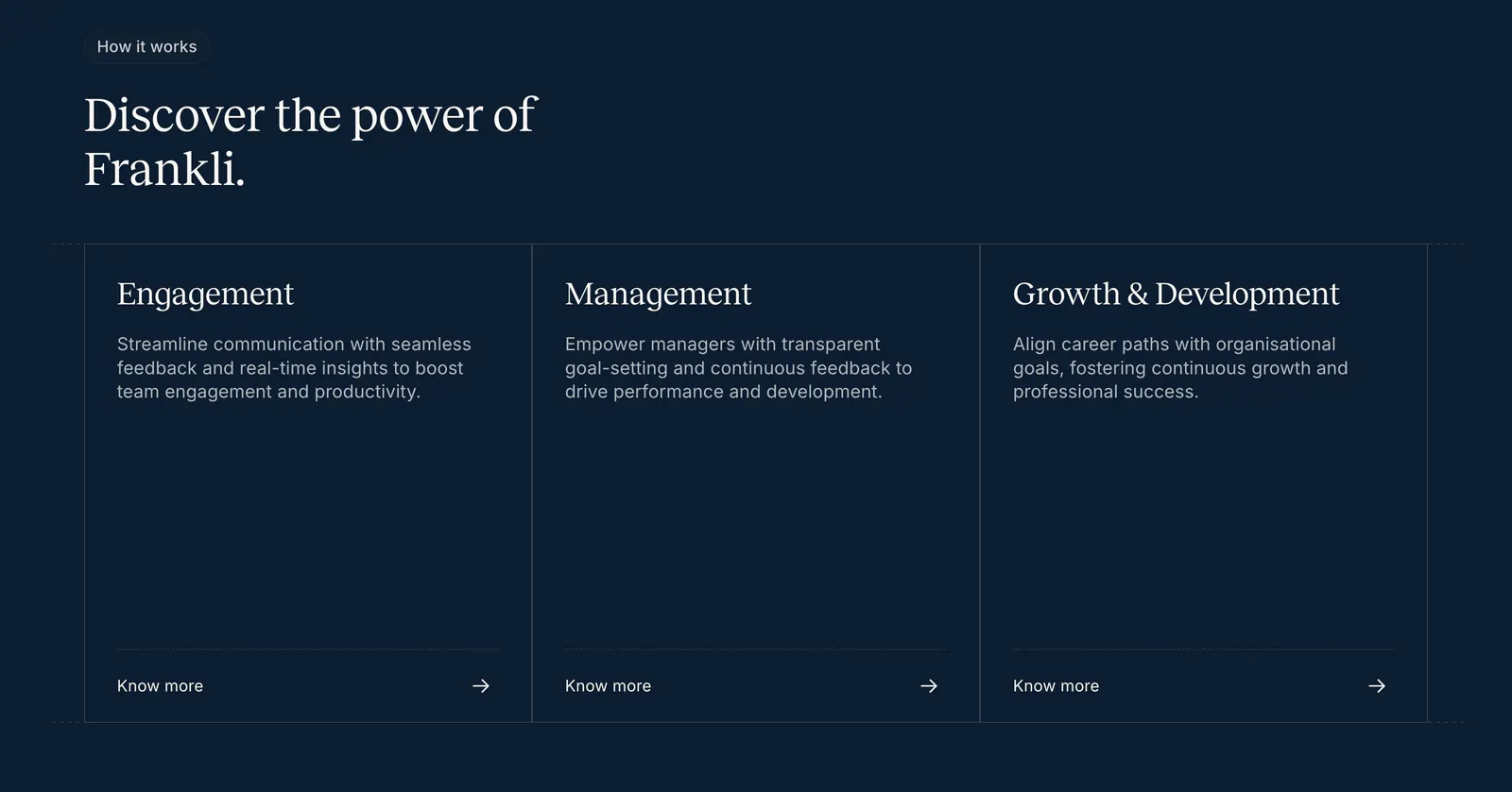
  12. Frankli how it works section: serif heading above three outlined cards for engagement, management and growth with links on navy
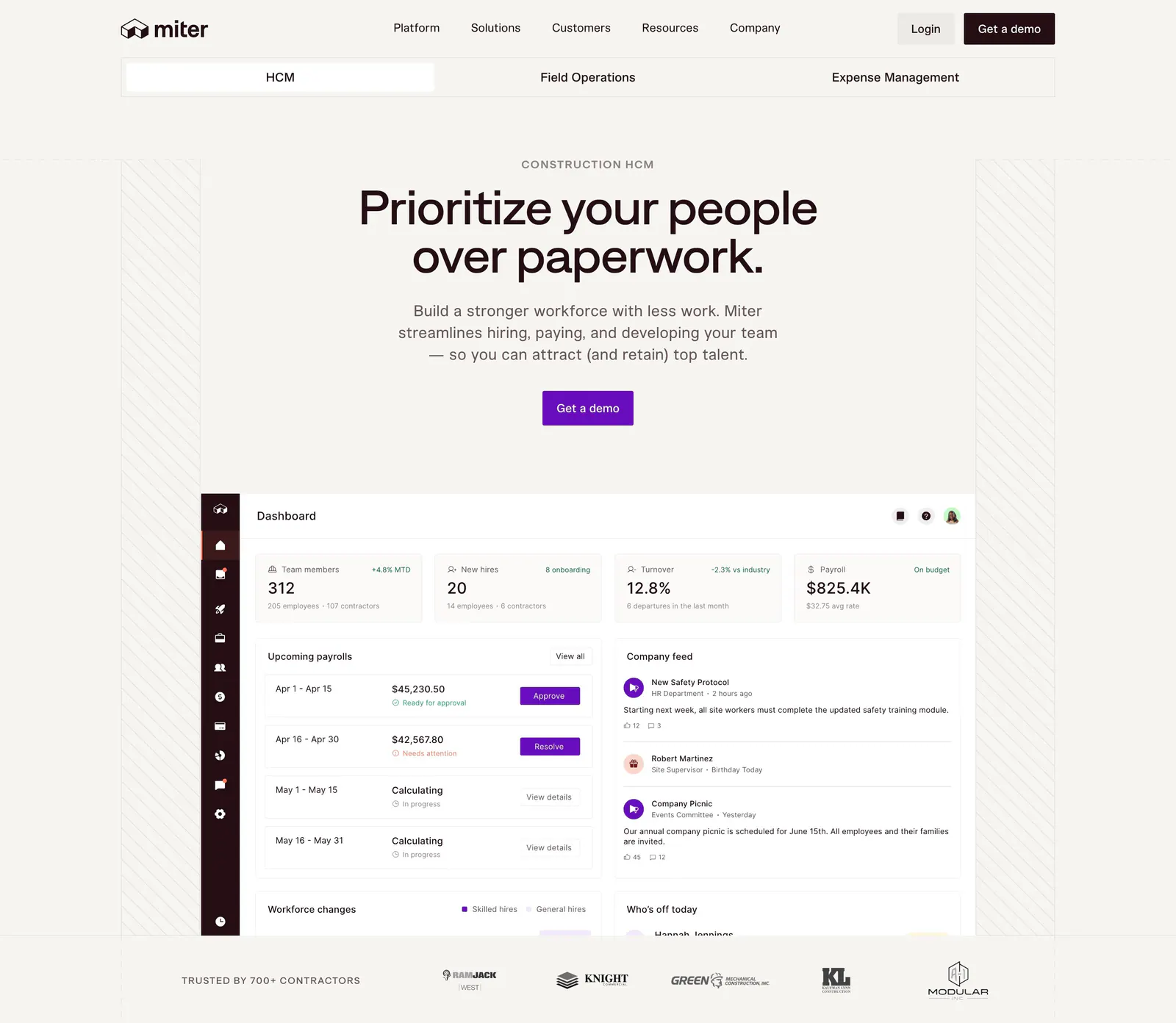
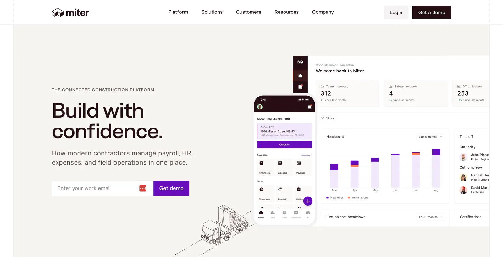
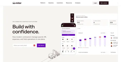
  13. Miter hero section: centered headline and CTA on warm off-white above an HR dashboard screenshot and a contractor logo row
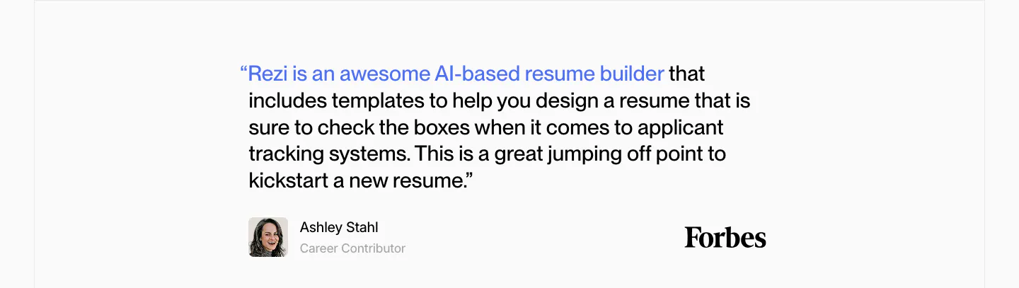
  14. Rezi testimonials section: single Forbes quote with a blue highlighted lead-in, author avatar and Forbes wordmark on light gray
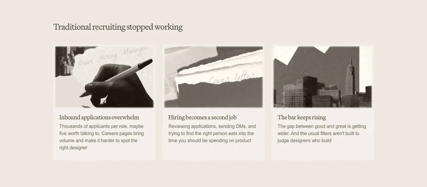
  15. Decimals value proposition section: serif heading above three cards with sepia photo collages and short problem descriptions on beige
  16. Remote features section: left-aligned headline above a six-item grid with cyan icon tiles and divider lines
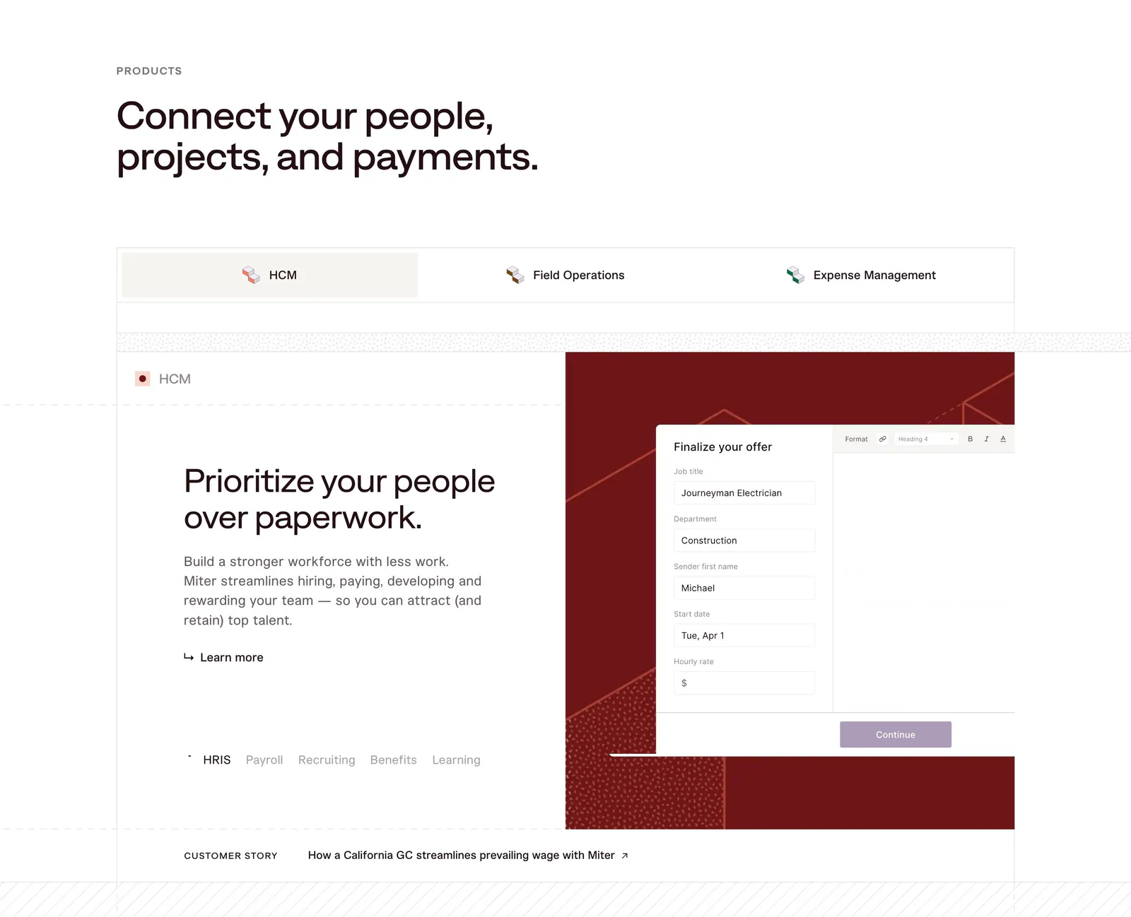
  17. Miter features section: headline above product tabs and a split panel with HCM copy beside an offer form UI on dark red
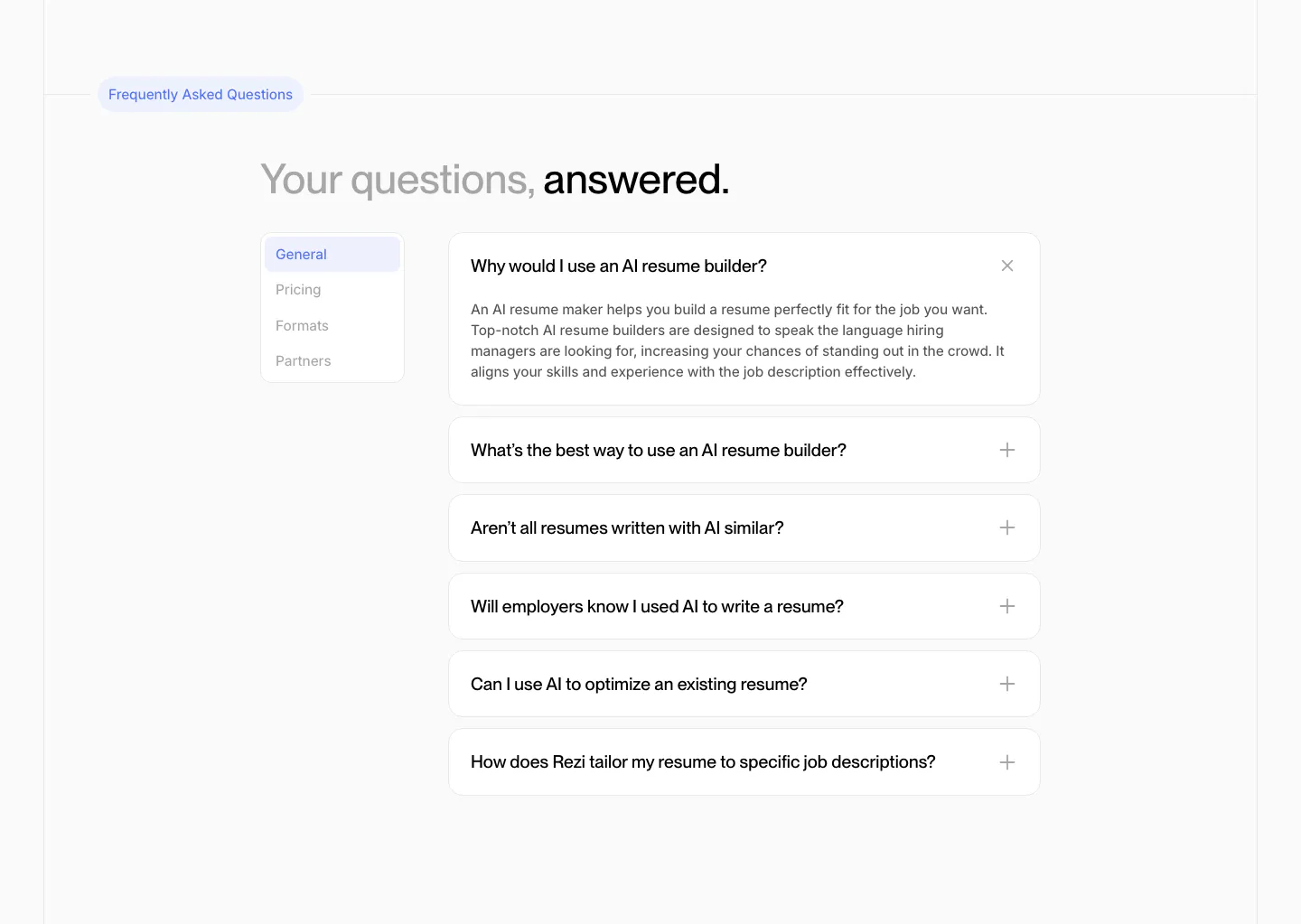
  18. Rezi FAQ section: two-tone headline above a side tab list and an accordion of question cards with one expanded answer
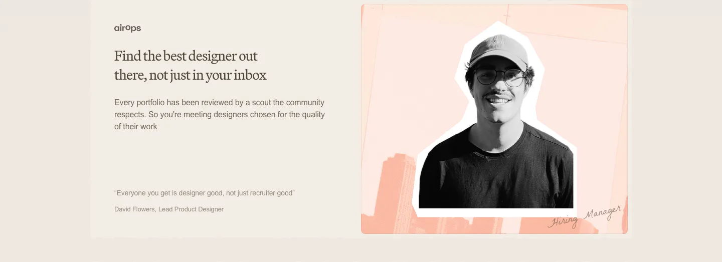
  19. Decimals testimonials section: serif headline, copy and short quote on the left beside a cutout photo of a hiring manager on a peach collage
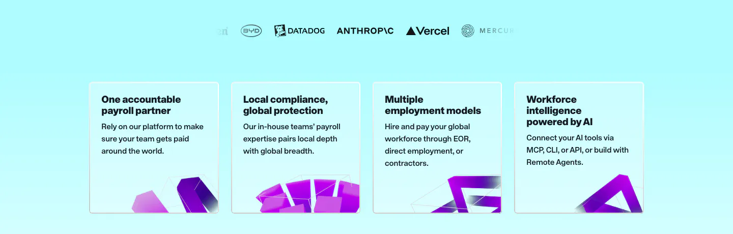
  20. Remote value proposition section: faded logo row above four light cyan benefit cards with purple 3D shapes at the bottom
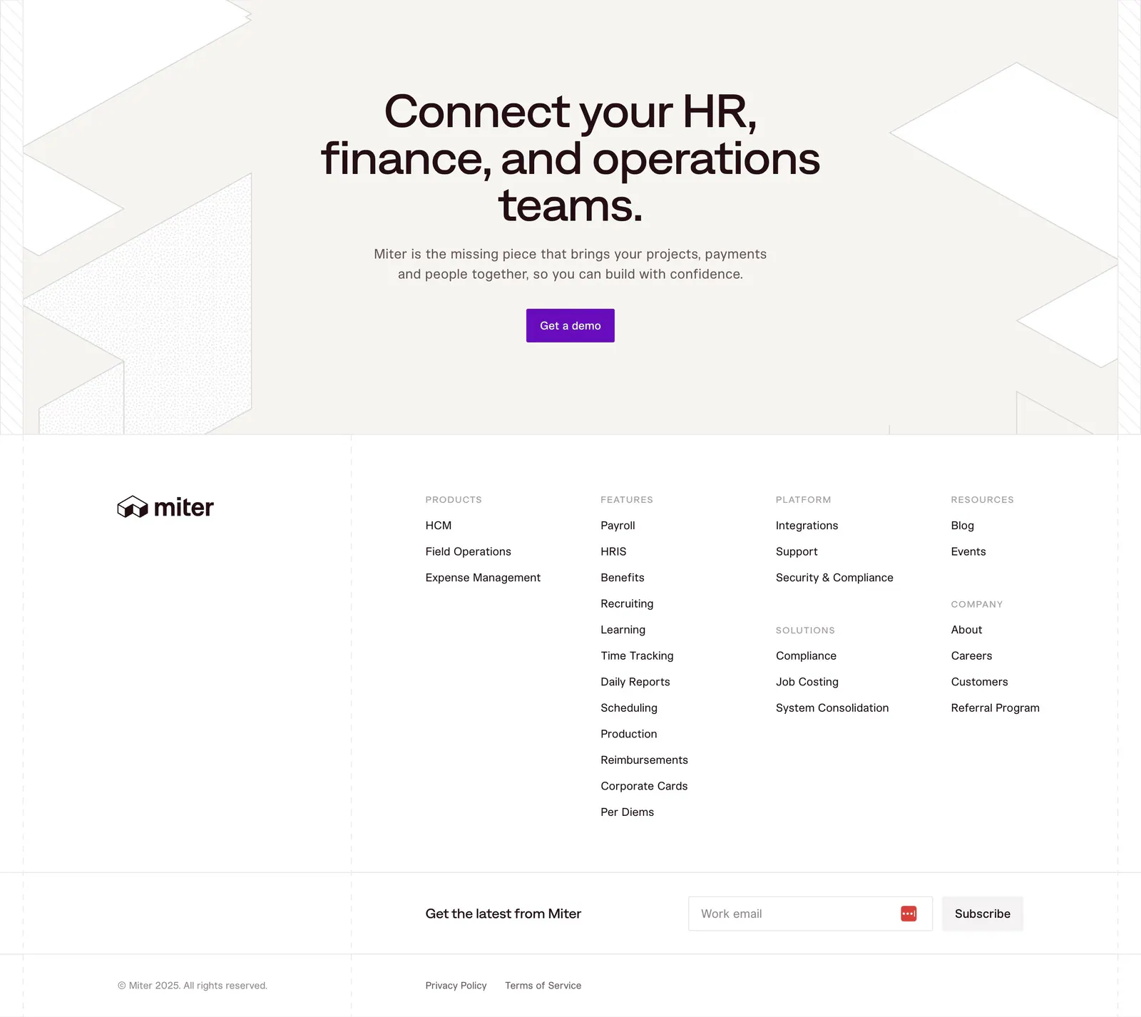
  21. Miter footer section: centered CTA on beige with geometric line shapes, then link columns, email signup and legal row
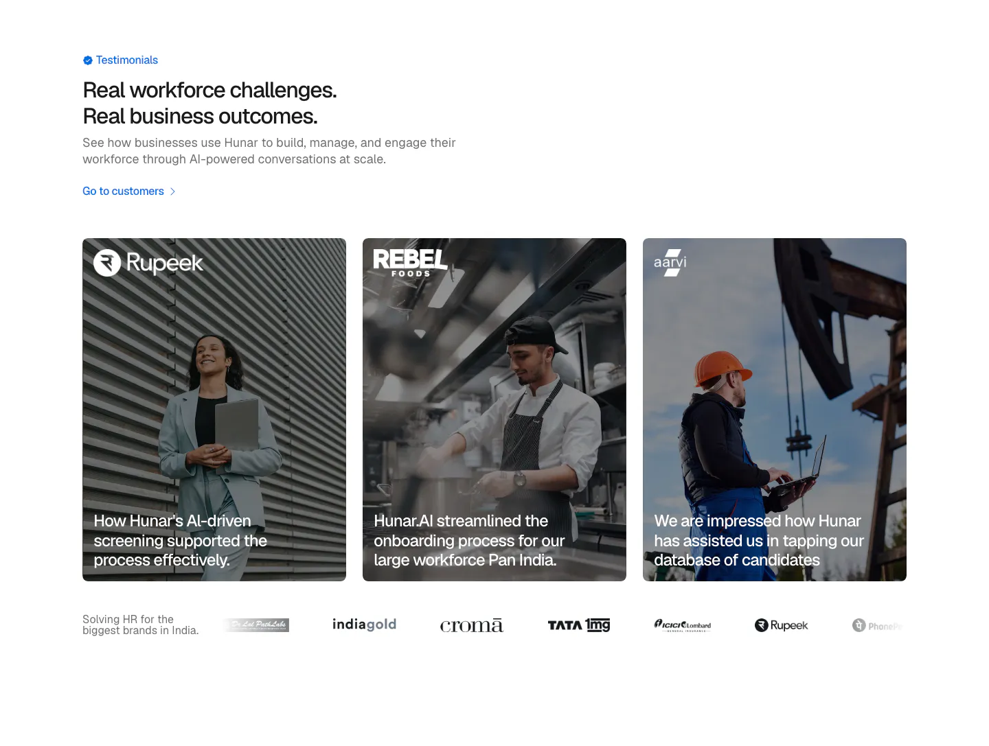
  22. Hunar testimonials section: left heading above three photo cards with customer quotes over images and a customer logo row
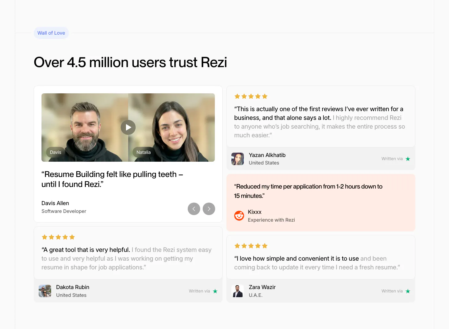
  23. Rezi testimonials section: two-column review wall with a video testimonial card, star-rated quote cards and a peach Reddit quote
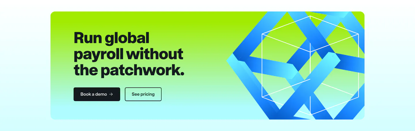
  24. Remote call to action section: dark headline and two buttons on a lime-to-cyan gradient card with a blue 3D ribbon cube
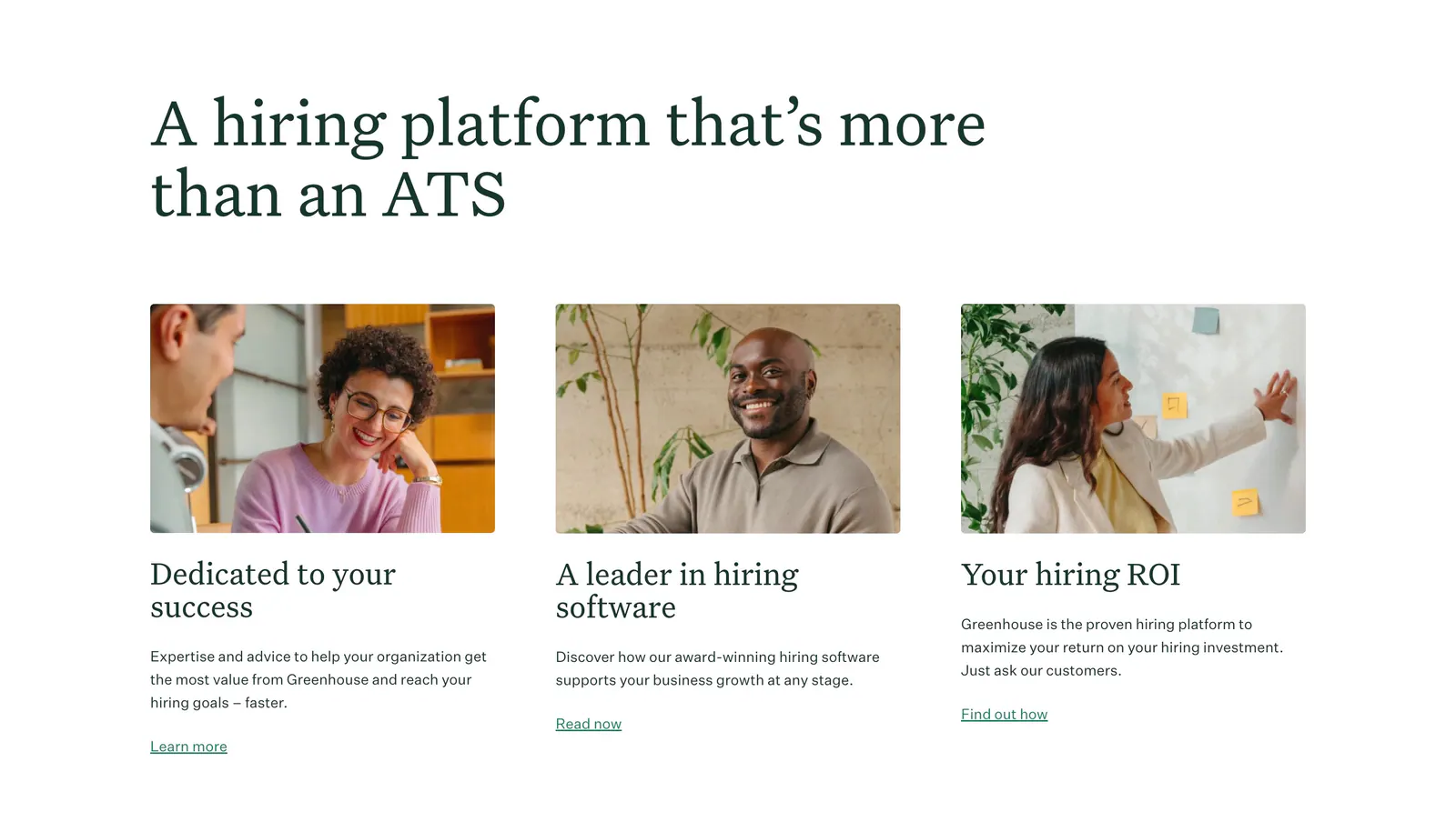
  25. Greenhouse features section: large serif headline above three cards with workplace photos, serif titles, copy and text links
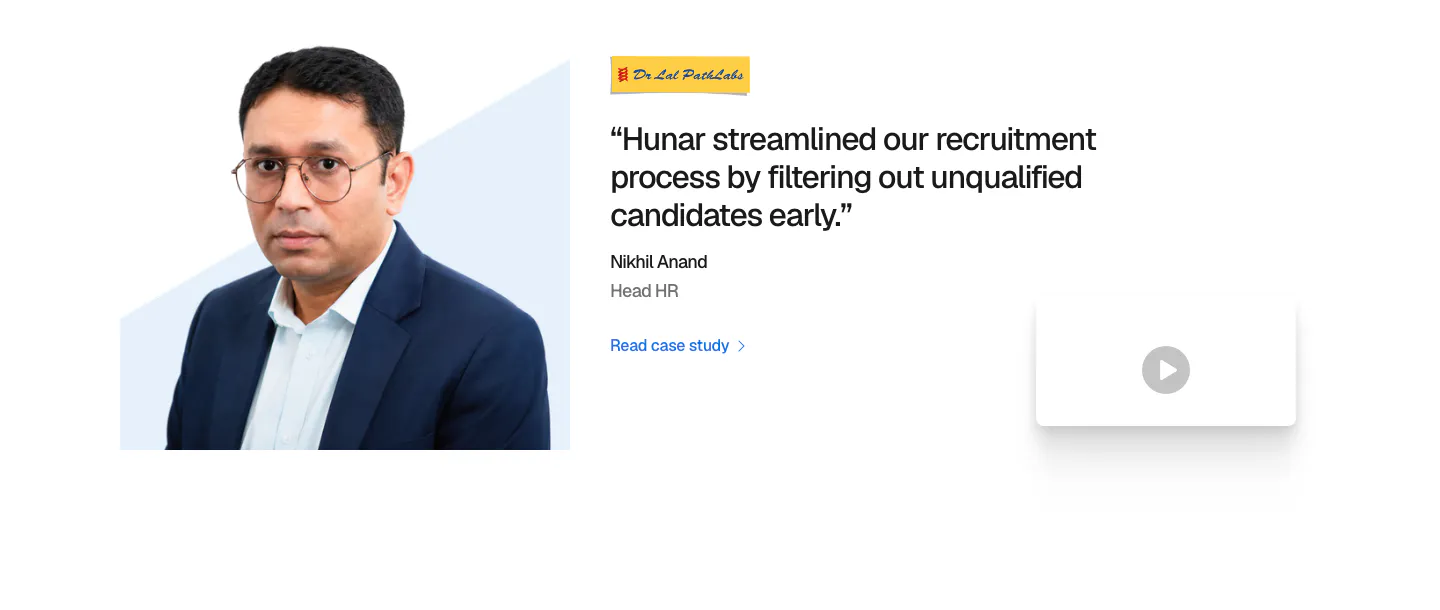
  26. Hunar testimonials section: headshot photo on the left, customer quote with logo and case study link, and a video thumbnail
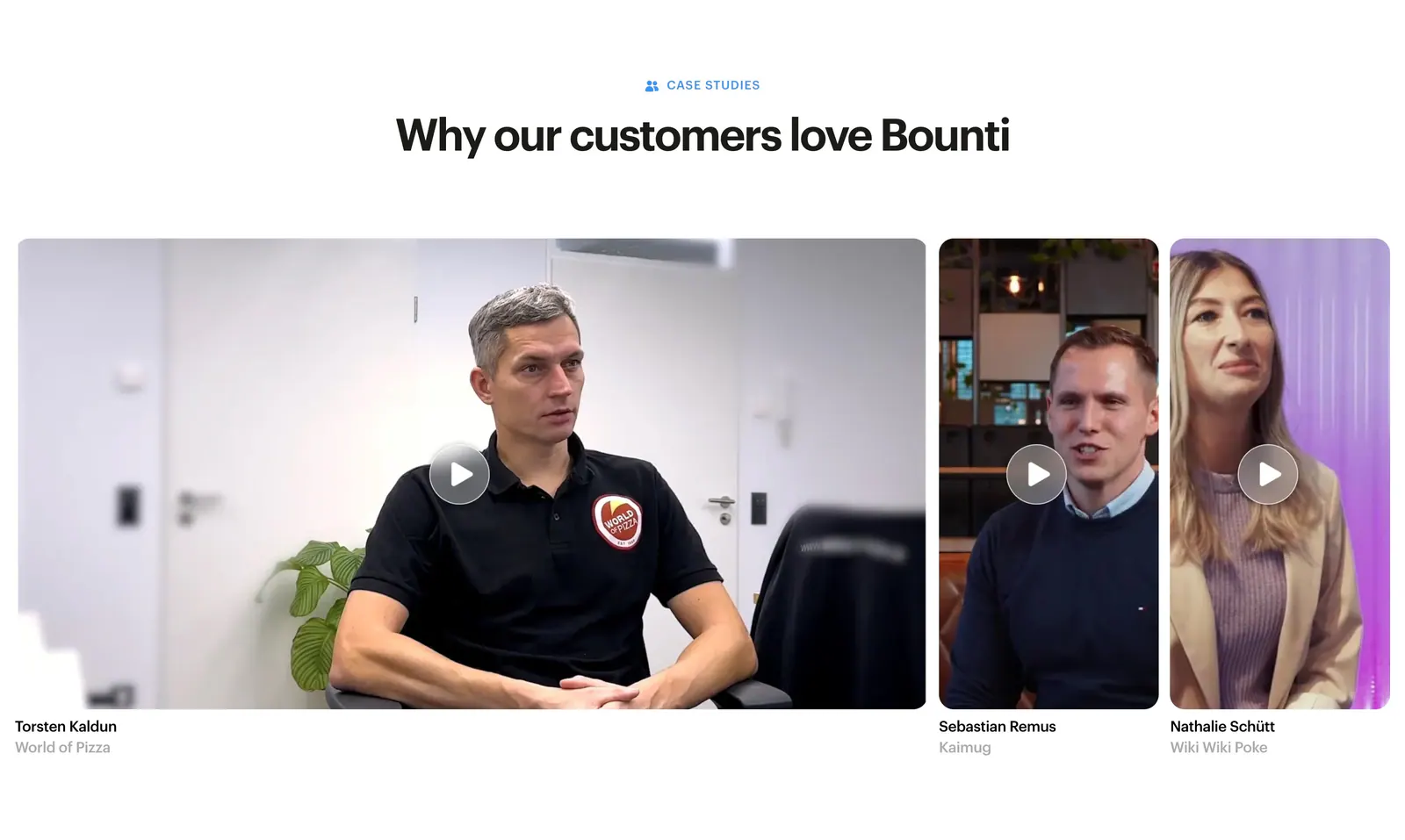
  27. Bounti testimonials section: centered headline above a row of customer video thumbnails with play buttons and names
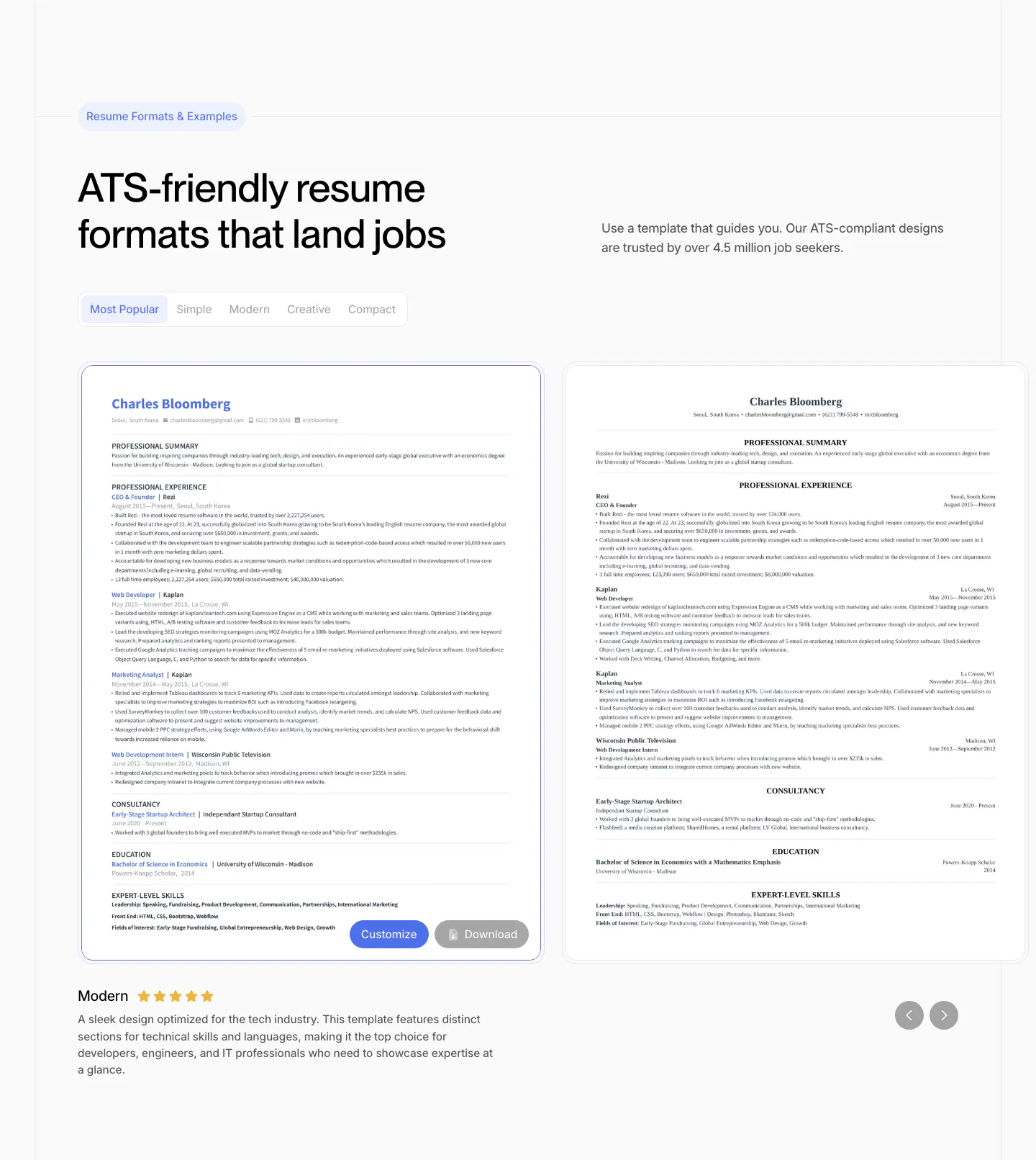
  28. Rezi features section: resume template gallery with style tabs, two resume previews in a slider with arrows and a rated description
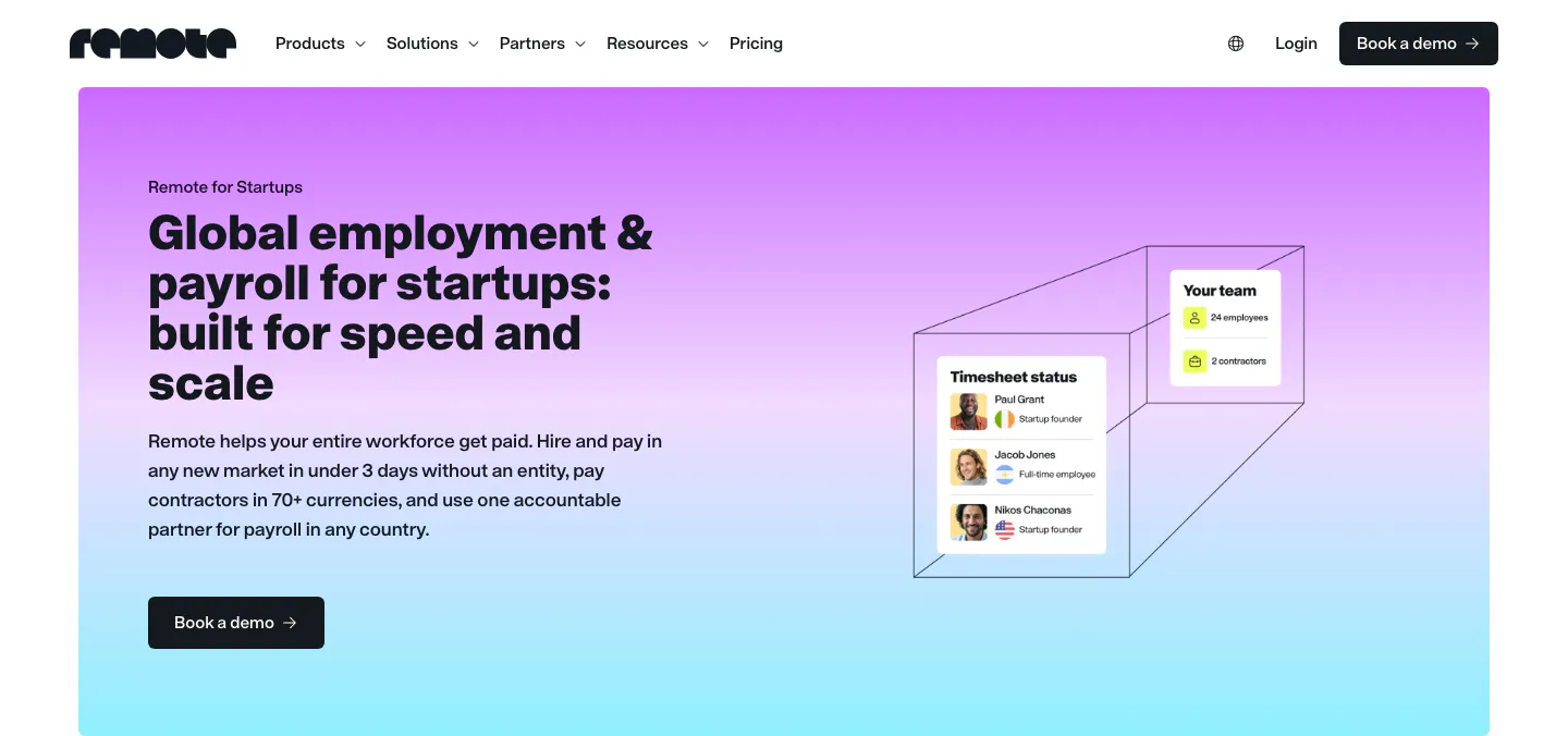
  29. Remote hero section: nav above a purple-to-cyan gradient card with headline left and timesheet UI cards in a wireframe box
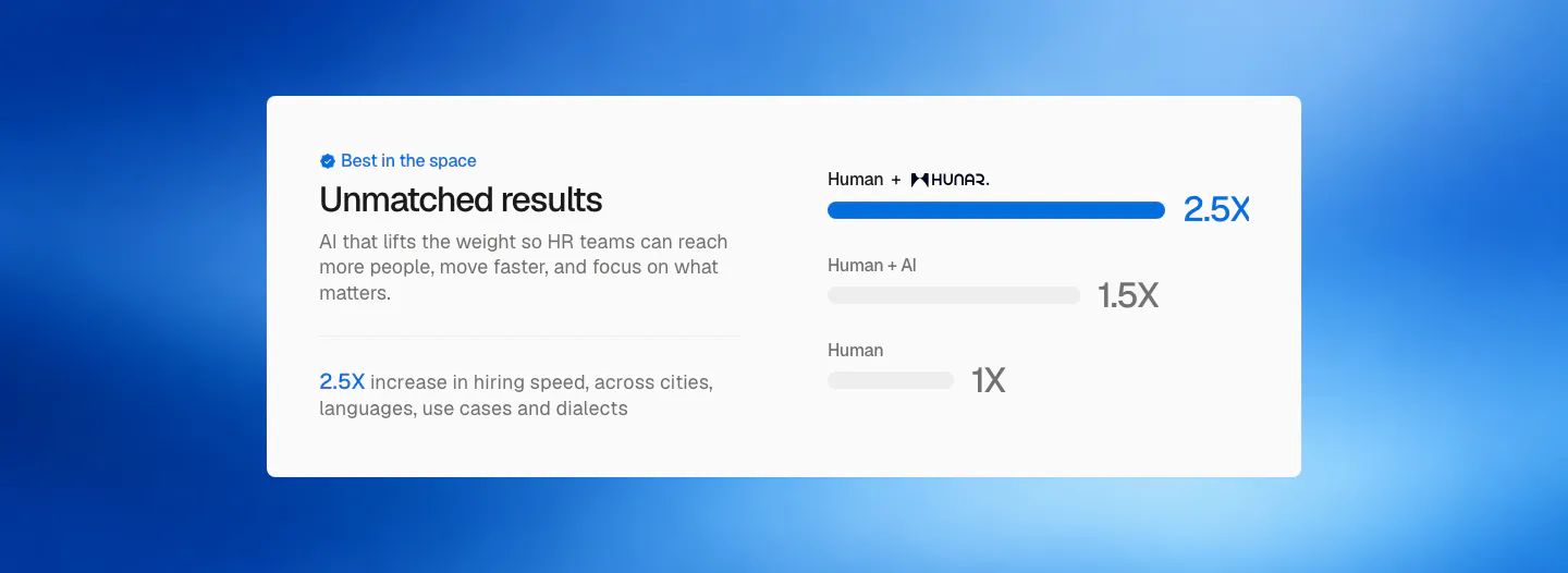
  30. Hunar comparison section: white card with copy on the left and a bar chart of hiring speed multipliers on a blue gradient background
  31. Greenhouse testimonials section: serif heading and customer stories button on the left, two-column grid of customer logos on the right
  32. Rezi call to action section: blue full-width band with a two-tone headline on the left and a white pill button on the right
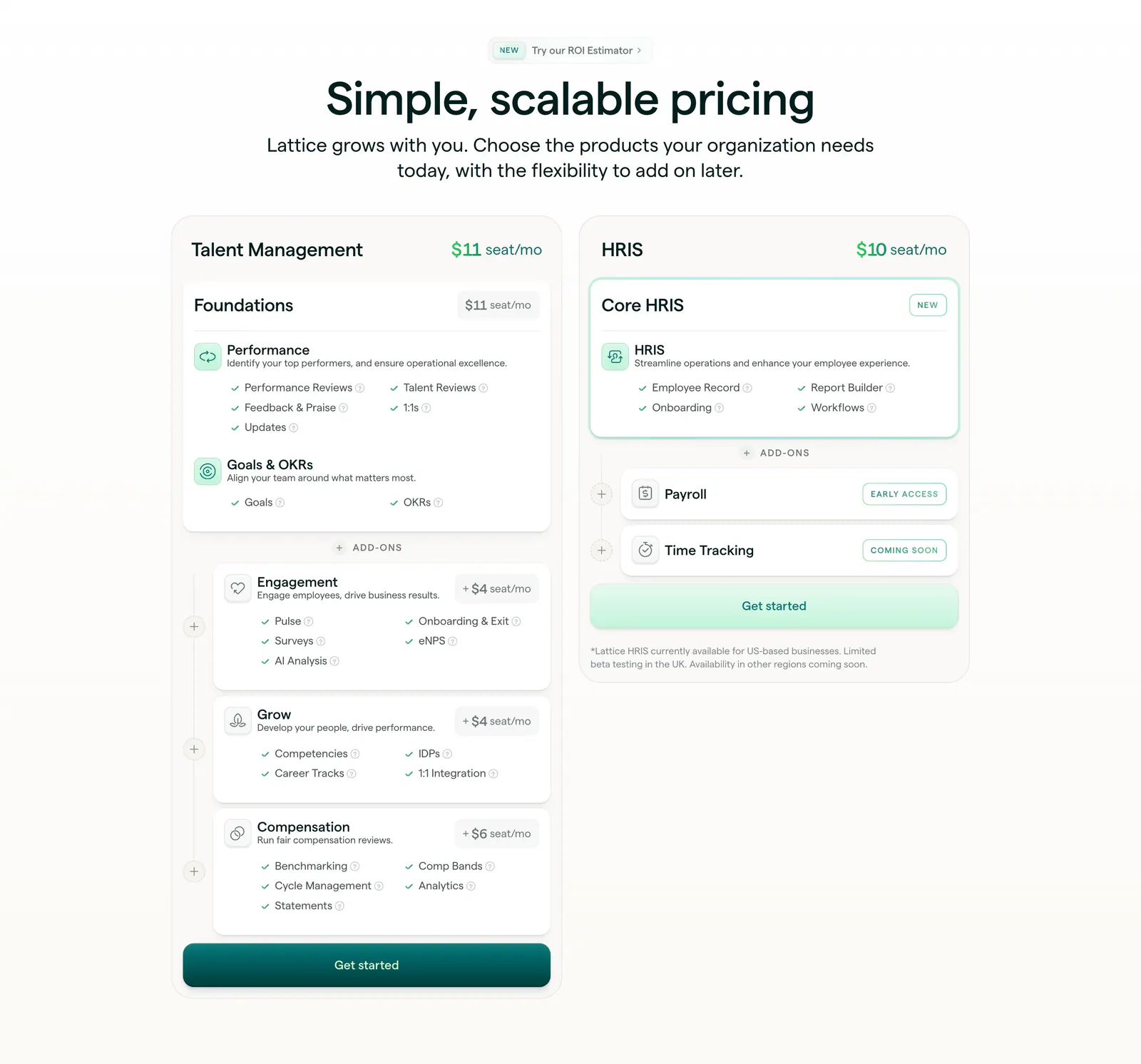
  33. Lattice pricing section: centered heading above two plan cards, Talent Management with stacked add-ons and HRIS, with seat prices and checklists
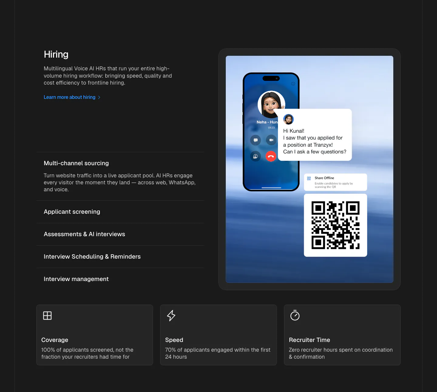
  34. Hunar features section: dark background with hiring copy and expandable list beside a phone call mockup, three outcome cards below
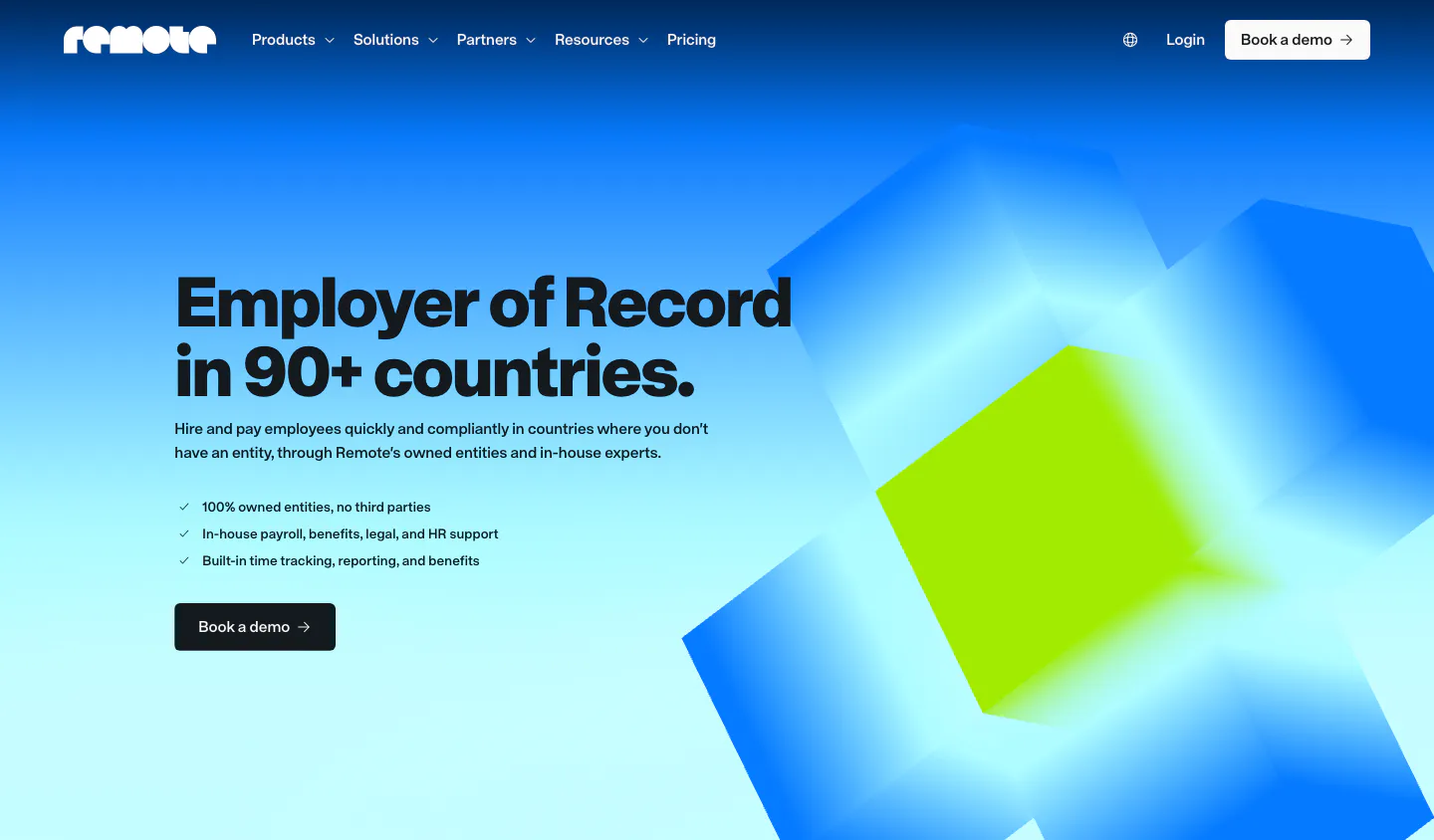
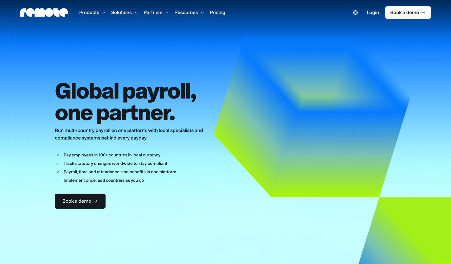
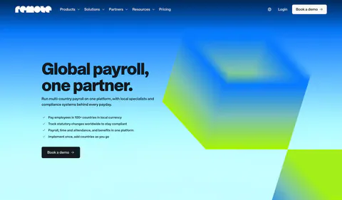
  35. Remote hero section: nav, left headline with checklist and demo button beside blurred blue and lime 3D cubes on gradient
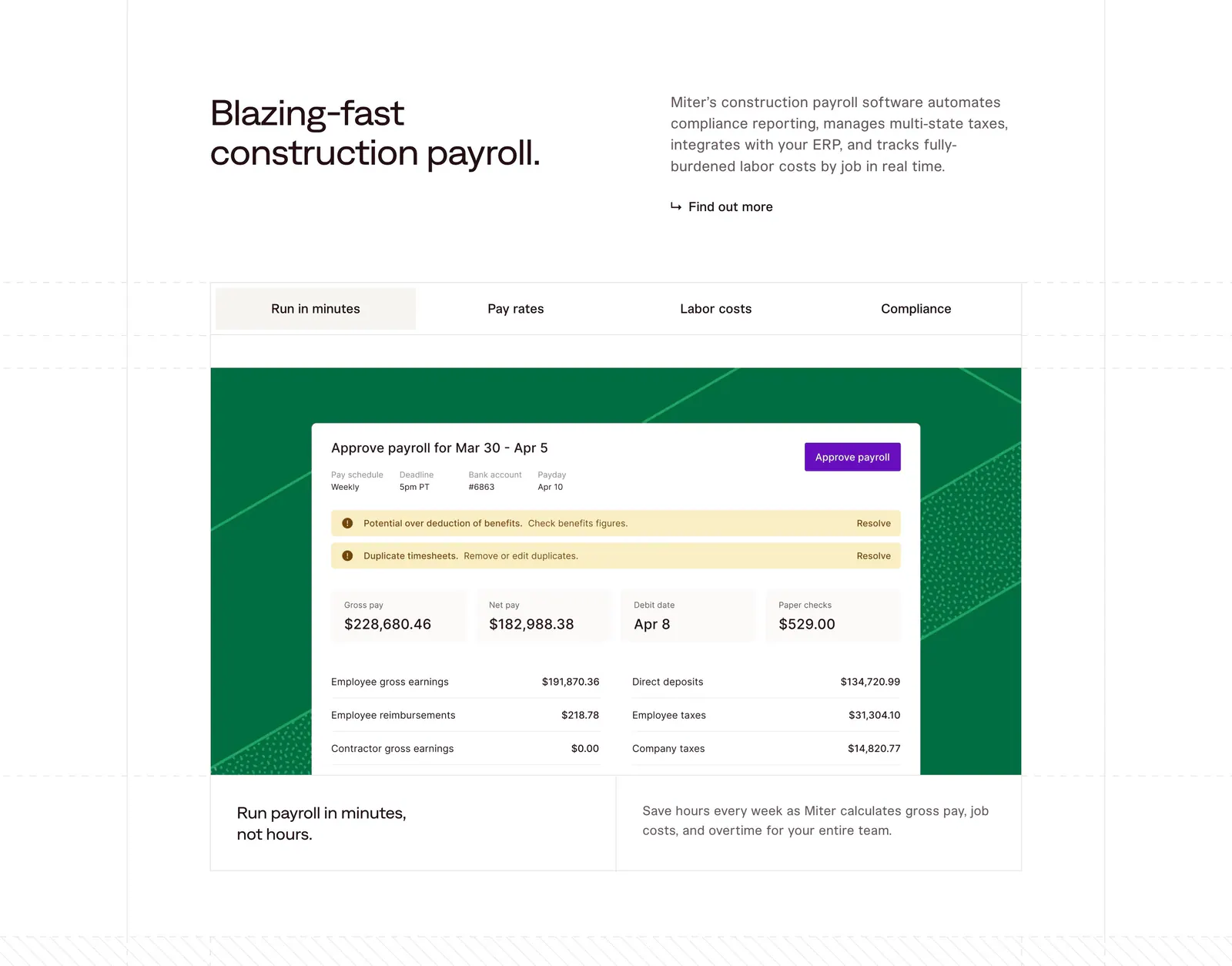
  36. Miter features section: headline beside intro copy above a four-tab panel showing a payroll approval UI on a green patterned card
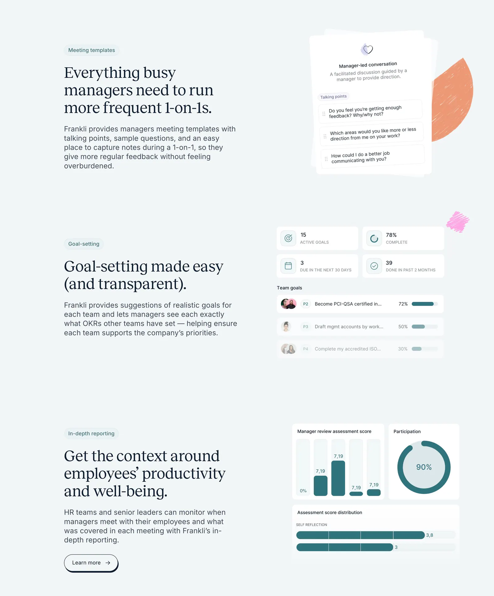
  37. Frankli features section: three stacked rows of serif headings and copy on the left with meeting, goal and reporting UI cards on the right
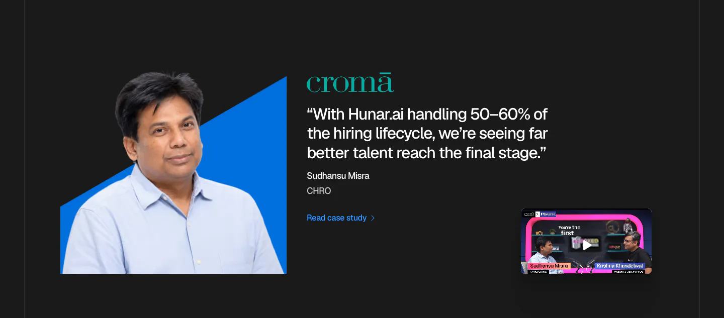
  38. Hunar testimonials section: dark background with an executive photo on a blue shape, Croma quote and a podcast video thumbnail
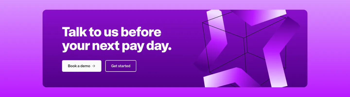
  39. Remote call to action section: white headline and two buttons on a purple card with abstract 3D ribbon shapes on the right
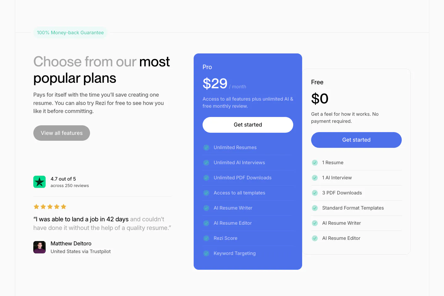
  40. Rezi pricing section: headline and Trustpilot quote on the left, blue Pro plan card and white Free plan card with checklists at right
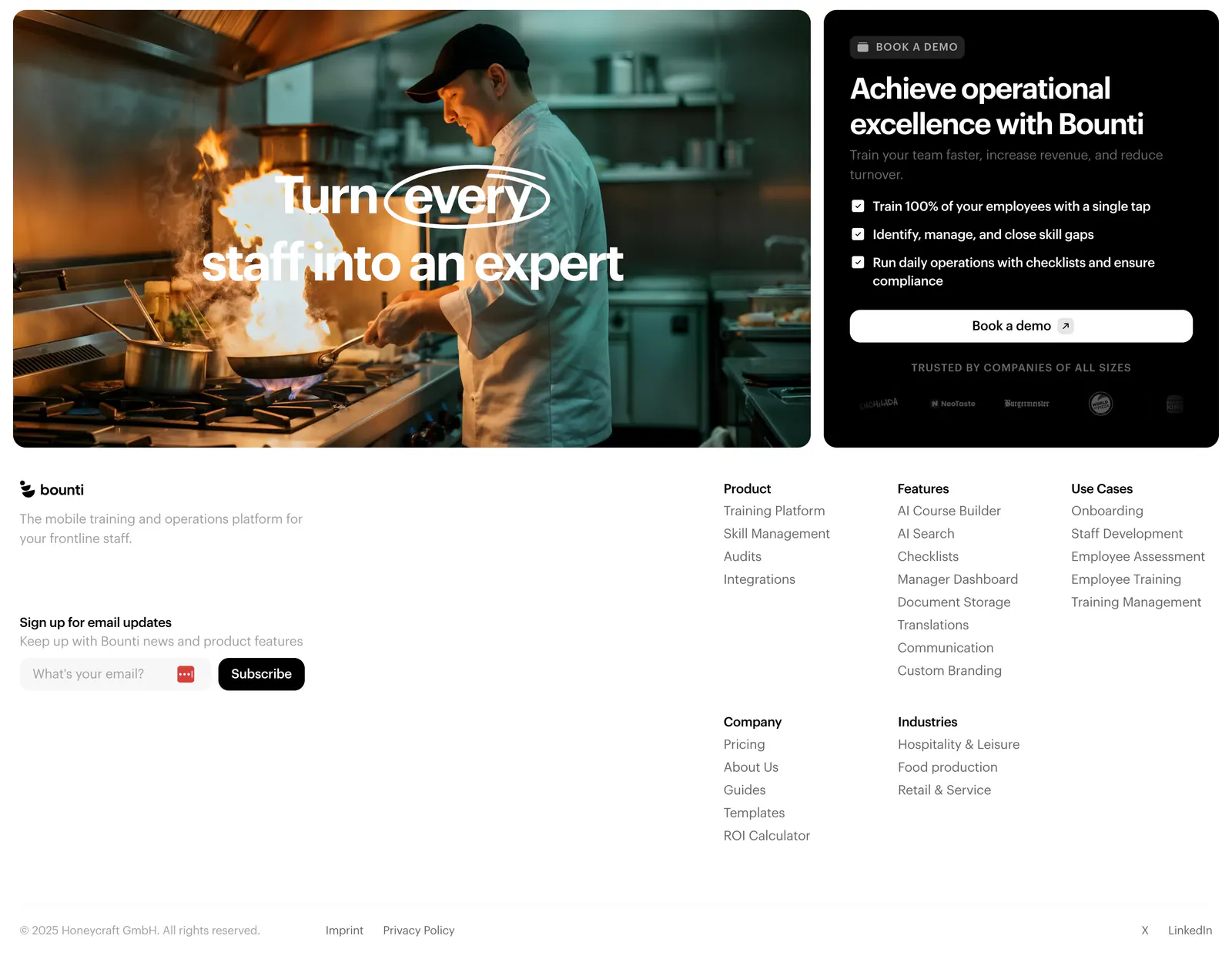
  41. Bounti footer section: kitchen photo card and black demo card with checklist above a white footer with email signup and link columns
  42. Hunar call-to-action section: white card with headline, AI model icons and a demo button on a blue gradient background
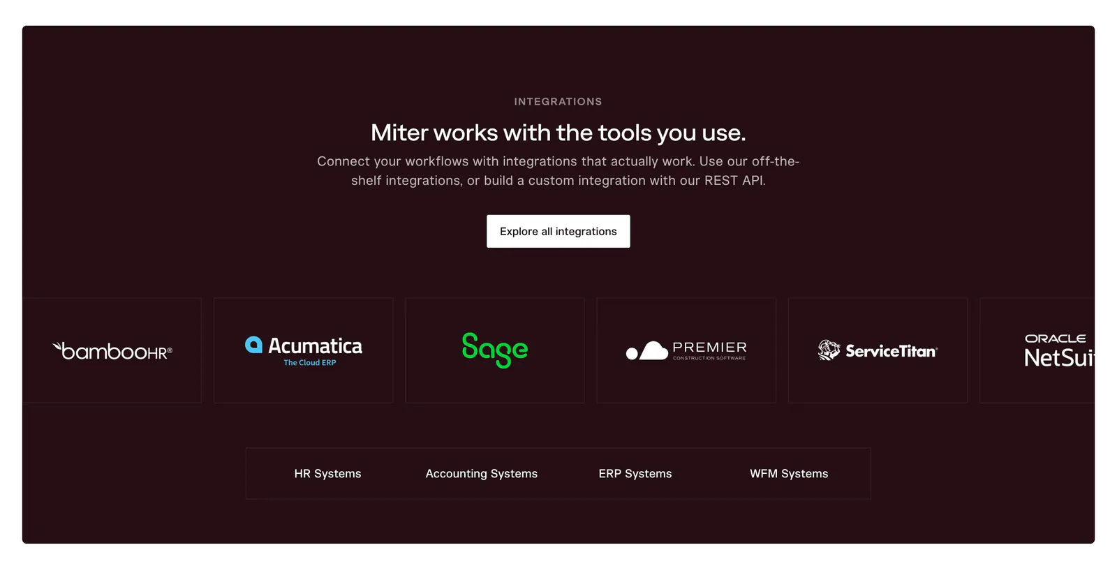
  43. Miter integrations section: centered headline on dark maroon above an edge-cropped row of partner logo cards and category tabs
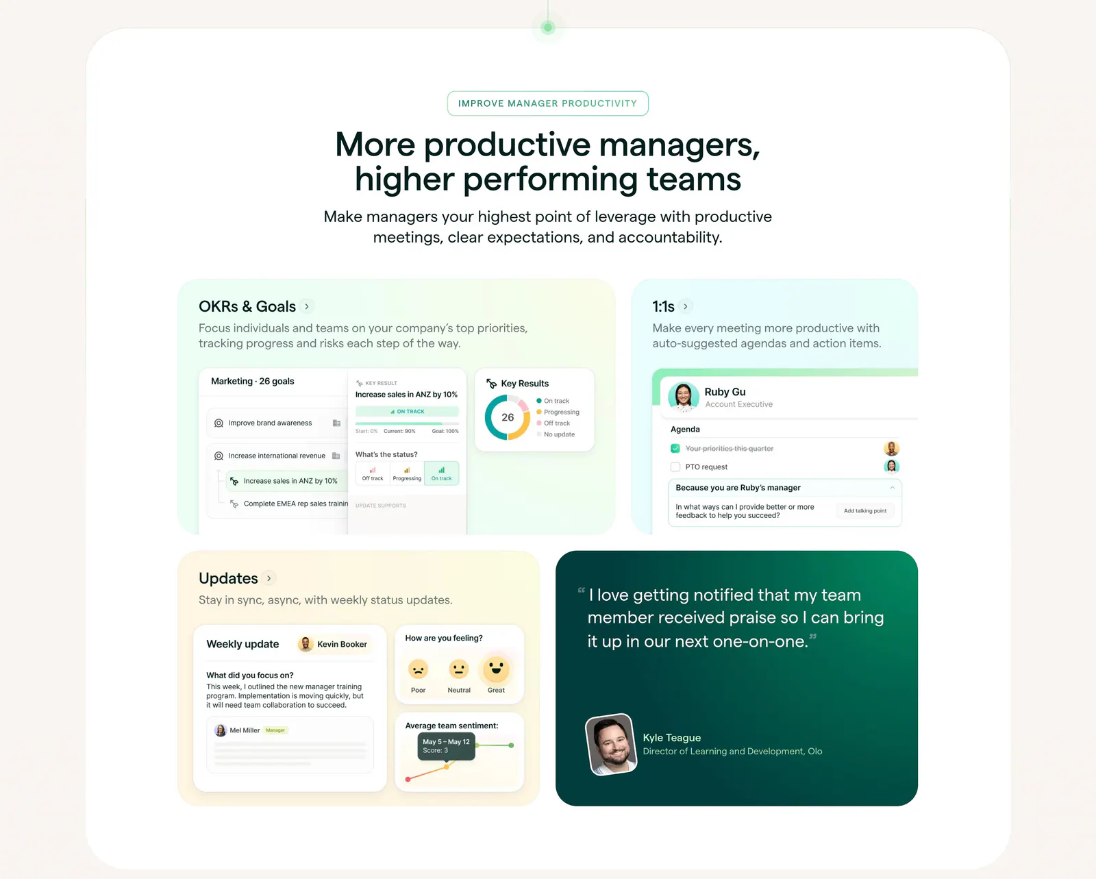
  44. Lattice features section: centered heading above a bento grid of pastel cards with OKR, 1:1 and update UI mockups plus a green quote card
  45. Remote logo cloud section: small centered caption above two rows of gray customer logos on white
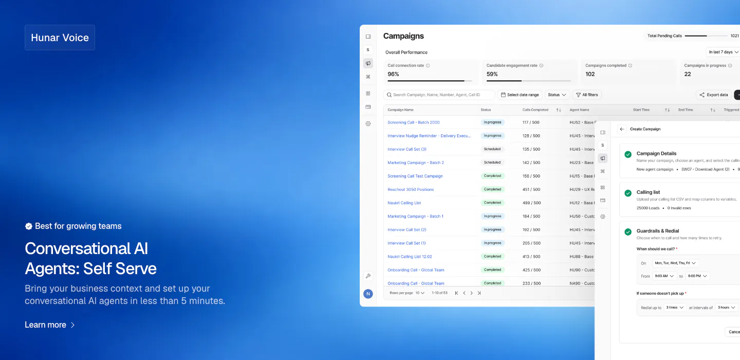
  46. Hunar features section: blue gradient background with text bottom-left and a campaign dashboard screenshot on the right
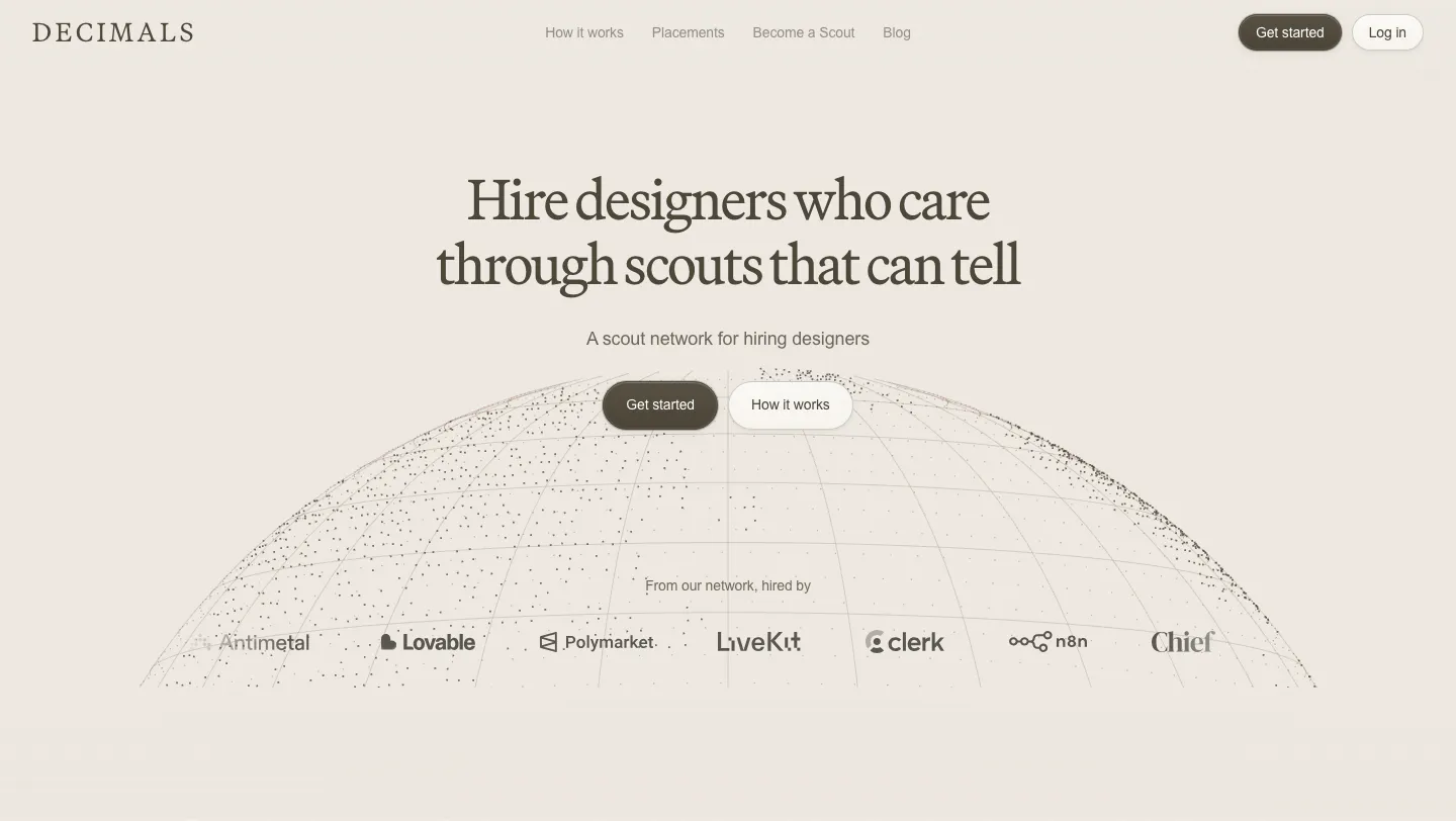
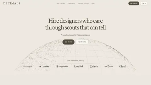
  47. Decimals hero section: centered serif headline and buttons over a dotted wireframe globe with a customer logo row on a beige background
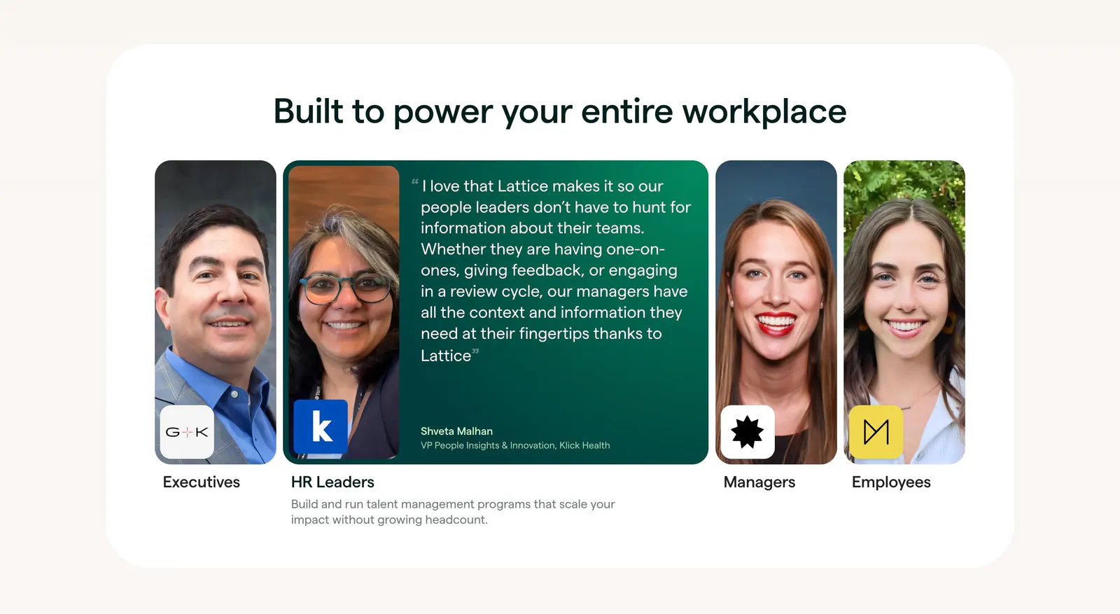
  48. Lattice testimonials section: centered heading over a row of role portrait cards, one expanded into a green quote card from an HR leader
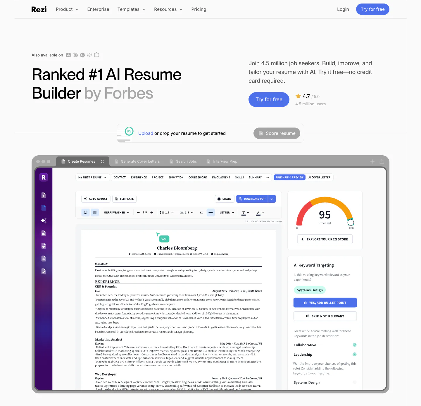
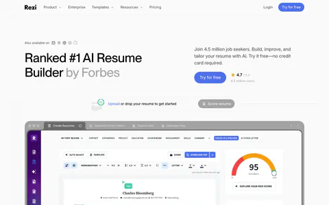
  49. Rezi hero section: left headline with copy and CTA at right, resume upload bar, and a large resume editor screenshot below
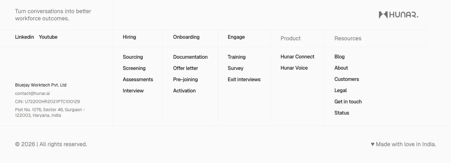
  50. Hunar footer section: light grid footer with tagline, social links, company address and link columns beside the Hunar wordmark
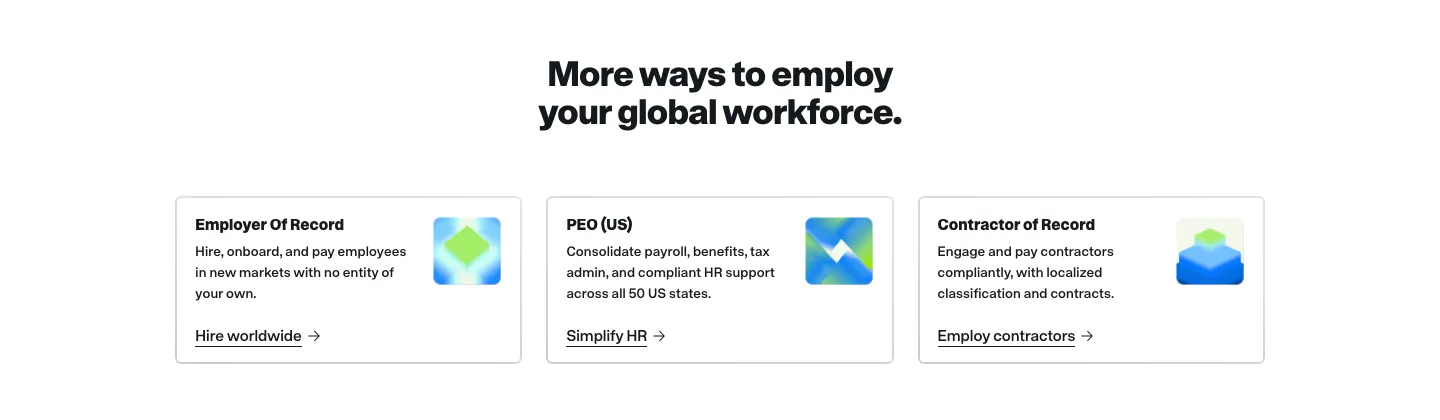
  51. Remote features section: centered headline above three bordered product cards with gradient icons and text links
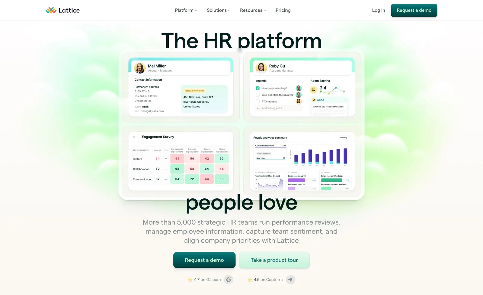
  52. Lattice hero section: nav bar, large headline split around a grid of four HR product UI cards, centered copy, two CTAs and ratings on green glow
  53. Firstwork footer section: centered uppercase CTA on a bright blue band above a navy footer with pixel-block shapes, legal links and badges
    Firstwork Footer
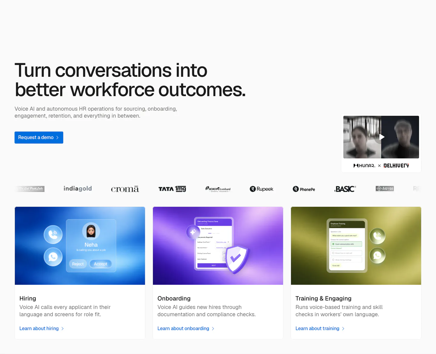
  54. Hunar hero section: left-aligned headline with demo button, video thumbnail, customer logo row and three gradient product cards below
  55. Miter logo cloud section: small centered label above a two-row bordered grid of grayscale contractor logos
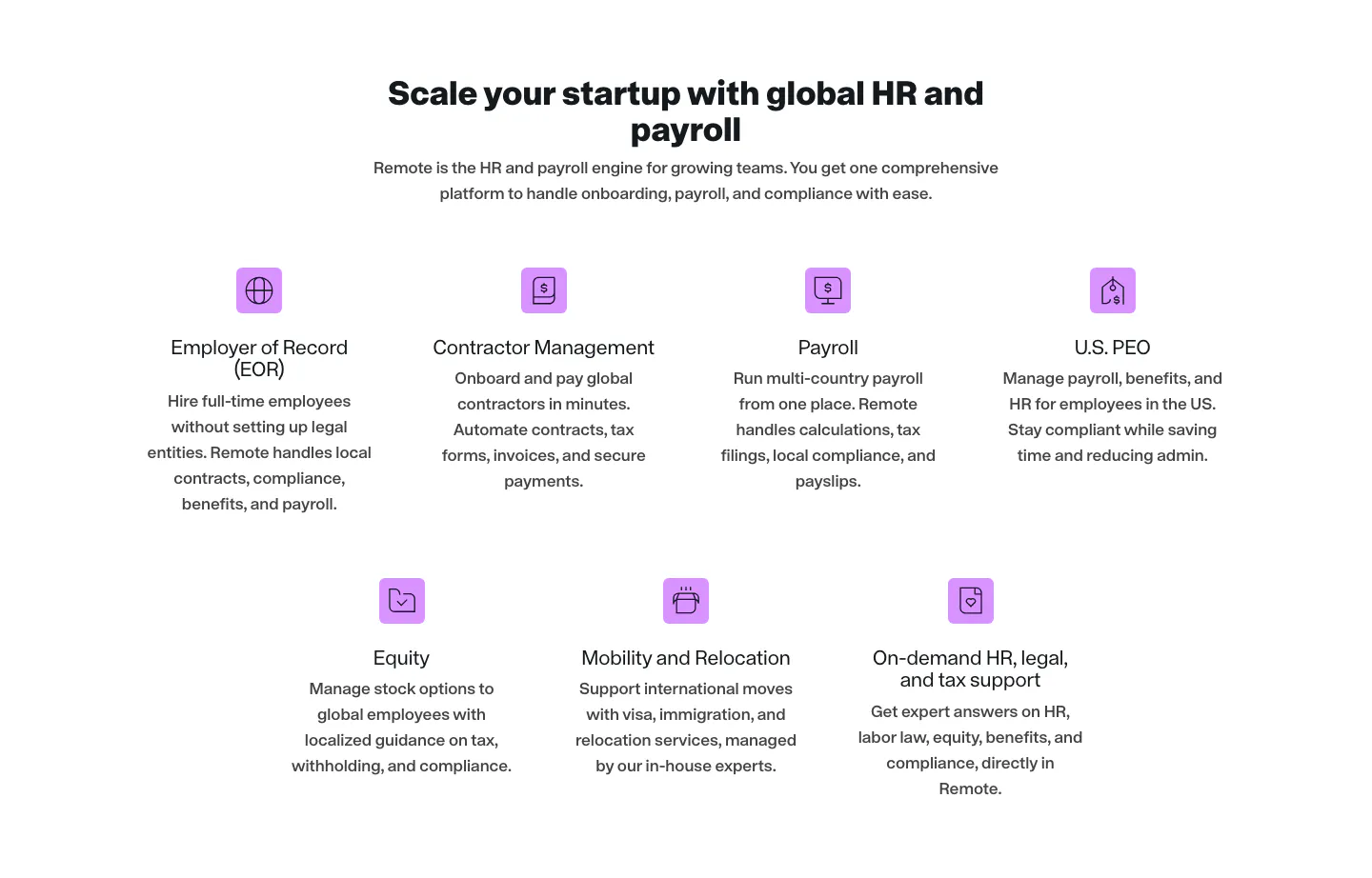
  56. Remote features section: centered headline above seven product items with purple icons in rows of four and three
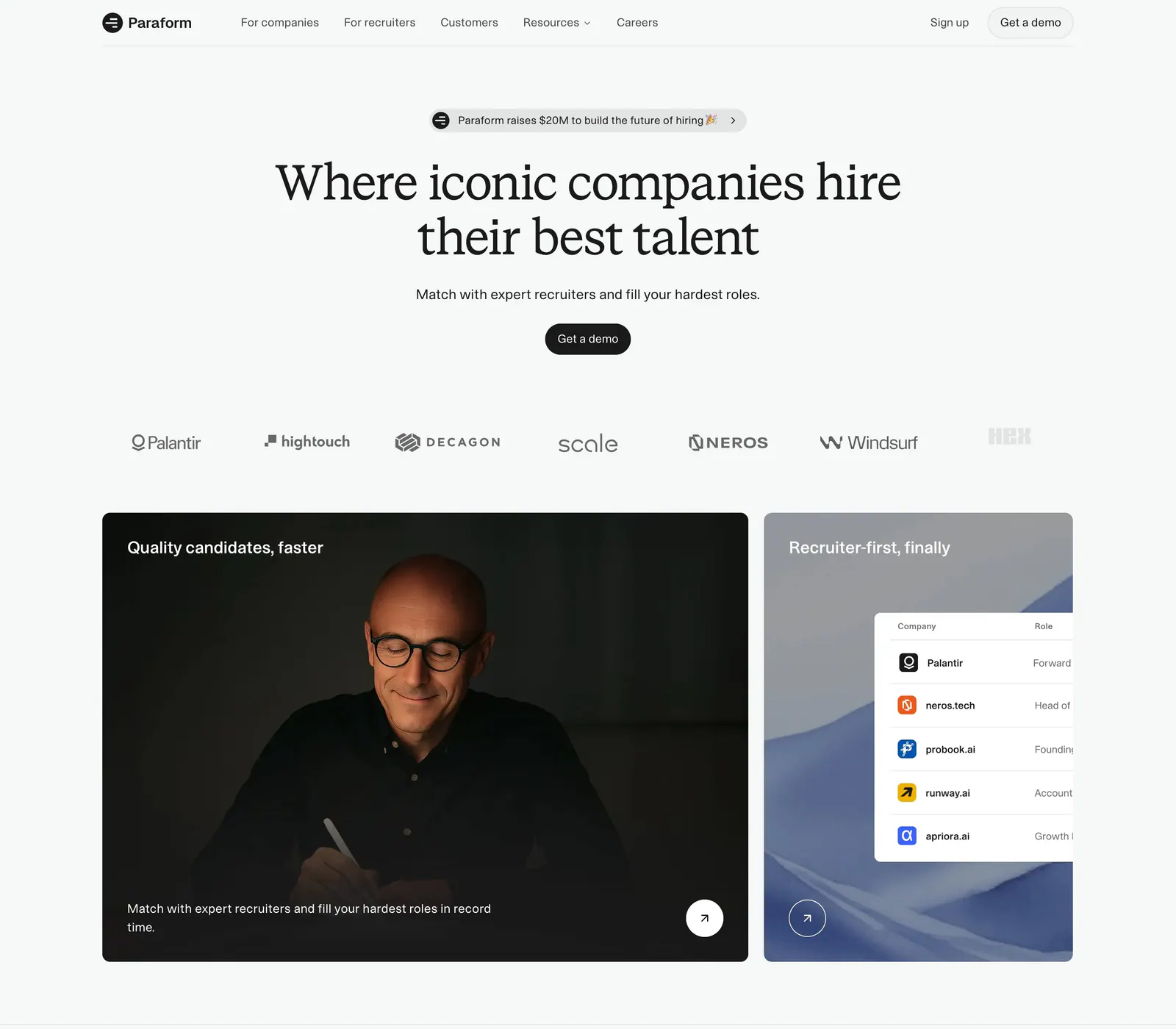
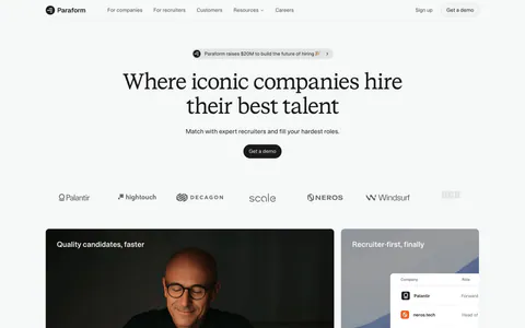
  57. Paraform hero section: centered serif headline with demo button above a customer logo row and two cards with a portrait photo and UI table
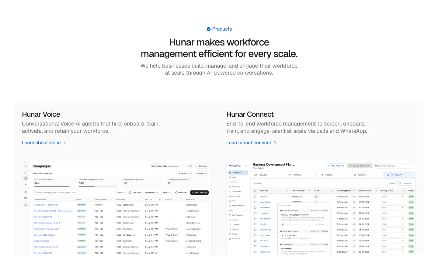
  58. Hunar features section: centered heading above two product cards with campaign and candidate table screenshots on a light background
  59. Greenhouse call-to-action section: white serif headline and blue button on the left with a fingerprint flower artwork on dark green
  60. Miter hero section: split layout on beige with headline and email demo form left, dashboard and mobile app UI right
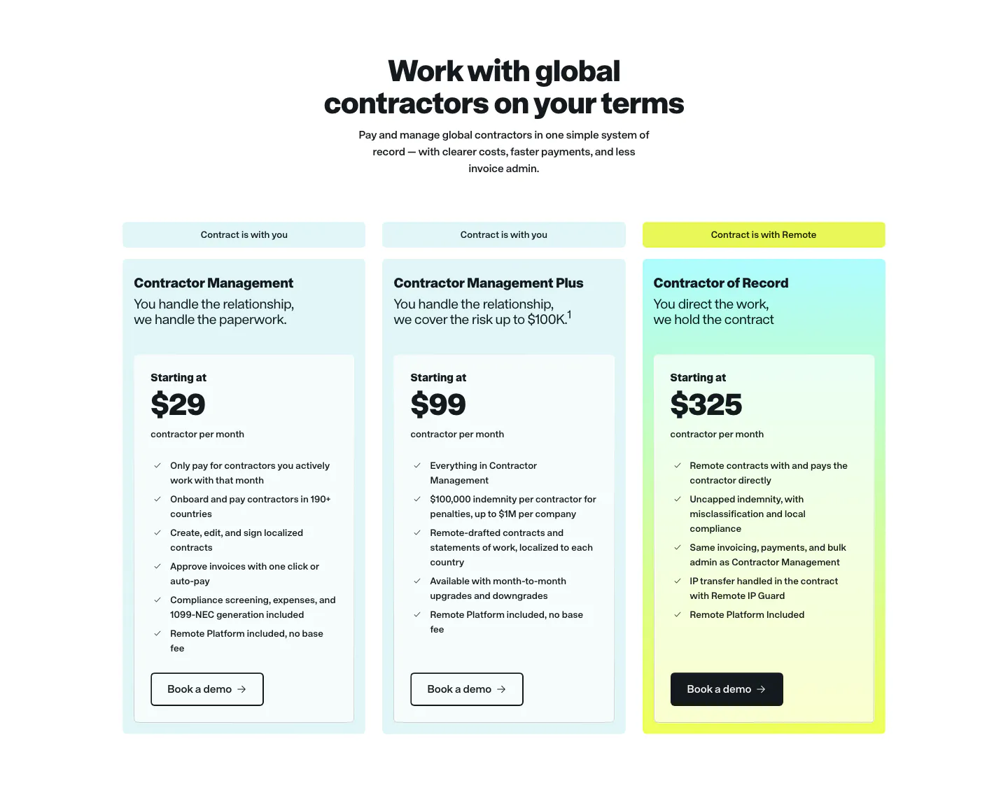
  61. Remote pricing section: centered headline above three contractor plan cards in light cyan with a yellow-tinted highlight
  62. Hunar features section: centered heading above a two-row grid of six icon cards on a pale blue background
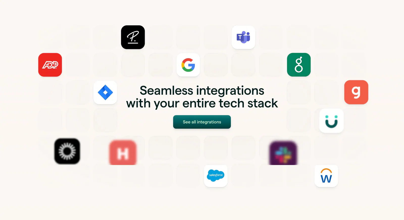
  63. Lattice integrations section: centered headline and button surrounded by scattered app icons on a faint tile grid over warm beige
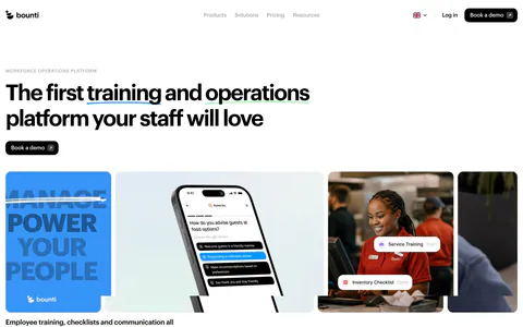
  64. Bounti hero section: left-aligned headline and button above a row of cards with type art, a phone app mockup and staff photo, logos below
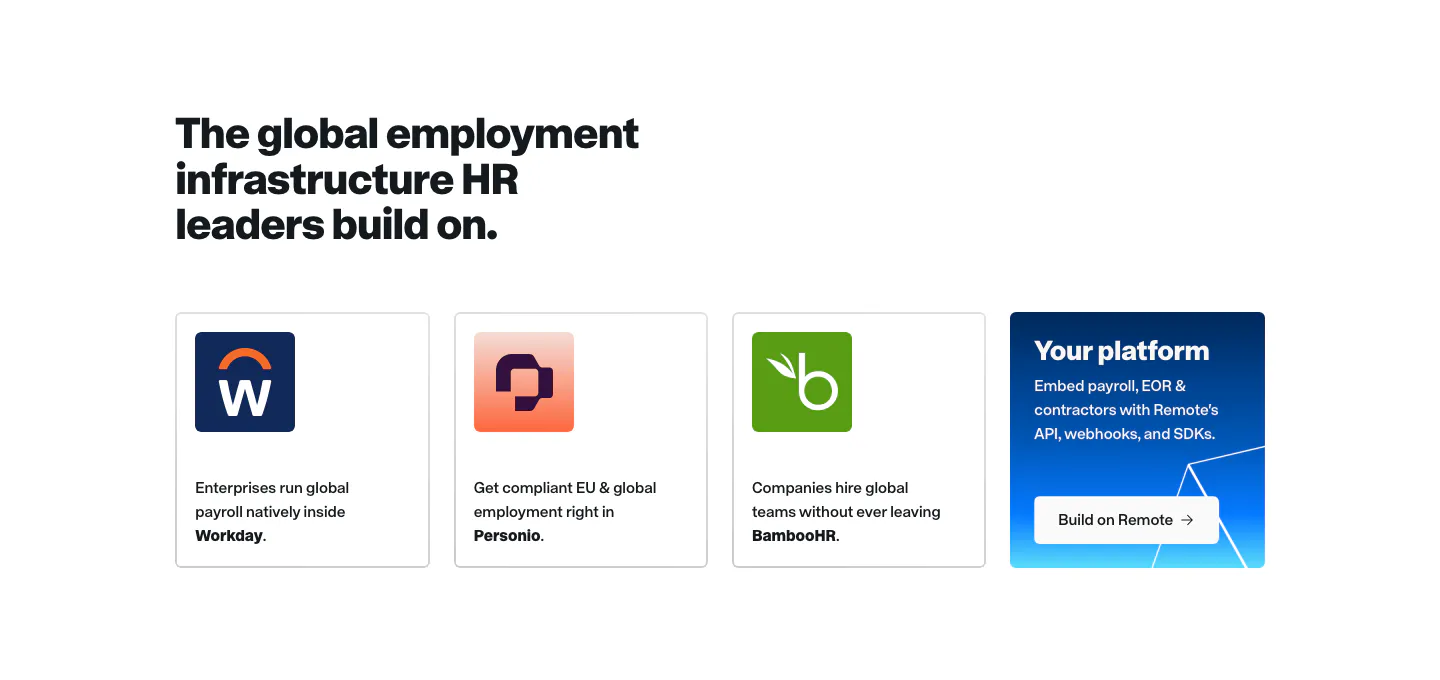
  65. Remote integrations section: headline above Workday, Personio and BambooHR cards plus a blue Your platform card
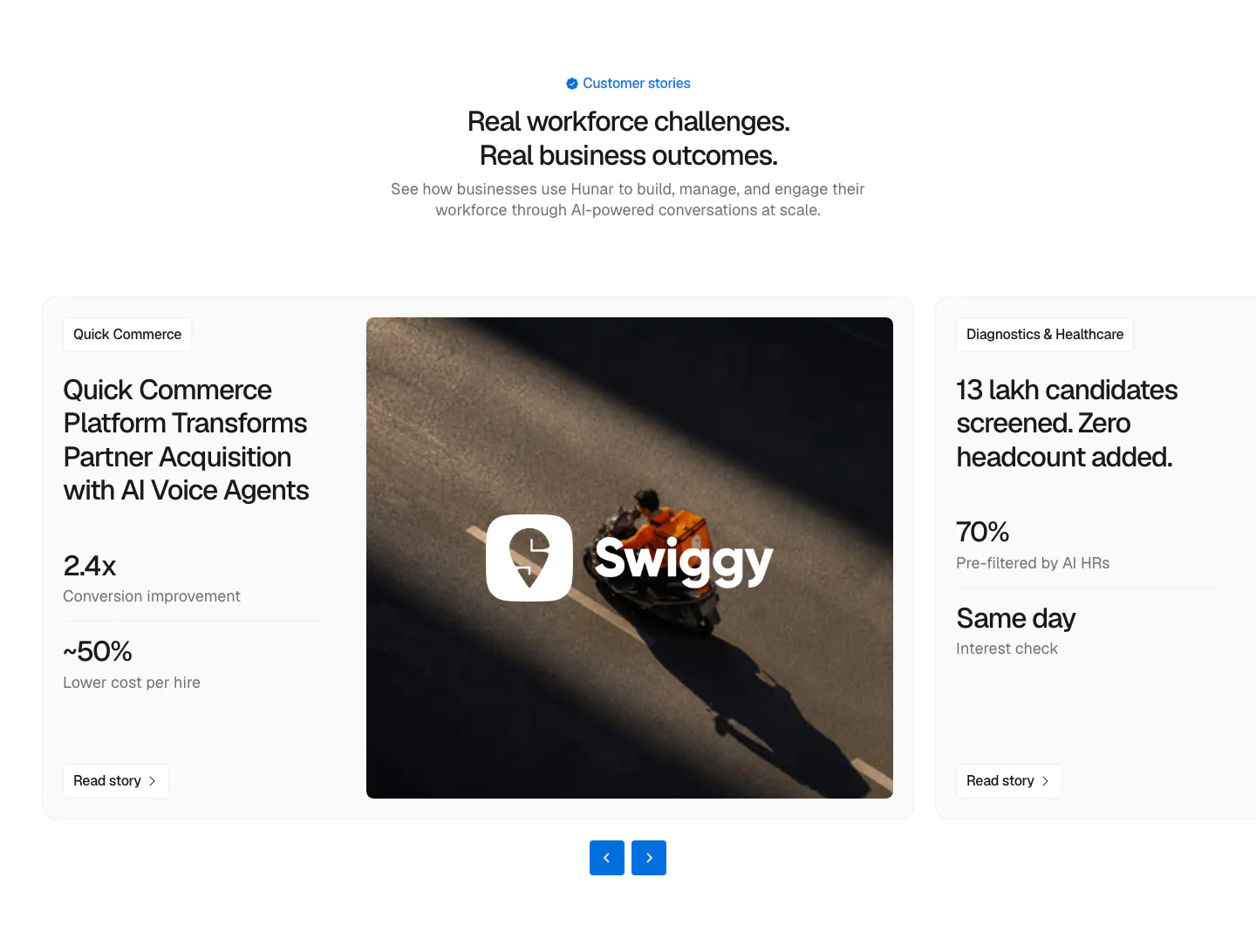
  66. Hunar testimonials section: centered heading above a case-study carousel card with metrics, a Swiggy delivery photo and arrow controls
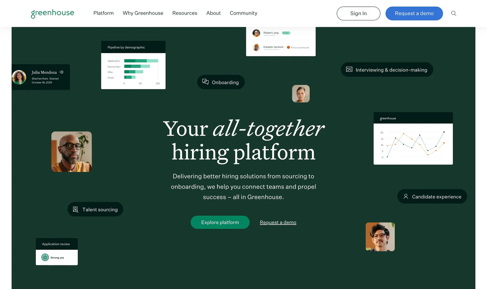
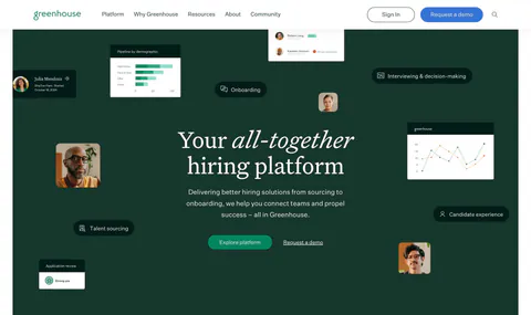
  67. Greenhouse hero section: centered serif headline and buttons on dark green surrounded by floating UI cards, charts and portraits
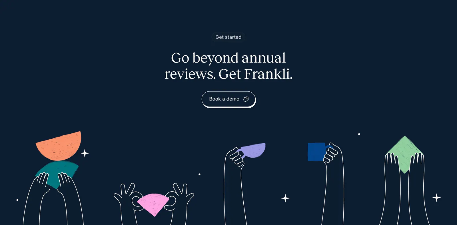
  68. Frankli call-to-action section: centered serif headline and demo button above hand-drawn hands holding colorful shapes on navy
  69. Remote footer section: dark rounded panel with Remote wordmark, app store badges and link columns on a purple background
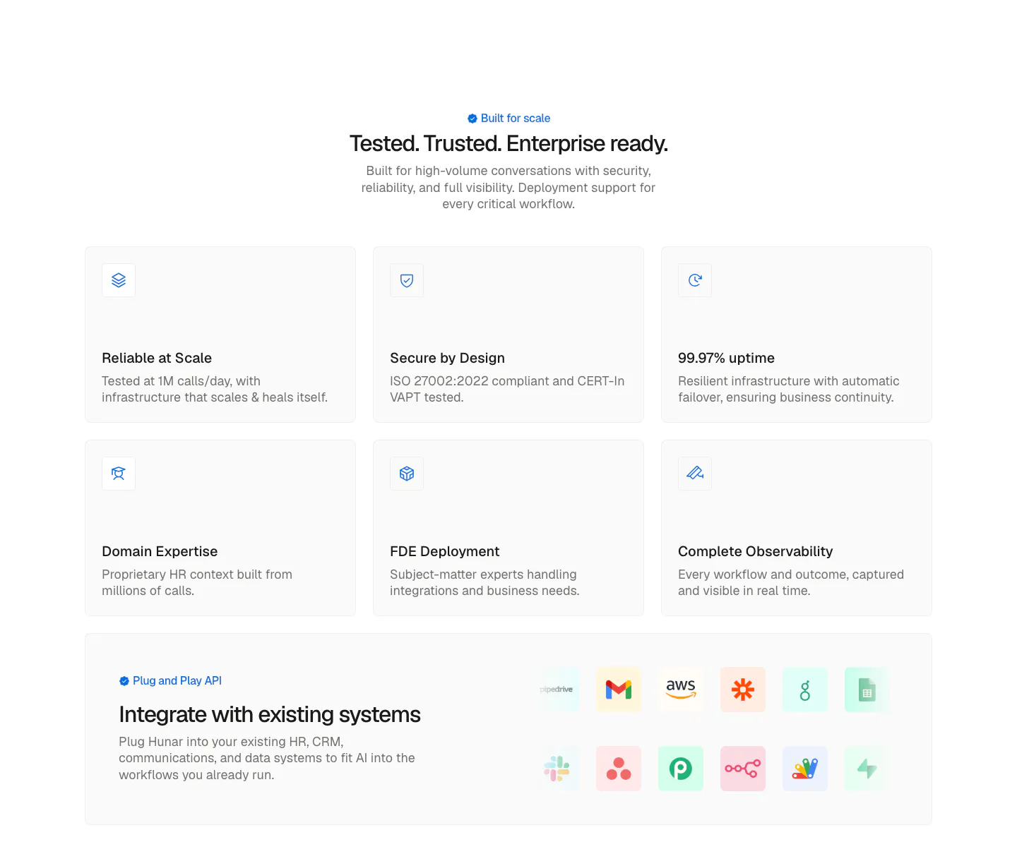
  70. Hunar security section: centered heading above six light icon cards and an integrations band with app icon tiles
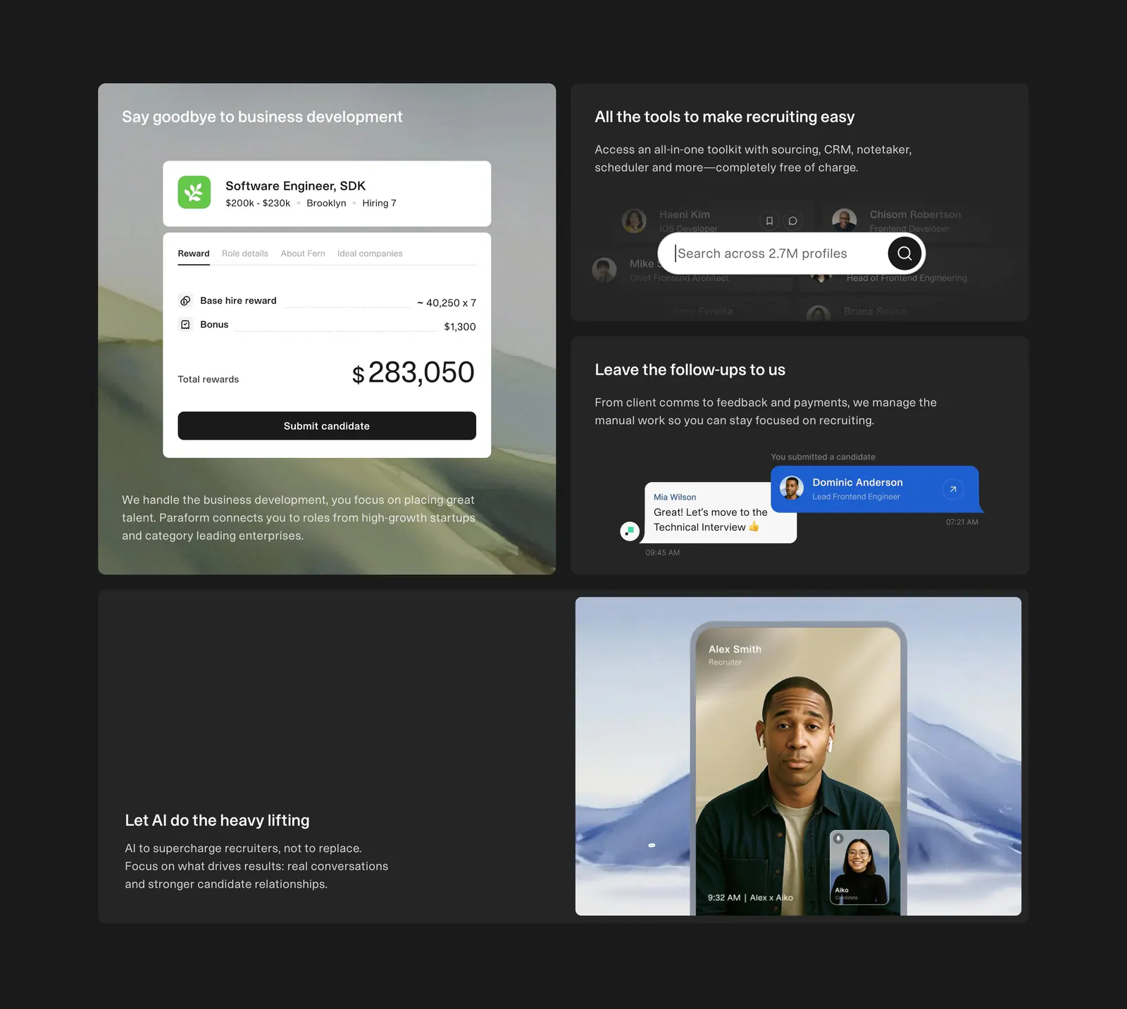
  71. Paraform features section: dark bento grid of four tiles with reward, search and chat UI cards and a recruiter video call photo
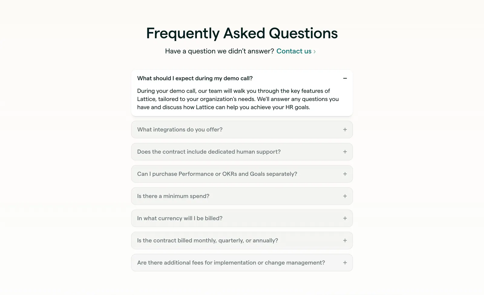
  72. Lattice FAQ section: centered heading and contact link above a single-column accordion with the first question open, on warm off-white
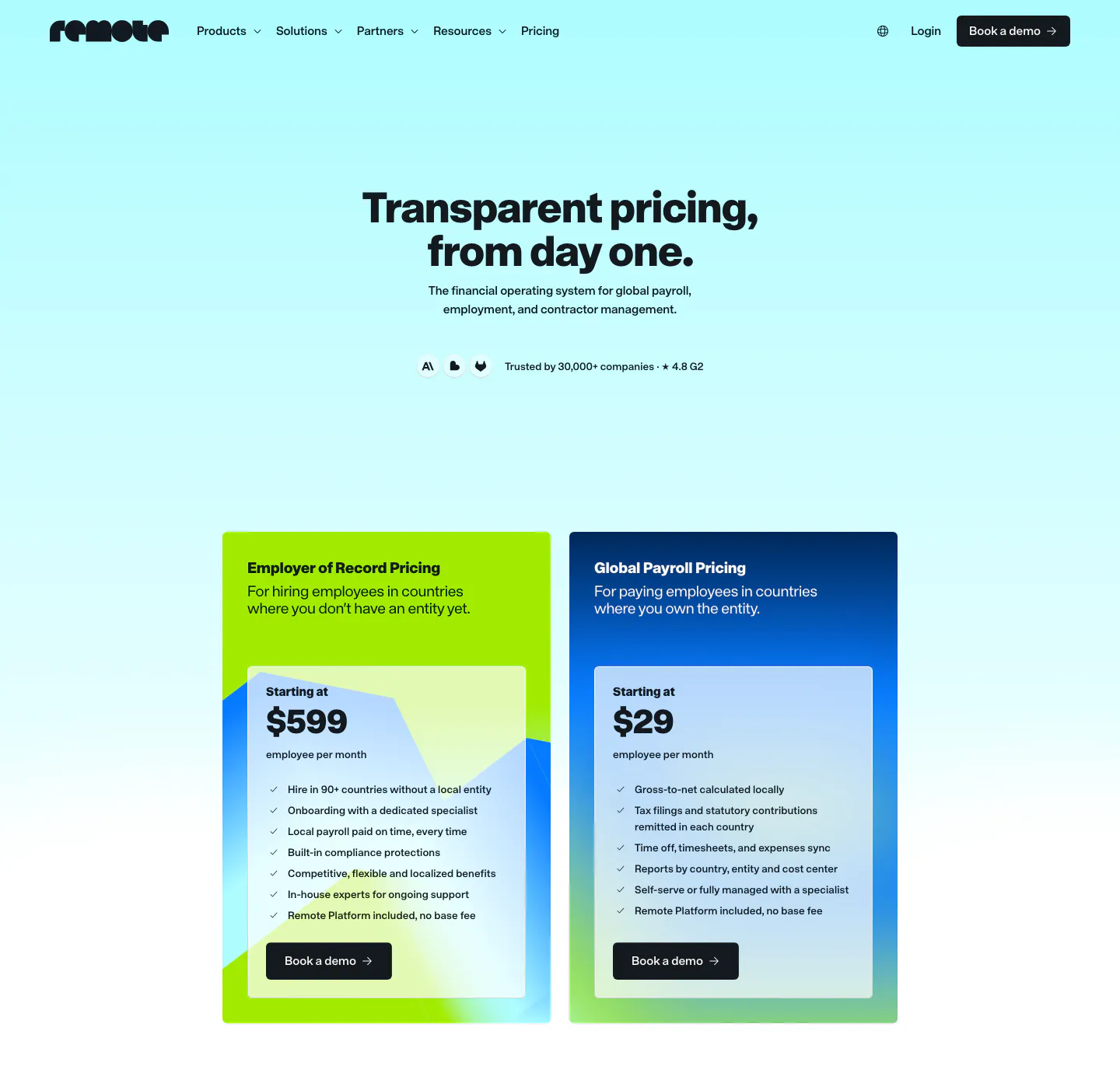
  73. Remote pricing section: nav and centered headline above two plan cards, lime EOR and blue Global Payroll, on cyan gradient
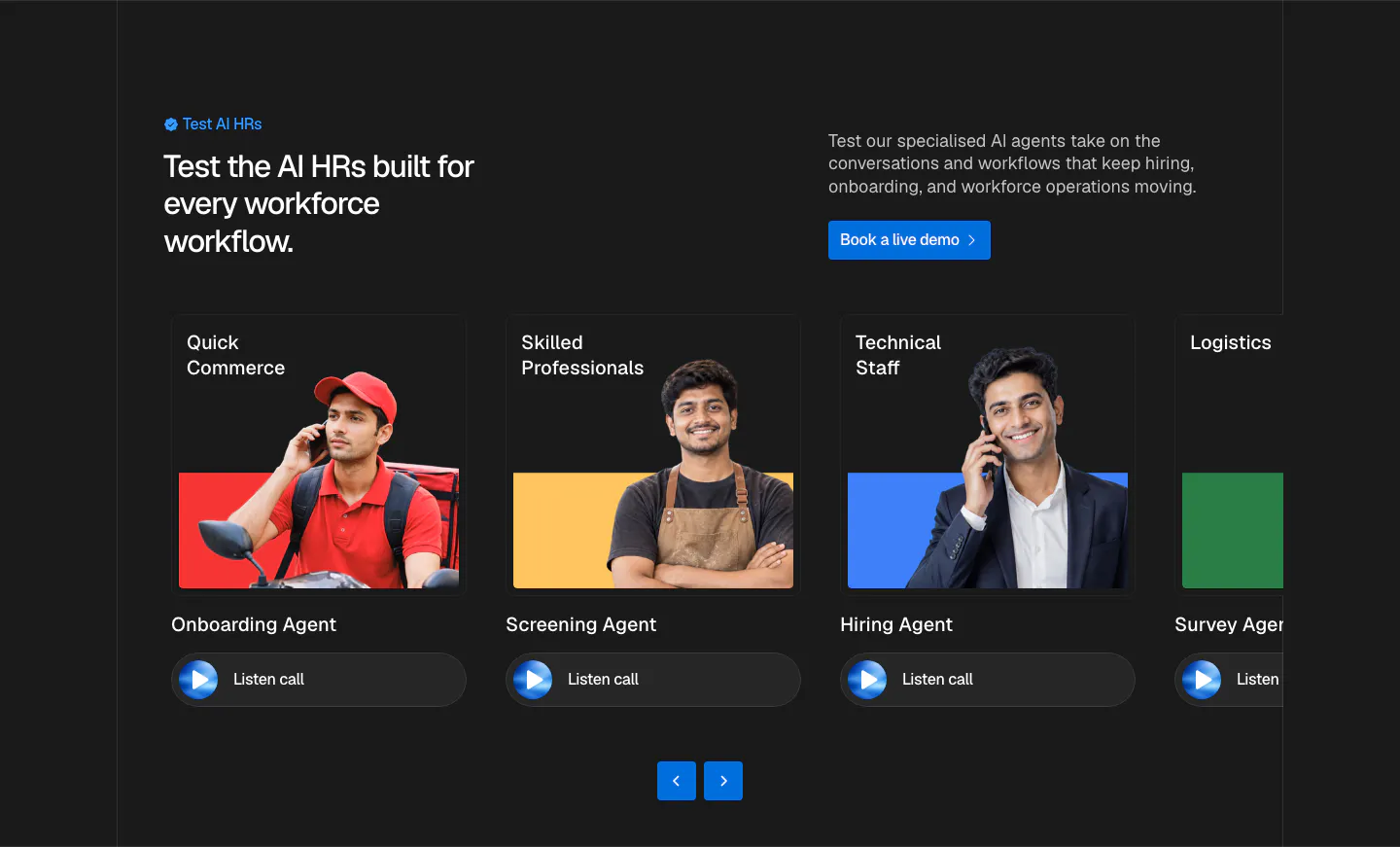
  74. Hunar use cases section: dark background with split header and a carousel of agent cards showing worker photos and listen-call buttons
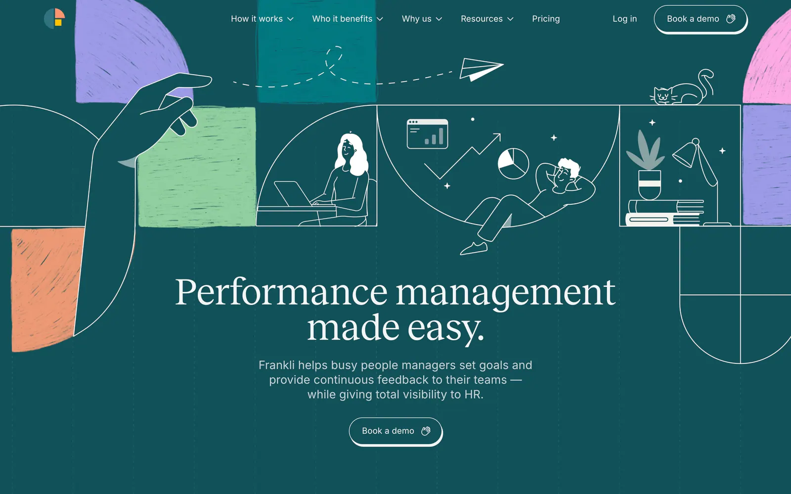
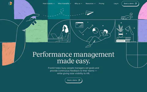
  75. Frankli hero section: centered serif headline and demo button below a band of line-drawn people and textured color blocks on deep teal
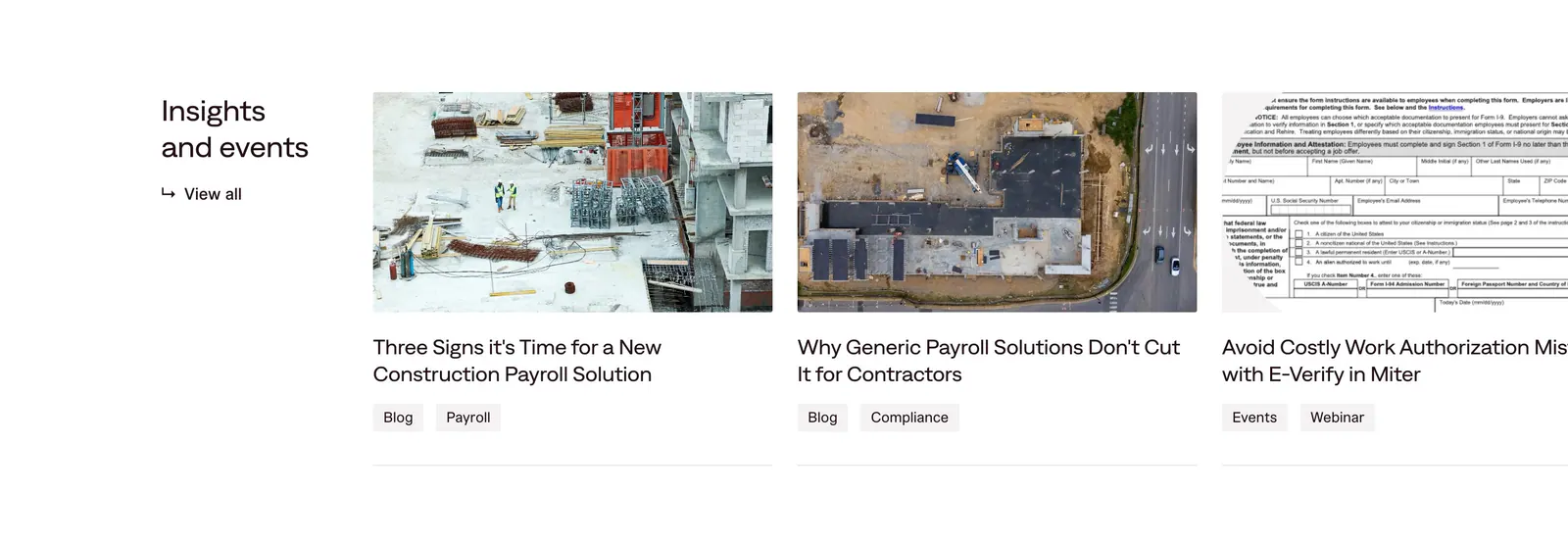
  76. Miter blog & resources section: heading with view-all link beside edge-cropped article cards with construction photos and tags
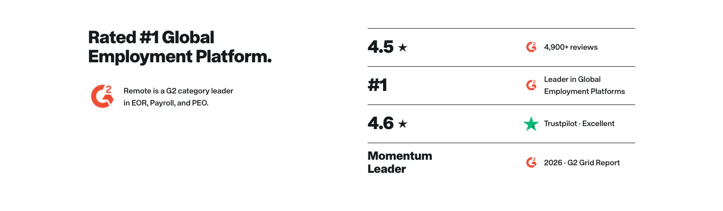
  77. Remote testimonials section: headline and G2 badge on the left beside a list of ratings from G2 and Trustpilot
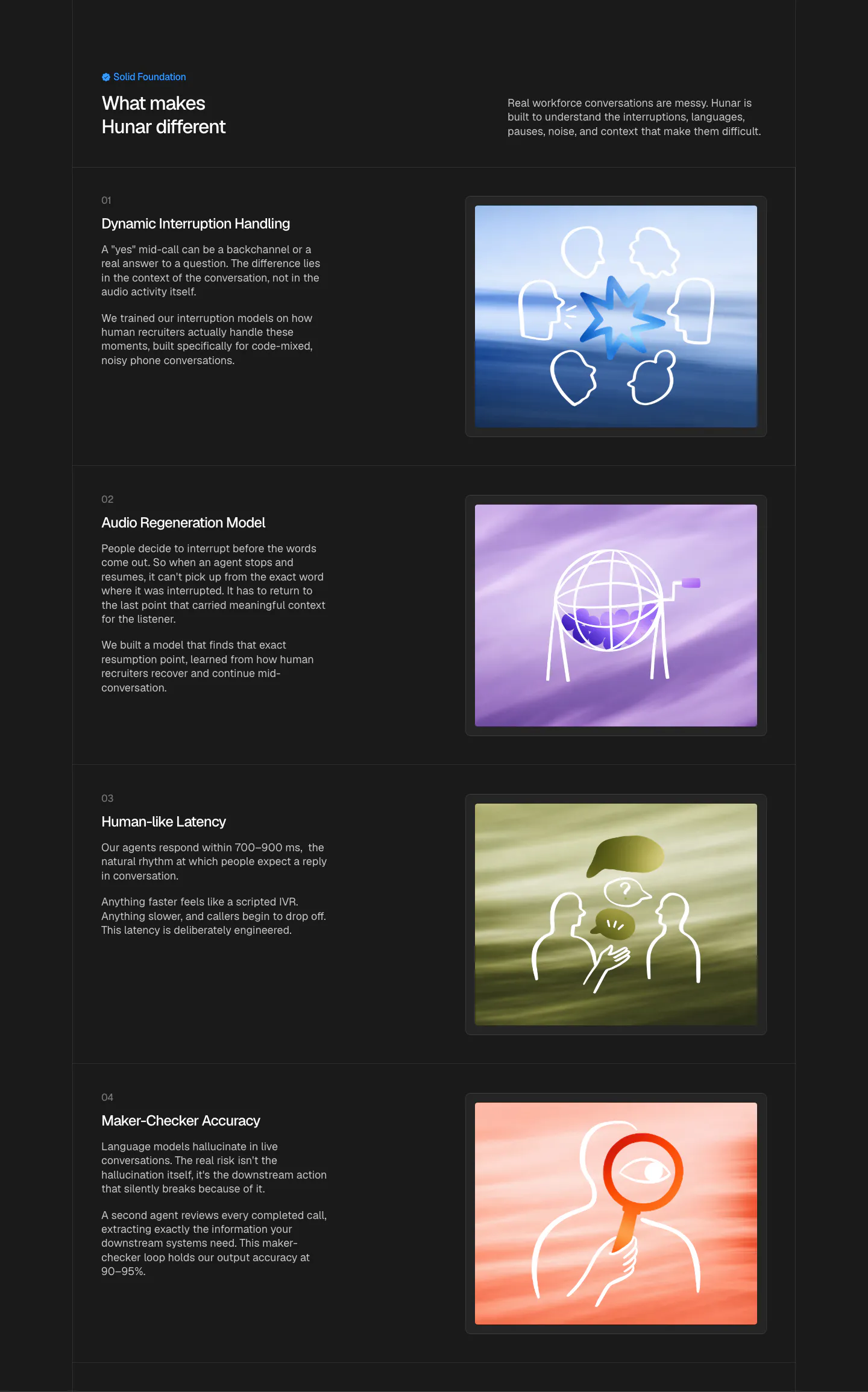
  78. Hunar features section: dark background with four numbered capability rows, each pairing text with a line-art illustration on color
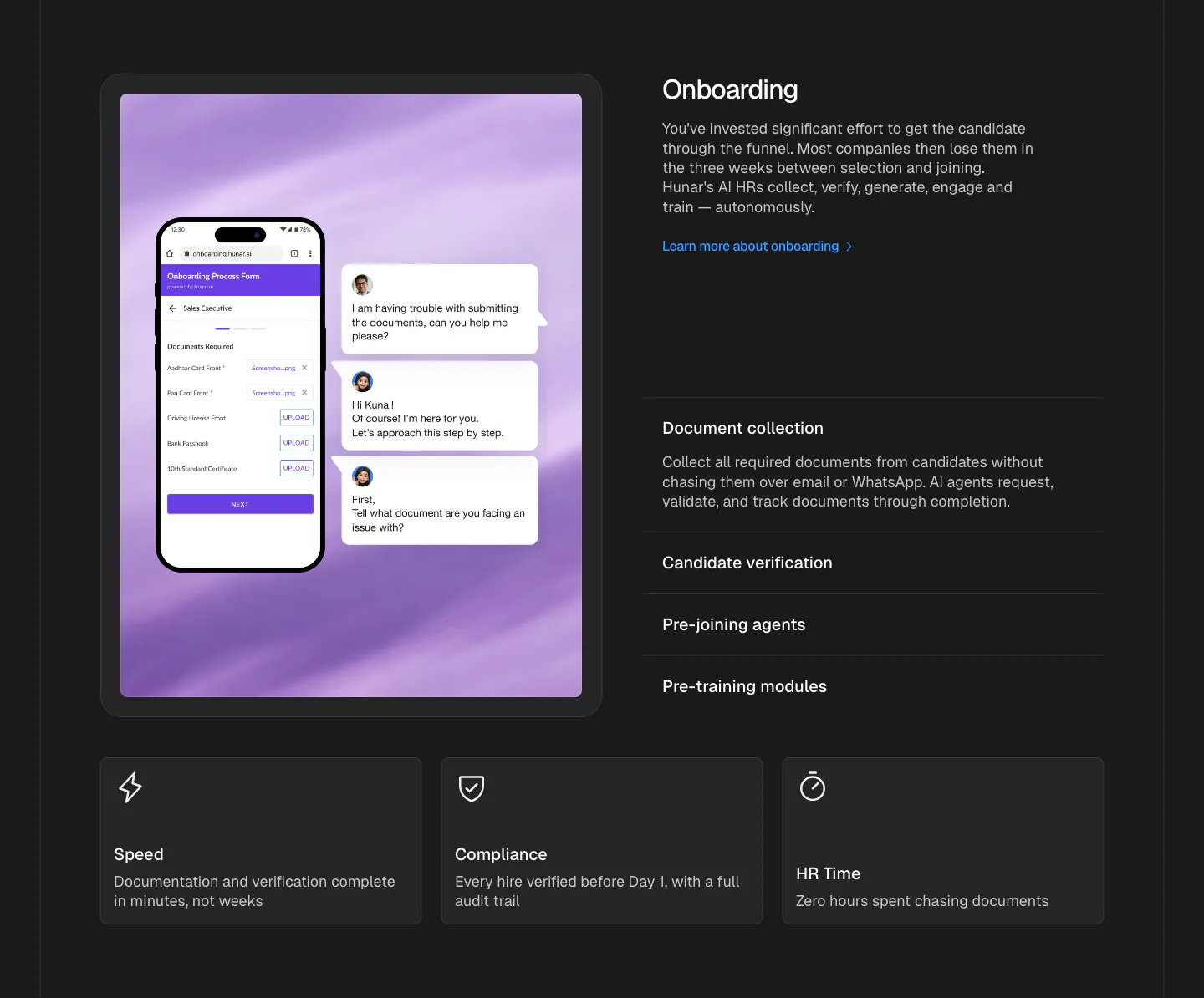
  79. Hunar features section: dark background with a phone onboarding form mockup on the left, accordion list on the right, three cards below
  80. Hunar features section: dark header with heading and Learn more button above a large candidate table screenshot on a blue glow
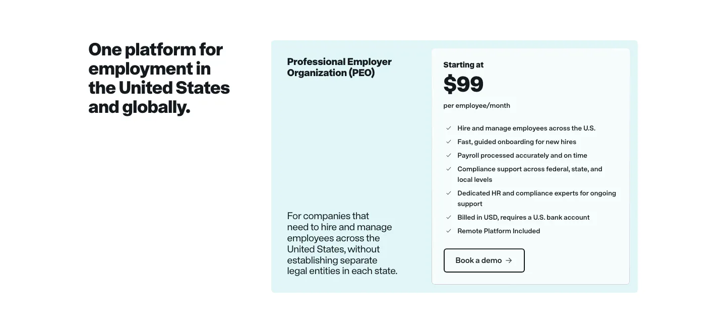
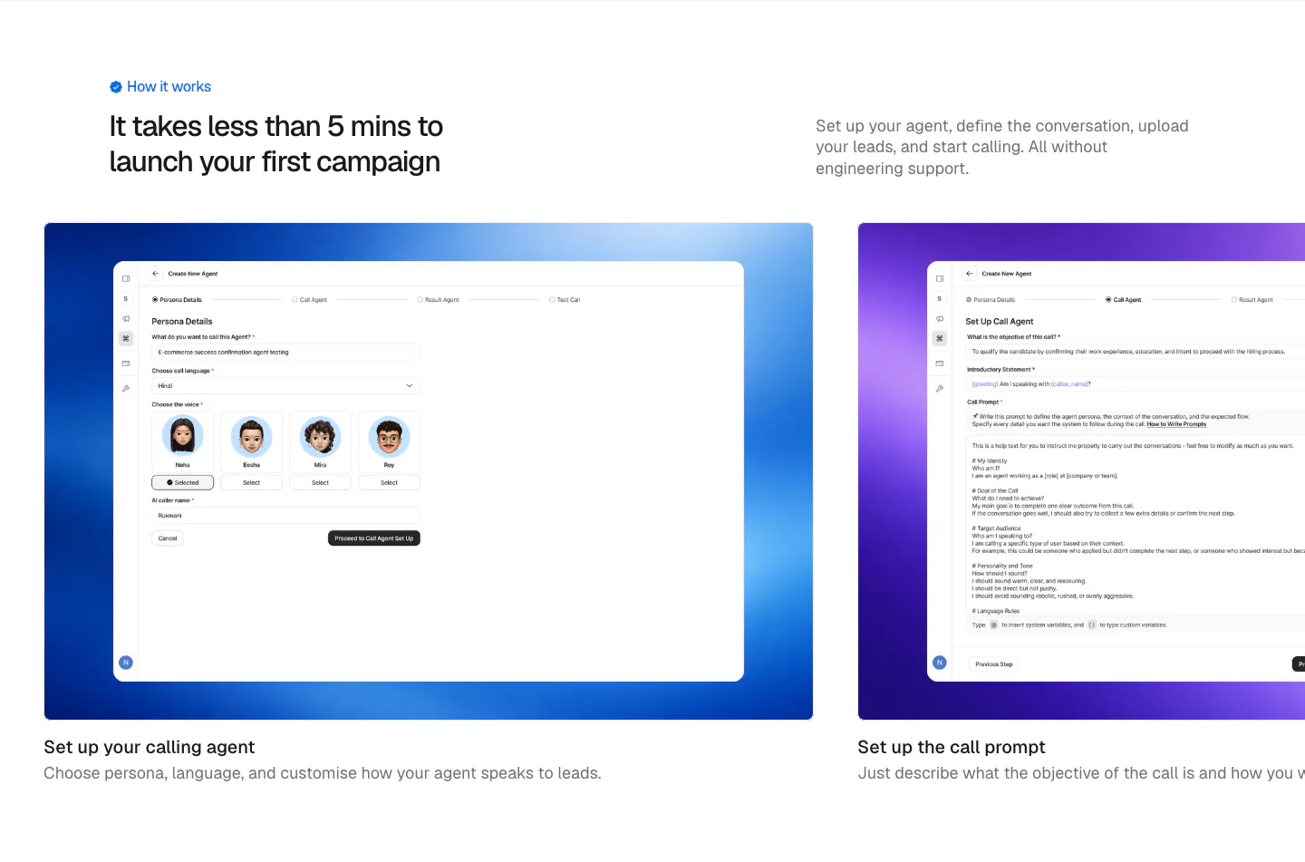
  81. Remote pricing section: headline on the left beside a light cyan PEO plan card with price and feature checklist
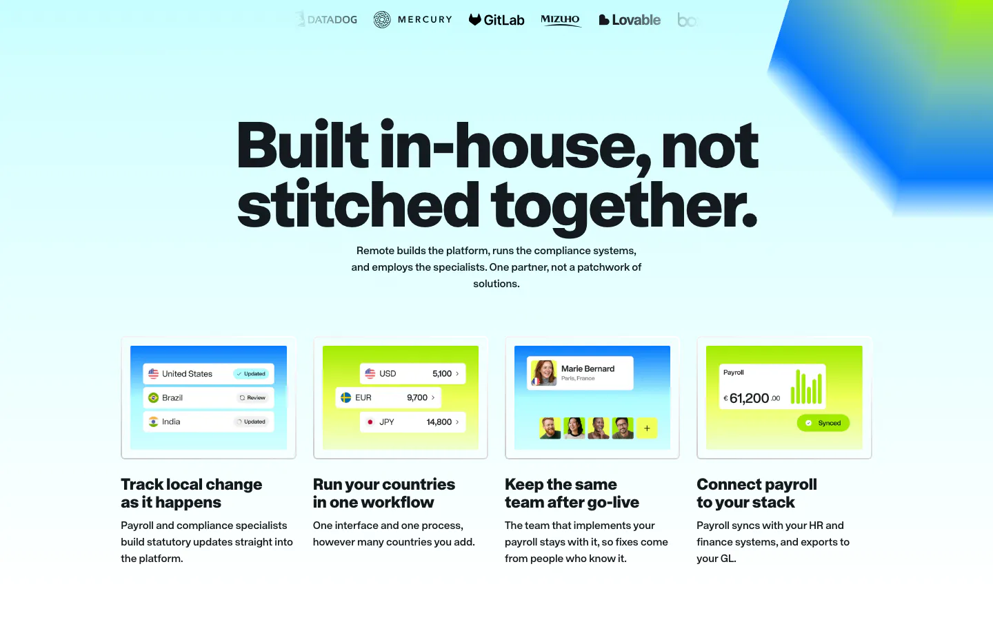
  82. Remote features section: logo row, large centered headline and four cards with payroll UI mockups on cyan and lime
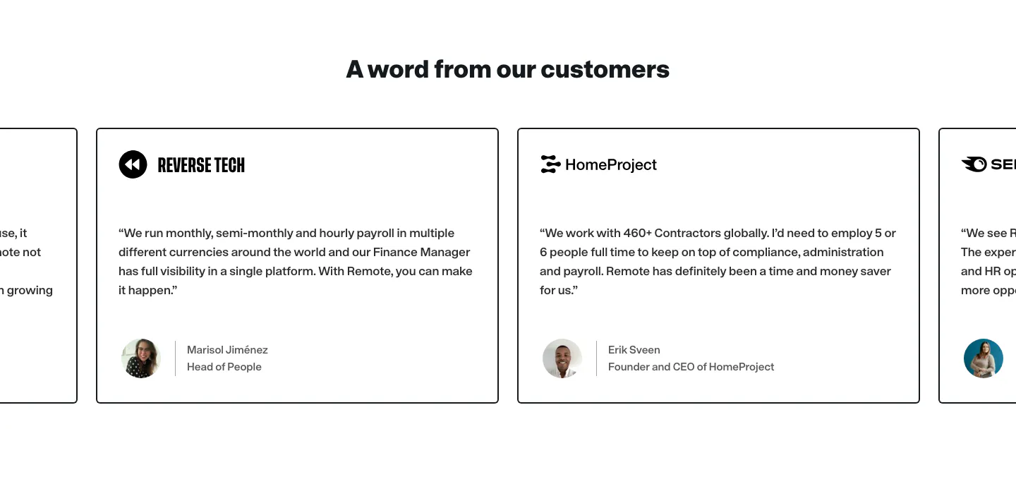
  83. Remote testimonials section: centered heading above a carousel of bordered quote cards with company logos and avatars
  84. Hunar how it works section: left heading and intro copy above a carousel of step cards with product screenshots on gradient panels
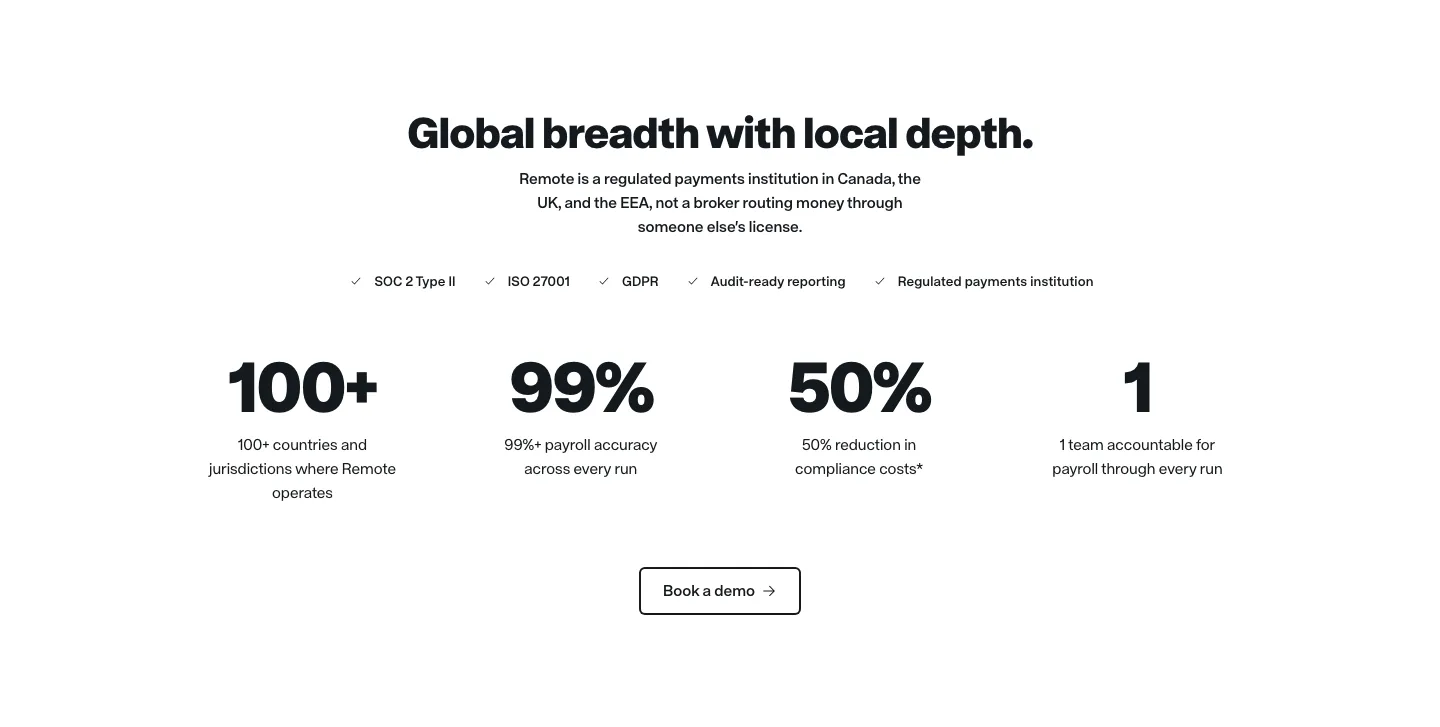
  85. Remote stats section: centered headline, compliance checklist row, four large black metrics and an outlined demo button
  86. Remote hero section: nav, left headline with checklist and demo button beside a blurred blue and lime 3D cube on gradient
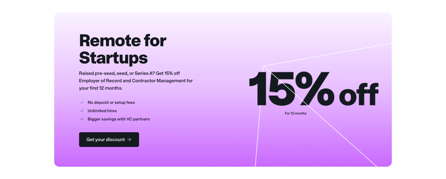
  87. Remote call to action section: startup offer card with headline, checklist and button beside large 15% off text on purple gradient
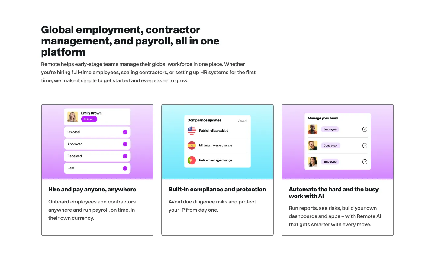
  88. Remote features section: left-aligned headline above three cards with UI mockups on purple and cyan gradient tops

HR & recruiting companies

11 companies in this collection

All companies

Common styles in HR & recruiting websites

  • Minimal 26% · 23
  • Split layout 25% · 22
  • Product UI 25% · 22
  • Card grid 22% · 19
  • Photography 20% · 18
  • Centered 19% · 17
  • Gradient 17% · 15

How to design an HR and recruiting website

  1. Show both sides of the product

    Put the admin view next to the employee or candidate view. HR buyers need to know their people will actually use the tool, and a clean mobile screen for the end user often matters as much as the reporting dashboard.

  2. Skip the generic stock smiles

    Polished stock photos of people in meetings make every HR site look the same. Use candid photos of real customers, screenshots with realistic names and roles, or simple illustration. Diverse, believable people matter more here than in most categories.
  3. Be precise about compliance and regions

    Payroll, hiring, and benefits rules vary by country and state. List the regions you support, the filings you handle, and your data residency options. If the product helps with fair hiring or pay transparency, explain the method rather than just claiming the result.

  4. Quantify the admin work removed

    HR teams are often small and stretched. Show the hours or steps a process loses when the product takes over, such as screening, onboarding, or running payroll. A before and after view of the workflow makes the case more clearly than a list of features.

All industries
    ↑↓ Navigate ↵ Open

    Section preview

    Website section