Cybersecurity Website Design Examples

Security buyers are skeptical by profession. They have heard every claim about stopping all threats, so they look for specifics: what the product detects, how it fits their stack, and how much noise it adds to the team's day. Credible cybersecurity website design avoids hooded hackers and glowing padlocks. It shows real alerts, clear coverage, and the certifications the company holds itself.
38 sections

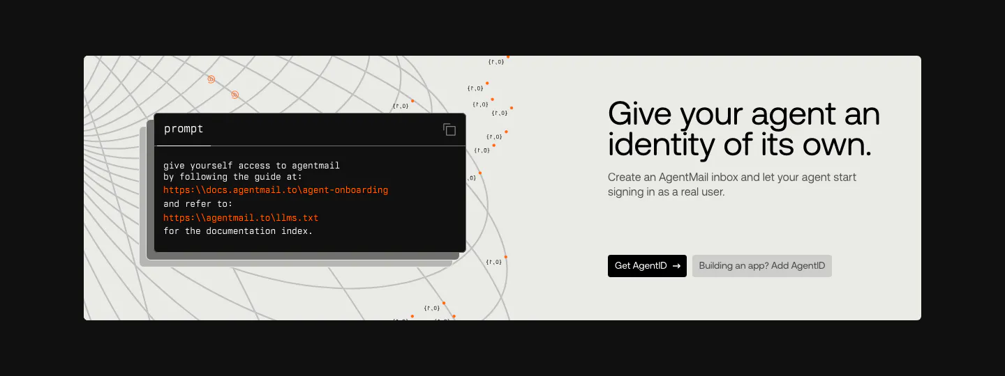
  1. AgentID call to action section: light panel on black with a dark prompt code card left and headline, copy and two buttons right
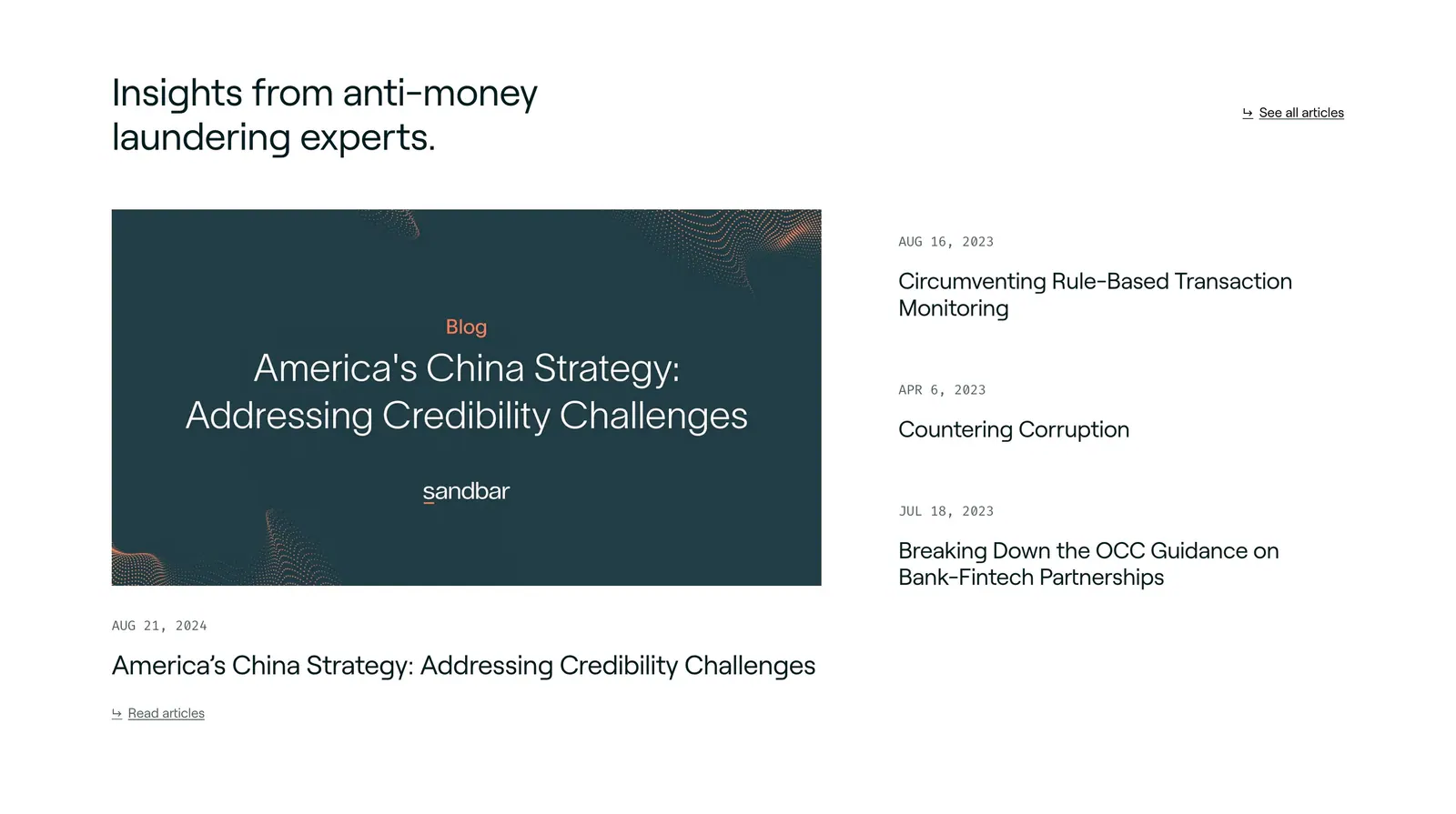
  2. Sandbar blog & resources section: headline above a featured article card on the left and a dated list of three articles on the right
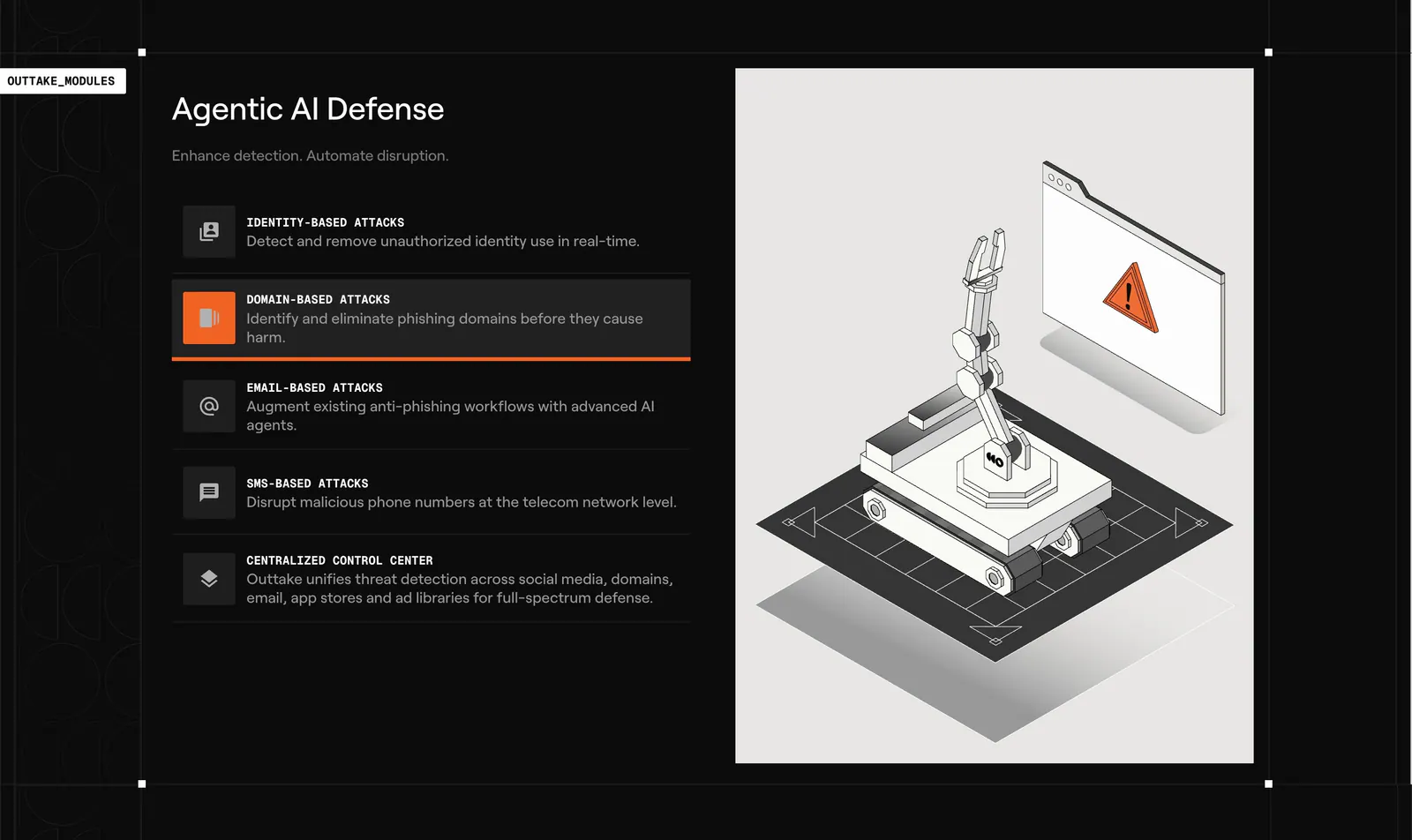
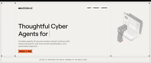
  3. Outtake features section: dark list of attack-type modules with an active highlight beside a light panel with an isometric robot arm illustration
  4. Cotool logo cloud section: single row of grayscale customer logos under a small 'Loved by teams at' label on a light gray background
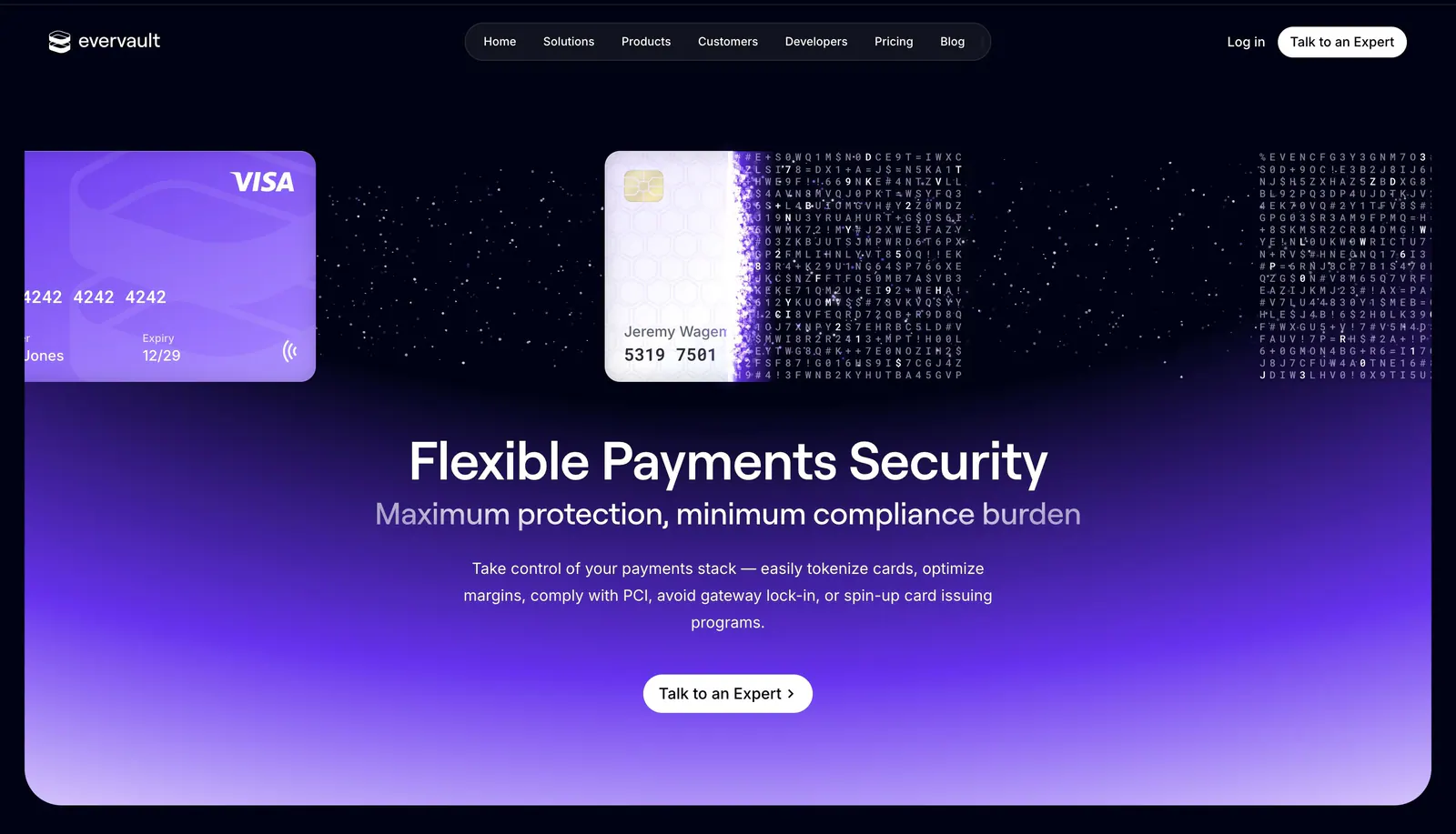
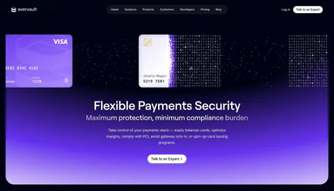
  5. Evervault hero section: credit cards dissolving into encrypted characters above a centered headline and CTA on a violet glow
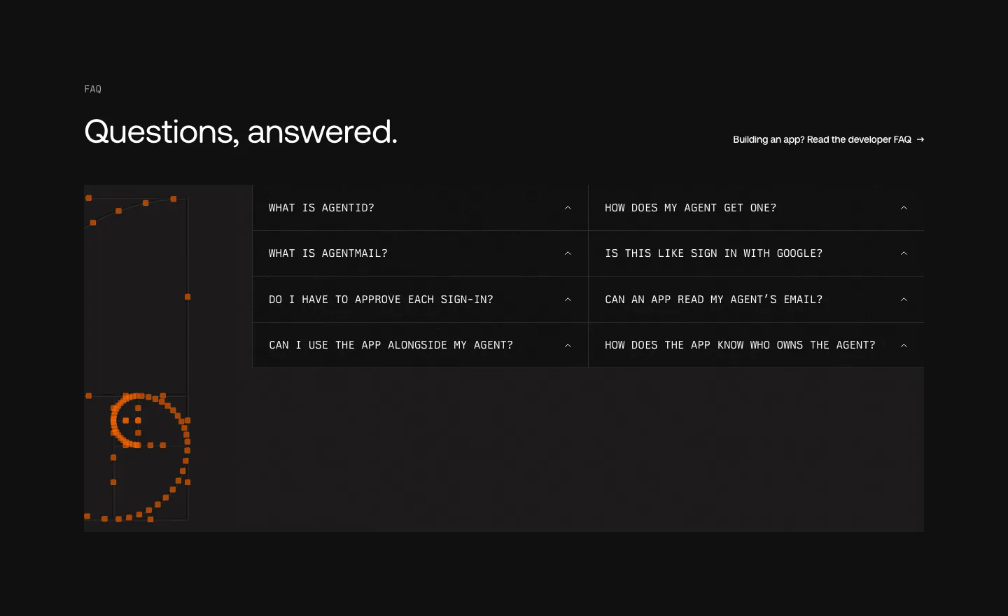
  6. AgentID FAQ section: dark two-column grid of monospace accordion questions beside an orange pixel-dot smiley artwork
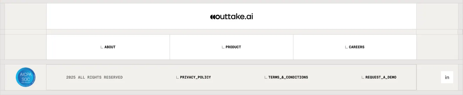
  7. Outtake footer section: centered wordmark above boxed link cells, SOC badge, copyright and legal links on a beige grid
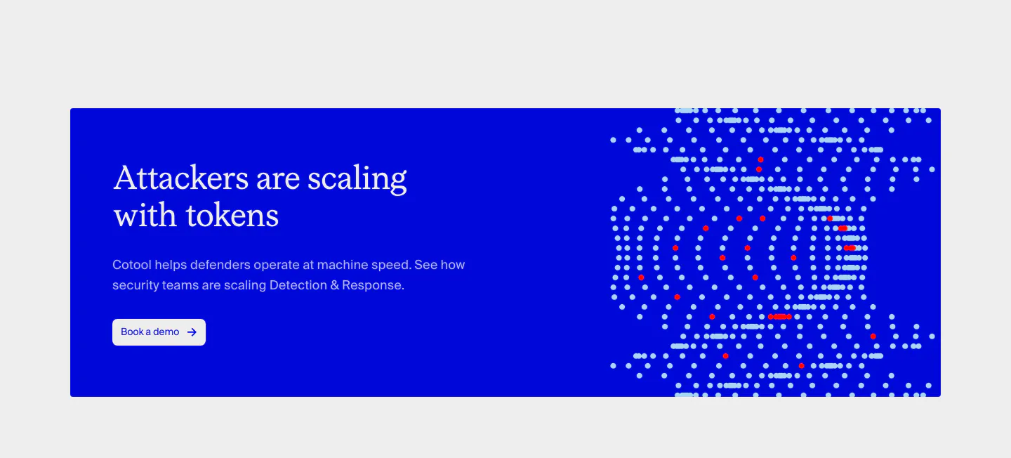
  8. Cotool call-to-action section: saturated blue banner with serif headline and button on the left and a dotted pixel artwork on the right
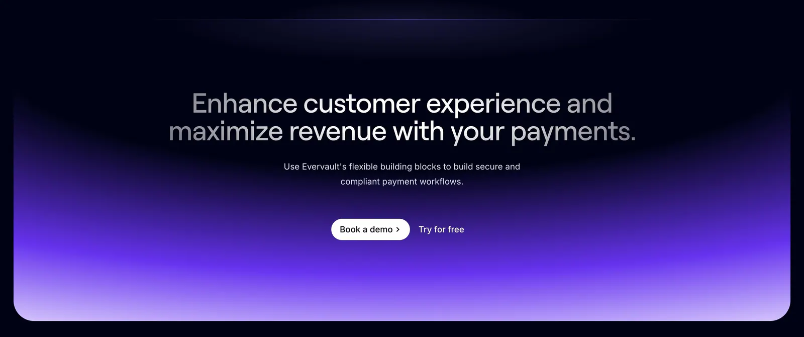
  9. Evervault call-to-action section: centered two-tone headline and demo buttons above a violet gradient glow on a dark navy background
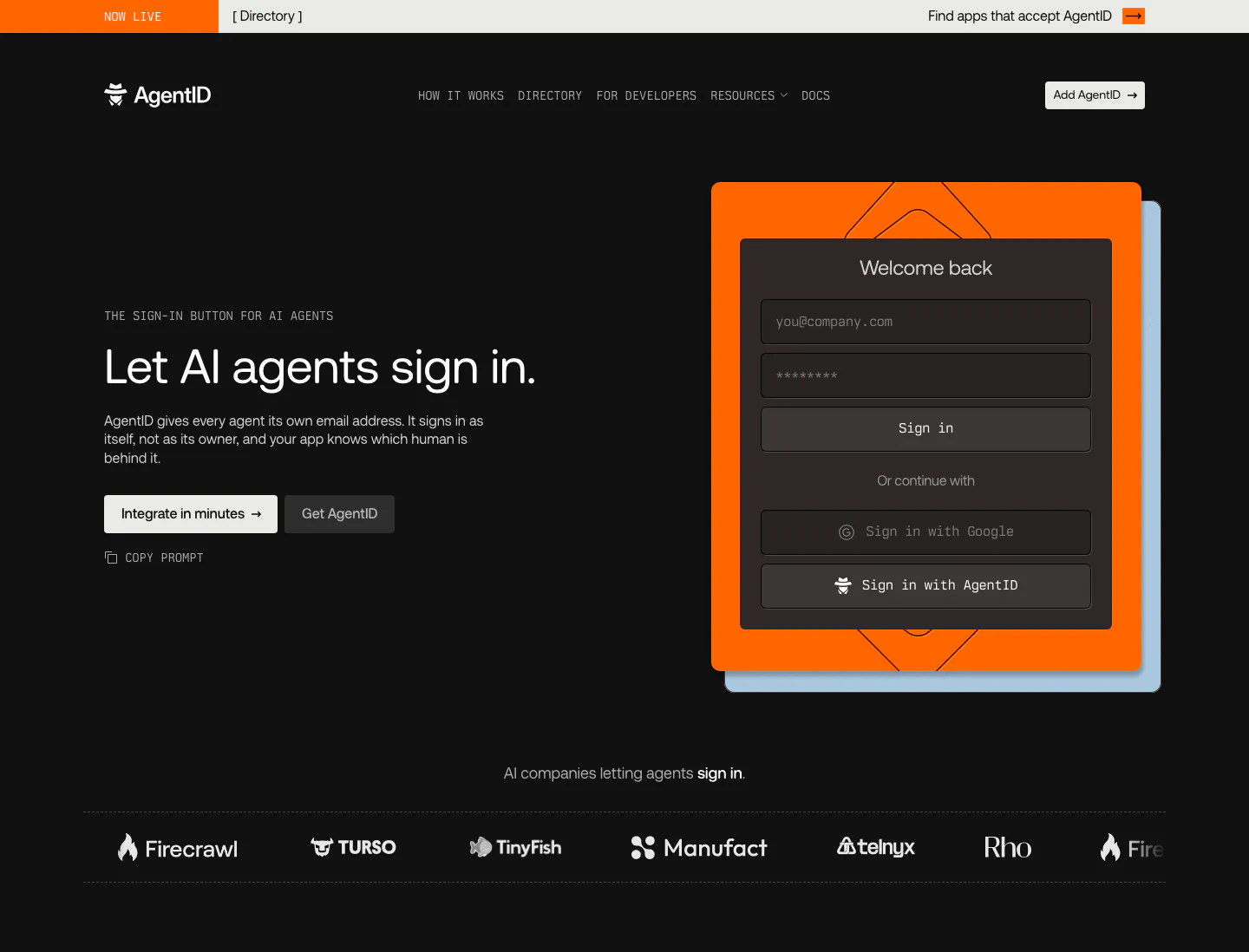
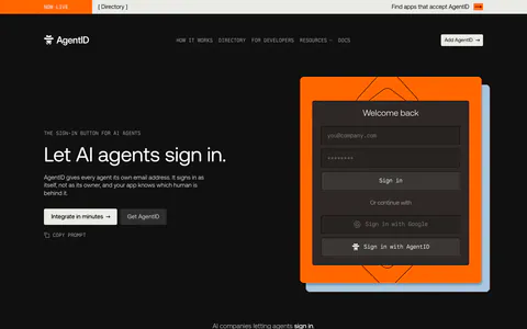
  10. AgentID hero section: dark nav, headline and two buttons left, a sign-in form mockup on an orange card right, customer logo strip below
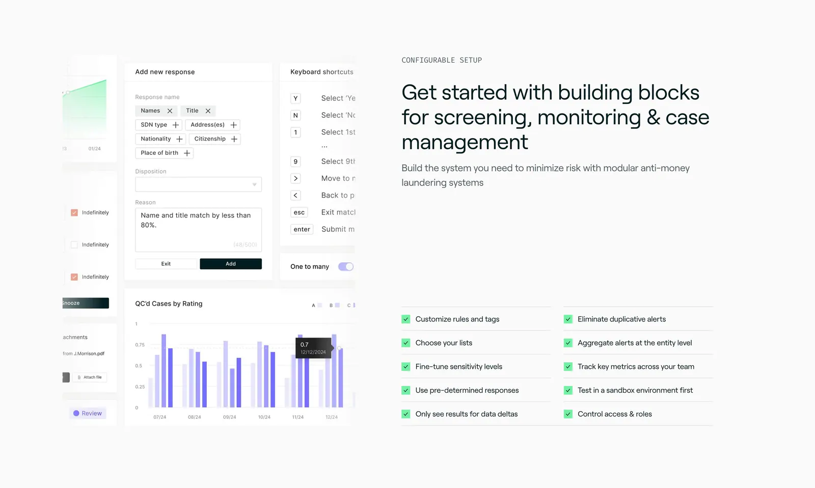
  11. Sandbar features section: product UI collage of forms and a bar chart on the left, headline and two-column checklist on the right
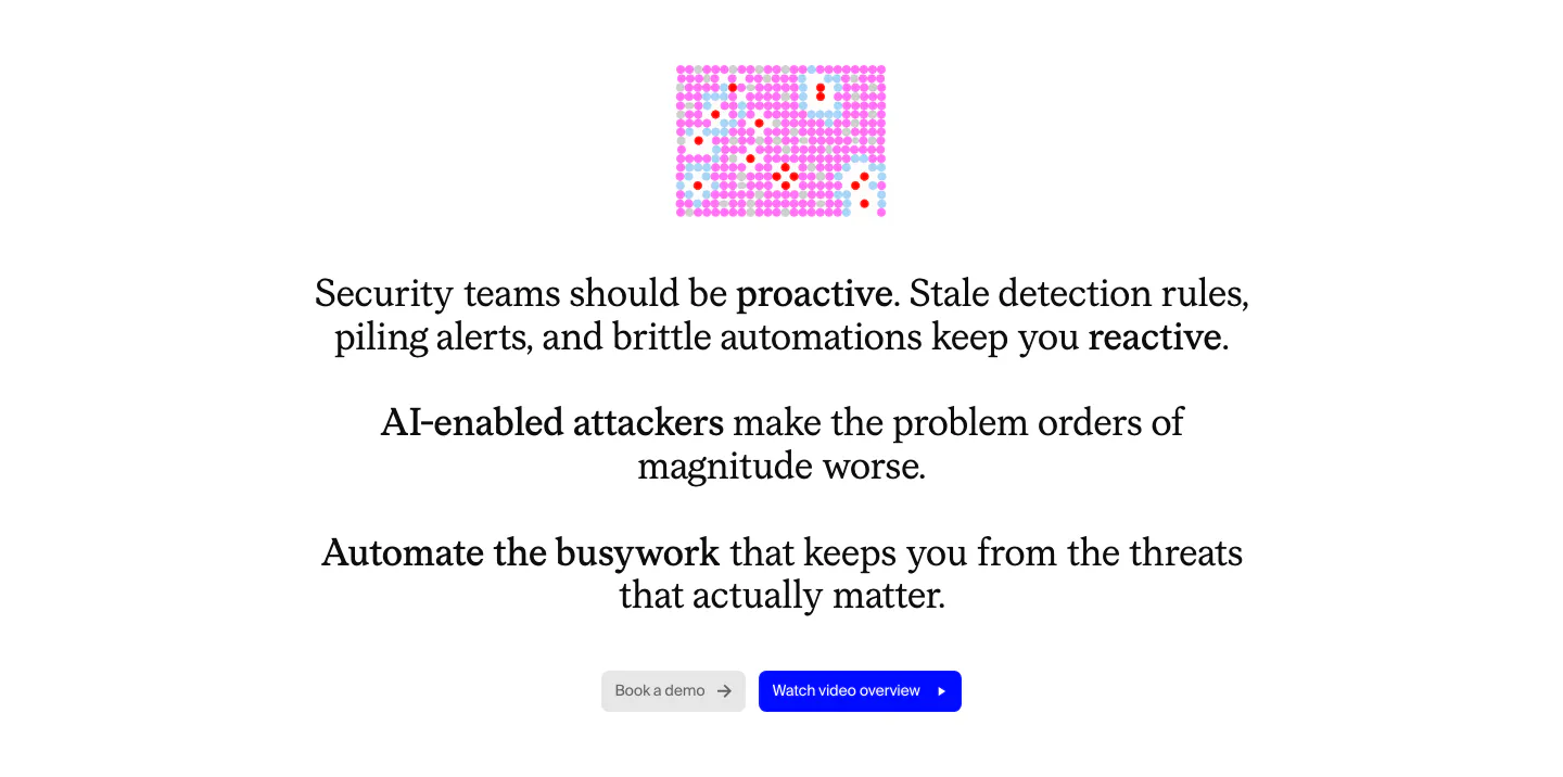
  12. Cotool value proposition section: centered serif problem statement with bolded phrases, small pink pixel graphic and two buttons on white
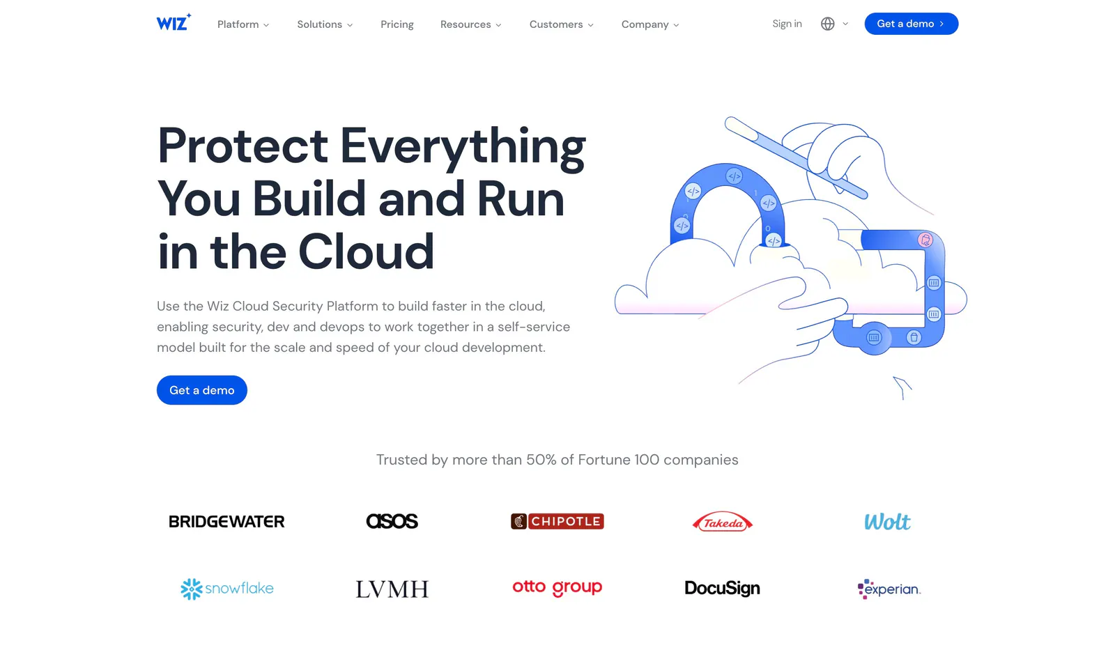
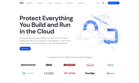
  13. Wiz hero section: headline and Get a demo button left, blue line illustration of hands, cloud and magnet right, logo strip below
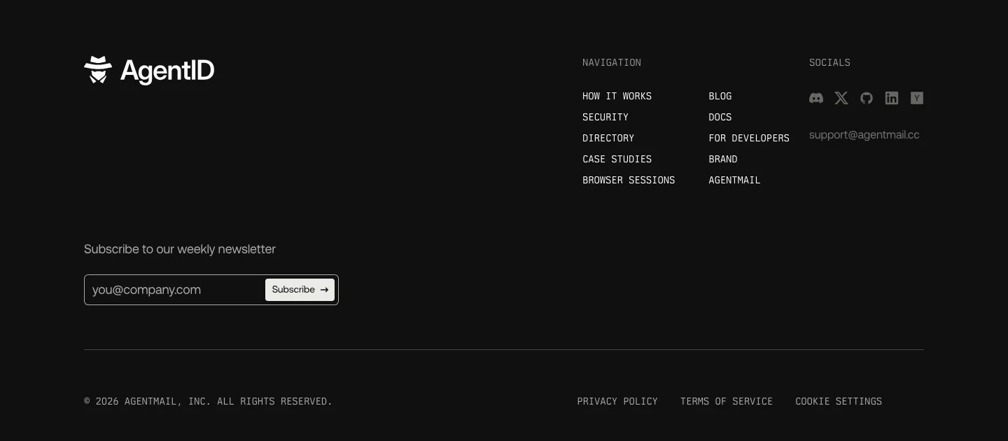
  14. AgentID footer section: dark layout with logo, newsletter email field, monospace navigation columns, social icons and legal row
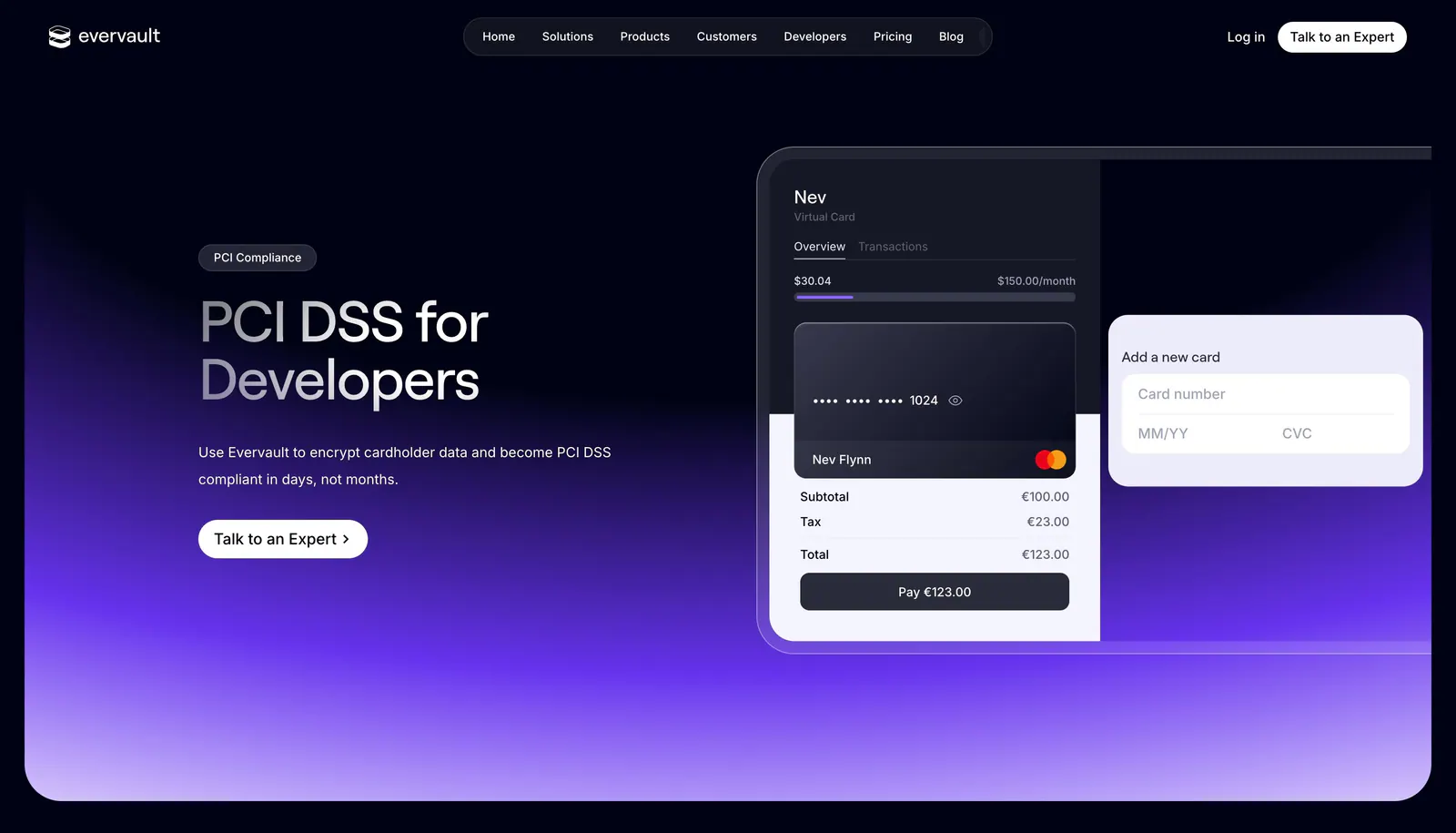
  15. Evervault hero section: nav bar, left headline with expert CTA beside a virtual card payment UI mockup over a purple glow on dark navy
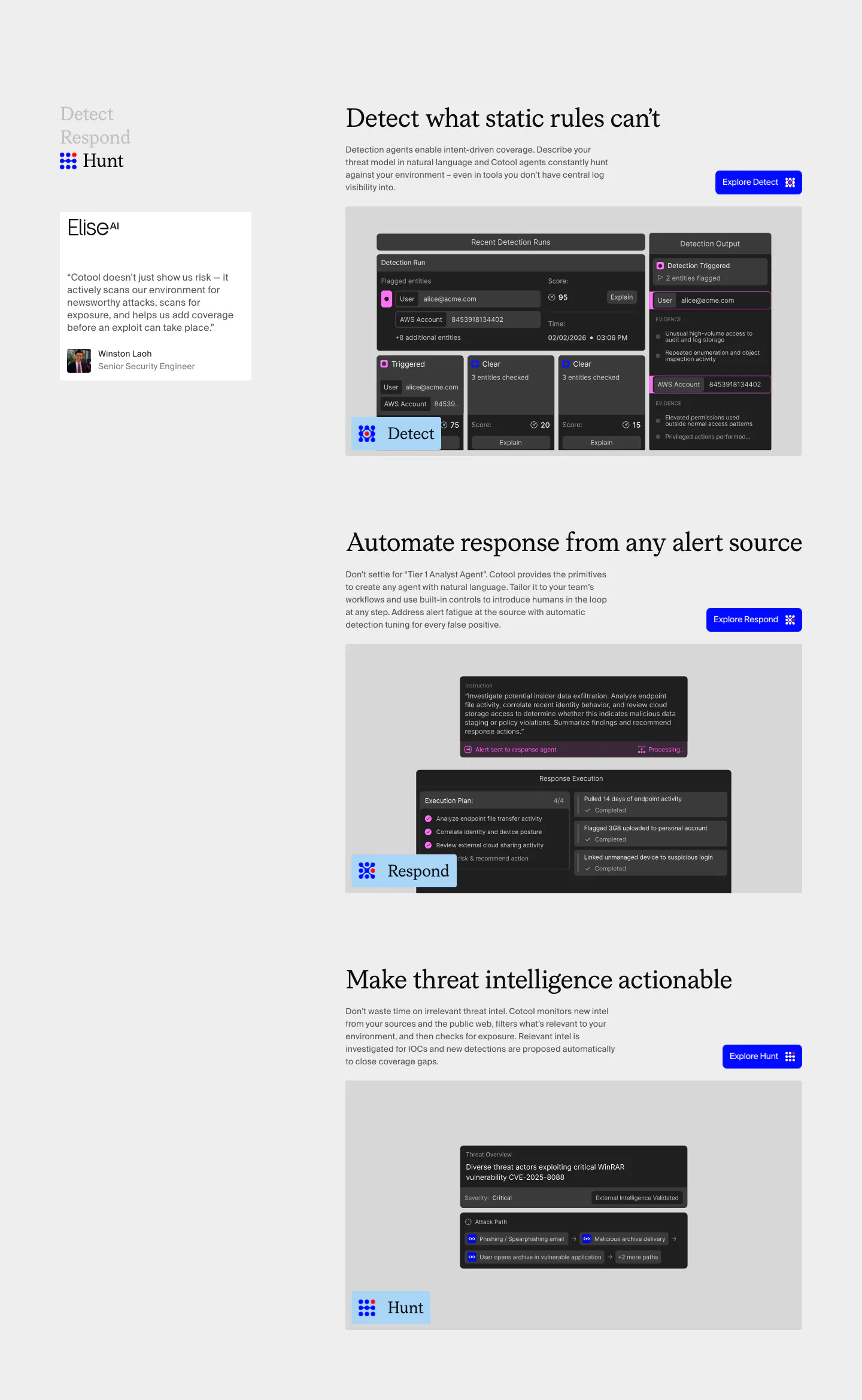
  16. Cotool features section: Detect, Respond and Hunt rows with serif headings, blue buttons and dark product UI screenshots beside a sticky side nav
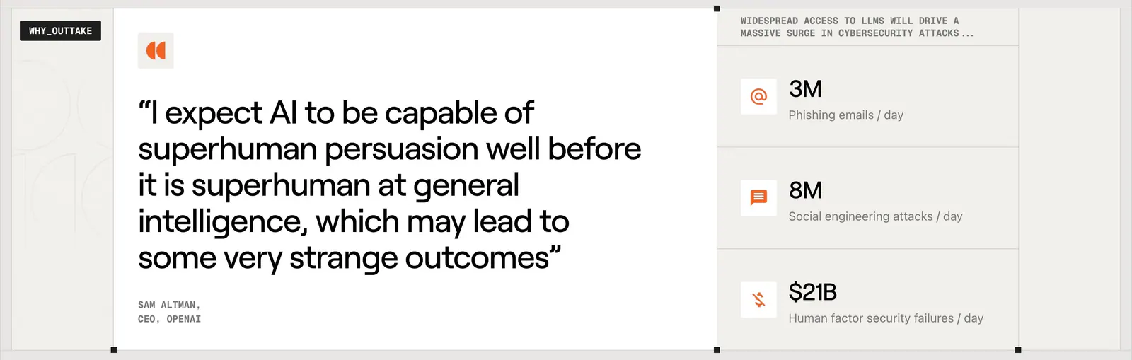
  17. Outtake testimonials section: large Sam Altman quote card beside a column of three threat statistics with orange icons on beige
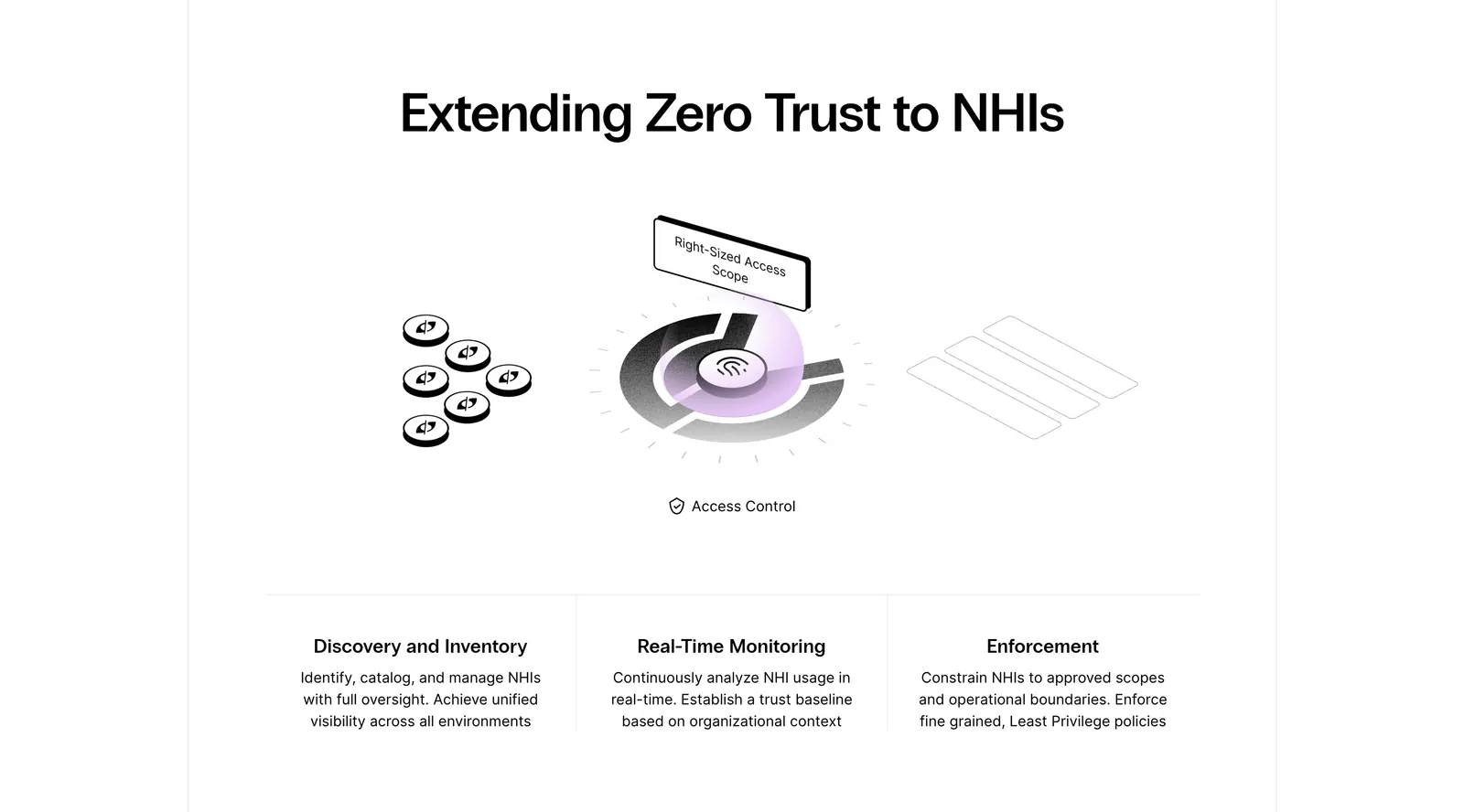
  18. Clutch Security features section: centered headline above a grayscale isometric access-control illustration and three capability columns
    Clutch Security Features
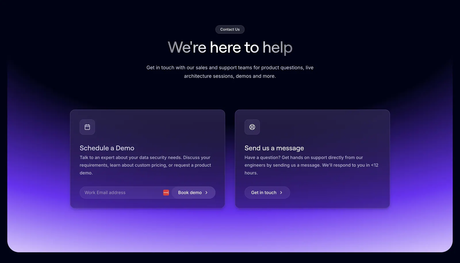
  19. Evervault contact section: centered heading above two cards for booking a demo and messaging support over a purple glow on dark navy
  20. Cotool footer section: tagline, demo button and link columns above a giant dot-matrix Cotool wordmark on a charcoal background
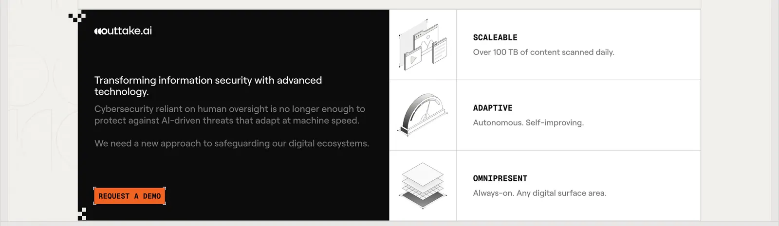
  21. Outtake call to action section: black text panel with orange demo button beside three rows of isometric line illustrations on a beige page
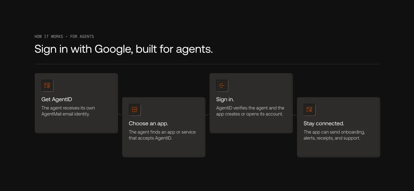
  22. AgentID how it works section: dark row of four staggered step cards with orange icons, from Get AgentID to Stay connected
  23. Evervault footer section: logo at left with five link columns, compliance badges and copyright line on a near-black navy background
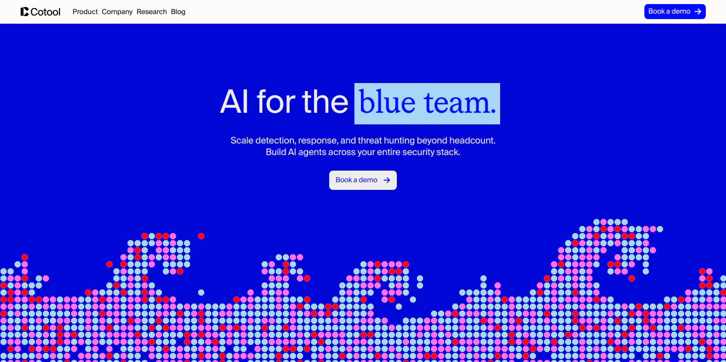
  24. Cotool hero section: centered headline with highlighted serif words on a saturated blue background above a pixel-dot wave artwork
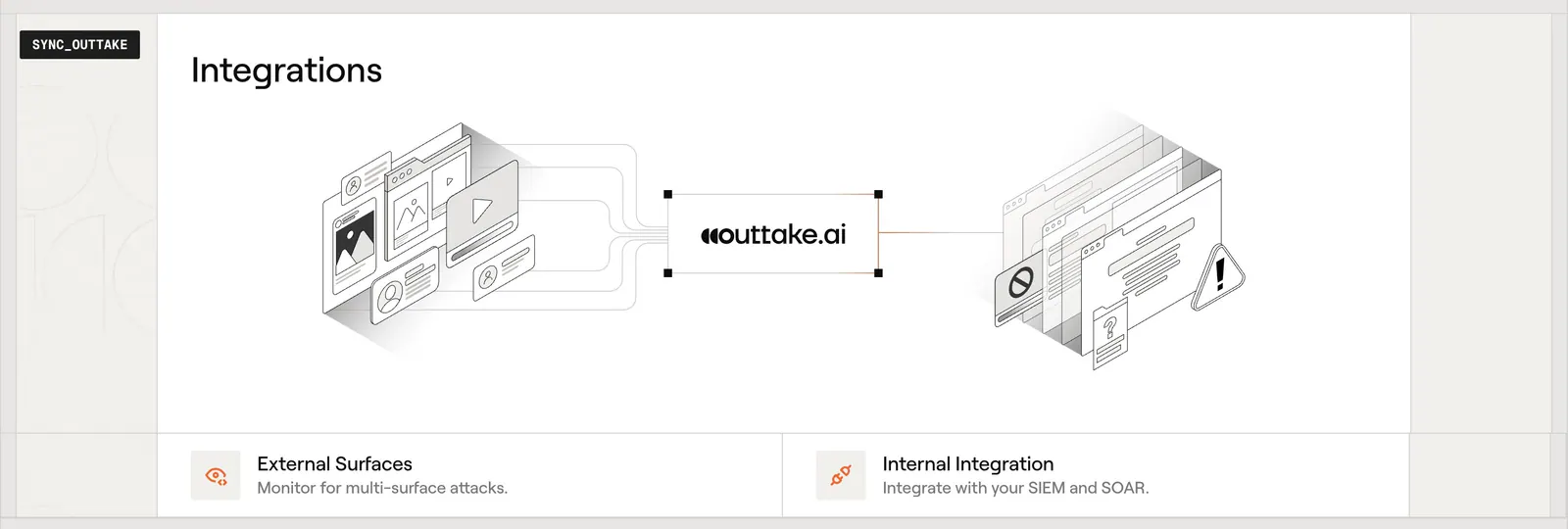
  25. Outtake integrations section: isometric diagram linking external surfaces to the Outtake logo and internal tools, with two feature cards below
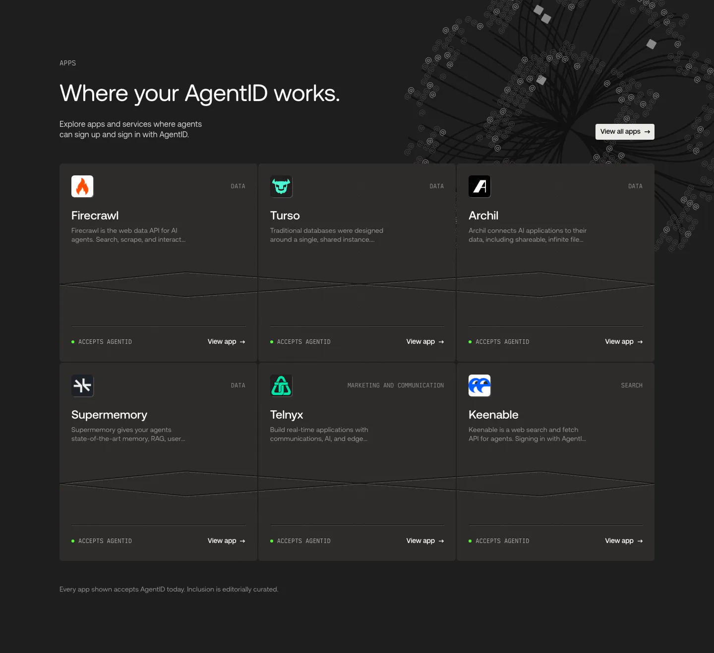
  26. AgentID integrations section: dark six-card grid of partner apps like Firecrawl and Turso with icons, category labels and view links
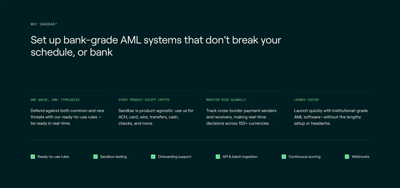
  27. Sandbar features section: left-aligned headline above four benefit columns and a row of checklist items on a dark teal background
  28. Evervault logo cloud section: two rows of six white customer logos above a centered trust caption on a near-black background
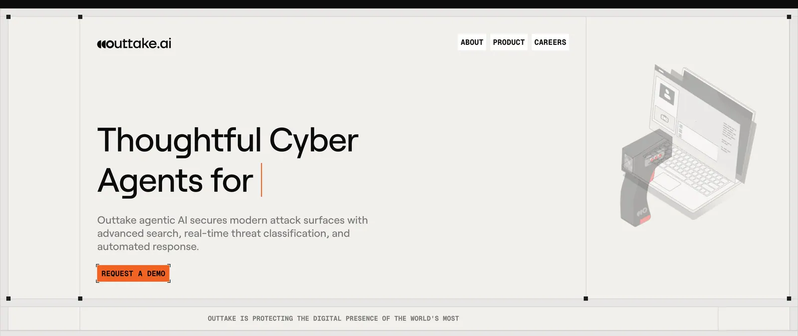
  29. Outtake hero section: left-aligned headline with typing cursor and orange demo button beside an isometric scanner and laptop illustration on beige
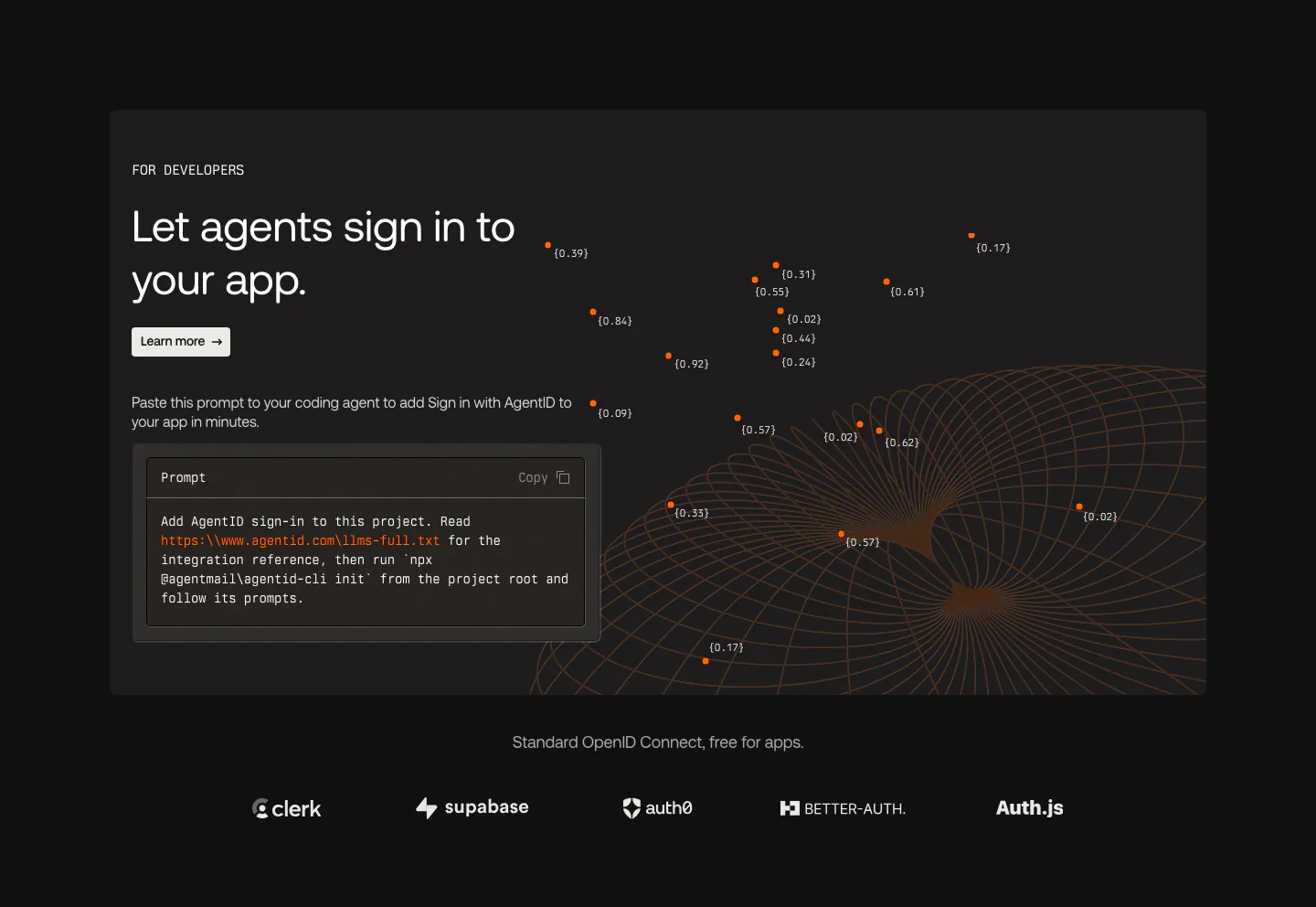
  30. AgentID features section: dark developer panel with headline, prompt code block and orange wireframe globe above a row of auth provider logos
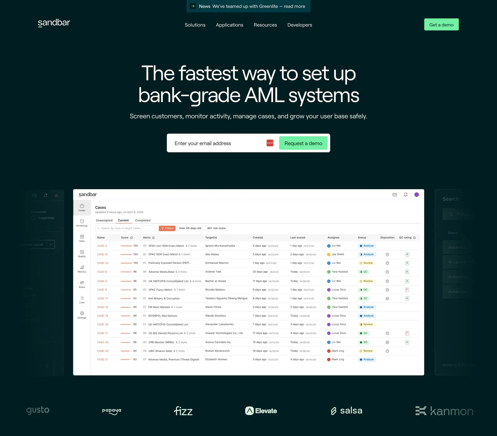
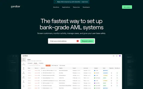
  31. Sandbar hero section: centered headline with email demo form above an AML cases table screenshot and a logo row on dark teal
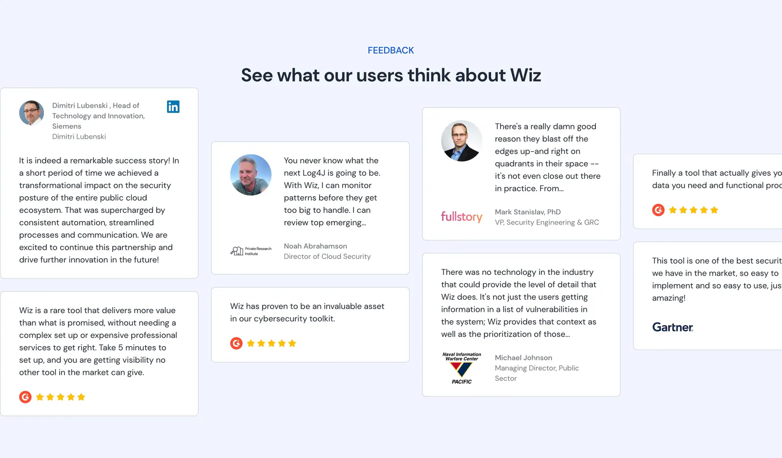
  32. Wiz testimonials section: centered headline above staggered quote cards with headshots, logos and G2 star ratings on pale blue
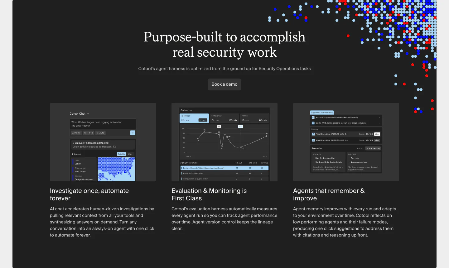
  33. Cotool features section: centered serif heading over three dark cards with product UI screenshots on a charcoal panel with pixel-dot accents
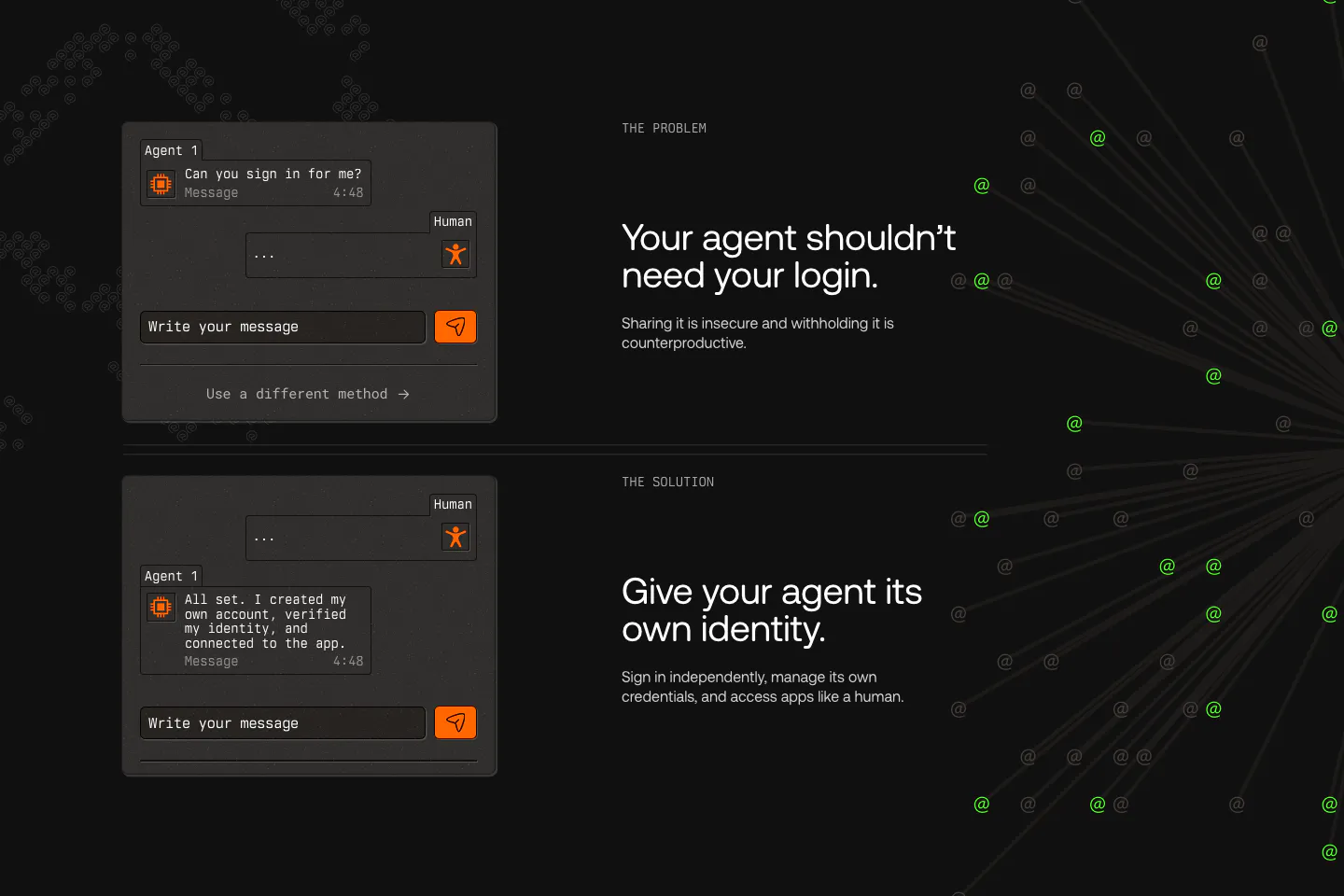
  34. AgentID features section: dark problem and solution rows pairing chat UI mockups with headlines, beside radiating lines of green @ symbols
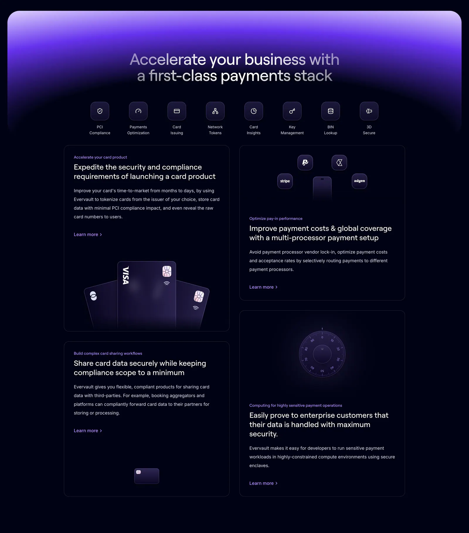
  35. Evervault features section: centered headline and icon row above four dark cards with payment card and vault visuals under a purple glow
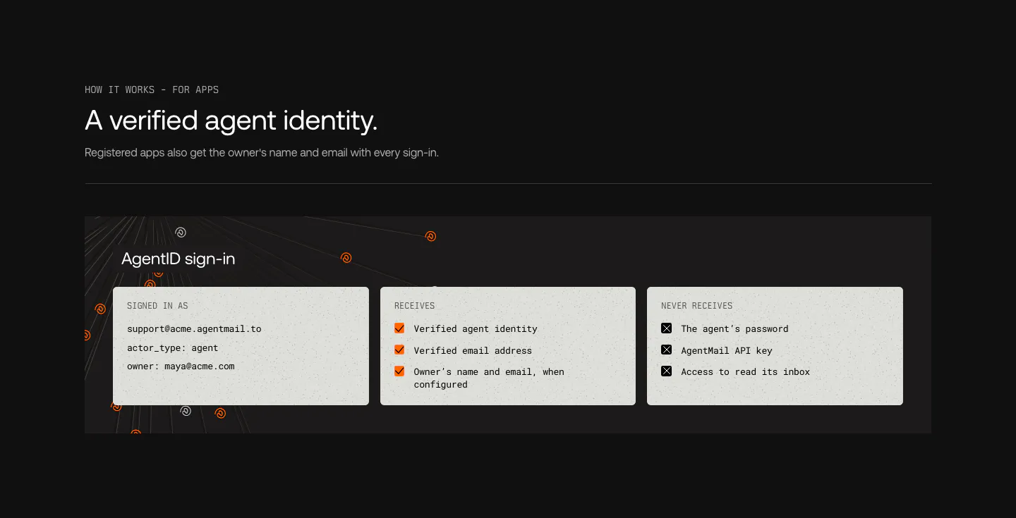
  36. AgentID features section: dark panel with three light cards listing the sign-in identity, data apps receive and data they never receive
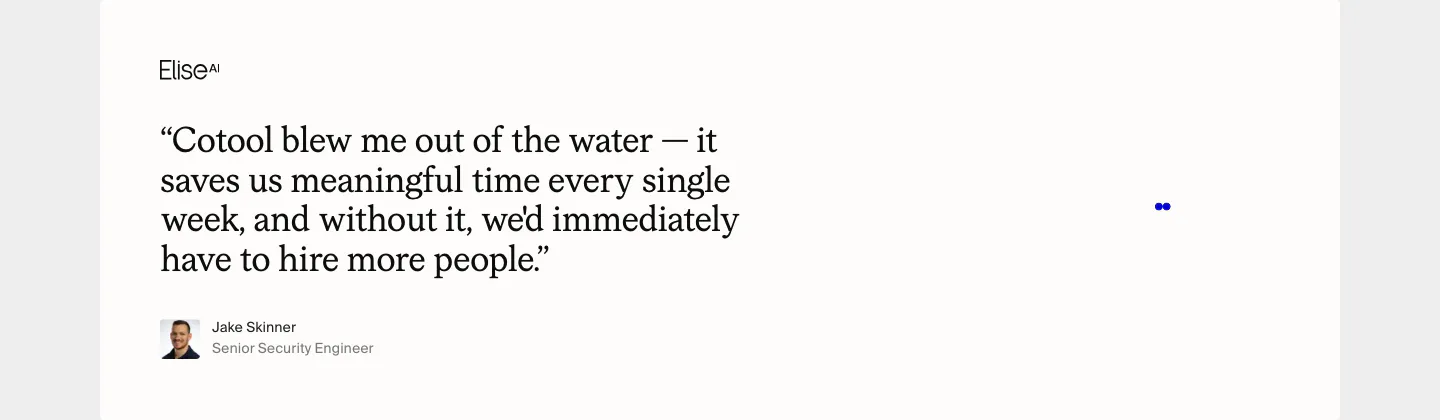
  37. Cotool testimonials section: large serif customer quote with EliseAI logo, avatar and name on an off-white card
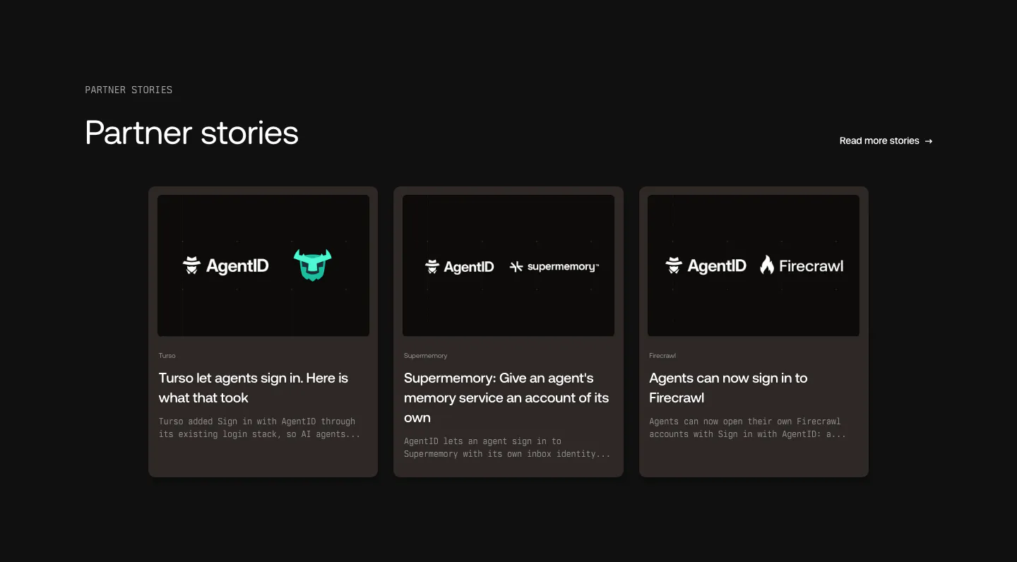
  38. AgentID blog & resources section: dark three-card row of partner story posts with co-branded logo thumbnails and excerpts

Security companies
7 companies in this collection

All companies

Common styles in security websites

How to design a cybersecurity website

  1. Replace fear with specifics

    Scary statistics and dark imagery are everywhere in this category and convince no one. Describe the exact threats or gaps the product covers, the environments it supports, and how quickly it responds. Specific scope reads as expertise. Dramatic language reads as marketing.

  2. Show what the analyst sees

    Security teams care about the daily experience: how alerts are prioritized, how much context comes with each one, and how fast they can act. A screenshot of a triaged alert or an investigation view is more convincing than abstract network graphics.

  3. Publish your own security posture

    A security vendor without a trust page is a red flag. List certifications such as SOC 2 or ISO 27001, link to a trust center, and describe how you handle customer data. Buyers check this before they evaluate a single feature.

  4. Map features to compliance frameworks

    Compliance and security leads think in frameworks and controls. Show which requirements the product helps meet and how evidence is collected. A simple table that maps features to specific controls helps buyers justify the purchase internally and speeds up procurement.

All industries
    ↑↓ Navigate ↵ Open

    Section preview

    Website section