Legal Tech Website Design Examples
Lawyers read carefully and distrust overstatement, and that shapes everything on the page. Buyers want to know exactly what the software does to a contract or a research question, how accurate it is, and who is responsible for the result. Effective legal tech website design uses precise language, shows real clauses and redlines, and treats confidentiality and privilege as main topics rather than footnotes.

















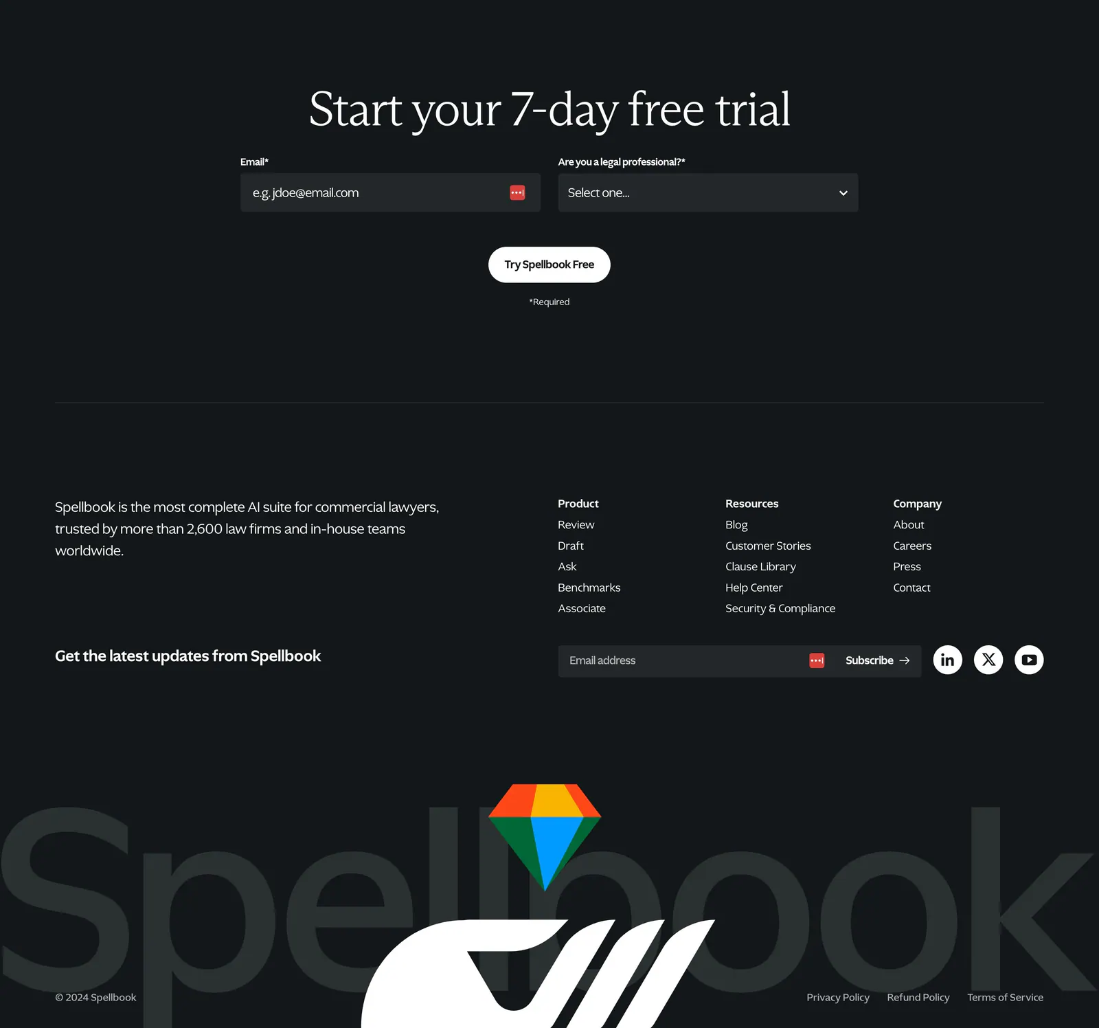




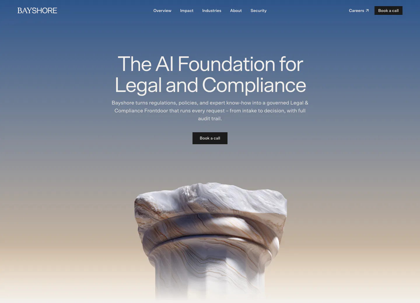
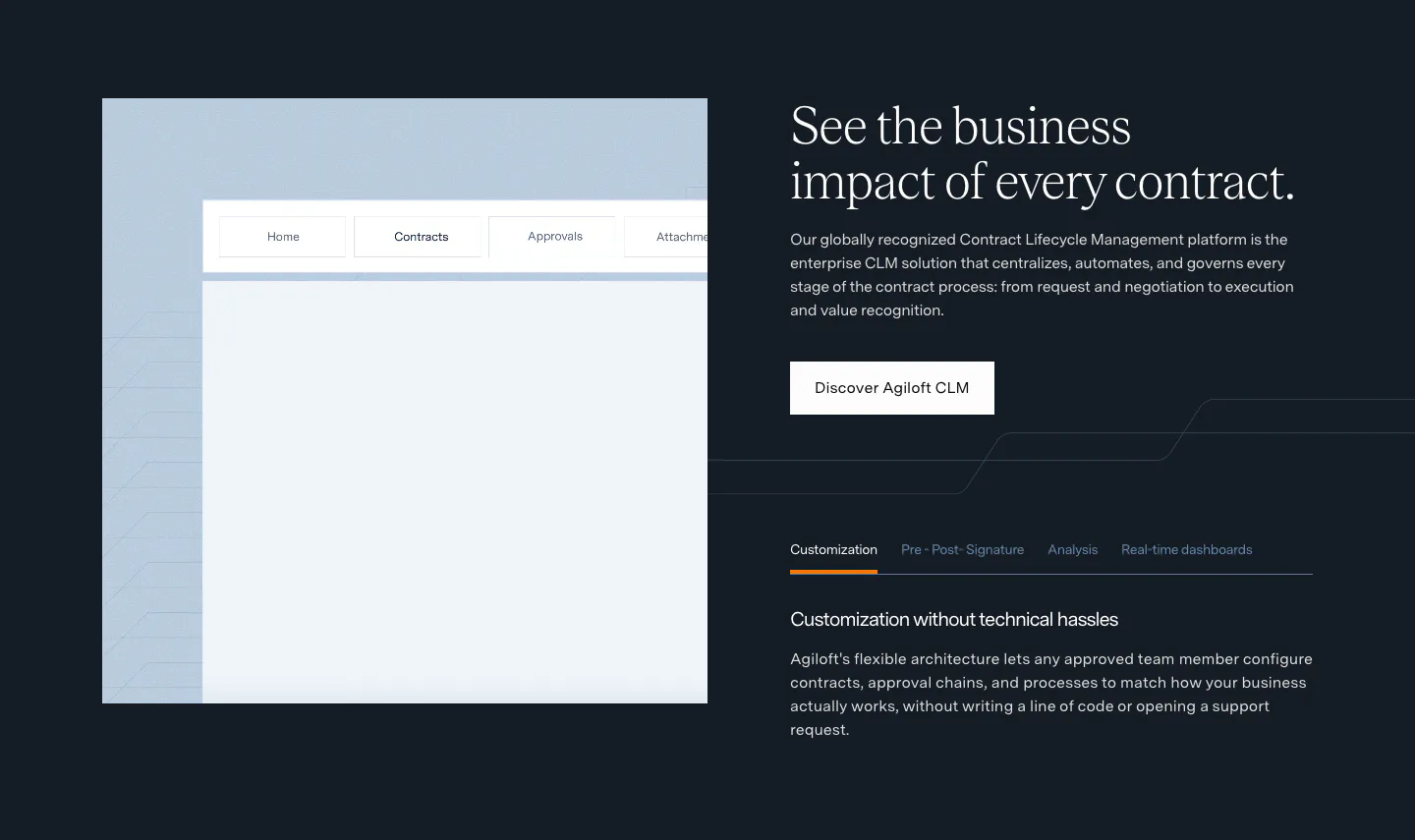



Legal companies





Common styles in legal websites
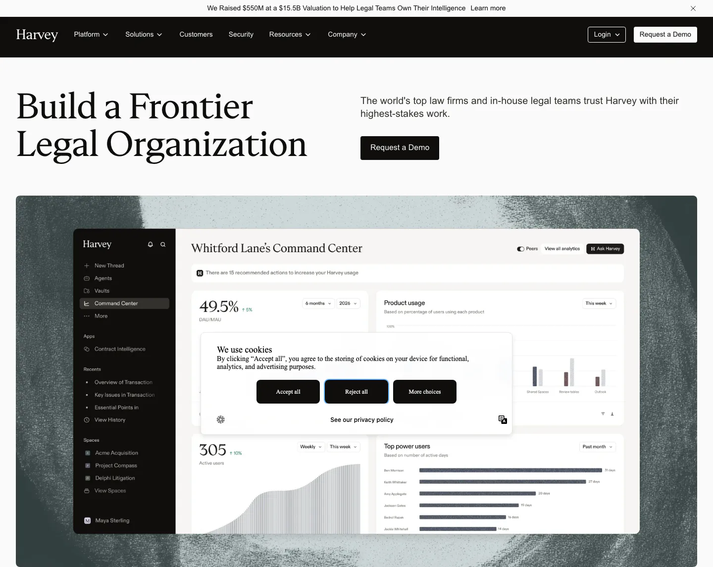
- Dark mode
- Serif type
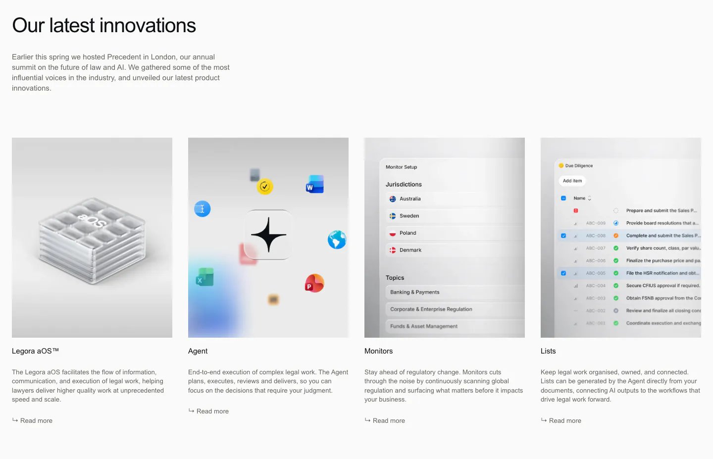
- Minimal
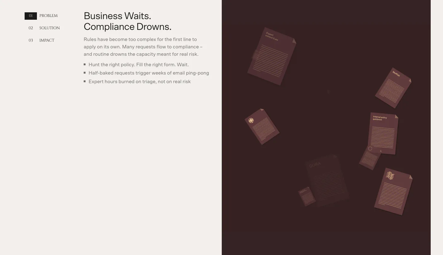
- Monochrome
- Centered
- Split layout
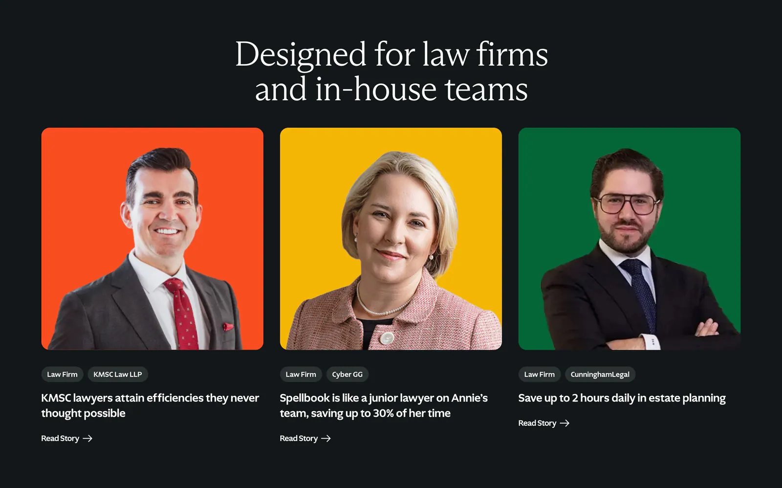
- Photography
How to design a legal tech website
-
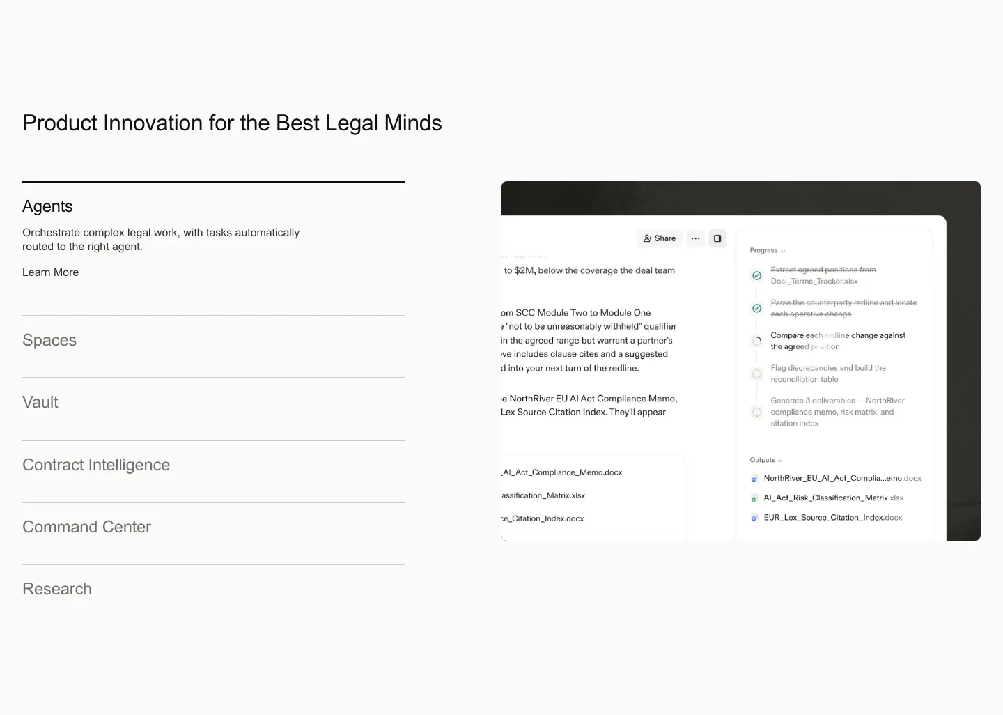
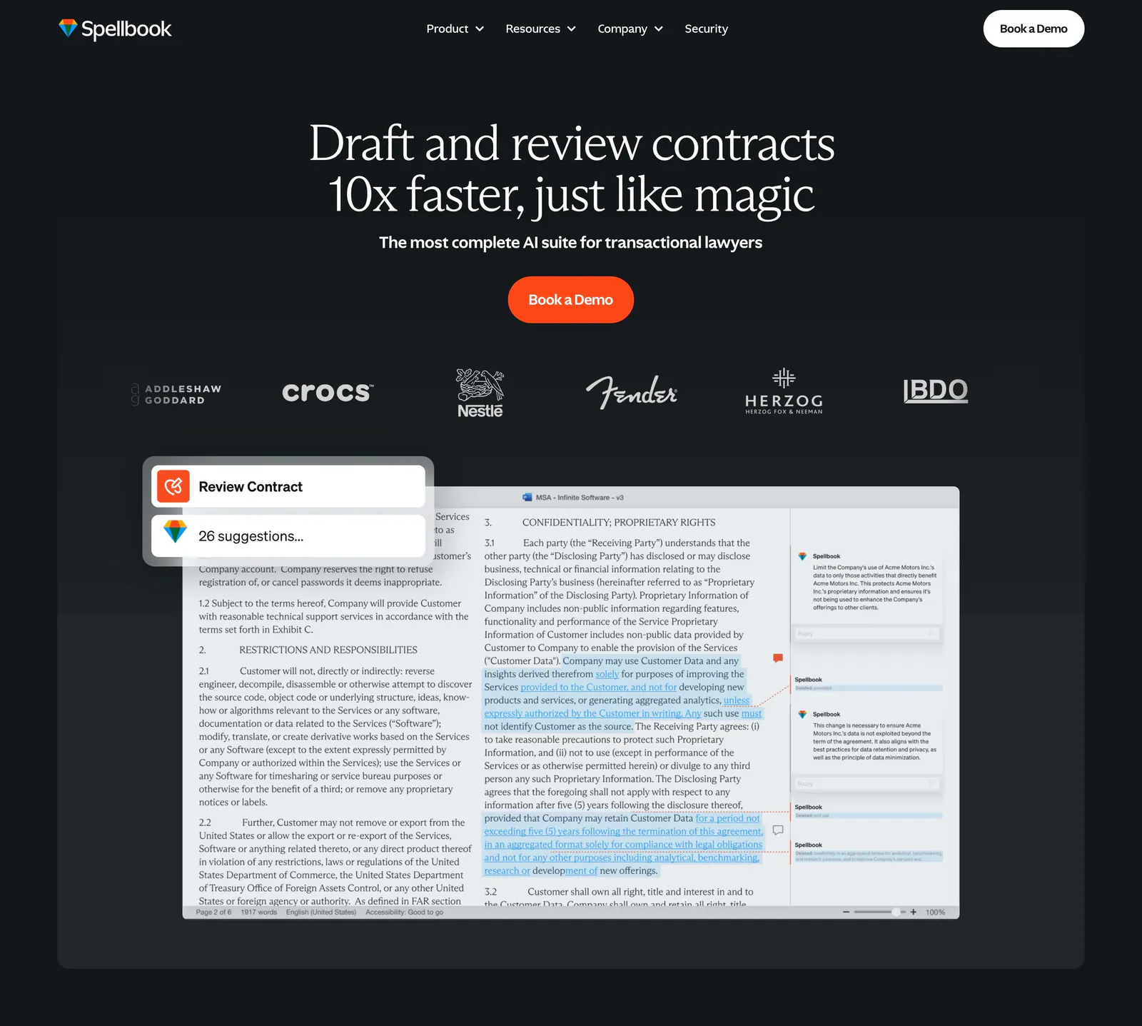
Show actual clauses and redlines
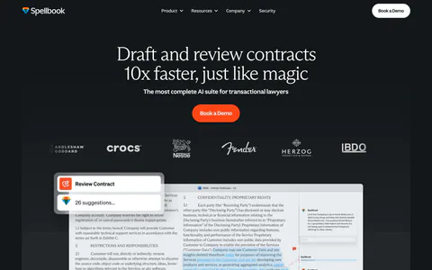
Lawyers trust what they can read. Display a real contract excerpt with the product's suggested edits, comments, or risk flags. Use plausible legal language rather than placeholder text, because anyone in the field will spot fake clauses immediately.
-
Address confidentiality up front
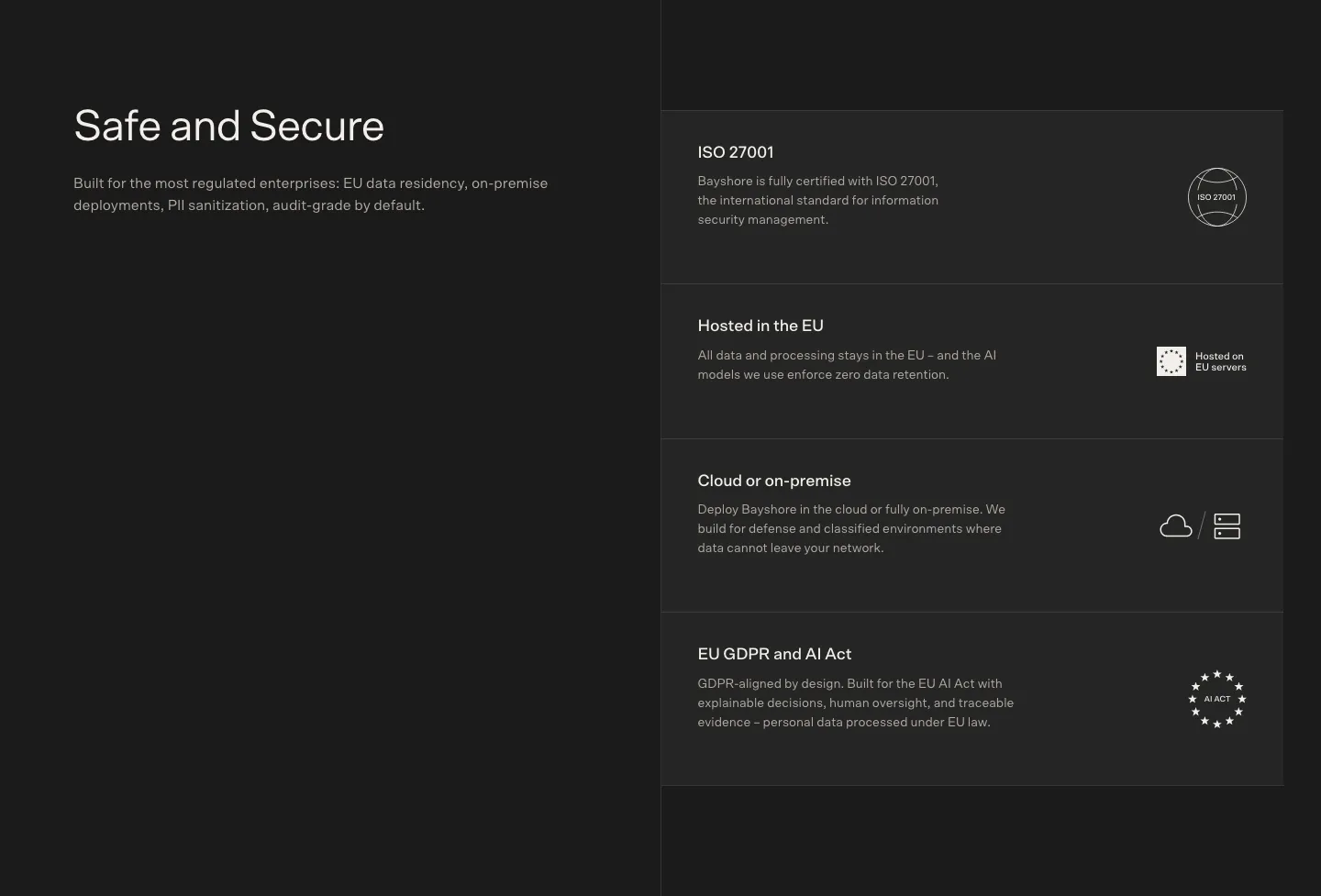
Client data, privilege, and model training are the first questions any firm will ask. State where documents are stored, who can access them, and whether they are ever used to train models. Put this near the top of the page, not only on a separate security page.
-
Write with precision, not hype
Avoid claims like "replace your associates" or "perfect accuracy." Lawyers respond to measured statements about time saved, error rates, and review steps. Copy that sounds careful signals that the product was built by people who understand legal risk.
-
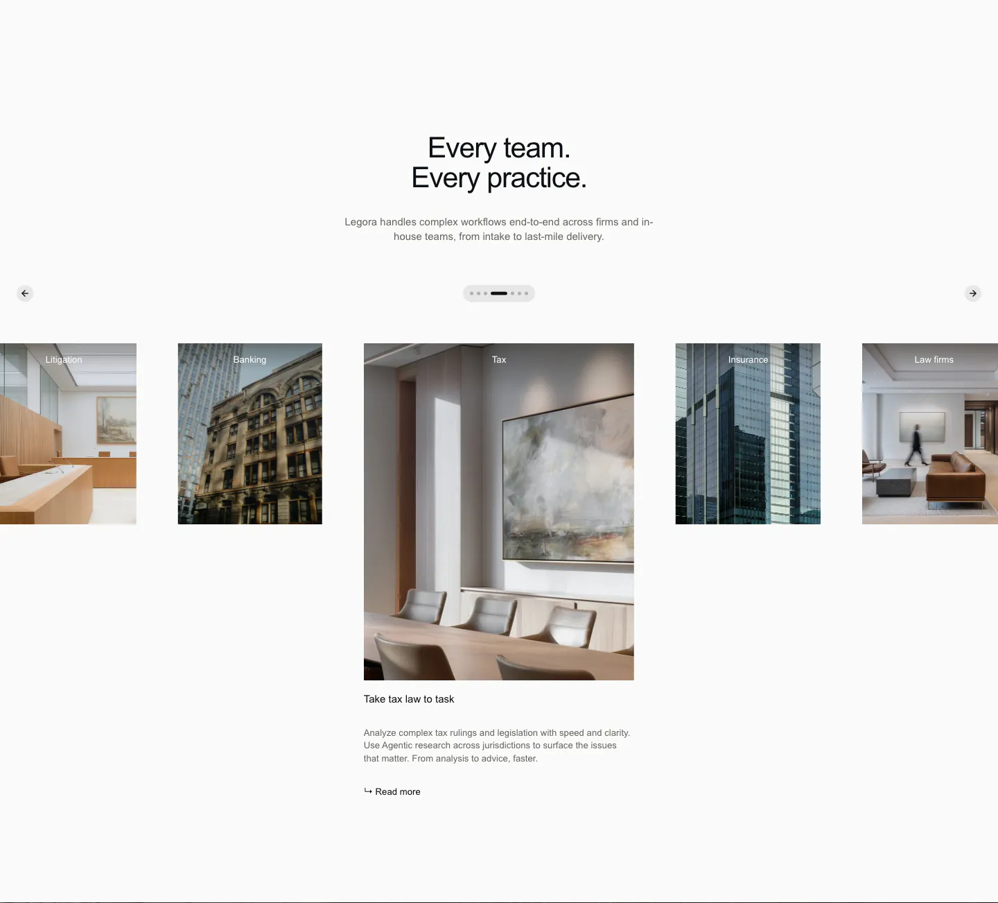
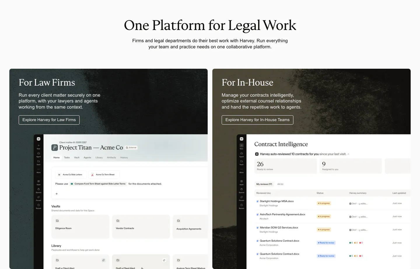
Separate law firms from in-house teams
Firms care about efficiency on billable work and client service. In-house teams care about turnaround, cost control, and keeping the business moving. Give each audience its own page or section, with workflows and examples that match how they actually handle matters.