Alternating Rows Website Design Examples
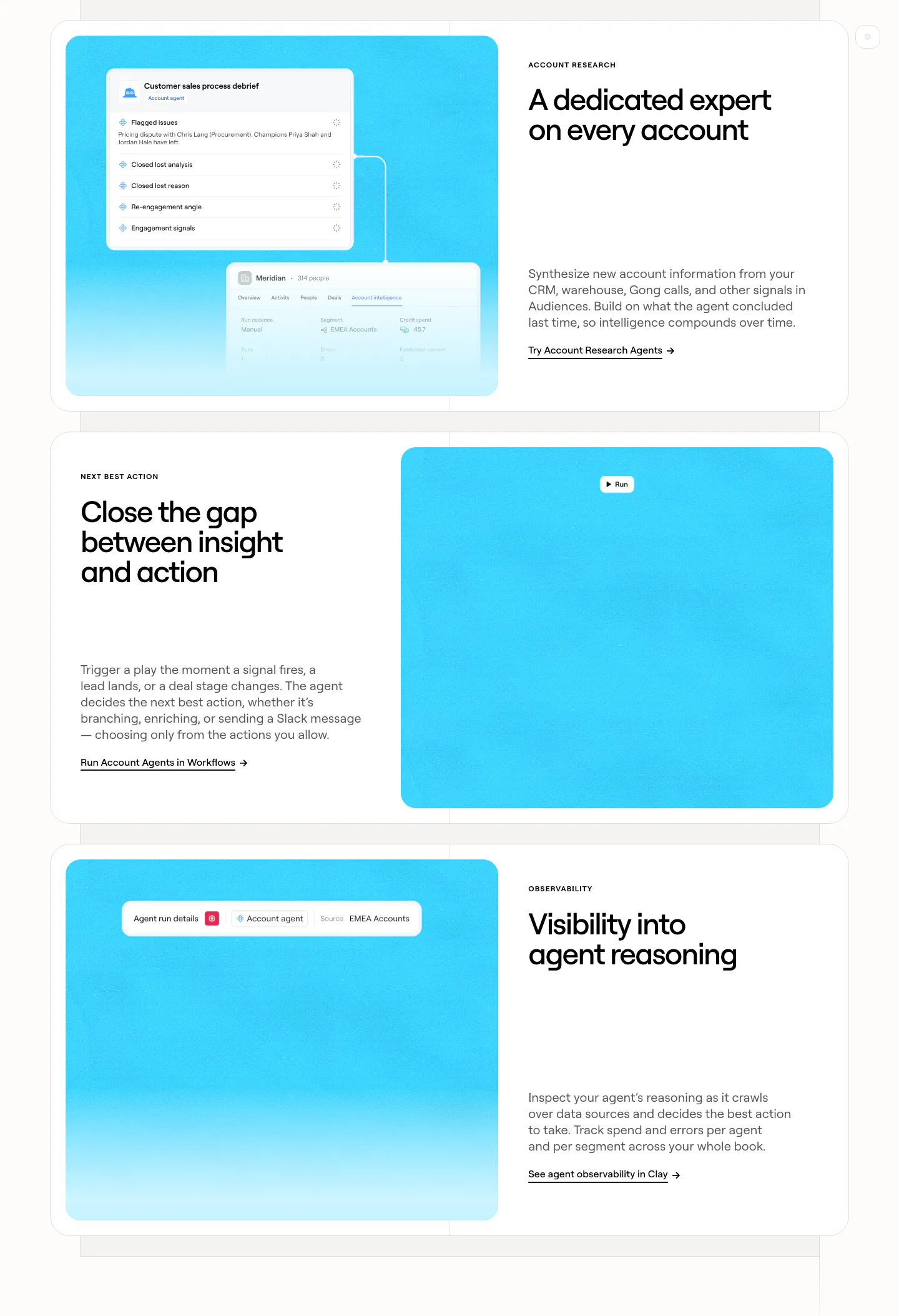
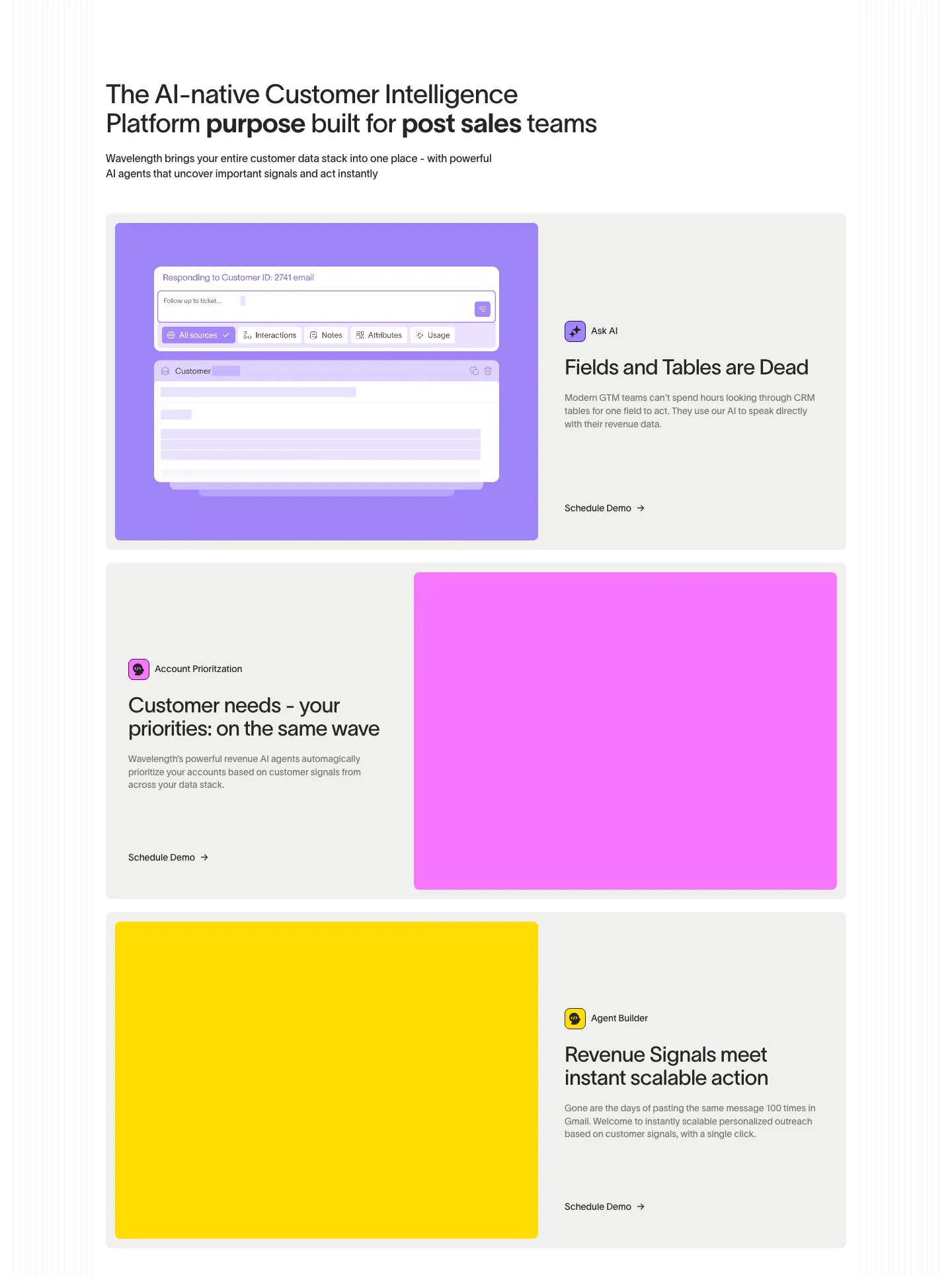
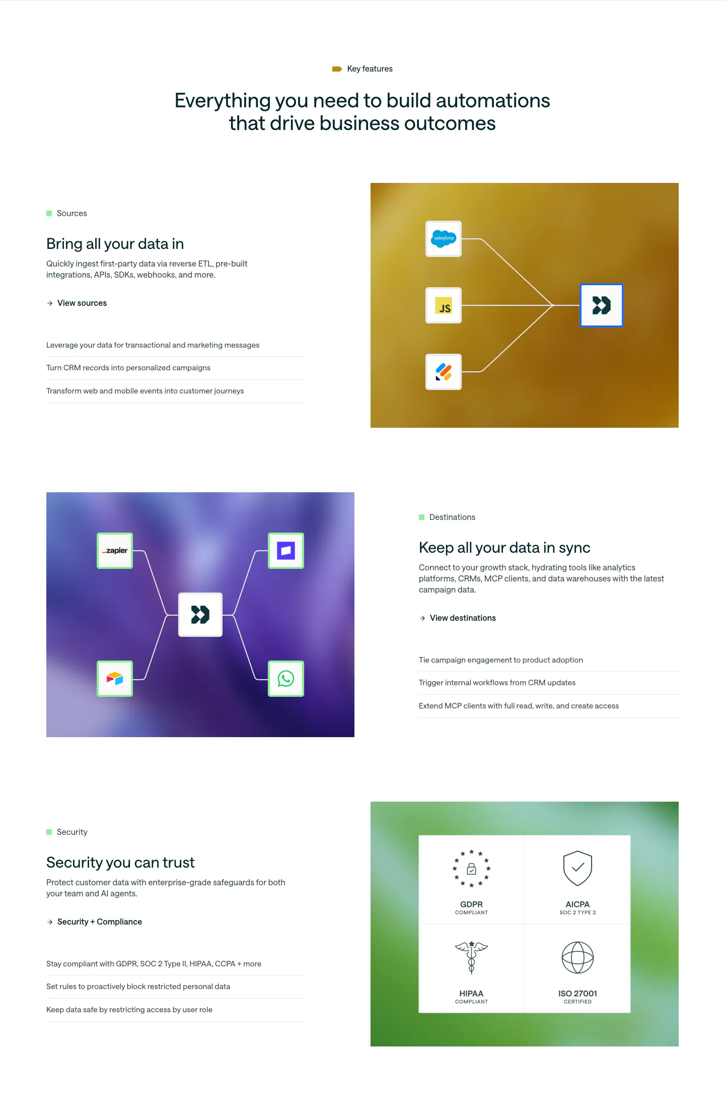
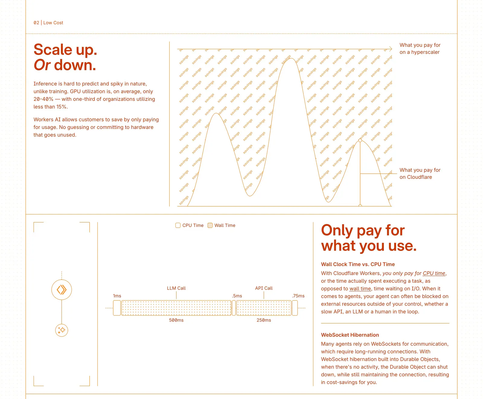
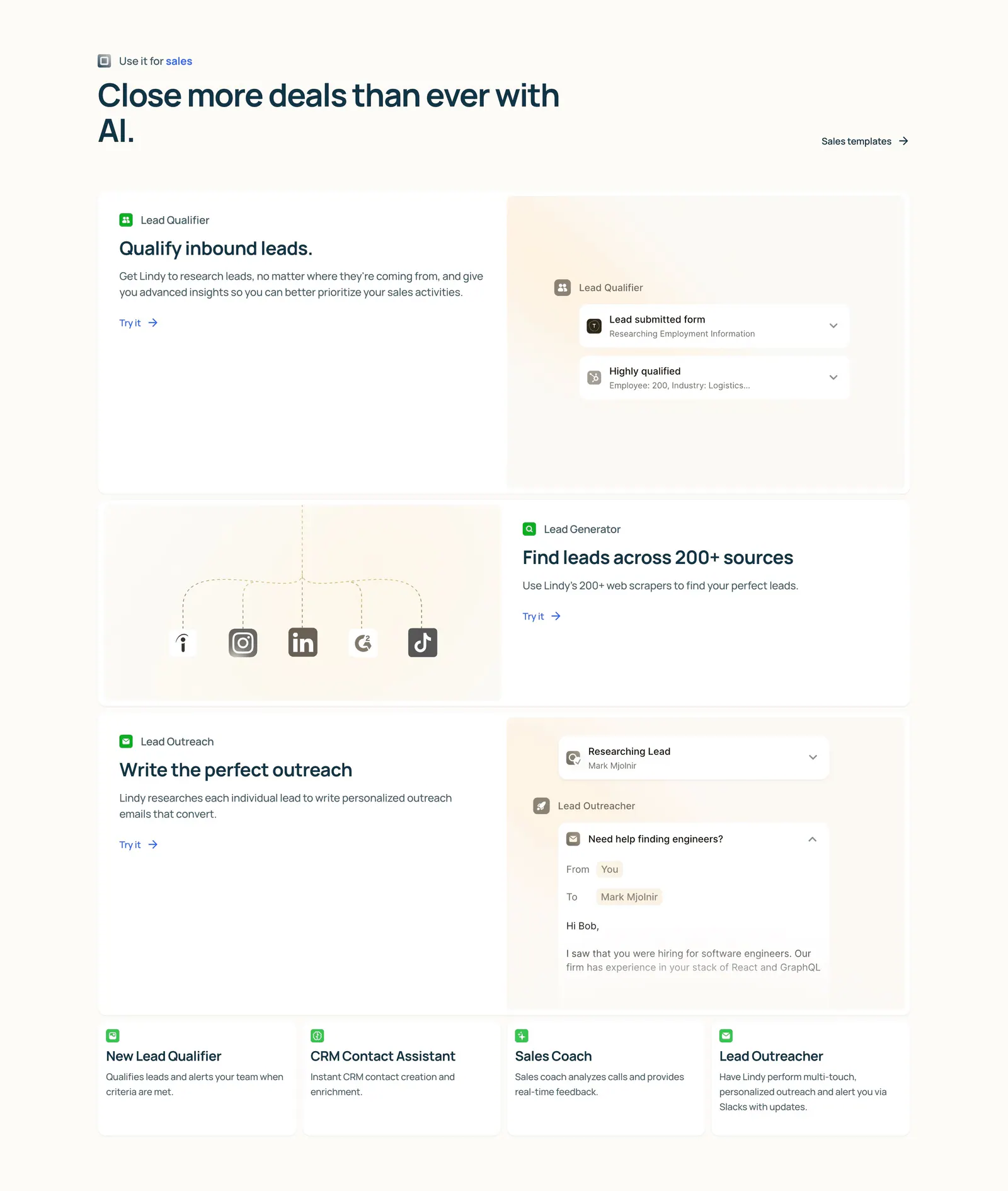
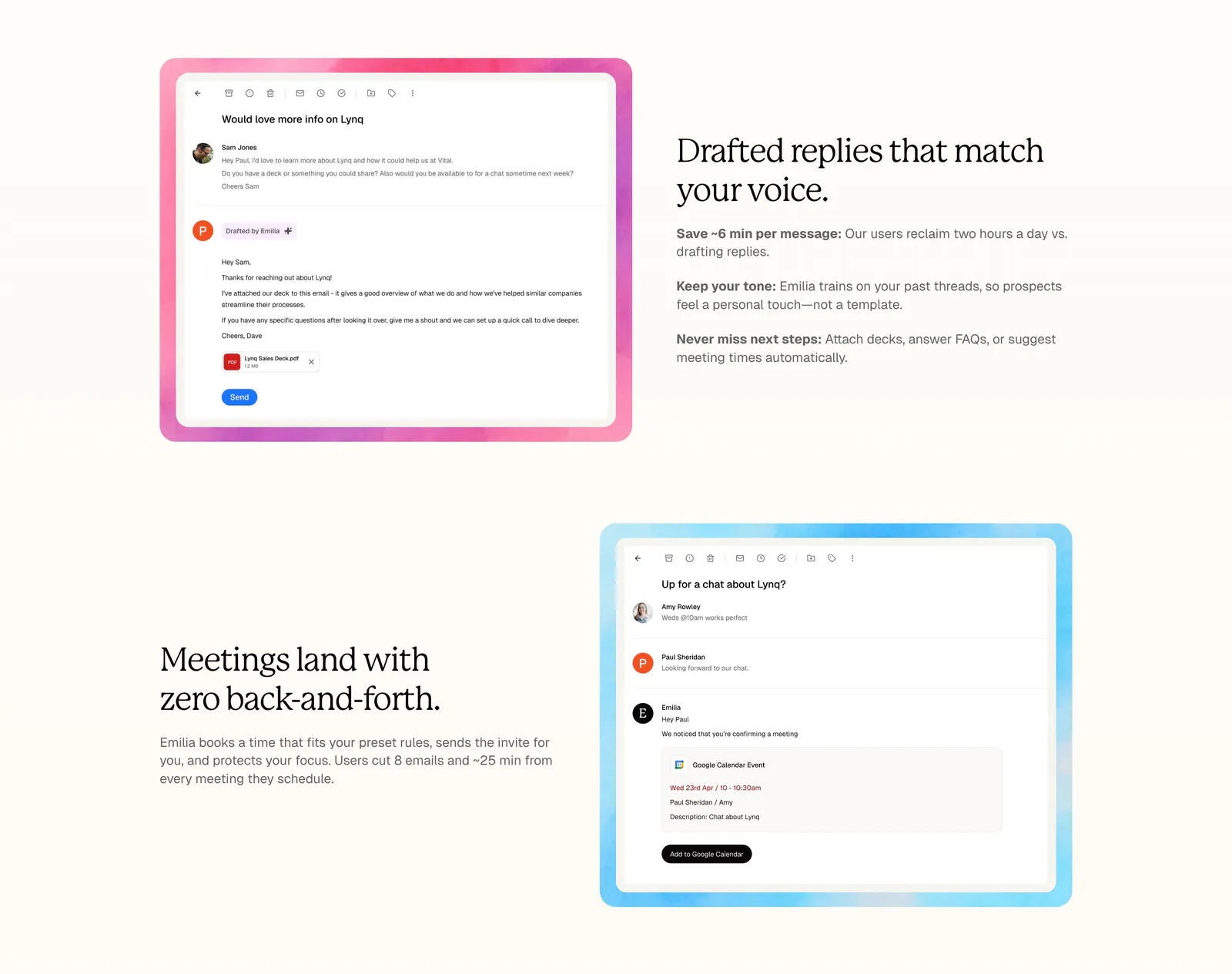
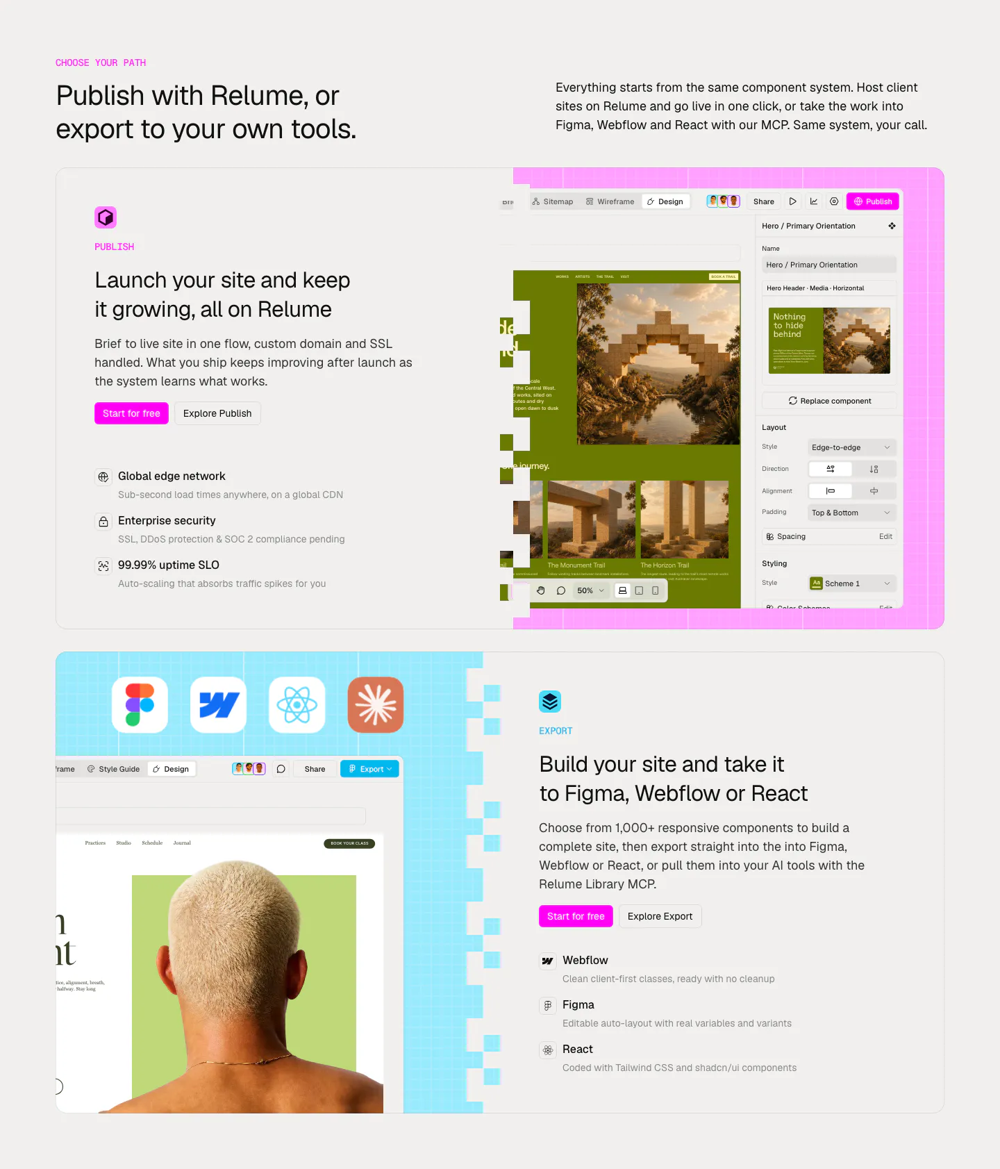
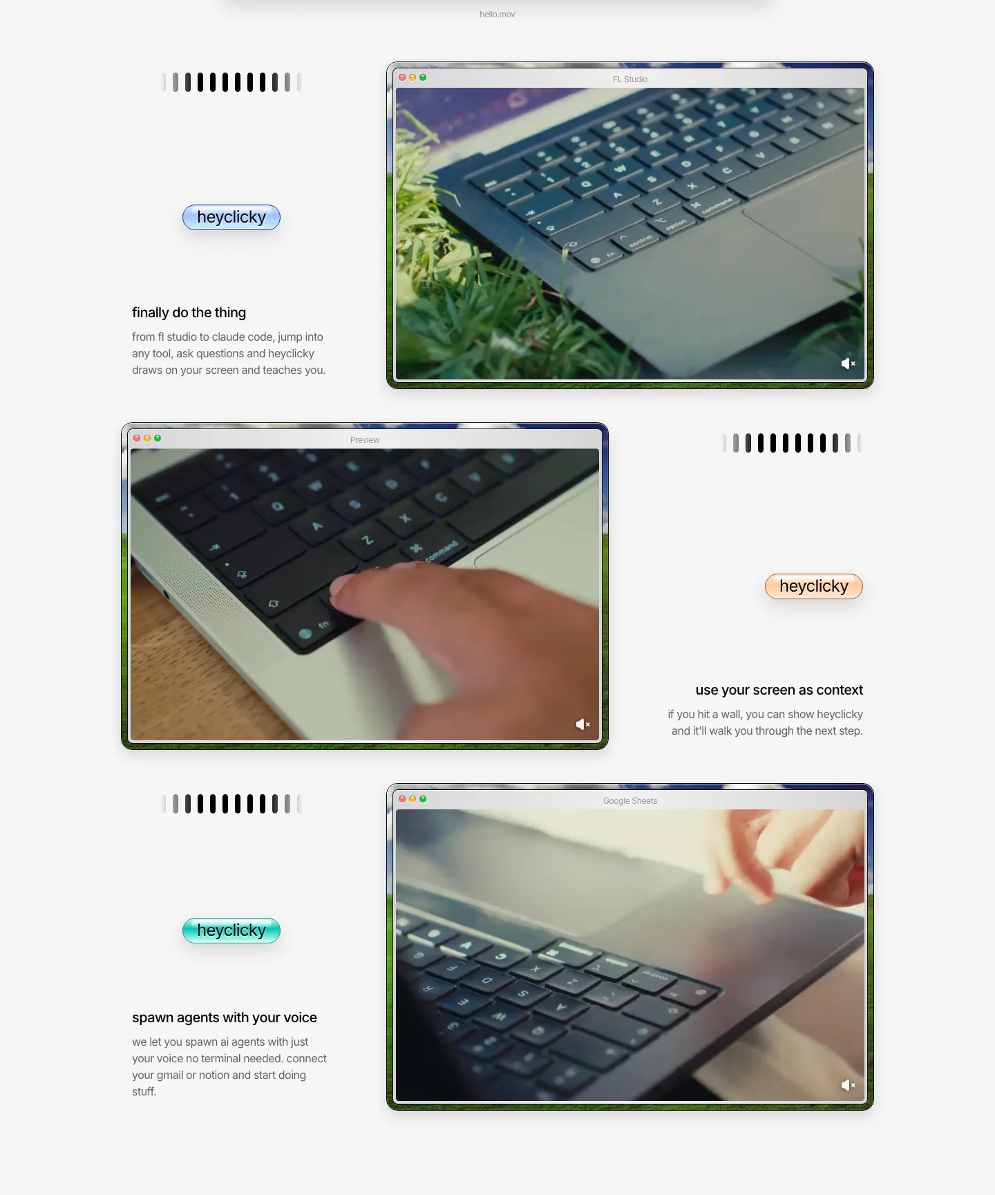
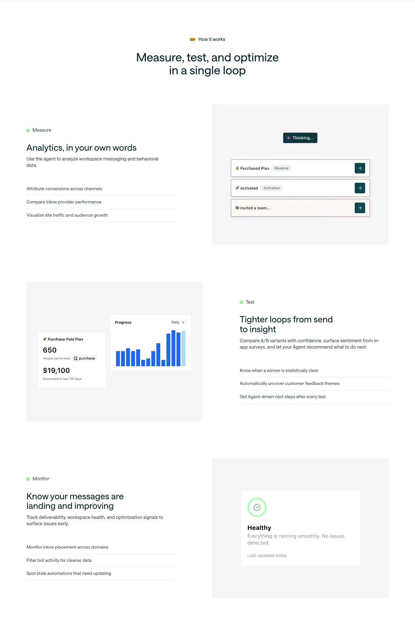
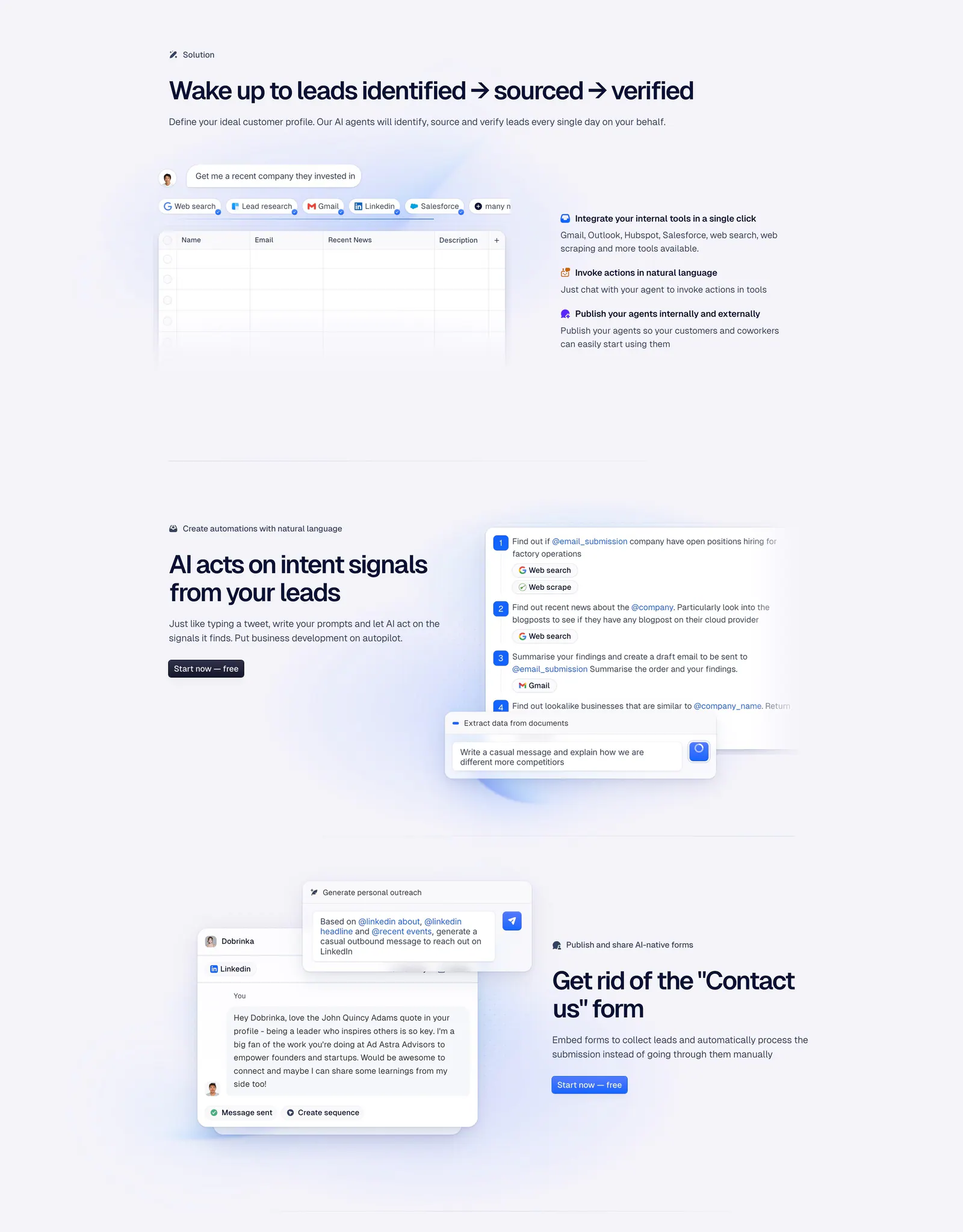
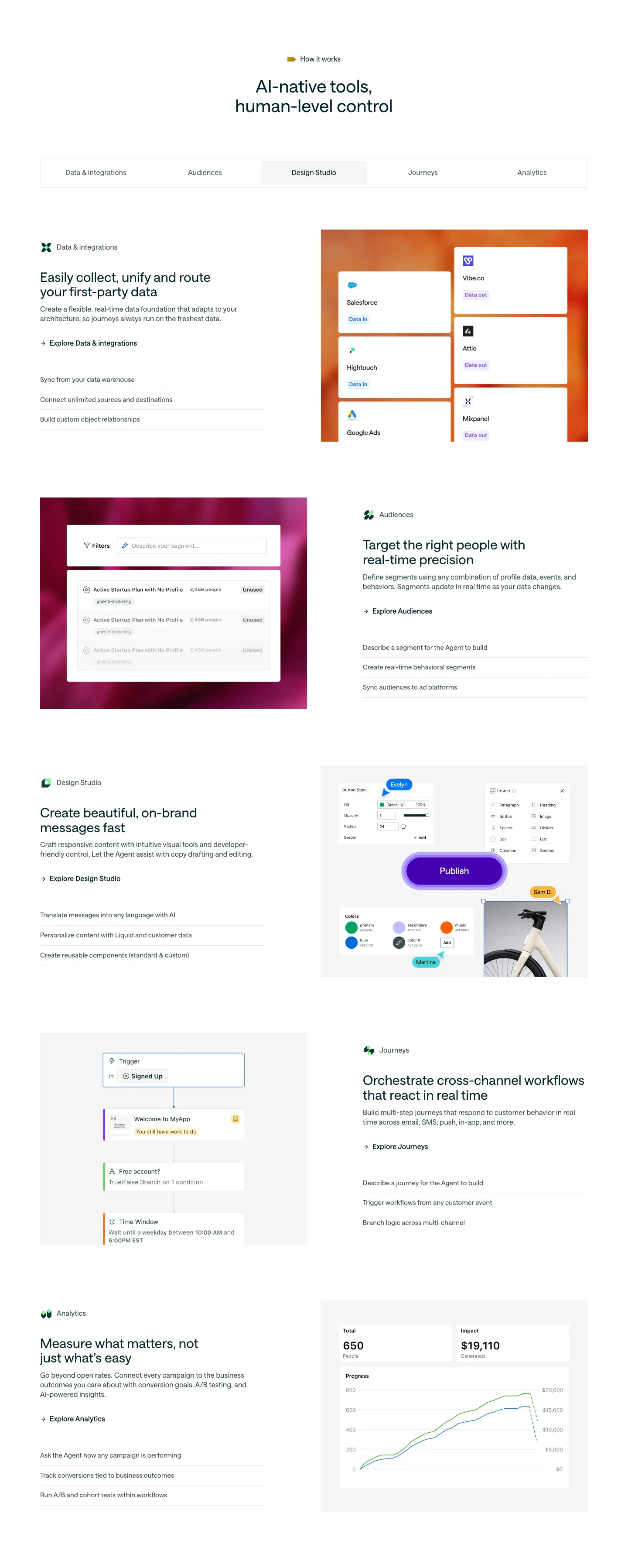
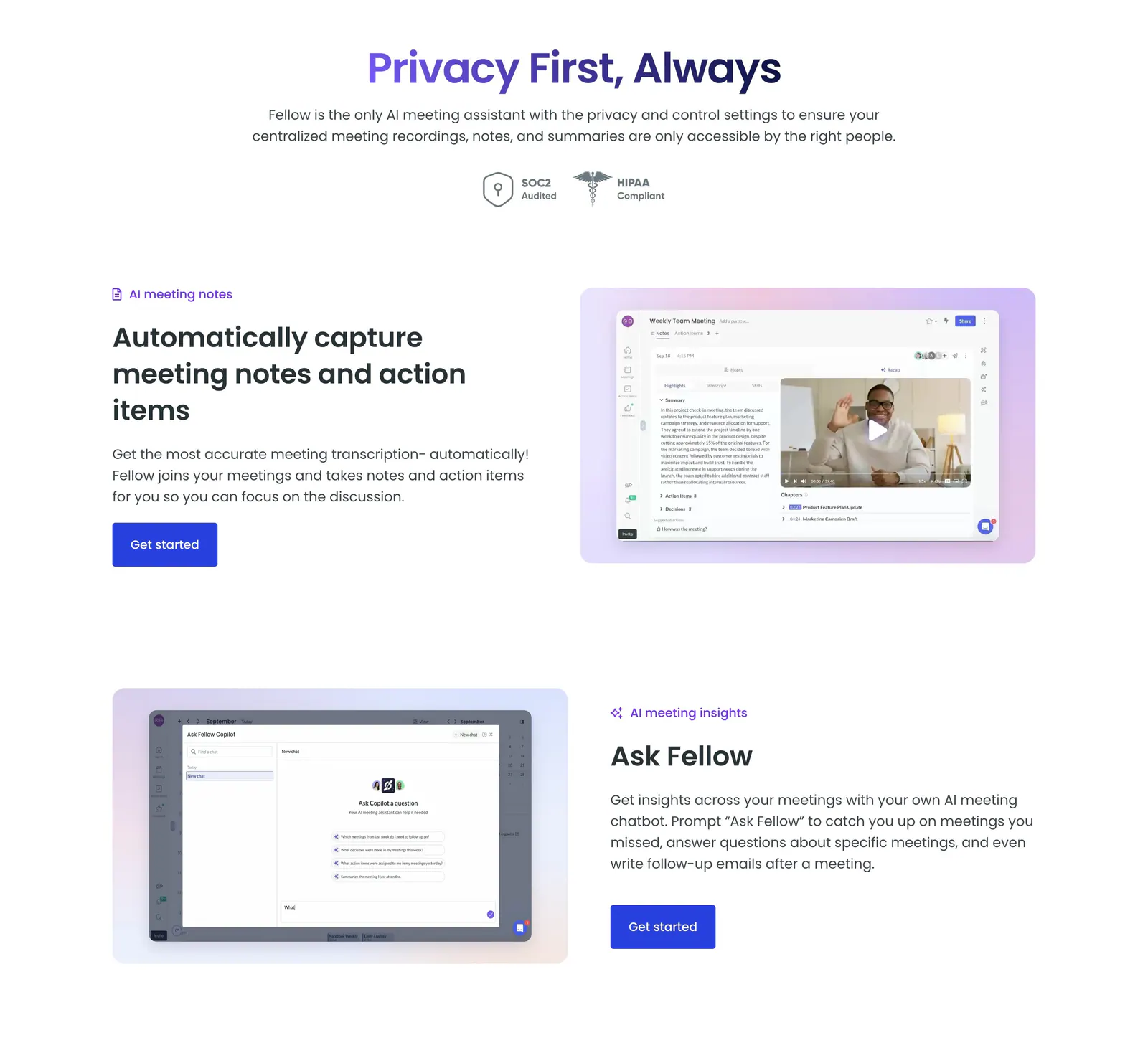
Text on the left, image on the right, then the reverse. The zig-zag of alternating rows ranks among the most dependable patterns in website design, walking readers through a sequence one row at a time, whether that is a feature tour, a process, or a company story. It goes wrong in two familiar ways: rows that all look identical, and phone layouts that scramble the order of text and visuals.





Where alternating rows shows up
Often paired with
How to design alternating rows
-
Stack every row the same way
On phones, every row should stack in the same order, usually headline and copy above the media. Keep that source order in every row and flip the desktop zig-zag with CSS, such as row-reverse, so screen readers and small screens both get a predictable sequence.
-
Vary the media between rows
If every row shows a similar screenshot at the same size, the section blurs together. Mix interface shots, close-up crops, diagrams, and short loops. Adjust media scale or add a background panel on some rows to give the eye a reason to keep moving.
-
Center text blocks against the media
Vertically center each text block against its visual so the row feels balanced, and keep lines to roughly 45 to 70 characters. A narrower text column beside a larger visual usually reads better than two equal halves competing for attention.
-
Cap the number of rows
Three or four rows is usually the limit before attention drops. Move minor points into a compact grid below. A short eyebrow label or step number on each row helps readers scan the sequence and know where they are.